#Mike Carlin's Superman era
Explore tagged Tumblr posts
Text
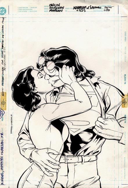

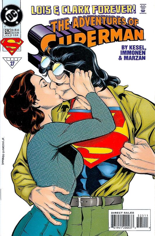
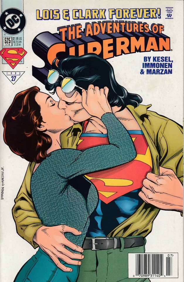
1995's Adventures of Superman Vol.1 #525 cover by artist Stuart Immonen, inker José Marzan Jr. and colourist Glenn Whitmore.
#Superman#Lois Lane#Clark Kent#adventures of superman#DC#dc comics#cover#art#love#lovers#romance#romantic#marriage#husband#wife#90s comics#1990s#Superman Triangle Era#lois & clark#karl kesel#José marzan#kiss#textless#comics#last son of krypton#man of steel#Mike Carlin's Superman era#Stuart Immonen#1995#clark x lois
56 notes
·
View notes
Text


“Did I ever tell you how “Mooch” Carlin had a crush on me?”
“Mooch” Carlin -> Mike Carlin. Mike Carlin was the editor for all the Superman comics during this era (this comic is from 1995, right before he took over as exec editor of all dc comics, but he’d been the lead on the Superman group since the 80s). This is just an in-joke reference to him. Not sure on the Batman “Devlin” name—could be made up, could be a reference to the Batman comic editors Dennis O’Neil or Darren Vincenzo but that doesn’t really fit.
The credits are formatted unconventionally on this page bc it’s supposed to mimic a boxing match poster. Plus the whole page bc I love these newswomen


#dc liveblog#idk much about Mike Carlin but I do really like his editing direction on the super#runs#dc comics#superman#lois lane#cat grant#mike carlin
6 notes
·
View notes
Note
What do you think of the Triangle Years?
To really give an honest appraisal of Byrne as some have asked me to, I think I need to reread his run. But the Triangle Era is a different story because it's not the product of one person, and therefore I think speaking in generalities actually suits the era.

Short rundown for those not familiar with the "Triangle Era" is that it's the name for the Superman time period from 1991-2001. This was after Byrne left the books, and after the Exile Saga which explored the ramifications of Superman killing Zod and the Pocket Dimension Kryptonians. After Exile there were 4-5 monthly Superman books, all with different creative teams, but all telling one continuous story that went from book to book. The titular "triangle" had a number which showed the reading order for the books that month, so a new story would start in Superman, then the second part would be in The Adventures of Superman, etc, etc.
Should not come as a surprise that overall the era can be described as a mixed bag, when you've got so many writers working together and they all have to coordinate, it doesn't really leave much room for creators to establish their own "take" or voice for the character. The main writers for this era were Jerry Ordway, Dan Jurgens, Roger Stern, Karl Kesel and Louise Simonson, names you probably recognize given their long history in the comics industry and with the Big 2. All of them have left an impact on Superman that is felt to this day, particularly those who participated in the Death/Reign/Return epic. Jurgens is often considered the main architect of the era, and while I think that gives his collaborators too little credit - also it ignores how central editor Mike Carlin was to the whole operation - I do think Jurgens is the writer and artist who most embodies that time period.
Byrne was given the task of "Marvelizing" Superman, something he did by wiping out the old Super-Mythos and creating a new foundation. The creators of the Triangle Era built upon the foundation Byrne left them, and continued Byrne's trend of bringing back old Superman concepts in a way that didn't conflict with the foundation Byrne set or the editorial edicts of the era. So we get a Bottled City of Kandor that isn't Kryptonian, a Supergirl who isn't Kryptonian or Clark's cousin, a Superboy who isn't Clark, and so forth. This was also an era where they tried new things, Superman died, got replaced, and came back, he revealed his identity to Lois and the two got married in canon, his powers changed as did his costume, he sported a mullet, if there's one thing you can give the era it's that they weren't afraid to take risks. Personally I prefer the way later creators tried to "modernize" concepts like Kara, Kandor, or Brainiac over the approach the Triangle Era took (Conner rules though, I'd take him over Pre-Crisis Superboy any day).
More than Superman himself I think the real legacy of the Triangle Era is the focus it gave to Superman's supporting characters. During this era there was a lot of focus on soap opera theatrics which was typically explored via supporting cast members in the Daily Planet, the Metropolis Special Crime Unit, or various citizens of Metropolis. Cat Grant's son murdered at the hands of the Toyman, Maggie Sawyer coming to terms with her sexuality, Lucy Lane's relationship with Ron Troupe, John Henry Irons seeking redemption by becoming Steel, and more. Granted I think a lot of the focus on the supporting cast happened because Byrne's established characterization of Superman didn't leave him much in the way of room for growth, making the supporting cast more dynamic characters and more interesting to write, but the Triangle Era still brought a period of development for the wider mythos that we haven't seen since. That much I do miss from this age.
Overall it's a time period that I think adaptions should sift through to find inspiration for approaching Superman's supporting cast, but not an era I have any desire to go back to with regards to the big guy himself. There's a lot of interesting ideas that could be updated and "modernized" like what I want for Conduit, and if we ever get a generation of writers who look to the Triangle Era the way Morrison, Waid and others looked to Pre-Crisis, I would be interested to see how they would revamp some of the ideas of this era.
7 notes
·
View notes
Note
Okay, but like, what actually *is* Triangle Era Superman? I see it alluded to occasionally online, always with a sense of dread and foreboding but never with an actual explanation.
Basically, there were four regular monthly Superman books - Superman, Action Comics, Superman: The Man of Steel, and The Adventures of Superman - and the story directly continued from one to another rather than each book being their own distinct contained stories even though they had their own creative teams. This basically made it a weekly comic (there was even a 5th title, Superman: Man of Tomorrow that came out when there was a 5th Wednesday in a month), and in order to emphasize that and make it easy to track, a triangle and later a Superman s-shield with a number in it was implemented in the upper right corner to show where all the books stood in reference to one another.
The reason folks like me don’t look back fondly on it isn’t because there weren’t plenty of quality creators involved - Karl Kesel, Jerry Ordway, Roger Stern, Louise Simonson, and Jon Bogdanove for instance, and later after the big turn-of-the-millennium changeover there was Joe Kelly, Joe Casey, Jeph Loeb, Doug Mahnke, Ed McGuiness, and Mike Wieringo. But this was the era where those individual visions were subsumed into Mike Carlin and Dan Jurgens steering the ship as a direct continuation of the Byrne ethos, with a tendency to sideline Superman and his adventures in favor of soap opera plots among the supporting cast to play into the weekly format, and its latter days after Carlin left was where Berganza got his start on the books. As many wild events as it went through like Death & Return and the electric blue suit (for better or worse), and a handful of great ideas that took such as the marriage and some major new characters, it’s always struck me as a fundamentally conservative, small-thinking era that embedded a lot of ultimately really bad ideas for the character into his bedrock, and was a spirit that seemed to carry over into the Rebirth books we all know my opinions on. Granted, I’m talking about it as a casual observer decades after the fact, but I know what I like when it comes to Superman, and buddy? That stuff ain’t it.
12 notes
·
View notes
Text
Personal Best

THE ADVENTURES OF SUPERMAN #428 MAY 1987 BY MARV WOLFMAN, JERRY ORDWAY, MIKE MACHLAN AND TOM ZIUKO

Perry White’s son is kidnapped and the ransom is an article in the Daily Planet, saying that a certain public figure was innocent of all the accusations. But will Perry lie for the first time in 50 years or will he let his son die?

SCORE: 9
A year before, these characters were there to advance the plot, now they are the plot, and that is one of the reason I really love the Mike Carlin era. Also debuting in this issue are José Delgado and Bibbo.
It is also interesting to see Superman interrogate criminals for information. As usual, this Superman is tough, but also has a good sense of humor.
The one thing that I never liked about this issue (and the ongoing arc) is Superman’s reaction to Qurac. It is clear in the opening sequence that Superman’s action didn’t start an international conflict, only because it wasn’t a problem for the Soviet Union. But it is still what the world accuses the USA to do in other countries. Superman just happens to be able to do it without casualties. It’s not that Superman shouldn’t put an end to terrorist nations. In fact, this is very in line with the Golden Age Superman. But it also creates a problem for future stories, and for conflicts in real life. If Superman was able to do this, why wouldn’t he put an end to wars? If I remember correctly, Superman will look back on these issues and realize he shouldn’t have done it.
Jerry Ordway is a national treasure as usual.
Spoilers after the break...


Jerry White’s character arc is perhaps one of the most interesting of this era. And it introduced one of the most shocking plot twists in Superman comics (you should know what it is, but in case you don’t... I won’t mention it).
Another thing I really enjoy about this era is how well the supporting cast was “distributed” between the titles. It didn’t last long though, once Byrne was out, it got a bit blurry (but the cast remained to be in specific titles until the end of the triangle era). This is important, because it gives a writer some level of control over their book when it is part of a larger continuity (I believe Spider-man was already doing this kind of scheme around the time).
As for the story, I remember hating Jerry White when I was a kid. And really sided with Perry over his dilemma. I still side with Perry. If it weren’t for Superman, though... I don’t know how this story would have ended.
#dc comics#comics#review#1987#modern age#superman#the adventures of superman#bibbo#jose delgado#gangbuster#jerry white#perry white
6 notes
·
View notes
Photo

Superman Meets the Quik Bunny (1987)
Bless Superman’s bullet-resistant heart, but I don’t think the man knows how to say no. When the Radio Shack Whiz Kids asked him to do a crossover comic, of course he said yes. When the anti-smoking folks asked him to beat up Shane MacGowan only dressed as a brown cigarette, he could only agree, even though it meant throwing the frontman for the Pogues over a building and into space. And when the Quik Bunny asked for a crossover, what is there for a Man of Steel to do?
It’s the Eighties, the era of Watchmen and Dark Knight Returns, and in Superman’s case there’s also a depressing newsprint abortion in which he teams up with the Quik Bunny. If Frank Miller had been in charge, we might’ve gotten Batman crossing over with a heroin-addicted Kool-Aid Man and his stable of hookers, but instead we get this, which is slightly more disturbing.
This opus to vertical integration and the phrase “Quick Thinking” is brought to you by writer Mike Carlin and artists Carmine Infantino and Dick Giordano. It’s worth remembering that, at different times, Infantino and Giordano were the most powerful men on the floor at DC Comics. Consider that as you picture them they putting the final artistic flourishes on a bedraggled rabbit twisting its ears in orgasmic delight while it sucked back what appeared to be beige motor oil.
And also, seriously, I hope you don't get sick of “Quik Thinking.” Seriously.
The story starts commonly enough, for a superhero comic: We open on Superman chasing down one of the multitude of antisocial stage magicians in pajamas which bedevil the world of superherodom. In this case, it’s Flash baddie The Weather Wizard, whose costume – green bodysuit, flated collar, pixie boots and a golden sash – help him cut a figure which is slightly less intimidating that the Quik Bunny…
While the Wizard is pouring torrential rain down on the city of Metropolis, four plucky kid geniuses are busily constructing a super-robot treehouse off in the suburbs somewhere. The multicultural and gender-balanced Quik Qlub – who go by the individual names of Ronnie, Patty, Maureen and Miguel, which sounds like a Protestant family of three and their gardener – apparently do all this at the behest of their manic mentor, the Quik Bunny. Like the mass hallucination shared by a doomsday cult, the Quik Qlub cannot stop themselves from obeying the harried, hectoring commands of their cotton-tailed tyrant. Some day there’s gonna be something extra in that chocolate milk.
While hanging out in their magic robotic treehouse, the Qlub chances upon a tvbroadcast of Superman's life-and-death battle against moisture and a fey Mister Greenjeans. Understandably, the Quik Qlub begin to fear for Superman's safety – possibly because they're idiots, or maybe they have Weather Wizard confused with a black hole or God – and rush off in their transforming magic clubhouse to offer assistance. And chocolate milk.
Luckily for the Qlubbers, Superman has a long history of accepting help from people far weaker than himself. “Sure Robin, come help me defeat Brainiac. Hey the Atom, thank goodness you’re here, how else could I beat Doomsday without you?” It’s condescending but his heart’s in the right place. I suspect this inclination on Superman's part is half fatherly good nature, and half that he knows the Weather Wizard couldn't even beat the Quik Bunny in a fight – and he's RIGHT!
So while the Weather Wizard is throwing hurricanes and tornadoes around the nation’s capital and making it snow in Egypt and what-have-you, the Quik Qlub follow around in their big happy schoolbus of delight while solving mazes and word puzzles and whatnot along the way. It's pretty enlightening stuff - I, for one, learned that the easiest path to the Great Wall of China is via the Canals of Venice. Thanks activity book mazes!
The whole story wraps up in China, where Weather Wizard's been making it hail, and oh man, the Chinese hate hail. Seriously. They must, otherwise why else would he do it? Hail, the one weakness shared by the entire nation of China. One billion people, brought low by hail.
Amazingly - or actually NOT amazingly really, if you think about it - the Weather Wizard is outgunned and outclassed by the Quik Bunny, who quickly fashions a lightning-attracting Quik Bunny metal decoy, and sets it up on the edge of the Great Wall. When the Weather Wizard zaps it with electricity, thinking he's striking the Quik Bunny himself, he instead ... somehow gets walloped himself, I think. The science seems to wear a little thin on the inner thigh around this point of the story, but from what I gather, the Weather Wizard is kind of a puss and then he's dead and thank you Quik Choclate Mouthwash, you've saved something from the forces of whatever!
Then it's back to the Qlubhouse and all its horrible, dark secrets for a celebratory chug of powdered chalk dust and a hearty Kryptonian backslap, bringing to an end another exciting occasion wherein Superman slowed down long enough to let nitwits like the Quik Qlub, the Radio Shack Whiz Kids or Jimmy Olsen fart around and let super-criminals go on massive sprees of destruction and mayhem just so they could feel like they helped.
Source: Gone & Forgotten
(image via Heritage Auctions)
1 note
·
View note
Text
PAGE x PAGE ANALYSIS — “GANGBUSTER: SWING ANNA MISS” from THE ADVENTURES OF SUPERMAN #500 (1993)
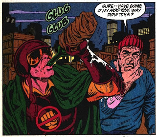
PUBLISHED: DC Comics, June 1993
SCRIPT: Jerry Ordway
PENCILS: Tom Grummett
INKS: Doug Hazelwood
COLORS: Glenn Whitmore
LETTERS: Albert De Guzman
EDITORIAL: Mike Carlin with Jennifer Frank
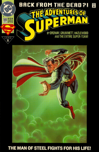
A couple days ago, I took a look at a short segment of the sixty-five page ADVENTURES OF SUPERMAN #500 — specifically, the four-page introduction to Superboy by Karl Kesel and Tom Grummett. Today, I wanted to revisit a different part of that same issue: the nine total pages of subplot that focus on the nobody’s favorite hard-hitting hero of Suicide Slum: GANGBUSTER.
Oh, Gangbuster. While many casual comic history buffs may cite 90s comic character design trends in terms of pouches and spikes, I feel like Gangbuster represents the aesthetic of that era in an equal but opposite way. His “What if Firestorm was Robocop” look is such a prime example of what straight attempts at designing new comic book characters in the classic superhero mold looked like at the time. The shoulders. The helmet. His little logo. He’s so serious. He’s just the worst. I think I might love him.
But hey, Andrew Weiss I ain’t — far better to let you see my man Gangbuster in action and let his performance speak for itself. So let’s tuck in and take a look at his subplot in ADVENTURES OF SUPERMAN #500, which I’ve entitled, for the purposes of discussion: “GANGBUSTER: SWING ANNA MISS.”
THE ADVENTURES OF SUPERMAN #500 and all characters contained therein are property of DC Comics, reproduced here solely for educational purposes.
***
PAGE ONE
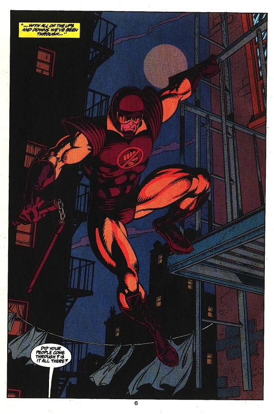
Aww, yeah. Drink him in.
Grummett and Hazelwood create a sense of distance between the buildings by showing the foregrounded building Gangbuster’s hanging off of in full detail, while the buildings in the background are rendered in black silhouette, suggesting they’re far enough apart that light affects them differently. This has the side affect of giving Gangbuster a sense of height — if the buildings behind him feel far away, we automatically assume the ground must be equally far below. This is a great hero shot, besides. From this first image, we know what kind of superhero Gangbuster is: the weapon and helmet suggest he has no powers, the collar implies he’s kind of a squarejohn. To my eyes, his design invokes two moralistic Marvel characters: Daredevil and Cyclops.
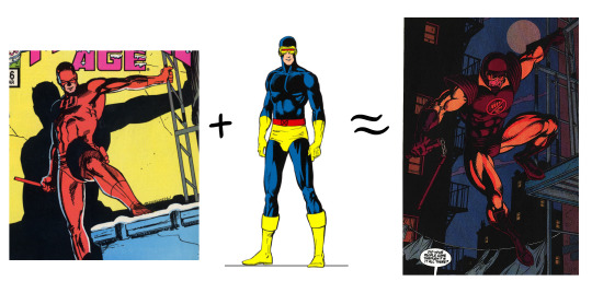
The message is clear: the Super R.A. is here to kick some ass.
PAGE TWO

Excellent establishing shot of the alleyway — going with an over the shoulder angle concretely places Gangbuster, our audience surrogate character, relative to the other characters below. When added to the previous splash page, this gives us a very strong understanding of the space: a narrow alleyway with entrances on both sides.
Note how Grummett makes panels two and three a smaller inset of panel one, giving the feeling that what we’re seeing is a detail of the larger scene. Colorist Glenn Whitmore even makes the gutters of these panels a dark red, a color we already associate with Gangbuster, further coding the scene as being observed by him, even though panels two and three are not literally from his POV. This might be reading into things too much — this color coding might just be a happy accident. Super minor continuity issue with his nunchucks: they’re dangling free on page one, but gathered into his fist here. Personally, I’d think the clinking chain connecting them would give him away. But who knows? It’s the DC Universe. Maybe they’re hard rubber instead of metal. Moving on.
Also, that guy next to the car. Keep an eye on him.
PAGES THREE AND FOUR
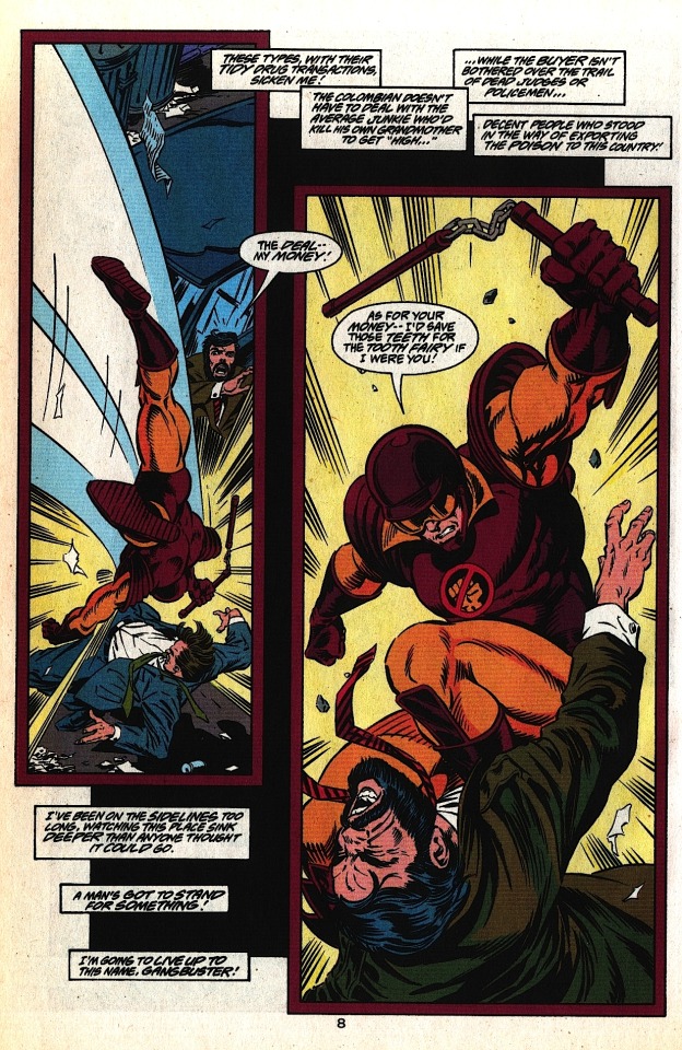

These pages work together as a sort of splash in three parts. The black field floating behind the panels on page three is a great way to add depth to the layout — Grummett employs this several times over the course of the issue, always to good effect. On the big splash page, I really like the visual representation of the whipping motion of the nunchucks; it adds force and speed to a weapon the can often look sort of ineffective on a static comic book page. The slowly increasing size of Gangbuster across both pages conveys the growing intensity and brutality of his attack on these guys. This also sets up this moment as the height of Gangbuster’s evening — we’re clearly meant to be more or less on his side right now. After all, we need a hero now more than ever. Superman’s dead.
PAGE FIVE
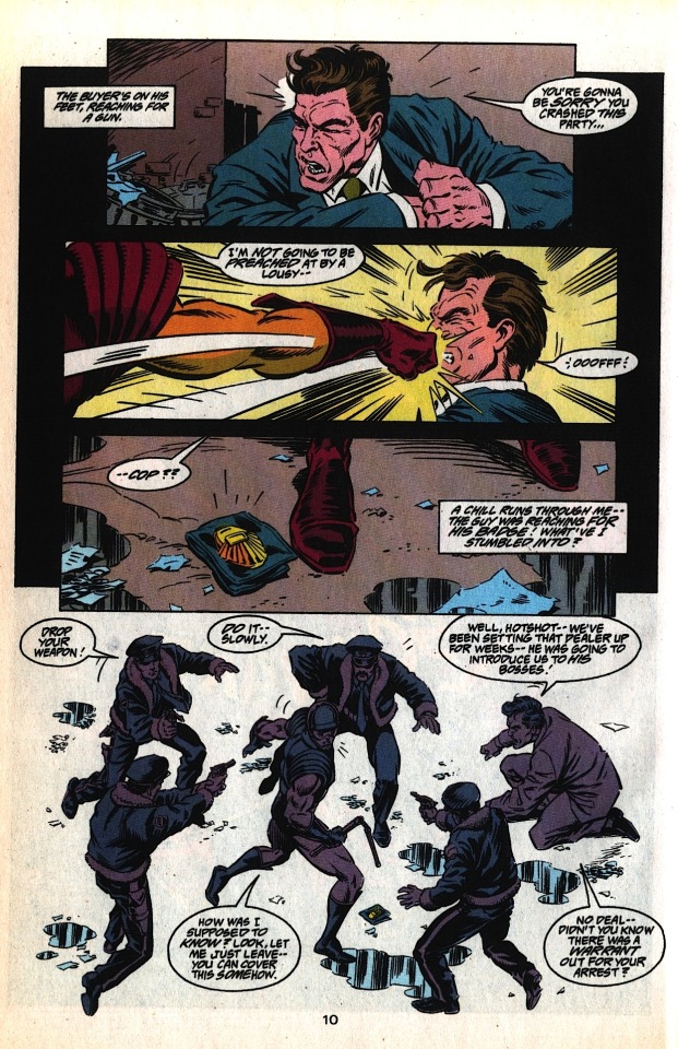
The first three panels on this page consist of tight action shots, limiting our ability to see our environment, so we share in Gangbuster’s surprise when we pull to a wide shot in the last panel. Dropping out the border in panel four, surrounding the figures in negative space, enhances the feeling that the cops have swarmed him from out of nowhere — although note that Grummett adds enough puddles and junk on the ground to make the figures feel like they’re standing on something solid. Lastly, making all of the figures the same cool shade effectively equalizes them; Gangbuster isn’t a superhero, he’s just some schmuck that’s about to get canned.
PAGE SIX

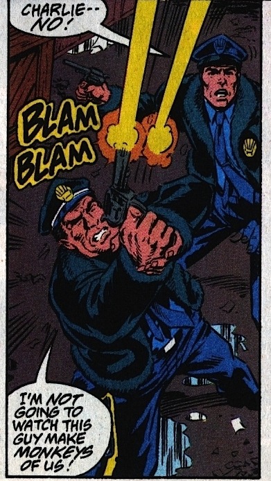
Is the cop who calls out to Gangbuster in panel four the same one who fires at him in panel five (“Charlie”)? Logistically, It would make sense — there’s no one in front of him in panel four, and Charlie in panel five is clearly in front of the “Charlie -- No!” cop in that panel (who we’ll call “Killjoy”). Character-wise, however, it would make more sense for the panel four cop to be Killjoy — he’s even holding his gun the same way in both panels.
I point this out as an example of the pitfalls of making characters in identical outfits too physically similar. If you’re drawing a group of big city cops, there’s no reason not to make them diverse in race and gender, if for no other reason than to add easy distinguishing elements between what is otherwise a totally homogenous pack of unnamed characters (although there’s plenty of other reasons why this is a good idea).

All that said, great bit of action between panels one and two. The close-up of Gangbuster grabbing the cop in panel one, a right to left motion, leads directly into the huge left to right throw in panel two. I love the anatomy in this scene — you can really feel how much effort the decidedly non-superhuman Gangbuster has to put into the throw. Once again, Grummett and Hazelwood create a feeling of space in panel two by dropping the back two cops into black silhouettes, with their badges still visible to create a feeling overwhelming, encroaching authority.
Also, considering how ineffective small arms typically are against costumed crimefighters, our boy Charlie is one crackerjack marksman. Or maybe — just maybe — Gangbuster is a goddamn terrible superhero.
PAGE SEVEN

Here is where I point out a minor flaw in this whole sequence; now that we’ve left the alleyway, we can say conclusively that the guy in the suit standing next to the car on page two never showed up again. He’s not even in the pack of cops surrounding Gangbuster on page five — we just lose track of him entirely. It’s a small thing, but since Grummett (or possibly Ordway in the scripting process) chose to include him in that establishing shot of the alleyway, it would have been nice to see him again when the Undercover Cops twist goes down. Losing him like this adds to the hash this scene makes of the work done to establish this space on the first two pages.
Couple possible fixes: One, take the guy in the suit out entirely. The initial interaction of the undercover cop and the drug dealer is framed very tightly and personally, so just have them be there (ostensibly) alone. Then pull the reveal of the undercover cop as is, and all the uniformed cops still swarm him from — the walls? I guess? They kind of come out of nowhere.
Two, and my preferred fix, would be to have a couple of guys in suits sanding by the undercover cop’s car on page two, with one distinct guy standing next to the drug dealer — a big guy in a leather jacket, something that screams “bodyguard.” On page three, Gangbuster takes out the bodyguard in panel two instead of the drug dealer. We keep Gangbuster wailing on the drug dealer on page four — that looked great. On page five, instead of just punching out that one cop, we have Gangbuster diving into the men in suits in a more “superhero takes on a bunch of thugs” type fight. Then the men in suits reveal themselves to be undercover cops, instead of the uniformed cops just appearing out of nowhere at the end of page five— something I keep bringing up because it really does bother me, since the geography of the narrow alleyway was so well established on page two, making the sudden appearance of the uniformed cops feel a little like a cheat. Wouldn’t Gangbuster have been ideally situated to see them hiding in the alley, from his vantage point on the fire escape high above? This proposed scenario cleans all that up, and loosely preserves the extant flow of action. And even though I did ramble on about this for a goodly while, it is ultimately a minor flaw. But then, that’s the thing about minor flaws; there’s usually a pretty easy fix.
Meanwhile, this page: Really strong lettering from Albert De Guzman at play here. Look how he guides our eye down the page, helping Grummett’s already clear line of motion by creating an arrow of words pointing right to Hob’s Bay.

Grummet consistently makes Gangbuster small (I.E. less powerful) on this page, a clear contrast to how huge he was during the opening pages. Here he’s dwarfed by everything on the roof, from vent pipes to chimneys, culminating in the huge cop’s hand + gun in panel four. I personally would’ve liked to have shown a little more of the cop’s arm, enough to see an official insignia up on his shoulder, but we’ve already established that the cops’ jackets have furry cuffs, so it works fine enough as is.
PAGE EIGHT
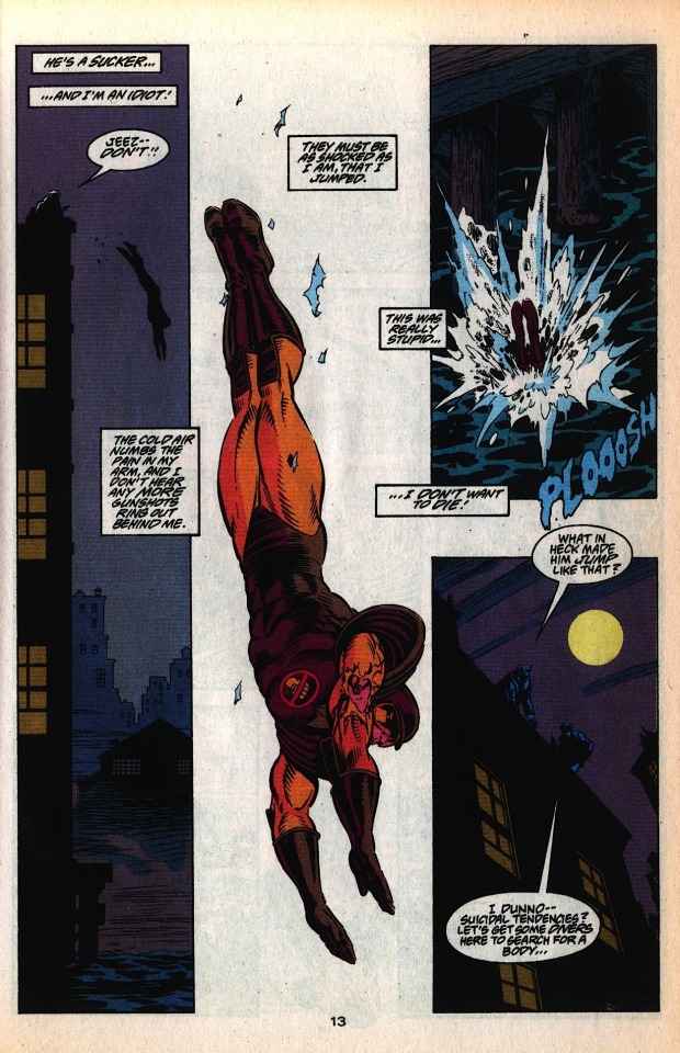
There’s been no shortage of great layouts in this issue, but this page is a cut above. The narrow verticality of that first panel bleakly lays out the stakes at play; the cop on the roof, the three story jump, the bay below. Grummett and Hazelwood use the fog off the bay to drop the buildings beyond into the deep background, visually “clearing the path” to the bay.
The second panel eliminates everything but this huge full-figure shot of Gangbuster diving, with a couple scraps of lead paint from the roof to place him in space. We can’t see his expression, but his captioned dialogue is tremendously affecting. Note also how while Gangbuster is diving towards the bottom on the page, the lettering still leads us organically to his plunge into the bay in panel three, even though that panel is layout-wise much higher on the page.
Nice reverse shot in that last panel, reminding us how far Gangbuster has just jumped and adding tension to the idea that he might not have survived. The last line is continued in a caption on the following page: “…No way anyone could’ve survived THAT!”
Another note about the last couple pages: Grummett always has Gangbuster moving in the same direction, left to right, throughout the entire rooftop chase. For this reason, the bullet Gangbuster catches is in his right arm — the arm that’s always facing us.
Oh man! It could’ve been a cool visual dichotomy, if we had seen the official insignia on the sleeve of the cop pointing the gun at him at the end of page seven! The officer of the law has a symbol of his authority where the vigilante has a bullet wound! Ahh, well. Still a phenomenal page.
PAGE NINE

We come back to this subplot after about twenty pages with a nice, low-energy establishing shot of the docks. The wafting, flapping paper is a great way to suggest windchill and urban decay. The bay is to the left of the page — when last we saw Gangbuster, he was making a rightward dive into the bay. On a storytelling level, we’re on “the other side” of the bay. Gangbuster got away clean.
High-Pockets is immediately helpful here, despite having a crummy night. No deep analysis to be had here, I just like it. Good little character trait for a good little character. As he hauls Gangbuster out of the drink, we see he’s transferred his wine to the pocket of his coat, which he then gives to Gangbuster. High-Pockets doesn’t offer him his hooch, mind you — Gangbuster just straight jukes it. We end on a nice reverse silhouette as High-Pockets and the slumped, defeated Gangbuster lope off into the shadowed, Superman-less city of Metropolis. Gangbuster’s last line concludes in caption on the next page: “…Then I’ll be finished with this stinking place!” Our hero, kids.
Again, this is one of the first comics I even read. When I think about it, Gangbuster has to have been one of the first, say, fifteen superheroes I was ever aware of. Before Green Arrow or Daredevil or The Question or Black Canary, I knew about Gangbuster — a character who, as depicted here, just isn’t really cut out to be a superhero. He’s a washout, a bencher, a big ol’ can of coulda beans. He’d be one of the hockey pad Batmen from The Dark Knight, only they wouldn’t let him join because he’s just such a giant prick. He’s awesome. Gangbuster, man! Gangbuster.
***
You can buy the full 65-page issue of THE ADVENTURES OF SUPERMAN #500 for the surprisingly low price of $1.99 off Comixology! It’s absolutely worth the read, containing a truly emotional Pa Kent story as well as the introduction of Cyborg Superman, which is, if nothing else, exceptionally well-paced.
Meanwhile -- we’re in the final days of the Kickstarter for SECTION ZERO!

Tom Grummett reunites with writer Karl Kesel to bring back the high quality old school team-based adventure comic — one of the few types of fiction that genuinely does work better in the medium of comics than it does anywhere else, and these guys are high in the top list of creators who can pull it off. If these awesome Gangbuster pages above did anything for you, SECTION ZERO is totally on your frequency.
If you want to read some preview pages and learn more about the project, I highly encourage everybody to check out the SECTION ZERO Kickstarter — it’s entering its last week and I very much want to see this book on my shelf.
***
As always, feel free to check me on any mistakes I might have made, add your own commentary, or share similar examples of good comics done well. I’ll be back next week with a different comic to peruse.
Be well!
PREVIOUS PAGE x PAGE ANALYSES:
MINI-ANALYSIS — FIRST SIGHTING: SUPERBOY
ULTIMATE SPIDER-MAN #69 (with Aud Koch)
THE SHADOW STRIKES! #13
PETER PARKER: SPIDER-MAN #13
BATMAN: GOTHAM ADVENTURES #17
#Gangbuster#Page x Page Analysis#comics#educational purposes#Superman#DC Comics#Tom Grummett#jerry ordway
5 notes
·
View notes