#LavenderTown
Explore tagged Tumblr posts
visionproductions2008 · 1 month ago
Text
Tumblr media Tumblr media Tumblr media Tumblr media Tumblr media
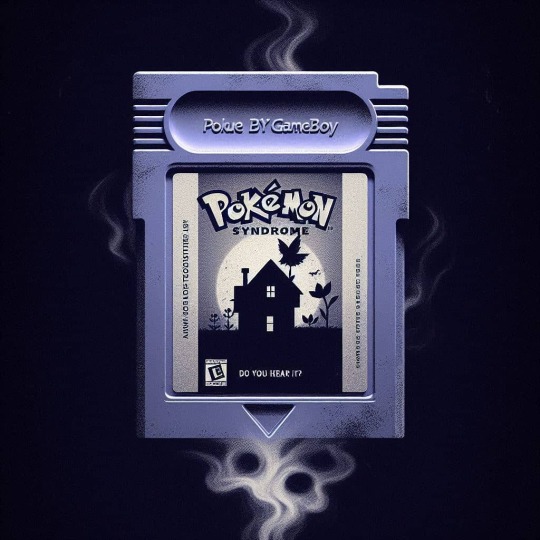
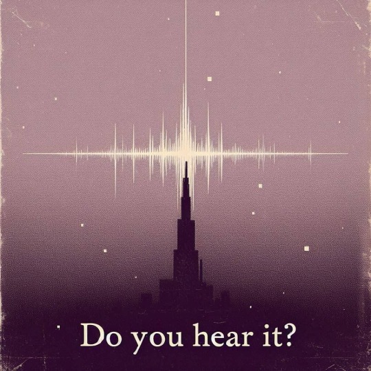
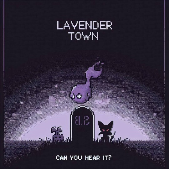
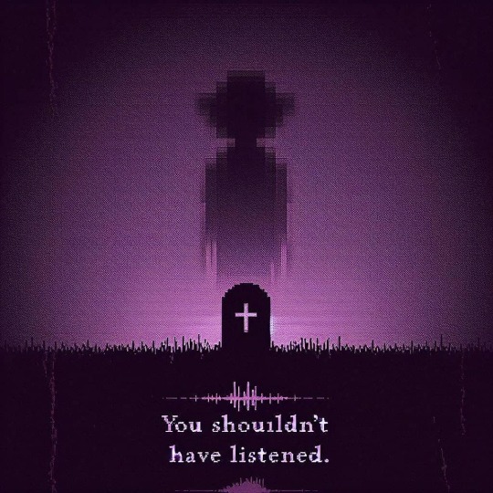
💀 Enter if you dare... 💜🔊 Beware the haunting whispers of Lavender Town. These posters hold secrets that echo the eerie tones of the infamous LavenderTownSyndrome. Can you handle the chills? Or will the melody drive you to the edge? 👁️🌀 Listen closely... but not too close.
4 notes · View notes
void-snakat · 1 year ago
Text
Tumblr media
I'm drawing the characters of youtubers that I like and making a conjoined picture with them! I made Lavendertowne's character Planchette from her comic Unfamiliar. I personally have never read it but I love her design and love watching her character design videos.
25 notes · View notes
m0thwinged · 4 months ago
Text
Tumblr media
you spot a gingi in the forest....... what shall you do?
207 notes · View notes
meshimellow · 19 days ago
Text
Tumblr media
hey guys its lavendertowne and in this video were gonna be drawing the characters from mouthwashing as cute gi🧨💥💣💥💨
Tumblr media
49 notes · View notes
luneariann · 1 year ago
Text
Hi does anyone wanna send me rly vague descriptions of their ocs and then i try to draw them and then you show me how off i was
182 notes · View notes
fagbearentertainment · 7 months ago
Text
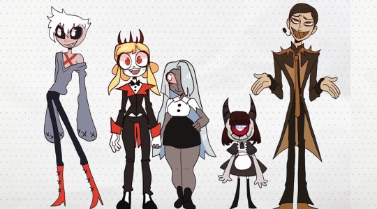
I feel ill wjat happened here why does Angel Dust look like that why are Alastors only colors beige and brown why do none of them even look like demons except Nifty Lavendertowne what happened 😭😭😭
Tumblr media
82 notes · View notes
scribblegoblin · 7 months ago
Text
Okay I don't usually get serious on this page but like... this Lavendertowne "situation" is kind of ridiculous. I didn't watch the video she posted when it came out, but I have seen the designs, and they're honestly completely fine for someone who hasn't watched the show (which I'm pretty sure she hasn't). Are they as good as some other designs she's done? No, but that doesn't change the fact that she's an excellent artist, and HUMAN. People can have a bad art day, and frankly, I don't even she dropped the ball that badly on this, but the amount of backlash and just generally horrible comments I've seen about this is genuinely sickening. No, her skills are not declining. No, this isn't the downfall of Lavendertowne, you are all just desperate for controversy. Stop being dramatic and leave the poor woman alone. And to Lavendertowne if you ever see this (which I doubt but y'know), you are absolutely wonderful, you inspired me to start drawing in the first place back in 2017, and many others too. Keep doing what you do, and I'm sorry so many people on the internet suck xx
109 notes · View notes
gh0stfaquerie · 7 months ago
Text
hey I saw lavendertownes video when it came out and it was literally so normal and like not a diversion from what she usually posts at all??? y’all need to get the fuck off her back, it is insane to get this mad over someone reimagining characters from a show you like
65 notes · View notes
pastelchaos12 · 12 hours ago
Text
I tried drawing N in the style of artist and Youtuber LavenderTowne
Tumblr media
Hope I did good, ik its not perfect but I do like how it came out
16 notes · View notes
blurrymango · 5 months ago
Text
Tumblr media
LAVENDERTOWNE IS GONNA DO A "BY THE BOOK" VIDEO FOR SCHOOL FOR GOOD AND EVIL.
I WIN. I WIN.
31 notes · View notes
that-ari-blogger · 7 months ago
Text
A Discussion Of LavenderTowne and Hazbin Hotel
So, a little while ago, a YouTube channel called LavenderTowne ventured into the Hazbin Hotel fan space to propose some criticisms and fan redesigns of the characters.
I had thoughts on the original video, but those are irrelevant because its reception was… tumultuous, and in my opinion disproportionate. The video has since been taken down, and LavenderTowne uploaded a follow up to it (link). In which she stated that her experience with the Hazbin Hotel fandom wasn’t the most pleasant, something I would like to address.
So, this post will be an academic discussion of the designs from the second video. Because I think her criticisms were interesting and because I want to show that it is possible to disagree with someone without being unpleasent.
Also, I want to give LavenderTowne a more welcoming experience with the fandom, and try to make up for some other members of the community.
Let me explain.
SPOILERS AHEAD (Hazbin Hotel)
Tumblr media
I'm going to start with something that needs to be said. You can disagree with the rest of my post, but this is non negotiable:
It is never, under any circumstances, acceptable to harass someone for their opinions, especially about art. I don't care if you take issue with conclusions or perceived motivations, actions like I observed are not ok, and are not welcome in this fandom.
I hope I made that clear.
Tumblr media
Anyway, I am going to be addressing the second video, because LavenderTowne took the first down, and I'm not about to intrude where I'm not wanted.
Tumblr media
LavenderTowne mentioned the overarching stylistic choices, and I think that is a good place to start with this post, because they are good source of difference. Several of LavenderTowne’s criticisms are leveled at the Hazbin Hotel visual style itself, discussing what specific elements didn’t work for her and how she would personally draw things differently.
That is what I want to discuss here. Rather than the specifics of artistic technique, I am going to talk about the character design decisions brought about by the difference in style. This isn’t a question of skill, but an examination of the ideas presented.
Tumblr media
Both LavenderTowne’s style and that of the Hazbin Hotel team range on the scale of realism, as is the nature of art, and that has caused a few of the design decisions that they have made. But it has also had a weird effect on the implied plot that is worth discussing.
Hazbin Hotel is more cartoony, for example, which means its logic is a bit more fluid. Vaggie's eye scar, for example, is shown over her hair, which isn’t how scars work in the real world.
This is a way of getting the tone across. Sir Pentious, at one point in the series, gets caught in the blast of an explosion and sent flying across the city. The design style lets you know that this is being played for a laugh and that he will probably be fine. If LavenderTowne had drawn Sir Pentious in her style, I guarantee that version of him would not survive the event, because hers is grittier (that’s the wrong word, but you get the point).
I do, however, really like the colour palette shift in LavenderTowne’s designs. Don’t get me wrong, I like the limited palette of the actual show, and I think it suits the setting more than the pastel aesthetic of LavenderTowne’s style.
But, those pastel colours are gorgeous and they are a really neat way of solving one of the problems that LavenderTowne identified and I agree with, that being how difficult character differentiation is when everyone has the same colouration as each other and their background.
Now, neither of the two options are implicitly better, there is just a different design sensibility going on.
Tumblr media
As for the designs themselves, I actually prefer LavenderTowne’s Alastor over the original. I would like to see how it interacts with Alastor animation and transformation, but I think the design overall works better for the character. I like the horns being more pronounced, and I like that neat hairstyle. I think it's much more suited to an overly refined character who revolves around appearances.
“Just because you see a smile, don’t think you know what’s going on underneath. A smile is a valuable tool, my dear! It inspires your friends, keeps your enemies guessing, and ensures that no matter what comes your way, you’re the one in control.”
I think that Alastors original hair style is more about looking cool than looking refined. The shorter style, combined with the more prominent antlers, gives that air of someone actively concealing their more wild undercurrents.
Tumblr media
That being said, I'm not as sold on Alastor's expression in LavenderTowne's design. This is a stylistic choice, but I don't think that the Cheshire Cat smile translates over to the alternate design as smoothly as his concept. In the original, that smile was the thing that denoted him as malicious, but LavenderTowne's design seems more huggable, at least to me.
LavenderTowne did raise an interesting point about the voodoo symbolism, a point that others have raised, and I think is worth noting. Incorporating that aesthetic as synonymous with dark magic in a setting based heavily off Christianity is funky, thematically. It's a use of stereotypes as shorthand, which carries the baggage of those stereotypes, intentionally or not. However, I am about as far from qualified to talk about this in detail as possible. I recommend that you listen to the opinions of people who know more about this than me, and who's case this is to make.
Tumblr media
Husk’s design is another that I like, but this one I have slightly mixed feelings about. The body type change addresses another of LavenderTowne's criticisms of the series, again in relation to character differentiation. That is a strength of the video, LavenderTowne gives criticisms, and explains what she means and how she would go about doing it.
Interestingly, that body type issue is something I disagree with. I think the way that LavenderTowne has handled the issue she identified is fascinating, and one of the best parts of her process. But this is simply an issue I don’t see as a problem.
The criticism is that the silhouettes of the characters are exceedingly similar, meaning that identifying them is difficult, as well as limiting in terms of variety of proportions. I could point out Sir Pentious or Husk here, but that is arguing in bad faith because Husk is very clearly the exception to the rule, and Pentious actually conforms to her observation. Without his hood out, Pentious’ silhouette difference is in his tail, which is rarely onscreen.
Tumblr media
The reason I am ok with this, is that Hazbin Hotel has a thing for transforming character designs. Charlie, Valentino, Emily and Serah, Lucifer, even Adam, Vaggie, and Lute, as well as a ton of others. All of these character designs shift as the story progresses, revealing aspects of them that they have kept secret. I like having the baseline similarities if everyone gets a moment where they show off how different they are from that baseline. I think that is a cool story beat that, for me at least, outweighs the problem of similarity. I’m sure LavenderTowne would disagree with me here, and that is more than fine.
Tumblr media
Back to the point, Husk is a character who is surprisingly acrobatic and martially competent, and the slight shift in the alternative design switches him into more of a bar brawl type character. This feels like the guy who would just deck you and tell you to cool off, rather than throw something at you. He looks like the type of bartender he is, cool and calm, and ready to offer advice when needed.
The removal of the wings is an interesting choice. On the one hand, it clears up his design and makes him look more down to earth. On the other hand, it leads into my main bugbear with this design. I don't think this version of Husk looks like an overlord.
Tumblr media
This is subjective, and I am struggling to quite explain it. But the wings, as well as his voice, give a sense of gravitas to Husk. Without that, Husk looks relatively unremarkable.
The outfit plays into this. While I prefer it and its subtlety, there is little that marks this version of Husk out as higher ranking.
Again, this isn't a case of the original designs being objectively better. This is a different design that communicates different things. LavenderTowne’s Husk is a humble bartender rather than an overlord playing pretend. I simply like the story that the original offers more.
Tumblr media
Vaggie’s new design is both my favourite design of the four, and the one that is the furthest from the story of the show.
I love the quieter eye scar, I love the silhouette, and I think moving the ribbons to her back is a genius bit of visual storytelling.
The outfit is cool (I especially like those boots), but there's an asterisk to that, because I don't think it entirely suits Vaggie as she is presented in the show.
Tumblr media
At the risk of oversimplifying, Vaggie is a fairly uncomplicated character. Not because she's written to be shallow, but because the show doesn't have time to explore her personality.
So, you get her past, which is fascinating, and it leaves some interesting things on the table.
Tumblr media
For example, Vaggie has zero self preservation instinct and will burn herself to the ground for Charlie. This isn't complex, but it's remarkable how much the writers (and animators if you’re looking for that kind of thing) get out of this one detail.
Most notably, her character grows into realising that love means living for someone rather than dying to keep them safe. This culminates in the defeat of Lute, the embodiment of her past, who doesn't think to move out of the way of a collapsing building.
Tumblr media
Similarly, Vaggie was an angel and wants to hide that aspect of herself. This makes her multifaceted in backstory, but the reveal doesn't have time to dwell on her characterisation, so it just feeds into what I said before.
I think that with another season of time to develop, Vaggie’s characterisation will become as complex as her backstory. But that doesn’t come quickly.
The point I am making is that I don't think this version of Vaggie would wear armour until the end. She doesn't think she can get killed, so why would she need to protect herself?
Tumblr media
Which means that LavenderTowne's design would work for the last episode of the show, if it had wings, which is sacrificing the single best piece of foreshadowing I have seen in a long time. Seriously, I cannot stop gushing about those ribbons.
What we have, then, is a version of Vaggie with a slightly different story and personality. To me, LavenderTowne's Vaggie looks like a character who craves safety. She seeks Charlie because she offers emotional stability and kindness, the one person in hell who Vaggie doesn't think is against her. But she would wear the armour and outfit because of the injury. She realises she can be wounded and grabs the heaviest set she can find, the twin coloured trousers come from that desperation, and add to the imbalanced aspect of her design.
This version of Vaggie is defensive rather than offensive, and though it renders Out For Love obsolete, I find it more interesting than the original.
Tumblr media
Charlie's design, however, I'm not such a big fan of. I'm sorry LavenderTowne, I really am. But this design really doesn't sit right with me.
Hazbin Hotel has a circus theme going on. The main foyer has a circus tent affectation, for example, and Charlie gives off the aesthetic of the ringmaster.
Charlie is very overtly the antithesis of a Disney princess, and that comes across in her design. Instead of wearing a floaty dress, she wears a suit and suspenders.
Yes, the hooves and horns being more prominent is a cool alteration that I appreciate, but the alternate outfit really doesn't feel like Charlie.
Tumblr media
I think the difference is in the framing. To me, LavenderTowne's Charlie comes across as naive and optimistic, where the original design is more relentlessly hopeful, and that second one matches how she is in the series.
Charlie in Hazbin Hotel showcases true hope. Not optimism, hope. The type of emotion that keeps getting knocked down, but picks itself off the floor ever single time, and gets ready to try again. Charlie has no proof of her philosophy, no basis. She's not trying to recreate phenomena, she doesn't even know she can succeed. That's why she needs the hope.
I don't think that LavenderTowne's design has that vibe. Instead, this Charlie seems younger, which contributes to the naivety. It feels like it leans into her regular design, so the more fearsome transformation comes as a shock, mostly.
On the other hand, the three horn tiara element is genuinely really cool. It gives that air of reality, and hints at the transformation without giving it away. They round out the design and make the “this is a demon princess” clear.
Tumblr media
Interactions between this Charlie and Adam, Lute, or Sarah would be interesting, as this version seems designed to foil off them, rather than the other way around. Especially Emily, this design seems genetically engineered to mirror her and make her question her ideals just through existing in the same place.
In short, this Charlie seems more gentle than the original, which might help in some aspects, but I prefer the original.
One again, this is my opinion, and not objective by any stretch of the imagination. If you disagree with me, good, that's the bread and butter of how analysis and discussion exists. But I hope I have shown that disagreement is possible without aggression.
Which brings me to my conclusion, and I have something here that I hope you will like.
Tumblr media
LavenderTowne's designs feel like they are made for the same story, but paced differently. They feel like a different style of musical. They feel like they were made for a version of Hazbin Hotel that had more episodes and has time for subtlety, something that the original show unfortunately didn't have.
The story feels the same, but the minour changes make it seem more drawn out. The tone is different, and that effects the entirety of the rest of the story.
In other words, she is designing an AU, something she makes explicitly clear at least five times in her video.
LavenderTowne mentioned in her video that she might do a follow up with a few more characters. I would be intrigued to see this, because I want to know what Angel Dust would look like in this version of the story, as well as the actual angels and even the Vees.
I also am fascinated by how the art style affects the tone of the story. And with LavenderTowne's permission, I might have a crack at writing some of the key scenes from the show to fit this aesthetic and tone. I think that would be an interesting thought experiment.
Tumblr media
Final Thoughts
LavenderTowne’s designs were dope as all hell, and the points she raised were worth discussing.
I love the series, but I understand that it's not everyone’s cup of tea. Content warnings should get that across, but also some people just won't like elements of it for any number of reasons, and that is ok.
I think @ohnoitstbskyen put it best in his discussion of the finale of the series. (Link). In his closing remarks, he spoke at length about people who will discover the show and the effect that it will have on them. That sentiment, boiled down, became the title of that video, and concisely says what I have taken just under 3000 words to talk around.
“This show will save someone’s life, but it isn’t for everyone.”
But let me be clear about why I wrote this.
I saw some of the shit that people wrote about LavenderTowne's original video, and though a lot of it was positive, a fair chunk was not, and I want to put my foot down. Disagreement about art is healthy, but if you think that involves harassment at all, then tell Husk he still owes me a drink.
On a lighter note, this is my first post about Hazbin Hotel, so for those who are reading my stuff for the first time, hello. I am Ari, I do media analysis, and I plan on doing a series on Hazbin Hotel, going through each song with lyrical and musical analysis once I finish my current one on Wicked. So, if that interests you, maybe stick around.
Next
46 notes · View notes
vampypurplequ33n · 27 days ago
Text
Sooooo… me and my friend who goes by 3DO Palace on YouTube decided to do a collab together, and I kinda sorta maybe went overboard on my end…
I still gotta make some changes and we gotta add our watermarks, and then I’ll post it on my channel!
15 notes · View notes
the-nameless-wacky-inventor · 4 months ago
Text
insane how kooleen can say and draw racist shit and not apologize for it and later be incredibly aphobic to a real person and it’ll blow over just fine and then lavendertowne does a small hazbin redesign and accidentally uses unofficial art and spends several minutes apologizing and people despise her now
27 notes · View notes
clownssouracid · 4 months ago
Note
could you draw Envy?
Tumblr media
Here is your bug eyed girl
(I'm bad at English sorry)
41 notes · View notes
yourdailyqueer · 4 months ago
Note
hi :3 just wanted to let you know you have an error on your Haley newsome post. She’s bi, not lesbian, as stated in the description of her latest “tuning pride flags into art” video
Thanks for letting me know. Her post has been updated.
19 notes · View notes
ravenclod · 11 days ago
Text
Tumblr media
CRINGETOBER DAY 27 : YOUTUBER FANART !!
> I DREW LAVENDERTOWNE GUYZ ARGHJ I LOVE LAVENDERTOWNE SM SHE WAS MY CHILDHOOD SND SHES SO ICONIC. ive nor watched her in so long i need to catchup ACKK she is what got me into art so im so excited to have drawn her and planchette YAYY :3
13 notes · View notes