#LSAD Seminar
Explore tagged Tumblr posts
Text
LSAD Seminar 01: Colour Theory with Sylvia Shortall
What is Colour Theory?
In it's most basic form, colour theory is the study of how colours relate to one another and how this, in turn, affects our perception of them. The feeling or emotion evoked by a colour or combination thereof is of particular interest this field of study.
Above: An old RTE test card from 1978 recorded by Andrew Walmsley on Youtube.
The Medium Affects the Message
An important consideration when discussing clour and colour theory is through what medium the colour is being perceived. For instance I have two desktop monitors; A pen display for digital art and an old Dell monitor from a million years ago. Due to differences in technical specifications and calibration they display colour slightly differently. The pen display is marketed toward artists for its colour accuracy, whereas the Dell monitor was basically made to for looking at spreadsheets. If I slide a picture across from one monitor to the other, I can observe the colours change in real time. In this sense, the accuracy of colours is something we can take for granted.
youtube
Above: A video which explains digital colour and how images are projected onto monitors.
Enter PANTONE
So if we can't even trust a colour to look the same between two different monitors, how on earth can brands like Coca-Cola or Starbucks slap their logo on every conceivable product under the sun with one recognisable colour?
Well for better or worse the answer is Pantone LLC and their proprietary Pantone Matching System (PMS). Basically Pantone have a specific formula to render any given colour in any given format. For instance an average computer monitor recreates colour through backlighting hundreds of tiny pixels varying shades of red, green and blue. This is known as the RGB colour model, which is considered "additive" as the colours "add" together to create their intended effect. Print media on the other hand, uses the CMYK colour model. The is a "subtractive" colour model, where the cyan, magenta, yellow, and black (K) mask one another out gradually until the desired tone is created. Pantone somehow they were able to copyright this process and have people pay them for it. If it's not obvious, I hate Pantone and here's a video that should explain why:
youtube
Above: A good video about a bad company.
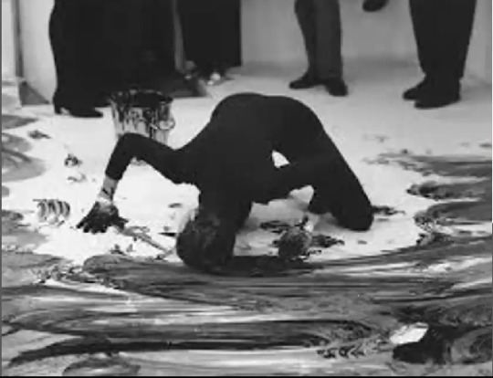
Janine Antoni - Loving Care, 1993
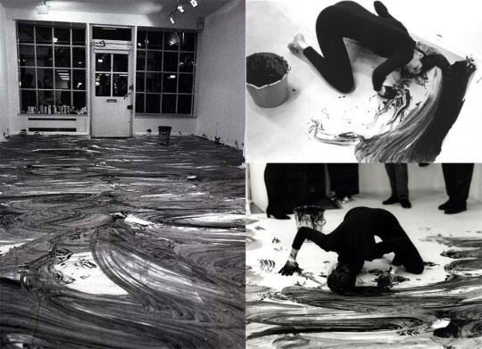
Sylvia actually recommended I research Janine Antoni for my project, so I was happy too see her work show up in this seminar. Personally I feel colour is one of the less important aspects of this particular piece, but all the same, it's roll can't be diminished either.
The use of commercial hair dye, Antoni's long hair and the act of mopping play into stereotypes of women and their gender defined "roles" in life. The gallery floor becoming covered in dye and the audience being gradually forced back out the door they came in can be seen as an act of reclamation. In this sense Antoni is challenging gender roles by using the traditionally feminine to accomplish the traditionally masculine. For me, it brings to mind the contrast between how men and women sit in public spaces, the phenomenon of "Man-spreading". Something that is seen as a faux pas for women but normalised for men. Antoni makes the viewer confront this kind of everyday sexism.
I think she choose a monochrome colour palette here for the contrast. The deep black on the brilliant white. The Yin and Yang of those shades is often said to represent men and women. I'm gonna move on now cause I'm really just rambling about a piece of art I enjoy.
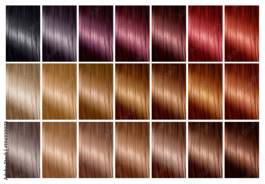
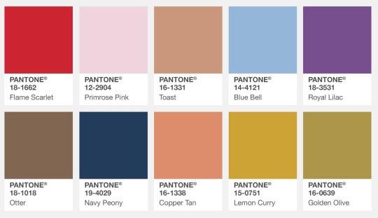
Above: Hair dye charts bear a striking resemblance to Pantone swatch booklets.
Colour for Legibility
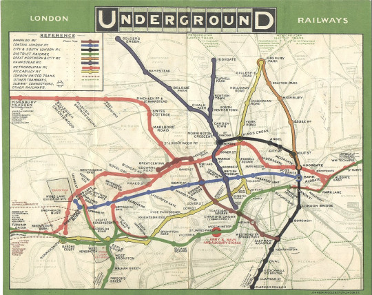
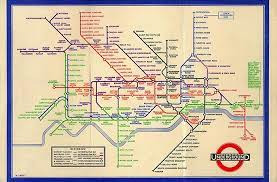
Many maps, such as the famous London Underground map designed by Harry Beck, use abstracted visuals and colour to distinguish between and make clear what might otherwise appear as confusing and arbitrary.
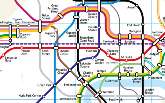
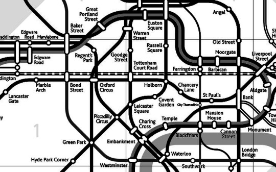
Above: You can tell me which one of these two maps is more legible...
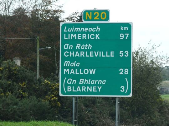
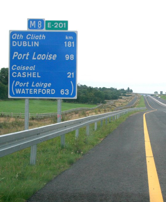
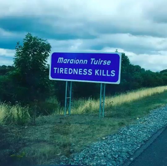
Similarly road signs are specifically engineered in such a way as to be legible under any given time of day or weather condition, regardless of colour.
The Politics of Colour
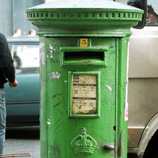
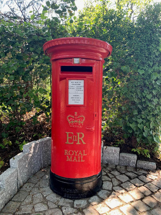
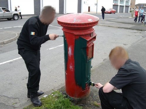
Colour can mean a lot more than simple aesthetics. As Sylvia points out in the lecture, there can be strong political associations with specific colours. A powerful example of this is how our public post boxes in Ireland were mandated to be painted green after the country achieved independence from British colonial rule. In fact the shade of green was entirely arbitrary, one could argue the act was more about the removal of the distinctly British-associated shade of red, which itself speaks volumes of the power of colour.
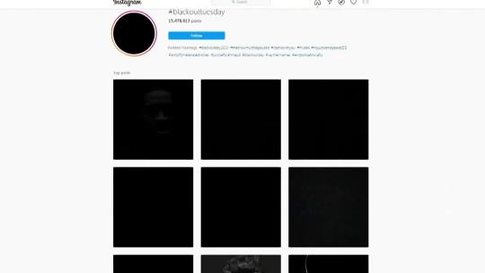
A similar example of the political power of colour was the #Blackout campaign to protest against racism and police brutality following the killing of George Floyd.
Copyright and Colour
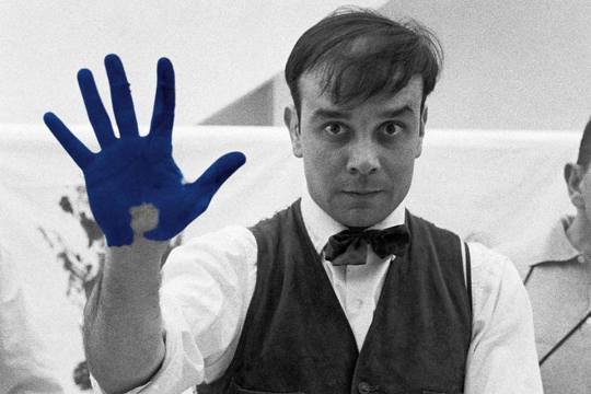
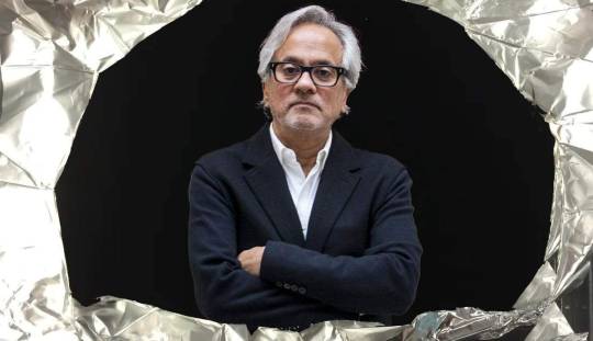
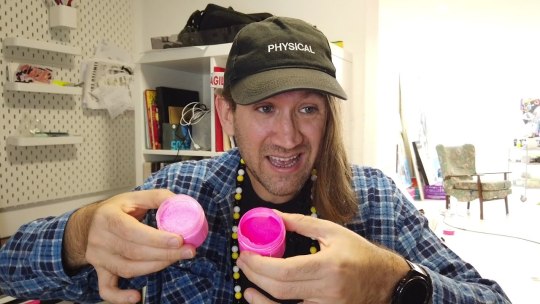
Left: Yves Klein, Center: Anish Kapoor, Right: Stuart Semple
A bit similar to Pantone and their patented method of matching colour, a number of artist have gained infamy for their roles in legal ownership and exclusive use of colour.
Yves Klein, an influential french artist and pioneer of performance art. Klein, in collaboration with Edouard Adam, created a vibrant blue, reminiscent of the lapis lazuli used in medieval paintings of the Virgin Mary. This shade was dubbed International Klein Blue or IKB. Klein registered this process with the French patent institute in 1960 but never formally patented it.
Renowned British-Indian artist Anish Kapoor, known for sculptures such as "The Bean" and Sky Mirror, was granted exclusive artistic use of the super-black coating Vantablack by it's creator Surrey NanoSystems in 2014. This provoked widespread criticism across the art world.
Kapoor drew particular criticism from Biritsh artist Stuart Semple. Semple, in retaliation to Kapoor's exclusive licensing of Vantablack released a shade of pink paint called "PINK – the world's pinkest pink paint" with the specific legal caveat that it could not be purchased by or for Anish Kapoor. This spurred him on toward a movement of democratising colour, creating affordable alternatives to patented shades such as the aforementioned Vantablack but also to Yves Klein's IKB and even an alternative to Pantone's matching system.
If it's not obvious I think artists have legal exclusivity to materials of any kind is an affront to art itself, and I'm happy to see people like Semple challenging the practice.
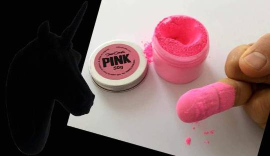
Above: Anish Kapoor's now iconic reply to Stuart Semple after getting his hands on PINK.
Stanley Whitney and Colour
youtube
Stanley Whitney is an American painter known for his use of colour and politically motivated art. I included a video above where he talks both about important political causes like contraceptive rights and also his feelings on colour.
What I admire specifically about Whitney's work is his persistent use of a loose grid as a composition. It highlights just how much emphasis he places on colour. What speaks to the viewer in a Stanley Whitney painting are the colours and their relationships between one another.
7 notes
·
View notes
Text
Disrupt project 03/12/23
(seminar)
I viewed the Typography seminar on this day. I also took some notes while watching it (see collaged picture below).
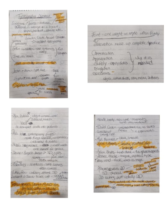
I found it very interesting, to learn how typography can be a very powerful part of art and why it is needed in everyday life.
Learning about how it can be both 2D and 3D, interactive and have movement excited me, as I would only ever relate it to 2D work.
I also really admired the illustrations artist Nate Williams. I really like how his typography fits well together and makes the work appear very fun and positive. I also love the pattern element that it has too.
I also really like the artist Stephens Powers. The use of big, bold and colourful work that both balances positivity and sarcasm is very enjoyable and inspiring to view.
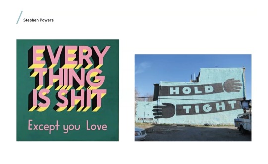
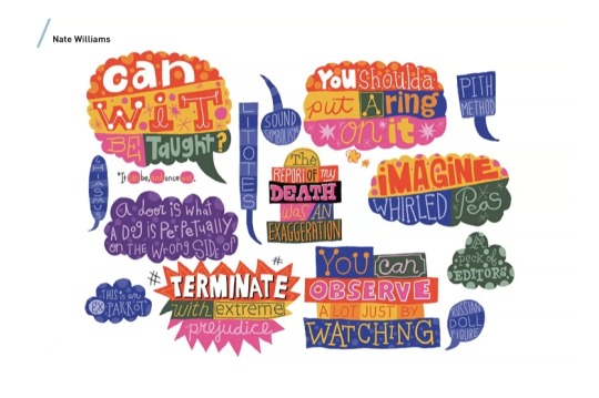
I am hoping that I can include some typography elements into my project work, after viewing this.
7 notes
·
View notes
Text
Colour Theory Seminar {Part 1}
Hey Tumblr,
Today I went back and watched the colour theory seminar, I had watched it before but decided to re-watch it to take notes on and post about it.
Colours can be perceived differently depending on what you're looking at it from, for example it will look different on a laptop or phone from a piece of paper. There are different factors such as the calibers of equipment, if your printer is running out of ink or even the lighting your looking at it from.
Test cards are physical cards which are held in front of cameras used for calibrating alignment. They're made up of patterns to adjust the receiver in televisions and to make sure it's displaying the colours correctly.

The Pantone Colour Matching System (PMS) is used to communicate through colour and to keep consistency throughout various materials and finishes. People and manufacturers use it to refer to to make sure they're colours match one another. It uses the CMYK process which is standard for most printer worldwide.
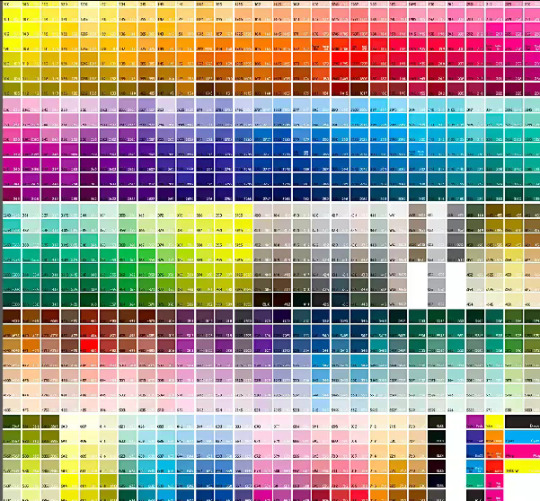
Each year Pantone pick a colour of the year, which in 2020 was Classic Blue 19-4052 which is seen as "a restful colour" and "brings a sense of peace and tranquility".
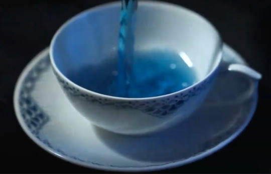
In 2021 they picked Illuminating 13-0647 and Ultimate Gray 17-5104. They grey is a flat colour in the middle of the spectrum, where as the yellow is an artificial florescent colour. By putting the yellow next to the grey it enhances the viewers perception of the yellow, giving it a metallic taint,

Fine artist Janine Antoni made a performance piece called 'Loving Care' in 1993. She mopped the floor of the gallery with her hair soaked in loving care hair dye colour natural black. This act was linked to mopping but also to abstract expressionist painting.
The London Underground map, made in 1908, uses lines of different colours to show different train lines. The map shows how the lines actually look throughout London so it doesn't show the Metropolitan line fully. In 1933 Harry Beck redesigned the map. He used vertical, horizontal and diagonal lines to simplify it. It shows individual stations and connecting stations. Although easy to read it looks like nothing the city of London.
Another example of colours being used is in road signage. Signs today look different to how they did back in the 30's and even the 80's, with todays being simplified. Brown indicating area of historical interest, white signifying placenames and yellow showing roads. Between 1957-1976 two british graphic designers created signage for the UK motorways by asking themselves, 'what would I like to see when I'm driving?'. At night the signs are slightly illuminated and are made so the letters are still visible. The colours help indicate what's ahead even if the driver didn't read what the sign said.
Colour is also an indicator of identity. In Ireland post boxes used to be painted red to show British rule over Ireland. In 1922 the Irish government ordered all post boxes be painted green.

This is all from part one of the seminar, I'll make a separate post about part two as I feel it would be too long of a post if I did them both together :)
6 notes
·
View notes
Text
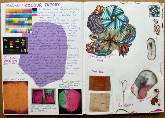
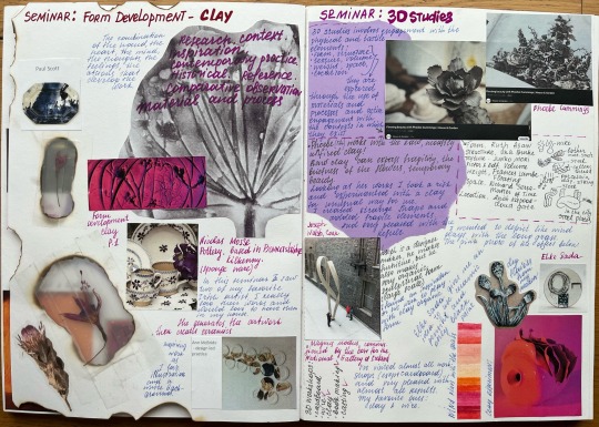
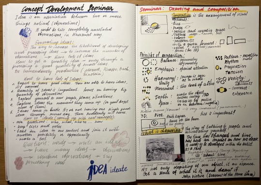
Week 13 LSAD 12/12/2024. Brief 2 "Assemble"
Here are my notes from the seminars:
Colour theory, Clay, 3D studies, Concept development, Drawing and Composition
1 note
·
View note
Text
Relief Print Seminar
Ahead of my Mono-Printing Workshop, I watched the Relief Print Seminar to see if there was any information I could use ahead of the workshop. This seminar was interesting as it covered multiple types of print as well as factors that would be useful to consider in the future such as; Scale, Material, and how to display prints. I also thought it was nice to get an insight into how Printmaking can create such a strong sense of community as well as how versatile it is.
1 note
·
View note
Text
My response to Tuesday Seminar lecture
I found it interesting to learn how factors such as shape, form and gathering are most effective in fashion design. Each factor can shape the design into a unique fashion item.
The lecture explained that these factors complement each other. For example, volume and shape are created by gathering materials. The materials can be turned into various shapes by techniques such as pleating and doubling. One of the most important qualities of becoming a good fashion designer is to experimental.
@eoinmclsad
@lsad
2 notes
·
View notes
Text
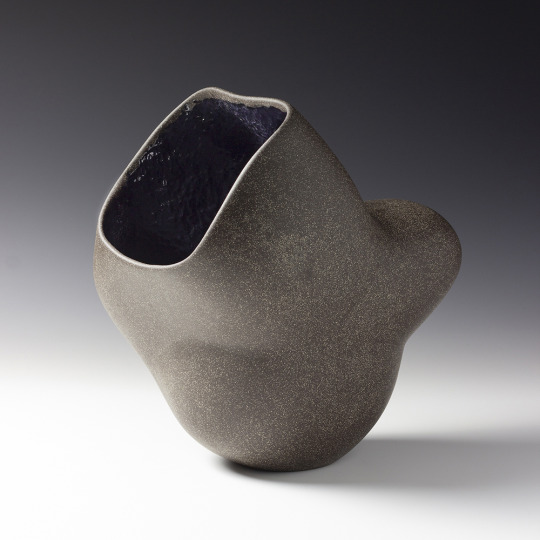
I was drawn to this masterpiece from Mcloughlin because it was all handmade. this inspired me to make the Urino, both object operate on the same principle of a hollow so I ventured into making one for myself. though challenging
HOW IT RELATES TO MY ASSEMBLE PROJECT A Urino is a valid component in a building the idea i gleaned from the seminar by Elain LSAD tutor and the ideas in my secondary research equip me with the knowledge needed to come up with the various piece that make up my assemble project.
0 notes
Text
SEMINAR RESPONSE
Form development ; clay
During this seminar, Elaine talks about the various uses of clay. When you fire a piece of clay it then becomes known as ceramic.
Clay gives people the opportunity to explore their creativity three dimensionally. It’s constantly changing and responsive to touch.
Elaine talked about a good few artists that work with clay in different ways. One that stuck with me was Ingrid Murphy.
Ingrid’s work is playful, its fun and surprising. It invites us to interact with it in ways that we’re unused to with ceramics. It’s not functional in the familiar sense that a jug, plate or wash basin might be, but it is designed to function. Ingrid’s work engages us on sensorial levels, prodding us to join in its investigations.
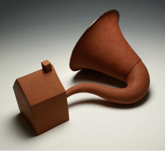
This piece caught my eye as the grammar phone is somewhat relevant to my project.
Ingrid Murphy also deals with AI to develop her work. I like how she incorporates the modern world into her work to keep it relevant.
Elaine also discussed how surface treatments change the appearance of clay works. They alter how we read certain shapes and forms. Some examples of surface treatments are glazing and under-glazing
Colour can also alter how we read the piece. The clay can be used as a canvas. An artist that uses colour in their clay is Tip Toland
Tip is a full time ceramic studio artist and part time instructor in Seattle. She carves into the clay. Her more recent three-dimensional stoneware sculptures are close to life size, sometimes larger. She uses paint, and hair to create figures with "uncanny skin quality, utterly convincing hand gestures and eerily spontaneous facial expressions." I find the scale of her work really impressive
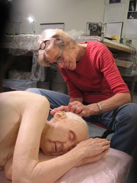
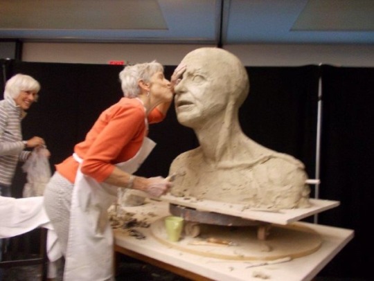
I learned through the seminar that LSAD owns an electric and gas kiln. The gas kiln works differently from the regular electric one. It reduces clay bodies or glazes to achieve different effects.
When talking about the firing process Elaine mentioned an artist I found inspiring, named David Robert.
David uses smoke to paint with. He pierces and scratches through the glaze he has applied. This gives him the opportunity to control patterns and surface qualities.
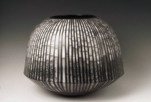
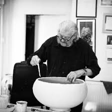
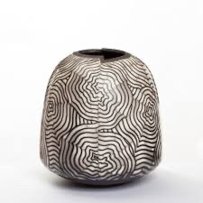
I find his work hypnotic. I love the patterns he is able to create, it’s so atmospheric.
Ceramics involves and encourages a lot of other disciplines, including film , photography and 3D printing which I really like as it gives you so many options.
My favourite quote from the seminar is that, ceramics is a combination of the hands, the heart and the mind. Thoughts, feelings and actions develop the work.
0 notes
Text
VantaBlack and Anish Kapoor
Gatekeeping Colour
/ Seminar Notes Colour 1
In the colors seminar we were introduced to one of the viral shades in the art scene, the darkest black ‘VantaBlack’.
“ Vantablack is a brand name for a class of super-black coatings … The coatings were invented by Ben Jensen (Surrey NanoSystems), who first publicly unveiled them in July 2014 … "world's darkest material", absorbing up to 99.965% of visible light perpendicular … “ - Wikipedia (yes, I did tip ‘em)
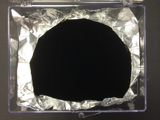
I was intrigued by the mentioning that one artist had bought exclusive rights to this specific paint and he is still currently the only one who is legally allowed to use it.
However, this investment would lead the artist to be banned from using other pigments, which is very ironic.
Introducing : Anish Kapoor
A.K.A The Bean Guy
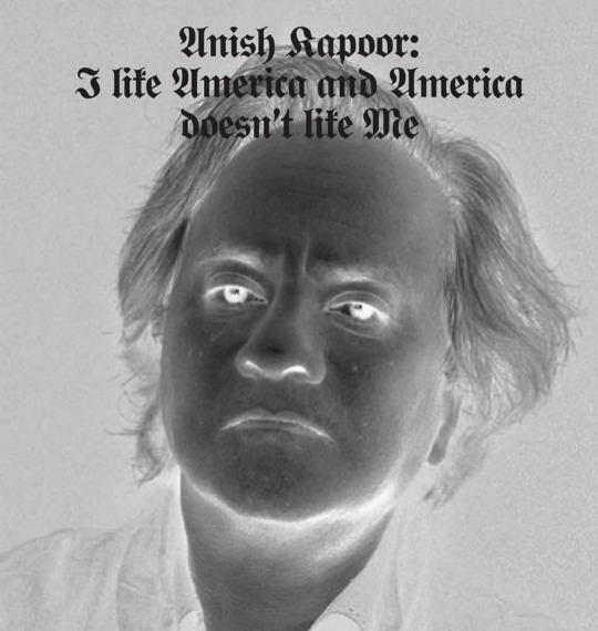
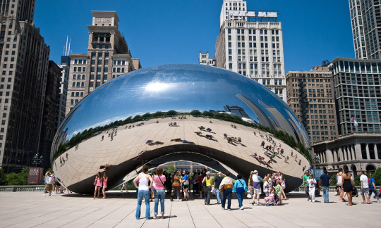
In 2006 Kapoor finished his sculpture ‘Cloud Gate’ a.k.a the Bean (nicknamed so by the public, which Kapoor hated but now pretends to like it for his own sake) in Illinois, Chicago.
Kapoor bought rights to the VantaBlack in 2016, and to say the least this caused an uproar in the public and artist community.
I decided to take a look at his instagram and noticed that Kapoor has been the target of online trolling for years since purchasing the rights to VantaBlack and the trolling is ongoing till this day.
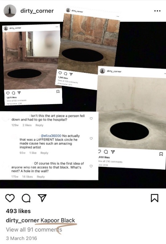
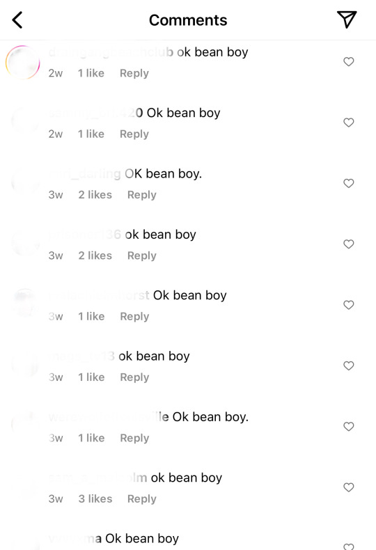
During the artists uprising against Kapoor, Stuart Semple created the Pinkest Pink and banned Kapoor from any kind of usage of this colour.
However, Kapoor got his hands on this shade and posted on instagram a picture with his middle finger dipped in the pigment captioned: “up yours #pink”
After the Pinkest Pink incident, Semple with his team of artists and paint makers, created the successor to VantaBlack the ‘Black 2.0’ which again was legally banned from Kapoor. Unfortunately to Kapoor the Black 2.0 is more user friendly than the VantaBlack.
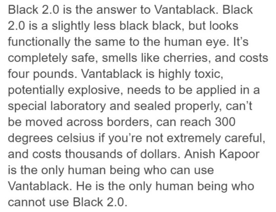
Quiet from a Tumblr post by gay-jesus-probably in the article linked bellow.
The end of VantaBlack as the blackest black
Either good or bad news to Kapoor, VantaBlack is no longer considered the “blackest black” as engineers from MIT Boston revealed a new shade of black pigment, even darker and more light absorbing than VantaBlack.
“ Vantablack is no longer the blackest black on the market: in 2019, a material was developed at MIT which absorbs 99.995% of light … “ - From an article “The Vantablack Controversy: Anish Kapoor vs. Stuart Semple” (Jan, 28th, 2021) by Truman Chambers on The Collectors
11 notes
·
View notes
Text
LSAD Seminar 02: 3D Studies with Elaine Riordan - Part 2 (I ran out of space edition)
This was originally all included in my last post on the 3D Studies seminar, but I ran up against the "30 images per post" limit that our cruel overlords imposed upon us. Basically I want to run through the seven elements of 3D studies outlined in the seminar and share an artist, found through my own research, who I feel exemplifies that particular element.
Form
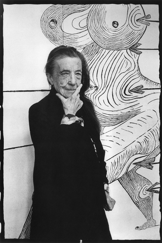
Louise Bourgeois
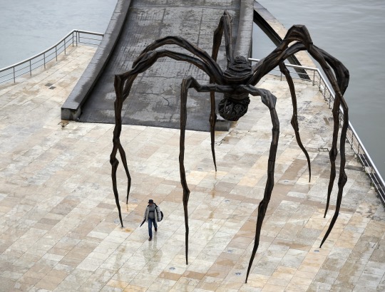
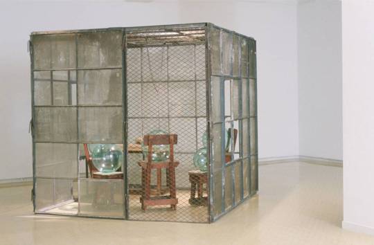
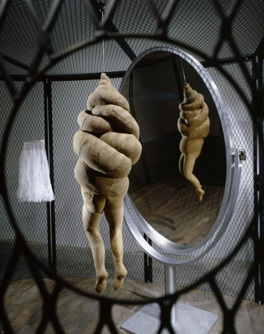
Louise Bourgeois is so renowned it almost feels like cheating to include her on a list like this, especially given the breadth of her work, incorporating many disciplines and techniques in her work. I chose Bourgeois for "form" as I feel she pushed the boundaries of what could be considered "form" as much as any artist ever has. Utilising mirrors like canvases, for example, makes us question where the form of a given piece lies. Similarly incorporating other elements such as structure, location, and space allowed her to express ideas in an entirely new way, unburdened by a dogmatic sense of what form "should" be. In this way Bourgeois' work broadened our understanding of what form.
Structure

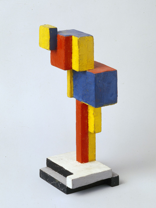
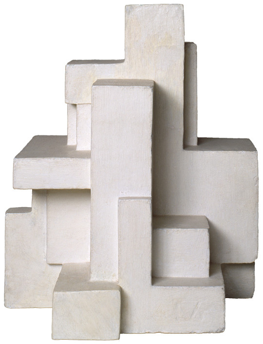
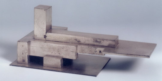
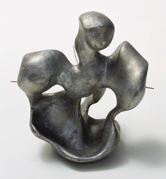
Georges Vantongerloo
Georges Vantongerloo was a Belgian abstract sculptor and founding member of the "De Stijl" or Neoplasticism movement. Proponents of De Stijl advocated pure abstraction and universality by a reduction to the essentials of form and colour; they simplified visual compositions to vertical and horizontal, using only black, white and primary colors. This idea of using reduction to find an underlying meaning led him to explore structure in his art. Vantongerloo never achieved major success in life and is often considered to have been too devoted to his movement. But through his sacrificial nature we gained insight into the pure structural nature of art, and the truth and beauty found therein.
Texture
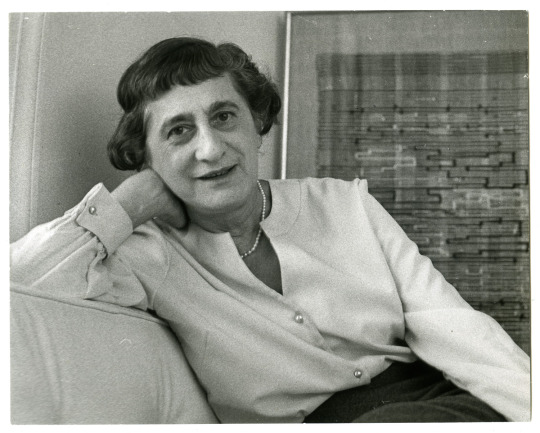
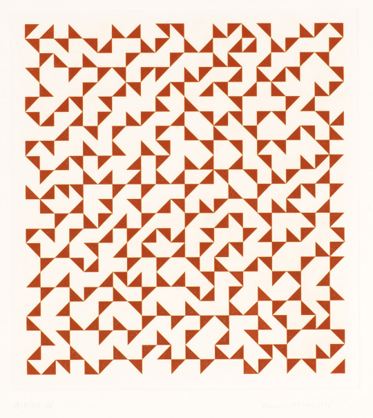
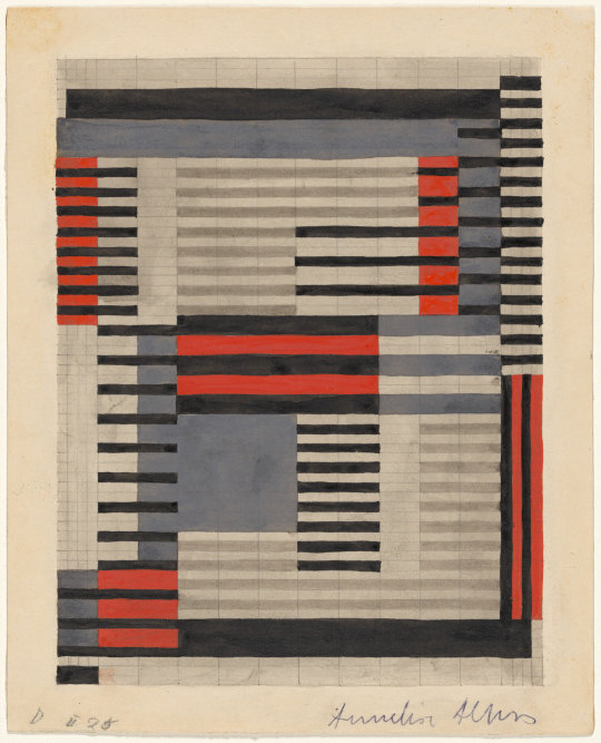
Anni Albers
"Besides surface qualities, such as rough and smooth, dull and shiny, hard and soft, textiles also includes colour, and, as the dominating element, texture, which is the result of the construction of weaves. Like any craft it may end in producing useful objects, or it may rise to the level of art."
A quote from the woman herself sums it up better than I ever could. Anni Albers is one of the most important textile artists there ever was. Her work elevated the standing of textile work in the art world and paved the way for the many artists to appear in her wake. Like many who work with 3D, she blurred the lines between art and design, gaining recognition for the traditionally feminine world of "craft" often excluded from the wider art world.

Volume
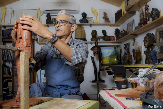
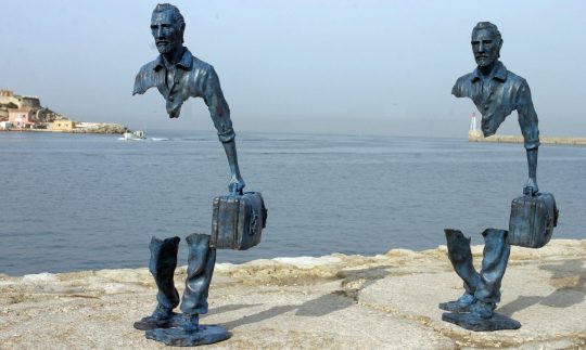
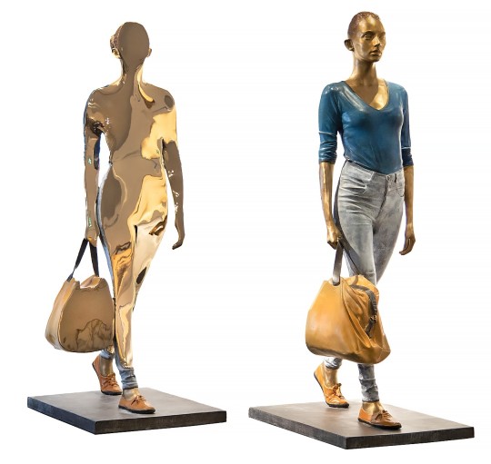
Bruno Catalano
Bruno Catalano is a Italian-French sculptor best known for his sculptures of figures with substantial sections missing. In my previous post I described the concept of "volume" in 3D studies as having to do with negative space, we must perceive an absence of some kind to truly grasp the volume of something. Much like the visual hollow of a glass informs its volume, Catalano's sculptures express volume specifically through their substantial missing portions. We as observers are forced to contemplate the "how" of a work, in such a way we would never need to with a conventional sculpture. Similarly Catalano's common practice of clothing his sculptures in everyday attire achieves the same effect in an additive manner, rather than a subtractive approach.

Weight
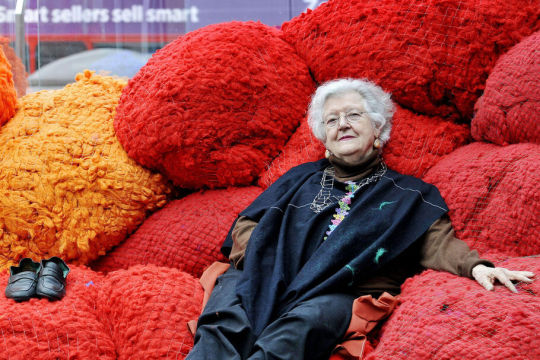
Sheila Hicks
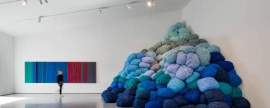
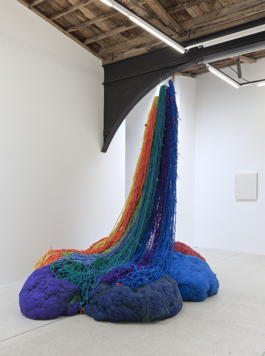
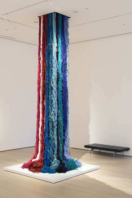
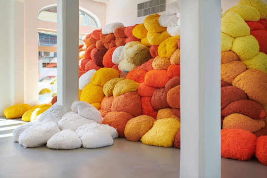
Sheila Hicks is another who could reasonably be argued to define basically every element on this list. Her work is similar in ways to Anni Albers, whom I placed on this list under the category of "Texture". While Hicks works undoubtedly deals with texture, as it does sculpture, colour, and narrative among others, what has always stood out to me first and foremost about her work is it's sheer weight. Hicks is particularly known for the contrast in the scale of her works, ranging from minute to massive. What intrigues me though is how through her work, we see the minute become the massive. Common, lightweight elements like wool and string become enormous behemoths, stacked like rocks in galleries or flowing like waterfalls through ceiling installations. There are many artists who work with heavy material but few who convey weight regardless of material.
Space
Chiharu Shiota
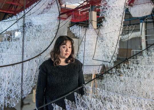
Chiharu Shiota was my immediate pick to exemplify the element of "space". Her work is not location-specific as it can be rearranged and displayed throughout many galleries but it is absolutely space-specific. Her installations dominate the space they occupy like few others. Shiota's work leverages the element of space to create ideas around the body and flesh, territory, and alienation. I feel there's not much else I can write here other than I'd love to visit an installation of hers one day and see the sheer scale of the space for myself.
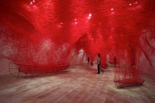
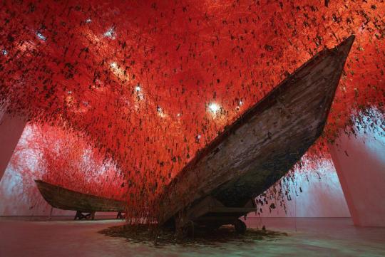
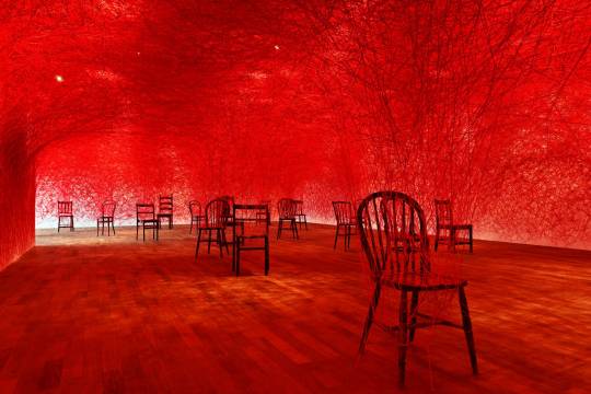
Location
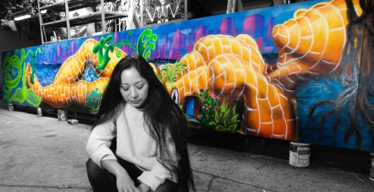
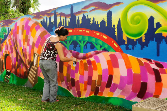
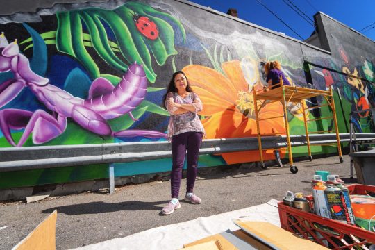
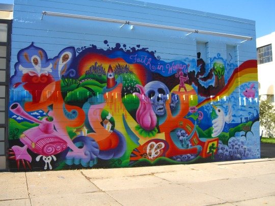
Lady Pink
I chose Lady Pink for the element of "location" as her signature graffiti work is deeply tied to her hometown of New York City and her identity therein. She began her career in graffiti in 1979 after the loss of her boyfriend, tagging his name across the city. I wrote in my last post that my understanding of location as an element, is that it's deeply attached to a work's context. Something so inextricably linked it would lose meaning were it removed from it's location. From the beginning Lady Pink's work has been inextricable from her life in New York.
3 notes
·
View notes
Text
Disrupt project 02/11/23
(Seminar)
I also, during the reading week, had watched the exploring ideas seminar.
I had not taken notes throughout watching this as I was in bed, watching before going to sleep.
But I had screenshotted one part(see below), as I felt it was very important and I feel too, it has helped me out with my disrupt project work.

Creating a quantity of ideas can eventually lead to one creating a great idea.
The lecturer showed us example of this, through public figures like Mozart and Einstein.
I also found it interesting to learn that to draw is to observe.
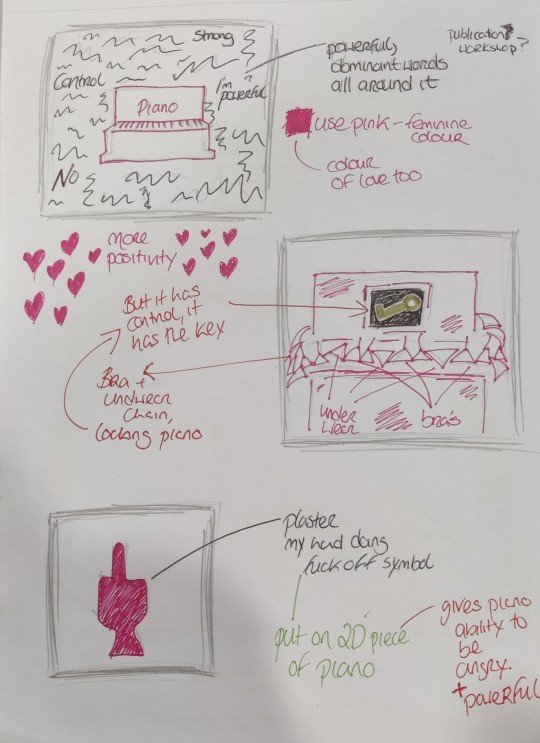
I have attached below, pictures from my sketchbook of my quick sketches. I drew most of them after watching this seminar, in the hopes of them helping me to form good ideas.

2 notes
·
View notes
Text
Exploring ideas seminars:

2 notes
·
View notes
Text
CLAY FORM DEVELOPMENT SEMINAR (:
The clay seminar was a good introduction to working with clay. I wish I was able to watch this before I was humbled making my car. The material is very sensitive to touch, it’s possible to overwork the clay and then it dries out. It was interesting also seeing how other artists incorporate the use of clay into their works. Ceramics isn’t just about making mugs and bowls, you can make sculptures and many other things too, a decorative or a functional medium.


2 notes
·
View notes
Text
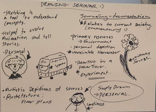
Drawing Seminar 1 & 2
I completed the drawing seminar. The main concept that I was interested in was by Laura Fahy. She created an animation about a man tell her about his day at a pub. It was done in a very simple style and it conveyed a sense of loneliness.
these are my notes from the drawing seminar.
1 note
·
View note
Text
3D Studies Seminar
I recently watched the 3D Seminars on Moodle. I found these seminars really interesting as I plan to do the 3D Workshop next week. The discussions about Form, Texture, and Structure were of particular interest to me and have given me an insight on what to consider in next week's workshop. By watching this workshop I also have decided to do further artist research on Una Burke as her work with clothes and garments strongly relates to my concept for Disrupt.
1 note
·
View note
