#Kiki Kaikai Advance
Explore tagged Tumblr posts
Visit Tumblr Blog
Explore Tumblr blogs with no restrictions, modern design and the best experience.
Last Seen Tumblr Blogs


Fun Fact
Tumblr has been banned in Indonesia for providing people with access to pornographic content.
Text

Pocky and Rocky with Becky Gameboy Advance 2001
#Rocky#Pocky and Rocky with Becky#Kiki Kaikai Advance#Manuke#orochi#video games#gaming#nostalgia#aesthetic#pixel art#2000s#2001#00s#Japan#japanese games#tanuki#retro gaming#gameboy advance#gba#Altron#Natsume#nintendo#shoot'em up#Shmup#obscure games#pocky and rocky#raccoon dog#game boy#game boy advance#japanese aesthetic
63 notes
·
View notes
Text

More bad window pics because I'm on that vaccine sleep schedule
I called out of work and had one of those days where I felt bad for doing like actually nothing, but my logic brain always kicks in quick to be like, you should've done less bro its recovery time
I bought the Castlevania Advance Collection the other day and finally started Aria of Sorrow for the first time. Dawn of Sorrow was one of my first Castlevania games and I really loved it for basically just being Symphony but with the cool monster powers. Aria is basically the same just with worse music lol. Im glad to finally be playing a Symphony style game on my switch though, its still fucking insane that you cant play Symphony or Rondo on that thang. I h8 u Konami
I also beat Pocky and Rocky, which has a crazy ass final boss. Its like an FF14 boss a little bit its really cool. And after finishing that I bought Kiki Kaikai to see what that first game was like, and its basically the same except you only have shoot and deflect, and you die in one hit. I havent been able to make it past the first level. I will call controller johns a little bit because the swotch pro stick seems to be snapping back in a way that is forcing me to shoot in cardinal directions when I'm trying to shoot diagonally. The split pad pro didnt seem to be doing it as much. Great games though
I realize that I never have anything to talk about besides video games but you gotta understand. Thats all just like, you gotta. I did a lot of real life facing the past few years and I'm in my wasting time being irresponsible era. But I'm having fun. I do a lot of philosophizing to myself all day I just forget about it when I go to post. I have been spending a lot of brain power thinking about Twin Peaks but I should probably watch season 3 before I go too crazy rambling about it. I'm not gonna talk about Judy. In fact we're not gonna talk about Judy at all
I better start thinking about christmas presents soon too 😳

2 notes
·
View notes
Text
[Review] Roller Angels (DSi)

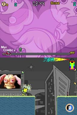
What if Jet Set Radio was a kids cartoon and also a 2D autorunner?
While researching DSiWare a while ago I came across this, a digital release exclusive to Japan and North America (a physical version was planned but cancelled). Thanks to advances in emulation I managed to stream a complete playthrough but now seemed a good time to revisit it during a run of games inspired by Jet Set Radio (in this case I'm able to play it thanks to 3DS custom firmware enabling a glorious piracy eshop).
The JSR similarities come in the game actions: it involves roller blading, rail- and wall-grinding, tricks, and spray-painted graffiti. This is in the context of a sidescrolling action ride, where you have to juggle all these actions (along with ledge-grabbing, shaking the spray can, and boosting) in increasingly dense runs. The pace starts slow but ramps up to an engaging level of multitasking, before plunging into a hectic spree of button-tapping in the final two worlds.
Unlike JSR, the theme is very cutesy, the stars a trio of sugary sweet magical girl superheroes with animal-themed personae. Their task is to restore colour to the world with their magic paint cans after some very round and non-threatening aliens have siphoned it off (as well as brainwashed local animals to get in your way). For plot reasons the levels are very drab and grey the first time you do them which is a shame, because otherwise the art direction is quite charming.
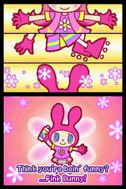
On this playthrough I made it my goal to unlock every alternate painting in the shop, which required no small amount of grinding for coins. I must have played through the whole game four or five times to achieve this, advancing from mostly using Patty (Pink Bunny) for her higher jumps to Becky (Yellow Bear) for an easier time recovering spray pressure, to Mee (Mew Blue) using boosts more often for a more challenging technical playstyle. The game also supports the DSi/3DS camera for converting photos into paintings to use in game, but I preferred sticking to the defaults which are contextually themed to each world (wild west, forest, undersea, etc.).
This title is so solid and clearly well-executed that it makes me wonder what other gems might be hidden in Starfish's back catalogue alongside all the DS shovelware and unlocalised PSP RPGs visible in their now defunct website. I know they did a decent revival of the Devilish adventure brick breaker series, and two Wii reboots of Taito arcade classics that are described as "mediocre" (for the Kiki Kaikai one, they lost the licence but then made it anyway). But their history goes back to the late 90s, and there could easily be depths untapped by me or the English-speaking Internet at large. For now, suffice it to say Roller Angels is a highlight of the DSiWare service and I love it dearly.
5 notes
·
View notes
Photo

Bonus Becky!
#Pocky and Rocky with Becky#gameboy advance#kiki kaikai advance#Becky#fan art#jmv#kaigetsudo#retro#who is she
101 notes
·
View notes
Quote
Murakami is certainly not the first artist to argue on behalf of a like-minded group of practitioners. The prewar avant-gardes were full of such garrulous self-analysis (think of the Futurists, the Surrealists, and the Constructivists, to name a few), and the postwar period saw the rise of artist/critics, such as Donald Judd and Mel Bocher, who wrote survey articles or curated group exhibitions of their contemporaries. Two key differences, however, remain: the first being that these Western examples were primarily addressed to audiences within their own cultural milieu, and the second being that the success of their critical positions was not likely to directly enrich their respective spokesmen. By raising this latter point, I do not mean to cast in doubt either the validity of Murakami's extremely compelling theses or his motives, but make no mistake about it: his activities as a curator and critic function as a shrewd marketing device. By framing and advancing a new "movement" of sorts, he has gained for his cohorts significant traction in both foreign intellectual and commercial markets, all the while co-opting the imprimatur of serious institutions, such as the Walker Art Center; the Japan Society; the Museum of Contemporary Art, Los Angeles; and even Yale University Press, which co-published the Little Boy catalogue. The fact that all three of his major curated shows to date have included not only his own work but that of younger artists represented by KaiKai KiKi means that he has a direct finical stake in their success, in terms of both the firm's revenues and his status as an artistic paterfamilias.
Scott Rothkopf, Takashi Murakami: Company Man
11 notes
·
View notes
Photo

✨Kiki KaiKai ✨ ⛩🌸👻 🇬🇧Kiki KaiKai Advance (2001). Developed by Altron and published by Natsume. Run&Gun based in Japanese folklore. One of pricey GBA games nowadays. Belong to Pocky & Rocky series. 🇪🇸Kiki KaiKai Advance (2001). Desarrollado por Altron y distribuido por Natsume. Run&Gun cenital basado en el folklore nipón. Pertenece a la saga Pocky & Rocky / Kiki KaiKai de Taito. Actualmente es uno de los títulos más caros de GBA en región japonesa
#kikikaikai#famicom#gameboyadvance#nes#taito#sega#nintendo#nintendocollection#videogamecollection#instagames#gamestagram#classicgaming#retrogames#retrogamer#retrocommunity#retrogamingcommunity#zelda#retrogame_feature#nin10do#games#ps4#game#gamer#gamers#instagamerspain#16bit#videogames#gaminglife#gameboy
4 notes
·
View notes
Photo

👉 We would ask questions if we have concerns, have the numbers adjusted, and send him the minimum funds necessary for the production. Once the work is completed, he would suggest a price for the piece, and we would pay his share of the profit minus what we had paid for the production. In other words, we have been paying for his works in advance. When we started this project, Ueda and his wife Yui’s sense of balance between production and living, as well as their mental balance, were far from ideal; it was astonishing how little they thought things through, and especially when it came to financial matter, they absolutely had no real sense of it. We held countless phone conferences, had Otani Workshop, who had introduced Ueda to me, join some of those conferences, and I lectured him quite a bit. His work has now drastically changed stylistically as well. Before starting the production for this exhibition, Ueda mainly made his quintessential, fragile works in which the flaky surface layers were in a constant state of peeling off. In the Japanese custom of ceramics appreciation, there is a technique of kintsugi, where a broken pottery is repaired using lacquer mixed with powdered gold; there is an aesthetic of admiring imperfections. That is, in Japan breakable connotes transience and empathy with the ephemeral; there is a tendency to favorably accept it as such. This resonated with the nature of Ueda’s works, making them very popular domestically. However, outside of Japan, there are different ways people appreciate or admire objects, and when something breaks, people sometimes dispose of it or want it exchanged. Many of our overseas clients who purchased Ueda’s works subsequently requested to return them once they broke. I discussed this matter with the artist; would he continue creating works with the fragility at the core of his artistic expression, or would he explore and find a new mode of expression that would enable him to achieve the same creative ideas while shifting the style to something more durable? Ueda chose the latter, and has arrived at his answers now after three long years of exploration. ...👉👉👉to last page! @yuji____ueda @kaikaikikigallery (Kaikai Kiki Gallery) https://www.instagram.com/p/BqeZEtllc3G/?utm_source=ig_tumblr_share&igshid=zq0gwufsh949
3 notes
·
View notes
Text
Takashi Murakami

Drawing from traditional Japanese painting, sci-fi, anime, and the global art market, Takashi Murakami creates paintings, sculptures, and films populated by repeated motifs and mutating characters of his own creation. His wide-ranging work embodies an intersection of pop culture, history, and fine art.
Murakami earned a BA, MFA, and PhD from Tokyo University of the Arts, where he studied nihonga (traditional Japanese painting). In 1996 he established the Hiropon Factory, a studio/workshop that in subsequent years grew into an art production and artist management company, now known as Kaikai Kiki Co. Ltd.
Since the early 1990s Murakami has invented characters that combine aspects of popular cartoons from Japan, Europe, and the US—from his first Mr. DOB, who sometimes serves as a stand-in for the artist himself, to various anime characters and smiling flowers, bears, and lions. These figures act as icons and symbols—hosts for more complex themes of violence, technology, and fantasy.
In 2000 Murakami curated Superflat, an exhibition featuring works by artists whose techniques and mediums synthesize various aspects of Japanese visual culture, from ukiyo-e (woodblock prints of the Edo period) to anime and kawaii (a particular cuteness in cartoons, handwriting, products, and more). With this exhibition, Murakami advanced his Superflat theory of art, which highlights the “flatness” of Japanese visual culture from traditional painting to contemporary subcultures in the context of World War II and its aftermath.
Murakami’s work extends to mass-produced items such as toys, key chains, and t-shirts. In 2002 he began a multiyear collaboration with Marc Jacobs on the redesign of the Louis Vuitton monogram. Murakami then took the radical step of directly incorporating the Vuitton monograms and patterns into his paintings and sculptures. While Murakami’s imagery may appear to present unprecedented characters and forms, many contain explicit art historical references, and some are even direct contemporary updates on traditional Japanese works.
Following the Tōhoku earthquake of 2011 and the subsequent nuclear crisis at Fukushima, Murakami began deeply exploring the impact of historical natural disasters on Japanese art and culture. In his 2014 Gagosian exhibition at West 24th Street in New York, In the Land of the Dead, Stepping on the Tail of a Rainbow, he created an immersive installation of eclectic arhats; deliquescing clones of his fictional creature Mr. DOB; and karajishi, the mythic lions that guard Japanese Buddhist temples, that visitors entered through a replica of a sanmon (sacred gate).
Not only does Murakami merge different time periods, styles, and subject matter in his work, but his approach to art crosses the boundaries between gallery, studio, art fair, and media as well. Along with creating paintings and sculptures, he has hosted art fairs for emerging artists, curated exhibitions, and made films featuring his many characters and motifs. Combining fantasy, science, and history, he shows that none of these categories can be considered in isolation.
Gagosian Artist Biography on Takashi Murakami
The Guardian: Takashi Murakami Review: a welcome return to a more disturbing style
Hype Bae: Take a look inside Takashi Murakami’s massive “Murakami vs Murakami” exhibit
1 note
·
View note
Photo


We want to see the newest things. That is because we want to see the future, even if only momentarily. It is the moment in which, even if we don’t completely understand what we have glimpsed, we are nonetheless touched by it. This is what we have come to call art.
Takashi Murakami
Drawing from traditional Japanese painting, sci-fi, anime, and the global art market, Takashi Murakami creates paintings, sculptures, and films populated by repeated motifs and mutating characters of his own creation. His wide-ranging work embodies an intersection of pop culture, history, and fine art.
Murakami earned a BA, MFA, and PhD from Tokyo University of the Arts, where he studied nihonga (traditional Japanese painting). In 1996 he established the Hiropon Factory, a studio/workshop that in subsequent years grew into an art production and artist management company, now known as Kaikai Kiki Co. Ltd.
Since the early 1990s Murakami has invented characters that combine aspects of popular cartoons from Japan, Europe, and the US—from his first Mr. DOB, who sometimes serves as a stand-in for the artist himself, to various anime characters and smiling flowers, bears, and lions. These figures act as icons and symbols—hosts for more complex themes of violence, technology, and fantasy.
In 2000 Murakami curated Superflat, an exhibition featuring works by artists whose techniques and mediums synthesize various aspects of Japanese visual culture, from ukiyo-e (woodblock prints of the Edo period) to anime and kawaii (a particular cuteness in cartoons, handwriting, products, and more). With this exhibition, Murakami advanced his Superflat theory of art, which highlights the “flatness” of Japanese visual culture from traditional painting to contemporary subcultures in the context of World War II and its aftermath.
Murakami’s work extends to mass-produced items such as toys, key chains, and t-shirts. In 2002 he began a multiyear collaboration with Marc Jacobs on the redesign of the Louis Vuitton monogram. Murakami then took the radical step of directly incorporating the Vuitton monograms and patterns into his paintings and sculptures. While Murakami’s imagery may appear to present unprecedented characters and forms, many contain explicit art historical references, and some are even direct contemporary updates on traditional Japanese works. https://gagosian.com/artists/takashi-murakami/
Takashi Murakami is a Japanese artist known for blurring the boundary between fine and commercial art. Often categorized alongside historic and contemporary artists working in the tradition of Pop Art, such as Andy Warhol, Damien Hirst, and Jeff Koons, Murakami's work has achieved a widespread level of fame beyond the art world. His innovative “Superflat” aesthetic—combining classical Japanese art with contemporary Japanese pop culture—has led many to consider him one of the most innovative artists working today. Exploring the links between traditional printmaking techniques and Japanese manga in postwar society, Murakami’s art acts as a cultural barometer with subversive undertones and imagery. “My aesthetic sense was formed at a young age by what surrounded me: the narrow residential spaces of Japan and the mental escapes from those spaces that took the forms of manga and anime,” he reflected. Born on February 1, 1962 in Tokyo, Japan, where he continues to live and work, Murakami has embraced commerce through the founding of Kaikai Kiki Co., Ltd., an artist management agency and studio based in both New York and Munich. With his popular collaboration with the fashion label Louis Vuitton, Murakami has established himself as a pioneer of promoting art as a brand. In 2007, Murakami provided the cover artwork for rapper Kanye West's album Graduation. The artist’s work has been the subject of numerous exhibitions around the world, include those held at the Mori Art Museum in Tokyo, Gagosian Gallery in London, the Guggenheim Museum in Bilbao, and the Versailles Palace.Takashi Murakami is a Japanese artist known for blurring the boundary between fine and commercial art. Often categorized alongside historic and contemporary artists working in the tradition of Pop Art, such as Andy Warhol, Damien Hirst, and Jeff Koons, Murakami's work has achieved a widespread level of fame beyond the art world. His innovative “Superflat” aesthetic—combining classical Japanese art with contemporary Japanese pop culture—has led many to consider him one of the most innovative artists working today. Exploring the links between traditional printmaking techniques and Japanese manga in postwar society, Murakami’s art acts as a cultural barometer with subversive undertones and imagery. “My aesthetic sense was formed at a young age by what surrounded me: the narrow residential spaces of Japan and the mental escapes from those spaces that took the forms of manga and anime,” he reflected. Born on February 1, 1962 in Tokyo, Japan, where he continues to live and work, Murakami has embraced commerce through the founding of Kaikai Kiki Co., Ltd., an artist management agency and studio based in both New York and Munich. With his popular collaboration with the fashion label Louis Vuitton, Murakami has established himself as a pioneer of promoting art as a brand. In 2007, Murakami provided the cover artwork for rapper Kanye West's album Graduation. The artist’s work has been the subject of numerous exhibitions around the world, include those held at the Mori Art Museum in Tokyo, Gagosian Gallery in London, the Guggenheim Museum in Bilbao, and the Versailles Palace.
http://www.artnet.com/artists/takashi-murakami/
Takashi Murakami is another artist that embodies an intersection of pop culture, history, and fine art. Although his art and my art aren't similar, he also draws from his own culture and pop culture to create works that have advertising/commercialised aesthetics.
1 note
·
View note
Text
Pocky & Rocky(奇々怪界)

Em 1986, época em que os videogames, com destaque para Super Mario Bros., e The Legend of Zelda, estavam em relativa ascensão, a Taito Corporation, empresa muito famosa pelos Space Invaders, trouxe aos arcades um título diferente, misturando shooter vertical com plataforma, ambientado no antigo japão feudal. Kiki Kaikai(奇々怪界) apresenta como protagonista uma jovem sacerdotisa chamada Sayo-chan, que parte em uma missão para resolver problemas envolvendo monstros encrenqueiros. No controle de Sayo-chan, tambem conhecida como Pocky nos EUA, jogadores atacam os inimigos com pergaminhos o-fuda, ou com o bastão sagrado empunhado pela protagonista. Além disso, Pocky pode levar apenas 2 hits antes de morrer(a referência com Arthur, de Ghosts ‘n Goblins não é mera coincidência). No final de cada fase, o jogador deve enfrentar um poderoso chefe que leva vários ataques para derrotar e é mais difícil do que os inimigos normais. Assim como The Ninja Warriors, KiKi KaiKai foi um trabalho único até 1992, quando Taito permitiu que Natsume lançasse KiKi KaiKai: Nazo no Kuro Mantle, que seria conhecido como Pocky & Rocky por seu lançamento na América do Norte. Natsume continuou com Pocky & Rocky 2(1994), e anos depois ajudaria a Altron a lançar Pocky & Rocky with Becky(2001,2002) no Game Boy Advance. Em algum momento de 2006, uma sequência moderna de Kiki Kaikai, Kiki Kaikai 2, estava originalmente em desenvolvimento para o Nintendo Wii pela Starfish Entertainment, no entanto, mais tarde ressurgiria como um jogo para Wii intitulado "Kiki Kai World". Esta versão era basicamente semelhante ao título cancelado para Wii, mas com a roupa de miko da personagem principal recolorida de vermelho para azul. Em vez de ser uma sequência direta do original, era mais um sucessor espiritual, a fim de evitar questões legais com a Taito e sua empresa-mãe, a Square Enix. Para separar ainda mais o jogo de Kiki KaiKai, os gráficos e o tema do jogo foram completamente refeitos, substituindo a heroína miko por uma deusa da neve chamada Sayuki. Quando abordado sobre o assunto, um porta-voz da empresa disse: "Para encurtar a história, a Taito, que agora é propriedade da Square [Enix], teve alguns problemas conosco e tivemos que abrir mão do título", dando a entender que a tensão com a Square Enix foi a razão do cancelamento inicial. “Kiki Kai World” foi simplesmente rebatizado como Heavenly Guardian no PS2 e Wii, sendo considerado um sucessor espiritual não-oficial da série Kiki Kaikai...
1 note
·
View note
Text

Pocky & Rocky with Becky Gameboy Advance 2001
#Rocky#Pocky & Rocky with Becky#Manuke#japanese aesthetic#video games#gaming#nostalgia#aesthetic#pixel art#2000s#2001#00s#Japan#japanese games#tanuki#retro gaming#gameboy advance#gba#Altron#Natsume#nintendo#shoot'em up#Shmup#obscure games#pocky and rocky#raccoon dog#game boy#game boy advance#Kiki Kaikai Advance
38 notes
·
View notes
Text

More bad window pics because I'm on that vaccine sleep schedule
I called out of work and had one of those days where I felt bad for doing like actually nothing, but my logic brain always kicks in quick to be like, you should've done less bro its recovery time
I bought the Castlevania Advance Collection the other day and finally started Aria of Sorrow for the first time. Dawn of Sorrow was one of my first Castlevania games and I really loved it for basically just being Symphony but with the cool monster powers. Aria is basically the same just with worse music lol. Im glad to finally be playing a Symphony style game on my switch though, its still fucking insane that you cant play Symphony or Rondo on that thang. I h8 u Konami
I also beat Pocky and Rocky, which has a crazy ass final boss. Its like an FF14 boss a little bit its really cool. And after finishing that I bought Kiki Kaikai to see what that first game was like, and its basically the same except you only have shoot and deflect, and you die in one hit. I havent been able to make it past the first level. I will call controller johns a little bit because the swotch pro stick seems to be snapping back in a way that is forcing me to shoot in cardinal directions when I'm trying to shoot diagonally. The split pad pro didnt seem to be doing it as much. Great games though
I realize that I never have anything to talk about besides video games but you gotta understand. Thats all just like, you gotta. I did a lot of real life facing the past few years and I'm in my wasting time being irresponsible era. But I'm having fun. I do a lot of philosophizing to myself all day I just forget about it when I go to post. I have been spending a lot of brain power thinking about Twin Peaks but I should probably watch season 3 before I go too crazy rambling about it. I'm not gonna talk about Judy. In fact we're not gonna talk about Judy at all
I better start thinking about christmas presents soon too 😳

1 note
·
View note
Text
Insight as a developing artist
Let's sit down for a bit and let me talk a kind of serious topic about art. Yes this is an art blog so it's kind of relevant ( Dismissing the fact that it has shitty posts). This is mainly about visual artworks, but you can connect to other form of art since the abstract substances are same. I've been teaching a few students lately, and observing some developing artists fella like I am. A raised debate was about "I am technically more advanced than B, but why B wins the audience more than I??" which caught my interest. Another friend of mine that is also teaching art said this as well : "My students are so good. They are young but know some techniques already. However, while the art are neat I feel somewhat punch lacking or something.." So regarding this, and the trend nowadays regarding young artists who is learning, I just want to say : Good and refined techniques make a really proper art. However, we don't live in Pre Renaissance era anymore. Art's root should be a place to express yourself, and deliver emotions. Now, taking aside the more in depth of what is art and the blablablah movement what not(which is debated a lot in the fine art major but that isn't my point here) we shouldn't forget this aspect. If art is all about good mastered techniques, we should be a technician instead. I am not looking down the aspect of technique here, you see. It is a really important core of it. I am saying that it's not ALL about it. If it is, there won't be romanticism, impressionism and the latter. Regarding the question "Technically A is more advanced than B, but B wins the audience more", there is something that A is missing, and probably a lot of artists have this problem. Popularity of the subject talked in their artwork matters too, but more importantly : Catchiness. Have you ever listened to a good, composed song, and you can say " Oh this one is arranged well" but somehow you don't want to listen to it again? Or have you ever find a strange melody, often simple and unimportant, messy, but somehow it becomes your earworm? that's the simplest concept of this catchiness. In the past I'd stumble artworks that looks like the creator didn't put as much effort as me and my detailed lineart ( welp I use lineart back then). But why with the messiness and effortless, simple attempt it can look more attractive than my detailed calculated planned works? again, it's catchiness. A lot of artists and student I observed seems to not realize this aspect because they are 'trained' to see factors of " neat, proper technique". Artwork isn't all about it, there is something more there that let you catch the attention of viewers. So how to obtain this catchiness? sadly it's sense. And honing sense is harder than honing technical skills. It's almost abstract and cannot really be taught. This is the reason why there are some case where people who takes serious art course beaten by a part time hobbyist who draw/do art for fun. But I have been thinking and discussing this with a Painter from Canada. She said that first of all, passion and emotion must there. actually, it's not noticed at firsthand but instead of teaching basics of skills, the first thing you should "plant" to them is for them to draw what they like. No skills? whatever! let them draw things they like, compose song, play, sing, whatever they like. Just let them do it for a while. Next, have them perpetually surrounded by good pieces of things they like. Good musics, good paintings, good artworks. The term of good is probably subjective so let's pay attention to each of your student interest and personality. If this is implied, the students will have an easier time learning technical skills. Other than that, they will 'subconsciously compare' their works of something they like to the pieces they like. After all, humans are subjective beings. Over things they are care/passionate toward they have an upper hand toward enforcing their ability to learn. When their subconsciousness compare, soon they will develop a good sense of what is catchy and what is not. Their technical skills will help them decide how an artwork can be catchy. Another thing is emotion and context. While I haven't really find how to pour emotion to your artworks naturally and make it deliver to the audiences, I can provide good example so perhaps we can break this case together. Look at some work of Kaikai Kiki artists http://english.kaikaikiki.co.jp/ See what I talk about. Not all of them use the oh godly superb techniques in the artworks, some looks like child doodle. But you have to agree--they are all catchy, radiating the heartwarming emotion, you can feel it from their works. Trying to analyze why they are good using only technical factors will confuse you. Look at Rei Sato's work. Of that paragraph above, my teacher from Canada say a tip :Composition, Value and Colors before line, perspective and anatomy. Learning how to properly proper a technique is a lifetime artist quest. So when trying to decide which factor to make my art "good" I'd agree to master with composition, value and colors first. It doesn't have to be neat or anatomically right. Just when your colors value and composition are right, they can be more catchy than the neat and 'right' artworks. Just like how psychologically humans are attracted primarily by picture (humans memorize visual/ picture better than words). It seems we also primarily attracted by colors and contrast first, then line and shape second (If not all true, it's majority). So I guess that makes sense if you want to make expressions, colors will be the easiest aspect to do it. On the summary, to attract audiences, my point is to improve catchiness primarily toward your artworks, and to enforce that, your artworks must contain your passion, love and emotion. A good art is subjective to every person but it should be agreeable that generally a good art is a proper art, which delivers "emotions" that when you see it you feel the atmosphere of what the creator wanted the piece to have. A neat but emotionless art is not ugly, but the key of art is soul. So when the soul isn't connect, people would find more comfort in the artworks that invoke their emotions. Good luck on your Journey!
#art#artist#mentality#INFP#musing#psychological#insight#it's so rare for chiwarino to write anything but husbando shit
2 notes
·
View notes
Text
Takeshi Murakami


(Murakami, Takeshi, Murakami Ego. Rizzoli International Publications, page 137-138 spread)
Artist: Takeshi Murakami
· Born in February 1st, 1962 in Itabayahi, Tokyo
· Founder and president of his own art production and management company, Kaikai Kiki Ltd
Murakami Ego. Rizzzoli International Publications, pages 70, 113-122)
Title: The 500 Arhats
Medium: Acrylic on canvas mounted on board
Size: 302 x 10,000 cm
· Modern incarnation of Kazunobu’s Five Hundred Rakan Series made in response to the 2011 Tohuku earthquake
The 500 Arhats is considered Murakami’s most ambitious project to date, both in sheer scale and subject matter, yet it still retains the overabundance of color that has become his trademark. Each of the Arhat’s four scrolls depict psychedelic color combinations that don’t follow any particular order, with the exception of a few shades of white that give the piece a sense of continuity while adding a twinge of order to an otherwise chaotic scene. The most vibrant colors are reserved for the piece’s more fantastical elements like the crimson flames of a phoenix tail or the rainbow tongue of a dragon. However, the cavalcade of color would not be nearly as vibrant if not for the fluid balance that comes from the Arhat’s style mimicking that of a traditional Japanese scroll. Though the individual swirls and characters are at a loss for a true equal, each side of the scroll is a solid imitation of the other. The size and clothing of the arhats may vary, yet their positions are largely unchanged. The presence of a dragon on one half of the scroll is offset by a giant white whale on its twin. This, coupled with Arhat’s unremitting movement coincides perfectly with Murakami’s theme of surface; the idea that if one were to strip away one piece of his paintings, it has the potential to spawn into a fully realized work of its own.
Though The 500 Arhats is supposed to lack any traditional narrative, it actually depicts the climax of a warped marriage between a dignified past and an experimental future. It may be hard for an educated and technologically advanced society such as ourselves to comprehend, but there was once an age when myths and folklore were taken as indisputable truths. People truly believed dragons controlled the wind and seas, children who did not resemble their parents were thought to be spawned from demonic onis, and any creature or inanimate object that exceeded the age of one hundred had the potential to develop an entirely new consciousness. Traditions spawned from these myths that are still upheld even to this day, some having obviously lost a great deal of their severity. The superflat art style that has spawned from the mind of Murakami reflects the simplicity and mild kitsch of the manga and anime industry, impressive in and of itself but still a far cry from classicism. Observing the manic characters frolicking about in an ever-churning ocean of color triggers a sense of youth and rebellion, as if we are getting a brief but delicious glimpse into another world that might start bending us to its will if we don’t keep our wits about us. So now ancient past and vibrant future collide to give birth to a fantastical hybrid. One with creatures and disciples that have managed to hold onto some sense of dignity yet are still powerless to escape the frenetic explosions of vibrancy and surrealism that are unshackled by the standards of the modern world
0 notes