#Jan van Eyck Academie
Explore tagged Tumblr posts
Text

Elements published by Jan van Eyck Academie, co-edited with Jessica Gysel
0 notes
Text
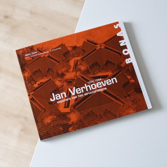

As a reaction to the overly rigid and schematic conception of architecture in the postwar years the Dutch Structuralists focused on the human being, the inhabitant, as an individual with changing needs and lifestyles. The key protagonists of the movement were, among others, Aldo van Eyck, Jaap Bakema, Herman Hertzberger and Geert Boon, the so-called „Forum Group“ which made up the editorial board of the Forum magazine. In their orbit also moved the young Jan Verhoeven, then student at the Academie van Bouwkunst in Amsterdam and a student of Aldo van Eyck whose seminars and teaching deeply impressed him: the human scale of his projects as well as his spatial configurations of added small units can also be found in Verhoeven’s house designs. Another recurring theme in his work is the zoning of individual and collective parts, a principle that came to bear especially in his housing projects.
The latter also constitutes the major part of his architectural oeuvre as the present book demonstrates: Mette Zahle’s monograph „Jan Verhoeven 1926-1994 - Exponent van het Structuralisme“, published by Stichting Bonas in 2012, which provides both a comprehensive work analysis and catalogue with special emphasis on Verhoeven’s housing projects. The author recounts Verhoeven’s deep involvement with the different housing programs and architect groups that especially during the 1960s and 1970s greatly influenced state funded housing construction, e.g. Werkgroep Stichting Nieuw Woonvormen, which he co-founded, and with it emphasizes the architect‘s deep concern for resident-focused housing. The basis for these designs always rests on Verhoeven’s unique variation of linked and mirrored uniform components that result in fascinating floor plan structures and equally fascinating drawings.
What Zahle’s book on the other hand lacks is a deeper insight into Verhoeven’s personality: although she delves into his upbringing and training and also doesn’t spare out the importance of the architect’s wife Eva as corrective authority Verhoeven nonetheless remains somewhat opaque as a person. But in view of the extensive work catalogue this is a negligible flaw and the book remains a great read.
#jan verhoeven#monograph#structuralism#structuralist#architecture#netherlands#architecture book#book
16 notes
·
View notes
Text
次のライブは5/27"New Buddy!"
どうも、春に立て続けにライブをやってから1ヶ月とちょっとたちました。次に我々が出演するライブはこちらです。
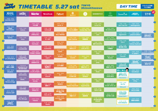
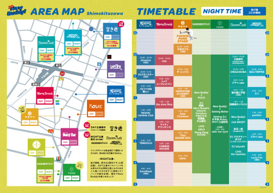
●2023年5月27日(土) THISTIME RECORDS 20th Anniversary "New Buddy!"
下北沢のライブハウスを舞台にしたサーキットイベントでして、Superfriendsの出演場所、出演時間は
【 CLUB 251で19:30〜20:00 】です!
この日はサポートギターにしょーはしくんを迎えて、スコーン!とロックに駆け抜ける予定です。THISTIME RECORDSは、はるか昔、『OK! POWERPOP2』というコンピレーションにお誘いいただいた時以来の長〜い付き合い…。社長がやっていたバンドにイベントに出てもらって、メンバーのみなさんが僕の下宿に泊まったなんてこともありました…。そんな思い出を胸に、グッドミュージックを奏でてこようと思います。
よければぜひ遊びに来てください〜! 詳細▶︎ https://fanlink.to/newbuddy20

会場:シャングリラ / SHELTER / DaisyBar / MOSAiC / ��松 / mona recordsCLUB251 / BASEMENT BAR / THREE / ERA / Flowers Loft / 下北沢空き地
DAY:開場 / 開演 12:00 / 12:30 NIGHT:開場 / 開演 22:30 / 23:00
<TICKET> 一般チケット発売中 ■チケットぴあ(http://w.pia.jp/t/thistime20th/) / e+(https://eplus.jp/thistime-20th/) ■店頭販売: SHELTER / DaisyBar / MOSAiC / 近松 / mona records / CLUB251 / BASEMENT BAR / THREE / ERA / Flowers Loft <出演者> cinema staff / Homecomings / uri gagarn / Helsinki Lambda Club / Mega Shinnosuke / ナードマグネット / HOLIDAYS OF SEVENTEEN / 加藤修平(NOT WONK) / 浪漫革命 / Khaki / TENDOUJI SEVENTEEN AGAiN / ルサンチマン/ アダム / きのホ。 / 鉄風東京 / Panorama Panama Town / THEラブ人間 / kobore / 禁断の多数決 / 愛はズボーン / Jam Fuzz Kid / said / Subway Daydream / peanut butters /SonoSheet / ん・フェニ / The Whoops / MARQUEE BEACH CLUB /とけた電球 / アフターアワーズ / 泣き虫 / österreich / polly /peelingwards / ONIGAWARA / situasion / CALENDARS / LIGHTERS / tipToe. / Superfriends / FENNEC FENNEC/ Lucie,Too / 健やかなる子ら / ミイ / トップシークレットマン / FATE BOX / 紺野メイ / Sundae May Club / 仲川慎之介(時速36km) / Cwondo ULTRA CUB / Hwyl /あるゆえ / airattic / ズカイ / SACOYANS / totos / さとりモンスター / 少年のように / Kamisado / the twenties / ひかりのなかに /グデイ / Sean Oshima / mabuta / 弁天ランド / Hammer Head Shark / 地球から2ミリ浮いてる人たち / たけとんぼ / インディアカヌー / ひとひら Ewoks /三島想平(cinema staff/peelingwards) / 飯田瑞規(cinema staff) / NaNoMoRaL / CONFVSE / えーるず / 美味しい曖昧 / BuG-Tripper / ねおち / ハシリコミーズ / ザ・リラクシンズ / パピプペポは難しい/ nape's / aoni / chie / メから鱗 / 東京パピーズ / either / CHINESE HOODIE Norenn/ pavilion / マイティマウンテンズ / blondy / ザ ニンクス / Jacob Jr. / 猫の眼に宇�� / kunmohile / Jan flu / SigarDown / sickufo アポンタイム / 小野雄大 / かりんちょ落書き / the slow films / HANDSOME ACADEMY / 千年ポプラ / Dear Chambers / 年齢バンド / SEMENTOS / (The)SEGARE KIDS / 影正 一貴 / DJ クロマティーゆうや(シンガポールチリクラブ) / DJ telyoshi / Getting Better / aldo van eyck / 雨模様のソラリス / Wang Dang Doodle / QPLO / ショーウエムラ×Jin Nakaoka / 平松稜大(たけとんぼ) / 安延沙希子(THE FOWLS) / サンシャイン / にゃんこスター / やさしいズ
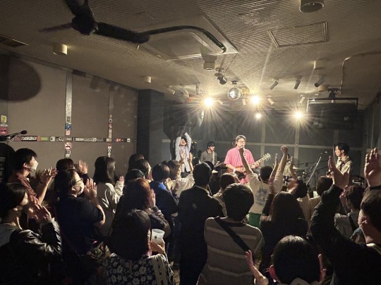
(写真は先日のBaconとのツーマ���の様子。楽しかった〜)
2 notes
·
View notes
Text
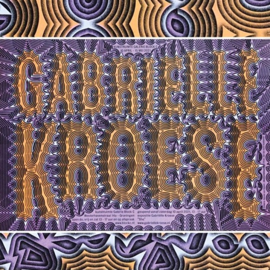
Hansje Van Halem (2021) • Galerie Block C poster for Gabrielle Kroese — 4 colours risograph 583 x 413 mm printed by Jo Frenken / Jan van Eyck Academie
#hansjevanhalem
#gabriellekroese
5 notes
·
View notes
Text


Stefan Peters from Hasselt, Belgium.
Fired by a fixed fascination with the language of painting, Stefan Peters (1978) has for some years been aspiring to fathom reality by disclosing the mechanics of representation. The artist makes uses of rhetorical devices such as reversals, mirror imaging and cutting to undermine the elegance of his painting technique. This results in scenes characterised by fairy-like as well as apocalyptic elements. Using indirect lighting, scenic shadows and brush strokes that refuse to take on any descriptive function, Peters dissects what is familiar to us. In his recent work, dream world and reality merge into one another. In his paintings, animations and installations, Stefan Peters not only creates images, but also sets out in search of their process of origination: the formation of the image. He explores the imitative qualities of painting, but knows that reality can also be evoked through alienating effects, image fragments or even the futility of a brush stroke. Just as silence makes the finest sound audible, Peters creates quietude in his paintings, so that even the smallest ripple becomes visually visible and acquires meaning. This is why, for Stefan Peters, creation does not only encompass the search for something new; using painting as his principle expressive means, it is for him always a rediscovery through which that which already exists is poetically revealed. Stefan Peters (1978) lives and works in Hasselt. He studied at the MAD Faculty in Genk and at the Jan van Eyck Academy in Maastricht. (Stef Van Bellingen)
1 note
·
View note
Text
Group Hug, September 26 at WSA
2024-09-26 7PM - 10PM EDT
161 Water St (Entrance on Water & John St.)
New York, NY 10038
join us for the opening of Group Hug, a new exhibition at WSA presenting large-scale videogame installations by Danielle Brathwaite-Shirley, Tale of Tales (Auriea Harvey and Michaël Samyn), and Theo Triantafyllidis.
For this exhibition, presented in partnership with Onassis ONX, Rhizome curated The Endless Forest (2005), a multiplayer online game and social screensaver by Tale of Tales (Auriea Harvey and Michaël Samyn). An attempt at creating a utopian game, in which online harassment is impossible, players wander an endless forest as deer, communicating only via sound and body language.
The Endless Forest is the duo's first foray into videogames, having made mostly websites under the collaborative alias Entropy8zuper! Since 1999. After becoming disillusioned with the web, Harvey and Samyn formed Tale of Tales in 2002, a video game studio out of the Jan Van Eyck academie, where they were practicing Design researchers. Back in April, Rhizome presented newly restored works by Entropy8zuper! as the first chapter of ArtBase Anthologies, with a celebratory event with Auriea Harvey and ONX on April 3.
0 notes
Text
Biography of Lode - photo of Lode at 2 years old drawing a train with his left hand with a stick in the sand. And yes, his hair was that light blonde.

ENGLISH TEXT: © Lode Coen 2024
Lode Coen, was born in 1952, in Antwerp, Belgium, the land of Rubens, Jan van Eyck, Magritte and Tintin. He hails from several generations of artists in his family: i.e. theatre makers, actors, musicians, composers and fine artists.
He is left-handed and started drawing when he was about two years old.
In secondary school, he studied classical languages, Latin & Greek.
In 1972, he was accepted to the Royal Academy of Fine Arts in Antwerp. He studied graphic design. He started his career, designing posters for the theatre and television in 1976.
He is an early adopter, always eager to learn new skills. He purchased his first Mac in 1984. This led in 1987 to an extended 10-year stay in Silicon Valley. He worked on many pioneering projects: video games, interactive movies.
As art and design director for Digital Pictures he managed a team of about 12 people and multimillion dollar budgets. He became an expert in CGI, special effects, 3D and UI design.
Back in the EU he founded his own company to create digital designs for IT companies in Silicon Valley for 18 years. Clients included Sun Microsystems, AMD, Intel, Bausch&Lomb, Pfizer, Oracle, Yahoo, PayPal.
For about 40 years he has taught at art and design academies throughout Europe, the U.S.A. and China. He was the president of Sint Lucas College, School of the Arts, in Antwerp (400+ students).
Lode studied Chinese for 10 years and this led to a tour in China. He gave lectures about his art and design practice in 20 top art universities in 10 major cities in 2016. He loves Chinese calligraphy. He is also well versed in Tai Chi and Qi Gong.
Since his retirement in 2017, he went back to his old love: creating fine art, but with the most advanced digital tools available.
His activity gained momentum in 2020. He won the Leonardo da Vinci Award in April 2023 in Milan. An ever growing number of awards, prizes, publications, exhibitions followed.
This culminated in winning the First Prize ‘Lorenzo il Magnifico” at the Florence Biennale in October 2023. Resulting in an exhibition at the Florence Academy of Fine Arts in January 2024.
Coming up: Galerie Espace Vision’Art, will host his solo exhibition, curated by Paul-Enzo, in the centre of Paris in December 2024. In October 2024 he is selected to participate in ‘Capsule Art Collection 4. Contemporary insights’, in Rome, curated by Dr. Monica Ferrarini. Also in October he will participate in the ‘Bienal de Arte’ at the MEAM in Barcelona, curated by Fondazione Effetto Arte.
Quote from Circle Foundation for the Arts—“Lode Coen's art is characterised by an exquisite fusion of elegance and surrealism, resulting in captivating and visually stunning imagery. Within his work, Coen has crafted a distinct visual realm where beauty, mystery, and the unexpected converge to form extraordinary compositions. While renowned for his mastery of CGI and Special FX, honed in the realms of both Silicon Valley and Hollywood, Lode Coen draws his primary inspiration from the Renaissance era.”
ITALIAN TEXT: © Lode Coen 2024
Lode Coen è nato nel 1952 ad Anversa, in Belgio, la terra di Rubens, Jan van Eyck, Magritte e Tintin. Proviene da diverse generazioni di artisti nella sua famiglia: vale a dire registi teatrali, attori, musicisti, compositori e artisti.
È mancino e ha iniziato a disegnare quando aveva circa due anni. Alle superiori ha studiato lingue classiche, latino e greco.
Nel 1972 è stato accettato alla Royal Academy of Fine Arts di Anversa. Ha studiato graphic design. Ha iniziato la sua carriera, progettando poster per il teatro e la televisione nel 1976.
È un early adopter, sempre desideroso di apprendere nuove competenze. Ha acquistato il suo primo Mac nel 1984. Ciò lo ha portato nel 1987 a un soggiorno prolungato di 10 anni nella Silicon Valley. Ha lavorato a molti progetti pionieristici: videogiochi, film interattivi.
Come direttore artistico e di design per Digital Pictures ha gestito un team di circa 12 persone e budget multimilionari. È diventato un esperto di CGI, effetti speciali, 3D e progettazione UI.
Tornato nell'UE ha fondato la sua azienda per creare progetti digitali per aziende IT nella Silicon Valley per 18 anni. Tra i clienti figurano Sun Microsystems, AMD, Intel, Bausch&Lomb, Pfizer, Oracle, Yahoo, PayPal.
Per circa 40 anni ha insegnato presso accademie di arte e design in tutta Europa, negli Stati Uniti e in Cina. È stato presidente del Sint Lucas College, School of the Arts, ad Anversa (oltre 400 studenti).
Lode ha studiato cinese per 10 anni e questo lo ha portato a un tour in Cina. Ha tenuto lezioni sulla sua pratica artistica e di design in 20 delle migliori università d'arte in 10 grandi città nel 2016. Ama la calligrafia cinese. È anche esperto di Tai Chi e Qi Gong.
Dal suo ritiro nel 2017, è tornato al suo vecchio amore: creare belle arti, ma con gli strumenti digitali più avanzati disponibili.
La sua attività ha preso slancio nel 2020. Ha vinto il Premio Leonardo da Vinci nell'aprile 2023 a Milano. Sono seguiti un numero sempre crescente di premi, riconoscimenti, pubblicazioni, mostre.
Ciò è culminato con la vittoria del Primo Premio "Lorenzo il Magnifico" alla Biennale di Firenze nell'ottobre 2023. Con conseguente mostra all'Accademia di Belle Arti di Firenze nel gennaio 2024.
Prossimamente: Galerie Espace Vision'Art, ospiterà la sua mostra personale, curata da Paul-Enzo, nel centro di Parigi nel dicembre 2024. Nell'ottobre 2024 è selezionato per partecipare a "Capsule Art Collection 4. Contemporary insights", a Roma, curata dalla Dott. ssa Monica Ferrarini. Sempre a ottobre parteciperà alla "Bienal de Arte" al MEAM di Barcellona, curata dalla Fondazione Effetto Arte.
Citazione da Circle Foundation for the Arts—"L'arte di Lode Coen è caratterizzata da una squisita fusione di eleganza e surrealismo, che si traduce in immagini accattivanti e visivamente sbalorditive. All'interno del suo lavoro, Coen ha creato un regno visivo distinto in cui bellezza, mistero e inaspettato convergono per formare composizioni straordinarie. Sebbene sia rinomato per la sua padronanza di CGI e effetti speciali, affinata nei regni sia della Silicon Valley che di Hollywood, Lode Coen trae la sua ispirazione primaria dall'era rinascimentale."
0 notes
Text
ELEMENTS 2024
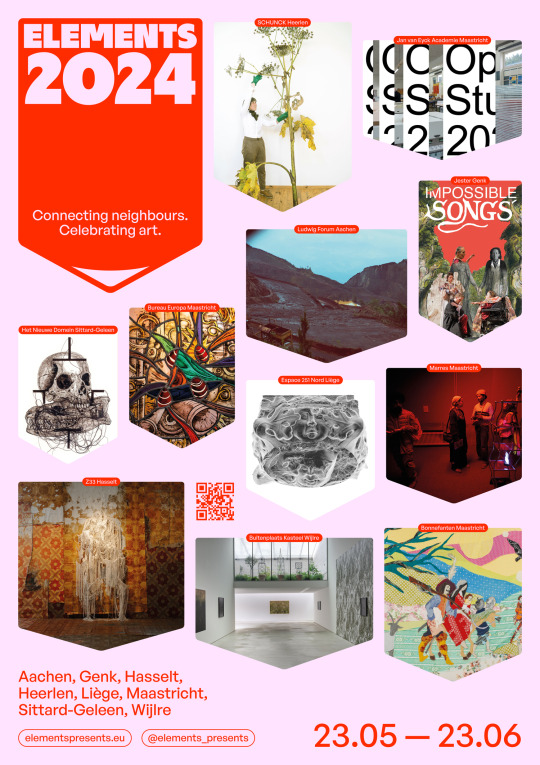
ELEMENTS 2024 : un programme culturel eurorégional unique
Après le succès de la première édition d'ELEMENTS en 2021, 11 institutions artistiques et culturelles eurorégionales ont à nouveau uni leurs forces. En collaboration avec le public, ce réseau d'institutions artistiques célèbre la diversité et la qualité de l'art contemporain et place l'Eurorégion Meuse-Rhin sous les feux de la rampe (culturelle). Entre Sittard et Liège et entre Hasselt et Aix-la-Chapelle, ELEMENTS 2024 présentera pendant un mois des expositions et des activités spéciales actuelles, diverses et novatrices. Une fête pour tous les sens.
Au cours d'ELEMENTS, tous les éléments de l'expérience artistique seront abordés : la création, la recherche, l'observation, l'expérience, l'expérimentation et le développement des talents. Outre les expositions, les institutions participantes organiseront des activités supplémentaires telles que des performances, des conférences, des visites guidées, des ouvertures gratuites en soirée, des ateliers et des studios ouverts.
ELEMENTS 2024 se déroulera du jeudi 23 mai au dimanche 23 juin.
Musées et instituts d'art participants en 2024 :
Bonnefanten, Maastricht
Bureau Europa, Maastricht
Het Nieuwe Domein, Sittard
Jan van Eyck Academie, Maastricht
Jester, Genk
Buitenplaats Kasteel Wijlre
Ludwig Forum, Aix-la-Chapelle
Marres, House for Contemporary Culture, Maastricht
SCHUNCK, Heerlen
Z33 Maison d’Art actuel, Design et Architecture, Hasselt
Espace 251 Nord, Liège
Quelques éléments que nous aimerions souligner:
- Vendredi 24 mai: visite guidée en espagnol et en anglais et Mestreechs par Opaque Spirits[1] d'Arturo Kameya[2] (dernier week-end!) à Marres, Maastricht
- Vendredi 24 mai : vernissage de l'exposition Hybrides/Renversements à l'Espace 251 Nord/la Comète à Liège
- Samedi 25 mai : vernissage de l'exposition et visite guidée Impossible Songs de Mikołaj Sobczak, au Jester à Genk
- Samedi 25 mai : Visite guidée en Allemand par Terrestrial Perspectives au Ludwig Forum à Aix-la-Chapelle
- Dimanche 26 mai : la productrice de télévision Karine Claassen présente Zondaggasten au Z33 à Hasselt. La première édition est un hommage à l'artiste Daan Gielis, un an après sa mort. Son œuvre est actuellement exposée dans le cadre de l'exposition Een sprong in het onbekende (Un saut dans l’inconnu)
- Vendredi 7 juin : Bonnefanten Free Friday à l'occasion de l'ouverture de l'exposition solo This is not the end of the road de Małgorzata Mirga-Tas à Bonnefanten à Maastricht.
- Dimanche 9 juin : visite guidée gratuite de Between Graveyard and Museum's Sphere à Het Nieuwe Domein à Sittard
- Mercredi 12 juin : dernière semaine In Vitro, les multiples vies du verre au Bureau Europa
- Jeudi 13 juin : Frictions Festival : Collecting Friends à SCHUNCK à Heerlen
- Dimanche 16 juin : programme Elements garden avec visites guidées et ateliers et conférence du philosophe botaniste Norbert Peeters au château de Wijlre
- Du vendredi 21 au dimanche 23 juin : Open Studios à l'Académie Jan van Eyck à Maastricht
0 notes
Text
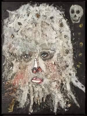
De Iconen van Rik Meijers
Rik Meijers. Ik zag zijn werk tentoongesteld in het Fries Museum, in 2002. Van de plaats die de wereld is, heette de expositie. In galerie de Praktijk bekeek ik een jaar eerder zijn expositie Mystieke Portretten. Ik vermoed dat het afgebeelde doek bij deze serie hoort, maar ik kan de titel van dit schilderij dat ik ooit deelde op mijn Facebookpagina niet terugvinden. In die jaren wilde ik graag een tekening van hem kopen, via zijn galeriehouder, maar ik kon de gevraagde 1100 euro net niet opbrengen.
Rik Meijers (1963, Rotterdam), volgde van 1985 tot 1991 opleidingen aan de Academie Beeldende Kunsten in Maastricht en de Jan van Eyck Academie in deze stad. Zijn laatste solo-expositie, I know where Rik Meijers lives, vond plaats in het Maastrichtse Bonnefanten, in 2022, maar die tentoonstelling zag ik niet.
Het werk van Meijers, die eigenlijk een hekel heeft aan schilderen en het liefst een blanco doek voor zich ziet, wordt in recensies vaak teruggebracht tot de gebruikte bierdopjes of kippenveren die hij in zijn doeken verwerkt.
Ik denk eerder dat hij Iconen schildert. Maar misschien kijk ik naar zijn werk door de bril van mijn katholieke opvoeding.
De laatste keer dat ik doeken zag van Meijers keek ik op van de locatie. Dat was namelijk de Nederlandsche Bank in Amsterdam, toen ik daar iemand interviewde die toevallig verantwoordelijk bleek voor de kunstcollectie.
#rikmeijers
0 notes
Text
if you are interested in western european art history yet keep calling every told timey painting you see "renaissance" style can i introduce you to what the different styles of painting actually look like?
Yes, wildly enough, THIS painting (The Arnolfini Portrait by Jan van Eyck [1434]) is actually High Renaissance art. You guys might not know how influential and, frankly, revolutionary this piece was. Before these kinds of paintings were being made, some of the most sought after paintings were simple portraiture that were very one dimensional, very flat and dully colored. This portrait was revolutionary because of its use of depth (see the mirror in the back) and its use of bright colors.

Other High Renaissance pieces include:


(In order: The Mona Lisa, Leonardo da Vinci, 1503; The Virgin of the Rocks, Leonardo da Vinci, 1508; The School of Athens, Raphael, 1509-11; The Creation of Adam, Michelangelo, 1512)
After the Renaissance ended, you see in Western art (primarily in a lot of British art) this shift towards taking elements of Greek and Roman statues and applying them to paintings. For example, Joshua Reynolds (first president of the Royal Academy of Art) painted this:

Commodore Keppel, 1753-54, based off of the sculpture Apollo Belvedere c.120-140 CE.
The combination of portraiture and landscape (headed in England by Thomas Gainsborough) was huge.
Baroque comes into play in the 1600s, one of the seminal pieces being:

Supper at Erasmus (1601) by Caravaggio, the Italian Baroque master. Do you see the differences between the renaissance paintings above and baroque? The big things to note here is the use of light and shadow (chiaroscuro is the artistic term here for the large contrasts between dark and light) and the idea that you as the audience are invited into the scene.


These two works, both by Joseph Wright of Derby, are also incredibly important works for Baroque--importantly, they depict scenes of every day life. (Left: An Experiment on a Bird in an Air Pump, 1768; Right: An Iron Forge, 1772)
So when you have photography, and you want to call something "renaissance art"...

^ This you could make an argument is Renaissance. Very flat, even lighting, portraiture

^ This you could argue is Baroque.
Of course "Renaissance" and "Baroque" in these contexts are for paintings, and were used to talk mostly about paintings (of course for architecture and sculpture as well) so you could argue about their efficacy when it comes to accurately describing photography. But yeah
"renaissance in the 21st century" when over half of those images are actually baroque. sorry .
77 notes
·
View notes
Text
People use art to help their well-being but also to draw attention to societal changes and issues. The combination of art and nature allows people to explore the natural world, create more profound meaning for themselves, and connect people through understanding and viewing their artwork. This article will discuss the importance of integrating art and nature and how various artists used nature to inspire them.
Throughout time, artists have used nature as a muse or motivation for creating different forms of art. Nature can provide endless forms of inspiration, and it can be a critical theme in many forms of artwork. Henry Matisse said, “An artist must possess nature. He must identify himself with her rhythm, by efforts that will prepare the mastery which will later enable him to express himself in his own language.” Artists use nature to express themselves but also to understand their work and themselves on a deeper level. To do this, artists may even use nature within their creations, such as wood, clay, water, and graphite, which are all-natural mediums.
There has also been some research done on the importance of art and nature to the well-being of others. Thomson et al. (2020) found that creative green prescription programs, which combine arts- and nature-based activities, can significantly impact the psychosocial well-being of adult mental health service clients. They recommended that museums with parks and gardens blend programs to incorporate nature, art, and well-being. Kang et al. (2021) found that nature-cased group art therapy positively affects siblings of children with disabilities. This type of art therapy increased their resistance to disease and their self-esteem while alleviating stress.
The Jan Van Eyck Academy in the Netherlands has opened a lab for artists to do their own nature research. They created a facility to support woodworking, printmaking, photography, video, and metalwork while allowing artists to explore their work and relationship with nature. This lab gives the artists a chance to consider nature in various ways, including its relation to ecological and landscape development issues to begin to bridge a gap between humankind, nature, and art. There needs to be more scientific research on the importance of nature and art; however, we see that artists are already beginning to research how nature affects their work and overall mindset.
How have artists used nature in their work?
Renowned artist Vincent van Gogh, was able to bring aspects of nature to life in his paintings. His work has allowed people to understand nature in different forms and bring people together. A recent exhibit of his work brought people together for a visual and thrilling experience.

Photos taken at the Immersive Van Gogh Exhibit Chicago from Sam Iwinski 2021
Nature also inspires modern artists, such as Mary Iverson, who draws inspiration from the natural beauty around her. Her paintings offer a contemporary spin on traditional landscape art, and she uses monuments, national parks, and societal issues (like climate change) as inspiration. She began addressing climate change in her art because she wanted to combine her environmental activism and painting interests.
Another modern artist, Miranda Lloyd, creates contemporary abstract nature art, such as trees, birds, and other naturalistic nature scenes. She uses inspiration from her own backyard and paints many scenes that are inspired by the sea. Miranda is an excellent example of how you can be inspired by nature within and outside of your home.
Additionally, items from nature can be used to create new forms of art. Renowned artist Daniel Poppercreates larger-than-life sculptures, and many of them are designed with forms of nature. He currently has an outdoor exhibit at the Morton Arboretum in Lisle, IL, called “Human+Nature.” This exhibit connects people and trees through sculptures and other forms of art. As stated on the Morton Arboretum’s website, “People rely on trees for clean air to breathe, shade to cool, and beauty that can bring joy and relaxation, among many other benefits. In turn, trees need people to care for them to thrive and share their benefits, especially in a changing climate.” Individuals can begin to reimagine their relationships with trees as they explore these large-scale artworks. Below are a few pictures from his exhibit!
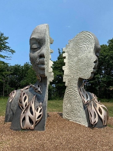
Photos taken at the Morton Arboretum from Sam Iwinski 2021
1 note
·
View note
Text
0 notes
Text
Speakers Research - Joseph Churchward


About Joseph Churchward:
Joseph Churchward was born on 20 August 1933 in Apia, Western Samoa. He was an internationally renowned typeface designer whose work record covered billboards, newspapers and popular literature such as posters and brochures worldwide during his lifetime. He hand-created around 700 typefaces, drawing upon influences from his Pacific heritage and family. These included Churchward Samoa, created in honour of his homeland; Churchward Māori and Churchward Ta Tiki, which reflected his relationship to his adopted land and fonts acknowledging his Chinese heritage.
Above is one of Joseph's significant works from Churchward international typefaces, a book of collected essays and images of his work, which David Bennewith published. Churchward's work was featured and discussed in a Wellington international symposium on the type. Acknowledged for his leadership, vision and achievement in New Zealand and abroad, Churchward was awarded the John Britten Black Pin by the Designers Institute of New Zealand in 2009.
Image Source:
Left Corner: Te Ara, Joseph Churchward at work, unknown published date
Right Corner: D&AD, Jan van Eyck Academy, Churchward International Typefaces, 2005
Bottom photo: The 10 sons of Manu, Joseph Churchward at his home studio in Hataitai, Wellington, New Zealand, unknown published date
Research Cited:
0 notes
Text
Major Sir William Newenham Montague Orpen, KBE, RA, RHA (27 November 1878 – 29 September 1931), was an Irish artist who worked mainly in London. Orpen was a fine draughtsman and a popular, commercially successful, painter of portraits for the well-to-do in Edwardian society, though many of his most striking paintings are self-portraits. During World War I, he was the most prolific of the official artists sent by Britain to the Western Front. There he produced drawings and paintings of ordinary soldiers, dead men, and German prisoners of war, as well as portraits of generals and politicians. Most of these works, 138 in all, he donated to the British government and they are now in the collection of the Imperial War Museum. His connections to the senior ranks of the British Army allowed him to stay in France longer than any of the other official war artists, and although he was made a Knight Commander of the Order of the British Empire in the 1918 King's birthday honours list, and also elected a member of the Royal Academy of Arts, his determination to serve as a war artist cost him both his health and his social standing in Britain. After his early death, a number of critics, including other artists, were loudly dismissive of his work and for many years his paintings were rarely exhibited, a situation that only began to change in the 1980s. Born in Stillorgan, County Dublin, William Orpen was the fourth and youngest son of Arthur Herbert Orpen (1830–1926), a solicitor, and his wife, Anne Caulfield (1834–1912), the eldest daughter of the Right Rev. Charles Caulfield (1804–1862), the Bishop of Nassau. Both his parents were amateur painters, and his eldest brother, Richard Caulfield Orpen, became a notable architect. The historian Goddard Henry Orpen was his second cousin. The family lived at Oriel, a large house with extensive grounds containing stables and a tennis court. Orpen appears to have had a happy childhood there. Orpen was a naturally talented painter and was enrolled, six weeks before his thirteenth birthday, at the Dublin Metropolitan School of Art. During his six years at the college, Orpen won every major prize there plus the British Isles gold medal for life drawing before leaving to study at the Slade School of Art between 1897 and 1899. At the Slade Orpen mastered oil painting and began to experiment with different painting techniques and effects. He would include mirrors in his pictures to create images within images, add false frames and collages around his subjects and often make pictorial references to works by other artists in his own paintings. His two metre wide painting, The Play Scene from Hamlet won the Slade composition prize in 1899. Orpen's teachers at the Slade included Henry Tonks, Philip Wilson Steer and Frederick Brown, all of whom were members of the New English Art Club; they ensured he exhibited there in 1899, and that he became a member in 1900. Orpen's The Mirror, shown at the NEAC in 1900, references both Jan van Eyck's Arnolfini Portrait of 1434 and also elements of seventeenth-century Dutch interiors, such as muted tones and deep shadows. Orpen depicted the 'Arnolfini' convex glass in several other paintings, including A Mere Fracture in 1901, during this period. Also in 1901, Orpen held a solo exhibition at the Carfax Gallery in central London.
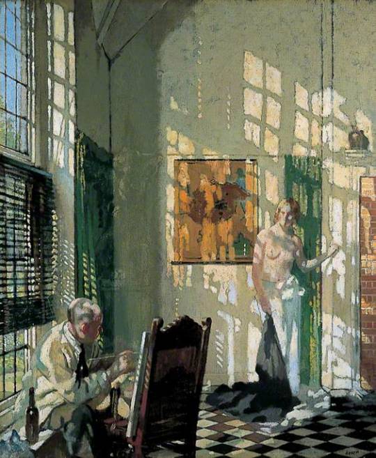
William Orpen (British, ) • The Studio • c. 1910 • Leeds Art Gallery, West Yorkshire, UK
82 notes
·
View notes
Photo
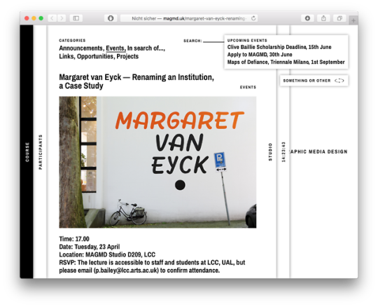
Margaret van Eyck Academie goes London College of Communication: Next Tuesday, April 23, I will be giving a lecture at LCC, hosted by the MA Graphic Media Design & Paul Bailey!
http://magmd.uk/margaret-van-eyck-renaming-an-institution-a-case-study/
#Margaret van Eyck Academie#Jan van Eyck Academie#Van Eyck#LCC#London#MAGMD#Lecture#Hagen Verleger#Paul Bailey#Renaming#Institutional Critique#Feminist Intervention
0 notes
Video
Jan van Toorn_Jan van Eyck Akademie Design Beyond Design, 1997 by David Cabianca Via Flickr: Original conference program brochure, front cover.
1 note
·
View note