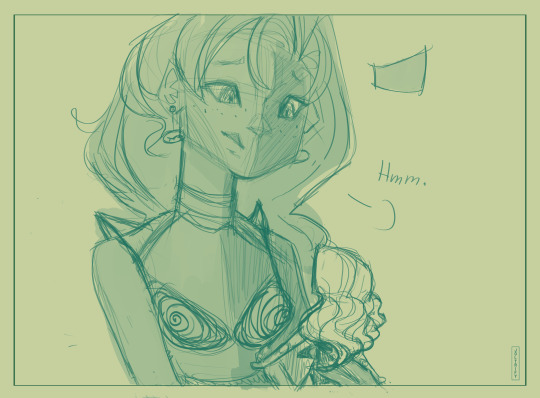
#Its an outfit concept for her! AND SHE LOOKS GORGEOUS
Explore tagged Tumblr posts
Text
Now we're onto late 2023 to early 2024 art!!
I didn't draw much mid 2023 lol

TW: Multiple Eyes and Arms


#MarshMeliaArt#Some are ocs and some were for my pfp!#The guy with the purple background and pointed ears is Tobias! he's a D&D character hehe#Tobias is a vampire and i love him so so much the campaign is still going#though i cant really call it DND because i oversimplified it... im a fraud...#The last three are OCs!!#Yellow bg dude is Dr. Happy but thats his old design im redesigning him currently!#Pink hair girl on the plate is Piiyo! shes... my most traumatized oc.... paying respects#THEN IS MY LOVELY SWEET GIRLBOSS DAUGHTER LAYLA MIYAMURA EVERYONE CLAP I LOVE HERRRRR#Its an outfit concept for her! AND SHE LOOKS GORGEOUS#Tpose Layla cant hurt you#Tpose Layla:#OC art#artists on tumblr#multiple arms#multiple eyes#Thats Lilith btw! not much that i will say about her though hehe#Girlboss with the bonnet and curly hair is an OC too!
3 notes
·
View notes
Text
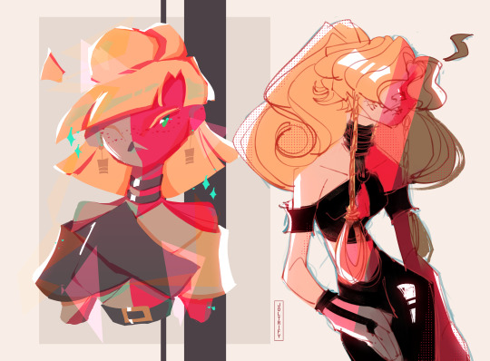
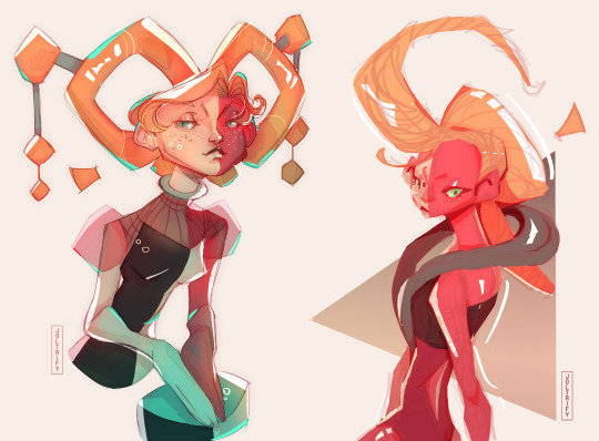

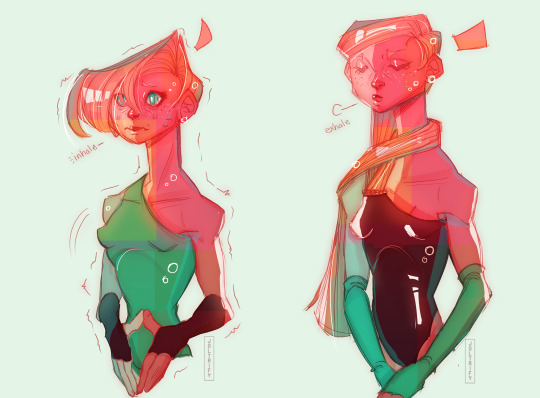
experimentations ft. the Artpop queen herself
Silly little (not so little) unrelated HC I developed later under the cut
₊˚ ‿︵‿︵‿︵୨୧ · · ♡ · · ୨୧‿︵‿︵‿︵ ˚₊
🎀- HC that EVE's most normal hobby - when not occupied with other things - is repainting dolls 🎀- Like in a blue moon you can catch her at the hobby lobby in mom jeans and a cardigan just looking for materials
★- In her down time (which is a bit rare these days) Nadia'll pick those ball-jointed Barbie/Bratz/MH dolls and give them a complete makeover ☆- While she's making them she's fervently thinking 'I will love you in a way that no one else EVER has' and she treats them all that way ★- She'll repaint them in the most unconventional ways possible but they're still gorgeous; a perfect reflection of her studio artwork on a body that isn't her own ☆- Sometimes if she's low on fabrics, instead of making a full-sized mockup of her exhibition fits she'll use her dolls to test the outfit design and make a mini version of the fit with small pieces of the final material ★- She's got this HUGE shelf on her pad that's got these fashion icon dolls displayed with their name and inspiration on a little plaque ☆- Whenever something significant happens and she doesn't want to paint, she'll hold onto the feeling, good or bad, and jot down an idea for a new doll's look ★- and she DOES truly love each of them - though she may have had to learn to love one in particular
🎀- She picked up the hobby in college (before she met Zuke) but didn't really think anything of it 🌸- It was just a means to practice different makeup looks and pencil techniques without sculpting something - and it was fun! She liked having a cute little gal at the end of the process 🎀- When she came up with the idea of using the dolls as models, she created a doll of herself but made the decision to make its skin completely white 🌸- When Nadia met Zuke, she sort of put the hobby aside to focus on her other art mediums, but she looked at the doll of herself and felt comfortable enough to repaint the right side pink (and she laughed a bit to herself looking at the final result, because it looked... Cute! Just like her other gorgeous dolls...) 🎀- After Rapturica, she didn't feel the need to create a doll based on her feelings as she didn't feel as hurt as she expected, but she did find it really, REALLY hard to look at the doll of herself, so she hid it away... 🎀- she picked up repainting again later but went in HARD - they began to look more artsy and alien, just like her other art pieces 🌸- After graduating she didn't really have time to repaint dolls and focused on creating other arts/music again, only occasionally using them to test outfits (but never the one of herself) 🎀- After the events of NSR though, she picked it up again as a form of self-care. It's something she doesn't have to create for the public eye, and she's rekindled the joy of creating a strange little gal and loving them despite their bizarre quirks. 🌸- ... I think she feels a bit more comfortable looking at the doll of herself now, too.
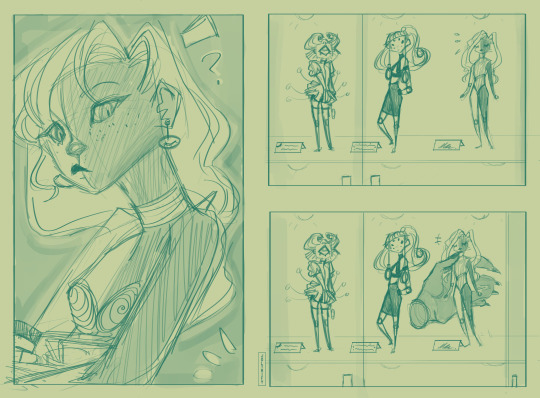
★- She's probably still got doll repaint videos up on her channel from her college days, hehe. ☆- (She's debating whether or not to make a mini exhibition about the concept of dolls.* Likely not, as she doesn't want to taint the tranquility of the act, but she still likes the idea. It's better to not mix work art with home art, anyway.) (* (How they can reflect their caretaker, they exhibit both confidence and vulnerability, they can be broken and discarded but repaired, they're still images that can be moved in a 3d space however you desire, they rely on a person to actually be 'real' ykyk that kind of thing. the symbolism of dolls.)
The doodle I made in the 3rd picture (above the cut) is inspired by those really pretty doll repaints... I think that that look in particular is one that she tested on a doll first... pre-ugly cry, that is.
Thanks for reading my very silly idea... decorated the bullets with Bows and stars because I felt like it, haha. Have a lovely day~🌸
#how does she even get her hair to do that she's so powerful...#(kinda popped off with the last one ngl ✋🙄)#i had a doodle of little Eve in my folders almost 4 years now so i decided to draw her again to see how my style's changed#i really forgot how much fun it is to just throw colors on the board... highly recommend!!!#also doubles as a destresser so it was a little relaxing :]#art#digital art#digital painting#fanart#nsr#nsr fanart#no straight roads#no straight roads fanart#no straight roads eve#nsr eve#nsr nadia#nsr eve fanart#end my suffering
601 notes
·
View notes
Text
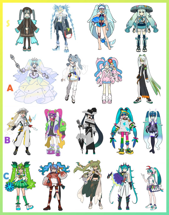
This is my Miku pokemon trainer tier list
For this tier list its both my favorites and what i consider a very good miku design
Of course all of them are good miku designs but some shine above the rest
S tier- my absolute favorites Bug miku is so classy, so well thought out, and i think the brown looks amazing with her teal. Shes everything A close tie with bug miku is Ice miku her hair is everything to me im in complete love with this sharp miku. Water Miku is basic but that's all she needs in lovely simplicity, truly feeling like Miku in this world as a water trainer especially with her tan lines from her original outfit it feels like this is her off time from being an idol! Steel Miku had my heart as soon as I saw her with Jirachi. Which was my favorite pokemon when I was a child [it was prior before i even had any pokemon games of my own and only watched the movies] The colors, the motif of star, the hat and the hair its all wonderful to me!
A tier- Amazingly done concepts and totally miku! Rock Miku's dress and veil is lovely, i love they incorporated the veil as mock pigtails. If this was the verison of her without the dress then she would have been in S tier. I love the jester look but thats my own personal preference. She also reminds me of diance with the dress.
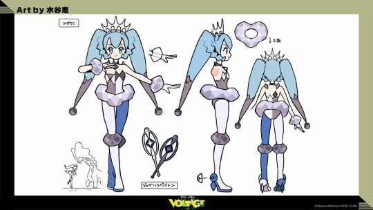
Flying Miku is gorgeous, the wispy hair, the translucent areas to mimic clouds and mist. It's an amazing concept and wonderfully executed design! Fairy miku i know is everyones favorite and it's obvious to see why, shes adorable and cute and I too would love to draw her. She has that appeal to her down to a T. Fighting Miku is something i've been waiting for this whole time. Of course no way they could do a pokemon collab with miku and not include farfetch'd! It's a sleek and simple design that takes traits of the original miku's outfit and tweaks them. Though she does kind of remind me of maka from soul eater just a small bit.
B tier- Great concepts! Electric Miku's lightening pigtails are so cute she looks like a little adventure/farmer of currents. She stands on her own as a design and as a tie to miku. Poison type Miku i would have done the same doing mucky/slime twintails though i probably wouldn't have thought to use the new alolan muk which is a very good look and helps add in the colors. It's a great design and while i wouldve put her in A tier some of her design elements hold me off. This is a top tier character design though trust me Dark Miku, i love she came with obstagoon. Though at first i couldnt even tell if miku had pigtails in the artwork. This reminds me just of a nice miku for a cover of an existing song which is not bad it's just how it feels. Normal type miku has good colors, shes paired with an active singing pokemon and while it's simple I think it conveys miku well enough. Though she keeps reminding me of the oversaturated stereotype of early 90s fashion. now on Ghost miku, shes higher than i'd actually put her but for her concept and simplicity of staying to miku but as a glitched out ghost version of her i do have to give props to that even if i find it more on the plain side. I think they succeeded in what was necessary even though this portrays miku AS the ghost instead of just a ghost trainer. ....honestly now that i type my words i feel like i was right and shouldve stuck with her in C tier.
C tier- too basic for my tastes yet still well done Grass miku is cute and all but if you told me she was unrelated to miku, i could believe you. Just that it'd be a fandom joke to call her 'green miku'
Fire miku, reminds me all too much of the anniversary miku song and im sure thats where they got part of the insipration from it but it doesnt really do much for me combined with the fire aspect and how her hair is shaped. I know its to mimic the pokemon shes with its just personal taste on that one. The silhoutte is good.
Ground type miku i had to keep looking up because i forget what shes supposed to be numerous times. Same case with grass miku, i could see someone telling me shes from x thing and unrelated to miku. I'm just not a fan of the design and colors but it's well done. I know when something is just my subjective taste rather than poorly done.
Dragon miku while i'm not the biggest fan of all the cowlicks going down the twintails i know it's purpose is there to mimic the spiked tail of a traditional dragon and i wouldn't want them removed. I think i especially just don't like the tacked on half shawl cape it feels disjointed. Yet i find its a nice concept they did both an almost knight look for her as dragon as always with the concept of knights and dragons battling. Now the knight trainer is battling with the dragon as comrades.
Psychic type miku- i think they started with the least interesting and noteworthy one honestly. It just looks, kind of uninspired but thats rude to say. I know shes here to fufill the concept of miku as a trainer in pokemon and well it just looks like she's her own trainer class that'd have multiple running around looking the same instead of a stand out like a rival or a gym leader in game.
101 notes
·
View notes
Text
Why I don’t like the “Amy is actually an Echidna” theory
One theory that I hate with the fury of a thousand suns don’t vibe with is the “Amy is Actually Part Echidna!” theory because not only is it easily disproven by looking at the source material, it also disregards the reason behind Amy’s redesign.
Heres their reasoning: Amy’s quills hang down like an echidna’s, she has a longer tail than the boy hedgehogs, in The Remake We Do Not Speak Of she has similar shoes to Knuckles, Amy is strong like Knuckles, her redesign debuts in a game that focuses on echidna lore, she has no back quills, her color scheme is similar to Knuckles, etc.
And while these things may be true, the same game that debuted Amy’s redesign introduced another character: An echidna girl named Tikal.


(Credits to Sonic Channel for this gorgeous artwork!)
If the plan was to recon Amy’s status as a hedgehog, the best way to do it is to have the only onscreen girl echidna look similar to Amy, right?
Well, let’s look at how their designs match up.
While their “hair styles” are similar, Tikal’s quills are smaller and more numerous, all of them hanging down like hair, while Amy’s are bigger, with her “bang” quills being just as spiky as Sonic’s.
They may both have long tails, but Tikal’s is in a long zigzag, while Amy’s, while longer than a male hedgehog’s, is short in comparison to Tikal. The biggest difference between the two though, is their face.
Amy’s has ears atop her head, Tikal does not, Amy has conjoined eyes, Tikal has separate ones, Amy has bangs, Tikal doesn’t, Tikal has a long muzzle, Amy has a short one, Tikal’s color is the same all around but Amy has peach colored arms, and Tikal’s head is egg shaped while Amy’s is spherical.
“But Rosy! Amy doesn’t have a back quill!!”

In Amy’s original design, she had one back quill, 5 head quills, and 3 1/2 ‘bang’ quills. But lets stop talking abt Amy for a sec, and focus on a boy hedgehog, specifically Silver.

Silver’s existence proves that hedgehogs can have different quill styles than Sonic’s. In fact, some of his concepts had him with no back quills at all!
Quills as a whole are treated similarly to hair within Sonic’s universe (insert gif of Shadow fluffing his quills) and thus can be styled. Or cut in Amy’s case.
“But if they really intended for her to be a hedgehog, then why did her design change so drastically for the game that focuses on echidna lore?”
Simple.
It shows that Amy has grown from that scared little girl in Sonic CD, who was nervous about beating Sonic, who needed a car to catch up with the others. Just an outfit change wouldn’t do, as you can see in the below picture.

She was going from 8 to 12, they needed to honor that, and to best showcase her growth, she needed a quill cut. Ask anyone, the best way to change your appearance is a haircut. Just as Sonic’s quills grew longer, Amy’s were cut short.


Also:

Sonic’s quills have been shown to be in a similar style as Amy in his dark spine form, yet not one person has pointed this out as a reason that Sonic himself is part echidna.
We also need to remember that hedgehogs and echidnas are similar species and thus look alike. Its shown in Sonic X (a tv series directly overseen by Sonic Team btw) that echidnas and hedgehogs get mixed up a lot, to the point of irritating Knuckles.


“What about Amy’s super strength?”
Amy isn’t the only super strong hedgehog. Shadow’s speed is canonically from his Air Shoes, meaning without them, he only matches Sonic in strength. Silver isn’t a speed character, with his gameplay being focused on puzzles and flight, and he was strong enough to deck Sonic six ways to Sunday, only able to be stopped by Amy.
Amy’s physical strength has only recently been made a big part of her character, with her gameplay focus being acrobatics (triple jumps and such) since Sonic Adventure. She is strong (wouldn’t be able to use her hammer effectively if she wasn’t), but her true strength is her heart.
She has taken down some of the physically strongest characters through her empathizing with them (Gamma, Shadow, Silver, Metal Sonic, Trip, Bark, etc). Her loving and passionate nature is why she has a pink, white and red color scheme to begin with.
Echidnas have been shown to have longer muzzles, thinner quills, no bangs (despite what Archie might say) longer tails that zig zag, egg shaped heads, separate eyes, no back quills ever, and have been proven through all of Knuckles character descriptions to be extinct except for him.
Hedgehogs have small muzzles, conjoined eyes, thick quills with bangs in some cases (like Silver and Amy), short tails (with girls’ being slightly longer) back spines that can be cut, ears on top of their head, and, judging by the amount of hedgehog characters, they’re not nearing extinction. Just because the only example of a girl hedgehog in the games has a similar quill style to echidnas doesn’t mean that they are the same.
In other words, Amy is a hedgehog, always has been, and always will be. Just because she got the Hedgehog equivalent of a haircut doesn’t make her an echidna or part echidna. To me this theory feels like an attempt to separate Amy from the other hedgehogs so she can be “interesting”. It’s ridiculous, and it messes with Knuckles’s backstory as the last echidna.
#sonic the hedgehog#amy rose#amy rose analysis#design analysis#character analysis#amy rose is a hedgehog#not an echidna#rosy rambles#sth#that one post by Gooseworx inspired me to post this
7 notes
·
View notes
Text
my 5 favourite k-pop music videos <3
I love music videos, and in k-pop there are a lot of mildy shitty ones, but there are also some amazing ones that are just as iconic as they are aesthetically pleasing. Obviously budget will come into play here, so big 4 groups will be more prevalent on this list, but I tried to be as fair as possible, within reason. Also, I'm a girl group stan, so don't expect many boy groups. Obviously I will forget some, but maybe I'll make a part two, and you are very welcome to leave your fave mvs in the rbs or comments. This list is in no particular order, lets gaur
1. 'Feel Special' - TWICE (JYP Ent.)
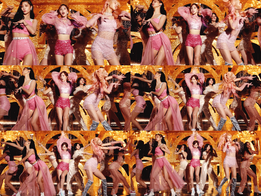
This music video inspired this list, and for good reason. 'Feel Special' is in my opinion, the epitome of Twice, as they stand today. It encapsulates their more mature concept post 'Yes Or Yes', but it doesn't alienate their debut cuter concept, it rather welcomes it with open arms and celebrates it as a part of Twice's history, something their newer releases occasionally struggle with. Visually its a feast, its decadent and lavish, and positively gorgeous. Each member has her own movie-esque set, employing various genres and aesthetics, and then the members unite in the most glittery set ever concieved, the gold contrasting their raspberry and champagne outfits magnificently, while also referencing the group's official colours, as seen on their lightstick. The whole video is cinematic and opulent, and every detail, down to Sana's dip died pink hair, and Nayeon's stunning ginger curls which I wish she would bring back, is flawless. The only gripe I have is Chaeyoung's unblended foundation in her solo scene, but hey, we aren't all be perfect. My favourite scenes in this video are the afor-mentioned glittery golden arches group scene, as well as Jihyo's rainbow vintage television scene, that was surprisingly ahead of its time in terms of its retro aesthetics. It's a must-watch music video for the history books, and it's Twice's best song too - it deserves no less.
2. 'Why Not?' - LOONA (BlockBerry Creative - ew)
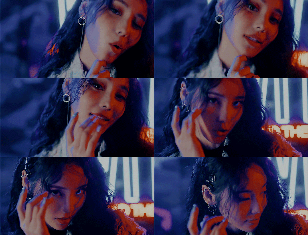
Note: If you would like to watch this m/v, please stream it from a non official yt channel, in accordance with the boycott. They will usually be marked with 'Boycott Ver.' in the title or something similar.
Loona has a lot of amazing music videos in their arsenal, but 'Why Not?' goes above and beyond. It's one of the most visually striking music videos I have ever seen, and its grasp on colour, composition, and rhythm is completely unparalleled. It's vibrancy is just gorgeous, full of neon lights and shining metallics. The video exists in a constant state of dichotomy: both cool and warm, metropolitan and pastoral, manmade and fantastical. You would assume this would ruin the video's visual message, but the contrast actually enhances it, as well as furthering the group's lore. it's unafraid to experiment with aspect ratio and camera movement, and along with the subversive editing, the final product is unique as well as timeless. Who cares that the last five scenes were neon and retro-futuristic? It's time for Heejin and Hyunjin's black and white minimalist mildly 1920s suited up dance break with a 4:3 aspect ratio of course! As the song itself says, why not? It's as playful as the song, as well as being visually stunning. My favourite scenes include Choerry's upside down mirror moment with the neon lights, as well as Kim Lip in the field with the funky glowing orbs, and of course the cult circle on the moon scene. Fucking iconic.
3. 'Ditto' (Sides A & B) - NewJeans (Ador)
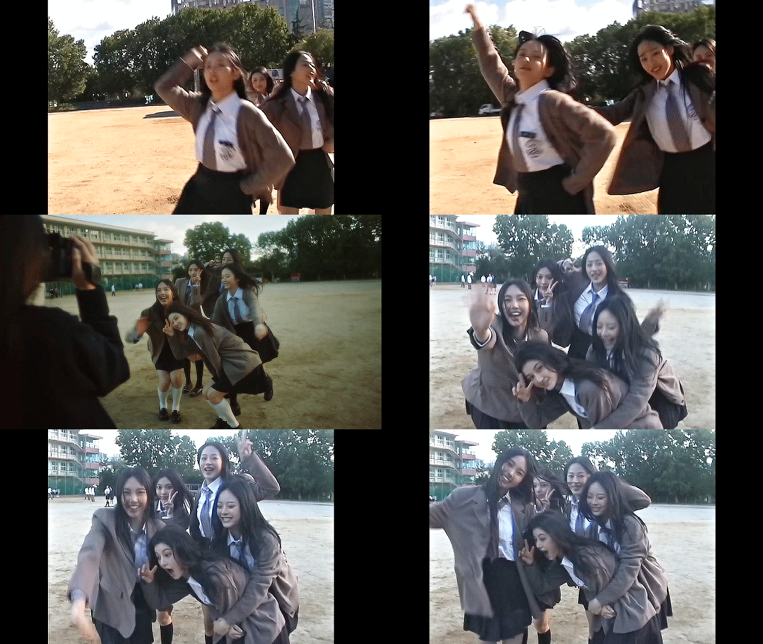
Note: I have a full review of this song, if you are interested.
Where the other videos on this list are overwhelmingly vibrant or cinematic, 'Ditto' is understated and personal. Arguably one of the most influential k-pop music videos of all time, it breaks every rule of what a music video of this genre looks and feels like, rejecting glamour and high fashion for an unromanticized schoolgirl aesthetic surrounded with melancholy. It's heartfelt and unassumingly tragic, and truly makes the viewer yearn for a time they only half remember. It is one of the most beautiful pieces of cinema I have ever seen, and I am so happy that K-pop stans loved it to death as I did, despite how starkly different it is to most everything in k-pop before it. It does however remind me of f(x)'s '4 Walls' m/v, which isn't a shock as Min Heejin (ew) was their creative director also. It also has vibes of the cult classic (?) Japanese movie 'All About Lily Chou Chou'. It has sparked many trends in the industry, including but not limited to: b-roll interspersions, the typical schoolgirl aesthetic, and the general rejection of the polished, glitzy vibe we expect of k-pop idols. Their impact on trends is notable, but in my opinion, no one has executed this aesthetic to the standard that NewJeans has. The unassuming tragic beauty of 'Ditto' is difficult to put into words, you must go and watch the two music videos for it - they are life changing.
4. 'Kill This Love' - BLACKPINK (YG Ent.)
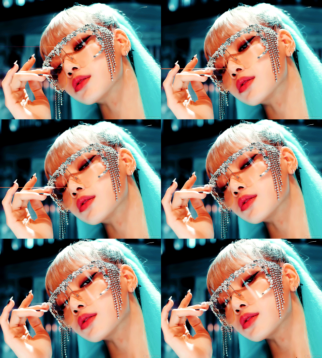
Say what you will about Blackpink, but they KNOW how to do a music video, and 'Kill This Love' is one of their best; it is beyond extravagant. The sets are huge and striking and insane - Jennie floats on the heads of two enormous swans and all four girls dance in the middle of a huge fucking BEAR TRAP and its ridiculously cool. The fashion and styling is amazing too - my fave looks include Jennie's Lara Croft moment with the braid, Lisa's big ass fur coat from her cereal scene, and Jennie's gorgeous eye makeup from her shopping scene with Lisa. In a word, 'Kill This Love' is extra(vagant). Even the scenes that are conceptually ordinary - Lisa's cereal aisle, Rosé crying in her car - are elevated into the extraordinary. There is no real storyline or through line between the scenes other than their saturated colour palettes and the members themselves, but who cares? The members look like fucking goddesses, the dance looks amazing, and there are MULTIPLE jaw-drop moments throughout the runtime - what more do you want? Where 'Ditto' rejects the typical k-pop visual aesthetics, 'Kill This Love' epitomizes them. If I wanted to explain to western pop stan what k-pop is about, this is the video I would show them first. My favourite scenes include: the group scene with the exploding statues and the bad bitch combat outfits, Rosé caught in the storm with beautiful lighting, and THE BEST SCENE IN A BLACKPINK MUSIC VIDEO EVERRRR... Jisoo's goddess moment with the sun and the reflections. Nobody does music videos quite like Blackpink.
5. 'What Is Love?' - TWICE (JYP Ent.)
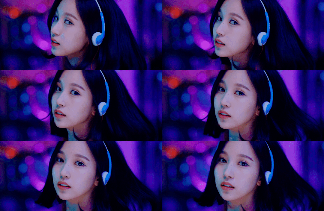
This music video is so unbelievably special to me. It doesn't break any boundaries with camera movement, editing, or aspect ratio like 'Why Not?', and it doesn't entirely reinvent the typical k-pop music video like 'Ditto' either, but I think it is one of the best music videos ever because it is so FUN. 'What Is Love' is a music video that is a series of references to iconic movies, most of which being about love, as the title suggests. It harkens back to 'La La Land', 'La Boum', 'Pulp Fiction', 'The Princess Diaries', and many more, with the girls playing the characters, on their fictional discovery of what love truly is. It's so special to me because it reminds me of doing exactly what the girls are doing with my best friends and my big sister - trying to learn what love is from the movies is something almost everyone has experienced, and thus the whole video feels nostalgic both for its references, and for its overall concept. It's fun and lighthearted and a memory of simpler times. Oh, to be a 12 year old obsessed with 'The Princess Diaries' again, to be a tween watching 'Pulp Fiction' with your big sister when it's probably not age appropriate, to be young teen watching 'La La Land' right when it came out. What a time to be alive. That's what 'What Is Love?' is, it's a celebration of life, of growing up, of being just a little naive and knowing it. Iconic, truly.
#this was so fun#should i do a part 2???#lmk ur fave mvs too#twice#feel special#what is love#sana#mina#momo#jihyo#nayeon#jeongyeon#tzuyu#dahyun#chaeyoung#loona#loona boycott#why not#loona why not#loona ot12#jinsoul#choerry#kim lip#yves#chuu#olivia hye#gowon#yeojin#heejin#hyunjin
44 notes
·
View notes
Note
I absolutely love the redesigns you showcase! They’re so gorgeous and the artists are talented!
Can I ask for your opinion on the design of my Dottore Segment OC Natalia? Keep in mind I didn’t make her outfit design as complex as hoyo does for their characters because I am not drawing all that detail.


OOUGHH
I am a sucker for multi-layered, long dresses. It gives a very medical vibe, which can either be inviting (ala cute/trusting nurse) or can be intimidating. They defo give off the latter vibe, like a creepy WW1/WW2 style nurse garb. Also the curly but still spiky hair makes me think of rose petals with thorns somehow <3 I also adore the little rope that keeps the mask and feathers attached to her shoulder, its a nice bit of asymmetry :D
Also I 100% get you on not wanting to draw all that detail!!
I actually study concept art at the moment, so I know a decent bit about character design. I'll put a more detailed analysis of the design + some ideas for them under a cut so you can choose whether or not you wanna read that, but I think she's super cute and I love her name <3 I would pull her
So the biggest thing I've noticed is that the design could use a bit more contrast, but since they're still meant to be monochromatic like Dottore's design, I'll compare to him to show what I mean by contrast!

If we put a black & white filter over the image, we can see that dottore has a lot of dark layers underneath bright layers, and then more dark layered on that! The contrast could be increased on her existing clothes (make the lightest colours lighter, make the darkest a bit darker) or you could add a few more layers so that contrast is spread throughout, instead of being localised to the mask & boots.
You could make the belt on her skirt a darker colour, change the shoulder piece to be darker, brighten the shirt, etc!
Another way Dottore's design has contrast is through the greys:

If we look here, his boots are actually more of a warm grey. This is the same with all of the metal detailing too! So even though his design is very monochromatic since it's all blue, there's a tiny bit of contrast created by making the neutrals warm tinted.
All the neutrals are slightly yellow/green hued, so they're warmer than blue without being extremely far from blue :) So you could make Natalia's boots & gloves more warm hued to get additional contrast :D
Lastly, you could exaggerate her silhouette by adding more volume to each of the layers of her skirt.
I don't have my tablet on me right now so I just did a quick draw over to show what I mean:

Just having each layer stick out a bit more so it stands out. You could also exaggerate the feathers on her shoulder if you wanted :D The simplicity of the outfit works super well for her actually, so having each layer stand out more will really elevate that!!
Despite the long winded explanation of colour theory, I really like her design and it'd only need a couple adjustments to improve, but she's so cute as is and you did an amazing job making her <3
OH AND LOOK AT WW1/WW2 NURSES they're amazing inspiration for plague-doctor style dresses. I used them as reference in one of my character designs for an assignment.
#genshin oc#genshin impact#genshin fanart#SHE'S VERY CUTEEEE#you did a good job of making her silhouette very clearly bottom heavy/down turned as opposed to dottore's more top heavy design#it's super cutee#even the feathers and her hair curl down to the bottom to help with that#but yes you did amazing and tysm for sharing with mee!!!#DM me whenever you want if you need more explanation or advice
8 notes
·
View notes
Text
Mafia au
"So how to go guys" I smiled at My Returning friends Vasilia Pushed a foil wrapped something In my hands " Good news , benjamin , its a sandwich shop" heath stepped forward and cut her off Causing the freakishly tall woman to Stare daggers into her Equally Tall friend " It turns out he knows an old friend of mine and he's just some ex Dinosaur Bone specialist" The final one of the theey members who volunteered was Mara and all she did was had Me a picture Was only one word living her mouth "grumpy" The free of them Left . I looked down at the picture he What's good looking! And he made sandwiches I smiled at the concept I never really believed in Soul mates but he was checking all the boxes as I giggled I bit into the Panini And I was suddenly in heaven The flavors Wher mixing into Each other bouncing and changing Beautifuly. " You ain't got a name tag" I smiled the true is .I knew his name I just needed to hear it " I don't like strangers knowing my name" My smile didn't waver I like a challenge " mines benny, benny sharp" He rolled his orange brown eyes I watch them glint from side to side The light trying to hide behind the black Glasses that adorned his face " You're not gonna leave me alone till I tell you" With a sigh he finally caved " Champagne mcgreger" My Smile widened at the win As I loudly told him that He Was now on my top ten list of names" He groaned And yet a smile was hidden behind it I'm with that.I knew I was gonna show up every week and I did I talk about robot and he'd talk about His old Job " One of them actually tried to put the tail joint into a leg once" I could go into my sandwich As he continued " So I guess this is better even if I did get Frattened a Few nights ago He said if I ever Enter his Street again I'd get a New hole" I smile Through my anger , giving him some extra money " Compensation for me not to tell in my stories" The glinting circle once again appeared in his eyes I smiled at it before Leaving my happy go lucky Damina dropping " Kayla Find out which idiot Been Threatening people down on pill-Street" " Woah ben never sees as angry before How about we Gather The gang and get a drink Tomorrow night" I gave a nod my anger dissipating I let my usual smile return.and jumping into a conversation with mara " So you've been talking to that champagne guy, he's grumpy.And he makes sandwiches" Mara joined us after I helped to get away from a bad relationship Becoming one of are Best assets and one of the best at reading me Specially since we're quite similar When it comes what we're looking for in a man ,What do you think i'm Sending war against pill-Street She Loudly laughed " You're a hopeless romantic" She was right I enjoyed Threatening the Ally rat who said those word. The next day walking to the sandwich shop Champagne gave his light groan As he got started on , my sandwich didn't even need to ask " Remember that guys I mentioned he showed up here and apologised" My smile grow thinking about his safety " Good good good Hey you wanna join me for some drinks tonight Don't worry my friends will be there" His eyes circled Behind his yes. When he showed up , he looked Better than usual Just
Removing the apron made him Look Different in a good way Hey gorgeous I blabbed out " You have a lot of friends" I put my arm around his back Supportively Don't worry you're gonna be fine and It was so we ended up Chatting with silly I Tell one of the stories champagne hadn't already heard How l Built my Fastest car leaving out the mafia Parts I knew I couldn't tell him " So that's really possible How are you Such a Cartoon genius" I shrugged as v chimd in Some of her fashion stories Even give you a compliment to champagne outfit Things are going great until the Gorgeous sandwich got a little too drunk So I took him back to mine He looked So tired so I let him Half the bed and whispered to his unconscious body " I promise to give you anything you need". He woke up confused after I told him he actually got almost emotional " Thanks benny Honestly, when I first met you.I thought you were just some Flirtatious annoyance I was wrong" My heart pounded as I left The room letting him get dressed. The walk to the door was in uncomfortable but as he was one step away From leaving He turned around and kissed me And I kissed back it got longer and more passionate until We fell Into my office His eyes turned to freer "y, your a mob boss" As if it couldn't get worse, his eyes stopped on the screen And he saw himself " And you've been Spying on me Whith that he ran. My usual smile was gone no matter where I looked , it wasn't they But about 1 week into this funk.Ana Pulled me over I'm Guided me to the sandwich shop Inside was two people champagne And mara " She was just telling Me about what you do Which is a lot More good than I expected" Anna Exerted herself in Causing a proud look to come over my face " He Let's sterling and alexis Take Me and zack in for training" A jokingly said that alexis runs The place more than I do but Thinking back now she does " When my life Became a more about What he wanted me to be then What I actually was Benny You came in and saved me" Champagne got close Really close " I'm sorry I came across a real life superhero when yelled at him" Suddenly there it was my smile " I wouldn't call myself a superhero I'd call myself yours"
2 notes
·
View notes
Text
Reviewing and Ranking the Hatsune Miku x Pokemon Designs because I'm a procrastinator lol
(pictures from @hapuriainen)
Review:
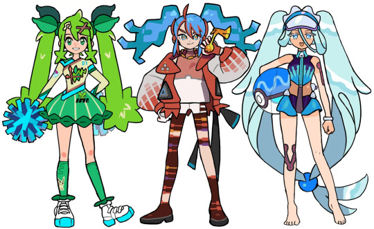
Grass: It seems like they were going for the Sword and Shield look with the jersey motif and I think it's smart to blend that with cheerleading. That being said, I wish it was... grassier? It feels a bit like wasted potential as the look is too focused on the region over the type. I like the elements of the design though.
Fire: I love the idea with the stockings but that's about it tbh. Her hair is supposed to look like fire but it doesn't come off that way and her bangs are disjointed from her pigtails. The colours are too muted and I feel like not enough effort was made to make her blue hair blend in with the rest of her colour pallet. The idea is there but it ended up being pretty underwhelming imo.
Water: definitely the best of the starter types! I love every part of the design and it all blends together perfectly! I especially love the design of the swimsuit! Simultaneously sporty and dainty!
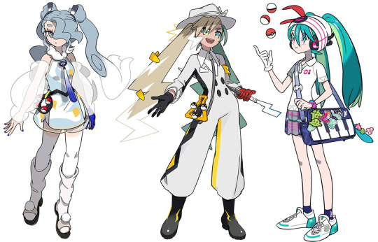
Flying: absolutely gorgeous and I can definitely see Articuno in her design! I love the light and silvery colour pallet so I'm a bit thrown off by that strong blue tone in the tie and glove. I think those should've been the same grey as her hair or maybe the hair ties (which I find a bit too dark but is alright).
Electric: a really cool and new idea that doesn't follow the expectation of a Hatsune Miku design! I really like the cartoony elements of her design but it does come across as a bit simplistic. The hat also feels too big and doesn't really look like she's wearing it? It also looks too feminine for the rest of her appearance imo.
Trainer: she blends right into the world of pokemon while still being Hatsune Miku! I especially love the signature trainer hat with headphones and the colours of her skirt being her actual colour palette. It's not too plain or overdone, it's just perfect!

Poison: Obsessed! It diverges from Miku's typical design expectations and creates a character that I'd actually love to see in pokemon! Her design is just so cool and exotic and the colours are so bright and fun. Those shoes are sickening!!
Ground: the concept of this design is a bit weak imo and the whole thing feels pretty flat. The clothes feel very basic that it comes across as a half-assed, generalized idea of a nomad. The shoes especially ruin the look for me..
Ice: really cool design (pun not intended)! I like the geometric shapes and the androgynous business attire. I'm not too sure how I feel about the green accents though (although the red on the bag makes it better but it's also weird that it's the only place with red so idk if that actually fixes it) and I wish the long pigtail bits weren't there and it was just the short hair. The pants could have more details too but overall, a really interesting design!
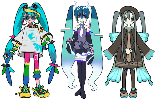
Normal: super cute, I especially love the glasses! It's a "normal" outfit which I assume was the intention so even though the saturated colours and simple outfit may keep it from being a favourite, I do think it's a strong design!
Ghost: it is a really cool design but to me, it doesn't give me "Pokemon". It feels like it's just a Hatsune Miku design that is ghosty and not enough innovation was put into actually merging the Pokemon aesthetics into this. Even as a stand alone Hatsune Miku design, there isn't actually a lot to it.
Bug: So precious! I love the simplicity and creativity put into this design. It's just perfect, head to toe!


Steel: love it! Every part of its execution is well done and I love the soft colours! It's simultaneously a cool and sweet design that I can just keep staring at!
Fairy: it's definitely cute and I like the idea of making her this gyaru school girl. It would've been cool to see something more extravagant for a fairy type look but it's still nice.
Rock: I love the princess design, she looks like she can be a gym leader or elite four member! It's so beautiful and the look is still great even without the dress and frills. I wouldn't understand how Miku can move with those things on her knees though lol. I also think the blue legging should've been black or have that blue present elsewhere in her outfit.

Dragon: I love a lot about the look but there are parts that also make it a bit disappointing. The shirt and pants in particular really wash out this look for me, they're so plain and bright (I hate that she's wearing a collared shirt). I feel like this should've gone all the way with its extravagance and medieval vibes, especially since it was the final revealed design and it's with a legendary Pokemon.
Dark: a stunning design that I didn't expect to be paired with Obstagoon! I love the slick shapes and the big fluffy hat and umbrella to contrast it (also the umbrella being a microphone is so clever)! The choker and shoulder straps make the look too modern but it's still overall really pleasant.
Fighting: Love the design and I'm obsessed with the colour palette! She looks so cool and I love the way sirfetch'd's leek was taken advantage of. My only nitpick is the shoes being a bit out of place from what's overall a slick design.
Ranking (lowest to highest):
18. Ground
17. Ghost
16. Dragon
15. Fire
14. Grass
13. Electric
12. Fairy
11. Flying
10. Ice
9. Rock
8. Fighting
7. Normal
6. Dark
5. Steel
4. Water
3. Bug
2. Poison
1. Trainer
19 notes
·
View notes
Text
Ranking every single fes card in Project Sekai
(This is just my opinion so do not get mad)
27. Tsukasa: I’m sorry Tsukasa I love you but what even is that card? If it was an untrained then it would be whatever but as a Fes card it’s very underwhelming if not straight up disappointing. The outfit looks plain and that’s not even getting into how dull the lighting is. I wasn’t expecting the best card in the game but for a Fes card it sucks so hard. I've seen some people say that it's supposed to show him in a more casual light but even then D4DJ's X-Cross Beat and Side Nova cards exist. There was no reason for it to look that bad when D4DJ has shown how good cards showing characters in a more casual light can be.
26. Saki: I’m sorry Saki I do like you but that card really isn’t anything special. It’s just a generic by the pool card to the point where I thought it was an edit when I first saw it. It’s not as bad as Tsukasa’s card but to say I’m not a fan is an understatement.
25. Emu: Man they really blew it with the last trio of Fes cards huh? This card isn’t bad per se but it just looks and feels bland, which is not what you want from an Emu card. Its cool to see a more mature side of her but it’s just overall very bland all things considered. Love the hairstyle though, especially as a Kamisato Ayaka and Kirari Momobami fan.
23-24. Rin/Len: Look these two are more or less the same card so I’m treating them as such. They aren’t bad but I really don’t care for how bright they are, it just feels blinding and not in a good way. Sorry Kagamines fans.
22. Miku 2: This card is cool but it doesn’t really stand out, especially among the other darkness festa cards. I love the drills though and I really hope they were referencing Teto with that.
21. Luka: See what I said for Miku. It’s a cool card but for as much as I love Luka it just doesn’t hit as hard as the other Darkness Festa cards.
20. Honami: She looks gorgeous here but there’s unfortunately really not much going on. It’s not a bad card, it’s just not really my cup of tea.
19. Airi: I get what they wanted to go for here but it just kinda falls a bit flat for me. Sekai sadly took a while to find its footing with colorful cards (though I may be comparing them to much to Bandori’s) and this one is nothing special. The untrained on the other hand is fantastic.
18. An: I love the concept for this card a lot, I just think they could’ve done way more with it in terms of colors and what not. Still it’s not bad, and I love how her hair references Nagi’s.
17. Mafuyu: I can’t be biased here I’m sorry. I adore Mafuyu and the sinking effect is cool but it’s not anything to write home about. She has way better cards even if I do love the idea of an underwater library.
16. Minori: This card is super cute but I’d hesitate to call it anything special. Her smile is precious though.
15. Rui: love the concept for this one but I feel like it’s greatly overshadowed by other Rui cards. It’s a nice card don’t get me wrong but it just doesn’t hit as hard as his Yokai card or his cyberpunk card.
14. Mizuki: See what I said for their boyfriend. I like this card but it’s very overshadowed by other better Mizuki cards and overall isn’t anything special outside of the Niigo plushies.
13. Ichika: I actually like this card quite a bit. I thought it was bland at first until I took another look and realized that it symbolized her learning to express herself. The main thing that sadly holds it back for me is the existence of Rainbow Canvas Emu and the Nomad cards which all do the paint concept so much better.
12. Kanade: For being an earlier Fes card this really holds up. The background was gorgeous, I just feel like my only problem is that you can barely see Kanade. Granted Haruka’s Hopeful Show card is worse in this regard but still.
11. Akito: He looks cool here. Not much else to say. I actually prefer the untrained, he looks so happy.
10. Miku (1): I love seeing Miku look like the goddess she is, and seeing her soar through the sky is very cool. For being an early Fes card I’m shocked that it holds up this well.
9. Ena: I love the use of browns in this card and it’s really nice to see her look like an actual professional artist. She’s just in her own little world doing what she loves and I love that for her.
8. Kaito: Holy shit this card. He looks so cool, so badass. Also the basketballs are a nice touch.
7. Kohane: As someone who does photography as a hobby I love this card. It’s so cool, and I love the kaleidoscope aesthetic. Between this and Take the Best Shot they’ve been focusing more on Kohane’s photography skills and I’m so glad.
6. Meiko: I don’t know what I can say here, she just ate this up. I love how cool and mature she looks, it’s just a great card overall.
5. Shizuku: Dear god where do I even begin? The puzzle pieces? The butterflies? She just looks stunning and I love how mature she looks here. Goofy Shizuku is great don’t get me wrong but her mature serious side rocks as well.
4. Nene: As a former theatre kid I’ll never not eat this card up, she looks so cool! I love the Broadway inspirations as well it makes perfect sense for her character. Bonus points for the untrained implying that Hamilton is canon in the Sekai universe, that’ll never not be funny.
3. Shiho: I love how stylized this card is, to this day it really feels like we haven’t seen a single other Sekai card try that kind of style. She just looks so cool and determined and oh my god the bright lights with the signs make this.
2. Haruka: ok I may be a little biased but can you blame me? She looks ethereal here. I love the use of blues and her the birds flying.
1. Toya: This is both me being biased and loving the symbolism. I love how this card shows Toya’s growth with the piano and how he’s beginning to face it. Also the sad yet slightly thankful expression he has kills me every time.
2 notes
·
View notes
Text
My ranking of Honoka's limited SIFAS cards and why
Hey! This will be the first in a hopefully long series where I rank the individual Love Live girls' limited SIFAS cards (the fes cards and the party) based on things like idolised artwork and 3D model. I thought, why not start with Honoka since she's a pretty good place to start? And with around a year since SIFAS (very unfortunately) closed down, what better time to start a series where I get to once again appreciate all my favourite cards?
SO without further ado, let's get into itttt
5 - Captain Honoka
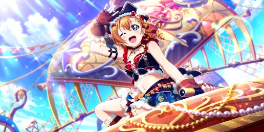
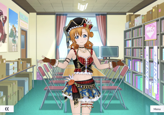
This is Honoka's party limited card and it is, in one word, underwhelming. It has some very basic theming, with the very typical 'pirate' top, and the embroidery on the skirt, but in the end, when compared to other party or festival cards, the design can't really compare. The art looks like it could be a normal event card, and doesn't at all scream 'special' when you first look at it, and the overall composition and colours look pretty simple. The 3D model is even worse though, as the whole thing is far too basic for its own good. I feel like they could've done some really cool things with the pirate theming and Honoka, but no, instead they just settled for this pretty half-baked idea.
4 - Colourful Magician
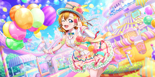

Honoka was the only μ's girl to get a fourth festival card before the game's end of service, and was it worth it? ...Eh. Overall, this card isn't at all bad. The art especially is pretty great, with a pretty aesthetic and strong, pleasant theming and colours. However, the idea is relatively simplistic, with the art feeling like it contains a lot of empty space around Honoka, which I really don't enjoy in a SIFAS card design. And, to make matters worse, the 3D model isn't great either. Despite the outfit looking so vibrant and full in the art, the model makes the dress stiff and not particularly enjoyable. So overall, it was a slightly disappointing finish for limited μ's cards.
3 - Cosmic Driver

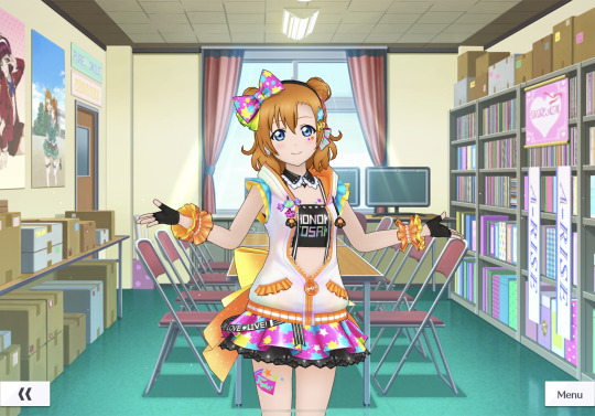
This is an absolute upgrade from the last two cards, and is Honoka's first festival lim. It's a really unique concept and surprisingly so for a first festival card, a set where for the most part, the girls' gimiks are pretty predictable. The art is full of life and the colour palette is absolutely brilliant, and the mesh of a racer and a party aesthetic really pays off for the card's overall uniqueness. I absolutely adore the characterisation found in the pose and the expression too. The 3D model is also consistently strong, with the colours being a little all over the place but in a way that could tie the outfit together surprisingly well if looked at correctly. The cutesy skirt and jacket combo works wonders here, and when tied with the very pop colour palette and hairstyle, it's an idea that really sells. However, it's the slight simplicity with the black crop top and the potential to be a bit of an eyesore with the 3D model's colours that ranks it below the others.
2 - Downtown Patrollers

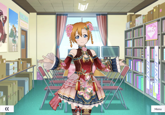
This is her third festival card, and one that really knows what it's doing. The art is exceptionally pretty and absolutely earns its title as a limited festival card, and the colour palette is unique and fits very well with the theme. The dragon she's sitting on and the background looks amazing, but still manages to not at all overshadow Honoka as the main subject of the image. The 3D model also, for the most part, does a very good job in keeping this aesthetic going, with the colours and patterns staying pleasing to the eye and consistent. So overall, this was an actually great festival card, and I have a lot of praise for it.
1 - I'll Show You Round The Mansion
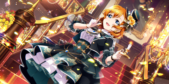

In my opinion, it's Honoka's second festival limited card that really takes the cake. The art is already very striking, with a rich and gorgeous palette that automatically seems to scream luxury. It's a great concept, a bit of an old reliable, and everything in the art from the background to the lighting effects really compliments the idea. The OUTFIT too just AUGH. AUGH I love it- It must be one of my favourite clothing choices in the game as a whole. And this of course is also great in the 3D model, where it continues its elegant and refined yet very Love Live-esque look. I also love the slight curl in her hair, it's yet another unique point about this model that just makes me love it so damn much.
---
Tysm for reading if you got this far! Kotori's next time~
#sifas card ranking#love live#love live all stars#sifas#honoka kousaka#school idol festival#love live sifas#μ's#the start of a series where I basically just whine about or praise cards from a gacha game lmao#I have a LOT of opinions about this game lmao
4 notes
·
View notes
Text
House of the Dragon funko ideas
I can't draw and I refuse to use AI so bear with me. All photos and gifs belong to those who made them, i am thankful for the makers.
Here we go and welcome to my funko pop collection/ideas for future pops. I collect the House of the Dragon ones and currently have 4 standing (thats a lot considering I owned 2 prior) and now I can't help but think of cool funko concepts, because honestly: What is Funko itself even doing?
Diamonds and chases count as one.
We are going to first discuss the characters that have gotten a funko
Viserys Targaryen 4 (Regular funko with sword, sick with mask chase, on the iron throne, and a NFT where he is also sick/mask for some reason)
Daemon 3 (Samuari nft (Idk why its called that way either) dragon egg and with sword/regular)
Rhaenyra 3 (NFT wedding dress (cruelty) heir dress (including diamond edition) and Queen Rhaenyra on her beloved Syrax.
Alicent 2(with dagger, and without dagger)
Aemond 2 (NFT exclusive without eyepatch and...regular version without eyepatch?)
Carexes (1 funko)
Syrax (1 funko)
Vhagar (1 NFT funko)
Criston cole (1 nft funko)
Corlys (1 funko)
Otto 1 funko
Crabfeeder (1 funko
So that makes a total of 21 funkos released in the collections conbined! Without further delay lets dive in.
Rhaenyra Targaryen
So Funkos I want to see are her in her red suitor gown for young rhae. Perhaps her riding on Syrax when she comes to collect the egg that Daemon stole, and her wedding dress a normal without ugly nft box version.


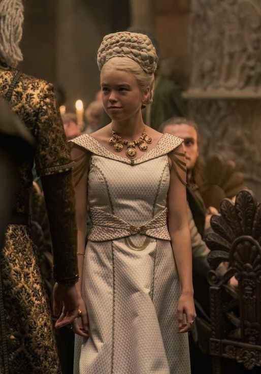
For Emma's version or older Rhaenyra:
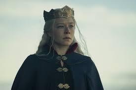
I want to see her new wedding gown when she wed Daemon, when she was crowned and I NEED a funko with her new diamond looking gorgeous dress with her crown.

DAEMON.
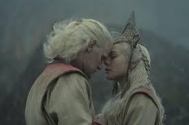
He already has so many uhm... Oh, I know. His outfit to Rhaenyras wedding, king of the stepstones and him riding Carexes/his battle outfit with the cool horns.


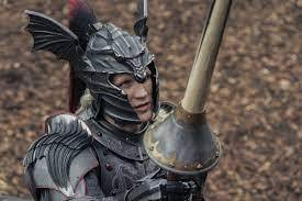
Viserys: I genuinely believe this man has enough. I can't think of a simple thing him and Aemma in the bathtub for the sake of nostalgia.

Otto: Him in his hightower armor. That is all I can think of for now.

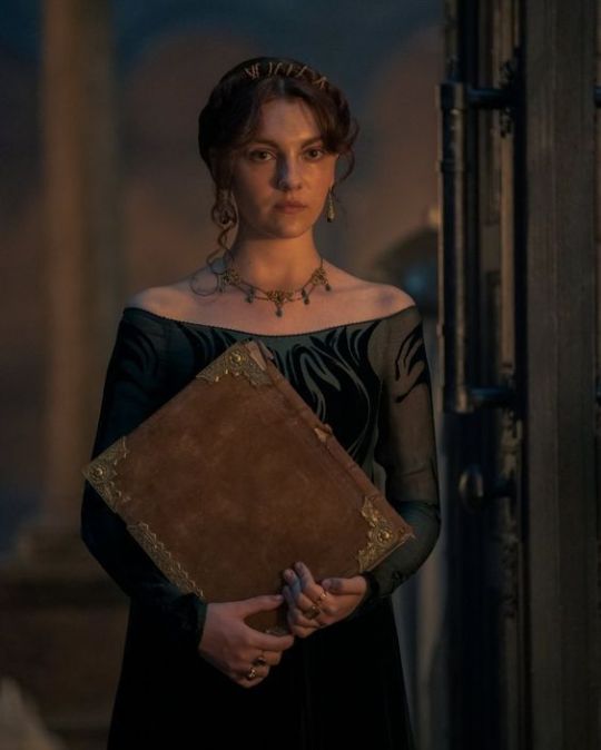
Alicent. Alicent with book (young alicent) alicent in red and alicents wedding dress (A GIRL CAN DREAM)


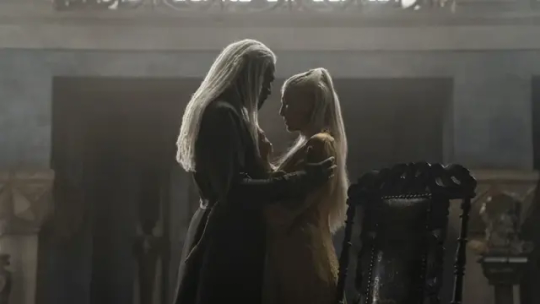
Corlys: The one idea I have is him and Rhaenys holding hands and standing facing one another. It is such a gentle moment and I love their relationship. The other is his stepstone armor and the final one is his first episode look, the crest just really speaks to me.


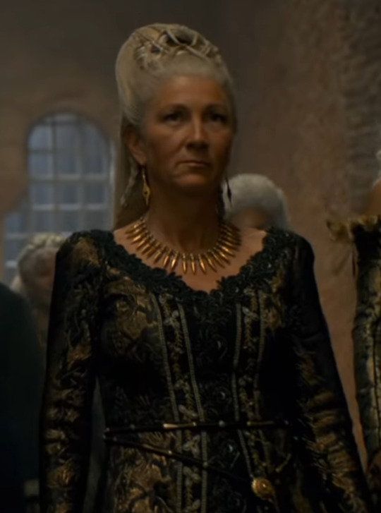
Rhaenys. This is so weird that she does not have her own funko becauses included in so much promo material too. She and Criston are the only ones of the promo posters who didnt got their own funkos, and even criston got his in the NFT drop. The first funko I think would be cool is Rhaenys her dress when she is denied her throne. The only time we see her wear the targaryen black and red colours and she looks stunning. Another one is the moment she crashed aegons coronation and the final funko is for her amazing wedding look.


Criston Cole. I'd like to see a bloodied lip funko, a peasant disguise funko and a kingmaker funko because I feel like that are his main moments and he does not wear his boring kings guard uniform the entire time.
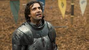


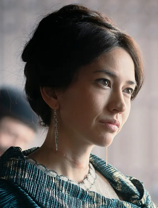
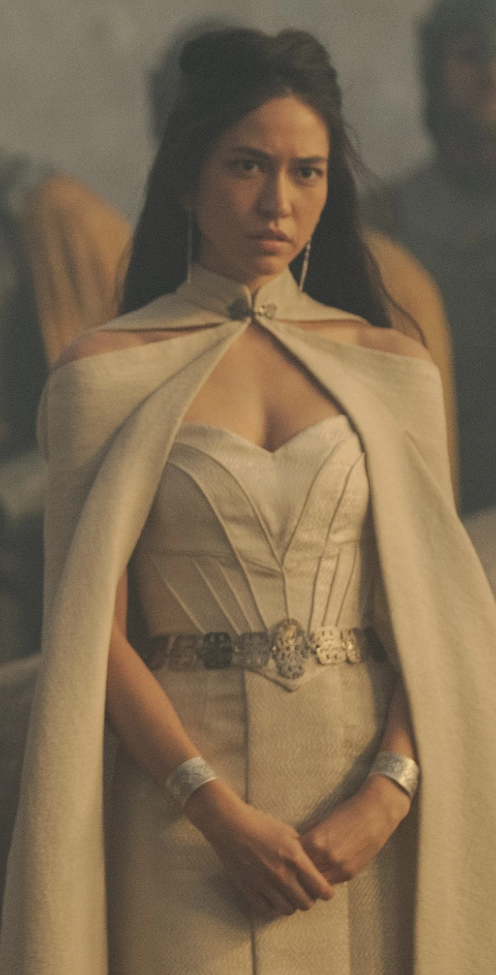
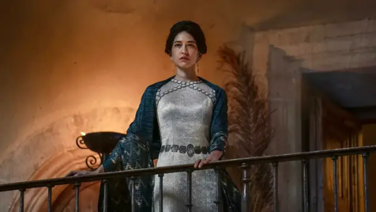
Myseria. I think shes a minor character so her getting a pop is unlikely but here are some ideas regardless. 1. her ''my condolances for your king.'' dress, lady of dragonstone dress, and finally her white worm dress.
This is just the first batch of ideas, I have more where that came from ahum.
#House of the dragon funko pops#Myseria#daemon targaryen#criston cole#rhaenyra targaryen#alicent hightower#otto hightower#rhaenys targaryen#corlys velaryron#Viserys targaryen#HOTD FUNKO
2 notes
·
View notes
Photo

“For they are all my children, all that I swore to defend -- It is my duty to become both queen and trusted friend.”
x~x~x~x
HPHM Cardverse developed by @ariparri // Carewyn’s outfit inspired by this gorgeous concept art for a special edition Snow White doll
x~x~x~x
Cardverse content! Cardverse content ahoy! ❤️
I’ve actually had this sketch unfinished in my sketchbook for a while, but I finally got around to fully editing it...this is Carewyn at her coronation, when she first became Queen of Hearts! Yeah, she does look a little less than excited about it. But hey, when you become Queen not because you want to (on the contrary), but because it might be the only leverage you have to stop the woman who’s tyrannically taken over your country of birth as a despot queen and to somehow protect your brother and mother from that same woman...yeah, that crown is going to feel really bloody heavy. Especially when there are so many people suddenly counting on you to succeed: not just your new partner, the current King Declan, but also the previous Queen Rosalie and the countless citizens you now represent. 😞
As you can see, though, even on this grand day where she’s dressed to the nines, Carewyn still holds onto a bit of modesty, with her hair in a modest braid and wearing her regular green Club earrings that Orion gifted her so many years ago. And despite the slightly melancholy stoicism of her posture, she held her head up high and spoke with the conviction of a general, when she addressed her new people as Queen.
“Not long ago, I journeyed here, with naught but dreams of advancing my education. Yet in my short time here, you have welcomed me, and for that, I shall always be grateful. It is for this gratitude -- and for the love I have grown for this land that’s embraced me -- that I shall fight to protect, provide, and advocate for you, as your Queen...for however long that you have both a want and need of me. Although this crown...is not one I ever would have chosen, for myself...I’m truly honored by our fair Queen Rosalie’s faith in me, as well as King Declan’s, and all of yours. Your faith in me is a gift so priceless, I don’t think I could ever be worthy of it...but I will try my best to honor that faith, all the same. From the bottom of my heart...thank you...and long may our Kingdom prosper, long beyond this Frabjous Day.”
Carewyn didn’t socialize that much at the coronation ball afterwards. Both she and Declan were much more attuned to speaking about important matters of state with their court and foreign representatives than small talk, so they almost simultaneously decided to withdraw and enjoy their guests’ levity from the sidelines.
“Will they really not mind if we just sit back?” Carewyn asked. Even with how much she dearly wanted to do just that, she didn’t want to offend anyone.
“Not at all,” Declan reassured her. He then offered her a slightly more mischievous smile. “Just remember to keep your head up, sit up straight and tall...and smile and nod slowly whenever you make eye contact with someone. Makes you look more regal.”
Carewyn bit her lip to hold in a laugh, before accepting the arm Declan offered her and following the older man back to the thrones at the back of the hall. The two royals then proceeded to chat more casually for the rest of the night, sometimes about politics, sometimes about the party and its guests, but occasionally also slipping in the odd reference to the works of Charles Dodgson, now and again. (Declan was very well-read, and he was actually rather happy to have someone else around who enjoyed talking about literature.)
The best thing about the coronation, however, was what came two days later, when Orion was finally able to come up from the Land of Clubs himself. Carewyn had been surprised and delighted enough to see her old friend again so soon...but when she saw that he’d not only brought her a white Abraxan of her own as a belated coronation gift (which honestly had been overwhelming enough!), but also a blond-haired traveling companion who at the sight of Carewyn was so full of pride she couldn’t hold in her tears.
Carewyn herself was crying just as hard herself when she ran forward, right past Declan, Orion, and her dear new Abraxan horse. She paid them or any reactions from possible witnesses no mind -- chucking out all of her usual stoicism and composure completely, she dashed across the courtyard to Orion’s open carriage and threw her arms around the older blond woman standing in front of it, latching onto her as if she never wanted to let go again.
“MUM! Mum -- Mum...!”
Carewyn’s voice was as choked and adoring as a child’s -- as if her whole heart had burst, and the emotion locked inside behind that dam for so long had flooded every inch of her being. Lane’s voice was a mere shadow of her daughter’s, hushed in the back of her throat and unsubstantial, and yet overcome and aching with relief, love, and pride.
“Winnie -- oh, my Winnie...my baby...my baby...”
The two held each other for close to ten whole minutes, stroking each other’s backs and hair, rocking each other back and forth, shaking, and crying all the while. After three years of painful separation, doubting whether they’d ever see each other again...here they were -- together and free.

#hphm#hogwarts mystery#carewyn cromwell#lane cromwell#my art#cardverse au#hphm cardverse#declan conroy#orion amari#sorry I just saw that snow white dress and went '...that is a queen of hearts dress'#'CAREY BEAR YOU'RE WEARING THAT 8I'#that rose cape is so friggin' gorgeous 83#I see 'frabjous day' basically just being hearts off-hand for a significant celebration or event#don't you love the lewis carroll references 8D#this song was bloody perfect accompaniment while working on this btw#it so suits queen!carewyn in this AU#caps cw
13 notes
·
View notes
Text
notes:
playing a new file of the star'd dew, this time with my younger sibling!! my name is Larsenie Theft and i look so cool and also so gay. maybe i'll draw a picture sometime. ive decided that although my appearance, name, and prospective spouse will change with each file, my silly fisherman father will always somehow be able to recognize me. i'll always be his kid <3
im trying to make designs for the medieval-fantasy-royalty au ive been kickin around for months hkjhf i am not good at outfits (and gotdamb where can a guy find the time to draw suits of armor lmao) but i love thinking about it, i'm excited to share details soon!! its with me, agent and alexandria <3
i have comic ideas (just two, for agent. he's my silly guy) and the concepts make me laugh kjghfkj
prjsk updates below the cut because the images would be too long otherwise hkfjh
my daughter my daughter my daughter my daughter m
my son my son my son my son m
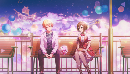
still thinking about emu and ryuji sibling momence <333 i wanna draw them eating ramen and taiyaki together <3
im nearly at 90,000 crystals (all without paying, ive just been saving up for a while hkjgh) the goal is to get to 100,000 crystals by the Amidst a Dream event next year lmao <3 EMU WILL COME HOME!!! <33
looking at the events list for upcoming en server and AWWWWWWWWW LIL BABY HARUKA,,, <33
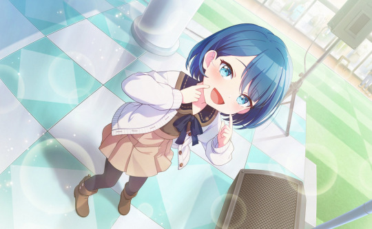
LOOK AT HER SMILE!!! SHE IS JUST A LITTLE GUY!!! LIFTS HER IN MY ARMS <33 i will be on team "online livestream" for this event <3 maybe i'll pull once on this one once, mm j events are always a temptation for me hgkjh but i'll get my daughter from the shop!! <333
i keep thinking the 'kito in Find a Way Out is 'kasa with weird lighting lmaooo <33 look at this guy doesnt he look like 'kasa hkjh??


AND THEN THE CARDS IN "DRAW YOUR BOW" WOW WOW WOW I WOULD GET THESE FOR THE ART ALONE??? literally SOOOO pretty, i will not be pulling on that but holy fcking sht hkfjh whoever was the artist for these ones are KILLING IT MAN, the fcking lighting in shi's card is immaculate <3
also duality of this guy hkjhg <333 one day i'll do a ranking of ka!tos from this game, but reliable stage manager guy is PRETTY FCKING UP THERE, he's probably second place let's be honest, hes so sweet, i love a guy who works tirelessly and selflessly backstage crew <33
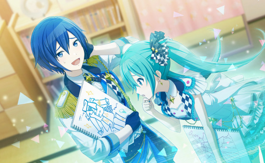
and then the new years event! wont be pulling on this one either though i'll definitely get the ne ne in the shop, the card is so silly and then the trained is gorgeous <33 not sure which team i'll go for here!!
AND THEN ITS AMIDST!!! I HAVE BEEN WAITING FOR THIS EVENT FOR FCKIGN MONTHS!!!! YALL!!!! emu coming homeeee~!!! <333 happy happy <3
that's about it hkgjhg gotta draw the daily eca and get more things in queue <33 bye bye!! <33
#and the choir sings (text)#who do i tag here hkjgh#[ the court of castle starlet ]#[ pink ferris wheel ]#[ general f/o ]#lmao good enough!! <33
2 notes
·
View notes
Text
K/DA ALL OUT Ahri

When Ahri steps onto the stage to perform with K/DA, she knows she's surrounded by the best of the best—different girls with different personalities, all at the top of their craft. As their leader and as their friend, Ahri is poised to guide these divas to even greater heights and leave their audiences breathless for more.
General Information:
Cost: 1350 RP Tier: Epic Release Date: October 29, 2020 Skinline: Riot Records, K/DA
Credits:
Concept: Rheekyo L Splash Art: Horace Hsu Model: Kylie Gage Animations: Einar Langfjord Tech Art: Isabella Cheng-Henehan VFX: Walker Paulsen SFX: Rachel Dziezynski Producer: Ambrielle Army Quality Assurance: Nathan Hales
Concept:
If you're counting Prestige K/DA, Ahri actually has four skins in this skinline with Popstar Ahri being the first and essentially the start of K/DA. Establishing Ahri as a K-pop princess, Popstar Ahri later (I believe it was with its Wild Rift release) added more depth to her character by giving her motivations and later (I'm not exactly sure when her bio changed again but I'm assuming it was with her ASU), doubts.
Design:
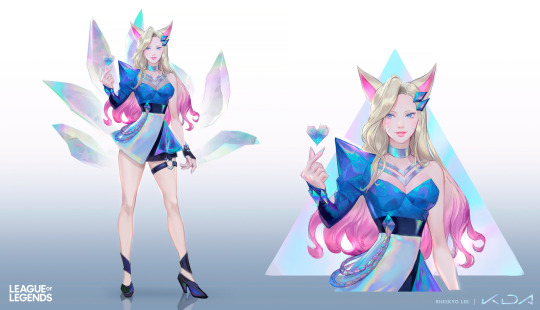
I really don’t have much to say about Ahri’s design. I find Evelynn’s and Kai’Sa’s outfits to be more interesting but the All Out skins are overall very coherent.
Splash Art:
Her splash art does a good job of highlighting certain aspects of her design like her dyed hair or gorgeous tails. I find it most excels at communicating her character as a pop princess turned queen using its perspective of being from below and looking up at her as well as her posing with her hand on her waist.
Model:

I think the model does a really great job of staying true to the concept and splash art. I especially love her hair and the textures are beautiful.
Chromas:
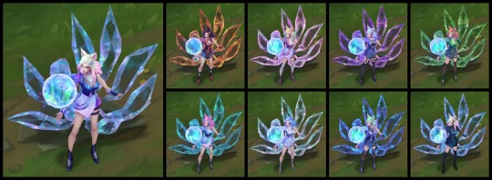
I love any skin whose chromas feature slight outfit changes and I appreciate how this extends to her dyed hair in this skin. Chromas for Ahri skins in particular are especially beautiful because of her tails.
Animations:
The recall animation is a highlight of this skin, even more so before her ASU. It must be mentioned that Ahri overall hugely benefitted from her ASU, making her animations—including in this skin—smoother, cleaner, and just better. Fittingly, Langfjord and Cheng also worked on Ahri’s ASU animations and rigging.
VFX:
One of my favorite parts of this skin is its visual effects. Speaking as someone who has no idea what kind of work goes into making skin effects, I find that Ahri has several opportunities to incorporate new visual effects, especially with her Orb of Deception (Q). I enjoy the crystal effects and I find that both the VFX and SFX work well together and elevates the other.
SFX:
My other favorite part of the skin is its sound effects. It's probably my most favorite out of all her skins (aside from, of course, Spirit Blossom). The K/DA skins in general all have very satisfying SFX with Evelynn’s Allure (W), Akali’s Shroud (W), and Kai’Sa’s Icathian Rain (Q) being some of my personal favorites.
Voice Over:
No new voice overs or voice filters.
Value:
I got this skin from a Hextech Chest, but if I’d had 1350 RP, I’d probably buy Elderwood Ahri or perhaps Coven Ahri (both from a skinline where Ahri, again, has multiple skins—Eclipse!). But I still love this skin's sound effects the most.
2 notes
·
View notes
Note
So, if you take away the scales, Lilith's later S2 top doesn't actually cover much and certainly does not work practically as armor. Do you think that is more "rebellion and rejection of the more covered outfits worn in the OCS" or "the scales chafe against fabric and leaving them bare is more comfortable"? Also, do you think the black/silver around her eyes is makeup or her skin darkening like it does around her scales on her arms (since she seems to scale over her injuries, and Adriel did burn her eyes out)?
well, 1) i rly dont like liliths look tbh, it couldve been so much better. so just know that. 2) i feel like she WAS already kind dressing like that since we can see her take off that cloak/jacket thing in ep1 on her fight scene. she also has a black sleeveless tight top, so i think she likes that style. however, she also has to account for her wings, so theres that as well. and the scales are a very good reason too. i think its a mix! like she was already breaking out of the norm of the OCS, and now she has to think of her scales
as for the makeup, i do think she did that, i find the concept hilarious but also kinda sweet. her accepting her new nature by working with it n shit. also her eyes looks gorgeous
#warrior nun#lilith villaumbrosia#sister lilith#an ask? for me???#HI HELLO#SORRY YALL#i couldnt remember the email#also the news of the cancelation fucked me over goo#*good#they still have my heart tho#so i'll probs pop in every once in a while i love my girls :'))))
3 notes
·
View notes
Text
Thoughts on the Drag Race Balls (US S1 - S16)
The Ball is my favorite challenge and I just wanted to place my thoughts down on it.
Absolut Drag Ball, S1: Executive Realness, Swimsuit, Evening Gown Extravaganza
This ball felt more like a pageant and really showcases how the show was trying to find its footing at first.
Bebe turned out a really amazing and beautiful Evening Gown. It amazes me how she doesn't know how to sew and has won two balls.
Nina's Exectuive Realness was really gorgeous and she was a good Runner Up for this challenge.
Also it's a little insane that they required the girls to incorporate the fruit into their outfits like I'm pretty sure all of them except Nina just put the fruit in their wig.
One canot mention the S1 Ball and not mention the iconic, MISS MANDARIN *tongue noises*
Diva Awards Ball, S2: Teen Diva, Diva D.C. Press, Diva Hollywood Eleganza Awards
Tyra is an impeccable sewer. She last minute changed her outfit design and it was gorgeous.
This ball did feel a bit predictable since there were two sewers left in Tyra and Raven with Juju and Tati not knowing how to sew. So it felt a bit obvious who'd end up in the bottom.
A look I'll never forget from this ball though is Tatianna's Diva D.C. Press Awards look. She looked so hot it was amazing. Unfortunate that her Eleganza look was so...bad.
RuPaul's Hair Extravaganza Ball, S3: Historical Hair, Red Carpet Glamour, Fantasy Hair Extravaganza
I highkey kind of think Raja should've won this ball. Like maybe she used a bit of fabric on her dress but she also absolutely destroyed the first two categories and at the end of the day her hair look didn't look like it was made of anything but hair.
Yara'a Historical and Extravaganza look were really good but her red carpet look didn't strike me as red carpet.
Manila's concept for her Historical and Red Carpet looks were really good and I espescially enjoyed her Historical Hair look. I also really enjoyed her bee look, I think she also could've snatched the win but they were really hung up on her makeup that season.
Alexis and Shangela were the clear bottoms for this challenge. I'm glad we got to see Alexis lip sync so much she's a fantastic performer and the Fantasia lip sync this episode was great.
Make Dat Money Ball, S3: Swimsuit Body Beautiful, Cocktail Attire After 5, Evening Gown Eleganza
Actually insane that season 3 had so many design challenges and a majority of them involved unconventional materials. Like they were putting those girls through the ringer.
I also think that Raja should've won this ball. All her looks were on point and her Eleganza was fucking gorgeous and the way it moved was stunning and beautiful.
I also kind of think Manila should've been in the bottom. Her cocktail look was off the mark and her Eleganza look wasn't very good.
Yara's elimination though was really hard to watch. Like it became clear how exhausting the competition was at that point
1 note
·
View note