#It's nice to post an actual colored drawing though instead of a sketch!
Explore tagged Tumblr posts
Text
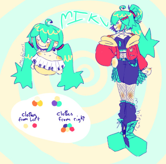
I was so sleepy last night and drew Miku outfits and colored them this morning :)
#I used all my energy on the full body one and I forgot I was going to shade and stuff#to sleepy still#It's nice to post an actual colored drawing though instead of a sketch!#does this count as that one Miku outfits trend thing? maybe#I might try other characters but I can't promise anything#art#artwork#my art#digital art#fanart#hatsune miku#vocaloid fanart#miku vocaloid
24 notes
·
View notes
Text
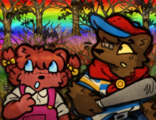
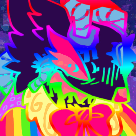
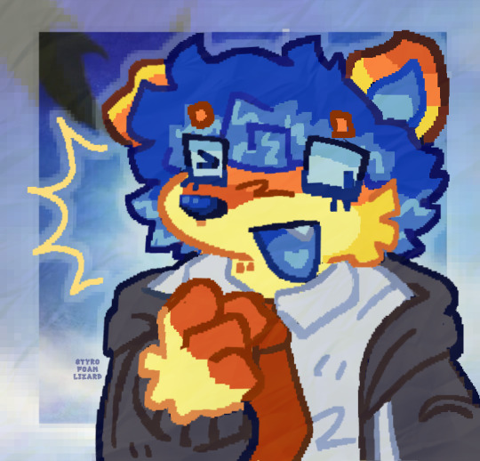
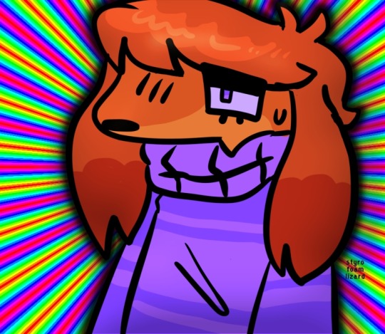
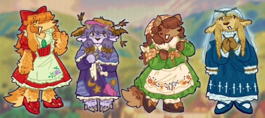
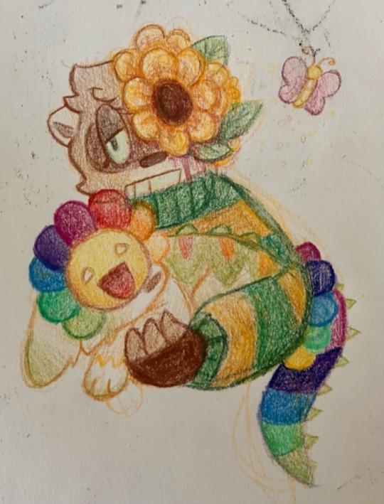
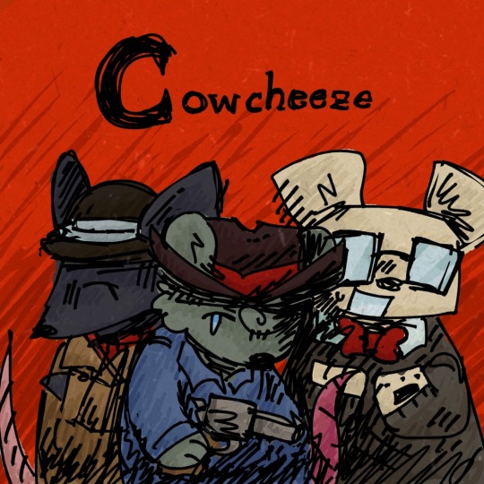
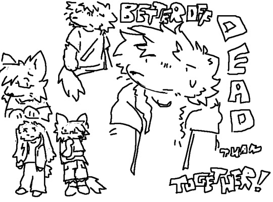
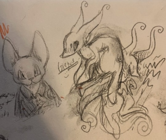
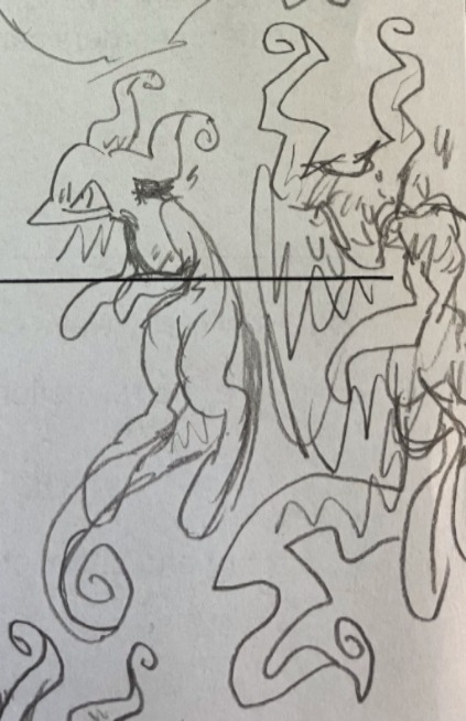
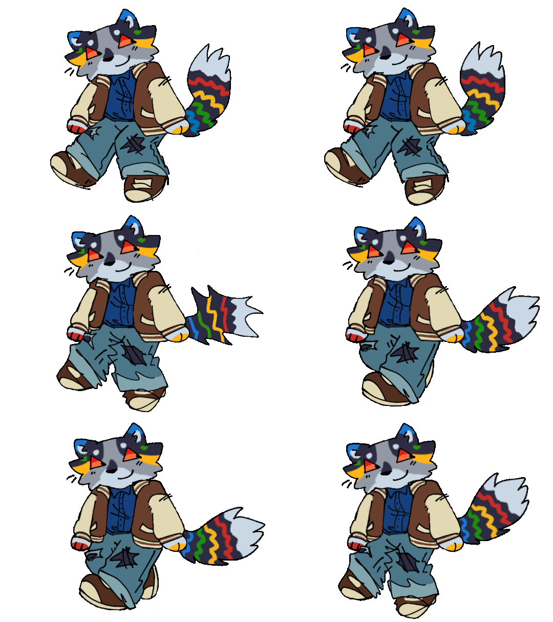
random assortment of drawings i might as well post
#scribbles#ocposting#furry tag#gif#eyestrain#bright colors#mother series#the gifs showing up kinda weird i think thats just a thing on my end though#have noticed it happens a lot for me w transparent gifs on here. idk#gif was for a dta thingy btw uhhh#‘cowcheese’ thing is for my sisters weezer parody where theyre rats nd instead called cheezer#words on the one on its right are lyrics frm heres to you by zebrahead cuz it was stuck in my head..#oh also the middle drawing on the first row of three was color picked frm the cover of phoenix also by zebrahead#first drawing i just made cuz i was messing w preset brushes nd thought itd be funny#long one w the four characters is.. little goody two shoes characters But Furries . lol#oh the one left of the cheezer thing was smthn i drew in class w my friends prisma colors instead of working on my actual art project#actually started that now its driving me crazy cuz i made like a million versions of the sketch messinf w the composition#and im still not sure entirely what i do and dont wanna include and also the actual paper im doing my final on isnt like. wide enough to fi#things in nicely 💔💔💔 also i never planned out colors like an idiot so im making that up as i go and avoiding it a lot aghhghh#giegue drawings are honestly just here cuz i think hes funny#sorry for the paragraph of tags i love talking abt things#uhhhmhmmh i kinda hate postint stuff most places online now ngl#i have so much more art i COULD post but it just feels weird idk#no one really interacts w my stuff much anymore anyways like idk <- this is jot me fishing for pity or disregarding anyone who does leave#nice comments i appreciate that stuff SO mucu it means the world to me. i just dont feel super strongly abt posting shit anymore i feel lik#i have much better peace of mind just leaving things to myself sometimes#as much as i like sharing things it just hasnt been convenient lately and also ive just been getting like.. very paranoid abt a lot of#things over these past years and the constant posting everything o. tumblr thing didnt help much#🙃 okay ill stop rambling now have a nice day
34 notes
·
View notes
Text
hi everyone!! my wrist is too sore to draw today, so instead i thought i'd share some of my favorite csp assets + how i like to use them! i also linked some procreate brushes at the end of the post!!
lineart brushes:
SU-Cream Pencil: i swear by this brush and i use it very often!! if you lower the pen density and use a gradient map over it when coloring your drawing, it has a nice effect. that's what i did in this drawing here! i also use this brush like i would draw on paper, so as a sketching tool. recently i've been enjoying blending it for shading. the pics below are drawn on one layer; left is more manga style while the one on the right is from a WIP of my singer sargent study, so it can be used for more realistic styles pretty well!


Found Pencil: another pencil brush that feels really nice to use, created by @/pigpenandpaper.
PS style brushes: a recreation of photoshop's (i believe) default brush. very versatile and also blends well!
analog wind variant pen: a nice pen that i like to use for lineart that is intended to have a bit of a sketch look.
zakutoro real g-pen: i used it for the lineart of this piece. although, it was drawn before i started using 600dpi in my works, so the lower resolution might make it look a bit unclear.
sets of rough pens: great for manga lineart with a rougher vibe; some of them have varying line weight.
coloring brushes:
zaku brushes: very nice and painterly mixing! i definitely recommend it for those who like to leave their colors a bit unblended.
softie marker: as the name implies, it's very soft! i like to use it for blush in chibi illustrations.
analog watercolor brushes: realistic-looking watercolor brushes. i recommend using it with csp's default paper textures, or those i linked below!
993 coloring pen: it's very soft and watery, though it can be made more solid by adjusting the paint density. i actually think it works very nicely for lineart too.
rock dog pen: another soft marker brush i like, that i once again also use for lineart and doodles.
thick coating brush set: recommended for paintings that show brush strokes.
cartoon cloud: don't let the name narrow your vision!! this has to be one of the BEST brushes for painting in my opinion, and of course it's great for clouds and explosions but so so much more!! and it's FREE try it try it!!
decoration/miscellaneous brushes:
neon pen
paper textures
symmetry move brush
close and fill without gaps
rope brush
sphere fisheye guide
flash balloon
speech bubble set: a lifesaving collection for comic artists!! dimensions and line weight can be adjusted by using the operation tool.
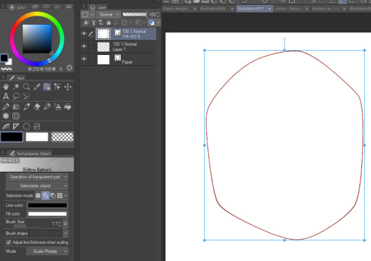
gradient map to use in color mode at 15% and another gradient map to use at 20%: the percentage refers to the opacity of the gradient map layer, but they are just the creator's recommendation and i tend to actually increase it. to use gradient map efficiently, i recommend putting all your colors (and lineart if you want) in a folder. then, right-click the folder, select "new correction layer" and then "gradient map". this allows you to modify the gradient map without worrying about affecting the original colors in case you decide not to use it in the end. to import a gradient map from your downloaded csp assets, click the wrench icon next to the name of the gradient set that's currently in use, then select "add gradient set".


you'll also notice that the creator recommends to use their gradients in "color mode". of course, this is also only a recommendation and i suggest trying as many layer modes as you like! to change a layer's mode, simply highlight the layer and click on "normal" (the default mode) and csp will display the available modes.

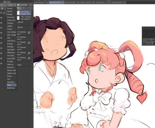
fruit ninja gradient map: fun to use if you want really drastic/vibrant colors! the names of the gradients are cute too, as you can see in the above screenshot!
BONUS: jeremy fenske's free photoshop brush pack: these aren't csp brushes per se, but they can be imported into the program! excellent for environments, i recommend watching fenske's video on how he uses the brushes to get a clearer picture since there are so many in this pack!!
BONUS 2: my good friend clem has a few brush packs for procreate that are ideal for painting,decorating drawings, and y2k-inspired illustrations, i definitely recommending checking out her shop!
in conclusion i hope this post can be helpful to you!! i tried to explain how to use the brushes as best as i could, but feel free to let me know if anything is unclear!! i hope you will enjoy using them! :D
#clip studio paint#clip studio paint brushes#csp#csp brushes#procreate#procreate brushes#brushes#tutorial#art tutorial#sort of hehe
76 notes
·
View notes
Note
if you havent yet, could you do an almond x latte fankid? i love that ship a lot :)
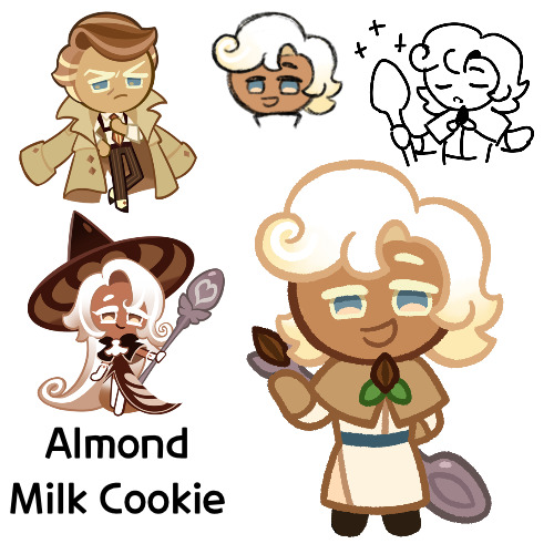
Here we are, this is Almond Milk Cookie
Funny enough, I was actually trying to go back and find this post after editing something, only to realize I never actually posted it and left it in drafts. Only for one day, but still
Anyways, so on to him
So Almond Milk here is a healer, using almost exclusively milk magic. He started out in Parfaedia, and spent a good portion of time there, until he switched over to the Vanilla Kingdom to learn healing magic, where he now works as a doctor
He’s a very friendly and kind sort, and he’s very dependable. Also, despite what some may think from his profession, he’s quite physically strong as well
However he is self conscious about not being made of “real milk”, instead being made from almonds, and he wonders if his false ingredient hinders his healing abilities. His mother has told him that whether or not his ingredient really counts as “real milk” doesn’t matter, but it’s never been something he’s able to let go. He doesn’t really make it that known anymore though, preferring to keep it to himself
Now on to design things
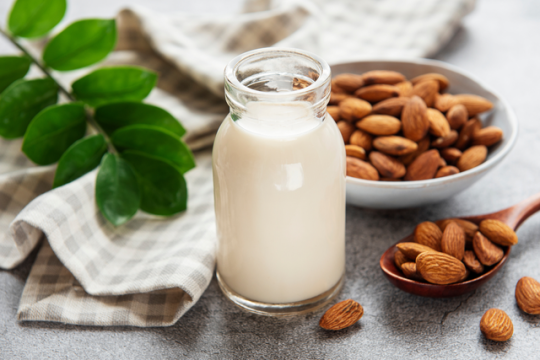
So I’ve had the name Almond Milk as an almondlatte kid idea for a good while now. Lattes are made of coffee and milk, and there exists a form of milk made of almonds, so it’s the obvious choice
Almond milk:
I made the initial rough sketch some months ago, so I don’t entirely remember the thought process behind it. But it looks nice, and like Latte’s but with one of Almond’s hair colors
I’m not sure why I gave him a thicker body type, but whatever, he has one. It’s not like I’m that good at drawing super skinny Cookies anyways
His outfit was originally going to be more hospital like, and probably somewhat closer to Butter Roll’s, until I decided that maybe I should make it more fantasy looking. Especially with all of my Almond kids generally having more modern looks to them, or at least in the way that Almond is “modern”, I don’t know the right word
The small cloak thing was a bit of a struggle, especially with his smile, but I eventually got something
In the sketch I gave his almond brooch something around it that looked nice, but I wasn’t really sure what it was going into the lineart, so I made it leaves. They probably shouldn’t have lines and should instead be solid green, but whatever
I gave him that spoon last minute in the sketch, since I remembered that as I said prior, I tend to not give my fankids accessories or tools anymore, and I wanted to rectify that. Unfortunately his pose didn’t really lend me well to putting it in his hands, so it’s just slapped on to the back. I’m also noticing now that the spoon itself it too small, at least on the bowl thing. But it’d be a big hassle to try and fix it, so I guess I’m stuck with it annoying the crap out of it
Oh yeah, so as mentioned earlier, I came to edit something in his design, that being his colors. Originally he looked like this
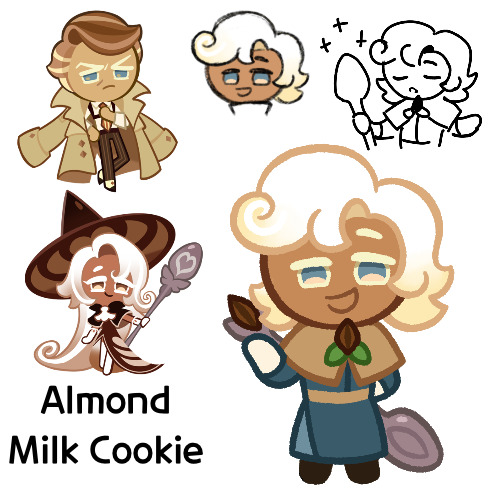
I liked the blue, and it does give him a color scheme unique from his parents, but my big problem was that the colors reminded me of Marcille from Dungeon Meshi. I don’t know if the outfit is exactly like hers, but it was bugging me, so I changed it. I think overall I like the new color scheme better, but I just wanted to mention the old one
I’m actually quite satisfied with how he turned out. Though granted I did have ideas going in about what to do with him, so that probably helped
Anyways, so that’s Almond Milk. I hope you like him
#cookie run#cookie run kingdom#almond cookie#latte cookie#almondlatte#cookie run oc#fankid#fanchild#almond milk cookie#my OCs#my art#requests#answers
38 notes
·
View notes
Text

Part 3 of 3 - Power
Tomorrow Morning I’m going to reveal the finished product! Until then I’m gonna leave today off with this!
Part 1 - Milky Way Wishes
Part 2 - The Wish
Finished Product - Check Back Tomorrow
Under the cut I added the same pieces I have for the other drawings!!! Enjoy!!!
To begin here was my reference! Originally I was going to include Magolor Soul but I felt that it was better sticking with the over all Superstar theme instead of digging into ultra.

Next of course is colors which I managed to stick to one palette for entirely of the drawing! I thought that was pretty great actually since I considered using two for this one. In the end it was worth the challenge!

Next is the sketch and progress shot! However, for this section there is a special treat of another version of the final product where I didn’t add the glass effect over everything! I thought it’d be nice to include in case people wanted to see the alternative though, everyone I asked agreed that the final you see above the cut was the best one


Finally, of course, is the speed paint! Again, the sketches were all done on a different canvas and will have their own speed paint posted with the final piece! At the beginning you can see me play with brushes and trying to decided how I’d go about the outlining. The rest from there was smooth sailing!
#🌟 homestar art post 🌟#kirby#kirby series#kirby of the stars#kirby fanart#kirby art#kirby superstar#kirby marx#marx kirby#marx (kirby)#Marx#milky way wishes
14 notes
·
View notes
Text
Oh hey let's do a rabid fire sesh of a few projects I did over the past few months 'cause these smaller ones don't need their own posts


Starting with the oldest; a basic ass red scarf. I had bought yarn, wanted to make a blanket, decided this wasn't the yarn for that project (mainly because I did not feel like buying like 200€ worth of this yarn to have enough FOR a blanket), turned it into a scarf instead. It is nice. And then the latest, as in "I finished this today"; a basic, small crochet rug. Mom had made these double-layered seat cushions years ago, and they were nasty, so much so that just washing them and dusting them would not clean them (because of being double layered, there was just dust inside the cushions). So instead of throwing them out I unraveled them to reclaim the yarn and turned it into a rug instead. It's a basic moss stitch rug, not very large, but it is quite soft (tube yarn). Though the texture of the yarn made crocheting it quite unpleasant, 0/10, would not do this again (with this yarn).


So if you remember, I had this pink yarn leftover from my first crochet sweater-turned-first knit sweater. Didn't have much to do with it, so I just knit that yarn into a single large panel. Then, reclaiming some fabric from an old button-up shirt (it had really bad stains on it elsewhere), I got a matching panel that I then attached together. I grabbed an old pillow I had absolutely shredded (as in "the filling is just loose lumps of polyester bouncing around"), stuffed it into the new pillowcase and boom. New cat bed for Honey. It's been done for a few months now and I can confirm, she absolutely loves it, which is all that matters. (I didn't sew the pillowcase shut because I wanted to make it easy to clean if necessary)
Then! Idiot's first try at embroidery! It sucked ass!


IDK I had wanted to try embroidering like small charms/pins for a while so I ended up caving in and got some felt and embroidery floss to try it out. I did keep on telling myself it was my first time so it was going to turn out bad most likely and to not worry about it, but man. It turned out so bad. I was so disappointed. It just looks so messy?? I can't tell if it's piss poor technique or poor color choises either (probably both let's be real)
But I kept on trying. Second attempt I forgot to take process photos but it was pretty much the same (I did have a delightful time trying to figure out how to "sketch" the moth onto the felt with thread because I couldn't actually draw onto it, it was too dark). Still hated how it turned out. Still decided to give it a third short, this time choosing to use some absolutely ANCIENT sewing thread instead of embroidery floss. (Also experimented using some extra felt to add "layers" to the thing, though in the end it wasn't noticable at all lol)


I still think it turned out horrible, but also definitely my favorite of the three. I am not immune to the Power of Penk I guess. But hey, I did manage to sell two of these for 50 cents each at a convention lmaooo
#Moon posting#Knitblr#Crochetblr#Yarnblr#Embroidery#Mandatory ''This was a DIY blog before a fandom blog!!'' disclaimer#Long post#Yarncraft Diary#Of these projects in particular although the scarf is the most useful probably my favorite is still the cat bed.#I just get so happy when I see Honey napping on it
10 notes
·
View notes
Text
Shyrax Designing
This might be a long post, apologies.
Tryna design Shyrax right now. Design-wise I feel like she is going to be the most complex, both because of how regal I imagine her to be and because I have to essentially design up karoshans. While reading I also found it really hard to visualize her especially. When character designing, my process usually involves rough sketches trying to find the characters personality and then coming up with outfits that fit them/the setting. For Shyrax though, I decided to do what I will now call the paper doll method, where I try to come up with a design first using a base, before actually drawing her. Did it this way so I can have a rough idea of what Shyrax could look like, put some ideas down instead of trying to tackle personality and appearance in one go. In future pieces, I would use these as rough guides on how to draw her, atleast until theres official art released.
My first attempts came out decently well. I think this is closer to what I initially pictured imagined her as. And I really like the results! I always got the impression that Shyrax is wearing a dress, but like designed for battle. I think it adds to the royalty vibe. For some reason, I also imagined her without irises, so I left them out here too. Whats really missing is more jewelry but eh that can be added in future work. I tried a few color schemes, these three were my favorite. Imo red looks the best, but I feel like the darker vers would be closer to canon.
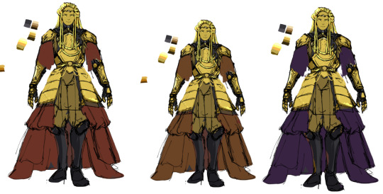
I still like this version, but in the end I don't think it matches the setting very well? Maybe I'm overthinking it but it feels like it borders too much on fantasy over scifi.
Next version is closer to what is described in the books. I also took some minor inspo from the armor Predators wear. I'm not sure how much inspiration from Predators I want to pull for her design, because although I do think Karoshans take some inspiration from them, I feel like its in a very different vibe. I also gave her irises in this version. This version also feels like it could have more jewelry and could probably deal with being a bit more scifi too. Two color versions, using a bronze as a secondary color. I like the one on the right more.
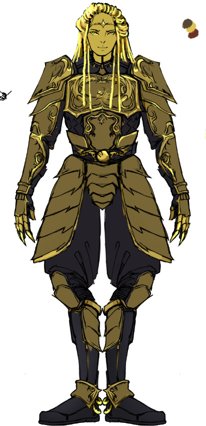
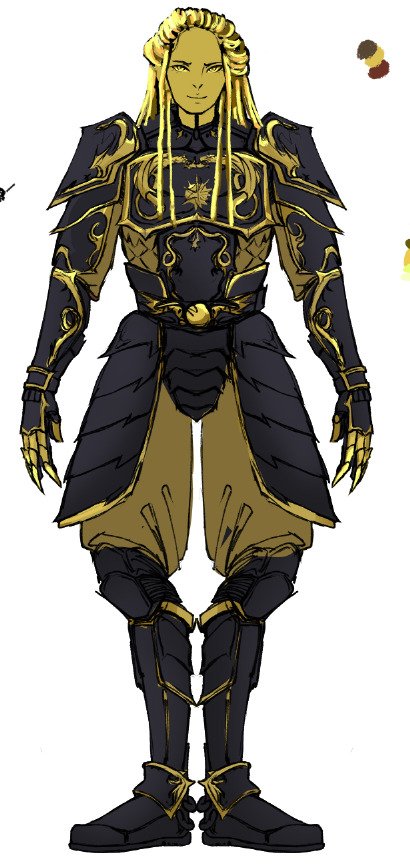
Additional notes:
Anatomy wise, I find it very hard to decide how alien I want go with Karoshans. Tried to find the nice balance between alien and humanoid. Now that we know how human-ish Visiri look, I don't want to go to far into alien, both because I have no experience designing aliens and I don't want Karoshans looking out place with the other races. I am giving them digitigrade legs, because its fun.
I debated adding more techy stuff to Shyrax. I think it'll be something I do on a case-to-case basis. Jewelry too.
I think I've hit the limit on using this method. I have some more ideas for alternative designs but at this point I really rather draw Shyrax in action rather than using a base.
Anyway this was mostly written for myself for future reference, but in case anyone is reading this, please feel free to share your thoughts on Shyrax's design or how you picture her. Or vote in the poll below for which of the versions you think looks better.
6 notes
·
View notes
Note
how do u color so nicely? sorry for such a vague question but your style and the way you color and shade stands out so much to me, its super unique, do you upload speedpaints or anything?
Lol its ok thank you so much! I haven't made a speedpaint since I was like 12 but they were fun so I could record more if anyone would be interested
My actual coloring process is hard to describe (and also generally very inconvenient but its the way I like to do things) so i will do my best to show you using this arcade drawing I never posted:

First my sketches are reallyyyyy messy. Also i draw on a grey background because supposedly it helps you choose better colors but idk if that's true. Also here's my sketch brush for CSP if anyone is interested

Second I put down flat colors. These ones are a little messed up since I erased them as I went later but this is the gist of it. My base coloring is messy and usually doesn't cover all the sketch since I change so much as I go anyway

Third i make a new layer above both the colors and lines layers and just paint over it until I like how it looks. usually my rendered/realistic drawings look bad until I do this. For this piece I had THAT ^ until i decided i didn't like it so I colored over it AGAIN: (colored over instead of restarting bc I liked the face)

NOTABLY, the most important part of my coloring process is probably color jitter. I mostly use a brush called flashito on CSP which has built-in color jitter, but you can turn it on on basically any brush you use. It basically just makes it so that each stroke has a slightly different saturation or hue based on your brush settings. It helps me get the color variety I like and works well with my insane painting process.
usually by the time I'm done painting something, I do so much that I can hide the lines and flat colors layers and it'll be virtually the exact same. Here's my arcade drawing without the flats/lines layers on

It's a little tedious but I like how it looks. This is a long post but honestly in short I think using a brush with color jitter will do a lot for you if you like the way my coloring looks. If u don't want flashito here's how to turn on color jitter on any brush on CSP, not sure about other art programs though

As for shading I honestly think I'm not very good at shading but i'm just critical because I'm myself. Usually i just try to remember that if the lighting is warm then the shadows will be cool or some sort of similar rule. unfortunately i love bright colors so it is hard for me to follow this
#not art#ask#I should start tagging asks#I'm glad my coloring style is unique because my sketching style is so inconsistent so it's my crutch
8 notes
·
View notes
Text
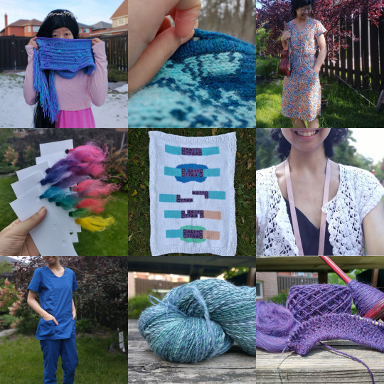
Happy NYE/NY everyone!
Because 'tis the season for reflection, I went through my camera roll and picked out the 9 projects from this year that I'm proudest of.
(We all know what posts from this year got the most online attention, but I think it's important to be introspective and think about what projects and posts were actually most valuable to me. Anyways. /soapbox)
Swan Song Scarf (Jasmine Lin, Crafty Coola). This is my design, and although I released it a good while ago, I'm still incredibly proud of it. I spent a lot of time sketching, charting, knitting, ripping back... it was a labor of love, but I'm proud that I stuck with it and got a result I'm happy with. Yarn: Miss Babs Yummy 2-Ply (World in a Book and Light Clematis)
Woodland Cardigan (Anna Johanna, Where We Once Knitted). This was my first time steeking, and yeah, I'm pretty gosh-darned proud of that. Yarn: Knit Picks Palette (Wonderland Heather and Calypso Heather)
Anza Dress (Kennis Wong, Itch to Stitch). This was my first time installing buttons, making (sewn) buttonholes, using interfacing (...don't judge me), and sewing scoop pockets. So many new techniques for me, but it created such a polished product and was an excellent learning opportunity. I'm so glad I took the leap with this pattern. Fabric: Singer Brand Cotton Poplin (2 yards)
Color Triangle (p: do you love the color of the sky?). This was my first time using powdered acid dye (read: Big Girl Dye instead of tie-dye/Rit/food coloring)! Obviously the whole color-formulating process for the Color of the Sky shenanigans remains in progress, but I'm proud of this triangle as it is anyways. Fiber: Knit Picks Stroll Bare, Dye: G&S Acid Dyes
Custom Intarsia Blanket. This depicts DNA replication using restriction enzymes and DNA ligase. I did this one for a custom commission, and I'm proud of myself for a) designing it, b) being so free with it, and c) getting to make something science-y! I sketched a rough plan before beginning, but I had to make an absurd amount of adjustments along the way -- in the end, I even had to duplicate stitch over the restriction enzyme bit with a half-strand (i.e. half the plies) of yarn since the stash yarn was too fine. I'm so used to planning everything and then being stubborn; this was a great exercise in adaptability and letting go.
Elderberry Dress (Shavonne Cruz, Mood Sewciety). I'm not one to do muslins or even much fitting on my sewing projects. I tend to just take patterns straight out of the envelope and then sew them, consequences be damned. This dress, though? After each wear, I've been making little adjustments to improve it; shaping the neckline and adjusting the fit, amongst other things. That's something I want to carry forward for my future projects.
Eliane Scrubs (Jalie). These aren't anything particularly special from a technical perspective, but they are possibly my most-worn me-made EVER. They've held up to weekly wear and washing and I'm proud of them for that, as well as of myself for letting my babies "do their job" instead of hiding them way out of fear. Fabric: cotton poplin
Fractal Yarn (p: swirling solar winds). I spun most of this for Tour de Fleece (which feels like a lifetime ago!) and it's a huge accomplishment for me. I'm often afraid to break down gradient braids, so doing a fractal spin was a first for me! I also got it nice and fine; a practical weight for what I usually work with. Fiber: Emily C Gillies (now House of Wool) Luck of the Draw December 2022 on Merino/Silk
Handspun Sweater (p: we pull apart the stars). Ok, so this isn't finished, but handspun sweater. I think that speaks for itself as far as why I'm proud!
#top nine#nye#reflections#craftblr#knitting#sewing#spindle spinning#p: swirling solar winds#p: we pull apart the dark
7 notes
·
View notes
Text
commission post!
Hie welcome it’s a long post bud.


1$ fullbody uncolored sketches. Quick to do, a wonderful way to support me actually.
additional characters is 1$
(Limit of additional characters: 12)


7$ fullbody colored sketches
additional characters is 5$
(Limit of additional characters: 7)

colored sketched backgrounds are 8$

uncolored 20 character sketch page is 18$ (currently the only sketch page option)

7$ clean colored sketch headshot
additional character is 4$
(Limit of additional characters: 3)

10$ clean colored sketch halfbody
additional characters are 5$
(Limit of additional characters: 6)
(Also! fullbodies for very simple characters will be this price, think pichu from Pokémon level of small.)

17$ clean colored sketch fullbody
additional characters are 10$
(Limit of additional characters: 7)

cleaned backgrounds are 20$
(Price example: 2 clean characters on a clean background is 47$ all together, while 2 colored sketched characters on a sketch background would be 20$ all together)
rules
1: be kind to me. if you threaten or treat me harshly I will refund and cancel any commission. Critiques are always welcome, though!
2: furries, humans, robots, vehicles are all fine, I will glady draw any of those :)
3: please understand that due to my disability, I have involuntary hand tremors. it is why I make cleaned sketches instead of line art, I physically cannot make clear line art
4: do not ask me to draw hateful art. or art that is meant to mock anyone, and if you are ablest toward me at all I will not work with you pleeease block and stay away, at least give me that decency.
5: don't ask me to draw pro shipping (ie: agegap, incest)
6: I will draw blood. while I am fine as well with gore, I consider it 18+, so see those rules if you want gore stuff
7: I will happily edit pieces if they are out of character, and with permission I will send examples to make sure I can aim for what you’d like it to be most. If you insult me I will most likely refund it and move on.
🫵 be nice
Here is the character design rules [link]
and here is the 18+ rules (no public examples, if you are old enough you can ask for examples privately. just be responsible ok) [link]
my kofi is kofi/gilbortgoose
thank you for reading!!! n___n;
16 notes
·
View notes
Note
HAIIII how about 1, 11, 26, and 34 for the OC ask game :3
alola >:D
1.Have you ever picked up a habit from developing/writing one of your own characters? And if so, who and what?
i don't think so actually. generally I give my habits (and habits from friends and family and other irl people) to ocs instead. I have picked up some odd habits from drawing and cartoons in general though, especially anime. mostly cause my brain can't exit artist mode and i'm constantly thinking about how i would draw stuff, so it's like that 'making weird faces when your drawing an expression' but instead it's 'over exaggerates my every movement because i am thinking about how i would draw that movement'
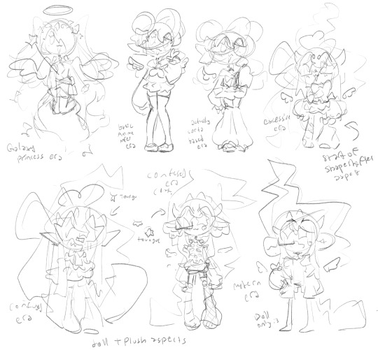
11.Which character has been through the most design changes?
gosh! a lot of pokemelody characters have beeen through DRASTIC design changes but not like, the most. so probably my sona character! here's a sketch i did once showing the basic progression. during the redesign segments though there's a bunch of mini phases of drafts that didn't stick. they've been through a few different eras. I like to split it into three main eras! the primative era (defining traits are galaxy hair and high fantasy aesthetics) the Sailor era (this era had the most story as a self insert oc, defining design traits is a sailor-fuku outfit and pigtail buns.) the confused era (era where i rebooted my sona but was still figuring stuff out, this era's defining traits is a visible ribcage, and way too busy/unfocused of a design) And finally the modern era! (simpler and more focused design but has a couple other forms with the shape shifter aspect. notably while theres still some scrapbook/sewing aesthetics the entire body is now bjd/doll instead of being a confusing mix)
fun facts about the design/s
-sailor era design had no heterochromia and had my irl brown hair, because i was younger and cringe culture was still super prominent: specifically that part where every 'character design tips thing' would tell you to avoid stuff like heterochromia and fangs and cool colorful hair unless they god forbid look like a mary sue.
-i think i've said this before but a year or so after I added that front bangs super long back hair short thing (plus litterally had my hair cut to match) a popular/influential artist made a character with this trait and it suddenly became a more common design trait. obvi i'm not trying to 'gatekeep' the design or claim i'm the first guy EVER to come up with it. but i would be lying if i didn't say i feel 'ahead of my time' and think it's funny to joke about this super big artist that def doesn't know i exist having 'copied' me fndjask
-one main design shift is the shift from the angel aesthetic to adding in some demon aesthetics
-all throughout the confused era the angel wings changed color according to mood, the chart used was to inconsistent and complicated though so this trait ended up being lost.
-starting with the confused era and sitll present in modern era my sona is a shapeshifting shiny mimikyu :3 and the idea is that their humanoid form is like, lowkey hollow, so the mimikyu body is inside
-despite having more inhuman traits i'd actually say modern era sona takes more inspo from my irl appearance than any previous design
26.What's your favorite relationship/dynamic between a set of OCs?
afndsjkfna i can't choose because i love different dyanmics for different reasons fnsdjkaf. ummm heres some honorary mentions!
-Sunny and Daisy, they're dorks in love, nice simple and wholesome! good ol' healthy loving relationship! classic malewife x girlboss lowkey
-kazumi and fukusha have this thing where they hate each other's guts, it's fun!
-SCOTT N TIP i've only posted about them once and they're lowkey co-owned sorta? (i designed them on my own and then an irl friend of mine took a likeing to them and started writing short stories with them, we'd like to make a point and click game series called 'Dectective Cardimen Scott + Tip' with them someday :3) Scott and Tip's designs litterally came from a little excercize I did on designing duos. Scott's a private investigator and was looking for an assistant, the enthusiastic Tip took up the job! they have this cartoon-inspired dynamic where their relationship is vague and up for interpretation. They're business partners and roomates at the least :3
34.What scene that you've written/imagined is your favorite?
hmmmmmmmmm generally speaking i prefer the like inbetween anti-climatic slice of life-y scenes but theres this climatic/hyped-up scene in arc '1.5' of Pokemelody that I'm excited for in the theoretical future where i make this a thing. arc 1.5 is the start of a redemption arc for the final villain of arc 1, the plot is the villain searching for someone she did something unforgivable too with the goal of apologizing.
also scenes where the characters are finally happy and content and theres shojo sparkles to express this my beloved.
scenes i include a lot of because they're what i want to see more of is like, characters having weird inhuman-physical traits both as casual details that are dispersed throughout but also like, when it's directly addressed or played around with. I feel like everything only ever gives me little hints of that sorta stuff and fanfic focusing on it is hard to come bye so i guess i'll just have to do everything msyelf around here lmao.
3 notes
·
View notes
Text
Sketch Request: Batch 1
So I said they'd be in pencil but OOPS they are in pen
Requests are still open, feel free to request the same character again!
Under the cut is Firestar, Bluestar, Runningnose, Flipclaw, Hawkwing, Violetshine, and Morningflower. Special guest appearances for Brokenstar and balding Lionblaze.
@doritopaw101 Firestar

FIRESTARRRR I want him to look like an anime protagonist. He starts off round, simple eyes, blush, and ends up as fire twink. The chest scars are from where Scourge killed him
I have never been able to imagine stripes on him. He is an orange crayon.
@nightly-ruse Bluestar

Ignore balding lionblaze in the corner we'll get to him
I usually just see a super basic blue cat when I picture her but Bluestar needs something cooler than that. I tried to channel a wolf, long face, tail's kinda thick, leg feathering. She also has a ThunderClan "mane," a feature I try to put on most TC cats
After the Tigerstar attack I love the idea she has tabby-like scars on one side of the face. Shredded ear, loss of vision in one eye. I also make it a point to always include her shoulder scar.
@runn1ngn0se Your Boy (scheme flavor)
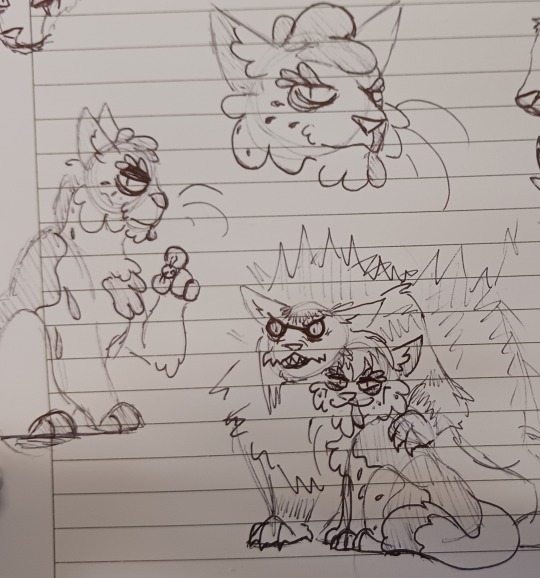
Runningnose looks sticky, but it's all just natural markings. He's actually quite thick and fluffy (same build as Tangleburr).
His defining feature is that snot-streak, which is also just a very unfortunate birthmark.
He's pretty naturally dour. Serious expressions, gives the vibe that he's always analyzing you, he doesn't tend to speak unprompted. But he does smile a lot when Brokenstar's doing Evil Things with him.
He LOVES when he gets to start shit and hide in the fluff of his beloved supernatural manifestation of spite and rage. Special drawing of it since I already posted his full design waaay back.
Also side note Im obsessed with the cut disney song "Snuff Out The Light" right now and it feels like SUCH a Bonefall Runningnose anthem.
@elkpoint Flipclaw
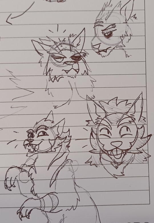
So I mentioned Balding Lionblaze here because he's his grandpa! Flipclaw looks a LOT like him before he lost his hair. He's MEGA fuzzy. (In the rewrite though Fernsong is an ex-kittypet and Ivypool is Lionblaze's daughter)
I also can't imagine him as a brown tabby, he's this really nice brownish-gold color like a lion. His stripes are brown, though. He's also a total jokester, I think he was really close to his uncle Hollylark and misses him a lot.
Pictured is him saying, "look at me guys im walking like a twoleg!!" What a guy.
@purrsnickitty Hawkwing
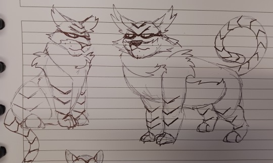
I have always seen him as a mix between Tony Tiger and Batman. I am not sorry about this.
He is also a lynxpoint. When I make SkyClan cats I think of monkeys and aviator pilots for some reason, so they're all getting dextrous paws and prehensile tails.
His stripes are also all chevrons, and he's got TONS of tufts on his shoulders, ears, plus a puffy 'mane' that's part of the belly (don't ask me why it just reminds me of aviator jackets for some reason)
He is also an absolute unit.
@purrsnickitty Violetshine
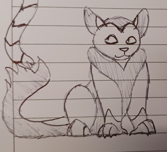
Usually I need to do two sketches to get where I'm going with a design but not for Violetshine. First try, there she is. Monkey woman
Heart shapes for her, heart face, heart belly/mane. It also didn't come across well but her tail is LONG. Able to wrap around stuff easy. Mm, monkey.
I intended for there to be family resemblance because her and Hawkwing are bodied. They have LOTS of diameter. Complete volume.
@nightly-ruse Morningflower
Mentally I adopted your design of Morningflower because it's so good, but here's my old idea of her

Calico Morningflower my beloved
The coloring was difficult but I tried to communicate she has very little white. Most of her is bright orange and warm, sooty gray. She is the sister of Ashfoot (Onewhisker removed) so the gray is very important in my head.
I like WindClan cats to be very whispy, and they almost always have a white tail tip. Morningflower, instead, has an orange tip (which I may fix in another draft).
(I drew her training an apprentice, it was going to be Whitetail! But then I borked the eyes and it's pen so I can't fix it. She looks too scary. So I cropped her out OTL)
32 notes
·
View notes
Text
Throwup Thoughts: "More Than Anything" Poster
(If you want to see the time lapse, click here for the original post!)
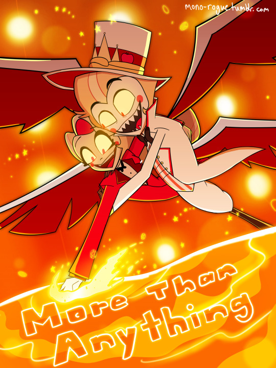
So you know how my usual art has a sketchy (and sometimes fuzzy) feel to them?
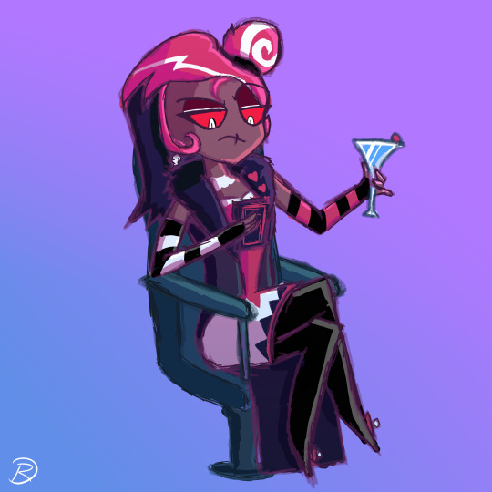

I decided to return to full on line art for the More Than Anything poster, partially because of Sam Haft's tweet, and partially because of Sam Haft's tweet (looking for poster-style fanart of Hazbin songs)
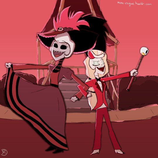
I probably wouldn't be as miffed if I didn't slave away a straight 9 hours (For comparison, that Rosie/Charlie only took at most 3 hours!), and the fact that I did not like to do line art at all... But you know what? Creating and posting art that didn't rely too much on cleanliness and instead focusing just on rough sketches and colors unironically helped me here, and it's really hard to explain how. For example, I was originally going for this shot as is:

Then midway through the sketch phase, my intrusive thoughts intruded: Why not shift the perspective? It would both serve as camera practice and to not just be a screenshot redraw (though you could consider it to still be one, depending on what you think it means)
I did also consider fully drawing both Lucifer and Charlie so I could have their own standalone renders, but I really only ended up doing that for Charlie since Lucifer's missing his right arm (his right leg... it's a perspective thing), and even then the way I did the composition wouldn't have worked for Charlie...
Adding in all the effects was fun though, figuring out what color treatment worked best (mostly linear dodge)! It just ends up becoming one big piece of eye candy. A very orange piece of eye candy. If you get orange diabetes from this, I apologize.
Angular Sharpness
I think one of the main issues I had with line art before was figuring out how to make angles appear as sharp as they appear, especially when considering the style of Helluva/Hazbin. I looked up how to make sharp lineart, and ended up on this short guide!
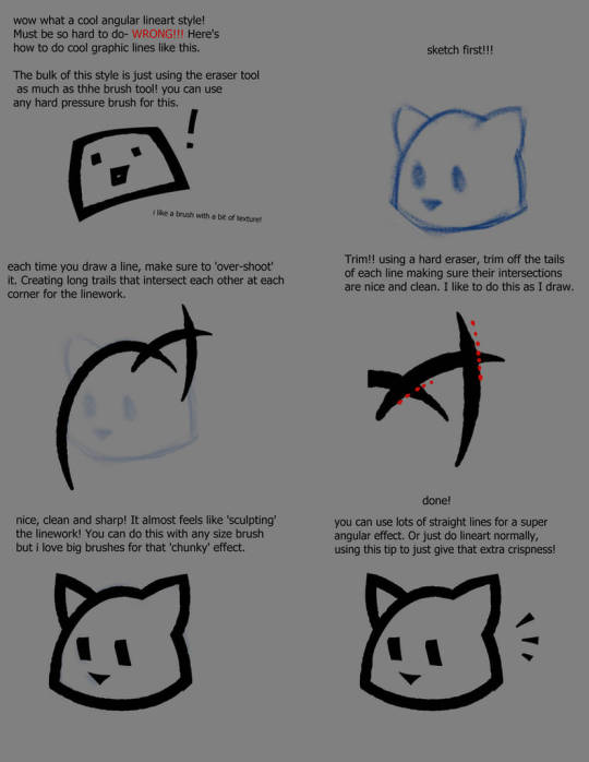
(Original DeviantArt post here)
I'm mildly conflicted now because now I feel like combining sketching and composition was already fun enough, yet now line art is actually fun. We'll see where this goes I guess?
Colors Are Weird
I noticed also Krita was exporting pics out as dull as Alastor's time, so I looked into a solution and the solution arrived:

So now colors should work the way I want them to be. Nice!
Off Topic Topics
I've been going back and forth on my post schedules a fair bit, figuring out what works and what doesn't. A couple early morning posts feels the most fitting for my style, so I might roll with that going forward, at least for a while
Hopefully I'm going to start to embrace the multifandom part of this blog and start making more of whatever. UT/DR? Lackadaisy? Who knows
The state of the Vox Alastor comic... it's in hiatus as of now. It's honestly that since the show was releasing at such a quick schedule that my initial ideas for how the comic would play out kind of got jumbled around? I don't know honestly, so for now it's on hold for now.
However, I got struck with an idea for another one...
2 notes
·
View notes
Text
Okay @kredena-dark you have unlocked an unskippable rant!!! :D
Some of this is just me explaining stuff, so don't mind that- actually idk I'm just info dumping rn, it explaining everything in full detail, but still explaining :P
Idk how long it'll be so- CUT TIME
💚Okay- posca pens!! Fuckin love those!! It's a liquid marker of sorts and there are thinner nib ones and thicker nib ones. There's also a very limited amount of color options. Which include pastel like colors, black, white, gray, silver, gold, basic color saturated colors, forgot if the green is more of a forest green or a more vibrant green tho :P
They can be so smooth and solid looking!! Which is what I like about them!! It's like markers but better!! :D
Really wanna get every single color for myself instead of only using them at school :/
💚 Woodworking has been going really great so far!! For woodworking 1 I took last year, it was introducing all the machines, taking safety tests on those machines plus ones for how to be safe in the workshop. It's where I made a box and a shelf were the drawer is now stuck in, which sucks, plus a phone holder with 2 holes for pencils.
Woodworking 2- very nice~ I'm working on another shelf, this time with 3 drawers!! And hopefully they won't get stuck :P. We also make a bowl, which I'll fully fully work on once my shelves done!! We actually learned a new machine for this!! It's able to make the wood rounded, so we can make a bowl and practice making the wood rounded.
💚Ink is a very nice tool for traditional art in my opinion!! You can put a blob of sorts and shape it however you want, then once it's dry you can use a sharpie or a pen or a fineliner sharpie pen to make something out of it :D
You can also just use the line pens and sharpies by themselves and create different values with thicker or thinner lines and I have shaky hands!! Which can really make your lines feel more organic in a way!! Also really helps me feel loose drawing!! But then sometimes it's rather annoying, like with digital art and when I want to make smooth straight and curved lines!!
💚 Speaking of digital art~
I ABSOLUTELY LOVE HOW THAT'S BEEN GOING FOR ME SINCE I'VE STARTED DIGITAL ART!! :D
I think it was..... Less than a year ago? Around that long ago :P
Anyway- I've made myself my own Sona and it's great!! My hair color and just having a pixie cut hair works quite well with the cat ears!! And all the markings and just- everything that's gone into making them has been so great~
And the art apps I use!! It took a few tries with multiple other art apps and looking up which would work for a phone and what was free to use. But I found Infinite Painter and HiPaint and they are so great!!
I found Infinite Painter first off, and it's worked splendidly and hasn't crashed or glitched on me at all!! And the brush options are so nice!! It's a great beginner digital art app, it doesn't overload you with so many brush customizations!! Even though there still are plenty of customizations, you don't have to adjust them if you don't want to!! You can just change the opacity and size of it if you want!!
And then there's HiPaint!! I REALLY like the brushes this app has, it's actually so much better than Infinite Painter!! And you can customize the stabilizer!! I currently have it a 20%. I actually thought I'd have it at some higher percentage since my hands shake, but it's quite comfortable at 20%!! I could maybe slide it to 21 -25% , just for a bit more smoothness. And- this app has glitched out once before and it wouldn't let me do anything at all!! So I tried restarting my phone a couple times and that didn't work so I uninstalled it AND I FRICKIN LOST MY PROJECTS ON IT AJSJDJFJFFKDJF that fuckin sucked, but luckily I already posted the doodles I did on there and I screenshotted the sona sketch I did, but I did loose my linework and the start of me coloring it :/. But I did redo the linework and finished it all and it looks very nice!! So didn't really lose anything permanently!! It hasn't glitch again so that's good~
💚hmmmm I'm running out of what to add!! Might just leave this as is~
Idk I wanna show this as soon as possible so I can talk more about this with you Kredena!!
(this is mainly for Kredena, but to anyone else reading, I hope you like this all!!)
Ye you know what idk what else to add, probably all my head cannons and such for every fandom I've ever been in, but I don't even remember all of that rn so- this is it I guess, maybe at least for now!! :D
💚Update: BANNER IDEAS FOR MY BLOG HERE :D
I have some very nice ideas!! There's one with my sona wearing my in progress green scarf!! There's another with a winter setting with a certain way the trees would look that I really wanna try doing!! There's a flower pattern idea for spring!! I also wanna do one with a pattern with better pumpkins and fall leaves and candy corn!! For summer I'd probably do a Sona drawing with a sunny background with my sona wearing shades and, OH OH MAYBE STANDING IN AN OCEAN!! OH I LOVE THOSE CONCEPTS SO FRICKIN MUC AJSJDDJFJajsjsjdjsffjdjAHSHDajsjdhASJDHDjajsdj!!
2 notes
·
View notes
Note
I absolutely love the watercolour art you’ve done recently! I’m just wondering what the process is on how you create the art? Like do you sketch, ink then paint or ink last? Im curious because I would love to try and do something like this myself!
Aahh thank u 😭 I haven't paint properly since last year so i thought my painting skill is a bit rusty but glad it look nice to you 🥺💕
This is a bit of a long post since I added a few tips to help you out on your process (tl;dr: sketch>paint>lineart)
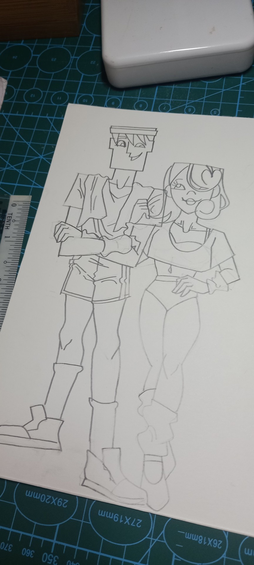
I actually took a few picture when I was painting this so I can show you a glimpse of how my painting process looks like. I usually start with a sketch and erase it lightly with gummy eraser (I erase it until its barely visible like the one at Chloe's legs). You can use a normal eraser but gummy eraser is easier and it doesnt damage paper and doesnt make those annoying eraser clumps so get those if you're on a grocery run one day hhh
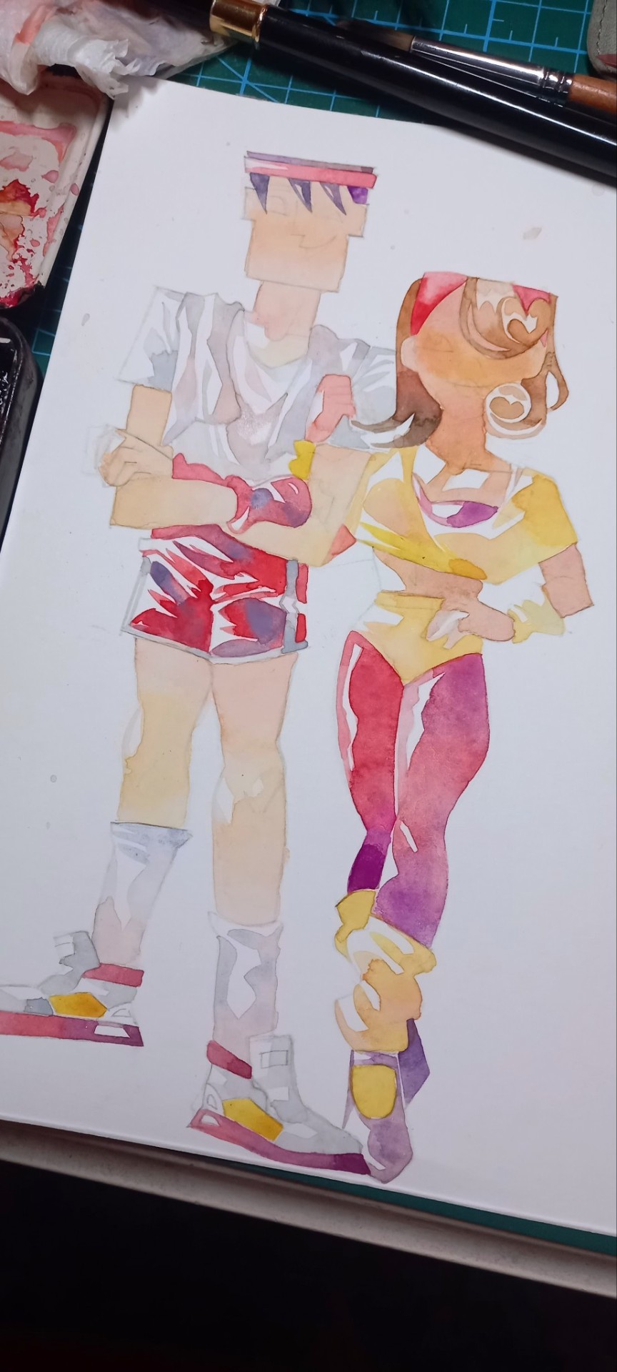
After I erase it, I put down the bases here and there. I intentionally leave some white spots cuz those are highlights and where the light hits. If you're painting, I suggest you figure out where the light source would be and leave the part where you think the lights will hit the folds of the clothes and skin unpainted.
When painting the base, dont forget to dilute it, the color of the bases shouldn't be darker or more vibrant than the shadow you will paint soon. The bases will look pale but I assure you it will look nice when you add the shadow soon :3
I also mixed a few colors at the areas i think it would look darker. For example, notice how Chloe's red legging isn't a solid red but a mix of purple at the bottom part.
White clothing can be tricky to paint since it's light and highlights are white so what I usually do is I always paint it to be off white. For the base of white clothes, instead of using black and dilute it with water to make it grey, I like to mix jaune brilliant (or any pale skin color)+ tiny bit of ultramarine because it creates such a nice neutral gray. From that grey you can add either add a bit of cadmium orange (to make the grey warmer) or a bit of purple or pink to make the tone cooler. For this drawing, I also add a bit of shell pink and horizon blue (a baby sky blue shade) on Utonium's clothes. Mixing those colors makes white clothes looks prettier to me.

I dont have a clear picture for this part so sorry about that aahh 😭😭😭 but anyway this is the neat part. Since we already use diluted colors for the base, you can use more vibrant color and add more paint as shadow.
I also dont usually use black to make the shadow darker since it will make your color look muddy. For that, I usually add other shade right next to them on the color wheel. For example, for red shade clothes I mix purple to the shadow just like at Utonium's shorts. This works for others too, if your clothes' yellow, use orange for shadow. Blue? Purple can be use as shadows. It helps if you memorize the color wheel so you can pick the shadow color quickly in your head hhh
You still can use black though if you intended the shade to look brown, there's nothing wrong using black but be careful on adding because its a strong color a just a tiny tiny bit is enough to darken your color. (If you paint with black all the time I suggest you buy a tube of neutral tint black because this shade can be use to make your color darker without making it look muddy since it is created for this purpose :3)

This is how it looks in the end after I'm done with the shadows and the bg (I havent add the lineart at this point). I actually dk how to draw background so I usually just draw patterns or just paint a solid color bg. I also think keeping the background plain is better since I want people to focus on Utonium and Chloe instead of the background and it would look cluttered af if I draw a complicated bg hhh
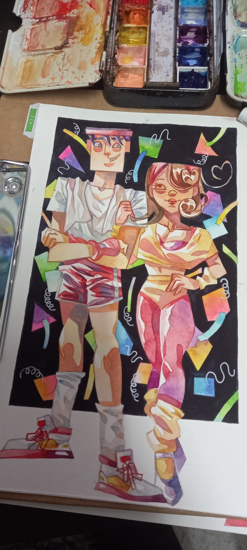
This is how it looks like after I finish with the lineart. For the lineart, I never use pen or ink, I use watercolor and colored pencils for it. I use a tiny 01 detail brush for the lines and also use a white gel pen for some highlights. Lineart is actually my least favourite part and I still struggle with it til this day ;w;
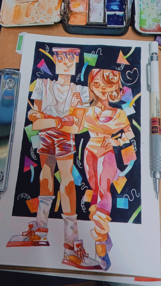
This is the one I posted the other day. I edited this one clearly since my camera actually didn't do justice to the color (it looks prettier irl i swearrr, my camera just fuckin sucks _(:3」∠)_) and also everyone lies on the internet hhh dont feel guilty about editing it since its hard making watercolor looks good on camera fr 🤧🤧🤧
In the end, watercolor is a fun medium for me to work with because it's an unpredictable medium and sometimes it doesn't look like how I intended it to be so don't worry if it doesn't look like how you planned it to be. I hope this is helpful enough for you and its easy to understand 🙏
#oof so sorry for the long post I didnt mean to go nerd about it 😔#but i hope it helps you pls dont hesitate to ask if you need any guide 🙏#anyway the brand I use is a mix of students and pro grade paints so dont worry if you dont have pro grade paints#and the tiny brush is a cheap nylon brush I bought at the bookstore hhh#if you ever do and finish the painting pls show it to me 🥺👉👈#anon#ask#watercolor#psa
8 notes
·
View notes
Text
15 Questions for Austin
This game is supposed to be for main characters, but I decided to go with Austin Dusky instead. He's my deuteragonist and a major part of the story, and I don't post about him much so I figured this would be a good chance. That and I couldn't get into Cozar's character to write his responses because he would never sit through an interview like this.
Thanks for tagging me @thetruearchmagos
-----------------------------------------------------
1. Are you named after anyone? You'd have to ask my mother that question. She's never said that I am so I think the answer's no. But then again I could be named after someone on my father's side.
2. When was the last time you cried? I can't say for sure, I don't keep track of when it happens. I cry pretty easily when I'm laughing, so if we;re counting that probably this morning.
3. Do you have kids? No, not yet at least. Millie and I are only 22 so there's still time.
4. Do you use sarcasm a lot? Not really. I probably should practice it though, it usually goes over my head when others use it.
5. What’s the first thing you notice about people? Expressions. I know this is obvious, but you can tell a lot about someone by their face. Their personality or just the mood of the day. And if they need a friend but can't ask for one with words.
6. What’s your eye color? Like most people on Hessdalen I have blue eyes.
7. Scary movies or happy endings? Happy endings, but just because a movie is scary doesn't mean it can't have a happy ending. Not that I ever watch scary movies.
8. Any special talents? I don't really like to brag about myself, I'm not all that special. But if I have to pick something, I'd go with drawing. I get voluntold to do the police sketches a lot, so I think there are others who would agree with that.
9. Where were you born? I was born in Cellano on December 27th, 151 (roughly equivalent to the year 2000).
10. What are your hobbies? I like reading and going for walks along the shore or in a park. Spending time with Millie is always nice too. Sometimes we go on actual dates, other times we volunteer at the school since she's a teacher.
11. Have you any pets? Yup, one orange cat. His name's Chester and we adopted him a year and a half ago.
12. What sports do you play/have played? I don't like competition that much so I've never done team sports. But I really enjoy ice skating and going for a run when the weather's nice.
13. How tall are you? I'm 6 feet tall plus one inch.
14. Favorite subject in school? I always liked language arts when I was younger. Usually we'd get to read or go to the library in that class.
15. Dream job? I'm happy where I am right now as a detective with the CCPD. I mostly get smaller cases and lots of chances to help in the community. I don't enjoy the nasty stuff I sometimes have to face, but the good I get to bring is worth it.
-----------------------------------------------------
Also here's a mood board.

#worldbuilding#writeblr#writing#fiction#oc lore#oc#moodboard#my characters#original character#character development#hessdalen#cozar
0 notes