#Is literally cropped from a screenshot I downloaded of the post
Explore tagged Tumblr posts
Text
To me the Merrow fighters (from a quick look at 2 of them) seem to take inspiration (at least in the face) from dunkleosteus
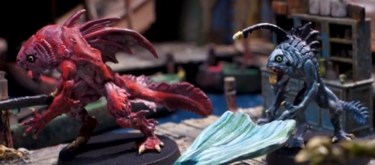
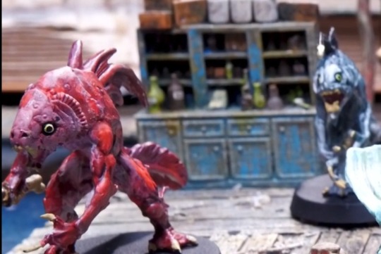
Dunkleosteus

#Neverafter spoilers#Just a little in case ppl want to go into the ep fully fresh ig#Full disclosure I did have to look up "bad dude fish'' to find the picture bc I misremembered the name as ''dunkleosaurus''. Also the image#Is literally cropped from a screenshot I downloaded of the post#Also I could be wrong and the teeth may be more thin but consider: wauuughhh#Anyways. Male anglers don't have the little lure. Hashtag feminism or hashtag Trans rights whatever the case may be#Also the red one looks to me like it may have taken inspiration from rockfish based on 1. Color and 2. Spiny fins (exaggerated ofc but#Still visually similar) anyways. Follow (DONT.) For more fish facts (DO NOT FOLLOW THAT IS A JOKE.)#Also idk about the green thing I don't care
10 notes
·
View notes
Text

Since I'm seeing the original Steve Buscemi sun post going around again, and this has been sitting in my drafts for over a year, it seems like a good time to actually post it. This project started (in 2021, apparently) because SimNostalgia's sun inspired me to make a Paul Reubens moon, then made my own Steve sun to match. This was originally intended for personal use, and was almost shared last year but got left in drafts and later shared with some Discord friends, but I think the time has come to release these handsome celestial gentlemen into the wild.
Credits:
@simnostalgia for the idea, 100%! ♥
@lowedeus for the default package files I edited to create these.
Tim and Eric Awesome Show, Great Job! (S01E03) for the Paul Reubens moon (I literally just cropped and resized a screenshot from the show).
Unfortunately it seems I didn't save the source for the sun image I used, and when I reverse search it now I get mostly various fandom wiki links in lower res, but I'm pretty certain I originally saved it from some "download free pngs" type of site. I put the original unedited image on Imgur, if anyone wants it for anything.
Steve Buscemi and Paul Reubens for their striking visages. ♥
Download @ SFS
108 notes
·
View notes
Text
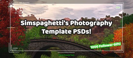
First of all, I want to say thank you so much for 1000 followers - that is truly a bonkers number I never thought I'd reach, thank you to everyone who interacts with my posts or follows along with my legacies or just occasionally sees my posts on your dash - I love this community so much, and I've felt so welcomed here since I joined simblr!! Mwah ily!
I come bringing gifts!! It's another PSD template, based off of the photography UI for Sims 3
I got the idea for this template way back when I was taking these screenshots in Gen 1 of my Blossom Random Legacy, and I figured they could really come in handy for people who are doing world adventures style gameplay :)
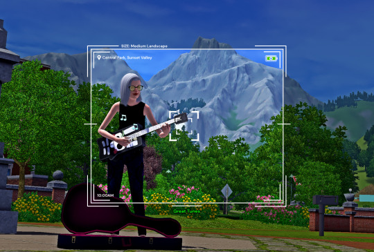
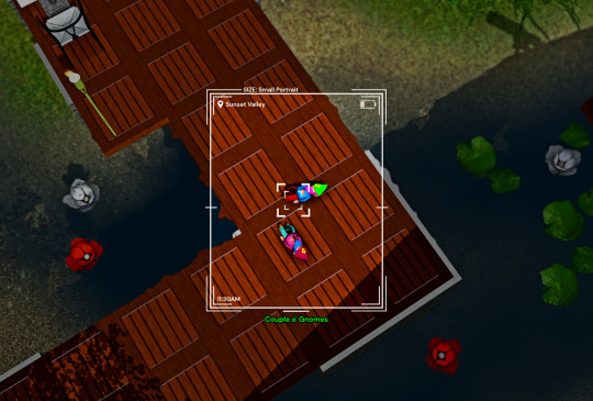
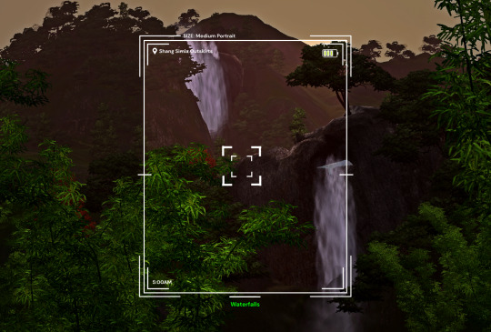
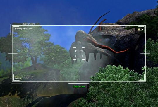
There are 4 sizes to choose from, each one is loosely based on a photo size in the game:
Medium Landscape Medium Portrait Panorama Small Portrait They're all on a 1450x980 canvas, but you can of course crop them however you want!
It's also pretty easy to create your own custom size if you want to, as long as you have a basic knowledge of photoshop tools - every layer is completely adjustable and customizable!
Terms of Use:
Please don’t claim as your own or reupload without my permission, and credits on posts aren’t necessary, but I’d love to see you use them in your game if you do tag me! Alter and customize the templates literally however you want, but if you're gonna reupload a downloadable variation of them I'd appreciate a link back to my blog :)
The only font used in all the templates is DM Sans (bold) it can be found here
➡️ DOWNLOAD (Simfileshare, .psd files)
Instructions: These are .psd files, so you can open them in photoshop, photopea (my personal choice of editor), gimp or another similar photo-editing software Then just place your image at the bottom of all the layers You can alter the text in the boxes to whatever your needs are, I recommend referring to this page on Carl's guide to see all the photography collections which inspire the green text! :)
112 notes
·
View notes
Note
hey isa! Do you have some advice for a beginner who wants to start a story? I know it's a lot of work, finding the right cc, buildings everything, create sims etc. Do you have a favourite blog to browse for such cc for storytelling? Also I could use some advice what's important for taking pictures - what's the best crop solution for tumblr? What font and font size is the best to use? And hoooow do I write dialogue without adding too much and still keep it interesting? Sorry if this is a lot, but I really admire your work and loved to start a storytelling simblr again!
hii! i think it’s awesome you want to dive into storytelling. i’ll answer your questions under the cut 🫶🏼
1. as for finding cc, i’ve just accumulated a ton over the last few years, no specific blogs but rather just browsing on tumblr. you can always check if your favorite blogs have a cc finds account, many do! mine is @warmfinds which could be useful. but yeah when it comes to cc, i suggest really thinking about what you’ll need! like, say you have a scene coming up in the kitchen, gather some kitchen pieces that you can use for that scene. it might be more helpful to break up the search according to scene rather than trying to find things all at once for your story. (also suggest downloading telegram and joining dollhouse mafia.. or keeping up with the vault… cough)
2. for taking screenshots there are some guidelines you can loosely follow (highly suggest watching this video for a quick breakdown) here you’ll find the different types of shots you can include in your posts! considering this is sims, there are some limitations so just allow yourself to get creative with it.
for most of my story posts, i’ve stuck with 1280x720 resolution. but recently i’ve been playing around with sizing, so unless you’re focused on consistency don’t be afraid to try out different crop styles.
3. font! the font i use is arial. it’s straight forward, and easy to read. i’ve used this my entire storytelling journey and haven’t had a complaint. at the end of the day just remember that the font is probably the most important part! pick something easy and clear to read. also, switching colors when a character is talking is highly encouraged. if that’s not your style, at least add a name tag for easy following along.
4. sooo, when it comes to dialogue, it’s really something you learn as you go. i had a tendency to write very lengthy in the beginning, i wasn’t a seasoned story writer so i sucked at knowing what to cut and trim. my biggest advice is to write out everything. ramble. let it be a mess. get out everything you want your characters to say. it’ll be rough, and that’s fine. once you’ve sat on it, go back and edit it. keep what’s important, what moves the story! i spend a good amount of time editing scene dialogue until it feels right. one huuge thing that helps is reading out loud! if it flows well spoken it’ll feel more like a natural conversation. just don’t be too hard on yourself, we all start somewhere. it’s a muscle that needs to be exercised and you’ll find your rhythm as you practice. (like seriously compare my first posts to now and it’s night and day, and i still have room to improve)
lastly i just want to say pleeease have fun. don’t pressure and compare yourself. i’ve fallen down that trap many times and it literally stopped me from posting. but as long as you remember this is all a fun hobby, i think you’ll be okay.
i hope this was somewhat helpful ♥️ also once you start posting lmk! i wanna follow along heh
15 notes
·
View notes
Photo
Sims Tag
Got tagged by the fabulous @deedee-sims - thank you! 🤗 Throwing in a random in-game pic because I can.
1. What’s your favourite sims death?
Hum, tough one. I guess being struck by lighting is pretty cool, not that I get to see it that often. Also being hit by a satellite, but I’ve literally never seen it happen in my game unless I cheat.
2. Alpha CC or Maxis Match?
Alpha, obviously. Although I prefer to call my style ‘semi-realistic’.
3. Do you cheat when your sims gain weight?
I used to, but now I’m like, nah. Let those sims have some meat on their bones!
4. Do you use move objects?
All the time, bruh.
5. Favorite mod?
If I only had to pick one, then Gunmod’s radiance lighting. Picked based on the fact that it’s always the first mod I get whenever I have to reinstall.
6. First expansion/game/stuff pack you got?
I think it was Nightlife? But my PC from back then was so weak that I couldn’t get the EP to work at all, save for a couple outfits that were randomly showing up in CAS.
7. Do you pronounce “live mode” like aLIVE or LIVing?
Been pronouncing it ‘aLive mode’ ever since I started simming. I never even knew there was a debate about it until I saw a post on simblr some years ago.
8. Who’s your favorite sim that you’ve made?
What, just one? D: I have a bunch of faves, and you can probably tell who they are by the fact that they crop up in every new iteration of my game.
9. Have you made a simself?
Never, nor do I plan to! Having a sim version of myself in the game would just feel weird.
10. What sim traits do you give yourself?
I don’t know them all by heart and I’m too lazy to google 'em, so pass. xD
11. Which is your favorite EA hair color?
I wouldn’t say that I necessarily have a favorite, but I noticed a lot of my sims tend to have black hair.
12. Favorite EA hair?
Imma go with hairshortcombed solely based on the fact that I don’t have a burning urge to replace it the second I see it in my game.
13. Favorite life stage?
Adults, duh. And teens. They’re pretty fun too.
14. Are you a builder or are you in it for the gameplay?
I do a bit of everything, but I definitely lean more towards gameplay, especially since starting my BaCC.
15. Are you a CC creator?
Yep! Got my own cc tag and everything! 🙂
16. Do you have any simblr friends/a sim squad?
I want to think so! ^^
17. What’s your favorite game? (1, 2, 3, or 4)
Sims 2 all the way, babey!
18. Do you have any sims merch?
Nah
19. Do you have a YouTube for sims?
Nah
20. How has your “sim style” changed throughout your years of playing?
I think it’s gotten more consistent? I’ve been trying to find a balance between realistic and cartoony cc to maintain that elusive ‘semi-realistic’ look that I’m so fond of, and I like to think that I have a pretty good grasp on it now, after so many years of simming.
21. What’s your Origin ID?
Never had one, lol.
22. Who’s your favorite CC creator?
One favorite cc creator? BRUH. I have a 10GB downloads folder, and you better believe every creator whose cc is in there is my favorite! 🤣
23. How long have you had a simblr?
11 years! Golly, has it really been that long?
24. How do you edit your pictures?
By offering a blood sacrifice on a full moon. Nah, kidding. No blood is spilled during my editing process, though it does feel that way sometimes, considering how effin' long it takes me to iron out all the small kinks that annoy me about my screenshots. I kinda hoped having a dedicated photoshop action would help, but it only speeds up the process so much, unfortunately. :(
25. What expansion/game/stuff pack do you want next?
For Sims 2? Dunno man. Maybe a higher-res remake with all existing EPs/SPs and all known issues ironed out. Which is probably never gonna happen, but a girl can dream, right?
25. What expansion/game/stuff pack is your favorite so far?
I’m partial to Apartment Life because it introduced witches, one of my favorite supernatural life states!
I’m tagging: @blackswan-sims @eleysims @episims @rudhira @ho3sferatu @analog-mothman @nervosims @frauhupfner @mrs-mquve-cc and @gphoenixsims! But feel free to ignore! ^^
35 notes
·
View notes
Text
still think about that malicious reposter that likely still crawls my blog and Twitter acc for my edits and gifs and compilations to repost on their daily Eggman Twitter acc. the way all the proof was there that they'd see my posts, download all the images from it and schedule them to post exactly a month after at times
and how they denied when I kindly sensibly asked for credit when they were using things I recorded and screenshot right from the games myself, or edited and cropped, or spent hours making into gifs. and it was extremely obvious that they weren't just happening to find them on Google, in the exact same order I'd posted them on my blog because that's not how it works
and I told them it was upsetting that they were heavily running their account on all my hard work and using the account's followers to raise real money on two different occasions. especially because it takes a lot of effort for me to make it all with my disability and the exhaustion and pain just the process of doing what I love can bring but I pour my heart into it anyway just for them to get all the credit and traction
and they just didn't give a shit lol they never consistently credited and when I asked the third time they just ended up blocking me and saying I'm a liar, even though I provided tons of proof that they were straight up all mine posted for days in a row and all were so obviously taken directly from my blog in the orders they were posted in. things I've literally drawn and colored on myself to correct at times too
and they're definitely still doing it to this day to everything that I'm too tired and in pain and fatigued to watermark now but I can't look because I'm blocked. and I told my friend to stop telling me when they do it because it just upsets and stresses me out knowing that someone would disrespect my hard work and leech on it and even raise money using the account while I struggle with money and my disability lol
so yeah I'm not just being an asshole this is genuinely hurtful and disrespectful. and if these people tell you rumors about how horrible I am for wanting credit, they aren't true. especially because they have a lot of people sided with them against me liking them out of spite because they hate me for various reasons that also aren't true
and they can't say this is me harassing because I'm not going to tell you their username anymore. but I know they're reading this and I wish they realized how disrespectful they are and at least apologized if they're not going to give me credit
and what got me thinking about that today is how also my disability also isn't being respected irl as I'm about to be forced into that programme I can't do. and it's like damn it would've been nice if it could've at least been respected online before then but nah couldn't get it there either
3 notes
·
View notes
Text
[ID 1: A screenshot of a Tumblr post with the username cropped out. It reads: "tape casette recorders are compatible with literally every. single. thing. im out here living in 2095." END ID]
[ID 2: More of the previous post. It reads: "things you can record (audio only), simply by lying to your computer, telling it that the tape recorder is actually a set of headphones:
discord call
podcast
documentary
radio and internet radio
music, from any source. without having to download it at all.
music you make on virtual pianos/etc noteworthy news items (fireside esque, interviews, huge events)
stand-up comedy
rented or borrowed media
any other sound your pc can produce
[and with a VCR you could do all of this AND have the visuals as well… but an audio cassette recorder is a good place to start, since they're small and simple. I would not recommend a boombox, because those are large and nowadays all very, very bad quality.
[Now you may be saying "how is any of this helpful, I want a digital file…" here's the fucking magic. You go into Audacity (free program), and lie to it that the tape recorder is really a microphone. Then you hit record on Audacity, and hit play on the tape, and let it play at regular speed. Trim and export the digital file, and you're doing gangbusters. You're cooking with gas. You're thinking with portals. You've won the internet.
[Congratulations, you can "pirate"* anything you want, and literally no one can catch you, because you're not downloading in the traditional sense. You're streaming to an external device, and that device is recording what it receives. It's exactly like taping a live tv show to a VHS. This is a very low-key and non-strenuous task for the computer, since your tape recorder does all the work.
[*Is this piracy? No. Well- it's time shifting. Sort of. Tell it to my Steely Dan albums. Tell it to my The Sims: Hot Date VG Soundtrack album. END ID]


Time shifting
––
I wanted this but the original poster is transphobic
71K notes
·
View notes
Text
Fives Screenshots Part Sixty Five
This is it. The last of the Domino screenshots. Many months have passed, both from the sheer number of them (literally hundreds) and the time I took between some of them. It's been quite the journey. I only went 10 parts over my initial goal, somehow. 65 for Fives (ended it with a 5 just for him). Thanks to everyone who has liked, reblogged, commented, and put up with all my commentary for this long. You guys are the best <3
I tried to spare what I could considering what happens. It's still hard to watch, let alone pause, take screenshots of, crop said screenshots, then arrange into a post. Just a heads up
Downloads are fine if you rb

More talking

FIVES NO

Pain

Pain

“I only wanted to do my duty”

I’m so sorry, guys
18 notes
·
View notes
Note
All the odd numbers, please :D
All the odd numbers hmm? You would do that to me 🤣 1. how big is your mods folder? I think it's almost 3gb? Which is huge for me. I had to be super careful about package sizes with my old laptop, so I have lots of little things. 3. what is your favorite challenge? I love BPRs (which might be why I have multiple 😅). I will read any and every BPR I can get my hands on. I just don't follow the rules. There are a few cute new challenges I want to try, but I always come back to the BPR format. 5. what type of cc do you hoard? All of it? 🤣 Um... the largest offenders that are my must downloads are skin details and tattoos. I also have a fondness for houseplants, kitchen clutter (I love the Snowy Escape cabinets because I can clutter the shelves), and rugs. 7. how many urls have you had, and what are the meanings behind them? Oof. Coming after all the secrets. So My main has a double meaning. Indigo Elfinspirit has been my online moniker for a while. Indigo for actual decades, and Elfinspirit for about 8-9 years. Elfinspirit is a combination of the fan club names for my two favorite Kpop groups Super Junior (E.L.F.) and Infinite (Inspirit), but it also means elf in spirit because I absolutely love Elves and Fairies and Shee (if you couldn't tell from my berry elves running around everywhere). My other urls are not so special. @Elvinarchive is just a place to keep things for simblreen or other treats that I don't want on the main page. Though I have thought about actually using it to archive things someday. @Elveinposelibrary is me keeping to a theme. It is literally just the place where I reblog poses I think I might need someday and for some reason people follow it... 9. who is your favorite storytelling blog? Dangerous Question. I have a lot. @simmancy's Pastel Pastilles was my first BPR and I will always love it. @simblrinterests Light Family Legacy is probably one of the best written one's I've ever read. It is beautiful, and painful, and magic. Jex and Kit's stories are my inspiration. Jex's made me want to write my own BPR, and Kit's mix of fantasy and personal experiences inspired me to write Starfall with all the personal messy experience mixed in. So blame them the next time things take a turn 😉 Everything @samssims does is just pure joy in a post, and makes me happy. @tainoodles is posting again and I am loving every second of it. Then there's the little story called Mimic that is everything my sci fi loving heart could hope or dream of. The days it posts are magical. It also has this really bad habit of making me want to do a Sci Fi story, but I don't have the time to make it look right. Literally I think I've start a sci fi save every other time you've posted a Mimic update in the last 3 months. 11. how do you edit your photos? I don't. I am notoriously lazy. I don't use reshade. I only crop or occasionally turn a photo black and white when I absolutely have too. I did edit one photo properly in photoshop for Sam's love photo challenge. I have learned how to use tab mode and my new laptop is capable of running poses in game (and a real graphics mode) so the photo quality is at least going to get better. 13. what do you do when you are unmotivated? I start a new save 🤣🤣🤣. Or I pick up an old one. Usually either option involves taking tons of screenshots and posting them on discord and talking about posting them on tumblr, but never actually doing it because I always end up missing Starfall and Rusty and go back to working on Starfall and Halcyon Days (I literally have two AU saves where Rusty gets a long and happy life, because he is my favorite... don't tell the others). 15. who is your current favorite sim that is not by you? Questions that are impossible to answer hmm? I will take Atlas from @lazarish‘s story almost anyway I can get him. I love Jack from Jex's legacy. Rae in @ancenth's NSB is adorable. Oh, and Tharen, Hal, and Freddy, of course. I have a real weak spot for Tharen, and I ship Hal and Freddy something fierce. 17. do you talk about sims with people in real life? Never actually. I have practically no life outside work, tumblr, and discord. Simblr is how I socialize and I have met some amazing people on here. (Lest ya'll worry too much I do have irl friends but with the pandemic and my crazy job and the fact that we're now spread across the country we don't physically see each other too often. I'm not like a weird hermit or anything). 19. how many posts do you have on your blog currently? 934 👀👀👀 21. how many posts are in your queue currently? 7, I rarely queue more than 3-5 days in advance because tumblr screws something up if I do. In this case I just haven’t queued next weeks posts yet. 23. are you in any sims related discord servers? Just one really awesome one. 25. how many hours have you played sims? Nobody knows... I have played on 3 different laptops in the last couple years, and the tally doesn't transfer. I think I was at 500+ hours on the one I used during the pandemic. 27. what’s the farthest you’ve gotten in a challenge? LMAO challenge? Me? I don't actually follow the rules or play challenges as challenges, so it doesn't actually count. I technically haven't gotten past Gen 1 yet in any of them. Though I am so close to Gen 2 in my Starfall save like I can see the finish line
14 notes
·
View notes
Text
gif makin’
alright! I had a friend say they wanted to learn how to make gifs so: here’s how I do em!
disclaimer: I do it different for non-theatre gifs, but for this im gonna be focusing on giffing theatrical moments
ALRIGHT. first of all: find what you want to gif. download it, take it from YouTube, whatever, you just need to have the file on your computer
then you’re gonna import it. I use photoshop, but there are plenty of other alternatives, but this is what I use because of school. you are going to import video frames to layers
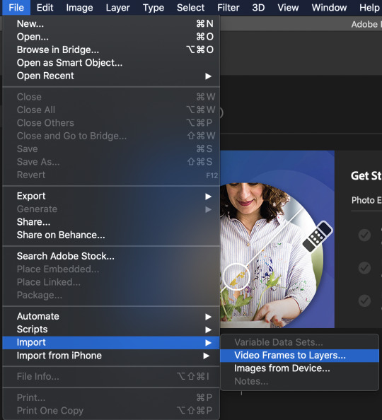
From there, you’ll be prompted to select the portion of your video you want to import! I didn’t screenshot mine, but I'm just giffing the opening of act 2 of bandstand where Johnny walks across the stage
when you import it, you’ll get a little bar like this along the bottom:

every one of these is a frame of video and my little section is almost 200 frames long, which is WAY too long. my rule of thumb for myself is not to go over 100 frames, but even then I think 100 frames can be kinda lengthy. photoshop sets gifs at 30 frames per second (fps) which means when you export it at 100 frames it’ll be kinda long. if that’s what you want, cool! if not, you just might have to make more gifs for your set or just pick and choose what parts you gif. there’s no real wrong way to do it.
so, I'm going to shorten my gif down to 100 frames, just for the sake of it being that max number for this tutorial. then I'm gonna change the time of each frame by selecting all the frames

then youre gonna click on one of those little .03′s and click ‘other’. I usually go somewhere between .06-.08-ish seconds, but again this is gonna be a thing you have to play around with and figure out what you like personally!
(something I already have done because I've done it before and just left it is that in that bottom left hand corner, there's a thing that looks like this:

you’re going to want to change it so it does say forever, not ‘once’ or ‘three times’ or whatever)
next I’m going to crop the gif. for reference, you’ll see dimensions as (number)x(number), the first number being the width and the second by height. the widest you can make a gif is 540 px on Tumblr, and the length doesn’t really matter as much, since the post can just get longer.
for this gif I'm going to crop it to about 540x296 (usually I'd do 540x300 but the length of the video is literally 296 px).
next, you’re going to convert to video timeline. then you’re gonna get something like this

then you’re going to select them all (which I already did in the above screenshot) and go layer > smart objects > convert to smart object so that you combine all of those frames into one video layer. then you got one neat little video layer like this

so! if I were to wash my hands and say ‘alright, I'm done’, this is what the gif would look like:

not too awful! but I can make it better. it’s a little dull and the colors are a little....bleh. if you’re gonna gif, play around with the settings yourself! mine are just my preferences
that being said: I try to just get it like the original video, not put my own little spin on it. Since I’m giffing a show people worked very hard to costume, light, etc, I want to show you the exact same thing you see in a video!
I basically took brightness and contrast up to +10 each, called it good esp bc I didnt want to nit pick this
so youre gonna go file > export > save for web
I then use these settings:

AND something important is you’re going to want to do is make sure its 5MB or less. mine is a little bigger, so I'm going to go back, make the gif shorter, and then export it.
NOTE: something I ran into trouble with at first is saving it so it’ll upload. as a precaution I now save everything as “name.gif”, not just “name”
and, drum role please, this is my finished product!

14 notes
·
View notes
Text
Tips on creating fun fanfic headers!

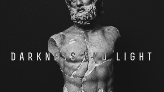
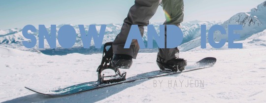

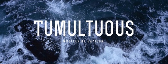
i had so much fun writing the fanfic writing tips yesterday and i got a few more questions about header-making, and so i decided to make one more of these! i hope these tips help somebody out there! hope you enjoy :)
p.s. these tips won’t require any hard editing skills or photoshop skills, nor any expensive tablets/apps!
typically i spend around ~5-10 min creating one header, and that’s either after i think of/finish a fic. i have so much fun doing it and sharing it with you that i figured i’d share how i do it!
why headers?
as I talked about in my fic tips, one of the most eye-catching things about fics are headers. when i’m scrolling through a rec page, my home page, a tag, or even someone’s masterlist, i’m immediately drawn to well-made headers. that’s what captures my attention, and then i’m more drawn in by the content. so, you can say that headers is your own version of an ad for your own fic, or an extension of it (like the cover of a novel!)
if you were writing your own book, imagine how much time you’d spend figuring out what you wanted your cover to look like. i try to have as much fun and invest as much time making my own headers because it’s just the cherry on top to my finished product :)
disclaimer: BUT HEADERS ARE NOT NECESSARY/DO OR DIE! if you don’t feel like you want to do this, then keep writing! its ok! this is just a suggestion. i’ve seen plenty of well-written fics without headers at all, so don’t beat yourself up over not having one/not wanting to do one. this is truly just a fun, extra kind of thing, and only keep reading if you want to learn how i do it! :)
tips for people who don’t want to make headers: if you still want something to make your fic stand out, use gifs! i use them in my drabbles a lot! this will at least give ur fic a lil boost!
how to find pictures
I typically use unsplash, which is a free website in which photographers upload their HQ pics for free use. the pics are really high quality, typically stock photos, and don’t have any logos on them like other ones on google. unfortunately, you won’t find any pics of the members or anything, but you’ll find beautiful stock photos of typical scenes like “ocean scene” or “desert scene.” I found the stock photo for cut me open (shown below) on that site by just looking up “medical” or “doctor”.
i used to use google a lot and just use keywords like “desert scene HQ” and edit the search settings to deliver HQ pics, and a minimum # of pixels, but unplash is definitely better in terms of quality, more aesthetic photos, and no logos/watermarks.

on some occasions, i will screenshot some scenes of youtube videos, turning up the quality to 1080p or 4k and zooming in so that the pixelation is as crisp as possible, and then editing it later to look good (which i’ll explain in a second!)
the above photo was a scene from the specific characters from the drama, “100 Days My Prince” that I screenshotted from a youtube video that TvN uploaded, recapping the drama. I cropped it just right so that their faces were left out, which i’ll also mention soon!
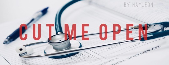
things to look for when picking pictures:
you want the picture to reflect a specific motif/theme from your fic! if its a moody fic, then try to find a moody scene that you can edit with filters/lighting to look even moodier; or if the characters’ jobs are a big portion of the fic (like cut me open/doctor theme) try to look for stock photos with that shown very clearly!
make sure its high quality: tumblr really dumbs down the quality of the photo when uploading it, so try your best to find something with a lot of pixels in it so that when you start editing, you don’t sacrifice too much of the quality already
try to look for something simple/clean: a picture with too much subject (ie. people in the background, or too much detail) may end up taking away from the main point of your header, which is your title. so find pics without too much clutter!
try to make sure its landscape: which will help during editing to save some of the quality better.
editing your pictures
now that you have a specific photo you want to use, now its time to edit! I use VSCO CAM (free app) and my own apple photos cropping tool for faster crops.
crop/adjust: if your picture is too large/wide, crop it to at least a 16:9 ratio. i’d say aim for skinnier if you can, so that you don’t take up too much space (especially if you’re planning to add headers to your masterlist). also crop out any faces, any clutter, any unnecessary details, so you have a nice, clean slate to work on when adding text.
contrast/sharpen/clarity/white balance/etc.: i’m not gonna give you a lesson on photography, but i’ll tell you I learned like 80% of everything that i know just by fiddling with it on VSCO! So just try it out and play with the app, see what you can make of it. i’d say a rule of thumb to follow is that you want happier fics with a brighter tone, and moodier/angsty fics with a darker tone so that it can reflect the nature of the fic further, without saying anything!

if you wanna be extra af like me, then go a step further and photoshop your pics. this one is a good example; when i screenshotted this scene from another youtube video for my fic One Year My Love part 2, i was specifically looking for a scene that would showcase the ornate/regal details of their clothing/environment in contrast to part 1′s modest clothing/scene (the first header in this post).
i found this scene, but actually, this scene portrays the Crown Prince and the Princess, not y/n. So, the actors weren’t smiling at all! They were actually frowning at eachother in this scene, to portray the tension between the two characters and their marriage.
So, I took the extra step, adjusting the pic with VSCO so that their shoulders/chins were at the same level, cropped off their faces up until their lips, and then used the adobe photoshop free app to photoshop their lips to be SMILING at eachother!!!! subtle, but important!
call me crazy for taking that much time but i’m so proud of how it turned out and i loved every second of making this one. that way, this scene makes it portray the happy ending for Jungkook and y/n!
adding text to your header
you can use any app out there, but i really like Font Candy! I actually ended up buying the 2$ version of this and never regretted it, but you can actually find a lot of their basic fonts on the free version; I tend to use the fonts: OSTRICH SANS, BEBAS, TREND, and INTRO the most! these are pretty clean-looking, block letters that look good whenever i put them as my titles.
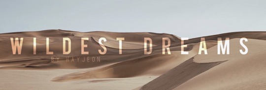
I love this app too cause you can easily control the spacing between letters to make them take up more space, add shadows, or even make them contrast their background using the overlay feature; like this one i made for wildest dreams (see how the text changes depending on what part of the photo its on? amazing! it’s literally with a click of a button!!)
And i’ll always add “written by HAYJEON” or “by HAYEJON”, space it out, and add it somewhere underneath as my own branding.
orrrrrr
if you want to be more creative, you can even go a step further and use whatever you have on hand to enhance whatever you’re trying to portray.
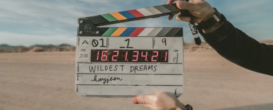
for this one, i ended up finding this amazing photo on unsplash and i thought it would do a create job of portraying the “movie-set” quality of what wildest dreams is going to be about. this stock photo had someone else’s names on it, so i used my ipad, and used instagram to just erase the existing writing with the color of the background, and then wrote in my own title and url with my own handwriting/apple pen!!!
i thought this was pretty cool because it’s like wildest dreams is its own movie/has its own movie set, which, once it’s out, you guys will see that it’s supposed to be!
saving/uploading
this is pretty easy/obvious, but i figured i’d mention it. all the apps i mentioned are available on the appstore, and they will save directly to your photos. after doing that, i’ll just upload them into a special folder i have on my google drive so that when i’m finished writing a fic on tumblr using my laptop, i can easily download the photos without sacrificing quality. easy!
and that way, i can save them forever; even if i have to delete them from my computer, i can always redownload them!
side note: making text separators
i just recently started doing this, but ever since tumblr took down their text separators, i’ve just been cropping the bottom like 5-10 pixels of the header to use as my text separators! (with my laptop)
i saw some other writer doing it and thought that it looked better than what i had used previously (a cropped photo of a random line i found on google); i found that doing this tied my fics together a little better and just looked better aesthetically;
so there it is! hope you enjoyed! :) i would love to see what other tips you guys have been using, feel free to send me an ask or reply to this post; and if you end up using any of my tips, please let me know! I love to hear from you guys all the time <3
lots of love, especially during these times,
hay <3
156 notes
·
View notes
Text
story process challenge
i was tagged by @xldkx to do this challenge, created by @herpixels , like a month? a month and a half? ago and it’s been sitting half finished in my drafts for nearly as long. *sigh* (regardless, i love stuff like this so even if it takes me forever to get to it, i appreciate the tags! 💕).
i decided to answer all the qs because it took me damn long enough to get to this, so i might as well put some extra elbow grease into it (plus it was fun!). btw it’s all going under a cut b/c it is long. i apologize in advance.
1. My Writing Process - used to be a hot damn mess. literally word docs strewn throughout my pc. However, I recently switched to using Onenote (it’s what i use to organize my d&d campaign notes) and hoo-boy is it so much nicer. this is how it’s set up and it’s honestly night and day. i can have a page with outlines, a page to organize & order screenshots, and a separate page for drafting text, and i can easily toggle though them without having to switch windows? a big thumbs up from me.
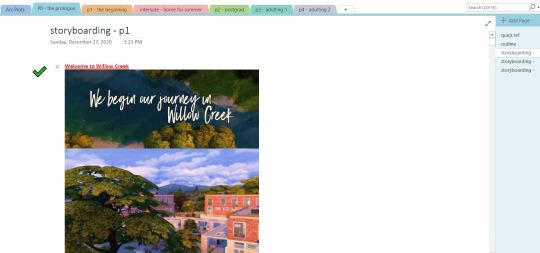
When it comes to actual writing- I used to write my drafts in novel format, which i enjoyed but it made “converting” them into tumblr posts time consuming and frustrating. I ended up scrapping most of the text in the process, retaining pretty much only the dialogue.
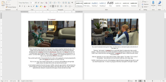
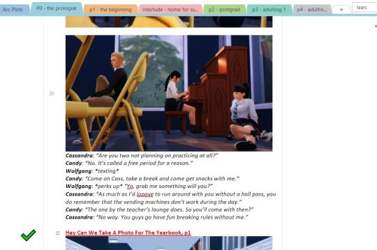
Anyway, nowadays I write in more of a screenplay format: dialogue only + key scene information with the occasional note to self.
I do keep a master “arcs” page with key events and each individual character’s arc from beginning to end and secondary “outline” pages with slightly more detailed outline for each leg of the project. No screencaps b/c spoilers galore!
My typical work flow process for a scene goes: (1) brainstorm scene ideas, (2) take screenshots, (3) organize screenshots into a rough storyboard, (4) add 1st draft of text, (5) edit photos, (6) edit text, (7) upload to "drafts” here on tumblr, (8) let sit for a bit (9) take a final look at things/proofread and edit as needed. It may sound counterintuitive, but i find it much easier to write dialogue for a set of images rather than attempt to take images based on prewritten text. I feel more comfortable editing and tweaking tone and content in the text this way. Otherwise, I get frustrated when I “can’t” shoot a scene exactly as it appeared in my head.
2. How I build my scenes - A lot of what i do is rooted in gameplay, therefore my sets are usually (a) play-tested and (b) not super pretty. I’ve certainly improved at decorating & building over the years but more often than not I download lots off tumblr and the gallery because I don’t have the patience, aptitude, or time to build all of my own sets. That being said, I frequently gut builds only to build a number of completely unrelated mini sets inside to reduce the number of times i have to replace lots. I also keep a list of “important locations” and where certain characters live / will move to, to help keep this all straight as there aren’t nearly enough lots per neighborhood or even per world in this damn game...
my least favorite part of scene building is actually decorating. lol. Don’t get me wrong, I love clutter. I honestly do. but fuck me if i expect myself to spend hours meticulously decorating a set, spend another 3 hours toggling back and forth b/w BB & live modes adjusting things to get rid of the damn routing errors. (yeah, yeah, i know i could ignore them, they’re not important, especially in those scenarios where i’m using a set for screenshots and nothing else, but idk. it really grinds my gears.) and then have to replace the lot like a week later because there aren’t enough lots in the game. *sigh*
3. CC/Pose Making - i do not consider myself to be a cc creator nor a pose maker but i do dabble occasionally. And to be completely honest i’d much rather spend my time doing other stuff, so it’s not high on my list of priorities atm. plus there are so many talented cc creators in this community; i can usually get by with what’s already out there.
4. Getting in the zone - Honestly, I do a lot of brainstorming for plot & dialogue in the shower. I don’t have any particular playlists to get me “in the writing mood” but I do enjoy listening to music as I work. Either instrumental stuff or simply artists/songs I like. If something just so happens to “fit” a scene I’m working on, one i’ve got planned, or even just gives me vibes for a certain character or group, I add a quick note to the top of said scene’s draft. Most of the time I stick it in the recesses of my brain and add a quick link when I finally get to the point of posting the draft to tumblr. For whatever reason, when I have one of those “oh this song is perfect for X” moments it’s essentially ingrained in my mind for the rest of eternity.
5. The screenshot folder - this will most likely give some of you out there major anxiety. but i swear it’s an organized chaos. :)
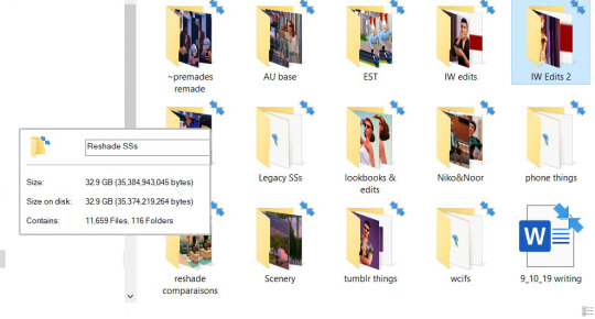
yep. 32.9gb of screenshots & related things...
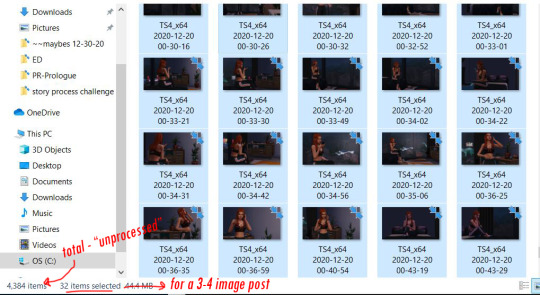
So with the raws from a single random scene selected, you can see i take roughly 10 screenshots per image posted. not terrible i guess but i’m working on it. Typically I take screenshots and once I’m done editing a scene I’ll move them from the general folder to a more specific project folder.
6. Captions - I’ll answer this in three parts:
for my townie story. not really. I prefer using the text box. I tend to write (& re-write) the dialogue for each one of these scenes several times over as I add more “scenes” into my drafts. It would be incredibly inefficient, time consuming, and would waste a lot more space on my pc to have to save .psds of each image just so i could edit dialogue when I decide: “oh hey maybe so and so needs to bring up X in this scene” and then change my mind an hour later.
for niko, noor, & co. I’m a text on image type gal here. don’t really know why, but it gives the project a different energy. ironically it makes it feel more laid-back to me. which i guess makes sense, it’s a much more light-hearted “story” than my townie project. which is, imo, very soapy haha.
for legacy stuff. all text goes below the images in the text box. reasoning: it’s gameplay, I don’t brainstorm, outline, or pre-write for this. I play the game, take screenshots, plug ‘em into my drafts and write some commentary / dialogue to go along with it.
7. Editing - i am a creature of habit and have not majorly changed my editing process in probably a year and a half (when I began using reshade and had to adjust my color correcting psd). it’s a super basic system:
drag & drop my “color correction” psd.
run actions in ps. (i made my own “all-in-one” actions to really streamline the process; i have different “actions sets” for my premades’ story and for other things that get posted to tumblr. even if no one else notices it, i like the little details that keep my projects separate and “identifiable”.
voila. all set to upload.
sometimes i crop images, add “text effects”, or do more in depth editing (i.e. editing a phone screen or adding rain etc.) but overall i try and keep it simple for myself.
8. Throwback - i posted an image of one of the first (but never posted) scenes I’d written for my townie project up above. but as for how would i redo a scene i’d already posted. well i’m currently re-doing my townie story so i guess i’ll just say you’ll see how it’s redone when i get to part 1! 😉
anyway, no tags because i’m so embarrassingly late to this party but if you hadn’t gotten around to this tag, wanted to do it but didn’t get a tag, or started it and left it to sit and now you’re thinking “oh god that was months ago should i even post this anymore?!?” consider yourself tagged by me and go ahead and post it for all to see!
#tag train#story process challenge#it's long. it's rambly. but that's me.#this one was a challenge! a challenge but fun.
8 notes
·
View notes
Text
gif tutorial
*waves*
ok so im really really bored so imma make a gif tutorial for anyone who wants to make gifs cause i have nothing better to do
kay
1) make an account for deviant art and giphy (pretty easy not that hard lmao)
2) go find a youtube video, or any downloaded video format-y thing that you want to make a gif from.
im making gifs from a music video, so im copying the link for the youtube video
3) go to giphy.com and click on create
it should look like this

4) if you’re using a downloaded video then find it, and if you’re using a youtube video copy and paste the url in the url box
i should look like this

5) this is pretty self explanatory but
top slider= how long the gif is
bottom slider= what part of the video you want the gif to be off
6) once you’ve created the length and what you want for the gif click on “continue to decorate”
it should look like this

7) the stuff in decorate is pretty easy to use, but they’re for like memes and stuff. and you can add text later so we’re just going to skip that for now. so click on continue to upload
8) the add info part is just for if you’re uploading to the site and stuff. which you are i guess, but it’s not that important. you can also make the gif public or private and add tags and stuff.

click on upload to giphy.
9) wants it’s uploaded just download the gif however you do that and boom you have created a gif.
now onto the aesthetic stuff lmao
10) go to photopea (it’s pretty much photoshop, but free and on the web)
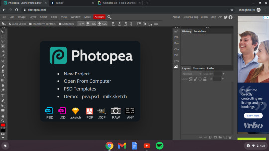
11) click on file, click on open, and then click on your gif
it should look like this
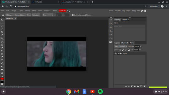
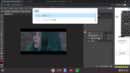
12) this just depends on the gif you have but mine has the black border which i hate around it so go to the little search bar and type in “crop tool” and then select the part you want to keep, and then click the little check mark


ok now that that’s taken care of you can just play around with the gif. if you want to sharpen it go to the search bar and type in sharpen, which you can do automatically. if you know how to use photopea then go for it and try to edit the gif. if you don’t go find some tutorials if you want. idk it’s not needed, but if you want it to look cooler than you can do that. (Just don’t do this step rn skip it)
13) now it’s time to find a psd (kinda like a filter) i can teach you how to make one, but like i suck at it so let’s go find one.
log into deviant art and then search psd

ok then click on one’s you like so you can see other psd’s like that, and just look for one that would look good with your gif.
i chose this one cause it matches her hair. https://www.deviantart.com/night-gate/art/PSD-119-Antidote-by-night-gate-658988835
but yeah find one you like and once you do click the little arrow to download it

now go back to photopea, click file, select open, and then find your psd. it should look like this
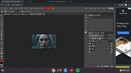
14) ok this might be kidna tricky, so imma try to explain in screenshots
make sure that you’ve clicked on the first file
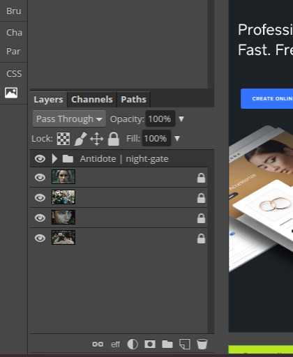
so pretty much make sure that you have clicked on “antidote/ night-gate” or whatever your thing is called with the folder.
15) then go to layer and click duplicate into


ok then click on destination and then click on what the other layer where your gif is. mine is titled “giphy.psd*” so click on that and then click “OK”
once you do that then go to where your gif is and look at it. it should work out. and look good. my psd looks a bit off, but thats ok cause this is a tutorial so whatever
16) and then click file and then “export as”

then click gif and it should look like this.

17) click “save” and boom you’ve made a gif, put a filter on it, and then downloaded it.
now it’s ready for whatever you need it for. post it on tumblr or whatever. if you want to add text i can show you how later this is taking way longer than it should so yeah that’s it for now.
so yeah
and the psd is optional obviously. you could just make the gif and upload that to tumblr
yeah that’s it for now. hope that made some sense. go send me asks if this post made literally NO SENSE AT ALL cause im confusing
my final project (yeah the filter was a bit weird, but whatever you use will probably not leave a square-ish thing of darker light than it’s supposed to lmao)
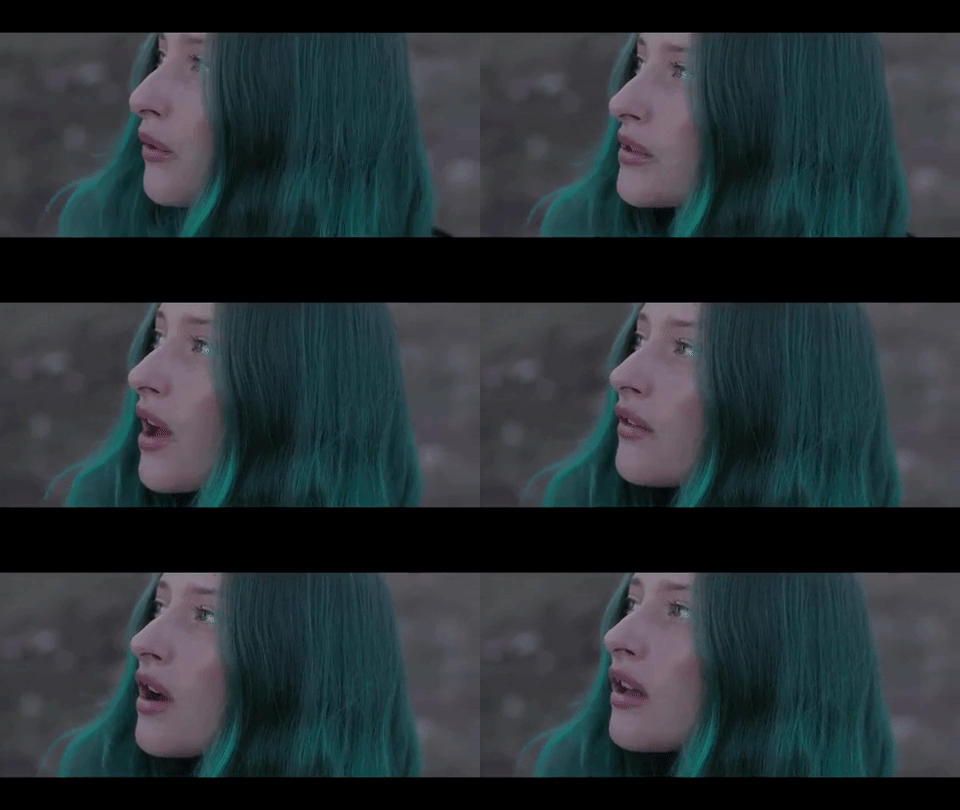

so yup
1 note
·
View note
Text
How I Make My Edits
because @lesterluminous asked
First off, I have the most convoluted process ever because I use free/cheap apps on my phone for reasons. So, I'm not really the best example to follow, but here you go~~~
These are all the apps I use. The pink I use for almost every edit, the blue I use for color correction, and the purple are my go tos to make pics look cool. Everything else I use less frequently and only if I want a specific look
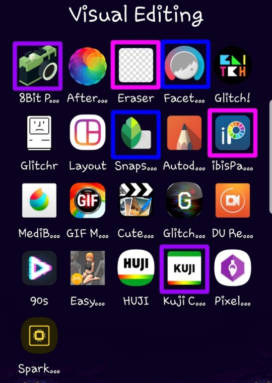
Here’s what I use each for
8Bit Photo Lab: easily my fave app for glitch effects
Afterlight: the best basic photo editing app I’ve found on android. Good if you’re in a hurry and just want like a filter. I rarely use this because I’m rarely in a hurry
Background Eraser: (from handyCloset Inc.) the best app of its kind I’ve been able to find. Very easy to use, minimal ads, and doesn’t lower the quality of your photo. I use this anytime I want to get rid of the background
Facetune: I mainly use this when I’m having trouble getting the coloring of the pic right in snapseed or if I want to color correct only part of the photo. The makers of this app have another one that is phenomenal called Enlight and it’s my absolute favorite editing app, but it’s not available for android
Glitch!: another cool glitch effect app. It can do some things 8Bit can’t, but it’s more random and I like ~control~ I mainly use it for GIFs
Glitcher: this one is ultra random, so I hardly ever use it. But, it’s good it you want a glitch effect, but don’t want to spend much time on it. Again, I mainly use it for GIFs
Layout: sometimes a bitch just needs a basic collage okay???
Snapseed: the first app I go to when making an edit. A lot of times the lighting in the boys pics isn’t great (especially in ig stories), so I use this to color correct and. It has the ability to edit using curves which is the best thing ever once you get the hang of it. It also has a bunch of features I never use, but they look neat. Also, it’s completely free
Autodesk SketchBook: tbh I never get around to playing with this, but it seems like it’d be good lol
ibisPaint: omg this app is sooo underrated. I use it for almost every edit and I also use it for drawing. It’s intended to be a drawing app and not an editing app, but it has so many features that are FREE. You can make a one time payment that gets rid of ads, allows you more layers than you’ll ever need, and gets you more brushes, but you don’t necessarily need that stuff. I’m honestly so shocked it’s free because it’s so, so good. It also has a monthly subscription with more stuff but I aint got a spare $2.99/month
MediBang Paint: I literally only use this to make gradients. I’m sure it’s perfectly good, but I like ibisPaint so much more lol The only thing ibisPaint can’t do that I wish it could was make gradients haha
GIF Maker: (by GIF Maker & GIF Editor & Video Maker) sometimes I make extremely shitty GIFs that may or may not work on desktop. This is what I use. It’s the least sketchy GIF making app I’ve found, has minimal ads, and plenty of features
Cute CUT: (by MobiVio Solutions) this is the best video editor I’ve found on mobile. I sometimes use it for editing video to turn into gifs and sometimes to work around the dumb way other apps do thing that’s too complicated for a basic overview haha
Glitchee: this app is really not user friendly, but it has some cool glitch effects. Good for GIFs because it allows you to edit/save video and not just pictures
DU Recorder: This is the best screen recorder I’ve found. Very reliable, non-invasive ads, etc. I use it to capture video I want to use for a GIF. I also used it to record my M&G
90s: (by ryzenrise) this has a lot of really cool retro and glitch filters, but it ONLY lets you edit video. I hardly ever use it, but it’s good for GIFs. I’ve also used Cute CUT to make a video file out of a picture as a work around
Easy Poser: for drawing, not edits lol
HUJI: for taking dumb photos, not edits
Kuji Cam: my fave for making pics ~aesthetic~ It’s free to download, but worth paying the small amount for full features. The filters are so good and I use this very, very frequently. If I’m still having trouble with color correction after Snapseed and Facetune, this is often my saving grace
Pixel Brush: for drawing, not edits
Spark Post: this seems like a cool app if you want to make edits, but would rather have something simple than mess around with a ton of tools. But, the best thing about it is that it has easily searchable free photos! I just use this to find a photo for the background of an edit then save it so I can use it in other apps that I like better lol
My workflow
So, I am not a good person to emulate if you want to make pretty edits. But, I’ve never claimed to be a good example, so I’ll tell you anyway lmao
To begin with, I have a Galaxy Note8. This is important because 1) the screen is huge af so I can actually see what I’m doing and 2) it comes with a pressure sensitive stylus. I literally chose this phone for these reasons. These combine to make my phone pretty similar to a drawing tablet which allows me to be a lot more precise than if I were just using my finger.
I download pics and video directly off Instagram because I want to know I’m getting the best quality possible I use StoriesIG for their stories and DownloadGram for their pics posted on Instagram (or i download from Twitter if the boys also put it there). I haven’t found a way to download photos from a photo set after the first one besides just screenshotting then cropping them.
From here, I color correct in Snapseed and Facetune, sometimes going back and forth between apps before I get it how I want. Then, I add any filters and/or effects I want. Next, I use Background Eraser to get just the boys. I determine what sort of background I want and I prepare that. I open a new canvas in ibisPaint and add any pics I want. Then, I get all creative combining everything together and making it look pretty instead of just slapped together (unless i want it to just look slapped together for a shitpost or something lol)
As for GIFs, I don't know how people who are actually good at it do it, but I acquire my video, use Cute CUT to up the contrast and saturation and mess with the color a little. Then I chop in into pieces that are about 3 seconds long and save each as its own video. Then, I put those into GIF Maker and maybe mess with the color again in there. Then I save that and pray to the patron saint of editing, Philip Lester, that I got the settings right and my file is small enough to upload. I rarely make GIFs because, using this method, they turn out very, very atrocious :)
And that’s it!
If anyone is curious about how to do specific things or get certain effects or there’s anything else you want to know, feel free to send me an ask or message and I’d be happy to try my best to help
19 notes
·
View notes
Text
Project 888 - Afterword
Apologies for the delay on pushing out this little presentation of mine, I recognize that I’ve been taking my time with it. There were a lot of other things I’ve been wanting to get done lately.
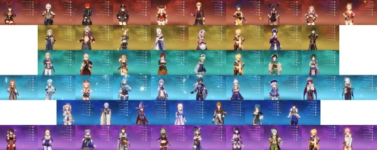
But here it is, every characters’ Talents screens lined up, side by side. Basically I took screenshots of every one, cropped them to a uniform size, and stitched them together in Microsoft’s Paint 3D. And then I shrunk the image down and saved it as a JPEG, because the file size was nearly 70 MB at first, holy fuck. Obviously it’s a little too small to see within the confines of this post, but you should be able to download the image and have a closer look.
You might notice a couple things if you do. Obviously my Ei and Hu Tao are both leveled past 8 on their Talents; in fact, my Hu Tao is triple-crowned, which is something I did a while back since she’s one of my favorite characters and I wanted her to be insanely overpowered. Same goes for Ei, but I felt it didn’t make sense to crown anything besides her Elemental Burst, so she just has a level 13 burst Talent to literally destroy everything.
But aside from those two, there’s something else that stands out... see if you can find it.
So yeah, thoughts on Project 888 I guess... It was a lot to push through. By far the worst thing about it is that it’s not a static workload, the way I set it up. It gets heavier over time due to new characters, and I always intend to get every new character that comes out, because I’m a character collector. Every new character I obtain adds to the grind by about a week, and since I started Project 888 I think there’ve been five character releases, starting with Miko.
Oddly enough, the added workload from new characters seems to roughly cancel out the time saved from getting extra resin and materials through events and the Battle Pass, which means that, barring things like getting three new characters introduced in a single update, my initial estimate of completion time for stuff like this is probably going to be pretty accurate.
I think I dealt with the monotony of it fairly well. There was enough other stuff going on both in and out of Genshin that it didn’t really affect me all that much. Really the biggest downside of perpetually grinding one resource over and over again is that it doesn’t let me work on characters that I’m particularly interested in building/using like Yanfei, who’s mostly complete but needs some optimization to be where I really want her to be.
I guess it also goes to show how I am truly interested in this game and in maxing my account eventually, since I’m willing to do something like this. I occasionally doubt whether Genshin is something that’s really worth playing to me, especially when it comes to how much money I spend on it, and I worry sometimes that I’m just engaging in a sunk cost fallacy. But I guess this is my hobby, and while it’s an expensive one, it’s one that I enjoy.
As for what I’m doing now, well, the work never truly stops. I’ve reached Adventure Rank 60, the game’s current maximum, and I’m now working on maxing out a weapon for every character. I’m done with swords, claymores, and polearms already, but catalysts and bows still need a lot of work. I wanted to get this sorted out so that I can focus solely on artifacts for a little while.
That said, I’m now using the artifacts that I gather from artifact runs for EXP again instead of destroying them for Mora. Obviously I’m quite low on Mora now, but since my current work is more free-form and not part of an organized project, I’m just going to grind some Ley Lines whenever I need money.
I’m not sure how long it will take me to get artifacts set up on every character. The thing is, I have a lot of random decent artifacts from my artifact farming days prior to Project 888, so some characters I’m able to equip without doing hardly any grinding. I currently have 9 characters with incomplete sets, most of which are only missing one or two artifacts.
I’m having a bit of a debate with myself when it comes to whether or not I should be satisfied with those sets, however. Many of my characters are running suboptimal sets, even if their sets are complete. There’s also the issue of getting enough Energy Recharge on every character so that I can use their bursts frequently... There’s a lot to sort out still.
So that’s on my to-do list: figure out what I still need to grind for after shuffling some artifacts around, and then going out and getting those artifacts. I’ll probably start with figuring out which characters are “complete,” and then working on everyone who isn’t until I’m satisfied. In other words, finishing up my artifacts could take either no time at all, or a pretty decent amount of time.
But I think once that’s all done, it will be time to move on to the next big project, which will be maxing out Ascension on every single character... oof. There’s going to be a lot on my shopping list for that one. Anyway, I think I’ve rambled on long enough here, so it’s time to finally close this chapter of my Genshin Impact journey. Project 888 may now be over, but in the words of a certain Wii U game whose story ended on a cliffhanger:
This story never truly ends...
1 note
·
View note
Text
avisynth alternatives: potplayer/kmplayer tutorial (giffing performances + 60 fps)

hi! my name is ju, and this is a tutorial post on using avisynth alternatives to gif performance files, but you can also just do the same method for any file really. above are the type of gifs we are looking to achieve by the end of this!
before anything else, if you have any questions about avisynth or what it is, please check out @nochuie's amazing (she's the absolute best for making this) avisynth tutorial here first before you continue. avisynth is the recommended option for gif-making. it features an easier, lossless debilinear resizer and far less tedious in regards to cropping/extracting once you get a hang for it.
UPDATE 05/29/2018: AS OF KMP’S NEW UPDATE, AND POTPLAYER BEING WINDOWS ONLY, THIS METHOD DOESN’T WORK WITH MAC. MAC USERS PLEASE REFER TO VAPOURSYNTH AS AN ALTERNATIVE.
but for those stuck with a mac like i did, or those who cannot get avisynth to work/download for some reason, this is for you! my ask is open if something isn't properly clarified. before i ramble on any longer, everything will be below the cut. good luck to anyone reading this and happy giffing!
you will need a basic knowledge of photoshop and frame animation in order to do this. if you'd like, i can make an in-depth screencaps to frames tutorial in another post. please let me know if anything should be added and i hope this is useful.
before we start, i’d like to clarify what performance files are. performance files are either .ts (transport stream) or .tp type, and will be far larger in size than your regular mp4 that you download from youtube. a single song’s length of a video is usually 400-500 MB, and those end of year award shows with several songs can extend to 2 GB. performance files are not fancams, and are taken from the actual broadcasts of shows such as sbs inkigayo, mbc music core, kbs music bank, mnet m countdown, etc.
they usually have closer, smooth, continuous zoom-ins or shots, almost always have 60 fps (frames per second! what makes movement smoother) and that’s why they’re worth the attention! ts files can’t, however, be opened by photoshop alone. quicktime for mac definitely does not open these files without converting to a different file type, and it just gets really messy. the built in windows media player also may have trouble playing these as well.
so what avisynth does is not only a resize and crop, but also turn a 17-second cut into an .avi file that photoshop can open. but with avisynth out as an option for mac users, we instead rely on potplayer/kmplayer for their deinterlacing and ability to not only play, but extract frames from .ts files.
the first step is downloading and installing either potplayer or kmplayer. if you have windows 7 or 8, get kmplayer. the process for kmplayer is simpler and it’s much more easy to set up. if you have windows 10, you’re going to need to use potplayer instead.
after downloading and installing, (you can decline kmplayer’s “offers” btw. they’re basically just ads for bing and yahoo haha) which should be fairly easy clicking through the download wizard, go to your .ts file and open it up with the program you installed.
KMPLAYER EXTRACT
if you have kmplayer, there is no preparing needed. simply play the video, and find the section you want to gif. say i want to gif a video at the 01:13 second mark. pause the video at that point, then right click on the video. you’ll see a menu appear.

from here, hover over “capture” and then click “frames: extract”. (this looks a little different on my computer since i have windows 10 now and it doesn’t work on windows 10. also don’t mind me doing hw in the bg!)
now, after that, this little window will pop up, and it will look exactly like this at default:

okay, so we’re going to change a few things. you’re going to change:
Image Format > Format: JPEG (middle) Numbers to extract > Continuously Frames to extract > in 1 sec [1] frame(s)
after that’s done, you can change the number in the [ ] brackets to whatever you want. extract either 60 fps or 30 fps, it’s your choice. however, japanese and singapore/overseas in general ts files won’t work with 60 fps in kmplayer. you’ll be able to play the video, but not extract the 60 fps frames. fair warning!)
when you’ve set it up, press “start”. now click the play button on your video. your video will play, and kmplayer will capture the frames as you play. when the part you want is over, pause the video.
right click again, reclick on capture > frame: extract and the window will pop up again. you’ll see that a time duration is running, and it will have #Frame and Captured in the previously empty Information box.
simply click the stop button (where the start button previously was). the window will close and you’ll see “Captured: [insert number] times flash up in the corner of the video player in yellow.
now, your frames are all captured and kmplayer has done its job! the next part isn’t kmplayer but in fact photoshop, so we’ll go through that after i run through potplayer.
POTPLAYER EXTRACT
okay, this is the hard part. but don’t fret, i’ve gone through the messy three-hour troubleshooting for you!
after you’ve downloaded potplayer, open up your file and find the section you want to gif. now pause the video, and before we do any capturing, we have to go in and alter some of potplayer’s defaults. lots of screenshots are coming, don’t worry!
after you’ve paused the video, right click on the video (like literally anywhere on the video) and a menu will show up.

click on preferences. a window will pop up. mine will have already been altered, so sorry, as i really didn’t want to go through the hassle of reinstalling for this tutorial.
on the left hand bar, click on “Source/Splitter”

A splitter basically will make your 60 fps interlaced frames into 30 fps frames. we don’t want that, so we’re going to delete it. First, after you’ve clicked on Source/Splitter, you will see that all the settings are set to “Built-in” source splitters. leave everything alone except for the one that says MPEG2 TS:

use the drop down arrow and change it to what i have above! the FFmpeg MPEG2 TS Source/Splitter. then, click “Apply” at the bottom right of the window.

after that’s done, click on the button near the bottom of the window above Apply that says “Filter management”, and when the window pops up, you’ll see that there are 3 lists and one blank column on the left.
on the list that’s titled “Source/Splitter,” click the check mark for “MPEG2 TS.” now, click the “Scan” button just below that list. you’ll see a bunch of stuff appear under “DirectShow Filter List.” select the one that is “MPEG-2 Splitter.” Make sure it’s the only one you’re selecting!
then, click the “Delete” button right under the scan button. MPEG-2 Splitter should be gone from the list.

see how it’s missing from the left most column? now we’re all set up! click “OK,” and the window will close. then click “Apply” again, then click “OK” for that window. both windows will have closed now and you’re ready to extract!
don’t worry, the settings will save since you clicked the “Apply,” so you don’t have to do this every time. make sure you’re still paused on the right time you want to gif, and then press Ctrl (or Command on mac) + G. a window that looks similar to kmplayer’s window will pop up like this:

the first thing you should do is set up the “Storage” designation. click on the ellipses, make a folder where you want your frames to end up, and click “Select Folder.” you can see mine is set up in a folder i made called “potplayer.” the default setting is just “Pictures” i think!
next, increase the Numbers/Frames to Capture > Number (s): [ ] to however many you want. it really doesn’t matter unless you want exactly 50 frames or what not, because you can manually stop extraction like kmplayer can.
instead of Every # frame, select Every # ms and input how many frames per second you want. then, click “Start” and play your video!
after the part you want to gif is over, pause the video, press Ctrl + G again, and the window will re-open. click on “Stop” and your frames will be all extracted and ready for you in your designated location!
FRAMES INTO PHOTOSHOP
okay, you may already know how to do this. open up photoshop, then go to file > scripts > load files into stack.

the window below should pop up. now click on “Browse”

and then find your folder with the frames in them. if you used potplayer, you should know where it is, and if you used kmplayer, go to your Local Disk (c drive) > KMPlayer > Capture and your frames should be there.
select the frames you want to import (for future reference, you can simply click the dropdown on Files in the window above and select Folder instead to just load the whole folder.)
wait for all the images to load into the empty box and press OK. the images will start to load layer by layer into photoshop. when they’ve finished loading, click on “create video timeline” on your timeline window. if your timeline isn’t there, go to Window > Timeline. then, convert to frame animation.

then, make frames from layers.
change your frame delay to 0.03 or a closeby number, so that we can play through the gif. for me, the frames always load backwards so i will have to reverse my frames before i will play my gif.
after that’s done, play through and delete any unnecessary frames. then crop, resize using some form of photoshop’s resample (bicubic sharper or bicubic depending on how grainy the file is) and apply adjustments/topaz!
i hope this was helpful, and i hope for the anon that requested this, that it helped you! it’s a lot of work, and avisynth is much better, but it’s worth the hassle if you don’t have avisynth. hopefully by the end you can achieve something like this:

love, ju <3
#angela's tutorial is way better hehe <3#t: resources#reply#i think i went though actual hell to figure potplayer out#avisynth...why must i be too lazy to use you#can you believe i couldn't find a yt video on this#this took forever i'm so sorry
113 notes
·
View notes