#Inclusive Web Design
Explore tagged Tumblr posts
Visit Tumblr Blog
Explore Tumblr blogs with no restrictions, modern design and the best experience.
Last Seen Tumblr Blogs


Fun Fact
US Tumblr user growth rate is estimated to slow down to 4.1%.
Text

Accessibility Benefits For Businesses
ADA Site Compliance shows the benefits of accessibility for businesses!
#Web Accessibility Myths#Digital Accessibility#ADA Compliance#WCAG Compliance#Inclusive Web Design#Accessibility Testing Tools#Assistive Technologies#Accessible Website Design#Web Compliance#Accessibility Guidelines#Accessibility Misconceptions#Keyboard Navigation#Alt Text for Images#Accessibility Overlays#Color Contrast#website accessibility solutions#ADA site compliance#ADASiteCompliance#adasitecompliance.com
1 note
·
View note
Text
Understanding Topical Maps of Websites
Navigating the Digital Landscape In the vast expanse of the digital world, websites serve as virtual domains where information, services, and experiences are exchanged. To help callers travel this expansive digital terrain, introducers constantly employ an important tool known as a” Topical Map.” This informative composition delves into the idea of Topical Maps of websites, exploring their…
View On WordPress
#Accessible Navigation#Content Categorization#content strategy#Digital Architecture#Inclusive Web Design#seo optimization#Site Mapping#sitemap#topical authority#topical map#topical mapping#topical maps#User Experience#website navigation
0 notes
Text
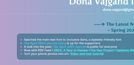
I've made a major update to my website: it now uses Inclusive Sans by Olivia King as the main text font.
It is a dyslexia-friendly font and will hopefully make my website easier on the eyes, especially the text-heavy sections with the art commission info. I wish I'd known about this font earlier!
https://dona.neocities.org
Read more about Inclusive Sans: https://www.oliviaking.com/inclusive-sans
8 notes
·
View notes
Text
Disaster struck earlier today, and my electricity was shut off. This is the dead of summer. For this reason, I'm opening up emergency commissions. There are 3 slots available. However, I'm only taking 2. My prices are a bit up there because of the time and effort it takes to make a website, so this is only geared toward a company or individual who can afford it. Please do not put yourself in the hole for me. You can commission me on Ko-Fi.
#freelancer#web design#commissions open#web design commissions open#lgbt+ inclusive#coding#html css js jquery php sql#full stack
0 notes
Text
Why Accessibility Matters
For digital writers and designers, I feel like their jobs are about ensuring everyone can access and use the content they create. While they want the content to sound good and engage people, none of that matters if everyone can't access it. According to Horton and Quesenbery in A Web for Everyone, "When websites and applications are badly designed, they create barriers that exclude people from using the web as it was intended." They explain that accessibility is about designing in a way that gets rid of barriers for everyone else. They also make the argument that "disability is a conflict between someone's functional capability and the world we have constructed." In my opinion, this means that poor designs are usually what makes content inaccessible, so it's not always the designer's fault.
I would say understanding the audience is really important in this sense. For example, according to Horton and Quesenbery in People First: Designing for Differences, "You have to know the people you are designing for. And that includes people with disabilities." They emphasize the importance of considering the needs of various different types of users, such as people with disabilities or people with low literacy levels. They also point out that one person's need for accessibility can be very different from someone else's, stating, "Be careful not to assume that feedback from one person with a disability applies to all people with disabilities." I would say this is one of the most important statements from the text because it ensures all accessibility needs and accommodations are inclusive, and it's also why accessibility matters to so many digital writers and designers. They don't want anyone to feel left out!
#accessibility#professionalwriting#readingresponses#digitalwriters#designers#disability#inclusivity#web
1 note
·
View note
Text
Improving Website Accessibility for Small Businesses
Did you know that about 16% of people worldwide have a permanent disability1? This fact shows how crucial it is for small businesses to make their websites accessible to everyone. In fact, 70% of shoppers want brands to take action on social issues, including making websites easy for people with disabilities1. More than 90% of people don’t complain about website issues, but 69% with disabilities…
#Accessible Web Development#ADA Compliance#Digital Accessibility#Inclusive Website Design#SEO for Small Businesses#Small Business Websites#User-Friendly Websites#Web Accessibility#Web Accessibility Tools#Website Design Best Practices
0 notes
Text
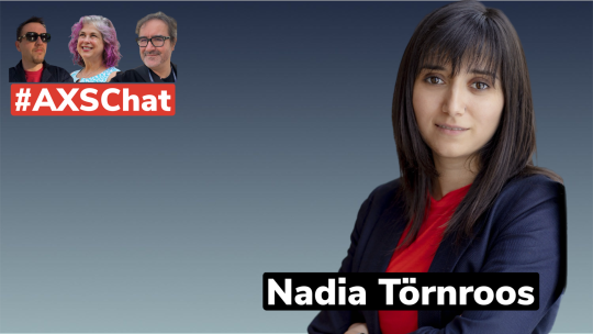
Empower Digital Inclusion: Strategic Approaches to Technology Accessibility.
Dive into the inspiring journey of Nadia Törnroos on #AXSChat! From student to #accessibility advocate, discover how education, community, & tech drive change. Hosted by Antonio santos, Debra Ruh & Neil Milliken. Don't miss this powerful conversation.
In a world increasingly reliant on digital spaces, ensuring accessibility for all is a necessity and a moral imperative. This week on AXSChat, we’re thrilled to feature Nadia Törnroos, a luminary in the field of accessibility whose journey from a curious student to a fervent advocate offers profound insights into the challenges and triumphs of making the digital world inclusive for…
View On WordPress
#Accessibility Advocacy#Accessibility and Inclusion discussion#Accessibility thought leader#Accessible technology advocate#Antonio Vieira Santos#Digital accessibility expert#Diversity and inclusion talks#Empowering accessibility practices#Inclusion strategy discussion#Inclusive community building#Inclusive design conversation#Nadia Törnroos interview#Social inclusion expert#User accessibility experience#Web accessibility insights
0 notes
Text
#Web accessibility#Digital Landscape#WCAG#Screen Readers#Disabilities#Section 508#ADA Compliance#AODA Requirements#User Testing#Digital Accessibility#Web Accessibility Statistics#Visual Impairments#Content Accessible#Hearing Loss#Accessibility Barriers#Digital Content Accessibility#Assistive Technology#Accessibility Crucial#Inclusive Design#Accessibility Guidelines#Web Accessibility Guidelines#Web Content#accessibility lawsuits#Website Accessibility#AEL Data
0 notes
Text
How to Make PDFs Accessible | Episode 10: Clovis Community College
Explore essential techniques for PDF Accessibility! (Blog Series Episode 10) #DocumentAccessibility, #InclusiveDesign, #PDFAccessibility, #WebAccessibility, #DigitalInclusion, #AccessibleContent, #WCAG, #AssistiveTech, #AdobeAcrobat, #ScreenReaders
Welcome to episode 10 on community college PDF accessibility. Today, we focus on two documents from Clovis Community College. The first was already accessible, while the second required complex fixes. Video Guide In case you missed them, here are Episode 1, Episode 2, Episode 3, Episode 4, Episode 5, Episode 6, Episode 7, Episode 8 and Episode 9 in our PDF Accessibility Community College…

View On WordPress
#Accessibility#Accessible PDF#adobe acrobat#Assistive technology#Digital Inclusion#Document Accessibility#Inclusive Design#pdf accessibility#Screen Readers#WCAG Compliance#Web Accessibility
0 notes
Text
Unlock the full potential of your online presence with "Inclusive SEO Best Practices: Ensuring Web Accessibility for People with Disabilities." Learn how to create a digital space that welcomes everyone by implementing accessibility measures. This comprehensive guide covers strategies to enhance your website's usability, cater to diverse user needs, and boost overall inclusivity. Elevate your SEO game while making a positive impact on users of all abilities.
#Inclusive SEO#Web Accessibility#SEO for Disabilities#Accessible Website#Inclusive Design#Disability-friendly SEO#SEO and ADA Compliance#Web Inclusivity#Diverse User Experience#SEO for All
0 notes
Text
Accessible Website Design
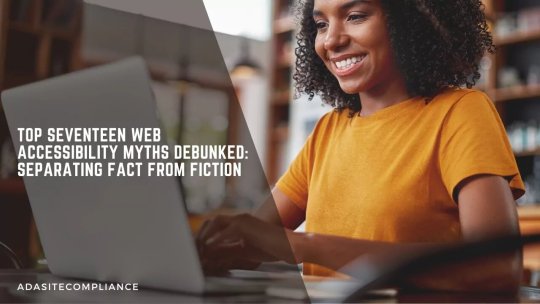
Top Seventeen Web Accessibility Myths Debunked: Separating Fact from Fiction
Accessibility is no longer a ‘luxury’.
Incorporating accessibility into a website today comes part and parcel with web development. With the internet harboring users with and without disabilities who use it for information, bookings, enrollments, purchases, and even jobs, websites need to be compliant.
Unfortunately, many aren’t because some misconceptions and myths cause confusion and hesitance to hinder progress. So here’s an attempt at separating fact from fiction by debunking the top 17 common web accessibility myths.
Remember, web accessibility is no longer just a legal requirement; it’s part of digital inclusivity. It increases your reach and demonstrates your commitment to serving everyone in your community.
If achieving compliance seems overwhelming, we at ADA Site Compliance can simplify things for you. Our team of accessibility experts can help you meet these requirements while you focus on your core business.
Top 17 Web Accessibility Myths Debunked
Let’s now examine these widely misinterpreted web content accessibility principles and guidelines. At the end of the article, you will realize that all those misconceptions you had about web compliance are just myths.
Myth #1- Web Accessibility is Only for Blind People and Users with Visual Impairments
False.
Other people with varied disabilities, such as deafness, limited motor skills, and cognitive limitations, also visit websites for various reasons. An accessible website gives them access to the information they seek, ensuring your website reaches more people.
Myth #2- Web Content Accessibility Guidelines Compliance Ensures Digital Accessibility
False.
Yes, the WCAG provides a framework to enhance digital accessibility. However, compliance alone is not enough for a completely accessible website. Website owners and developers must understand and implement the WCAG principles, as factors like cumbersome user interfaces, poor content, and insufficient testing can lead to incompliant websites.
Myth #3- Accessibility is Only About Making Websites Accessible
False.
Accessibility applies to other digital assets, including mobile applications, PDFs, and other digital documents. Organizations must thus ensure accessibility across all digital platforms for inclusive digital experiences.
Myth #4- Accessibility is Only Relevant for Disabled People
False.
It is not just people with disabilities that benefit from website accessibility. Digital compliance features benefits extend to broader groups, including:
Older adults facing sensory or cognitive challenges as they age
Individuals with temporary disabilities due to injury, illness, or surgery
People experiencing situational limitations, like background noise
Non-native speakers struggling with language barriers hindering understanding and engagement
Myth #5- Accessibility Means Redesigning a Less Visually Appealing Website
False.
Many businesses believe digital accessibility requires a complete website overhaul or poor visual appeal, which is far from the truth. Minor adjustments can significantly create an accessible digital experience without significant redesign efforts.
Myth #6- Digital Accessibility is Only a Concern for Large Corporations
False.
Size is not a criterion for digital accessibility; failure to meet the many digital accessibility laws can lead to legal repercussions and damage a company’s reputation.
Small businesses may face resource constraints, but the numerous tools and online resources can help them understand and ensure web compliance. Embedding accessibility practices from the start ensures web compliance for companies of all sizes.
Myth #7- Accessibility Limits Websites to Text-Only Content
False.
The myth that accessible websites must be plain, text-heavy, and free of multimedia elements stems from earlier text-based web pages. However, modern standards allow visually engaging, multimedia-rich websites that meet diverse accessibility needs.
Strategies like adding alt text for images and captions and transcripts to videos ensure compatibility with assistive technologies. It not only supports users with disabilities but also enhances everyone’s user experience.
Myth #8- All It Takes Is A Quick Technical Fix For an Accessible Website
False.
Web compliance is more than a simple technological adjustment. True accessibility is not just a developer’s responsibility but the joint effort of various teams, including design, testing, and content creation. Relying solely on automated tools or accessibility overlays does not ensure comprehensive accessibility.
Myth #9- Accessibility Can Be Addressed Last-Minute with Simple Fixes
False.
While adding elements like alt text at the last minute may seem convenient, genuine accessibility requires careful planning and integration. Last-minute changes usually require significant counterproductive restructuring, which may harm the user experience, especially for those requiring accessible design.
Besides, including alt text in sites is only one piece of the accessibility puzzle. A truly compliant website involves various other steps, including:
Semantic HTML tags to structure content and enhance readability and interaction.
Keyboard Navigation of the website.
Color Contrast to make text and images readable.
Focus Management highlights elements currently in use for better navigation and clarity.
Using Selective ARIA when necessary to support assistive technologies, as overuse can create confusion.
An accessible design demands proactive attention to these elements throughout development rather than depending on quick fixes at the end.
Myth #10- Accessibility is Expensive and Time-Consuming
False.
Integrating accessibility into an existing website can seem complex, require multiple resources, and be time-consuming. However, prioritizing accessibility from the start can significantly reduce most associated challenges.
In fact, with the right planning and skilled development teams, accessibility can be achieved with minimal additional time and resources as an integral part of the development process.
AI-powered accessibility tools also make digital accessibility more affordable and accessible for all website owners to use and ensure websites are accessible for individuals with disabilities. They help achieve substantial accessibility improvements in just a few hours by automating the detection and correction of many common accessibility issues.
Myth #11- Achieving Web Accessibility Is Overly Complicated
False.
Web accessibility standards can seem complex, but their implementation is not complicated. Multiple tools and resources are available to help developers and website owners ensure digital accessibility.
It is better to start with basic principles, such as providing alternative text for images and ensuring keyboard navigation, and then later delve deeper into more advanced techniques.
Besides, remember that automated accessibility testing alone cannot guarantee complete digital accessibility. Automated tools can help identify issues such as color contrast and structural errors.
However, they cannot fully address complex challenges like unclear language and intricate site designs. Human review by accessibility experts is crucial in ensuring website compliance.
Myth #12- Accessibility is Just a “Nice-to-Have” Feature
False.
Ensuring website compliance is not an option; it is a strategic move with significant potential to impact your business success. An accessible website can do a lot for your business, such as attracting a larger audience, driving higher revenue, enhancing brand reputation, and mitigating legal risks.
Besides, with legal scrutiny, accessibility can no longer be an option. A website owner does not want a lawsuit, considering the financial and reputational risks of overlooking accessibility efforts.
Myth #13- Accessibility is All About Avoiding Legal Trouble
False.
Contrary to popular belief, accessibility is not only about meeting legal requirements to avoid lawsuits. Legal compliance is essential, but its benefits extend far beyond this. For example, implementing accessible design dramatically enhances user experience and boosts your brand’s reputation.
Besides, accessible content opens your entire website or application to a broader audience, ultimately increasing user satisfaction and building loyalty.
Myth #14- Digital Accessibility is Optional
False.
Accessibility is more than an option; it is a requirement in many countries, enforced through laws and regulations. It may not be the top priority for all website owners, but digital compliance is essential for ethical reasons and for creating an inclusive experience for everyone.
Following accessibility standards helps meet legal obligations and ensures your website reaches a broader audience, including individuals with disabilities.
Myth #15- It’s Better To Have Separate Websites for Disabled Users
False.
It was previously thought that having a separate website for users with disabilities ensured accessibility for disabled people. However, this strategy is ineffective and biased, as managing multiple websites is expensive and work-intensive and can lead to content and performance discrepancies.
It is, instead, better to design and develop a website that is inherently accessible to everybody from the beginning.
Myth #16- Accessibility is a One-Time Fix
False.
Many people think digital accessibility is a one-time fix, with nothing else to do once experts ensure compliance. This misconception has led to poorly designed products that users cannot effectively access.
On the contrary, web compliance requires constant commitment and oversight, with continual integration of accessibility features from the initial design through ongoing maintenance. Website owners and developers must regularly review and update the website to meet evolving accessibility standards and user needs.
Myth #17- Only Disabled Individuals Can Test To Ensure Accessibility
No, this is false.
Disabled individuals who frequently rely on assistive technology are effective accessibility testers. However, they are not the only people equipped to evaluate accessibility. All that is needed are the proper training and accessibility testing tools to become adept at identifying and addressing accessibility issues.
Closing thoughts
Dispelling these seventeen myths should inspire a more inclusive web design and development mindset. Remember, accessibility is a legal requirement and moral commitment to making the digital world available to everyone, regardless of individual abilities.
By prioritizing accessibility in our choices, we can create a more equitable, user-friendly online experience for all. It also increases your reach and demonstrates your commitment to serving everyone in your community.
Do not worry if achieving compliance seems overwhelming. We at ADA Site Compliance can simplify things for you. We have a team of accessibility experts who can help you meet these requirements while you focus on your core business!
#Web Accessibility Myths#Digital Accessibility#ADA Compliance#WCAG Compliance#Inclusive Web Design#Accessibility Testing Tools#Assistive Technologies#Accessible Website Design#Web Compliance#Accessibility Guidelines#Accessibility Misconceptions#Keyboard Navigation#Alt Text for Images#Accessibility Overlays#Color Contrast#website accessibility solutions#ADA site compliance#ADASiteCompliance#adasitecompliance.com
0 notes
Text
Absolutely fuckin wild that SCOTUS delivered a blow to LGBTQ inclusive nondiscrimination laws nationwide based on that case...because one web designer went to court to have the "right" to refuse to design wedding websites for same gender couples hypothetically.
Hypothetically, because no one even tried to hire her to do that. But this is the outcome.
I hope Lorie Smith never has a day of peace ever again.
...And they just stuck down the Biden administrations student loan forgiveness program.
Fuck SCOTUS.
4K notes
·
View notes
Text
Ch-ch-changes
🌟 Novità
Per aiutare a combattere lo spam dei link nelle Community, ora stiamo bloccando la creazione di nuovi post nelle Community quando il post contiene un link sospetto.
Nelle app e nel web mobile, le descrizioni delle Community ora hanno un link "vedi di più" che ti mostra ulteriori dettagli sulla Community, incluse le linee guida.
I membri delle Community bannati ora possono vedere il motivo del ban nell'attività di rimozione della loro adesione.
Se hai raggiunto il limite di Community a cui puoi unirti per giorno, le Community consigliate scompariranno fino al giorno successivo.
Sono stati apportati diversi miglioramenti al design dei post nelle Community, rendendo più facile identificare l'autore e la Community a cui il post appartiene.
🛠 Correzioni
Tumblr è stato un po' lento per un'ora questo lunedì. Abbiamo trovato un Tumbeast che masticava un filo e gli abbiamo gentilmente chiesto di masticare qualcos'altro.
🚧 In corso
Al momento non ci sono situazioni in corso di cui parlare.
🌱 In arrivo
Nessun lancio in programma da annunciare oggi.
Hai riscontrato un problema? Invia una richiesta di supporto e ti risponderemo il prima possibile!
Vuoi condividere il tuo feedback su qualcosa? Dai un’occhiata al nostro blog Work in Progress e avvia una discussione con la Community.
Vuoi supportare Tumblr con una donazione diretta? Scopri il nuovo badge Sostenitore in TumblrMart!
47 notes
·
View notes
Text

a while ago i mentioned on discord that mitr'a would have definitely given the twins knives made by him, and i've since been thinking about the shape they would take. evidently they had to be functional above all, and probably made with insane, never dulling ultima thule materials or something
eventually decided to go with one i had researched before. its inclusion into my personal keeper lore is ongoing; still have to decide on the traditional materials... maybe some sort of very hard seedpods would be cool? anyway
got a bit long:
these two are based on the chilean corvo knife. historically it was a knife used by miners and farmers, made from recycled farm equipment, and probably descended in its shape from the morish knives brought by the spanish. it can, and has, been used as a weapon, but its original function was practical: cutting rope, leather, wood, boring holes, skinning animals, opening cans...
you can absolutely filet a person with it, but it requires intention. you have to hack at people like you're holding an axe, and while it doesn't require much strength or dexterity to wield it, you have to know what you're doing. it's not much good to defend either, so if you're attacking with it about your best option is going fully lethal with killing shots to the eyes, throat, gut, and arteries
alphinaud's would be the so called 'condor's beak' shape, mostly used by the military, but in this case i chose it because it's also perfect for cutting underbrush like a handheld rozón. added a little saw too, replacing most of the outside edge. you could also use it to climb, probably. it looks impressive, but it's actually harder to fight with. can hook on bone alisaie's is the shape called 'atacameño' and is an older, more utility based knife, with an edge only on the inside of the curve. it was mostly used by workers, and then brought by them to the pacific war where it was used as a close melee weapon and multitool. unlike alphinaud's, it also can stab, and the extra metal in the pommel is for whacking people (and things) with for both, the handle has the 'angel's eye' design, which is, supposedly, to distract and scare the opponent before you slice and dice them
here's some sketches with other shapes. since it was mostly a self forged weapon until about the 60s, there was a LOT of variation in the references

all this lore was gathered from a bunch of web pages. i can't claim to be an actual expert on corvos
#my works#theunbound#mitr'a#and the twins; but i don't have a specific tag for them#anyway drawing knives is harder than it seems
45 notes
·
View notes
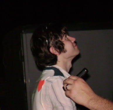
Text

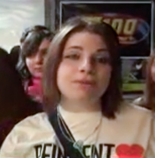
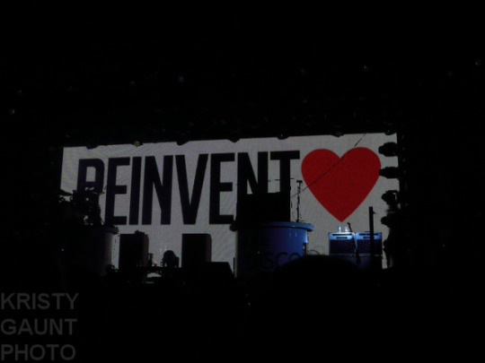
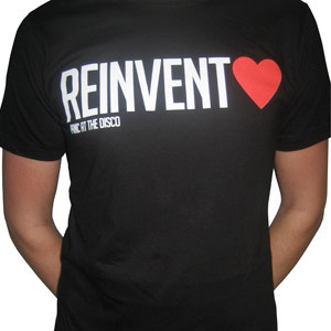
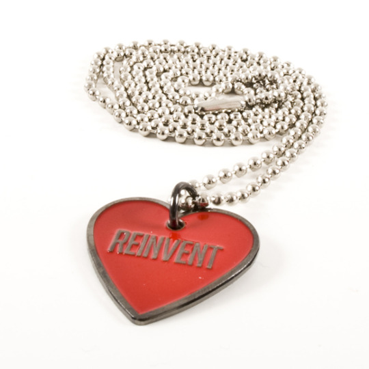
This off-white t-shirt that was for sale at some shows during the 2008 Honda Civic Tour was really popular and was usually the one you'd see people asking other fans to grab for them in late spring because their show sold out in their size. This is the shirt that was sewn into a vest for Ryan that season btw:
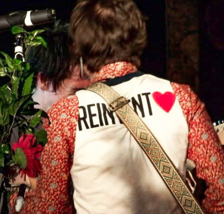
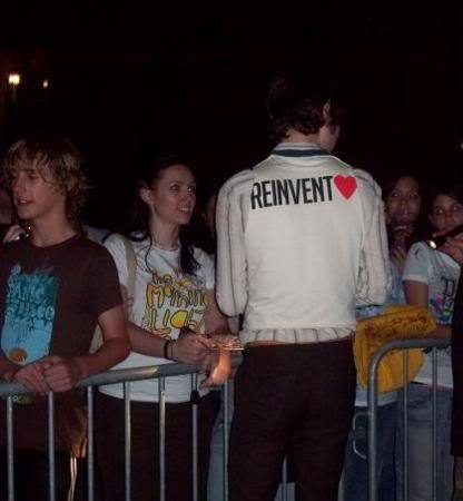
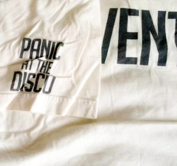
FBR added this shirt to their webstore in August 2008 and some sizes sold out quickly but then got restocked. I remember some people complaining that FBR's shirt was a slightly different color than the one on tour, but others said it was the same. Idk, it looked like the same general off-white color to me. The band's name was still on the back of the right sleeve:
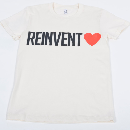
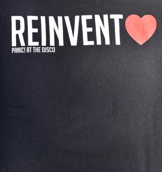
I liked this design because it was SO different from most t-shirt designs in this era (like in general, not just PATD) and was way more minimalist. A fan created some pngs that we could print out to iron on our own shirts, so I'll add them here if anyone wants them. They used the "Big Noodle Tilting" font and created their own heart:


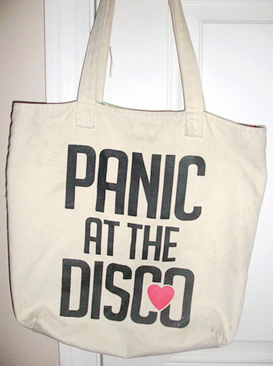
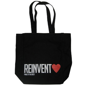
That fall Hot Topic also came out with an off-white tote that had the same large "reinvent love" design on one side. Then the design of the band name (from the t-shirt's sleeve) got a heart added and was enlarged to be the graphic on the other side of the tote. The inside of the bag was a floral pattern that reminded me of the striped hoodie's lining:
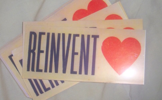
FBR clearly loved how successful this whole design was. The webstore included a bonus sticker in the order packages for P!ATD fans in fall 2008:
The Rock Band Live Tour shows in fall 2008 used the same type of graphic:
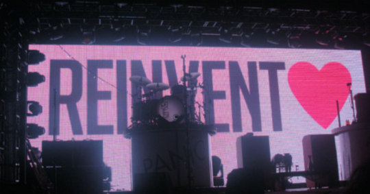
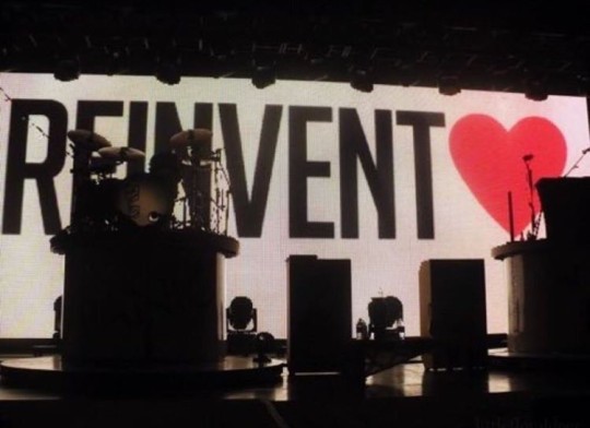
And the shows on that tour had a black tote & shirt for sale:
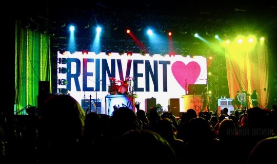
Spencer did an interview with Out.com this season that had this question:
The most popular items at your merch booth seem to be a t-shirt and bag that say “Reinvent Love,” which is such a strong, inclusive message. Tell me about how that became the band slogan. It started out as a lyric in “Mad as Rabbits.” It was the last song we were recording for the album, and as we figured out how to fit it into the end of the song, it took on some more anthem-style cheer. As we went on tour, me and Ryan [Ross, Panic’s guitarist] talked about making a “Reinvent Love” shirt. At first it was just going to be on the Fueled By Ramen web store, just a limited edition thing because it didn’t have our band name on the front, and we didn’t know how many people would want to wear that. It ended up being a lot more popular than we thought it would. We were ending all of the concerts with that song, so that was the last thing that people were hearing. We wouldn’t want to be a part of anything that wasn’t that kind of that message. If there’s going to be some saying associated with our band, that’s a pretty good one. It goes along with everything we want to represent and the way that we feel.
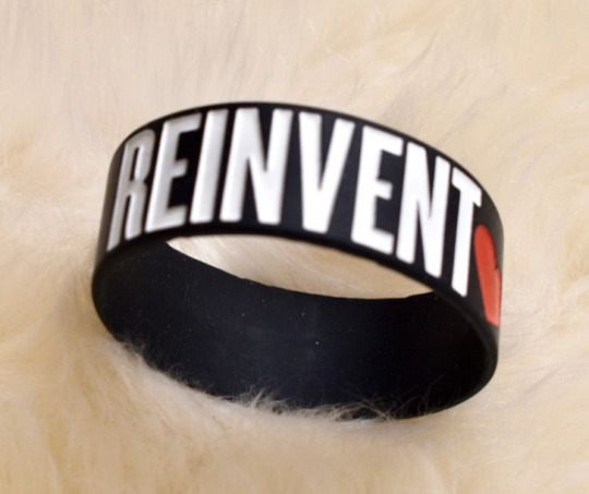
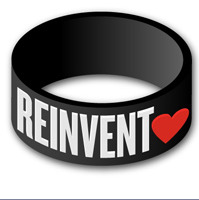
This bracelet was added to FBR's webstore in December 2008 (after the Pretty. Odd. era had basically ended & around the time that Live in Chicago was released):
By the time this necklace got added to FBR's webstore in January 2009, a lot of fans were tired of this theme:
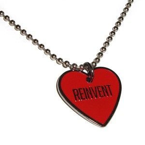
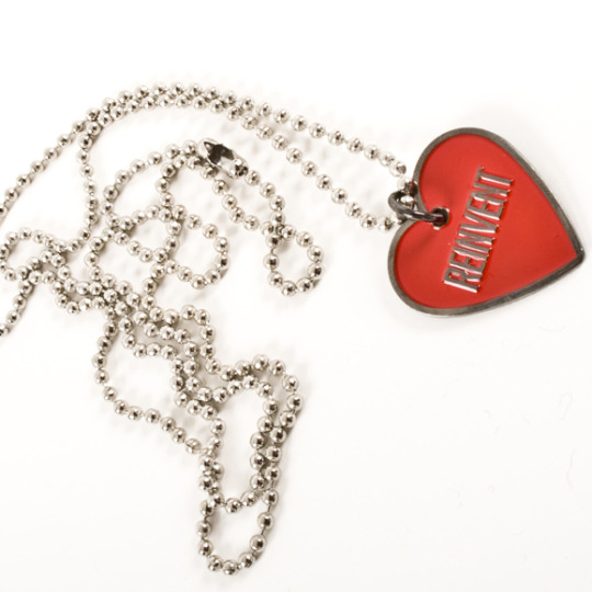
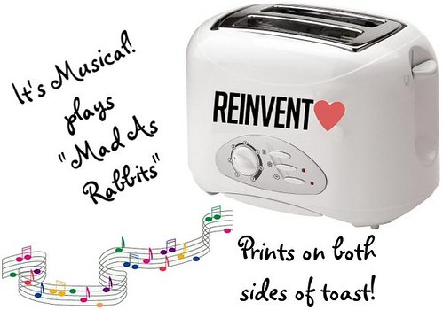
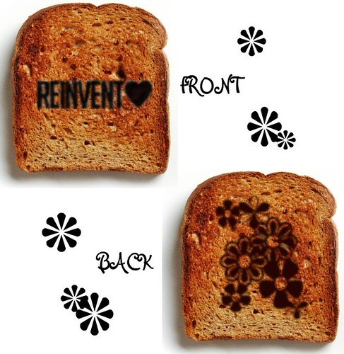
The necklace spawned more fan jokes about what was coming next at that point... my favorite was still the musical toaster:
So in March 2009 FBR just added the black shirt & tote to their webstore (the ones that were sold at shows in fall 2008) and then let the phrase rest so they could soon move onto overusing the return of the exclamation mark. lol jk.
100 notes
·
View notes
Note
Web safe colors and bi inclusive = 🥰
Looks like Stami Studios has pins with your inclusive lesbian flag on it
It's not my flag! We didn't create it, we just use it!
As noted in the post on the @nerdykeppie company blog about it, that flag was created by Lydia. They used to be on Tumblr as @kispesan but that Tumblr is now empty.
(If they have a new Tumblr, can someone please tell me? I'd like to fix the link in our post and give proper credit.)
You may be thinking about the Queer Chevron flag, which came from a conversation between me and @officialqueer in 2016 & @bizexuals brought it to life. That's the flag that I had a hand in creating.
Whether it's the Queer Chevron flag (which is public domain, because fuck copyrighting Pride flags) or the Inclusive Lesbian/Sapphic flag, I'm happy to see more usage of both flags. I'm not a fan at all of the "sunset" flag or its creator. I also both really strongly identify with the 4-color flag and appreciate that Lydia thought a lot about making a flag suited for creative use (4 simple, basic, easy-to-source-materials-in colors) and with set web colors.
So like... that rocks. Can you link me? I looked on their site and can't find anything that uses my favorite lesbian flag, and I need more pins.
146 notes
·
View notes