#I’m trying closed lineart for this piece and it’s
Explore tagged Tumblr posts
Text
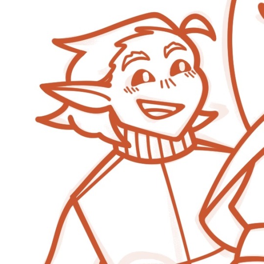
Day 96: chibi tango from a wip :3
#tangotek#tango tek#hermitcraft#hermitcraft fanart#skadoodler#I’m trying closed lineart for this piece and it’s#interesting#I’m so used to not having to connect everything lol#anyways I’m happy with how it’s looking so far :3#also I was today years old when I found out the milli pen on csp has pressure sensitivity#I thought it stayed the same size but nope
56 notes
·
View notes
Text
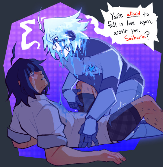
“You’re scared. Because you know deep down, I’ll end up just like the others. Why ever get close, when you’ll just lose me in the end, right?”
HIII TUMBLR IM BACK WITH MORE FUN CRYPTIC SYMBOLISTIC ART (MY FAVORITE) went out of my usual comfort zone with this one (PEEP THE LINEART?? FINALLY FIGURED OUT HOW TO MAKE LINEART WORK FOR ME!! STILL WONT BE A THING I DO OFTEN THOUGH LMAOOO) BUT I HAD LOADS OF FUNWITH IT!!
basically the story here,
I got reminded of my like. over half a year old symbolistic intimacy kiibo piece (that instagram almost snipped me for bc artistic nudity is so scary or whatever over there) and was inspired to sort of make a shuichi parallel! kind of!!! cuz I’m still really fond of the kiibo centric piece!!
so obviously, like the other piece, this is in like. a dream scape in shuichis head, and that ghost-like kiibo is more of a reflection of his pushing AWAY of feelings, as opposed to curiousity and doubts, like the kiibo piece was. this killing game has taken everyone shuichi has gotten the chance to love, and crushed them in the palms of its hands, leaving him to weep. this ghosty kiibo is basically a manifestation of how badly he wants to pursue his feelings but he can’t bare to go through the same thing ALL over again.
oh! and heres that half year old kiibo symbolistic piece i was talking about! with its original caption too!, cuz I don’t think I ever got to sharing it here!! cw for non explicit nudity!!
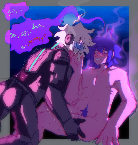
"or are you just programmed to feel this way?"
the idea of this piece was centered around kiibo and his first experiences of feeling love and intimacy, how confused he'd be and how vivid it'd feel, I wanted to try and express that in a physical way, this almost ghost-like version of shuichi being a manifestation of all those feelings piled up, how he has no idea how to deal with them while simultaneously wanting so badly to pursue them, it's rly interesting to think about!!!
ANYWAYYSSS these two are so fucking fun for more intimate type symbolism idk. their relationship is so much more. complex when you look at all the layers to each side and each of their responses to things and etc etc EXPLODES IDK THOUGHTS AND BRAIN JUICES EVERYWHERE
#cw nudity#past the keep reading line !!#forgot I hadn’t shared the initial piece here yet pfhfh#ITS CRUTIAL#THEY MUST GO TOGETHER!!#CONTEXT MATTERS YADDA YADDA I LIKE DEEP RELATIONSHIP SAIIBO SYMBOLISM#saiibo#shuichi saihara#k1 b0#kiibo#keebo#danganronpa v3#danganronpa#drv3#danganronpa kiibo#danganronpa shuichi#saihara shuichi#danganronpa v3 killing harmony#danganronpa fanart#danganronpa art#danganronpa ships
135 notes
·
View notes
Note
hello!I hope this finds you well ^^ the names magpie,I was wondering if you could tell me some basic tips for your art style or a time's lapse of one of your drawing for me to analize? I love the art style so much and I want to be like you! if you cant/won't I completely understand!sorry if its to much to ask,have a good day/night! ><
hello magpie! thank you so much for sending in a question and I’m delighted you like my art! 🩵✨
to start off with, the only person who can truly do the atompalace art style is me- it’s my own uniquely personal way of drawing, so I cannot tell you how to wholly replicate it nor would I encourage it. BUT! every single artist’s art style, including my own, is a patchwork of effort and practice, techniques you enjoy using, and influences from the things you love- and that’s beautiful!!! 🌈💕 so instead I’ve written four ways to help develop your very own art style:
1. Gather Inspiration 🌟
what inspires you? this can be any type of art, photography, character design and so on, or anything made by a favourite artist, but also delving into nature, places, feelings... now try and identify what specifically you love about these things!
I like to save any artwork or photo that particularly resonates with my tastes into a folder, then I analyse the specific traits about each piece that I admire, especially if I aspire to improving that trait in my own work. artists who have influenced my style recently include Mia Ikumi, the Kamikita Twins, Lisa Frank, Naoko Takeuchi, and Elena Kucharik; I also find lots of inspiration in Sanrio character artworks and Pretty Cure cards and merchandise ✨
it’s a wonderful feeling to reach a stage where you’re naturally drawing the type of art you love to look at, and by delving into why you enjoy the art you enjoy, you can use that knowledge to your advantage to achieve that!
2. Practice, Practice, Practice 🔥
I always tell aspiring artists that the most important way to develop your skills is to draw as much as possible. yes, fundamentals and going out of your comfort zone are important, and many artists tell you to focus on these when you start out… but personally I think drawing the things you enjoy and often is an equally valid method, because it gets you into the habit, and you will still learn lots!
when I was in school, I drew OCs and Pokémon on spare paper using ink. I didn’t really focus on anatomy or composition at that point, but it certainly helped develop my line control/confidence and drawing speed- and my art style, too!
a good specific way to practice is to pick artworks that you love and make studies of them! this way you can learn from the various techniques of the original (such as ones you identified in the previous section!) by trying to redraw them. IMPORTANT: if you make studies/reproductions of illustrations, particularly by contemporary independent artists, please keep them private and don’t post them, because that can give others the impression that you’re imitating them 💧
another fun way to do studies that you can post publicly is by choosing a TV show, film, comic, or video game with a style you like and try to draw your character (or even a character from a different media) in that style! for example, I enjoy drawing my Pokémon trainersona in the official Pokémon style occasionally- I improved with every attempt because of the time I spent practicing and looking closely at art made by professional illustrators, which helped me really understand the trademarks of that style. learning by doing!
3. Making It Yours 🎀
a recognisable or “iconic” art style is made up of multiple trademarks; no single trademark is ever exclusive to one artist, but it’s a unique combination of them that makes a style stand out.
for instance, I love drawing heart shaped shines in my characters’ eyes, which is something lots of artists do. but in tandem with multiple other trademarks common to my works (pastel colours, lineart quirks, typical subject matter and more), that’s what makes them say- “I’m an atompalace piece!”
to make sweet, glittery art, drawing your very own effects brushes or textures is a fantastic way to express your own style effectively. I programmed all of my sparkle brushes! some of my base brush shapes are referenced and some are entirely from my own imagination, but I drew them all myself. you can find free tutorials on making your own brushes for most art programmes online if you need help, or just edit default brushes that came with your art program!
4. No Restrictions 🪽
don’t be afraid to experiment! especially as a digital artist, a good few of the exclusive techniques I use were ones I discovered unintentionally or by trial-and-error, and when you work with digital layers it’s a lot easier to play around with colour palettes. tweak colours and mess around effects, and you might come up with a happy accident that you can use in the future as a building block to your style!
this might seem contradictory to the previous section, but you don’t have to tie yourself to any one art style. we all change and grow all the time, and especially if you’ve only been drawing for a relatively short time, it’s good to keep an open mind and allow your art to evolve. (for me, only the last 2-3 years has been the longest my own art style has been consistent!)
even if there’s a main style you always return to, it’s absolutely fine to deviate from it. I do, and I have fun with it, too! switching things up every so often is fun and can even help your main art style improve! conversely, if you try too hard to stick to a method that you don’t truly enjoy or have become bored of, it can be creatively stifling, so allowing yourself to branch out is key.
if you’re a hobby artist, your own enjoyment and personal satisfaction should be your priority- not the approval and attention of others. one of the best ways to let your art style shine is by letting yourself draw as self indulgently as you like without holding back!
before I sign off, I do have two timelapses of two detailed illustrations to share with you! The Sylveon Sanctuary and The Mermaid and the Fairy 🫧 notice how I use the golden spiral or a grid to help make balanced compositions; I don’t always make a colour draft, but I did for these; and I sometimes do “mini sketches” to help me visualise from my base sketch.
thank you again for your message, I enjoyed answering this and I hope you find it helpful and motivating to draw lots of lovely art!!! 🎨
- Princess Sol ⚜️🎀🩵✨
#atompalace correspondence#atompalace writings#yapped a lot but I’m passionate about art and style 🥹#super hope this is helpful!!!
19 notes
·
View notes
Note
OMG YOU'RE SEVENTEEN?? (I've been following you for months and I didn't once read the pinned message beyond the line about no AI and NFTs lmao) YOUR ART IS SO CRISPY I THOUGHT YOU WERE A PRO ARTIST AROUND 30 WTF
(sorry for the yelling via text)
HOW DID YOU GET SO GOOD!! (Tips on lineart please?) WE'RE THE SAME AGE, BUT HALF OF MY ART IS SHIT AND THE OTHER HALF IS FART
ALL HAIL LITTLE RED FOOL, BESTOW THY GREATNESS UPON THOU MERE MORTAL SERVANTS
But in all seriousness, any tips on, like I said, lineart or just digital art in general? (I just started digital, and... Ten hours of work and I'm just on base colors 😎🕶️🤏🥲) I love, LOVE your style and especially COLOR! How do you tie it all together? Like, I'm 17 too, but I'm not even close to your stuff?? I'm scared as fuck from ever trying color traditionally because I spend SO MUCH TIME ON A SKETCH, so I just picked up digital and HOURS LATER IT'S STILL AWFUL
Sorry for the rambling and repeating, man, it's been a long day and it's late in the Balkans... Don't let the rambling force you into answering tho
Have a good one. ->excited fellow artist
(tip of the day: did you know that in Romanian, moon and month are the same word, with the same pronunciation, spelling and plural? It's called: lună [loonuh] and I think it comes from latin, since Romanian is a heavily latin language, with bits of french and turkish (HEAVY bits), dacian, slavic, italian)
OUAHFSHD THANK YOU SO MUCH I’M REALLY HAPPY YOU LIKE MY ART!! Also I’m sure your art is better than you think it is (we generally tend to view our own creations as worse than others because we’re the ones that made them, don’t worry I’m the same as well ajdbsjd) but yeah I’ll be happy to give you some tips and stuff! (and yeah I never colour traditionally either I just leave everything in plain biro because I don’t want to mess it up lol)
(I haven’t seen your art so these will probably be more general tips but hopefully they’ll help a bit, also keep in mind that I’m not a professional so this will be more about what has worked for me but I hope it might help you a bit)
So for stuff like lineart, avoid using chicken-scratches—it might seem easier or less daunting to do shorter overlapping lines like that but it will give your sketches and drawings that overall fuzzy look, the trick is to have longer confident strokes. It might seem a bit tricky at first if you haven’t done it before so don’t worry it happens but if you keep practicing they’ll eventually look smoother and less shaky. For the longer lines it better to draw from either your elbow or shoulder, and by that I mean keeping your wrist still and letting the larger parts of your arm do most of the work—this will also help your wrist in the long run. For things like shorter lines and smaller details then absolutely use your hand to move the pen, but generally try to use your elbow and shoulder as it will help you get those longer smoother lines. Also this is just a personal preference of mine but I generally use brushes that have a bit of pressure sensitivity which helps add some line weight. If you don’t have pressure sensitivity another way you can get line weight is by taking an eraser to some of the edges and narrowing some parts.
For colours it mainly depends on the lighting—lighting is everything and will affect how the rest of the colours will look, so it’s important to have an idea of the brightness and colour of your lighting. The background also plays an important role in picking colours for me as well as it helps provide colour context and makes it easier to pick colours by eye if you want a certain mood. If you want a more dependable way on getting colours to match up then I’d recommend having a layer that’s just colour on top of the rest of your piece—you can play around with the blending modes and opacity, I mainly use either an overlay layer with a medium colour that’s slightly desaturated or a colour burn layer with a light saturated colour; most of the time I use colour burn because if you put it over your lineart then it will also tint the parts of your lineart or sketch that’s at a lower opacity too. But with figuring out colours I’d highly recommend researching some stuff about colour theory, there are a lot of good and easy to understand explanations and art tutorials on YouTube so I would recommend starting there (unfortunately I can’t link recommend specific videos because my playlists are a mess ajdbsjdbsj but some good channels to learn from are Sinix Design, Marc Brunet and Marco Bucci).
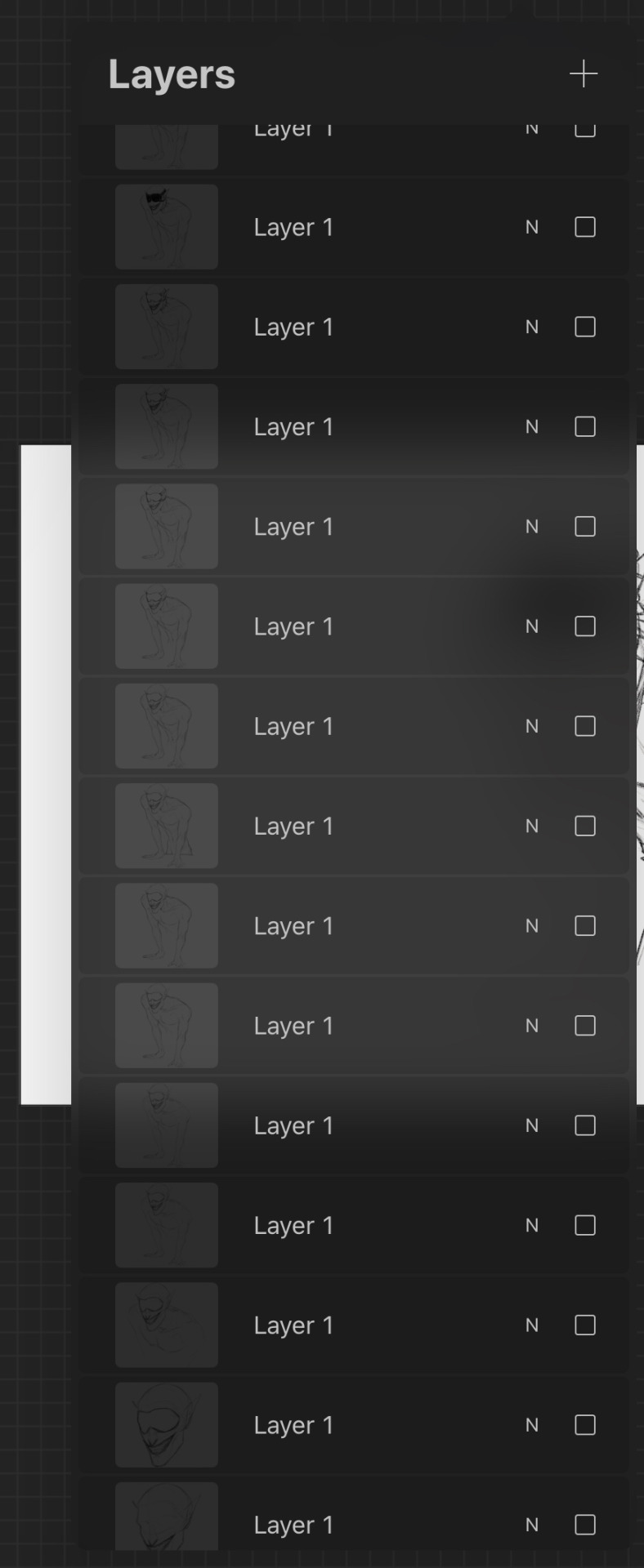
In terms of general digital art tips, ALWAYS FLIP YOUR CANVAS. You will not believe the amount of times I’ve looked at a drawing and thought it looked pretty good, flipped the canvas and found that everything’s wonky. In cases like these the liquify tool is your best friend, as well as the lasso tool and transform tools, as well as just manually fixing them by redrawing some parts. Also use as many layers as you need, and by this I mean if you’re working on your sketch, lineart or colouring or whatever and you want to do something you’re not sure you’ll like, duplicate the layers so you have a backup in case it goes wrong and you want to go back. When I say use as many layers as you need I mean use as many as you need, these are some of mine and they’re all from just one sketch because I get really anxious about messing stuff up lol, also don’t be afraid of drawing separate parts on separate layers and merging them afterwards if you want.
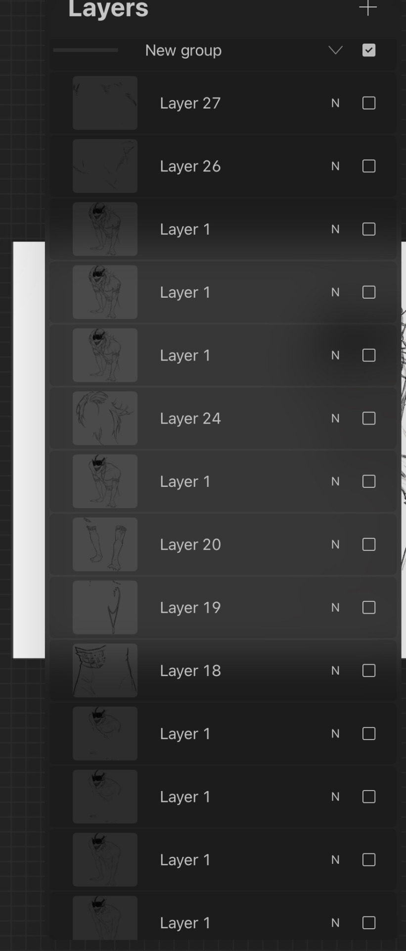
Also take your time, unless you have a deadline don’t feel like you have to complete a drawing within a certain timeframe, if you want to get faster at drawing then that’s great but don’t feel like you need to push yourself, especially if you’re just starting. Practice takes time and patience is your best friend, and you probably hear lots of other artists saying this but trust the process. You might get to a bit you’re struggling with and not like it and want to abandon the drawing, but I found that rather than saying “this is bad” or “this is wrong” start asking “how can I make this work” because a change in mindset can help you a lot with art. Also don’t feel like you have to reach certain milestones with your art by certain points either, like with the age thing and comparing your progress with other artists of either the same or different ages, because it can make you feel worse about your art. Trust me there are some artists younger than me who are like 14 or 15 who’s art I envy and—again with the mindset thing—instead of getting down that your art isn’t similar to their’s or worrying that you’re “behind” in your artistic development (there is no such thing btw everyone learns at different ages and speeds so don’t feel bad if you haven’t progressed as much as you would have liked to) it helps to ask what you like about their art and what you would like to incorporate into your own—this has helped me learn and improve a lot faster.
I don’t know if I have any more tips at the moment, but I hope that answered some of your questions! (also sorry it’s a bit long or some bits don’t make a lot of sense I like to ramble a bit lol) (also also thank you for the little fact as well!)
Have a nice day anon 🧡
19 notes
·
View notes
Text

So I decided I needed a break from that beach picture I’m working on (yes I’m still working on it, right now I’m making two versions because I thought the lineart and background didn’t match), so I just decided to make this
Yes it is based on the Toy Story meme
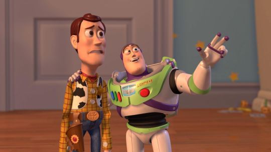
Anyways, I did this for two reasons. One, because I realized that Reno and Ceres are basically the instigators of the game’s plot; Reno the first half and Ceres the second half. It’s also different in that Reno was unintentional; he just wanted the power of the Forest Guardian, and accidentally made the Magilith activate, causing Kuro and Fina to time travel and the story to happen. And then later when they get back to the present he’s the person they’re trying to stop from unleashing the Great Disaster. Ceres meanwhile very intentionally instigated the second half of the plot as she was the one to inform the group about the existence of the Magi Key and what it could do, as well as where to find the pieces
Second reason is just that I really want them to interact, because I think it would be really interesting, especially since likely, Ceres knows of their connection, while Reno doesn’t
I have also come up with this alternate plot where the story starts because Ceres approaches Reno and his group and has them start the time travel, which our heroes then get wrapped up in. And in doing so, we see their dynamic, which is basically that Ceres tries to interact with Reno and deep down wants to be close to him, even if she knows she’s just using him for her goals, but meanwhile Reno, whom she does not tell about their relationship (because he absolutely wouldn’t believe her and it’d probably ruin her credibility), sees her as more of a work partner, and while he goes along with her plans he isn’t fully trusting of her. And at the very end where he comes to his senses and turns on her, it does hurt her in a way he wasn’t expecting (he fully believes that Ceres doesn’t care and has no clue why she does), but she ultimately gets him out of the way because her mission is more important than her feelings, and she may or may not reveal to him their true connection
And that whole scenario is kind of one of the other reasons I wanted to draw them together. I’ve just been thinking a lot about the two of them interacting and wanting to draw that
I think I got carried away, what was I talking about? Oh yeah, drawing I made. Well might as well pivot over to the drawing process itself now
So I’m using a different brush here. I was looking for a brush for my big beach drawing, and someone suggested the Syrup brush on Procreate, and I actually had fun with it (and it is the reason I’m making two versions now), so I wanted to use it again here, and I think it turned out pretty well
I will say though, I had no clue what I was doing on the sketch with the bodies. I don’t think it’s super noticeable in the final product, but it was a mess in the sketch. I really need to figure out how I’m drawing anatomy, I swear. I can’t just keep doing guesswork
…You know actually, I don’t think I have much else to say, so I guess we’ll end here. It was a bit of a haphazard description, but I’m scatterbrained, what you gonna do?
I do want to draw more of the two interacting, I just don’t have ideas yet. Maybe in the future though
#I feel like I was gonna put something here but I don’t remember what#evoland 2#evoland reno#evoland ceres#my art#oh yeah I’m trying to tiptoe my wording here because major spoilers about Ceres and Reno#but I don’t know whether or not I should say or not because of that#because people haven’t played this game#and also I don’t want to put half the description under the cut when it’s only one thing#I should probably tag spoilers still though#evoland 2 spoilers
9 notes
·
View notes
Text
finally wrote up a somewhat proper explanation as to why Roulette doesn’t like Chai at the start of her rather tumultuous journey. I don’t know if this can be considered a long read post but here’s your warning. Oh, and you can scroll down for some lineart pieces (really proud of those two) and another mention of a NIN album.
because we love NIN in this house
At first glance it might seem like Roulette hates Chai’s guts to an unimaginable degree, but “hate” is too strong of a word here, even in her own opinion. Yes, she does find him rather annoying, arrogant, idiotic in his antics and just in general the biggest dumbass she’s ever laid her eyes on. At the same time, she knows it’s rather pointless to be as nasty as she is to him at times, yet she feels as though she can’t stop now, like she has to be mean to him. Acting all nice and calm towards him after everything she’s said to him would be like admitting some so sort of defeat to herself.
(And she’s can be a stubborn bitch sometimes, even when she knows how she’s acting towards him is incredibly mean and stupid (her first meeting with him basically clouds her judgment; the reason for initially disliking him is really petty, a spur of a moment situation))
The issue runs deeper than that though. Ru is angry with Chai not just because he feels like a caricature of every lazy loser who thinks they’re the hottest shit out there, but because she is extremely envious of him, both his character and position. Seemingly a nobody from God knows where gets a prosthetic for garbage collection and then becomes an ambassador for one of the departments of a multibillion tech company just… because? A literal college-dropout, a slacker who doesn’t take his job seriously and just seems to leech off of the company he works for? And people even like him?!
Is it really because of his positive attitude? His stupid smile? Or… is he just that charming and lovable compared to her? It seems as though everything comes to him easily, without him even trying, that he is just that incredibly lucky.
Of course, Ru doesn’t knows his situation, what he’s been through to get to this point in time and who he had to face. Heck, we don’t even know what his past was like, but we can only assume that it wasn’t that great. She thinks her comments don’t really affect him much, that he brushes them off with ease and just goes about his life being all “rockstar” or something.
And he does, but some of them just hit way too close to home without even meaning too.
She dreamt big too, you know? Big dreams of her own, that she couldn’t fulfil due to her life circumstances. And here he is, a reminder that more often than not, hard work is not enough. Just one lucky moment can be enough change your life completely, and her hard work couldn’t compare to that.
At least she got lucky this time, getting accepted into Vandelay Tech as a mere HR-assistant. She thought she could change her life around completely, start fresh in a new and unfamiliar environment.
And she did, but wherever you go, you’ll always have yourself, right? And you can’t really outrun your own problems like that. It might give you more motivation to work on yourself, but in the end… who is to say that it’ll actually help you?
Their relationship will improve eventually, but only after someone will be saved once and at least one attempted murder/voluntary manslaughter? Hard to tell
Also LISTEN TO «With Teeth» BY NINE INCH NAILS IT LITERALLY DESCRIBES HER CURRENT STATE AND FEELINGS. YOU CAN JUST READ THE TITLES OF THE SONGS AND ALREADY GET A GOOD PICTURE
Actually JUST LISTEN TO NINE INCH NAILS IN GENERAL. And I’m not just talking The Downward Spiral or Pretty Hate Machine (both are wonderful, of course), but listen to other works too.
And now, the little art pieces:
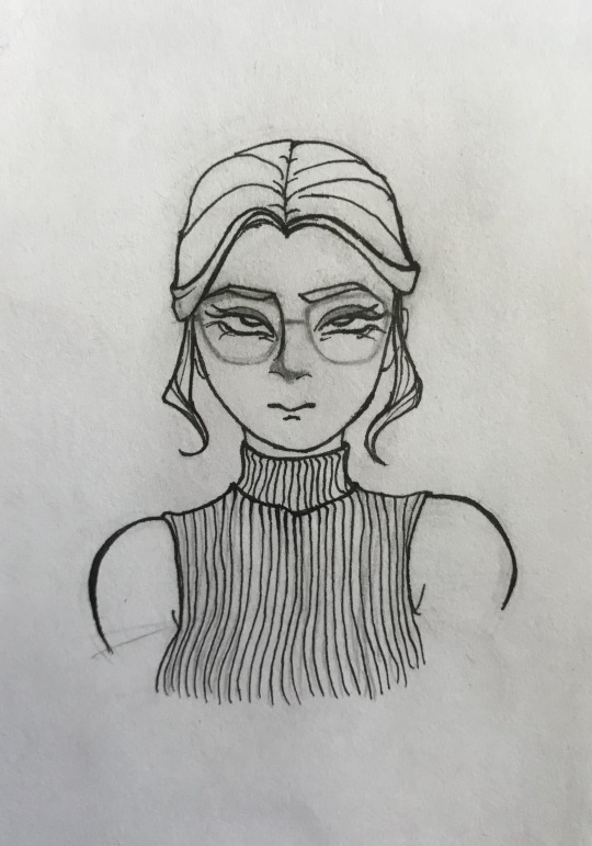
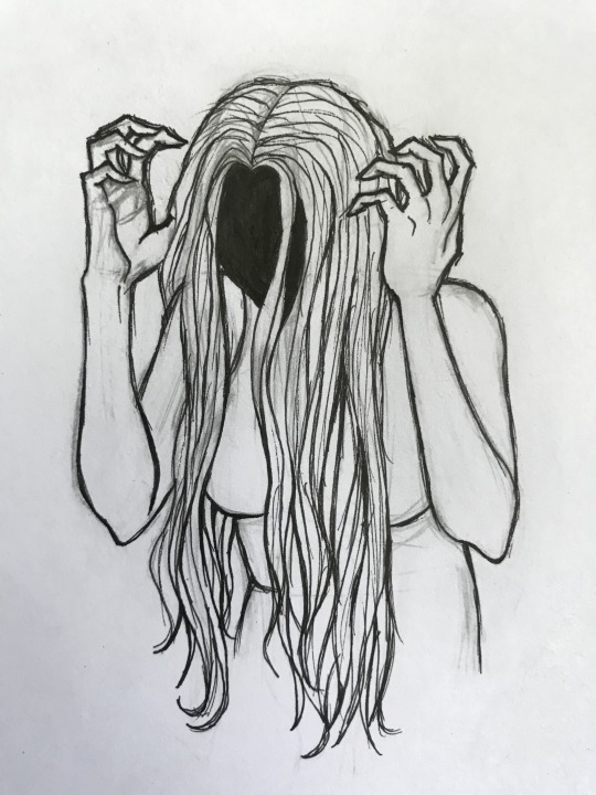
Still experimenting with style and how to draw Roulette. The last post with her was leaning more into being somewhat realistic, while this one is just… cute. Which I really like! And of course, the second is more of an experiment with lineart. Still love my Sakura Pigma Micron pens to death, they just hit different. The scratchy look turned out lovely on the second piece.
oh yeah, and these two are the same person
#hi fi rush#hi-fi rush#hi fi rush oc#lineart#i want to do more colourful works#But I haven’t touched my watercolour in such a long time#I’m scared of touching it#But I will because I’m not a pussy#wrote this to All The Love In The World and drew the last pic to The Background World#almost went a bit coocoo there with the loop getting more and more distorted at the end#Ru/Roulette
5 notes
·
View notes
Text
I’m so close to done with the lineart for this piece but the part that’s left is the most complicated part and it’s 10:45 PM and I’m still 3 time zones behind and I KNOW it is the devil trying to convince me it’s worth it to stay up to finish it 😔
1 note
·
View note
Text

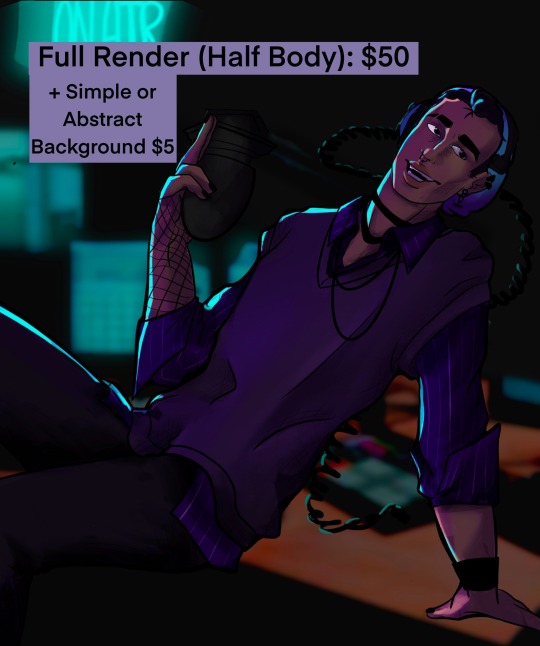


COMMISSIONS: OPEN!
I haven’t posted my new art in a hot second but I’m out of work for a month before I’m moving for grad school so I figured I’d try my hand again.
I’m going to grad school for scenic design and if you want to see more of my work you can check it out here:
So if you want to buy a background to use (with credit) for your character art that price is posted above!
Sketches and line art are priced the same from bust to full body and additional character come at and extra $7(sketch), $10(lineart), $20(bust), $25(halfbody), or $30(full body) per character.
Detailed background will come at some sort of discount when being added to a character piece but I can’t put a consistent number to it. Also I consider all of these numbers base prices. I will likely stick to them for characters but might chat with you depending on how complex a background gets.
I have few reservations about the type of art you can ask me for just no excessive gore and I don’t think I have the skill to draw a furry (though most dnd races are fair game)
If you’re interested ether message me here on tumblr or fill out the form, below. I can take payment through Venmo, cash app, and Zelle (if you promise to close your eyes when it shows you my dead name).
I am also including a 15% hyper fixation discount for all Dimension 20 and Critical Role art!
#alik’s art#fan art#my art#art commisions#art commission info#art commission prices#art#character art#background#critical role#Dimension 20#background commission#commissions
0 notes
Text
I like the act of drawing, but not liking the final result stresses me out. That’s why I have such a hard time with taking commissions from people that aren’t like. Close friends. I hate doing lineart in that I do all my digital art on my phone and getting the lines right is difficult. I like traditional inking but I prefer coloring digitally and my process isn’t sophisticated enough to color a traditionally inked piece digitally
I guess it’s because I don’t follow the main rule they try to pound into you in art class (and I assume art school idk I didn’t go) and I only draw the things I want to (mainly my cyclops girl I’m very normal about her) so I don’t stress over drawing something right
Responses on my post about this are all over the map, but it looks like most people who create art do so just out of a need to create art, even though they find the actual steps and process to be totally unfun or even annoying to do.
It appeared from notes to be a bit rarer that people draw or write out of loving the work process itself. Lets find out!
4K notes
·
View notes
Text

please clap for my ineffectual nerevarine
#I’m already doing an in depth lineart piece of him but that’s pre-game and I love him in game#he’s very sexy but then he talks and makes you feel insulted and disrespected. my little no charisma blorbo#top skill is short blades bc I try to use the bow and then get scared when they get close LOL.#Actually top skill is in being my favorite little guy rn and also carrying the burden of prophecy#personal /#wip#illyana
5 notes
·
View notes
Note
Hello Amalas! I love your artworks coz they're so detailed and you can even make clutter look beautiful. I'd like to ask: what reference do you use for the background? Do you go outside and take pictures or sketch here and there? Do you use photo books? Internet? Coz everytime i look at your artworks in a bigger screen, it makes me feel like i'm transported to the place-- like i'm a passer-by or a fellow diner watching your character a few steps or tables away from where i am.
Awww thank you!! Okay This is gonna be a bit longer It’s a mix of a lot of things and a lot of the things around me. I not only love to draw cluttered places, but I also always kinda lived in lovely cluttered places. So a lot of inspiration is just taken from the things around me, my own memories, and the things I like.
My latest pic for example is something that is created by just an idea I have of a kitchen, based on things I know and things I’ve seen. I didn’t have a specific reference here.
I mostly always start with my characters and then very roughly sketch the room I have in mind around them.
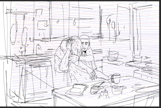
And based on this I create my perspective lines and map out the space a bit clearer. Measure my distance with the perspective lines and create my surfaces.

And then I go into lineart. First for the surface only.

And when I have all my surfaces I only then go into my detailed clutter and add it all over time.
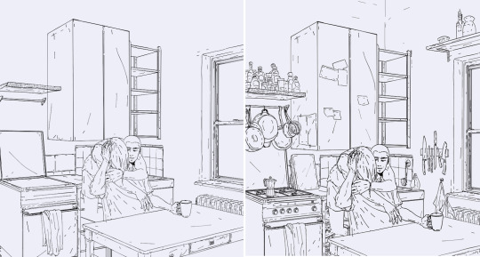
As said, this kitchen was fully made up and only really got shaped into form on my canvas.But I for example have a gas stove and one of those espresso cans at home, so just a quick walk into my kitchen allows me to look up certain items if I’m unsure how they look.
But there are also a couple of items by now that I have stored in my own personal mental library. When you look at my pieces closely there are a bunch of items that I have in several of them. Poles, electric cables, a certain type of window, stacked bowls and cups, soda cans, etc And those are all items that I can draw by now without any reference. And then there are some new items that I have to look up, so I mostly just do a quick google search to get an idea on how they look. For example this bedroom piece was created like the kitchen above and just based on an idea I had in mind, rooms I knew or saw somewhere and then just created out of my head. I started with a rough sketch
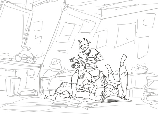
And then continued the same way as with the kitchen piece. But here I had some very typical late 90s items in mind, and as I could draw the bed, room, window, and some small details just out of my head, there were a couple of items I looked up on google to get the right look for them!

So I created a small library from pics I found on google and just put them on the side of my pic to have them as a ref.It doesn’t have to be a perfect ref. Just a good enough pic to give me an idea of how an item looks like.
Sometimes I have an idea of a room but want something specific and it should look more or less authentic so I go on a google search for similar places.I still like to create my own version but I look at certain structures and items that those places have and try to incorporate them into my piece
Like with this one for example. I just used some photos from google that gave me a good idea of a place like this.
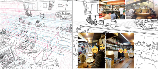
Many of those items are still chosen from my mental library, but I also have some things I look up and some loose references.
Keep in mind that I’m doing this for some time now! And I build up my mental library and how I want to draw things over time! This is not something that comes over night. It takes time! And it comes by repeating things and drawing them over and over.
I also love to take photos and when I visit new places or see something I like I take photos. One because I love to take photos, but also as a future ref. And some of those photos I use as loose refs as in the examples above. And sometimes I even pretty much just redraw them. Because I really like the structure, or want that specific look or even specific place!
For example I took this photo when I was in New York and as the Aran and Tao story takes place in New York I really wanted to create a place like this! A structure and street similar to the photo.
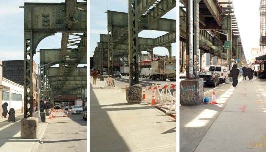
And as you can see especially the train structure and street look is something I used for this drawing here
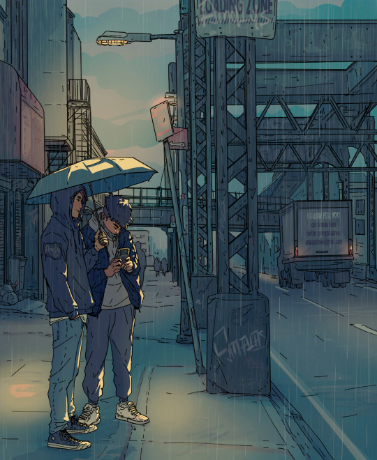
So long answer short
It’s a mix of things!I have a good mental library by now, I like to draw the things I know and the things around me, and when I go for a certain city, or street look I like to work based on photos I took by myself and use them as refs.
And taking photos also helped me a lot with my background drawings. It gave me an idea of how my irl 3d street view looks on a 2d photo, an idea for lines and angles, what works and what not, and what to look for in backgrounds, what I like in city scenes, and what I want to create. Google photos can be helpful refs, but I like to use them more loosely to only give my brain a reminder again on how a certain item or space looks like. When I really redraw something or stay close to my ref I like to take my own ref photo, so all is my work.
#amalas answers#how I draw backgrounds#drawing backgrounds#using references#long post#art references
334 notes
·
View notes
Photo

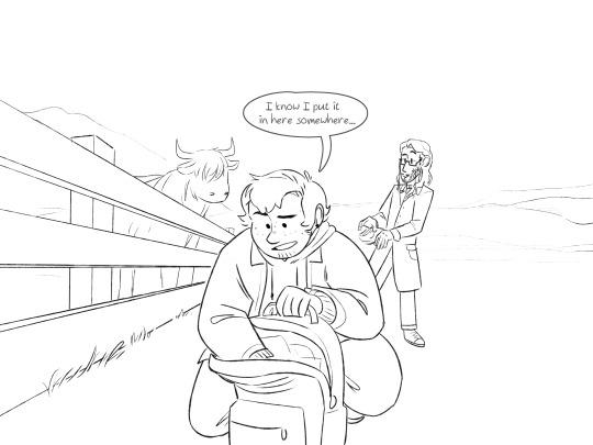
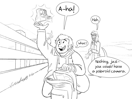
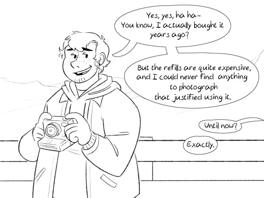
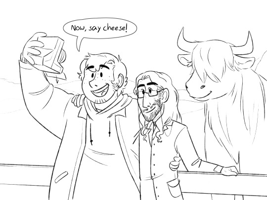
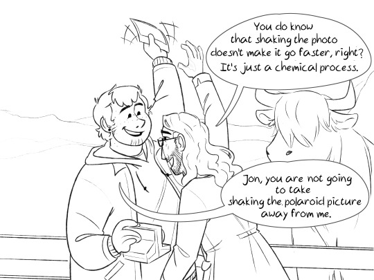
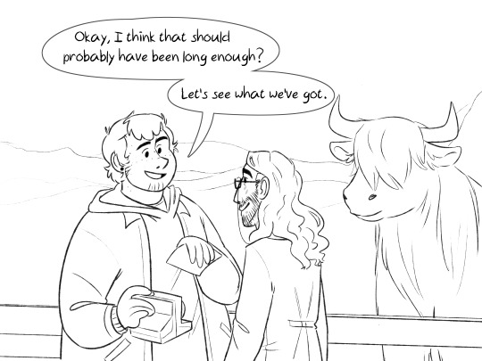
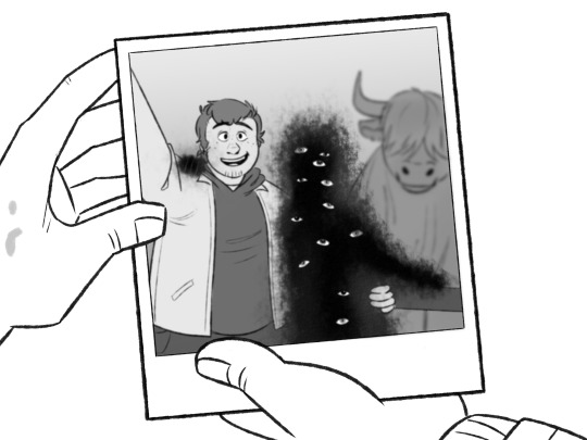

[Basic image ID in the alt text, more elaborate below the cut]
I do have some kind of justification for why Jon would show up weird on polaroids (as opposed to digital media, when in tma it’s often vice versa) but to be honest, the actual justification is “because it’s funnier”.
Bonus:
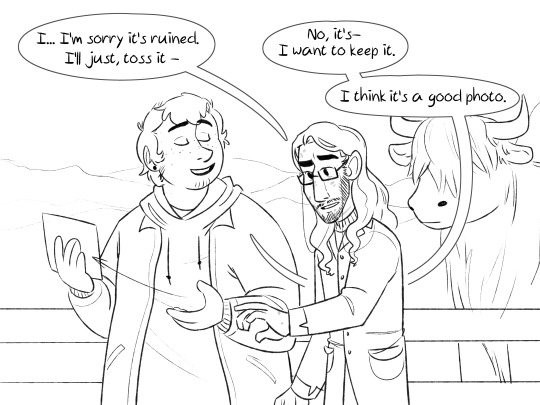
[Image ID: Jon is frowning, trying to grab the photo, which Martin has passed to his other hand. Martin is smiling, eyes closed. Jon: “I... I’m sorry it’s ruined. I’ll just, toss it-” Martin: “No, its - I want to keep it. I think it’s a good photo.” /End ID]
[Image ID: A digital comic drawn as black on white lineart, featuring Jon and Martin, consisting of 9 images, one panel per image. Throughout, Martin is a fat, white man, with short hair and freckles. He’s wearing an open jacket over a hoodie, and small round earrings. Jon is a smaller South Asian man with long, wavy hair, a beard, and glasses. He’s wearing a long coat. He’s covered in small scars. First image: Jon is leaning over a fence, holding out a handful of grass towards a long-haired cow. Martin is standing next to him, wearing a backpack, saying: “Oh! Jon, don’t move, I need to grab something.” Above Jon, gray, smaller text reads: “Yes, come here, here’s some fresh... grass?” Second image: Martin is kneeling while reaching into his backpack, saying: “I know I put it in here somewhere...” Jon is standing behind him, looking a bit confused, dropping the grass. Third image: Same composition as the previous. Martin is holding up a polaroid camera, saying “A-ha!” Jon, behind him, laughs. Martin: “What?” Jon: “Nothing, just- you would have a polaroid camera.” Fourth image: Martin is standing, holding the camera in two hands, smiling. “Yes, yes, ha ha - you know, I actually bought it years ago? But the refills are quite expensive, and I could never find anything to photograph that justified using it.” From off-screen: “Until now?” Martin: “Exactly.” Fifth image: Martin is holding up the camera in one hand, his other arm around Jon, who also has his arm around Martin. They’re leaning against the fence, behind them is the cow. Martin: “Now, say cheese!” A piece of paper is coming out of the camera. Sixth image: Laughing, Martin is keeping away a piece of paper from Jon, who is also smiling and reaching for it. Jon says: “You do know that shaking the photo doesn’t make it go faster, right?” Martin: “Jon, you are not going to take shaking the polaroid picture away from me.” The cow is still standing behind them. Seventh image: Same composition as previous. Martin has lowered the paper, Jon lowered his arm. Martin: “Okay, I think that should probably have been long enough? Let’s see what we’ve got.” Eighth image: We see the photo Martin took, his hand holding it, and Jon's hand, reaching for it. The photo shows everything the same as image five, except in Jon’s place is a big, black, staticy shape, with several realistic eyes placed in it. Ninth image: Jon, Martin, and the cow are all staring at the paper with baffled expressions, their eyes drawn as simple black circles with white centers. /End ID]
#tma#the magnus archives#gammijart#tma s4#jonmartin#jonathan sims#martin blackwood#monsterjon#magnuspod#magnus archives#tma fanart#tma jon#tma martin#srry for doing it this way with the image id#in this case it just really was so long that im quite sure it would be detrimental to the post#and i worked on it for. too long honestly#at least all the text actually fit in tumblrs alt text. but it left little rooom for other descriptions#and now ill find out how much the tma fandom has shrunk since it was completed#and ill finally get to eat my cake#< thats irl cake im getting rn#martin k blackwood#martin#jonathan
10K notes
·
View notes
Note
how long does it take you to complete a detailed work from start to finish? seeing artwork so detailed and precise gives me the impression that it takes a very long time. there are gaps in my head that say "I do not know this technique" and so I wonder how you establish a specific detail, color, shape, text. it's fuzzy magic to me, science to you. it's a separation of worlds and I am so curious.
it varies on a variety of factors! if i'm particularly motivated to draw, i can whip up some art in a few mere hours.
this animation of sebastian for instance was done in three to four hours but i was Really vibing with it and didn't have any interruptions. i had the luxury to just sit down and Go.

other works like this for instance probably take well over 72 hours to make. a lot of time comes from me nitpicking the background details or applying changes per the request of the client.
they often start off with messy scribbles for the backdrop along with a semi-clean lineart. occasionally i run through a couple angles if i'm not satisfied with the first one.


depending on the client's request, i try and stick to an angled view rather than a head-on view. i’m personally not a fan of flat wide shots and will avoid them in elaborate pieces if i can.
now when it comes to something like this next piece, while it still takes me a long time as well, the time-consuming part is in getting the background details Right.
if you look closely here all the graphics on the black background are more or less evenly spaced apart. the weight of the lines are also very close / similar in sizing. my personal rule of thumb is to try and keep things spaced like this so they don’t distract from the primary focus of the art. that said, if the art allows for it i’ll throw some things in there that’ll take the eye on a sort-of tour, aka - the Guiding the Eye technique.
ideally here, the name of the character [Laika] being a brighter white than the backdrop will draw your eye up to that area of the canvas, then naturally your gaze will want to migrate to the face. the dashed lines to the left are there to bounce your eye back to the name and face as well as break up that empty space. without them your gaze might get lost in an awkward empty void. see example;


of course, a lot of this IS subject to the viewer. what works for some might not work for all, and that’s okay.
i’m gonna cut this post off here before it gets any longer but feel free to ask if there’s something more specific you want me to dive into!!
142 notes
·
View notes
Text
aid’s collection of neat art tricks
aka I wanted to compile all the neat things I’ve learned and picked up over the years across various sources; I wish I knew some of these, but they’re scattered across a variety of social medias and some from conversations.
of course, these are not a must and just have helped me! I just wanted to put them all in one place in hopes that maybe it’ll click something in someone like it has for me. c: I’m not the best at explaining, but I hope it makes sense!
some may use Clip Studio assets but can be replicated through other methods (or done by hand in the case of how I do my lineart colouring), but do keep in mind all of these are written with CSP in mind.
this is pretty heavy in images and gifs, and is quite long.
how to quickly fill your outlines (CSP tool)
this is a CSP specific method, but this tool has been my absolute saviour for making colouring so much easier for me (even if sometimes it still does require me to manually fill in some holes or erase sections). the bulk of how it works is explained in the tool as well, but I’m going to show a gif example for myself!

you have to make sure your lineart is set as the reference layer to ensure this tool does work; with messy outlines (like my own) you may need to manually fill in holes as can be seen in the gif above; with cleaner outlines, you don’t need to worry as much, but you may have some bleeding out of the lines for places that are a bit too close together (as you can see below, those areas would need to be erased).
the tool can also help to close ‘gaps’ between colours!

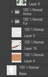
I usually tend to have a ‘base’ colour that I just clip a folder of flat colours to, so it doesn’t bleed outside of it, but I’m also a nested folder freak to make sure everything is cleanly separated and doesn’t get ‘destroyed’ while I work on it. this tool just makes it so much easier to get that base down and just jump right into adding flats.
adding a little pop of depth
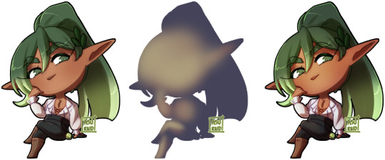
this one is thanks to a clip studio article itself where I saw it from, and I’ve been using it in practically all my drawings so far; all it is, is a simple blue-ish overlay layer with some muted yellow/red shading to give it a bit of a “3D” effect, for me I enjoy more that it adds a bit more colour variation underneath (usually lowered to 20-50% opacity, depends on the drawing)
the article definitely explains it a bit more nicely, but this is an example of having it at 50% opacity over one of my drawings
making your lineart feel less ... boring?
of course, boring is subjective from person to person, but I’ve always found my lineart to be too boring by itself

like this is fine, but it’s missing some kind of oomph. there are two tricks I use when it comes to sprucing up my lineart: using the watercolour edge effect in CSP, and a combo of coloured outlines + black outlines
first things first, the watercolour edge option: by default it’s a bit too strong, so I usually find the sweet spot to be at 1 range and with an opacity of ~20


this can be replicated through duplicating your lineart, and if the option is available, using gaussian blur on the duplicated lineart to achieve around a similar effect.
coloured outlines!
when it comes to colouring my lineart, truth be told I do use a wonderful auto action for it which can be found here, and there is this alternative one as well (which i’ll be trying now!!!).

it is a little different since it uses the flats, vs the one i use which just requires you to have the lineart selected, but as you can see it is a very quick way to colour your lineart ... this isn’t perfect by itself and will require you to have your flats finished.
this is my process: outlines done, autoaction, cleaning up by adding black outlines where they’re required and fixing up sections where the colours don’t quite make sense (like the sleeve area).

as you can see with the last drawing, I also tend to add a black outline around the outside of the piece, I personally found I really enjoy the contrast of the dark outside and coloured interior lines, as you can see in this little sample; it just adds a bit more visual interest for me!

unfortunately, outside of manually doing it, I cannot think of alternatives for this specific action (perhaps duplicating + flattening all your colours and placing it on top of the lineart may be a start)
crunchy textures and pretty colours ...
the texture i use on top of my drawings can be found in this CSP asset pack (though the marker brushes themselves are very lovely, and I’ve used them myself). this can be replicated through adding perlin noise, but I just find this texture to tickle the good spots in my brain, and it’s why I use it on pretty much all my drawings for some additional visual goodies.
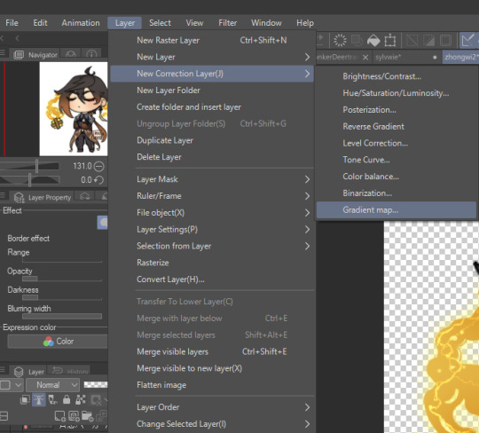
yes, i am also a person who uses gradient maps. I usually tend to use them as finishers and more subtle ways to add more colours and variations to keep my shading from looking too flat, but they do have to be handled with care lest they become overwhelming. vampbyte does a wonderful introductory thread on gradient maps, how they function, and how they can be used.
they can be found through layer > new correction layer > gradient map -- or at least that’s how i usually access mine!
i often place mine at 20% opacity on the colour mode, though soft light and overlay also do their own fancy things! really depends on which you like most and works with your piece.
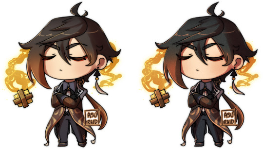
an example of my chibi w/o texture and colour gradients vs the texture + colour gradient ... as you can see it does change the colours quite a bit, so usually it does take me a bit of playing around to find a colour gradient I like (I’m a gremlin who has downloaded a lot of them) and to play with opacity values.
and to top it off, here’s the combination of all of these vs one with them all off.

how i personally shade (multiply layers)
i usually tend to either go for multiply shading over the whole drawing using one colour (and a few lil tricks to add more depth) for smaller pieces, or hard light shading for bigger and more complex pieces since it has more value depth.
my multiply layers are usually just one or two layers using around the same off-purple shade (though i shuffle it around pending on how it looks on the drawing

the second layer is a duplicate of the first, and i usually use an airbrush to either erase or expand areas to give it a softer shade (as you can see in the gif, the second layer is definitely missing chunks), or to add a different colour to the shading that isn’t the off-purple
how i personally shade (hard light mode)
this one’s a bit more of a mouthful, and thanks to a friend who introduced me to it! my second method is hard light shading, which, at its simplest, is greyscale shading and feels like it leans more into ‘painting’ your shades (as it works best with a brush that blends colours).

although I’m obliterating my own art here, it’s to show that most of your work will be in the greyscale/muted colours! it is inherently a non-destructive method of shading, so any changes to the colours underneath will maintain the shading regardless. normally I do have to duplicate the layer a second time since I don’t go too close to black shades, and it gives me a bit more control over how ‘hard’ I want my shading to be.

the middle is your ‘neutral��� shade, aka what you want to fill your entire hard light layer with, then your lighter greys will be your highlights, and darker greys your shading!
alternatively, you’re looking for this when you want to find your ‘neutral’ shade.

once you got your hard light layer filled with your base/neutral shade, grab your favourite painting/blending brush and go ham!
as a heads up: when it comes to skin or warm colours in general, you may need to get out of the greyscale range otherwise it will look too desaturated and grey, as you can see below. for any other tones, the greys usually work well.

as of the moment, I think that’s all the little tricks I use when doing art, I hope it helps you guys!
(unless I somehow remember something else, but these are usually my default tricks I use for everything)
#art tutorial#clip studio paint tutorial#digital art tutorial#clip studio paint#tutorial#art tricks#mine.txt#10#20#50#100#200
227 notes
·
View notes
Photo

Okay so I generally have two styles for doing shaded stuff Painted and then my “holographic sticker” style with the dots and that one swishy dotty gradient pen. This is for my painted style!!! Long story short here’s a tutorial on how I do that for some friends on discord hehe.

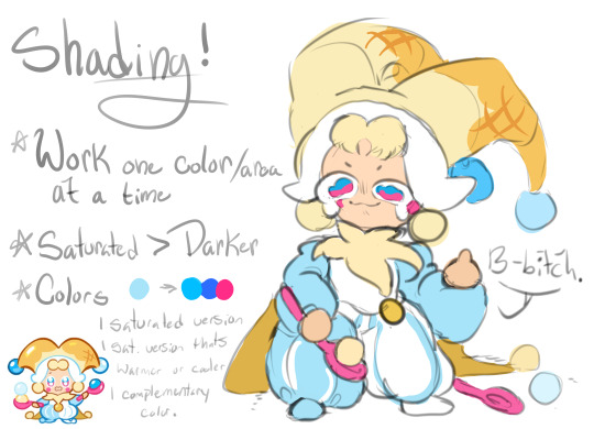
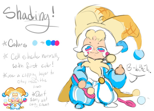
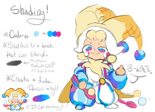
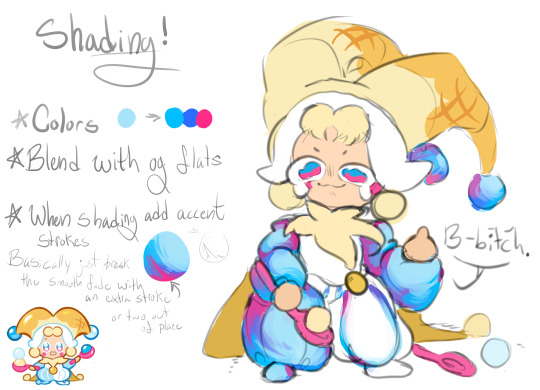


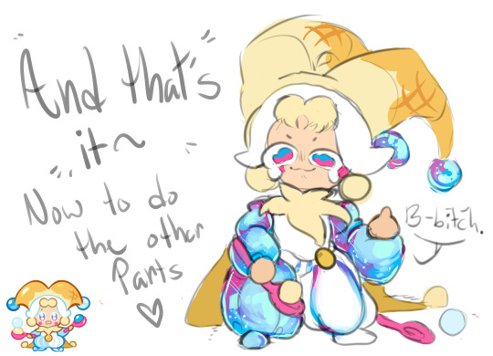
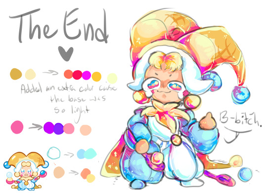
AND TADAAAAAA THATS HOW I DO IT~~ cant read my absolutely ADDHORENT handwriting? No worries!!!! Captions/Transcript + some extra notes below !!!
TRANSCRIPT! Step 1: Lay down your flat colors! I always color drop everything to make sure its as close as possible. The only time I don’t color drop is if I’m adjusting a red to a more pinkish color!
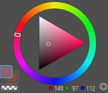
Step 2: Shading time! The first step is to choose what color you want to work with!! Remember that when you’re shading that SATURATED IS BETTER. Don’t darken the color unless you really need to. Just make it more saturated and/or cooler. Cooler colors are darker than warm tones. So if you need to adjust go saturated - cooler - and then lastly darker if needed!! For the sake of the tutorial make 3 colors.
The first one a saturated color / A DARKER saturated color / a complimentary or contrasting color. This is our lightest to darkest scale!
To start off take your first color and cell shade ONE FLAT COLOR or SECTION with it!!!! Do NOT use this for the ENTIRE drawing!! Work in pieces!!!
Step 3: Add a gradient to that cell shade~~ So you just used 1/3 colors to cell shade with. Now take your other two colors and create a gradient with it!!! You’ll want a blendable brush for this. I like CSP’s oil flat brush! Make sure your contrasting color is in the darkest spots! Step 4: Blend with the flat color bordering your cell shade!! AKA just make the border that meets the cell shade softer.
Honestly, dont worry about making it clean. Really all you need to do is take a few strokes of the flat color and put it into the cell shade a little and youre good to go. I like doing little dashes. Also when you do this feel free to take that yummy contrasting color and make it bleed up towards the lighter color!! It’s not accurate with like how shading works or whatever, but it looks super fucking cool.
Step 5: Highlights!! Its time to add some highlights!! Basic rule for highlights.
Warm flat color = cool toned highlight!
Cool flat color = warm toned highlight!
Literally just put this color anywhere you want a shine and then take that color and OUTLINE the cell shade like riiiiiight up against the lineart. Trace your lineart with this color where its darkest basically. This counts as your “backlighting” and all that nonsense, but more importantly it just looks cool. If your highlight is too bright for the shadows you can also outline with your flat color!!
Step 6: Details!! Add sparkles and shit. I also like little lines. Draw diamonds, fish, stars, planets, flowers, etc etc. Whatever the fuck you want! I use the highlight color or I use a slightly lighter version of it to do this Aaaaand youre done!!!!!
I don’t do all of these in this order obviously, usually I wait until I do EVERYTHING with cell shading before I add my highlights and details, but for the sake of doing one section of the tutorial I figured it would be easier to see how its done. If you wanna try drawing this way just know that with time you dont need to plan out your colors and eventually youll just know what to do as you go along and you’ll probably jump around a bunch.
My tips are make it messy, have fun with it, dont worry about all the little details until the very END (i.e lines or patterns on the clothes. You’ll just cover it up otherwise), and feel free to fuck with your glorified cell shade as much as you want!!!
Dont over think it either~ Its literally just a cell shade with a gradient + highlights that outline the lineart where its darkest. Thats alllll it is~
Hope this helped and have fun drawing guyssssss
#im actually shit at drawing tutorials#but i hope this explained some of it lmfao#if this made even a little sense ill be happy#art tutorial#shading#my art#cookie run#lmao tagging that anyways
168 notes
·
View notes
Text
Adrien Trapped in AU-Land Chapter Banner Production in Progress/Sneak Peek
Hi guys! So, if you’ve been following my art journey, you might have heard me mention that my end goal is to be able to do illustrations for some of my fics. The inaugural project I have in mind for this is Adrien Trapped in AU-Land. There’s an akuma, and canon Adrien gets bounced around into alternate universes which all seem to be trying to set him up with Marinette.
My art has improved by leaps and bounds over the past month, but we’ve still got a long way to go, so I’m starting off with rough drafts of the chapter banner images for each of the AUs. I’ll need to do one for the prologue too, but I did the coffeeshop/café AU first because it’s the first AU, and I had a strong mental image of what I wanted to do.
Anyway! Here’s the first rough draft. It’s a takeaway cup from the coffeeshop Chez Plagg next to two chocolate chip cookies. (That’s a piece of Camembert on the label of the takeaway cup.)
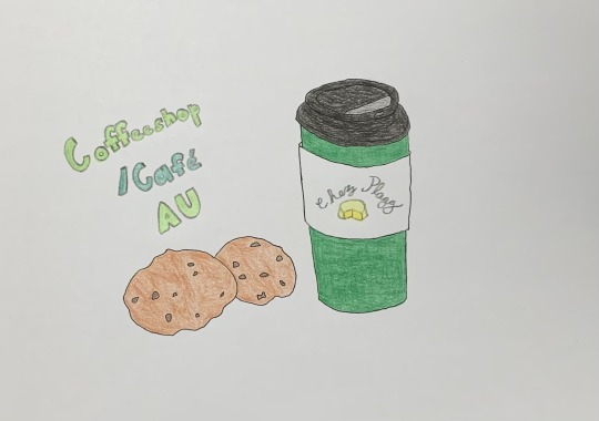
It turned out okay. The cookies aren’t wonderful, but the takeaway cup is so-so. It’s alright for a rough draft anyway. I’m going to be redoing everything once I get a tablet and start doing things digitally, so this is good enough for now. I’m sure I’ll play around with the colors too. I’m not sure that I love this. XD
Here’s the lineart before I colored it. I might do some other versions and play around with things.
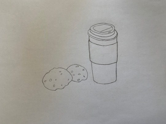
I’m a little stumped as to what I’m going to do for the banner images for some of the other AUs. I know what I want to do for the ballet AU, but I really only have general ideas for the other ones. I’ll be doing: coffeeshop, ballet, fashion designers/enemies, life swap/kwami swap, royalty/Cinderella, fake dating, and roommates. Any thoughts/ideas/suggestions? Any AUs you’re particularly excited for?
Here’s a snippet from the Coffeeshop AU. It’s also a reverse crush AU, so Coffeeshop Adrien has a hard time talking to Marinette when she comes into the shop. Also, the kwamis are people in this universe, since it’s a universe where they don’t have powers. Canon Adrien’s consciousness is currently in Coffeeshop Adrien’s body.
[Adrien] kept it together until Marinette stepped up to order.
“I’d like a tall chai latte with a shot of mocha, please,” she requested with a smile that nearly knocked Adrien’s lights out.
No wonder this world’s Adrien was so overwhelmed by her.
“C-Coming right up,” Adrien stuttered, fingers fumbling with the menu screen.
He didn’t fair much better during the rest of their brief stay. Try as he might, he couldn’t come up with a single thing to say to the pretty girl across the counter.
It felt rude to interrupt after she finished paying and turned to talk to Tikki while they waited for their drinks.
All Adrien could do was wonder why the Marinette of this universe was friends with Ladybug’s kwami. Did that mean that Ladybug was someone close to Marinette? Did they travel in the same circles?
Adrien remained completely distracted until the young women were out the door.
“Well,” Plagg sighed. “You didn’t do any better than the regular Adrien. Didn’t you say you were friends with your world’s Marinette?”
“Yeah, but Marinette back home isn’t that ridiculously gorgeous,” Adrien complained and then stopped to reflect. “Well, I mean…she is. Marinette is incredibly attractive, but I don’t usually think of her like that because we’re just friends, and it’s weird to think things like that about someone you’re just supposed to be friends with, so…”
Adrien gave a helpless shrug. “I was just taken aback.”
Plagg slowly began to nod in understanding. “You’re in denial about your feelings for your world’s Marinette.”
#Adrinette#Adrienette#Miraculous Ladybug#Adrien Agreste#Marinette Dupain-Cheng#Plagg#ML Fanart#Drawing#Graphite#Colored Pencil#Mikau's Art#Mikau's WIP#Sneak Peek#Coffeeshop AU#Adrien Trapped in AU-Land
11 notes
·
View notes