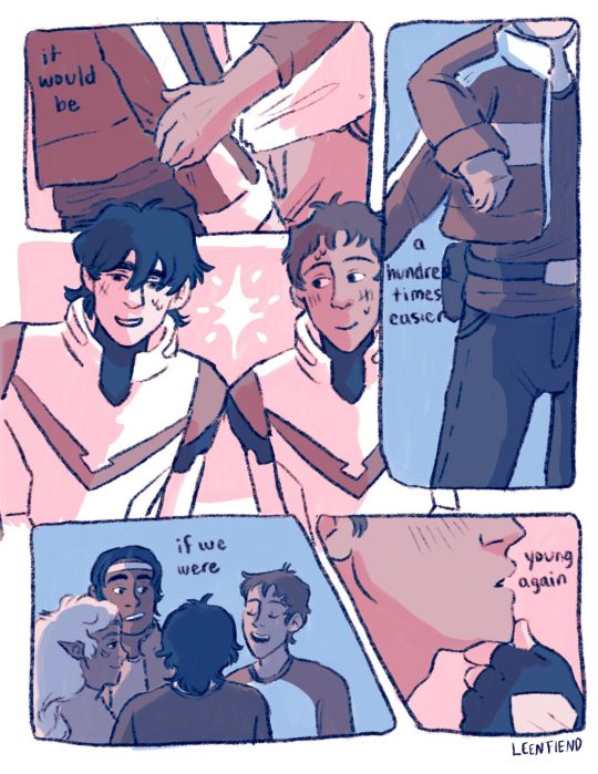
#I’m not good at drawing comics. especially on procreate which is what I use
Text
I had a cute concept in my head
I eventually plan to draw a variation of this, but here’s a more detailed concept
So Pip and Damien are hanging out, maybe playing together and Pip ask’s “Damien? I do hope it’s not to much to ask, but why do you not have horns? Your father has horns.” Damien looks over at him and let’s out a small huff “I have horns! Big and grand ones! They…just aren’t here yet.” He says the last bit in a mumble, admitting they haven’t grown in yet. Time skippy and they’re a little older and Damien seems frustrated he still hasn’t grown them yet. “Still no horns yet? Let me see” Pip pushes back his hair and sees a small nub covered up by his fluffy locks and gleefully announces: “oh joy, Damien! You are growing them!”
Damien gets embarrassed by how small they are and is frustrated all around they aren’t grand and massive as he expected (he’s impatient), and his blondie pal once more helps him out by styling him some hair horns so he looks all big and scary.
Bonus idea: little devil tail. Swishes so much, like the kitty,,
#I’m not good at drawing comics. especially on procreate which is what I use#so I’ll probably draw a simpler version of this concept#my writing narratives are bigger then my will to liv-draw :<#south park#pip pirrup#pip pirrip#sp pip pirrup#philip pirrup#damien thorn#south park damien#sp damien#south park damien thorn#southpark#pip x damien#south park dip
58 notes
·
View notes
Text
Hi!
I’m Ginger: artist-nerd, citizen-scientist, make-garden-not-lawn enthusiast, and avid baker-of-cinnamon-rolls-from-scratch!
I very much enjoy fandom!
What is my weekly fanfic consumption like? High. Very High.
Some of my current favs include: Star Wars (especially Kylux), The Witcher (here meaning I saw about an episode and a half of TWN, found the fandom, and wandered happily off towards Lambert and Aiden), LotR, sometimes StarTrek…..assorted others!
I am passionate about creating things, too! Often, that means drawing fan art and/or comics.
Actually, I’ve found myself stalling intermittently in that department over the past year or so. I’ve been almost exclusively drawing Kylux things using only Procreate, for a while now. Which I love doing! But I suspect doing just that one type of art for going on 4 years now is starting to have an effect of the breadth and depth of my creative well.
So I’ve decided to change up how I create for a while!
A good friend gifted me a sketchbook IRL and I want to fill it with traditional media drawings. I want to try drawing from more fandoms, try out new digital techniques and styles that maybe I hadn’t allowed myself before. I want to invest some time into art forms besides drawing, even - I’ve always enjoyed fiber arts and I’ve got a jack loom I’ve meant to finish repairing for a while. Once that is working, I want to learn to weave. And I want to share some of these things here!
On that note, I suspect more than a few people who follow me on Tumblr are here because I have drawn a lot of kylux. Especially the long-form fan comic ‘Dying Is Easy Young Man, Living Is Harder’. WRT The Comic: Kraken and I are still fully intending to see it to it’s conclusion! Honestly, though, it’s been on unofficial hiatus for a while now and it’s likely to remain that way for a bit longer. Kraken is super busy with retraining and job related demands IRL, and I am also pretty swamped and trying to get back in a more sustainable groove artistically. The whole sitch doesn’t leave us a lot of room to create a big project like DIEYMLIH together, right now.
I know firsthand how hard it can be to wait a long time for a story you enjoy to get finished - so I want to say ‘thank you’ to everyone being very patient with us! We will get there eventually!
If you want to check if there has been an update or just re-read the kylux comic to-date, the best place to go is the DIEYMLIH Site

If you want more kylux themed stuff in the meantime, I’m still putting my Kylo Amidala and other AU stuff for them on my Patreon
If you want the whole complete collection of my art (kylux or other)…. I'm working on that. I’ve historically been really inconsistent with tags. I'm trying to be better about that and also go back and fix all my personal art so it is consistently tagged. It’s gonna take a while. Eventually!
60 notes
·
View notes
Text
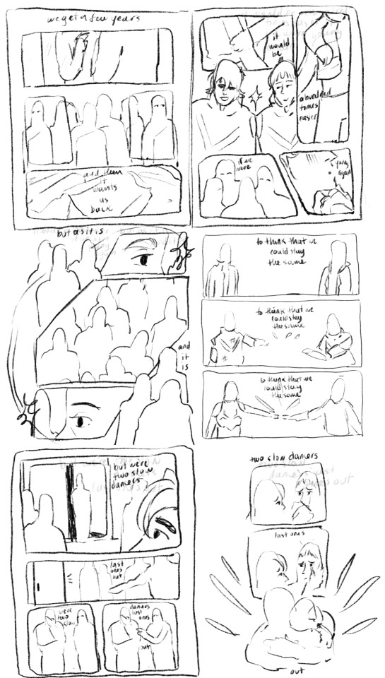
I thought the Two Slow Dancers comic would be a fun opportunity to break down my process a lil bit cause this was a lot of undoing and redoing and adding so for any ppl curious it will be under the cut!!
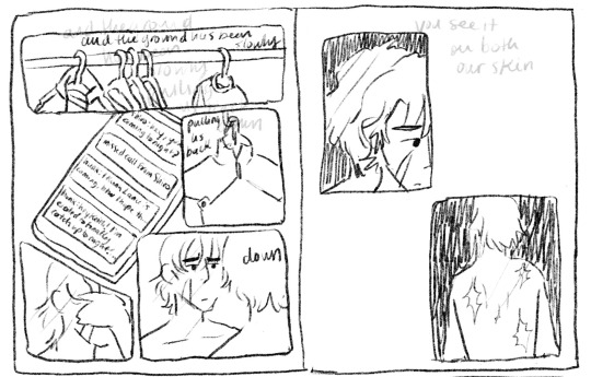
So to start off I actually only thumbnailed what is now page five and six, the original image in my mind was them reaching out to each other in different seasons clothing, I considered just making an animated version of that but then I connected it to the two slow dancers scene I had imagined in my head a month or so back and wanted to make it part of a small narrative:

(I actually did page six first - u can tell by the way my writing is nearly incomprehensible that this idea came to me like a vision in the night)
But then looking at that i said - well surely that doesn’t tell the story enough. I need more. And then I played two slow dancers on repeat for probably an hour while I thumbnailed a surrounding narrative for those two pages and ended up with this mess:
And from there I actually started working on the lineart two pages at a time - I like working on freakishly large two page spreads because to me it helps the flow feel more cohesive, I don’t look at them as isolated pages until I get to the shading part of the process.

But once I sent it to some ppl for feedback and reread it myself a million times I felt like the story still wasn’t reading the way I wanted it to - two out of six pages were “flashbacks/memories” pages and that ratio didn’t really allow for the other four pages to read as a cohesive story in my opinion so I kept trying to workshop two more pages for the front and I went through a few iterations:
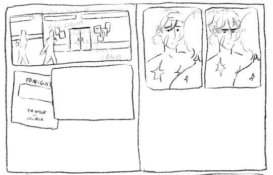
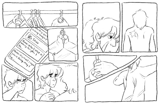
I thought at first I would show the outside of the garrison, give the audience more of a setting, and then show the flyer so we know Keith is getting ready for this celebration. But it was too literal for me (even though what I ended up doing was still pretty literal lmao). So then I started with the phone/text messages as a story telling device:
Also this is an example of how I almost always draw the comic panels before I decide what goes in them haha, unless I’m really sure what images I plan on focusing in on the panels almost always end up informing what goes inside if that makes sense. But I finally ended up here when I decided “that’s good enough”
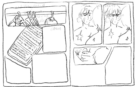
I even did most of the lineart for this composition before I decided the imagery of the jacket was just too repetitive, like we don’t need THREE PAGES of keith putting on a jacket.
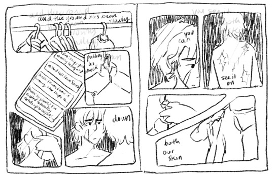
So i kind of just moved the left page over to the right, and left the right page blank for most of the rest of the comic process. I finished most of the lineart on the rest of it before I finally circled back and decided to go with a tweak of what I originally thought was a lame idea (I had this image in my head of the lions silhouette against the glow of the Earth for the first page, but with the lyrics “the ground has been slowly pulling us back down” I thought it was just too cheesy, especially because that’s not what the lyrics mean either in the song or in the context of this comic and I didn’t want them to be perceived as so literal)

So this is the thumbnail I landed on for that which eventually turned into the actual final page.
Once I had all of the thumbnailing done the rest was pretty fun work! Just lots of going back in and detailing out the scribbles I had first put down. Now in terms of color, I actually have a secret. Most times I don’t color much at all? It depends on the piece but for most of my comics what I do is this -
I flat greyscale color everything and then use a color curve adjuster inside of procreate to pick a color pallet:
color adjusters are ur friend for picking color pallets i'm TELLING YOU!! I used to have a lot of trouble with cohesive color comps but it's a lot easier for me even without using this method now. Anyway I usually leave it here, in my other comics I don't have any shading or background elements outside of the panels but I figured since I was working so much on this comic anyway, I might as well light it a bit.
So I basically just scribbled over the whole composition with a purple marker set on a multiply layer and then erased out the places I wanted light to hit, and then added a soft light layer with colored lights to give it more of a party look:
The only hang up I had during the coloring process of all this was how to color the "memory" pages. I originally just wanted them to be more pastel/blue, I thought that would make them look distinct enough. So I painted/shaded this whole page before looking at it within the rest of the composition and deciding it didn't read well at all and ended up sliding the saturation down to zero and calling it a day:
But I'm happy with that decision because it allowed for the "coming into color" moment with the other memory page and I think it connects better to the rest of the comic visually that way.
And that was the whole process! There were tons of other little adjustments I made along the way and other composition things I tried out but I do tend to erase instead of iterate in layers so this is the process I have to show you!
As a little bonus behind the scenes, here's the time lapse replay of that initial thumbnail for all eight pages! (it is sideways just because it's so large so if you're on a phone/tablet/laptop just turn ur screen sideways otherwise I'm so sorry lmao)
#my art#this is so long but i like 2 talk about process stuff lol#i also would love to see anyone else do a breakdown like this i LOOOVEEE seeing how other people work.#and feel free to steal any way I do anything ever (it is not stealing it's simply learning and using artistic practices that u are drawn to#colleen thoughts#also i use the 6B pencil in procreate for all of my linework ever and all of my thumbnailing im a one brush type of person#and it's like a default brush too lmao
23 notes
·
View notes
Text
@czigonas wanted to see me answer those artist questions and I did them all so it’ll be under the cut
1. Art programs you have but don’t use?
As of rn I cannot draw on my laptop/tablet so technically paint tool SAI and photoshop(idk what version). But I guess I hadn’t used photoshop for /years/ back before my drawing hiatus. Sorry but SAI is so much nicer to look at and to use, for me personally.
2. Is it easier to draw someone facing left,right, or forward?
I flip flop my canvas a ton to a) look at it for wonkiness and b) to get specific lines in a direction that feels good, but the actual act of drawing I typically like to have them looking left cause most the the lines flow from top right to bottom left which is nicer to do since I use my right hand to draw even tho I am ambidextrous.
3. What ideas come from when you were little?
This question confuses me on what it’s actually asking soooo? When I was like 12 I had to write a story for school so I did a story about a plane crash in which the survivor came face to face to a rat/bat/cat/dog creature thing? I’ve always wanted to redraw the creature, idk if I have the original drawing I did and I don’t feel up to digging to see if I kept it during all my moves.
4. Fave character/subject that’s a bitch to draw?
My favorite animal color patterns aka brindle, merle ,roan, spots/stripes. So time consuming. In terms of shape, human faces for sure.
5. Estimate of how much of your art you post online vs. the art you keep for yourself?
Before hiatus, probably 90% /shared/. Currently, probably 75% /posted/cause I can’t post the porn to tumblr lmaoooo but I have shared them with like half a dozen friends.
6. Anything that might inspire you subconsciously?
I’m sure there’s a ton but if it’s subconsciously then how would I consciously know?🤔 ok serious answer, probably every single 2D animated movie or show I’ve ever seen, and all the various artists I follow. I mean, there’s parts of my style I can pinpoint you to what it’s inspired by.
7. A medium of art you don’t work in but appreciate?
I’ve never /seriously/ tried oil paint, acrylic paint, or pastels but that shit always looks so good. Also watercolor even though i have tried and enjoyed using watercolors but I am far far faaarrr from being proficient in them. Non drawing wise, I fucking love dioramas, especially those that are then filled in(?) with acrylic(?). I watch a lot of those videos on YouTube.
8. What’s an old project idea you’ve lost interest in?
Most of my old animal ocs I had in the same universe in my mind and had a comic planned that I never got around to. I still love and wanna revisit those ocs. But also my dragon age ocs who I’ve SERIOUSLY BEEN CONSIDERING drawing in @soaps-hoe-141 universe 👀
9. What are your file name conventions?
Before hiatus/ on my laptop, subject or character and whatever was happening in the pic. Now using procreate on my iPad? I don’t think I’ve named a single one lol.
10. Favorite piece of clothing to draw?
Nothing, no clothes, nude, nakedness please and thank you. lol but I guess I do sorta enjoy figuring out clothing in general, folds and shit, getting that practice in. Like how it hangs and creases in poses since I’m not used to drawing it.
11. Do you listen to anything while drawing?
I don’t usually listen to /only/ music while drawing, I much prefer having a favorite movie playing in the background and/or a show I enjoy rewatching/am actively watching. I also watch a lot of gamer YouTubers I put on as background noise/short watch breaks that their voice is just soothing to me even if I’m not /watching/.
12. Easiest part of the body to draw?
I’m not sure… maybe boobs/pecs for humanoids. General body shape for animals?
13. A creator you admire but whose work isn’t your thing?
Honestly can’t think of a single one. I mean, plenty of artists do work(or with a medium) that I can’t or don’t want to do/use personally but I read the question of “isn’t your thing” as “subject you don’t enjoy”. If that’s correct, then idk what to tell you. I don’t follow or remember people who majority does things I can’t enjoy on some level.
14. Any fave motifs?
Quite a lot of religious imagery I guess ex. Circles around a persons head. Less serious answer is drawing characters in meme formats lol
15. Where do you draw?
Please don’t tell any physical therapists I live like this… on my back on my couch with my head on the arm rest while holding my iPad propped up on my chest like 8 inches away from my face lmao
16. Something you are good at but don’t really have fun doing?
Idk???? I do shit for my own enjoyment so I’m not sure? Maybe perhaps backgrounds? Like I could do something decent if i wanted to but I’m not into it so I usually just don’t?
17. Do you eat or drink while drawing?
I take breaks… but while actively drawing? I often drink aka let the horny demons out while I enjoy whiskey lol.
18. An estimate of how much art supplies you’ve broken?
Broken broken? Next to fucking none? some charcoal sticks but otherwise…. None… I majority do digital art so really nothing to break there lol
19. Fave inanimate objects to draw?
Idk? I like doing life charcoal drawings? Of whatever, but particularly statues if that counts? I usually have living beings as my subjects.
20. Something everyone else finds hard to draw but you enjoy?
Ok, I hate this question, cause we are all good at different things. Maybe it’s just most of those I follow have different strengths than me???? But I guess if I had to pick, recreating from life(or picture) is a lot easier for me than some others(like making it life like/very accurate).
21. Art styles nothing like your own but you like anyways?
Yooo, anything I’ve reblogged honestly. Love everyone.
22. What physical exercises do you do before drawing?
Absolutely none, again don’t let the pros know cause damn. But I will do stretches or take breaks as needed.
23. Do you use different layer modes?
Absolutely. Mostly for lighting and shading but yes, if I’m doing digital imma take advantage of it.
24. Do your references include stock images?
Yes? I don’t really understand what it’s asking?
25. Something your art has been compared to that you were not inspired by?
Idk? I don’t usually get feedback of that sort.
26. What’s a piece that’s viewed a wildly different interpretation from what you intended?
Again idk? I guess my shit is straight forward?
27. Do you warm up before getting to the good stuff?
Almost never, again don’t let the pros know lol I do sometimes jump between pieces or start a new sketch before going to something farther along.
28. Any art events you have participated in, like zines?
Nope, wanted to and have tried before but I tend to NOT do something if I feel pressured to do it.
29. Media you love but doesn’t inspire you artistically?
Again I feel like this is a weird question or maybe it’s just my understanding of it but I can feel inspiration from all sort of artist shit even if it’s something I’ll never do(ex making a crochet animal or dioramas). I guess I can feel inspired to create from other creators even if it’s not direct inspiration/subject/medium.
30. What piece of yours do you think is underrated?
Underrated as in no one has seen aside from a few people irl would be my colored pencil pieces I did during afternoon naps when I worked at a daycare a few years ago.
5 notes
·
View notes
Note
I adore your tarot card series, your art is amazing and one of my favorites in the fandom. I have a strange (possibly unanswerable) question, but do you have any tips on emulate Gabriel Bá's style? I've tried to, but it always feel like a poor imitation. I feel like yours emulates his amazingly, while also being unique to your own. Sorry this is probably confusing, and feel free to ignore if it doesn't make sense.
awww thank you so much!!! honestly I feel like I'm still figuring out how to mimic his style. but! I love talking about how I make art, and what I think about when making art, so Anon, I hope you are ready for this extremely long and convoluted reply under the cut
first of all, reference! obviously lmao. I just googled around for pictures from the comics. but if you have something specific you're trying to draw you should definitely get the closest equivalent.
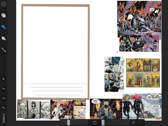
[ID: a screenshot of a canvas on Procreate. It has a large upright rectangle surrounded by various panels from The Umbrella Academy comics. End ID.]
This is my reference for the tarot series. I really ought to have more, and make tailored reference sheets for each card, but I’m lazy lol
Once you have some reference (don't be afraid to decide that some of your reference isn't that helpful, or that you need more), you can get to ~analysis~
Basically, this is just getting a feel for what the artist does that makes their style distinctive, especially when its different from your own. Things to look out for include proportions, amount of detail, the way eyes, hair, hands, and clothes are drawn, and any other distinctive features of note (like how Bá often exaggerates the chin). A good place to start is by tracing the form!
lets use this picture of vanya as an example (sorry about the quality lol)
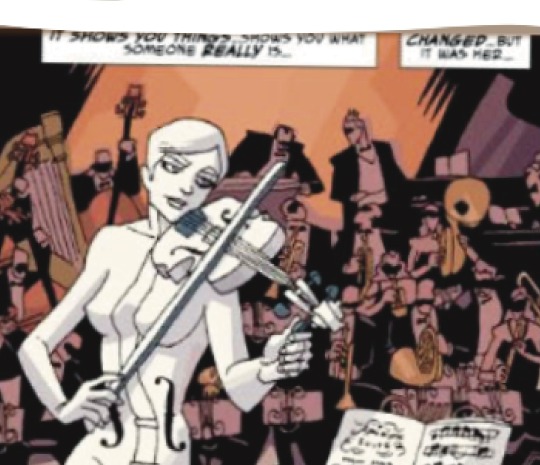
[ID: a panel from The Umbrella Academy, of the White Violin playing and tuning her violin. End ID.]
Tracing the white violin’s form is fairly straightforward since she’s not wearing any clothes, but even so this is not just an outline- you want to mark the pieces of her body (such as head, shoulders, ribs, stomach, hips) and how they fit together, like for example:
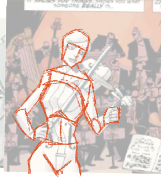
[ID: the same image as above with the opacity lowered. A red line tracing the outline and joints of her body has been drawn over the image. End ID.]
(I also marked how much of her head that her face takes up, which can be helpful too.)
from this, you can learn that Bá has drawn her with a large head, small shoulders, a torso too wide for her shoulders, and a very long torso- very long ribs in particular, as her stomach and hips are more traditionally proportional. Doing this more times, with more characters - being careful to outline the body under the clothes, not the clothes themselves - can give you a feel for how Bá generally draws proportions. Based on my own experience, I can tell you that the “torso disproportionally wide to the shoulders” thing is pretty typical, and that though he does tend toward longer torsos, this is pretty long even for him.
If you want to get more specific, you can. for example, you can use this method to examine how his faces are proportioned - how how much space in the head that the face takes up, how much area the eyes take up versus the nose, whether there is more space in the forehead or the chin and so on.
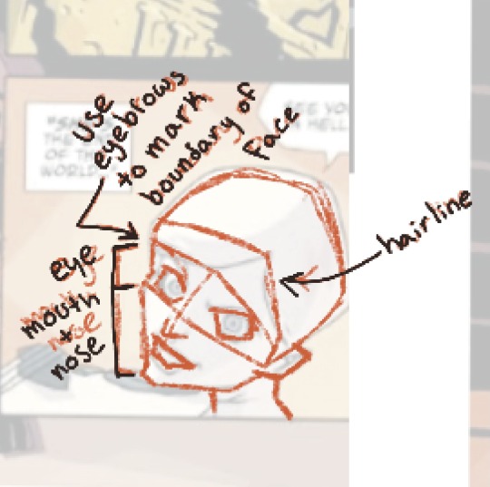
[ID: a panel of The Umbrella Academy showing a closeup of Vanya’s face. The opacity has been lowered, and the basics of the forms of her face have been sketched over in red. Arrows note which line indicates her hairline, that the line of her brows is used to determine the size of her face, and have sectioned off how much of her face is taken up by her eyes versus her mouth and nose. End ID.]
This can vary depending on the character, but I’ve noticed that he usually draws ears as very small, sharp, and low on the head with minimal defined shape, and when he draws hair, he usually draws it in one big shape with minimal interior lines.
You can also use it to figure out how he draws hands - some specifics that I’ve picked up are that his hands are usually more realistic than mine, and that the meat of the palm, where the thumb connects to the hand, is generally very pronounced and is also generally a round shape (I usually draw this area fairly pointy).
Figuring out how Bá (or any artist) generally proportions a character can go a long way to making your own imitation feel more accurate. Another good, though more straightforward, thing is to examine and imitate how he draws details - how he draws t shirts if you’re drawing a character wearing a t shirt, how he draws trench coats if you’re drawing a character wearing a trench coat, and so on. When choosing reference, keep in mind is how close to the “camera” whatever you’re drawing is, and try to get reference that is located at a similar distance. There’s more detail closer up and much less detail farther away!
and of course, practice before you jump into your final piece! You can try to copy directly from the reference a few times, and then place your version directly over the original to examine where you went wrong - if you tend to make your heads too big or your torsos too short - in order to keep it in mind for the future. and also practice the pose you’re planning to draw and examine its proportions compared to other drawings Bá has done. And don’t be afraid to trace!! tracing is taboo for final pieces but it can be extremely useful for practice, as long as you are paying attention while you do it!!!
All this is important foundational stuff to getting a good imitation, but what really sells the style, and what can make any sketch look at least more like the comic no matter how unlike the style, is the final lines and coloring.
heres an uncolored piece of art by Gabriel Bá.

[ID: a black-and-white illustration of Five, Diego, Klaus, Allison and Luther standing in a jungle, presumably in Vietnam in the 1960s. End ID.]
I use it for my example because it’s easiest to examine line art when there isn’t any color.
this has more detail than the panels in the comics, but from it you can learn a few things. The most important thing is that Bá uses a thin pen with absolutely no line weight variation or tapering, and also uses large black shadows. He also occasionally uses intermittent dots or dashes to add texture. Many of his lines, particularly the ones for small details, are very wiggly. And much of the time, a given curve is actually made up of a series of straight-ish lines.
The pen I use for the linework looks like this.
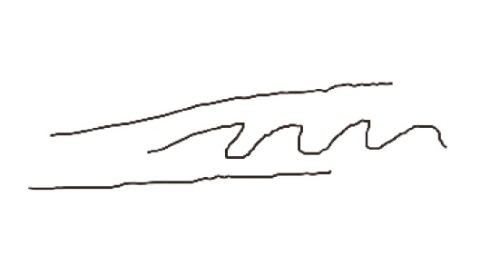
[ID: a set of scribbles made by a pen that does not vary in width, and does not taper at the ends. The curves are slightly jagged. End ID.]
now lets take a look at the coloring. I don’t know if Bá does the coloring or someone else, but the style is still very distinctive and worth taking a closer look at.
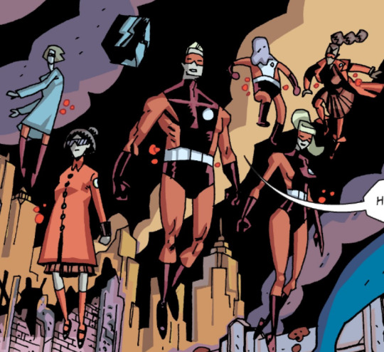
[ID: a panel of The Umbrella Academy showing the Sparrows from the end of Hotel Oblivion. End ID.]
All of these colors are flat colors, with no gradients. Not terribly surprising for a comic book, but worth pointing out. All of the shading is very geometric, and there are almost no curved lines, even in the shading for the smoke. most areas have a base color and a shadow, rather than a base color-shadow-highlight, or even multiple highlights and shadows (this is a rule i break frequently). The shadows are likely individual colors picked to be darker than the base color, rather than one color layer set to “multiply”. That’s fairly obvious, but I point it out because its different from how I would normally shade. Occasionally, colors do not fit neatly into the outlines, usually on background objects rather than characters. There are almost no areas where a low-opacity color is laid over the other colors; any places where this happens are almost invariably small and shaped like a rectangle, as though drawn by a chisel brush.
The brush I use for the colors looks like this.

[ID: a set of scribbles made by a chisel-shaped pen. It also does not vary in width, though vertical strokes are thinner than horizontal strokes because of the shape of the tip. End ID.]
for figuring out what colors to use, I honestly recommend just finding a scene that you like the coloring for and taking the colors directly from that. It’ll teach you how to use color palettes like it in the future, and the coloring is already done by a professional, so why not let them do the work for you! If that feels too much like cheating, I still recommend at least taking inspiration from them.
All the practice for form etc is important if you really want to feel like you’re imitating the style, but honestly even just copying the line art and coloring techniques will get you pretty far.
this got. so long. I hope at least some of it was helpful!!!
#for the void#tua#thanks for the ask!!!#and im so gald you like my tarot series!!!#hoooly shit this is so long i really really hope it helps *somebody*
10 notes
·
View notes
Text
MariNaomi.
Bio: I started writing and drawing comics in 1997, and my first published comic appeared in Action Girl Comics. Since then, my comics have appeared in more than eighty anthologies, I've published seven books (four graphic memoirs and a young adult graphic novel trilogy) and have an eighth along the way in November, a gag book about erotic fruits and veggies called Dirty Produce. My comics have appeared on The New Yorker's Daily Shouts, The LA Times, The Rumpus, Razorcake Magazine, Bitch Magazine, and The Comics Journal. Earlier this year, one of my memoirs, Turning Japanese, was translated to French.

In addition to making comics, I'm the founder and administrator of the Cartoonists of Color, Queer Cartoonists, and Disabled Cartoonists databases, which I created to help elevate the voices of marginalized cartoonists. I'm a Bay Area person currently living in the Los Angeles mountains with my partner and a menagerie of animal rescues.

Find this Daily Shouts piece here!
Tools of choice:
I never thought I'd say this, but I do most of my work on the iPad these days. I never used to enjoy doing art digitally, but the Apple Pencil (even though I have complicated feelings about Apple as a company) really changed the game for me. I still sketch out roughs on scrap paper and play around with traditional pens, pencils, paints, and paper, but Procreate has allowed me to delve into color and collage in ways I've always wanted to, but were too tedious to do by hand.

Tool I wish I could use better: Oil paints. I love the final product when others use it, but uggggggghhhh it looks so bad and is SO MESSY and uncontrollable when I've tried to use oils.
Tool I wish existed: A pen or pencil with a fast, easily adjustable nib size, especially if it were a brush! The iPad comes close, but wouldn't it be amazing to have something like this in physical form? I have some tools that come close, such as a mechanical instrument from Japan that has four settings I can switch between (ink gel, eraser, 05 pencil lead, and 03 pencil lead), but it's clunky and imprecise.

Tricks: When lettering my comics, I've found that drawing on a graph just can't be beat for ease and speed. Procreate has a drawing guide I use, but when I'm using IRL paper, I have many different sizes of graph paper specifically for this purpose.
A trick for when I get creatively stuck is to have other projects to turn to, and to take lots of breaks. When I'm really stuck on something I need to get done right away, I find it effective to go do something that lets my mind wander, such as going to a hot tub solo, a swim in a pool, or a road trip (without the distraction of audiobooks). Nothing gets the creative juices flowing better than not being able to write down your thoughts!

Misc: Tips for folks just starting out: Take all the gigs that interest you, even if they're not necessarily in your perceived wheelhouse, so you can find out what you like and what you're good at (assuming you haven't sussed that out yet). Experiment within (and outside of) the medium. Keep pushing forward and trying new things. Don't burn out—take breaks, don't quit your day job, DON'T take to heart what people tell you you should and should not be doing. Follow your passion! Be punctual, don't flake, be polite, but don't be afraid to ask for what you're worth (there are lots of ways to find out what you should be charging if you google it). Reach out to fellow creators, but not if you're just going to ask for favors. Give more than you receive. Most importantly, don't compromise your values.
Websites:
Website
Twitter
Instagram
Facebook
I also founded and run these databases:
cartoonistsofcolor.com
disabledcartoonists.com
queercartoonists.com
—–
If you enjoy this blog, and would like to contribute to labor and maintenance costs, there is a Patreon, and if you’d like to buy me a cup of coffee, there is a Ko-Fi account as well! I do this blog for free because accessible arts education is important to me, and your support helps a lot! You can also find more posts about art supplies on Case’s Instagram and Twitter! Thank you!
2 notes
·
View notes
Note
hi birgitte! I’ve been drawing on photoshop for a couple years and am going to lose access in a couple of months, and I’ve been thinking about getting an iPad + apple pen + procreate to replace that! You’re totally my favorite artist on tumblr and i feel like you said you use procreate? feel free to ignore but I would really love to hear your thoughts on if it works well/any advice on getting started! thank you so much regardless and I really adore your most recent cable drawing, it’s gorgeous💖
heihei! thank you so much, I appreciate nice comments about my drawings it really motivates me to draw more 💖 tbh a lot of compliments i’ve gotten (especially if they’re specific about what they like) i’ve screenshotted and thought about later so for anyone who’s sent me nice things: it’s not unlikely that i’ve thought about it for AGES
I have mentioned using procreate, but I only use it to get sketches for ideas I have when I don’t have access to my computer (instead of paper bc I can draw the colors I have in my head too!). I’ve been using painttool SAI for my actual drawings for like 4 years, and I like it the best out of all programs i’ve tried (including photoshop). I mainly like it because it has amazing customizable brush settings which is very important to me. I like it more than procreate because:
I like drawing tablets+computer more than drawing on an ipad
the brush settings are great
I use a lot of layers when drawing (for multiple panel comics, color sketches, etc) and procreate has a limit on that which is super annoying
if you used photoshop until now, I’m assuming you have a tablet and a computer already. It would be more expensive to buy an ipad+a pen+procreate, and it would still probably be a downgrade and have A LOT less features, compared to continuing to use your drawing tablet and switching to a different program. if the problem is losing access to photoshop but still having a computer+tablet i’d definitely switch to SAI if I were you. if you’re not gonna have the computer anymore at all, procreate is still fun and has a lot of cool pre made brushes. SAI is a one time payment (you won’t lose access if you stop monthly payments like with photoshop) and then u can keep it forever, and it’s like 50usd or something
wow SAI should sponsor me
anyway if you’ve seen any of my art tutorials I’m basing those on SAI and I don’t think i’d be able to do most of those things with procreate
good luck! if you want to update me on how it goes that would be really nice 🥰
4 notes
·
View notes
Text
There is no better way to get to know someone than through a good question tag. In this case we have decided to make an Indie game dev question tag with the responses of our four developers. We hope that it will reveal many unknowns, but if you are left with any questions, do not hesitate to use our ask.
What part of game development are you responsible for?
Athe: I write and write, I melt in my seat, I correct, I cry and then I program. It’s an endless cycle. Occasionally I laugh like crazy while I eat Pringles.
Sam: I draw and color without leaving the lines (almost always) the sprites, the illustrations and the ravings that usually occur to us past 3 in the morning.
Illy: English translations.
Sher: I draw BGs
What tools do you use (hardware / software)?
Athe: Recently my desktop PC has passed away, so I’ve had to rescue my old PC from the garage. I also have a laptop that saves my life more times than I would like to admit. As for the software, I need, above all, drive documents, video editing programs, image etc (I have an Adobe package) and of course Renpy and Atom.
Sam: My main friend and companion is my tablet, a wacom intuos S (pistachio color, so cute). As programs I mainly use the Paint Tool Sai, because there is nothing in this life like its stabilizer. And less frequently than I would like (for details, texture brushes, effects ...) I also use Clip Studio Paint, which I only know how to use at about 2% of its capacity ... If someday I have time I would love to stop and learn seriously what can be done with it.
Illy: During the school year I live in a residence, so I use an old laptop, and when I return home I use a desktop computer that never has memory space. I translate the chapters in the same Atom where the complete script is and I keep them in google drive files where I share them with our beta reader. I also use editing programs like photoshop when I have to translate comics or procreate for when my artistic skills are required.
Sher: ipad+procreate+some final tweak in photoshop, I don't need much more
What is your favorite part of the job?
Athe: Would it be wrong if I say that is when we released the episode? During the whole production time everything is very stressful, there are times when it’s really uphill, but when we release a new chapter it feels soooo good. It's like saying to yourself, yeah, dammit, I can do it. Look at everything you've climbed by yourself. You're doing it right.
Sam: In general, my favorite parts are when the first scenes start to be programmed, and I can see the sprites with the backgrounds, the texts, and how the illustrations look. Everything always looks so much better when viewed in-game… I also really like being able to check out the script as it is written. And from the artistic part that concerns me, when I see that my hands capture the idea that I had in my head ... Especially in character designs.
Illy: Having to find a way to translate very spanish expressions into English, research vocabulary that I have never had to use and commenting on some translations with our beta reader (which we adore) to make it understandable without losing the original meaning.
Sher: I like to do the lineart when the sketch is complete, if I no longer have to think about anything else and it's just going through it, I find it very fun and relaxing
What is the most difficult part for you?
Athe: Offf, yes, I admit it, sometimes writing is the WORST. Other times I love it, especially when I can expand on the descriptions or stop at a part that is intimate or that I find interesting (for example, Hasiel's conversation from 6.3, small spoiler: P). But, I HATE having to paste scenes, often the protagonist moves between scenes and you always have to add lines to those transitions that really do not interest anyone, but that otherwise the text would be confusing. Anyway... It is a very wide world, with a lot of history, I have to deal with what I need readers to know to understand the facts, although sometimes it gets a bit boring.
Sam: What part does not... Rather who e.e Zihel and Ariel are a thorn in my side. Especially Zihel. I know it has to do with the fact that it has never been my strength to draw boys, and much less if they are more masculine in appearance... That's why I also suffer a lot from drawing muscles. Another thing that brings me a headache is the perspective of the illustrations. Every time I try to get out of the typical shot or poses a little... It doesn't work out.
Illy: Doughy’s stuttering ¬.¬
Sher: chairs, sofas, tables... anything with four legs is my enemy
Anything to help or encourage you while you are working?
Athe: I need music, no, seriously, I NEED IT. I’m unable to focus without it. If, on top of that, I can get what I hear to act as a sounding board for what I write, the text is a thousand times better... But the muse is a pretty bad person.
Sam: Having a show/movie in the background that entertains me. The longer the better, so I don't have to stop to think what I want to put on next.
Illy: Eating sunflower seeds to trick my brain and not be tempted to do something else that distracts me.
Sher: I try to see other artists to motivate and inspire me before I start drawing, what I find most difficult is that initial push and that is where I need the motivation, then I usually have something in the background but it is not necessary
Something that’s a pet peeve or discouraging?
Athe: Some narrative climax moments. Generally, they are not important plot moments (that is almost entirely decided), they are often small decisions to go from scene A to scene B, but I can spend a LOT of time deciding which is the fastest and best way to tie those two ends. I'm the worst.
Sam: Many times when starting, I can't get the poses to fit the way I want, for example.
Illy: Finding many parts in a row that I find especially difficult to solve and that make me believe that I have forgotten how to English properly. And looking at how many lines I still have left.
Sher: When I don't know how to fill in some area, if I see something very empty but I don't know how to solve it, I can spend days looking at the screen without being able to advance, even if I have other areas that I could do in the meantime
What is required on your table or work surface?
Athe: Notebooks, sticky notes, pens… I’m a person who writes everything down, especially the tasks, but I also order the story by color schemes. The stack of sticky notes have 9 different colors, each one represents a character and I play a lot with them for a lot of nonsense. Besides, even though I have been writing on the computer for many more years than I wrote by hand, I still have a preference for the analogical.
Sam: Coffee, sweets, chocolate, cereals... And cats.
Illy: My phone, the sunflower seeds, a Capital America: Civil War 1L water cup, sticky notes that remind me of tasks.
Sher: I have nothing really lol all my things are for decoration
Your most productive hours?
Athe: Owl. Totally nocturnal. Although I have several crises a month to force myself to work at other times that always end... Wrong.
Sam: Also at night for the most part, although I can no longer stay awake as long as I endured before having a job (the good old days...) However, in the middle of the afternoon, when the zoo that I have at home is still taking a nap, I also manage to go a long way.
Illy: From when I finish eating until 7 or 8 in the afternoon, when I don't have to cook, clean, run errands...
Sher: I take over for Illy apparently, from 7 or 8 is when I start to get into the mood until bedtime
Do working hours make you forget to eat or make you eat twice as much?
Athe: It depends, in the past I ate a lot, now if I have stress I don't eat anything. If I'm in a normal productive phase and I'm not on my nerves, I'm probably eating by inertia.
Sam: They make me eat more, but especially junk food e.e And they make me forget healthy meals, especially dinner at night.
Illy: It depends on my mood, but I usually eat twice as much.
Sher: I'm generally a VERY distracted person so I don't usually get to focus on a task to get to either of those two modes but I guess when I am sooooooo much on the task, I forget. But that happens like a couple of times a year and "forgetting" is "I delay an hour."
What part of your set up would you improve / change (in aesthetics or functionality) if you had no money limit?
Athe: I'm trying to match some of my peripherals with the rest. They are all a damn different color, apparently I'm cursed... Now seriously, I wish I had a better graphic card that would allow me to make video captures, some speakers and a quality printer.
Sam: Actually, I don't think I need anything more complex than what I already have… But if I had to improve something, I'm curious about the most professional tablets, the big ones with the included screen and all that stuff.
Illy: A new laptop that lets me open 4 chrome tabs, Atom and photoshop at the same time without dying.
Sher: A pc screen that will not change the colors I use on the iPad would be nice, really
Which character are you most like? And why?
Athe: Phew I think the easy answer would be to say Akane ... But, Akane is a better person. : P
Sam: This is very difficult... They are all very different, but still I do not think I look much like any of them. If I have to say something, I could identify with Maske's tendency to avoid problems, and his more homey and calm side. And well… Since Akane has been an OC of mine for many years, surely I have something of her too.
Illy: I think I partly have Maske's instinct to stay out of trouble, and on the other hand Joe's shallowness, although tbh I wish I really did look like any of our awesome babies.
Sher: surprised because (unpopular opinion around here) is one of those who I "least care" about really but I would say that Pin because he is a little dumb, happy and probably has a Satanic room and proud of it
Favorite CG/art.
Athe: AT THE MOMENT. Maske chapter 1. It couldn't be more predictable. I know.
Sam: I quite agree with Maske in chapter 1. But I would also put Pin in chapter 5 and Akane in chapter 6.2 on the top.
Illy: Kyeran in Coco's tank ?? Is he even real? Being basic is my brand.
Sher: surprised again and disappointed but I would say that of angel Hasiel because I like pretty dresses, pretty hairs and pretty wings
Favorite BG/scene.
Athe: The Red Light District amazes me. I already liked the life of that place, its history, but the way of expressing it... Uggg Sher took it to another level. The dirt on the street, the night, the constricted buildings...
Sam: I think I’ll say Raziel’s square, I like it a lot from the first day.
Illy: I don't know if I can choose just one T__T but I would say that the Red Light District and Valefar's pub are at the top.
Sher: for not repeating the red light district that I also like very much, I really like the areas of Coco's laboratory, including the “main” area although the perspective is horrible and makes the characters look tiny, but I like how it looks :(
Your favorite chapter to date?
Athe: Ufff... The first and second one I assure you no, hahaha. I will say that the third one, but also for things that are not necessarily from the chapter, but of the production. It was a good moment. I felt that everything was flowing with ease. We all assumed a clear role, they were times that made us feel comfortable and capable of assuming what came next, I think it was a qualitative leap also, both in texts and in art.
Sam: Oh. Well let's see... Chapter 5 is amazing for me, for everything that happens but also because there are many personalized interactions and choices. I can't say I have a definitive favorite, but it could come close… Also from the last ones I really like the 6.2.
Illy: Chapter 5 has so many details, so many things happen, it's hard not to be my favorite. But the last ones with the specific routes are so great that if I stay with the 5 it’s with the pain of my heart to have to choose one.
Sher: I would say 5 also because in the end when a lot of things happen is when you remember the most
Twitter | Instagram | Itch
🚧🚧🚧🚧🚧🚧🚧🚧🚧🚧🚧🚧🚧🚧🚧🚧
No hay mejor forma de conocer a alguien que a través de un buen tag de preguntas. En este caso hemos decidido hacer un Indie game dev question tag con las respuestas de las cuatro desarrolladoras. Esperamos que os aclare muchas incógnitas, pero si os quedáis con alguna no dudéis en usar nuestro ask.
¿Qué parte del desarrollo del juego llevas a cabo?
Athe: Escribo, escribo, me derrito sobre mi asiento, corrijo, lloro y después programo. Es un ciclo sin fin. Ocasionalmente me río como una demente mientras como Pringles.
Sam: Dibujo y coloreo sin salirme de las líneas (casi siempre) los sprites, las ilustraciones y los desvaríos que suelen surgir a partir de las 3 de la mañana.
Illy: Las traducciones a inglés.
Sher: Hago fonditos
¿Qué herramientas utilizas (hardware/software)?
Athe: Recientemente mi PC de sobremesa ha fallecido, así que he tenido que rescatar mi viejo PC del trastero, también tengo un portatil que me salva la vida más veces de las que me gustaría admitir. En cuanto al software, necesito, sobre todo, documentos de drive, programas de edición de video, imagen etc (tengo un paquete de Adobe) y por supuesto Renpy y Atom.
Sam: Mi principal amiga y compañera es mi tableta, una wacom intuos S (color pistacho, muy cuqui.) Como programas uso sobretodo el Paint Tool Sai, porque no hay nada en esta vida como su estabilizador. Y con menos frecuencia de lo que querría (para detalles, pinceles de texturas, efectos…) también utilizo el Clip Studio Paint, el cual sólo se usar como a un 2% de su capacidad… Si algún día tengo tiempo me encantaría pararme a aprender seriamente todo lo que se puede hacer con él.
Illy: Durante el curso vivo en una residencia, así que uso un portatil del año que reinó carolo, y cuando vuelvo a mi casa un ordenador de sobremesa que nunca tiene espacio en la memoria. Los capítulos los traduzco en el mismo Atom en el que está el guión completo y los guardo en drive donde los comparto con nuestra beta reader. También uso programas de edición como photoshop cuando tengo que traducir viñetas o procreate para cuando mis habilidades artísticas son requeridas.
Sher: ipad+procreate+algún retoquito final en photoshop no necesito mucho más
¿Cuál es tu parte de favorita del trabajo?
Athe: ¿Estaría mal si digo que es cuando sacamos el episodio? Durante toda la producción todo es muy estresante, hay veces, que se hace realmente cuesta arriba, pero cuando liberamos un nuevo capítulo sienta taaaan bien. Es como decirte a ti misma, sí, joder, puedo hacerlo. Mira todo lo que has escalado tú solita. Lo estás haciendo bien.
Sam: En general, mis partes favoritas son cuando se empiezan a programar las primeras escenas, y puedo ver los sprites con los fondos, los textos, y cómo se ven las ilustraciones. Todo queda siempre mucho mejor cuando se ve dentro del juego… También me gusta mucho poder cotillear el guión conforme se va escribiendo. Y de la parte artística que me toca, cuando veo que mis manos plasman la idea que tenía en mi cabeza… Sobretodo en diseños de personajes.
Illy: Tener que buscar la forma de traducir a inglés expresiones muy nuestras, investigar vocabulario que no he tenido que usar jamás y comentar algunas traducciones con nuestra beta reader (a la que adoramos) para conseguir que se entienda sin perder el significado original.
Sher: me gusta hacer el lineart cuando el sketch está completo, si ya no tengo que pensar nada más y es solo ir repasando me parece muy divertido y relajante
¿Cuál es la parte que más te cuesta?
Athe: Ufff, sí, lo admito, escribir a veces es lo PEOR. Otras me encanta, sobre todo, cuando puedo explayarme con las descripciones o detenerme en una parte íntima o que a mí me parece interesante (por ejemplo, la conversación de Hasiel del 6.3, pequeño spoiler :P). Pero, ODIO tener que empastar escenas, a menudo el protagonista se mueve de escenarios y hay que agregar siempre líneas a esas transiciones que realmente no interesan a nadie, pero que de lo contrario el texto quedaría mal montado. En fin… Es un mundo muy amplio, con mucha historia, tengo que lidiar con lo que necesito que los lectores sepan para entender los hechos, aunque a veces se haga un pelín peñazo.
Sam: Qué parte no… Quiénes, más bien e.e Zihel y Ariel son mi espinita. Especialmente Zihel. Sé que tiene que ver con el hecho de que nunca ha sido mi punto fuerte dibujar chicos, y menos si son de aspecto más masculino… Por eso también sufro mucho dibujando músculos. Otra cosa que me trae de cabeza es la perspectiva de las ilustraciones. Cada vez que intento salirme un poco del típico plano o poses… No sale bien.
Illy: El tartamudeo de Doughy ¬.¬
Sher: sillas, sofás, mesas… cualquier cosa con cuatro patas son mis enemigos
¿Algo que te ayude o anime mientras estás trabajando?
Athe: Necesito música, no, en serio, LA NECESITO. Soy incapaz de concentrarme sin ella. Si ya consigo que lo que escucho haga de caja de resonancia de lo que escribo, el texto es mil veces mejor… Pero la musa es bastante mala gente.
Sam: Tener alguna serie/peli de fondo que me entretenga. Cuanto más larga mejor, así no me toca pararme a ver qué es lo que quiero poner después.
Illy: Comer pipas para engañar a mi cerebro y no tener la tentación de ponerme a hacer otra cosa que me distraiga.
Sher: intento ver otros artistas para motivarme e inspirarme antes de empezar a dibujar, lo que más me cuesta es ese empujón inicial y es donde necesito la motivación, luego ya suelo tener algo de fondo pero no es necesario
¿Algo que te corte el rollo o te desmotive?
Athe: Los nudos narrativos. Generalmente, no son nudos gordos de la trama (eso está decidido casi en su totalidad), a menudo son decisiones pequeñas para pasar de la escena A a la escena B, pero puedo tirarme MUCHO tiempo decidiendo cuál es la forma más rápida y mejor planteada para atar esos dos cabos. Soy lo peor.
Sam: Muchas veces a la hora de empezar, no conseguir encajar las poses como quiero, por ejemplo.
Illy: Encontrar muchas partes seguidas que me cueste especialmente resolver y que me hacen creer que no tengo ni idea de hablar inglés. Y mirar cuantas líneas me quedan todavía.
Sher: cuando no se como rellenar alguna zona, si veo algo muy vacío pero no se como solucionarlo puedo tirarme días mirando la pantalla sin ser capaz de avanzar, incluso aunque tenga otras zonas que pudiera ir haciendo mientras
¿Qué no puede faltar en tu mesa o superficie de trabajo?
Athe: Libretas, post-its, bolígrafos… Soy una persona que lo anota todo, sobre todo, las tareas, pero también ordeno la historia por esquemas de colores. La pila de post-its tienen 9 colores diferentes, cada uno representa un personaje y juego mucho con ellos para miles de idioteces. A parte, a pesar de que llevo muchos más años escribiendo a ordenador de los que escribí a mano, sigo teniendo querencia a lo físico.
Sam: Café, chucherías, chocolate, cereales… Y gatos.
Illy: El móvil, las pipas, un vaso de 1L de agua de Capital America: Civil War, post-its que me recuerdan las tareas.
Sher: no tengo nada realmente lol todas mis cosas son de adorno
¿Tus horas más productivas?
Athe: Búho. Nocturna totalmente. A pesar de que tengo varias crisis al mes para forzarme a trabajar a otras horas que acaban siempre… Mal.
Sam: También por la noche en su mayoría, aunque ya no aguanto trasnochando tanto como antes de trabajar (qué tiempos aquellos…) Aunque a media tarde cuando el zoo que tengo en casa aún está echando la siesta también consigo dar un buen empujón.
Illy: Desde que acabo de comer hasta las 7 o las 8 de la tarde, cuando no tengo que cocinar, limpiar, hacer recados...
Sher: le tomo el testigo a Illy aparentemente, a partir de las 7 u 8 es cuando empiezo a entrar en el mood hasta que llega la hora de dormir
¿Las horas de trabajo hacen que te olvides de comer o te hacen comer el doble?
Athe: Depende, antes comía mucho, ahora, si tengo estrés no como nada. Si me encuentro en un rango productivo normal y no estoy de los nervios, probablemente, esté comiendo por inercia.
Sam: Me hacen comer más, pero sobretodo porquerías e.e Y hacen que me olvide de las comidas sanas, sobretodo de cenar por la noche.
Illy: Depende de mi estado de ánimo, pero normalmente comer el doble.
Sher: en general soy una persona MUY distraída así que no suelo conseguir centrarme en una tarea para llegar a ninguno de esos dos modos pero supongo que cuando estoy muuuuuuy dentro de la tarea, me olvido. Pero eso pasa como un par de veces al año y “olvido” es “lo retraso una hora”.
¿Qué parte de tu set up mejorarías/cambiarías (en estética o funcionalidad) si no tuvieses límite de dinero?
Athe: Estoy tratando de que alguno de mis periféricos peguen con el resto. Todos son de un maldito color diferente, al parecer estoy maldita… Ahora en serio, desearía tener una mejor gráfica que me permitiese hacer videocapturas, unos altavoces y una impresora de calidad.
Sam: En realidad, no creo que necesitara nada más complejo de lo que ya tengo… Pero por mejorar, me llaman la atención las tabletas más profesionales, las grandes con la pantalla incluida y eso.
Illy: Un portátil nuevo que me deje abrir 4 pestañas de chrome, el Atom y photoshop al mismo tiempo sin quedarse tieso.
Sher: Una pantalla de pc que no me cambiara los colores que uso en el ipad seria bonito la verdad
¿A qué personaje te pareces más? ¿Y por qué?
Athe: Ufff Creo que la respuesta fácil sería decir Akane… Pero, Akane es mejor persona. :P
Sam: Esto es muy complicado… Son todos muy distintos, pero aún así no creo que me parezca mucho a ninguno. Por decir algo, me podría identificar con la tendencia a evitar problemas de Maske, y su lado más casero y tranquilo. Y bueno… Dado que Akane es OC mío de hace muchos años, seguramente tenga algo de ella también.
Illy: Creo que en parte tengo el instinto de alejarme de las movidas de Maske, y por otro la superficialidad de Joe, aunque tbh ojalá parecerme realmente a nuestros bebés geniales.
Sher: sorprendida porque (unpopular opinión por aquí) es de los que “menos me importan” realmente pero diría que Pin porque es tontito, feliz y probablemente tenga una habitación satánica y orgulloso de ello
Tu CG/arte favorito.
Athe: DE MOMENTO. Maske capítulo 1. No podría ser más predecible. Lo sé.
Sam: Coincido bastante en la de Maske del capítulo 1. Pero también metería en el top la de Pin del capítulo 5 y la de Akane del capítulo 6.2.
Illy: ¿¿Kyeran en el tanque de Coco?? ¿Es siquiera real? Ser básica es mi marca.
Sher: sorprendida de nuevo y decepcionada pero diría que la de Hasiel de ángel porque me gustan los vestidos bonitos, los pelos bonitos y las alas bonitas
Tu BG/escenario favorito.
Athe: Me flipa el Barrio Rojo. Me gusta la vida de ese sitio, su historia, pero la forma de plasmarlo… Uggg Sher lo llevó a otro nivel. La suciedad de la calle, la nocturnidad, los edificios constreñidos...
Sam: Creo que me quedo con el de la plaza de Raziel, me gusta mucho desde el primer día.
Illy: No sé si puedo elegir solo uno T__T pero diría que el Barrio Rojo y el bar de Valefar están en el top.
Sher: por no repetir el barrio rojo que también me gusta mucho, me gustan mucho las zonas del laboratorio de Coco, incluida la zona “principal” aunque la perspectiva sea horrible y haga a los pj parecer diminutos, pero me gusto como quedo :(
¿Tu capítulo favorito hasta las fecha?
Athe: Ufff… El uno y el dos os aseguro que no, jajaja. Diré que el tres, pero también por cosas que no son necesariamente del capítulo, sino de la producción. Fue un buen momento. Sentí que todo estaba fluyendo con facilidad. Todas asumimos un rol claro, unos tiempos que nos hacían sentir cómodas y capaces de asumir lo que venía después, creo que fue un salto cualitativo también, tanto en los textos, como en el arte.
Sam: Ay. Pues a ver… El capítulo 5 es una pasada para mi, por todo lo que pasa pero también porque hay muchas interacciones personalizadas y elecciones. No puedo decir que tenga un favorito definitivo, pero podría acercarse… También me gusta mucho de los últimos el 6.2.
Illy: El capítulo 5 tiene tantos detalles, pasan tantas cosas, que es difícil que no sea mi favorito, pero los ultimos de rutas específicas son tan geniales que si me quedo con el 5 es con un poco de dolor de tener que elegir uno.
Sher: Diría el 5 también porque al final cuando pasan muchas cosas es cuando mas se te queda grabado
Twitter | Instagram | Itch
#chr 4012#Chronicles from 4012#otome#otome game#visual novel#vndev#vn#indie dev#indie game#gamedev#tumblronday
6 notes
·
View notes
Text
Reflection of the day 22/11/21 - 25/11/21 Project Covers Revisit
Reflection of the day 22/11/21 - 25/11/21
This week we revisited the Covers project, where we needed to finish or redo the album and book covers.
In my case, I had a certain advantage, because when the projects came out, I made several different covers and theoretically I finished the project faster.
However I remember that I was very dissatisfied with the final result of the cover of the book, because although the front cover was interesting, I remember that many people had complained that the back cover had a very generic background.
Because the intention was to make the Frankenstein monster with the flames in the background as the front cover, and as the back cover Dr Frankenstein and the arctic in the background. But as I had done in a hurry, it turned out to be very simple.
So during the second one I had the opportunity to remake this generic fund and turn it into something more interesting.
Obviously following the same idea as Artico, but as I learned to use the Procreate tool better these last few months, I ended up discovering new brushes and techniques to improve the style.
I made a more blurry background trying to make the glaciers a little more realistic and include the ship the doctor was aboard.
Victor Frankenstein's drawing was the same, because there wouldn't be time to make another face, and I also like how I made this drawing.
I received feedback in the afternoon to see if I was on the right track. And apparently yes, I had made a background that matched the free tone much better than the other.
What I needed to change despite this was the monster on the front cover itself. Because despite being well made, it wasn't quite as monstrous as it was described in the book. He looked more like a zombie, with some scars and yellowish skin.
Lauren suggested I use that first drawing of the monster with the face all deformed, and completely scary.
As far as I remember, I didn't really like that drawing because the coloring had turned horrific, and I had dropped the drawing.
But he made more sense within the proposal than the other.
So I reused this design, but I added some touches to it to make it more to my liking. As the coloration itself became more flat, with the comic style I like, in addition to having more details and shadows on your face.
But doing all this made me very tired. I'm just running out of energy because I'm just dedicated to Ebac and nothing else. I can't stop and I always try to make things as good as possible so that I can make a good impression.
The problem is that I couldn't take a minute to breathe, because there are too many projects to do at the same time, and I know that if I leave one behind, it can harm me further on, that's why I prefer to move my things forward, even that could be tiresome sometimes.
On Tuesday I received the terrible news that Ebac would close, and its partnership with Hertfordshire would also end.
It was a very sad news, because despite knowing that Ebac's situation was not the best,due to the Covid, I didn't think it could reach this point.
I was really shaken by this, because it was a College that I identified a lot with, because it took me a while to find the ideal college and course, and when I discovered Ebac, I didn't think twice about joining it.
At the beginning it was a little difficult to adapt to the course, but as I understood the dynamics of the college in general, I enjoyed the classes, the professors and the projects, which made me unleash creativity and try to enjoy the moment, and try to learn with my own mistakes.
I will still have the opportunity to continue attending Ebac, and do my projects there, but I am very sad to know that after I graduate, everything will just vanish.
On Wednesday I tried to concentrate and redo Solange's album cover.
The last cover I had made, it was really cool, especially because of the herons coming out of Solange's hair, it was something really cool to do.
However, it was a drawing done in a hurry, because I wasn't sure what to do.
As I now had an idea of how aesthetically I wanted it to look, I just needed to redo the design, again focusing on Solange's expression.
But this time I did the drawing much more calmly and patiently, and again using different brushes to make the cover.
The drawing was much more expressive than the other, representing a look of joy on Solange's face that the other didn't have.
The only thing that got a little worse in this drawing is that the lettering was much tighter than the other one.
The letters in the first drawing looked more fluid and natural, in this new drawing it felt tighter.
On Thursday there was an online feedback, where I was feeling very bad, and I didn't even have the courage to leave the house to do something.
Despite having coughed a lot when speaking, the feedback was very positive regarding the work and also the formative feedback, which I had done over the weekend.
The formative feedback helps me a lot to clarify issues I have involving projects, and positive points about my learning.
Lauren told me that it's very important for me to understand one hundred percent of what I'm asking, because I had said that sometimes I didn't understand certain things because I didn't read the brief, because I wanted to dive into the projects right away. But I should do things more calmly and analyzing to make sure I'm doing and not make silly mistakes along the way because I've been careless.
But in general the feedback was very positive in relation to evaluation and works.
A little later, I had the opportunity to talk to Manuela so she could give me feedback on my cover design.
What she asked me to do in relation to the cover of the book was to adjust the head height of the characters to make them line up as if they were one face.
In addition to creating a mockup for the book, to show the cover and back cover together, to imitate a real book.
For Solange's album I wanted to know which of the designs was better, and which lettering worked the most.
She told me that the design I had done on Wednesday was actually much better, mainly for the finish and expression of the design. But she told me that even though the lettering was a little tight, she didn't see it as a problem, I should just make the lettering smaller, to make it less tight, but nothing more, because it was really good this way, according to her.
All this feedback was great, and it was really a very unusual week, what I really want to do now is rest and shut down my brain for a few days.
0 notes
Text
Thoughts about Spn 13x02
SPOILERS! SPOILERS! SPOILERS!
Trigger warning for mentions of self-harm and suicide
I felt asleep on the sofa. Don’t mention it.
Ah Bucklemming. On the plus side: they didn’t kill off a fan favourite. On the down side: everything else? It just felt like exposition, exposition, expostion, that really cool thing Dean did with the angel blade, expostion. Like a big info dump instead of an episode, with a weird cutting between the scenes, and the usual awkward dialogues (do they even read their scripts? Do they think actual people talk like this?). I mean we had worse from them, but it always saddens me to see in one week how great this show can be (13x01) and then we have this. I don’t think there was much to learn about the characters, at least nothing we didn’t already know, so I will focus a bit more on the mytharc stuff and what we could possible see in this season.
Bizarro World
In which Mary lands in apocalypse world and her hair still looks better than mine *sigh*. I really hope they kill of Lucifer, simply because the guy (and the dude who plays him) likes to hear himself talk. And is it just me but I think the reason why he keeps Mary alive doesn’t really make sense? He wants her as a trade for his son, but a trade doesn’t sound like Lucifer. Like, at all. I assumed he would just take Jack with him, and needed Mary to get back to our world. And by now I’m not sure iof Jack even wanted to be reunited with Lucifer, but maybe Dean’s behaviour will get him there? Believing his father is the only one who cares about him? (And does he? Don’t give this character feelings or a redemption arc, please don’t)
So, we learned a few new things about bizarro world. Appearently women are hard to find, which turned all men into rapists, because Bucklemming can’t write an episode without any sort of sexual assault in it. Angels dress up like soldiers, and Michael is cosplaying Cas. And he doesn’t kill Lucifer because he needs him, hopefully not for another trade. But why though? I wonder if this Micheal regrets killing Lucifer, because the big endfight didn’t bring paradise on earth like promised. Now he is stuck in an eternal warzone and maybe that is why he needs Lucifer to fix it? Also, look at these screencapes from the Shaving things promo: (credit to @postmodernmulticoloredcloak)


That looks like a cage to me. Is this some sort of ritual? Let me hear your thoughts.
Asmodeus
I already don’t like him. Dude looks like a comic book villian in his white suit and his accent makes it hard for me to understand what he says. I had a hard time understanding why he would wanted Lucifer and Jack to return, especially after he told stunt demon number three how Lucifer humiliated him, but at the end the picture got clearer. Asmodeus is out for revenge, and he tries to get Jack in order to help him achive his goal (the same way Crowley wanted to use Amara, and we all know how that ended). He asks (as Donatello) Sam about two things: Jack’s powers and his relationship to Lucifer. What he learns: Jack might be one day even more powerfull than Lucifer and he barely knows his father. Bucklemming are not very subtle with it, but you can see the direction in which this is going and why Asmodeus won’t stop to manipulate Jack.
Other than that Asmodeus was used to introduce a whole lot of new stuff to the show’s mythology. In true Bucklemming fashion they just created new stuff instead of working within the existing mythology, to make the story they wanted to tell work. I hated it.
So, appearently Princes of Hell can shapeshift, which from now on will have us second guessing everyone who even looks at Jack. Also, there is another gate of hell, a special one, because why not? Makes Azazel’s big plan in season 2 kind of redundant. And now there are the Shedim, who will probably play a bigger role in this season. They are actually quite interesting, at least if you look at their wikipedia entry:
Shedim are said to have had the feet and claws of a rooster and share some characteristics both of human and angels. Like angels, they know the future and have wings, but like humans they eat, drink, procreate and die. [...] The shedim are not always seen as malicious creatures and are also considered to be helpful to humans.
That... sounds like Jack? not the rooster part of course, but: both human and angel? Check. Knows the future (his vision in 12x19) and has wings (can teleport)? Check. Eats and drinks (and sleeps)? Check. Helpful to humans? Check. But also:
Asmodeus is a king of demons [...]. In Jewish and Islamic lore he is the king of the demons (Shedim/Jinn).
Asmodeus is already linked to the Shedim, he wants to free them, but he also wants to free Jack (”Jack, they wanna stop you. Contain you”).
Nougat
Can someone just like hug him? Kid needs a hug. A lot of what we saw was a continuation of 13x01: Sam thinks Jack can be good, Dean thinks he’s the devil. Nature vs nuture (and thanks Bucklemming for letting Donatello spelling it out, it’s not like every meta writer came to this conclusion since may this year). So far the jury is still out. What we know is that Jack is powerfull, enough to draw Donatello to him, and that he will become more powerfull. But his powers still don’t seem like a part of him, he has no control over them. He uses them unknowingly during times of emotional stress: when he is afraid, or hurting, or angry. He needs to learn to understand his emotions and how his powers are influenced by them, or else he ends up like the next Anakin Skywalker. (@margarittet wrote a great meta about the connections between Star Wars and what we could possible see in season 13, go read it).
Jack is still paralled a lot to his foster dad Cas. We start the episode with him sleeping in the back of the car like Cas did in 5x22, he enjoys TV the way Cas does (Scooby Doo, so you can bet Jack is somehow causing Scoobynatural) and he desperately wants Dean’s approveal. Mimicking Dean? That is what Cas has been doing for years. His whole manuael on how to be human is to act like Dean. And what is the first thing Dean teaches him about being human? that pain is being part of it. Because at the moment Dean is nothing but hurting.
There was a short moment where Jack rembered Lucifer reaching out to him, which was quite interesting, because if anything Jack seemed afraid of him. Donatello tells us that his power is not dark or toxic like Lucifer’s was, but then again power is just power, neither good or bad.
Sam tells Jack that he believes he is worth saving, like his mother and Cas did. Unlike them Sam though was never influenced by Jack. His faith in him is genuine. Also, with all the brainwashing talk, we should remember that Kelly already loved her son before 12x19. She wanted to keep him, to raise him, to take care of him. It was only after she learned that she wouldn’t be able to do so, and that Dagon would twist him into something evil, that she decided to take her life. At least when it comes to Kelly I like to believe she and Jack influenced each other in equal parts. “I was her”.
So what is Jack to the Winchesters? In the tattoo parlour Sam says they are brothers, that the tattoo is a family crest. But the tattoo vanishes, and though it is unintentional on Jack’s side it is rather symbolic. He is not a part of the Winchester family (yet). Later he calls them his friends.
The ending scene was pretty heavy. Jack doesn’t know who he is. More so, he is afraid to find out, that he will hurt everyone around him and can’t be saved. It was an interesting choice that Dean stopped him. Dean, who never believed he deserved to be saved, not after hell or the MoC. And he tells Jack the same. And I get where Dean was coming from, why he said, but that doesn’t make it OK. Dean telling Jack he will be the one to kill him makes me believe the opposite now, that Dean will die for Jack (who will bring him back of course).
Also, when Jack read the bible we saw The Book of Solomon opening:
Jewish tradition reads it as an allegory of the relationship between God and Israel. Christian tradition, in addition to appreciating the literal meaning of a romantic song between man and woman, has read the poem as an allegory of Christ and his "bride", the Christian Church.
Now, I already speculated about Jack’s fate on the show. If he turns out to be good where will be his place in the universe? I could see him replacing God, and him reading a text about the relationship between God and his chosen people? Interesting.
Anyway, “What would Mr. Rogers do?” is a motto we should all live by.

63 notes
·
View notes
Text
2000AD Drawing method, actions and art style
I'm having a hard time thinking about what i could arite about in these posts since almost everything i talked about in my journals last semester was about all the harships i came across from draiwng a comic seriously for the first fime. This time, i already knew what i had to do so it's more about trying to note down my process on how i came to conclusions and decisions about designs and other such things but they happen so subocnsciously that i have to keep track on what i have to talk about ahah..anyway here's a journal on something very imporant: what i'm gonna use to make this comic!
So when Monty came around to see what our ideas and concepts were for this comic a few weeks ago, i showed him what i had thought about until now (mostly designs, concept art, themes and art style) and altough he liked everything, he made one remark that stuck with me: "this is an action comic so i would suggest that you focus less on details and more on dynamism. Make use of thicker lines and don't be afraid to use more black". At first i thought "well i mean sure" but then i realized that i do often tend to go a lot in details and create nice compositions almost unconsciously by using thin lines and very little black spots, and then end up with quite motionless bodies where only expressions change and the background engages the eye.
I re-read my best comics and i realize that altough i play around with the camera angle at times, bodies don’t move that much...it kinda hurts to say but i’ve got a bit of a “talking heads syndrome” going on. I only make my readers engage with the text and with the details and not with what is actually happening.The only action that really moved the body in my last comic “Among Tales” is in page 4 where i am running...and that’s it. I guess it’s to be expected since most of my comics are about...pondering and talking and wondering rather than actual ...actiony stuff. I myself am quite the motionless person so I guess this realization should not come as a surprise.
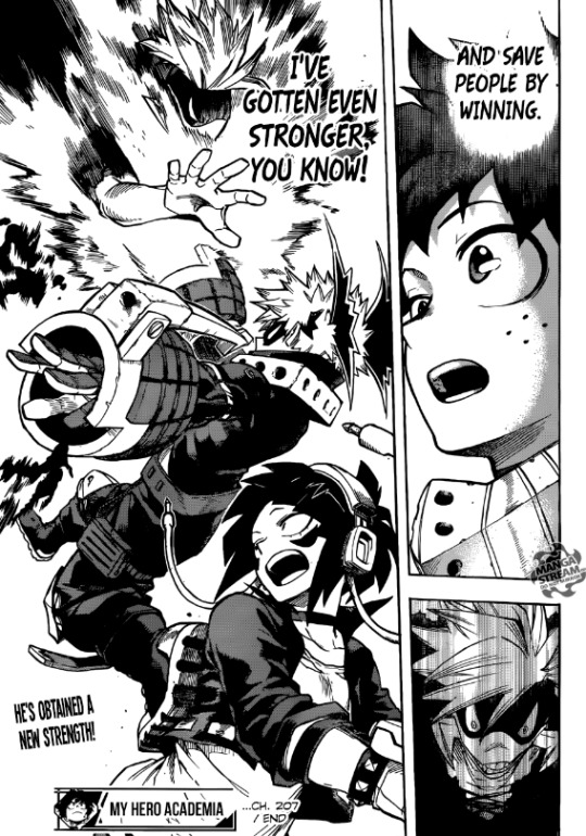
I looked at the few action-y webcomics and mangas I love and i noticed that when it comes to the action itself, what really makes the reader engage with whats happening is actually perspective! I mean of course the main thing is having intense action with lots of dynamic poses and i get that, but I feel like a pose really becomes powerful when you see it from a point of view that enhances the action that is happening! Shounen mangas especially do that and i definetely can feel the impact of their actions because of it. If we take for example Boku No Hero Academia by Horikoshi, even fairly simple actions like the one in this page gain much more depth and impact simply because the angle is slightly tilted and the perspective is from below Jiro’s point of view (girl being saved).
So yeah, perspective was really something I tried for the first time to play with in terms of focusing on the people rather on the buildings! In Among tales I used perspective to show how big the library but in this case it was about enhancing movement and making the reader feel as if they are seeing the action right there as it is happening!
(insert images here)
I feel like i could have pushed the perspective even more but in that case it would have become a bit excessive and since I’m not that great with it I feel like i would have wasted too much time on it. I think i found a good balance... also i really love the panel with axel slicing the throat...i feel like the arm just slightly being foreshortened gives much more strengh to the move!
The other thing that Monty talked about, about the inking and the lines and the details, I just agree. I use a very thin line because it allows me to add many details but in this comic the point is not details but AAACCCTION so i’m going to go for a much ticker and rougher inking style!
I’d like to say that i want to imitate the manga style a bit...but that’s not style y’know? I never tried go for a rougher inking style but I know for certain that I want to not focus on details i can’t complete this comic on my Cintiq. When I work on my cintiq, I simply can’t help but focus on the details, and since I work on Pain Tool Sai, the lines and brushes are just smoother. If i were to ink this comic on my cintiq, I would end up with simply...thicker black lines sadly. My other classmates who often work digitally like me have decided to work on this comic tradionally to have that traditional 2000AD look...and i’d lie if i said i didn’t think about it too but i sadly fear that would be a bit too much of a long shot...I’d have to learn about traditional inking and learn to draw on A3 papers....which is jjust too much. I already decided that for this project what i was gonna really focus on is the sci-fi feel, the actions and the emotions (cause that’s just a must for my comics...i don’t enhance their emotions there’ just 0 for me)...so i think that i will let my traditional skills shine another time.
No for this project, I decided i will make the entire comic on my ipad using Procreate, which i think is a nice compromise between traditional and full digital. It may not sound like that ot someone who is full traditional, but Procreate is actually not that fancy of a digital program, and was mostly designed for people who work traditionally and want to have fun with some digital art. The app and the brushes it offers are much more “life-like”, and since the ipad is acting as paper, it just feels a lot more like i’m just drawing on paper. My hand too is more relaxed, and the pen even has a tilt sensibility....so yeah...i think this is a fair compromise!
0 notes
Text
Brush Reviews & Customer Feedback
Please feel free to follow me and share your feedback in the Procreate Forum. Thanks for your great support. You're awesome! :D
joe12south: George, thank you SO much for these amazing brushes! I was very disappointed in the ink brushes included with Procreate, and was dreading the hours that I would have to spend to create suitable inking brushes, when I discovered your set. Not only did you save me untold hours, but the quality is almost certainly better than I would have achieved on my own. The combination of the Apple Pencil + Procreate + your brushes yields an amazingly natural drawing experience. I've used every drawing tablet ever made since the Koala Pad (1984) and this is the first time I don't feel like I'm losing something by not using pencil/pen and paper.
... I've been using Georg's brushes for my morning warm-up sketches all week. Tons of fun. I've also fell in LOVE with the Dupa pencil brush. Previously, I really liked the 6B included with Procreate, but I find the Dupa brush superior in every way. My guess is most people buy this pack for the ink brushes, and may have overlooked this gem. For the first time, I feel like I could throw away my black and white Prismacolor pencils and never look back!
... Savage Interactive needs to seriously consider working a deal with Georg to include these brushes. I love Procreate, but the base included ink brushes are not "inky" at all.
... Lest you think Georg's brushes are only for cartooning, here's a portrait commission I did this morning using only the upcoming "BRISTLY" brush.
Wizard of Zog: Thanks so much again for making such awesome brushes. I hope the folks at Procreate send you all kinds of free stuff because your brushes are what truly makes that app sing for me.
Kazart: Thanks Georg for your work, i already found my favourites brushes wich allow me to draw like my traditionnal style. Here is a sample, a space assassin!
Thanks again.
kewlpack: Georg - Thanks for continuing to make the MegaPack an INCREDIBLE value with these updates. Fantastic customer service right there.
dftaylor: Just a quick note, since I've already harassed Georg on Twitter, that these brushes are wonderful. I've used nearly every art app out there, and between Georg's brushes for Procreate and Frenden's brushes for Manga Ex, I can work on my comics on my iPad Pro and my Surface Pro seamlessly. They're just brilliant tools - my favourites are the Penciler, the DUPA pencil, the Eisner, the Watterson, and the Underzo (both the texture brush and the lettering brush). I've used them on everything I've drawn since I got them. Great work and amazing value for money. Here's my most recent piece.
jollyrein: I LOVE LOVE LOVE The COPICESQUE set! Absolutely magical :D It's exactly what I was look for! Thank you so much Georg.
Vezinho: Hi Georg ! Just wanted to say that i bought your megapack and i find your brushes fantastically natural to use, very precise !
... Fantastic Georg You ROCK The link appeared… A lot to play with !! These are all fantastic Top quality And the watercolor serie already seems a joy to use It will take a bit of time to get the feeling of everyone Once again thanks a lot ! I will post some portraits soon. By the way i exclusively use your brushes for now!
Finch: Beautiful brushes. Thank you for making these!
monarobot: I just got the G-pen and woooow it's the o my brush I've found that is anywhere close the feel of the clip studio version, awesome job!
pixelsnplay: You had so many great brushes for free too that I went ahead and bought your MegaPack. Thanks for sharing :)
dankelby: Hi Georg, just wanted to drop in and say that I love all of your inkers, great job! I just purchased them and can't wait to work with them. Cheers!
Bos: Just tried the ELDER, and immediately bought the Megapack. Wonderful. I like how you inclined the shape of the brushes (a thing I had planned but not had the time to try) and played with pressure AND velocity together. I've redrawn a panel of mine to try, and love the Watterson, the Peyo and the Uderzo especially (but haven't had the time to ding into them all, yet). Very flowing, very natural, with and without the textures.
FranklinKendrick: I just purchased the mega pack as well and am blown away at how natural the brushes are. Haven't tried the pencil yet (I should have time later) but, now you really make me want to play around with it!
I stayed up way too late doodling with some of the inks. These are so much better than the ones included by default in Procreate - and well worth the money. I originally got into Procreate because I wanted to do some detailed ink work and just never had the tools to do it digitally. Now, with my iPad Pro, I feel like I have the tablet I always dreamed of having ever since I learned that digital drawing was a possibility.
Thank-you Georg vW! I am so excited to try drawing cartoons again with these brushes.
Philip R: I really love the brushes, Georg! Thanks for all the hard work!
My main favorites are The PEYO, The BREUGAL, and The FURBALL. I can finally create digital art the way I imagine. I mainly use the brushes for cartoon illustrations.
bem69: Bought your MegaPack too, and enjoying all of the brushes. Awesome!
... I love your ink brushes. So much potential and so fun to use. Totally recommended for those who are still considering.
... CAN'T WAIT FOR THE UPDATE!
Batsquatch: yo georg, when are we getting the update- your brushes have CHANGED MY DIGITAL CARTOONING LIFE! I'm jonesin' for the new brushes! -Phil
kawoody: Hey Georg! I'm totally about to buy all these brushes. They look amazing! Just what I've been wanting!
Bas0411: Hi Georg, your brushes are great! My favourites at this moment are the Bruegel, the Watterson and the Yellow Kid, all of which I use daily.
tmp2209: Thanks so much for the option Georg the brushes are spectacular, I picked them up last night and have been very happy with the results and look forward to your future brushes. Thanks again!
Klaas: I have been testing your brushes, George! They are great!
Caricature Shop: Truly enjoy these brushes!
... Really appreciate the MegaPack addition! I was eagerly anticipating the DAVIS, but have to say that my new favorite is the STRATMORE. It's feel, flow and responsiveness makes it a notch above, in my experience. Thanks George!
DougHardy: Oh my god these are AMAZING
sajishtr: Installed cartoons Brush set. Installation was smooth as I used AirDrop to transfer .brush file from mac to ipad. (Pls. include this instruction in your website). I tried Watterson first, to my surprise I was able to achieve a lot in the very first attempt itself. Pls. find the sketch with the original on the side. THANKS A LOT!!
Kris_Lap: Hi, Done a Crumb copy from blue layer. Always with excellent Mort Drucker Brush. Better traditional feeling using those brushes / Procreate than with Manga Studio. (...) Keep up your genius work !
... A MANGA STUDIO Robert Crumb Copy with Astropad Please compare previous post with Procreate copy and Georg vW Mort Drucker Brush, above. The Procreate app / Georg vW brushes combo is a far superior inking tool. I would tell it to the world (if i was famous)...
Patman: Impressive brushes!
Ripples: These are wonderful, Georg, and thank you very much again; an honour that you used the names, and I love the other names and set too. Looking forward to doing a painting over the next couple of days, and will post it up! Thanks so much for making these.
Anne R. Cutler: This is a crazy good deal… thank you!
The Air-Drop method worked perfectly.
nylontoast: I just bought your MegaPack, fantastic! wonderful work, can't wait to use all the brushes!
Silpi: Thank´s GEORG wonderful work Hug
Jennifer Bannink: Exactly what I was looking for! Thank you so much, it's an amazing brush :)!!
timskirven: Hi Georg - these brushes are fantastic!! Thanks for all your hard work.
Doomsayer: Thanks mate - love the set / have been playing with it all morning while my Christmas presents gather dust :)
I did a bunch of alterations to the G-pen and it is really solid / I made it so that it can get a very scratchy, scetchy feel - first 2 panels are my old brushes / 2nd two is the new ones. Love the tone brushes btw!
Brush Feedback via Twitter
#reviews#testimonials#feedback#megapack#procreate#procreateapp#brushes#paint bundle#freebie#review#featured#forum#twitter#double_size
5 notes
·
View notes
Text
Reflection of the day 25/10/21 to 28/10/21 Project Reportage Week 2
Monday - Today was the first day I went to Ebac. After such a long time, I finally had the chance to see the new building, and to re-establish myself.
The day started with the presentation that we needed to make, about our entire experience in the Liberdade neighborhood. The presentation should include drawings, photos, references and questions.
I was the first to present, and as always I have that difficulty in speaking in public because of my shyness. But I think I managed to spend my experience in Liberdade well.
In the teachers' opinion, the presentation was very good, because it showed how Liberdade is a varied neighborhood, and how I tried to look for different places to draw, sometimes drawing slower, and sometimes in a hurry.
In the afternoon, we had the chance to draw in small concertinas, to play our ideas about what our story could be.
For me that was the hardest part, because again, I have no idea how I'm going to be able to create.
The teachers suggested that maybe I do more research, and try to use them as inspiration for my work. Besides trying to go deep into the Japanese cultural part. If I want to represent their culture, I should go beyond researching reportage illustrators
I can either tell a story about my experience in Liberdade, or something that most impacted me on this trip.
What I should do these days is just focus a hundred percent on the story, and try to create something interesting.
Maybe I even have to go back to freedom to gather more information, probably interview someone in the neighborhood, to give me some sort of content.
Wednesday - I'm still creatively blocked in doing this illustration report. I'm not getting a clear idea of what I want about the job.
So I decided to go back once more to the neighborhood of liberty, and try to interview someone and tell me a little about the neighborhood.
So I started with the same places and a few different ones to have something more for my reporting.
I met a Japanese gentleman who owned a souvenir shop. And I asked him to tell me a little bit about him.
He told me that his father was Japanese and his mother was a daughter of the second generation of Japanese people in Brazil.
He also told me that he doesn't live in the liberty district. He just works there. Nowadays the neighborhood is predominantly Chinese and Korean.
Then he tries to interview other people, but I wasn't so lucky.
Because some of them had a very heavy accent, and it was hard to understand.
I went home soon, to at least start the concertina.
I gathered some experiences that I had in these two weeks, including mainly places that caught my attention.
I had to rush to make the drawings, which even at the beginning I was going to do in the concertina I had done. But to make it faster I did it in procreate.
The aesthetic I was looking for, was one very similar to that of Robert Crumb and Joe Sacco. Trying to make a fully crosshatched and a little caricatured drawing.
Although it was visually interesting. It was very rushed, there was no general connection between the drawings. But I was forcing myself to at least have something for tomorrow.
Thursday - Today I went to deliver the reportage illustrations that I had done during these days. As I mentioned earlier, I made these illustrations in a bit of a rush, and I wasn't confident about showing them to Lauren.
The problem with these illustrations for me was that they were made without me getting a real sense of where I wanted to go.
And it ended with an idea in my opinion, weak, and that could have been something much bigger and interesting.
Arriving at EBAC, I was the first one to talk to Lauren about work. I explained my situation and how difficult it was to decide where I wanted to take this story.
Despite this, she liked the idea, especially the painting with the Japanese interviewed in Liberdade.
But she suggested me to maybe create a comic that maybe shows if my favorite experience in the Liberdade neighborhood.
And I had said that the place I liked the most was the Japanese immigration museum. Where it has a rich history of the Japanese and their coming to Brazil, and the problems they had to face.
This idea was much more interesting to explore for me, than maybe my experience in the neighborhood.
What I have in mind is to make the whole history of the Japanese, since their coming to Brazil working on coffee farms. Until the present day where I would like to return to the Liberdade neighborhood, and interview people and ask about their stories as children or grandchildren of Japanese immigrants.
The idea is precisely to make the front side of the concertina like the Japanese past, and the other side like the present.
This is an idea that brings me many possibilities, because I can create a very impactful story, made with more calm and patience, and I can also expand my research and add books about the Japanese and their history.
During the afternoon we were introduced to the new project, where we need to make an 8-frame comic, but without any living beings, dialogs, and be limited to using only two colors.
I think it's an excellent challenge, because it can make me create something totally out of the box and completely freaked out.
I had some ideas, like for example; a bag tearing, a match burning, a gum being crushed. But my favorite idea was a bottle of whiskey "drunk", bouncing sideways and then falling.
I think it's a really cool idea because I can give the bottle a certain personality, without having to put arms and legs or a mouth.
0 notes
Last Seen Blogs
frenchiefieart
DRAWININ' TIME

arkansasbookworm-blog
Arkansas Book Reviews

leedollop
Lee Dollop
bathandbodybeauty
Luxury Bath & Body Products
batty-gutz
Batty.Gutz🦇🖤