#I’ll do proper lineart next time
Explore tagged Tumblr posts
Text

Hehe Conan as Frisk or is it Shinichi as Frisk?
#I don’t actually know how to draw him as Conan#aka as a child aka how he appears in the show#but I tried#but yea#what if he fell down as Shinichi when he was younger lol#or I guess the story still makes sense if he fell as Conan#Solo!Shinichi#dcmk#dcmk au#dcmk fanart#I’ll do proper lineart next time#I just wanted to do some quick sketches#Conan as Frisk au!#undertale au#oh god another one
12 notes
·
View notes
Note
can you pretty pretty please with extra sprinkles on top drop the speedpaint for your most recent rookvil art? i wanna see how you did vils pretty dress and everything else cause its all so beautiful
I am so happy you like how it looks!! I would love to make a speedpaint, but unfortunately, I didn’t record it + the base for the drawing was actually done traditionally with a pencil. A lot of my drawings are done this way, actually…
Even though I can’t drop the speedpaint, I’ll do the next best thing and explain my process for this specific drawing step-by-step. It’s actually not that complicated!
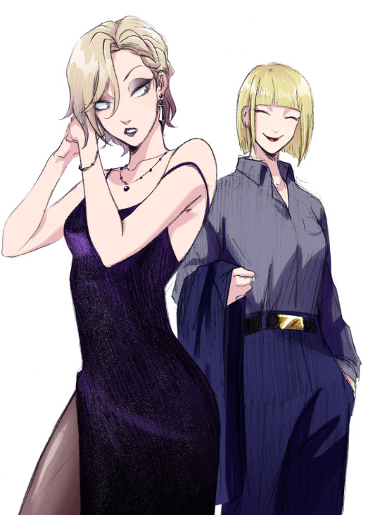
Here is how the sketch looked initially. As you can see, I shaded the dress very crudely; in fact I was kind of upset with how the dress looked at this stage. Ironically, I ended up not doing much to the pencil shading, and it still turned out okay somehow?? Anyways, the first thing I did was to prep the sketch for the colouring stage: I adjusted the contrast, fixed Vil’s face, and erased some dirt and imperfections.

Then I create a new layer, set it to Multiply (this way I can colour the sketch without disturbing it, as if I was just colouring a digitally done lineart) and do a base colour layer. There is a gradient in Vil’s hair and Rook’s belt buckle, but other than that, all the colours are flat at this stage.

Before doing all the shading needed for this sketch, I add details such as makeup and tights. If you want to know how I did these, let me know, but I basically looked at a tutorial once and then simplified it lol

Now, the dress.
To be completely honest, there isn’t any proper technique to what I did, everything is always just trial and error and an hour of me going “does that look good? NO IT DOESN’T >:(“ until both Katsu and I are satisfied. This time I was lucky, because it didn’t take very long, and the “solution” was pretty simple.
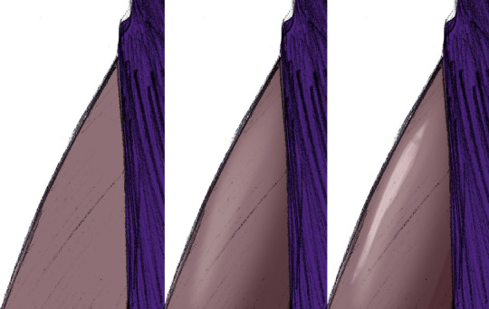
Starting with the base colour. I turned off the sketch layer to show that it is indeed completely purple. And it looks kind of bright at this point, almost too bright even, especially considering that the dress is supposed to be mostly black, or at least dark purple. But bear with me.

Next I added some highlights (new layer, set on Overlay or Screen, depending on what looks best). Usually I would add the shades first, but I wanted to make the fabric look more “shiny”, you know, the type of fabric that would reflect the floor and make this highlight under the boob lol.
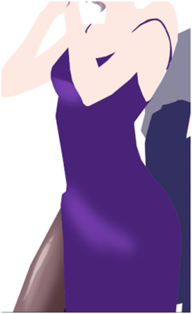
And after that I just went ahead and added black gradient (on a new Layer) from the bottom of the dress to make it look darker, silkier and a little bit more interesting for the eye. I erased some parts of the gradients as you can see, because it looked too dark on the highlighted parts… could’ve just placed the black gradient layer under the highlights layer and saved myself a headache, but hey, where is the adventure in that.

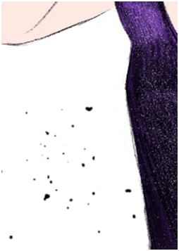
Finally, it turned out looking like this. It looks better than it used to look like initially, but there is one more thing to do. We don’t get to do this one too often, so it always excited both Katsu and me: THE SPARKLES!! Somehow, making the dress sparkly makes everything much better.

How do I do the sparkles: I use the star brush… or was it a snow brush? I use this brush when I draw both of these things lol + when I draw anything sparkly. I would’ve given you this specific one, but I don’t really remember where I got it from, and I honestly think that any starry or snowy brush would work wonderfully as long as the specs are small enough.
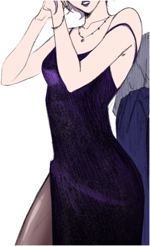
After that is done, I just shade the rest of the drawing. Nnew layer set on Multiply, the shading is done with darker purple/red + darker blue, whatever looks better on any particular material: the skin really likes warmer colours, but Rook’s suit looked bad with red shades, so I adjusted it to blue.
And here is the post where I talk about how I colour hair! Good thing I already wrote that one, this post is getting long lol
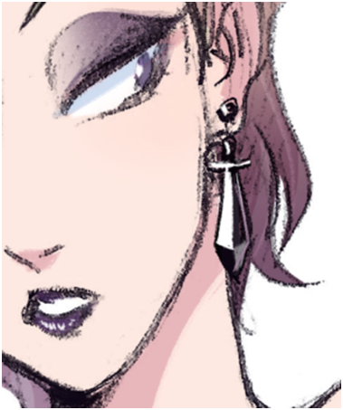
And the last step is to add details. The original sketch was done in a rather small (smaller than A6) sketchbook, so I couldn’t draw all the details like Vil’s earrings and stuff properly. Basically I just paint on a separate layer on top of everything.
And there you have it! I hope it makes sense, please let me know if you have questions.
106 notes
·
View notes
Photo
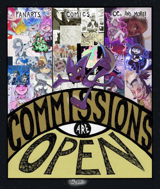
Here we go!
[GENERAL RULES AND TERMS OF SERVICE]
I START WITH 6 COMMISSION SLOTS. First come first serve, by the time they are full I’ll open them again only once I’m finished with them all.
If you want a slot and you know what to ask me to do please send me an email at [email protected] subject titled "Auro commission". In the email, include your selected commission type and any other details about your commission. Visual reference must be included, and if it’s a comic you want, please include your storyboard.
🚨🚨 EDIT of the 5/10/2023: SECOND SESSION IS OFFICIALLY PAUSED. I’ll be working on the 6 slots commissions that made it before the technical difficulties with Paypal (mentioned in the last reblog). If something changes I’ll be reopening the remaining 4 slots!💪🎨 If not, I’ll be seeing you at the next session directly :’>
✨Please read all the details that are written down below under Read More before sending any email. If something is not clear do ask about it! ✨
This list can be updated at any time if situations and/or experiences demand so.
IMPORTANT:
Currently I don’t work under deadlines, and I don’t do rush jobs. I guarantee that clients will be kept updated on progress of their respective commissions. Please keep that in mind before asking for a commission and I thank you so much for your patience.
If the goods are meant to be showcased in videos or other projects of the kind (permission must be discussed beforehand), please give proper credit and link to my pages (instagram, deviantart or just one of them) in the description.
The goods will be distributed digitally only. Printing is only allowed for personal use and you cannot resell the commission under any circumstances or claim to be the original author of the artpiece.
Unless it has been agreed otherwise, I’m able to choose to display the commissioned art on my galleries and portfolio to promote my work.
I do not allow my art to be used for NFTs, training AIs or crypto transactions.
Things I can draw… Characters from shows/anime, video games and manga/comics I’m familiar with (examples: Sonic The Hedgehog, Homestuck, Pokémon, NiGHTS, Skullgirls, Splatoon, Hades (by Supergiant games), The Legend of Zelda, YuGiOh!, Promare, Undertale/Deltarune, The Owl House, Trigun, Dr. Stone); characters from a series I’m not familiar with if given proper references; crossovers, fantasy, scifi, animals, fanfic illustrations, OCs (if given proper references), and possibly more. Feel free to ask! Things I will not draw… Gore, vore, rape, abuse, offensive themes (racism, transphobia, homophobia, etc.), RPF (real person fanfiction) or shipping real people, I reserve the right to refuse any request.
Upcharges
My limit of characters to draw in one picture/comic is 1, you will be charged for every additional character in the drawing. For an illustration, the price will be multiplied by the number of total characters. The backgrounds will remain one charge. For a comic, every additional complex character is $30 for a pencil page, $40 for an inked page, and $50 for a coloured page.
If your character has a complex design (Examples: detailed armor, complex clothing or jewelry, additional features…) a charge of $15 will apply.
Excessive changes will be charged. On your third and every subsequent major modification request, you will be charged $20.
My limit for short comics is 1 page. If you want more, it will be multiplied by the number of pages and type of commission (ex. a 2 page pencil comic is $100 x 2 = $200).
HOW TO PAY: You will receive an invoice from my Paypal email once the commission has been agreed upon. I will not start working on the commission until the invoice is paid. No refunds. Payment in euros is preferable, if possible. Otherwise USD is always accepted.
[ILLUSTRATION PRICING]
PENCIL SKETCHES:
Head: $10
Half body: $15
Full body: $30
-> With Abstract Background: +$30
-> With Detailed Background: +$50
INK (or DIGITAL LINEART):
Head: $20
Half body: $25
Full body: $50
FULL BODY FLAT COLOURED (with pencils, markers, or digital): $75 (+$15 for shading)
With Abstract Background: +$35
With Detailed Background: +$100
FULL BODY COLOURED WITH WATERCOLOURS: $100
With Abstract Background (watercolours): +$80
With Detailed Background (watercolours): +$150
NSFW*:
Half Body Pencils: $40
Full Body Pencils: $80
Half Body Pencils + Inks: $45
Full Body Pencils + Inks: $95
Half Body Coloured (only digital) : $65
Full Body Coloured (with pencils, markers, or digital) : $110
->With Shading: +$15
->With Abstract Background: +$125
->With Detailed Background: +$155
*YOU MUST BE 18+ FOR THIS TIER. As it is a new and delicate subject for me, we’ll discuss beforehand what kind of scenarios I will be comfortable enough to draw.
[COMIC PRICING]
The client has to show me the storyboard or script of the scene that I’m meant to follow in the desired commission.
SHORT COMICS:
1 Page Comic, Pencils: $100
1 Page Comic, Pencils And Ink: $180
1 Page Comic, Inks + Colours (with pencils, markers, or digital): $270
NSFW COMIC PAGE**:
1 Page Comic, Pencils: $300
1 Page Comic, Inks: $350
1 Page Comic, Inks + Colours (with pencils, markers, or digital): $400
**As it is a new and delicate subject for me, we’ll discuss beforehand what kind of scenarios I will be comfortable enough to draw.
198 notes
·
View notes
Text
Arts + Crafts Dump
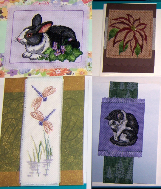
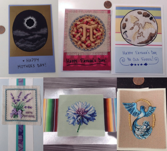
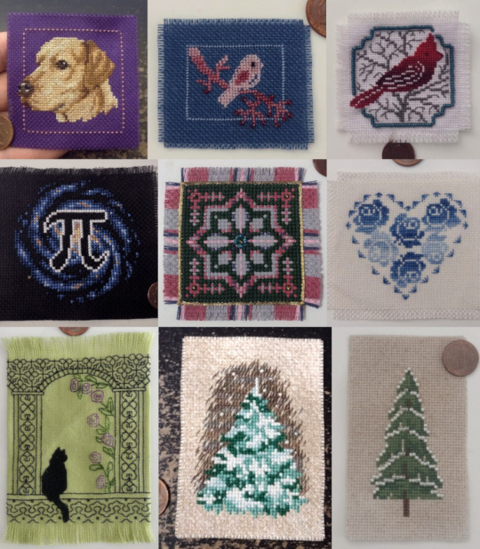
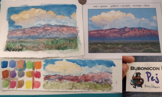
I have not had a lot of time for stitching of late, thanks to a mix of my own choices, work projects, and general tiredness/burnout, but have a roundup post of everything y'all haven't seen since last September! It’s mostly cross-stitch, with a few art pieces at the end.
There won’t be proper image descriptions, just keywords; I’m sorry to those who use them but I just do not have that many words in me. =( If anyone would like more information on a specific piece, though, by all means please send me an ask and I’ll be happy to do that for you! Answering an ask is much easier for my brain than posting from scratch.
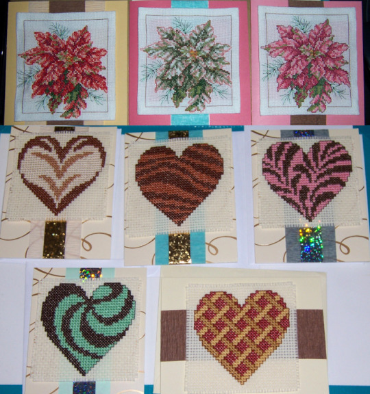
The first two images are stitchbits from my Jan 2024 winter cards, which go to select family members and close friends+coworkers.
Color-variant poinsettia triplets and five dessert-inspired patterned hearts:
Domestic rabbit, stylized poinsettia, dragonfly creek, and elegant cat:
Next up are a variety of other-cardified stitchbits. On top, an eclipse for Mother's Day plus a pi pie and fossil for (Grand)Father's Day, all from @mathysphere's patterns. On bottom from a variety of places, a lavender bunch birthday card, a blue blossom wedding card, and a blue bird w/beads for another birthday card.
The rest of the stitching is some misc stitchbits, many embellished with beads: golden retriever, tiny pink bird, cardinal, galaxy pi (also from @mathysphere!), assissi flower, heart of roses, blackwork window cat, snowy pine, and antique evergreen.
Last up are the art pieces -- two watercolor versions of a picture of the Sandias (included for reference), and a tiny marker coloring of Dale Ray Deforest's Perry Rodent lineart from my Bubonicon badge.
If you’ve made it this far, thank you for looking! Please feel free to ask me about any of these, and as always I hope you’re doing ok out there. For those of you in the US, check your voter registration status and please do make sure you've got a plan in place to vote in November. <3
8 notes
·
View notes
Text
Holli’s Shiny New Commission Sheet
In all honesty, this sheet is temporary. I’m working on an actual updated sheet where I’ll redraw etoile miku and hopefully update my painted style as well, but my old sheet felt too disingenuous to leave pinned. My art has changed a lot since then. So here’s the temporary new sheet :)
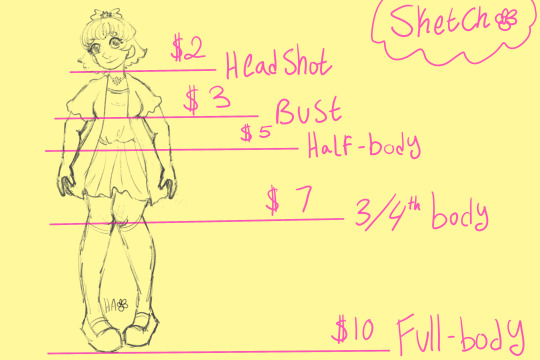
Sketches!
Headshot - $2 Bust - $3 Half-Body - $5 3/4 Body - $7 Full Body - $10
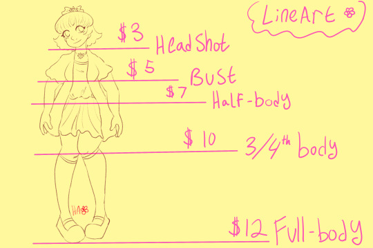
Lineart!
Headshot - $3 Bust - $5 Half-Body - $7 3/4 Body - $10 Full Body - $12
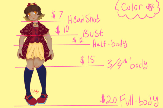
Color!
Headshot - $7 Bust - $10 Half-Body - $12 3/4 Body - $15 Full Body - $20
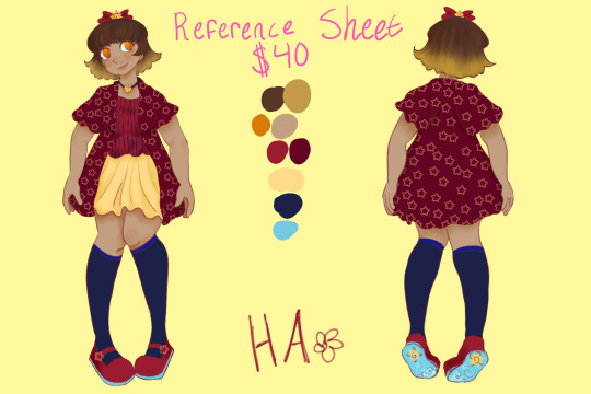
Reference Sheet Commissions: - $40 - 1 Front Facing Full Body Color Illustration - 1 Back Facing Full Body Color Illustration - Color reference chart
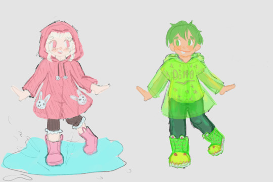
Colored sketches / Concept art would follow the same pricing as Lineart!
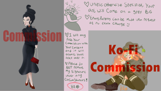
- Unless otherwise specified, your art will come on a grey background. - Transparents can be made upon request at no extra charge. - I will only post your commission with your consent and if posted it will always have red text over it to prevent theft. - Please do NOT remove my signature under any circumstances!
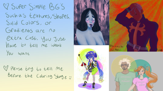
- Super Simple backgrounds such as textures, shapes, solid colors, or gradients are no extra cost. You just have to tell me what you want. - Please try to tell me before the coloring stage.
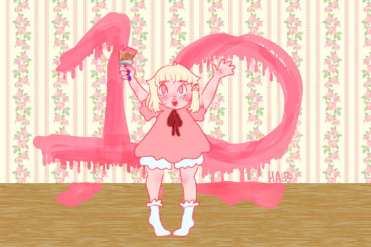
- Specific Backgrounds range from and extra $5 to $15 depending on complexity
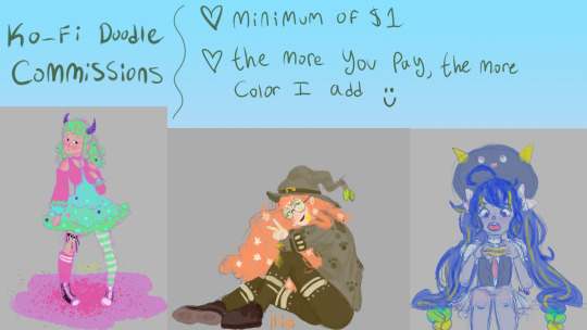
Ko-Fi Doodle Commissions: - Minimum of $1 donation to my Ko-Fi - The more you pay, the more color and detail I add. - These are marker sketches - Requests cannot be hyper specific. - No revisions will be given to these doodles.
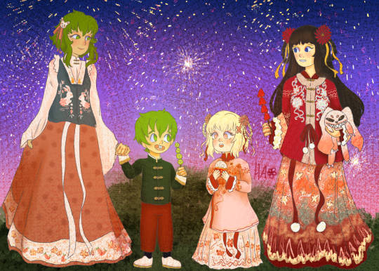
Terms of Service and other such details: - I hold the rights to all finished illustrations unless you purchase commercial rights. - Industry standard for the purchase of commercial rights is double the price of the drawing. If you would like to purchase commercial rights, the cost will be according to this industry standard. Ex: If your commission would normally come to be $40, to purchase the commercial rights you would pay $80 total. - You are free to post your finished commission wherever you'd like without the big red commission watermark so long as you give proper credit and do not remove my small signature (the little HA with a flower next to it.) - Using my works for the production of NFT's or anything Crypto-Currency related is prohibited. - I will give up to 3 revisions per commission, any additional revisions will come at a small extra cost. - No major revisions such as pose changes can be made once the coloring stage has begun. Small changes such as colors or small details can be altered.
Turnover Time: - I am a rather slow artist and as such my turnover time is slow as well. Commissions could take up to a month. Please be patient with me. - I do my best to communicate while working on the illustration as to ensure satisfaction with the progression of the art. - If your commission ends up taking over a month for any reason, you will be offered 2 options: 1. I finish the drawing and offer a partial refund of half of what you paid. 2. I give a full refund and do not finish the drawing.- Please understand that I am disabled and my medical issues make it difficult to complete anything in a timely fashion. If you need art fast, I'd recommend looking elsewhere for an artist. If you don't mind a bit of a wait, I'd be happy to draw for you.
Will Draw : - Fanart - Original Characters - Real People with photo reference - Humanoids - Mild NSFW (nudity / mildly suggestive) - Disability aids such as canes, wheelchairs, hearing aids, braces, etc. - MemesWon't Draw : - Mechs / Really angular or bulky robotic stuff - Animals ( I mean I can try, but I cannot grantee good results) - Furries (Again I can try, but no guarantees) - Gore (Blood is okay, but guts and stuff is not) - Anything medical themed such as hospital scenes or doctors. (For personal reasons I can only do this of my own accord and not for commissions) - Very buff people. I'm sorry I'm just not very good at it yet. I am best at drawing soft and squishy things.If I am uncomfortable with your request I reserve the right to decline the commission.
Payment: - I accept Paypal and Zelle. - Payments can be made either entirely upfront or in 2 payments, one upfront and the other after the completion of the sketch. - Refunds can be given if commission takes more than a month to complete or if informed of cancellation during the sketch phase.

#commissions#commission#my commissions are open#doodle commissions#artist#art#Digital Illustration#Illustration
3 notes
·
View notes
Note
I admire your art reeeeally much! Can you make a video how you draw this? I really want to know the way you start to draw and how you do the thingy with the colours ans stuff!
Thank you dir posting your arts!! :> <3
HI!!!! thank you so much for ur interest!!!! i won’t make a video but i can show u some screenshots of my wips and explain my process ^__^ sorry this took so long to answer but anyways here we go!!!!! this is all over the place im so sorry- i draw differently every time and i don’t really follow a direct process so HI
this isn’t really meant to be a tutorial by any means but rather just me rambling and documenting the different stages of my drawings. the main thing is to just have fun with it!!
in case you don’t know, i draw on procreate! i use nikko rull as my main brush to block down colours, and since i draw using my finger i basically use this as a substitute for nicer shapes since i lack any kind of pressure sensitivity. i use the drawing brush eaglehawk to do all of my lines- although depending on what im drawing and what stage im at in the drawing i’ll sometimes switch to other brushes for a softer/harder look. mainly though, i’ll use eagle hawk when im doing sketches n stuff or if i want certain shapes or details. my main blending brush is spectra! i used to use salamanca to blend but that’s kinda fallen out of use for me. but if i need more textures i’ll switch it up (for example, with the kaiba drawing i did, i blended with spectra first and then softened with the standard soft airbrush tool) below is an image i posted on my story like a year or so ago about how i create that “painted” look in some of my drawings. Note: i don’t really use any opacity layers anymore except for finishing touches- i just blot colours down from the wheel
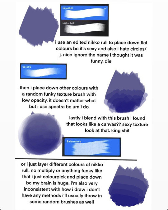
so! let’s talk about how i actually draw my pieces. when i’m not like. just doing some quick and fun sketches i always start off using the nikko rull brush to blob down some colours in the shapes that i want on the canvas. my process is essentially to blob and then refine ^__^ i’ll be going over my portrait type pieces bc the way i do backgrounds or sketches is waaay different and both change a lot

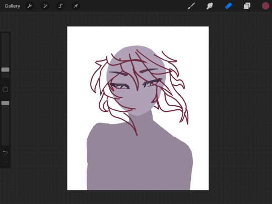
i always start off with a general circle for the head- and i draw the body in a slightly different shade for visibility. this is honestly the easiest way for me to visualize drawings bc i am very close to having aphantasia so it’s extremely hard for me to imagine things in my head and they appear more like shapes and gestures to me ^__^

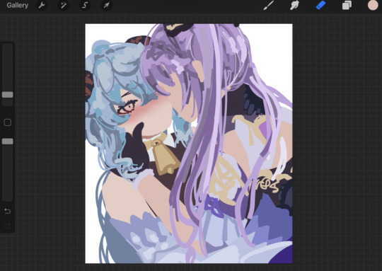
i don’t really do any sketches or like preparation beforehand like im not joking when i say i just draw and that’s as far as my planning goes. i never do proper lineart ever all of my lines are the sketches that i drew from a blank canvas. anyways in these two images u can see how the drawing starts to take form on top of the bases i already drew. i pick individual colours from the colour wheel and layer them (full opacity) over top of each other to create form. i would explain how i pick colours for my drawings but honest to god that would need it’s own separate post and most of it is just instinct. but anyways you can see in the judai drawing i kinda combined both my sketch style and painted style- like i said i don’t follow any proper way to draw

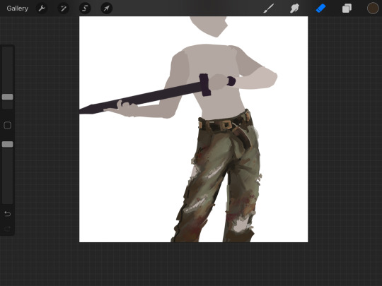
i next start to refine and blend the colours that i blocked down- adding more as needed (like if i feel a colour is getting too swallowed or i need lighting in an area, etc) i’ll sometimes do this all at once or in sections like u see in the image on the right
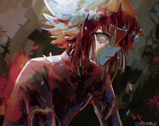

LASTLY IS JUST. exporting the canvas and importing it back in to draw overtop of everything on one single layer, i’ll add any effects here or adjust the colours as i see fit idk. or, in the case of that judai drawing on the right, i’ll darken things to make them more visible than the original i drew. i’m not joking when i say i draw like a painter and i didn’t even know that’s how painters draw until recently but it’s all about blobbing and then refining/blending
anyways. i can certainly say this wasn’t helpful in any way at all but i at least hope it was interesting to read ^__^ thank you again for the ask!!
49 notes
·
View notes
Note
Hi Chekhov! Really enjoying your white diamond au! I had a quick art question: How do you start comissions? I've been improving my drawing skills and thinking about drawing for others after having fun in artfight, but I don't know where to start? How much to charge, how to get paid, etc. Do you have any tips? Hope you're doing well! :)
Alright, since a few people have asked, I’ve decided to put together a few things about how to get started on commissions - what you need, what you should make, and how to keep things organized.
This will get a little long, so I’ll divide it into 4 main sections:
1) Draw Art - Getting started
2) Get Commissioned - Making a commission sheet, Advertising
3) ??? - Communicating, Setting Limits, Running the Business
4) Profit - Pricing Yourself and Getting Paid
* Disclaimer: I’m an artist, so this How-To will be illustration-focused. I’m sure many of these tips can apply to ANY types of commissions, but I will be focusing on the type I know best. If you are proficient in other types of commissions for other types of art - music commissions, photography, etc - feel free to chime in and leave a comment or make your own tutorial!

1) Draw Art
I think this is probably the most obvious part, but it needs to be said:
Before you start making art for other people, you must first be comfortable making art in general.
I’m not saying your art has to be Disney-quality, or industry-level! Not at all.
BUT! You must be comfortable creating what you sell. If you try to sell something you have little confidence in, you will stress yourself out and possibly end up losing time AND money.
Don’t shoot for the moon if you haven’t landed on it even once. Sell what you know you’re good at. Your commissions don’t HAVE to include full-body illustrations if you don’t know how to draw feet/solid stances. Limit yourself to what you can do.
Things you need to should probably have before starting commissions:
1. Access to art materials or a fully downloaded art program
DO NOT - Use a free tutorial version that will expire in a month and leave you without a way to draw! If you are having trouble finding a program, try free ones like MediBang Paint Pro.
2. Free time to complete the amount of commissions you want to take.
DO NOT - Take on or offer commissions if you KNOW you’re going to be overwhelmed with school or personal life for the next 2+ months. Pace yourself, otherwise you’ll burn out, get stressed, and get discouraged.
3. A reliable way to communicate with your customers like a commissions-only email
DO NOT - Use your friend/family/college email. It’s hard to keep track of things as it is, and creating new emails is easy and free. And keep it professional if you can! Not many people will reach out to dong-wiggles20434 to ask for a design. Ideally, your email should be close to your brand - however you want to brand yourself. Usernames are fine!)
DO NOT - Use Instagram/Twitter/Tumblr to collect commission info unless you are ready to do the organizing yourself. Some people make it work, but in my experience, if you use these SNS sites to communicate with friends and network... you’re going to be losing commission inquiries right and left and accidentally ignoring people. Email is much easier to organize and sort into folders.
4. A portfolio or at least 2-3 pieces of each type of art you’re planning to sell.
DO NOT - Advertise commissions without having any examples of the art you plan to sell. People will find it difficult to trust you if you can’t even give them a vague idea of what sort of drawing they’ll be getting.
Disclaimer: These are not hard ‘do not’s. If you have had a different experience, I respect that. I’m simplifying for the sake of streamlining this advice.
.
2) Get Commissioned
So - you have your art, you have your art program, and you’ve got all the time in the world. That means.... that’s right! It’s time to let the world know you’re taking commissions.
One of the most common ways artists signal to their audience that they can do commissions is by creating a commissions sheet. There are MANY ways to make this - and they range from simple and doodly ones to VERY complex designs. For example, here’s mine!
There are many ways to organize a commission sheet. At its core, a commission sheet should display the types of art you WANT to be commissioned to make. Let’s go over a few ways they can be done!
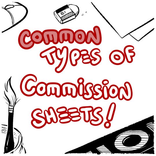
#1.... Body Portion Dividers!

This sheet is most common with those who want to capitalize on drawing people and characters. If you want to draw lots of characters, this is a great way to offer several tiers of pricing based on how much of their character your customers want to see.
#2... Complexity Scale
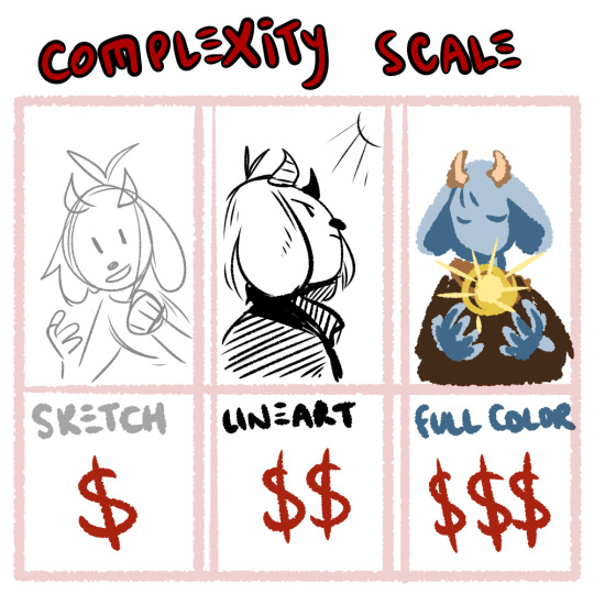
If you’re open to drawing many things but want to base your pricing off of how complex something is, you can split your tiers into done-ness. This type of commission is popular with those that draw characters AND animals, furries, etc.
#3.... Style and Type

If you’re more on the design side of things, or if you have various niche art styles that you can’t quite lump together, display a variety of your skills alongside each other! It helps if all the ones you have can be organized under a common customer - like those looking to advance their own business and get logos, websites, or mascots made for them!
.
3) ???
You got your first commission... what happens now???
Well, ideally you have the time, tools and motivation to make things happen! Now all you have to do is... sit down and... draw.......
I’m going to say something that may be a little controversial:
Commissions aren’t fun.
No, no, hear me out: I have fun doing commissions! I genuinely enjoy drawing characters and coming up with designs. But even with all that said, commissions are, first and foremost: WORK
I’m not saying this to discourage you, I’m saying this to keep things realistic. When I first began commissions, I thought it would be just like any other type of drawing. I would sit down, imagine a thing, draw it... it would be fun!
But then I realized that I couldn’t just draw what I wanted - another person had an idea in mind and had asked me to do it. I stressed over getting the design correct from descriptions. I stressed over not having the right reference for the pose the commissioner wanted. I stressed over not being able to draw the leg right in the way I had promised I would do. I stressed about billing. I stressed about digital money transfers. It was difficult, and time-consuming, and I did not enjoy it. At all.
And a part of that is definitely on the commissioner - we, as artists, NEED to demand proper references or descriptions. We, as artists, NEED to limit the amount of changes we’re going to make at the flick of a finger. We NEED to demand clear instructions and set boundaries. That’s also super important.
But also - don’t be discouraged if you find yourself exhausted drawing your first commission. MANY artists go through this. Adjust your rules, fix up your limits, practice putting your foot down on finicky commissioners who expect you to read their mind! It does get easier, but you have to communicate and put in the effort and act as your own manager AND your own customer service AND your own accountant. That’s what you’re looking at.
Good limits and boundaries to set:
Limit the amount of changes a person can ask to make. “I want blue hair.” Next email: “No wait, yeah, make it red.” Next email: “Actually I changed my mind, can I get the blue but like, lighter?” Next email: “No, not that light.” ... At some point, we have to stop. I personally allow 2-3 changes on the final stages of a commission before I start refusing or start asking for extra money.
Demand clear instructions and/or references. If something isn’t described, you have to take artistic liberty and design it, but that’s difficult! And if the customer is not happy with it but can’t tell you more? That’s not your problem - the burden of reference is on THEM. You cannot read their mind, and that’s not your fault.
Get at least half the payment up front! This is a good balance between the ‘pay before art’ and the ‘pay after art’ conundrum that will limit the amount of woes between artist and customer. (I’ll touch upon this a little more in the Profit section.)
Organization:
Where possible, create good habits! Tag your emails and organize your folders. I have a tag on my emails for active and finished commissions. I also keep my emails on Unread until I have time to sit down and properly look at/reply to them.
My Commissions in the folder are also organized chronologically and I mark down which ones are paid and which ones are not.
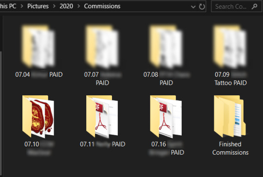
(I understand not everyone can do this, but if you want to give it a try, it does make things easier in the long run. Again, this advice is just what I have found personally helps.)
One last thing - I do not want to shame ANYONE for taking their time with commissions! Commissions are complex, and they take time and work. You can draw in 8 hours, but some things take research, materials, etc. Some illustrations realistically take up to half a year, or, depending on what’s involved, several years!!
THAT BEING SAID - it’s good manners to be upfront with your customers about how long you expect the commission to take. If you think you’re busy, just say that! Explain that you have a lot going on, and you will probably take (insert time period here).
And if your commissioners are worried, work out a system to keep them updated! I send my commissioners updates when I finish the lineart/flat colors/etc and I try to be clear about how long everything will take. I try to estimate with a +3-5 days buffer to give myself extra time... and recently I’ve been using it. Always say a bigger number than you think you’ll need.
If someone wants a rushed commission... make them pay more. If ANYONE wants a commission done ‘by the end of the week’ - that’s an automatic rush-job for me because I’m juggling an irl job and several commissions at once. I WILL charge a rush fee and I won’t feel bad about it.
If someone wants a commission within 24 hours...... Well, they better be paying you 3x your normal amount, or more. And remember - you CAN refuse! It’s perfectly reasonable to say ‘No, sorry, that sort of turnaround time is not realistic for me.’
Food For Thought - Invoicing
Many artists I’ve commissioned in the past have not used Invoicing, but I’ve recently begun to fill out invoices and file them in my Commissions folder just to keep track of things. It’s not necessary until you start getting into the Small Business side of Freelancing, but it’s not a bad idea to get into the habit early in case you might need to do it later for tax purposes.
Here’s what my Invoice looks like, for example.
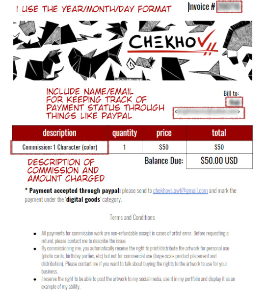
I’ve optimized it to help me remember who, what, and how much is involved! It also contains important info for my customers like where to send the money.
Which brings us to...
.
4) Profit
One of the hardest things for artists is pricing themselves. I’m not going to tell you which way is BEST - there is no BEST way, only the best way for YOU.
One of the options available to you is pricing by the hour. It includes averaging out how long it takes you to draw a specific type of art (whatever you’re offering as a commission) and multiplying that by an hourly wage you’ve decided on.

When you do this, I stress - do NOT price yourself below minimum wage if you can help it. When you first start out, aim for the $15/hour mark and adjust accordingly.
Other ways to price your art:
- Per complexity: Portraits vs full body should be scaled based on how difficult you find one vs. the other. You can also easily decide on a price for a sketch and double it for lineart, triple it for full color, etc.
- Per type: Look up for industry prices for website design and logo design. They may surprise you! You don’t have to charge that much, but it helps to keep things in perspective.
It’s okay to change your prices! Keep your commission sheet image handy so you can update the amounts as you grow. :)
Payment up front or after completion?
Some artist take full payment up front. Some only demand payment after they’ve finished and sent out the piece. I personally think these are both risky for everyone involved.
I recommend doing at least HALF of the payment BEFORE you start the commission. Calculate your full price and ask for half before you start working on it in earnest, to make sure the person can actually pay you. Then, when they receive the full piece and are satisfied, they can complete the payment.
I personally work in this structure:
> Someone emails me with their idea/reference
> I send back a rough draft sketch that shows the idea/pose (only takes me 10-20 minutes so not a huge loss if they ghost) and quote them a price
> They can pay the full thing upfront OR pay half
> I finish the commission and send updates when I do the lineart/colors to double check anything so they have multiple chances to spot any errors
> If the person paid only half on completion, I send them a low-res version of the finished thing, they finish up their payment and THEN I send them the full-res version plus any other filetypes/CYMK proofs, etc.
Many of the people who commission me pay me up front even though I offer they pay half - and I’m really flattered that they trust me that much! Because of that, I feel encouraged to update them frequently and ask for their input as I work, so they have the peace of mind knowing I’m actually doing their commission.
Great, but how do I get PAID????
There are NUMEROUS ways - these days money is relatively easy to transfer over digital means, and you have a few options.

Paypal is perhaps one of the oldest digital wallets and is geared towards businesses. By setting up a PayPal and connecting it to your debit card of bank account, you can tunnel a pathway from your online business directly into your hands in a matter of days.
Paypal also offers Invoicing - you make an invoice, price it and send it to the person’s email and they can pay whatever way they need! (It also allows partial payments.)
Pros: transfers from PayPal to bank account are free, and take a couple of business days. It also has no upper limit to the amount of money you can move in/out each month. It can force refunds due to the nature of its business-oriented payment system.
Cons: Because it’s used by businesses for larger transactions, PayPal may demand a more rigorous proof of your identity. It may also take longer to set up and be harder to get used to. I’ve also heard that they can be a hassle when it comes to closing your account.

Venmo is another type of digital wallet that acts much like paypal, except for a few key differences - it is NOT made for businesses (so depending on whether you’re officially registered as a freelancer, you may not be able to use it). I personally don’t use venmo, so I cannot speak to its usefulness, but I know a few people that use it for casual transactions. It’s easy and quick! :)
Keep in mind that you cannot force a refund over venmo! The transactions are final.
There’s also CashApp, GooglePay (which could load gift cards but also allows peer-to-peer transactions) and I’ve heard good things about Due, though I’ve never personally used it.
Other ways to pay: I’ve had people pay me over Patreon by upping their pledge, and I’ve had people pay me over Ko-Fi by donating a specific amount.
Many people even use Etsy - the website specialized for independent small businesses selling art - by listing their commission sheet and offering up several ‘slots’ of commissions, which allows you to track taxes AND allows your clients to pay using whatever they feel comfortable with.
If you’re in Canada, you can even pay by emailing money directly from bank account to bank account - check whether your country offers this type of service! There’s no shortage of ways to move money in the digital world.
Just like everything else, there’s no singular ‘Best’ way. It just depends on what works for you.
I think that just about wraps it up! I can’t quite think of what else to put here - but I’m sure other artists will chime in with their own advice. :) I’m very sorry this became so long but I hope it was helpful!
Obligatory Disclaimer: I’m not qualified to give legal or accounting counsel. Please double-check the laws in your own country/state in regards to taxation of freelancing work and do your own research. If you are underage, DEFINITELY get an adult’s permission before you start doing commissions, and have the adult help you through the process.
. . . . . . . . . . . .
OTHER POSTS YOU MAY FIND USEFUL:
An Extended Post on Pricing Yourself for Commissions
Dealing with Imposter Syndrome/Feeling ‘Not Good Enough’
Growing Your Audience
Advice for Starting Digital Art
2K notes
·
View notes
Note
Do you have any advice on how to draw clothing? I’ve been trying to get into making my own art and all my characters look like they are walking around in socks 😂. Idk how you do it so well
... that the day has come when someone has asked me how I draw ANYTHING is genuinely mindblowing to me xD I know I've upped my game in fabrics lately but this is surreal xD Am I really gonna do an art tutorial, for the first time ever in my whole life?!
Well, for you, Anon, I shall try xD
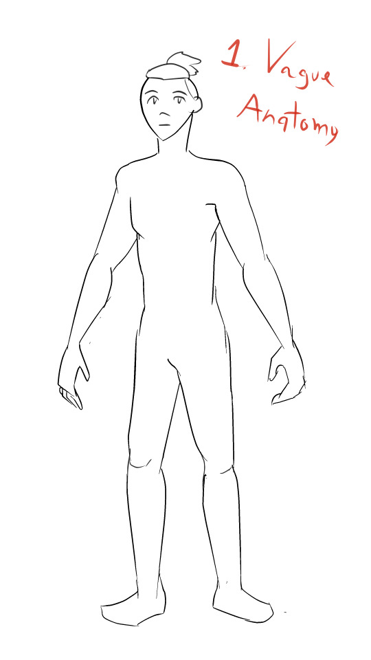

First off, you're going to want to doodle a basic body shape. I am not going to pretend I am good at doodling body shapes. Nope. But what matters there is getting the position of your character, figuring out what goes where. Once you have that, you go to stage two, and that is putting clothes on 'em!
You can start with basic clothes, the way I did. I simply draw them atop the body outline, then erase whatever bits of the body the fabric will cover up. Depending on what kind of clothes you're drawing, the fabric behaves differently. But what you need to keep in mind is that fabric usually has its own volume, weight, and is affected by a body's movements and positioning. As this body is in a general, simple standing position, the fabric doesn't need to move around MUCH... but it does need to move around a bit if we want it to feel legit.

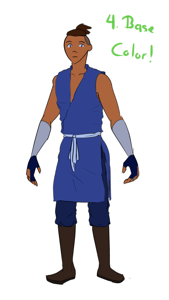
For the sake of making it look more real, you have to account for where the folds show up more often in clothes. My typical choices for that are locations where fabrics overlap, or where there are joints. Feel free to add a few extra folds here and there, of course, especially if the clothes are meant to be baggy and with a lot of air! The clothes that aren't baggy, however, like (in this case) the gloves or the arm bandages, as they're meant to be tight on the body, won't need folds unless you're drawing something highly detailed with a very peculiar hand shape.
After that, it's base color time! Base color is very very important, as the shades and lighting will be derived from that initial hue. Gotta pick each color right!


Now... SHADING! This is something I used to do with air brush tools. Currently, as I'm working on Clip Studio Paint, I use this fabrics' brush and it has really improved my fabrics' game, so if you can find a good brush that gives your fabrics more texture, it'll help heaps :D if you can't, however, the basic air brush tool, on any art software I've used, can achieve good results on its own.
Normally, when I color, I select the fabric's color, all of it, to avoid unwanted accidents with color bleeding out all over the place. I believe some people just make different layers for everything, but I like pain (?) So, believe it or not, the most important part here is selecting the right color: I leveled up big time in art on the day I started choosing more saturated colors for shadows. I typically went for gray-ish shadow tones, back in the day... but in my humble opinion, it does not hit the same way as more saturated shadows do.
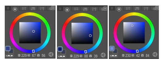
The first one there is the base color, the second one the shading color and the last one is the lighting color. As you can see, I'm not that far inside the black area of the color wheel in the shading one, but I'm choosing a much more intense shade of blue, and that results in a contrast that doesn't require a lot of darkness to feel right.
As for where to apply your shading? That's in fact what the folds are for! :D they serve as guidelines, pretty much, for how you'll shift the color across the fabric. At the shading stage you can even add extra folds you didn't place in your lineart too, if you want, but what matters most is that they will give your clothing volume and texture.
Just as it is with the shading, lighting will lean on the folds as well!

(don't fret, we ain't done yet xD gotta soften that lighting later, naturally...)
I picked a much brighter color for the lighting, and far closer to white. This can work fairly well, but you can also choose a more saturated color if you want to, in some clothes. Makes them feel extra luxurious in my experience xD One of my tricks here is that there will be parts touched by the light that will be brighter than others. Hence why you can see that, while I applied my brush all over the folds, some parts are softer than others. This as well provides texture to the piece, and a dynamic feel that offers it extra volume.
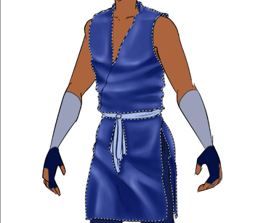
With my base color once again, I've softened the lighting by brushing the base color over it veeeery lightly, and lo and behold! Looks a lot more normal now, right? :D and the colors blend well into each other (if you can't achieve this with a simple airbrush, the blending tool, applied carefully, can result in a similar outcome).
You can use the lighting and shadows to highlight some body shapes too: see how there's shading on that thigh, but instead of flowing right back into the base color, it shifts into the lighting color directly? That helps in giving the fabrics some shape too, therefore, the lineart isn't the only bit that matters in giving fabrics the behavior you may be looking for.

And as I wasn't even sure what number we were at anymore, here we go, step number ?, finish up lighting and shading everything XD I left it with very basic lighting and shading because Tumblr won't let me add any more images to a single post *shakes fist* but usually I play with layer modes, namely Multiply, Glow Dodge, or Color Dodge, to get some extra volume and feeling in clothes. Still, the bulk of the work is what you've seen here :D
Alright, some last tricks I want to share: if you take the lighting shades and brush them veeeeeeeery softly over the edges of each element in the artwork, you can get a really nice contrast that makes the clothes more realistic, to a fault. And one last important thing to point out is... commit to your shadows and lights xD if one area of the shirt is bright and, say, there's another layer of fabric right below it, you have to try your best to follow the pattern of lighting and shading that you set up in the first clothing item you shaded and lit up (?) if that makes sense xD if it doesn't, I'll try to explain it better in another ask, if you send one :D
Anyway! I hope this has been helpful, if it's not thorough enough then I'll have to think of some other way to pack up a proper tutorial that Tumblr won't attempt to destroy x'D but good luck with your next art ventures, and may all the fabrics be on your side in the future! :D
#anon#sokka#I kinda had to#I thought of using Azula but her clothes are... not just more complicated but very armor-y#whenever I draw her :'D#so Sokka felt like a more natural choice for this xD#thanks for the interest in my wonky techniques!#I am by no means a professional but if my amateur ramblings and tricks help anyone I'll be thrilled!#:D
13 notes
·
View notes
Text
Yuumi’s art process (with pics!)
This is how I go about doing the art palettes, and generally how I do art (specially on lose, not so long pieces such as these). I’ll breakdown the process under the cut so I don’t spam people’s timelines (´・ω・`)
I was going to put these final advises at the very end but someone else might make use of these instead of going through the whole thing so here:
Important things to keep in mind in case you’re learning and actually think I’m worth being listened:
References are GOOD. No one is perfect and no one knows how to draw stuff from their memory so go google weird things, Google-sensei won’t judge. Hopefully. (else set your navigation on private).
Brushes and whatnot don’t make the artist, but it sure as hell help you feel like you’re doing what you like or not. I can’t stress enough how many times I’ve just not finished works because my brushes felt “off”.
Posemaniacs is very good for both anatomy and speed practise (I’m aware I’m really fast compared to my fellow artist friends but by no means it’s a standard, I just got used to work fast uwu)
Be careful with your wrist!!! use your whole arm when drawing!! and also T a k e · b r e a k s.
Art block is a bitch and strikes anyone. I’m usually artblocked but if you find something you’re passionate about go draw that, whatever it is. (I hadn’t consistently drawn in p much 5 years after college and thanks to MLB season 3 here I am LOL)
And now for the actual breakdown:

Step 1: Sketch
My first step is the sketch, which some of you might think “but it’s SO CLEAN!!”, yes, sometimes I leave my sketches as lines and polish them a bit. Anyways, these is what my sketch looks like and next an important thing:
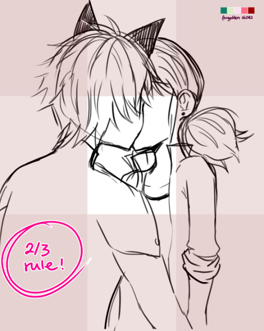
...which is the 2/3 rule! Photoshop blabbery ahead, tl:dr how i made the grid
I’ve been doing this small trick by filling a layer of any color, lowering the opacity to 50% and transforming it to 33,33% it’s height duplicate and place on each side of the canvas and then merge, and then another layer doing the same but doing 33,33% width instead of height. Then I merge both layers, set the opacity to 30% and the result is that perfect 2/3 rule.
If you don’t really know what the rule is, I kindly suggest this instead of my explanation bc words are not my forte.
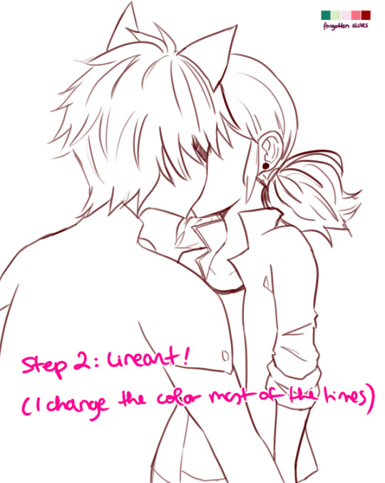
Step 2: Lineart!
Nothing to say here other than cleaning the lines from earlier with a different (or the same in this case) brush as the sketch one. Opacity varies from day to day.
I have several styles of lineart and they all come with the mood I feel on that day, so don’t be afraid of experimenting and finding what you like most! I personally like thin lines a lot but also thick lines too! i’m constantly looking for the perfect line™ and to give an idea this is what my brushes look like:
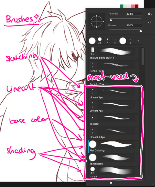
in summary, practise with as many tools you can find around and see which ones you like most uwu

Step 3: Base Color
This is probably the part where I give up the most bc it boooooores me LOL. I try to spend as little time as possible in order to overcome this step. These are usually colors I use in 99% of my pics, since... idk years. If you look in my old arts in twitter you’ll see them haha.
Something important I’d like to mention here is ✨LAYERS✨:
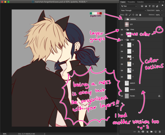
This is how my layers look like in the base color part. I tend to do 1 for skin color, 2 for hair / eyes, 3+ for clothes and stuff. I tend to separate them in colors so they don’t merge! I go with numbers because... I think it’s faster to type and I’ve been using this way of naming for years so it works for me, what matters is that you group your layers and keep them organized uwu (specially if someone else has to look at your psd files >>)

Step 4: Shading!
Normally, I shade every single layer with a proper shade but on the case of the palette challenge I’m doing just the skin because I want to stress the light mood. Liiiike if I want to go with a softer light I’d use lighter shades or a stronger light = stronger shades. To pick colors, I usually go with that brown from Chat Noir and Marinette’s jacket as my universal black (I don’t like working with black, I’m weird), and most of the colors I just eye pick from the Color Picker on Photoshop. In the right you can see my swatches:
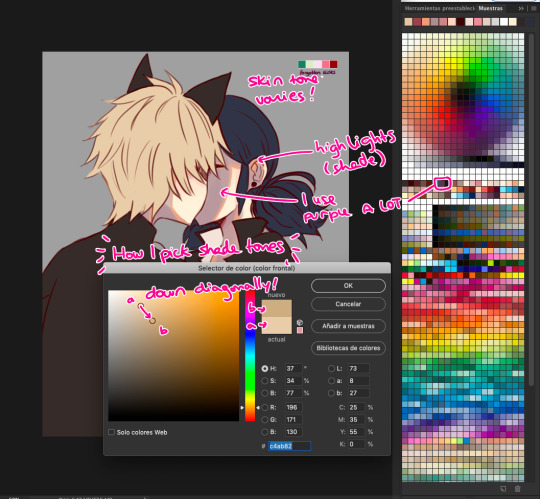
To choose the shade tone (in this example we’ll use Chat Noir’s hair), I picked a Yellow -Adrien’s hair is specially hard to color ugh- And then with that same tone I’d choose its shade going diagonally looking for a darker tone. This way you can find interesting colors! On this pic I did that for Adrien’s hair and... the rest I did the following:

I did my lazy shading™ : which consists in a layer set to Multiply with 50% opacity (this varies depending on the light, again), and I shade everything with the same tone (my to go is purple, but sometimes I use other colors too). This gives a sense of uniformity and the resulting shades are way nicer in my opinion.

Step 5: But Yuumi... where are the palettes???
I take that people straight handpick the palettes and use them to shade all the way and I respect them for that. I instead decided to do whatever floats my boat so I color regularly but add the palettes over the whole thing to change the overall mood and colors of the illustration. I randomly use the Gradient Tool and use the palettes’ colors around and then set that layer to Screen, Multiply, Focal Light, Overlay... etc etc, whatever I feel like doing in that moment, and so the magic happens! :’D
I don’t usually do this on my works but this is a new way to experiment for me and I’m having fun with it!
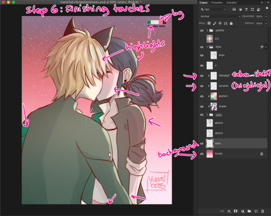
Step 6: Finishing Touches
Here is where I use the palettes the most, adding random highlights in whatever way I feel like. Yep, I pretty much Ladybug my whole coloring process: Wing it and go with the flow™. I’m still learning about lighting and whatnots but I really don’t care at this point LOL
To which you’ll say: But Yuumi?? In art school they told me that---
To which I say: shhhhhhhhhhhhh assigntments are over for me. go watch some Bob Ross (I am serious). Do whatever you feel like. Be happy. No one is going to judge you, and if they wanna judge they better be paying for your work first. so. whatever you do: BE HAPPY. or don’t do it. unless it’s a school assignment, in that case go do it or i’ll kick your ass.
✦ Finishing Notes ✦
So yea, that’s my art process in how I’ve been doing these Miraculous Color Palettes and generally how I go about my illustrations most of the time. For more complex illustrations, I need to remember how I did those (oops). And actually, do them. These illustrations usually take up 2 or 3 hours to make, on other pieces i’ve been working on them for up to 8 hours, it really varies from piece to piece, but I hope this was helpful!
Please let me know if you have any questions, commenting in this very post will help me -and others?- keep track of things and learn together! My asks are also open and I’ll reply as fast as I can uwu (my requests are still waiting there, don’t worry).
aaaaand that’s all, folks. Stay Peachy!
54 notes
·
View notes
Text
Kass Update 20th June 2020
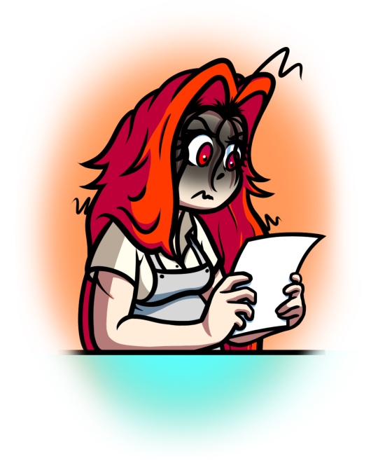
Hey guys! So I know it's been a while since Kass has had an update of any kind but that's because I have been working on a few things behind the scenes that I didn't want to go too far into until I was sure about some things. Now I'm gonna say it straight up, most of what is in this post could be considered 'bad news' but I assure you the things I have decided for Kass are for the greater good in the long run.
So anyway I got 3 things to discuss about Kass right now: The animation, the comic and the website, so I'm going to section this post up into 3 parts so you can read whatever part interests you most!
THE ANIMATION
So some of you might be aware that I put the comic on temporary hiatus so that I might work on pursuing my interest in developing my skills in animation, and it has gone really well so far! I had many small animations in mind, the first being a fun little simple vid of Tubba Blubba from Paper Mario which took about 2 weeks to complete and then I immediately started on my next animation which focused on Kass. Initially it was only to be a simple lip sync test to help me learn how to animate talking, however it very quickly became so much more than that. The animation, despite only being a few seconds long has become one of the biggest products I think I have ever made at this point. I have essentially decided to go all out on it, having every frame of Kass herself being an entire drawing, giving it smooth lineart, full colour, shading and lighting and even getting in another voice actress to give Clementine a line. It might not end up looking like much to the untrained eye but from an animation perspective I have gone way above necessary for what it is but gosh dang it I'm enjoying it. Essentially that has been my life for over the last month, where I have worked on it every day, 6 days a week with some days even reaching up to 15 hours on it. I am very proud of how it's coming along and I can't wait to show it to you! But...
This is where the first bit of 'bad news' comes in, while the animation still isn't even done I'm afraid to say I'm probably going to delay the release of it even when it's finished... The most frustrating part of it is I can't go into why I'm delaying it either as it pertains to personal matters. I'm sorry if that's too vague but it's all I can say for now I'm afraid, and believe me it burns me up inside to do so, maybe one day I can explain why but for now you're going to just have to take my word for it However I should mention it's possible I will indeed be able to release it when it's done, or it could be a few weeks from now or even a couple of months (my bet is on that one) what I'm saying is I doubt the wait will be too long, but I can't say for sure right now.
THE COMIC
So as I have been nearing the end of the animation I gotta say I have been positively itching to get back into working on the comic! But the other night I had a bit of a think as to how I am producing the comic right now and I realized that I don't think I like how I've gone about it so far.
Essentially, I currently release Kass one page at a time as it was a response to my other works in both how long it took me to producing anything for my past comic (Edited) and how long it took to produce videos on my YouTube channel. I wanted to just get content out on the regular and actually just jump into something without constantly working behind the scenes with little to show over several months/ years in the case of Edited. But I've come to realize that when it comes to books of any kind, it's gotta be really frustrating to only read one page every week or so. Seriously how can I expect anyone to get invested when they only get the story in the tiniest of chunks at a time. While on paper It sounds like a good way to keep audience engagement but I think in reality it's the opposite. I mean, Imagine if Bryan Lee O'Malley published Scott Pilgrim one page at a time every week, you'd get nothing out of it. Therefore I've decided that going forward, I will not publish each page as it is made but rather hold onto them all and publish them all at once, one chapter at a time (I'm doing a chapter at a time because if it was the whole book, you'd be waiting for years and years probably).
Publishing each page at a time worked wonders for the beginning because it really helped me just get something out there, but now I think we're past all that and it's time to be smarter about this. That being said, what to do with the rest of chapter 2? A part of me wants to finish up this chapter by going page by page but a much stronger part of me says it's far better to start holding onto them now, I don't fully know what to do about it so I'm opening up the question to you:
"How should I finish publishing chapter 2? One page at a time? Or all at once?"
THE WEBSITE
So I'm sure I've talked about the potential of a website for a few posts now, and it's been a bit weird. At first I had little success in finding an appropriate way of making the website that suited my needs but I may have found something that sort of works now. But admittedly when I found the site I was very busy on other things by that point and kind of threw it by the wayside for a while. So what's the deal now? Welllll, while I still don't know all the details on making it I do very much plan on pursuing it and releasing it at a proper point. You see the launch of the site is a big deal to me and I would want to celebrate it by actually giving you guys something to actually be on the site, namely say.... an animation or a new chapter.... you see where I'm going with this?
Essentially I want to hold off on the site until I have something to release it with, and look I know I could still make it at anytime and just have what I already have on there but I just feel it's the right move to wait on that too when I actually have something to show for it.
SUMMARY
So yeah, while I am still working on Kass and many things for Kass, unfortunately everything Is still a little ways off. It's entirely possible that some of these things might appear sooner than expected but I can't make any promises Sorry if this post was a bit of a bummer but I like to tell you guys like it is and hopefully I'll have something to show you soon, maybe I'll try and pop out some individual art pieces of which I haven't done in quite a while due to these big projects.
Anyway, hope this didn't bum you out and hope you have a good day!
7 notes
·
View notes
Note
hiiii! i just wanna say, i adore your art. second, im teaching myself to draw and while i can draw simple basics (mouths and sometimes eyes if im lucky), im still a beginner. ive watched many art videos and im still a bit confused on wtf im doing. so i just came here to ask if you had any words of wisdom for beginners? could be anything from what tablets to buy to simple mistakes to avoid. ive read some of the other posts here and have found it all extremely helpful so far! Thx for all you do!!
Hey there! Thank you so much!
I would put a read more but tumblr is broken. I’m trying to cover a lot of varied thoughts in little points, so if there’s anything you would like me to elaborate on or otherwise have questions on, feel free to shoot me an ask or dm me!
General
I think the biggest thing to remember is not to compare yourself extensively to others. A little bit of comparison is healthy... But too much will destroy your confidence, motivation, and take the fun out of art. Particularly if you are comparing yourself to someone older than you (life experience and coordination come into play here) or that has been drawing much longer (practice).
Additionally... If you’re not having fun (and you’re not getting paid to do it), don’t force yourself. If you find yourself being frustrated or bored with art, don’t force yourself to do it. That’s how you burn out and get art block! This applies to parts of a peice, too! If you don’t feel like drawing a face or a hand today? don’t force yourself to finish it. Come back to it later when you aren’t as frustrated or are getting better results. Even if its a week or a month from now. Honestly, at any given time I have probably ten headless bodies in my drafts. That’s okay! I just come back to them when I’m ready to do the face. And don’t be afraid to abandon something if it doesn’t feel right!
Something that also doesn’t get said enough.... take care of your body! I never knew when I started art, but artists are supposed to do warmup sketches and stretches and muscle exercises! I didn’t do any of this, and i went through a period of a few months where I was drawing for 5ish hours every single day. I developed carpal tunnel from it! So remember to take care of yourself. Take breaks, stretch, remember to eat.
Practice
Practice!!!! Even if its just for fifteen minutes every day. Or twice a week. But if art is something you really want to get good at, you have to put in the time and effort!! You can’t expect to draw an hour per month and be on the same level as someone who draws an hour a day!
I know I say this a lot but I think the biggest thing is just reference! If you don’t know what something looks like, look at a picture of it when you draw it! To go hand in hand with that, though, don’t just copy what you see! Learn from it and apply it! So take, for example, a shoe! pay attention to the way the heel is shaped, the location of the eyelets for the laces... how large the toe is, how steep the top! While you’re at it, look at other styles of shoes as well, and compare them! See what makes it look like a boot versus a trainer! And then the next time you draw it, hopefully you’ll remember all the things you learned the first time around!
I do lots of studies that serve no purpose other than to teach me things! I use referencing/studies to learn about color theory, shapes, and anatomy in a real environment. For example, hands or fabric folds! Oftentimes I’ll do them timed (20 or 45 minutes) so that I don’t fixate on perfecting things, just on the process itself and what I can learn from it. This also helps with getting better acclimated to your software and more coordinated with what you’re doing. Repetitive learning, like with playing sports.
I’ve realized a lot of people don’t quite understand what a study is? Basically you just look at a photo and try to replicate it so that you can learn about lighting or color theory or textures or anatomy or whatnot. So here’s an example of a timed study.
Additionally, don’t avoid!! We, as humans, have a tendency to avoid things that make us uncomfortable or are difficult. But it will make you a better artist in then end. When I first started, I absolutely hated doing fabric. I felt like I wasn’t good at it. So instead of avoiding drawing clothing, I sat down and did studies and sketches of different kinds of fabric. By the end of this learning period, I became comfortable with it and grew to enjoy it. These days, I adore sketching clothes, and it’s why my pants and shirts and things tend to be detailed instead of stylized in line art. If you don’t like drawing hands because you feel like you aren’t good at it? Sit down, look at a bunch of pictures of different hands, and practice it. By the end, you’ll be more comfortable, you’ll have learned something. Even if you feel like the drawings you ended up with aren’t good, you’ll still have learned, and that’s what matters!
Style
I worked on basics before I tried to develop a style. I made sure to start with a very realistic method at first, so that I could be sure I understood how fabric folds, anatomy, and realistic expressions worked before I tried to stylize them. I think in the long run this approach really paid off for me. It also allowed me to be conscientious of what elements I was absorbing into my artwork. I hear from so many artists that they started drawing when they were younger and into anime or cartoons or things like that, and tried to emulate it. Because those styles became so ingrained into their artistic skillset, it becomes near impossible to iron out those influences and get rid of them later. So starting with realism is a way to ingrain proper anatomy and other good practice into your artwork.
One way to develop style is to take a look at the artwork of someone you admire, and try to list out the things you like form their style - perhaps the thickness of their lines, or the way they do eyes. Do this with several artists, take all those little details you like and try them out! See if you enjoy using them in your own drawing process! Think of it like a grab bag or a pick-n-mix, sprinkling in the elements you like here and there to create something new and your own - not just copying another artists style word for word.
Don’t worry too much about it though; don’t allow yourself to become anxious or fixated on “achieving a style”. Its a natural ever evolving process that comes with time and practice. I know a lot of people get hung up on style, but just take it one day at a time!
Also try to keep in mind what style you’re going for as you begin drawing. And I don’t mean that like sailor moon vs. ghibli. I mean that as in, is this piece going to be a painting, a lineart, a lined painting, cell shading...? It will help you in the longrun if you narrow down the broad kind of style you use, and refine from there.
Workflow
My workflow for paintings is very different from my workflow for lineart and cell shading. A full tutorial on how I do paintings can be found here! A process video for how I cell shade can be found here!
Everyone is going to have a different method that works for them! You just have to experiment and find out how you like to draw! For me, personally, I use color blocking for painting (see the tutorial above) and a spine method for lineart. How the spine method works is that I will draw lines that represent the legs, arms, back, etc. so that I can determine the placement, length, and composition. From there, I’ll add a dark outline that actually shows the shapes of the body. Then, I’ll use thinner lines to add details. This is the method I’ve found that works for me. Another commonly used method that I’m sure you’ve seen is representing body parts with cylinders and cubes. There are lots of good tutorials out there on breaking down bodies into shapes like this!
Something that I do is if I’m not quite happy with a part of a drawing, I don’t just erase it. I duplicate the layer so that I always have the original copy, and then I make changes from there. Sometimes I can end up with five or six different versions of the same arm or face that i’ve made minor changes to. And then I compare and pick the one I like best, or condense all the parts I like from each version to make a “best” version.
Tools
Currently I use Procreate and the standard Ipad with Apple Pencil. Prior to March I was using a Wacom Bamboo Touch and Photoshop Elements 2008. I find its harder for me to do full paintings in procreate, but its made my life a million times easier for lineart and cell shading. The pen pressure is phenomenal, and I also adore that its wireless / active screen instead of plug in like the wacom. The programme itself is intuitive and easy to get the hang of; it simply lacks a lot of the neat tricks that photoshop has, like rendering (lens flares, for example), gradients, and gradient maps. Try testing out different trials of programmes... firealpaca, photoshop, autodesk, whatever it may be! What works for me may not work for you!
287 notes
·
View notes
Text
July 20th-July 26th, 2020 CTP Archive
The archive for the Comic Tea Party week long chat that occurred from July 20th, 2020 to July 26th, 2020. The chat focused on Ring Spell by Artem Ficta.

Featured Comment:

Chat:
Comic Tea Party
BOOK CLUB START!
Hello and welcome everyone to Comic Tea Party’s Book Club~! This week we’ll be focusing on Ring Spell by Artem Ficta~! (http://ring-spell.com/)
You are free to read and comment about the comic all week at your own pace until July 26th, so stop on by whenever it suits your schedule! Discussions are freeform, but we do offer discussion prompts in the pins for those who’d like to have them. Additionally, remember that while constructive criticism is allowed, our focus is to have fun and appreciate the comic! Whether you finish the comic or can only read a few pages, everyone is welcome to join and chat with us!
DISCUSSION PROMPTS – PART 1
1. What did you like about the beginning of the comic?
2. What has been your favorite moment in the comic (so far)?
3. Who is your favorite character?
4. Which characters do like seeing interact the most?
5. What is something you like about the art? If you have a favorite illustration, please share it!
6. What is a theme you like that the comic explores?
7. What do you like about the comic’s story or overall related content?
8. Overall, what do you think the comic’s strengths are?
Don’t feel inspired by the prompts? Feel free to discuss anything else that interested you!
Feather J. Fern
1. What did you like about the beginning of the comic? I like how it seems lighthearted at first, but knowing Artem it's going to drop the ball on us really soon haha.(edited)
Also I always love how the backgrounds are, they look great.
Artem Ficta (Ring Spell)
Hahah, it's a shame I didn't get one more update up XD Thank you so much, Feather~!
snuffysam (Super Galaxy Knights)
well, the CTP is gonna run for the rest of the week...
Artem Ficta (Ring Spell)
I can't finish the next 8 pages by then XD
My guess is they'll be up the week after next
RebelVampire
For the beginning, I'm with Feather and I like how quickly the comic transitions from just lalala happy school to oh wait there's weird shit going on. I really like stories where the status quo is quickly ripped out from under your feet. My favorite moment in the comic so far is probably the most recent scene when we get to see Lyall's apartment and ya know, Claire starts dropping all these bombshells on us. The scene is the epitome of "Well that escalated quickly" and its just loaded with so much info to unpack. My favorite character right now is Claire. One because she seems the most sensible and mysterious, and two because I love Claire's hair so much and I'm so jealous and want such floof beautiful hair. ;3; As for characters I like see interacting the most, probably Claire and Lyall and they have some really good banter and a relationship, insofar, that's just kind of hilarious in its brutal honesty. A close second for me is Claire and Tasha as it quickly switches from happy smiles to probably most likely to have a catfight in the hallway.
Artem Ficta (Ring Spell)
Catfight in the hallway, lolol. Makes me want to draw them dressed like cat girls XD
RebelVampire
No not that sort of catfight
probably
O_O
Artem Ficta (Ring Spell)
comic turns into a catgirl fetish comic
Artem Ficta (Ring Spell)
1. I like how the first word is Zenchav which was the title of the comic this is a hard reboot of XD 2. My favorite moment was Lyall sticking his hands up Damon's shirt XD I really like how it was drawn and it's the most Lyall thing ever to do. 3. My favorite character overall is Damon, although it's probably Lyall at this point in the story. But I like them all of course XD 4. Damon and anybody, lol. I like when I get to draw him XD 5. I've been trying out a new shading style with this since I almost exclusively just hard shaded before, so it's nice to be branching out a bit and trying some new things. The Intro page is probably my favorite atm.
snuffysam (Super Galaxy Knights)
Theory: Lyall sticking his cold hands up Damon's shirt is how he drains Damon's energy, because secretly he's the witch.
mariah (rainy day dreams)
Oh no! XD that would be a twist!
Artem Ficta (Ring Spell)
Oh snap!
mathtans
Hmmm, so we ship Claire and Tasha then?
Artem Ficta (Ring Spell)
I don't not ship Tasha and Claire >v>
Artem Ficta (Ring Spell)
Drew that picture of them
RebelVampire
We should indeed all suspect Lyall. I mean no parents, lives alone, yet somehow affords everything? That's witchery.
Artem Ficta (Ring Spell)
How does he afford all that stuff
does he sell drugs on the side or something XD it is suspicious
mathtans
1. I'll mostly echo everyone else here in terms of the start seems pretty straightforward and makes one wonder how the teaser page fits into it all. I'll add a remark on the subtle details of world building, like you've got your digital alarm... and dude straight up has a TAIL, and it's like, no comment, that's normal too.
2. Favourite moment was probably recruiting Claire into the cosplay skit. It's like, hello new person, oh you want to associate with us? Then you need the proper accessories, and Claire's all 'Um, I'm not sure... prop weapons? Uh, okay then...' Cosplay is a force to be reckoned with. (nods)
3. Fave character... yeah, may have to echo Rebel here and go with Claire. Possibly because she's the first chapter name, and like the reader is coming into this new situation, so can get behind her trying to figure it out... but also because I'm big on the time/space bureau stuff and that sounds like a cool job to get.
Damon has a cool cane and has the mysterious ailment afflicting his cosplay though, so he's my fave guy at the moment. (Werewolf blood? Moon thing? Dunno.)
4. I honestly do like the Tasha/Claire interactions the most, because each of them seems to have something to hide, and so you're kind of wondering if and when one of them might slip up. The other girl interrupting with the paint was classic, and I felt it helped break tension. The ship picture (which I imagine won't show in the log) is kind of representative of that with the chessboard too, like they're making moves against the other (though I'm not yet convinced that one is a witch, could be a setup).
Of course, I'm very biased towards the yuri, so grain of salt for my opinions and all. And while the ship was a humour comment at first, I think I'm more into it after seeing a "catfight" could play out.
All that said, the Lyall/Damon interactions are equally good. Lyall's perversion sometimes saying the quiet part out loud.
5. I recognize the art style, have read some of the work before (under different name). Always find the hair impressive, like here you get the impression of each individual strand except that's not actually what's drawn... you can still see the neat ears, Claire having some strands that fall in front of her too. The shading is really good too, like definitely shades of grey, not just black and white.
Kind of echoing the author there, but I can see it.
I'm so bad with themes and need to charge computer, will be back later. o.o
Artem Ficta (Ring Spell)
I love all this input Math, thank you ;3;/
RebelVampire
@mathtans You have no idea how happy I am that someone noticed the tail that nobody seemed to comment on.
RebelVampire
What I like about the art is how clean and crisp everything is cause mmmm that sexy lineart you can just paint bucket when needed. <3 I like that the comic explores the idea of having someone you've known your entire life possibly be evil. Cause it opens up a lot of questions. Like should you doubt? Should you trust? And at which point have you hit the point of betrayal? So I'm glad we'll get to see a bit of this tackled as Lyall and Claire look for evidence. As for the overall story, I like that there's just lots of questions going on. It's a theorists dream. But I find the more mysteries a comic has, the more engaging it is. Because even when you know the answer, it's interesting everytime to see the characters reach that answer. As for the comic's strengths, see the above and the art. It's super pretty and clean to look at, has some fantastic emotive faces during the more comedic moments, and there's just lots to theorize and look forward too. ;3;
Now I will proceed to weep as someone who beta read the script and actually can't theorize cause I just know .
mathtans
Others may have noticed but not been sure what to say? (Does the tail turn into the cane?)
6. Ok, themes... could be a theme of belonging in there. Like Claire being accepted into the group, like Lyall wondering if she's only talking to him to get to Damon, that sort of thing? Then there's the idea Rebel raised of thinking you know someone but not necessarily knowing them.
Of course, there's also credibility, like maybe Claire is simply an escaped mental patient with really good hacking skills to get herself in the school and apartment. Because that's quite the tale she spins. (Though Lyall had heard of the organization? Or he's pranking her, bit hard to know for sure.)
7/8. The story's been setting up a number of things in the background, I feel. Which can be a strength, as we're learning more character items first. Though Claire's latest revelation I'm really jazzed about, because the idea of time travel (times when demons weren't supposed to be) and personification (Earth as a female entity) are right up my alley. So that's cool.
Also Lyall apparently has a strange aura to go with Tasha's strange energy? Maybe the witch is jumping bodies. Maybe we should ship Lyall/Tasha.
Artem Ficta (Ring Spell)
Oh my gosh, loving these ideas!
I don't want to give spoilers but I think I'll answer the tail thing cause I never really meant for it to be a mystery It's just tucked into his pants when he's in public is all. That's why he's wearing the track suit for the school and not the standard school uniform, cause the pants are looser.
although it turning into the cane could have been hella cool(edited)
now I'm a little bummed I never thought of that
But the cane has other purposes
mathtans
I didn't really think it was a big mystery, and that explanation makes sense. (So I suppose it could be not normal, only normal for Damon's friends... demon prejudice otherwise?) Ok, so the cane is where he hides his stimulants to keep awake until the full moon.
Comic Tea Party
DISCUSSION PROMPTS – PART 2
9. What are your theories about Damon’s past? Why is he concerned about when the full moon is? Additionally, what do you think was meant about Damon and Xerfonos being the same age but not being twins?
10. Do you think Claire is right that Tasha is the witch Cadence? If so, how will she prove it? If not, who else could it be? Also, what might this all have to do with Tasha’s concern about Claire being the mysterious Draco’s student?
11. What do you think Cadence ultimately wants from Damon? Why would this compel the Earth, and by extension Apus, to protect him? Also, even if the characters find Cadence, can she actually be stopped?
12. Why do you think Lyall reacted so strangely to Claire mentioning Apus, and why do you think he’s so sure Apus wouldn’t care about protecting Damon? Do you think Lyall can trust Claire even for the long term?
Don’t feel inspired by the prompts? Feel free to discuss anything else that interested you!
mathtans
9. I mean, Damon seems to be a demon, but he's cool with being in our world, so... maybe he was born of a human/demon pairing? Or he was adopted by humans when he was a baby and simply given the same birthday as Xerfonos. I'm guessing the full moon has more significance than merely to werewolves (unless Damon needs to bite a werewolf to regain strength idk) and so it would help him.
I will say that initially the "same age" thing didn't phase me because there's more than 9 months in a year, plenty of time for having a second kid born in the same year. But now that I'm debating the adoption angle, maybe there's more to it.
They're not twins... they're TRIPLETS! Dun dun dun. Anyway.
snuffysam (Super Galaxy Knights)
they could also just not be twins due to a date technicality like one was born right before midnight and one was born right after
but yeah the adoption angle would explain a lot
mathtans
10. I don't think she's right about Tasha, or if she's right, not in the way she thinks. Because we've seen some from Tasha's perspective and she didn't seem to be the person in charge of whatever. In terms of proof, I guess she could see if Tasha would cosplay as a witch? And if the shoe fits? But yeah, maybe the witch is jumping between people like I mentioned earlier, or is not actually there yet, like APUS got the date wrong or something. Maybe Tasha's also trying to protect Damon from the witch (hence trying to give him that new name) but it's a rival organization?
I mean, technically still twins in that case, just not having the same birthday. (If Feb 29th enters into it, it gets even weirder.)
Actually, why wouldn't Claire use Damon's given name? Maybe her organization doesn't know everything it thinks it does?
Anyway, just had time for some random thoughts. Back later tonight.
mathtans
11. Cadence may just want him to keep living so that she can keep siphoning off energy. (Thus perhaps APUS wants him dead, it's not about protection?!) Or maybe Cadence wants a sweet cosplay. (Probably not.) Of course, it might be that if she's a free floating witch, she wants his body. Maybe she can't be stopped, but could be redirected?
The Earth aspect is one I haven't really been able to figure out yet. (Are pavonis a type of pasta?) But maybe there's a destiny or something that Damon needs to fulfil first.
12. Lyall could have been pranking, but maybe he knows a different organization like that... or maybe that's the name of some mystery file on his computer that he hasn't been able to open because the Cadence inside him hasn't revealed the password, oooh. I think Lyall can trust Claire (assuming she's not a raving lunatic) and she might even need him to provide better cover (she didn't seem to even know what apartment she was in)... but that's short term. Long term is another question, if she starts getting Apus directives saying to do things he wouldn't agree with.
Artem Ficta (Ring Spell)
This is all so interesting ;3;
Pavonis as a type of pasta, lolol
mathtans
I'm glad it's more interesting than rambly.
Artem Ficta (Ring Spell)
Nah, I love it XD I'm afraid I'd give spoilers if I said anymore lmao
RebelVampire
My theories about Damon's past are that he's a werewolf. And that something about being a werewolf has changed how he ages compared to Xerfonos - thus why they're the same age but not twins. Granted I guess they could also just be half brothers who have a shared father who said, "Man I should knock two girls up at once." But werewolf sounds more interesting. No I think we've established Lyall is clearly the witch. He is too suspicious. Tasha probably is a super secret agent or something, hence the suspicion. Maybe Apus is into some shady shit that Tasha knows about, especially Draco, so she doesn't want them jumping in on everything. As for how proof, she won't. Cadence will reveal she's Lyall when the most damage can be caused and Claire will weep her career as a detective is through. Cadence might just think Damon is hot. Although I think Damon has a grand destiny ahead of him, and Cadence wants to interfere with that destiny while also bulking up on some of that tasty werewolf energy. Also, can Cadence be stopped? Probably. But definitely not by these chumps right now. XD Lyall reacted strangely cause that was the Cadence in him going oh shit and kind of taking over. And sure, Lyall can trust Claire to never figure out its him. Sorry Claire, you hot, but clearly aren't noticing some stuff.
mathtans
I hadn't considered the "same father different mothers" angle. O.o Maybe it was a sperm donation sort of thing though?
As to Claire, maybe Tasha will be nice enough to buy Claire ice cream and give her snuggles once she realizes the error of her ways.
Artem Ficta (Ring Spell)
Tasha and Claire will get to snuggling at some point I'm sure XD
The same father with different mothers sounds most probable
of what's been mentioned at least
mathtans
I mean, time travel could also be involved. What with Apus.
Maybe Claire is Damon's daughter and she's trying to protect her own existence.
Artem Ficta (Ring Spell)
Maybe Claire is Xerfonos' mother
Wait, I don't think that'd work out lmao
Daughter would be way more probable
Comic Tea Party
DISCUSSION PROMPTS – PART 3
13. What are you most looking forward to seeing in regards to the comic?
14. Any final words of encouragement for the comic?
Don’t feel inspired by the prompts? Feel free to discuss anything else that interested you!
Artem Ficta (Ring Spell)
I look forward to getting a bit further into the story XD it's still pretty early on atm and there's a lot of really good scenes later. I don't feel like we've really gotten to know Damon yet either
RebelVampire
I am looking forward to seeing people's theories as the story continues and pieces fall into place. It will be interesting to see the routes people take with the ideas of what the answers are going to be. My final words are just read the comic. O_O
mariah (rainy day dreams)
I didn't end up having any brain power to write responses over the week, but I really enjoyed Ring Spell. Damon and his brother are cuties, Claire seems very capable, and I can't wait to find out what Tasha's motives are. I'm real excited to see how the themes of magical marital vows come to the forefront :3
Artem Ficta (Ring Spell)
Thank you~!
mathtans
Busy weekend was busy. Looking forward to seeing how the Apus thing fits in, like is Claire even from their time period? Will Lyall spill all the secrets? Will the ships happen? I'm so behind in all my reading but I've flagged it to check back when I can.
There was also the bit at the start implying knowing people from other lives, but the time travel possibilities make that weird. And I guess there's also the question of whether a Ring will have a Spell on it. Like, maybe the witch doesn't know she's the witch while she's wearing a ring? Or they have to get her to wear a ring? Here I am guessing again. ^^
14. To conclude, all the best with it, looks like a good setup. I do enjoy the art style too.
Also I guess congrats on being the finale CTP? Nice that you got it in there. Good initiative.
Artem Ficta (Ring Spell)
Thank you so much Math~!
Comic Tea Party
BOOK CLUB END!
Thank you everyone so much for reading and chatting about Ring Spell this week! Please also give a special thank you to Artem Ficta for volunteering the comic and creating it! If you liked Ring Spell, make sure to continue to support it via some of the links below!
Read and Comment: http://ring-spell.com/
Artem Ficta’s Ko-fi: https://ko-fi.com/artemficta
Artem Ficta’s Twitter: https://twitter.com/ArtemFicta
#ctparchive#webcomics#indie comics#comics#comic chat#comic discussion#book club#bookclub#webcomic bookclub#webcomic book club#comic tea party#ctp#ring spell#artem ficta
1 note
·
View note
Text
Sans Tutorial?
Last year someone sent an ask for a tutorial about how I draw Sans, but I have been pretty busy and not gotten around to making it! I don’t know how helpful this will be, because it turns out my technique is basically:
1. draw a circle
2. draw the rest of the skeleton
But anyway, I’ll post the steps for this picture here :3
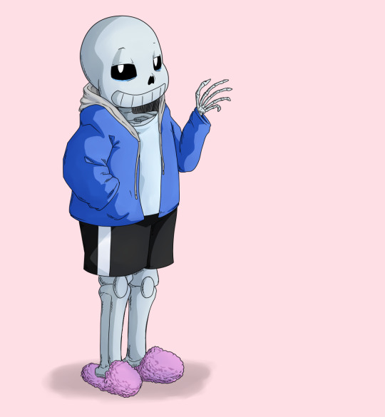
I have picked up some good tips from tutorials but I don’t use them very much because some are too basic, some are too advanced, some are written too proscriptively, and usually the example art looks way better than what I’m doing if I follow along. So my tips may be a mix of too-obvious and not-adequately-explained, but perhaps a few beginner or intermediate level artists will find something useful here :3 I will assume you know what layers are and have software that can do layers. I use Paint Tool SAI, which is pretty affordable, and there are other programs that are free.
First I draw a circle where I want the skull to be. I don’t necessarily stick with this circle as I continue sketching. And one of the advantages of drawing digitally is that I can move parts around if it’s not working. If I’m planning out a complex picture, Sans will be a circle with two more circles for eyes and a vague cylinder/blob as a body, at first.
Then sketch in more detail. Fingers are important, and I often have to go back and refine the sketch of the hands in the middle of doing the lineart.
There are many different and valid styles for drawing Sans. I always draw his eyes as this sort of arch-like shape, like a half circle that’s stretched out vertically. Even if they’re half-lidded, I start with the whole eye shape (and if they’re half closed they tend to end up pretty rectangular).
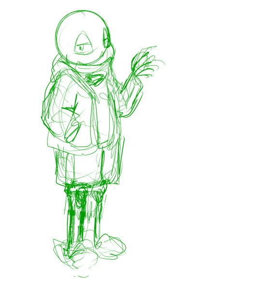
In this picture, I made his legs too short, then too long, and you can see some artifacts of how they got moved around and adjusted. (I pretty much never draw him just standing there in full-body, I guess owo) It’s much easier to adjust things in a sketch than after it’s been lined, so take your time. If I wasn’t feeling confident, or if I wanted to make the linework easier, or if I wanted someone to approve the picture before I did lines, I would do another, more-refined sketch on top of this one. But I’ve been drawing a lot of Sanses over the past few years so I didn’t :3 I do have a brush for sketches that is not totally opaque.
(Beginner tip: If you’re using a serious art program, you can reduce the opacity of the sketch layer and draw the next sketch in a new layer on top. This is how you’ll do the linework too. I also put Sans’s legs on a separate layer when I was adjusting them in this pic. This is also a good time to adjust the framing of the picture; I usually drew it too small and off-center. This pic is a bit off-center because I thought I might add text on the right side about the steps. But then I didn’t.)
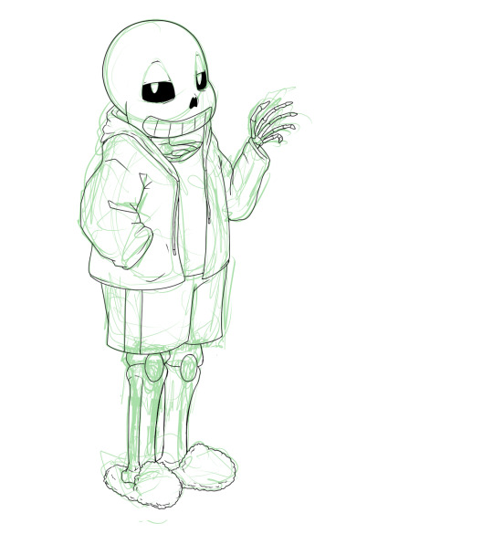
Next is lines. In Paint Tool SAI, I can have multiple layers in a folder and select the whole folder as “selection source” (so I can fill in the colors later). This makes it easy to use a Lineart layer for the smooth curve of Sans’s skull, and a regular Raster layer for the rest of the lines. Of course, make sure the line width is similar. (Being able to choose a selection source other than “current layer” or “whole image” is one of the advantages of SAI in my experience.)
I used thin lines here. I don’t always, but sometimes I try to use thin lines and add plenty of detail and I’m pretty pleased with it. (Often if I want to save some energy I use thicker, rough-textured lines, so that you won’t be able to tell so much where I got the curve of the skull wrong and then adjusted it.) When I first started drawing Sans, I gave him too many teeth. Then I overcompensated and gave him too few teeth. Now I’ve settled on about this many teeth. I like to draw bony, skeletal hands. For any bones, Google image search is your friend. You don’t need to know the proper name of the bone; just search for the body area + bones. I usually draw the nose hole a bit more simplified. I don’t always bother with the drawstring. Sometimes I give him a turtleneck sweater so I don’t have to draw a glimpse of collarbone, ribs, spine inside his shirt. Idk why his tibiae are so thick today owo

Flat colors and cel shading. I like to put a bright color that contrasts with the colors I’m using in the background, so I can easily see corners that got missed by the fill tool. Usually, I do multiple layers of the base colors, so that I won’t have to worry about the edges when shading. (All the color layers are collected in a folder. Not the bg though; if it’s complex it will have its own folder.) Here, I used a shading layer for each base color layer (the shading layer is a clipping layer, so the shade color won’t be visible unless it’s overlapping its correct base color). I don’t like to be organized and label my layers, so I do the shading right after the base color, while I still remember what layer it’s on :3 You can also do the flat colors on one layer (or just in one folder) and then put a multiply or shading layer as a clipping layer over that for the shading (many fewer layers to deal with but you must pay more attention to the staying inside the lines). Aside from the sketches, I still haven’t used any brush other than the default pen. You can of course use more layers and more colors for fancier cel shading. I have used a few extra darker shades on Sans’s neck.

More shading. I usually choose between cel-shading and more shading, but I tried adding a little bit more here since it’s a tutorial. It doesn’t make a huge difference though; if I hadn’t done cel-shading, I would have made the blendy shading stand out more. You can do each color individually (here’s a tutorial about that), but you can also make a clipping layer over all the colors (flat colors on one layer or all the color layers in a folder) and make it a multiply or shade layer, and shading for all the colors there. I like to fill in this shading layer with white so it blends more between the light and dark. This is also a great technique for adding shading to something that has a pattern on its surface (e.g. you can add fur texture to your rainbow cat without painting the texture in every color of the rainbow). This is where I use brushes I adapted myself or stole from other artists :3 and another place where SAI has an advantage because it’s specifically designed to be good at painting. I lightened the background and added a little shadow (blurred with the watercolor brush).

Extra cross-hatchy lines. When I do thin lines, I like to add these lines as a little extra shading/detail. I usually do them before color, and on a separate layer so I can keep them out of the “selection source” when filling in flat colors. This time I did them at the end. They add a little texture to everything and I think they work well on the hand bones.
22 notes
·
View notes
Note
You improved quite nicely in your art you know this right? If I compare your collage AU you did for our IR month in 2018 and now seeing this... The anatomy is quite nice, the faces are good. You are still rough around the edges, but the damn girl keep going, you have the talent.
Aww thank you anon 😊 tbh I never feel like I improve much, bc depending on what I’m drawing, sometimes it feels like I know what I’m doing but then the next day looks like I’m back on bs again lol. My laziness keeps me from practicing, my trying everything at the same time is a bit of a mess, my bad habit to not do a proper lineart and rushing to finsih a draw bc I want to.finish.it.fast. are some of my main enemies but I’ll keep going :)
12 notes
·
View notes
Text
Commissions Closed Indefinitely
SO I had to really think about it for a bit. I think most of you guys are aware if you’ve seen me chatter about it that I’ve not been in a very good mental space, I’ve been struggling a lot with motivation and art blocks and RAGH. I’ve got commissions from last Spring I still haven’t completed, and I feel very ashamed over it. This is the longest I’ve ever taken to complete art, and I’m going to veer on the edge of a burnout, which I don’t want at all.
The current commissions I have will be completed as swiftly as possible, I’m fully dedicated to making sure they’re done and still worth the wait, I apologize to those who have had to wait such a long time. My current queue, in order of who’s next in line to get their art:
Nyxy (fixing sketch, moving to lineart)
Aya (fixing sketch, moving to lineart)
Vaelois x2 (currently on sketch)
I’m not going to accept anymore commissions after these for a while until I can get my stuff together and figure out what’s a healthier way for me to organize my work. I won’t let clients be subject to poor work ethic as a result of my own personal troubles and obstacles.
I will however continue to work on my private projects, do art trades, and throw some flash stream sales up again since they had a good turnout! Stream Sales are, you come to my Twitch, throw $15 into my PayPal on the spot and I’ll draw a headshot of your character live in one hour, limit of 3 per session. It’s fun for me, and it’s easier for me to complete than my bigger art pieces.
And I’ve struggled a lot with Patreon because by god it’s hard for me to figure out how the hell to maneuver that website (I don’t know why it’s hard for me to learn but it IS) but eventually I’m going to get my stuff together enough as well where that will be a nicer way to get content once I figure out how to actually manage it properly without leaving it barren or without proper direction. I want to offer sketch rewards there, some actual tangible rewards other than empty promises, but again, I have got to figure out how to get organized.
So TL;DR: After this batch of commissions is done, commissions will be indefinitely closed until my art block is over, but I will still make art, do stream sales, and partake in art trades, and I thank you all for your patience and tolerance of me! ♥
15 notes
·
View notes
Note
Hey Lilium! I love your Servant redesigns! I'm starting to learn to draw digitally so that I can design Servants myself, like Kriemhild. Would you have any advice you could give me on this?
Hi! Thank you so much for your words!
I’m a bit unsure if you’re asking for tips on digital art itself or on chara design?
In doubt, I’m going to go with “digital art” in this post, if you meant chara des hit me up with an ask and I’ll happily provide for that :)
*necessary intro*: please consider that my art education ended 10 years ago and never prepared me for more stylized/cartoon styles, so I’m self taught for almost all intents (100% regarding digital art).
Long wall of text under the cut:
First suggestion is to get a good, reliable art program.
Plenty of artists use Paint Tool SAI and Clip Studio Paint (currently using CSP myself and don’t plan to ever abandon it). Neither of them is free but both are less pricey than Adobe bundles and both were created more for illustrating than “photoshopping” purposes. There’s plenty more but those are two I used and can recommend. Many art programs usually offer a 30 days trial so my suggestion would be to try them out and see which is more to your liking and offers the best quality/price wise.
By personal experience, it’s much better to pay and have support than to find a free unofficial version and then get fucked and lose all your works when you update your operating system and discover the bootleg program doesn’t work anymore. Learn from me, don’t risk it.
Next suggestion, get a drawing tablet or a tablet. Nothing too pricey as a beginner, when paired with a good program any decent tablet will do its job. What you really need is pen pressure, everything else is optional. People draw on their iPads with great results but never having tried I can’t give suggestions here, if not to look for artist who do and see how they work (YT surely has tutorials ‘bout it).
With hardware and software out of the way, let’s get down to proper drawing business:
First of all, forget that “but you’re not a real artist if you use references/copy poses” noise: use references, use all the references you want.
If you want to paint a starry sky and don’t know how to rend the effect, maybe the glowing of a nebula? Look up Youtube and Deviantart tutorials, tumblr tutorials, look up on how all the artist you like paint and their tips, all the IRL photos in google.
Something I personally find very helpful are tutorials comparing realistic and stylized styles and showing how to go from one to another, how to simplify shapes etc.
Renaissance artist invented the darkroom/camera oscura to help them drawing perspective and then traced over that shit. If Caravaggio traced to save time, then so can we.
And there’s so many different ways to reach a similar result that maybe your first attempts will look like copycats of that tutorial you saw or that really inspiring artist. It’s fine. But the more attempts and the more you play with your program of choice, brushes you like/find more comfortable, the more you look up different sources and integrate bits of them all in a singular piece, the more your work will be distinct.
Now, onto one of the big elephants in the room: do you know how to correctly sketch a human body from scratch? If yes, amazing! (all my respect).
If not, there’s plenty of solutions without having to learn how to (which is the way I currently work bc drawing is a 100% hobby and I’d rather spend my time elsewhere than in re-learning human anatomy) and working digitally makes these solutions way easier.
After you find a “how to draw anatomy” book or blog or tutorials and safely store it somewhere safe to go back and reference, then you can
1. find stock photos, either from google (be careful not to use copyrighted stuff) or in bundles specifically created for artists to use as bases or references. On Deviantart for example there’s SenshiStock, incredible project with hundreds of photos free to use. The anatomy book/blog here will be useful if you want a certain body shape and your reference doesn’t match with your idea.
2. chose a program like CSP or similar that comes with 3D stock poses which you can then alter as much as you like in size, weight, rotation, light direction, position of every body part down to each finger (in CSP’s case, you can also download plenty more free to use poses, brushes, 3d objects, patterns etc created by the userbase and shared in the library bundled with the program).
3. if your main art program doesn’t come with human poses? no problem at all, get one just for this specific purpose, like Design Doll (both free/pay ver, imo free ver is more than enough), Posemaniacs (free, online, uses flash), MagicPoser (free with option of in-app purchases, it’s an app, good reviews, just tried it a little and seems quite good).
4. less conventional but imo still useful, especially if you want to draw in “anime” style and proportions for Servants designs: go to My figure collections and use figmas.
They’re highly posable plastic figures from the most different jp (and not) characters, each one with a photo gallery and as long as you modify the final piece and -important!- don’t sell it if you base it on a specific user photo? I’d say go for it. Or mix body parts of different figmas, or use the “archetype” products, naked bodies made precisely for drawing bases, there’s options with both more “anime” and more realistic proportion.
I collect them for both owning Fate/other characters without spending a fortune and for drawing references and I find them quite well suited for this purpose. Why on earth despair if I’d ever want to draw Arturia in armor when I can just grab my figma of her, pose it, take a photo and then draw on it? :P
Now, hardware and software check, way to find poses check, what else?
Layers are your best friends. For example, Bradamante? A good 50+ layers, some of them stored in folders so I could just select and deselect them to remove or put on mantle, lance, shield, sword etc. Just... remember to name them to save yourself a lot of time.
And changing a layer’s opacity too, especially to draw the definitive lineart over the first rough sketch or for shading or highlights.
The more I write the more I find things to write about so I’ll call it for now, this post is already a WoT as it is. Hopefully I was of use, but if you need more, ask right away and I’ll do my best! :)
13 notes
·
View notes