#I worked as a designer and illustrator for many years
Explore tagged Tumblr posts
Text


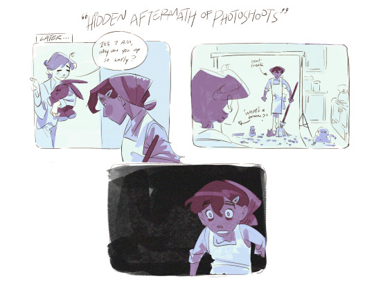
⭐🌛🌞 november trick or treating... spooky season can be anytime if you aint a scaredy cat!!! flynn, terence, nate - from my series Lost & Found Children
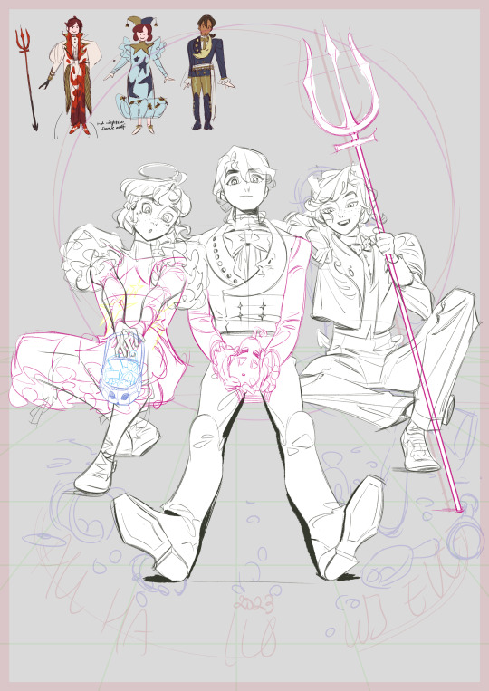
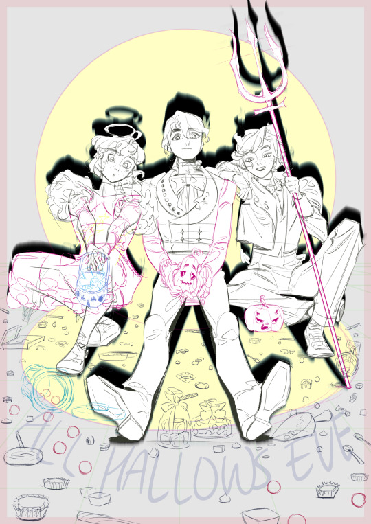
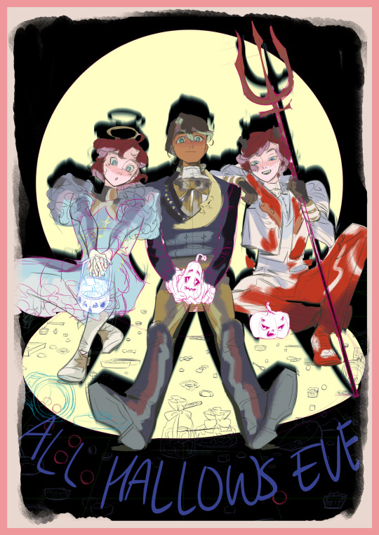
some WIPs!
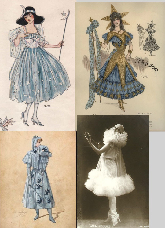
^ some theatre costume designs that inspired Flynn's outfit. originally I wanted more of a pierrot motif, but I went with a sortof celestial angel to match nate's fiery devil. I do want to draw them all as pierrots one day...
my friend asked about the "costume" part of this - terence is not wearing a "halloween costume" per se, because he thinks he's too mature for costumes (haha). hence the star moon and sun theme to unify all of their outfits. he IS a piano player in the story, who wears a similar outfit to concerts, so you can see him as being a sort of astronomical musician for the occasion. i think these designs turned out pretty rad and since they're not "stereotypical" halloween fare, i would like to use them again...
tumblr killed my drafts... and unfortunately I am too tired to type out more of the description that got lost.
#oc#halloween#illustration#character design#my ocs#artists on tumblr#my art#flynn#nate#terence#i dont usually put so many 'generic' art tags but ive been wondering if it works!#tardy to the party as always. i debated not finishing this but i felt i had so little oc works in my repertoire so i wanted to change that!#moving on i want to put more narrative into my works so i made that short comic :)#i also want to change my art style more lately! my art became very clean in the last 2 years and i feel like people didnt really favour it#lost and found children
523 notes
·
View notes
Text

year of the dragon. 🐲🧡
#happy new year#i'm happy with my very first drawing of 2024 :D I hope this year brings many more#messed around with the colors a little too much it's not the same as it was intended but eh it's works i like bright colors#illustration#new year 2024#artists on tumblr#beyblade#beyblade metal fight#metal fight beyblade#mfb#ryuga#ryuga beyblade#l drago#fan design#year of the dragon#artidoesart#cute illustration#cute style#digital art#drawing#beyblade fanart
307 notes
·
View notes
Text
Excuse me for adding a bit more to your post! This illustration gave me a good memory trip of high school reading years, seeing books with similar illustrations, and after rummaging on my scans from that era... I found some of them!


But the one that I'm glad I saved in full is... this one

Because this was my first exposition to anything Phantom of the Opera... since then THIS become THE Phantom on my mind! It ruined me forever to watch anything else that didn't portray him in this way x'D (To the point I even gave tribute to this design in an old fanart coff).
STILL, LOOK AT THAT! Both horrible and tender... how not to fall in love with a story that puts you in the middle of the struggles of these characters?
Btw the artist is [Ignacio Noé], an Argentinian Illustrator who was commissioned to do dozens of pictures of this caliber by a children's magazine of the same country, "Genios", under their collection "Grandes Clásicos" (circa 2000) that gathered old-time classic novels wrote down in very summarized chapters as a first introduction to literature for high schoolers.
It's not hard to find them being sold on the web separately but so far for me at least, this one is a grial because I only saw it in a few libraries, not always intact.
Still, I'll forever cherish this man and book for putting such a picture in my head ♥

Erik at his organ, from a Latin Leroux edition
#windy replies#windy reblogs#the phantom of the opera#poto#book illustration#what i love the most of this man's work is that#YOU CAN SEE THE SKETCHY LINES UNDER HIS COLORING!!!#and it doesnt look bad! its quite cool and very goals to me#i fight a lot to hide my sketchy lines but sometimes im like NAH let it be!#he tends to draw very cartoony and uncanny proportions too#it makes his character designs a distinctive flavor from the usual “realism” of other artists#BE AWARE if you check his portfolio: he started a few years ago to participate on ComicCons-like events and taking pinup requests so... yea#i hate how many men illustrators end falling for such themes on their art dksfhskjdhfd#I MEAN i like women but COME ON!#when you got skills like THESE so god for me to draw even the impossible of dreams#you cant just... ugh#idk ill better shup up
736 notes
·
View notes
Note
So why do you hate the advertising industry?
Hokay so.
Let me preface this with some personal history. It's not relevant to the sins of the advertising industry perse but it illustrates how I started to grow to hate it.
I wanted to be a veterinarian growing up, but to be a vet you basically have to be good enough to get into medical school. I do not have the math chops or discipline to make it in medical school. I went into art instead, and in a desperate attempt to find some commercial viability that didn't involve moving to California, I went into graphic design.
I've been a graphic designer for about seven or eight years now and I've worn a lot of hats. One of them was working in a print shop. Now, the print shop had a lot of corporate customers who had various ad campaigns. One of them was Gate City Bank, which had a bigass stack of postcards ordered every couple months to mail to their customers.
Now, paper comes from Dakota Paper, and they make their paper the usual way. Somewhere far, far from our treeless plain there is a forest of tall trees. These trees are cut down and put on big fossil fuel burning trucks and hauled to a paper mill that turns them into pulp while spewing the most fowl odors imaginable over the neighboring town and loads the pulp up with bleach to give it a nice white color.
Then the paper is put on yet another big truck and hauled off to the local paper depot, then put on another big truck and delivered to my print shop, where I turned the paper into postcards telling people to go even deeper into debt to buy a boat because it's almost summer. The inks used are a type of nasty heat sensitive plastic that is melted to the surface of the paper with heat. Then the postcards are put on yet ANOTHER truck and sent to the bank, which puts them on ANOTHER truck and finally into the hands of their customers, who open their mail and take one look at the post card and immediately discard it.
Heaps and heaps and literal hundreds of pounds of literal garbage created at the whim of the marketing team several times a year. And thats just one bank in one city.
I came to realize very quickly that graphic design was the delicate art of turning trees into junk mail.
And wouldn't you know it there are a TON of companies that basically only do junk mail. Many of them operate under the guise of a "charity," sending you pictures of suffering children or animals and begging for handouts and when they get those handouts the executives take a nice fat cut, give some small token amount to whatever cause they pay lip service to, and then put the rest of the cash right back into making more mailers. "Direct mail marketing" they call it.
Oh but maybe it's not so bad, you can advertise online after all. Now that there's decent ad blocker out there and better anti-virus ads usually don't destroy your computer anymore just by existing.
Except now when I search for the exact business I want on Google it's buried under three or four different "promoted search items" tricking me into clicking on them only to shoot themselves in the foot because I searched for the specific result I wanted for a reason and couldn't use those other websites even if I felt like it.
And now we have advertising on YouTube and on every streaming service, forcing more and more eyes onto the ad for the brand new Buick Envision that parks itself because you're too stupid to do it on your own.
Oh thats ok maybe I'll get Spotify premium and go ad free and listen to some podcasts- SIKE we have the hosts of your show doing the song and dance now. Are you depressed and paranoid from listening to my true crime podcast about murdered and mutilated teenagers? That's ok, my sponsor Better Help can keep you sane enough to stay alive and spend more money.
It's gotten so terrible that now you have content farms, huge hubs of shell companies that crank out video after video to get more and more precious clicks. Which if the videos were innocuous maybe that wouldn't be so awful except now you have cooking hacks that can actually burn your house down and craft hacks that can electrocute you being flung into your eyes at the speed of mach fuck so some slimy internet clickbait jockey doesn't need to get a real job.
It of course goes without saying that animals are also relentlessly exploited by clickbait companies that will put them in compromising situations on purpose to create a fake fishing hack video or even just straight up killing them for sport by feeding small animals to a pufferfish that rips them apart for the camera.
And all of this, ALL of this doesn't even touch how adveritising is the death of art in general. Queer topics, any kind of interesting art, any kind of sex or substance use topics are scrubbed clean and hidden at the behest of advertisers.
Sex education, a nude statue, topics such as racism or sexism or bigotry in general have tags purged or hidden from search, even life saving information about SDTs or drug use, because if someone saw that and complained then Verizon might sell fewer tablets and we can't fucking have that.
Conservative talking heads often bitch and moan that they're being censored on social media. The stupid part is, they're right! They are being censored! But it's not by a woke mob, it's by ATT and Coca Cola not wanting their adspace sharing screen time with their stupid fucking opinions.
However, they won't ever figure that out, because the talking heads they get their marching orders from like Tucker and Jones ALSO rely on the sweet milk flowing from the sponsorship teat and they aren't about to turn on their meal ticket so they have to come up with even stupider shit to say for the train to continue rolling.
I managed to rant this far without even getting into the ads I see for the beauty industry. The other day a botox ad described wrinkles as "moderate to severe crows feet" as if wrinkles are a symptom of a fucking serious disease! Like having a flaw in your skin is a medical problem that you need thousands of dollars of literal botulism toxin to fix! I was incandescent with anger.
Advertising is a polluting, censoring, anti educational and anti art industry at it's very core. It destroys human connections, suppresses human thought and makes us hate our own bodies. It ads no value, actively detracts from value, and serves no real purpose and I believe it should be almost if not entirely banned.
23K notes
·
View notes
Text

Meet the Artist: @erindrawsstuff
Hi, I’m Erin, and I draw stuff! I’m an illustrator and 2D animator based in Austin, Texas (yee-haw). I’ve been in and out of the animation/entertainment industry for about 3 years, working many different roles like character designer for Rooster Teeth, animator for The Daytripper (a Texas-based PBS special), and character and prop designer for Lowbrow Studios (Adam Ruins Everything, etc.). Most of my work is now in personal projects like my webcomic “SUBSIX” (I promise I’m coming back to it!) and working with friends and colleagues within indie spaces, all while working my day job and returning to school for a degree in 3D animation! Most of my inspiration can likely be traced back to my cringe anime roots and the more obscure 2D animated movies from Disney while looking to new inspirations like Into the Spider-verse and Delicious in Dungeon. I think my main goal has been to create compelling stories with enticing characters while trying to navigate the complexities of life and the people in it (both in the media I create and irl). In the meantime, I explore this through reading works like The Locked Tomb, listening to Philosophy Tube, playing disaster lesbians in our DnD campaign of nearly 4 years, playing video games that make me cry and question things, and challenging myself to grow and improve in all aspects. I hope someday I’m able to return to being a full-time artist, but for now, I’m rediscovering why I create and how to maintain a reasonable work/life balance. I’m truly grateful that people enjoy my work, regardless of how big or small my following is or becomes in the future. I hope one day I’m able to be an inspiration to someone as many have for me! Thank you for this opportunity to introduce myself!
Nice to meet you, Erin! Below are some pieces they have shared with you all.
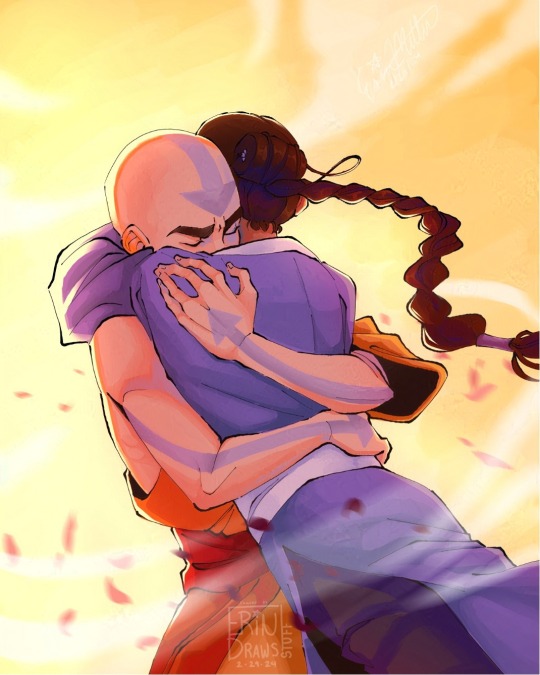
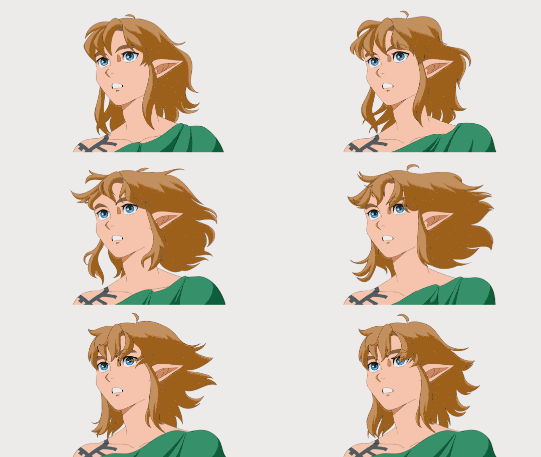
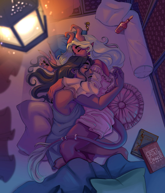
Check out more of Erin's work over at their Tumblr, @erindrawsstuff!
#meet the artist#meet the artist on tumblr#artists on tumblr#art#avatar the last airbender#atla#kataang#zelda#totk#link#erindrawsstuff
1K notes
·
View notes
Text
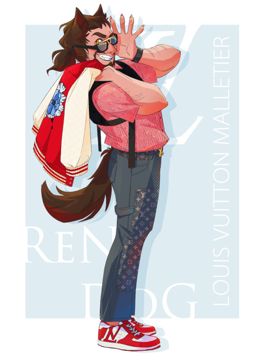
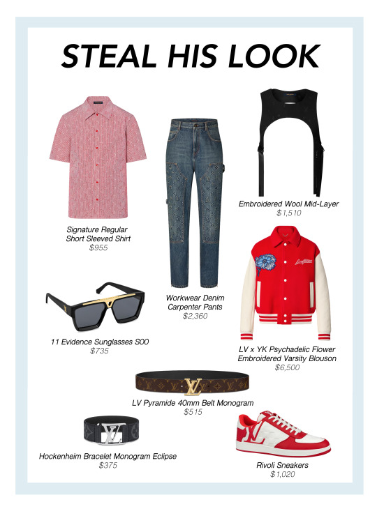
RenDog x Louis Vuitton
18/18 of LifeStyle: A Life Series Fashion Zine!!
-
Last, but most certainly not least, we have the Red King Mr. RenDiggityDog himself. I knew the instant I saw the reference for this pose that it would be what I use for Ren - the model had the perfect amount of charisma and attitude, and I think it fits him just perfectly. And before anyone asks, no, I didn't draw the pattern on his shirt by hand! I pulled it, and most of the repeating patterns for this whole series, directly from the item or brand site I was working with, to save time and my wrist (and my sanity).
-
(Click through for my Sappy Conclusions under the cut)
And with that (except for a special little bonus illustration vis a vis the unused Bdubs piece), we are finished with the LifeStyle zine. All 18 of the official pieces have been posted, almost exactly a year after I first saw a red shirt in the window display of an Armani store and started to compile a list of designers and brands on my phone notes app. The pieces are laid out here before you on my socials. A print copy of the zine sits on my bedroom shelf.
I really, truly could not have imagined the amount of love and support this community has poured out for these pieces. I am being 100% honest when I say I thought I'd be posting these into the void. Every single effusive tag, ever positive comment, and every single like means so much to me, from the bottom of my heart, especially for a project that was as passion driven as this one was for me.
This is the first time I can say that I've truly finished a long term project of mine, despite having ups and downs and stops and starts in between, and it feels surreal to be stepping away and calling it complete. But I also know that the community loved it just as much as I did, and it's made me even more passionate about wanting to make and do more moving ahead both for the MCYT and Life Series fandoms and far beyond, into my own original stories and crafts.
So here's to many more, for me and for all of you! Thank you so much for all your amazing support!!!!
#llsmp#trafficblr#third life#rendog#renthedog#louis vuitton#mcyt#illustration#digital art#fashion design#fanart#my art#queen.jpeg#traffic smp#lifestyle zine#im not crying i just put eyedrops in ૮ ⸝⸝o̴̶̷᷄ ·̭ o̴̶̷̥᷅⸝⸝ ྀིა⸝#i speak
477 notes
·
View notes
Text


A Poultry Piece Feathursday
Here are four hand-colored illustrations from A Poultry Piece written, illustrated, designed, and hand-printed in 1978 by Carol J. Blinn at her Warwick Press in Easthampton, Massachusetts, in an edition of 250 copies signed by the artist/printer. The book is a brief memoir of Blinn's time in Warwick, Massachusetts, "a picture post card New England town," and her most cherished memory of raising ducks and geese, particularly Pekin ducks: "It was not only the Pekins' beauty that attracted me, it was their cleverness." She writes:
Many years have passed since leaving Warwick and those ducks and geese behind. Living in Warwick enriched my life and I often yearn for another country home. . . . The building where I have my printing shop has a canal running behind it. Early in the morning I often see three sparkling white Peking ducks lazily swimming up the muddy water course. Standing quietly and watching, I hold my breath, secretly making believe they are mine.
Carol Blinn is among what we call the Pioneer Valley School artists. She apprenticed with the legendary master printer Harold McGrath at Leonard Baskin's Gehenna Press before beginning her own work as a printer, artist, paper decorator, and founding Warwick Press in 1973.
This book is dedicated to Blinn's friend Ron Masse who "helped share my anxieties & joys in the writing of this book. (What he actually did was egg me on.)" Our copy is another donation from the estate of our friend Dennis Bayuzick.
View posts on other Pioneer Valley artists.
View more Feathursday posts.
#Feathursday#Carol J. Blinn#Carol Blinn#A Poultry Piece#Warwick Press#Pioneer Valley School#Peking duck#American Peking#domestic ducks#ducks#letterpress printing#fine press books#Dennis Bayuzick#birds#birbs!
207 notes
·
View notes
Text
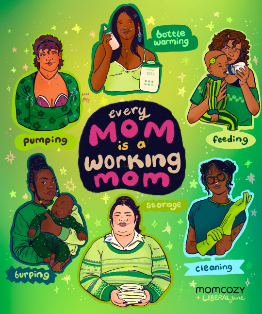
Reproductive labor is work -- typically designated to women -- that is required to sustain human life. It's unpaid, and is often invisible or unnoticed.
This includes tasks like cooking, cleaning, caring for children and more necessary to raise future generations. It's time to bring visibility to this labor, and acknowledge it for what it is: work. Far too many women and fems take on the bulk of household and domestic tasks in addition to having full time jobs -- also known as the 'second shift.' It's time to end gender inequality at home.
I was super excited to work with @Momcozy, who is working to provide comfort and companionship to parents from pregnancy through your child's early years. ❤️ parenthood is already hard enough, why not be comfy? their hands-free pump allow for on-the-go feeding and is designed with your body in mind.
There should be NO moral judgment given to how people choose to feed their children. Formula & chestfeeding are both valid. You have to do what’s best for you, your baby and your life
💚 Wanna try their products yourself? Momcozy is offering 10% off with code LIBERALJANE
* * Image description: Digital illustration of six parents doing different jobs related to chestfeeding. Around the circle shows, 'pumping, bottle warming, feeding, cleaning, storage and burping.' In the center there is text that reads, 'every mom is a working mom.'
#art#feminism#feminist#reproductive care#care workers#domestic work#unpaid labor#gender inequality#sponsored
383 notes
·
View notes
Note
Congratulations on your author debut, I'm so excited for your book!! 😇💕
Would you consider talking about the whole process of becoming a book illustrator /children's book author?
Thank you so much, I really appreciate it!! And I'd be happy to share the process!
It all started for me with my 3dTotal artbook. 3dTotal is a small publisher in the UK, and they mainly focus on collections of artists' work. They use Kickstarter to fund each book, and my agent (the amazing Seth Fishman at Gernert) discovered me through the Kickstarter for my artbook Windows to Worlds!
He asked if I had any interest in working on graphic novels or picture books, and I had already been thinking about picture books! He found me my first picture book project with Penguin Workshop, Mother of Sharks, written by the awesome Melissa Cristina Márquez, which came out last year!
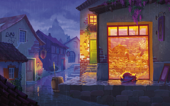
While I was working on Mother of Sharks, I was also talking with him about developing The Bakery Dragon, based of course on this painting, which was (and is) one of my proudest artistic moments.
For a little background on the painting, I painted it right after a really challenging couple of months medically - I was dealing with medical complications from my chronic illness for about 6 months, and I wasn't able to finish a single painting the whole time, I was just too exhausted from hospital visits and being in pain. That painting was the first piece I was able to actually complete (both emotionally and literally) in about half a year. So it always held a really special place in my heart, and I really wanted to keep living in that little world. I think there's something in it that is very special to me, about being outside in the cold, seeing warmth and love through a glass barrier, and wanting desperately to reach it.
With Seth's guidance, over a couple months, I developed a pitch for it. The script developed slowly alongside the designs for characters, locations, etc.
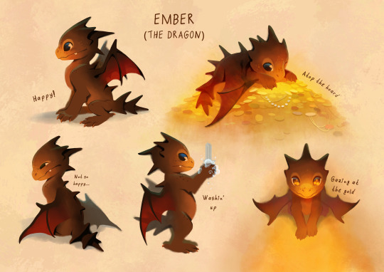
(Early version of Ember above! He has changed a bit!)
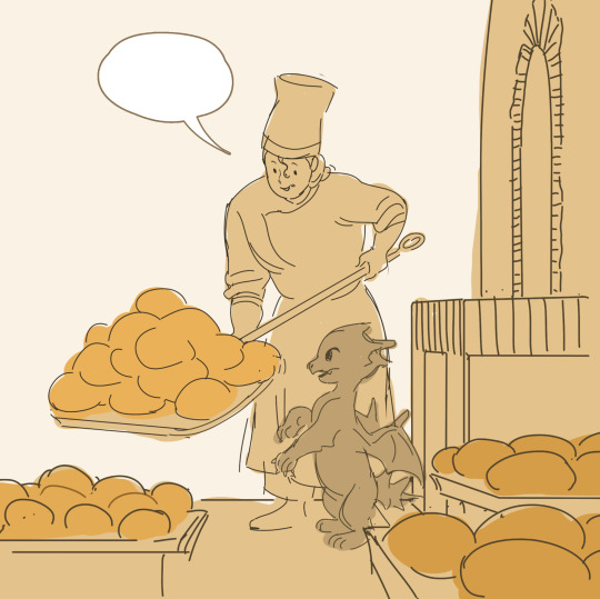
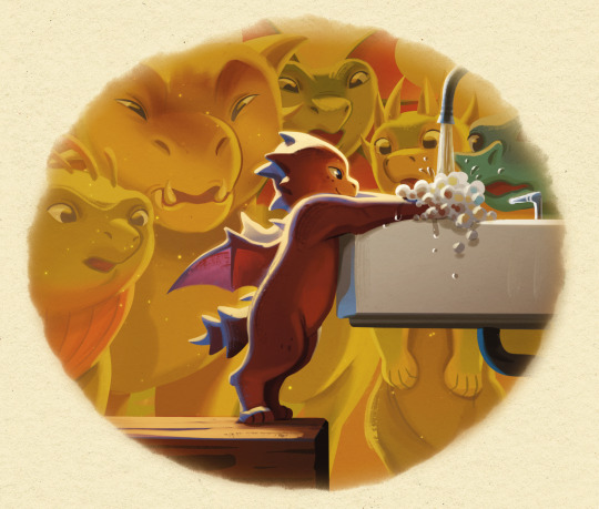
I thought I had already read a lot of picture books, I've always loved them, but I read hundreds and hundreds during this process. There is something uniquely fun and challenging about telling a complete narrative in 48 pages (which is already a long picture book, many are 32!) My book also pulls some elements from comics, such as speech bubbles, which I found to be incredible assets for humor and character development.
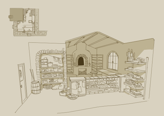
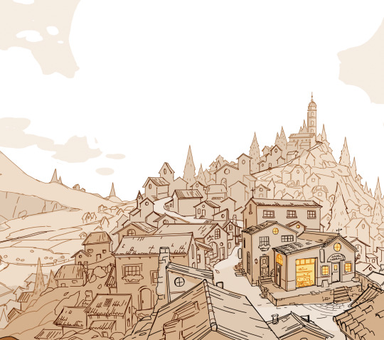
My pitch included designs, some early example spreads, and a rough script with story beats and jokes! My agent took it out into the world, and the publisher we ended up going forward with was Knopf, an imprint of Penguin Random House! I absolutely love the Knopf team and the beautiful books they put out! My editor, Katherine Harrison, really understood what I wanted to accomplish and has been so incredibly helpful in her guidance!
And from there... through rewrites, dialog adjustments, and lots and lots of drawings, it became a book! I'm happy to answer questions about the process! I'll leave you guys with a little preview from the interior of the book! (And of course you can pre-order it here, gotta learn the author skill of always including that link haha!)
592 notes
·
View notes
Note
Cactus fascinates me, does it run on code similar to an existing instruction set or is it completely original on that front?
What can you do with it? What's it's storage?
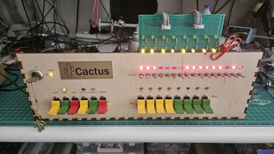
Both the Cactus (the original wooden prototype from years ago) and the new PCB Cactus(es) are essentially derived from a minimal 6502 computer design by Grant Searle for their core logic. Here's what that would look like on a breadboard:
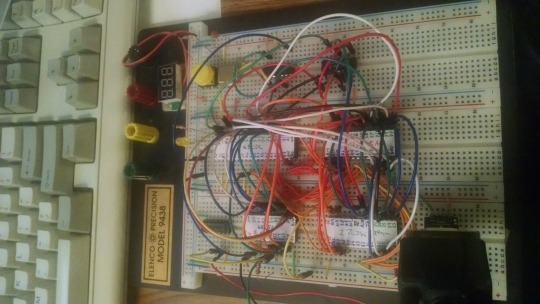
There isn't much to it, it's 32K of RAM, 16K of ROM containing Ohio Scientific's version of Microsoft BASIC, a 6850 ACIA for serial interaction, some logic gates, and of course a 6502 microprocessor (NMOS or CMOS, doesn't matter which). You hook it into a terminal and away you go.
Grant's design in turn can be best described as a distilled, modernized version of the OSI Challenger series of computers. Here's an OSI-400 and a Challenger 4P respectively:

The left one is a replica of the 400 circa 1976, also called the Superboard. It was affordable, endlessly reconfigurable and hackable, but ultimately very limited in capabilities. No BASIC, minimal monitor ROM you talk to over serial, but you could connect it to a bus to augment its features and turn it into a more powerful computer.
Whereas the OSI C4P on the right from about 1979 has more RAM, a video card, keyboard, BASIC built in, serial interface, cassette tape storage, and that's just the standard configuration. There was more room to expand and augment it to your needs inside the chassis (alot changed in 3 years for home computer users).
Grant's minimal 6502 design running OSI BASIC is a good starter project for hobbyists. I learned about the 6502's memory map decoding from his design. I modified and implemented his design on a separate cards that could connect to a larger backplane.
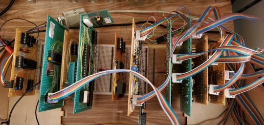
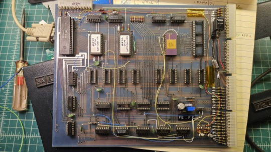
Here are the serial, ROM, RAM, and CPU cards respectively:
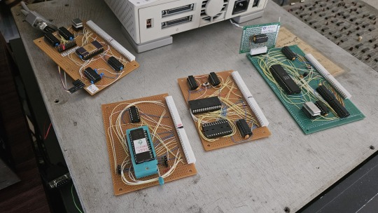
Each one is 100% custom, containing many modifications and fixes as I developed the design. However, that's only half of the computer.
I really wanted a 6502 machine with a front panel. People told me "nobody did that", or couldn't think of examples from the 1970s but that seemed really strange to me. Especially since I had evidence to the contrary in the form of the OSI-300:
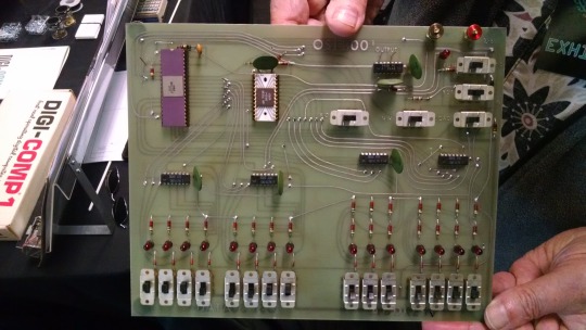
This one I saw at VCF West back in 2018 illustrates just how limited of a design it is. 128 bytes of RAM, no ROM, no serial -- just you, the CPU, and toggle switches and LEDs to learn the CPU. I was inspired the first time I saw one in 2015 at VCF East, which is probably when this whole project got set in motion.
Later that year I bought a kit for a miniature replica OSI-300 made by Christopher Bachman, and learned really quickly how limited the design philosophy for this particular front panel was. It was a major pain in the ass to use (to be clear, that's by OSI's choice, not any fault of Christopher in his implementation)

So... I designed my own. Took awhile, but that's the core of what the Cactus is: my attempt at experiencing the 1970s homebrew scene by building the computer I would have wanted at the time. Over half of the logic in the Cactus is just to run the front panel's state machine, so you can examine and modify the contents of memory without bothering the 6502. I added in all of the things I liked from more advanced front panels I had encountered, and designed it to my liking.
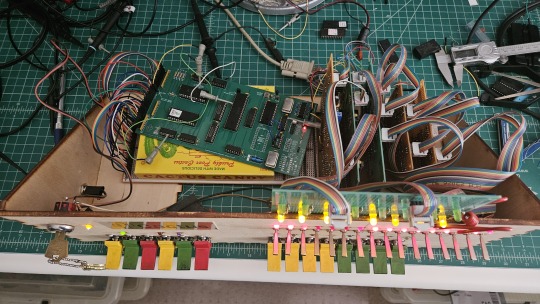
Here's the original front panel, accompanying logic, and backplane connected to the modern single board computer (SBC) version of the machine:
And here's the new Cactus SBC working with the new front panel PCB, which combines the logic, physical switch mountings, and cabling harnesses into a single printed circuit board.
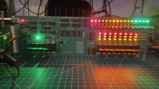
So, what can you do with it? Pretty much the same things I do already with other contemporary 1970s computers: play around in BASIC, fire up the occasional game, and tinker with it.
I've got no permanent storage designed for the Cactus as yet, it's been one of those "eventually" things. The good news is that a variety of software can be ported to the hardware without too much trouble for an experienced hobbyist. A friend of mine wrote a game called ZNEK in 6502 assembly which runs from a terminal:
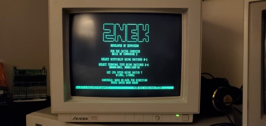
Right now, you have to either toggle in machine programs from the front panel from scratch, burn a custom ROM, or connect it to a serial terminal to gain access to its more advanced features:

Here's it booted into OSI BASIC, but I have also added in a modern descendant of Steve Wozniak's WOZMON software for when I need to do lower level debugging.
I've also got a video card now, based on the OSI-440. I have yet to implement a keyboard, or modify BASIC to use the video board instead of the serial connection. Even if I did, screen resolution is pretty limited at 24x24 characters on screen at once. Still, I'm working on that...
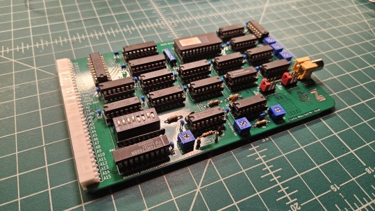

Anyway, I hope that answers your question. Check the tags below to see the whole process stretching back to 2017 if you're curious to learn more of the project's history. I'm also happy to answer any more questions you might have about the project.
268 notes
·
View notes
Text
so many of us haven't seen it
we don't encounter it, we can't imagine it, we can't get out of the tomb of apathy because we haven't seen the wonders just beyond their line of sight
I talk about this all the time, but it's because I think about it all the time
There are likely thousands of plants native to the area you live in, and chances are you have never even seen most of them, in your entire life.
Not even rare orchids that only bloom at midnight on a blood moon or some shit—regular flowers. Weeds. They have been systematically eliminated from every single place you ever set foot in, and you have to have a special hobby or line of work to ever even rest your eyes upon the flowers that used to bloom for no one on every hill, or in every valley, or beside every stream
There are a few hundred birds that live where I live. I have never seen most of them before. I have never seen a Kentucky Warbler, and I have lived in Kentucky for what...twenty years?
I have never seen a rosy maple moth. When I saw one on the internet, I didn't even think it was real.
I've become a deeply weird person over the past couple years. Tasting even a little bit of the Wonders changes you. I wouldn't have thought blue bees were real, or the fantastically rainbow-colored dogbane beetles.
I have seen the world beyond the wasteland, and that glimpse makes you crazy.
You or I may have never seen a truly mature tree. A fraction of a percent of the old growth forest of the Eastern USA remains. Once there were tulip poplars over 6 feet in diameter and sycamores well over 10 feet in diameter. Only a few remain, in secret locations. Imagine walking through a forest where the tree trunks are over 3-4 feet wide.
The forest where I work is 100 years old. That's a baby forest.
Knowing that, being aware of that, it's maddening.
Central Kentucky has disproportionately few endemic plants. Almost none. Central Kentucky was the first area west of the Appalachians settled by European colonizers. The Bluegrass was once described as having the most peculiar plant life anywhere in the East, but now, there are no species known that are unique to that area.
Colonization destroyed the canebrakes. (Did you know that we had vast forests of bamboo full of carnivorous plants?) The bamboo is barely hanging on. It destroyed the sycamores so enormous you could use the hollow center of one as a stable for animals. It introduced invasive grasses to feed cattle and horses. It destroyed the rich lush topsoil. Most of the ancient oaks were cut down or died when housing developments were built on top of their roots.
What happened to the endemic species, never recorded in books of herbs, never sketched by a European naturalist.
Either gone forever...or hiding in a sinkhole on a backroad somewhere, not even yet discovered.
So much has been lost for eternity. So much still could be lost.
Some days it's hard not to wail and scream. There are herbicides in your drinking water. When you spread honey on toast, you likely also spread neonicotinoid pesticides, which testing has confirmed to be present in something like 45% of honey. In many areas, insects are immersed in the presence of chemicals designed to kill them in every drop of water, every leaf, every square inch of soil.
When games, animations, and illustrations envision the outdoors, they cover the ground with a short, uniform carpet of green, because that is what we see, no matter where we go: turfgrass cut by a lawn mower. Where I live, there are no natural environments that resemble this, remotely. The closest thing we have to turf-forming grass is our wealth of native sedges, most of which are rare or endangered.
I talked to a man who had devoted his life to studying the American bamboo, Arundinaria gigantea, and he had never seen a canebrake larger than 200x500 feet. Canebrakes once covered ten million acres, and now the bamboo exists in short, straggly clumps instead of dense bamboo forests up to 40 feet tall.
I want to cry and scream. The grief will tear me to pieces. I live in a post-apocalyptic wasteland, surrounded by people who can't even grieve, because they have been so completely severed from everything that was lost that they don't even know it was real.
It hurts. It hurts, and we have to live with it. It hurts, and the grief is all-consuming.
There is the agony, and there are the Wonders. Both are true at the same time. It is because nothing around us is standing still; everything in nature is always moving, iterating, becoming. Something is pulling and nudging at our species, urging us to move, to iterate, to become.
So much has been lost. Even more is not lost.
The trees, the bamboo, the sedges, the Kentucky warblers and rosy maple moths.
They are not lost. We are lost.
This is the hard part. The grief is hard, but this is somehow harder for us. We are lost, and it is time to come home.
Not to a physical place, but to a way of living: interconnected, mutualistic, interdependent. Symbiosis. In the forest, no one is separate from anyone else, everyone is linked and dependent on the community. Trees help each other, they support each other, they protect and shelter and feed one another and all living things, and together they are a forest. I don't really consider myself religious, but I have to reserve something in my head for how it felt to realize what Forest was.
When I noticed the little plants popping up in the sidewalk cracks and gravel paths, the tough weeds holding on in the lawns and pavement, something in my brain began to change dramatically and permanently.
They're still here. The trees. Even in the pavement and lawns. The dandelions have come, adapting rapidly, helping the bees hold on. The wildflower seeds are still sprouting in this depleted ground. Waiting for us to recognize them. Life is everywhere. The Forest is everywhere. It felt like they were waiting. We're here. We have not abandoned you. We are resilience, persistence, survival, adaptation. This is not death. This is Chaos. Come home. Come home. Come home.
I saved little plants from the roadside and tended them in plastic cups. I didn't think it would work. I don't know why I tried. I was acting as something bigger than only myself, responding to a call that moves throughout all of nature. But they survived, and growing and tending to my little plants and trees, I—understood.
I don't know if I believe in God, but I believe in Something, whatever it was that seemed to whisper like a secret: Welcome home, Caretaker.
And honestly, truth shone through then from relics of religion I hadn't touched in ages; God put Adam in a garden, not a suburb, a mall, or a Walmart. This is who you are. Not a Consumer, but a Caretaker.
And when the threat of the Flood loomed, God told Noah to start building a fucking boat.
In ecology, the plants we know as "weeds" are pioneer species: the first species to return to an area after a natural disaster or mass extinction. They survive in the harshest conditions, and prepare the land for regeneration. This is who you must become.
Look to the Dandelion—in just a few hundred years on this continent, Dandelion has risen to the highest calling of a Weed: first survive where the others can't, and then help the others survive. If the human species is to survive, you must be a weed species. You must adapt relentlessly, resist eradication, and protect and nurture other life forms by your very nature. You must be tough as nails, and make the world a gentler place through your survival.
Have you heard the saying that grief is love with no place to go?
That's the hard part.
We must grieve, but it is not yet time to grieve. It is time to love.
2K notes
·
View notes
Note
As someone who only recently got properly into Magic this year my stance on the recent UB Standard legality is that so long as the mechanics are good, fun to play, and work well with the other Standard legal sets then I don't particularly care if Final Fantasy is legal.
But.
There is something about the Marvel Universe being Standard Legal that feels off. Final Fantasy shares many aesthetic and gameplay similarities to Magic that make it slide into the general ecosystem better from a Look/Feel perspective. Meanwhile, as much of a Spider-Man fan as I am, it is going to be incredibly weird seeing Peter Parker or Miles Morales face off against the critters of Bloomburrow, even more than Thunder Junction or Duskmourn do.
I will attend the Final Fantasy and Spider-Man prereleases because I love playing Magic and I am interested in both sets, but I cannot shake the feeling that this decision makes the overall play experience strange, especially since SIX Standard sets of a year is way overdoing it (maybe 3 In-Universe sets and 1 UB set would be a better balance?)
I understand the decision from a logical standpoint but the emotional reaction to Magic losing some of its Qualia is something that I can't ignore
I have read many of the responses to my request for emotional responses yesterday (I will continue reading - there are just a lot of people sharing). A common through line is the feeling of loss, that the decisions we’ve been making are taking things away from them.
So, I wanted to take a moment to talk about something that I believe Universes Beyond is adding to the game. I’m not talking about value to other people that aren’t you, but something that is upside to the enfranchised players that are the backbone of the game.
As I’m head designer, my focus is on mechanics and the core gameplay experience of playing the game. Universes Beyond has been a bolt of energy for the design of the game.
Because so many of you are sharing personal stories, I’ll use my own experiences as a way to illustrate my point.
One day, when I was seven or eight, I woke up and went downstairs to see that my Dad had bought me a comic book and left it out on the counter for me as a surprise. It was Spider-Man.
I must have read that comic ten times. It was the start of a life long love of comic books. I’m not quite sure why the superhero genre, in particular, spoke to me so strongly, but it did.
As a teenager I was a bit of an outcast, and when I stumbled upon the X-Men, it felt like a story that was core to my lived experience. I too was an outsider, but out there were people like me and if I could find those people, we could bond over our similarities.
I enjoy designing Magic. I mean really, really enjoy designing Magic. I don’t throw around the term “dream job” lightly. It is truly a lifelong passion. I spend so much time writing about it because it is something that brings me so much joy, and there is a desire to share that joy with others, my found family that shares my similarities.
Designing Marvel cards has been electrifying. I have spent years mastering the art of Magic design. Getting to combine that with my love of Marvel characters has been inspirational. It has inspired to make designs I would have never thought of.
It has pushed me in directions I couldn’t have predicted and resulted in designs that tickle both my inner Mel and Vorthoses.
And it hasn’t just affected my own designs. I have given more notes on card designs than I have in my twenty nine years at Wizards.
For example, the amount of back and forth with Aaron who designed the five Secret Lair cards we recently revealed at New York ComicCon was exhaustive. He and I have long bonded over our shared love of Marvel, so getting to translate that into Magic with him has been amazing.
And each Universes Beyond product we’re making has people as equally passionate about that property.
My point is from purely a design perspective, Universes Beyond has had huge dividends. It has inspired us to make fresh new designs. It has sparked creativity. We are making awesome card designs, mechanics, themes, and sets, things that most likely wouldn’t have come into existence otherwise.
The passion that beloved characters and worlds has inspired in us is translated into amazing Magic design, something that will make the act of playing Magic better for anyone who enjoys the nuts and bolts of the raw gameplay of Magic.
135 notes
·
View notes
Text
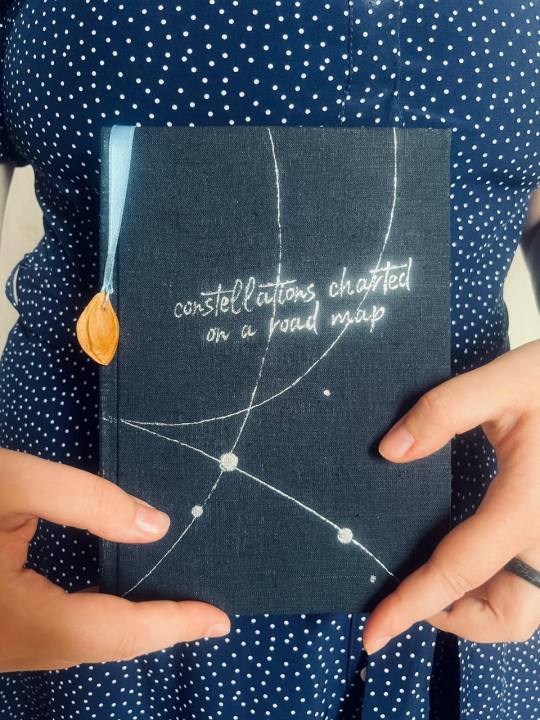
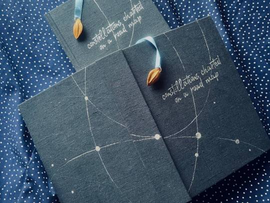
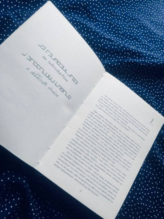
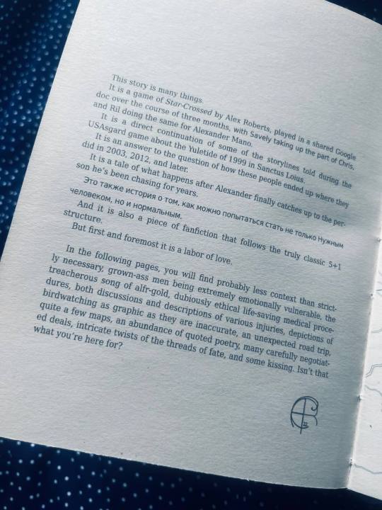

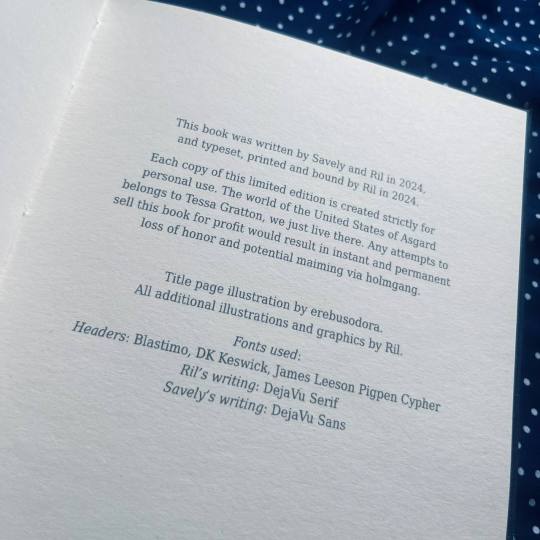
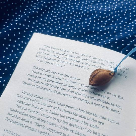
These past months I’ve not been dead, but rather multitasking (making author’s copies of books I’ve bound previously to send a box of them to the US, experiencing a severe depressive episode, and also, working on this!). And now: Behold, the best fucking thing I’ve made in my life so far! ✨
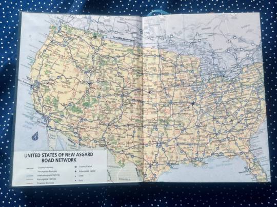
These two books are basically step-fanfiction, or maybe fanfiction times two, seeing as it's the story (co-athored by my darling spouse and I) featuring NPCs from our long and passionate TTRPG campaign (played in the setting of Tessa Gratton’s United States of Asgard). Do not be fooled by the books’ papery appearance, they are primarily made from my heart’s blood and tears.
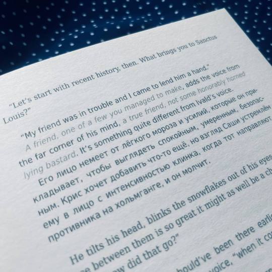
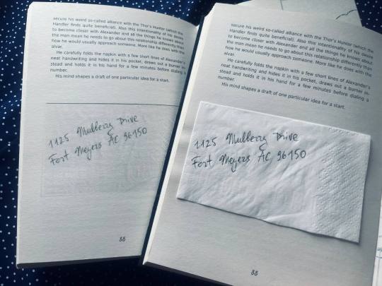
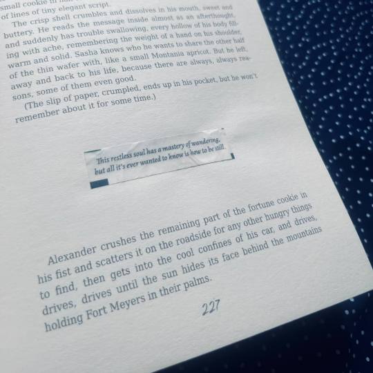
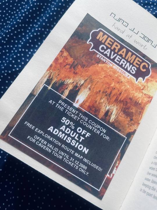
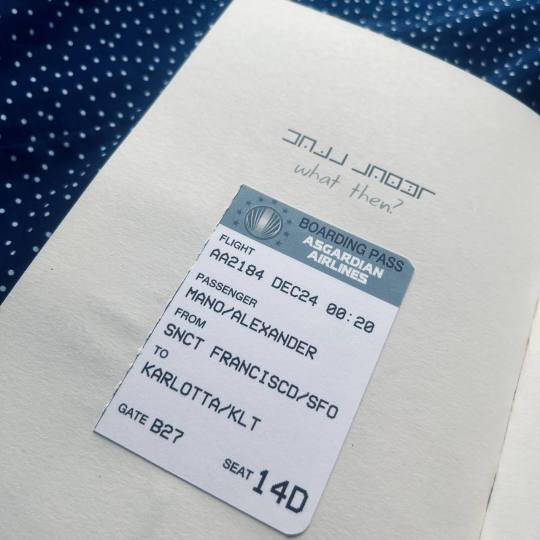
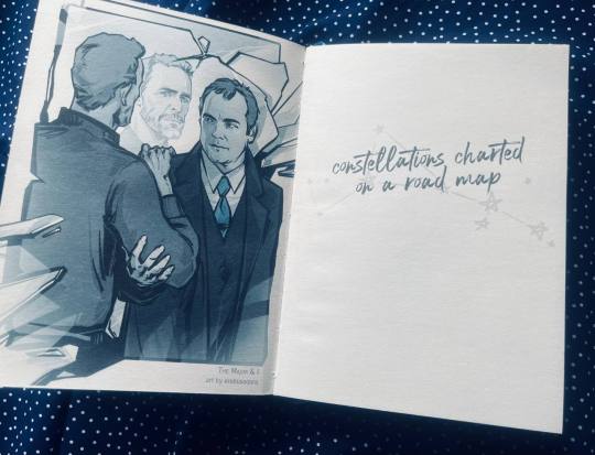
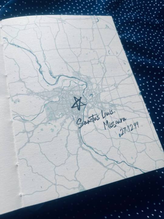
🌟 The story takes place in 6 (ish) locations over the course of a year (and that year is 2000, which is why people are still into paper maps), with one of the protagonists being very fond of various maps and the other keeping his notes in a Pigpen-style cypher, which informed a lot of design decisions. The constellation (featured on the cover and on the title page) is formed of all the mentioned locations as marked on the road map (which I stitched from two pictures and painstakingly edited all the state names, some borders etc etc to replace the actual US names with the ones Tessa mentioned in her books and some that we came up with as the need arose). Every chapter starts with an additional map, marking the location and date, and with coded (and decoded) prompts from the Star-Crossed TTRPG that we used for inspiration.
🌟 It’s a bit of a tradition that spouse and I use different fonts when writing together, with their usual font being Arial and mine (surprising absolutely no one) Georgia, but for this I wanted a more matching pair of sans/serif fonts, so the body text fonts are DejaVu Condensed.
🌟 The title page illustration is by the fantastic @erebus0dora (my request was basically that I wanted it to look like one of the Bridgerton promo posters but less glossy, and oh, they delivered! The Major & I (referencing, of course, The Duke & I) is a joke name for the hypothetical crack version of this book where every chapter ends with “And then they fucked.”) When we finish the definitive edition (with many deleted scenes and other bonus content), it is also going to be on the dust jacket.
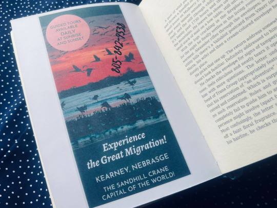
🌟 All additional illustrations are ephemera that I made for the story, added as extra-illustrations in my copy, and as scanned images in the spouse’s copy.
🌟 The bookmark charms are actual (plot relevant, of course) apricot pits, sanded, polished and waxed by hand.
#mythril thread books#amber family manufacture#bookbinding#fanbinding#ficbinding#ttrpg#the united states of asgard#gods of new asgard
156 notes
·
View notes
Note
What all roleplaying games have you worked on?
I'll try to name them all here but there are a lot and some of them are pretty small so I may miss a few by accident.
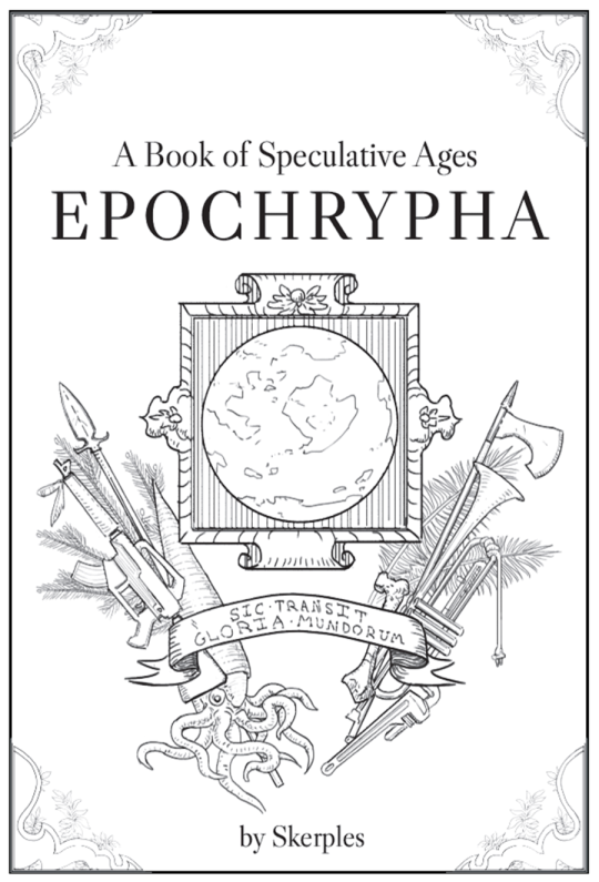
Epochrypha (2018) by Skerples was both the first piece of paid work I did and also the first game supplement I worked on. This is so old I was still inking digitally.
I also provided illustrations for Magical Industrial Revolution and The Monster Overhaul by the same author.
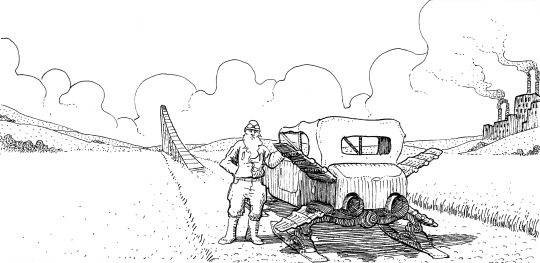

Monster Overhaul was neat because I did interior illustrations in early 2020 but didn't do the cover until 2022 so you can see quite a stylistic evolution.
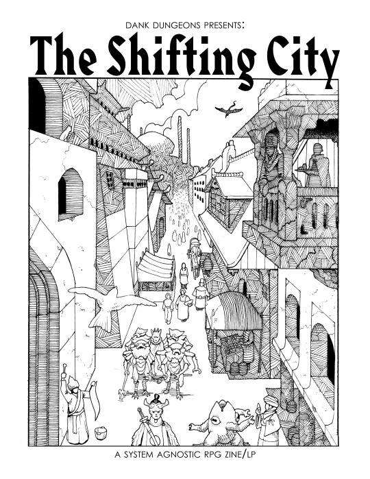
From 2018 to 2020 things were pretty quiet for me until I worked on The Shifting City by Dank Dungeons. People really liked the cover for some reason and that basically created a career for me. I still get people asking me to basically recreate this cover a few times a year:
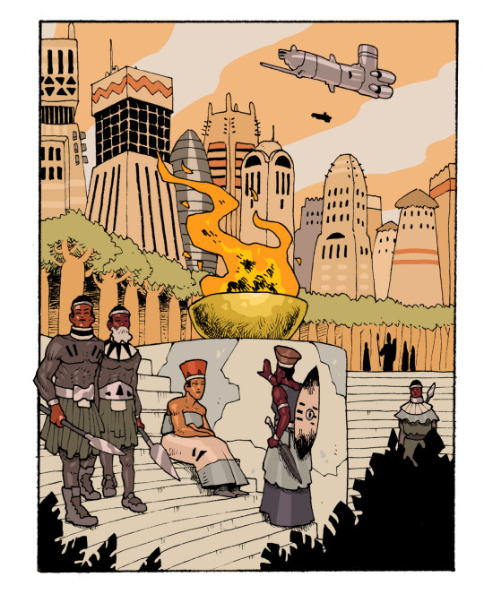
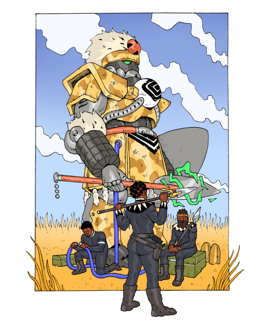
I did a handful of illustrations from 2020 to 2022ish for Ukuwa Station that ended up in The Field Guide to Mfecane, a third party afrofuturist Lancer expansion.
Our Vale of Discontent was a small game I worked on in 2020:
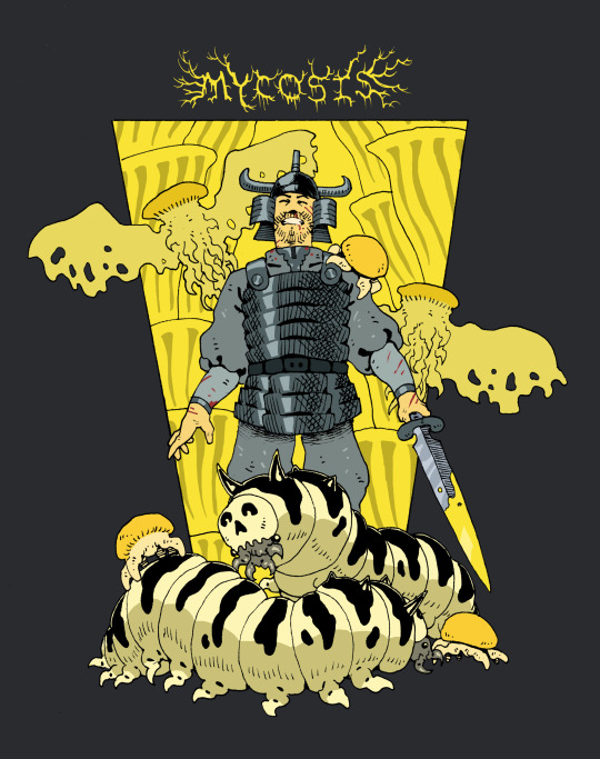
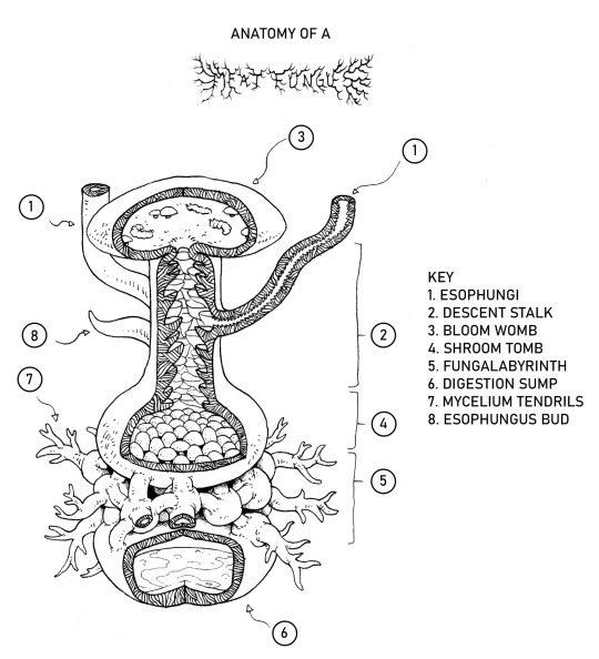
Mycosis is a Mork Borg dungeon I worked on around this time, which notably marked my first attempt at doing some goofy black metal title font.
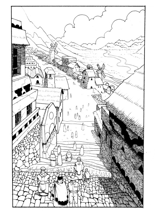
I did most of my illustration work for Desert Moon of Karth by Joel Hines in late 2020 and early 2021:
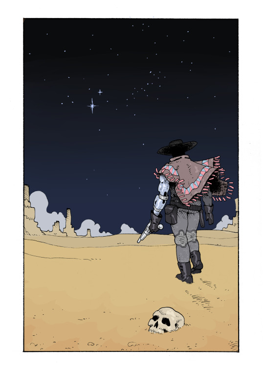
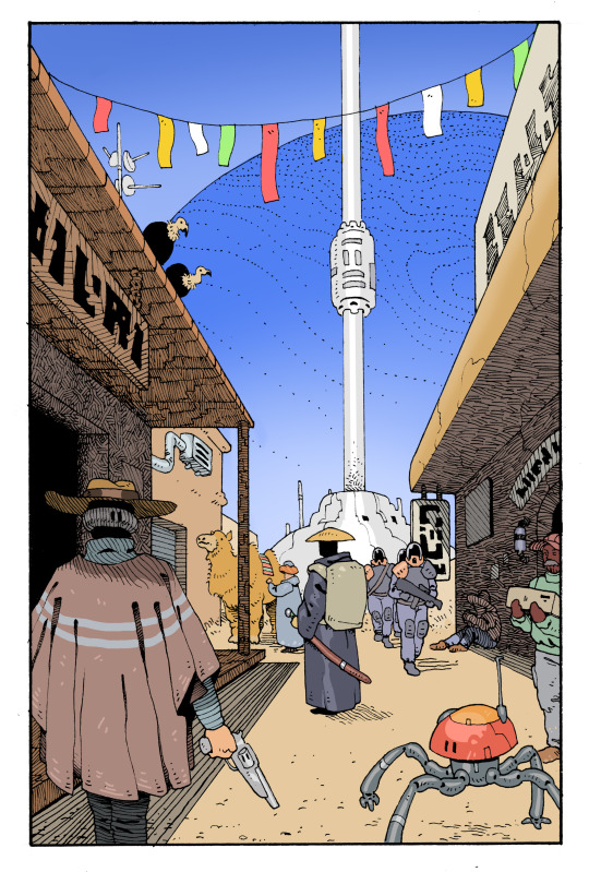
The sequel, Tide World of Mani is still being worked on. I just finished my last interior illustrations for it a month or two ago.
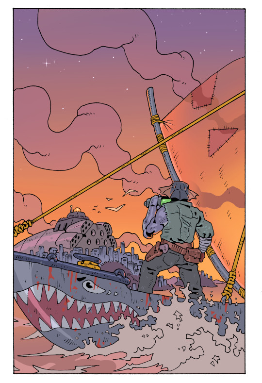
AZAG by Dank Dungeons was a game I worked on throughout 2021 that was a blast and I think more people should know about.
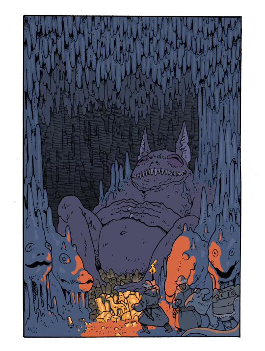
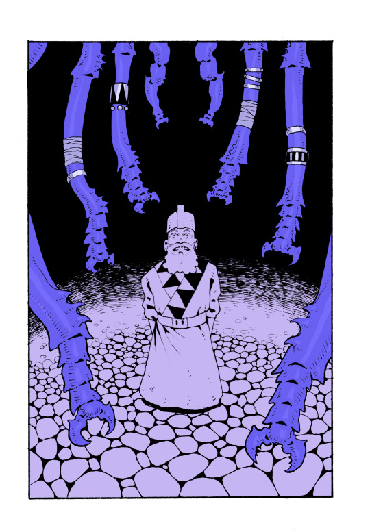
At some point in 2021 I did a bunch of pieces for Lore & Legacy although I don't remember exactly when. These never got posted but the book's been out for a while now so maybe I'll show them off later.

Late in 2021 was when I started doing illustrations for The Electrum Archive by Emiel Boven (I think issue 2 is out soon).
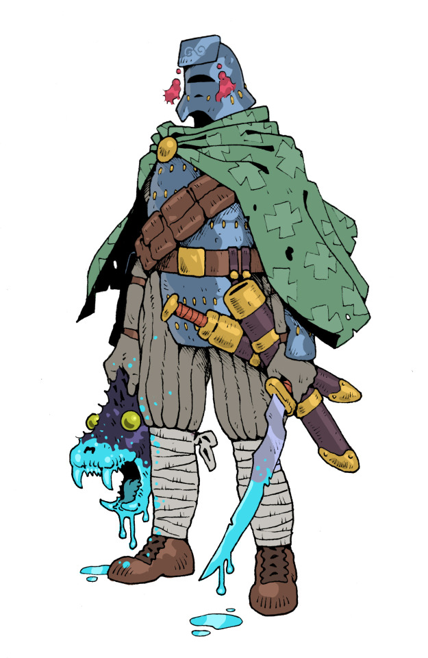
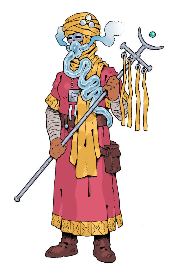
Early 2022 I did a bunch of character illustrations for some Victorian horror fantasy game that I don't think ever actually came out (commissioner never responded to me when I asked about it at least) which is a shame because I'm proud of these. At least I got paid!
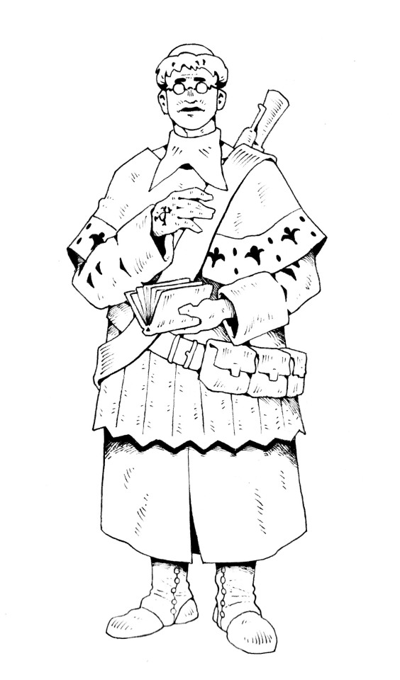
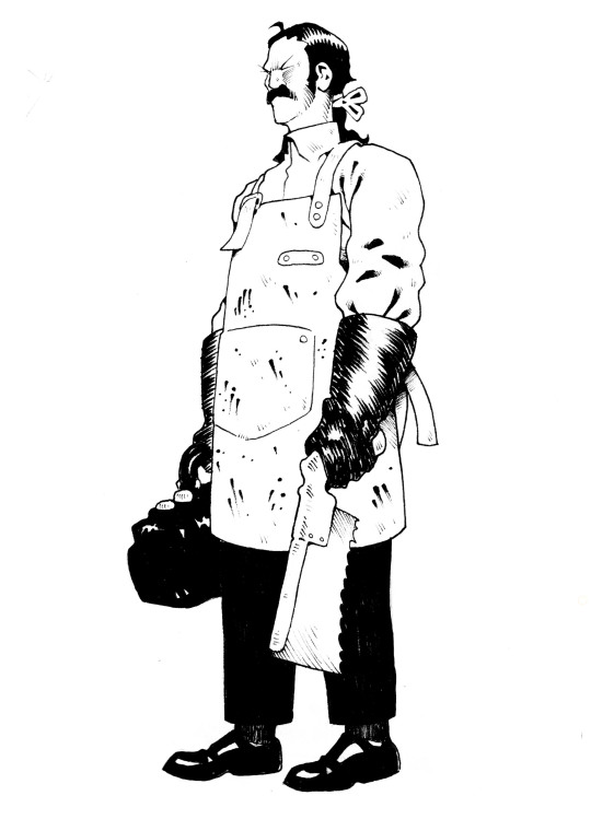
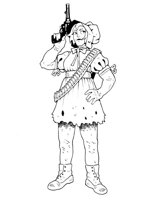
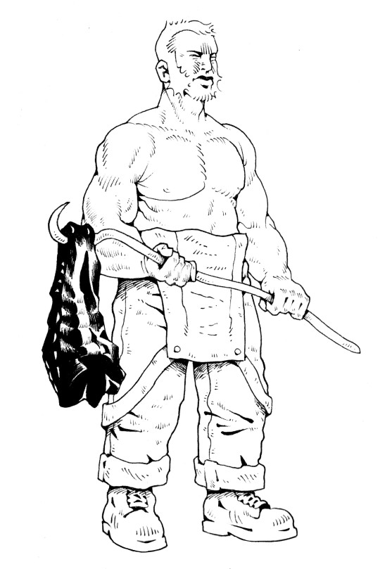
This was another one for a game that I don't think ever came out:
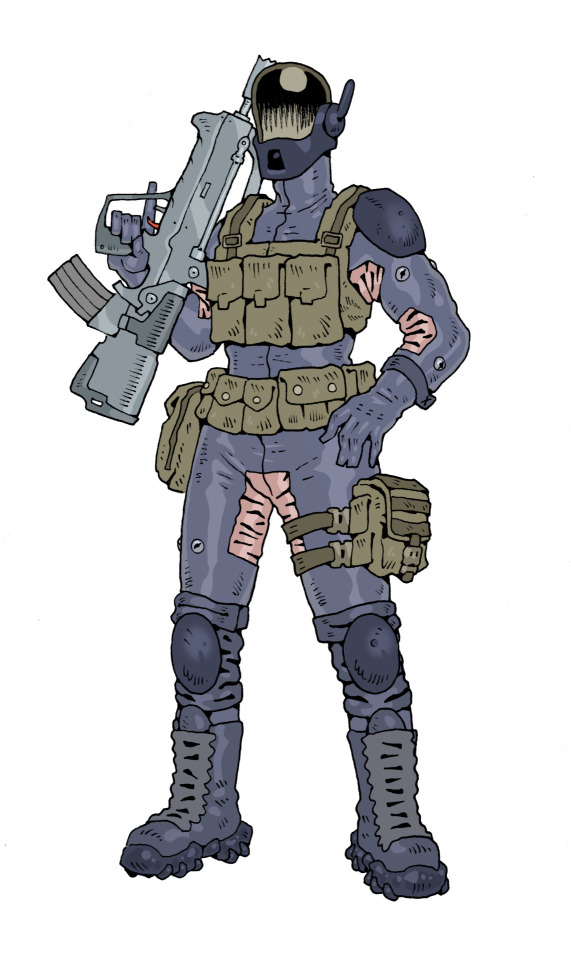
I did character designs for Nebula Chaos by Polyhedra Games in 2022:
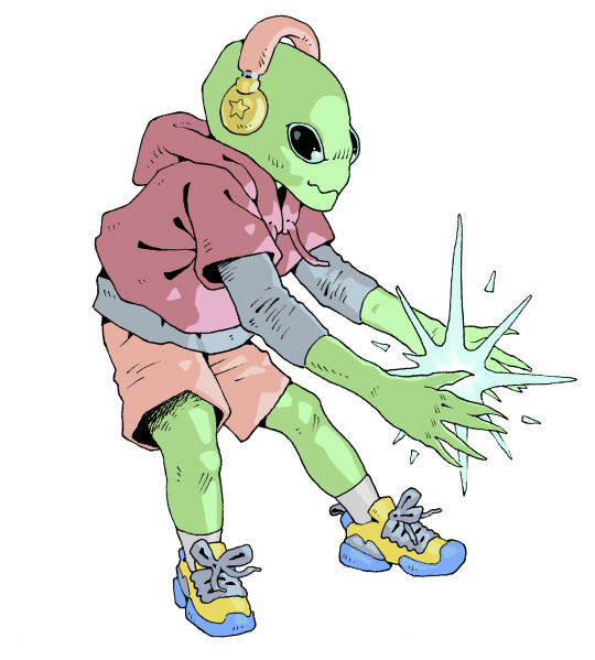

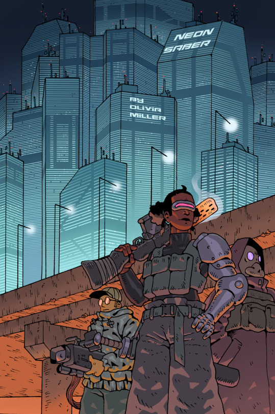
Then Neon Saber by Olivia Miller
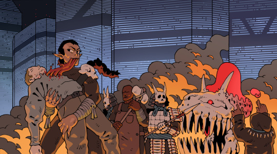
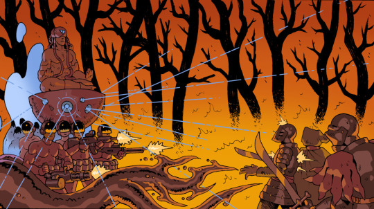
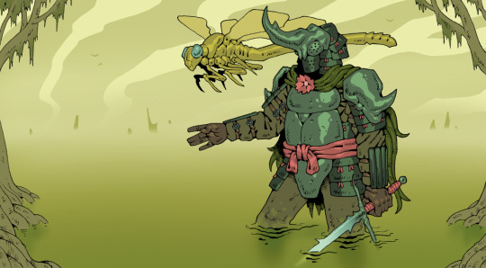
Then some pieces for If Worlds Collide:
Then Critters & Companions by Pearse Anderson:
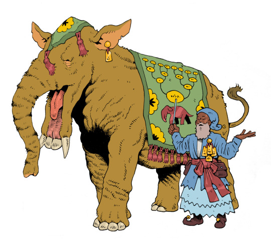
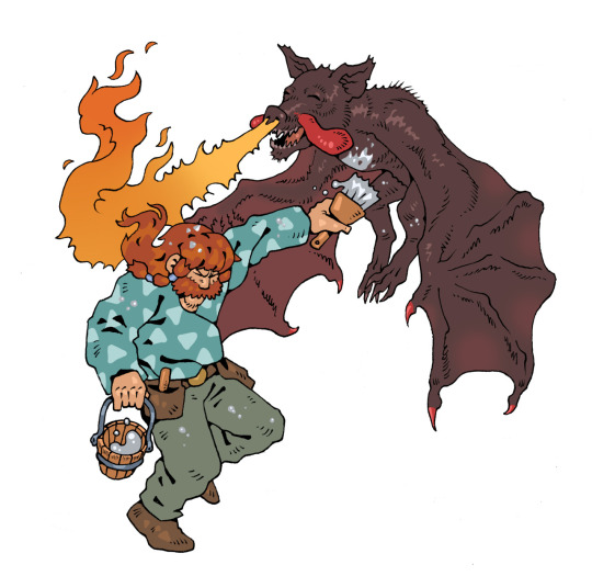
Ran out of space for images, I'll finish this in part 2...
517 notes
·
View notes
Text
“Arknights/Limbus Company/etc is obviously very political, why are these incels playing it?” Here’s a longer answer if you’re interested.
If you haven’t been watching gacha communities for the past decade this might be confusing to you, but these guys see the games as just apolitical stories with a majority or all-female cast being there to titillate the male viewer. They are for his consumption. It’s why in both eastern and western “gacha game” communities you can see them talking about how these games are better for having “beautiful” anime women versus the hideous hags of western media. I’ve seen so many people asking “how are incels playing a game with so many strong female characters?” They see them not as “strong female” characters but rather “eyecandy made for me”. tbh when it comes down to it I wouldn’t call any of the designs in these games absolutely groundbreaking for the anime genre they’re aiming for. Arknights even follows the standard “fully animal faced-guy” and the female equivalent “small featured anime animal girl with some fur”. This doesn’t mean the designs are bad or you’re foolish for enjoying them of course, there are a lot of fun ones. Anyway, you can see the same sentiment in the majority of anime communities as well. Like do you think that stereotype of an anime nerd who “loves 2D women but hates 3D women” means he’s a feminist because the 2D girl is still female?
To be frank, after some of the actions taken by these companies (ex. the firing of women for posting anything vaguely feminist) can you honestly say an “apolitical game with anime babes” is not the way the games are often enjoyed? The company Yostar who publishes Arknights in Korea literally wrote a statement saying the game is apolitical and calling feminism a dividing force. If the publisher can say something so flippantly like this just to appease their incel fanbase, how can the game be making any meaningful, hardline progressive political statements? I am of course not saying this renders any positive message you get from these games moot nor am I saying it’s impossible for the writers to be passionate about their work, I’m just relaying the thoughts of the incels/“gacha gamers” playing them because there seems to be confusion. What I’m writing here doesn’t mean the worst interpretation of these games are their defining interpretations. I’m trying to explain how the games that many people see as being antithetical to incel beliefs can have these same men as high-spending fans.
Gacha games are unique in the world of consumer media in their extremely close and constant relationship with the consumer. You have to not only love each character’s design (and sometimes story) but also be willing to drop serious gambling money to “buy” them every single month. It’s like merchandizing on steroids. I think the term “whale” has been watered down since younger kids have started playing, but these people spend thousands per patch. Over the years I’ve heard about multiple games like this being sustained by just a couple of high spenders. In 2018 there was even a western news article about a man who had spent $70k+ on FGO. The publisher can’t rock the boat too much to displease the consumer too many times without risking EoS. Every character design and story of a gacha game is affected by this FIRST while any artistic intent comes second.
A Korean woman who had lost her job due to similar “feminist hunting” tactics wrote an article describing the way these incel men think. I posted it here and part of it summarized: the men that play these games see themselves as buying and “owning” the female characters in gacha games, who are often dressed and presented to them in a highly sexualized manner and will obey their commands. In the same way they “own” these 2D women, they also want to own the thoughts of the real live female illustrators who work on the games. Therefore, if these women have expressed ideas that the male gamers find upsetting, they will be angry she doesn’t conform to what they want like the servile 2D girl and do everything to get her fired (this is where she mentions Limbus Company as the most recent example of this happening).
You can argue for some of these games, maybe the girls aren’t dressed super provocatively and give (you) shit instead of being a simpering doll, but in the end it’s not like they can physically walk away or stop speaking to you. For the “waifu” hunter guy it’s just a different type of anime girl to collect.
The stories in these games are generally not what gets targeted as much by incels. In gacha “gamer” communities, especially the Korean incel ones, their main concerns are: how revealing are the summer swimsuits? How many women work for the company designing characters? and related, Are the male characters designed for women or for men and do they “look gay”? If you search through this blog, you can see them directly speaking about these things in regards to their hatred of Genshin Impact and Star Rail. All of these have also been encapsulated in the original Limbus Company incel attack: they hated that the summer female character looked more “clothed” (wearing a skintight suit instead of a bikini) than the male summer character. They thought the collar necklace and open shirt on the male summer character meant he was “a slave” for the female viewers, so obviously it was designed by a woman. When they learned a man designed and illustrated those characters, they searched to find a female illustrator who worked in the game and went after her instead. These guys WERE FANS that played the game beforehand and didn’t think anything in the story was upsetting enough to attack the company about. They were familiar enough with the works of Project Moon to name their little group after an antagonizing force in one of PM’s previous (non-gacha) videogames. And Project Moon saw them as such a significant part of their gacha fanbase that they wrote an immediate apology and fired the artist. How do these actions in reality inform their fiction and the interpretation of it? Getting this out of the way, they were NOT in any danger, the “fans” were not clamoring to get in their offices or camping outside, they were let in and calmly had a meeting with some employees at the office. You can still find photos of them goofing around, the ridiculous write up they brought with them and a transcript of the conversation. This was not a “guy shows up at Mihoyo’s offices with a knife” situation. In the end it was a financial and moral loss for the studio with many new and longtime fans completely dropping the games and Limbus Company taking one of the biggest financial and D/MAU drops for a gacha I’ve ever seen. You can read more regarding the ramifications of this here, this post is already pretty long for this website anyway.
Again I’m not writing this to shame anyone who plays these games, loves their characters or enjoys their stories. I don’t really care either way, and I obviously find the genre interesting or else I wouldn’t have been monitoring it and the fans for a decade. I just want to shine a light on the thoughts of the more “incel” gamers that play some of these games since I have seen a lot of genuine confusion as to why they would play them. In the future my aim is to write a more in-depth post about these issues, their history and the way antifeminists think.
#Arknights#yostar#hypergryph#project moon#limbus company#Genshin impact#long post#korean incel#incel ideology#gacha#fate grand order#fgo
545 notes
·
View notes
Text
I have a headcannon that it was Peeta's mother who used to decorate the bakery's cakes before him.
She learned it as soon as she married the baker, and is kinda good at it.
Maybe that's why she's so picky about the cakes Peeta makes. "If I had done it..." is what she always says when is about to criticize him. But the truth is that the boy is so good that it's difficult to find something in his cakes to complain.
Peeta took his mother's artistic essence. She is good at crafts, always painting the bakery sign with elegant calligraphy, decorate them with flower designs.
Mrs. Mellark would be a good artist if it weren’t for her complete lack of imagination. For her the books are nonsense, and the illustrations are children’s drawings.
That’s why she didn’t let Peeta draw too much when he was growing up. “go do something useful.” She said “You will not learn to knead bread making doodles.”
She never wanted to be a baker, she never wanted the life she chose, but she knew it was the only way. Her father was a drunk, her mother was neurotic
She didn't choose her husband out of love. She chose him because he was stable, because he was disciplined, because he could be a good father. She didn't have children because she wanted to be a mother, but because she needed more hands to work.
The first was planned, the second tolerated, the third an accident.
After the games, when Peeta returned home, limping and with deep-set eyes. She went to visit him a few times in the victors village.
Peeta's house wasn't organized like she taught him to leave his room. Was a mess. His room was full of pages with scribbles, tubes of paint amd unfinished paintings. Art and more art, everywhere... Mrs. Mellark didn't even know that her son still painted. After he became a teenager, was good at hiding who he really was from his mother. She never saw him draw again, but the truth is that the little artist she tried to repress so much never stopped drawing.
Drawings of landscapes and places, many doodles from the small bakery where he grew up. Drawings of people, neighbors, customers, many drawings of the hunting girl. Peeta paints her much better than she really looks, without marks, without scars, without the frown she has. For Mrs. Mellark, it's just another sign of the madness her son has fallen into.
To the woman’s surprise, she find some drawings of herself, all unfinished. Peeta always seems to stop drawing when he get on her face. Lots and lots of unbedded scribbles of herself. She has always preferred to be feared than loved, to be the tough guy when her soft husband doesn’t have the courage to discipline his children. But it pains her to see that her husband’s drawings at least had the decency to be finished before being thrown into the pile of forgotten scribbles.
Peeta. Her youngest boy. Weak like his father, sentimental, scared, soft. She was perhaps a little heavy on him growing up. She saw how very fragile he was when he was little. He wasn't like his brothers, Peeta was always an outsider. And she always saw that... So she doesn't even try to scold him for the mess in his house.
After he came back to the games she could only see in him the small, scared boy who always tried to hide under her skirt when he was young. And with that memory, comes all the times she pushed him away and told him to become a man. That a six-year-old boy shouldn't cry like a soft girl.
But Mrs. Mellark regrets nothing, even if the memories make her uncomfortable. Was because of that he won the Hunger Games. She taught him to endure, she turned the weak boy into a grown man. She never apologized for that, even though her son hates her forever.
She didn't visit him much in the victor's village, but one of the few times she did, Peeta thought she would fill him with complaints about the dirty house. But she just does said:
"It's not because you're crippled that you have to stay inside this house all day, go sunbathe and open the curtains." And then she left a fresh loaf of bread on the kitchen table and when home.
That was it.
One of the last interactions Peeta had with his mother before she died. Buried under the rubble of the bakery that she fought her entire life to maintain, with the children she raised to become respectable bakers. Men enough to take care of their wives and children. Everything she fought for her entire life was left in ashes and the only one of the boys left was the one she never thought would prosper.
Peeta misses her sometimes.
He thinks his eldest daughter looks like her grandmother a bit. Big blue eyes and dimples on her cheeks. He sometimes thinks he even forgives his mom, not all the time, but sometimes. Peeta misses her discipline and resilience. Sometimes he wants to hear her voice telling him to stop whining and come back with his head held high.
Perhaps the only lesson she taught him and stuck with him until the end is that the Mellarks never give up. Every morning, they wake up early, turn on the oven and work until sunset. That the Mellarks are never content with little, that they never accept mediocrity.
So he teaches his children to lift their heads after a defeat, to try again after they fail. Because The Mellarks never give up.
#the hunger games#sorry for the typos#I cried a little writing this#peeta mellark#headcanon#mrs. mellark#mommy issues#thg#character essay
259 notes
·
View notes