#I was thinking today about how artists develop a voice in every medium
Explore tagged Tumblr posts
Text
The Sims 4 Paranormal Stuff: Developer Blog (Part 1)
SimGuruConnor has released part 1 of the Sims 4 Paranormal Developer Blog series.

Hello Simmers! Welcome to a small 2-part Dev Blog about our newest Stuff Pack, Paranormal Stuff! This pack has been an absolute blast to work on, and I’m excited to share what this pack is all about!
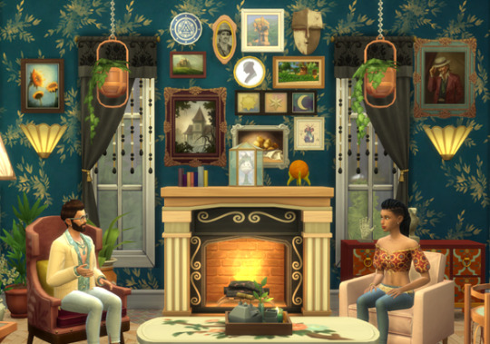
I’ll try not to reveal too many spoilers for the pack either, so I’ll keep things somewhat brief. Our topics for today are the new Scared Mood and the Haunted House Lot Type, plus an interview with our Audio Artist too!
Get Scared
Sims can now relish in the mortal dread of the Scared Mood! The Scared Mood affects Sims in a variety of ways, with my personal favorite, the new Scream Incoherently interaction, where a Scared Sim runs up to another Sim to scream their lungs out. This can result in the other Sim calming down the Scared Sim, or resulting in both Sims becoming Scared. This can create a Scared Mood wildfire if you’re not careful!
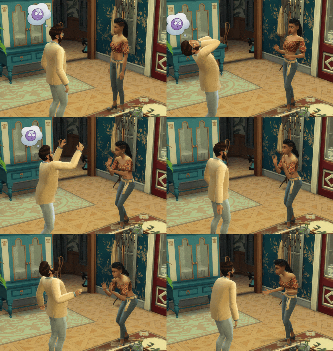
Whoa, whoa, whoa, it's okay!
Sims afflicted with the Scared Mood also have trouble communicating with others, the urge to panic-run everywhere, and are slightly more prone to accidents. If no other Sims are around to help calm down a Scared Sim, they might just have to Hide Under The Covers for a while.
But if being Scared just isn’t your Sims style, consider purchasing the new Brave Trait. This Satisfaction Reward Store Trait will rapidly reduce the incoming fear a Sim feels and help Sims regain their composure faster. While no Sim is totally fearless, this trait should help mitigate some of those creepy feelings.
The Scared Mood and the Brave Reward Trait are all base game features coming with the Paranormal Stuff patch on January 21st. Tons of previous Uncomfortable Buffs are now becoming Scared Buffs, such as the “Startled By Ghost” Buff or the “Thalassophobia” Buff from Island Living.
While being Scared might not be a common occurrence in your everyday Sims life, living in a Haunted House is a whole different story…
Happy Haunts
Introducing the Haunted House Lot Type!

The Duplantier Dwelling, created by Doctor Ashley! This “canon” Haunted House will be available in the gallery!
They’re like regular houses, only haunted! Although unassuming during the day, at night, these places get super weird. Your Sims may notice things like flickering lights, pipes rattling, or even creepy dolls staring at them in the corner. All are totally normal occurrences in a Haunted House, but it may take some time for your Sims to adjust to their new surroundings.
Sims living in a Haunted House will also be introduced to floating apparitions known as Specters. They’re cute little critters, but their motives aren’t entirely clear. You can try talking to them, or even offer them presents in hopes of establishing a good rapport. If they like you, they’ll drop special loot for you and your family. If they don’t like you, well, you’ve been warned.
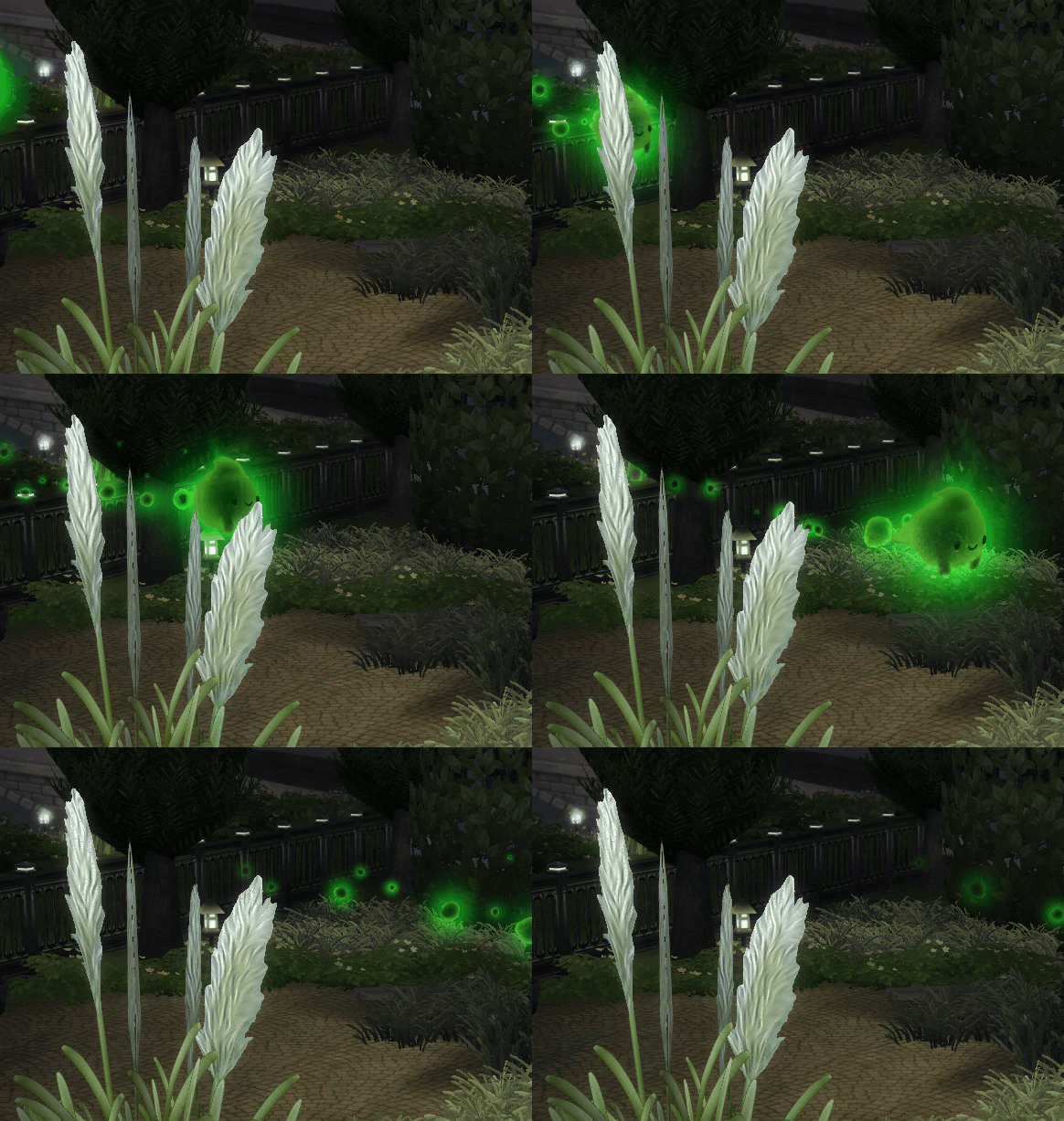
o o o (> ‘ u ‘ )>
Learning to get along with your new ghostly inhabitants is crucial in a Haunted House. Things like botching seances, neglecting Specters, or letting accursed objects invade your house will have a negative impact on its spiritual serenity. There is a delicate art to co-existing with the entities of the house, and thankfully you’ll have an expert on the matter to assist you!
Meet Guidry
Claude René Duplantier Guidry was a seasoned Paranormal Investigator in his previous life, but now he exists to help anyone brave enough to live in a Haunted House! You’ll probably run into him eventually living in a Haunted House, but don’t worry, he’s a nice ghost!
Guidry will gladly offer his wisdom to those who seek it. If you’re confused, alarmed, or slightly uncomfortable by your new haunted surroundings, give Guidry a holler and he might be able to help. He can also offer valuable objects to help your Sims, too; all you need is to reach out!
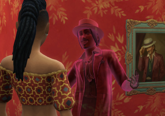
Still got it.
All Guidry wants in return is to crash at your place for the time being. Sounds like a fair deal, right? But if you’d prefer to fly it solo, you can always disable his nightly visits—he won’t be too upset, maybe.
As mentioned before, Guidry was a Paranormal Investigator before his untimely demise. If he sees potential in you, he can certify you with a Paranormal Investigation License, granting access to the Paranormal Investigation Freelancer Gigs. Only those who are qualified enough can join the ranks of Paranormal Investigators, but more on that next time!
Be Brave!
Living in a Haunted House adds a layer of risk and reward for your Sims, and each successful night yields Reward Store Satisfaction Points for everyone in the Household. Specters can also drop treasure that can also be collected, consumed, or sold to an Oddity Collector. So although your Sims might go through a bit of peril, they’ll thankfully be compensated.
One of my favorite pieces of haunted treasure is the new Sacred Candle. Not only do they look cool, but they also help protect Sims from paranormal influences. Place them around your house to make sure Sims are properly shielded!
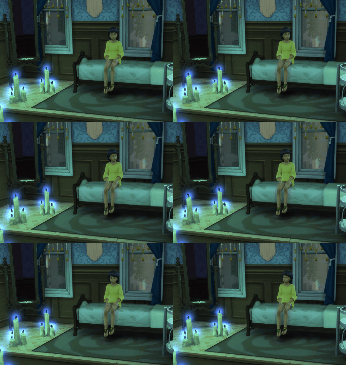
A properly protected Sim.
Things like Sacred Candles and performing ceremonies at the Séance Table are integral to keeping your Sims happy in a Haunted House. Without using these paranormal tools, the entities of the house might get a little bossy.
And while it might be in your Sims’ best interest to keep the spirits of the house in check, watching things go horribly wrong in a Haunted House can be just as fun too. So whatever works for you!

Like Tiny Homes, this Lot Type can be toggled on or off at any time. So whether you’re a casual thrillseeker who wants to spend a couple of nights in a Haunted House, or a seasoned Paranormal Expert who wants to take on a new challenge, this Lot Type should offer something for you!
Crosspack Stuff!
Pets get to share the fun too! They especially love the accursed objects that show up!
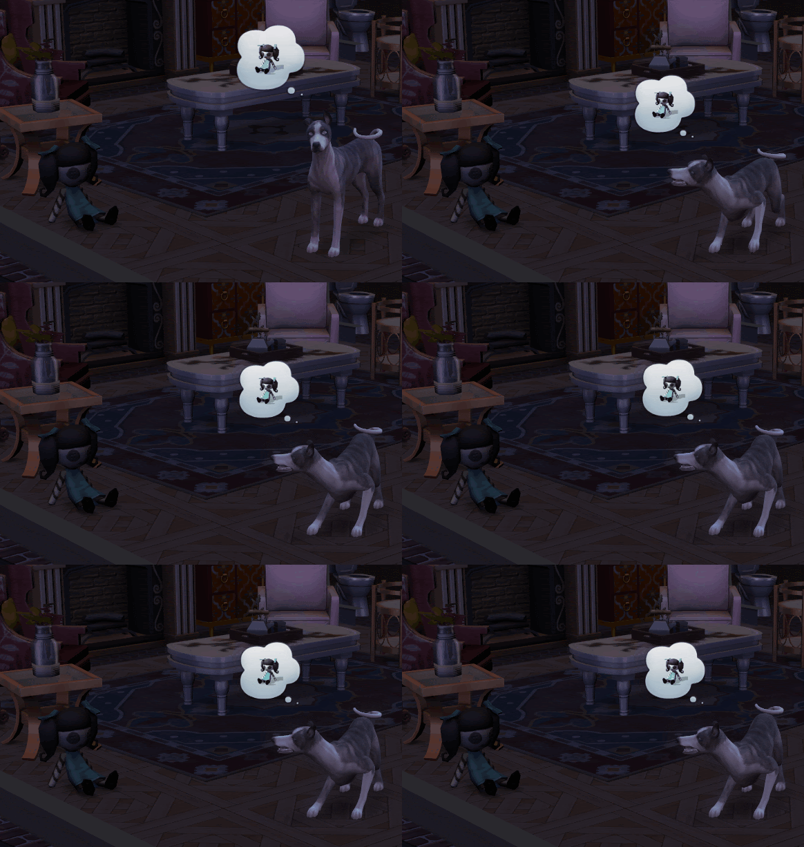
I think they’re gonna get along great.
As mentioned before, a ton of old Buffs from multiple packs are now being converted to the Scared Mood. I think 70 something Moodlets were converted? Honestly, I lost count. Anything that seemed more appropriate for the Scared Mood was transferred over.
Oh, and you might remember an old Lot Trait from City Living called Haunted. For clarity’s sake, it needed a name change, so now it’s the Spooky Lot Trait. It also benefits from being combined with the new Haunted House Lot Type and will have an increased chance of spawning Ghosts at night. So use both for maximum haunted-ness!
Audibly Frightened
Last but not least, I’d love to turn it over to our Audio Artist for this pack, Briana Billups! She did a killer job bringing Haunted Houses to life! Trust me!
Conor: Can you tell us what an Audio Artist does on The Sims 4?
Briana: Big, broad picture: an audio artist decides what everything in The Sims 4 sounds like. We record, create, and edit sounds to the art and animation of the game. Little, very detailed picture: creating the actual sounds is usually one of the smaller aspects of our job. We are meeting with other departments, like design, animation, and VFX, to understand the overall vision of new game features and how we can fit in sonically. We are meeting with each other to make sure all our new content still keeps the very fun and quirky vibe of the Sims. We come up with new tools and implementation where necessary.
Conor: What sort of things go into the creative process for creating audio?
Briana: Every audio artist/sound designer has their own creative process, but I like to make a “sonic mood board” of sorts. I typically like to have a good idea of what I want something to sound like in my head before I record or edit it, so it’s nice to have sound effects or music to refer to that represents my original inspiration or ideas. When I was in college, I would make Spotify playlists for whatever I was working on. I would listen to them once a day, adding and editing as necessary, so when I actually got to work, I was in the right headspace. Now I’m usually less formal about this sort of stuff, but for this pack, I would refer back to things like Vincent Price’s demonic laugh from Thriller or Casper the Friendly Ghost Cartoons and the looping soundtrack from the queue of a horror ride at the Santa Cruz Beach Boardwalk (Ghost Blasters)
Conor: What were you most excited to work on for this pack?
Briana: Definitely all the haunted house sounds! Good sound design is the crux of so many horror movies and video games, so even if we were keeping things more “Casper” and less “Poltergeist,” I still wanted to give a good scare here and there. I actually scared myself one day while playtesting another feature in the game!
Conor: If you had to choose, what is your favorite audio clip you’ve ever added to The Sims 4?
Briana: I would say my favorite SFX were the sports arena loops in EP08: Discover University. When you visit the arena for the soccer/esports match or graduation, you can actually listen to the whole game or ceremony. It was great to craft a whole story from start to finish using just sound. I also snuck in a lot of developer names when writing the scripts for our voice actors.
Thanks, Briana!
More To Come!
That about covers this first foray into the Paranormal Stuff Pack! This pack has been a ton of fun to work on, and watching my Sims flee in terror has been more enjoyable than I’d like to admit.
Next blog, we’ll focus on the Séance Table and developing your Medium skill, as well as the new active freelance career Paranormal Investigator.
Big thanks to the Stuff Pack team for helping this pack come to life, and thank you, Doctor Ashley, for building our featured Haunted House!
Until next time, SimGuruConor
56 notes
·
View notes
Text
Examine the ways in which films deal with social, political, cultural, and economic issues, both in direct and indirect ways. What is the political impact of cinema on audiences around the world and how do we see it? Should filmmakers directly engage with these kinds of issues or do so subtly? Discuss any of the films we have watched so far from this perspective, and draw upon other examples if necessary.
Social commentary exists in many forms. We read it in books and hear it in music of every genre. It does not discriminate, covering every issue from politics to economics. As film grew into its own medium, it became a new platform for artists to utilize in portraying their visions of the world. Whether they be whimsical and over the top, or down to earth and stunningly realistic, movies grew to become one of the largest entertainment industries. Directors and screenwriters, whether inspired by or displeased with their surroundings, came to use film as a method of sharing their thoughts and emotions. Be it through direct or indirect means, they would criticize politicians and governments to historic and current world events. Certain countries were more limited than others in controlling the content of films, pushing creators to become even more crafty and thoughtful when conveying their opinions on screen.
With the Motion Picture Production Code in full effect in the US, film makers who wanted to touch upon political issues in American society had to do so in a very subtle way. Take Force of Evil, for instance. On the outside, it reads like a classic gangster movie that was commonly seen in the 1940’s. However, it is deeply critical of the money and power-hungry American underbelly of society, digging into the Capitalism that has overtaken the country even in these earlier years. Irony is found in the two main characters, a pair of brothers. Joe is a lawyer who runs dirty deals with gang members, using his education and career to further their unsavory deeds. His brother Leo believes that his own line of work is earnest and respectable, when in reality it is not. Leo runs a ‘bank’ for the small number rackets that exist in New York City, mainly centered around bets that are placed on horse races. Leo strongly feels that he is not as morally corrupted as his brother, despite being in charge of an illegal business.
The mise-an-scene of the film is what really drives home the underlying critique of money and its corrupting force. Joe takes Leo’s former secretary Doris for a walk on Wall Street, taking her through a church cemetery. The church building is completely dwarfed by the towering buildings of Wall Street’s capitalist businesses. The implied message here is that money is the new God, that the hold it has over people is nearly as strong as religion.
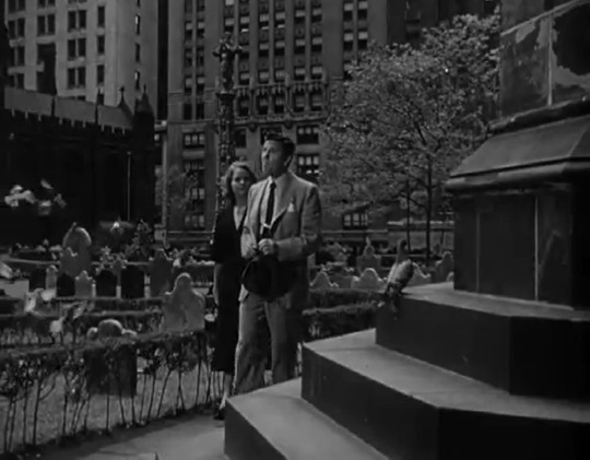
For Polonsky, who was put on the blacklist by HUACC for his leftist ideals, this message is as true to him as it gets. In Polonsky’s eyes, people no longer feared God as much as they did losing money in capitalist America. Considering what the entire world had just lost three years prior in World War Two, it is almost insulting to showcase people like Joe and his associates on screen. Money grubbing is not what America wanted its people to think they had fought and died for, just the opposite. Justice and morality is what America wants people to think it stands for, not capitalism and the desire to supersede the people in their lives. Force of Evil is astoundingly subtle and simultaneously gritty, holding true to the film noir standard of the times.
At the end of the film, when Leo is killed by Joe’s nefarious associates, Joe goes to retrieve his brother’s body. Stairwells are used as a metaphor for an internal moral struggle. In a voiceover, Joe laments ‘I just kept going down and down. It felt like I was going to the bottom of the world.’ The decrepit area beneath the bridge is the exact opposite of the organized, shining city above. Finding his brother’s body is Joe’s moral rock bottom, both literally and metaphorically. It is a slap in the face for Joe, stripping away all of the justifications he has held for his less than moral behavior and actions.
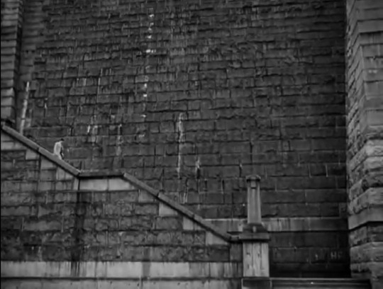
Polonsky cuts to Doris as Joe says, ‘He is dead,’ juxtaposing the image of a living woman with the realization that his brother Leo is gone. It is jarring, but it also suggests a dual motivation rising within Joe. Inspired by Doris’ love and Leo’s death, Joe turns to make his way back up the enormous staircase. This finale leaves the viewers with some hope that Joe can possibly redeem himself after his selfish actions, but will it be as quickly as he ran down the stairs towards his brother’s corpse?
One wouldn’t think that in 1950’s America, a bold film would tackle such a hot social issue: equal rights for African Americans. Especially with the Motion Picture Production Code still in full effect. Typically, when reflecting on movies from that decade, our minds are filled with images of romantic melodramas, as well as musicals and other bright, cheery content. The Defiant Ones not only tackled the issue of racism in America, but it also set the standard for the ‘buddy’ films that are commonplace today. Two escaped convicts are chained together at the wrist, one white and one African American. The film goes back and forth between Johnny and Cullen’s escapades whilst on the run, and the officers who have been assigned to track them down and take them back to prison. The tone of the film is established in the first few minutes, when one of the officers refers to Cullen as the n-word. Later on in the movie, when Johnny and Cullen are apprehended by a group of townspeople after attempting to rob their general store, they start stringing up two nooses. Johnny is mortified, looking around at the townsfolk with terror in his eyes. ‘You can’t lynch me, I’m a white man!’ he pleads. The message is clear: lynching is something white people do to black people.
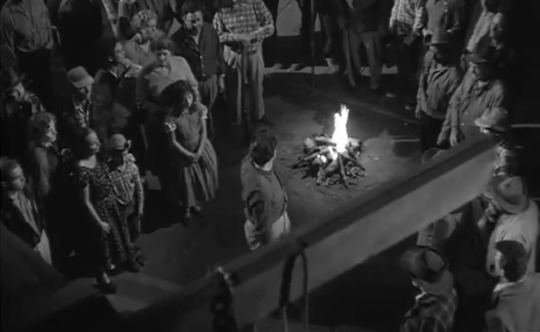
Not only does the movie look at the harsh reality of life for African Americans at the time, but the relationship that develops between Johnny and Cullen is in itself socially and politically charged. Over the course of the movie, the two convicts go from being at odds with one another to developing a close friendship. Not even Johnny’s mistake to trust the woman they holed up with can break their bond. Johnny leaves the woman behind to rescue Cullen from the dangerous swamps. At the film’s end, Cullen is cradling Johnny, who is wounded from a gunshot to the chest. They are collapsed on the grass together, sharing a cigarette while Cullen sings and the police detective approaches to apprehend them.
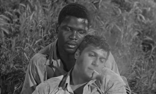
Not only has Johnny moved past his racist ideals, but one could also say that their positioning at the end of the film is borderline sexual. The way Cullen holds Johnny is almost as if it is in a lover’s embrace. Cullen’s portrayal in the film is especially bold, since he was portrayed to be well-spoken, intelligent and overall good. A far cry from films like Birth of a Nation where African Americans are put in the most negative light possible, portrayed as thieves and rapists while the Ku Klux Klan members are seen as heroic and noble. The Defiant Ones, supported by Sidney Poitier’s phenomenal acting, gave rise to a much more positive role for African American actors to portray on screen. Though the ‘righteous Black man’ did end up becoming a trope in Hollywood for many years, it was still a positive step in the right direction for civil rights.
Outside of the US, films were not constricted by strict standards of morality and content. They were much freer to openly criticize the societal norms and political atmospheres that were in place at the time of their creation. Hiroshima Mon Amour is a French made film that touches on the devastation of the nuclear bomb drops in Hiroshima and Nagasaki. While the movie itself seems to be mainly centered around a couple who cannot be together due to extenuating circumstances and their own inner demons, it is also direct commentary on how Japan remembered the bombings, and how different it is from the perspective of the rest of the world.
The first ten minutes of the film are composed of an almost poetry-like sequence of shots of Hiroshima before and after the bombs paired together with the two main character’s voice overs. The characters, a French woman, and a Japanese man, are in bed together in a loving embrace. The opening shot features ash falling onto their naked bodies, which we can infer mimics the death ash that fell onto Hiroshima after the atomic bomb’s detonation. This frame cross fades into nearly the same image of the naked couple, but the ash is gone from their bedroom.

The woman is stating that she knows all about what happened in Hiroshima, from having seen the newsreels that aired after the bombs had been dropped. The man argues that she has no idea what really happened. She states that in the newsreels she viewed, bugs were already crawling up through the debris and dirt on the second day and that flowers were growing all over Hiroshima just a few days after the bomb had been dropped. This voiceover is paired with the footage of a young boy being treated for burns and lesions on his skin, the exact opposite of new life springing forth from the ashes. The obvious pain that the boy is enduring is starkly contrasted to how the French woman describes all the different kinds of flowers that began blooming after the bombs had been dropped.

The Hiroshima that exists in the French woman’s mind is completely different from the Japanese man’s. This speaks to the overall theme of the movie, that collective and individual memories, as well as one’s identity can be corrupted. That the human brain is not a perfect organ and at times, it can even be our worst enemy. The French woman protests that she has seen Hiroshima. She had been to its museums, she knew how it had been over ten-thousand degrees in Peace Square at the time of detonation, and she had seen the films that had been made about the devastation. Her partner states over and over during this intro sequence that, ‘You saw nothing in Hiroshima. Nothing.’ Her experience of the disaster when compared to his is hollow, a clever way of illustrating how two people can think of the same event so differently.
Even if the trend of filmmaking has changed, shifting from film noir and melodrama to the blockbuster and action movies, social commentary still persists throughout the media. As the world around us changes and moves forward (be it for better or worse), so does the real-life content that directors and screenwriters are inspired by. Seeing politically and socially charged movies, whether they are extremely subtle or right up in your face, helps us both cope with world events and immortalize what occurred. As if to say, ‘We were here. We saw what took place. This is how we remember it.’
14 notes
·
View notes
Text
Jamais Vu - Part One
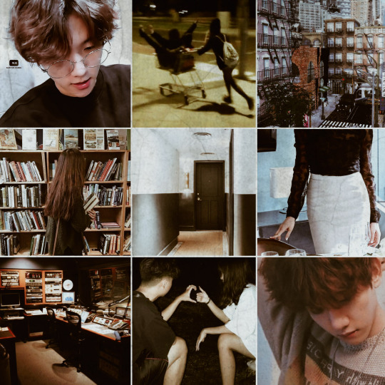
Exo Fanfiction
Baekhyun x Female Reader
Warnings: some light swears.
Genre: Fluff/Angst?
W/C: 2560
Part Two Part Three
_____________________________________________________________
Everybody has that ‘what if’. The one who got away....not quite regret, but thoughts that would drift by late at night when insomnia has set in and you’re deep into your latest existential crisis.
What if things had been different? What if you had said what had been on the tip of your tongue that day?
Byun Baekhyun was your what if.
He had been your best friend in college and the only person you had truly loved.
You had no reason to run into Byun Baekhyun. You didn’t share classes. You an Accounting major and him Architecture.
You didn’t run in the same social circles, he was part of a frat house and you opted to remain in dorms with your small group of friends.
But what had brought you together was music, meeting in your second year while working at the campus radio station.
You had applied for the role of Production Director on a whim, looking for a hobby outside of classes and studying and also benefited from the extra credit of managing the finances of the small college club.
The first time you met you were positive you’d never understand him. After all, you were complete opposites. He was loud and outgoing; always the centre of jokes and a far cry the quiet loner you were perceived to be.
But from the first show you ran with him, he has surprised you. Baekhyun was the On-Air Presenter for the Sunday night Jazz & Blues segment and as soon as the light would turn red he’d take on a completely different persona.
His voice would become soft and melodic as he’d whisper sweet nothings into the microphone about the classics of Miles Davies and Frank Sinatra.
You’d often be on the same late-night shift together; downing coffee after coffee, discussing your favourite artists and organising records until the early hours.
He wasn’t exhausting like the rest of your extroverted friends, his presence giving you a warm sense of comfort.
Without noticing you became joined at the hip for the rest of your college days.
Not to the point that you were a regular at his crazy frat parties but you’d hang out at the radio station, would marathon movie after movie at each other’s dorms on the weekends and crammed for all your major test’s together.
You hadn’t even realised you were in love with him until you’d just graduated, you even had the crazy idea to confess.
Then the news broke that he was moving to a different country.
He had been in two minds on whether to go. You’d always talked about living and working in the same city and he’d been concerned about you being alone and him going back on his promise.
Honestly. Who achieves their dream job at a globally famous architecture firm and worries about their dumb friend during the happiest moment of their life?!
You remembered that day vividly.
‘“Of course you should go! It’s your dream, Baek” you forced the enthusiasm into your voice.
Inside, you could feel your heart tearing at the seams. You weren’t selfish enough to show him just how much you would miss him, as much as you had wanted to.
He was always too considerate of your feelings.
This wasn’t some Rom-Com TV show, where Baekhyun would suddenly declare he couldn’t live without you. He wasn’t like Rachel choosing not to get on the plan for Ross.
You’d cried so hard the night he’d left. Almost texting the words you’d be aching to tell him for the last three years.
‘I am in love with you’.
But the alcohol had knocked you out before you could hit send.
He’d promised to keep in touch but over the years you drifted. As life and work became more and more hectic it devolved from video chatting on the weekends, to texting occasionally.
Fading into receiving a generic happy birthday post on social media and then nothing at all.
You’d pushed him to the back of your mind as you told yourself over and over that this is what happens as you get older.
And with that ten years had passed.
----------------------------------------------------------------------------------------------------
You wake with a start. Back aching from where you’d fallen asleep in an awkward position while watching a random ASMR video the night prior.
*Clatter*
Your sleep-filled eyes search the room, trying to locate the source of the noise.
*Thud Thud Thud*
It appears to be coming through the wall behind your headboard.
Could someone be moving into the apartment next door? It’s been entirely empty the whole time you’ve been living here, about seven months now.
You've enjoyed the quiet solace of not having to share the walls with another person. Especially being one of the only two apartments on the upper floor, it was one of the reasons you love your apartment.
It’s also located near the subway and tucked far back enough on the outskirts of the city that it’s almost peaceful. There’s also a small cafe bar and a couple of small stores that remind you of the town where you grew up.
*Bang*
You groan again at the loud noises as you stretch your arms over your head and wonder about the people moving in next door.
Maybe a couple? Or a young family. It could even be a cute guy. You snort at the thought. Yeah right. What kind of a psycho moves into an apartment in the early morning anyway?!
You reach under your pillow for your phone to check the time. 8:30 am! SHIT. You overslept and if you don’t leave your apartment in the next ten minutes you’ll miss your train to work!
With no time for a shower, you rush to your bathroom to wash your face and brush your teeth.
As you drag a brush through your hair and pull it up into a simple, neat ponytail you start forming a contingency plan…
‘Skip the usual to-go coffee at Dunkin’ and settle for the instant stuff at work’ you think to yourself, ‘As soon as I get to work, throw on some BB cream and mascara with the time I’ll gain abandoning my daily vanilla latte with coconut milk…’.
You sniff sadly at the thought as you step into one of your tailored dresses, fumbling with the awkward zipper in the back.
Within 10 minutes you’re flying out the door and straight into the elevator. Using the short amount of time to button up your sweater and glance through your bag to check that you’ve got everything you’ll need for the day.
You’re in your own thoughts as you stride towards the lobby doors, and almost walk straight into your building manager.
“Oh! Good morning, Mr Sato!” you gasp in surprise.
“Good morning!” he smiles obliviously, not realising that you almost knocked him flying. You move to step around him as he continues. “There’s a package of yours with Ralph” (the doorman) “and I also wanted to let you know about a new tenant moving into the place next to yours...”
“Uh-huh, of course, that’s great!” You cut him off, waving your hands apologetically “I am so sorry. Please excuse me, I’m late for work!” you call out behind you as you make a mad dash out of the building to the subway station.
You make your train by the skin of your teeth, panting from the final sprint from the ticket gate to the platform. Feeling glad you skipped the makeup as you would have surely sweat a good portion of it off by now.
You currently work for a large accountancy firm Kim & Partners. You could have worked within a finance department of any company as most qualified accountants tend to do but you love the challenges and variety of working with different industries and clients every day.
You manage a small team of four and specialise in bookkeeping for small to medium enterprise, one of the smaller departments in the company but you have a pretty large client base and enjoy the satisfaction of helping others and providing a clear and efficient service.
“We are transferring you to manage corporate accounts,” your boss Mr Kim announces in the morning management meeting. You feel like someones just pulled a step from beneath your footing.
You were aware that your manager Mr Choi had wanted to transfer you out to provide more specialised management accountancy for larger corporate clients but so far you’d been convincing enough from the commission and reputation you’ve built for Kim & Partners to be able to continue as you were.
“Uh, thank you for the opportunity, Mr Kim, I-” you begin shakily, looking for the words or a reason to decline the transfer.
“Fantastic! You’ll handover to Jaehyun for the rest of today and you’ll start in corporate accounting tomorrow!” your boss claps his hands together enthusiastically and with that you chicken out of any further protest and nod your head.
Jaehyun is your second in command and honestly, he really deserves this promotion. You couldn’t think of someone more diligent and detail-oriented.
The rest of your day is uneventful. The handover goes incredibly smoothly despite a very surprised Jaehyun but the more things are explained, the more you realise that this progression will be good for everyone.
You’ll still oversee Jaehyun and his team but allow him more room to make decisions and develop while you work on the larger corporate accounts that keep your company in business.
There was even a hint at the opportunity to become a junior partner, which by your calculations would make you one of the youngest in the company.
You leave work feeling excited, passing up on celebratory drinks with your (old) team so that they can have more fun without their boss present.
“COME ONNNN” Hani, your junior accounts clerk had whined when you announced that you wouldn't be joining “You’re not a regular boss, you’re a COOL boss!”.
You appreciate the sentiment but everyone likes to complain about work and management when they drink and you wouldn't like to take that away from them.
You sit on the train heading back to your apartment feeling optimistic, texting your best friend Aria about the day and making plans for your own celebratory drinks.
You’re walking through the lobby of your apartment building, heading towards Ralph’s desk to collect the package Mr Sato mentioned this morning. Probably the new nutribullet you’d ordered while drunk Amazon shopping a couple of weeks back.
Normally you’d cancel the delivery but drunk you was really onto something this time. You giggle at a dumb vine quote Aria sends you and as you finish typing up your response-
THWACK! You hit a wall, falling ungracefully backwards onto your butt.
You grunt as the air gets knocked out of you when you make contact with rough carpet of the lobby.
“Seriously!” another voice snaps you back to reality as you realise you didn’t walk into a wall but another person.
A now very annoyed person, carrying what you assume was their groceries as you glance over at the produce and cans rolling around on the floor between you.
“I- oh my gosh, I am so sorry!” you stammer as you scramble to your knees and start frantically picking up some of the items in front of you. A can of beans, a bag of pasta and a lone orange trying to make its escape.
“I wasn’t even looking, I promise I’ll pay for anything dama-”, You begin as you look up, expecting to see Mr Sato or one of the other tenants of the building.
The rest of your sentence dies in the back of your throat.
“Baekhyun?...”
His name leaves your lips as a whisper, heart thumping against your chest as you almost drop the items in your hands.
He’s not looking in your direction, you hear him grumble something under his breath that you can’t quite make out as he scoops the remainder of his groceries into a battered paper bag.
Is it really him? Did you hit your head and you’re actually unconscious and hallucinating about a guy you used to know and haven’t seen in ten years?
It sure looks like him. A few extra lines crease his forehead, his hair is a darker shade of chocolate than you remember with a few flecks of silver glinting at the centre of his parting.
You glance to his left hand searching for the mole that sits beneath his thumbnail but it’s not there. Maybe it was on his right hand?
He finally looks up as if finally registering that you’re kneeling on the floor next to him, his lips part slightly in surprise as he looks you over. A tiny mole sits just above the corner of his upper lip. It really is him!
Before your mind has time to catch up you’re throwing your arms around him, allowing your excitement to overtake all of your other senses. You feel him instantly tense up.
“H-hey!” he shouts, pushing you off him abruptly. “What the hell are you doing!”
You shoot to your feet, shaken by the sharpness of his tone you take a step back to create some space. Your throat feels dry all of a sudden. His eyes look you over but there’s no familiarity in them, they’re so cold you almost shiver.
He takes a step towards you, “How do you know my name?” his tone sharp and accusing, “Are you some kind of stalker?”.
Your cheeks start to burn as the realisation set’s in that Baekhyun has no idea who you are. You struggle to swallow the lump forming in your throat as you search for a response. Words seem to fail you right now.
“Y/N, is everything alright?” you hear the worried voice of Mr Sato, by the time you remember to blink he’s already standing between the two of you. You look up at him, dumbstruck as you fight back the sharp prickles in the corner of your eyes.
He looks back and forth between you and Baekhyun, trying to piece together what has taken place. You realise you’re still holding Baekhyun’s groceries, practically hugging the bag of pasta to your chest and your cheeks burn even hotter.
You hear your name spoken again but it’s not Mr Sato’s voice this time, and you don’t have the nerve to look at Baekhyun again.
So you do the only thing you can think of and thrust the items you're holding at Mr Sato. Run as fast as you can to the stairwell, and find the nearest hole to jump into, aka your apartment.
Your knees ache as you force yourself up each flight. You can’t even remember the last time you used the stairwell and when you finally reach the threshold of your apartment you collapse against the door.
What on earth were you thinking?
What gave you the right to assume anyone would recognise you after ten years?
What was he even doing here? As that final thought crosses your mind someone knocks at your door.
You jump at the abrupt noise, chest still tight from the anxiety (or the running). But there’s no way you’re answering the door.
Your legs still feel like jelly and you really fear that Mr Sato has come to scold you or worse Baekhyun has followed you.
But he wouldn’t know which apartment you lived in. Would he?
You pull yourself to your feet and glance through the peephole.
You watch as Baekhyun turns away from your front door and disappears towards the next apartment.
No way.
*Slam*
Shit.
#baekhyun#byun baekhyun#baekhyun fanfic#baekhyun fanfiction#baekhyun imagine#baekhyun oneshot#baekhyun series#baekhyun drabble#exo fanfic#exo fanfiction#exo onehsot#exo imagine#exo drabble#baekhyun fluff#baekhyun angst#exo fluff#exo angst
178 notes
·
View notes
Text
Watch This Space: Playwrights Train for All Media
As dramatists begin to write for all media, the nation’s playwriting programs are starting to teach beyond the stage.
BY MARCUS SCOTT
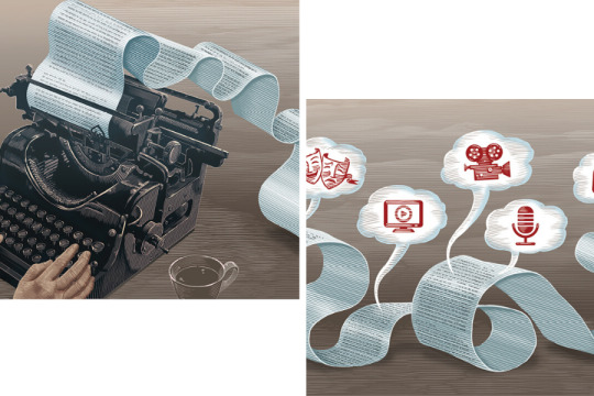
In 2018, a record 495 original scripted series were released across cable, online, and broadcast platforms, according to a report by FX Networks. And with the growing popularity of streaming services such as Netflix, Hulu, and Amazon (not to mention new players like Disney and Apple), a whopping 146 more shows are up and running on various platforms now than were on air in 2013. So how does peak TV relate to theatre?
Once a way for financially strapped playwrights to land stable income and adequate health insurance, television has since emerged as a rewarding venue for ambitious dramatists looking to forge lifetime careers as working writers. Playwright Tanya Saracho is the current showrunner for “Vida” on Starz. Roberto Aguirre-Sacasa is the series developer of “Riverdale” and “Chilling Adventures of Sabrina.” Sheila Callaghan is executive producer of the long-running black comedy “Shameless.” Sarah Treem, co-creator and showrunner of “The Affair,” recently concluded the Rashomon-esque psychological drama in November.
To satiate demand for more content, showrunners have sought to recruit emerging playwrights to fill their writers’ rooms. It’s now common practice for them to read plays or spec scripts penned prior to a writer’s graduation.
Many aspiring playwrights have caught on, enrolling in drama school intent on flirting with virtually every medium under the umbrella of the performing arts. Several institutions around the country have become gatekeepers for the hopeful—post-graduate MFA boot camps bestowing scribes with the Aristotelian wisdom of plot, character, thought, diction, and spectacle before they’re dropped into the school of hard knocks that is the modern American writers’ room. Indeed, since our culture has emerged from the chrysalis of peak TV, playwriting programs have begun training students for a career that includes not only the stage but multiple mediums, including the screen.
Playwright Zayd Dohrn, who has served as both chair of Northwestern University’s radio/TV/film department and director of the MFA in writing for screen and stage since 2016, said versatility is the strongest tool in the kit of the program’s students.
“We offer classes in playwriting, screenwriting and TV writing, as well as podcasts, video games, interactive media, stand-up, improv, and much more,” he explained. “There’s no one way to approach the craft, and we offer world-class faculty with diverse backgrounds, professional experiences, and perspectives, so students can be exposed to the full range of professional and artistic practice.”
Dominic Taylor, vice chair of graduate studies at UCLA School of Theater, Film and Television in California, also agrees that multiplicity is the key to the survival of a working writer. “In the industries today, whether one is breaking a story in a writers’ room or writing coverage as an assistant, the ability to recognize and manipulate structure is paramount,” Taylor said. “The primary skill, aside from honing excellent social skills, would be to continue to study the forms as they emerge. Read scripts and note differences and strengths of form to the individual’s skill set. For example, the multi-cam network comedy is very different from the single-cam comedy—‘The Conners’ versus ‘Modern Family,’ let’s say. It’s not just the technology; it is the pace of the comedy.”
Taylor, a distinguished multi-hyphenate theatre artist working on both coasts, said that schools like UCLA offer a lot more than classes, including one with Phyllis Nagy (screenwriter of Carol). UCLA’s program also partners with its film school, and hires professional directors to work with playwrights to develop graduate student plays for productions at UCLA’s one-act festival, ONES, or its New Play Festival. Taylor also teaches four separate classes on Black theatre, giving students the opportunity to study the likes of Alice Childress, Marita Bonner, and Angelina Weld Grimké in a university setting (a rarity outside of historically Black colleges and universities).
Dohrn, a prominent playwright who is currently developing a feature film for Netflix and has TV shows in development at Showtime, BBC America, and NBC/Universal, said that television, like theatre, needs people who can create interesting characters and tell compelling stories, who have singular, unique voices—all of which are emphasized in playwriting training.
“Playwrights are not just good at writing dialogue—they are world creators who bring a unique vision to the stories they tell,” Dohrn emphasized. “More than anything else, a writer needs to develop his/her/their unique voice. Craft can be taught, but talent and creativity are the most important thing for a young writer.”
For playwright David Henry Hwang, who joined the faculty at Columbia University School of the Arts as head of the playwriting MFA program in 2014, success should be a byproduct, not a destination. “As a playwright, I don’t believe it’s possible to ‘game’ the system—i.e., to try and figure out how to write something ‘successful,’” he said. “The finished play is your reward for taking that journey. The thing that makes you different, and uniquely you, is your superpower as a dramatist, because it is the key to writing the play only you can write. Ironically, by focusing not on success but on what you really care about, you are more likely to find success.”
Since arriving at Columbia, one of Hwang’s top priorities was to expand the range of TV writing classes. This led to the creation of separate TV sub-department “concentrations,” housed in both the theatre and film programs. All playwriting students are required to take some television classes.
“We are at a rather anomalous moment in playwriting history, where the ability to write plays is actually a monetizable skill,” said Hwang, whose TV credits include Treem’s “The Affair.” “Playwrights have become increasingly valuable to TV because it has traditionally been a dialogue-driven medium (though shows like ‘Game of Thrones’ push into more cinematic storytelling language), and playwrights are comfortable being in production (unlike screenwriters, some of whom never go to set). Once TV discovered playwrights, we became more valuable for feature films as well.”
Playwrights aren’t the only generative theatremakers moving to the screen. Masi Asare is an assistant professor at Northwestern’s School of Communication, which teaches music theatre history, music theatre writing and composition, and vocal performance. The award-winning composer-lyricist, who recently saw her one-act Mirror of Most Value: A Ms. Marvel Play published by Marvel/Samuel French, said that the world of musical theatre is not all that different either; it’s experiencing a resurgence in both cinema and the small screen: Lin-Manuel Miranda, Kristen Anderson-Lopez and Robert Lopez, Justin Hurwitz, and Benj Pasek and Justin Paul have all written songs that were nominated for or won Oscars. The growth of YouTube, Instagram, and Twitter have offered new ways for musical theatre graduates to market and monetize their songs and build an audience.
“The feeling that a song has to ‘work’ behind a microphone in order to be a good song is really having an impact on young writers,” said Asare. “The song must sound and look good in this encapsulated video that will be posted on the songwriters’ website and circulated via social media.” She noted that in this case, the medium of video is also changing the medium of musical theatre itself. “Certainly it may lead to different kinds of musicals—who knows? New experimentation can be exciting, but I think there is a perception that all you have to have is a series of good video clips to be a songwriter for the musical theatre, a musical storyteller. I think that does something of a disservice to rising composers and lyricists.”
Some playwriting students, of course, are not interested in learning about how to write for television. But many who spoke for this story agreed that learning about the different ways of storytelling can be beneficial. One program in particular that has its eyes on the multiplicity of storytelling mediums is the Writing for Performance program at the California Institute of the Arts. Founded by playwright Suzan-Lori Parks in 2001 as a synergy of immersive environments, visual art installation, screenplay, and the traditional stage play, the program has helped students and visiting artists alike transcend theatrical conventions. Though Parks is no longer on the CalArts faculty, her spirit still infuses the program. As Amanda Shank, assistant dean of the CalArts School of Theater, puts it, “Every time she came to the page, there was a real fidelity to the impulse of what she was trying to communicate with the play, and the form followed that. It’s not her trying to write a ‘correct’ kind of play or to lay things bare in a certain prescribed way.”
That instinct is in the life fiber of CalArts’s Special Topics in Writing, a peer-to-peer incubator for the development of new projects that grants students from across various departments the opportunity to develop and produce writing-based projects. Shank defines the vaguely titled yearlong class, which she began, as a “hybrid of a writing workshop and a dramaturgical project development space.” A playwright and dramaturg, Shank said her class was born of her experience as an MFA candidate; she attended the program between 2010 and 2013, and then noticed her fellow students’ lack of ability to fully shepherd their projects.
“I was finding a lot of students that would have an idea, bring in a few pages or even bring in a full draft, but then they would kind of abandon it,” said Shank. “I wanted a space [that would] marry generative creativity, a place of accountability, but also a place that was working that muscle of really developing a project. Because I think often as artists we look to other institutions, other people to usher our work along. Yes, you need collaborators, yes, you need organizations of supporters—but you have to some degree know how to do those things yourself.”
Program alum Virginia Grise agrees. Grise has been a working artist since her play blu won the 2010 Yale Drama Series Award. She conceived her latest play, rasgos asiaticos, while still attending CalArts. Inspired by her Chicana-Chinese family, the play has evolved into a walk-around theatrical experience with some dialogue pressed into phonograph records that accompany her great uncle’s 1920s-era Chinese opera records. After developing the production over a period of years, with the help of CalArts Center for New Performance (CNP), Grise will premiere rasgos asiaticos in downtown Los Angeles in March 2020, boasting a predominantly female cast, a Black female director, and a design team entirely composed of women of color. Her multidisciplinary work is emblematic of the direction CalArts is hoping to steer the field, with training that is responsive to a growingly diverse body of students who may not want to create theatre in the Western European tradition.
“You cannot recruit students of color into a training program and continue to train actors, writers, and directors in the same way you have trained them prior to recruiting them,” said Grise. “I feel like training programs should look at the diversity of aesthetics, the diversity of storytelling—what are the different ways in which we make performance, and how is that indicative of who we are, and where we are coming from, and who we are speaking to?”
As an educator whose work deals with Asian American identity, including the play M. Butterfly and the high-concept musical Soft Power, Hwang said that one of his goals as an educator is to train a diverse body of students and teach them how to write from a perspective that is uniquely theirs.
“If we assume that people like to see themselves onstage, this requires a range of diverse bodies as well as diverse stories in our theatres,” Hwang said. “Institutions like Columbia have a huge responsibility to address this issue, since we are helping to produce artists of the future. Our program takes diversity as our first core value—not only in terms of aesthetics, but also by trying to cultivate artists and stories which encompass the fullest range of communities, nationalities, races, genders, sexualities, differences, and identities.”
The film business could use similar cultivation. In March 2019, the Think Tank for Inclusion and Equity (TTIE), a self-organized syndicate of working television writers, published “Behind the Scenes: The State of Inclusion and Equity in TV Writing,” a research-driven survey funded by the Pop Culture Collaborative. Data from that report observed hiring, writer advancement, workplace harassment, and bias among diverse writers, examining 282 working Hollywood writers who identify as women or nonbinary, LGBTQ, people of color, and/or people with disabilities, analyzing how they fare within the writers’ room. In positions that range from staff writer to executive story editor, a nearly two thirds majority of this surveyed group reported troubling instances of bias, discrimination, and/or harassment by members of their individual writing staff. Also, 58 percent of them said they experienced pushback when pitching a non-stereotypical diverse character or storyline; 58 percent later experienced micro-aggressions in-house. The biggest slap in the face: When it comes to in-house pitches, 53 percent of this group’s ideas were rejected, only to have white writers pitch exactly the same idea a few minutes later and get accepted. Other key findings from the report: 58 percent say their agents pitch them to shows by highlighting their “otherness,” and 15 percent reported they took a demotion just to get a staff job.
But there was more: 65 percent of people of color in the survey reported being the only one in their writers’ room, and 34 percent of the women and nonbinary writers reported being the only woman or nonbinary member of their writing staff; 38 percent of writers with disabilities reported being the only one, and 68 percent of LGBTQ writers reported being the only one.
For Dominic Taylor, the lack of diversity and inclusion in TV writers’ rooms can be fought in part by opening up the curriculum on college campuses, which he has expanded since joining the faculty at UCLA. “Students need a comprehensive education,” Taylor pointed out. He noted the importance of prospective playwrights being as familiar with Migdalia Cruz, Maria Irene Fornés, James Yoshimura, Julia Cho, and William Yellow Robe as they are with William Shakespeare, and looking at traditions as vast as the Gelede Festival, the Egungun Festival, Shang theatre of China, as well as the Passion Plays of Ancient Egypt.
“All of these modes of performance predate the Greek theatre, which is the starting point for much of theatre history,” explained Taylor. “It is part of my mandate as an educator to complete the education of my students. Inclusion is crucial to that education.”
After all, with the growing variety of platforms for story and expression, why shouldn’t there also be diversity of forms and voices? Whatever the medium of delivery, these are trends worth keeping an eye on.
Marcus Scott is a New York City-based playwright, musical writer, and journalist. He’s written for Elle, Essence, Out, and Playbill, among other publications.
2 notes
·
View notes
Text
Don’t Hug Me, I’m Scared REVIEW:
Hello there everybody! My name is JoyofCrimeArt and I do review-y type stuff on rare occasion! I've been a fan of online original content ever since I was a kid, ever since I first got into "Homestar Runner" back in 2010 (before that most of my internet time was spent playing flash games online and listing to Phineas and Ferb songs on Youtube.) Me and my brothers fell in love with Homestar Runner, as well as the various spin-off series that came from Homestar like the "Teen Girl Squad" and the "Strong Bad Emails." While I'm sure there where some web series I had seen before then it was Homestar that was the first big one and ever since I have been enamored with online original content. As time went on I became fans of other online web series, like Death Battle, TOME, RWBY, and many many others. There is something I find just magical about online original content. It's completely unfiltered content. Online you can do or create anything you can imagine, have it run for as long as you want it to (assuming you have the money or dedication to keep producing it) without the threat of it "not meeting the right demo" or "not pulling in high enough ratings." If you can imagine it and have the gumption to put in the hard work you create anything you want to. It like the artist equivalent of the American Dream. You can do anything you want, and be as creative as you want to be! Sorry if that came off as a bit long winded and cheesy but that's how I feel about this exciting new medium. And while there are tonnes of web series I would like to talk about in a review at some point, (and hopefully I will get to some of them in the future) for today I want to talk about a web series that brings whole new meaning to the word "creative," Don't Hug Me I'm Scared. "Don't Hug Me I'm Scared" is a British web series created by Becky Sloan and Joseph Pelling. Also TomSka was an executive producer for episodes 3-6. Which...actually explains a lot. Basically DHMIS Is a six part miniseries that ran from July 29th, 2011 to June 19th 2016. The series is basically an education series in the style of "Sesame Street" starring three puppets named "Red Guy," Yellow Guy," and "Duck Guy." (And yes those are there official) names as they learn different educational lessons from different "teachers" in each episode. Now if you haven't seen the series yet I highly suggest you check it out before continuing the review because this is the kind of show where the less you know going in the better, plus combined the series is only about a half hour long. However, I feel like I must warn you, this series is not for young children. It is for adults. (Because come on, it something online and it looks wholesome. Of course it's actually fu*ked up.) Don't go into this series unless your in the mood to see some messed up sh*t. So before you advance be aware, SPOILERS! Anyway, you back? Okay, so for those of you who already know the show or don't care about spoilers, the show is really a dark parody of pre-school televisions that should either be classified in the horror genre, the REALLY dark comedy genre, or BOTH, depending on ones personal point of view. Each episode tends to follow the same basic formula about some teacher showing up and trying to teach our main characters a lesson, but somewhere along the way the message becomes corrupted and usually ends with the puppets being traumatized or killed. Episode Two, for example, is at first about time, but slowly but surly ends up becoming about the impending death or everyone and thing. Episode Three starts talking about love and ends up being about cult indoctrination. It's pretty messed up stuff. But I know what you're thinking, who cares? There are tonnes of stuff that take kiddie things and makes them adult, especially on the internet. What makes DHMIS so special? Personally, I think want makes Don't Hug Me so special is the amount of detail and that was put into it. Even without the shock value the series is still a well made and interesting spectacle to see. So let's talk about the characters. While this form of simple and short form series doesn't lend itself to any complex characterization the main three puppets still have distinct personalities, even if there not the deepest characters out there. Red Guy is the sarcastic and rational one, and always talks with a deadpan tone to his voice. He is the smartest one of the group and is the fastest to figure out that something wrong is going on. Yellow Guy is naive, childlike, and not very bright. He is the most excepting of all of the puppets. He's my favorite character in the series, because by the end you just feel so bad for him (watch the series if you want to know what I'm talking about, I don't want to spoil to much.) Duck Guy, honestly, is my least favorite of the main three puppets. He seems kinda foppish and a bit more likely to kinda acts as the smart one when Red Guy isn't used for that, but overall I feel he's the weakest of the main three characters and doesn't have as much character development.
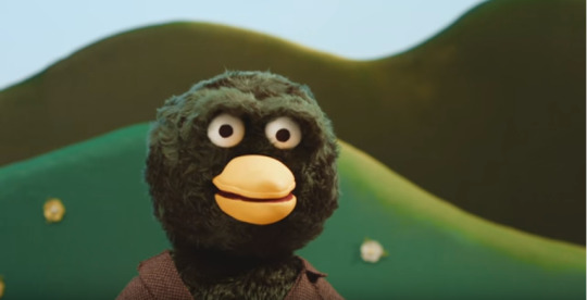
(...) (What did you say to me, b!tch?) And I say character development because, shockingly, all three characters do go through some character development as the series progressive. The characters become more self aware, and eventually start to expect something bad to happen once there weird "teachers" show up, instead of just going with it like they did in the earlier episodes. One of my favorite blink and you miss it style jokes in the series is when Duck Guy freaks out when The Computer mentions being able to tell the time, because he remembers the "lesson" about time he already learned from the clock. It's cool because they are learning form past experiences. Also there's individual arcs for the characters as time goes on like Red Guy learning to be less of a downer and being more creative. The show starts following a basic formula, with a teacher teaching the puppets a lesson through song, then something messed up happening and the world resets. However what I really admire is that this show plays with that formula, starting with episode four onward. The shows starts to lose it's status quo and, as mentioned above, the characters start to become more self aware. The episodes start having frickin' continuity! For real! It's really unexpected and, in my opinion, was a really good idea. The audience where starting to see the formula, and after the first episode where just waiting for the episodes to become messed up. So they decided to create a story to draw the audience in. If they just keep doing messed up things over and over again the show would become boring but the twist of actually telling a story, couple with the brevity of the story, managed to keep the story interesting the whole way through. The story is...weird. It's very much up for interpretation and cryptic. Sort of in the "Five Nights at Freddies" kind of way. Hints and Easter eggs are hidden in the various episodes and there are tonnes of theory videos online about what it all "really means." So if that's your kind of thing then you'll love this series. there are so many weird hints and recurring motifs that I haven't seen a single theory that covers everything. The final episode feels like the story is solved but heck if I know what the story even was about. I think the point of DHMIS isn't about actually solving the mystery but rather making up your own conclusion. I don't think there is a one hundred percent "definitive" answer, partially because of the theme of "creativity" that is in the series a lot and partially because Becky Sloan in an interview said in regard to fan theories that "they are all correct." and I love it when creators say that. They leave things up to the audience to decide what to take away form the series, instead of telling them. Don't Hug Me I'm Scared's attention to detail goes beyond the recurring motifs and Easter eggs though. What I really appreciate about the series is the attention to detail when it comes to the parody aspect of the show. Now this is a subjective thing, but I've always felt that the best parodies are the ones that either respect the thing that they are parodying. If you like the thing that your parodying it will give you a better understanding of it and make it easier to parody, cause you know exactly why the thing works and is good. It is possible to parody something you hate if you really get what your parodying, but it may end up coming off as sounding bitter. (Not always mind you, but sometimes.) It is clear that there was respect and love for educational programming like Sesame Street, and thus the parody ends up working a lot better. The high production value also helps the parody aspect. The puppets in DHMIS look really good! They look like they could be legitimate puppets in a real children's educational television program. This ends up making the twist that it's actually a horror story even better because the audience doesn't know what to expect if there going into the series blind. They might stumble upon the video and think it's a clip from some real British television series. The series wouldn't be able to work the way it does now if the puppets looked creepy from the start, there would be no contrast. To be honest the puppets in this show look less creepy than some real children's educational puppet shows.
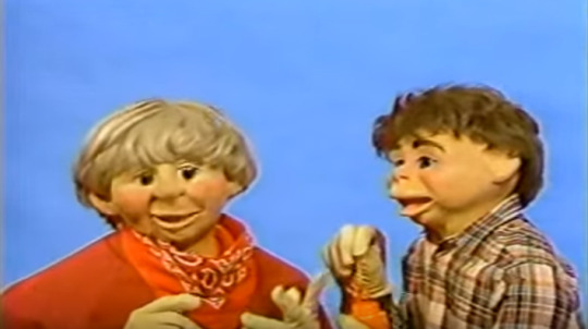
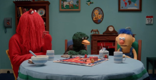
(That top pic is from 80's direct to VHS education series "Peppermint Park" by the way, and also sorry if I accidentally gave you any nightmares.) Speaking of which, the production values of this whole show is frickin' incredible! Admittedly the production values for the first two episodes aren't as good as later episodes, but starting with episode three the series becomes amazing to look at. Every prop is is made of felt or cloth and the world is heavily decorated down to the smallest detail. The show also incorporates a multitude of different art styles throughout the series. Sure it's ninety percent puppetry but they also incorporate stop motion, flash animation, purposely bad CG graphics, and even some live action film making in certain parts. Every episode features a different song, and most are really catchy (Though the series tends to focus less and less on the songs as time goes on in order to focus more on plot, which is kind of a bummer.) The humor won't be for everybody, it's that sort of dry and surreal humor found in say, and old adult swim show. It's not for everyone but I really like it. It would be so easy to just make this show a kid show that ends up becoming disturbing, but this show does offer other positives so you can still enjoy the series after on re-watch. If I had to pick a favorite episode out of the six I would probably say episode three. I like the song, moral, and environments the most out of any episode and I feel like the comedy in that episode is the best of the whole series. Episode three also acts like a nice breather episode as it's one of the least terrifying one. My least favorite episode would probably be episode five. The song isn't that catchy in my opinion and it keeps getting interrupted by the plot, which isn't bad for the episodes necessarily but it does hurt the song.) Also I honestly can't tell what the message is. Most other episodes have a message, even if it is a dark and twisted one, like how episode four is about the dangers on the internet, how it just wants information from you, and how easy it is to get sucked inside it. But episodes five's moral, I just don't really see it. I still like the episode but I just find it a bit subpar compared to some of the other episodes. And no disrespect to you if you love episode five or hate episode three, it's just my personal opinion. So yeah, I highly recommend DHMIS. It's bright, it's disturbing, it's funny, it has incredible production value for a Youtube series, it has great songs, it has chicken picnic's and aspic, what more can anybody want! While it's in no way the perfect series it's a really creative show that I think really pushes the envelope of what a Youtube series can be, because honestly that's probably the most impressive thing about Don't Hug Me. It managed to become popular without feeling the need to conform to what everybody else on Youtube was doing. It is something completely unique. While there may be tonnes of online gamers and film reviewers (And I'm not trying to knock those type of Youtuber's as I am a fan of many people that fall into that category) but there is only one online surrealist, horror, dark comedy, musical, puppet show! And that's Don't Hug Me, I'm Scared. It's not for everybody, but if your a fan of things like "Too Many Cooks" than you'll love this. So that's my review of Don't Hug Me, I'm Scared (Hopefully it didn't come off as too rambly and fanboy-y). Have you seen the series? If you have, what do you think? Do you have any theories or interpretations on the ending? What's your favorite episode? Tell me in the comments bellow if you'd like to. I'd love to have a civil discussion about it! I'd love to hear what you all have to think, even if you disagree with what I think. Also I'd love to know what you think about my review style, and what I could do to improve upon it in the future. Please fav, follow, and comment and If you liked the review and I will see you all next time! Have a great day! (I do not own any of the images in this review.) .......Okay, I change my mind. This guy is my favorite character.
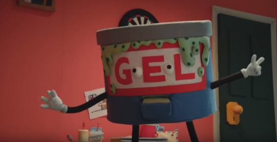
https://www.deviantart.com/joyofcrimeart/journal/Don-t-Hug-Me-I-m-Scared-REVIEW-629975791 DA Link
64 notes
·
View notes
Video
youtube
A good or great writer may refuse to accept any responsibility or morality that society wishes to impose on her. Yet the best and greatest of them know that if they abuse this hard-won freedom, it can only lead to bad art. There is an intricate web of morality, rigor, and responsibility that art, that writing itself, imposes on a writer. It’s singular, it’s individual, but nevertheless it’s there. At its best, it’s an exquisite bond between the artist and the medium. At its acceptable end, it’s a sort of sensible cooperation. At its worst, it’s a relationship of disrespect and exploitation.
The absence of external rules complicates things. There’s a very thin line that separates the strong, true, bright bird of the imagination from the synthetic, noisy bauble. Where is that line? How do you recognize it? How do you know you’ve crossed it? At the risk of sounding esoteric and arcane, I’m tempted to say that you just know. The fact is that nobody—no reader, no reviewer, agent, publisher, colleague, friend, or enemy—can tell for sure. A writer just has to ask herself that question and answer it as honestly as possible. The thing about this “line” is that once you learn to recognize it, once you see it, it’s impossible to ignore. You have no choice but to live with it, to follow it through. You have to bear with all its complexities, contradictions, and demands. And that’s not always easy. It doesn’t always lead to compliments and standing ovations. It can lead you to the strangest, wildest places. In the midst of a bloody military coup, for instance, you could find yourself fascinated by the mating rituals of a purple sunbird, or the secret life of captive goldfish, or an old aunt’s descent into madness. And nobody can say that there isn’t truth and art and beauty in that. Or, on the contrary, in the midst of putative peace, you could, like me, be unfortunate enough to stumble on a silent war. The trouble is that once you see it, you can’t unsee it. And once you’ve seen it, keeping quiet, saying nothing, becomes as political an act as speaking out. There’s no innocence. Either way, you’re accountable.
Today, perhaps more so than in any other era in history, the writer’s right to free speech is guarded and defended by the civil societies and state establishments of the most powerful countries in the world. Any overt attempt to silence or muffle a voice is met with furious opposition. The writer is embraced and protected. This is a wonderful thing. The writer, the actor, the musician, the filmmaker—they have become radiant jewels in the crown of modern civilization. The artist, I imagine, is finally as free as he or she will ever be. Never before have so many writers had their books published. (And now, of course, we have the Internet.) Never before have we been more commercially viable. We live and prosper in the heart of the marketplace. True, for every so-called success there are hundreds who “fail.” True, there are myriad art forms, both folk and classical, myriad languages, myriad cultural and artistic traditions that are being crushed and cast aside in the stampede to the big bumper sale in Wonderland. Still, there have never been more writers, singers, actors, or painters who have become influential, wealthy superstars. And they, the successful ones, spawn a million imitators, they become the torchbearers, their work becomes the benchmark for what art is, or ought to be.
Nowadays in India the scene is almost farcical. Following the recent commercial success of some Indian authors, Western publishers are desperately prospecting for the next big Indo-Anglian work of fiction. They’re doing everything short of interviewing English-speaking Indians for the post of “writer.” Ambitious middle-class parents who, a few years ago, would only settle for a future in Engineering, Medicine, or Management for their children, now hopefully send them to creative writing schools. People like myself are constantly petitioned by computer companies, watch manufacturers, even media magnates to endorse their products. A boutique owner in Bombay once asked me if he could “display” my book The God of Small Things (as if it were an accessory, a bracelet or a pair of earrings) while he filmed me shopping for clothes! Jhumpa Lahiri, the American writer of Indian origin who won the Pulitzer Prize, came to India recently to have a traditional Bengali wedding. The wedding was reported on the front page of national newspapers.
Now where does all this lead us? Is it just harmless nonsense that’s best ignored? How does all this ardent wooing affect our art? What kind of lenses does it put in our spectacles? How far does it remove us from the world around us?
There is very real danger that this neoteric seduction can shut us up far more effectively than violence and repression ever could. We have free speech. Maybe. But do we have Really Free Speech? If what we have to say doesn’t “sell,” will we still say it? Can we? Or is everybody looking for Things That Sell to say? Could writers end up playing the role of palace entertainers? Or the subtle twenty-first-century version of court eunuchs attending to the pleasures of our incumbent CEOs? You know—naughty, but nice. Risqué perhaps, but not risky. It has been nearly four years now since my first, and so far only, novel, The God of Small Things, was published. In the early days, I used to be described—introduced—as the author of an almost freakishly “successful” (if I may use so vulgar a term) first book. Nowadays I’m introduced as something of a freak myself. I am, apparently, what is known in twenty-first-century vernacular as a “writer-activist.” (Like a sofa-bed.)
Why am I called a “writer-activist” and why—even when it’s used approvingly, admiringly—does that term make me flinch? I’m called a writer-activist because after writing The God of Small Things I wrote three political essays: “The End of Imagination,” about India’s nuclear tests, “The Greater Common Good,” about Big Dams and the “development” debate, and “Power Politics: The Reincarnation of Rumpelstiltskin,” about the privatization and corporatization of essential infrastructure like water and electricity. Apart from the building of the temple in Ayodhya, these currently also happen to be the top priorities of the Indian government.4
Now, I’ve been wondering why it should be that the person who wrote The God of Small Things is called a writer, and the person who wrote the political essays is called an activist. True, The God of Small Things is a work of fiction, but it’s no less political than any of my essays. True, the essays are works of nonfiction, but since when did writers forgo the right to write nonfiction?
My thesis—my humble theory, as we say in India—is that I’ve been saddled with this double-barreled appellation, this awful professional label, not because my work is political but because in my essays, which are about very contentious issues, I take sides. I take a position. I have a point of view. What’s worse, I make it clear that I think it’s right and moral to take that position, and what’s even worse, I use everything in my power to flagrantly solicit support for that position. Now, for a writer of the twenty-first century, that’s considered a pretty uncool, unsophisticated thing to do. It skates uncomfortably close to the territory occupied by political party ideologues—a breed of people that the world has learned (quite rightly) to mistrust. I’m aware of this. I’m all for being circumspect. I’m all for discretion, prudence, tentativeness, subtlety, ambiguity, complexity. I love the unanswered question, the unresolved story, the unclimbed mountain, the tender shard of an incomplete dream. Most of the time.
But is it mandatory for a writer to be ambiguous about everything? Isn’t it true that there have been fearful episodes in human history when prudence and discretion would have just been euphemisms for pusillanimity? When caution was actually cowardice? When sophistication was disguised decadence? When circumspection was really a kind of espousal?
Isn’t it true, or at least theoretically possible, that there are times in the life of a people or a nation when the political climate demands that we—even the most sophisticated of us—overtly take sides? I believe that such times are upon us. And I believe that in the coming years intellectuals and artists in India will be called upon to take sides.
Arundhati Roy, The Ladies Have Feelings, So . . . Shall We Leave It to the Experts? (Based on a talk given at the Third Annual Eqbal Ahmad Lecture, Amherst, Massachusetts, February 15, 2001; compiled in The End of Imagination)
38 notes
·
View notes
Photo


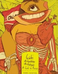
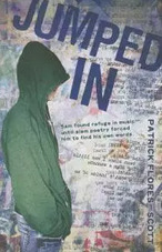
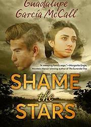
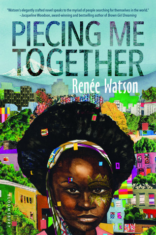
Poetry Favorites
I cannot remember a time when I didn't love words. Poets use words efficiently and effectively and quite often evoke strong emotions, so poetry has also always appealed to me. I tend to seek out anthologies, novels in verse, and even books with poetry sort of sprinkled throughout. Here are a few of my favorites.
Anthologies:
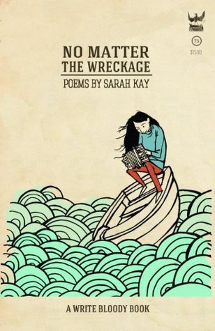
No Matter the Wreckage by Sarah Kay Write Bloody Publishing
Summary: Following the success of her breakout poem, “B,” Sarah Kay releases her debut collection of poetry featuring work from the first decade of her career. No Matter the Wreckage presents readers with new and beloved work that showcases Kay’s knack for celebrating family, love, travel, history, and unlikely love affairs between inanimate objects (“Toothbrush to the Bicycle Tire”), among other curious topics. Both fresh and wise, Kay’s poetry allows readers to join in on her journey of discovering herself and the world around her. It’s an honest and powerful collection.
Voices in the Air by Naomi Shihab Nye Greenwillow Books
Acclaimed and award-winning poet, teacher, and National Book Award finalist Naomi Shihab Nye’s uncommon and unforgettable voice offers readers peace, humor, inspiration, and solace. This volume of almost one hundred original poems is a stunning and engaging tribute to the diverse voices past and present that comfort us, compel us, lead us, and give us hope.
Voices in the Air is a collection of almost one hundred original poems written by the award-winning poet Naomi Shihab Nye in honor of the artists, writers, poets, historical figures, ordinary people, and diverse luminaries from past and present who have inspired her. Full of words of encouragement, solace, and hope, this collection offers a message of peace and empathy.
Voices in the Air celebrates the inspirational people who strengthen and motivate us to create, to open our hearts, and to live rewarding and graceful lives. With short informational bios about the influential figures behind each poem, and a transcendent introduction by the poet, this is a collection to cherish, read again and again, and share with others. Includes an index.
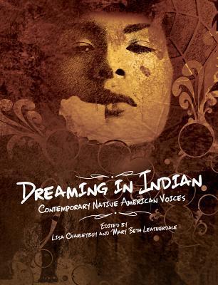
Dreaming in Indian by Lisa Charleyboy & Mary Beth Leatherdale (Not solely poetry, but containing some poetry) Annick Press
A powerful and visually stunning anthology from some of the most groundbreaking Native artists working in North America today.
Truly universal in its themes, “Dreaming In Indian” will shatter commonly held stereotypes and challenge readers to rethink their own place in the world. Divided into four sections, ‘Roots, ‘ ‘Battles, ‘ ‘Medicines, ‘ and ‘Dreamcatchers, ‘ this book offers readers a unique insight into a community often misunderstood and misrepresented by the mainstream media.
Emerging and established Native artists, including acclaimed author Joseph Boyden, renowned visual artist Bunky Echo Hawk, and stand-up comedian Ryan McMahon, contribute thoughtful and heartfelt pieces on their experiences growing up Indigenous, expressing them through such mediums as art, food, the written word, sport, dance, and fashion. Renowned chef Aaron Bear Robe, for example, explains how he introduces restaurant customers to his culture by reinventing traditional dishes. And in a dramatic photo spread, model Ashley Callingbull and photographer Thosh Collins reappropriate the trend of wearing ‘Native’ clothing.
Whether addressing the effects of residential schools, calling out bullies through personal manifestos, or simply citing hopes for the future, “Dreaming In Indian” refuses to shy away from difficult topics. Insightful, thought-provoking, and beautifully honest, this book will to appeal to young adult readers. An innovative and captivating design enhances each contribution and makes for a truly unique reading experience.
See also their other two collections: Urban Tribes & #NotYourPrincess
Novels in Verse
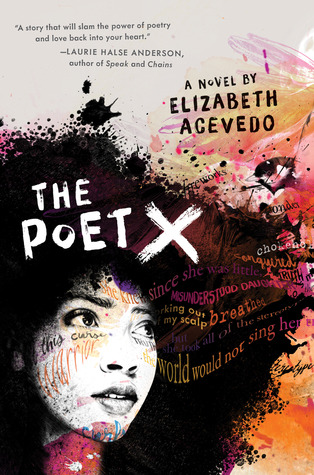
The Poet X by Elizabeth Acevedo HarperTeen [Audrey’s Review]
A young girl in Harlem discovers slam poetry as a way to understand her mother’s religion and her own relationship to the world. Debut novel of renowned slam poet Elizabeth Acevedo.
Xiomara Batista feels unheard and unable to hide in her Harlem neighborhood. Ever since her body grew into curves, she has learned to let her fists and her fierceness do the talking.
But Xiomara has plenty she wants to say, and she pours all her frustration and passion onto the pages of a leather notebook, reciting the words to herself like prayers—especially after she catches feelings for a boy in her bio class named Aman, who her family can never know about. With Mami’s determination to force her daughter to obey the laws of the church, Xiomara understands that her thoughts are best kept to herself.
So when she is invited to join her school’s slam poetry club, she doesn’t know how she could ever attend without her mami finding out, much less speak her words out loud. But still, she can’t stop thinking about performing her poems. Because in the face of a world that may not want to hear her, Xiomara refuses to be silent.
A Time to Dance by Padma Venkatraman Nancy Paulsen Books [My Review]
Summary: Padma Venkatraman’s inspiring story of a young girl’s struggle to regain her passion and find a new peace is told lyrically through verse that captures the beauty and mystery of India and the ancient Bharatanatyam dance form. This is a stunning novel about spiritual awakening, the power of art, and above all, the courage and resilience of the human spirit.
Veda, a classical dance prodigy in India, lives and breathes dance—so when an accident leaves her a below-knee amputee, her dreams are shattered. For a girl who’s grown used to receiving applause for her dance prowess and flexibility, adjusting to a prosthetic leg is painful and humbling. But Veda refuses to let her disability rob her of her dreams, and she starts all over again, taking beginner classes with the youngest dancers. Then Veda meets Govinda, a young man who approaches dance as a spiritual pursuit. As their relationship deepens, Veda reconnects with the world around her, and begins to discover who she is and what dance truly means to her.
Long Way Down by Jason Reynolds Atheneum/Caitlyn Dlouhy Books
Summary: A cannon. A strap. A piece. A biscuit. A burner. A heater. A chopper. A gat. A hammer A tool for RULE
Or, you can call it a gun. That’s what fifteen-year-old Will has shoved in the back waistband of his jeans. See, his brother Shawn was just murdered. And Will knows the rules. No crying. No snitching. Revenge. That’s where Will’s now heading, with that gun shoved in the back waistband of his jeans, the gun that was his brother’s gun. He gets on the elevator, seventh floor, stoked. He knows who he’s after. Or does he? As the elevator stops on the sixth floor, on comes Buck. Buck, Will finds out, is who gave Shawn the gun before Will took the gun. Buck tells Will to check that the gun is even loaded. And that’s when Will sees that one bullet is missing. And the only one who could have fired Shawn’s gun was Shawn. Huh. Will didn’t know that Shawn had ever actually USED his gun. Bigger huh. BUCK IS DEAD. But Buck’s in the elevator? Just as Will’s trying to think this through, the door to the next floor opens. A teenage girl gets on, waves away the smoke from Dead Buck’s cigarette. Will doesn’t know her, but she knew him. Knew. When they were eight. And stray bullets had cut through the playground, and Will had tried to cover her, but she was hit anyway, and so what she wants to know, on that fifth floor elevator stop, is, what if Will, Will with the gun shoved in the back waistband of his jeans, MISSES.
And so it goes, the whole long way down, as the elevator stops on each floor, and at each stop someone connected to his brother gets on to give Will a piece to a bigger story than the one he thinks he knows. A story that might never know an END…if WILL gets off that elevator.
Gabi, a Girl in Pieces by Isabel Quintero Cinco Puntos [My Review]
Summary: Gabi Hernandez chronicles her last year in high school in her diary: college applications, Cindy’s pregnancy, Sebastian’s coming out, the cute boys, her father’s meth habit, and the food she craves. And best of all, the poetry that helps forge her identity.
July 24
My mother named me Gabriella, after my grandmother who, coincidentally, didn’t want to meet me when I was born because my mother was unmarried, and therefore living in sin. My mom has told me the story many, many, MANY, times of how, when she confessed to my grandmother that she was pregnant with me, her mother beat her. BEAT HER! She was twenty-five. That story is the basis of my sexual education and has reiterated why it’s important to wait until you’re married to give it up. So now, every time I go out with a guy, my mom says, “Ojos abiertos, piernas cerradas.” Eyes open, legs closed. That’s as far as the birds and the bees talk has gone. And I don’t mind it. I don’t necessarily agree with that whole wait until you’re married crap, though. I mean, this is America and the 21st century; not Mexico one hundred years ago. But, of course, I can’t tell my mom that because she will think I’m bad. Or worse: trying to be White.
Jumped In by Patrick Flores-Scott Henry Holt and Co. [My Review]
Sam has the rules of slackerhood down: Don’t be late to class. Don’t ever look the teacher in the eye. Develop your blank stare. Since his mom left, he has become an expert in the art of slacking, especially since no one at his new school gets his intense passion for the music of the Pacific Northwest—Nirvana, Hole, Sleater-Kinney. Then his English teacher begins a slam poetry unit and Sam gets paired up with the daunting, scarred, clearly-a-gang-member Luis, who happens to sit next to him in every one of his classes. Slacking is no longer an option—Luis will destroy him. Told in Sam’s raw voice and interspersed with vivid poems, Jumped In by Patrick Flores-Scott is a stunning debut novel about differences, friendship, loss, and the power of words.
Shame the Stars by Guadalupe García McCall Tu Books [My Review] [Interview with Guadalupe García McCall]
Summary: Eighteen-year-old Joaquín del Toro’s future looks bright. With his older brother in the priesthood, he’s set to inherit his family’s Texas ranch. He’s in love with Dulceña—and she’s in love with him. But it’s 1915, and trouble has been brewing along the US-Mexico border. On one side, the Mexican Revolution is taking hold; on the other, Texas Rangers fight Tejano insurgents, and ordinary citizens are caught in the middle.
As tensions grow, Joaquín is torn away from Dulceña, whose father’s critical reporting on the Rangers in the local newspaper has driven a wedge between their families. Joaquín’s own father insists that the Rangers are their friends, and refuses to take sides in the conflict. But when their family ranch becomes a target, Joaquín must decide how he will stand up for what’s right.
Shame the Stars is a rich re-imagining of Romeo and Juliet set in Texas during the explosive years of Mexico’s revolution. Filled with period detail, captivating romance, and political intrigue, it brings Shakespeare’s classic to life in an entirely new way.
Piecing Me Together by Renée Watson Bloomsbury [My Review]
Summary: Jade believes she must get out of her neighborhood if she’s ever going to succeed. Her mother says she has to take every opportunity. She has. She accepted a scholarship to a mostly-white private school and even Saturday morning test prep opportunities. But some opportunities feel more demeaning than helpful. Like an invitation to join Women to Women, a mentorship program for “at-risk” girls. Except really, it’s for black girls. From “bad” neighborhoods.
But Jade doesn’t need support. And just because her mentor is black doesn’t mean she understands Jade. And maybe there are some things Jade could show these successful women about the real world and finding ways to make a real difference.
Friendships, race, privilege, identity—this compelling and thoughtful story explores the issues young women face.
If you want even more great titles, check out our Poetry Month posts from the past.
Poetry Month (2018)
Pieces of Poetry (2017)
Poetry Link Round Up (2016)
Novels in Verse (2014)
Piles of Poetry (2013)
11 notes
·
View notes
Text
Love Paint (Oneshot; Minkey; ~1K) (AFF Link)
While it’s not wholly uncommon for Kibum to call Minho in to sit with him -- regardless of whether he’s modeling or not -- there’s still something special about the invitation. About being requested to exist in Kibum’s safe haven.
(Uhh I don’t think there’s any needed warnings but there’s like one (1) dick joke at the end)
A/N: this was based on Nu’est “Love Paint (Every Afternoon)”
“Will you come model for me, dove?”
Though they’re rooms apart, Kibum’s voice carries well enough that it’s almost as if he’s standing just behind Minho.
“Just as soon as I finish tidying up.”
“I have to prep everything anyway, take your time.”
Sweeping up photo paper trimmings, Minho tries to hurry in the cleanest way he can. Their new apartment with extra rooms for work spaces had turned out to be the much needed change in their life. FInally done tidying up, he walks down the hallway to Kibum’s paint studio. Per usual he has all the windows wide open, sheets spread out to protect the floor and walls.
“How am I to pose, maître peintre?”
Kibum laughs softly at the attempted French as he finishes drying his watercolor palette.
“Just come lay down near me. The afternoon sun’s going to be coming in soon.”
Minho does as he’s told, taking care not to knock anything over as he attempts to get comfortable. While it’s not wholly uncommon for Kibum to call Minho in to sit with him -- regardless of whether he’s modeling or not -- there’s still something special about the invitation. About being requested to exist in Kibum’s safe haven.
“Any idea of what you’re painting today?”
Kibum smiles. “Nope.”
“I feel like having no starting idea is harder for a painter.”
“As compared to a photographer?”
“Yeah. I might not know what I want to photograph when I go out, but I’ll know it when I see it. Like, the project I’m working on now. I had no preconceived idea of what it would be, but when I saw it it just clicked.”
“Like us?”
Minho hums and starts getting lost in the memory. His childhood friend and now dance prodigy Taemin dragging Minho along to an art exhibition that he was required to attend for a class. Though Minho had always had a penchant for visual arts, the fact that the exhibit was mostly focusing on up-and-coming painter Kim Kibum turned him off from it. Kibum’s work -- self described as vivid impressionism -- was obnoxiously bright and egregiously abstract in Minho’s opinion. And the fact that Kibum had made a comment in an interview about how Minho’s art was “stiflingly gray” and “incredibly barren.” Somehow -- by some miracle -- Taemin was able to appreciate both artistic visions and even orchestrated -- by some even greater miracle -- a joint exhibition between them: Minho took photos of Taemin’s self-choreographed senior recital and Kibum painted his own interpretations of the routine. After the opening of the exhibition, the three had gone home to Taemin’s tiny apartment for some celebratory drinks. A drunken heart to heart revealed that their differences in artistic style were driven by almost the same thing: Minho’s clean, minimalist grayscale photos sprang up out of his desire to simplify the world around him; Kibum’s loud, lively, messy paintings developed as an escape from the constraints of the world around him. Armed with newfound understanding and a handful of almost sober kisses, the two made an agreement and effort to improve their relationship. Though some of the smaller arts papers were saddened by the loss of their favorite intermedia rivalry, the two quickly became the beloved princes of the local art scene. And now, 5 years later-
Minho’s train of thought is interrupted by the sensation of something cold on his hand. Blinking back to the present, he looks at his hand.
“You weren’t listening to my posing instructions so I changed my mind and decided that you’re my medium today. I hope you don’t mind.”
Minho laughs but tries to keep his hand still in Kibum’s.
“Sorry, I was thinking about us.”
“I assumed you were. You had that funny dreamy look.”
“What’s funny about it?”
“It just seems odd to romanticize about our original rivalry is all.”
“How do you know that’s the part I fantasize about?” “I said romanticize not fantasize.”
Minho sighs in fond annoyance and Kibum goes back to painting.
“Can I at least see what’s being painted on me?”
“Absolutely not.”
“Why?”
“Because I want you to trust me.”
Minho chuckles and shifts around so his arm is in a more comfortable position.
“There’s finally proper reviews of my last exhibition out.”
“It took them this long?”
“Yeah. Well, at least for the serious people.”
“But didn’t it close last week?” “Yeah. They came to the last day so they could interview me about it.”
“Ahh.”
Minho waits for Kibum’s interest to come to the forefront of his mind; he recognizes the focused look in Kibum’s eyes. Five years later, he’s learned to appreciate and love the look of Kibum painting.
“So what did it say?”
“That it was very experimental for me, and that even though everything was still monochrome, that it seemed as if you’re finally starting to rub off on me in the brightest way.”
“It would really kill you to have more than one color wouldn’t it?”
“One color is enough for me, just like one boyfriend is enough for me.”
Kibum furrows his brow, amused skepticism coloring his face.
“Was there doubt about this?”
“One of the comments on the article was if I had enough lovers who used such bright colors that eventually I’d end up with full color photos.”
Kibum puts his paintbrush down and laughs til there’s tears in his eyes.
“I thought of commenting back ‘sorry I only need one shade of love paint in my life’ but didn’t want to seem like I super care about public opinion on my private life.”
“Love paint? Is that what I am?”
“What? You’ve made my life literally and metaphorically more colorful, haven’t you? Painted my existence with love?”
Kibum rolls his eyes and picks up his paintbrush again. “Don’t make me paint a dick on your hand.”
“I’m being honest! And also you wouldn’t.”
“Oh wouldn’t I?”
“Why would you put the effort into consciously painting a dick on my hand when you could just put yours in my hand?”
Kibum huffs in unadmitted defeat and starts washing his brush. Minho sneaks a glance at his half dried hand and forearm: the sight of grayscale paint makes his heart swell.
#i love them ok#art gays minkey is a concept we should all think about#minkey#minho#kibum#1 shot 2 shot just for 1#writing
11 notes
·
View notes
Text
Grace Ellis: The Frederator Interview

Grace Ellis is among the most exciting comic and TV writers working today, and all from coffee shops ‘round Columbus, Ohio. The first comic she created, Lumberjanes, is a NY Times bestselling series, in development as a movie, and brought her home Eisner and GLAAD awards for her cat to try to knock over. Grace is currently writing one of the most magical comics of the year, Moonstruck, but still found time to pen some awesome episodes of Bravest Warriors season 4 (after she determined that the gig was not, indeed, a prank). Grace and I sat down to talk log-doodling, queer representation in comics, and the commonalities between Beth Tezuka and Captain America.
Having written Lumberjanes: were you a Girl Scout yourself?
For a little, until my troop disbanded! Lumberjanes re-connected me with my Girl Scout roots. The inspiration for a lot of the woodsy stuff comes from an outdoor camp I was part of. After college I worked for Autostraddle, the biggest online network for queer women. They host a weeklong sleepaway camp every year called A-Camp. It has a bunch of panels, talent shows, activities - really cool stuff. When I was a camp counselor one year in Big Bear, I made friends with an attendee, Shannon Watters, who’s a writer and editor at Boom! Comics. Later, she approached me about making a comic together.
Wow! So Lumberjanes was your very first comic... ever?!
Yup! The first issue of Lumberjanes was the first comic I ever wrote.

That’s amazing! Wait, backin’ up - what were you doing before?
My big kid job was journalism. I studied a mix of journalism, theater and women’s studies at Ohio State. After school ended I started pitching around and got a gig writing ads for Playbill. Then I got some work with Bustle too. I was doing sort of garbage writing: mostly TV recaps and some vaguely personal stuff here and there. Very little actual journalism. Then I got the job with Autostraddle when the site was still fairly new.
So you taught yourself both comic writing and screenwriting?
Pretty much! I was already familiar with story structure, so it was really about learning to adapt those elements to different formats, and take advantage of each medium. That comes with practice more than teaching. Every format is different. Like with comics, I go panel by panel, one at a time. I have to keep framing in mind while focusing on what’s happening in the scene, and what the characters are saying, because comics are super dialogue-driven. Writing comics is like trying to write the minimum in order to say the most.
How did Lumberjanes develop from the first ‘let’s make a comic!’ moment?
We drew a lot of inspiration from Ms. Kitty Fantastic and Buffy the Vampire Slayer. I developed the concept with Shannon and we started from just rough outlines of the characters. Then Brooklyn A. Allen came on and designed them. And after that we brought on Noelle Stevenson as a second writer. Working all together was really smooth, a cut-and-dry process. We only needed one Skype call per issue!
Which girl in Lumberjanes are you the most like?
Molly - well, I’m always told to answer Molly! She’s the timid and unsure one. But hopefully Jo as well! I like to think that I can be a leader.
How did you come to write for Bravest Warriors?
Shannon submitted me! Benjamin (Townsend, Story Editor) reached out. I actually forwarded the email to my lawyer right away. I was sure that I was getting scammed. I was so excited when it turned out legit!

(“Catbug! You don’t just bust in on someone when they're dukin’. Buddy... we talked about this.”)
Do you have a favorite character in Bravest?
Catbug is the most fun to write. Before pitching the Detective Catbug episode I wrote this season, I prepared by hanging out with a 5 year old. It actually helped! Catbug has the funniest voice, I just love writing him. But Beth is my favorite Bravest Warrior. Once I’d nailed down who she is, I really liked writing her. She kind of reminds me of Captain America: she’s unbeatable and refuses to stay down. And she’s unapologetically herself.
She truly is That Beth. How did you first start working on Moonstruck?
It actually started as a school exercise, with no plan to extend it! 2 years ago I was doing a program with Columbus College of Art & Design, where they partner their artists with pro comic writers. I was lucky enough to be accidentally (I later found out, secretly-totally-on-purpose) partnered with Shae Beagle. The assignment was to write a 5 page scene, with 2 twists; the first building off the second. That became the opening of Issue 1: the first twist is that we’re not in a normal human coffee shop - it’s full of mythological creatures. The second is that the girl we're following who seems totally normal… well, she doesn’t view herself as normal at all.
I’ve wondered why Julie is so insecure, when she’s surrounded by such a diversity of mythological people?
For Julie, it’s really this fear of losing control. She’s has a deep sense that in her werewolf form, she’s not normal. She’s not right. So she’s internalized some really negative stuff about what that means for and about her.
Are there levels of privilege and marginalization in this world around being human or mythological?
Yes - I’ve been working on how to represent societal privilege surrounding mythological and non-mythological people. A big inciting factor in Julie’s story is her falling in love with a girl, who - spoiler alert! - is also a werewolf like she is. But Selena has a totally different perspective on who she is. She’s comfortable with herself.
Your characters are so distinct - what is your process for nailing a character’s voice?
It’s a lot of time thinking about who the character is; how they’d react to things, based on their personalities and what they’ve lived. Living close to a college is a big help because I’m surrounded by people around the age of the characters I write. Overhearing conversations is often inspirational! I also pull a lot from real life and my own friends. I have the best time writing over-enthusiastic characters: the ones that are high energy, always on, and oblivious. Julie, on the other hand - it was tougher to find her voice. She’s so timid, yet she also has this sardonic edge. It helped when I realized that she would say “Sorry” all the time. It’s her instinct to apologize for herself, even when she has no reason to! After figuring out something like that, that’s core to her character, I was able to grow her voice from there.
What do you find most challenging about writing? And most rewarding?
Being done is very rewarding! And feeling like you nailed it. The worst thing is when you don’t want to write. It’s easier now that it’s my job, because I have to do it. When I was an AV tech at a movie theater, I always wanted to write, but I wouldn’t do it. What’s tough is that I would rather think than write. Thinking is underrated. But the problem is, I know that I should write something - anything! - every single day.
Do you ever do any of your own art?
Nah, I’m not an artist. I draw sometimes. I’m a prolific log-drawer.
Logs?!
Yeah (laughs) I sometimes fixate on one thing and it becomes the only thing I doodle. Logs are that.
That is… oddly fitting! What is your creative process like?
It’s not very strict. My rule is that I leave my house every day before noon and go to a coffee shop. Then I just plug into it.
What do you like to do outside of writing?
Is there such a thing? Video games, especially during winter. Reading a lot of comics, plays and nonfiction. Biographies are great character studies. Currently, I’m reading a novel, The Blunderer by Patricia Highsmith. For writing pretty light and happy comics, I really do like books about heavy guilt and punishment...
Speaking of Patricia Highsmith - with her Price of Salt such a cornerstone in queer writing - what are your thoughts on representation and writing queer characters?
Oh yeah - we’re all familiar with the tropes. The sad stories, the coming out stories. They’re important in their way. But they aren’t what I need to write! I’m not a sad person, so I can’t just put that on. I write upbeat stories about characters who are already out and accepted. I’m a happy, out lesbian. So to represent those characters isn’t just what’s truthful to me - it also says to readers that hey, you can be a happy, out lesbian too!
Do you think there is a market for young adult media with queer characters and themes that didn’t exist a decade ago?
Absolutely. It used to be that anytime a writer put a gay or lesbian character in anything - let alone a main character - they were pigeon-holed as a ‘queer writer’. And a decade ago, that could severely limit, or even ruin, a writer’s career. Now, ‘queer media’ isn’t just a subgenre - gay and lesbian representation is coming into the mainstream. It’s a changing world. Lumberjanes did so well, it uncovered a whole market of tween, teenage girls and queer women. And there hasn’t been enough made for them! Backstagers, Zodiac: Star Force - a lot of the new comics coming out are riding on a wave of realization for the comic companies. They figured out that they were leaving money on the table when it came to queer female audiences.
What’s your advice to people who want to write comics or TV shows?
Write a lot. Write every day, if you can. It’ll make you a better writer. And put stuff on the Internet. It sounds scary, but it’s the best way to get your work seen. At this point, people are getting jobs off of Twitter. Networking is BS!
What is your Dream, or dream gig?
My dream is to write things that I’m proud of in many different mediums. A musical. A video game. A movie. I’m a really big fan of form. It’s an almost intellectual interest: the different things each format brings to the table, and how you work with each to find the best possible way to tell a story.
What are some of your favorite Things?
I loved Saturday Morning Cartoons. Recess, The Weekenders. I like weird slice of life children’s stories. Calvin and Hobbes is a huge favorite. LA Noir is my favorite video game. And one of my favorite comic artists is Alison Bechdel. She does a strip called Dykes to Watch Out For that is absolutely hilarious. ❀
Follow Grace on Twitter and Instagram.
Thanks for the interview Grace! We’ll no doubt be keeping up with you. Can’t wait for the great stories you’ll tell, across all the formats that strike your fancy!
- Cooper ❀
#The Frederator Interview#frederator studios#grace ellis#lumberjanes#boom! comics#bravest warriors#comics#moonstruck#noelle stevenson#brooklyn allen#alison bechdel#cartoons#animation#writer#patricia highsmith#interview#shae beagle#columbus
71 notes
·
View notes
Text
Why i started to self-taught web development ?

I was in parental day off. I doing a tons of
cyber security tutorial for many reasons..
First i hated my last jobs in underground
mine gold mine and start thinking about
how it can affect my new son in the
future.
After take this step-back in my mind
I stop cyber-security because. I Just
realize. I didn't know how the deep structure work!
The journey begin at this moment.
I said to myself
-okay you need to work hard on it and finally fall in love with all the aspect of web development!
I remember when ive got installed my
first IDE *vscode". Alot of tools, alot of
shortcut!
I was like;
-Omg dude, are you really dive in this deep thing?
- Oh yeah for sure!
At the beginning , I looking where to
start. It was same thing everywhere html
& css . I remember my mind saying me,
Damn its boring!
I have hush up thats voice in my mind
and continue learning...
It was a really good thing to continue
because. I've Just realize after a moment
the complexe structure HTML could
give ! A good developer who really know
how the "SEO" the accessibility works
can make the différences.
The CSS with a fine knowledge can be a
artwork it is powerful and leightweight
for the browser too!
Javascript are the most powerful of these
maybe so it couldn't work without them!
The beauty of knowing to coding his web
page openning so many possibility for
the coder.
Its not in hand of all to create anything who
want !
"Programming look like magic tricks sometimes. But before get the result you very need to "grind"!"
It is my first post here. Let me know if
you like it . The next post will be more on
the technical approach I think!
Follow me everywhere ! Love you ugly nerd !
> instagram
https://instagram.com/dev4learn?igshid=ZDdkNTZiNTM=
> Github sponsor are activate ! If you want contribute or push issue too !
Dev4learn on #github are a blog project for sharing all my journey and help other polyglote like me to achieve their passage across the river Styx of programming struggle 🤣
>
>
1 note
·
View note
Text
Q+A with Irina Boersma, the Photographer Capturing the Environments of Our Dreams
Irina Boersma is a product and interior photographer based in Copenhagen. While working on projects internationally, she captures the places and brands at the core of our aesthetic desires in a delicate and harmonious manner.
We recently took the time to ask her some questions to learn more about how she succeeds in creating the perfect scenography for each pictures; the one you wish you could spend your Sundays in.
EL: Can you tell us a little bit more about how you started as a photographer? When did you realize you wanted to pursue this path in your life?
IB: When I was studying at university, I was studying Film and Media, and though I loved the storytelling through audiovisual media, I wasn’t satisfied with the creative process of filmmaking. I found it too slow and heavy, and most of my energy ended up in managing and organizing details of film production, which in the end took space from my creative contribution to the process.
I changed course to photography, which had been present in my life on a hobby basis already, and went to an art photography school. At this point, it was quite clear to me that I wanted to work with photography as my primary medium. I had always been very creative as a child, painting and drawing a lot, and the artistic expression was very natural to me. At the Art Photography school, we learned to find our own visual language and photographic voice, working with exhibitions and book projects. Afterward, I assisted one of Denmark's prominent art photographers Nicolai Howalt, which gave me a good insight into the working life of an art photographer. I admired and loved his work but wanted to have an everyday life with more photographing and less gallery networking and fundraising for art projects. After all, what I loved to do was really the act of photographing.
So how could I have a working life shooting more images I thought… That would be to do more commercial photography work next to my art projects. And to become a better commercial photographer, I started assisting one of the best photographers in that field, Peter Krasilnikoff. This began an almost seven-year-long work relationship, first as his full-time assistant, then he hired me as a photographer to take on some of the clients and the last two years we have been business partners in the studio we shared. Now he has retired from the commercial work, and I am continuing the work with our old clients and a lot of new ones on my own.
Peter taught me a lot of technical knowledge about photography, how to give shape to objects with light, and also a lot of business knowledge on how to approach commercial clients and organize large-scale photoshoots with a lot of practical details. And throughout those years I have been behind the camera every day, which is what I wanted.
Now that I have worked with commercial projects for years, I am finding myself returning to the more artistic expression in photography. It is like closing a circle, really, combining the two worlds I have been trained in - commercial photography and art photography.
EL: Were you always more attracted by shooting spaces and objects rather than portraits? Why did you decide to take this direction?
IB: Throughout the many years of working with photography, I have been around a lot of different genres of the medium. I have worked with food photography, travel reportage, wedding photography, interior, and portraits. I have always liked portrait photography because of the connection you get with the subject in front of the camera, and the empathic process and psychological challenge to get the right emotional state out in the image. So this type of work has been present along the way. I have chosen not to focus on it because I prefer the creative process of creating a universe and atmosphere around objects. You start from scratch and build up a world around the story you want to tell, and for me, that is very gratifying and a great creative outlet.
I do shoot portraits sometimes, but I never show them anymore. Now I think about it, it is a different way to use the medium - instead of catching a moment unfolding naturally before your lens, I am creating the scene and atmosphere unfolding before the lens. It is still a vivid process and often with several other creatives involved, like stylists, art directors, etc. so the process is not 100 percent predictable, and never gets boring to me.
“Now I think about it, it is a different way to use the medium - instead of catching a moment unfolding naturally before your lens, I am creating the scene and atmosphere unfolding before the lens.”
— Irina Boersma
EL: There is a precise aesthetic direction surrounding your body of work. Is harmony something that is important to you? Why is that so?
IB: This is an excellent question, because I do believe visual harmony is essential, but I don’t think about it consciously all the time when I work. It happens intuitively somehow. I look at the image and arrange things in a way that they feel harmonious and leave nothing to disturb or distract the eye from the story I am telling.
I think it must be because I want to convey an emotion in the spectator when they look at the image, and I don’t wish distracting elements to lead them away from the atmosphere and feeling I am creating. It is not just a space with some pretty things put in there, I want the image to convey some kind of atmosphere or emotion, even if it is very subtle. It can also be so subtle that the spectator doesn’t notice that he is being told a story, there is just a feeling of a beautiful scene.
“It can even be so subtle that the spectator doesn’t notice that he is being told a story, there is just a feeling of a beautiful scene.”
— Irina Boersma
EL: Do you work differently when you are shooting personal and commercial work? How do you manage to bring that artistic touch to your commercial projects?
IB: The commercial work has a specific framework set up by the needs of the clients, whereas the artistic or editorial projects are freer. So the process changes a bit, but my approach to every kind of project is the same, very serious and professional and I’m always trying to push the situation to the best outcome possible. What I try to do with the commercial work is to push clients bit by bit to become braver and expand or move their framework to include some artistic expression. It has to be done respectfully because after all the images need to push their business, create income, and therefore also finance my work. I also think it is about finding the right clients that see some value in adding a little extra feeling into the marketing material they need to produce.
EL: What role do you think images play in the lifestyle industry?
IB: Today images have become such an integrated part of our life and perception of ourselves and the world we live in. Obviously for a lifestyle industry images are crucial to presenting a universe surrounding their products. It is a straightforward way to connect to the consumer especially because we all spend so much time every day looking at images on Instagram and other media.
Personally, I think the overconsumption of images today is working a bit against the creatives in my field, in the sense that people don’t take the time to observe and feel the work we are presenting. You look for two seconds in your Instagram feed, think ���oh that’s beautiful,” put a like and on to the next images. The attention to the image, and therefore also the emotional response to it lasts for a very short period.
As a photographer, I will probably embrace the analog ways of showing images again at some point in my career. This could be exhibiting printed images, having editorial projects in biannual magazines and making book projects. Showing pictures to an audience that takes the time to actually look at them! This would lead me back to the starting point of my photographic career, art photography, and the circle has been completed once again. I’m not impatient to get there though, right now I love where I am and embrace all the challenges that come my way.
EL: What are your upcoming projects for 2019? What would you like to accomplish this year?
IB: For me, this year is really about integrating the artistic expression into the commercial work and having good working relations in both the commercial and editorial photography field. I will release several great editorial series that I am working on and still continue to work with my current and hopefully some new commercial clients.
This already has been my focus for a while, and I will continue working in this direction. Expanding my international network is also very important to me this year, as it gives me a lot of new inputs and inspirations for my work. I want my photographic work to develop continuously, so to expand my visual horizons I want to see some other colors and ways of doing things. That feeds the creative brain with inputs for new photographic projects in the future.
All images by Irina Boersma
1 note
·
View note
Text
Remembering Stan Lee: The Amazing Origin Story Of The Marvel Comics Scribe
Remembering Stan Lee: The Amazing Origin Story Of The Marvel Comics Scribe
Strangely enough, Lee said he would cast himself as the opposite of all that in his own imagination, drawing a comparison to the cynical, Stan Lee Thank You For The Memories Shirt uncompromising newspaper editor J. Jonah Jameson. “I’m very frustrated that by the time they made the movie I was too old to play the role,” Lee said. “I modeled him after me. He was dumb and loudmouthed and opinionated. Of all the characters he helped create, Peter Parker remained his favorite. “In a way Spider-Man is more special than the others,” he said. What made him Lee’s favorite? “Nothing ever goes right for Peter. I think for most people in the world, nothing ever goes right. He hates people he’s never seen — people he’s never known — with equal intensity — with equal venom. “Now, we’re not trying to say it’s unreasonable for one human being to bug another. But, although anyone has the right to dislike another individual, it’s totally irrational, patently insane to condemn an entire race — to despise an entire nation — to vilify an entire religion. Sooner or later, we must learn to judge each other on our own merits. Sooner or later, if man is ever to be worthy of his destiny, we must fill our hearts with tolerance. For then, and only then, will we be truly worthy of the concept that man was created in the image of God ― a God who calls us ALL ― His children. 2.99. Available in North America and Europe. Oscorp Search & Destroy Pack - In The Amazing Spider-Manvideo game, Spider-Man has his own smartphone to help navigate around Manhattan, locate missions and challenges and fight crime. With this pack, Spider-Man's smartphone will feature two mini-games inspired by classic arcade fun. 2.99. Available in North America and Europe. Lizard Rampage Pack - The notorious Lizard is on the loose again in Manhattan! Take on the role of Dr. Connors' terrifying alter ego in a race against time. Go berserk through the streets using his devastating stomp attack and tail swipe to defeat Oscorp guards and earn mega points.
Lee knew his work was different, proudly noting that stories were drawn out over several issues not to make money but to better develop characters, situations and themes. He didn’t neglect his villains, either. One, the Moleman, went bad when he was ostracized because of his appearance, Lee wrote, adding it was “almost unheard of in a comic book” to explain why a character was what he was. Lee’s direct influence faded in the 1970s as he gave up some of his editorial duties at Marvel. But with his trademark white mustache and tinted sunglasses, he was the industry’s most recognizable figure. The Amazing Spider-Man is getting a whole bunch of DLC today, including a few different packs that will have you playing as people other than the titular wall-crawler. The Lizard Rampage pack will open up a level where you play as the Lizard, along with a new Spidey suit to wear. 49.99 on Steam, including complete integration with Steam achievements. A Nintendo 3DS demo is also now available in the Nintendo eShop. Rhino Challenge Pack - Take control of the massive, genetically engineered villain Rhino and rampage around Manhattan in an exclusive gameplay challenge of pure destruction! As Rhino, players will be able to unleash his formidable powers to destroy anything and everything in his path in a timed event full of speed, combo streaks, and of course, a ton of things to break! The Associated Press in a 2006 interview. Lee considered the comic-book medium an art form and he was prolific: By some accounts, he came up with a new comic book every day for 10 years. He hit his stride in the 1960s when he brought the Fantastic Four, the Hulk, Spider-Man, Iron Man and numerous others to life. His heroes, meanwhile, were a far cry from virtuous do-gooders such as rival DC Comics' Superman. The Fantastic Four fought with each other. Spider-Man was goaded into superhero work by his alter ego, Peter Parker, who suffered from unrequited crushes, money problems and dandruff.
XXX in the world of comic books were awesome. I happen to think they’re not exactly what a lot of people think but I don’t doubt their size and endurance. I knew him since 1970, worked for him a few times, talked with him at length and fielded an awful lot of phone calls from him asking me questions about comic books he worked on. He really did have a bad memory, if not when he first started telling people he had a bad memory, then certainly later on as he turned more and more into the Stan Lee character he’d created for himself. That’s all I’m going to write now. That’s where it begins and ends with me. To those of us who have been so deeply affected by the humanity of his imagination, the understanding of reaching beyond our potential and the necessity of tapping into our immeasurable imaginations, we thank you and are forever indebted. Rest In Peace Dear Stan. You made our time here a better one. What a man. What a life. When I first broke into Hollywood, he welcomed me with open arms and some very sage advice I’ll forever take to heart. A true icon who impacted generations around the world. Rest in love, my friend. I have to say I am deeply touched by the passing of Stan Lee… I always looked forward to seeing his cameo parts in all his great movies. 1 - Maybe you haven’t noticed, but there is a spiritual quality in all the Stan Lee movies… always the good guys win. Eventually, not always right away, but eventually. And his movies most of the time ended on an upbeat thought… that allowed us to ponder our existence. 2 - Stan Lee was also a man who could have been a musician but he was not good at music at all.
Legendary Marvel Comics co-creator Stan Lee — famous for giving the world beloved superheroes including Spider-Man, Iron Man and the Incredible Hulk — died Monday. According to TMZ, Lee suffered a number of illnesses over the last year, including pneumonia. His daughter J.C. told the site, “My father loved all of his fans. Lee was born Stanley Martin Lieber to Romanian-born Jewish immigrants in New York City, spending much of his early life in Washington Heights. He returned to Timely Comics in 1945 and married wife Joan two years later. In 1950, Timely Comics publisher Martin Goodman tasked Lee with creating a new superhero team to rival DC Comics’ Justice League. “Let’s lay it right on the line. Bigotry and racism are among the deadliest social ills plaguing the world today. But, unlike a team of costumed super-villains, they can’t be halted with a punch in the snoot, or a zap from a ray gun. The only way to destroy them is to expose them — to reveal them for the insidious evils they really are. The bigot is an unreasoning hater — one who hates blindly, fanatically, indiscriminately. If his hang-up is black men, he hates ALL black men. If a redhead once offended him, he hates ALL redheads. If some foreigner beat him to a job, he’s down on ALL foreigners. Stan Lee, the comic book mastermind who changed the landscape of the superhero genre, has died at age 95. Lee revolutionized the comic world by creating Marvel Comics superheroes such as Spider-Man, The Fantastic Four and The Incredible Hulk. An attorney for Lee's daughter, J.C. Lee, said the creative dynamo who revolutionized the comic world by introducing human frailties in superheroes such as Spider-Man, The Fantastic Four and The Incredible Hulk, was declared dead Monday at Cedars-Sinai Medical Center in Los Angeles. In a statement to Fox News Shane Duffy, CEO of Stan Lee’s POW! I think everybody loves things that are bigger than life. I think of them as fairy tales for grown-ups," he told The Associated Press in a 2006 interview. "We all grew up with giants and ogres and witches. Well, you get a little bit older and you're too old to read fairy tales.
How long would this superhero movie thing last? He didn’t know. He was glad to be along for the ride. Happy to see the old characters he helped create being brought to life onscreen. We began talking about the origin of Spider-Man, born in 1962 after a string of other successes had made Stan Lee a powerhouse scribe at Marvel Comics. He had started working there when he was 17. Back then, Marvel Comics was known as Timely Comics, and he was known as Stanley Lieber, son of Jewish Romanian immigrants from the Bronx. His dream was to become a writer. But before any of that could happen, he earned cash by working a series of small jobs. As a theater usher, his first claim to fame was tripping and falling while showing Eleanor Roosevelt to her seat. “Are you all right, young man? Remember, this was six years before Iron Man and the launch of the Marvel Cinematic Universe. The films were not yet interconnected, not that there were many to string together. Stan Lee cameos were not yet a phenomenon. He had played a beachside hotdog vendor in the X-Men film. That was it. (“You missed me?” he teased. “I was like the lead of the movie! ] idea was, I was selling sunglasses in Times Square and I was talking to this little girl, showing her a pair of glasses as Peter Parker walks by,” Lee recounted in his gruff, nasally voice. Think about the incredible characters that derived from the mind of this man. Iron Man, the X-Men, Thor, Daredevil and Dr. Strange. These are characters everyone knows and loves. Look at this list of Stan Lee's creations and think about which ones have gone onto success in other media as well as had very successful runs in comics. Every single one of them almost. Granted, a lot of that success is due to the efforts and contributions of those writers and artists who developed the characters through the years. But Stan Lee's fingerprint is on each and every one of them and will always be seen and felt. Can you name one single creator in comics that has contributed as much in terms of longevity, creativity and uniqueness? You can't because there are none. There are plenty of creators that have made great contributions and have written or drawn amazing characters and stories. But none can say they changed the face of the industry quite like Stan Lee can. No matter what happens from this day forward; no matter what superstar creators land at the Big Two. Stan Lee, Marvel Comics' own living legend, stands head and shoulders above the rest. LOS ANGELES (AP) — Stan Lee, the creative dynamo who revolutionized the comic book and helped make billions for Hollywood by introducing human frailties in Marvel superheroes such as Spider-Man, the Fantastic Four and the Incredible Hulk, died Monday. Lee was declared dead at Cedars-Sinai Medical Center in Los Angeles, according to Kirk Schenck, an attorney for Lee’s daughter, J.C. As the top writer at Marvel Comics and later as its publisher, Lee was widely considered the architect of the contemporary comic book. He revived the industry in the 1960s by offering the costumes and action craved by younger readers while insisting on sophisticated plots, college-level dialogue, satire, science fiction, even philosophy.
1 note
·
View note
Link
Being in financial crunch situations is not new to many. If you too are one who gets into financial complications in life, I recommend you to give a try on these websites to make money online. There are numerous ways with the help of websites to make money online. If you are looking for a constant stream of additional income into your life, you must check out the 10 options that I have listed down.
Here is the list of top 10 websites to make money online.
1. Fiverr
Fiverr is a platform where anyone and everyone with skills can do freelancing work. As the name suggests that every task gets paid $5, it is not the same anymore. A freelancer now can charge up to $750 for a task done on the website. All you have to do is create your FREE account, create a gig that pertains to how you can help others. No matter what your skills are – whether it is in writing, digital marketing, graphics design, website development or anything else, all you need to do is list yourself. Since, millions of individuals and companies who seek some or the other job to be done, you are almost assured of getting projects on a daily basis. The best part is you can have as many gigs as you want based on how many skills you possess. Fiverr is definitely my top website to make money online.
2. Freelancer
Freelancer.com is a marketplace filled with individuals and companies who like to work on client’s requirements. Although it is same as Fiverr, it is different in the way you get your project based on your skills – In Freelancer, a client posts his job on a feed along with all information related to the project, including the budget he has for the project. Freelancers who are interested in taking up the listed project must bid on it. The client will individually connect with ones who he feels the best and allocates the project to him. In my experience, Freelancer can be too taxing for beginners, however, if you are ready to bid at lower compared to others, higher are the changes you will make some really good money from Freelancer.
3. Etsy
Are you a good craftsman? Do you have a special talent in craft forms that you can showcase to your prospective customers? If yes, Etsy is the place where you can sell your stuff online. From handmade jewelry, shoes, paintings, toys, collectibles, carpentry work, wall decors, clothing etc you can sell everything here on Etsy. For artistic folks, Etsy is the website to make money online over the internet.
4. ShareASale
ShareASale was founded back in the year 2000 and it is one of the most trusted and reputed affiliate marketing network available out there.With 17 years of experience, they have been trusted by over 4200 merchants to sell their products on affiliate marketing basis including well-known, medium and small merchants. Register with ShareASale, get access to thousands of products that they have listed for marketers just like you. Put up a website and start writing about these products with affiliate links embedded contextually. When someone clicks on the link and makes a purchase you get a commission. Some commissions can be as high as $200 per sale made from your link. If you are good at blogging ShareASale is the place you want to register with.
5. Mturk
So, what is MTurk all about? MTurk is the short form for Amazon Mechanical Turk. MTurk platform lists various Human Intelligence Tasks or HITs in short, which can be picked by workers to choose micro-level jobs, complete them and submit. For each submission, workers are paid.
“Amazon Mechanical Turk was conceptualized based on the premise that there are a variety of tasks that machine intelligence cannot perform and human interference is required to perform them efficiently. Tasks such as secondary research data mining, identifying objects in an image, transcribing video and audio files etc require human intrusion.
The best part is to complete these micro-level jobs one need not possess special skills and anyone who is computer literate can accomplish these jobs. If you looking for part-time job opportunities to make some dough on your side, register with MTurk today.
Each of these micro-level tasks varies in the amount of time required to finish and submit and so does the payment for each.
6. TaskRabbit
TaskRabbit is primarily very local in nature. This means to say that you select locally available freelancing jobs in your neighborhood. Some of the categories of jobs that you can get on TaskRabbit include – Moving and Packing, Furniture assembly, Gardening, Home Improvement, Installations and Mounting work, electrical works, plumbing works etc. All you have to do on the website is a search for the jobs near you. If you think you can take jobs listed for you, approach them to start working. If you really have a lot of spare time, especially during the day, earning up to $2,500 per month is very much within reach.
7. CafePress
Are you good at designing? Do you have good hands-on knowledge of image editors? Here is an opportunity to make some extra buck on your side.
CafePress is that opportunity, where you can submit logos and designs that can be printed on CafePress’ products. CafePress basically is an eCommerce platform that specializes in selling mugs, t-shirts, wall arts, stationeries, bags, clothing etc.
If your designs are accepted to be placed on CafePress’ products, you become eligible for royalties against each product sold.
So, how to join CafePress? There are no registration fees to join CafePress. All you need do on the platform is to register, create your own store and portray your designs. Pick from the array of product lines that you want your logos or designs to be placed.
If the combination of the products and your design gets sold, you earn a percentage of the selling price as a royalty. Fair enough?
8. ThredUp
ThredUp is an online Thrift and Consignment store where you can sell your old clothes. Based on how good they are, you can earn equivalent money on your side. Next time before you opt for a yard sale, hold on! Reach out to ThredUp before you do anything that might fetch you less money.
9. UserTesting
To start working on User testing, all you need is an internet connection and a microphone. On this platform, all you have to do is test websites and applications. Voice record each testing scenario along with the video played on your computer and earn. One can expect to be paid up to $10-$20 for a single testing activity for up to 20 minutes. Whenever there are testing jobs available you are notified by UserTesting.
10. Gazelle
If you are in need of money urgently, Gazelle is the platform you should log into. Here on this website, you can make money by selling your old mobile phones and other gadgets. Once you have uploaded all required information about the mobile phone, you will be offered a value to the device. Once you accept the offer, you will be sent with packaging materials for you to ship Gazelle the cellphone. Not to worry, Gazelle covers the shipping costs. Once they have received the gadget you can opt for the payment mode to receive the payment. Yes, this is not an income stream that can fetch you money week on week, but surely is a way to pay your rental bills for the month.
Life can sometimes get itchy financially. Since there are no legal shortcuts to make money, it is best to be focussed and work harder. An additional stream of money can work wonders in your life. For this exact reason, we have compiled the list of websites to make money online, just for you.
The post Money Making Websites | 10 Websites to make money online appeared first on Waftr.com.
1 note
·
View note
Text
** CAMP Artist Talk: Phoebe Boswell 18/02/21

Phoebe Boswell, The Matter of Memory, 2014
Talk Notes
https://www.phoebeboswell.com/
A tutor told her - “You make work to fill a hole, the difficulty is trying to figure out what that hole is.”
Care as antidote, the future as hope.
We are memory and earth and freedom and hope.
We are speculative and nuanced.
Art making as ritual practice, liberal practice, a safety valve.
‘Acadia’ - a discontinued term - a man seized by this emotion who is disgusted. Coined by a monk
How we see each other / how we fail to see each other.
Multidisciplinary artist
Part of CAMP’s series relating to resilience and care.
Zanzibar - where her parents live - charcoal and paint drawings of fisherman - their fishing livelihoods are now heavily affected by tourism, over fishing and climate change. These fisherman were descendants of slaves.
“How will you practice freedom today?”
Rights, representation, labour, activism, precarity. Not intrinsic to life, something that can be taken away, perverted.
Work:
Cluster - Eye, Rapture/Rupture, A Broken Heart, New Moon. Looped video projections, Medical imaging, 2018.
Ythlaf, looped video, 2018.
Transit Terminal, charcoal and carbon on constructed box plinths, 2014.
The Eye series, pencil on paper, 2018.
Performative | Black | Square, instagram posts, June 2 2020.
There is Peace There, charcoal and pastel on paper (diptych with cutouts), 2018.
For There Is Softness There, charcoal and pastel on paper, 2018.
And I Can Cry There, 2018.
And We Can Laugh…, 2018.
Untitled (from Take Me to the Lighthouse), 2018.
Matatizo, 2015.
The Matter of Memory, installation, 2014 - recreated her grandmother’s living room and filled it with narratives that explore familial love and the trauma entrenched in history. Born in Kenya. Born as a result of an urge to go home but didn’t know what home was. Neither Kenya or England. Did have her parent’s memories of home. Recorded both parents talking about their childhood. Unliniearity of human existence. Made small drawings, tiny animations and sculptures in response to these recounting. Each chair has each of the parents speaking with her speaking over the top repeating their words, taking ownership of the stories.
We care for the stories that we tell.
Importance and profoundness of stories that define our existence.
Medium, how we tell stories and how things can be reinterpreted. Intimacy and scale. You can only see certain projections from certain places in the installation, e.g. from sitting in the chair with her father’s voice.
Always a wound and a projection of animated flies onto the wound.
Made drawings based on family photographs of new formations of family members that had never met. Rewriting and remaking memories, right things that were wrong. Using work as a process of healing.
Mutumia (working drawings), 2016. An ode to women who have used their bodies as a form of protest. Used real women as models for the drawings. Shame, sisterhoods, resilience. 30 minute looped animation - took 9 months to make. Pencil and paper animations. Inside the floor was a series of hidden sensors that triggered different sound tracks. This work featured in the Venice Biennale. People were encouraged to draw and write with charcoal in the installation. It became a chaotic work which changed completely as a result of the interaction by the audience.
‘Food for the spirits’ - What does it mean to stand in your own body as an author of yourself? Based from Adrian Piper’s self-portrait series when he isolated herself over a period of time and documented it.
Who are we and how do we give ourselves agency?
Had a significant trauma where she lost the sight in her eye and had a mini heart attack. Made work as a result collaborating with another artist, self-indulgent work which was healing in a wider context. Everyday she would photograph herself in the morning however she was feeling and that would be the drawing of the day. She drew these in a gallery space everyday over a period of 3 weeks. Drawn in soft willow charcoal - wanted it to be as fragile as she felt. Notions of trust interwoven. Cathartic experience where she had to see herself in all moods. Kept having memories back to a photograph of her when she was child so started drawing her as a child in order to engage in dialogue with her younger self. Made her realise what art can be and what it can do in relation to trauma.
Received the British School at Rome residency at the Slade School of Art (2019). Working in a space that was built on colonialism, she started examining what it means to make black work in white spaces. How to speak truthfully about black experience. Contemplated instead what whiteness was, how it functions, what it was afraid of and why it was afraid. Thought about how whiteness permeates archives and history. Got quite bored quickly of drawing the white, male body. Learnt of 3 black male deaths that had been reported in Italy, created work in response to how they were reported by in Italian press. The drawings change depending on how they are viewed/engaged with (i.e. light, colour). Three drawings: I See You / I.C.U [Rest in Power, Pateh Sabally], 2019; Wake Work I / Chiuere, You Are Loved / Wake Work II [Rest in Power, Emmanuel Chidi Namdi], 2019; Sing, Beloveds, Scream, Be Loud, Remembert, We Were Never Meant to Survive [Rest in Power, Idy Diene], 2019 - Took flower pots from the fountain where Idy was shot and smashed them in the gallery space.
What happens when you perform erasure? Abstraction through colour and tone; sometimes the work was not visible at all depending on the light and it was only a black square that appeared visible.
PLATFORM, moving image public work in situ at Lancy Bachet Railway Station, Geneva, 2020. I AM - every time someone disappears, their sentence appears and lingers beyond when they sentence disappears.
Thinking about the sacred bond between the artist and subject. The eco system of care, how often careless the art world can be, how we cope with the way in which art feeds into capitalism.
Question: What are we willing to lose?
Q&A:
She grew up naive about the systems and structures in place in terms of race and gender. She didn’t know how she would be perceived in England until she got here.
Belief systems - why do we believe things? The spirit world? What makes us believe this?
Navigating the middle space is sometimes difficult.
Reflection:
This was a truly inspiring and lovely artist talk. I resonated with Phoebe Boswell's work so much and found the way in which she presented her work and the talk itself incredibly poetic. Boswell's drawing talents are truly phenomenal and her ability to translate her practice through different mediums is brilliant. This was my first CAMP artist talk and I am so glad that I attended. The opportunity to ask questions at the end helped make the talk even more personalised. I was particularly interested in her installation work 'The Matter of Memory' (2014) as it resonated with me greatly in the context of my degree show practical project due to the similarities between mine and the Boswell's need to explore identity through the exploration and recounting of personal histories. There was an opportunity to enter a competition to win a tutorial and portfolio review with one of the CAMP visiting artists, Phoebe Boswell being one of them. Unfortunately my name wasn't drawn out of the hat, however I do feel that the talk itself was thorough enough for me to have learned enough about the installation itself and the level of detail that went into creating it. Boswell truly thought of everything, from tiny animations in teacups, to replicating her grandmother's living room. This was my favourite artist talk to date. (Smith, 2021)
References:
Boswell, P., (2014). The Matter of Memory. [Online]. Available at https://www.phoebeboswell.com/the-matter-of-memory. [Accessed on 05/03/2021].
Smith, L. (2021). Creating and Professional Development Folder: CAMP Artist Talk: Phoebe Boswell. p.132.
0 notes
Text
Latte love
@catielynnelove I’m sorry you had to wait so long to get this but here you go, your gift for the @voltron-ss. I hope you enjoy
“Hi can I get the house latte?”
“Medium?” Keith asked, even though he knew this order by heart. This costumer, this really pretty blue eyed costumer, came every day and ordered the same thing, different if they had his favourite pastry out.
“Yes please. Ooh, can I also get raspberry and apricot tart please?” there it was, the one thing he’d add to his order.
“Sure. Lance right?” Keith asked as he finished typing in the whole order and picked up a cup for his favourite customer’s drink
“Yep.” Lance answered handing over his usual $10 for when he ordered 2 items and gave him that bright smile that made coming to work all worth it.
Keith could deny it all he wanted, he was head over heels for Lance. It wasn’t just how he looked or the smile Lance gave him. It was also something else.
Keith was an artist and it showed with the cups he’d doodle on and his latte art. He always enjoyed the ways of latte art, always trying to do something different for everyone. Most people didn’t take notice but Lance always, without fail would take a picture. He didn’t realise it but Lance also uploaded them to his Instagram. Keith never really used his, he only had it so he could follow his brother when he and his girlfriend went on their Europe trip. So he had been surprised when he was tagged in a photo one day. A photo of a very familiar latte art. He also remembered that was the day he finally gave Lance his name.
Took me forever to find his account, but @koganeartist does the best latte art. Voltron Coffee House scored with him.
The caption made his face turn red. He didn’t follow him back but he’d check back every couple days to see the pictures of the latte art he made on Lance’s account, mixed in the pictures of Blue the ragdoll cat and selfies of Lance. There was even a sneak shot of Keith, in his zone of making latte art on Lance’s profile. No caption, but Keith would always analyse the photo, trying to figure out why Lance had a picture of him on his Instagram. Shiro would suggest that maybe he ask but the idea of Lance knowing he practically stalked his account was not something he wanted Lance to know.
Keith focused on the picture, trying not to rush but also not to take too long. This was way more elaborate than he usually did but all the compliments Lance gave him on his Instagram pushed him forward. He finally was able to finish and smiled at the result. He gently picked up the cup and put it on the pickup counter, calling for Lance as he bagged the tart. He went to clean that machine as Lance came to pick up his things and moved as slow as possible without being too obvious in hopes of hearing Lance say something.
“Oh my god. Keith, come here.” The stunned voice said, telling Keith he succeeded.
“Yes?”
“You did this?” Lance asked pointing at the cup. When Keith nodded, the stunned and amazed look grew even more. “This is so amazing. I love this. How long did it take you to do this?” Lance asked, pulling out his phone to take a picture. “I almost don’t want to drink this. It’s so pretty.”
Keith gave a small shrug, “it took a while to perfect, can’t be that amazing.”
“I’m going to pretend you didn’t say that. Oh god, I can’t cover this up or drink it. I wanna show it off.” Lance said, actually looking distressed at the thought of messing the art up. He had seen this face many times but never to this level. Keith had to stop himself from turning red with the unsaid compliment.
“You have pictures and you think it’s amazing. Trust me, I won’t be mad for you drinking it. Besides, don’t you have to get to work?”
“I do. Alright, since you gave it your blessing, I won’t feel so bad about drinking it. Thanks again.” After putting a lid on and picking up his pastry, he gave another wave and smile to Keith before leaving.
That encounter left Keith in a good mood for the rest of his shift. Now only if he could get rid of the lingering headache.
Keith coughed, moaning as the sudden pressure made his head ache more. He looked at the picture that was at the top of Lance’s Instagram, the koi fish latte art he had done for Lance the day before
Just when I thought he couldn’t surprise me more, he does. I don’t know how he does it, but I look forward to seeing just how @koganeartist can impress me even more.
Lance was really dialling it up with the compliments. Keith wanted to impress him more, to get more compliments from him. Maybe even more in front of him and not behind a screen. Maybe it might actually give him the courage to ask him out. However with his headache turning to cold, Keith wasn’t seeing that in his future anytime soon. He was sure Lance would lose interest if he didn’t show up and he wanted Lance to be interested. His head was just pounding too much to even think about going. He was planning on calling in sick when his phone started buzzing.
“Hello?”
“Keith my boy, glad I caught you. Tell me, are you planning on coming to work today?”
Keith was going to say no but the sound of Coran’s frazzled voice stopped him. “Why?”
“Rolo called in sick and so did Shay. It’s this cold going around. You’re my only worker today and I have to catch up on paperwork so I have no clue how much help I’d be.”
It was tempting to say he couldn’t but it was Thursday, one of their busiest and he really wanted to see Lance.
“Sure, I’ll be there.”
“You will? Oh thank goodness. I’ll see you soon then my boy.” How bad could it be? He’d just wear a face mask on his way to work and take it off. It��d be fine.
It was not fine.
How did Keith ever think this was fine? The morning rush was horrible, even with Coran helping. His headache got worse with the noise and trying to hide the coughing and sneezing from Coran was becoming harder. Finally, Coran disappeared into the back to work on the paper work and things started to quiet down. Keith put his head in his arms on the counter, hoping for the end to come when the door opened again and he heard a concern voice.
“Keith, are you ok?”
Keith pulling himself away from his makeshift pillow to see Lance staring at him in concern.
“Yes, I’m fine. Getting your usual?”
“Um, yeah but are you sure you’re ok? You look really pale.”
“I’m fine, don’t worry.”
Lance didn’t look like he believed him but thankfully stopped pushing. “Alright. Then I’ll have a medium house latte.”
Keith did the money transaction quickly and picked up a cup, going over to the coffee machine to start, having to pause as his head pounded more. The original plan was to try the simple Pikachu in Lance’s foam this time but Keith didn’t have the energy to even try. Making a simple flower was all he could do. He put the cup on the pickup counter, not even calling Lance over. He put his head back in his arms as he heard Lance come over. It was silent and Keith was close to falling asleep when his arm was shaken.
“Keith, can you lift your head for me?”
Keith looked up and felt a cool hand against his forehead. It felt nice and his head didn’t feel like it was buzzing as bad as he focused on Lance’s concerned face. But why was he concerned.
“Your forehead is really warm. I know it, you’re sick. Why’d you come to work if you’re not feeling well?”
“Everyone else couldn’t come. What do you mean ‘you knew I was sick’?”
Lance looked slightly embarrassed. “Oh well, um. Your latte art? This is gonna sound weird but every latte art you’ve done for me, I have a picture of and I noticed they seemed to get more and more elaborate with each up, which is why I get so excited when I come here. I mean, the flower is really pretty but it doesn’t seem to up to your out their standards so it kinda sealed the deal that somethings wrong, other than you’re really pale face.”
Keith knew Lance had a picture of every art but the fact that he could tell just how out there he went with each one was something else.
“I, uh, I’ve had a headache since yesterday, which developed into coughing and mild sneezing.” Keith didn’t see the point in hiding it anymore.
“And it’s about to develop into you going home. I’m getting your boss.” Keith couldn’t stop Lance from practically jumping over the counter and disappearing into the back. It was tempting to call Lance back but he had a feeling Lance wouldn’t listen.
Soon Coran came out, looking worried, with Lance following after him. Keith let himself be prodded by Coran, knowing he’d be lectured so he might as well get it over with.
“Why didn’t you say anything?” Coran demanded
“Everyone else couldn’t come in. today’s one of our busiest.”
“I would have been fine, trust me. Now, I want you to be quiet because I’m taking you home and making sure to call that brother of yours so he can come take care of you.”
“He’s out of town and you have paperwork.”
“Um,” Lance poked between them, “if it’s ok with you both, I can take him home.”
“Don’t you have work?” Keith asked, though he’d take any chance to try and spend more time with Lance.
Lance shrugged. “I have the day off, besides, um it’s the least I could do for all the amazing latte art.”
Coran gave Keith this look that just told him Coran knew everything.
“If that’s ok with you, that would be perfect. I can close the place early and take care of the paperwork. I’ll get you his address in case he tries to tell you someplace different to get out of it. Wait here.” Coran first went to flip the Open sign and then disappeared into the back.
Keith watched Lance grab his drink, pulling out his phone. Then, he took a picture.
“But that wasn’t a good one?” Keith mentioned, confused as to why Lance still took a picture.
“It’s not as elaborate, but you still did an amazing job and it’s really good. Um, I hope you don’t mind me taking you home. After your art yesterday I kinda realised that I really wanted to talk to you more and I was gonna but you’re sick so…” Lance explained, his skin starting to darken with his blush.
Lance was interested in him?
“If it’s ok with you, once you feel better, maybe I can take you out? Like on a date? Maybe?”
Lance was very interested.
“Um, yes, sure, absolutely. I’d really like that.”
“Great. Awesome.” Lance said, a relieved and embarrassed smile on his face that Keith was sure he had on his own.
Coran came back out and handed Lance a paper, that same knowing look on his face. Keith knew he wasn’t going to get out of integration when he came back.
“Get him straight home and into bed. I don’t want to see you for at least 3 days, more if you get worse. I take it you’d be getting his number so make sure and check up on him. Have a nice day.” Coran disappeared just as quickly leaving a thoroughly embarrassed Keith and a blushing Lance.
“Well, come on. I have a date waiting for me once your better and I’m sure if I don’t get you home soon, your boss might do something to me.”
“I swear he’s not usually like this.” Keith said, pulling his apron off.
“Hey, at least I know I choose an interesting place to get coffee. It’s got odd but caring managers and really cute baristas who can make really amazing latte art.”
Keith wasn’t sure how many more compliments he could take. He had a feeling his eventual date would leave him more red than this fever was.
36 notes
·
View notes
Photo




GAC Design Proposal
My design campaign is themed around the topic of human-caused global warming and climate change. I hope for people to become more aware of the damage caused by the human population towards the environment, as well as understand the prevalence of climate change by addressing its issues and consequences. It is important because the growing human population continues to depend and harm the environment to meet resource needs. This has caused the mass emission of greenhouse gases, which has proven to cause environmental damage in many natural ecosystems, species, and even the resources we depend on. It is important because it affects our every-day lives, but we have carried a deliberately evasive mindset in addressing and tackling the issue of climate change and global warming. I believe by actively integrating modern and minimalistic design, people will be attracted to ways that they can decrease the effects of climate change, simply by shifting small every-day activities that can go a long way collectively.
I want to present shocking information about climate change such as the rise of global temperature, its effects in species extinction and ecosystems, as well as other “attention grabbers.” I will integrate logos and general designs that are connected to one another but also provide some individual attention, in order to accurately talk about the issue, its effects, why it's important, and what people can do to help the population combat it. There are many species that have been or are currently showing signs of possible extinction. I think documenting animals and some relevant facts about animal conservation and the general scope of their survival during climate change will put a bigger emphasis in the effects of the issue, as well as providing a good connection towards any external links the viewer can access that will allow them expert research to further educate them about this issue. By prioritizing the use of the Futura font style, as well as a generally the intended message to care for the Earth will be effectively communicated in its typography and design, which will catch and keep the viewer interested in the issue. I will allow my brand to be a cohesive brand/look by using color relationships (mainly complementary to blue and green to represent the Earth) to enhance the looks of the brand, in hopes to make it more in line with the contents of the campaign for flow, as well as integrate appropriate design elements that will further expand the brand to be approachable. This will effectively translate the purpose and meanings of the poster and hopefully become a good inspiration for the viewer to cause action in the climate crisis. I will also put a big emphasis on the individual and renewable energy because they represent hope during this issue, and making them stand out in the campaign will accurately point out the importance of involvement and participation in such times.
I will be further expanding my designs, aiming to add simplistic graphics that will represent specific aspects of climate change, each important in its impacts and longevity of importance while tackling the most important issue of our lifetime.
GAC Advocacy Campaign: Design Rationale
I overall enjoyed implementing design into the issue of global warming and climate change. Programs in the Adobe suite such as Photoshop and Illustrator really allowed me to effectively communicate the urgency that we are all currently facing to combat climate change, as big of an issue as it is. I hope that my campaign was effective and impactful enough to allow someone to just think about the climate crisis and admire the importance they possess in the course of action against this issue. I believe that I was able to accurately represent the scope of climate change and its effects very simply and minimal, which allowed the campaign to become more streamlined and easy to follow.
A part of the project that was the most enjoyable to me was getting down to designing graphics for the campaign. Those were crucial steps in deciding a common ground for the types of figures I wanted to feature in my iconography and typography, all reflected around the Earth in color, as well as the effects of climate change. I wanted the designs to be immersive in a way that they were eye-catching to make the viewer want to know more about what they were looking at. I also believed that the climate crisis has not been recently met with any support from graphic design or other artistic mediums that can explain its effects in our current population. So this was the perfect opportunity to show just how much of an impact art can have on communicating the importance of the issue, as well as encourage others to take it upon themselves to change and take action.
A challenging component of the work was actually deciding which graphics I wanted to feature on the campaign. I made a lot of graphics in the beginning stages of the project, which allowed me to have a lot on my plate in terms of direction, but also made it difficult to make final decisions on iconography and typography. At times, I second-guessed the directions of the project, thinking that too many graphics were being featured. But I realized that this made the project really stand out, as some graphics, especially in the brochure, I considered some of my best work. It was a great and fun experience to get to rely on digital design to carry through the importance of climate change, an issue that I am and others should be more passionate towards, since my career is involved in the science field.
I loved how simplistic and minimal the project ended up looking at its current stage, and I am overall very satisfied to be granted the opportunity to voice the importance of climate change towards people all needed to resolve the issue.
My campaign explained the issue of climate change because it talked about its causes, effects, and was to resolve it. It did that in ways that were easy to recognize and were eye-grabbing to the viewer, to hopefully carry them through the satisfaction of learning something new. The visual identity of the movement was heavily based around getting those iconographies to accurately translate towards the effects of climate change. It was very enjoyable to articulate ideas to bring those conditions of climate change into light with digital software. I think that using the Futura font across the work made the campaign look very connected and harmonious, which was translated in the design as well, staying dear to the issue while not being too exaggerated. To continue this campaign, I would tackle social media platforms in order to spread the important messages climate change possesses. It is necessary within this current generation to care for the Earth and actually take action in the mitigating of anthropogenic fossil fuels. This campaign is hopefully a stepping stone towards greater things within combating climate change.
As much as the process of this work was heavily time intensive, it is satisfying to see the final product as an important reminder of the dangers of climate change and I am staying optimistic for its effects in the near future.
Works Cited
Denchak, Melissa. How Can You Stop Global Warming. Natural Resources Defense Council Inc. July 17 2017. April 19 2021. https://www.nrdc.org/stories/how-you-can-stop-global-warming
Denchack, Melissa. Global Climate Change: What You Need to Know. Natural Resources Defense Council. February 23 2017. April 20 2021.
https://www.nrdc.org/stories/global-climate-change-what-you-need-know
Diego Arugedas Ortiz. Ten Simple Ways to Act on Climate Change. BBC Future. November 4 2018. April 19 2021.
https://www.bbc.com/future/article/20181102-what-can-i-do-about-climate-change
Global Climate Change: Vital Signs of the Planet. National Aeronautics and Space Administration. April 19th 2021. https://climate.nasa.gov/
Global Climate Change: Vital Signs of the Planet: Facts. National Aeronautics and Space Administration. April 19th 2021. https://climate.nasa.gov/effects/
International Union for Conservation of Nature. Species and Climate Change. April 19th 2021. https://www.iucn.org/theme/species/our-work/species-and-climate-change
Rice, Doyce. One-third of all plant and animal species could be extinct in 50 years, study warns. USA Today. February 14 2020. April 19 2021. https://www.usatoday.com/story/news/nation/2020/02/14/climate-change-study-plant-animal-extinction/4760646002/
Schleuning, M., J. Frund, and C. Hof. 2016. Ecological networks are more sensitive to plants than to animal extinction under climate change. Nature Communications: 13965
United Nations. The Health Effects Of Global Warming: Developing Countries Are The Most Vulnerable. April 19 2021. https://www.un.org/en/chronicle/article/health-effects-global-warming-developing-countries-are-most-vulnerable
World Wide Fund for Nature. Causes of Climate Change. April 19 2021. https://www.wwf.org.nz/what_we_do/climateaction/causes_of_climate_change/#:~:text=The%20main%20causes%20of%20climate,absorb%20and%20store%20carbon%20dioxide
Credits/Licenses:
1. Tote Bag Mock Up used from graphicburger.com
2. Other mock ups supplied by professor.
0 notes