#I was going to draw a background for this one but I gave up lol
Explore tagged Tumblr posts
Note
I’m feeling silly 🤪 I can’t elaborate other than in bullet points 😅 yandere Sanji vs Reader (Female) where reader is a. Latina so she expects the queen treatment and in return you treats him as such b. Is still that humble, please, yes, thank you know Latin/southern manners type of shit and c. Can handle herself! 👏 💁♀️ he would be so frustrated and all over her lol. Sanji: what do you mean get out of your kitchen?! I am doing the cooking! Reader: shh 🤫 just sit down and let me take care of you here have a drink.
------------
Unique ask, to say the least! Quite specific, even!
I intentionally wrote her character so that her exact cultural background is very open to interpretation for readers. However, her personality and traits are definitely something I could draw on here!
------------
Vinsmoke Sanji

The scent of garlic and saffron filled the air, but it wasn’t Sanji behind the stove.
“No, no, no! What do you mean get out of your kitchen?!” Sanji’s voice cracked, his eye wide with unfiltered horror and disbelief. “I do the cooking around here, my love! Always!”
You slid past him with the grace of someone born to be obeyed, soon placing a warm drink in his trembling hands. “Shh. Just sit down and let me take care of you,” you murmured, tone calm, royal and final. “You’ve been on your feet all day, haven’t you? Relax, Sanji.”
He nearly collapsed. “I… Yes, thank you, but, my heart, what are you doing to me?”
You hummed as you stirred the sauce. Confident and steady. One hand on your hip, the other wielding a ladle almost like a weapon. You’d fought your way through worse than pirates and violent storms only the Grand Line could give. Cooking was second nature. Power radiated off you in waves, and he basked in it.
He was the Straw Hats’ cook. Their cook. But you? You cooked for him. You treated him like a prince, even as your very presence wordlessly demanded you to be treated like a queen.
And he was completely into it.
You didn’t even have a bounty. But that made it worse. You didn’t need one. The World Economy News covered you with wary fascination. Headlines read: "The woman the World Government watches closely", "Too powerful to ignore". A single misstep on your part, a lean toward the wrong side, and a bounty would be given and would shoot past the stars.
Yet here you were. Humble, kind, yet very confident in everything that you do. Stronger than any of them. Especially him.
“HEY!” Luffy’s voice shot from the deck. “Can you make that beef stew again?! The one with the spicy stuff that made my nose cry?! I WANT THAT!”
You chuckled, calling back without missing a beat. “Of course. Coming right up, Captain.”
Sanji stared, appalled. The queen… Serving him? Serving them- the other men on the crew? How dare they ask for your attention like it was theirs to take? You weren’t theirs. You were his. His goddess. His perfect, untouchable vision of strength and softness.
Every day with you was paradise... And purgatory.
He watched you laugh while trying to teach Luffy to chop herbs (horribly, Sanji noted, though he wasn’t at all surprised). That sound- your laugh, made his heart thud so hard it rattled his ribcage. His cigarette slipped from his lips. He barely noticed.
It got worse when you served Zoro and Usopp.
You ladled stew into their bowls with a smile, lightly brushing off Zoro’s lazy grunt of thanks and Usopp’s overly dramatic praise about how you were surely trained in a royal palace. They laughed with you, shared warm jokes like old friends.
Sanji stood frozen at the edge of the Going Merry, his jaw clenched so hard it ached.
Zoro… ZORO was sitting there, getting your cooking, like he deserved it. And Usopp? He was practically swooning. You even patted his head. His.
Sanji’s fists tightened around the rag in his hands, trembling.
“They don’t deserve this,” he muttered to no one. “They don’t deserve her.”
Every bite they took felt like a personal betrayal. Every smile you gave them twisted like a knife in his chest.
And yet, he couldn’t look away.
The closer they got to the next island, the more unhinged he felt. Every moment with you became too sweet, too fleeting. He began to memorize the sound of your voice, the rhythm of your footsteps, even the way you tucked stray strands of hair behind your ear.
That night, when the crew finally slept, he found you on the upper deck, silhouetted by moonlight as you stared out at the stars. The breeze tugged gently at your cloak, and for a moment, he let himself believe he could stop time.
“You’re not staying,” he said, voice tight. It wasn’t a question. It was grief wrapped in the shape of a sentence.
You turned, soft-eyed. No denial. No hesitation either. You smiled like you’d already made peace with the goodbyes.
“The sea calls for me. But don’t worry.” You stepped closer, reaching up to brush his golden hair from his face, fingertips lingering. “I’ll always be your queen, as you like to say.”
And then you turned.
Sanji stood frozen, the cold wind nothing compared to the emptiness suddenly blooming in his chest. He clutched that promise like a man drowning, desperate for air. Desperate for you. Disbelieving. Unwilling.
His fingers twitched at his side, aching to grab your wrist and pull you back to him. To fall to his knees, to beg; just one more day. No. A week. No. Forever.
“You don’t have to go,” he whispered into the wind. “You could stay... you should stay. With me.”
His voice vanished into the night. You were already gone. And he already knew he couldn't stop you from going.
When you disappeared down the gangplank at sunrise, the Going Merry never smelled the same again. Every breath he took in the ship’s modest kitchen tasted like absence, like grief simmered low and slow.
He still set an empty plate out for you every night. A fork. A cup. Napkin folded perfectly.
Not just in case.
But in mad, undying hope.
That you’d walk through that door again.
That you’d remember where you belonged-
With him.
Only with him.
He should start planning how to actually make it happen.
#female reader#yandere#reader insert#one piece#op#x reader#vinsmoke sanji#sanji#yandere one piece#one piece x reader
26 notes
·
View notes
Text
LU Sky in the style of Hades

Version without the extra stuff:

Reblogs > Likes
#art#digital art#legend of zelda#linked universe#sky linked universe#lu sky#I was going to draw a background for this one but I gave up lol#hades game#hades 2#hades ii#artists on tumblr#lu hades series
1K notes
·
View notes
Note
sorry if you've already mentioned but what (re?)ignited your love of comics/x-men/cherik? curious because there are so many different adaptations of them
i think im gonna speak for a few (or a lot of) people when i say that TL;DR the wolverine x deadpool movie that came out this summer is what pulled me back into comics and i COULD leave it there but i will go into excruciating and unnecessary detail instead because i love an origin story and i love oversharing.
under the cut tho because im nice sometimes (there's also wxdp doodles in here. if you want to see that)
ironically (and probably commonly), growing up i was more of an avengers kid. Kinda. Loosely <- binge watched the cartoons and movies and read copious amounts of comics and fics and i am hoarding fanart in my old dresser as we speak ok 'loosely' is a modest lie.
embarrassingly i remember getting into discus cause of captain america LMAO so yeah needless to say i was a Humble Fan- me joining my school's comic class/club didnt help either (shoutout to my teach from that she was the realest one out there for. A Multitude of reasons). she definitely is was inspires me to even draw still and make comics and i often think bout the tips i learned from her class tbh she was great
back to the movies t and comics tho, i got into em because my brother would offer to take me and that's how we'd hang out (i rarely saw movies in theaters and i even more rarely went anywhere as a teenager. still kinda like that today tbh ooops) and yk. it just snowballed after that.
my brother and i have always liked comics- he just more than me for a while (though he still very much loves comics and As We Know From My Posts we still talk about them whenever i see him To An Exhausting Degree)
durin then i was really into stony and i have a few surviving doodles i made but those are between me and god. and anyone who asks tbh LOL
'snap can you make this related to x-men again this is long' ok so fast forward to This Summer again I Still Don't Really See Movies but my brother offered to take me and this was the first time i'd actually seen an x-men movie in full
as a kid i only remember seeing the 'perfection' scene between erik and raven in first class while i was channel surfing. pretty sure i changed the channel after seeing mystique naked cause i was scared my parents would get mad at me if they caught me watching it LOL
BUT MOVING ON As A Kid i think it's also natural you'll sometimes watch 92 if it's on And I Did though evidently it didn't stick too hard (i do remember really liking beast and gambit though.... still do really): my knowledge of x-men was. INCREDIBLY sparse. like diabolically so so i didnt have too much expectations (aside from the fact i vaguely liked deadpool beforehand).
tbh i dont know why my bro never took me to see any of the x-men movies. it's not like he doesn't Also like x-men (90% sure nightcrawler's his favorite but my brother will be caught dead saying he has absolute favorites like that)- he owns a bitch load of deadpool comics/omnibus sets too (of which ive read over the years and reread this year) but Shrug moving on
Much Like Most Of The Internet i fell down the rabbit hole that way. i have some doodles i made a couple days after seeing WxDP that i now have an excuse to throw at all of you Look And Perceive
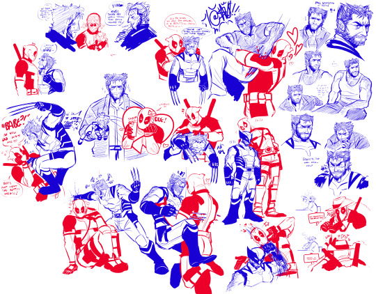
and so. As I Do. i got curious and told myself i'd binge watch all the x-men movies the week before i went back to school And Then I Did ft. My Brother Sometimes and then i said i'd binge watch all of '92 and And I Did That ft. My Brother Sometimes But Less So and now we're here. currently watching Evolution...
once i got to school i realized i lived near a comic shop and started getting into the comics that way (the first ones i got since going down this rabbit hole was Magneto Was Right!, The Resurrection of Magneto, and The Trial of Magneto. if you were curious !!!!! clearly i didnt care too much about context i just needed to see My Guy jelvejlkvj i have no regrets and Evidently ive read more since)
i'm pretty sure what dragged me into cherik specifically was the fact i saw a clip of The Famous ending to 92 where erik's aghast at the notion jean even has to question his love for charles. i think that was what officially had me refocus my lens on them: not a single poolverine thought after that LOL (all the cherik posting i saw on twitter definitely helped too but that was the nail in the coffin for any other interests i had: i was locked into cherik and x-men in general now)
that clip specifically, i was surprised at the fact they- frequently even- have the x-men franchise say erik loves charles and vice versa so bluntly. even if it's not meant to be romantic, i fear im just a fan of how casually the word's thrown around with them two and i got tender bout it all. Then Yk. i just live for the drama. the hilarity even. the sincerity .... they make me sick if i think of them too long so im gonna end it here
before i go tho ironically enough, the first x-men issue i owned was This one (story a this is that while stuck in some wacko dimension charles accidentally gets himself trapped in logan's mind while utilizing his astral projection. if you were curious). pretty sure i got it for free with another comic set i got years ago since our old comic shop loved to do that, but it's poetic aint it. maybe ill doodle something referencing it..
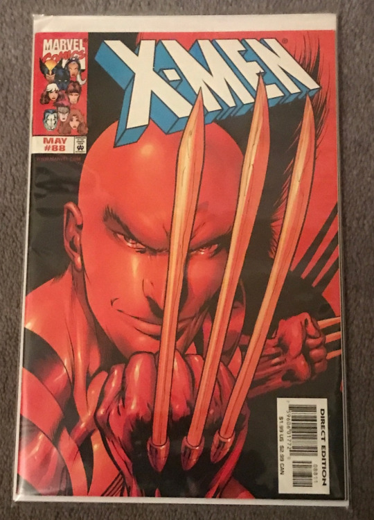
i should probably look into finishing this arc someday im Dummy curious to even know how it started and how it ends.....
#snap chats#usually this onea them posts i ramble bout in the tags but i have photos and this is Long long so .. i use the main body for once ...#sorry i gave a biography but i never talk to people and i also love typing. im one of those party can-of-worms i fear#i feel like i could talk about this forever because x-men itself has never been super prominent in my childhood#it was just kinda there in the background BUT comics themselves have always been with me. theyre a keystone to me i think#but yeah. x-men definitely sticks a lot harder than avengers does now OOPS this is not me taking shots i am just SAYING#i have a lot of old marvel doodles tbh .. i found an old deadpool one i remember drawing with my bro during a car ride#kinda funny how much my bro and i bond i dont think of it much but I Guess thats another reason why comics are special to me#we dont bond much- i dont bond with my fam in general tbh we're kinda. Isolated in a way LOL so its cool we're tight at least#if you wanna go deeper bout Comics And My Family my dad really liked comics growing up- more dc tho maybe#apparently he used to draw hulk a lot but if he did those drawings are loooong gone.. at least i know who to blame for me drawing#he loves superman tho. i remember id get embarrassed watching superhero cartoons and superman was on screen when he was around#for some reason i thought id get in trouble if he caught me watching superman but when he did once he was real happy so. tf wrong with me#he loves to say hes superman a lot and id be like Dad... Stop... LMAO but in the cheesiest way possible he do be my hero so. accurate ig#but yeah thats my origin story for why i like comics again thank you for reading if you actually read all that#and sorry it got all sappy Unfortunately i be like that sometimes. i am very emotionally constipated and i over explain a lot#ok i fr gonna end it here im gonna keep going by accident if i thinka any longer and i have stuff i still have to do
19 notes
·
View notes
Text
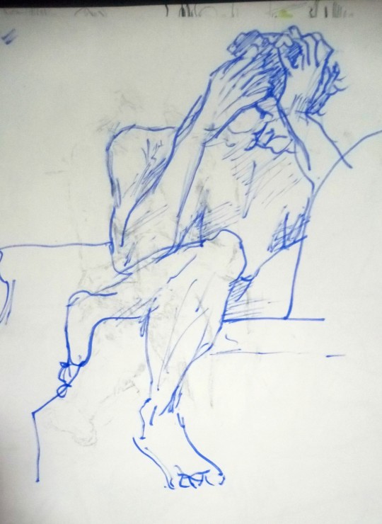


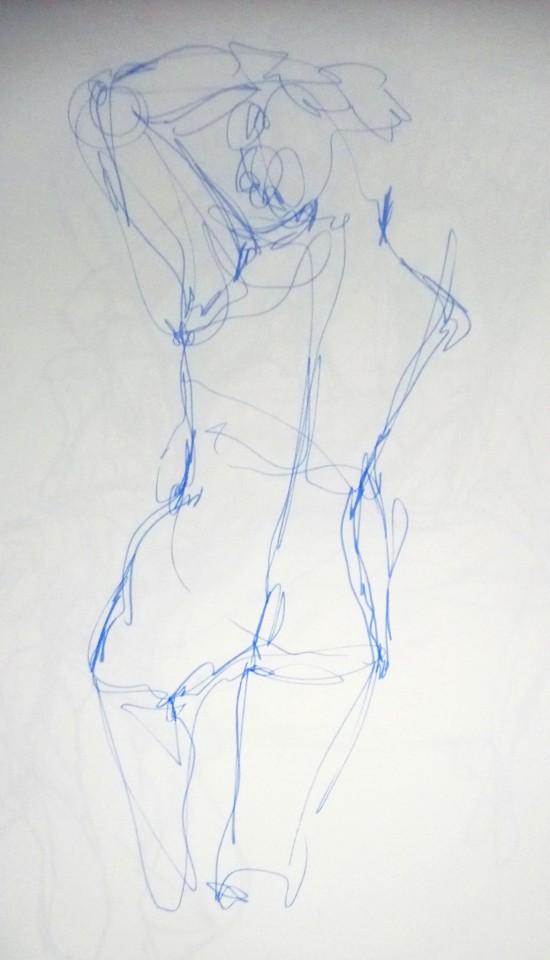
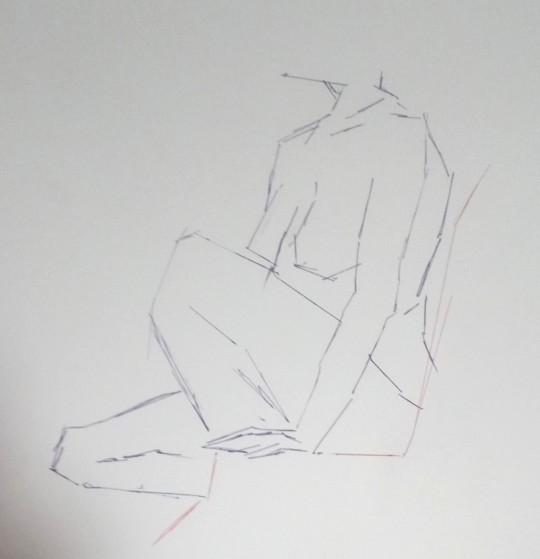
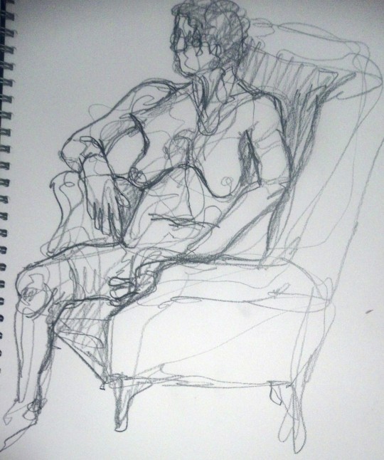

26.9.23
#original art#why dont i just tag it life drawing actually#life drawing#new classes in a new city and it was really fun actually ...i knew it was guided but sometimes that just means#somebody saying alright this is 5 min pose.now we're doing 10 mins.half your time is up etc and maybe making some general advice but#its basically up to you how and what you do#but today for the first half of the session they were like you have to draw in this way or using these materials and although i was#expecting and maybe hoping for the former it was fun actually#the first one w the thick blue lines they gave us a felt tip taped to a wooden stick and told us to hold the paper far away + hold the stick#at the end so that you had less control/were making sort of loose marks or being more considered in trying to make a mark#+ they made us do one just using straight lines by using a playing card as a ruler lol?#the last one was a 40 min pose where u could do what u like and from my angle i didnt rly wanna focus on the figure so i drew the background#i liked the shadows behind the plant#it was in a coffee shop so i had a yummy chai latte during the break ❤️ i will try to go again pretty often
4 notes
·
View notes
Text


Shortly after that Zanmu drawing, I went on an art spree and made small little drawings of a majority of the current playable characters in Touhou (I've been procrastinating on drawing Aya and Ran) and finally gave myself refernce points for how to draw all these characters going forward! Also, don't mind the change in background colour, that's just me changing the background so the values are actually visible lol.
Artist's Notes;
So the first one I started with was Reimu, and the inspiration for her pose came from this pose reference on Pinterest of a girl doing ribbon dancing, and I thought "Damn, that's very Reimu-coded" and did a quick little Reimu drawing from that.
This was also the drawing where I finally learned what makes a Reimu drawing feel like Reimu. It's the shirt, it's literally just the shirt. I decided to try making Reimu's shirt have a stronger square shape and oh my god it's like I discovered some kind of secret sauce because it just feels so much more like Reimu. I also gave Reimu a tabard and loose pants because I felt like that also fit her very well and also tied in some element's of Yukari's design into hers. I also made her bow look more like a very geometric butterfly as a bit of a tie in to "Diochromatic Lotus Butterfly" and also because I think butterfly symbolism fits her a lot. I also left the hands unfinished because they are not the focus of this piece, Reimu is, I don't wanna cry over how I can't get the hands right and then never get to the actually fun parts of the drawing. Previously, I did some design experimentation with Reimu where I added a little ornament on her obi that was inspired by Yuna's design from Final Fantasy 10 (I can't remember if I ever posted that one lol, also FFX is so good you guys I love it so much) and I like it, I think it adds some fun assymetry to her design that I think makes it look neat. I also gave her some more traditional Japanese shoes (I don't know the name of them so please correct me if you know) since I've seen other artists doing it and I love that look so I added that to this drawing as well.
I also really like how Marisa turned out, I experimented a bit with her body type and outfit, though I didn't really go too off-model with her compared to Reimu. I liked the longer sleeves on her and I gave her a big bow on the back of her apron since I thought it looked cute. I couldn't find a spot for the bow on her hat that looked good so sadly that isn't present in this version of her :( I do like how her face turned out though, since I've also been experimenting with how differently stylized I can make faces in my art. I will always love mangas like Hunter X Hunter that can put two extremely differently stylized characters on the same panel and make it look cohesive, it's why I love the style so much.
I think the crulest irony is not being able to draw your favourite character well while you're hyperfixating on them, but then only being able to draw them how you picture them once they're no longer your favourite, and that happened with Sakuya here. I was initially gonna give her the flashiest eyeshadow known to man but when I removed the layer wih the eyeshadow rendering on it I ended up liking it more without it, so now she's just got some nice bottom lashes. I tried giving her more of an hourglass shape for her body type, mainly to differentiate her more from Reimu and Marisa, and I focused on making as many points in her drawing as sharp as I can. I also gave her some white gloves because I like the idea of Sakuya having fancy gloves, it fits her. To me, Sakuya has always been the most high femme of the main Touhou characters. Maybe this is just because she was my gay awakening, maybe it's just influence from the fandom, but it just kind of makes sense to me. Much like Marisa, I also emphasized the bow ribbons for extra oomph with the silhouette and when I added the red bows and looked at the overall design, I fixed the lack of red anywhere else by just... covering her in blood... I mean she does work for two vampires and she's exactly the sanest person in Gensokyo so please pardon my indulgence in edginess it couldn't be helped.
Youmu was really fun to do but also kinda challenging. In my mind I wanted to make her feel different compared to everyone else I've drawn so far, short enough to be somewhat accurate to canon, but not too childish looking since she never really acts all that childish in cannon and it wouldn't make sense for her to look like a child. I also had to make her look fast and speedy without her looking like Sakuya and potentially avoiding same body syndrome with Aya, who's whole gimmick is speed. In the end, I think her drawing is my favourite, mainly because of the shapes and silhouette. I also really like how I golden-ratioed myon. I also took a few liberties with her outfit and decided to give it some layers to add visual interest. I also like how the cuts in the clothing add more triangles, which adds to the shape language. For her face, I was wondering what to do with her eyes until I decided to just go for the simple, glowing, circular eyes she has in the final product. I was also listening to a bunch of Gorrilaz albums while drawing these (Demon Days is my favourite album btw, idk how basic of a take that is though) and my brain 100% was subconsciously influenced by some elements of the art style (it's so good omg). I also like the shade of green I gave her, though I am a certified green lover so I am 100% biased.
Reisen is where I let myself get a little weird with it, because as you can see, I turned her into an anthropomorphic bunny because she is a weird moon rabbit god dammit, why should she look normal? I was more excited about drawing her IN design than her modern design so that's why she's dressed like that, but I do have a sketch of her in my sketchbook of her modern design. I also had fun rendering her velvet suit jacket. This also helped me tie in some of the reds in her eye and ear, which is also a nice bonus. I also gave her pure white fur to create more visual contrast. Overall, I'm pretty happy with how she turned out, though I wish I didn't shade the legs too much because it's kinda blending with the skirt colour....welp, ya win some ya lose some I guess.
Sanae is also relatively on-model compared to everyone else here, though I did try to make some changes to her outfit to make her feel different from Reimu. First of all, I made her big sleeves (IDK the proper Japanese term for them, if there is one, so again if you know please correct me on this) more open than Reimu's, as well as making them more pointy to give her a different silhouette. I also tried out a new rendering style on her eyes that I also applied to Cirno (we'll get to her in a moment) to also make her face feel different from Reimu's. I'll be honest, I didn't really know what to do with her body type so she just kinda got the "basic slim girl" look in her drawing. I'm not too big a fan of the frills I added to her skirt though, I don't really think she needs them. I'm glad I gave Reimu pants and a tabard instead of a normal skirt because that does help to make the two of them feel different. I also kept her little frog hair clip the same shade of blue as her dress, mainly to economize my colour usage and limit the palette into something a little more tight-nit. I do like how her little hair snake looks though, it's cute lol.
And finally, we have Cirno. I have been a firm believer of "long sleeve Cirno is best Cirno" ever since I saw the art of her in PMiSS because she's an ice fairy, I think it would make sense for her to want to keep herself warm, same reason she has little socks too. Now that I look at it more, her colours are pretty similar to her design in Great Fairy Wars, and honestly I like that, I think keeping her colour palette simple is a good idea so I'm happy about that. I mainly wanted to focus on rendering her wings though, mainly because rendering ice and crystals is fun even though I have done zero studies of them! I also wanted to experiment with rendering her eyes in a similar way to Sanae's, and I like how they turned out! I don't know if I'll continue with this style in the future but it will probably stick around because to me, any stylistically different way of doing eyes is another facial feature I can use to bend the rules of same face syndrome.
While I'm on the topic, I want to mention that the reason Hunter X Hunter's art works so well is because everything is kinda rendered the same. It showed me that if you do everything else consistently in your style (i.e. rendering, lineart, shading), stylizing each character's faces differently will be a lot easier, at least that's how I see it. IDK if I'm ever gonna do drawings of Aya and Ran in this style since I gotta think about them more as well as stop procrastinating lol.
#tw blood#touhou project#art#fanart#touhou fanart#reimu hakurei#sanae kochiya#sakuya izayoi#marisa kirisame#cirno#reisen udongein inaba#youmu konpaku
1K notes
·
View notes
Text
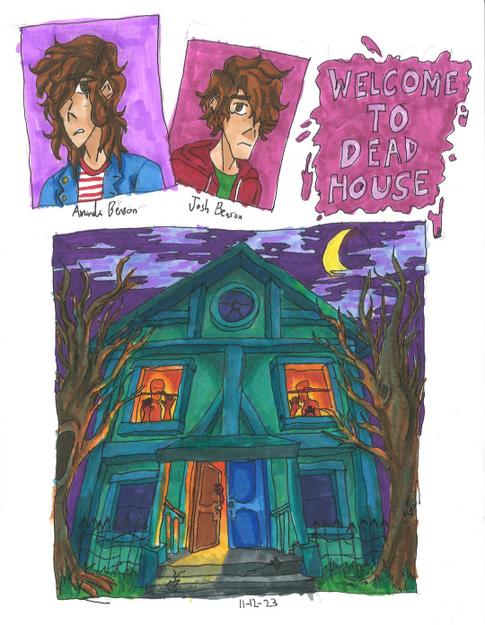
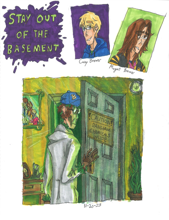
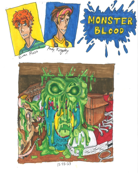
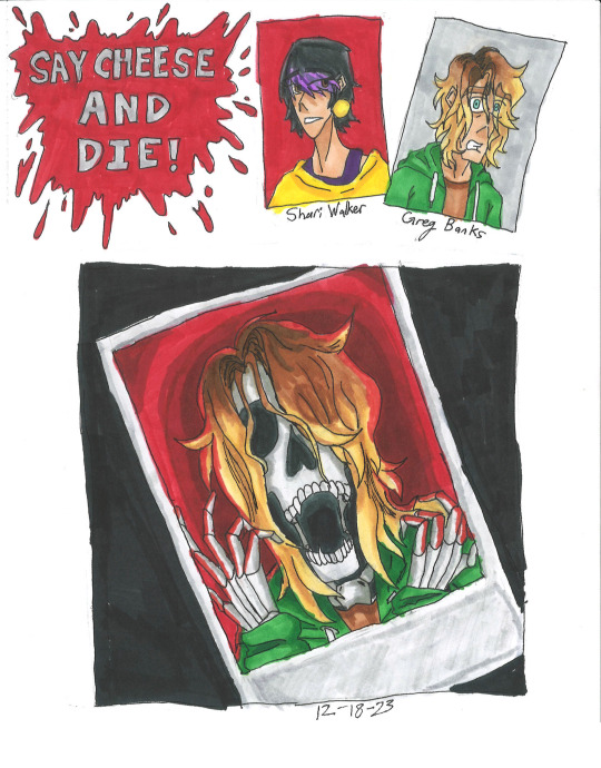
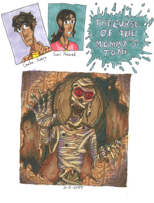
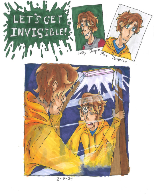
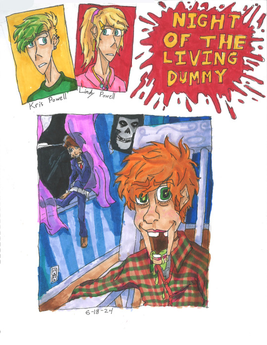
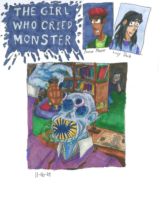
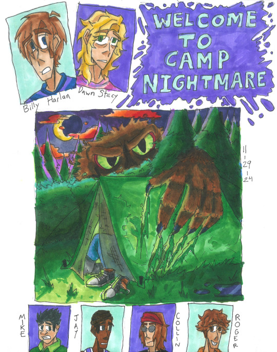
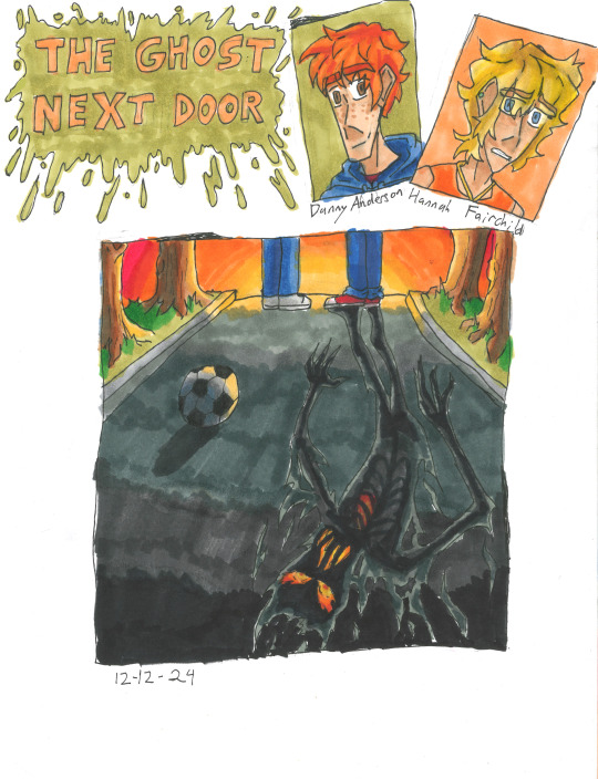
Goosebumps Books 1-10
Can't believe that it took me nearly two years to just do 10 covers for the books. Will be posting more Goosebumps in the future, along with other stuff.
Read more to know my personal opinions and critiques on my fanart for each book:
Welcome to Dead House: I wanted to make the house look alive like Monster House, so I gave it more human characteristics (ie: the people in the windows to form eyes, or the finger-like branches.) Also paid homage to a horror film by styling it after The Amityville Horror house.
The Benson children themselves look a bit depressed, that's because the first book is actually more scarier than the rest of the series, so they're a bit angsty.
Stay Out of the Basement: This one killed a lot of my green markers lol. I tried to make Dr. Brewer as menacing as possible while still showing that he is a father with the photos, There were going to be more plants reaching out, but I decided that the leaves hidden on him would be enough.
Though I have to admit my disappointment with the lighting. It still looks a bit too bright, and not dark enough. That's just my own critique.
Monster Blood: Honestly, pretty mixed about this one. While I'm proud of the bubbling ooze that looks like a skull, which is outlined by one of my colored pens. I'm not proud that everything else is so muted with brown. Almost all of Jacobus' works are vibrant and saturated, so it being dull in colors feels like a disservice to him.
Also, Andy's last name was made up by me, she apparently just doesn't have one. It's inspired by Stephen King. Btw, hope you love banana and strawberry dyed hair, you'll see more of it soon in future batches.
Say Cheese and Die!: One of my favorite books, and of course it gets the best fanart imo. The screaming skeleton form of Greg Banks with red bg in the polaroid, contrasting with the dark background is just super cool, coolest shit I've ever done. Though I might be biased, I really like skeletons. Like Curly.
I actually made concept art for a Say Cheese and Die! graphic novel, which includes drawings of the photos and Spidey! Let me know if you're curious.
The Curse of The Mummy's Tomb: Not much to this one honestly. Just a mummy casually busting down a wall filled with hieroglyphics. Though I will say, I was experimenting with shading with purple and blues like Jacobus. As you can see, didn't stick for long.
This is also the book that I discovered that if the protag doesn't have a last name, then there is an official one either in the Presents novels, the mobile app, comics or other.
Let's Get Invisible!: This was pretty tricky to draw. Drawing someone turning invisible maybe easy in Photoshop or Procreate, but this was traditional art. Sure Jacobus did it with airbrushes, but I all had were pens and markers. But I somehow managed to pull it off, which is insane that I even managed that in the first place.
Night of the Living Dummy: Ah, the infamous Pamela Vorhees book, where the main antagonist isn't the mascot, but instead some other puppet lol. I've seen a lot of fanart of Slappy, but never of Mr. Wood. So I wanted to do justice for Wood while still showcasing Slappy. While I am proud for how it mostly turned out, there are two things that bother me. 1. This is the night sky that is black, the rest are either blue or purple. 2. I forgot to add the lines that make the jaw on Mr. Wood, whoops.
Aside from that, I hope guys like that Misfits poster in the background and Kris's cool hair cut. The green was inspired by the comic adaption not 2015 Jacksepticeye.
The Girl Who Cried Monster: Please forgive me for the small thumbnail, I wasn't using a ruler at the time. The design for Mr. Mortman wasn't much of a challenge. I loosely based it off of the French rendition of the cover and gave him a large leech-like mouth.
In my headcannon, the teeth spin like a garbage disposal, making easy work of the turtles.
Welcome to Camp Nightmare: Another one of my favorites, and I think I did a decent enough job, too. The lighting is perfect, the clouds look alien enough, and you can just barely see the screaming campers inside the tent. I do have one issue though, and that is the size of the monster, Sabre. In the original sketch I did, he was supposed to blend in like a bush, but instead he looks like Sasquatch Sr. Oh well.
While they did give Billy a last name in the Presents books, I had to make up one for Dawn. Just based it off Gwen Stacy lol. Also, hope you enjoy the little bonus pictures down below.
The Ghost Next Door: The original Jacobus art was perfectly vague enough to keep the twist there but not spoil anything. Of course to do the same thing, but with a twist of my own. The "ghost" shadow that you see in the street is the Dark Figure that follows Hannah around or when Danny is near. I wanted it to look like it was constantly on fire, since SPOILERS: someone in the book does die in a fire.
Another headcannon is that the Dark Figure isn't actually a ghost or whatever, but instead the embodiment of Misery.
#goosebumps#goosebumps fanart#welcome to dead house#stay out of the basement#monster blood#say cheese and die#the curse of the mummys tomb#lets get invisble#night of the living dummy#the girl who cried monster#welcome to camp nightmare#the ghost next door#horror#nostalgia#90s nostalgia#amanda benson#josh benson#magret brewer#casey brewer#dr brewer#evan ross#andy kingsley#greg banks#shari walker#gabe sabry#sari hassad#max thompson#lefty thompson#kris powell#lindy powell
844 notes
·
View notes
Text
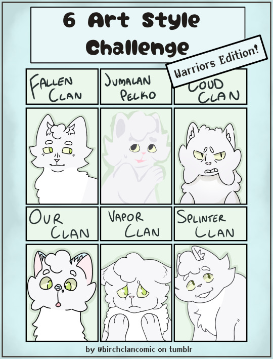

wanted to try out one of those old different art style challenges (but with Warriors comic blogs) with Snowbelly from BirchClan and it was actually really interesting to do! i had a lot of fun doing this!!! attached are my version, and then the templates if anyone wants to do their own (first image has white panel backgrounds, second image should be transparent panels if saved directly)
in order, the blogs are:
@fallenclan - this one actually required a lot of adjusting and attention to detail! i also think it turned out looking the best
@jumalanpelko - i actually draw in their style occasionally because i did it once for fanart and its a SUPER fun way to draw!! so i enjoyed this one the most
@loudclan-clangen - this style was the hardest to replicate, and i had to look at a lot of different refs LOL - the angles/poses in the comic are super dynamic (/pos), so i had trouble finding one basic enough to help me with my pretty simple profile drawing!
@our-clangen - i think this style was the most similar to my own and so the easiest to do. i really love how smooth everything is! i wanted to give Snowbelly a power like the OurClan cats have, so I gave her frosted ear tips (my friend's suggestion) and a little lump of snow on his nose :)
@vaporclan - this is the one on the list i've been following the longest, and for a similar reason as LoudClan, this one was pretty difficult to find multiple references for - there were so many panels with super detailed expressions that i wasn't confident enough to replicate LOL
@splinterclan - looking at references for this was actually super helpful for cat anatomy!! and it was interesting to draw, i feel like this style is also pretty similar to my usual one but the anatomy and faces are a bit different
GO CHECK OUT ALL THESE BLOGS!!! ive drawn cats from a few of them before and they are all so good!!! currently catching up on FallenClan and LoudClan right now :)
#warriors#warrior cats comic#warrior cats#warrior cats art#warrior cats oc#birchclan#warriors oc#digital art#warriors fanart#warriors comics#comic fanart#warriors comic fanart#wc fanart#fallenclan fanart#jumalanpelko fanart#loudclan fanart#ourclan fanart#vaporclan fanart#splinterclan fanart#multiple artstyle challenge#clangen art#clangen comic#warriors comic#clangen fanart#warrior cats clangen#clangen#snowbelly#not a comic page
200 notes
·
View notes
Text
Can't Sleep
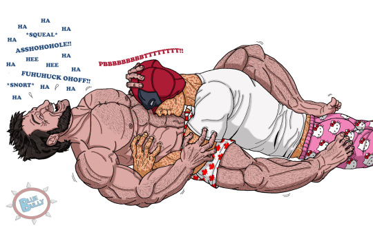
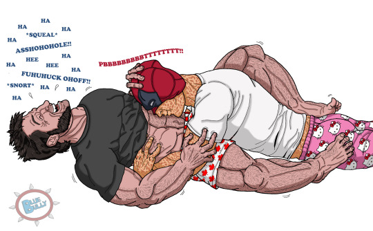
UPDATE 11/16/24 - I made an alternate version with Logan wearing a t-shirt. I was going to draw it like that that originally, but I couldn't resist making him bare-chested because I love drawing muscles. 🤭 But I also like the idea of Wade having to push his shirt out of the way to get unobstructed access to his belly so you get both now. Double the fun! lol
Logan suffers from insomnia, but Wade knows just what will help. Tickle him to pieces until he's completely exhausted and the laughter has filled his mind with endorphins. 😊 Logan tries to avoid letting Wade know he's having trouble sleeping because he's so ticklish, but in the end he's happy to get caught. 💗💛 The tummy raspberries absolutely kill him. 😆
Yeah ok, I spent waaaaay too much time on this, but I'm pretty satisfied with it for the most part. I think I redrew Logan's right leg ten times before I gave up so don't focus on that too much or any other anatomy goofs I made. 😅 Hands and feet are always a bear.
Plus I had to look at many, many pictures of shirtless Hugh Jackman to try to get his muscle structure accurate as best as I could, along with his little arm veins and that one on his lower belly. *sigh* The things I do for you guys. 😏
No background. Too lazy. Just imagine they're on a bed, or wherever Logan decided to try to sleep. lol
(Again if you click the pic to enlarge it then right click the pic and select 'Open Image In New Tab' then you can see it in larger format.)
I hope you guys love it!! 🙏 (I know a lot of you guys just hit the Like button and move on, but feedback and comments are really appreciated by us writers/artists. 💗)
#Finally finished#Logan loves the tickles#tummy raspberries#ticklish!wolverine#ticklish!logan#ler!deadpool#ler!wade#deadpool tickle#wolverine tickle#my art#tickle art#ticklish raspberries
182 notes
·
View notes
Text

Happy halloweeen. :)
This is the commentary track(?) to my digitober. It's just rambling, so don't expect anything too interesting.
This first picture came out on a whim, I originally didn't intend to do anything for this october. I had just arrived home from helping my mom out with something, and was in a good mood. I think this picture, as sketchy as it looks, reflects that feeling. I'm content with it - and it's halloween themed! All the better.
For the second, I tried to follow the "official inktober" list (something I'd drop quickly in the following days). I'm disastrous at making backgrounds, so I gave it a shot for practice sake. I think it's not a bad result, it almost kinda tells something of a story.
"Boots", hah. It's not terrible, but it's also missing a lot of polish. I think the idea behind it works well for a cute/sexy picture of Angewomon. Maybe some day I'll revisit it? I should put more practice into drawing the human form in the meanwhile lol.
I really dislike the fourth one. I think Lianpunmon deserves better art, so I'll definitely do it again some day. My skills are so undeveloped, it's very obvious seeing this poor hatching.
Speaking of hatching, I bit more than I can chew with this one. The composition isn't interesting enough either, and just like with Lianpunmon there's no story here. At least Angewomon seemed to be interacting with the viewer lol.
The sixth is something I liked better. It's kinda shody, but there's something of an urban fantasy thing going on.
The Vamdemon one I can see the faults: I need better line control, the shapes aren't locked in as well as they should be. Yet, I'm partial to it…
Rapidmon deserves better lol. I still really dig the idea behind this drawing, I just wish I'd have given myself the patience and time needed to render a kickass explosion.
SkullGreymon, I have little to comment. It has zero story, but it's carried by the vibes. It's the first (and arguably last lmao) time I think I was cooking with the halftones.
The tenth is arguably the peak of the entire month. It has some story, a neat composition, and acceptable execution. Strangely enough it was one of the quickest to make: I had an idea, and it came out in a few minutes (compared to some other drawings where I was fighting for my life), and it ultimately was one of the most interacted with drawings in my entire blog. Funny how that goes.
I like a lot the Piemon one, as bland as it is. It's like a design piece, more than a drawing. It helps that the perspective deformation hides my poor linework haha.
I went too hard on the Mephismon X one, to the detriment of the piece. Instead of adding texture, it just looks dirty. Damn.
The thirteenth one was my poor attempt at making a background. Originally, Bakemon was gonna have this devious, whimsical look, but as I finished drawing the stairs I thought "I'd be kinda tired after climbing a few floors", so I changed Bakemon's expression to reflect that. Just a little trivia.
The Jesmon is what I'd argue was my peak. Shapes are locked (as best as my skill lets them), values worked well, it told a story. It's my favourite of the month.
Fiftenth was made, mostly, trying to catch some Adventure buff to the ammount of interactions I'd get. I mean, I had fun drawing the characters, but the reality is that I had petty reasons. I don't dislike it though.
I know exactly what I wanted to do with the sixteenth, and I didn't achieve it. Looking back, I think I should've done it in BW, rather than grayscale, to make it pop more. Fix the composition too. It's too plain. Shame, I really like Lilithmon X's design.
Seventeenth was also one where I just phoned it in. I think the values are all over the place; though I do like the harsh light. Impmon is a lot of fun to draw, all things considered.
Greymon was fun, lots of fun to draw. But this was another piece where I went too crazy trying to use halftones, I ended up making something that lacked impact or presence. I do like, in a self deprecating way, how the background seems okay until you look at it directly and see that it's kinda bad lol.
I made Nefertimon's torso too long! I only realized when I was doing the finishing touches lol. Yet I like the whole thing a lot, I think the texture and lightning kinda sells it as a photo (the white border was an attempt at selling that further). Saw someone refer to it as "the last thing I see before I die", and that comment might stay with me forever lol.
The twentieth is another I had a clear picture in my head as to what I was actually hoping to make, but failed to. Instead of landing some sort of finish, it's on a weird gray (lol) area. Making clouds is hard y'all.
Twenty one is one where I managed to stick the landing to what I had in mind. I think the composition needed a few more minutes of baking, but overall I'm content with the result. Death-X-DORUgoramon is a complex design, so any degree of succesful translation is a win in my book.
I think I needed to draw some more background Kuramon for the twenty second. Y'know, to really sell the swarm thing. It's kinda too clean.
Before twenty three, I had never given myself the time to draw a tree shilouette. It was fun to turn off my brainfor a bit and just draw line, after line, after line, after line. I did the tree first, and then I tried to figure out how to make Shurimon. Originally, I wanted him to be hunched over more dramatically, almost as if he was climbing down the tree, but I was incapable of drawing it in a satisfactory manner. So this is what I got.
Twenty four is so bad! I think Monitamon came out fine, but the background elements are so poorly done! I'm so embarrassed! lol
Kabuterimon was really fun, very dramatic looking. I think it has some serious readability issues with the hands, but I don't dislike the idea I had at all.
Hackmon's drawing was done almost like a sibling piece to the fourteenth, Jesmon's. Like, Huckmon is somehow watching his exhausted future, yet he stands stoic. On it's own, I think it's plain. Like, it has some charm, but it's lacking in impact compared to the fourteenth. But maybe that's for the best of the story?
The Wizarmon sticker came through me realizing I wasn't practicing my lineart! So I did a sticker instead. This was actually version two, but number one was so bad I had to redo it. Despite it being a humble sticker chibi, it's overall the day I spent the most time drawing.
Twenty eight came from me realizing I hadn't done any Alphamon! So I did what I thought would look badass. As much as I like Alphamon, though, his shapes are difficult for me to grasp so it came out shoddy and weak lol.
Twenty nine, Ragna Lordmon vs Ragnamon, was hurt by me recording it. While an exciting thing to do, I felt like I wasn't allowed to do anything but move forward quickly, or to change things (I'd have moved both Ragnamon and the main Ragna Lordmon body closer to the center) that would've made the composition flow better. It's not an abject failure, and the video is fun to watch, but still…
Dorumon is a simple piece that I was a bit surprised to make. My birthday is not information I tell people, but I was just compelled to share a bit of myself. I dunno, it feels weird. I'm weird. It came out cute at least.
And at the last! Noble Pumpmon again. I'd love to tell you that I applied everything I learned throughout the month and it's my best piece and stuff, but that isn't the reality. It's a better show for a similar amount of effort compared to the October 1st drawing, but it's not some crazy good display of betterment. A bit, yes, but less than I had hoped.
If you made it this far into this silly wall of text I wrote, I thank you. I thank everyone who interacted with my drawings, it pleases me a lot to see that someone gave it a like, or a share, or a comment. I learned about myself, and my limits, through this experience. It was tiring, but setting myself the goal of "make a drawing a day" was, paradoxically, liberating. Like, now I had a reason to draw! (despite me having some comission work to do lmfao). It was nice. This was one of the most entertaining octobers in recent years. Thanks again to everyone who participated in some fashion.
189 notes
·
View notes
Text

OL2 and Pokemon!!! Background is from the game :D
No motion blur:


and a simple bg <3 oh my son he is so darling...
anyway I'm going to talk about all my thoughts on what pokemon the characters would have so it might get wordy:
FIRST UP QIU LIN!!! I gave him a fletchling cuz they're one of the speedier birds and I feel like it just fits him yanno? And mimikyu also suits his personality I think, I can totally see him being super kind and befriending it and UGH. My heart.
I limited myself to two pokemon for this piece but I was also considering KIRLIA!! (because ballet, I'll probably draw this one at some point), deerling (coz autumn lol), pumpkaboo, ninjask, duskull (coz of his halloween costume), and just for vibes: riolu, charmeleon, jolteon, pikachu.
OKAY TAMARACK TIME!!! My first pick is teddiursa, I think, purely for the cuteness factor, plus they stand similar, it's sooo cute. Next kricketot (because cello), seedot, polteageist, politoed and for some more vibe ones: phantump, leafeon, togepi!! (oh my it fits her so well), joltik, comfey, bulbasaur, cleffa.
now for nobody's favourite, mr baxter alexander ward. So my first thought was gardevoir, specifically mega gardevoir because it looks like a ballroom dancer (plus the shiny has a black dress), but yeah he would definitely have a galarian zigzagoon as a teen (coz he listens to heavy metal i think?), aaand otherwise i had, zebstriker, gothitelle, mightyena, wooloo, and shiny roserade (coz it's fancy)
And lastly Ren! I'll be transparent- I do not know a lot about her,,, yeag my bad, so I just have all the fox pokemon put down for her, vulpix, nickit, fennekin, zorua- but also Volcarona I think would fit her vibes.
I lied that wasn't the last one a little bonus for my own mc, Rena, she would have a Vikavolt, Porygon, Staraptor, Espeon, Minccino, and Garchomp - and she's very afraid of ghost types
i love pokemon so much please tell me what pkemon your mcs would have pleaase please please
#our life now and forever#qiu lin#olnf#our life#oh yeah and the pose ref is from the tbhk manga#skips art :3
169 notes
·
View notes
Text
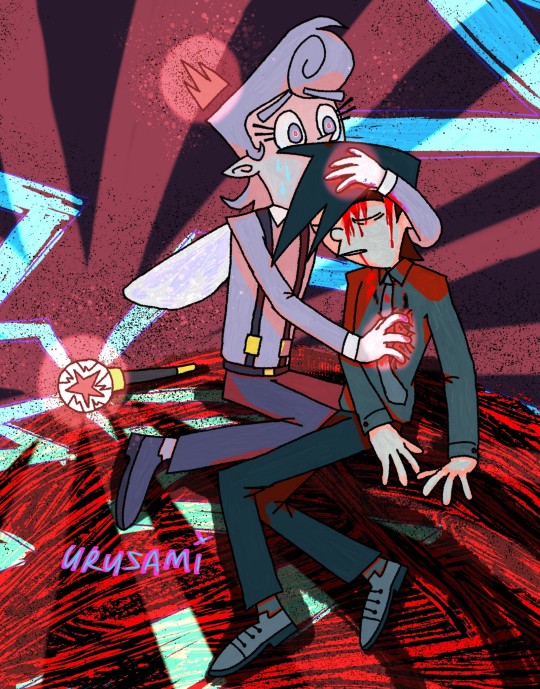
Hello, sorry it took me so long (6 days), but here's your request @candyglumboy. I was experimenting a lot on these honestly.
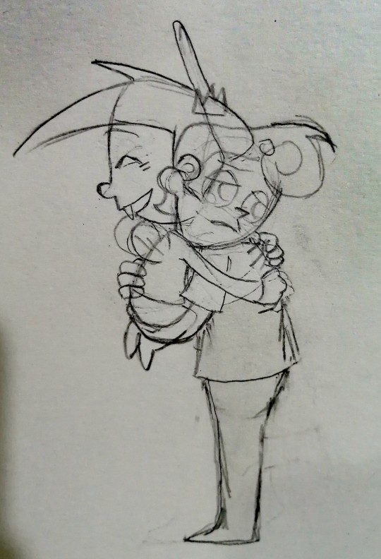
From first to last in order, First memories/ Mortality/ Ascension (or an imitation of heaven?). I'm still unsure if these are the appropriate titles for these pieces lol.
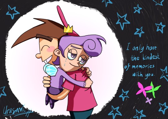
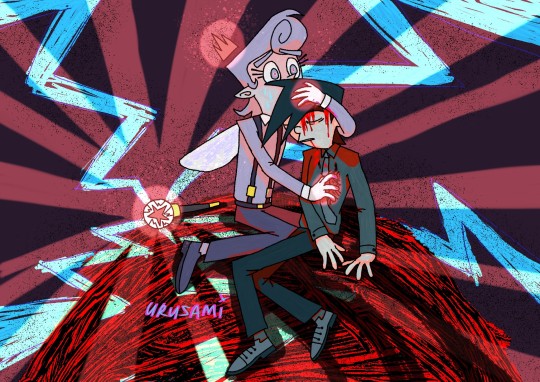
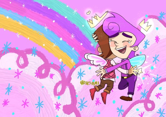
Thanks for requesting me by the way! It was fun practice admittedly. (I still suck ass at backgrounds though.)
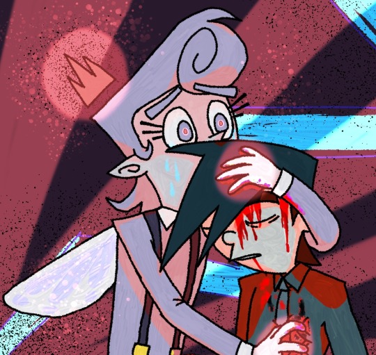
As usual, my insane ramblings below and some close-ups and concept art (will change if formatting is fucked up).
Oh yeah, I've been offline a lot because I'm so busy with uni stuff and... unavoidable family matters..., plus all of these took me a while to finish. I was brainstorming a lot on their request and these are the ones I've chosen to finalize.
I've decided to go with the concept of life, death, and rebirth on their request to just see Peri hugging Timmy lmao, because why not? It was to make me fulfil this request in a more enjoyable and exciting way.
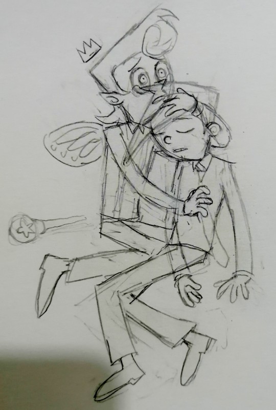
I was experimenting and practicing a lot on understanding the Fairly Oddparents style in these pieces. My attempts are still far from perfect obviously, I mean the second one (Mortality) took the longest for me to finish just because I couldn't translate 3D poses into the 2D artstyle very well lol. (The second one was the hardest to make it look... well alright/pretty to me. It looks like a mess of haphazardous colors... I am terrible at coloring. I think I'll share the other scrapped poses later.)
Honestly, I struggled and got frustrated a lot with finishing these but still enjoyed the process. Here I'll list my inspirations for each pieces;
First memories - xblubotx (i won't tag them because i don't want to disturb): Their small Peri/Poof and teen Timmy fanart pieces continues to inspire me to this day. And yes!!! I see that they have made More Timmy fanart!!! Thank you xblubotx. I will continue to appreciate those in silence.
Mortality - I was thinking of loss and death a lot on this one. I thought what kind of embrace that shows this feeling? So, I used the famous, Ivan the terrible and his son painting, for the pose. I wanted to challenge myself if I could translate the 3D pose into 2D, so yeah, that's the final result... It looks like a mess of vomited red colors... I am sorry if you're squeamish towards blood by the way. I wanted to see if I could also attempt to draw blood streaming. I still think I have a long ways to go in terms of skill... For now, enjoy the nuclear baby about to explode because of overwhelming feelings <3 <3 <3!
Ascension (or an imitation of heaven) - @bevony: I hope I did not miscredit you, as I used your Fairy Timmy design for this one! I changed it a little according to my preferences/headcannon though. Still, I love their Fairy Timmy design! I like the hot pink Channel boots that they gave Timmy lol. (And the very comfortable formal fashion.) Keep on slaying~ My Fairy Timmy design will probably be heavily influenced from them when I get to that eventually... Tell me if you don't want me to, I'll back off. For now, I'll be enjoying the others fanarts of Timmy quietly.
(Additionally, my phone is slowly dying from all of these creative projects that I'm doing currently lol. Agh, I wish I had a drawing tablet or a better device to satisfy these creative urges....)
Again, thank you for the request! I'm okay with requests as I'm still not confident with my creative skills at this moment lol. So, admittedly I view these as a challenge or for practice. I can't fulfil them quickly though, as I have multiple responsibilities to do in real life. Still, I don't mind them once in a while.
I hope you like what I've done here. Sorry if it doesn't fulfil your vision candyglumboy. I'll keep on practicing my creative skills.
So yeah, I think that's all I wanted to share in the post this time. I'm still at season 3 on the FOP rewatch by the way. I am very excited to get to the specials eventually. Yeehaw!!!
Here's some concepts and close-ups of the pieces below this long massive yapping session lmao. Thank you for reading. Have a nice day <3

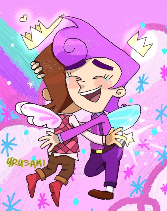
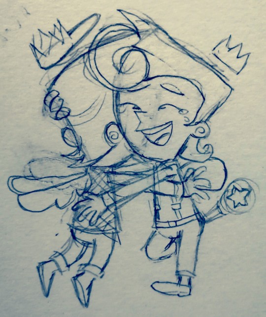
#the fairly oddparents#fairly oddparents#fop#timmy turner#poof fairywinkle cosma#periwinkle fairywinkle cosma#fop timmy#fop poof#fop peri#peri fairywinkle cosma#nickelodeon#cartoon fanart#usagifuyusummerart2024#fanart#infinite painter#the fairly oddparents a new wish#this tag is for peri stuff poof is from the original#candyglumboy answered request#tags might change if formatting is awful#artrequests#usagifuyusummerasks2024#nickelodeon fanart#digital art#fanart 2024
175 notes
·
View notes
Note
How did you come up with your human Bill design?
I described my goal in the first post I made about his design:
After seeing dozens of tall dapper skinny white twinky anime boy Bills, I wanted a design that matches none of those words. My other two goals were to use the show’s art style; and to lightly pay homage to Alex Hirsch’s “canon” human Bill with the triangle body… except not deliberately hideous.
My unspoken final goal was "and I'm gonna make him damn good looking."
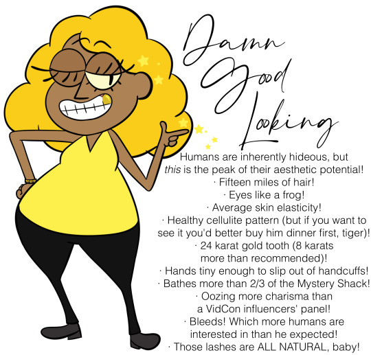
All the colors were sampled from Bill & Bipper, except his skin (which I sampled off a background character and tweaked until it looked good with the yellows) and his gold tooth (which I sampled off of Ergman Bratsman's).
On top of the fact that I was tired of specifically white dude Bills, brown skin tone was chosen because of the emphasis on Bill's interactions with ancient Egypt; I wasn't sure at the time how much of an influence I was gonna headcanon he had on the region, and it woulda felt weird depicting Egyptians bowing down to a white dude. (And then I decided to deemphasize his influence on Egypt almost completely lol.) It woulda been more accurate to go darker, but I was worried it would start to tilt his design into Nyarlathotep-esque Creepy Pitch-Skinned Mysterious Demonic Threat From The Orient racist territory, especially when he's already got demon eyes.
The triangular torso is the most important part of his design, I usually draw an equilateral triangle in the sketch layer and then pad it out.
If I were a better artist a year ago, I would have given him a double chin so his head+torso together would be triangular. But when I tried, I couldn't figure out a way to draw it that looked appealing instead of like a mean fat joke. So I took the coward's way out and gave him a skinny neck with a vaguely triangular chin, and now write him complaining about having a neck every few chapters.
I think the skinny neck, thinner face, noodle limbs, and typical baggy hoodie fooled people into assuming he's skinny. I figured out a way to draw a rounder face with less neck that looks more appealing to me than the original face, so I do that now. Can't do anything about the noodle limbs tho, those were chosen to match Bill's canon noodle limbs.
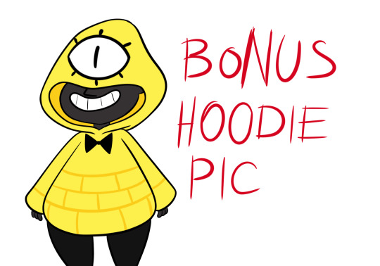
I went for a hoodie instead of the typical suits you see on human Bills for two reasons.
One: several years ago I had an OC I'd conceived of as a dumb kid who'd given Bill permanent standing permission to use her as a puppet, and when letting Bill take over she'd hide her human features by wearing a hooded poncho and tying a blindfold with an eye on it over the hood, and that idea stuck with me.
And two: for the story I came up with this design for, the premise is that Bill's been recently unhappily stuffed in a human body and dumped on his enemies' doorstep. So, he doesn't have the freedom or money to get fancier clothes; he's too depressed over being stuck in a human body to care much about his human appearance; and he's most comfortable in something that obscures his human anatomy and reminds him of his real form. If he was rich, free, and able to ditch the body any time he wanted, he'd be wearing suits.
#anonymous#ask#bill cipher#human bill cipher#gravity falls#gravity falls fanart#fanart#my art#reference#bill goldilocks cipher#(might use this as part of an updated character design sheet?? i've been meaning to replace the old one)#(Edit: HOW THE FUCK DID THIS POST GET TAGGED WITH HAZBIN............ tag deleted. tumblr why)
206 notes
·
View notes
Note
If each link was a dog breed, which ones would they be? (besides golden retriever)
Oooo yess I've seen this question before!
Time: Golden Retriever-- nope, Great Pyrenees! I almost put Bernese Mountain Dog, but honestly? I think that fits another member of our beloved chain a bit better. Anyways, the Great Pyrenees is a breed of livestock guardian dog originating from France, which fits Time's farm background well, and they're known for being very loyal and patient companions, though they can deal a lot of damage if provoked. If anyone decides to draw the LU boys as dogs, I would pay money to see Time as one of these cuties <33
Twilight: Bernese Mountain Dog. I just had to. There's a lot of reasons that I believe this dog is the best fir for our rancher, but the biggest ones are that these creatures were specifically bred in Switzerland as farm dogs (omg it's literally Twi), they're known for being very intelligent and eager to please, and they're one of the best dogs you can keep if you have children (not that you can't have other dogs around kids, but these specific dogs take it to a whole new level). I also love love love the floppy ears <333
Wild: Jack Russell Terrier. Kind of a no-brainer because, like Wild, their adventurous spirit knows 'no bounds' and they've been described as "clownish, lively, and intelligent" by several sources. Also chose this one because they're originally a British breed of dog and Zelda in BOTW has a British accent, so...
Hyrule: This sounds a bit mean, but I can't see him as anything but a Mutt. He's already a bit of a street rat, and no one really knows where he came from, so it makes sense that the type of dog he is (hypothetically) would have similar characteristics of this. Despite this, I definitely think he'd be extremely loyal, if not a bit wary, of new people, but once you're in, you're in.
Legend: Shiba Inu. These dogs are typically classified as being intelligent, loyal, and somewhat standoffish (though they do tend to form very strong bonds with their owners), plus they're just so damn cute! Someone please meme him as this 🥺
Sky: If any of the boys were golden retrievers, it would be Sky, but for the sake of the ask, I think the Saluki suits him best. The American Kennel Club describes them as "thought to be a gift from God" which fits great with Sky's background as the "First" hero + his connection to Hylia and the Master Sword. The only drawback is that Saluki's are known for their endurance, while Sky is not, but he is a sprinter, which these dogs also excel at (some breeders say they can run up to 50 miles per hour for short sprints!!!!!!!)
Warriors: Dalmation. This one was a tough-ie because I was trying to find a breed that has connections with the military (b/c Wars is in the army) AND looks absolutely fabulous while ripping your throat out, which is irrevocably the Dalmatian. Described as "reserved and dignified" by the American Kennel Club, these dogs have been used for hundreds of years to accompany and guard carriages of the wealthy, as well as firefighters, in more recent times.
Wind: Schipperke. My instinct told me to go for a Whippet Hound or something similar (have you seen these dogs?? Absolute cuties), BUT then I discovered the Schipperke, a type of dog specifically bred to accompany sailors on their journeys. They're described as very active, energetic, and overall 'busy' dogs, which fits with our Sailor. Breed colors also include a whiteish-creme color that looks SO adorable.
Four: Papillion. There's a fair amount of smaller dogs out there, but I saw the Papillion and immediately thought of the Minish, so here we are! One commenter on Reddit describes them as: "smart enough that they'll sometimes look at you, consider the command you gave, and decide "nah"", so obviously I had to choose this breed for our smithy.
(Actual answer is that Four is a munchkin cat in disguise LOL)
#linked universe#lu time#lu twilight#lu wild#lu hyrule#lu legend#lu sky#lu warriors#lu wind#lu four#lu as dogs
73 notes
·
View notes
Text
Winter Elliott

OKAY I WORKED MY ASS OFF FOR THIS ONE Pls Tumblr don't let this one flop 😭🙏 I still don't know how to shade to save my life but this is my best work so far. Look at that background. That's a nice background
v Closeup, Hozier reference, and low-effort farmer x elliott comic below the cut v
Closeup:

Freckled ginger Elliott supremacy. I actually gave him wrinkles and everything but I fear they don't show up. Guess I gotta make them more obvious in future iterations, but I am putting this piece down for now. I've been at it for too long and I'm going a little crazy because of it lol
Comic: (Ive never made a comic before help)


Lie to me and tell me Elliott would not be a good sport lol
Reference:

Hozier on a beach AND wearing a tailored jacket? Say less. Had to do it
I think this outfit actually translated really well to Elliott's winter fit. I got lucky there because I do not want to draw a suit and tie that sounds like torture.
PS: just have to say, doesn't it look laughably like I'm trying to avoid drawing hands or legs? Until you see the reference and nope, that's just how it is lmao. Why is Hozier hiding in the tall grass?
PPS: I had an awful time with this hair. I so badly wanted to give him super curly ginger hair and that was not happening 😞
#lily-alphonse art#my art#sdv#sdv fanart#sdv elliott#stardew elliott#stardew fanart#elliott sdv#stardew valley#sdv 1.6#sdv winter outfits#artists on tumblr#elliott x farmer
87 notes
·
View notes
Text
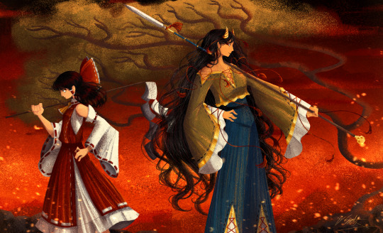
[Click image for better quality]
I FIGURED OUT A WAY TO FUCKING MAKE THE IMAGE SMALLER FOR POSTING ON TUMBLR WITHOUT SACRIFICING THE ACTUAL QUALITY OF THE IMAGE OH MY GOD
Ok so, what I did is go into the clip studio paint file, make a new file, copy and paste the group in the original file, merge everything, get rid of the extra stuff outside of the canvas, and then make the flattened image smaller and crop the canvas. Once you have that, export it and you're done. This helps maintain the actual quality of the image and also helps shrink the file size down to something actually postable (if anyone has a better way of doing this please tell me)
[Edit]: Ok I guess posting something to Tumblr just naturally compresses the image a bit more somehow because I'm looking at it now and zooming in too much makes it a bit blurry so I'm still gonna have to futz around with image quality for future pieces oof
Artist's Note:
I'm so glad I figured out a way to do this because I like working on a big canvas so I can get as much detail in as I possibly can. Only problems are how laggy it gets while drawing lol.
I had an idea for a drawing with Reimu and Zanmu because I really like thinking about their potential dynamic a lot. I also wanted an excuse to draw Zanmu again but in my normal rendering style because last time I drew her she was in my more sketchy style with generally flat colours so I wanted to draw her again. Speaking of, looking at the sketch for this is a jumpscare that I never enjoy seeing, like, man am I glad I didn't use those for my final piece.
Also about her spear. I was originally gonna make it like the ones she had in game, but it kinda threw off the whole piece. It was too big, too blue, and too flat, so I just went "fuck it" and gave her a different one instead. My headcanon justifying this is that the ones she uses in game are for danmaku battles whereas in any other fight she just uses a proper yari, or she still uses the yari and just makes it all glowy to power it up, maybe both lol. I pulled as much inspiration as I could from Sengoku era spears, and even put in some blue into the decorative part of the spear and also added a little skull to pay tribute to the original spear. Also, in my research I saw some art of izanami and izanagi making japan and saw that the yari izanagi has had a little decorative tassley thingy on it so I took some inspo from that and just made it one of Zanmu's tassles (Idk when that art was from or if the spear was still accurate to Sengoku period Japan but hey, probably the same reasons Eirin puts little bow ties on her arrows, it's just for personalization purposes).
I love rendering hair and clothes so much omg, while I like the super curly hair Zanmu, the longer, wavier hair suits her better for this drawing (I imagine it only does that like how Ghibli characters hair moves when they feel angry lol). I love making Zanmu's hair all messy and crazy, as well as giving her grey hairs, this woman has aged like a fine wine. Also, if the hem on the ends of her sleeves, top of her shirt, and her pants look like gold to you, that's because it is! It's fairly light so she's not collapsing under the weight, but it's gold! (I don't care how impractical it is, it's just cool). Not the undershirt though, it's made of a gold fabric. I had a cute idea with Reimu's hair to make it have a red shine to it. I also changed up Reimu's outfit so it isn't just a blob of red. I like it a lot when Reimu's skirt and outfit is segmented into different layers, so I wanted to incorporate that.
I tried to draw their hands differently as well, but IDK how noticeable that is. Also, I am super happy with how the side profiles for the two of them turned out, I used to struggle a lot with how to make the side profile of a character actually look like the character, so I'm really happy that they actually look like themselves.
Also added in the tree and rocks in the background as an homage to Zanmu's character art in Touhou 19, just because I was getting kinda stumped on what to do with the background lol.
In terms of a story idea with Reimu and Zanmu, idk why but the potential plotline of Zanmu wanting to ascend to godhood is so fascinating to me. Like, it is very possible that if she just convinced everyone she was a god (which would be very easy for her to do), she would become one in a heartbeat. Also, if she were to become a god, with her ability to return stuff to nothing, could she hypothetically get similar abilities to (Jojo Part 5 spoiler btw) GER? Like, idk about the death timeloop stuff, but the concept has been haunting me every night as I have been trying to find loopholes in GER's ability for a while now ( for no reason in particular). Back to the main topic, I imagine that she would probably tell Reimu that if she were to become a god she would take over the Hakurei shrine since the god there might as well be dead, and Reimu just says to her, "Over my dead body bitch." Like, I have no idea how to summarize their dynamic but like, it's the type of hero-villain dynamic where the phrase "We're not so different, you and I" would definitely be a phrase said during a fight. I think that if another IN style game were to release, Reimu and Zanmu would be in a team together. They could also have an interesting mentor and pupil kind of dynamic. Can you tell that Zanmu has been charging my mind rent these part few months? Like, instead of living in my head rent free, she kinda just uno reversed the whole situation and now she's the one charging me rent. What happens if I get evicted from my own brain? Actually, scratch that, I don't think I wanna know.
#touhou project#art#fanart#touhou fanart#touhou 19#touhou#東方project#zanmu nippaku#unfinished dream of all living ghost#reimu hakurei#東方
281 notes
·
View notes
Text
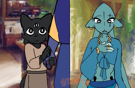
Meeting + Kitty Bath right after
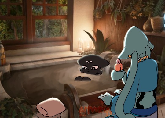
(I can’t draw backgrounds so I “borrowed” these from pinterest and then put a filter over the first two, to make them to make them look like drawings)
AU/Headcanon yapping for this lol ⬇️
Kallamar and Shamura met in their teenage years, living with eachother as close besties who found some random ass crowns along the way. They both shared a cabin on the border of early-day Anura and Darkwoods (there was no distinction between the areas, both areas were relatively the same). They shared a bed because it was comfortable enough for them, and lived an average life.
Now during his 30’s, Kallamar really wanted to take care of a child, even though he wasn’t as capable to carry one himself(intersex, infertile, AND he was single lmao). Shamura didn’t care for children as much, but wanted to see their best friend happy, just didn’t know how.
One day the two were sitting around and playing knucklebones with eachother, when they heard a knock on the door. Shamura got up to answer the door, looking around before glancing down, seeing a young black cat staring back up at them. Shamura was in a state of confusion at first, asking the kit where he came from, only getting a shrug as a response.
It was only a few seconds, before it clicked to Shamura that this child had been abandoned. With no second thoughts, they knew exactly what to do next, as they gently took the child by the hand to offer them a new home. Walking back into the living room, Kallamar had put away the board and dice, asking Shamura who was at the front door. Shamura replied with a simple “Just look for yourself”, as Kallamar gave them a look of confusion, before spotting the child stepping out from behind Shamura, while holding their hand.
Shamura explained to Kallamar the child’s situation, they brought up the idea of taking in the child, as if he were their younger sibling and such. Kallamar became ecstatic, agreeing to the idea almost immediately while going over to hug Shamura tightly, then greeting the little boy.
However, first things first, the kid smelled like trash(despite looking clean), which called for an “emergency” bath. I won’t go into big detail about the rest of that day, but let’s just say that Kalla and the child, nownamed Narinder, had alot fun getting to know each other.
This is literally “revised” lore I made up in my head for two weeks, finally had motivation to draw a bit of it, I just really like seeing interpretations of Narinder and Kallamar. So I thought instead of the usual sibling battles, they started off with a loving caretaker their adopted child type relationship, only becoming more sibling tied once growing up lol
#cult of the lamb#cult of the lamb art#digital art#cotl au#cult of the lamb shamura#cult of the lamb kallamar#cult of the lamb narinder#tiny narinder#bby.. bby boy Nari..#cotl shamura#cotl kallamar#cotl narinder#artwork#my art#Death’s Honor AU
294 notes
·
View notes