#I was going to actually try to add more detail in art form but I can't focus and I'm not well
Explore tagged Tumblr posts
Text

So I also ended up making this this afternoon
So basically the story behind this is that I decided “eh screw it, I said I’d try making that megop kid idea, might as well try making some helm designs to start out with”. And I made a bit of one for TF One, though specifically inspired by their cogless designs since I’ve drawn them a fair bit
But then it dawned on me that outside of TF One, I haven’t actually drawn that many Megatron and Optimus designs. Like I drew Animated Optimus like a couple times when I was starting out, but that’s it. And also the idea itself doesn’t really work with TF One, since as it stands the war hasn’t technically even broke out yet. It works far more in a series where it’s actually been happening
So I figured, I should start at the basics and get myself some practice on g1 Megatron and Optimus, since you know, they’re the classic designs
Also side note on g1 that isn’t really related but I wanted to add in anyways, today I got the complete set of the g1 cartoon (minus the movie but that’s okay). It was a Christmas present that was supposed to come earlier but finally came in today. And I learned my PS4 can play Blu-Rays (which really shouldn’t be a surprise, I’m aware that’s what made the PS2 sell so well, but I didn’t realize they kept doing it), so that means I am now able to watch g1 on an actual TV, legally, with presumably higher quality, and possibly even subtitles
So you know, I’m doing pretty good right now. I’m glad my dad is supporting my Transformers fixation and the fact that I’m insisting on using a DVD player (for the movies at the library, but still), which means actual DVDs
Anyways, side tangent aside, back to the drawings
I think they turned out fairly decent, they don’t really bother me. I do kind of wish I added shading/lighting so the drawings weren’t so flat, but regardless
Admittedly I think I do need to work on actually doing poses and things with these designs, I’m doing a whole lot of nothing with them right now. I need to pose those cubes
Also there’s some colors shared between the two. I don’t know if this is something actually done in the show, and maybe it makes the colors look inaccurate, but I think it’s neat to use the same colors elsewhere
Now on to random things about the characters’ designs I just wanted to mention
First off, this isn’t really a character design thing, but these were the pictures I used for references, outside of some concept art I have for full body basic anatomy (getting screenshots from the show is my preferred form of reference), and I gotta say, it took a fair bit longer to find a picture online with a proper look at Optimus’ head than Megatron’s
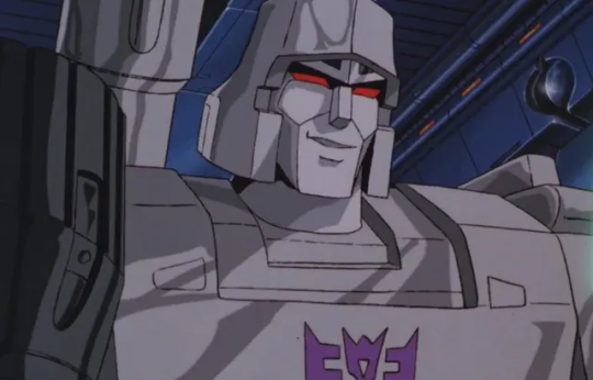
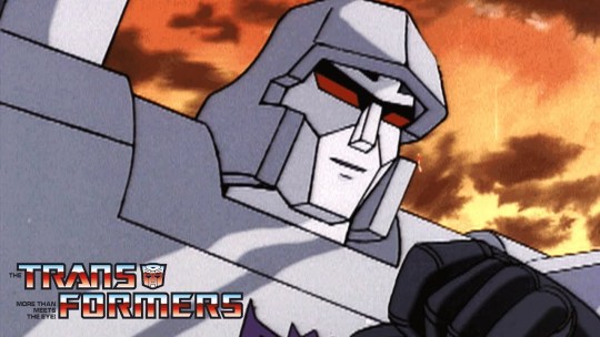
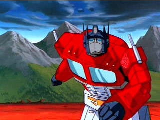
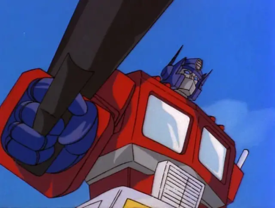
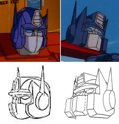
Like it didn’t take that long, like 1-2 minutes, but I just noticed how a lot of screenshots don’t really focus on his face, unlike Megatron. I assume because in g1, he doesn’t really have much of one, given his mask covers half of it
Also while Megatron’s helm itself is relatively basic looking and doesn’t really have a lot going on, the rest of his face has got a fair amount of details
Like he’s got defined cheek bone lines (I think), but he’s also one of the few (again I think) characters to have the shadow around his eyes that becomes more common later on
Then there’s also that whatever he’s got going on above his eyes. I’d say it’s eyebrows but I don’t think that’s what it’s supposed to be, given these characters don’t really have those yet
I saw someone, aka the person who makes Transformers Until One, granatu888 (idk if I should tag them here or not), turn the thing into a battle mask that drops down onto his face, and frankly I think that’s really cool, and that’s what I now choose to believe it is. Hasbro, make that what it is
Anyways, moving on. I don’t really have a lot to say on Optimus other than his helm being a lot more simplistic in its shapes than I’m used to, as well as very triangular. Like compared to TF One Optimus, who’s got a lot of details going on, his is super simple. I also didn’t make his antenna full triangles going down because I thought it looked weird, now they’re more like TFA Optimus
Also one last thing, but I swear the way I drew him looks just like that how one artist does, the one who draws Sparkplug (sorry, unlike the last mention I don’t actually remember the artist’s name, probably because I don’t follow them. Which tbh I should probably rectify, I like their Sparkplug stuff). Sorry it was just something I noticed afterwards and can’t unsee it. This also applies specifically to the face, they draw the actual rest character much better than me
Anyways, back to Megatron. Random thing, but he’s got a whole control panel on his torso. I’ve known he has it, because he has it in TF One, but why does he have it?
This kind of goes hand in hand, but random other thought I had today that connects, his design in general is a bit off compared to other characters because in g1, he doesn’t transform into a vehicle, he turns into a gun. Like that’s not to say he looks out of place (I mean I still think his helmet looks weird), but like, he doesn’t have a lot of kibble because of it. Like he’s one of the characters with no glass on his body because guns don’t have glass
Also does he have two guns? One on his shoulder, another on his back? I don’t know, I’m only now realizing that. They probably combine together when he transforms. Also I think his fusion cannon is just supposed to be his scope in gun mode, which ironically I’m pretty sure aren’t actually involved with the damage part of shooting. I don’t know, random observation
And uh, I think that’s it. It was mostly just random design details, and honestly not as many as I was expecting. I didn’t really have much to say on the art itself, mostly since it was just me trying to draw the g1 designs
But yeah, it was neat, I think I have a better understanding of their general designs, at least here. Now to actually use them in any way
#don’t know if I will be using these for the original purpose I outlined#but you know it was good practice anyways#transformers#transformers g1#my art#megatron#optimus prime
23 notes
·
View notes
Text
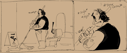
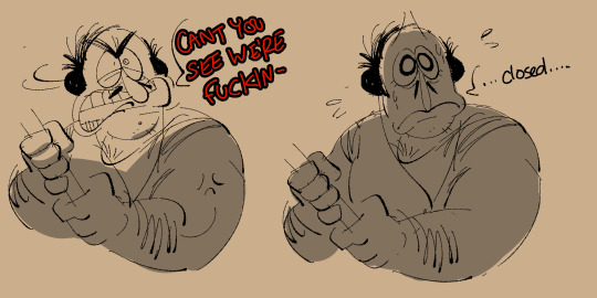
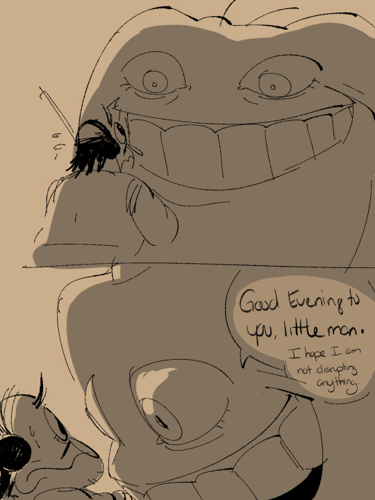
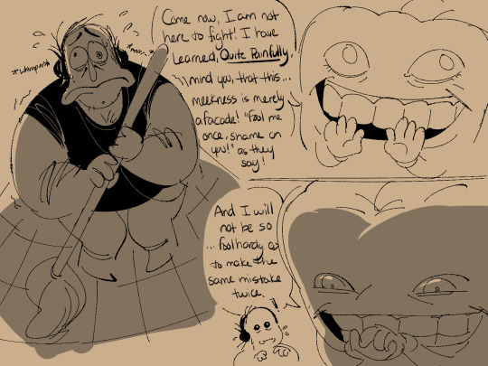
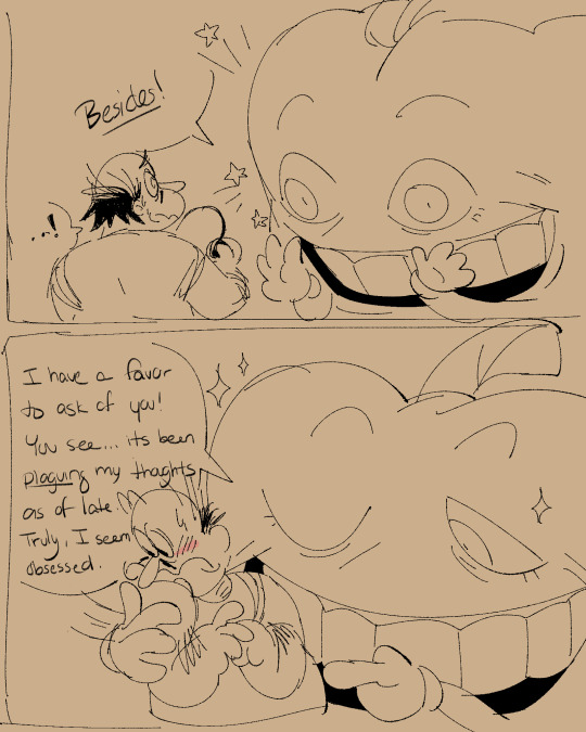
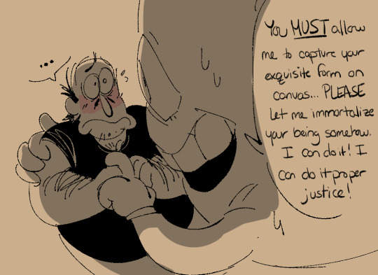
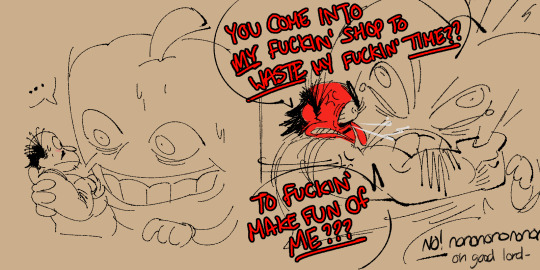
Hiding the rest of this HUGE comic behind a readmore for ur sanity

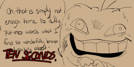

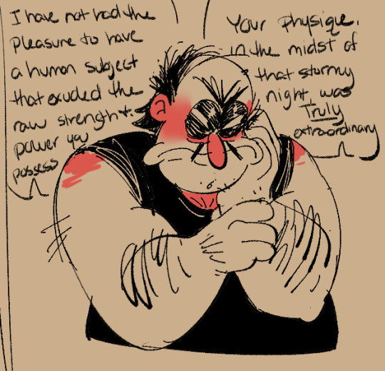
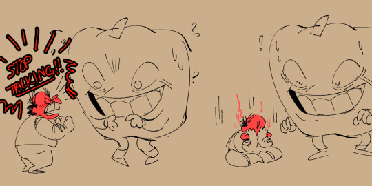
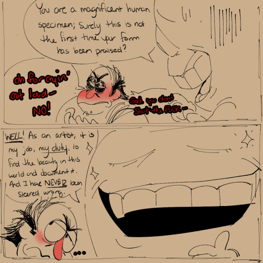
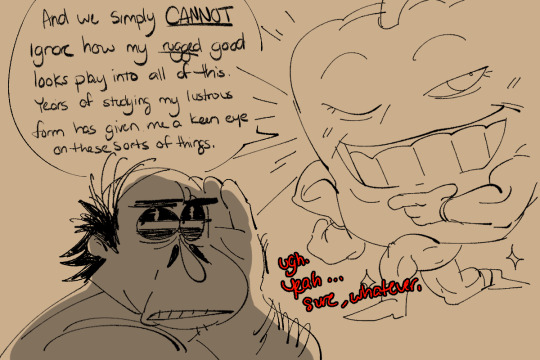
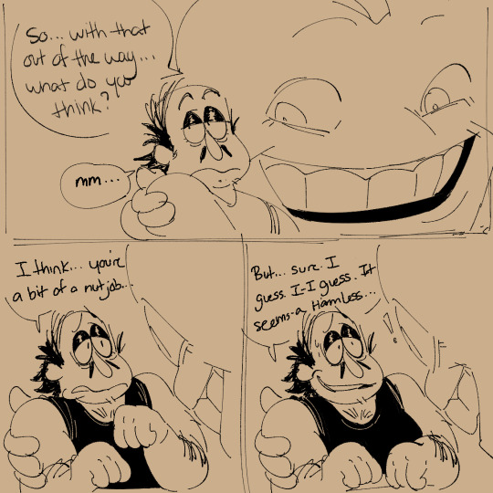
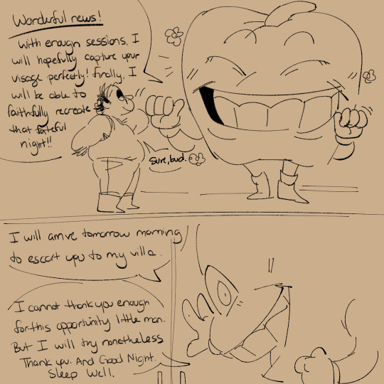
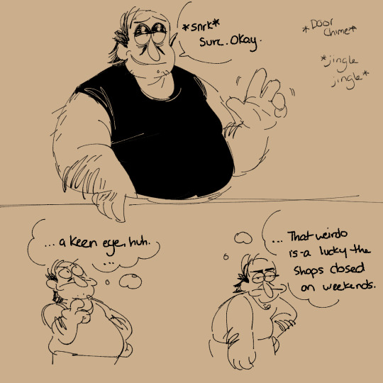
Hes got the keenest eye for these things!
Now that this is hiding behind a readmore i can justify writing an essay in here. Nothing big tho i am just very chatty :)!
Postgame where Peppino still gets visits every now and again from the bosses of the tower. I already drew one for the noise (lmao) but i wanted to draw each of the main four interacting with him in some way.
Pepperman is a refined and well renowned artist. His art is highly sought after and his advice is not taken lightly. He has many MANY fortunes to pull from to make his visions a reality and to influence anyone to do anything. Except for Peppino.
From the very first fight, Pepperman is immediately, overwhelmingly obsessed with this stout little brawler. He is much much more than what meets the eyes. He is initially extremely offput and annoyed that a human so boldly decided to waltz into his domain, and he expects to be able to steamroll and bully this…beast…out of his place of work. He is refined when he wants to be, but he is quick to use his brute strength to get what he wants if only bc he knows he can do it
And so when he decides to fully charge and thrash this little trembling human, expecting him to skitter away the second he gets struck, he is completely unprepared for when he gets launched to the other end of this room. The human looks so incredibly PISSED, like a bull seeing red, and suddenly this little altercation suddenly became a real actual ‘knock your teeth out’ brawl. This human is only like half his height, but his punches and bashes fucking knock the wind out of him.
And like ! To add insult to injury!!! After he wins the fight! He visibly deflates, the adrenaline seemingly wearing off. Hes just this trembling fuckin whelp again !!! Whimpering as he fucking runs back out through the portal to do god knows what. And Pepperman could not be any more fucking intrigued. Like this no name came in, whooped his fuckin ass, and went about his day. Its unreal
While Peppino is running around climbing the tower, Pepperman is in his room losing his mind. Hes obsessed. No one has challenged him in this way. No one has fought him and WON. He is ALWAYS able to bully people into submission either through brute force or with money, and he got his ass handed to him !! He needs to know more. Its quite literally consuming him.
Cut to the final fight, set up for a rematch; and he knows he is going to get steamrolled again but it is SO exhilarating to get another chance to see this humans form up close again. This time he can try to commit everything to memory. Its all such a blur though, and in a quarter of the time it took to end their first fight, its over. He gets to watch the human fight the gunslinger with his bare hands, no gun necessary, and he doesnt even bat an eye at what looks to be a clone of himself. He is a force of nature tearing through every single defense, and when Pepperman watches the actual final fight with the bizarre little pizza man, its like hes caught in a movie. The rain, the storm, the atmosphere. He wishes he could burn the entire scene into his mind.
So when everything returns to normal, he takes the time to travel for days to come and find this little human named Peppino. The memory is still strong and vivid but eventually, details will start to slip his mind. He needs to find this human, convince him to sit and do some still life sessions with him to help cement the humans appearance in his head. He hasnt had to resort to…asking for permission for anything in a loooong time…he bullies people into doing what he wants but Peppino is not your average person, and if he wants something from this man, he’ll have to meet him at his level.
He...can make an exception for Peppino...he supposes.
#pizza tower#peppino spaghetti#peppino#pepperman#i love love love how this little comic turned out#esp with how peppino came out in so many panels#esp the one w pepperman holding peppino close: that one is the best i think#anyway#yeah#heehee#this is not intended to be shippy but do as u please#pepperman is just an artist that appreciates beautiful BEAUTIFUL forms#and people who defy him#and he has No filter#peppino is like oh my god#hes eccentric…the worst kind of person….#but like#no one has tried to fight him since the tower collapsed#and everyone seems peaceful enough now#so if this weirdo thinks hes ‘beautiful’ and ‘exquisite’ and ONLY wants to spend some time to draw him#well thats better than fighting again; hell take it#also#heehee yes; peppino is using a walkman#hes been holding onto that shit for decades its his ol reliable
4K notes
·
View notes
Text
I finally had time to make proper designs for the Trio!
Redson: Ver 1
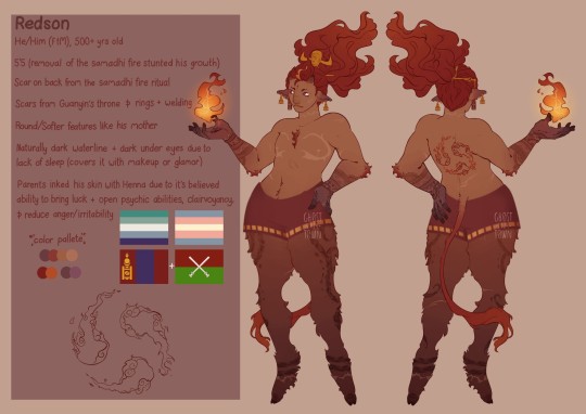
Ver 2
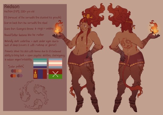
I couldn't decide on if I liked it better with the braids or not so I just posted both, but anyways!
I gotta admit, I used to not like the idea of redson having Bull features (except for a small pair of horn maybe) but the concept really grew on me and now I really love it and wanted to try making my own design and I'm really proud with how it turned out.
I would've added more scars, since Guanyins throne pierced his entire body, but there came a point where it just looked like there was too much going on so I had to get rid of a few scars to tone it down, so we're just gonna say they faded over time, okay? Okay.
I also made him Miao (one of the largest ethnic minorities in southwest China) on PIF's side, and Mongolian on DBK's.
The Miao ethnicity of China has a long history, rich culture, and an ancient folk religion. Adorned in beautiful traditional clothes, possessing natural talent for singing and dancing, they live in uniquely designed indigenous architecture, which I think fits perfectly with how I imagined Princess Iron Fan and with her; Redson.
As for DBK being Mongolian, I saw someone else talking about this headcanon and I just liked it so I decided to use it, I don't really have a specific reason for it, I just thought it fit, not sure why though, it's just one of those things that makes sense even if you don't know why, you know?
Mei:
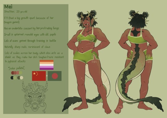
I made her taller and gave her a long dragon tail (like really long, it drags along the floor if she's not holding it up), though her scales are pretty much everywhere across her body they're most noticeable on her shoulders, thighs, and face (they're a bit hard to see in this photo because they're kinda hidden behind her hair, but I did give her scales beside her eyes)
I also gave her horns these little spiral designs around them, gave her sharper nails, and designed her ears to look like coral, since she's a water dragon and I thought they looked cool.
Honestly idk what else to say about her design, I didn't have anything specific in mind when designing her, I kinda just had to wing it, but I'm happy with how it turned out :)
(I also made her Bengali, on her dad's side, but it's not really important or has any reason behind it, just a headcanon I've had for a while, don't know where it came from though)
MK:
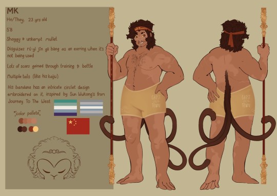
Alot of people have speculated that the monkey form we see during the fight against Azure in season 4 isn't MK's full form yet, that we're just seeing a fraction of what he's yet to become, based on the fact that while he has the weird side burns, the tail and the face marking, he also lacks a natural skin tone, they didn't give him a proper nose etc, so I wanted to play with the idea.
I decided to make him this strange mix between human and monkey, leaving him pretty much human with the addition of his tail(s), and weird li'l monkey feet.
(I was also gonna give MK more arm/leg hair, it was in my first sketch, but I forgot to add them when I was doing the line art and didn't realize until after I saved it as a jpeg, so that's my bad, but I'm gonna add it in to any other art I make)
It's also a bit hard to see in this, but I designed his staff with more details, specifically adding dragon-esque imagery to the Golden ends, this is because (for anyone who's new to the fandom/hasn't read JTTW) Wukong's staff was originally one of the several pillars that held up the sea in the dragon palace, until he stole it and shrunk it down to use as his weapon.
I also did MK's clones :)
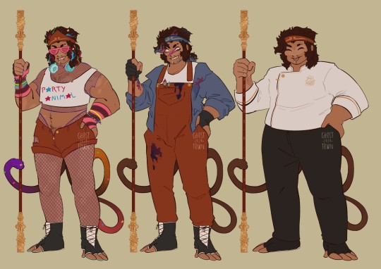
Porty MK:
I gave him stripes of coloured hair and gave his tails all different colours, though I don't think he would actually dye it, instead I like to think that he would use that really crappy dollar store spray in hair dye (or hair chalk). I kept the fishnet clothes that I added in my originally design of him for my headcanons post, and decided to give him striped elbow length fingerless gloves.
I also gave him a cropped shirt, ripped shorts and these weird fingerless glove-esque shoes for convenience, since regular shows seem like they would be uncomfortable.
Edit: my dumbass forgot Porty's stupid print jacket 😭
Artist MK:
For Artist MK I gave him overalls and a jacket over it, which he wears specifically for when he's doing paintings so he doesn't ruin too many of his actual clothes (I know I said that this was inspod by Circusapple, which it still is, but this is almost exactly what I wear when I'm painting too, just in different colours).
I also gave him those gloves that digital artists wear so they're hands don't accidently trigger something on the screen because everyone knows that every artist just walks around with their art glove on even when it's not necessary.
Delivery MK:
I have to admit, I was never a big fan of MK's work uniform just being his regular clothes with a work jacket thrown over it so I wanted to try and make him look a little more professional and decided to instead give him a chef coat (similar to the one Pigsy wears on the show as well), with a logo for the restaurant on the chest, along with it I gave him plain black pants, since casual red jeans didn't seem very professional (I know he's just a delivery person, but if you were to look at pretty much any food corporation, even people who do deliveries have to wear uniform, so it's always been kinda strange to me that he's just in regular clothes).
The shoes were harder to make professional given the whole "half-monkey" thing so I opted to give him the same strange fingerless glove-esque shoes for comfort and convenience, but made them plain black as well.
#lego monkie kid#fanart#lego monkie kid red son#monkie kid red son#lego monkey kid fanart#red son#lego monkie kid mk#lmk spicynoodles#lmk mk#hong hai'er#lmk mei#lego monkie kid mei#monkie kid mei#long xiaojiao#qi xiaotian
511 notes
·
View notes
Text
Gallavich Masquerade 2024

Let's have a New Year's Masquerade Ball!
This time it'll be a mixed one, for fic writers and fanartists! The fanworks will be revealed on December 31st and people will have up to January 31st to cast their votes.
As you now know, in a Masquerade, creators (fic authors and fanartists) will produce their works anonymously. These fanworks will all be revealed at the same time on December 31st - our New Year's Masquerade Ball! - and fans (previously called readers and admirers) will have a month to attempt to guess who's behind each mask, that is, who made what. Creators are encouraged to try to fool everyone!
Details after the read more, but don't forget to please spread the word. This will be fun!
Requirements
All fics must have between 2,000 and 5,000 words. For art, there are no requirements. (Needless to say, AI "works" are not allowed.)
No theme is required or forbidden, but, as this is an event in which the goal is to have as many people checking out our work as possible, fanworks in niche categories are not advised. Regardless of what you do, please tag accordingly.
I don't know what to write/draw about!
You can get inspiration from anything you want. It can be canon-compliant, canon-divergent, after the show ended, AU...
But, if you still need some ideas, you can find some here, here or here (not to mention @callivich always has tons of prompts lists).
Sign-ups
Signing-up is required and can be done here. For this event, sign-ups can be done up to the time of posting. Unlike other events, this is one where you will need to sign-up only at the end, after the fanwork is done. You'll be required to add your AO3 username and the title of your fanwork.
What if I don't have an AO3 account?
Then I'm very sorry, but in this case, you won't be able to participate (as a creator). For this event, having an AO3 account is mandatory so that you can post in the collection. That being said, a lot of people have AO3 invites, so ask right now and someone may be able to send you one.
Posting
Posting will be done on AO3 and AO3 only! This is because the Masquerade Collection will be unrevealed and anonymous. All posting must be done until December 29th. On December 31st, all fics will be revealed and available for the readers. (The two days different is to ensure that everyone has posted before I reveal them.) The fanworks will remain anonymous until January 31st, when the game ends. (Please take note that this may be extended if there are a large number of fics). On February 1st, the authors' identities will be disclosed (and your fic will appear under your account just like any other fic).
As an creator, all you have to do is, when posting on AO3, choose to do it under the Gallavich Masquerade 2024 Collection (as in the picture below). I'll take care of the rest. It's important to do so when posting and not after, or it won't work. You can go to My Works > Works in Collections to confirm that it worked.

Voting
Voting will be done via a new form, which will be disclosed only after the fanworks are posted. All titles will be displayed and fans will chose from a menu who they think the creator is. This time, voting is mandatory in all three guesses. If you don't know who to vote for or if you haven't had a chance to read a fic, for example, just take a guess. Also, you might as well guess three different creators to increase your chances, even if you think you're sure who it is.
Points
There are two ways of winning this game, as a creator and as a fan.
Creators are awarded 1 point for each person who correctly guesses their fic/fanart on the first try, 2 for correct second guesses, 3 for correct third guesses and 7 points for each person who wrongly guesses it (that is, matches three different creators to your fanwork). That's right, you get more points if you're actually able to deceive everyone.
Fans are awarded 5 points for each fanwork they guess correctly on the first guess, 3 for each correct second guess and 1 for each correct third guess (obviously the points are only awarded once, so there's no need to guess the same work more than once). No points are being deducted this time.
Creators can also be fans, so they have twice the chance of winning. There will be separate winners for artists and writers.
Prizes
Winners will get boasting rights! XD Plus, of course, a special post for them.
If anyone would like to make fanworks for the winners (like art for the winning writers, fics for the winning artists, edits, whatever), please let me know, that would be super nice!
94 notes
·
View notes
Text
More Roddenberry Archive musings...
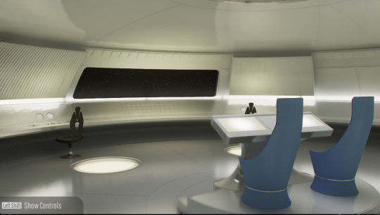
This is supposedly the launch configuration of the Prime universe U.S.S. Enterprise NCC-1701's main bridge. It's based on the first piece of concept art for the TOS set, and is one of several weird not-quite-canon things the Roddenberry Archive has decided to consider canonical. 2 command chairs and the whole centre console and chairs spins to face the very minimalist 60's scifi perimeter consoles or viewscreen. Try to imagine Captain April and first officer Chris Pike on this bridge, it's weird.
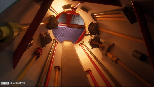
Behold! The top of the Jeffries Tube.
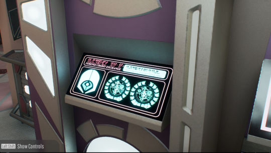
FERENGI ATM MACHINE ON THE PROMENADE!!!!
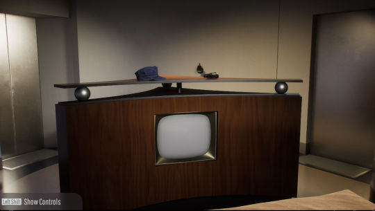
The view from OG Captain Pike's bed, featuring his awesome TV, his laser gun and his Starfleet hat. We wouldn't get hats back in Trek for 50 years.
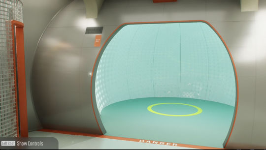
This is inside the Ringship Enterprise XCV-330, circa 2100. The Ringship in canon was seen only in picture form or a desktop model, we never saw inside. The ship was actually designed for a non-Trek Roddenberry scifi show called Starship which never came to be, and there was actually concept art made for the interior which the RA people decided to import to Trek too. Predating the transporter, here is the Metafier.
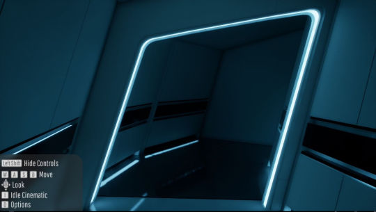
Discovery Season 2's U.S.S. Enterprise has a cool corridor running around it. Walk around it and... it goes nowhere😂 the Archive tries to balance the reality of everything being a television show with the fantasy of a 100% accurate in-universe museum, it'll give sets ceilings to make them into a believable spaceship but doesn't want to go nuts inventing too much of it's own stuff and that sometimes leads to weird stuff like this dead end
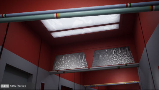
Speaking of ceilings, here's the ceiling and lights of the classic TOS Enterprise's corridors. I think they did a decent job keeping to the TOS aesthetic. The sets TOS was filmed on didn't have ceilings at all.
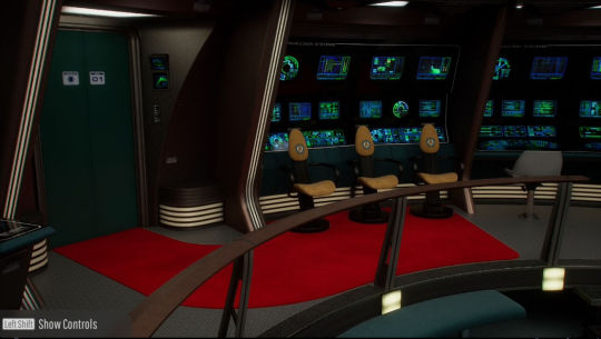
The Enterprise-B actually had a red carpet for special guests Kirk, Scotty and Chekov
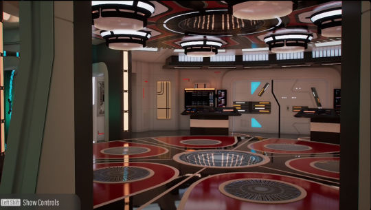
Strange New Worlds has the coolest transporter room of all. Just look at it😍
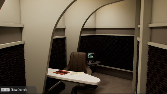
The TNG Enterprise battle bridge has it's own ready room! And it's super tiny, ultra cramped and Picard probably never used it because there's no replicator in there and thus no access to tea.
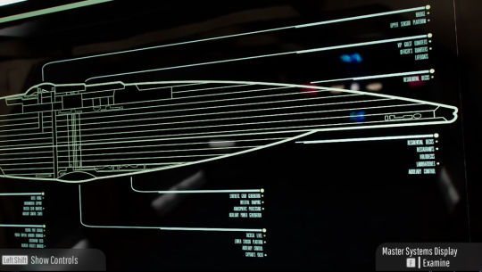
The 1st version of TNG engineering's big Master Systems Display as seen in "Encounter at Farpoint". Ten Forward wouldn't be a thing until season 2, and you can see here an earlier deck layout and the original concept for the saucer rim, a corridor walkway with windows above and below. You'll also note Ten Forward would actually be on deck 11 had they not changed the diagram by then.
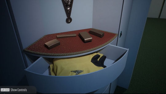
Kirk's quarters on the TOS Enterprise has dresser drawers full of uniforms for when his gets torn
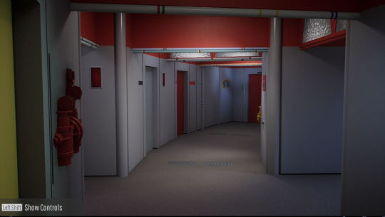
Walking around the Roddenberry Archive ships is eerie as hell. You're the only one on board, exploring corridors and poking your head into rooms. These starships are liminal spaces. This for me adds to the atmosphere greatly.
Here's the link (enjoy before it vanishes again!):
Roddenberry.x.io
Here's my original post about the Roddenberry Archive:
Also a clarification, I was wrong when I said it won't be in VR. There is one VR setup it was designed for - the $3,000 Apple Vision Pro. More details here, although it appears to only show a 2D window rather than be fully immersive 3D, possibly confirming what I was told previously that no current 3D setup is capable of doing a true VR experience:
#star trek#star trek the original series#tng#starship design#behind the scenes#roddenberry archive#deep dive#ringship enterprise#the next generation#strange new worlds#apple vision pro#uss enterprise#enterprise
188 notes
·
View notes
Note
Hello! I'm trying to shorten my sketch to good drawing time and I think your lae'zels are good (great) drawings. What does your initial process look like? (If you don't mind sharing your process) Do you have a sketch step or are you going straight in with the outline somehow? I'm trying to find a process that's more comfortable than I what I do now, which is sketchy and messy. And then I hate the inks I do because the sketch always looks better.
Thanks :)
Lucky for both of us I actually still have the sketch layer for my last Lae’zel drawing so I don’t have to make anything new to show the process!
I have no idea how to organize this so I'm just gonna go with my own weird thing and do levels and hope that it makes sense!

Level 1: This level is entirely for working out poses and forms. The sketch is really ugly and has no detail, just the basic building blocks for the pose and anatomy. Most of the time it looks even messier than this example, but I had to mock one up for this because if the pose is simple and I'm familiar with the character I'll just skip right into level 2
Level 2: This is when I start adding in details, not anything clean, still very messy and basic. I try to keep it loose and mostly from memory so I don’t overwork the sketch more than it needs. I usually start with a simple anatomy sketch, add hair and clothing overtop on another layer, erase the underlying anatomy, and then merge it all into one layer
Level 2.5: Sometimes on more complicated areas like the hair, hands, face, and clothes I’ll do another cleaner sketch with reference just in those areas to make the jump to level 3 easier. If I intend to leave it as a sketch ill usually do this with the whole piece and leave it as a "cleaned sketch" something a bit cleaner and more detailed than the level 2 example but not quite at level 3
Level 3: Here is where I really start busting out the references and getting down into the details. Since I don’t do inks and prefer a sketchier style this is basically my line art. I work through it in parts so things like the face, hair, clothing, hands, and skin details are all usually split up into different layers so it’s easier to manipulate and erase bits. Then at the end I merge it all together into one layer and either start on colors or call it done.
In really simplified terms, my drawing process is - draw a sketch, lower the opacity, make a new layer, draw a cleaner sketch, and then keep repeating that process till I get the results I'm looking for. Its definitely probably not the best way to do things but it works for me!
Hope all this makes sense and that the insight on how I do things helps you out!
92 notes
·
View notes
Note
Hello! I'm sorry if this is a weird ask, feel free to ignore if you want, but I would like to know how would you think the Sakamaki's would react to Laito strutting in high heels?
(also can I go as ❤️🔥 anon? It's a burning heart if you can't see)
oooooop?
I’m still in bed as I’m typing prolly the first half of this out (just woke up) but this honestly was an interesting ask (congrats, you are now nixxio’s ❤️🔥 anon, you shall suffer like the rest of the anons here//j)
Small little tw I suppose >>> There's a brief mention of homophobia and transphobia in this ask, but nothing detailed or explicit to be known- So just keep it in mind
sorta of a long post below >>>>
OKAYYYYY- I wanna first talk about how Laito got himself into the whole act of strutting.
Kou. That's it, end of ask
No but I feel like with all the clubbing and whatnot, that's how Laito possibly could've found his brief interest in such a thing. Also convinced this man has been to drag shows as well, so that just adds more fuel to the fire. As for where he got the heels...Does it REALLY need to be said with how he does get around with women on a daily?
He doesn't even slip or anything when first walking in heels, he treats it as nothing- A walk in the park simply. Laito prolly has worn high heels to school before and simply nobody took it in (Just to be cunty I guess????)
okay now time for reactions amongst the rest of the Sakamakis
Ayato >>> Finds it the funniest shit alive actually
I don't know, he doesn't find it as it being a trans interest from his triplet, but a simple act of comedy that gets on the rest of the households nerves.
I can probably count up to 6+ times where Ayato purposely tries tripping Laito up//down the stairs WHILE he is in heels, it's priceless.
He sorta wants to try strutting himself in heels just to see how it is.
Ayato sprained his ankle within the first ten minutes of being in the heels (It's not for everyone)
Ayato also uses Laito's ability to strut in heels for his own media uses, he'll take videos just to post them and gain attention (taking all the credit in fact of putting his triplet in heels)
He seems pretty cool with it, finds it entertaining every time w//Laito, but he also enjoys it because it's something Laito does for Ayato to get him in a better mood at times, despite it being...Silly. He doesn't judge his brother for wearing heels other than jokingly calling him a queer or a drag, doesn't care what Laito does either way
Kanato >>> Hates it
He has no interest whatsoever in the art of strutting, ESPECIALLY when it's coming from his perverted brother.
Kanato in fact finds the noise of heels against the floor annoying, whether it's a spike or flat platform. Sure, he's into the doll aesthetic of clothing with the cute heels and stuff, but least they don't CLICK CLACK CLICK CLICK CLA- (i'm shutting up)
Not to mention how Laito is already taller than Kanato, the heels just add more which Kanato takes STRONG offense to as seeing it as a way to taunt Kanato for being 5'5
Laito has offered Kanato try the many pairs of heels he owns (stole) but Kanato wants NOTHING whatsoever to do with them
Shu >>> Ehhhhhh?
He doesn't really care what Laito does, or any of his siblings overall. He barely keeps his eyes open, so why would Laito strutting be entertaining?
I guess the times he is awake and it happened to be when Laito is in heels, he'll take a moment or so to watch him, but that's really it.
You guys know the fucking drama cd where everyone is drunk to FUCK except Subaru (I have a yt link to the Vampire Juice cd if anyone is curious) And how Shu is just a laughing hysteric mess drunk?
Yeah, drunk Shu + strutting Laito = Pure madness
It's like a literal circus, Shu looses his voice drunk with a flushed face seeing Laito and heels, and it gets better when Ayato trips him and stuff too.
Reiji >>> "You're only tarnishing the Sakamaki name"
Doesn't appreciate this side of Laito, thinking him wearing any form of female clothing is disgusting nonetheless (Hi I'm one of those DL blogs who is convinced Reiji Sakamaki is homphobic and wants nothing to do with queers, trans people, etc...)
Has probably yelled at Laito wayyy too many times for him to not walk in heels around the mansion, as the noise disturbs the peace. Reiji also has a thing for finding markings on the floor from when Ayato attempted to try sturtting and tripped and scratched the wooden material//other material of the floor up (Which now he has to get rid of all over the place)
When it comes to wearing heels out in public, Reiji doesn't care, just as long as he isn't in the presence of Laito himself. As they enter the limo to get to school, and Laito comes in wearing the heels, you can hear Reiji heavily sigh and rub his face under his glasses.
Subaru >>> Fucking fed up
If Subaru hears "She's a super queen (duper queen) She's droppin', she's flippin', she's winnin'" ONE more time, he is blowing the mansion up.
He has nothing against drag queens and stuff (Because he doesn't seriously care about them) But the music makes him want to fucking kill himself
When Laito strunts, Subaru is his target to tease and bother the most.
And don't get Subaru started with the heel noises too, he hates them MORE than Kanato.
Subaru was resting in his coffin one time only to hear those fucking heels pranching and struttig on the LID of the coffin. (He sent Laito flying when he opened it with full force)
When he hears just one click clack from the heels, Subaru knows it's over for him and his patiences, right out the damn window. He gets headaches rather easily, and Laito strutting DOESN'T help them.
#this was fun to do tbh#LMAO#this is silly#nixxio ask#❤️🔥 anon#laito sakamaki#sakamaki laito#ayato sakamaki#sakamaki ayato#kanato sakamaki#sakamaki kanato#shu sakamaki#sakamaki shu#reiji sakamaki#sakamaki reiji#subaru sakamaki#sakamaki subaru#diabolik lovers#diahell#diaboys#dialovers#nixxio headcanons#diabolik lovers headcanons#nixxio text#sakamaki brothers#kou mukami#mukami kou
27 notes
·
View notes
Text
Fonts: Body Fonts
I had some free time, and I thought, what could be more fun, than putting together a post of some of my thoughts on my favorite fonts? Certainly not going outside or any activity involving moving from my chair, so font talk, here we come! (Links to where to get the fonts for free included in this post). So of course first up we have the majestic Comic Sans..........I kid! <insert baaing goat gif> While it is surely a most iconic font, I will unfortunately not be covering Sir Comic of the Sans in all his glory. See below the break for the full actual post on my favorite fonts to work with.

Note, my interest in fonts is entirely enthusiastically non-professional. Thus, if there's a technical aspect I called 'the tippy bits' instead of tapers or what have you, uh, my amateur ass doth apologizes.
Body Fonts
Body fonts are the all the main parts of a text. The good ol' torso that carries the headers and stands above the footers. They're the font you see the most of and spend the most time with. They're the part of the text that hugs the eyes, to use an entirely weird metaphor. *** My favorite body fonts are the IM FELL series. Especially IM Fell English.

Look at that pretty serif. It's got a great classic appearance to it that reminds me of old paperbacks. There's a grittiness and unevenness to it that gives a more 'natural' look, and is reminiscent of text from a typewriter. The imperfections of this font (like the uneven tippy bits of that lower case y) are my favorite parts, and they add a lot of character to a text while still being legible. I know some folks may not be as fond of the italicized version of IM FELL, but personally I've never had trouble reading it, and enjoy how fancy it looks. IM FELL English is a font that could work as a letter from a gentleman's daughter to the arrogant, handsome heir visiting town, or as the carefully kept diary of a mad scientist detailing the experiment that would eventually rise up and try to kill him. Fun things like that. *** Next font is Crimson Text (there's a Crimson Pro as well, but I like the Text version better for it's fancier capitals).

Just take a look at that w. Sharp enough to cut through digital paper. And the capital W is even better. The angles, the triple Vs...whew, that letter's a work of art! It looks like it should be walking down the runway at a european fashion show and stared down by an unsmiling stone cold magazine editor.

Crimson Text is a very clean, crisp font. It's got those little sharp tippy bits at the end of letters that look like they could prick you if you tried to pick them up. Crimson Text lends itself well to more modern, artistic text. I tend to personally use Crimson Text sparingly, because while it is a very aesthetically pleasing text, it can be a bit harsh for my tastes, and difficult to work with when pairing with other fonts/design elements. Crimson Text is a font that I feel like is for a special occasion, and that occasion is hard to pinpoint, but when it arrives, it makes the most striking appearance. *** Following that, we have EB Garamond, which is probably the second most used font in my personal typesets.

Garamond is a classic. You see it a lot, in one version or another, in published works. For me, it feels very familiar and comforting to read text in EB Garamond. It's like an old, worn blanket that's still perfectly soft and plush. It's the kind of thing that'd get past down generations in the back of a closet, brought out whenever there was a need. Simple, straightforward, and timeless. The only caveat with EB Garamond is the 'e' in it's italicized form is a bit of an exhibitionist that likes to inappropriately protrude it's bottom bits out into it's neighbor. It's a quick fix to teach that 'e' some modesty if you're on Affinity. Just turn off the final forms for the font by going into Text Style Editior -> Variants -> uncheck Final Forms. And now you're prudently dressed for a night of font formatting. *** The last I'm going to talk about in this post is Baskervville. This is, as per the about page on google fonts, a 'revival of Jacob’s revival of Baskerville’s typeface'. I'm not familiar with the original Baskerville, but hey, an extra letter thrown in has to be extra lucky, right?

The thing that really sticks out for me with Baskervville is the 'o's, and the 'o' shape you can see with the 'e's and 'b's and 'd's and such. It's a very...circular, and pronounced font. Round. Rotund. Orbital. There's a flow and balance to this font that stands out, and makes it unique against other fonts on this list. Conversely, the lines of this font as much thinner and sharper than, say, the lines in the Libre Baskerville version. I like that contrast, though it is a bit of a strange one. Like having long stick thin arms and legs and a really round torso. Like one of those mascots for M&Ms (controversial footwear unspecified). Anyway, Baskervville kind of hovers between classic and modern. It's a font you see a lot of (in one version or another) in published works. It's 'family' has been around a long time, and this latest version is like the youngest son of an old, rich, prestigious family. It's got a lot of potential, and can be applied in new, exciting ways, or it can easily fall into a traditional role and live off of it's trust fund. Recently, I used Baskervville for a Pride and Prejudice modern day high school au, and it really felt like the font blended together the two worlds and two time periods well. It's kind of like a hipster that manages to pull off the fedora (a fine hat, I might say. Hats need a bigger comeback, in my opinion). *** That brings us to the end of this post. You'll have noticed that all these fonts were serif fonts. I just like serif fonts best for body fonts. They're the most commonly used in published books, and so they're the ones I've grown most comfortable with. However, a good sans serif can work well in the right setting. For my own work, though, sans serif are usually kept to titles or headers. If there's interest, I'd like to do similar posts on Drop Caps fonts, Title fonts, etc.
#fonts#font recs#body fonts#typesetting#typesetting tips#typography#these are just my thoughts#there's good in all fonts#even comic sans
29 notes
·
View notes
Text

Raren demonstrating a suspicious spell in front of the royal court.
visual storytelling notes:
The bg was left blank until I started painting and the elements added to the bg were designed around the character. I didn't go into this with a little synopsis of what I wanted to convey. Only an abstract idea that Raren was going to be talking to someone, figure it out later. I decided he'd be presenting a new spell in front of a political chamber because he wears a crown and a blue crystal. So he has to be of some form of nobility and magical prowess. He also has blue eyes meaning he is an ice dragon and thus its a blue spell wow. The monarchs he's addressing are left dark and disapproving in the corner while Raren powers a statue beneath them. He could be demonstrating how the spell effects the world around them, maybe it freezes the stone? maybe it brings the statue to life? Either way its primed to eat Raren's opposition. Two of the bg guys are red one is blue maybe he's an arch nemesis who knows.
Art process and wips under the cut
I'm trying and failing to get better at visual story telling while keeping things simple. My long term goal is to have a frequent and consistent posting schedule. Most of the art would be stylized and simple like this and the rest could be fully rendered.
Art has been more of a "draw what's in you head and make it look pretty/ cool to hang up later" thing to me w/ the benefit of being a good source of self reflection as I create. Writing has more so been my go to for expressing that meditation. Writing I don't share because im unnecessarily cagy abt my emotions and my harshest critic lol. I want to tell stories with my art , convey tone, feeling, etc. and right now my paintings don't do that. I don't have the technical skill yet. This painting is the first of many to come that will hopefully change this.


The texture in this is chaotic and the line work is rough. Raren is the only part of this with a full sketch. All other line art was added to create the illusion of detail. There is less attention on rendering each section and more being put into the placement of characters and props. I had hoped this would make the painting go faster and...it has the potential to do so in the future. Sooo a piece that could have taken a couple hours took a whole day.
While im not overly thrilled with the final image im still happy about the process. Normally the dragon would be the only real focal point in my painting with the bg being a gradient, or a simple theme added last second. Conveying a message is more work but it gives more cool things for the eye to look at and the mind to ponder. So in theory even if the final result is aesthetically unappealing the theme can still salvage the work a bit.
what this taught me:
sketchy line work is passable in the final image
it can even add character to the art
plants are a great way of filling space without actually doing so
(hence the wip of the room looking empty af with out them)
the more clothing and eye candy you put on your character the more clutter you have to add to the bg to balance it out
the main oc was sketched the bg was painted on the fly
doing so saved time but harmed the natural flow of the piece
all of the storytelling is happening in quarters and it is almost abrasive to look at
what ill try in the next piece:
perspective guides
less shading and rendering
find a color palette to stick to
or work in greyscale first
write a little picture synopsis
or pick a theme
just find something that acts as a story guide
sketch out bg elements
toy around with the sketch more before moving to painting
#flight rising#artists on tumblr#fantasy#digital art#oc#flight rising art#imperial dragon#my art#photoshop#dragon#dragon art
26 notes
·
View notes
Text
How DO I sign up for this?
We have had to squeeze the sign-up form until it screams to make this work, so buckle in. Here is an example of how to sign up on Ao3 for the recursive exchange, step by step.
I have an idea for a side story for Etho and Iskall in This Is About A Stuffed Bird, by bee_4. So, to start with— that's a hermitcraft fic.

So I select Hermitcraft on the Fandoms part of the sign-up. Note that as we add more fandoms to the list, potentially this will become a drop-down menu instead of checklists. You still select the fandom you want in the same way.
Next is Gift Style. We're using the "characters" tab for that one.

I'm good with my gift being an art, a fic, or a web weave, so I can select all three of these! If I only wanted a fic, or an art, I would only select one.
Next is the Relationship tab, which we're using for characters (told you that we were having to squeeze the signup form until it screamed).

This is a drop-down menu, and I select the characters I want— in this case, Iskall and Ethoslab. Note that possibly I will only match on one character, as we couldn't do relationship matching this time, so I try to keep that in mind when it comes to my requests!
Next is Additional Tags, which is where I select the fic that I'm actually asking for a gift about! In the future, as more fics are added, this will be a dropdown menu, but right now it's tickboxes.

Next is categories. This is our shipping on-off switch.

I've decided that I am good with shipping or not with this one, so I've selected BOTH Gen and M/M. But now that I'm on the page I'm like "I wouldn't mind it if they were lesbians either" so I have selected F/F as well.
Next is rating, which is the NSFW on-off switch. I'm good with smut or no smut, so I've selected both options.

If I wanted no smut whatsoever I could do just Gen (which could also lead to a Mature or Teen work, but excludes E-rated work), and if I definitely wanted there to be dicks out I could select only Explicit.
Then we get to the major archive warnings. This is where you opt-in to archive warnings— it doesn't mean I will necessarily get them, but I'm okay with them! The matching says you might get any one of the things you select here.

Given the source material, I'm opting into Violence and Death as options, and I'm also selecting no warnings apply to show that I'm also good with no major archive warnings!
Now on to the actual request!

There's a space where I could link a letter if I wanted to go into detail with my request, but I think I can fit it in the text box today! I had to put my DNW on the Ao3, and because I said I was open to smut I included a NSFW DNW.
Okay, on to request two.
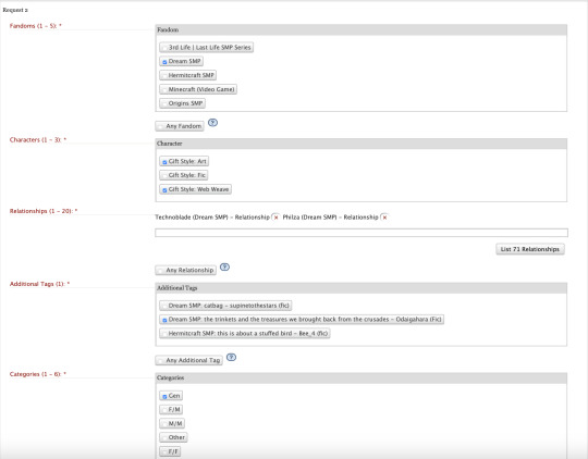
As you can see, for request two I'm doing a DSMP fic this time, and I specifically want art or web weaves! I selected emerald duo, and the fic I want. And I just want this one to be no shipping, so I only selected Gen for the type of relationship.

I opted out of explicit for this one, and I did say graphic violence was okay OR no archive warnings apply.
On to request three!
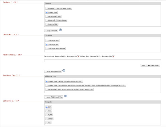
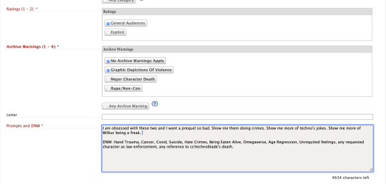
This is much like request two, except I only want fic for this one! But it's Dream SMP, Fic requested, the characters I want (techbur twins), the fic I want (catbag), I want it to be Gen and no shipping, no NSFW, I'm okay with graphic depictions of violence, and my prompt!
Now on to my offers.
I'm gonna start with Stuffed Bird again.
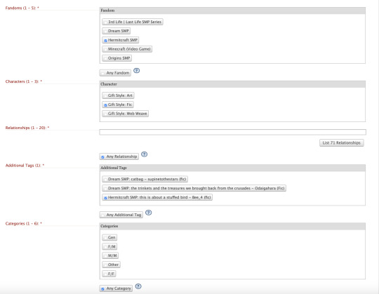

So it's a Hermitcraft fic, I am only able to make fic for it, but you know what, I'll write literally anybody in this world. Hit me. I selected any relationship (which in this case means any CHARACTER). And I selected any TYPE of relationship too— yes I'll write any type of shipping or non-shipping. I can't write smut though, so I only selected General for the rating, and I will absolutely do violence but I am not good with MCD or noncon, so I didn't select those.
For my second request, I opened up catbag.
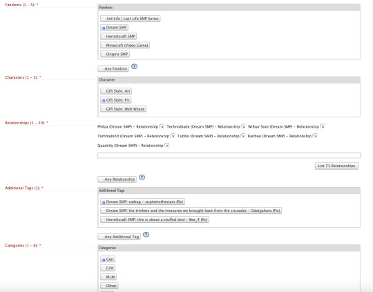

That's a Dream SMP fic, but this time I only wanted to do specific characters. I set it up so that I'd write any combination of SBI, Beeduo, and Quackity. No shipping for me with this one, and no smut, but yes I'll do graphic violence.
And then on to odaigahara's fic!
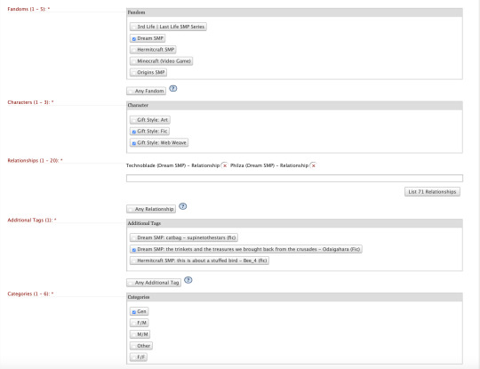

That's a Dream SMP fic, and I think I could make a web weave for that one, so I selected both fic and web weave. I only want to write Emerald Duo for it, so I just selected them. No shipping, only Gen for this one, and no smut, only gen as well. I don't feel like doing graphic depictions of violence for thisone, so I just selected no archive warnings apply!
For my final one, I really want to make sure that I'm matchable on femslash, so I did a bit of a basket offer.
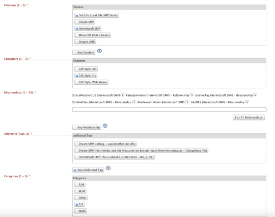

I selected both Hermitcraft and 3rd life, and selected that I would be making fic. I selected all the ladies (+iskall, for stresskall), and when it came time to select an additional tag, which is what fic I'm saying I'll match on, I selected any. With that and the F/F tag selected, it means that I'll be matchable to any Hermit-Traffic femslash request, no matter which story or art it's attached to. Cause I figure I can read the source material and make something in the creation time period!
So that is 3 requests and 4 offers done, and I have a full sign-up! I'm ready to go! That is how you sign up! Over the course of the sign-up period I might keep an eye on other people's sign-ups (available at the Ao3 automagic app) and tweak my sign-ups so that I'm matchable with someone (or several someones), but for right now, I'm good to go!
65 notes
·
View notes
Note
hi dema! i’m learning how to do digital art, would you mind sharing your coloring process? coloring (and lineart) is the hardest thing for me to do T_T… what brushes do you use for coloring and how do you not make it look muddy? i’ve been trying to follow tutorials from different artists on youtube but i find my work to look so muddy… thank u in advance >__<
Hi, and thank you for thinking about me for advice! I'm honoured to share a bit of my process, nerve-wracking as that is for my shy self, and hopefully help you out as much as I can. Forgive me if I don't express myself very clearly—I have a bit of a hard time explaining these things. Now, let's get started, shall we?
I'll be using the first panel of this artwork as an example.
My process is pretty straight-forward for most artworks. Make a sketch, draw the lineart, and follow a self-made guideline for coloring and rendering.
Sometimes I'll throw the guideline to the trash bin and start experimenting with brushes and chiaroscuro and color palettes, but that doesn't happen most of the time and, when it does, it's more a challenge than anything else, and not really what I think you're looking for.
I'll include my usual steps here, however, and like I said earlier, these steps are more like what you'd call guidelines than actual rules.
(I just realized I didn't save the sketch for this artwork. Oops)
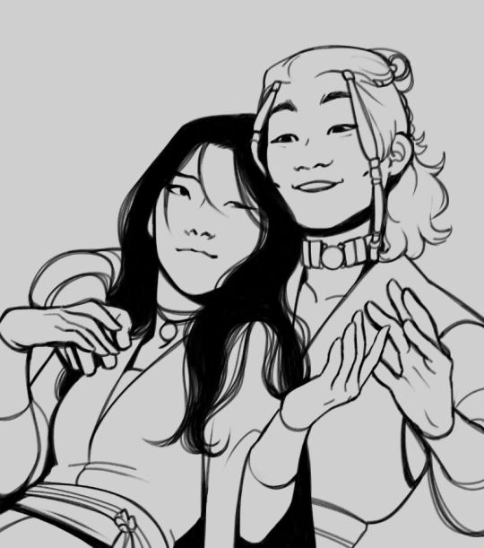
This is the lineart!
I tend to think that details bore me and are actually pretty exhausting to do, but then I go and make things as clear and detailed as I can. Because I'm a hypocrite like that.
I did try to keep things simple here, though, mostly because I had to go through three other panels and didn't want to burn out my fuel mid-process.
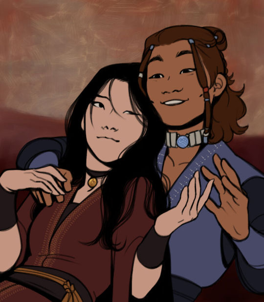
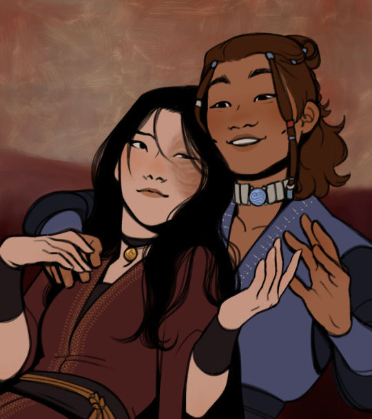
Base colors! The blush (and Zuko's scar!) I draw in a different layer in case I need adjusting the brightness or saturation later.
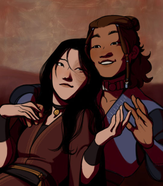
It's time for shadows!
Pick a color depending on the atmosphere you want the artwork to have. Is it a cozy, warm scene in a honey-tinted room, or is it a moment shared under the moonlight? The color choice should come as an answer to those questions—deep red for the first one and dark blue for the second.
Choose a color and make it dark and saturated. Then, play with the layer opacity! A darker shadow means harsher light, while less opacity works best for a softer look. See the difference? It's subtle, but it's there.
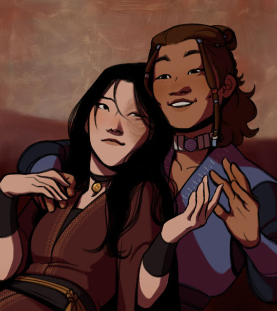
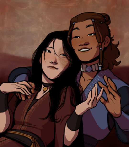
Of course, this is my personal choice. The way shadows are drawn and color is chosen depends on the artist and the artwork. I choose to play with a more simple coloring style, keeping shadows from blending into each other, but you may like a more realistic approach to shadows and colors.
My best advice? Try doing it every way you can, but in the end choose what works best for you. Whatever feels more comfortable, whatever you enjoy drawing the most. And then work to improve it. Love the little proof that you've gotten better, even if it's subtle.
And talking about subtlety...
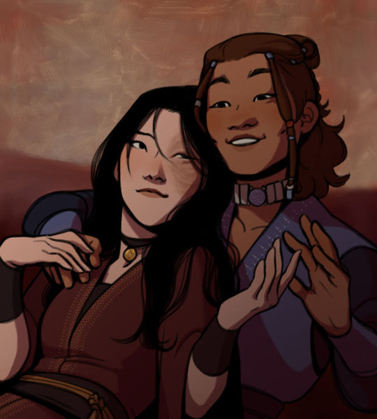
I love to play with gradients. I use them mostly to give the artwork some form of atmosphere, and make it look cohesive and whole. A light gradient in the color and direction of the shadows will help the characters blend with the background, as will another gradient in lighter colors for the light.
Get creative with gradients! Use them so the lights feel brighter and the shadows darker.

Now it's time to work with the lineart again.
The pure black lineart makes the artwork look harsher, sharper, so I tend to give it some color to soften its edges and compliment the rest of the drawing. In darker shades as the rest of the colors, growing more saturated as the light comes closer.
I love to make the characters' eyes pop and glow! It's really fun what you can do by just messing a bit with the tones of the lineart.
Finally, I play with the level correction. A high contrast will help your artwork stand out and look brighter. See the difference?
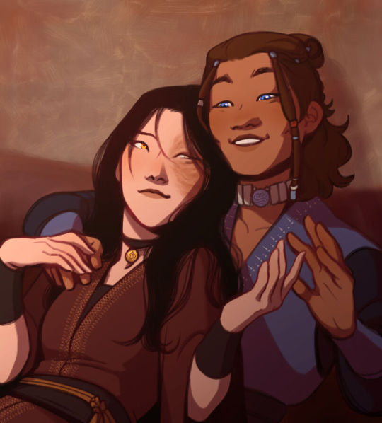
And it's done!
Sometimes I like to add other effects or details, but this is the very, very rough shape of my usual process, and thus what I thought you'd like to see.
Once again, I'd like to point out that this is what works for me, and a large part of improving as an artist is just fooling around and messing up until you find the tools and tricks you're most comfortable with.
So keep drawing those muddy shadows and colors! They're only a step of the process.
#dema answers#zutara#art advice#art process#I hope this helped you anon#Tbh I have zero idea of what I'm doing most of the time#So don't worry if you don't#Worry instead the day you feel like a drawing comes easy and poses no challenge anymore#Always strive to do better to improve to fix that lighting or find a new way to depict a scene or find other filters and effects#No artwork is ever perfect and perfection itself should never be the goal#“Don't trust a song that's flawless”#Don't give up on the strain and the frustration of struggling against your own skills#Never fall out of love with the process#That's where art is
29 notes
·
View notes
Note
I see that you're Ukrainian and I saw two arts with Ukrainian culture. Is there some meanings behind it, references? Could you please tell more? I love seeing artist drawing their culture. It's amazing
OH, anon! You have no idea how it made me happy to know you're curious about my country. And yes, there's a lot to tell, so thank you so much for asking!
I'll try to keep it as short as possible and not turn it into the lecture, so here we go!
So, I have two arts, featuring Ukrainian culture


So, all the jewelry here is traditional Ukrainian jewelry, and not just random. Important note: all Ukrainian culture is about the beauty of layers, in clothes, jewelry, literature, in art.
For example, this one from the left art is called dukach - a medallion, which is supplemented with additional jewelry elements, such as ribbons, bows etc. Annie wears a lion medallion, of course, as a reference to her surname.

Another element, under the dukach, the necklace with the half moons, is called zgrada. The base consists of crosses in two or three rows strung on a string or a dart, in the spaces between them there are tubes or spirals made of brass or copper. Well, the truth is that zgrada can be not only with crosses but also with other elements. Here are half moons that are a reference to another Ukrainian piece of jewelry, lunnitsa. It's a talisman ornament in the form of a crescent with the tips down. Lunnitsa was called to ensure the continuation of the family, it was endowed with the properties of a family talisman, capable of harmonizing the relationship of spouses. It was also believed that the talisman promotes restful sleep, drives away nightmares, and protects the owner from nighttime evil spirits.

Finally, the red necklace that we call namysto. The more layers of necklaces a woman had, the wealthier she was considered. Here Annie wears 10 (!) strings of the namysto, and it's not just a "cheap" gem, it's corals!

Now, about earrings!
Both Armin and Annie wear earrings, and it's the usual shape of the Ukrainian traditional earrings, but we have a small interesting detail here with Armin.
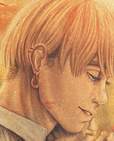
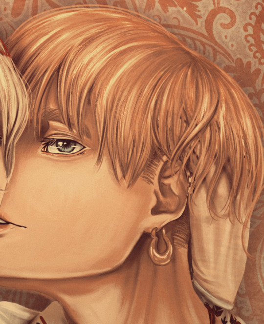
Actually, in both arts Armin is a Cossack - the Ukrainian warrior, who decided against all odds to fight for the independence of Ukraine. All of them were struggling in slavery (not really the "usual" form of slavery but more military like) and under other countries' protectorate, but if we put it VERY simply, they were fed up and started fighting for Ukraine and the freedom of their homeland. That's why they are usually called "people of a free spirit".
And Armin wears earrings in both of his ears and in Cossack culture - it's also the symbol of his status. So, if the Cossask wears it on his left ear - indicates that the Cossack was the only son of his mother; on the right — signals that the man is the last representative of his family; both have a sign that the Cossack is the only child of his parents. So, yeah! Only child Armin!
About the embroidery!

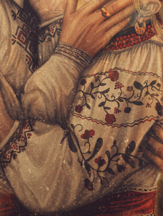
Each region of Ukraine has various embroidery techniques, starting from the color of the threads used and to the ornaments/motifs the shirt is adorned. Both Armin and Annie wear floral and geometry ornaments that are widely used in the central-north part of Ukraine such as the Poltava and Chernihiv regions. But also you can find similar ornaments in Kharkiv, Donetsk, Luhansk, Zaporizhzhia, but all of them differ in colors and shapes.
Now, Annie's flower crown or wreath that we call vinok.
Usually, vinok is worn by girls and unmarried women, sometimes, even after marriage, women wear it, accompanied by a head shawl or kerchief. Flowers here aren't also random, but each of them symbolizes something: malva and peony - beauty, hope, the long lives and symbol of home, of Homeland; centaurea - simple and quiet life.
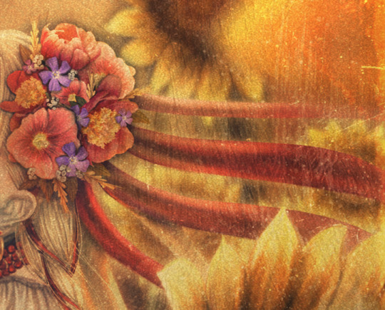
And ending it all, just want to add that the left art with the ornaments in the background - it's an imitation of one of the traditional Ukrainian ornaments that is widely used for the decoration of walls, plates, cups etc; and for the second one - Ukraine has a lot of sunflower fields, so that's landscape is very dear for me.
Thank you once again for asking, and I hope it was interesting!
#aruani#ukraine#ukrainian art#ukrainian culture#my art#art#digital art#illustration#attack on titan#armin arlert#shingeki no kyojin#annie leonhardt#annie leonhart#answered ask#ask#aruannie#арткозацтво#украрт
87 notes
·
View notes
Note
Hello there! What are the pros and cons of using naginatas as a weapon specifically? Is it fairly similar to the ones for lots of other polearms? Or is it it's own unique thing? (Trying to get an accurate idea of how it would feel to use one in combat for some writing I want to do.)
Thanks!
Pros:
Firmly encourage people to maintain social distancing.
Slice people you haven't even met yet.
Slice people riding horses or standing on low roofs.
Add ribbons and streamers as fashion accessories.
Easy to carry.
Can always find one at the right length for you.
Better leverage for your blade than if it had been mounted of a katana.
Never need to explain that you're overcompensating for something.
Amazing looking duels with fellow naginata users.
You can use it on horseback.
Try to impress the Onna-musha.
Cons:
A little bit claustrophobic.
Not great in a mosh pit.
Doesn't like going indoors.
Not good against people who refuse to social distance.
No one will respect you for being a samurai, and may still make fun of you.
Still a delicate razor blade.
Fail to impress the Onna-musha, they know all your moves, are probably better at them than you, and are more interested in making jokes about the length of your shaft.
So, the naginata is basically the blade of a katana mounted on the end of a long shaft. This doesn't make it inherently bad. But it does inherit some of the weakness of a sword, combined with the range of a polearm. That said, keeping them intact is quite doable, you just need to be careful about how you strike.
As mentioned above, and as with almost all polearms, it shines in situations where you can keep enemies at range, and becomes a lot less appealing if you can't keep them off of you. This means it works really well in phalanx-style applications. As with all (or, almost all polearms), it has serious value as an anti-cavalry weapon, letting you dispatch riders.
As for it being its own unique thing, yes and no. It is a different kind of polearm, and you can probably some surviving manuals on exactly how to use them. And there is a modern martial art based on the original form. However, I don't know how much of the original Naginatajitsu martial art has been lost. As far as I know, there were at least a few decades between the, “death,” of the martial art in 1868, and it's revival sometime after 1889. Also, when it was revived, it was as a physical fitness regimen, and not as a martial art. That's enough time, to lose a lot of the technical detail, and meant that if it was preserved, it was done so quietly, which increases the risk of elements being lost.
As polearms go, the naginata is pretty light, ranging from about 3 to 8lbs. (Specifically 1.5 – 3.5kg.) Which does make it a bit more agile than you'd expect from a polearm. It's not clear how much of the flourishes you'll see from modern martial artists were actually part of the original martial art or just spectacle, but you can get some solid movement out of them. And even in its day it the weapon's agility was noteworthy. (Though, to be fully honest, I'm not sure how much of that was in the contemporary literature, and how much is from modern analysis. I do suffer from not being able to read the primary sources in this case.)
Naginatas were a very egalitarian weapon, used by the samurai, monks, peasant footsoldiers, and the Onna-musha (women warriors.) That last category has become one of its more enduring cultural associations. In fact the physical fitness revival was specifically targeted as exercise for young girls. (This is part of why the weight range is so wide, as there's a massive variance in shaft length. Anywhere from 4 to 8 feet in length. (Specifically 120-240cm.)) As a polearm, that's kinda short, but the blade itself adds another 85-100cm. This puts the total length at between 6'8” and 11'2”. And, yeah, a three meter polearm is not a joke. Even if there is an unusual amount of blade on the end of that shaft. It's part of why the naginata is immediately distinguishable from other polearms of similar sizes.
The short answer would be that it is a specific weapon, with its own identity. Some of that is a function of physics and some is cultural.
-Starke
This blog is supported through Patreon. Patrons get access to new posts three days early, and direct access to us through Discord. If you’re already a Patron, thank you. If you’d like to support us, please consider becoming a Patron.
211 notes
·
View notes
Text
Bestiaryposting Results: Miscellaneous "Worms"
Here is what I intended to be our final Bestiarypost: all the animals from the "worms" section of the Aberdeen Bestiary.
I checked, there's not a big missing portion this time. "Worms" only get two pages.
I put quotation marks around "Worms" here because what medieval writers would call "worms" and what we would call "worms" are not the same. The medieval sense is somewhat preserved in the modern word "vermin", but in other ways it's closer to "bugs". Really, it's broader than either of those terms are for us, because it more or less means "any animals that are very very small."
Anyway, if you don't know what I'm talking about, answers can be found at https://maniculum.tumblr.com/bestiaryposting.
If you want to see the entry people are working from, it's here:
And if you want to see the entry for the next (and, unless something goes awry, final) week of Bestiaryposting, it's here:
Now, art below the cut:
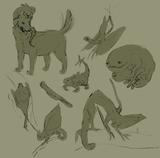
@silverhart-makes-art (link to post here) decided to make these into wyrms, with a "y", and I think they came out well. The Lenggalgak and Shmigwanog are probably the coolest-looking, but I also like the Phlerotger. Silverhart calls it a "horrible little creature" but I think it's charming how... shameless it looks about that. More details on all of these in the linked post.
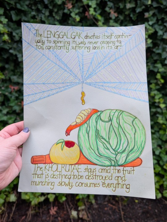
@wendievergreen (link to post here) has drawn two of them in this very nicely stylized artwork here. I like the detail added by including the Lenggalgak's web and some plants for the Kholruntae to eat. I really like the inclusion of evocative bits from the entry as captions. (Also, thank you for including alt text.)
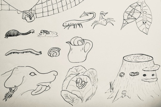
@cheapsweets (link to post here) has done the whole set here. I like the depiction of the Khrezaroth swelling in a pitcher, and the kind of charmingly goofy Phlerotger. Also they pretty clearly have the Logkashgae's number -- which is to be expected, given where this whole project started.
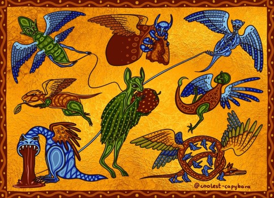
@coolest-capybara decided to go with the theme of "what medieval illustrators might draw when they have no idea what the animal is and decide to get weird with it." I absolutely love all of these, but I think the Khrezaroth is running away with this one. All of them really would fit into the margins of a suitably fancy medieval manuscript. (And I think they might also have clocked the Logkashgae, judging by the face.)
Now, the Aberdeen Bestiary. None of these get illustrations -- they're just brief little blurbs crammed into two pages, so there didn't seem to be any motivation to add pictures.
The section does, however, start with this rather nice inhabited initial:
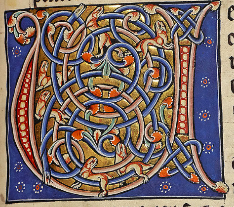
(This is of course the first letter of "Uermis".)
The entry starts with this helpful introduction:
Here begins the account of worms The worm is a creature which generally springs from flesh, or wood or some other earthly material, but not as the result of intercourse, although occasionally they are hatched from eggs, like the scorpion. There are worms that live in earth or in water, in air, in flesh, in leaves or in wood, or in clothes.
Again they are trying to define "worm", but the fact of the matter is that it's mostly vibes-based. The author suggests that worms are anything formed through spontaneous generation, but then notes that some of them, like scorpions, lay eggs. And, of course, in the Miscellaneous Mammals entry, we learned that mice form through spontaneous generation, but they're not listed with the worms.
Anyway, here are their identities:
Lenggalgak
This is of course the spider, which is apparently called aranea on account of it living on air. Maybe the author didn't know what the web was actually for, and figured its tendency to catch insects was an accident.
Khrezaroth
The worm with many feet that rolls in a ball is the millipede. I haven't seen any swell in pitchers, but I'm sure they could if they wanted.
Phlerotger
The bloodsucker is the leech, naturally. "So called" because the Latin term given by the author is sanguissuga.
Logkashgae
In a bit of a full-circle moment, this is the scorpion. I've written a lot about these already, so we'll just move on.
Burlebroth
The worm that makes silk is the silkworm, surprising nobody, I'm sure. I can't explain the name thing this time, because the Latin name given is bombocis.
Kholruntae
Interestingly, this is the caterpillar. Odd that it is specified not to fly, when in fact it's one of the only ones on this list that does. Just... not until after it metamorphoses.
Shmigwanog
The wood worm is the termite, which makes sense.
Feabladtae
Finally, the worm that sticks to dogs' ears is the tick.
Misc.
There are also several that I intentionally left out this time, because there was even less of them to make into these little entries. Here's the rest for your perusal, however:
The worm found in clothes is called tinea because it gnaws at fabrics, and burrows into them until they are eaten away. For this reason, it is called pertinacious, pertinax, because it works away all the time at the same thing. Worms of the body are the emigramus, the stomach-worm, the ascaride, the coste, the louse, the flea, the lendex, the tarmus, the tick, the usia, the bug. The emigramus is a worm of the head. The stomach-worm, lumbricus, creeps into or lives in the loins, lumbus. Lice, pediculi, are worms of the body which get their name from their feet, pedes; people on whose bodies lice swarm are called lousy, pediculosi. Fleas, pulices, however, are so called because they live mainly on dust, pulvis. The tarmus is a worm found in pork fat... The usia is a worm found in pigs, so called because it burns, urere. For when it bites, the place burns so much that blisters form. The bug, cimex, gets its name from its resemblance to a plant which has the same stench; properly speaking, this worm originates in putrid meat.
There is also this helpful little conclusion:
To repeat, you find the moth in clothes, the caterpillar in vegetables, the termite in wood and the tarmus in pork fat. The worm does not crawl like a snake with visible steps or by the pressure of its scales, because it lacks the firm spine which you find in snakes; but, moving in a straight line, by expanding the contracted parts and contracting the expanded parts of its little body, it unfolds in motion and, impelled in this way, creeps forwards.
So there you have it. Worms.
#maniculum bestiaryposting#maniculum miscellaneousworms#Lenggalgak#Khrezaroth#Phlerotger#Logkashgae#Burlebroth#Kholruntae#Shmigwanog#Feabladtae
17 notes
·
View notes
Note
CHARACTER ASKS WOOOOOOOOOOOOOOO! #14 for Val and #20 for Ale, pretty please? :)
YOOOOO CORINNE HELLOOOO :D
— thank you for the ask 🤭❤️🔥
(14) Do you have any quotes tied to the character, either from the story itself or from another source that fits them?
I have found a few quotes from Pinterest that screams Val and here they are:
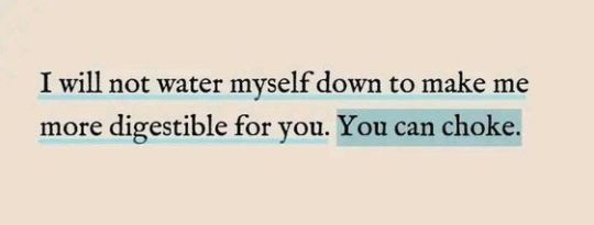
This kid of mine used to be a people-pleaser. However, she eventually got tired of being one and decided to be unapologetically herself. Naturally, it wasn't an overnight thing, but to sum it up, that's what practically happened 🤫

Most of the time, Val treats people how she wants to be treated; not that she expects it, but it's something she'd be thankful for if the energy of the exchange is reciprocated.
(20) Bonus question: share any additional thoughts, art, favourite scenes, anything you've been waiting for a chance to ramble about.
Hehe, did someone say 'ramble'? 👀
Will gladly do so! 😁✨
Well, I've been wanting to share more of canon Ale since I realized he has more AU contents than canon 🤣 As much I as enjoy the meddling pathetic lover boy that he is in AUs but Ale might sulk that I'm not defending him 🤣🫂
So here we go:
Fun fact! I actually have a more detailed lore for Ale than for Val. But for some reason, I haven't shared much of his lore yet XD
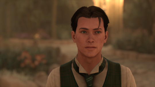
Let's talk about Ale regarding romantic love.
Ale is definitely romantic. He knows all the words to say, the gestures to do, and how to make his partner feel like they're literally the best. He's the human form of the word 'romantic' if I'm being dramatic.
Ever since his first year in Hogwarts, the ladies really fancies him (even the lads aren't safe from his charm). His energy naturally draws people towards him.
If I had to describe Ale in 5 words it would be: charming, classy, suave, playful, and gentleman. From those words itself, you can already tell why the ladies like him so much XD
To add on, he is a huge flirt. He can literally flirt his way out of almost anything. Despite that, Ale usually just flirts for fun or just because it comes so naturally to him that he forgets he comes off as flirting.
But underneath that flirty exterior is just a boy wishing to have a real connection with someone someday. It's safe to say that he daydreams about finding the one and even makes poems about it sometimes.
The funny thing is that once he meets his 'the one', suddenly he turns into a clumsy and stuttering mess. Meeting Val during his fifth year is something he isn't prepared for at all.
For instance, there's this narrative he keeps telling himself that there's no way he's gonna meet the love of his life in school since he already met everyone (boy is sociable af it's not even funny 🤣). Sure, he had like a few crushes back then but he knows that there's nothing really more to it than admiration. But meeting Val, that really caught him off guard.
Luckily, they eventually became best friends since they have a lot in common in their core values and their traits are complementary so it's fun and enriching.
There was actually a point in their 6th year when he got so sure that he and Val actually had a chance (he wasn't wrong tho 🤫). But teenage love is messy, so some things happened that were out of his control and out of his perspective as well that changed the course.
Now here's the fun part 😈
Then in the 7th year, here's when Valreth became a thing.
On the contrary to the AUs (which I love btw 🤭), Ale never meddled in Val's relationship with Garreth. WOW surprising 🤣 but yes, he never did.
He supported them because in his defense, "if she's happy and safe, then that's all I need to know."
Although, he actually dislikes Garreth even before meeting Val. But I'll try not to drop spoilers too much 🤫 (it's just an academic-related thing 🤣).
For that whole year, Ale focused more on his studies and spent an unholy amount of time on his poems instead. As much as he's content with the friendship he has with Val, he decides to just listen to his heart shatter into pieces in silence and with nature.
I'll leave a few quotes I have found on Pinterest as well to give a hint of what his poems sounded like while being heartbroken:
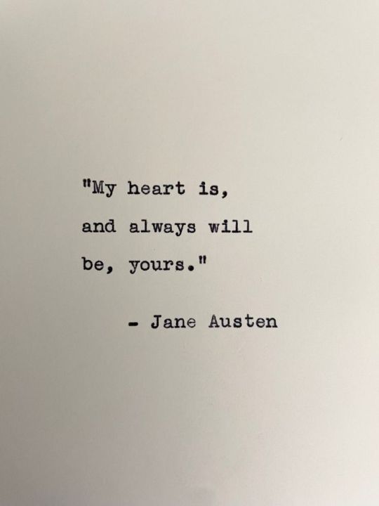
He's very cheesy, yes.
That's all for my Ale's Ted Talk for today!
Thank you for attending (I mean reading)! 🫂❤️🔥
—
I hope you enjoyed reading this! ❤️🔥
9 notes
·
View notes
Text
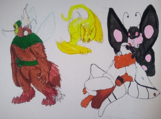
First batch of @bug-oc bugs. This would've gotten finished sooner, but we've been sick as a dog for most of the tournament's runtime, so we're calling it a victory that we managed to get anything done - there are a lot fewer contestants this year, which means both less art to do and more ability to commit to trying to make some particularly unique creature designs - there are some in this batch that we REALLY want to do justice, and that is... unfortunately hard to do when we're barely functioning for two hours a day. This is our unofficial call to STAY HOME when you're sick! Even if you're feeling sturdy enough to go out and about, your actions can impact those around you very easily.
Design notes and owners below the cut with individual pictures - the middle one here is a beta design that we're still in the process of ironing out, so that one just has
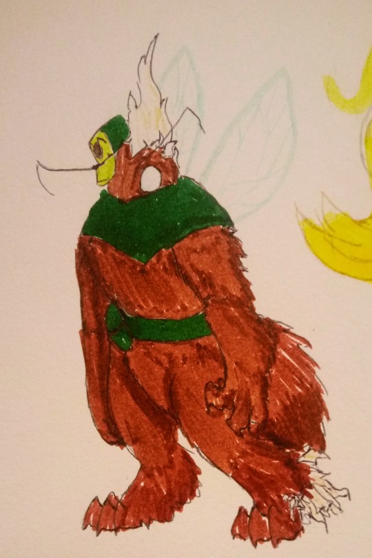
[This is the first time I've met someone who "worked in Snakemouth" since that one... weird encounter, with those roaches giving me a job offer. I didn't know that they had a security guard position. I... didn't know that they knew what a security guard even is, honestly. To have two bugs involved with the lab turn up is an incredible coincidence. I wonder if the time portal is actually open again, or if different universes just work on different timeframes?
Regardless, it's a good opportunity to advance my knowledge of partial transmutation and multi-organism transmutation. Whatever happened to that moth in the last tournament... my understanding of how to handle both symbiotes and parasitism is clearly incomplete, if running into multiple organisms can cause problems like that. I'll have to put some extra work into monitoring...]
Omelette from @tangleslime2 was one that felt... obvious, we suppose?Your work will one day consume you, and such - one way or another! More literal in this case. A lot of the work here, honestly, is toying with shapes and body language. Omelette has a LOVELY sillhouette with some extremely identifiable clothes, and translating it to a zombee design was Very fun. Maybe a bit plain on the design side, but the linework was incredibly fun to do - we got to do a whole lot of fur, which is always a fun time. This design was very quick and easy, as designs go, and we had a lot of fun doing the hat. Wildly askew, and held on by but a single antennae!
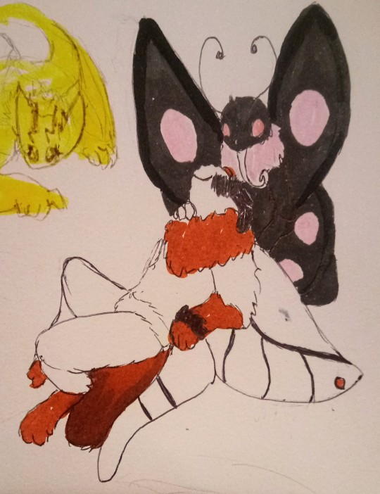
Sundew and Nerine from @mizzle-moths are untransmuted, as requested - Sundew's pose was very fun to do - nice and fluid, though the wing markings were admittedly a bit funky to parse. We hope we got all the details correct here! Both of your bugs have gorgeous color palettes. Our usual marker set's dark gray marker's dried out by now, so we had to use an alternative, which... unfortunately bled clean through our sketchbook page. Lesson learned, we suppose. The scribble over the eyes used the same pen that we did our linework with - the "scribbling over the eyes of a dead character" trope is very well-worn, but cliche only becomes cliche because it inspires enough people to follow in the footsteps of a story, and we're very fond of the way it adds to the... hmm, visual language? We just think it's neat. Hope you enjoy!
[...working with spirits and more immaterial forms isn't my area of expertise, but it's something i dearly need experience in. My hope is that by advancing my knowledge in this field, I might be able to apply the knowledge to other fields that evade me - anything inanimate has proven to be my bane, and I'm fairly certain that a few of my attempts into this area have produced "hauntings", when they're not producing incredibly specialized organisms. Maybe if I know how to cause a haunting, I can figure out how to not cause one...?]
Moving on to our beta design - that is a VERY rough draft of Beera from @longeth-dayv. Given by the obvious Luigi's Mansion inspiration, we wanted to run with it by pulling our inspiration more directly from a Luigi's Mansion enemy - mostly, this meant tinkering with sillhouettes while trying to figure out what sort of design would match best to the character, and how to translate a design to something recognizable.
The pack, despite its significance character-wise, doesn't have quite as much weight in the balance of the design, which meant more tweaking for the transformation - though we briefly tried toying with the pack itself for this design, that particular page we felt would skew a bit too close to body horror for your personal comfort, so we scrapped the idea. Better safe than sorry, as they say. As such, we're aiming more towards using wire and body language to drive recognition.
The image here is a loose draft based on the bats enemy, used to test the fade and layering of the highlighter we were using - as it turns out, it doesn't layer very well! We started out looking for electric enemies, but we only really turned up the Electric Oozer, and that... was a bit too close to "normal boo" for our personal tastes, so we swapped to just primarily yellow enemies. Though we were previously considering taking the bat design to final draft, actually putting it out on paper convinced us to the contrary, so we went back to the... sketchboard. We'd bet there's a good chance you can already figure out where we're going with this one. A fun design challenge, for sure!
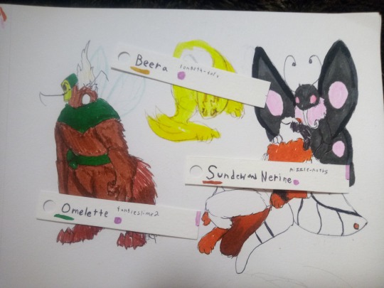
Finally (at least for this particular evening), we offer you this: a look behind the scenes, (or at least, the scenes that don't involve "us being sick and struggling to communicate whether or not something is sorted with the other mod"). What we've been using to keep track of matches, as well as to draw lots. Not precisely a high-tech solution, but damn if it doesn't work - the ends here are split into two for the sake of a loser's bracket, which we... thought we had figured out, but then it turned out we've been having miscommunications on what the bracket setups even are, and, well...
...we're working on it, we'll say. It might still be integrated, but that'll have to wait 'til trying to do things doesn't require fighting for our life. We will probably rerandomize the brackets for it, we might use it for illustration practice if the contestants are cool with it, so on and so forth. As always, thank you for your patience - we hope that Round 2 encounters slightly less hitchups compared to Round 1.
31 notes
·
View notes