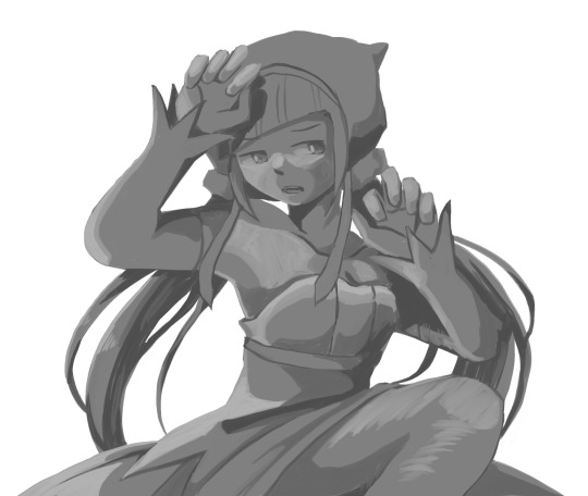
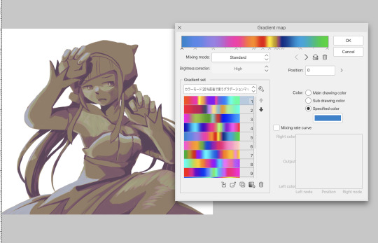
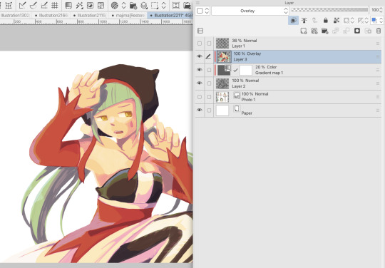
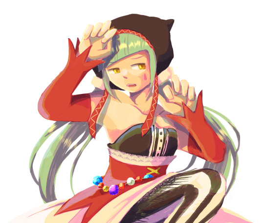
#I used a gradient map for the first time to do the colors and then did the lineart/rendering on top of that. (Couch was also done in post)
Explore tagged Tumblr posts
Text

Anyone ever think about the fact Beetlejuice canonically age regresses? Nah me neither.
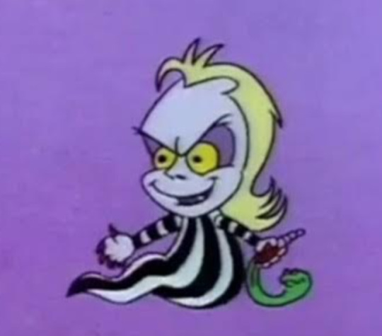
He was forced to eat cement when he was six
#beetlejuice#my artwork#beetlejuice fanart#beetlejuice the animated series#lydia deetz#beetlejuice the cartoon#babyjuice#lydia deetz fanart#I used a gradient map for the first time to do the colors and then did the lineart/rendering on top of that. (Couch was also done in post)#sfw agere#beetlejuice agere#beetlebabes dni
61 notes
·
View notes
Text
OK SO my goodnight arts are usually stuff I think you guys would enjoy as well but this time I decided to do something for myself, went back to my roots and used Micah for color study again like the first time I drew him

Since I posted a speedpaint of an old painting right before this I thought I could record my process with this too. It's a bit lacking because i started recording after the first sketch and then added in some additional touch ups afterwards but here you go
I almost never use gradient maps but I thought this would be a good chance to try them out!
#micah#yandere priest#artists on tumblr#digital art#yandere#male yandere#art#illustration#illustrator#illustrative art#rkgk#color study#art study#aesthetic
1K notes
·
View notes
Text
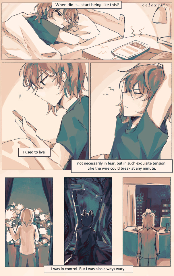
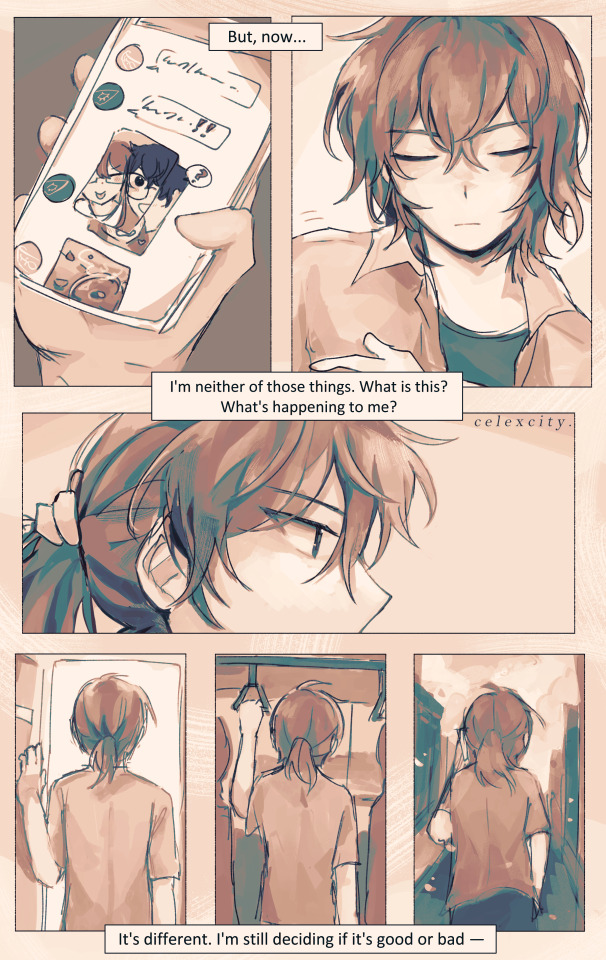
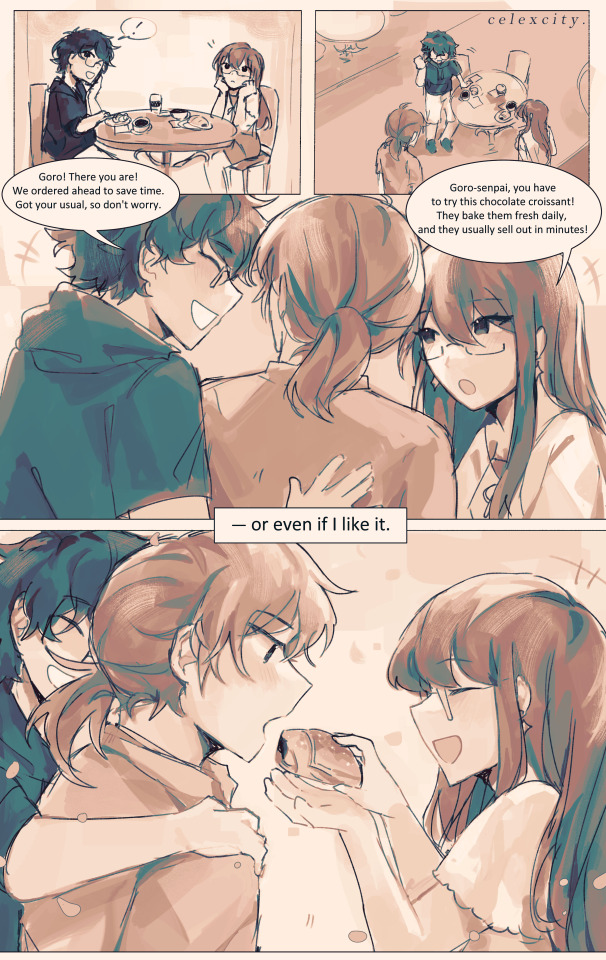
present day
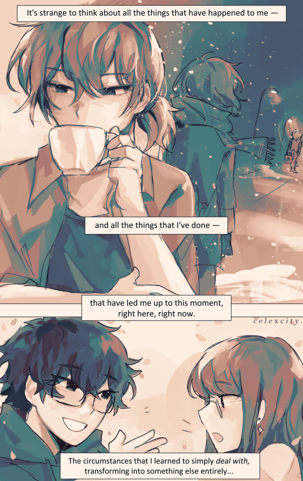
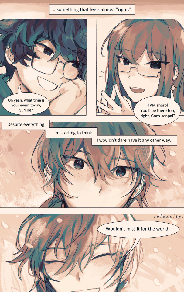
if every day will be like this from now on, i'll look forward to every single one.
ok. Sits down. help meeee i tried using csp's comic tools for once (and also gradient maps + coloring w monochrome) to save time bUT I ENDED UP SPENDING THE USUAL AMT ANYWAY SO. . erm. WELL IT WAS FUN ANYWAYS
hiiiiiiiii i wrote this script 4 months ago nd finally did it (had this on the backburner for 20 million yrs bc i wanted to get out other angst bullshit first)
the parallels of goro's back (x3) on the first 2 pgs are kinda not 1:1 as i'd like but REGARDLESS i still like them. goro, who had utmost control over his life, running it like a machine, regardless of how he feels or if he's tired or if he wants to give up.......he was in control. knowing, of course, that his life is on the line at every waking moment, but since he was always on edge, always alert, he was still in control.
but now, surviving the long winter and coming out to the other side, he's lost that control AND that edge. now what is he left with? what is there left?
very speficially in the 2nd page.... i think its so <3 YAY <3 that goro, now, doesn't feel the need to take such spic-and-span clean-cut care of his appearance.., guy who rolls out of bed and throws on a shirt to go hangout w akira and sumire. he decides to tie up his hair and forgoes his gloves... feels more "comfortable" to change his apperance, to let down his guard a little. <- was the rough symbolism JKDSHKFS
sumire getting the choco croissant but letting goro have the first bite YEAHHHH WHATEVER
4th page symbolism is also rough i didnt think abt it too hard LMAO. 3rdsem goro watching his detective prince self leave. he knows acutely well that chapter of his life is over - whether he survives the long winter or dies in it. all that he knew - even though it was miserable and awful and frustrating and dangerous - is gone.
and now there's just this: the present day. whatever that means.
i think something important to me abt royal trio is just the idea of Learning To Just Exist: no need for a "purpose" or a "calling" or some overarching "goal". they just learn to exist.
and of course none of them really have a benchmark for "wow i like this i want to live like this" so they just roll with the punches, as they always have, but yknow. finally getting to live their honest student life as they always deserved
edit: and most importantly for goro, i think, is learning to cut himself some slack. "despite everything" he says, despite all the shit he's endured AND all the shit he's done, he feels like this is "right." whatever that means, he's ready to take it day by day to figure it out. AND THATS THE WHOLE THING Punches wall really hard
edit: I ALSO FORGOT. i think the sentiment of "being waited for" for goro means a lot. since he had to do everything by himself, fight for himself, decide everything for himself frm such a young age, the idea of akira and sumire waiting for him, inviting him out simply for him to be there -> is really meaningful to him, more than they could know.
edit AGAIN: also goro sleeping in means a lot to me. i imagine that guy has pretty terrible insomnia. ALSO HE HAS A BEDFRAME! i like the thought of his apartment being so /r/malelivingspaces throughout the game. he doesn’t deserve a bedframe. BUT HE HAS ONE NOW!
goros expressions in the last page gve me a hard time. sparkly....
also im SO freaking sorry if his voice isnt too well-written... i had a crisis over the wording while draiwng htis so much DSKHASKDASJK AND THE PANELING AND WHATEVERRR IDEK WHAT IM DOINGGG but it was fun!!!! exploratory..... regardless i will keep workign to do him and royaltrio justice. THUMBSUP EMOJI.
#4am again no problem. chokes#goro akechi#sumire yoshizawa#akira kurusu#persona 5 royal#royal trio#shuakesumi#cele draws#long winter#<- technically but its also good w canonverse#cele comics
513 notes
·
View notes
Text

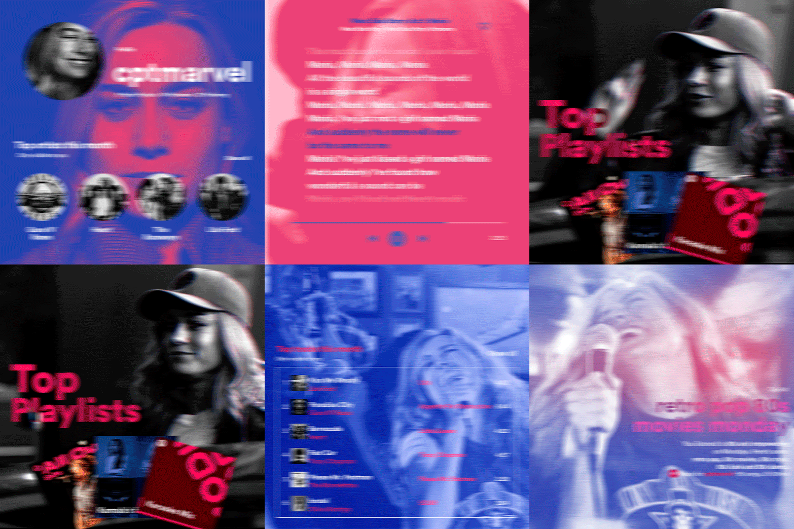
hi! someone requested me to do a tutorial based on this gifset!
this tutorial requires an intermediate knowledge of gifmaking. i won’t teach you how to do gifs from scratch, there are other tutorials for that out there.
[tutorial under the cut]
THE BASICS
AN INTRODUCTION
first off, the gifset in question is based on this gifset by @/eddiediaaz and i got permission from them to explain the process. i won’t be sharing the template because it’s a near replica of theirs (that isn’t shared to the public) and i don’t feel comfortable doing so, but you can recreate it by yourself just like i did!
also, ESL, so please pardon any mistakes.
THE FONT
Circular ST (Medium & Black). download it here & here.
CLIPPING MASKS
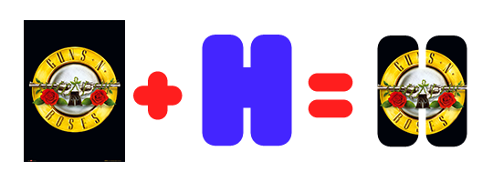
clipping masks are the way i put images and gifs inside of shapes. i used that method in the first and second gif of the Spotify gifset as you can see here. what does a clipping mask do? basically, it links two or more layers together in a way it follows the “shape” of your base layer. ie, everything that is shown follows the “shape” of your main layer and nothing more. your base layer can be anything: a shape, an image, a gif, a text, an adjustment layer, really everything. let’s see an example:
CLIPPING MASKS & SHAPES

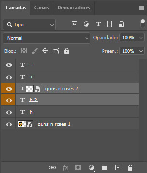
the original image (Gun 'n' Roses logo) is intact, as in, it’s not cut like a circle, something that cannot be undone. instead, everything outside the limits of the blue circle is just hidden. if i delete the base layer (the circle layer), the original image will appear as it originally is, as an rectangle. talking about layers, let’s see my layers panel (some things are in Portuguese, but i think you can understand):
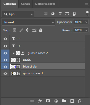
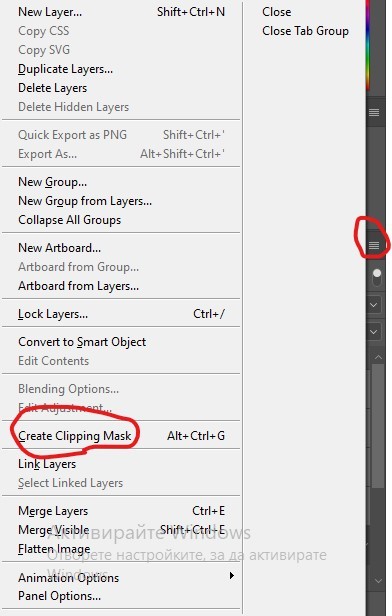
notice the little arrow pointing downwards to the “circle” layer. that is the clipping mask symbol. the base layer always needs to be below what is being clipped. if the base layer is deleted, the chain is broken and every layer clipped will now act independently and have its original shape. you can have as many clipped layers as you want. you can also have multiple chains going on in a .psd, each one with its own base layer. to clip a layer, you just need to press ctrl+alt+G or cmd+option+G while having the layer you want to clip selected (NOT your base layer). or, you can go to LAYER > CREATE CLIPPING MASK.
CLIPPING MASKS & TEXT
let’s see the same example, but with text instead:
A TIP
because adjustment layers are clippable, you can completely gif by using clipping masks. this is very useful when you have more than one gif inside a canvas and don’t want an adjustment layer to affect everything besides a certain layer/element.
let’s take my first gif of the Spotify gifset as an example.
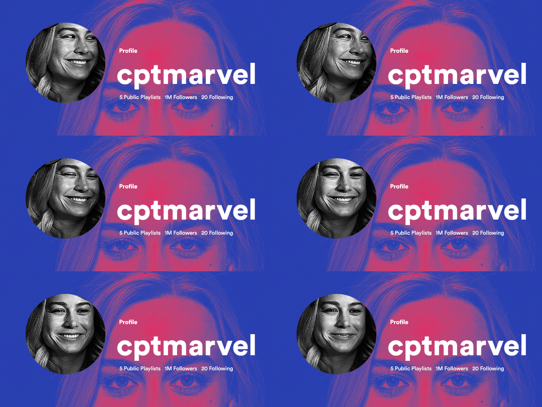
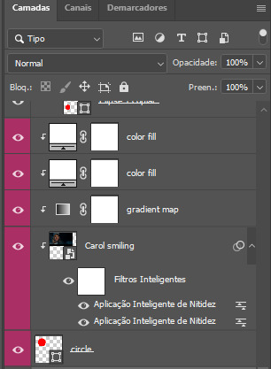
the circle is the base layer. the “Carol smiling” layer is my gif converted to a smart filter. above that “Carol smiling” layer, there is a black and white gradient map and two color fills of white so i can achieve the coloring you see. all those layers are clipping onto the circle layer, making my now b&w gif have the shape of a small circle as well. those layers are in a folder in the .psd of my first gif, so i don’t have multiple files sitting on my PC to assemble just one gif. i could have giffed that small gif separately and pasted it onto my canvas as well, but i like to do this way so i can adjust everything i want in real time instead of redoing a gif over and over every time i want to change something.
HOW TO MAKE EACH GIF
all gifs are 540x540px.
THE FIRST GIF
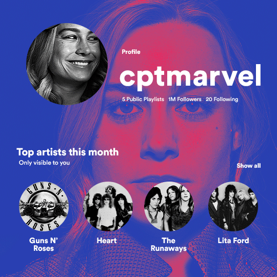
the first gif has 6 elements. the elements are: a big gif serving as a background (a close-up of Carol), a smaller gif inside a circle (a b&w gif of Carol smiling) as a profile picture and four static images for the featured artists. i giffed as i normally do (loaded screencaps, resized the gif, sharpened the gif, etc) for my background gif. to achieve the coloring, i’ve added a gradient map (layer > new adjustment layer > gradient map) purple to pink. to the profile picture, i made a 160x160px circle in the top left corner. the color of it doesn’t matter. the next step is a matter of taste: i giffed the smaller gif in the same .psd thanks to clipping masks that i explained earlier, but you can do it in a separate canvas too. for the featured artists, i made four circles with 98x98px each. for the images, i had to check Spotify for their selected PFPs. after that, i googled “[band/artist] spotify” to find the images. the PFP of bands and artists in the Spotify app are displayed in black and white, so you might have to make them b&w if you happen to find them only in color. to make the artists PFPs pop a bit more, i transformed them into smart filters and added a bit of sharpening to them (intensity 10 x radius 10). you can adjust the colors and the brightness if you want, too. the sizes of the texts in the gif are: 58px (username), 20px (top artists of the month), 15px (name of the artists), 12px (only visible to you + show all + profile) and 11px (following and follower numbers).
SECOND GIF
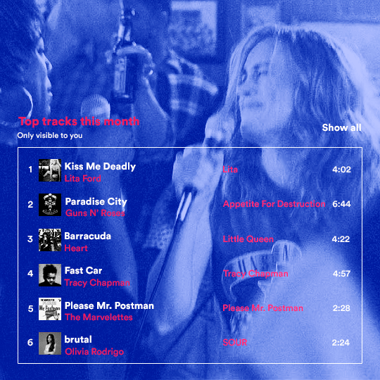
for the chart, i created a black rectangle (490x308px) that i set its blending mode to lighten (thus making it transparent) and i added an internal white stroke. i added the text and the little squares next to the top 6 numbers. the font sizes are: 17px (top tracks this month), 11px (only visible to you), 14px (song title, show all, top 6 numbers), 13px (artist/band, album title, length of the song). i added the album covers — that i made b&w — by clipping images onto 32x32px squares. for the coloring, i added a gradient map (dark purple > light purple).
THIRD GIF
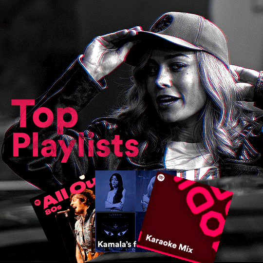
there are three types of playlists in this gif: a Spotify original playlist, a playlist made by a user and a Mix. you don’t have to follow this formula if you don’t want to, but in the case you do, here’s how i did it: browse Spotify for an original playlist of theirs. chances are, if you google the playlist’s name, you can find its cover on Google Images. at least, i found the “All Out 80s” cover that i used in my gifset. you can also create your own. for the user playlist, just pick four songs and find their (album) covers, also on Google. create a square canvas on Photoshop and make four squares, each in one quadrant of the canvas. paste your images onto your canvas and clip the images to each square. then, add a gradient map (black + whatever color you want) to all those images and title your playlist (font size: ). save that collage as a PNG and load to your gif canvas or merge all the layers+transform into a smart filter and drag the smart filter layer onto your gif canvas. now, the trickiest one. while you can invent your own Mix, i wanted to use a real one, but i had no idea on how to find them. thanks to reddit, i discovered that, if you search “made for you” on Spotify, you will find their Mixes! some of them are very whacky and specific! i just picked the Mix that made the most sense for Carol from that (gigantic) list. before doing the next step, i would advise you to google the name of the Mix you picked to see if you are able to find the cover of it with good quality. i wasn’t able to find mine (Karaoke Mix), so i just screenshotted my Spotify app, pasted that screenshot into Photoshop and cut the Mix cover and pasted that onto my canvas. the quality wasn’t great, so i transformed the cover into a smart filter, added a bit of gaussian blur and then sharpened it (intensity 10 x radius 10). the color wasn’t what i wanted either, so i used Hue/Saturation to change the hue. because the original image for the Mix was smaller than i wanted and i stretched it to make it bigger, the quality of the text and the Spotify logo was botched. i painted over the Mix cover and created a text with the font i linked earlier to replace its now pixelated title. i also painted over the little Spotify logo, found a logo in the internet and pasted over the Mix cover about the same size of the original logo. to achieve the “3D effect” of the gif, i made my b&w gif, the base. then, i duplicated all layers and added a gradient map (black > pink) and merged all the layers of that duplicate. i made a second replica of my gif, now with a different gradient map (black > blue). i set both replicas to the ligthen blending mode. you will notice that the replicas will "disappear" and only the original b&w gif will remain. if you move the replicas a bit, that colored border will appear. this doesn't work much in very bright gifs without a lot of dark areas, btw.
FOURTH GIF
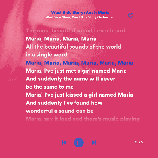
this gif used an altered (by me) version of this template. (i changed the fonts to match the rest of the gifset, too.) for the color text effect, you will have to gif with the timeline bar. take your gif’s length and do the math to find how many frames are ⅓ of it. take your lyrics’ layer and cut it into three equal parts or close to it by using the scissors icon in the timeline panel. in each third, change the color of just one line, line by line. when you play your gif, the colors of the lyrics will change like in Karaoke. you can do the same thing with frames iirc, though. i explained the timeline method because that’s the one i used in this gifset and use in general gif making. for the coloring, i added a gradient map. to make the colors pop a bit more, i add two gradient maps: the first one is in black and white, the other is in color. that adds depth to the blacks and darker colors of the gif.
FIFTH GIF
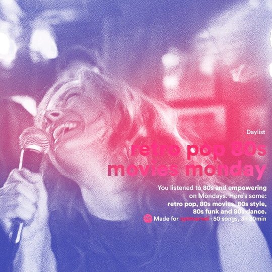
like in the Top Playlists gif, i wanted for my Daylist to be real as well. to achieve that, i listened to my Carol Danvers companion playlist (that you can listen here) for a long time until my Daylist refreshed itself. (Daylists refresh in certain times of the day — don't worry, Spotify will tell you when.) then, i just copied what it told me — the title and the genres i listened to generate such a Daylist, plus the genres i should check it out. you can invent your own Daylist if you want, but because it is generated by AI, i find very difficult to mimic its crazy titles, but you can try! you can also search in the web for other people’s Daylists if you want, but usually people don’t tell you what they listened to to get those playlists and nor what was recommended for them to listen to and i, at least, find that information important for the gifset. be aware that Daylists aren't available for every country yet (like in mine), but i found a way to work around that. the browser Opera GX offers a free "VPN" — not exactly a VPN, but it works close enough — so you can set your location to the US and listen to in-browser Spotify. i recommend not log into Tumblr while using Opera's VPN as there is a myth (that could easily be true!) that Tumblr terminates people's accounts that use a VPN. font sizes: 43px (daylist title), 13px (text), 12px ("daylist" & "made for"). for the flare effect, i searched for flare overlays on YouTube and downloaded one of those videos with 4K Video Downloader, a free software. i loaded the overlay into Photoshop and added a gradient map (purple > pink) over it, thus changing its color. i pasted the overlay onto my b&w gif and set its blending mode to screen. voila!
that's it! i hope you liked it and that i was able to express myself well. if you have any questions, feel free to contact me, i love helping people about their gifmaking questions! 💖
#*#*tutorials#gifmaker tag#dailyresources#usergif#completeresources#alielook#userairi#userhallie#userbess#userrobin#usershreyu#userzaynab#tuserju#tusermalina#tuserheidi#usertina#userabs#userbuckleys#usermagic#userjoeys#antlerqueen#userarrow#flashing gif tw
377 notes
·
View notes
Note
sorry if this has been asked before but how do you make your gradients look so good?
Hi Anon! First of all thank you so much 🫶
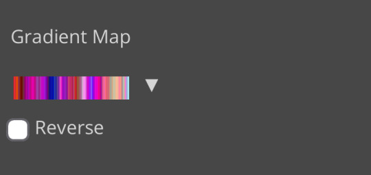
I like to use gradient maps (which I've explained here) or gradient fills + gradient tool. I'll drop a little tutorial under the cut:
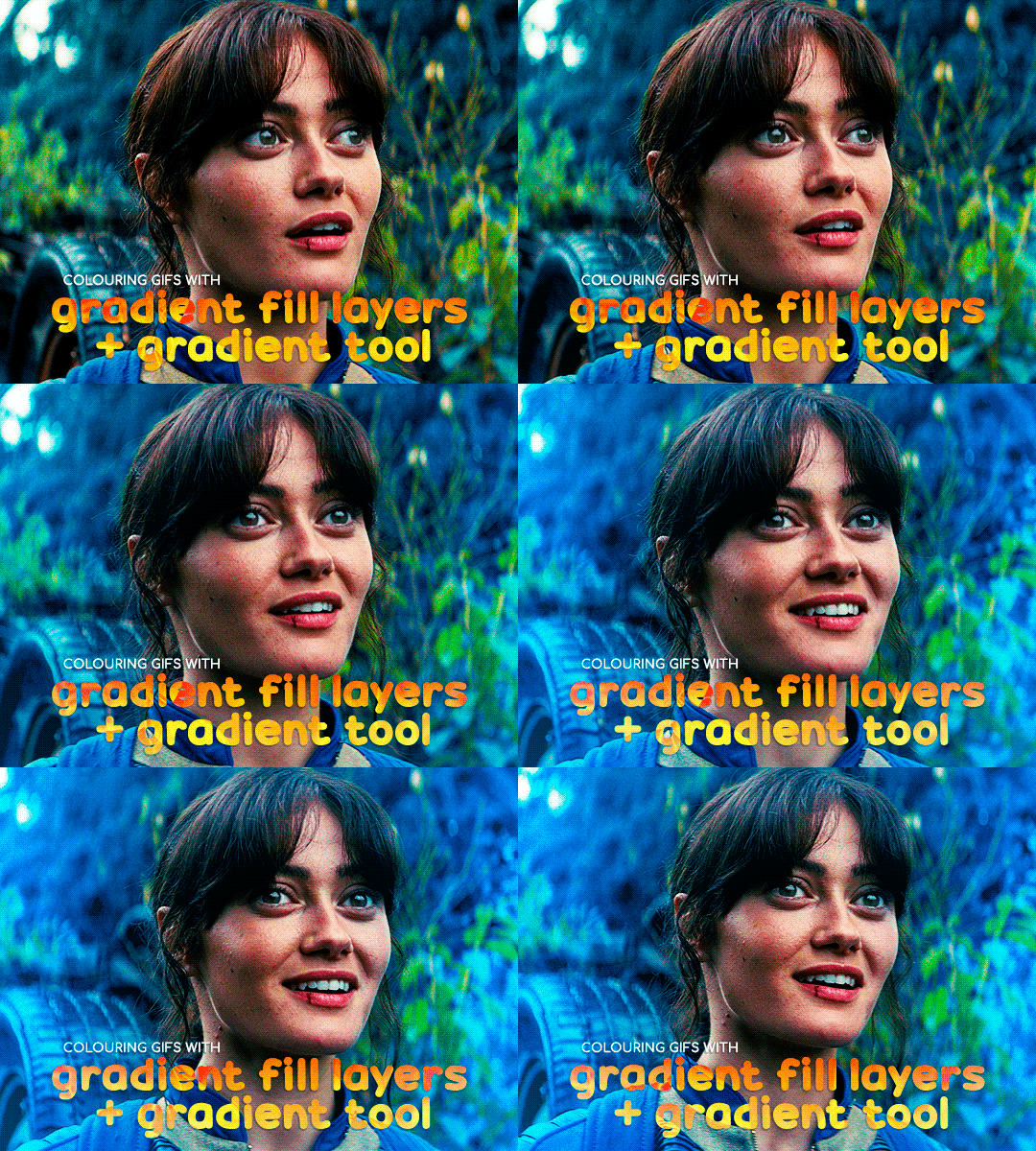
GRADIENT FILL
I'll be using this gif which I've already sharpened and coloured:

First of all let's make the background pop so I'm going to add a gradient fill (Layer -> New fill layer -> Gradient) with these settings (I'm using this colour #0099ff):

Now it's the time to play with the blending settings! Depending on your scene some will look better than others but I usually switch between Soft Light, Overlay, Color or Hue. 90% of the time I use soft light but this scene looked much better using overlay:

As you can see the background looks more blue and vibrant but it's not too much you know.
GRADIENT TOOL
Now it's time to use the gradient tool to give this gif a hazy look. I haven't seen many gifmakers talk about this tool but it's soooo useful and it takes gradients to a whole new level.
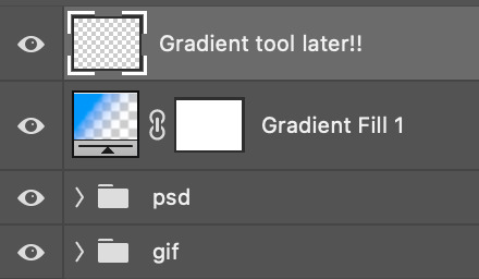
Before using this tool we'll need to add a new layer above the gradient fill, like this:
(HELP I just realised I typed “later” instead of “layer” 🤡 but let’s ignore that)
You can choose the gradient tool by pressing 'G' and then clicking here:

Make sure your gradient goes from any colour to a transparent background.

Okay so next to this gradient settings we have five different styles and each one will create a different shape. Depending on the scene I'll use the first, second or fourth one. Here are how they look:
1. Linear gradient
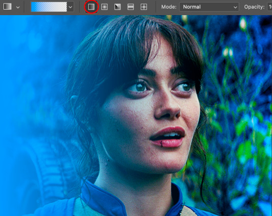
2. Radial gradient + Reverse (if you don't click this you'll end up with a blue circle above your gif)
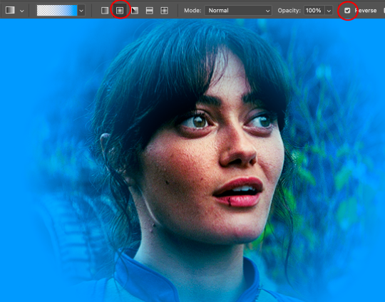
3. Reflected gradient + Reverse
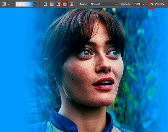
This time I'm going to use the radial gradient so to draw it start by clicking on the centre of the gif and drag the line (the farther you drag it the less intense the gradient looks):
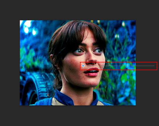
And this is the gradient:
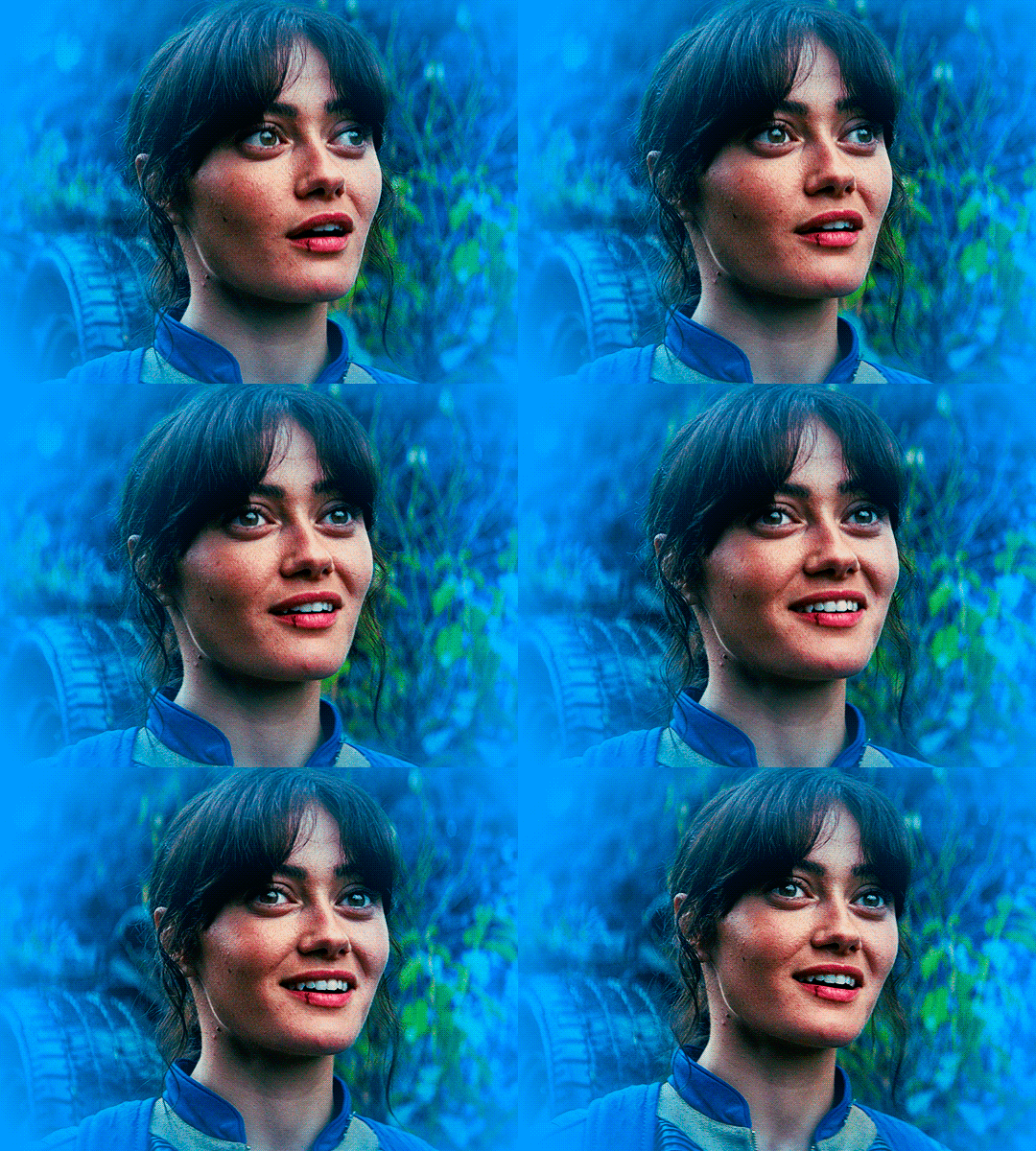
And here comes the fun part again, playing with the blending setting and the opacity! Before doing anything I duplicate my gradient layer because I always use more than one so this is how your layers should look like:

Let's go to the first gradient tool layer and again try different blending modes: soft light, overlay, hue... Most of the time I'll use 'Soft layer' and I'll leave the opacity at 100%.
For the second layer choose 'Screen' and don't worry if your gif looks too bright because we're going to fix this by decreasing the opacity. Anything between 20-60% should look good but it depends if you want a more vibrant or more natural effect. I ended up using 40% and this is the result:

And we're done!!! As you can see the result looks much different from our first gif and it only takes a couple of layers!
Honestly the best advice I can give you is to play with the opacity and blending mode of the different gradient layers because depending on the scene some will look better than others!
#ask#Anonymous#ps tag#tutorial#usernolan#userrin#useraljoscha#uservalentina#userbunneis#userlockescoles#usernik
493 notes
·
View notes
Text
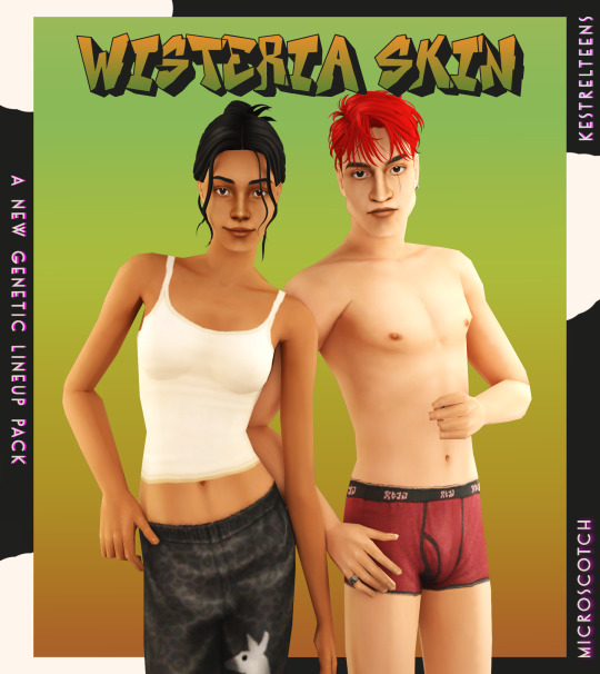
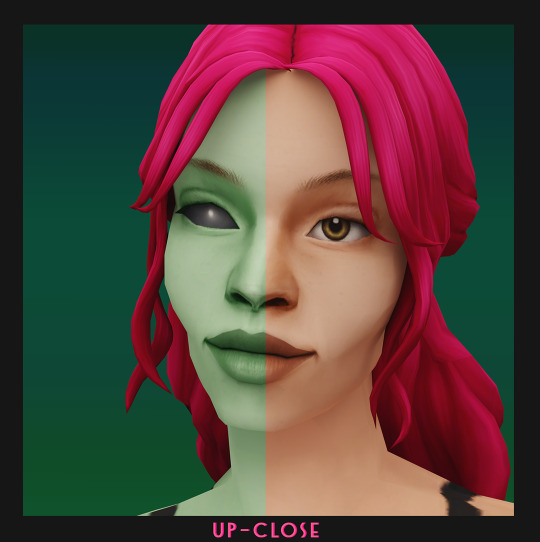



WISTERIA SKIN + PUPA EYES: A COMPLETE SET OF GENETICS
BOI that was an undertaking! but finally, and with lots of assistance from the wonderful @kestrelteens, this skin is completed. and it turned into an entire set of cohesive genetics, too! more info under the cut ⤵
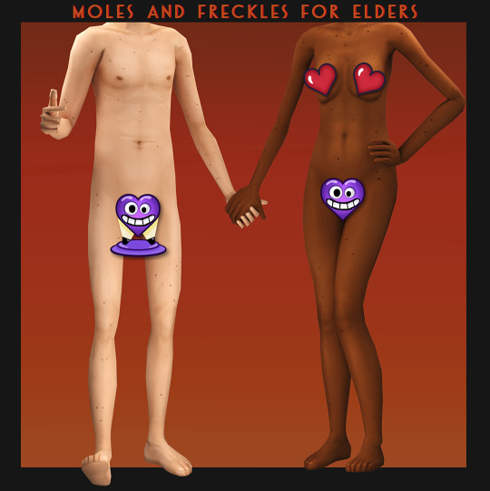
essentially this is a mix of woohoo on the beach (aka ios those darn skins slightly edited) and various other components taken from @obscurus-sims, @lamatisse and @buglaur, (such as collarbones and ears), and some moles/freckles for the elder bodies i snuck from @episims, and @sixfootsims tongue + teeth texture. lips are a nod to maxis and a blend of so much stuff that i dont even remember it.😅 also tried to eliminate the smeared lipstick texture under the feet, and p much blended every seam i could find.
here's a swatch of the full range, which is more undertone rather than gradient based:

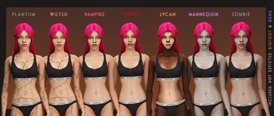
yay, first time doing supernaturals! 🌙 it was a lot of fun doing eye textures for them, here's the swatch:

NOTE: the zombie and vampire default come with an overlay mod! and the werewolf skins are correlated! please check out the hyperlinked instructions given by the respective creator ‼
also, i highly recommend downloading shasta's genie hair fix!
the eyes - squeas pupa eyes to be exact! come in 17 colors.

SO here are the downloads:
pupa eyes 👁 - custom / gen&town / defaults
wisteria skin 💗 - custom / gen&town / defaults / supernaturals / pngs for recolors + add ons :)
NOTE: these eyes are meant to go with the alien skin. 👽
dec 3rd update: EM chubby morph for shadowrealm has been fixed, feel free to redownload the non default version you're using!
for the database:
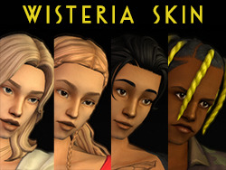
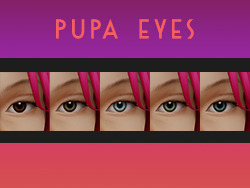
credit 🥰: serabiet, squea, obscurus, buglaur, themeasureofasim, sixfootsims, epi the phenomenal mod maker (and correlated werewolf skin maker!), withlovefromsimstown (plantsim textures), deedee(vamp cracks), platinumaspiration for more vamp cracks, veronavillequiltingbee (vamp overlay base), magical-girl-sandbox(bigfoot base), tvickiesims, lordcrumps, lamare & teaaddictyt for playtesting & feedback 💗
~~~~~~~~~~~~~~updates~~~~~~~~~~~~~~~
dec 3rd-- EM chubby morph for shadowrealm has been fixed, feel free to redownload the non default version you're using!
january 13th-- i noticed that the s3 range for females is a little too highlighted in the chest area, to the point that clothing where the skin texture mapping is just off the *tiniest* bit makes it clip with the neck, which also applies to a lot of ea meshes. i have toned down the shine and blended the neck down further for this range so that it looks better with differently mapped clothes :)
please redownload the natural defaults and/or non defaults. make sure to keep a backup of the previous version in case you end up not liking the changes ive made to this range!
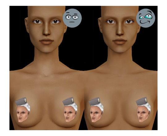
july 1st-- oh, ~fun fact~ seems like the genetic values werent saved correctly as simpe takes note of the digit separation convention of your own localization (as in, if , or . is used in your region) SO if ure using the gen/town version of this skin, redownload that one, please!
#ts2cc#s2cc#sims 2 cc#sims 2 download#ts2 download#moncc#dl:eyes#dl:genetics#🍊#yes ofc the name is a desperate housewives reference
2K notes
·
View notes
Text
how to make cool blobby turing patterns in photoshop
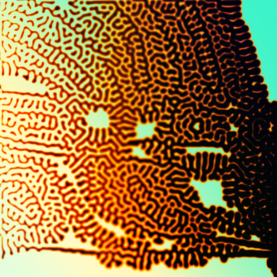
i'll preface with i learned the basic loop from skimming a tutorial on youtube, but as someone who prefers written tutorials i'm sure many would appreciate one! also, the second part of this is some of the visual effects i figured out on my own using blending modes and stuff.
i'm using photoshop CS4 on a mac so some buttons and stuff might be in different places on windows and newer photoshop versions but all the actions are the same. my canvas is 1000x1000 pixels.
UPDATES (i'm hoping these'll show up whenever you open the readmore?)
it's possible to do something similar in krita using this plugin, made by the love @arcaedex
it's also possible to do this in photopea, a free browser alternative to photoshop! the results are pretty much identical.
FIRST off you wanna get or make a black and white image of some kind. it has to be one layer. can be noise, a photo, a bunch of lines, whatever. here's mine, just some quick airbrush lines:

now find the actions tab. idk what it looks like in newer versions of photoshop but you probably won't need to dig!
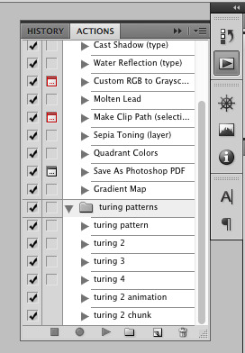
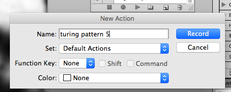
hit the little page thingy to make a new pattern. once you hit 'record', it'll record everything you do. the little square 'stop' icon will end it.
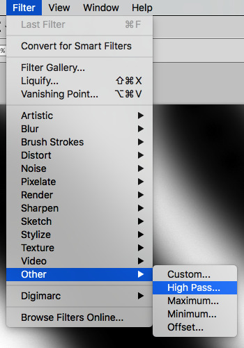
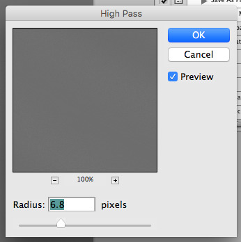
now you want to do a high pass filter. you can mess around with the radius to change the size of your squiggles, but the tutorial had it set to 6. experiment!
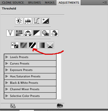
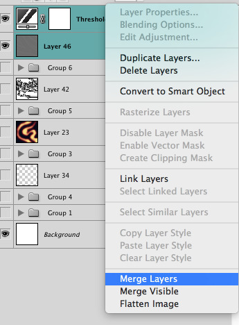
now add the 'threshold' adjustment layer. i use the adjustments tab but i think there's also a dropdown menu somewhere. keep it at the default, 128. merge it down. (control or command + E or you can right click it like some kind of weirdo)
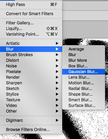
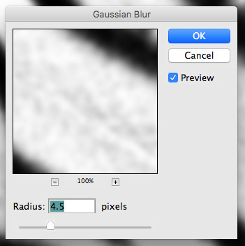
and finally, the gaussian blur! the radius of this affects the shape and size of your squiggles as well. i like to keep it around 4.5 but you can mess around with that too.
after that, hit 'stop' on the action you're recording, and then repeat it a bunch of times using the 'play' button, until you have something you like, like this:
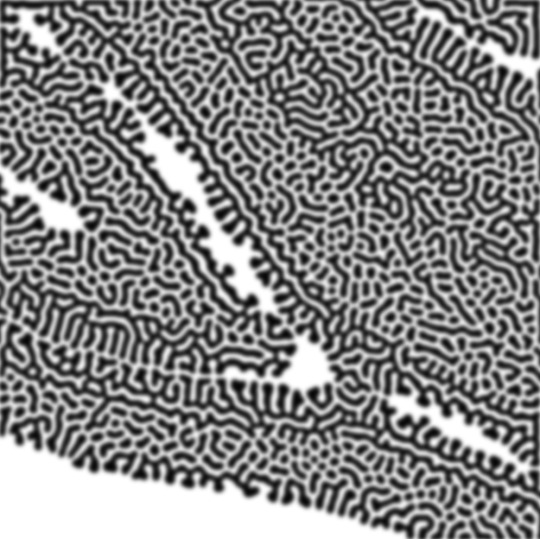
WOW!! that was fun!! and only a little tedious thanks to the power of macros. anyway, here's some fun layer blending stuff i like to do. it's with a different pattern cause i made this bit first.
anyway, using a black and white gradient (or a grey base that you do black and white airbrush on), make a layer with the vivid light. this will make the blobs look thicker or thinner.
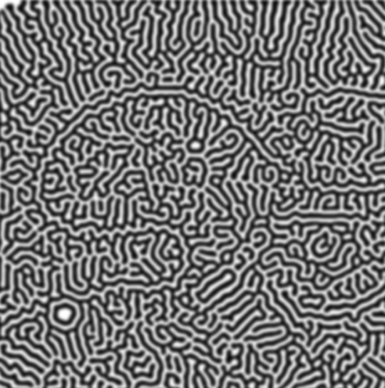

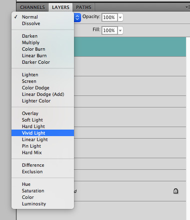

then, for cool colors, do a gradient map adjustment layer over that:

and finally, my best friend, the overlay layer. just using a gradient here bc i'm lazy, but feel free to experiment with brushes, colors, and blending modes!
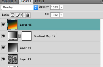

NOW GO. MAKE COOL SHIT WITH THE POWER OF MATH. AND SEND IT TO ME
also these are not hard and fast rules PLEASE mess around with them to see what kind of weird shit you can make. here's a gif. as you can see i added some random airblush blobs in the middle of it, for fun.
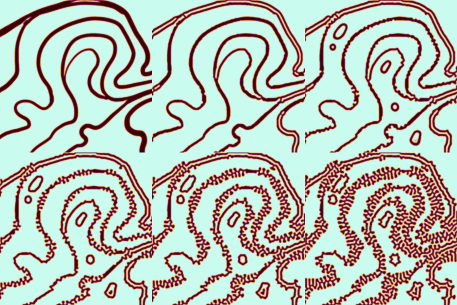
931 notes
·
View notes
Note
whazzit like using procreate? do u enjoy it more than ibis?
punches wall oh my god. oh my god im glad u asked i actually have so many complaints about procreate SAKDKASLHAHDAJWHE💥💥💥💥
FIRST OF ALL PROS
the brush sensitivity is really really nice. pen strokes flow a lot smoother there compared to ibis so i love doodling in procreate <33333333
brush variety is crazy /pos, love the graphite feel ones
animation assist, page assist, bloom, curves, gradient map, crazy functions theyre great
supports apple pencil pro squeeze
ok now that ive listed off the pros i can complain, long time ibis users only you will understand me but
why is it so annoying to flip the canvas. i use the quickmenu but its still annoying
theres no blending brush. u blend using the smudge tool. why
YOU CANT SET BLENDING MODE TO A GROUP ARE U FUCKING KIDDING ME <- this severely hinders my usual process im 100% srs
also cant clipping mask to a group
THE FILL BUCKET IS FUCKED UP. ibis has so many more options oh my gods
if u only rotate the canvas a tiny bit it snaps it back. and theres no way to turn it off
you cant have multiple reference images what the fuck
no brightness/contrast adjustment option, ik u can just use curves but what if i want to use numbers man
im sure i had more complaints but thats about it for now i think
NVM I FORGOT A VERY IMPORTANT THING YOU CANT EYEDROP ON ONE LAYER ONLY. ONLY THE WHOLE CANVAS
so yeah uh. HASKLDJSALDSALKJJ i love procreate for its pros but now my process is usually procreate sketch -> ibis color -> procreate finishing touches 👍 or the inverse. really depends on what kinda piece im working on ig LOL (dd comic was done in reverse ibis -> procreate)
that said, id say getting procreate was worth it tho solely for the purpose of expanding my arsenal o7777 it just feels like i have more tools now
58 notes
·
View notes
Note
could you please do a tutorial of your game of thrones 'so much for stardust' gifs where it has the ripped paper textures? it's so pretty, and i'd like to learn how to do one with just the texture in the middle and two gifs on either side, like half and half and just having a rip in the middle. it's so cool how you did a gif in the middle though so i wanted to ask as well! all of them are so cool looking. you are extremely talented. if you don't want to though i understand :) thank you
TORN PAPER EFFECT + BLENDING TUTORIAL
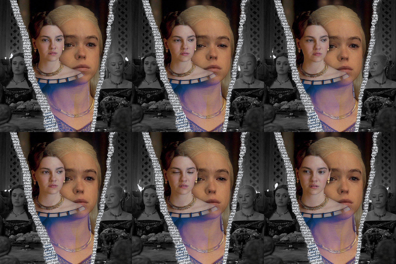
thank you so much for your sweet words, dearest anon and i'm sorry it took so long to answer but it's here now so i'll try my best to explain <3 disclamer: this is the first tutorial i ever made, it's very screenshot heavy and it assumes the basic knowledge of ps and gifmaking. if there's something you don't understand, don't hesitate to ask <3 so, let's get to it!
1. PREPARING THE BASE As you can see in this shot there's a lot of space between Rhaenyra and Alicent and that makes it perfect for the ripped paper overlay without hiding much of the base gif. So the first thing i did was to crop it like this:
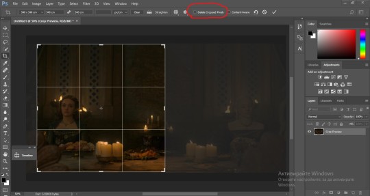
Also you want to make sure that the highlighted box (delete cropped pixels) is unchecked! After taking the usual steps for the animation (creating frames from layers, reversing the frames, setting frame delay) you continue with the video timeline and convert your frames into a smart object. psa: if you don't have the motivation or the time to play around with coloring here are some psds i recommend: 1, 2; as for the sharpening i think this one is the best.
now that you have your smart object sharpened and colored what you want to do next is drag it to the end of the canvas and duplicate it. after that you move the copy on the other end like the original and make sure it's under the coloring layers, like this:
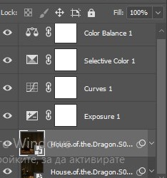
After that you have to create layer masks (the highlighted icon above) for both smart object and the copy and change the blending option of the copy to screen or lighten (whatever looks best!). So this is how it looks now:
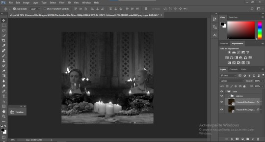
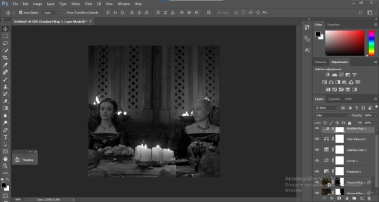
pls ignore that there are no layer masks on the smart objects i just added them after changing the blending rip </3 Now, as you see both gifs are like fighting eachother for their rightful place on the canvas. (fgfgfdf) To fix that you have to use a soft round brush to delete the parts you don't want. (feel free to play around with the brush however you want to get the result you want!) Here's my result:
2. THE OVERLAY
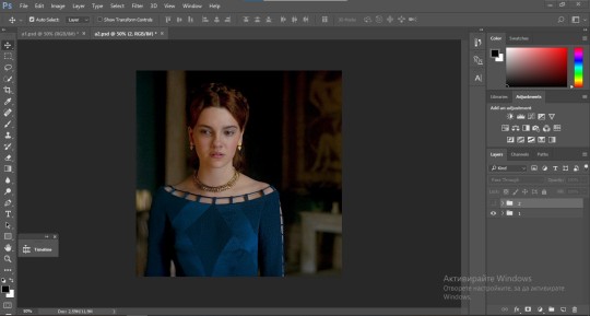
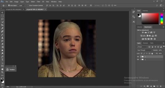
Now for the both gifs you want to use for the ripped paper effect you pretty much apply the same steps as the ones you did with the gifs for the base. Here are the two gifs i chose:
Before blending both gifs however you want to create a clipping mask for each of the smart objects coloring layers, like this:
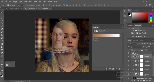
And now you're ready to blend both gifs together! You choose the group with one of the gifs and change the blending again to screen or lighten and place the said group on top of the other. So this is how it looks now:
optional: if you feel like the base gif doesn't pop out enough you can always add a gradient map on one of both gifs and play around with the opacity and the color you think fits best.
Then you add a layer mask on the overlay gif group and again play around with the brush to delete what you don't want. So this is the final result:
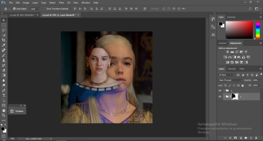
ps - don't repeat my mistake by placing the group with the layer mask under the other group. it should be on top and the blending option should be lighten or screen.
After blending both gifs together, you're ready to place them on the base. So first thing you want to do first is place both groups of each gif in one single group together. Then you duplicate the said group in the psd of the base gif and create a layer mask. This is how it should looks:
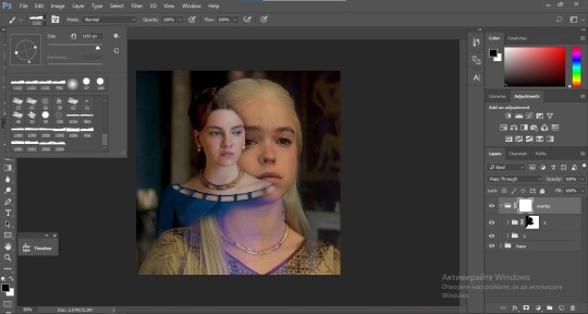
Now, in order to create the ripped paper effect, you'll have to download a ripped paper brush pack. This is the one i use. After loading the brushes in ps (if you don't know how here is explained) you're ready to begin! Change the size and angle however you'd like to make it look how you want. And if you want you can move the overlay gif by choosing both groups in case you aren't happy with the adjustment. This is how it looks like so far:
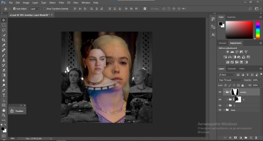
We're almost done! Now you have to find a paper texture, (i got mine from google) place it between both groups of your gifs and create a layer mask, like so:
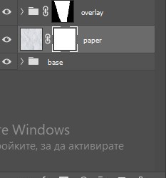
What you have to do here is pretty much the same thing you did with the overlay gifs. Still, make sure there's enough space for the text you want to write in. However, if you think that the space isn't enough you can just delete a bit more of the overlay gifs. Here's mine:
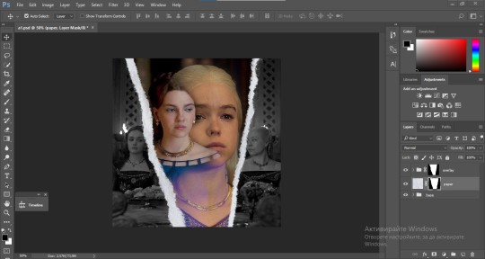
3. THE TEXT
You're finally ready to type out the text you want! If you're having troubles with choosing the right font and size, here are my text settings:
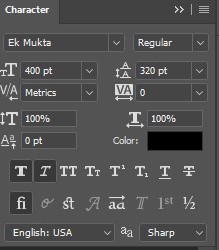
You can always play around with the angle and if your text is too small, zoom in so you can place it just how you like it. And since i'm a bit lazy to deal with it later, i choose to add the highlight color while it's still zoomed. You just have to add an layer above the text and use a soft round brush with opacity from 70-75% and flow from 15-18%.
For the repeated text you want to make sure you create a big space for writing so it can contain the whole space of the torn paper. Also, write where the text will be seen only and use the tab button to skip the space where the gif is. This is how it looks:
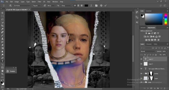
Once you're done with writing the repeated text, you want to select all the character layers and the highlight layer and move them under the overlay gif and on top of the paper, like this:
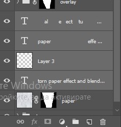
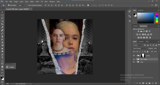
With the layers still selected and in order to contain the text within the paper the last thing you want to do is create a clipping mask. And that's It. You're done! This is the final result:
#allresources#dailyresources#usergif#chaoticresources#gifmakerresource#hisources#onlyresources#alielook#usermaguire#userrobin#usernik#userpat#userbells#gif tutorial#ps help
160 notes
·
View notes
Note
Hi uh,, kumzorg. I watched your 'you're too much' video on youtube, and I think it is really cool. I am really interested on how you did the filters for the backgrounds, as in; what program you used and what filters you applied.
Thanks for your time reading this, bye :D!
ok, first thing i have to admit is im really bad with colors so i rely on effects very often, be it level correction or posterisation or whatever, but i hope my explanation will still be of value to you ^^;
long post ahead
for that video every bg except the first one was taken from google maps, so their quality was always high and crisp, which i DONT like

for example first one I took from Shinsei Kamattechan MV "Michinaru hou e": (神聖かまってちゃん - 美ちなる方へ (youtube.com), and the compressed quality looked very nice when applied with tons of effects on it (My apologies to Noko for erasing them (m > <)m
So I'll go with example of another picture I already used, and scale it down

First I correct the levels and contrast so that details that I need pop out more

Then I use krita feature called "Gradient Map", which has a really nice feature that lets you do dithering with transparency

I copy the original picture and now for the second one I simply posterise it

I join the two new ones together, I usually use whatever effect I feel like but I personally really like the one called "Combine Normal Map"

now i copy the original picture AGAIN, and blur it with different constrast levels this time

I use Gradient Map on it again, this time with different dithering settings and color

I combine it with the previous one whily applying effects like Overlay or Burn

Now i'm mostly done, i scale up this new image slightly so that pixels are blurred, for a more washed out effect (plus some additional effects if your heart feels like it)

I posterise it once more so that colors bleed together nicely and now im done!

Just put whatever 2d freak you want over it and what the hell is this now (ಠ_ಠ)
(My first inspiration was from Shizuku VN, it had really cool backgrounds which had dark uneasy atmosphere, so i can kinda understand the comments that said they got a mysterious and liminal feeling from the video lol)
126 notes
·
View notes
Text
youtube
"Okay, yeah. If you kill a red name, killed a red name-" "I'll give you a life for that. That's the deal." "We'll be back together like buddies again, Bdubs."
In participation of Extreme Timed Challenge Gift Exchange hosted by @extremetimedchallengeexchange!
[gifs, full storyboard, behind-the-scene rambles under cut]
past 48h animatics: MCYTETC2023, ETC2023
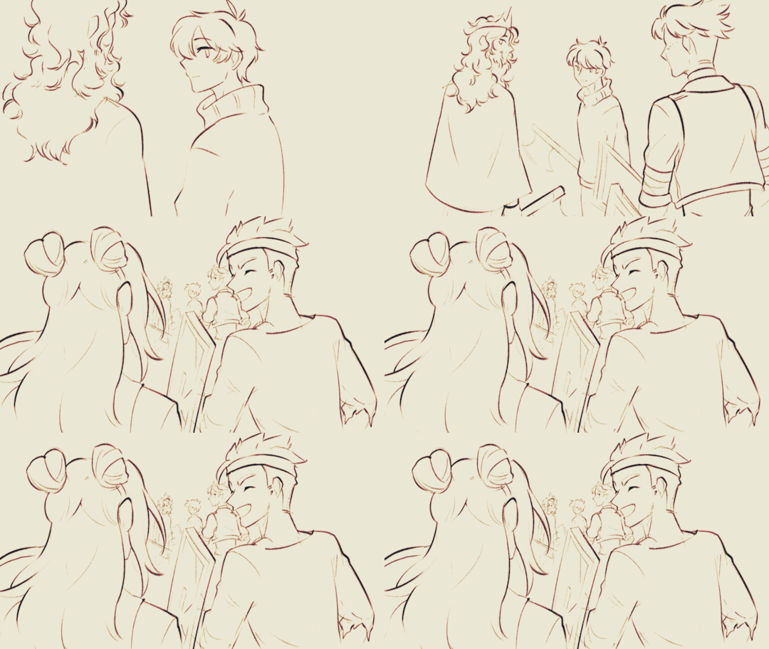
[Red Lives-Suspicion; Prayer-Determination; Fireworks]
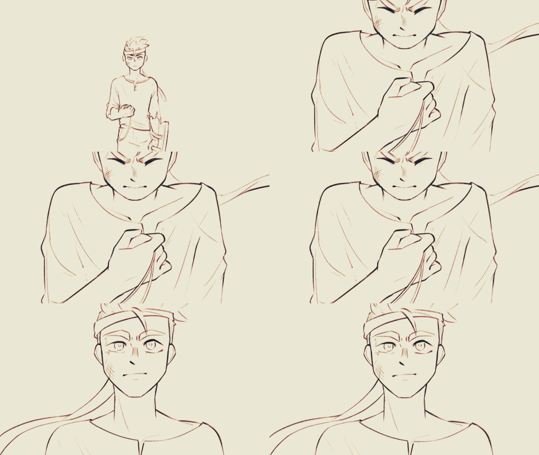
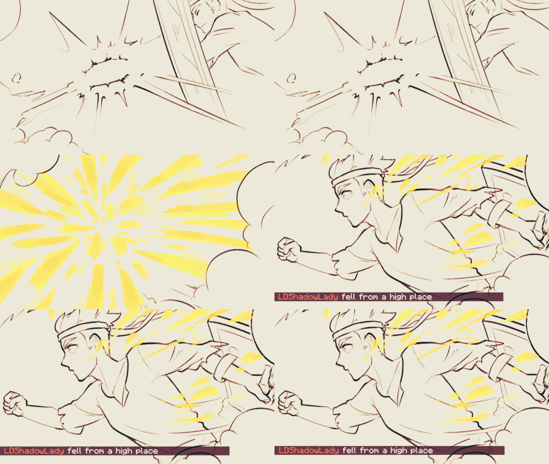
Fiddled with gradient maps this time for some additional colors :D I would have colored in the eyes as well, but I didn't have enough energy left when the event hit the 47th hour xD
Also played around with camera movements. Respect to people who do fan edits and other forms of video/ assets editing 'cause keyframes are so 😭
13 hours to draft storyboard this time! Last year I used 16 but with waaay more frames idk how I accomplished that. Probably bc this year I'm drawing more than three(3) characters lmao
Progress Timeline:
[13th hour] finished storyboard/ draft (plany off time...) [25th hour] lineart for the first 10 seconds (wuh oh) [36th hour] lineart for the first 25 seconds (oh shit oh fuck gotta shorten it) [45th hour] finished Bdubs' part (NOOO I DONT HAVE TIME FOR ETHO)
ngl kinda glad i cut it in half rn 'cause i'd have to spend time figuring out shadowDog's design /lh
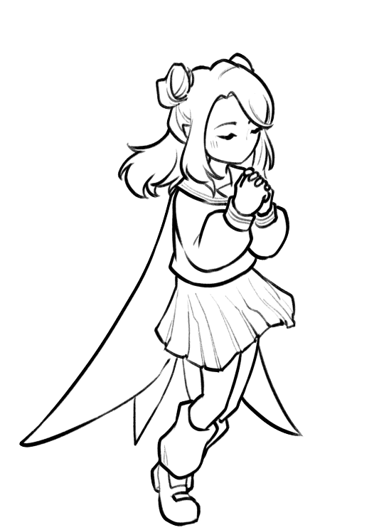
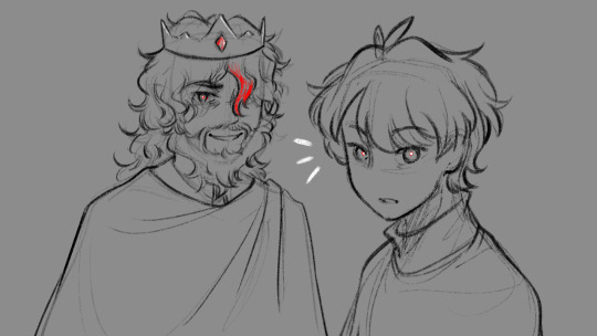
Designs I used for Lizzie and Joel (old art from 2022 and 2021 respectively) (holy shit i've been here for 3 years???)
Joel *shakes fist* i hate u and ur stupid beard
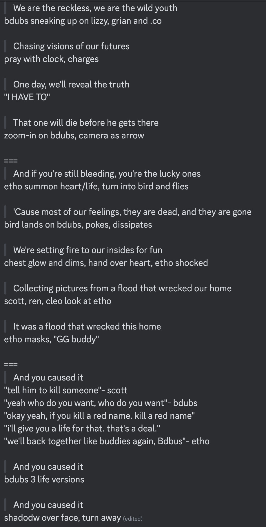
[Lyrics vibe/scene planning; hours before disaster]
I think most of the drawn parts didn't deviate from the initial idea. Mostly timing adjustments and building upon the vibes. The parts that were changed the most was the "And you caused it (×3 combo)".
Went from "vague flashbacks" to "following Etho and co. out of the cave and back to Scott's base while implying who Etho blames with single character focus shots".
The first one is Scott because he suggested the idea. Like, obviously he's to blame. It's not like Etho went along and cemented the deal himself. Scott totally peer-pressured him into it.
The second one is Etho because... well the scene ends up kind of being like. The sight of the Snow Fortress triggering a flashback. (EthosLab the content creator deliberately turned his camera towards the Snow Fortress and holds it there for a second instead of looking at the huge lava pillar right in front of him. What is WRONG with him.)
But also like. Clocks are kind of special to Bdubs right. Whoever gave him a clock basically has his (temporary) loyalty or at the least earned a favor from him. So like. If he hadn't gifted Bdubs the clock, which signifies a closer(?) bond, maybe Bdubs wouldn't be so devoted to him (wrong). Also serves as a call-back/ reference to the "Prayer-Determination" shot ("pray with clock" in the scene planning screenshot). I like to think that Bdubs weighted his options and thought about "if he will kill/ who to kill" a lot while following the other Red Names. And in that scene he's like, convincing/ motivating himself. Remembering who/ what he's doing this for.
(It is also meant to be part of my giftee's other prompt: "an exploration of the doubt one or both of them felt during the heart transfer that didn’t happen after Bdubs killed Lizzie, and the following guilt Etho felt." The Etho section starting from "we're setting fire to our inside for fun" til the end of the animatic is based on that prompt.)
After a brief period of self-blame, it's time to shift it onto someone else! Because you're in denial! If Bdubs hadn't gone red, then Etho wouldn't have to offer the deal. If Bdubs hadn't want to stay as teammates, then he wouldn't agree to the deal. If Bdubs wasn't so devoted to Etho, then he wouldn't have attacked Lizzie and gotten himself killed.
Then the animatic ends with the end of the session :D
...That's longer than I expected but also not that long. If you read through all that, tysm :] Tell me your thoughts! Have a good day/ evening/ night :D
#bdoubleo100#ethoslab#ethubs#bdoubleo100 fanart#ethoslab fanart#last life smp#last life spoilers#traffic smp#trafficblr#Extreme Timed Challenge Exchange#48 Hour Exchange#events#my art#animatic#i sound like i didnt sleep but i DID DO NOT WORRY
85 notes
·
View notes
Text
Hii!!! YTTD fanart from my inprogress playthrough with @rookeryyy!!!
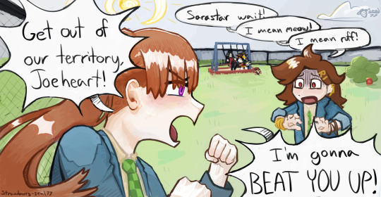
We took a 15-20 minute break from playing and 7 hours later this image was sitting on my screen fully formed. also rook drew sara's warrior cats purrsona!!!
Extra images and thoughts under the cut!!!
Time Spent: 7 hours 24 minutes


Okay so first thing, if it's not obvious, this is them playing warrior cats on the playground!! We have decided they do this. Shadow the hedgehog and baby baby shadow are part of the awesome sillyness that happens when you make a drawing on vc!! Though baby baby shadow himself is a longer running joke between us.
Second thing, this playthrough is SUPER FUN !!!!! Chat and I split the voices evenly (somehow) and we've been adding on silly little bits as we play!!! Like Sara sleeping through the instructions of the gun game (and yet winning flawlessly) and Joe having unwaivering confidence in her.

Also Sara threatening to beat people up, as we see above <33
Though it DOES mean the game takes much longer to get through, especially if you're taking a SEVEN HOUR BREAK to draw FBDJHSBFH
the drawing was INTENDED to be a quick doodle but. as you can see. its gone past that


I had a good amount of struggle with Sara's fist, as I originally had her body turned away from the camera to look mainly at Joeheart, BUT it wasnt working, and I think it looks much better this way anyhow <33
The drawing was first sketched, then colored in grayscale, colors were put on by overlay layer, and after that I did a whole lotta paintover!! <3 As shown below

After I did the greyscale I actually had to use a gradient map to make the darks darker, cause I have a tendency to pick really light colors. All is well though!!
We decided that Sara would be leader of the warrior cats group on the playground, hence being Sarastar, and Joe would be a dog! She takes being a leader very seriously, including hiding snacks around the playground for her clan to hunt! I think I even smell a doritos bag by that bush over there...!!
It's not as obvious in my image as in Rook's, but we also decided that Sara identifies as a gun (because me saying "as a gunslinger" was misheard to be "as a gun"), and Joe is a furry.
im soo happy with this <3 theres so much to LOOK AT Im not used to large canvases <33
#babys first yttd fanart... I guess????#your turn to die#yttd#sara chidouin#joe tazuna#kai satou#shadow the hedgehog#baby baby shadow#what a cast we have here!!!! hehe#my art#finished art
50 notes
·
View notes
Note
hi! not exactly a request but i do wanna ask, whats your process when you're rendering more paint like art? (if that makes sense, English isnt my first language so apologies hdskhsjdbd) i really love how you use the colors and im curious how you do it :0
i’ve been meaning to answer this one for a while so here’s how i painted miku in today’s post (put under the read more because yeah prepare for a long post
i’d also like to preface this by saying that i never follow a set way of doing things, so in terms of what my personal process is like, these are only broad strokes of what i do! sometimes i’ll combine or skip parts entirely, depending on how i feel. also, this is not a tutorial, just how i do things, so please don’t treat it like one :’D this will read like the ‘how to draw an owl’ picture if you do
first, like every artist, i sketch. more specifically, i’m getting an idea of what i want to paint later on. this could be how a scene is set up or in this case, how a character is posed. here i’m not concerned about details or getting everything perfectly, i’m only planning how the thing will be composed. maybe a lot of canvas size changing, or adjusting what miku’s doing (note how busted miku’s right hand looks from all the transforming!) however, i still have to be concerned with how clear the sketch will be to future me, because the sketch won’t be any good if i can’t read what miku’s doing

after that, i lay down a flat gray under the sketch, mainly focusing on giving miku a clear silhouette. this is also a good time to make adjustments to the composition on the fly if i suddenly feel like something can be improved upon, like shortening miku’s left arm from the sketch!
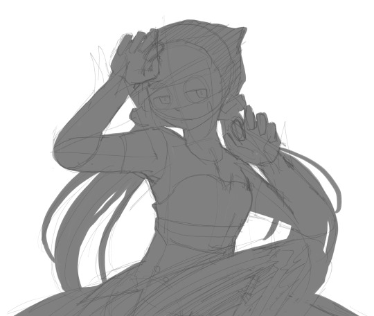
after painting a flat silhouette, i start shading in grayscale, focusing only on lighting. i usually do it in two passes, one for the lightest and darkest tones i’ll use (not black and white) and then a second for midtones to blend them better with the base gray but i forgot to screenshot the result of the first pass 🗿 nevertheless, here is where i can start adding some amount of details. i’m not including any extra accessories yet, just focusing on the base design of the outfit and the character herself (for anyone wanting to draw characters from That Gacha Game, this is how i personally make the process more bearable for myself.) i still use the dark gray to separate where certain details (like the facial features and fingers) begin and end, mainly to make colouring more bearable later.
now here’s where i get the Good Colours. it’s a cheat lol. i put a gradient map layer over the grayscale painting so that there’s a little bit of color to start. some gradient maps can be applied as is, some need the layer settings adjusted to make it look good. this one, for example, is a (free) gradient map set from the csp assets store that needs you to set the layer opacity to 20% and to set the blending mode to color to achieve this result. in general, i tend to pick which gradient map i want to use based on vibes, or basically whether i want the work to be warmer or cooler, colour-wise. but this does do quite a bit of lifting for the colors in my stuff.
and then, finally, i add the colours. i add flat base colours in an overlay layer. at this stage, i’ve made the character silhouette clear enough that i don’t need to refer to the sketch anymore for what miku looks like. also, the gradient map layer does its magic by making the shading a bit more vibrant than it would’ve been without it. after that i paint over with a new layer to add details like the lace.
and then i put some extra shading on top. basically this is where the ‘better lighting’ happens. again, this isn’t a tutorial, so i’m not here to say what each part of the lighting is, but i’ve labeled which layers do which job. in other works where the lighting within a scene is more defined (from a window, from a small crack in the walls, etc) the glow dodge layer may be more opaque and sharper, but since this isn’t a work with that, the lighting was applied using an airbrush. the linear burn layer is also there to make the whole thing darker so the glow dodge doesn’t end up oversaturating miku. i also usually match the lights to the vibe i want, and use a complementary color for the shadows. so here you can see i have warm colors on the glow dodge layer, but light purple on both the linear burn and multiply layer.
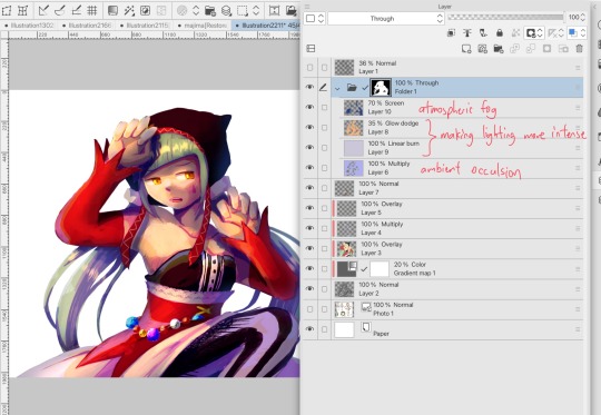
and that’s it for the character—here’s a gif showing how each layer adds to miku! (sorry it’s so toasty)

as for the background, depending on the complexity, it may go through a similar process, or if i can settle with flat image backgrounds, i just go for that. it’s ok to use external image materials. i didn’t have a background in mind for this miku in specific, so i got some default csp materials and threw together something
and that’s about a rough overview of what my process for more finished works looks like! again, art is a fluid process so i never specifically stick to certain steps all the time, and you shouldn’t either. i can probably answer why i’d pick this colour over another in one particular work, but it’s something that kinda has to be learned on a grander scale. i think everyone can already feel what colors work with what atmosphere or what setting, even if they can’t immediately explain why. colors and composition do take some level of experimentation to find what works best!
126 notes
·
View notes
Text
…make a psd?
this is a question i get pretty routinely, and i’m going to tell you upfront: there is no one way to make a psd. there’s no ‘better’ way, no ‘easier’ method, you just have to figure it out yourself.
with that said, this post is going to be how i, personally, make my psds, just for the sake of reference. my way isn’t better or worse than anyone else’s—it’s just the way i do things ¯\_(ツ)_/¯
i. making a showcase/moodboard
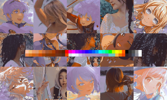
depending on the psd you want to achieve, your moodboard will probably look different—if you’re making a blue psd it will be mostly blue, if you’re making a psd based on a certain character or card set it will be based around that, etc. i made myself a general showcase that i test my psds on that includes both irl images and darker skin characters, because i like for my psds to work for those purposes most of the time. my showcase is below if you’d like to use it!
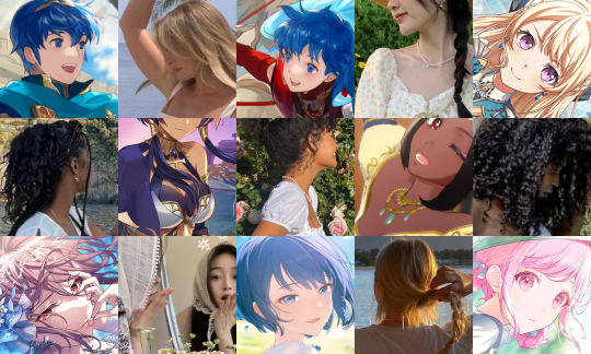
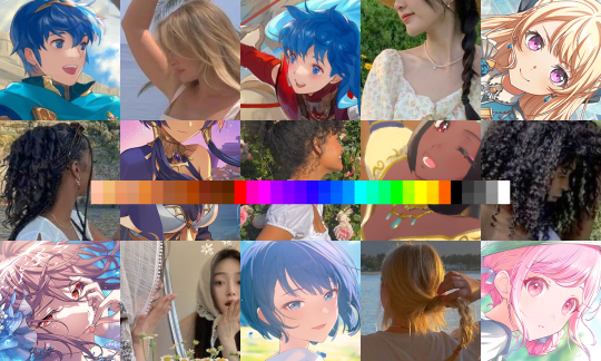
it’s best to include sources you edit frequently so you know what works on them and what doesn’t but how the moodboard looks exactly is up to you ¯\_(ツ)_/¯ i also recommend using swatchies (original by zeroresources on d*viantart) as long as you bear in mind that swatchies is not a great guideline for actual dark skin
ii. creating the base
actual step two is creating a folder but that takes like two seconds. do make a folder though or you will be sad.
after making a folder, start making the base of your psd; whatever the foundation is going to be. depending on how you want your psd to look, this will look very different. i personally always start off with a gradient map, just to get things going
my settings for this are the default black and white gradient map set to reverse, and it’s set to blending mode soft light at 35% opacity. i typically do something in the range of 20-45% opacity depending on how i want it to look
i’m honestly not sure where i picked up this habit but it does make it a little easier to get things going for me personally. it’s a simple change but it’s a good start. if you want higher contrast you can do the same thing but without reversing the gradient map
next thing i do when creating a base is add a selective color layer, which helps things pick up the pace. i’m too lazy to write it all down but these are my settings:
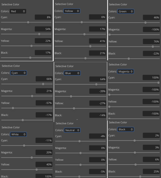
worlds ugliest collage so i don’t max out my images LMFAO apologies. obviously depending on what colors you want to focus on this will look different. for this one i completely axed magenta and emphasized blue and red/yellow. i also maxed out the black in white, which is extremely typical in my psds. this is what our psd looks like now:
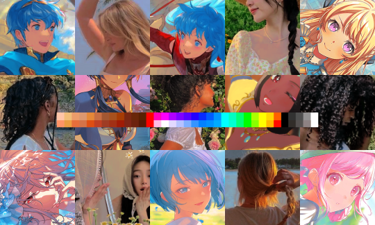
pretty different already, right? nice!
next thing i typically do is another selective color layer. it’s typically pretty similar to the first, but once again that depends on the psd! the worlds worst collage again:
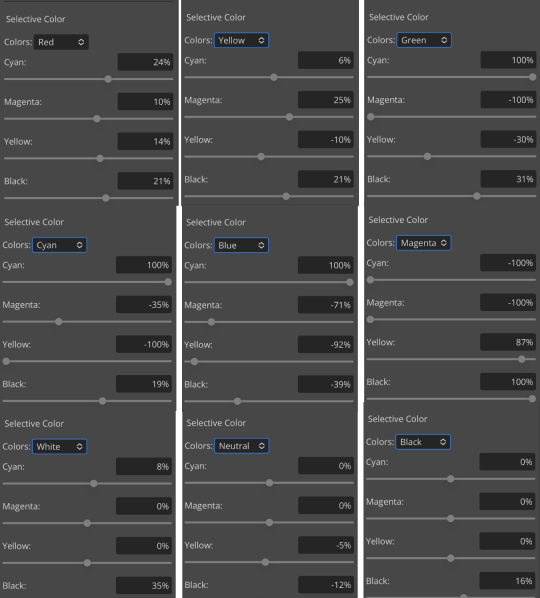
pretty much the same but a little different. and our results:
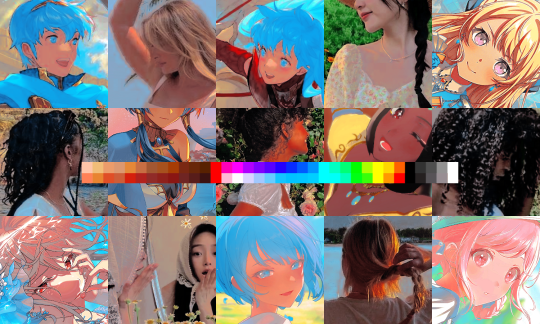
as you can see, this is pretty saturated and a little all over the place. not to worry—let’s move onto the next step!
iii. let’s get serious
this step varies a lot depending on what my psd needs, but because this one is pretty sayurated right now and that seems to be my main problem, i’m going to add a photo filter in a light grayish-blue to help desaturate and cool it down
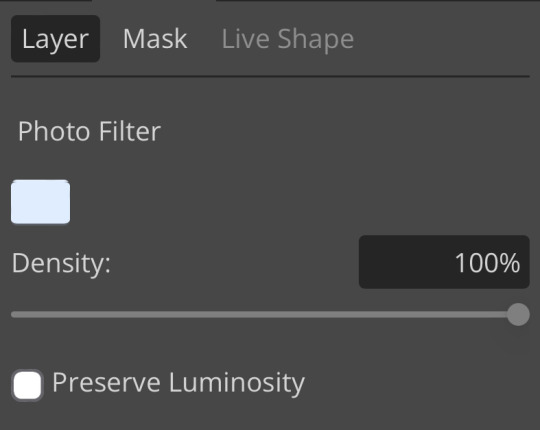
(i unchecked preserve luminosity here because i think it looks neat. i don’t recommend doing that if you’re using a darker color bc it gets hard to see, but you can do whatever forever)
obviously this isn’t the only way to desaturate but i find it fun. observe:
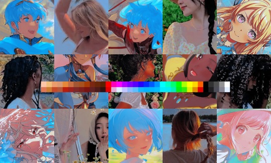
definitely better, at least to me, but still not great. we’re going to add another selective color layer bc the skintones look kinda wack. welcome back world’s worst collage:
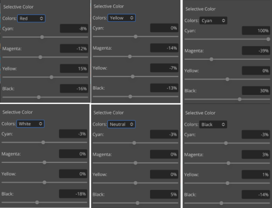
i only adjusted some of the colors in this one because i wanted to fix specific problems; namely that the darker skin tones were too dark and ashy.
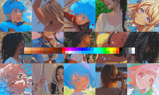
mission accomplished
with that done, it’s time for hue/saturation! for funsies ദ്ദി(˵ •̀ ᴗ - ˵ ) ✧ this part i just had some fun with. a new collage:
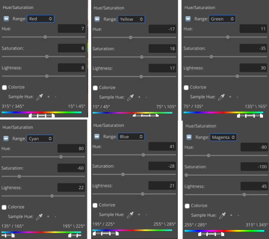
and the results:
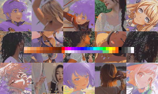
purple! this wasn’t what i originally had in mind but it was much more fun to do tbh LMAO i decided to turn the cyan/blue into purple because it looked better in my head
iv. okay now get silly again
now that the main meat—so to speak—of our psd is done, we can add some fun layers. if you want ideas for this, i have a post about it, but what i’m gonna add as my first silly layer is channel mixer, which is one of my personal favorite layers
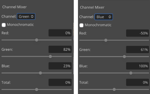
pretty simple adjustments for channel mixer honestly ¯\_(ツ)_/¯ but i thought this would look fun. as a general rule of thumb i don’t mess with the red channel so much because it tends to screw over my skintones, but, as with anything, you’re free to do whatever forever
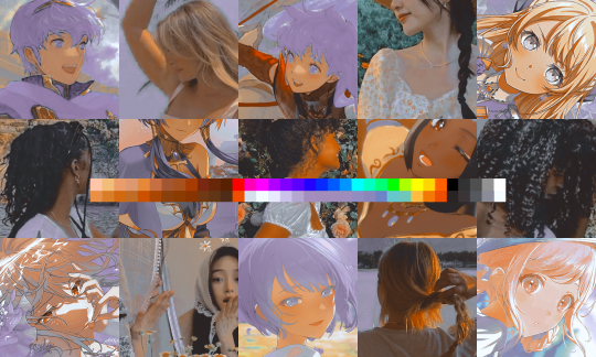
next fun layer i’m gonna add is a noise gradient map, also just for funsies
i randomized until i got a nice pink-ish kinda one. i was hoping for blue but all the blue ones were too green and i got impatient LOL
a little fucked but for sure fun. i set the gradient map to soft light at about 15% opacity. it gave the psd a fun texture and a bit of extra warmth
v. finishing touches
sometimes i add a couple more layers, sometimes i add less, but this psd feels about done so imma wrap it up. i typically don’t save my psds as the showcase for my storage’s sake, so i’m gonna grab something to use as an icon. i typically go ahead and size it at about 300x300
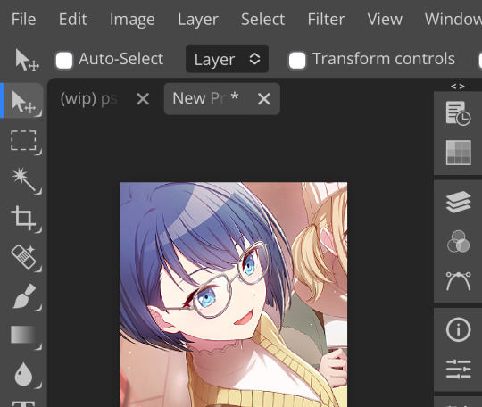
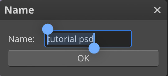
hello, haruka! once i have my icon set i duplicate the folder into the new project and name both the project and the folder. how you name it is up to you, i usually either use a random word generator or just whatever comes to mind. in this case, i’m just naming it ‘tutorial psd’ lol

then go to file and save as psd, bada bing bada boom you’ve got a psd ☆〜(ゝ。∂)
as i said at the beginning, there’s no one way to make a psd. this isn’t the only process or even the best one, it’s just how i personally work. the best way to make a psd on your own is fuck around and find out <3 canarysage out
…so that’s how you do it.
P.S. the psd i made here will be posted under the tag #tutorial psd. you’re free to poke around in it and use it as per usual. if you want to copy it, feel free, but don’t claim it’s your own or repost it as your work. thanks!
P.P.S. wondering about adjustment layers? see photopea for dummies. wondering about something i haven’t covered yet? shoot me an ask ദ്ദി(˵ •̀ ᴗ - ˵ ) ✧
59 notes
·
View notes
Note
Woowww, I LOVE the texture of your art 😍 can I ask how you achieve the many fine lines? Do you do them all by hand or do you have a specific brush? I’d love to hear more about your process in general!
Hello!! Firstly, thank you SO MUCH for your words, they seriously mean so much to me and every time I get a cute little reblog tag or an ask like this, I squeal in excitement !!
As for my brush/process, I would be happy to share! I work on Clip Studio Paint and I seriously love it. It's got so many cool features, and I barely know a third of them. As for brushes, I use one of the stock brushes they have, charcoal, under the pastels category.
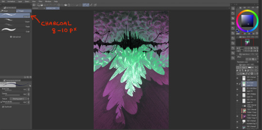
In terms of process for this veiltober lineup, I am doing every line manually, one by one, but I have a couple of things that help me through the pieces.
First, I don't work with color right away. Once I have the sketch done, I will lay down some base values that give a good contrast to the piece. Doing this allows me to focus on the values and not so much on the palette I will use later.
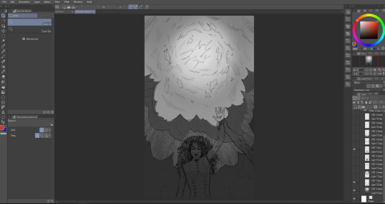
Then, I manually go in and start doing every line. I try to have it follow some sort of flow (for the coulds/smoke/etc) or the planes of the body, face. And I work on the contrasts too, see what works or what doesn't work, what needs to be more hidden or brought out more.
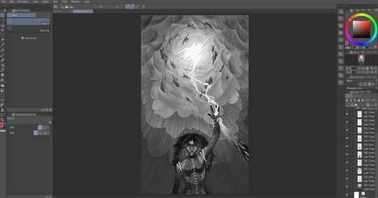
Then I will group all my layers, duplicate that group (to keep the original, in case I wanna change anything), and merge all the layers in the group so as to have one single layer with everything. With that layer, I apply a gradient map and watch my B&W drawing colorize! In CSP, you have to go into Edit > Tonal Correction > Gradient map. I Also make some final adjustments on another layer, like white accents, extra lines or different colors (like Solas' arm here).

It's not that smooth though! Some pieces take a really long time because I'm constantly playing with colors, contrasts and details. Seeing what works, experimenting. There's always a lot of layers and groups in my files because of that xD
Hope that answers your questions :D Once again, ty for asking! It totally brightened my day!! I'll be going back to making the pieces now :3
41 notes
·
View notes
Note
Hello hi I just found out you're the artist of my favorite pic of Jamil from all time 🥹 I absolutely LOVE LOVE LOVE LOVE LOVE LOVE LOVE LOVE LOVE LOVEEEEEEEEEEEEE SO MUUUUCH his bday art from 2020!! It's my favorite one from every art and he looks so pretty and hot and cool and like he's in a music clip and about to drop a fire verse!! I LOVE your painting style so much, as a baby artist, would you one day show us how you color? I'm sure you put so much blood, sweat and tears into your hard work and it would great to get a little bit of that wisdom. Please keep drawing, keep doing what you love because it makes the world a better place to live!
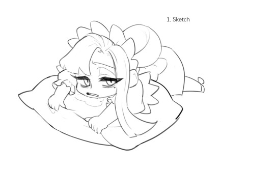
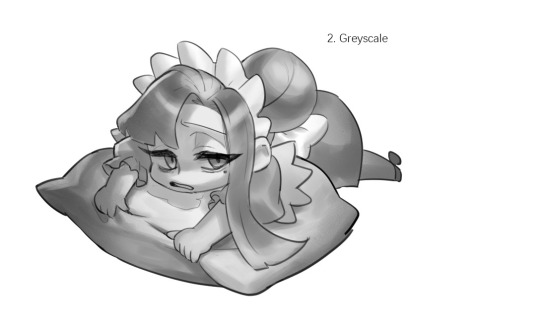
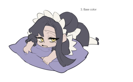
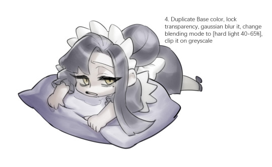
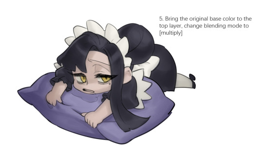
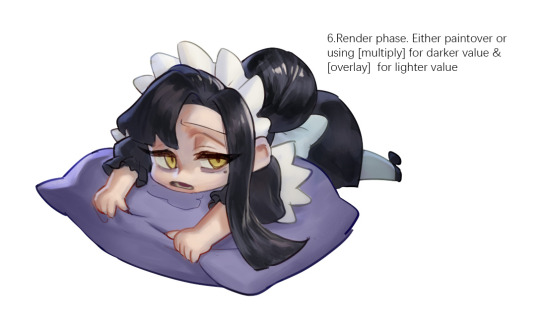

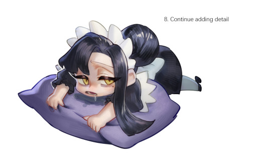
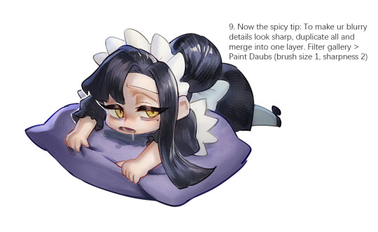
Sketched my sleepy and tired oc to do a very quick demonstration but it covers how I color when i render things:
Start with rough greyscale first, it's a good start to roughly decide light direction and value of your overall work. Especially if you have no idea on your shading.
Next, apply base color to greyscale. I'll use gradient map if I want to keep the details of my greyscale. But if not, I'll just start with a flat base color, and try whatever I can to apply color.
Rendering phase. Add layers and just paint on top to refine it. Merge all layers if it's too messy. Then add layers again. My rendering really depends on how much time taken because it's just a loop of paint over and refining. Thats why i do more simple fanart cuz I sometimes get bored of rendering Also at this stage when doing lineless style, I merge lineart with layers and cover up the lines.
Final touch. Merge all layers and use [filter gallery > paint daubs (brush size 1, sharpness 2)]. It will sharpen your work and look detailed. Or add some very fine noise texture, it will look detailed too.
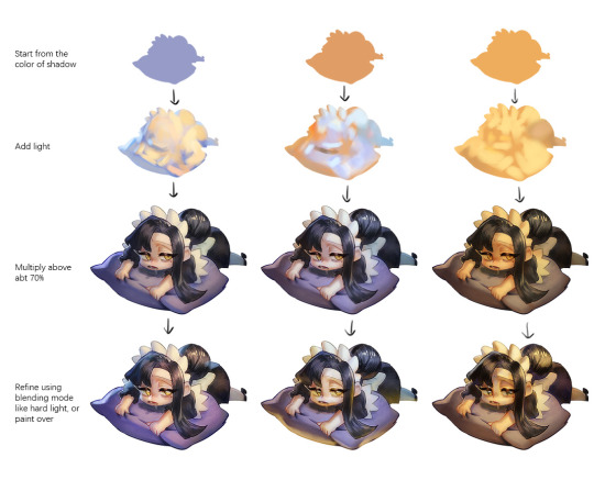
Another very rough demonstration on how i apply color mood. This will be after step 2. And same will be more refining and even paint over to ensure the colors look ok.
Other tips:
Add warm and cool colors especially on skin.
Use pinterest. Always find more than one reference for a subject if you want to draw better than yesterday. Pure ref is a nice tool to gather reference on your pc. When i draw a single hand I had a lot of ref. (pose, color temperature, lighting, photos, artwork, all diff ref)
Color theory is so important I still struggle a lot. I highly recommend beginners start from practicing Marco Bucci's ball practice. After that slowly change to adding character into movie scene and photographs, the purpose is to adapt different color moods and learn the lighting from the image. Learn more from famous movie and cinematic. They did their best to nail the colors.
Anyway,
this is a long answer about how I color. My previous job influenced me so much on coloring so there's a lot of thinking and struggle on my colors.
So, I suggest you be more experimental and try new ways, at the end what remains is what fits you.
117 notes
·
View notes