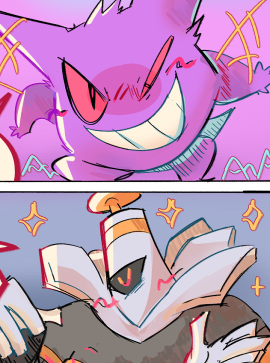
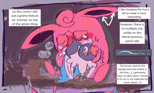
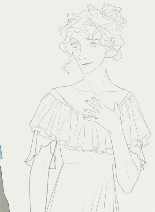
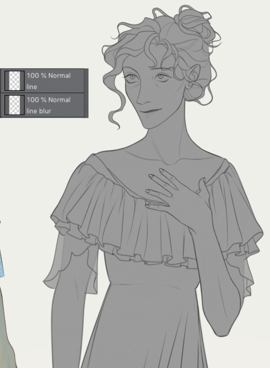
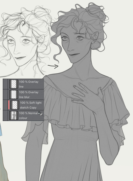
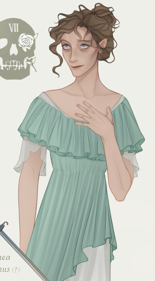
#I tried really hard not to render and add more details
Explore tagged Tumblr posts
Visit Tumblr Blog
Explore Tumblr blogs with no restrictions, modern design and the best experience.
Last Seen Tumblr Blogs


Fun Fact
Total funding amounts to $125.3M.
Text

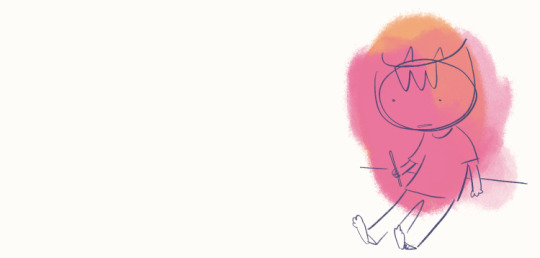
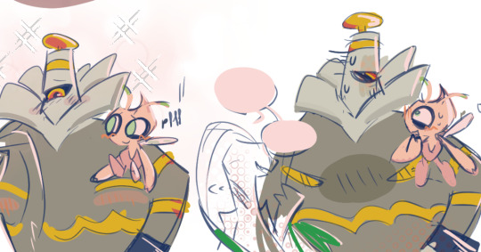
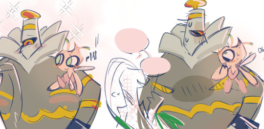
Everyday you can receive a kiss 👊💋💗
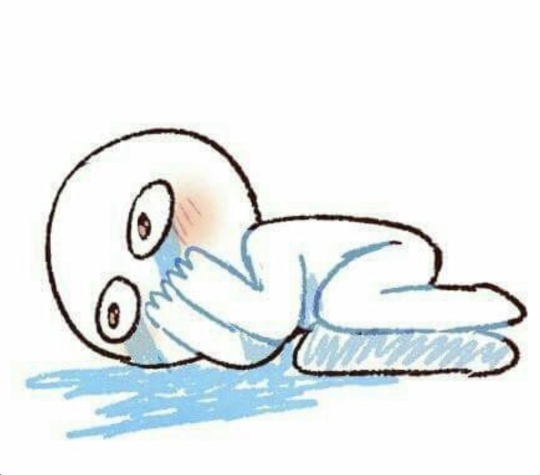
#This is very simple but it is special#late Pocky day#my art#twst oc#twst#ruggie bucchi#twstagatha#twisted wonderland#disney twisted wonderland#twst ruggie#I tried really hard not to render and add more details#♡Aggie♡
1K notes
·
View notes
Text
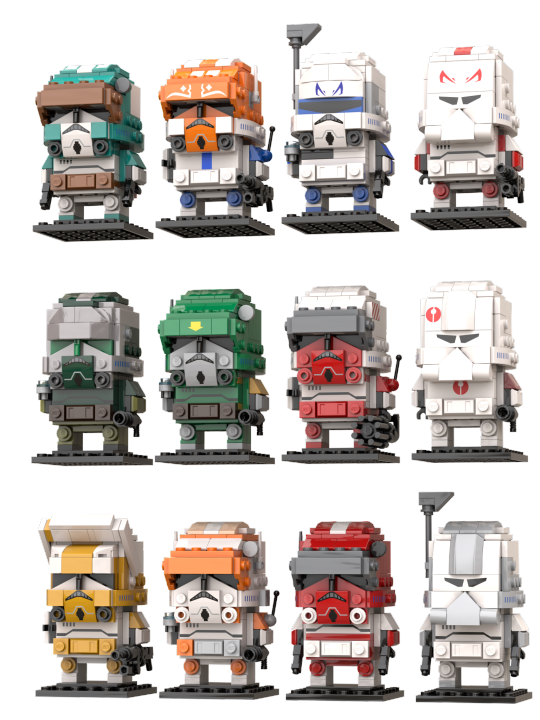
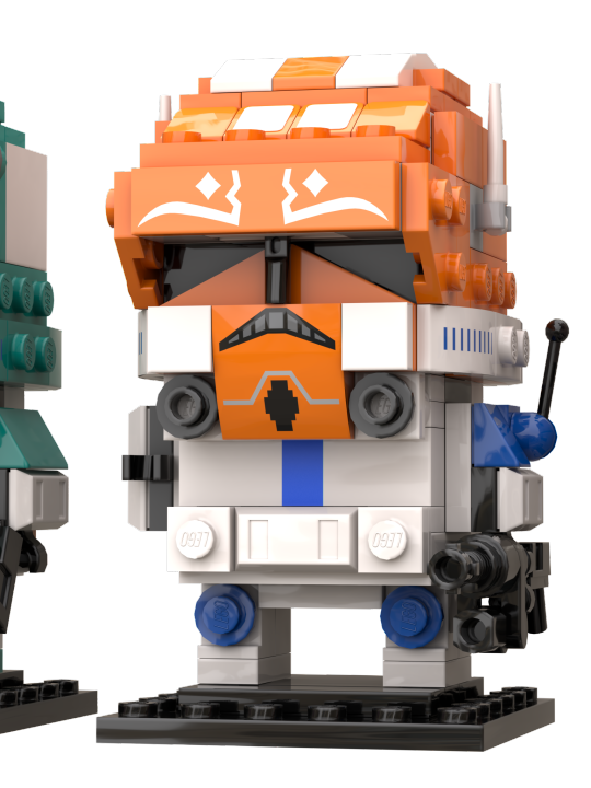
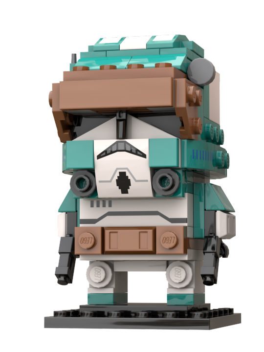
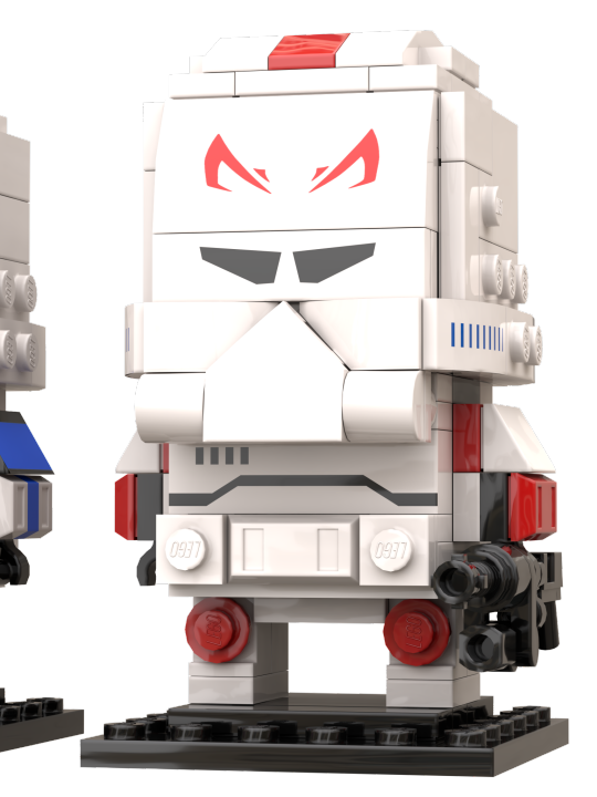
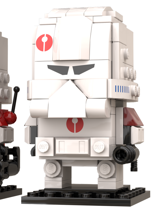
✨More Clones Brickheadz !✨
Since I acquired the Small Cody (40675), I found that there was an untapped mine. Why would they only make one ? Well. I don't have an answer to that, but I decided to take matters into my own one; so behold : 11 more. I went mostly for commanders here, but then I went a bit astray and so I added some captains to the mix.
In order, row by row :
Tukk (Not cannon but the colours are so beautiful)/Vaungh (died too soon-)/Rex (obviously)/Fordo (I did Rex, so I had to)
Gree/Doom/Thorn/Neyo
Bly/Cody/Fox/Wolffe
It was a really fun project, and I hope to do more of them in the future - maybe even phase 1s, some day~); supposedly not commanders because I did most of them (except Bacara, I know...The helmet was too tough).
And because I really like challenges, if you want to see another clone turned into one of these (Be it cannon or one of your ocs) feel free to send requests in my aksbox !)
Anyway this post is already far too long for anyone's dashboard, so closeups and details will be under the cut !
Let's start with the easy ones : Cody, Doom, Fox, Thorn

Obviously, Cody was easy, I just rebuilt the original one virtually - Nothing too hard. The printed pieces here are not the right ones, because Cody's are not available on STUDio yet, but the storm trooper ones were relatively similar, so I used these for most of these models. Of course, it means I'm lacking the sun bands, and a few other distinctive elements, but it works well enough for now.
Now, Doom is essentially a colour variation (minus a few antennas). I also used an old space piece, which has this big yellow arrow printed on it. I's not exactly what Doom has, but I feel like it's close enough for a first attempt.
Then, Fox is relatively similar to Doom, but with two DC-17s. I also moved the printed torso brick up to get that red line he has.
Thorn works in a similar way to Cody too, except I removed both accessories on the side of the helmet. I also added this tile with diagonal lines to figure the wings he has. One day I'll slap some real wings on there, but I haven't found the right image yet. I also gave him a Z-6, obviously. I really like it, so I might actually make that one physically, because the way it's build (with old binocular pieces) is pretty nice; although I doubt the pieces are available in black.
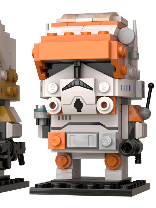
Moving on to two captains : Vaughn and Tukk !
Admittedly, not really that different either, except for one thing : I learnt to do custom prints now ! Yay ! Well, these are really basic : the blue line for Vaughn, and some trapezoids for Tukk's helmet (which are, indeed, not visible here - shame, I spent so long making these fit). The Ahsoka pattern was already in STUDio (because Ahsoka already has her own brickheadz, which I'll get my hands on someday~)
I must also add that having some cyan in this whole thing added some much needed colours in here, I'm grateful some people give their clones amazing colours (If somehow someone doesn't know who Tukk is, well just check High Ground Animation. Right now. It's really cool, trust me). Anyway.
As for design changes, I modified the faces slightly by adding 1x1 tiles, to allow for different colours variations on the face. It makes them look slightly blockier, but given the overall size of the head, it doesn't do much.
I also gave Vaughn a DC-15A. It's a bit messy, but it works out well enough. Past me forgot to render it, so here is a raw, in-software picture of it (from Fordo(s hand, but it's the same design for both) :

BARC helmets ? Wolffe, Fordo, Neyo

As I've been told, these look a bit wonky, and I'll admit its wasn't exactly easy, but in my defence, it's relatively hard to get such round shapes with bricks (lego cheated by adding the visor). Anyway, given that doing that with a printed piece was out of the question, I tried to replicate the filter's shape with actual bricks, and I used a printed piece which, technically, is Lando's moustache, but downward. I'd say it does the job relatively well.
I also added a rangefinder to Wolffe, which is a little big compared to everyone else's antennas, but It's still relatively to scale with the head itself. No custom prints for him (not sure where I would find the correct pattern images ?), but I've done it for Fordo and Neyo. Fordo obviously has his well deserved Jaig eyes (and who knew it would be that difficult to find a picture of that on internet ?), and Neyo has his symbol on the helmet, chest plate, and the shoulder not shown here.
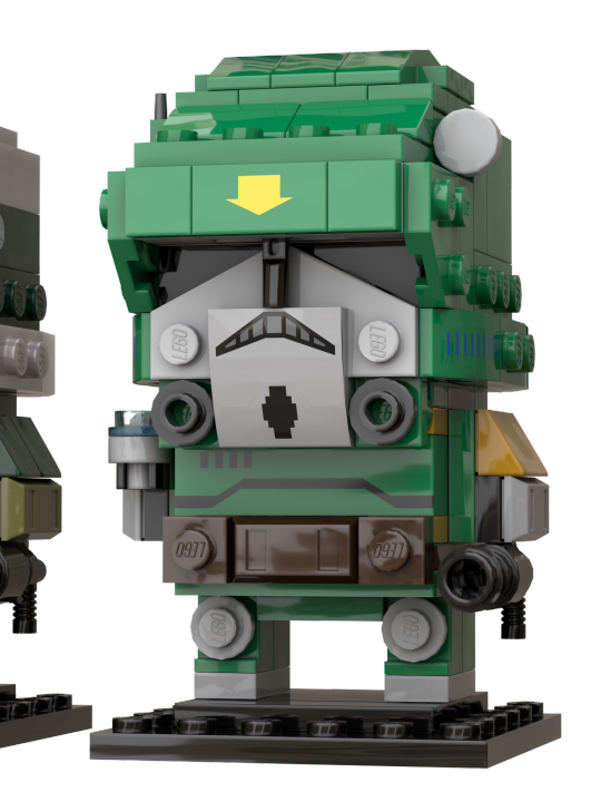
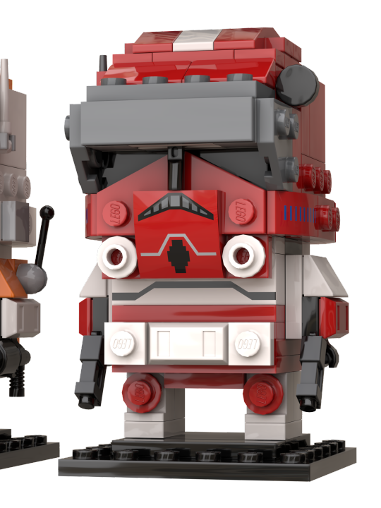
The really tinkered ones : Gree, Bly, Rex :

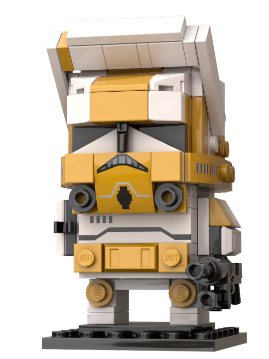

Here, it was a matter of trials and errors to figure out just how to get the shapes right.
I actually started with Bly, by removing the previous visor and adding the macrobinoculars first, then I tried to shape the helmet around. Truth is, it doesn't make sense technically : the two separated parts of the helmet do not connected at all, if you remove the equipment. Luckily, no one has to know that.
Next is Gree. It took me some time to figure out how to properly get a round feel, but I feel like it's as good as I can make it like this. Colour-wise, it was surprisingly difficult to find how to balance the different shades of green, and equally hard was to figure out which silvery colour would render well in STUDio. The answer lied, as it always does, in Bionicle. Of course, none of these pieces exist in this colour, but it's not really my main problem (because none of the coloured printed pieces exist either).
Finally, Rex...He gave me some trouble, I have to admit. Firstly, the part-designing software decided to have some trouble with custom prints, which was problematic, because I simply couldn't do Rex without jaig eyes (and Fordo already had his). Then, I started with Gree's base and tried to go from there to fit Rex's custom helmet. I ended up using Boba Fett's printed visor piece for Rex, because these were all triangles. I also got rid of the printed chest piece and used some black plates to simulate the pouch he has; while also adding a a few more custom printed pieces for the arms and pauldron (barely visible, but they're here. I'm not entirely happy with it, but I don't see much other solutions than more and more custom prints, which isn't my goal, so it'll stay like that for now.
Anyway, that's way too much rambling for one post, so I'll just end by saying that next week I'll post an alt version of this whole build [here !], with some 'slight' colour alterations. Definitely nothing big.
#lego#lego moc#tcw#lego clone wars#the clone wars#captain rex#captain tukk#captain vaughn#captain fordo#commander cody#commander fox#commander thorn#commander wolffe#commander bly#commander gree#commander doom#wow that's too many tags-
220 notes
·
View notes
Text
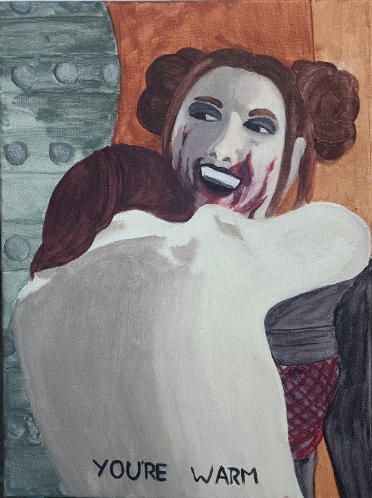
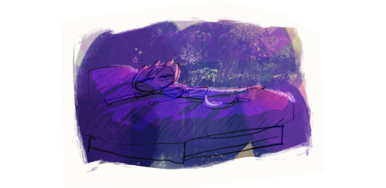
acrylic on canvas 30x40 cm
it is very evil of Belladonna to not bite women when she probably has the entire lesbian community on their knees now
anyways, Dracula's Ex-Girlfriend was so fucking good and despite my hatred of drawing (let alone painting) humans it compelled me to create something.
I'm just going to leave a wall of commentary on the process under the cut because I need to chatter about all of this real quick
I chose this scene at the end because 1. it was super hard to find one still where Bella and Fay are both properly visible (yet somehow Fay's still facing the other direction) and 2. this scene just hits a bit different to me.
the discussion of smoking, a thing that's bad, but it being life, right as Bella drank that bartender dry made me think of a few things I experienced and while I personally will still keep on going against what Fay said here, I still got to see things in a somewhat different light I guess.
Fay's care is also so present here. Bella is self-destructing massively, but Fay still comforts her, even after she "fell back" on her bad habits (she never quit) and this hug just hit me personally quite a lot. the silent care, the "you're warm". I can't fully describe everything it makes me feel, but this scene was good.
on a more technical level. I had to take some creative liberties with the lighting and such because it was DARK and my painting skills aren't ready to make such minute details with extremely dark colors. It would get ugly and muddied, so I had to adapt. the harsh shading on Bella's face is less striking, but I don't know if I could make it better with my current skills.
This was also one of the first times I've really rendered a human face; Last time I "tried" it was 1. without a ref (unwise) and 2. when I was even worse at drawing humans and I ended up so mad at this painting that I Could Not Go Paint Again for a while because of how mad I was lol, so I'm honestly really impressed with how I managed to do this without making a huge mess.
At least until I got to add the blood. It still looks good now, but I had to fiddle a lot with the reds I used and the skintones to mitigate the damage of a few first strokes that got too grandiose.
I also decided that Fangs. I am a bit of a vampire researcher and seeing the different traits they get in different media is always fun and here the fangs seem a bit retractable, but Bella's a vampire and I am a sucker for fangs, so I had to include them.
my handwriting also didn't fail me too horribly, even if I had a few accidents and had to clean them up before I got this "clean" little text. I really don't have good brushes for very thin and precise strokes (nor the capacity to not tremble the entire time honestly)
This was honestly quite fun too. Four hours of listening to some music, having a weird moment with my mother on the phone and just painting. I did really not want to draw Bella's face at first and drew nearly everything else before I began, but once I did I got into the groove and it went fine, so I'm pleased with this.
#morningtalks#morningdraws#dracula's ex girlfriend#also. Abigail if you're for some reason reading this I am fully willing to send this painting to you if you'd like#It's quite large and I have way too many in my room already lmao#so dm me or something I'll arrange the shipping
155 notes
·
View notes
Text

hi anon ty for sending the message! I did look through their blog and they very obviously use AI - I would've published the ask normally to let other people know but I decided against it in the end because after a closer inspection I noticed that all commissions are fake (besides being fake art I mean) and they're not actually scamming anyone because. uh. literally most of the blogs I saw interact with them are empty rp blogs that are blatantly controlled by them and one of the commissions I saw on their patreon was for a defunct ohsc rp blog from 2014??? Which honestly was really funny.
so yeah, they're very much not pulling any money from that, and on top of it all they posted pics of themselves sooooo yeh, not going to blast them on a blog with a big following for trying the 'i dont use ai im a real artist' but ultimately not scamming anyone out of their money. They're also not the best at like... hiding they're using AI because you can see their traditional art in other posts, and the style or experience level doesn't match at all.
I will post some of their AI stuff underneath the read more and point out the inconsistencies tho, to help out other people in spotting out ai shit (esp non artists that might have an harder time figuring things out). If you find out the original user that posted these, please don't harass them, be civil.
BTW I'M SAYING THIS NOW: if you see something I point out and say ''ah, I do that, I'm in trouble" - no you're not, if you actually draw the stuff yourself. You can see when an artist's work (and mistakes!) are genuine. Beginner's mistakes can be made by experienced artists too, but if you look at their entire body of work you can see when something doesn't add up.
to start off, I saw anon calling them out on this one so I'm just reiterating some of the points, but here's some junko 'art' they made

when confronted abt it, they said that the fingers look weird because they can't control their shaky hands and drawing small is hard. anyway if you draw digitally you can zoom in on the canvas and work on a detail as big as you need, so that excuse doesn't hold
this other post was basically what made me just say 'yep thats ai' and it was just the second 'art' post I saw from them

while taken alone they could've been a little harder to spot as AI, with them all bundled together you can easily see they came from the same prompt; the user tried to justify the inconsistencies saying it was because they were 'experimenting' with the design of their oc and gundham's scar but I'm telling you now, no sane artist fully renders four pieces that are basically the same concept while changing the design of the character just slightly in every single one of them. anyway, here's the breakdown of every piece:


another that was way easier to break down because it's so full of inconsistencies the moment you really take a look at it


also let's be real if you render art like that you're not gonna put a bright purple unreadable text on your supposed vtuber "art"
let's end this with the AI "commission" that could be harder to break down as AI if seen in a vacuum now, shall we? esp because our friend, the fucked up melty finger, isn't there
I honestly had to look for a while at this one because if you had shown it to me and I didn't see the other stuff this person posted, I could've just chalked up a lot of these mistakes to human error. Tangents between lines, scribbles for details, forgotten uncolored sections is all normal stuff. BUT we know this person used AI in all the other posts, so we know what to look at:


again, some mistakes the AI does can be also mistakes actual artists do: be sure to check the other art the user makes before throwing accusations
they also posted a fake speedpaint that is so embarassing it made me laugh but if I start pointing out inconsistencies in an AI speedpaint we're gonna be here for a long time, so.
TL;DR AI 'ART' SIGNS:
The classics: hands and fingers don't make sense, there's additional weird lines and they melt into other part of the drawing
long hair strands and other long or flowy elements can suddenly disappear behind objects and not reappear where they should
jewels, intricate details, hairpins and other accessories bend and melt into each other and other part of the design
the resolution of the image is very low and/or grainy - a lot of artists post lower res pieces online, but again: look for a pattern and combos of all the other signs
inconsistencies between multiple art posts, character designs constantly being different, sudden art style changes - while this can also be found with real artists, this is an additional tell of someone using AI, when combined with the stuff I mentioned above. humans mistakes usually have a reason for what they happen, AI makes them because it doesnt understand what it's doing most of the time
#admin post#so srry this is a long ass post#at least no real money was involved with this user but still sucks ass
318 notes
·
View notes
Note
GOD IS GOOOOOOODD 🤭 GOD IS GOOOD!! BOOM SHACKALACKAAA cause in this situation I devour yiur leech twins art AND THERE PARENTS GOD DAMN
ANYWAYS DO YOU HAVE ANY CUTE OR SMALL DETAILS YOU HAVE EVER DRAWN IN ANY OF YOUR ART PIECES?! Its my fav thing to see or figure out about artists to see if they added any cute or small details or acessories as extra parts! Continue to work and draw hard! I aspire to be as awesomesauce like you!!
AAAAAAAA TYSM LOVE 🥹 u are freaking AWESOMESAUCE the way that you already are right now
i wish i could say that i have a special quirk…but im unfortunately kind of a boring person 😓…
maybe i can interest you with patterns i have while drawing and what i consider when drawing specific characters?
while i draw:
-can i be honest? i have no idea what i’m doing. when i render hair (especially if im faded) its like i blink and then i did all of it. don’t know how i did it, i couldnt give a tutorial if i tried
-i like to add saturated red lines randomly to everything! i know there are rules to this, but when it comes to my art i sort of yolo everything (i really shouldn’t). does it look good or does it look bad when i place it here? thats really the only question i consider, but usually it’s in areas where i notice the coloring is repetitive, and it needs an outline to make it pop.
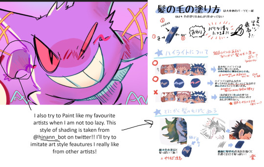
-twst taught me this first, but i really like adding a light blue to where a dark shadow will be. for example, in hair (for the back of it) i like to add a lighter blue instead of darkening the shadow, imo, it makes it less repetitive and pop out more
-my favorite (well, i hate actually doing them, it takes ages) types of pieces when i finish them, are the ones with multiple poses of a character and then a chibi interaction! like with jade’s halloween outfit, i envisioned floyd helping him get his hair done, waking up at the crack ass of dawn (tired as fuck)
-my artwork is very blue… i just love using blue most of the time. for the saturated color laying overtop an already blue toned black dress? yeah it’s gonna be blue. the back of the hair? light blue. i just feel like it’s the easiest color to use for shading 💀
-i don’t usually draw a white dot to represent light in the eyes. the only reason i specifically talk about this is because i TRY. i always try adding a white dot and no matter what i don’t like it. no clue why
-i rarely post line-art/sketches (in comparison to my fully rendered art), this is because i fix EVERYTHING when i render. the anatomy, the hair, the posing. i can’t see my mistakes until it’s halfway done in full color and almost completed shading 😓
-(random complaint): i’m noticing a problem where the colors seem super saturated in procreate and then it just becomes really dulled down when i post it…idk whats wrong with my eyeballs
character design:
-for leech mom: i really try to balance her sexy, scary side with her cute, bubbly mom side. when i first made her, i never even considered making a leech dad. i just thought, “jade and floyd’s mom would probably be super hot…” and that’s how she was made ^^. pearls are always a must on her, i think in every piece i have of her so far she’s wearing pearls in some way. the idea of her that i always go in with when i draw her is that she’s supposed to come off as someone that would converse very cheerily, have an upbeat attitude, but you there’s something that intimidates you about her… she gives off: will smile kindly while tearing your heart out
-jade and floyd: i like to give jade a darker blue palette than floyd! maybe my eyes decieve me, but i always feel like jade’s hair looks a darker shade of teal… i could be tripping. also, i do try to take into account most times that jade has broader shoulders and floyd is slightly taller! this is just a random tidbit lol, it never affects much really. also, i do make them more muscular whenever i draw them. i know they’re lanky and i love them the way that they are but it’s just a personal preference (along with the fact that they both eat very well and are extremely active? like….) i also prefer drawing their teeth larger
-leech dad: i’m glad i came to the current design of leech dad, but i was freaking looooost when i redesigned him. the first time i made him, i hated it while drawing it. it was more of a, “whatever i drew the mom now i have to draw the dad..”. but now, i can say with 80% confidence i’m happy with the way he is. he was supposed to be more of a navy, but that navy is now mixed with tones of purple, because i can’t move the slider more towards cyan, he’ll just end up looking like leech mom. he had to also be cool toned, his kids have teal hair, so he can’t diverge from that too much right? it’s be weird if he had mostly warm tones in his palette… the things i think about when designing leech dad are: expensive (same with leech mom), old money, hot but slightly psycho looking face, looks like he has a hobby of collecting watches, but surprisingly a guy that’s not extremely moody (cough his wife and son) and well tempered
both him and his wife are giants. i hope that i properly convey that as well 🤣
27 notes
·
View notes
Text
2024 retrospective and 2025 goals
this is the censored version of this post. for full images, check out the full free post on subscribestar!
hi :)
i'm really happy with everything i achieved in 2024. it was my first year illustrating full time, meaning no school and no salaried job on the side (believe me i tried to get one) and i'm happy to report i did not die! fuck yes. i even illustrated for 7 (i think) art books, designed merch for 2 and organised my first collab fanbook.
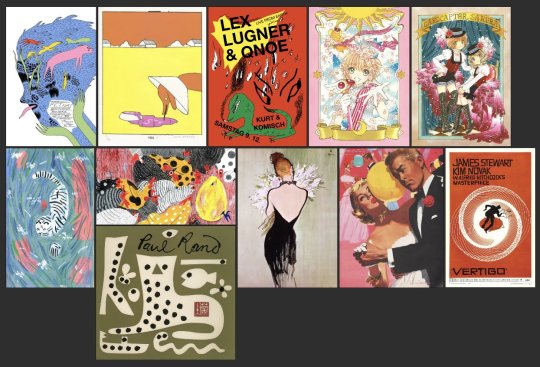
from top left clockwise: michael deforge, anna haifisch, Michel Esselbrügge, CLAMP, saul bass, jon whitcomb, rene gruau, paul rand, molly fairhurst
at the beginning of 2024 i made this moodboard for influences i wanted to incorporate into my work more, they are pretty much the same faves ive had for years but i just wanted to have them in front of me and start deliberately choosing elements to ape.
i'd say i basically want to incorporate more 2D cartoon graphic elements combined with detailed, realistic, delicately rendered characters, more theatric background design and props... features like borders etc. the thing about a moodboard is unless you print it out and put it up by your desk it will sort of slide to the back of your mind which is what i think happened w mine LOL. cuz looking at this now im like well i didnt really hit all these ideas but i did inch closer.
the first pic here is sth i drew immediately after making the board and i like it but it does feel like a slightly clumsy attempt at mashing stuff together... i wouldn't say that it shows i dont understand whats appealing about the work i was referencing (even though thats how it looks), its more like the picture goes in an unexpected direction while making it LOL. but that's part of the fun. whereas in my mind the 2nd pic spiritually embodies the ideas of the ppl i'm trying to copy. even tho visually it's still a ways off. its probably my favourite thing i drew all year? :) though that's hard to say bcus i'm so pleased w so many other pieces especially those u can see on my summary pic!!!
i have a few more artists i wanna add to my board and then i will definitely print it this time so i can look at it every day instead of just twice a year LOL.
another thing im really pleased about is the number of comics i drew in 2024. i have this odd relationship with comics where i do draw them and have for years and im more or less decent at them but i act like drawing them mortally wounds me. like im so dramatic... i do partially believe the only way ill ever be able to complete a longform comic is through abusing stimulants but you know ill also never find out if i keep crawling off to die after inking a page. i see a lot of illustrators suffering when approaching comics from the illustration mindset of making beautiful pictures instead of the comics mindset of making finished pictures, but u know, im extremely slapdash as an illustrator and im also proud enough to believe im a guy that can do both, so its really time i act like it... basically just shut up and draw. i want to apply this especially to perspective drawing/panel backgrounds, which im, like, fine at. honestly fine at. i do think i trip myself up because i want to be the next dostoevsky or beyonce or whatever, i want to be great, but have to remember the most anyone can do is aspire to express something from your inner world. everything else is secondary.

one thing i learned the hard way is how hard it is to have work life balance when you work from your bedroom and 'monestise your hobby'... you know, the thing everyone has been warning each other about for years. turns out its real. its super confusing when so many elements of your work bleed into your social life, physical health, leisure time etc -- like i go online for fun, and also to promote myself. so wheres the distinction? i watch movies for entertainment but also for research... ive definitely felt like ive been working around the clock or my job has consumed my life at points. but i think being stricter with my work hours is the way forward. it truly is shaytan at the wheel when u answer an email at 3AM... no more of this!
and tied into this is being realistic about what i can achieve in a day and not feeling ashamed or that i need to do more... i get stuck in this silly loop that's like... 'i believe everyone should work 4 hours a day, but because other people are stuck working 40 hours a week i should also be making myself do that' and then i work myself into a flare up and wreck my work ethic and enjoyment. u can laugh... i know it doesnt make sense. well i wont do it any more. because i CANT... because i will DIE... some days i work 4 hours. some days i work 6. some days i work half an hour... it doesnt matter as long as stuff gets done.. and it does.
also want to talk about my chronic pain and hypermobility... after a year of lifting weights i am stunned to let u know ive actually improved. unfortunately i dont look anything like the rock and i still cant do a real push up but im stronger and have more stamina and suffer from way less zaps and aches and numbness, which was unthinkable before. i only really noticed after taking a trip and doing different activities (painting walls) that i can physically do a lot more than i usually do at home. but also my house is fucking cold so its hard to do anything for anyone. hoping for warmer days and big muscles to come.
some of my other art goals are to work more on paper whenever i can. i used to have a huge stack of newsprint on my drawing board underneath my ipad and id doodle and test ideas on that paper before drawing it digitally. i wanna do that again. many people find its easier to 'think' on paper and im the same. whenever i have an idea i wanna go 'what would this look like on paper?' and then find out.
i want to be thinking about composition and storytelling more in my illustrations, as in, think cinematic, movie posters, communicating big ideas. even if that idea is only as big as 'this blue looks great with this orange'... i want to make more stuff that looks like promotional material for my stories. of course behind every movie poster is 100,000 thumbnails and sketches and half-finished ideas. i want to remember that and not be hard on myself for drawing girl in profile #997.
i want to draw more autobio comics, just to be drawing more comics and also to look back on and know what i was doing that day. nothing fancy. a lot of people are doing that gentle comics habit this year and i fear my competitive nature may get me into it too.
i have more books i wanna create which ive talked about at length in my last diary entry and for now i think that's enough goals thank you very much. thank you for reading this far and for all your support. happy new year! love you x

11 notes
·
View notes
Note
Do you have a set process for coloring and rendering / adding texture to your art? If so, would it be alright for me to ask what goes into that process? I'd love to learn how an artist I admire goes about their work!
Omg I'm so flattered, I'll try my best to explain it!! ^^
Tho, okayyy, I apologize beforehand for how incoherent this might be, since I don't really have a set process at all and mostly I fake it 'til i make it haha. I'm the first to admit that I don't have a ver consistent method and that shows in how irregular in quality my art can look, even inside the general sketchy look.
(Btw sorry if some of the fanart i use for example doesn't make you comfortable but I've tried to find the best examples for each type of coloring haha)
I'll start with the brushes I rely on the most, tho I admit i made the mistake of downloading too many brushes and textures so I might use others on rare occassions xddd
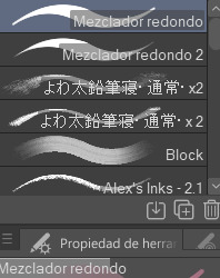
These are basically the brushes I use the most. The "mezclador redondo" is just CSP's default paintbrush and I only tweaked it to find sth I liked and felt comfortable with for both lining and painting
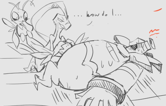
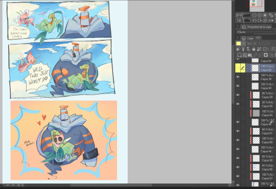
As you can see here I only used one layer for lines and other three for each of the guys' colors. I colored it all with the default brush (tho unfortunately I lost the settings I used for this drawing in particular and haven't found them again rip). In drawings like this I just do a sketch, clean the lines (no lineart) and then paint it. After the base color I start laying out different hues to make the coloring more interesting.
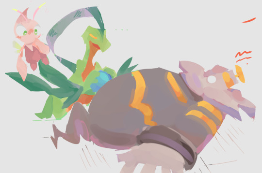
This one was the same. One layer for coloring, manually adding lighter hues (see the more light and yellowish color on grovyle's left leg compared to the shadow) or darker tones. I try to add color to the shadows as well to make them feel less flat, and an airbrush in overlay tends to help with that (tho here I just used a brush).
Here you can see that I often paint over the lines on another layer to correct mistakes in the "lineart" lol. I also applied an airbrush (layer mode overlay) over celebi to make her more bright. I wanted to put this one to show that coloring doesn't have to be detailed to look nice enough. Here Celebi basically has no shadows at all but the tone of the drawing makes her look cute anyways imo ^^
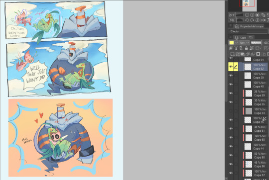
In these two you can see adjustements over the full image again (yellow layer), but I also wanted to show that I don't have a set number of layers either, it depends on how many I feel like using. Again, sorry for the lack of consistency but im too lazy to have a proper method lmao
I will also use harder brushes and tone changes sometimes, instead of blending them with less dense brushes. I am also fond of adding hard lighting in some drawings. You can experiments with it on a top layer and delete it if it doesn't fit, so it's always worth a try.
Another thing I recommend is studying and copying artists you admire or like. Add things from their styles into yours, see how they work with proportions and try to use that in your own art. It has helped me a lot and, without looking to fully copy anyone's style, it does give you some ideas of how you wish your drawing would look, which motivates me (when it doesn't depress me lol)
Finally, the texturing isn't consistent either. I use one of CSP's/Downloaded texture packs, put a grainy texture on the canvas, set it to overlay and adjust the opacity until I'm satisfied. In these two images you can see I am not consistent in coloring even in the same comic lmao. But we are doing this for fun, so I think experimentation is always sth worth exploring ^^
And I think that's all I have to say. I don't control color theory at all, so I can't really explain how I choose colors. I look up some tutorials on youtube and pretend I understand lol. Ig the one thing I tend to do a lot is changing hues in a base color to make it look less flat, the same as with shadows.
Anyways I hope this was helpful or that it at least waas what you asked for haha. Thank you for the interest!! :DD
#ask#art process#i guess???#anyways thank you for the ask sofie i hope this was helpful <333#I am KIND OF A BIG MESS IN ORGANIZATION#but hey we have fun hahaha
10 notes
·
View notes
Note
If you're comfortable, can you make a tutorial on how to draw in your artstyle? I'm very sorry for asking if somebody else have already asked
hello anon, thank you for asking! i will preface all of this by saying i don't mind if anyone takes inspo from my art etc. but i will probably be a little neurotic if i notice it in the wild and there's itches in my head about it. i'm trying not to let personal feelings get in the way of my principle of it here 🏇
i don't really know how to make a tutorial. i tried to draw something that could get concepts across, but it was really hard and i didn't like any of it so instead i'll just put the general process and "rules" i have in mind when i draw. 🙏 sorry if this is less helpful than if i'd use a drawing
the drawing process changes by how much i plan and whatever i feel like, but my general rule of all of this is to keep it as enjoyable for me as much as possible 😊 i start with a sketch.
if i want to shade everything in one layer ("render" even...) i go straight to color after this. this only works if i don't mind it being messy and choppy. i never mind choppy shading i find it charming personally but it will be harder to adjust perspective/proportion/composition mistakes here. i usually color under the sketch layer then i merge it all(with a backup ver out of habit) and just color over the lines and refine things. this way is not very time consuming because i don't care about messiness 🤷♂️
or, if i want to use lineart. i just clean up the sketch usually because my attempts to redo the energy in a sketch suck balls 🤷♂️ if the sketch sucks too i just try to redo it entirely. idk. sketch=lineart etc. my general rule for this is too keep things shaped and simple. i don't think my silhouettes are very good at all but i want to work on it lol. i don't like having to do details so i like avoiding them. sometimes a messy lineart can be more charming to me than a clean proportionate lineart? keep shapes in mind that you find cute ⛹️♂️ details add texture so you have to be careful with how you want that to go. uhhh my mind when doing lineart is too jumbled up i mostly go by intuition based on what i like in other people's art but that applies to any part of drawing
for lineart-related coloring umm ive changed shading styles a couple times here lol. but they can all usually be categorized into two. i'll simplify it with hard to soft shading 🙂 hard is like, "cel shading" i guess? it's solid. it's easier to do but also harder if the colors are too complicated. i usually do this in one layer with the lineart because i use procreate and i'm too lazy to do the selection shit 💢 i like colors a lot in art and i've mentioned how i do them before i think? i always fuck with it with tone curves and gradient maps and posterize if it'd work. just fuck around with anything and you'll start to learn about colors from there 👍 i avoid multiply and add/luminosity layer settings to shade. just because i think it looks bad on my art. and it's annoying to work with too. the hard soft shading thing is a spectrum kind of cause it's really just how many colors are used in one "object"? like skin can vary from one color base and one color shading or a gajillion colors to create texture with blush etc. but there's inbetweens where it's various colors but "hard" but also soft and hard.
soft shading is just straight airbrush. actually not really usually for me it's just me lowering the opacity of my pen as i draw and fucking around with the colors like improvisation. feels like painting but in a too stupid for traditional art way 🤤. but i've also used the airbrush a lot lately. i don't try to use airbrush in "objects" and art that need more texture, like trying to shape with airbrush is fucking hard. but i've done drawings entirely with airbrush tool before just to size it down so it's basically a blurry pen the lol. but for the other way i use the airbrush (where i block out objects and make a flat-ish gradient on it) that one is just exactly what it looks like i just make shapes under the lineart and then clipping-mask a color over it. and always always mess with the tone curve after 🤤 or maybe you can learn color theory for real #up to you
that's all that's really important i think? if you want to ask more you can. sorry if this was less helpful than you'd want i just don't rly know how to give an art tutorial i don't rly have like. a set idea for my artstyle. is not solid
6 notes
·
View notes
Text
TRI-2 - Seq.Structure & Contexts. Week 1
On the first week of this module we went to the Fitzwilliam Museum in Cambridge to find interesting objects and draw them, adding some notes about the time period and the name of exhibit. Later on it will help us to create our own character with rich background and meaningful design. I've never been to this museum, so it was really exciting experience.
Once we came there, I planned my approximate route and went to draw. At the first I didn't know what should I do. I saw sapid things, walking through different sections and made small sketches on my notebook. On our short break, I was given an advice to draw bigger, pay attention to the overall shape, and render my drawings a bit. It was quite hard to draw again, since I didn't practise a lot on my winter break, but I got used to it real quick.

I tried drawing slower, adding more details on my sketches, also didn't forget to add some historical notes. I enjoy this type of exercises, so felt inspired all the time.

At the end of the day we gathered around, showing our drawings. I really liked others' works. We then randomly took the time period in history and headed back.
We returned to the university and were given the home task to make a research about the given period. I took the Georgian era and started studying it at home.
0 notes
Note
i fucminf LOVE ur art i want to devour it. do u mind me asking what brushes u use
Oh my god. I have... SO many brushes lmao. And i change it up a LOT because it keeps my art fresh. I use procreate is the first thing

(this is maybe half of my folders not including defaults)
The main brushes I use are from my LOVE Maddie Bellwoar who prices her stuff way too cheap for how quality they are. i cannot express how much I love these brushes. i use all of them all the time. and have for years now.
The other pack i have been using a lot is this Elizmils Sketch & lineart brushes
I have dozens and dozens that i use for so many things but I tried to narrow it down to my most basic used ones:
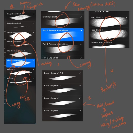
1 is the elizmil pack. I use these for my linearts, my sketching & my color fill

Then #2 i use maddies hand painted gouache brushes for my coloring lately. I like the texture of it

#3 I use it less now unless i'm painting foliage but her Ghibli Set is a CLASSIC and I still use it to do hair more than any other brush. She came out with a second one that I have yet to explore

#4 Then finally I have an airbush i made myself for rendering. It's just a hard blend that I overlaid a rust texture with to give it some texture variation. it's subtle once you blend but adds a lot of subtle detail.

You'll see I have duplicates here and that's because I will have versions of a brush with a hue shift on it. This basically slightly changes the color with every stroke. You can see it most on my skin/coloring brushes. There's multiple because some have more of a hue shift than others. But it mimics partially blended oil paints and just adds even more texture. which I love.

Specifically the setting to tweak is the Stroke color and BE conservative with it unless you want some crazy changes. I don't ever go above 8% really
1 note
·
View note
Text
Week 8
Progress checkpoint


Document your learning for this week. What theme, common to all of your work irrespective of subject or media, can you identify in all your own work?
This week im dealing with silhouette cutout illustration, which is something im not quite familiar with, and im also developing the tote bag to be BSNB background inspired. i have to admit drawing scenery and background is really hard, im not entirely sure what perspective id use, or what kind of style im going for. my usual style is watercolor based and even when i switched to digital, my redering technique still resemble watercolored a lot. In our project moodboard, we had a lot of Camelia Pham works, because i think her works altho resemble traditional method of rendering, look really mature and classy, suitable for our sudden change of target audience. i tried to learn and incorporate her style into my illustrations, but what i thought was a very quick and easy process requires a lot of experience and developement. Her works are very textured and detailed oriented, compleately opposite to mine, which is very soft, dreamy and dont mind much details. so when i finished with the totebag, i felt very off and defeated.
it was not up to my expectation and plus the foggy mind of covid just add more to the failure i felt.
i decided to draw the 2nd version with another composition

it still look really weird and out of charcter, so i developed entire different sketch hoping it would turns out better

And then i have too much on my plates with theprinting i have to outsourced it to Song Linh
They really finish the painting the way i expected it to be. and honestly im very disapointed that i wasnt able to do it. But i think it's a lesson for me to plan better and do not crumble under pressure. It would be ideal to develope more into the style if we have time, but since our timeframe is very limited, i should've sticked with things that works.
For the common of my usual style, one thing very recognizable is it's very dreammy, round and colorful. since my base was watercolor transit into digital, my works has a very sheer and dreamy, translucent. and it's often nature-oriented.


0 notes
Text
wop wop i wanna fill more ask games
1. Art programs you have but don't use
I dont have them anymore but i used to have Medibang paint downloaded.
2. Is it easier to draw someone facing left or right (or forward even)
Left!
3. What ideas come from when you were little
Many of them tbh, many of my characters are like 10+ years old and come from when i was a tween
4. Fav character/subject that's a bitch to draw
I actually really like to draw enviroments (in theory)
5. Estimate of how much of your art you post online vs. the art you keep for yourself
All, all of it, i have no self control.
6. Anything that might inspire you subconsciously (i.e. this horse wasn't supposed to look like the Last Unicorn but I see it)
Hmmm i dont think so? i at least cant see any influence that wasnt there purposefully
7. A medium of art you don't work in but appreciate
sculpting! i tried to do it but gave up, still i love to see timelapses videos of people sculpiting
8. What's an old project idea that you've lost interest in
Ugh sooooo many, so many. My first characters have sort of faded away, and other projetcts i gave up halfway.
9. What are your file name conventions
Jokey, very non-serious titles. Like 'siblings road trip' or ' shit hit da fan'
10. Favorite piece of clothing to draw
DRESSES!!!
11. Do you listen to anything while drawing? If so, what
Youtube videos, like gaming comentary or video essays
12. Easiest part of body to draw
Face and torso.
13. A creator who you admire but whose work isn't your thing
Hmmm idk to be honest, i dont have one i think
14. Any favorite motifs Duality!!
15. *Where* do you draw (don't drop your ip address this just means do you doodle at a park or smth)
My room.
16. Something you are good at but don't really have fun doing
Hmm nothing i think, i just draw things i like drawing lmao
17. Do you eat/drink when drawing? if so, what
nope!
18. An estimate of how much art supplies you've broken
None!
19. Favorite inanimate objects to draw (food, nature, etc.)
Nature!! i love drawing nature! <- never draws nature
20. Something everyone else finds hard to draw but you enjoy
Clothes. I like doing the folds and then the rendering
21. Art styles nothing like your own but you like anyways
Semi-realistic anime styles, or very overly detailed styles.
22. What physical exercises do you do before drawing, if any
Nonee lmao, thought i do stretch my arm/hand while drawing.
23. Do you use different layer modes
Multiply+ Overlay+ Add (glow) are my best friends
24. Do your references include stock images
Yeah sometimes.
25. Something your art has been compared to that you were NOT inspired by
My art never gets compared LMAO. Characters ive drawn have been compared to characters that have nothing to do with them though
26. What's a piece that got a wildly different interpretation from what you intended
None i think?
27. Do you warm up before getting to the good stuff? If so, what is it you draw to warm up with
No warm ups, we raw dogging this
28. Any art events you have participated in the past (like zines)
Currently participating in one!
29. Media you love, but doesn't inspire you artistically
Music i suppose.
30. What piece of yours do you think is underrated
SO MANYYYY
0 notes
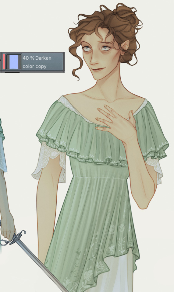
Note
you have such a cool style! i love your dulcinea, you really bring out the weakness/danger combination of her character
if you don't mind sharing and have the time, would you mind explaining how you did the colored lineart for it? i've tried it several times and can never get the colors to look good
thank you! that dulcie was heavily inspired by young carol kane so i get what you mean about that combo, she looks a bit sickly and deer-like in that photoset but so commanding.
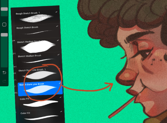
to get the coloured lineart look i just set it to overlay, but i attached a more detailed step-by-step under the cut:
i did the lineart with the custom brush 'daub fine pencil hard', but for most drawings i use the lighter pencil tool in manga studio 5
i copy and paste the layer, set to gaussian blur to make it look softer (5.00, but adjust to what feels right) and add the colour base.
set both lineart layers to overlay, then i copy and paste the sketch, set it to soft light and select clip at layer below
after painting this is what it looks like with the above steps, the overlayed lineart absorbs the colour but it still looks dull
i merge the layers, copy + paste it and choose the sunset gradient map, set to soft light, lower it to somewhere between 15-25% opacity, clip at layer below, merge the two layers, render the lace and embroidery
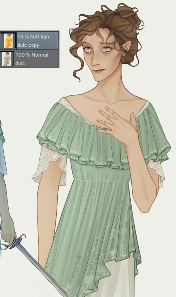
slap some blue on top and set to darken
6 notes
·
View notes
Text
Week 10
This whole course we have been learning how to create physical sketches, physical sketch models and digital models. This has provided many different opportunities to learn new skills and improve on old skills that can be used for future course as well as during full time work.
The first few week of the course, we learnt how to use engineering tools to create a variety of different types of sketches such as orthogonal, auxiliary and perspective sketches. I have quite a bit of experience sketching orthographic views in high school so relearning how to do them was not that hard. However, I definitely think I have improved from my high school days as I have learnt how to format my page better, add additional relevant information to the title block and used fineliners with different line weights to create a crisp sketch. Auxiliary views took a bit of time to wrap my head around, but once I understood its purpose and how it was drawn, it was quite easy to sketch. These first few weeks for the first assessment were relatively fun and interesting. Next time I will try to improve on my speed since the drawings did take some time but also would like to make less mistakes when I create the sketch such as misplaced lines and measurements. This can be remedied through continuing the practice doing more and more sketches.
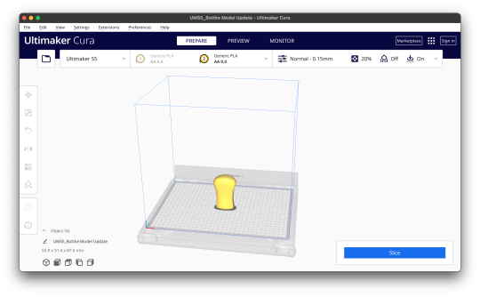
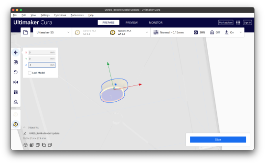
For the next assessment we learnt how to do create perspective sketches, free hand sketches and digital rendering. Perspective drawings were definitely much harder than learning auxiliary sketches but I slowly got the hang of it. It was challenging to figure out how to draw some of the detailed areas of different objects accurately. But the more perspective sketches I did, the easier it became and the quicker I could do them. We also learnt how to free hand sketched different designs of a perfume bottle and use many drawing techniques to create something realistic. I was never really good at drawing and the decent drawings I create take me a long time. However some of these drawing techniques were able to assist me to make cleaner sketches. However I struggled quite a bit when creating a perspective sketch for the perfume bottle since there was so much more detail compared to the previous perspective sketches I made. It took a while but in the end I was satisfied with my result. Digital rendering was quite intimidating to me because I have virtually never used photoshop before. Because of this, I chose bottles that looked similar in size and didn’t have super complex shapes. In the end I was pretty happy with how it turned out. Overall this assessment was definitely a step up for me but I think I was able to manage relatively well. I enjoyed the perspective sketching but not so much the freehand sketches and digital renders.
For the final few weeks we learnt to create physical models and use a 3 dimensional modelling program to create models and clean up digital scans. Creating the physical model wasn’t too hard. Because I love creating craft at home and have had 5 years of experience in wood working at school, I didn’t find it too difficult to create a foam model. The only setback was that I had very little experience with foam so I was definitely a lot more cautious than usual and took a lot more time and care. This was worth it because I’m quite pleased with my end result. However, when I began using 3ds max it was quite a roller coaster. I have little to no experience using autodesk apps and 3ds max was a completely new experience. I followed the videos for tutorials and it took a bit of time to understand but was not super difficult. But when I tried making my own model in the program, I was not sure where to start. I found it hard to think of what functions I should use to make any object. I eventually figure out how to do it but it definitely wasn’t the best model and quite a painful experience. We then learnt how to prepare a 3d scan in rhino and 3ds max so that it can later be 3d printed. Considering my last encounter with 3ds max I was quite intimidated but in the end I didn’t find it that difficult. It was honestly quite interesting how we could modify a scan of a physical model digitally and then create digital iterations to be later 3d printed so we could have physical iterations. After that we learnt how to put it into the 3d printing software to be printed at any time. These final few weeks I found were equally as challenging as the previous three. This assessment had its ups and downs but overall was helpful for future projects.
All in all, this course has definitely been helpful and useful. Not everything was that enjoyable but most things were definitely informative and helpful. It was definitely useful to look at my peer’s work to share our knowledge and advise with each other to improve on both our strengths and weaknesses. I look for to be using these skills I’ve picked up sometime in the future.
6 notes
·
View notes
Note
HEY SHAWTY 😏😏!!!! hehe fr hi bby (@⁀ᗢ⁀@) !! Umm ok request time! Can I pretty please request tamaki and shinsou Hc's with a very... positive/sunny fem!reader? Maybe kind of girly/rlly feminine :) I'm not sure if this is specific enough HAHHA UH OF NOT THAT THEN JUST A FEM READER who's really kind and can give it but gets really flustered/embarassed when anything is returned (≧﹏≦っ);; thanks... sorry if this was weird ilysm!
(Sorry I kinda gave u two options, just go w whichever u feel more into writing!!)
headcanon corner - girly and flirty reader
reader type female (she/her + feminine terms used)
characters included tamaki amajiki + hitoshi shinsou
tamaki amajiki
you’re too much for him. in a way he can never get enough of. in fact, he craves it. just one chiming giggle from you makes his cheeks and ears flush warmly, his palms dampen with sweat, and heart patter like heavy rain hitting the sidewalk. you make him feel warm all over.
when tamaki is nervous and needs a method of grounding himself, he’ll sometimes train his stare at your earrings, noting every precious detail of them as he takes careful breaths.
his favorites tend to be the dangly pairs or anything that sparkles and twinkles (like your eyes when you smile at him).
your rings or bracelets end up being something for him to fiddle with whenever he’s holding your hand in public and feeling a bit anxious or restless.
he thinks your frequent jewelry wearing is not only adorable, but also adds to and enhances your alluring beauty. there are times where he’ll simply sift through your jewelry box and ask you about every little piece.
tamaki loves to buy you cute accessories and such. he’ll see something in the store and think “oh, she’d like that.” (she would look nice in that) to himself. next thing he knows, he’s shyly handing you whatever it is.
the sweet taste of your lip gloss and light scent of your perfume are two things tamaki’s brain has begun to associate with his adoration and infatuation for you. seriously, he doesn’t even have to be nipping at your lips or cuddling close for them to have effect; the mere thought is enough to make him perk up like a jittery excited bunny.
and your words. even before dating, you were always singing him praises and giving him all kinds of affection. he didn’t know how to handle it in the slightest and sometimes he still doesn’t...
tamaki’s own flirting surprises you both. usually, it’s by pure accident because if he tries too hard about it, he’ll more than likely flounder under the pressure.
without even thinking, he called you his pretty girl once. he nervously watched for your reaction and was very surprised to see that you looked even more flustered than he felt! you were speechless, doe eyes blinking at him before finally replying with a hesitant fluttering kiss to his cheek.
it was then tamaki discovered that he had significant impact on you as well. in that way. he couldn’t even lie, it made him feel good inside. he still refuses to force any flirtiness out of himself, simply enjoying the moment and letting everything go naturally.
he’s prone to blurting out blunt compliments and unlike you, he barely even gets embarrassed about it now. your reaction is truly the cutest thing to him; watching you go from your bouncy self to adorably ruffled just from his actions alone. it’s actually a real boost to his confidence...
you and tamaki both share a gentle and fragile disposition when it comes to intimacy, hearts racing and faces heating up at the first stroke of tenderness from the other.
hitoshi shinsou
the thing is, hitoshi considers himself to be a fairly composed and confident person. and then there’s you; your shining smile, bubbly laugh, and lovely outfits... he’ll start to wobble a bit, but he will be damned if he lets anyone, especially you, notice.
you took that as a bit of a fun challenge, of course. flirting with him freely and absolutely relishing in how caught off guard he always looked.
that hasn’t changed now that you’re finally together.
the two of you go back and forth; you flash him a winning smile, running a hand through his thick tufts of hair, and he’ll response with a fervent kiss planted on your painted lips as revenge for effortlessly rendering his cheeks a vivid cherry red. that’ll quickly wipe the victorious look off your face...
he always jumps at the chance to watch you model new clothes and is beyond happy to give you an honest opinion for every article shown to him. yes, you two have mini fashion shows. he’s showering you in sweet words, unfairly smooth about it, making you flush with embarrassment each and every time.
you giggling away while twirling around for him, skirt or dress swishing tauntingly at your upper thighs? for hitoshi, nothing beats that.
“you look good, princess.”
he’s smitten for you. you’re the only thing that can never fail to make his face light up. well, besides certain furry friends, that is.
speaking of, i’ll go ahead and end this by saying hitoshi would probably love to see you in cat ears or something similar...
#bnha imagines#bnha x y/n#bnha requests#tamaki amajiki x y/n#tamaki amajiki x reader#tamaki amajiki x you#tamaki headcanons#tamaki fluff#hitoshi shinsou x reader#hitoshi shinsou x you#hitoshi shinsou x y/n#shinsou headcanons#shinsou fluff
188 notes
·
View notes
Note
I'm so deeply fascinated and joyful about your Book of the Sun drawings, both from an audience standpoint and an artistic one. It's so distinct and wonderful, and there's so much detail and nuance to the texture and the line weight right alongside the intuitive concept of "gold lines on black." It's so great, I feel like I'm browsing an ancient grimoire. Some of my favorite art anywhere, period.
Do you have any tricks or insights you've learned artistically throughout the last 24 pages? You mention loving the problem solving aspect of art, and I'm so intrigued by that.
Thank you so much! Always glad to hear these pages inspire and fascinate other people. I wish I was better at sharing the lore behind them, but part of me always goes “nah you will just spoil things, don’t even know where to start” (what things? why? wouldn’t they just make people more interested?) and another part goes “the way you write this doesn’t sound 100% perfect yet, do not share unless it is perfect” (why must it be perfect? I have no deadline, I can always go back and explain more, too). I started working on these pages in November 2019, which was by all means an incredibly tumultous month, so it’s now been 18 months in which I did these 24 artworks, besides the usual progress in skill I can see with my normal art, I can also clearly see it in the BotS pages. Older pages tend to be muddy. And not focused. One page, the 4th for example is to this day the one I dislike the most. I drew it while I was stressed as I had to leave for a couple days and really wanted to get it finished - which was a mistake, I should have taken my time to fix what annoyed me. Another page, 9, suffers from a similar problem but in a different way. I finally figured out something plot related and desperately wanted to draw a page for it, but I didn’t know yet fully how to translate it - didn’t stop me, should have stopped me tho. 4 on the left, 9 on the right here. Now looking at them again I do see positive things and stuff I did well, though. It’s important to keep your eyes fresh. If I work on a picture well until 1 AM and then actually get it finished, I’d rather just close photoshop nowadays and sleep instead of getting overexcited. Goes for non-BotS work too. Goes for commissions. Anything. I’d rather sleep another night instead of handing in something I am not feeling all too well with.

Later and younger pages tend to be cleaner in a way. Something thing to focus on, ornaments are kept small and not distracting with a hundred lines. As example here pages 19 and 20 (below). One big thing to notice clear negative space which is only defined by this slight colour jitter (I’ve got several brushes to add those now, all slightly different). The upper two pages have these blocks of small ornaments and lines for no reason that make them difficult to look at and concentrate, in my eyes. Especially 4 suffers a lot from it. I could have grouped them up, I could have not added that black splotch around Alazar’s muzzle, I could I could I could. Same goes for the unnecessary golden lines outside of the circle in 10. The rays, yes. The rest? Hm.

And here’s something more, which took me quite a bit to actually get fully - using tiny different changes in hue and value without actually rendering. Negative example is 5, once again a page drawn a year ago, the other two younger. I didn’t know what I was doing back then, it was the first page I wanted to experiment with bigger blocks of grey, and I had no idea what I was doing. I like the black and greys in the clouds, how dense they look and oppressing, but it was unnecessarily confusing. There’s too much going on in them compared to the bottom. I feel like it keeps pulling the view up, where nothing is, essentially. Drastic example I didn’t circle are Judrig’s arms in 21, I tried really hard to actually make them black (for lore related reasons) but the picture kept collapsing on itself, something about it got muddied too hard and made it difficult to focus - until a friend said that, yes, for lore reasons her arms should be black, but if you make her arms red, a colour you already used a lot in previous pages, you can use the black or dark greys for bigger areas and accents without sacrificing readability. Which was good. And I don’t know why I didn’t think of it.

Also I keep saying this in bad tones, “I dislike this page”, “negative example”, but I honestly do not hate any page. I’m happy with them, I’m happy with the progress I can see in them and it makes me excited for the next ones to come. I told myself I will not redraw any of these pages because if I start, I will never stop fixing mistakes no one would care about with a project that is already going way out of hand - but in a way I am proud of. There’s also older pages I really really adore, such as 8, or 6. In lore, the book is drawn and worked on by many multiple vampires, over multiple centuries. It feels a bit like an excuse sometimes, but it does help to explain the slight changes that come with me improving in general. At least to myself.
#long post#ask#sorry I really started to ramble here a bit#but thank you for the ask#anonymous#Anonymous
56 notes
·
View notes