#I took some screenshots for ref reasons
Explore tagged Tumblr posts
Text
Pink lev ball Crystal is so real and canon btw
#earlier today I was playing pn1 ( on a new save to get the achievements I missed ) and I was doing Millas dance party#and Crystals lev ball was a purple pink color#it did change color during the race segment though ( forgot what color exactly )#I took some screenshots for ref reasons#I’ll probably post em tomorrow#cosmic chatz#psychonauts#crystal flowers snagrash
12 notes
·
View notes
Text
How I draw: Use of references
Second response to a few art questions from @johnny-and-clyde let’s gooo!
I love references! Like most artists I did have that phase where I thought I was better than everyone because I didn’t use ‘em, but lemme tell ya- starting to use references took my art from this
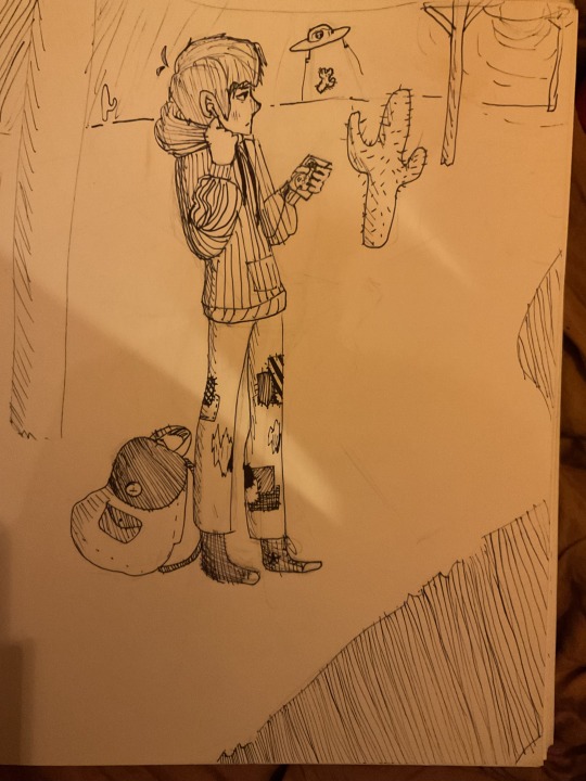
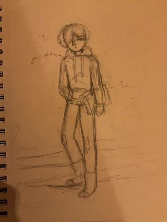
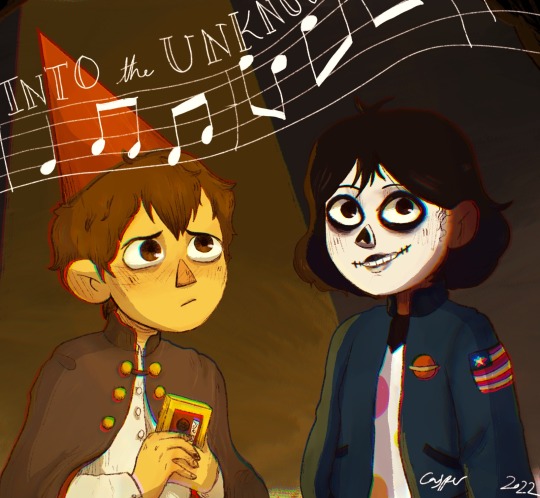

(Art from 2021-2022) To some better lookin stuff, and eventually to the stuff y’all know me for now lol!
Nowadays I do use references for almost every drawing, but the amount that I reference them varies Occasionally it’s pretty direct, like my drawing of Curly Shepard, in which I HEAVILY referenced a photo of myself for the pose and fit:

(I don’t dress like this on a daily basis the pic was taken at a Twilight-themed school dance ok) (I’m not cool enough to wear that many necklaces w/o a good reason 😔)
In drawings where I directly reference photos that don’t belong to me, I put the reference in the post under the drawing, so folks know I didn’t plan the concepts/compositions on my own. But usually I don’t directly reference things…
Usually I use a bunch of different references for a bunch of different things. This is for two purposes:
1- Making sure everything stays vaguely anatomically decent, that the fabric folds in the right places, that the perspective works, that the lighting looks good, etc…especially in tricker/unusual poses. Um I’m also pretty sure that I might have some form of aphantasia, or at least a really weak “mind’s eye”, which is probably why I struggle with composition/planning in art and why I do so much better with references
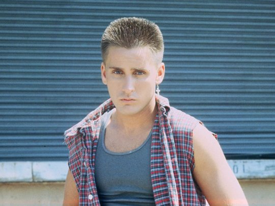
Like here, when I used this pic of Emilio Estevez’s character in Repo Man to make sure I was getting Mark Jennings’s face shape right- just glanced at it off to the side and (more or less) drew what I saw

Or here, in this pic of Steve Randle- I didn’t know how to even start to draw the angle I needed, so I took a pic of myself and used that

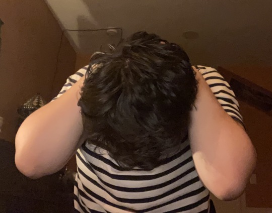
2- Capturing the likeness of a person. For most new characters I draw, I take a bunch of screenshots and roughly redraw them and occasionally trace them to build muscle memory, all while taking little notes about unique features they have. Then, once I have a feel for them, and enough odd-looking line drawings to look like a crazy stalker, I’m ready to start actually drawing post-able art yk?
Here’s an example from 2023 where I studied Nancy Wheeler. Final product ain’t fantastic, but this was two-school-years ago so it’s basically ancient in my book lol

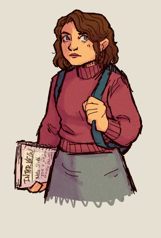
I do still use refs often in the finals, but less directly and with less adherence
But I will say, for rougher/cartoonier drawings I don’t use as many refs. Like, I didn’t use references for these (although I did pose in the mirror to get the arm right in the self-portrait lol) :

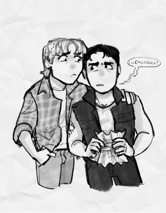
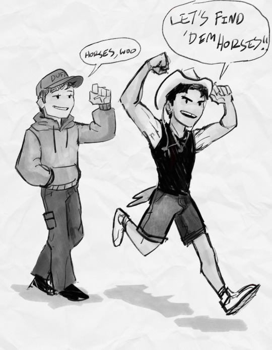

Lastly, I also find it’s nice to have a mirror/window nearby to look at my own anatomy and reference that, although that’s mainly just useful for characters who look semi-like me/have similar builds to me lol. Like I can reference myself for drawing Steve Randle or Johnny Cade (at least his face lol), but not so much for drawing like…Dally or Evie or Marcia. Still, it’s useful, especially when I can’t find a specific reference I want, yk?
Anyhow, those are the main ways I utilize references in art! Hope some of this was helpful :))
#ask#how i draw#digital art#art tips#rambling#long post#will answer the hands question tomorrow probably?? It depends lol
33 notes
·
View notes
Text
Been playing a lot of minecraft with my friends and let me tell you things have really been heating up.
Between two mysterious God-like entities who are only known as "Fire" and "Ice", hints at other Gods who have been killed in the past and NINE Ancient Cities all within 2000 blocks of each other its been an adventure.
Then to make things weirder the Gods have apparently chosen two people over the others and since then those two people have been changing. One person is becominf burned and the other (me) was also the first to show any changes at all starting with all color fading from them before they started to turn blue and frostbitten. Now other people are starting to change, picking sides and devoting their loyalty to the God's they picked.
But despite the sides we all still work together to piece together the story of what happened between the Gods. Why did Fire and Ice betray each other? Why did Fire kill the Earth God? Was it the same reason that Ice killed Water? Are there other Gods?
And who was it that simply said "SOON" in the chat and has been leaving messages behind? Whoever it is, Ice and Fire seem freaked.
Anyways, this was a long drawn out way to say, have my art! Now, unfortunately I dont have the references anymore but I do have some of the names saved so I'll do my best to credit them!
Start and more recent pictures of the two chosens. Myself and @chaoticentitycc ! This has since changed but you get the idea. This reference was from K_MB001 (I have no idea where they posted it some of these references are as old as my phone so they have since been lost to time).

The reference I had saved for this one wasn't signed so if anybody can tell me who did it I would appreciate it but I am shit at saving the refs after I'm done with them so it is also lost.
But this is Ice and Fire or at least how I picture them! But everybody in the server has differen ideas about their looks.

This ref came from Albanenechi on Tiktok! Its me again because I can~

These next two use references from Mellon_Soup on tiktok! I have a lot of them saved on my phone for a bunch of fandom art.


This is another old reference with no signature and while I loved it at the time I have since discovered I hate it so we're gonna move on XD

Now these next three are all part of a sequence of events that took place the other day on the server. The original of one reference was from one of the beautifully drawn Shadowpeach Bio Family Au by Kyri45 but I could not for the life of me get it to work. Thankfully @stellawolfe30 saved the day and made me one.
The other two are from Pokemon screenshots that I mashed together for what I needed. Anyways well go in the order of events. Pokemon - Stella - Pokemon. Warning the piece under the continue line has some mild gore but its not too bad.
I HOPE YOU ALL ENJOY!


13 notes
·
View notes
Text
Duckz Rule masterlist: (ordered oldest to most recent)
Hazbin Hotel doodles
how to draw Alastor
JAMBALAYA!!!
Cannibal!!
alastor likes.. ducks??
sticker page #1
nope .
again, nope
stickers page #2
Cutesy Alastor
Christmas Radioapple
ummmmmm ok
Nifty doodle page
Christmas-Lucifer
after work Doodle #1
Bambi, that you? aka my most popular for some reason
I had to buy him a happy meal at 10:30 -.-
Box.. I mean Vox
Alastor being a deer #1
I seriously still don't know
Work doods #1
Work doods #2
Alastor ref page
is that a falcon? again??
sticker page #3
Vox is...still... the hottest
Zestial teaches wittle Al how to use his magic awwww
sticker page #4
Alastor doodle with Eaglebones
It's world radio day!
"I hope in separate boats"
Habin Hotel Fullcolor art
2p Alastor #1
alastor #1
Vox is mean >:(
thanksgiving
Testing coloring
Human alastor
strawberry p-i-m-p
header
I don't like this one
He looks like my bosssss
Al and 2p Al
New Year's yessssssss
He's so silly
Voxxy
Miss Bomb
Vox and Al should be friends
soooo excited for season 2!!
Holy duck I sucked LOLZ
Valentine's Day- Alastor
Love my ace boi!! (Every fullcolorart onward is tagged with "but maaaax")
Alastor #3
Valentine's Day ♠️♥️
Hazbin Hotel Comics
scrapped comic page 1
scrapped comic page 2
Chick dayz part 1
chick dayz part 2
shopping
Lyme's awareness 0.o
Rings popped
Dreams=shattered (radiosilence)
is that a--- FALCON? *gasp*
ice skating (radioapple)
Nifty and Alastor shenanigans
Rosie meets Vox
DesPAcito VoxVal
Candy---? (radioapple)
Alastor canNOT deal with hot
missed it by that much...
Mountain dew rockz 🤟
Random comic set #1
Other fandoms doodles
Invader Zim/Hazbin
Alastor>Bill Cipher
Blackhat (villanous)
First time I watched TADC
Me and my Siblingssss
Bro's cute alastor
my sister drew Cherrisnake reeeeeeeeee *dies*
My brother's art is ON TOP
My bro slays at art
so does my sis!!
Random
ship poll 0.0
is that a falcon??
alastor has a tail-?
Random OC
Who's hottest?
Random Hazbin screenshot
Hell's greatest screencap
Clay Art #1
BEANZYYY
Best writer
clay art #2 Fizzy and Ozzy
It's been 7 years! (months)
Merch rant #1 ❤️
Would radiosnake be as popular as radioapple
Parallels- radioapple
AQUABATS (THIS is the only one you can visit, Beanzy)
Hottest poll
Art trade #1
Holy Heck that took forever 0_0.
Peeps giving me ducks/asks!
Thanks Beanzbones
You're so sweet Anon 🥺
How I draw Alastor
I think I improved, Ya'll
My car 👇 My duck 👇.


And that's it ¯\_(ツ)_/¯
#alastor#hazbin hotel#hazbin hotel fanart#hazbin art#my art#vox#hazbin hotel comic#artists on tumblr#masterpost
14 notes
·
View notes
Note
okay i am very new here, so i need a through introduction to your mcs! like eve for example, pls post his whole biography o(╥﹏╥)o
fr tho, tell me anything and everything :D
TOOK SO DAMN LONG SINCE I WANTED TO DRAW A STEP ONE REF OF EVE BUT ITS GONNA TAKE A MINUTE so here are the sketches,,, Anyways- gonna introduce the main two mcs/ocs you'll see here: Eve Cortez Williams and Aaliyah Dubious
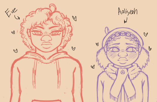
(dont mind my ipad scribbles on the screenshot iofqiowogi) Lemme put this under a readmore actually so yall dont get slammed with a long ass post:
Starting with Eve:
He's my Tamarack MC, but I figured since uh. all my art that was a given
He has a strained relationship with Qiu in step 1 but they become besties by step 2 and by step 3, they are like family to each other. If no one got Eve, Eve knows Qiu got them, amen 🙏
He comes out as transmasc by step 2, and by step 3 he gets top surgery and starts taking testosterone and firmly identifies as a butch lesbian
He's from the southern part of Miami, Florida. He's Golden Grove's residential florida man
He practices martial arts religiously, he's a big fan of Goku and Dragonball in general so he wants to be like his idol
His story deviates a bit from the OL2 generic mc story, he did have a dad! Opal and his dad wanted a kid but they both didn't want to get married and since the two of them were best friends, they decided to have a kid together (or well two but we'll talk about that later)
What's important to note from above is that his dad isn't around anymore because his father passed away a few months ago due to a car accident and Eve was hospitalized as a result
So by the time he's at Golden Grove, he's in anger stages of his grief and he doesn't want to be bothered. Which sucks cause hes neighbors with the two loudest kids on the block
Doesn't help he's a ESL speaker (English as a Second Language) and Golden Grove's population is majorly white so he has even harder of a time adjusting to it
He gets into fights in step 1... a Lot. Someone will look at him funny and they'll get punched in the face
He does adjust but he still doesn't like Golden Grove by step 3 but funnily enough, he moves away at the end of step 3 for treatment but moves back in step 4, crazy how that shit works huh
He has two emotional support bunnies; Bulma and Chi-Chi! He gets them in step 2, Qiu and Eve bond over them LMFAO
As for Aaliyah:
She's my Qiu MC, to the shocker of no one. Tamarack is also her best friend <3
Aaliyah is from New Orleans, Louisiana! She's full blooded Haitian and she has family in Haiti
She's also transfem! She passes for cis in step 1 thanks to hormone blockers and some makeup and then starts taking estrogen in step 2 and onwards
Her being black and transfemme is integral to her character and how she navigates around Golden Grove, she doesn't tell anyone she's trans until near the end of step 1. By step 3, the girl gang and Qiu knows shes trans
^^ That's because she had a very negative experience coming out to her community who previously loved her but flipped on her just as fast
So moving to Golden Grove was supposed to be a fresh start for her as herself but by that point she feels like she has to keep up her "cis-sona" lest she gets bullied again
She still gets bullied for other reasons in step 2 though (being a pretty black girl and the one person who has a crush on her is the most popular kid in school... its rough! 😭)
By step 4 though she is proud to call herself trans and will let people know!
She lovessss animals! And the animals love her back! She feeds them all the time and keeps animal food on her for that purpose when she goes to the park to read by herself, she got a flock of crows and stray cats that like to follow her
She has a cat named Kiki!!! Kiki loves everyone except Qiu though, Aaliyah doesnt know that though-
I hope that was enough of a info-dump! If anyone has anymore questions please ask i have so much lore please-
#candy girl answers#our life 2#our life: now and forever#our life mc#aaliyah dubois#eve cortez williams
20 notes
·
View notes
Text
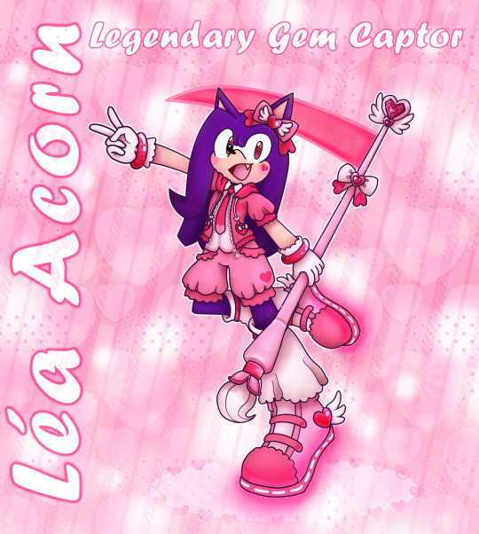
NEW ART !? It's more likely than you think !
I've redesigned Léa's Magical form again, but this time around I've actually colored (& shaded) the whole thing ; I'll share more of my process under the read more.
Feel free to reblog this (but it's ok if you don't) !
(Léa use they/them pronouns and are agender)
So this is Léa's old Magical form, or at least the last art of it I had completed before the 2024 version :

I was going for a fancy, somewhat ouji inspired outfit that'd still be comfortable to wear, as Léa Acorn's style is all about being cute yet comfy. Their body saw no change from their regular form.
I think I was already not fully satisfied with this design by the end of 2021, but as time went on my list of grievances kept growing longer. I started to dislike how much of the design was pure white ; it's not really something I like on Magical Girl designs but for some reason I included it here, probably because I was trying to branch out and take inspiration from series like Lolirock & Pretty Cure for once. I also ended up finding the jacket kinda dumb, or at least the way it fit on top of the shirt seemed off. I had no idea how to color the shoes when I drew this design and it was bugging me more and more over time.
But while I fell out of love with the outfit, my main grievance was the staff-paintbrush-scythe hybrid, which was not only drawn poorly but also pretty boring. I couldn't help but try to redesign it just a month or two after completing the new ref, but I didn't want to redo the whole thing as back then I still made my refs in Microsoft Publisher with the help of Photofiltre, which was a slow and painful process I dreaded.
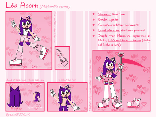
(Léa's Mobian forms 2021 ref, for... Reference)
So between my laziness, art block and the general state of my life I wasn't able to complete any new design before this year (2024). Let's break down this new design, shall we ?
This was my main inspo board this time around :
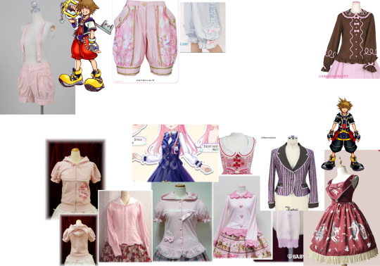
As you can see I kept the lolita/ouji influence but added some streetwear elements to it. I felt like the previous design didn't do a great job showcasing the mix of preppy prince & comfy fashion Léa are supposed to encapsulate, so I brought up pictures of a character that had only influenced their story and personality so far : Sora from Kingdom Hearts !
It's not something I bring up a lot anymore, but I used to be well-versed in Kingdom Hearts lore and Léa's story was heavily influenced by it ; they were even supposed to fight with a keyblade at one point ! Design-wise, I borrowed the length of Sora's shorts/jumpsuit for Léa's bloomers, and replaced their cropped suit jacket by a short-sleeved hoodie (which also mirrors some of their Sonic.exe world designs). I mixed these elements with lolita items for a cuter look.
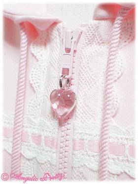

Léa share my love of ties, so I've replaced their bow tie by a regular one ; it's somewhat short to showcase their shirt, which is a revamped version of the old one.
For the legwear I took inspiration from some long flowy legwarmers I saw in a few fairy kei coords, and also the shoes from this CocoPPaDolls screenshot I've taken years ago, back when the game was still up :
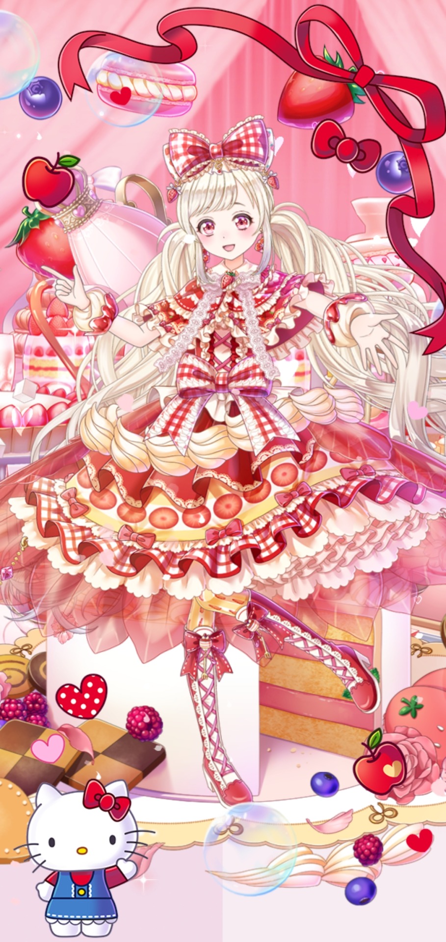
(I miss this game every day)
And of course I needed the shoes to be velcro LED shoes, because that's just the Léa Acorn way.
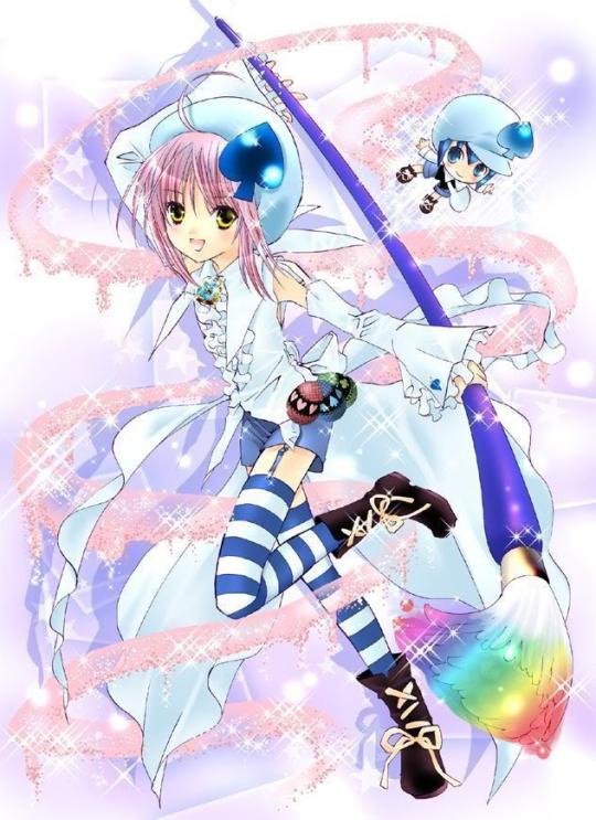
The rounded pink heart-shaped gems throughout the outfit were somewhat inspired by Amulet Heart from Shugo Chara.
Talking about gems, time to talk about the staff ! It was inspired by Amulet Spade's paintbrush, some Lolirock items, and a bunch of bootleg Magical Girl wands. Why reference bootleg wands, you might ask ? Well, since they're already off compared to the real deals, they allow me to not design wands that are too similar to ones from well-known properties.
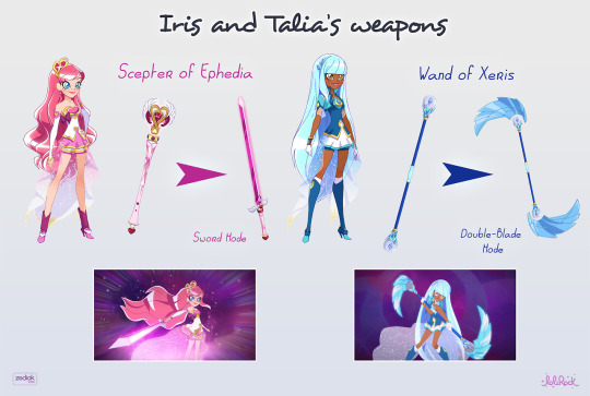
I've been meaning to make Léa's eyes pink in their magical form for years but didn't actually follow through for a while. I ended up making their eyes brownish pink to not make their eyes too light, as I felt like it'd remove some of their charm (I already felt guilty for not keeping their eyes brown in this form). And of course, I had to bedazzle their eyes to hell and back.
Actually all this shininess and sparkling was inspired by the original drawing of Léa's Magical Form drawn all the way back in 2017 and redrawn in 2018 :
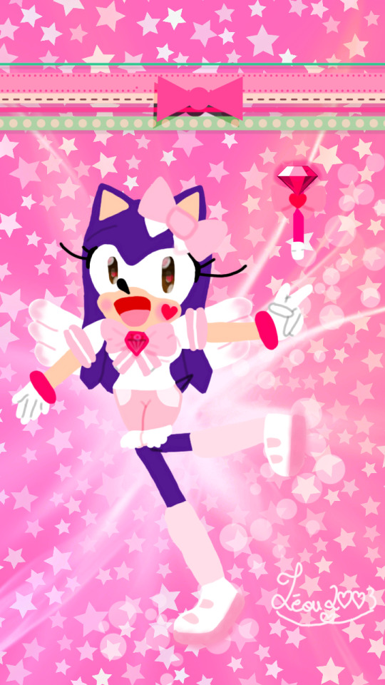

For some reason I took a lot of inspiration from Sailor Moon for these despite Léa's role being inspired by Card Captor Sakura (and Kingdom Hearts). Also Wish Gems used to be called "Magical Chaos Emeralds" and look just like the regular Chaos Emeralds, which was kinda dumb. But I loved the energy of these pieces so I've tried to recapture the "sparkly pink magical transformation void" vibes they had ; I hope I've succeeded on that front.
Anyway, thank you for reading this all the way through ! I hope this was an interesting read, somewhat.
#my berry own art#sth#sonic oc#magical transformation#magical girl#magical boy#magical enby#mobian oc#mobian#Léa Acorn#sonic fan character#kawaii#artists on tumblr#art#digital art#sonic fc#sonic original character#oc redesign#scythe
17 notes
·
View notes
Text
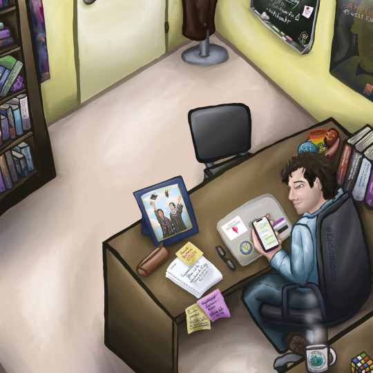
Bridgewater fanart again! (Jeremy Bradshaw in his office)
This is my biggest biggest fanart I’ve ever done so far and let me just say that I’m super proud of it!! There are a lot of details once again 👀 (kudos if you can see the references!)
This is a fanart totally dedicated to @thelaurenshippen , thank you so much for your support on my fanarts, it truly means the world to me, and it isn’t much but it is my way to thank you, as you said that you had a new headcanon as you reblogged my Jeremy sleeping fanart “also: new headcanon I now have vipin started TAing for Jeremy when he was still in undergrad so Jeremy also has one photo of the two of them at Vipin's graduation in his office” so I had to do this: Jeremy’s office where there is a picture of the two at Vipin’s graduation!
Once again as the details are detailing and the headcanon is headcanoning, I’m putting some further explanation after the read more! (And also I’ll tell the refs if you don’t want to search for too long 😭)
It took me 19 hours (I’m slow don’t judge me too much and this is not counting the frame on Jeremy’s desk 😭) so let me just say that a LOT of thoughts went through that little (big?) piece.
First of all as you saw, there is Vipin’s graduation pic on Jeremy’s desk, so here’s a further explanation of it under the post of the art itself (in case you want to see it in a bigger way too)
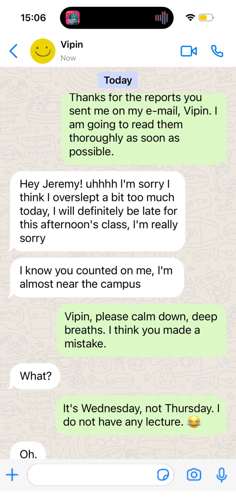
Then, for the phone’s screen, I did a fake conversation between Vipin and Jeremy which I think totally happened at some point. And here is the real screenshot of it because I don’t think you can see well what is written on the fanart unfortunately. (I also put a little reference to the album “Feelings and Such” by Louden Swain in it which is what Jeremy is supposed to listen to, I gotta say the main reason is because it’s my fave album and group but I would totally see Jeremy listening to that kind of music from time to time, I see him listening to “There’s the Rub” from that album)
Then comes his computer: it is truly the logo of the Bridgewater State University, the sticker from the real merch of the Bridgewater podcast, and the ace flag (because Jeremy Bradshaw being on the ace spec soothes my soul)! It’s my headcanon about Jeremy’s computer, it’s the third time I’ve drawn his pc, and the stickers stay the same no matter what and it’ll stay this way jsksksk
There is little basket of stim toys on his desk too and that’s totally my headcanon: I see Jeremy as a really caring professor, and to me he would have it in his office for the stressed out students coming to see him so they can feel better, or at least his students know he has some to lend! (And I’m nd, I would love to have a professor like that 😭) (thanks for a moot on Twitter for the slinky idea!!)
For the sticky notes on the desk: the one on the papers states “read before 03/24” which is the date the last episode of S2 aired, the pink one “proofread Lauren’s thesis defense date 08/06” Lauren is a direct nod to Lauren Shippen, and the date corresponds to the first airing date of the two first eps of S1 of Bridgewater.
The sticky note it “printer password BSU1976JyBw PS: Vipin I do have a limited amount of copies!” because I thought that printers in the uni might have password deferring from each profs (at least it was like this in my French highschool — as a reminder, I’m from France so it’s really me trying to find stuff on the internet), so BSU = Bridgewater State University, 1976 being Jeremy’s birth year (at least I tried to calculate it and it was 1976? Hopefully I’m right 😭✋ as the show aired in 2021 I tried to assume that 2021 was also the date in the podcast and as Jeremy is 45 during S1 welp), and JyBw is just the first and last letter of his first and last name. Comes my headcanon: at some point Jeremy couldn’t print anything because Vipin had printed too many stuff, hence the little reminder because Jeremy doesn’t want to beg to have more copies 😭
The research paper Jeremy has to read before 03/24 has been written by a certain “J.Novak”! (Totally a Supernatural reference) And when it comes to SPN refs, it’s much more subtle, but I did the same soles for Jeremy’s shoes as Castiel in the episode The End of spn (because the shoes are quite famous for being also identical to the one Dean wears so it was funny and on a funfact Jeremy’s legs and feet posture is bc I saw Misha sit like this so I thought it was fun (I also sit like that so it made me happy))
Behind Jeremy there’s an undone Rubik’s Cube, because I totally see it as Jeremy’s very own stim toy but the catch is that he doesn’t know how to solve it 😭 (thanks another moot for the idea @stillwinchester ily!!).
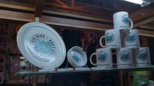
There’s also a mug, because our man needs to stay concentrated (tea? coffee? Your thoughts, to me Jeremy is more of a tea guy), this is a reference to the X-Files! Big Blue is txf’s Nessie, and the mug is a literal copy of the “real” merch mug you can see in “Quagmire” (3x22 of the X-Files)
For the posters on the walls, the one behind the bookshelves was the main art of an exhibition which occurred “Supernatural America: The Paranormal in American Art” and I’m persuaded that Jeremy would have gone to see that! And he would have loved to keep something from it! (But he ended up having to put his shelf in front of it because he had to put his books somewhere and maybe it creeped out his colleagues and students, here’s a picture of the original painting)

Agatha Wojciechowsky (American, born Germany, 1896–1986), and Spirits. Untitled, 1963. Watercolor and crayon on paper. 11 3/4 × 8 7/8 in. Courtesy the collection of Steven Day, New York, NY. Photo: Steven Day
And for the one near his desk, it is an old poster from the American Folk Art Museum, and to me Jeremy would totally be a museum guy, it’s very “academic” after all, plus he would be interested into it as it’s more around people and self taught people and so on, as he is very interested into anthropology, it goes well with the whole vibe.
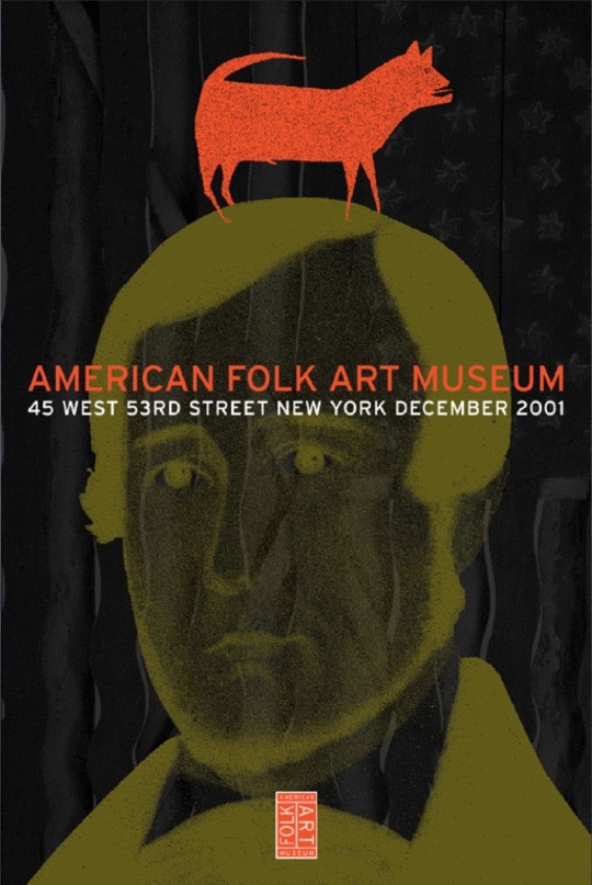
https://pirtledesign.com/portfolio/american-folk-art-museum/
For the blackboard, the titles are basically what he is teaching in his lecture in S1 EP01 so to me it would be his way to see more what he has to work on for his students (and I think he fidgets his chalks in his lecture because in the same ep as he speaks you can truly hear a lot of chalk sounds which weren’t due to him writing so I understood it that way?), and there’s a little magnet with a “buy cat food!” because headcanon to me but Jeremy owns a cat (a black cat you can see him on his lockscreen on my drawing of Jeremy sleeping) but as he spends a lot of the time at the BSU, I think he would put reminders just in case 😭 (and there’s a little flower drawing made by Vipin! to me he would doodle little stuff from time to time with little smileys to brighten up Jeremy’s day a little)
Then in the bookshelves you can see a little purple owl! It’s to me, an amethyst carved one, as Jeremy had had his esoteric era when he was younger (it was said in S2 that he tried to be Wiccan) he must still have some stone knowledge and as amethyst is supposed to have soothing and good vibes properties, he might have taken this although he doesn’t believe in it anymore, and of course he picked it because it was an owl because it’s better now to laugh about the owl situation 😭
Lastly: all the books are real books! It took me some time but all of these exist, it’s mainly anthropology book, faculty/uni book, research stuff, and there are two books about the Bridgewater triangle! I tried to keep it around Jeremy’s field of course so it’s the occult, witchcraft, the Salem trials, UFOs, beliefs and all!
Thank you so much if you’ve read this far and I’m very grateful for all your support, it truly means the world to me and Bridgewater is very very close and dear to my heart, lots of love to you all! And thanks for bearing with me through my ideas and headcanons 💜🫶
#bridgewater fanart#bridgewater podcast#Jeremy Bradshaw#vipin khurana#jeremy bradshaw fanart#Bridgewater#fanart#artwork#digital art#it took me way too long#I love them so much#headcanons#hcs#Misha Collins fanart#supernatural reference#the x files reference#details are detailing#too many details#bridgies#Vipin and Jeremy are besties#I want Jeremy Bradshaw as my professor#drawing#fanwork
34 notes
·
View notes
Text
i hope you don’t mind me adding to this post op but i’ve got a sorta personal connection to this story. for ppl who do not know this about me, ive been fencing for like five years and am trans. i also used to fence in the same circles as this woman
this woman—stephanie turner is her name, because i think people should know it so this shit can ruin her life—regularly fences cis men and wins because fencing is fucking co-ed
i know that is in the screenshots already, but what i can add which isn’t in the screenshot is that i personally know and have fenced some of the people listed in that “competition history” screenshot, including some of the cis men which she beat. i know from fencing them myself that these guys are good, smart, capable fencers
that said, even if i didn’t know them, i could tell you a lot of these guys are solid. do you see that column labeled “rating”? being rated means they’ve placed very well or won medals at prestigious or decently sized tournaments—E is the lowest rating (but still difficult to get) and ratings go up to A (and U means unrated). if you look, you can see she beat a few rated fencers in that screenshot, some of them male!
another thing i know about stephanie turner is that she fences at a club my friend’s brother works at. she regularly beats said brother, who is 6’4 and 200lbs. i’ve never met this brother, but if he’s anything like my friend, he’s a damn good fencer with years of experience. stephanie turner is GOOD. per my friend, she probably would have won the bout she took a knee on. she really did not need to pull shit transphobic shit and i guarantee she knows it.
all this shit about fencing cis men really does not matter, to be clear. being a woman beating men doesn’t make stephanie a good fencer—it doesn’t even make her a notable fencer. every afab fencer who is good enough to beat other fencers beats amab fencers. the first fencer i beat as an afab person was a cis man who started the sport at the same time as me just bc we were at the same general level. because again, fencing is co-ed. i just am explaining all this to show how damn stupid dying on this hill is (and the fact she for sure knows how damn pointless and hateful it is)
because fencing is NOT a strength sport! being stronger or taller than your opponent, like how a cis man would stereotypically be vs a cis woman, isn’t necessarily an advantage—strength can absolutely fuck you up if you don’t know how to manage it, and if you know how to use it, being shorter than your opponents can actually be an advantage
if anything, fencing a stamina sport, which something you can very much train no matter your gender if you put in the work. more than anything to do with strength or speed, though, fencing is a strategy sport. there is really no reason to gender segregate it. a lot of tournaments do, but plenty tournaments DON’T, and most clubs you go to for practice and drills and learning fencing will be co-ed and have you constantly fencing against “opposite sex” fencers
(half related—one of the best foils on my fencing team is a trans woman who sometimes fences in the men’s brackets in tournaments and regularly beats cis men)
if stephanie turner is a good fencer—which she definitely is—she knows all of this. that fencing is more about stamina, that strength and height mean nothing, that the only thing that really matters is your strategy.
stephanie turner was literally just doing this to be an asshole. the fact she’s getting money for it is fucking disgusting. i hope she faces some damn consequences for this shit, because it’s such stupid, hateful bullshit, especially for a sport where that “biological advantage” shit really and truly does not matter
i do want to end this addition on a nice note tho, so i want to add: a few days after this story broke—this weekend, actually—i attended a two day tournament as a spectator. while it wasn’t everywhere, i definitely saw a lot of refs and staff wearing trans pride/support pins, as well as a few people in attendance wearing trans supportive shirts and accessories. all of the people ive spoken to in the fencing world about this—which is quite a lot—have thought it both appalling and monumentally stupid, and im hoping that will lead to consequences for stephanie turner and anyone else who tries to follow in her bullshit idiot footsteps
I'm sorry I'm going fucking insane over trans people in sports issues the anti trans crowd has lost the fucking plot and then has the audacity to act like its the trannies who are ridiculous
I used to be of the "well the sports issue isn't really important to me its w/e I just don't want it to be a gateway into other transphobia" but oh my fucking god we are so far gone. The fencing shit is sending me over the edge. What the fuck.
#again sorry for the rant on your post it’s just. it’s so dumb and hateful and pointless#and i need people to know that#also fencer friends who follow me i am being careful w the personal info i give off do not fucking doxx us. i am begging you
57K notes
·
View notes
Text
I don't know whether this is a bad feeling to have cause people have gotten upset with me over this but sometimes I see people talking about how a character is "transfem coded" and meanwhile I relate to their experiences so much I feel like they just took a screenshot of my life and put that in the character ref instead of a personality, and when i see nobody talking about transmasc coding i feel lonely. Like sure it's great that transfems are relating to this character but so am I and I'm not transfem and sometimes i headcanon them as transmasc and sometimes i get attacked for that and very rarely do i find other transmascs talking about it, let alone those who agree with me. Is it a crime to relate to a character? Is it transmisogynistic to see transmascness in their (fictional) experiences? Why can't they just be trans coded instead of having them be a specific type? I like balloon and zero and leafy as much as the rest of you but they're transmasc to me because I am and I find myself in them. It's fine if you're a trans woman and you see yourself in these characters too but i don't think it's rude necessarily to see yourself in a character. I think anyone of any type can relate to a character and thus headcanon them however they'd like. But when i post this take on anon on some confession blogs people get mad at me for some reason and I don't get why. Is it bad to think a character is a trans guy
1 note
·
View note
Text
v3′s art is comically terrible for a professionally distributed game in a series: a compilation
in this not-essay I will list all of the mistakes and problems I have spotted in v3′s art. don’t worry, it’s entirely for fun and I’m doing this on a whim, so please feel free to not take this seriously but also it’s hilarious and embarrassing how ridiculous this is like what happened did they speedrun the whole production or what
see, there are some things you can take as meta like “they made it bad on purpose to allude to the downfall of tv shows that have been on air for much too long” but I have a very strong feeling this is not the case due to the nature of some of these errors
disclaimer, the more I study this art, the more I fear that the artists were underpaid and underslept, so if this is in fact the case, I am so sorry to all of them but also I’m going to make fun of the art anyway
anyway let’s get started!

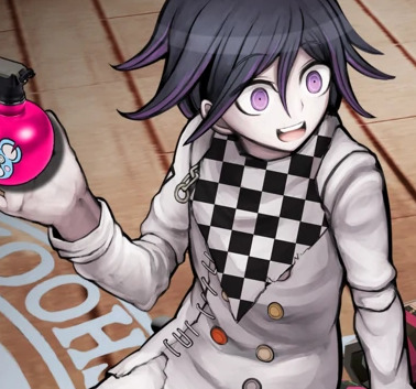
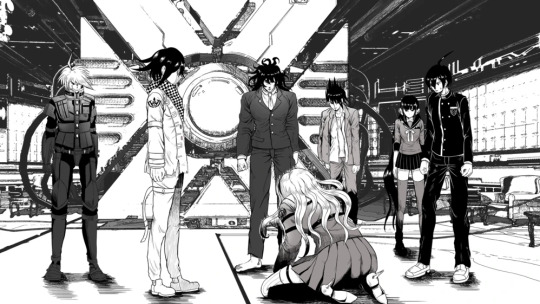
if you study this image for longer than 5 seconds, you will see that kaede is the only one fully shaded and keebo is literally just his normal sprite pasted into the image. every other character is just an ordinary ref, hence most of them facing the exact same direction with neutral expressions on their faces. it looks like a bad edit, and is probably one of the worst pieces of art in the game. it kind of gets better from here on, but my roasting will not.
with that out of the way, here’s the problem that officially bothers me the most and clarifies my viewpoint of “this is not meta and an actual lack of company communication”
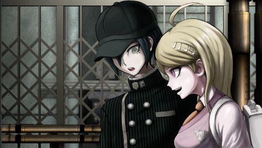
this freaking cg, which seems normal at a glance, but some wiseass was like “oh, kaede is a girl, so obviously she’s going to be shorter than the Male Protagonist™” ah, that’s funny. because if you look at the character bios, kaede is, in fact, one inch taller than shuichi and not like 6 inches shorter as she is shown here.
also shuichi’s shoulder is disproportionate and horrendous and he looks vaguely like a jojo character, but I wasn’t even thinking about that until right now.
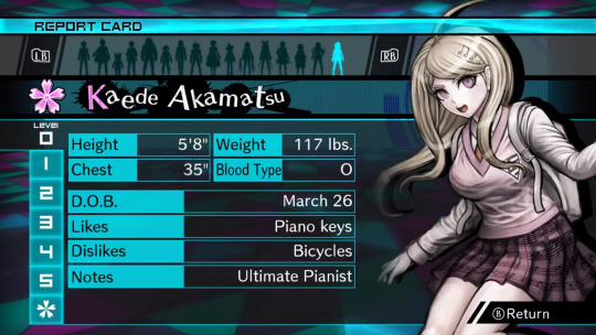
thanks guys, 50% of the fandom who has never bothered to check these bios thinks that kaede is like 5′3 (did the developers really put so little thought into her to the point where drawing her correctly in the game didn’t even matter??)
also I would like to point out that, even though this isn’t related to the art itself, yes, a character kaede’s size being only 117 lbs is unfeasible, but this applies to literally every character in danganronpa ever and it’s not new news that it’s unrealistic
update: someone in the tags informed me that in versions of the game that use centimeters, like the japanese version, kaede is actually shorter than shuichi, which just adds another thing to the list of weird decisions the localization team made for no reason. that said, after confirming this, kaede is 167 cm in the original, while shuichi is 171 cm, which are approximately 5′6 and 5′7 respectively, but one inch is still nowhere near as drastic as it is depicted above. (in spite of this, I would rather depict kaede as slightly taller, so I’m probably going to keep doing that.)
the journey continues!
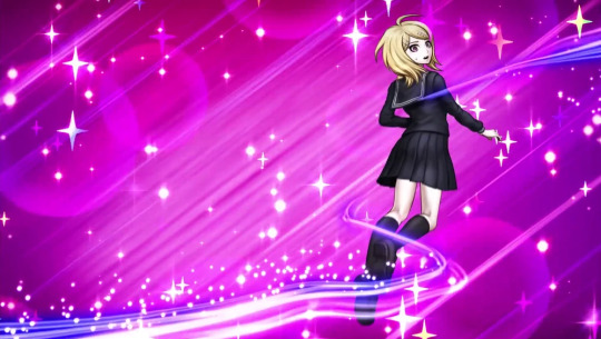
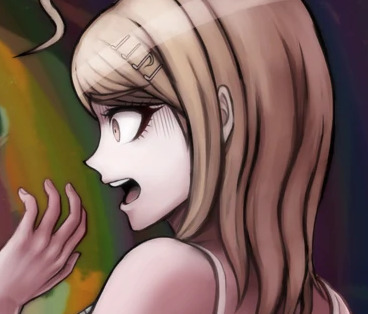
bro if you want kaede to have shoulder length hair then stick to it to begin with
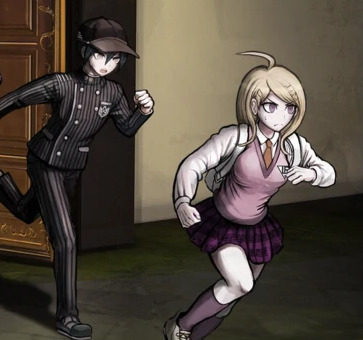
you can pretend this is at an angle all you want but they definitely committed the shorter kaede sin a second time
wait a goddamn second.
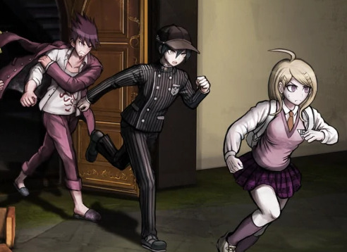
DO YOU SEE THIS
no………… it wasn’t kaede who shrank. it was shuichi who got taller
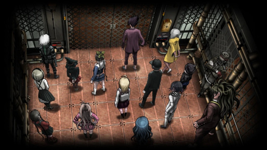
speaking of which, can we talk about how shady the perspective is in this elevator pic? look at shuichi and kokichi in comparison to kaede. kokichi, who is canonically 7 inches (edit: or 5, if you’re loyal to the original) shorter than kaede, looks taller than kaede. he’s growing too. what steroids are these gays taking

running into the room, electric boogaloo: I don’t think tsumugi is supposed to be the same height as kokichi
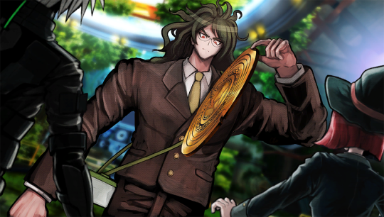
gonta… gonta you’re lookin a bit like a jojo character there
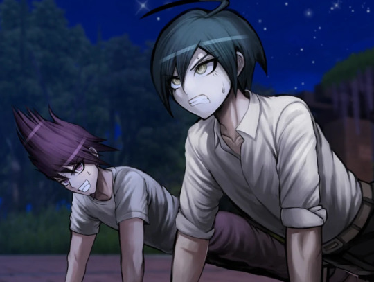
I love how kaito’s head looks kind of like it was pasted onto his body. why is he the same size as shuichi? shouldn’t he be high school bully size or something? his torso is teensy
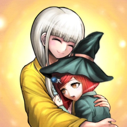
ah yes, white angie.
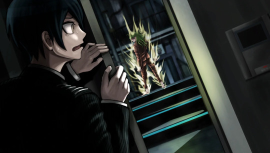
I love this cg but why is shuichi’s right hand so much bigger than his left hand
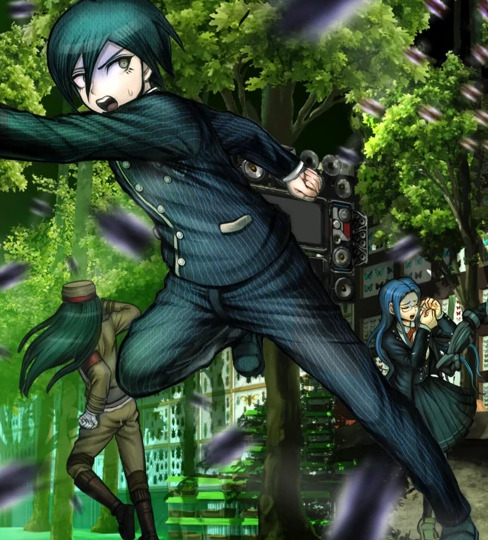
I also love how this cg looks like they literally took pictures of trees and pasted them into the background, especially on the left. the shadows are so weird, especially closer to the ceiling, it’s difficult for me to believe they didn’t do exactly that.
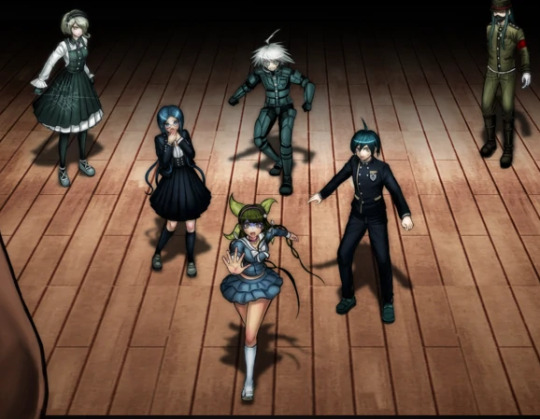
return of Enlarged shuichi
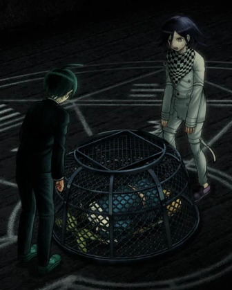
puberty update: kokichi is now taller than shuichi in spite of shuichi never missing leg day. what crimes will he commit
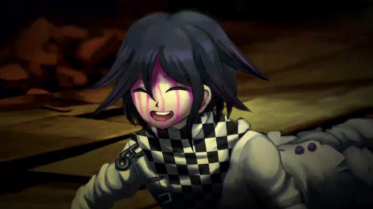
I have to mention it, guys. this has to be one of the worst danganronpa cgs. kokichi’s facial proportions look atrocious. look at the way his face sticks out like his jaw is in the wrong place. his scarf is a pasted texture. that’s it. this moment was so iconic but the cg just looks so… so… off. like something is terribly wrong, but you can’t put your finger on it.
you know what? let’s get into that ‘pasted texture’ thing.
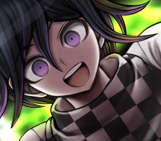
let’s imagine you’re an artist working on a professional game. you’re assigned to draw cgs of kokichi ouma, who has a checkered scarf from hell. sure, it will be terrible to draw, but you only have to draw it once at a time! plus, perspective is pretty important, right? can you be bothered? nah, actually. let’s just copy paste a checkered pattern into the cg, because I’m sure nobody will notice. it’ll blend right in with the other cgs that someone actually put effort into drawing his scarf in, right?
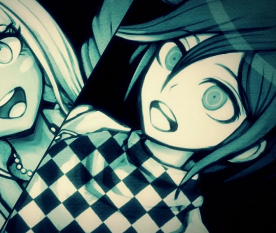
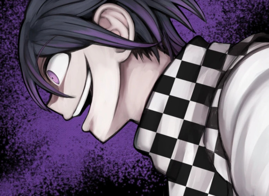
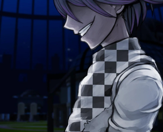
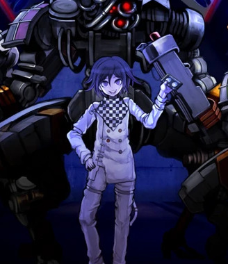
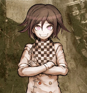
no. the answer is no and I very much noticed. this genuinely looks terrible and I would understand taking a shortcut like that in fanart or even an indie game but this is a full price pc and console distributed game
(an addition: look at kokichi’s TINY HANDS in that last one)
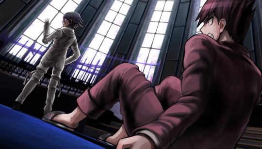
meanwhile, they straight up forgot to color in kokichi’s scarf in this cg.
dude. I forgot about whatever the hell this cg was. anyway look at keebo please just look at him
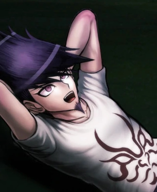
lovin kaito’s baby arms
real talk, maybe you could argue that he’s missing muscle because he’s deathly sick, but most of his cgs don’t line up with this, and his arms just look disproportionate to his torso size (granted this is a consistent problem across all danganronpa games and a lot of characters have this weird problem, like hajime, but also kaito is bigger than hajime so I kind of have higher expectations of him) maybe it’s his stupid goatee and the way he reminds me of yasuhiro?? it creates this illusion that he’s older than he is and so I keep expecting him to look more like an adult
oh, also rantaro is missing some of his accessories in that video he made–you know the one–but I don’t wanna go back and screenshot it
also you may have noticed that I’m skipping all of the monokub cgs because I literally do not care about them and I’m not even bothering to check and see if they have artistic mistakes in them
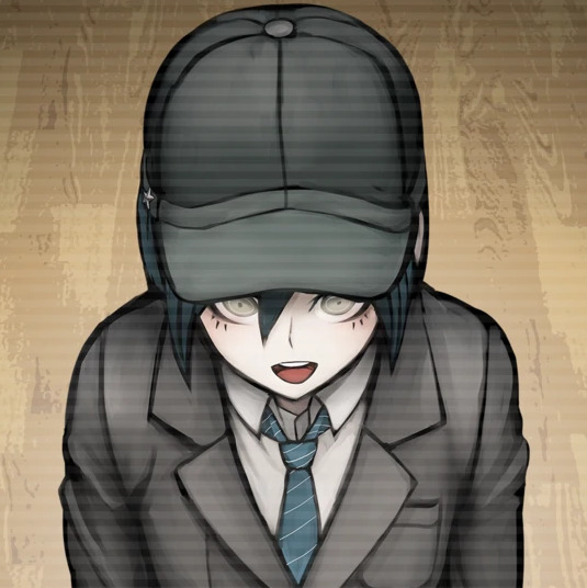
JIMMY NEUTRON???
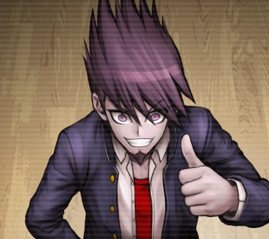
hey um uh kaito you seem to be missing your neck
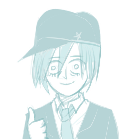
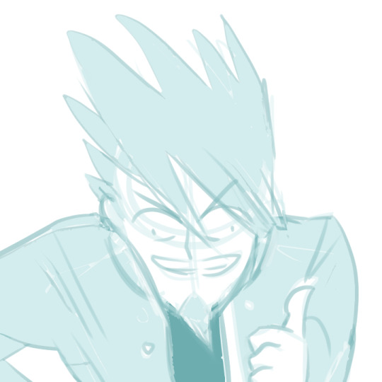
hey guys do you like my pregame fanart
so, that done, the sprites are also pretty terrible at times. they’re not as interesting to go through, however, and downloading the full sprite sets for every character and studying every single one of them will drive me insane, so I’ll just sum some of the ones I noticed up. I made things for kaede and shuichi before deciding I wasn’t going to get into it, so here are these.

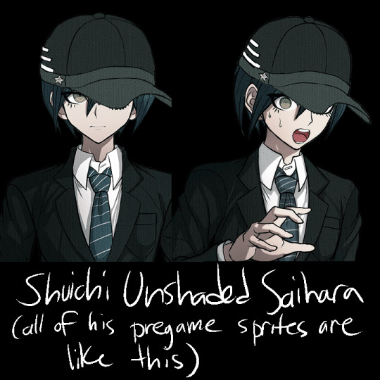
that said, other mistakes include kokichi missing his purple highlights in all of the sprites encompassing a specific pose, stray pixels all over the place on everyone, and everyone also has heavily inconsistent shading, but literally all I think about is how pregame shuichi is unshaded and two of kaede’s pregame sprites have glaring outfit change mistakes in them
anyway, thank you for taking the time to read my ridiculous ramble. in all seriousness, there’s this looming presence of some lack of communication in the development team, like with all the art and design inconsistencies, pieces and sprites that look rushed, stray pixels, and missing basic proportional stuff. these are the kinds of things that you supposedly have to pretty much have in the bag in order to get jobs in professional businesses, so it’s really weird to me that this game suffers from so many of these problems. it’s like they tried to make the art so much more crisp than the other games, but it fell on its face as they realized it was going to take longer to draw everything and they started to rush. it’s weird, because the coloring itself looks normal–it’s just sloppily drawn, and the proportions are a mess once put into the context of perspective. many of the cgs look like they were drawn by different people, and I’m still not over the fact that half of kokichi’s cgs have his scarf pasted in as a texture.
the moral of the story is that if you’re selling a game at full price that also happens to be in a series that has had 3 very good games in it already the stakes should probably be higher than this. v3 has been out for more than 3 years and it’s still $40 (did it cost more than that before? I sure hope not), and the overarching quality of the game is just not as high as the other games. I’m not saying that the other games don’t have any problems with their art at all, they’re just not as glaringly obvious and every artistic choice in those games feels intentional.
regardless, I had a blast roasting the art at 2am, so maybe you got a kick out of all this chaos.
#god I keep telling myself I'm gonna stop rambling about v3#v3 spoilers#drv3 spoilers#ndrv3#random stuff#but making this… it sounded so fun#danganronpa
702 notes
·
View notes
Text
Journeys Ep 96 Screenshots and Commentary, Part 1
It's that time again, the time when Andre posts screenshots he took of the most recent episode alongside some pithy commentary
Well, I was supposed to post these on Sunday, but I have never followed a schedule before, and certainly won't start now! /self-deprecating
But anywho, on the with the show, and remember:
SPOILERS FOR EPISODE 96 AHEAD!
Sophocles has invited our boys to visit a space center in Hoenn, and it seems he's gotten a new pokémon?

Said pokémon, Ampharos, is very clumsy and immediately gives Ash a Hodge-style bruise on his head after bumping into him. Ouch!

Goh: ...I think I'll pass 💦

Sophocles wonders how Raboot is doing, but Goh gives him this incredibly smug chuckle in response before showing him Cinderace. It has to heard to be believed!
(I think Goh has laughed like this in other episodes, too? I'm not sure, though.)
When they arrive at the space center, Ash immediately gets distracted and runs off, like an excitable toddler.

Not helping his case is the fact that he somehow thought the satellite's name, "Fiarrow2" (Talonflame2), meant that there were Talonflames living in space!
Look at Ash's sage expression here, he's so confident. Thank goodness Goh is there!
Ash: I thought they were a new Talonflame evolution... like Porygon and Porygon-2! Goh: Ash, why are you like this 😔/lh

Normally, I would criticize these people for involving children in such a critical and expensive project... but then I remember that this is the pokémon world, where absolutely nothing gets resolved without the help of children /hj
Shout-out to that kid in the bottom with the crazy poofy hair

That's what you get for not catching one before, Goh 😉

Turns out the reason why Sophocles has an Ampharos is because they're doing a collaboration to get kids interested in space by letting them use their Ampharoses (Ampharoi?) to guide a satellite to re-entry. And it's almost about to start, so they head to the command center...
But then Ampharos' clumsiness rears its ugly head and hits everyone with its tail all at once like it's trying to get a high score in Devil May Cry or something /ref

Thankfully this is an anime, so they all quickly recover. Ampharos is placed in this big chamber and starts shining. Will it mess up again, or will things go smoothly this time?

Nope! The machine next to him starts sparking and they're forced to bench Ampharos for the time being. Everyone starts freaking out.
...Well, Grookey might be freaking out, for all I know, maybe it's leaping up and down from excitement. "Ooh, sparks!"

(Continued in Part 2)
#pokemon#pokemon journeys#pokeani#anipoke#pokemon anime#goh#gou#goh pokemon#gou pokemon#trainer gou#trainer goh#ash ketchum#ash pokemon#trainer ash#trainer satoshi#satoshi pokemon#sophocles#mamane#spoilers for dub only viewers
9 notes
·
View notes
Photo


Took a break from working on finals to do something I’ve been wanting to do for awhile now, which is a redraw! Top is the redraw (December 2020), bottom are the originals (January 2018). I did do my best to keep poses and expressions the same
Speech on how I think I’ve improved/what I want/need to work on under the cut
A lot has changed in almost 3 years. I went from drawing on my phone with my finger, to using a computer and bluetooth pen. My understanding of anatomy has expanded a fair bit, although I do struggle with same-face/same-body just as anyone does
I want to say that color has gotten more vibrant, but that could just be because I made myself color-adjusted refs instead of relying on screenshots that have variations in lighting and shadow. Noses have been a definite improvement, although angling is tricky at times.
My absolute personal favorites from the redraw are Aira and Azari. For some reason Aira has always given me a hard time? Idk why, but I always have to work at her for a little bit to make her look less wonky. Azari’s S3 outfit (at least in the official art) has always been my favorite of her outfits. It’s so bright and pretty just like she is :)
#lego elves#secrets of elvendale#artists on tumblr#draw this again#elvendoodles#lego elves emily#lego elves azari#lego elves rosalyn#lego elves aira#lego elves naida#lego elves sira#emily jones#azari firedancer#rosalyn nightshade#aira windwhistler#naida riverheart#sira copperbranch
42 notes
·
View notes
Note
okay so i have more to talk about. i'm not sure if you get a notif multiple layers of reblog in so @moongasux i guess.
anyways i'm going to quickly start with the topic of pronouns for clarity. the only statement about the characters' pronouns is this

. personally my interps of Heart, Mind, and Soul have he/she, he/they, and he/it respectively as their pronoun sets so we'll be using those.
alright, now we can start properly. we'll be starting with the topic of fan nicknames.
the most popular fan nicknames you see (other than Whole, of course.) are ones derived from the mythology motifs in the second track of the album, Dream (Outro from Calamity), these being Atlas, Artemis, Apollo, and Harmonia. other fan nicknames are usually references to some of the songs the album covers. for example someone could have their interps of HMS be named Juno, Simon, and... Marvin, i guess? (i don’t have another one for Whole so i guess, for lack of a better phrasing, he’s cis) that second Heart nickname lets me segue into our next topic.
as you may know, Heart and Mind won a poll bracket known as the Ultimate Sun and Moon Duo Tournament and... well, they do in fact have those motifs, Mind being the sun and Heart being the moon. Soul doesn't have a specified motif and most of the fandom has it as stars, but i have planet for its motif. and i know what you're thinking; "S, are you making the theological mistake that the greek mytholgical figure Atlas held up the earth instead of the sky?" and for that, here's an edited screenshot from a pokemon competitive meme copypasta or something i found out about once because why not. (honestly i feel like a comedy genius somehow for this. egotistical queer by any definition /ref)

thank you, thank you, i'll be here all night.
anways let's address the elephant in the room. yeah, Heart actually like... shot Mind. literally. the gun part is mentioned in track three and still phrased like that so it isn't just using pre-existing lyrics for symbolism. (probably. you can read it as something else if you want there's room for interpretation.) (man, that must not have made sense to you if you haven't listened to the original Ruler Of Everything or the album's filk of it)
in my interp Heart did that because he was tired of Mind saying that she wasn't needed and was trying to prove that she was by seeing if they would react with ANY concern if he hurt them to such a degree... and well, i mean... he didn't react with anything reasonably recognisable as that. but that isn't all that happened.
Heart trembled. (no, no...! what have you done!?) [She had presumably been aiming for my head.] he took steps back, shifting her vision from the hole in Mind's neck to their eyes. (you hurt him! oh god what if he dies their your logic youll surely go insane you hurt yourself you hurt yourself no, no!) [I knew he was a crying irrational impulsive mess, so I should have expected that she would turn to violence one day.]
and then Mind fucking stabbed Heart's eyes out.
my idea behind this hc was basically; Heart has a blindfold in canon, Mind voice modulator headcanon is a thing, Heart shot Mind, the tines through the eyes lyric from Night could be placed later in the plot using Soul timeloop awareness jank; just throw that all together.
yet again, tell me if you have any questions!
sometimes i like yapping about an album i like to my mutuals. now is one of those times! can i do it to you?
OH MY GOD YEAA!!
10 notes
·
View notes
Note
I mean, that hardly counts as a verified source, it's just the mclennonwasreal blog stuff. There are videos on youtube that show the whole pre-show video, and the photo is nowhere in sight. It doesn't look like it was photographed from a stadium screen either, and how would they know Paul took it in Paris, or that it "hangs in his house".
okay, fine. obviously i tried to answer too fast to get back to the thing i was actually working on and didn’t consider the source as alec baldwin so smartly reminds us to do. happens to the best of us. i deleted the post.
however, i still think it’s probably genuine based on some circumstantial evidence:
-paul has used several different pre-show films/photo reels/what have you. i found three distinct ones on youtube (and one of those was only the post-beatles part of it), from three different tours - one from 1993, one from 2005, and one from 2013. There’s a very short video that shows tiny pieces of his pre-show video from 2019 as well, but it’s literally only maybe a minute or two of very shaky footage. according to wikipedia he has done 16 separate solo tours since 1989. if he has a separate video done for each tour (who knows if that’s true but let’s assume it is) that would mean youtube only has 2.5 out of 16 different videos. (as a sidenote, i don’t know where the “it hangs in his house” thing came from either - i’m absolutely willing to believe that’s one of those things that got added onto it after the fact by the internet rumor mill. i’m also willing to believe it’s not from his pre-show videos at all; it could have come from anywhere.)
-there are a lot of beatles photos we know of where the source has been lost to time. we don’t have a centralized archive (though lewisohn seems to be working on that). no one has everything. there are so many things that have been auctioned off to private collectors that were once publicly available; that video of the beatles in wales comes to mind, and the only reason we know about it is because someone made a series of 4 screenshots of paul in it. there’s only like one photo of john in paris in anthology (at least in the section of the book where paul talks about it, tbf i have not read the entire book because it’s the size of a house); where did the other dozen or so come from? magazines? newspapers? other photo books? auctions? paul’s personal collection?
-i’ve reverse-image searched several of the photographs from paris. one showed up first online in 2008, another in 2010, one in 2012, another couple in march 2014 and yet another in october 2014 on the same day and page as the john-in-bed photo. because the website is now gone, i can’t check that source. but the other photograph posted originally on that page at that time (this one) is unquestionably genuine.
-it looks like john to me. idk why it doesn’t to you.
anyway, i’m not gonna be able to convince you and you’re not gonna convince me. i think it’s real and you don’t and that’s fine.
photo for ref:

11 notes
·
View notes
Text
Things you can do to help Anne With An E be Renewed
There are so many different ways big and small you can help in the fight to get Anne With an E renewed. I’ll do my best to compile all the ways you can contribute.
1) One of the easiest ways to let networks know there is a demand for more Anne With an E is to request it on their help page. Request Anne with an E season 4 so they know you want the show to continue. There is also no limit to the number of times you submit requests.
https://help.netflix.com/en/titlerequest
https://help.disneyplus.com/csp
For Disney+ click “Give Feedback” then “Request a film or show” then you can type in Anne with an E season 4
2) Watch Anne with an E on Netflix. Just constantly stream it in the lead up to the season 3 premiere. When the show premieres Jan 3rd make sure you stream the new season that day and in the days after. Not only do we want Netflix to know that the new season has a big audience, but we also want as many people watching at the same time for the show to make it to the “Popular on Netflix” category. New people may be attracted to the show if they see it is popular on Netflix.
3) Write emails to Networks. Netflix and CBC are not the only options when it comes to Networks that could renew Anne with an E, since it seems that the rights to the show are currently owned by Northwood Entertainment the production company behind Anne with an E. Many other fans have done the hard work of compiling lists of emails of network executives. I will provide links to various tweets I have seen with important emails. (of note, most will probably not check their work emails again until after the holidays, so you can draft emails now and send them out after Jan 1st) Also below is a google doc that includes emails of many network executives.
https://twitter.com/LeaOux/status/1205485569691680768
https://twitter.com/KindredsParty/status/1208518970002870272
https://twitter.com/KatVal11/status/1206141522820976640
https://docs.google.com/document/d/1StN_dHgHjhPhYkfgS_7AbeMbmu0KXhrtJW1ytAASUaw/mobilebasic
Template for writing emails and email addresses to send emails to: https://docs.google.com/document/d/1nkEu-ZyIiBkCABleKRBLU21T8lRSwRxwWXuVDZ7cxeo/mobilebasic
4) Write emails to magazines, newspapers, websites, etc. Any form of Press about Anne with an E will draw attention to the show from people who may not have heard of it before. You could write emails to ask them to cover the news of the show's cancellation, to review the new season, to discuss certain topics the show addresses that set it aside from other shows and more. Anything that you could dream up that could be an article that could be written about Anne With an E you could pitch the idea to someone to write about.
5) Appealing to other fandoms with similar interests. Two big movies that are about to drop that have an audience that may be interested in a show like Anne With An E, would be Little Women and P.S. I Still Love You (To All The Boys I’ve Loved Before sequel). Little Women is also a period piece with a feminist heroine, so you could point out the similarities in the stories’ themes to appeal to fans of that film (which premieres Dec. 26th). For P.S. I Still Love You, the big connection is that in the third book of the To All The Boys I’ve Loved Before trilogy, Forever and Always, Lara Jean, Lara Jean states that Gilbert Blythe is her ideal man. Screenshots of this quote have been going around all over tumblr and twitter since the P.S. I Still Love You trailer dropped. The selling point could be that if you enjoy the films and relate to Lara Jean then you should check out the stories and adaptions of those stories that Lara Jean considers peak romance. ( It also helps that the premise of the films relies on love letters and AWAE season 3 features love letters as well). When entering into other fandoms tags to recommend Anne With An E make sure you are always being RESPECTFUL and don’t just spam the tags with Anne promotion. You could always create side by side edits of the two programs to demonstrate how similar they are. Basically, make sure your posts in their tag don’t seem like a blatant promotion for AWAE.
6) Rate Anne with an E on IMDb. (Note: It is listed as Anne(2017) on IMDb). Right now Anne is listed in Top 250 TV Shows, but it is toward the bottom of the list at #248, with an average show rating of 8.4 stars. If enough fans rate it, the show could move up on the list, which may attract new people to watch the show. You can rate the show overall, and rate each episode individually. Plus you can leave a review.
7) Watch the Anne With An E Netflix trailer and share it with others. The more views on the trailer the better. The trailer is available on Youtube and Instagram. On twitter, people are organizing trailer boosting parties for Dec 23rd - Dec 30th.
This calendar shows when trailer boosting parties have been planned detailed descriptions of what those events include with links to tweets and posters
https://calendar.google.com/calendar/embed?src=potatolightbulbs%40gmail.com&ctz=America%2FNew_York
8) Sign the petition for the show to be renewed and get anyone you know who likes the show as well to sign it as well.
https://www.change.org/p/netlfix-awae-fans-renew-anne-with-an-e-for-season-4?recruiter=916548586&utm_source=share_petition&utm_medium=copylink&utm_campaign=share_petition
9) Recommend the show everywhere. On twitter search “What to watch on Netflix” or “tv show recommendation” and reply to any of these tweets with Anne With An E and maybe a reason why you recommend the show. If someone has already recommended Anne With An E don’t recommend it again, we don’t want to spam or annoy strangers. This can also be done on reddit search “What to watch” , “Netflix recommendations” , “Period Piece” and comment on any of the relevant results with Anne With An E.
10) Tell EVERYONE you know to watch Anne With an E. A great way to spread the popularity of the show is by word of mouth. People trust the opinions of people they know, so your friends and family are more likely to listen to your recommendations than strangers on the internet (but there is no harm in trying #9 anyway).
11) Continue to be your amazing creative selves. Gif sets, fanart, video edits, memes, etc. All of these can help attract new fans to the show, so continue to create and post things related to Anne With An E.
12) Make bookmarks or small promotional posters and leave them in public places. I have seen a trend of this on twitter and it's not a bad idea. One amazing fan even took it to the next level and made tiny posters that have QR codes on it that when scanned takes people to the Anne with an E trailer or the show on Netflix. Below is a link to tweets showing what those looked like and how they dispersed them.
https://twitter.com/itsMaeWithAnE/status/1208618422768033792?s=20
Here is a tweet thread with templates for the posters if you want to print them out yourself:
https://twitter.com/itsMaeWithAnE/status/1208816797555671040?s=20
13) Buy official merchandise for the show and wear it around. You could be a walking advertisement for the show if you want (and can afford to). There is different merch available on the official Anne With An E shop website and on Amazon. Also sales of the merch may be considered by networks when they consider whether to renew the show.
https://shopannewithane.com
https://www.amazon.com/stores/page/A8C18641-8ECE-4892-A276-6A0A952A125C
14) Join the r/Anne community on reddit. There has been some encouragement to grow the size of the community on this thread because it shows a static number of how many people are apart of it. This number could be used to approximate how much interest there is in the show. It currently only has 2.5K members. Even if you’re not very active on reddit, joining the subreddit would be helpful.
https://www.reddit.com/r/Anne/
15) Donate to the campaign to have a billboard to promote the show. Details can be found on the gofundme page.
https://www.gofundme.com/f/renew-anne-with-an-e?sharetype=teams&member=3295372&rcid=r01-157601384514-6d847f2ab5bb49bd&pc=tw_co_campmgmt_w&utm_medium=social&utm_source=twitter&utm_campaign=p_lico+share-sheet
16) Donate to campaign to run instagram ads for Anne With An E. More details on the gofundme page below.
https://www.gofundme.com/f/anne-with-an-e-season-3-ad-campaign
17) Let’s Make Some Noise Campaign. Some fans are encouraging people to write messages on white rags, like the ones the avonlea students use during their protest, and sending them to various streaming networks or Northwood Entertainment, the production company behind the show. Details can be found in the tweet below.
https://twitter.com/kindredsparty/status/1206624186342559745?s=21
18) Rate and review Anne With An E on Rotten Tomatoes. You can do this for each season. Currently there are a fair amount of negative reviews so it would be incredibly helpful to explain why you love the show. Good reviews would attract new potential fans to start watching.
19) Vote Anne With An E up on Ranker.com lists. This might attract new get people interested in the show if it consistently ranks high on lists of best shows.
https://m.ranker.com/list/the-best-new-original-shows-on-netflix-hulu-and-amazon-of-the-last-few-years/ranker-streaming?ref=also_ranked&pos=2&a=0&l=85370943<ype=n&g=0
20) Take care of yourself. THIS ONE IS MOST IMPORTANT. Don’t sacrifice your health in your efforts to get the show renewed. If you need to take a break please do. Also don’t feel guilty if you need to step away or you can only do one or two things on this list. Every effort counts and is greatly appreciated.
I’ll try to update this as more stuff comes up. Good luck with all your efforts Kindred Spirits!
Remember “Dreamers change the world”
#anne with an e#awae#anne shirley cuthbert#anne with an e season 3#renew anne with an e#anne with an e spoilers#awae spoilers#awae s3#save anne with an e
375 notes
·
View notes
Text
caution for longass post ahead. it’s my (summer of) 6th grade sketchbook
thank you, past me, very cool
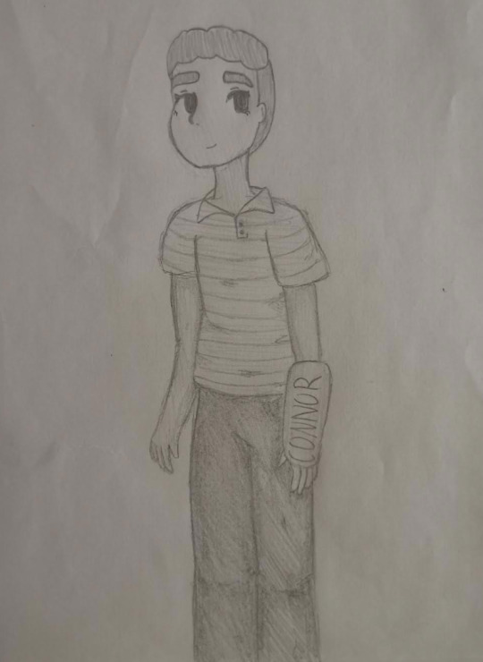
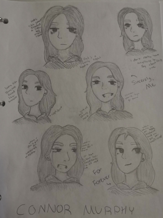
theres a fuckton of deh in here and most of it makes me want to dump a bucket of cold water on my past self’s head, so be warned
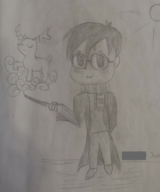
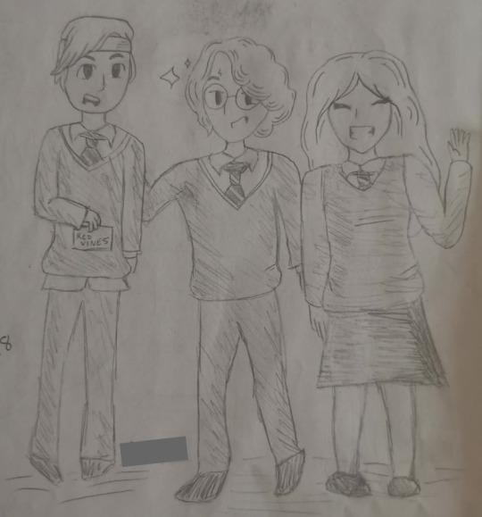
chibi harry potter. this one’s not awful
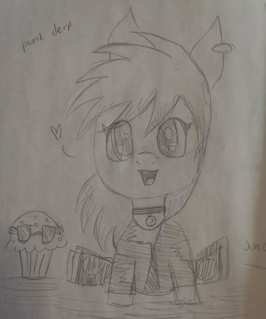
this was also back when i liked mlp. i was a derpy stan
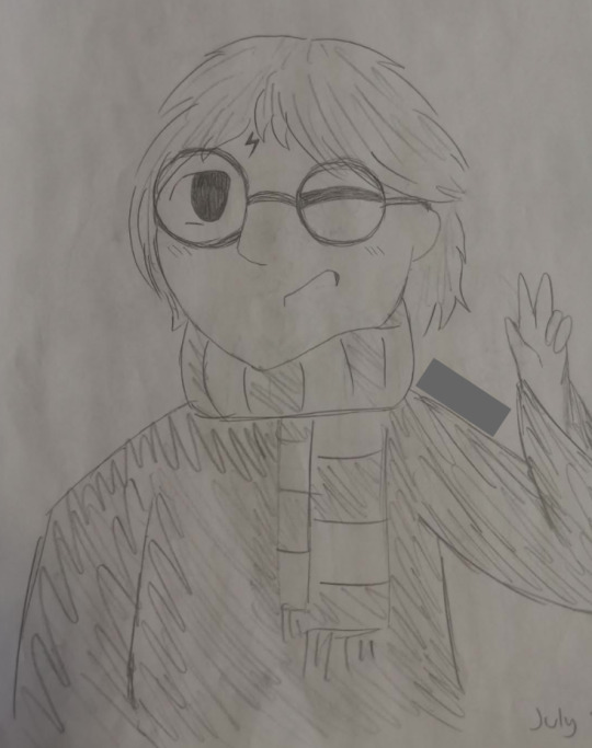
harry potter again. this one actually looks worse in the photo because i took it at a bad angle. i liked it at the time but noted the hand was a bit small. lmao
this was also the same year i rediscovered avpm! so many things happened in that year in terms of fandoms
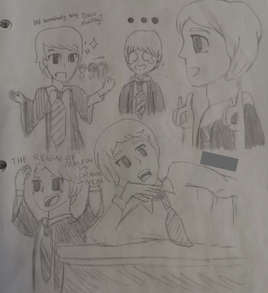
lauren’s draco. the one on the bottom right (the actual screenshot, not the drawing) was my profile picture for the longest time
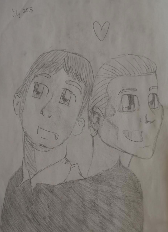
quirrelmort. the one ship i don’t hate now because it was like. canon
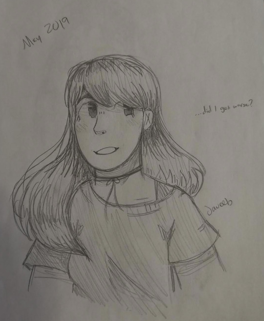
this was from like. a year later also @ past me you absolutely did not
i remember angrily drawing the line across her neck because it was a “good drawing” but the neck was too long. lol
i sort of wanted to be one of those kids that drew cats. as you might be able to tell, that didn’t happen
ah yes, the precious baby bean modern!john laurens
i don’t know. something to do with pride
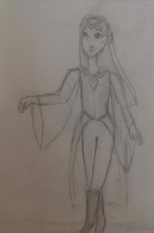
some elf girl
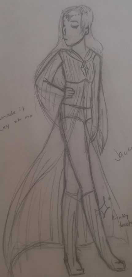
attempted redesign of elf girl from a year later. i cut it out but it says “oh god no come back in 10 months” and i think it’s been about that so challenge accepted
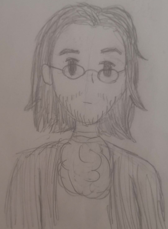
hmaliton
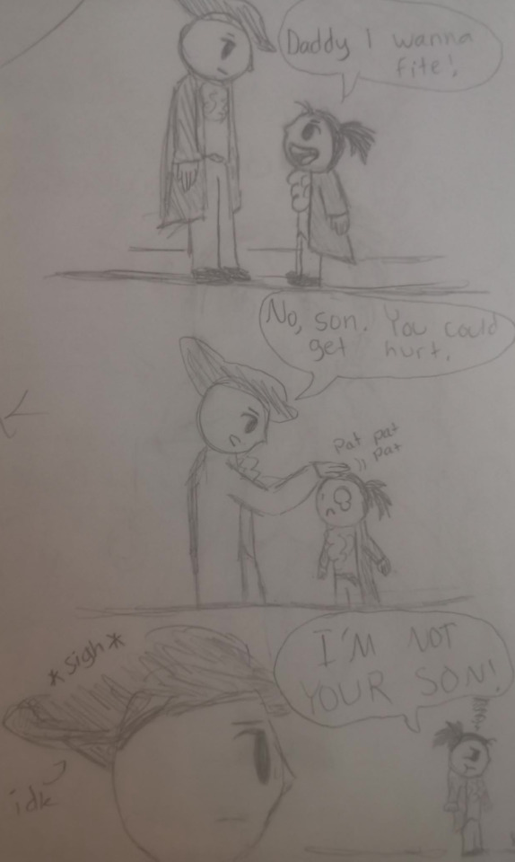
lmao very cool. on the side it says “idkkk lol”
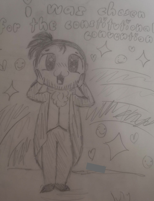
tfw you were chosen for the constitutional convention
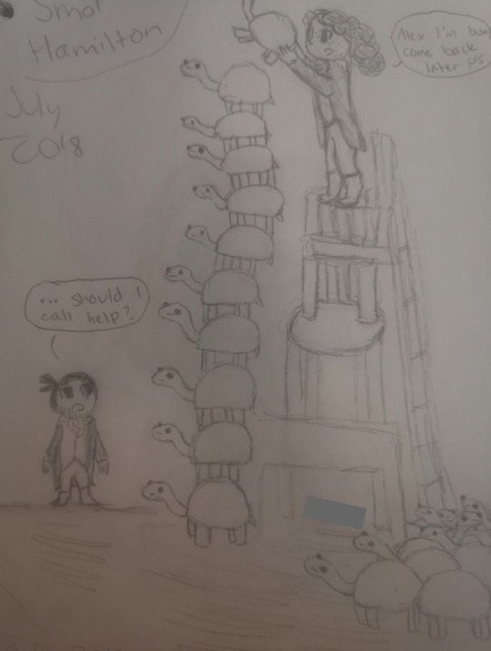
john laurens stacking turtles. haha turtle boi
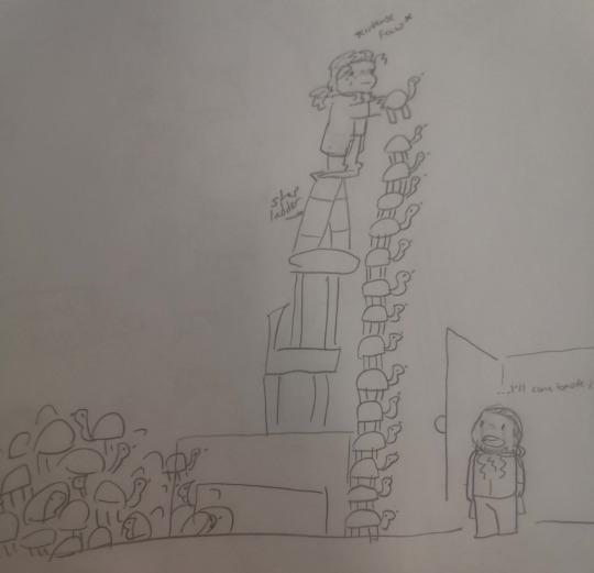
redraw from 2019 probably. iactuallykindoflikethisjgkfjbhsdvs
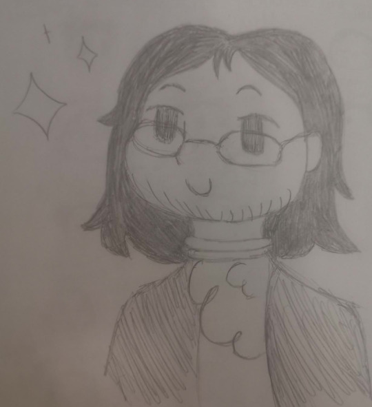
you will Literally never guess who this is
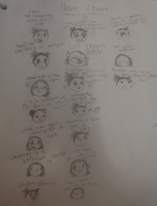
ham chart.
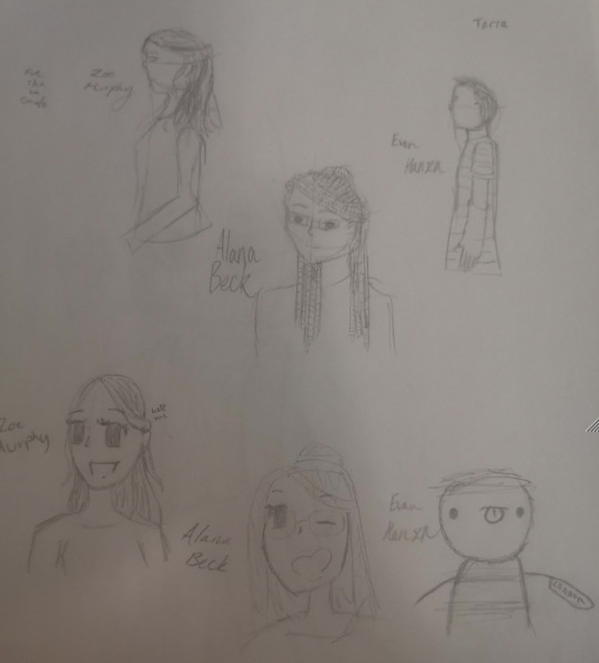
the top ones were drawn by a good friend.
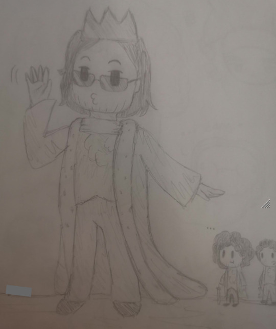
we stan a problematic king. or something
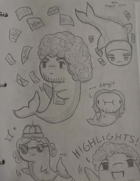
HAMILSHARKS
expressions practice. fun fun fun
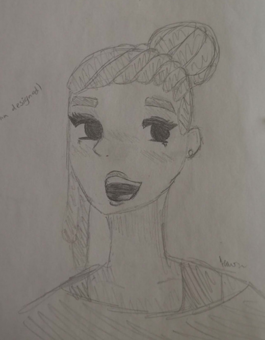
this one’s kind of good. there’s nothing too cringeworthy here so that’s a plus
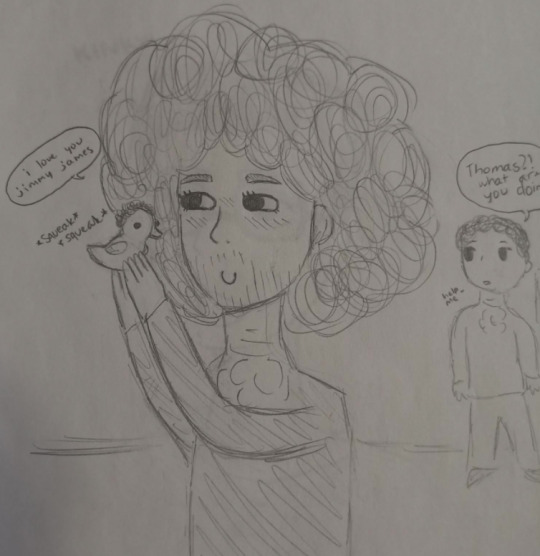
foh doh doh dee doh
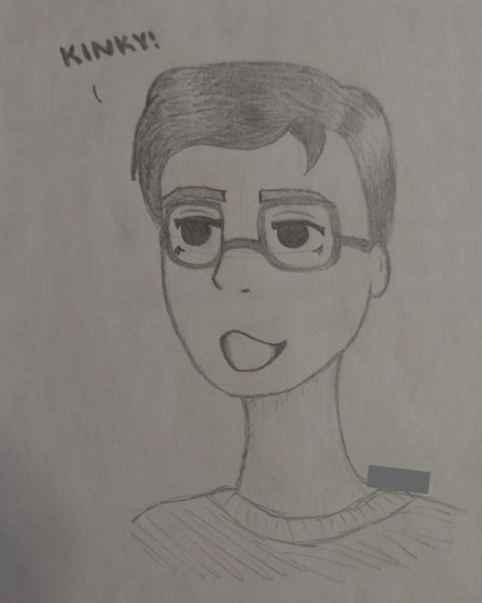
this is probably the best one. i used to think jared was funny hahahaaahahah g
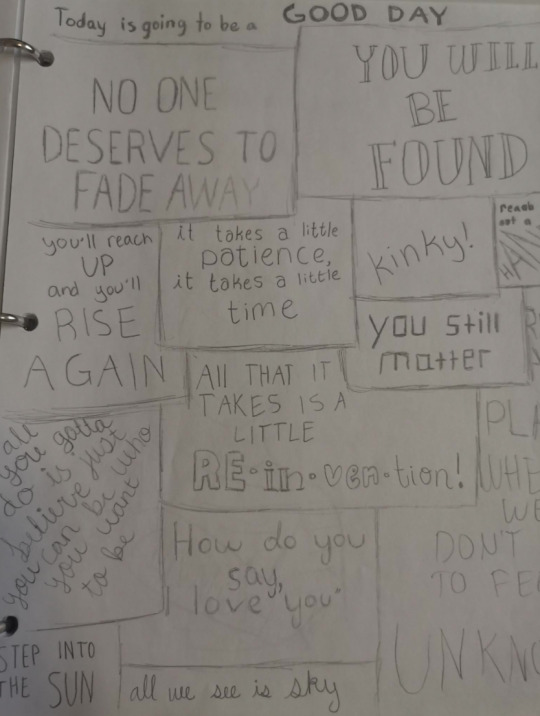
dear evon handsin
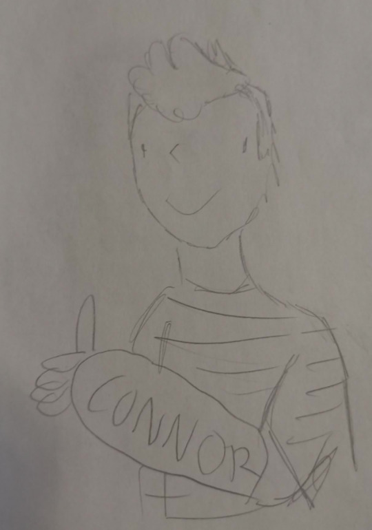
masterpiece
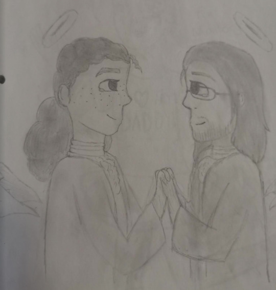
sjskdfavf,,, i remember being super embarrassed of this at the time but i didn’t want to throw it away because i spent ages on it anyways rip eliza
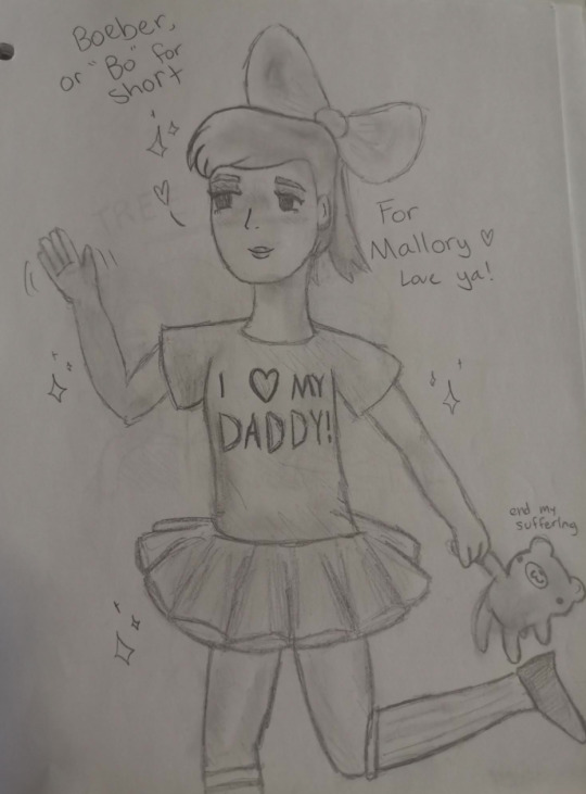
uh.
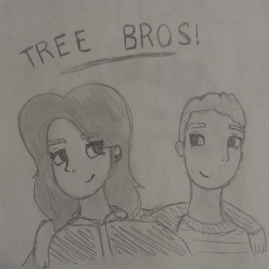
thanks, i hate it
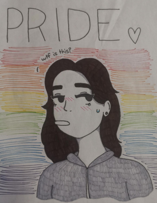
thanks, i really hate it. this used to be inside the plastic on the outside of the binder, which makes it even worse
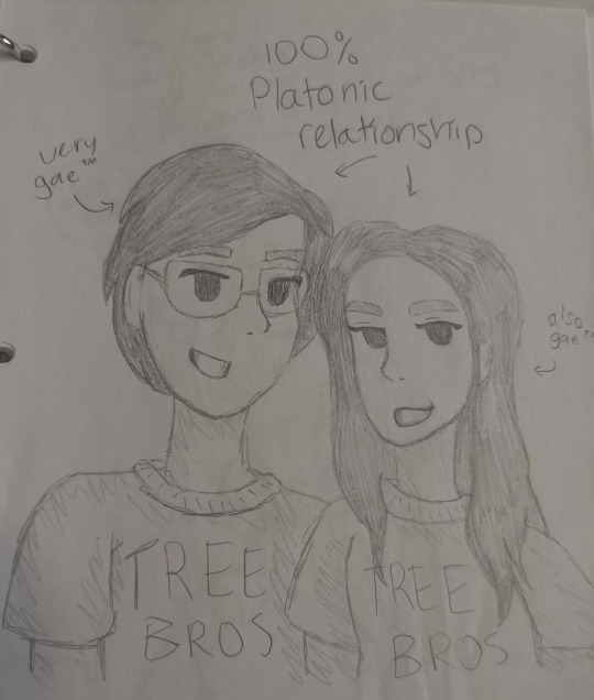
ew ew ew but the backstory behind this is that my friends shipped me with jared kleinman. i drew this in response being like “nope i’m just a lesbian that fetishizes mlm relationships for some reason and also jared is gay”
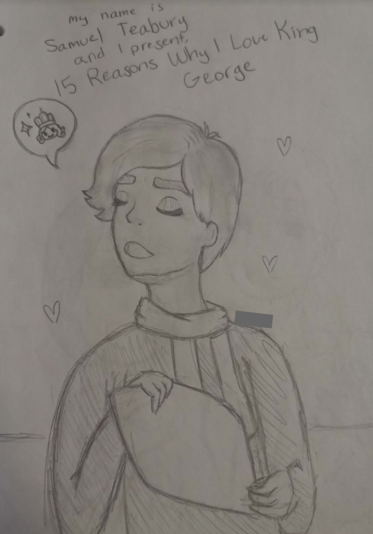
haha seabury gay
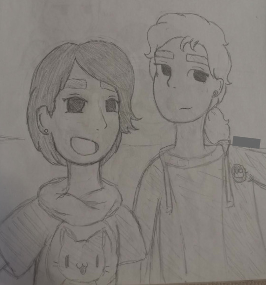
haha modern!seabury gay
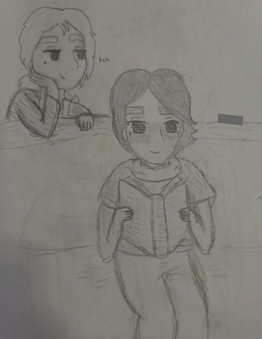
hahahah whatre you reading there pal
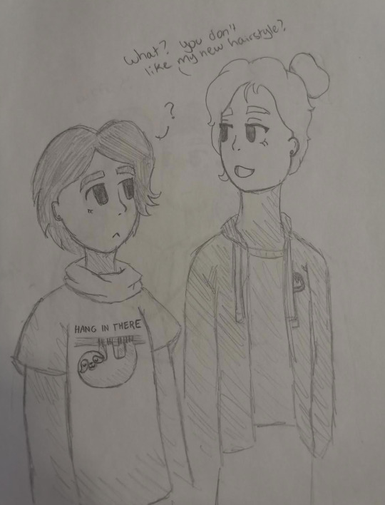
modern au kingsbury antics. what a couple
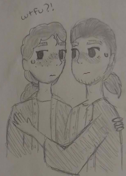
hahahahahahah more lams i drew myself and a friend poking our heads out on the side saying kinky kill me please
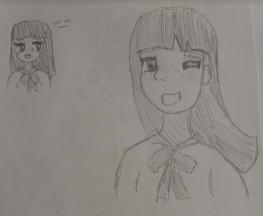
tried to draw a japanese schoolgirl and failed. i didn’t know references existed back then apparently
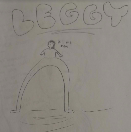
leggy best hamilton ship
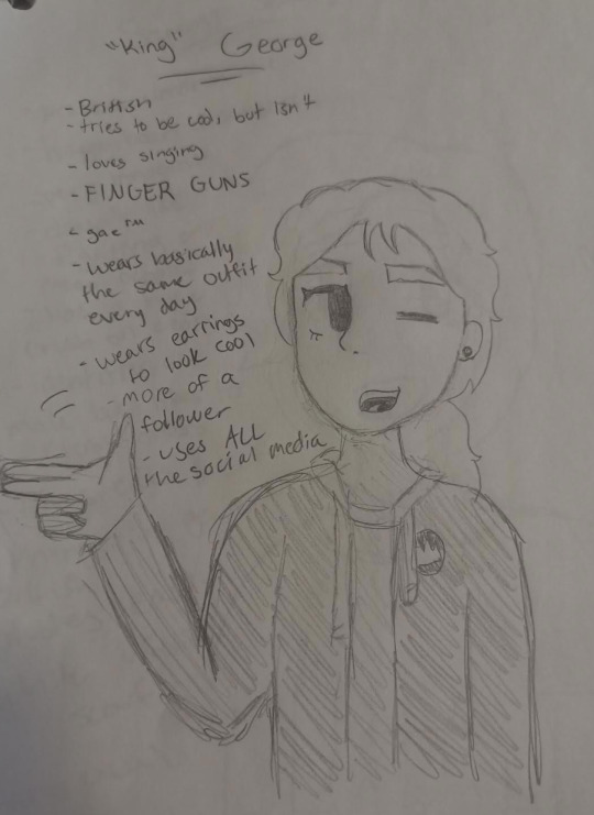
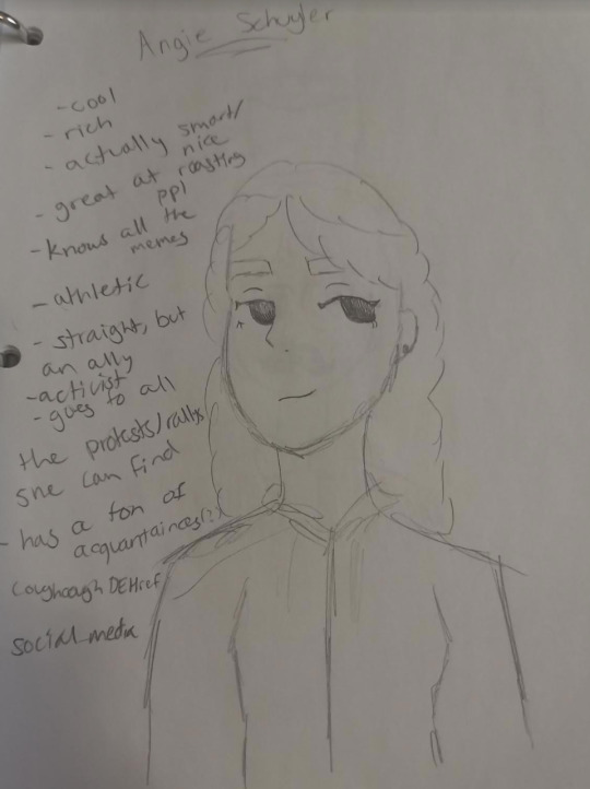
modern kingsbury ref sheet
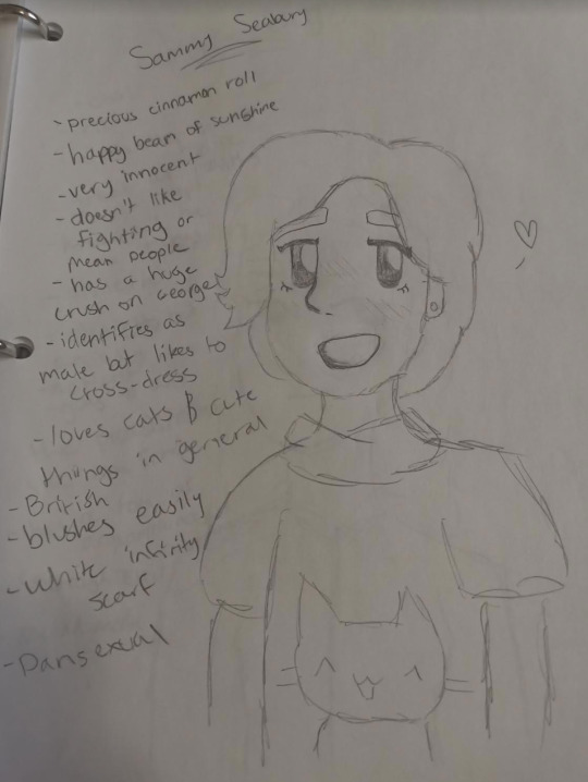
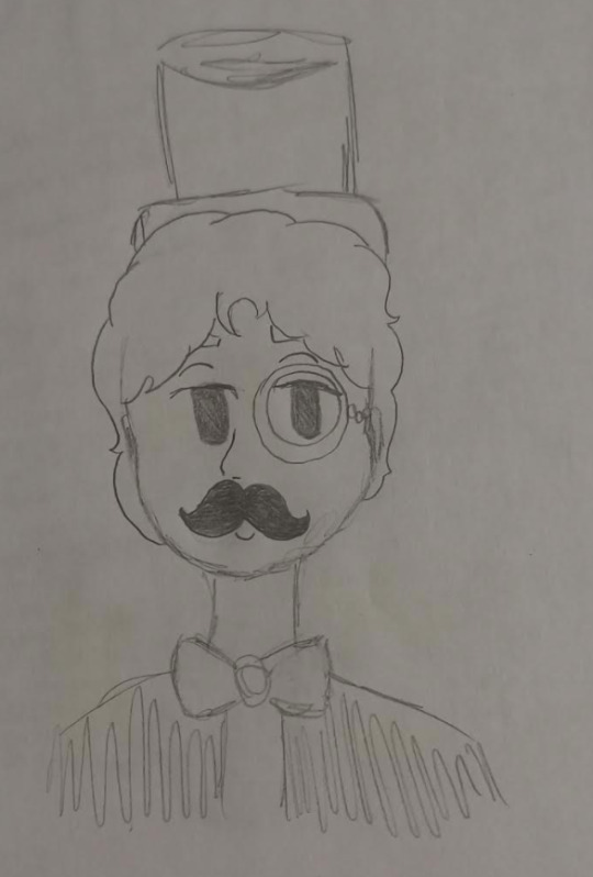
modern kingsbury ref sheet
modern kingsbury ref sheet
my friend’s old oc
vent. i shrunk it so you can’t really read it but it was all worries in the form of questions. i went back in 2019 (i guess) and highlighted the things that happened. a few more have also happened since then. i really hate the “LMAO OK Drama bitch” i wrote in 2019 though
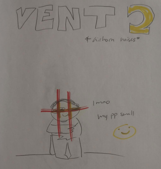
this is from 2019 i guess. wow what a master comedian
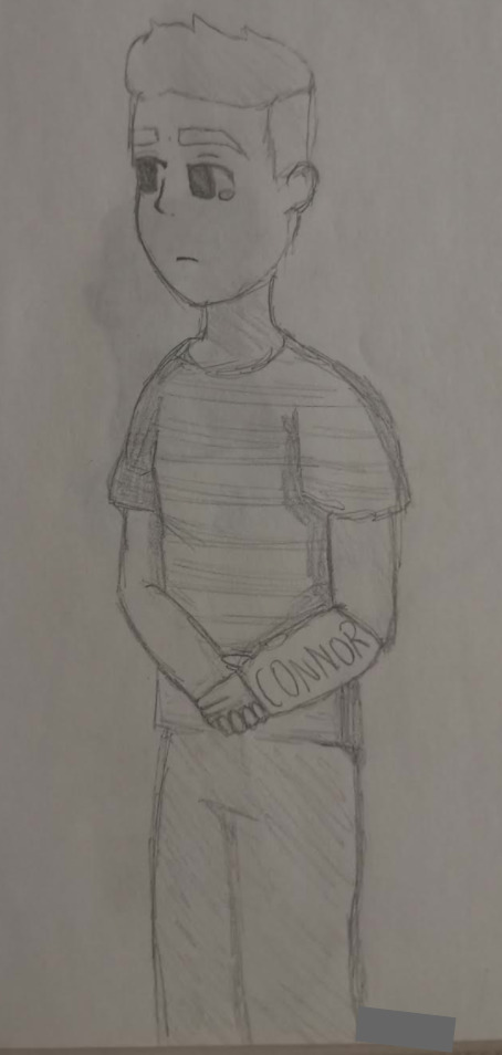
ebon honschen
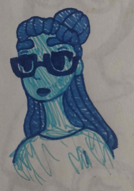
alana but shes blue daba dee daba die daba dee daba die
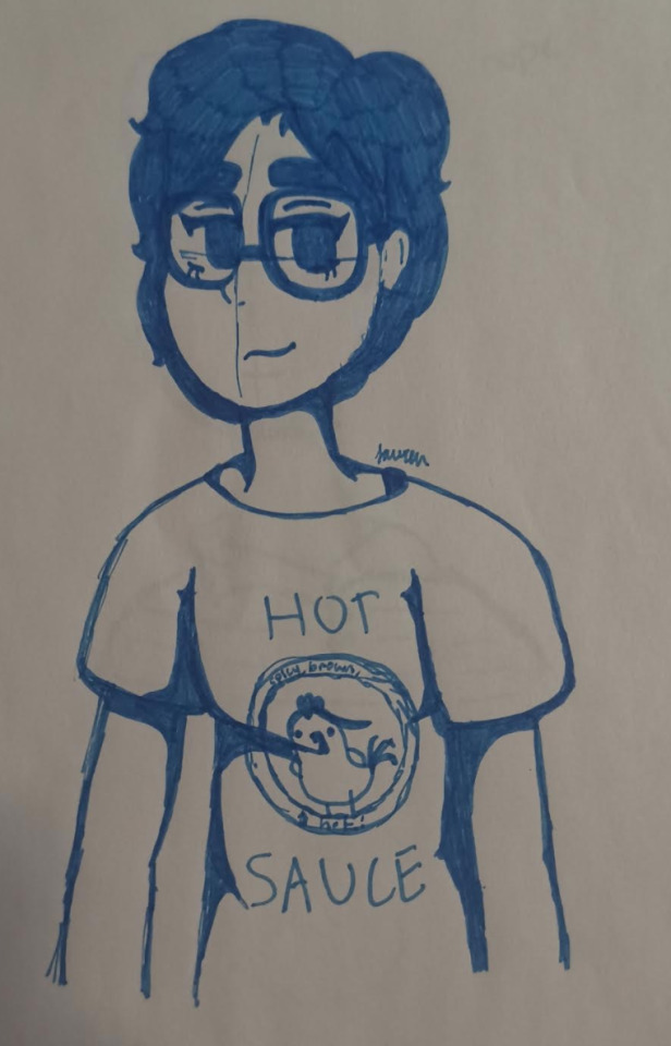
genderswapped gared gleinman
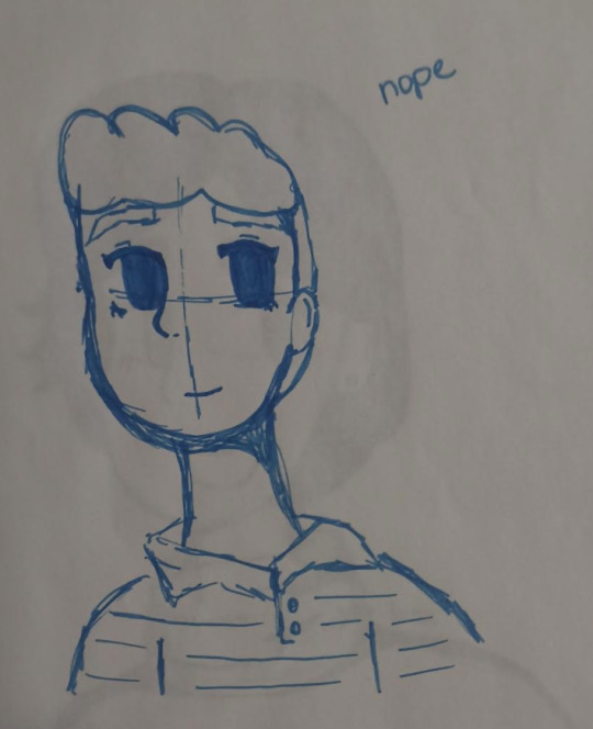
“nope” first of all, mood
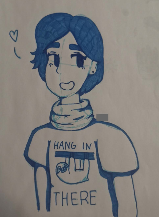
this one was ok. modern teabury again

tried to do those aesthetic-looking doodles but ran out of Things
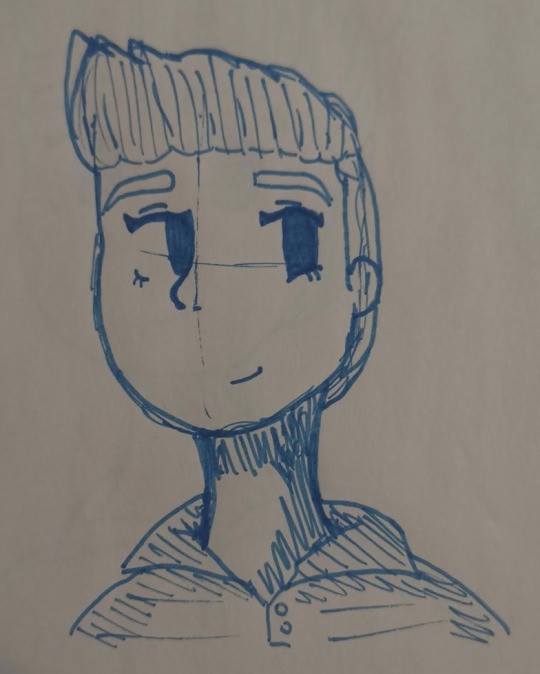
piss
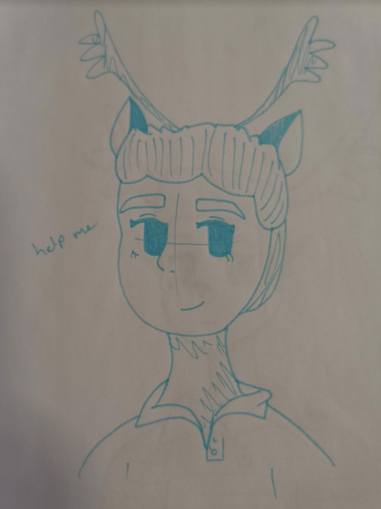
haha cause it’s dEER EVAN HANDSEN GEDDIT D EER HAHAGAHGSDAHJ
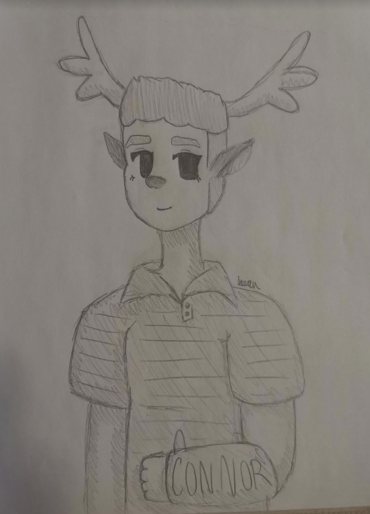
deer evan hansen: good edition
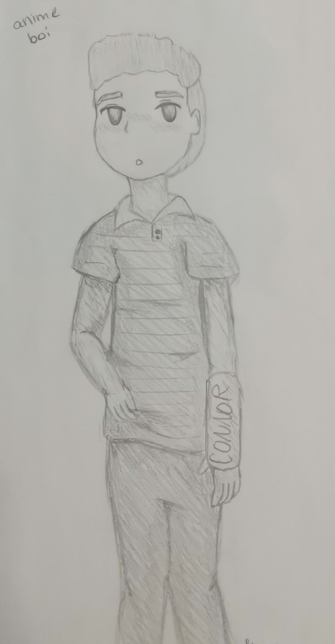
anxiety is so adorable amirite
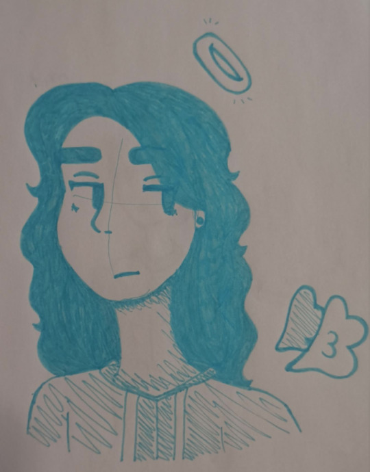
angel connor. in terms of drawing alone this one’s actually not bad. also WE’RE ALMOST AT THE END
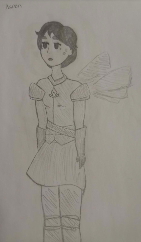
some cool badass knight princess or something
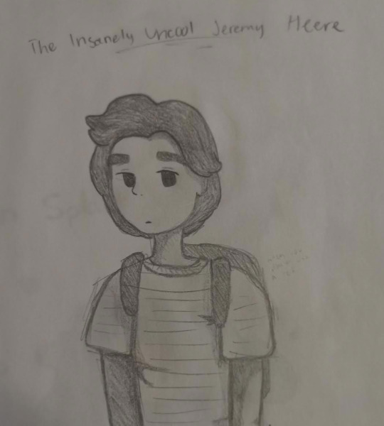
im pretty sure i stole that phrase. also look at that hair haha
i thought i was a fucking genius for coming up with this
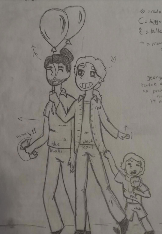
GEORGEFAYETTE OTP ALSO WE HAVE REACHED THE END!!! PRETTY SURE ABSOLUTELY NO ONE IS GOING TO READ THROUGH THIS WHOLE THING BUT CONGRATS IF YOU DID I GUESS
4 notes
·
View notes