#I redid an old drawing but digitally
Explore tagged Tumblr posts
Text
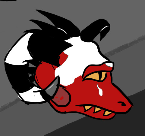
The experience of serving the royal family was completely different from anything Diaval had ever experienced in his life. Many positive things came, but the responsibilities were equally important.
Still, in the face of all these changes, one thing remained the same—Diaval's favorite pastime, where he could play with his one and only best friend.

(click the image for better quality)
Tag list: @cyanide-latte @oya-oya-okay @theleechyskrunkly @thehollowwriter @distant-velleity @boopshoops @br3adtoasty @casp1an-sea @heyhellohihowareyou @revolllutionary @tixdixl @sillyslipperybananapeel @u-makemeunpocoloco @cheerleaderman @revolllutionary @nyx-of-night @lumdays @skriblee-ksk @hanafubukki (Ask to be put or to be removed!)
#I redid an old drawing but digitally#so if you remember a similar drawing that's the reason#malleus draconia#diaval corvo#malleus twisted wonderland#twst#twisted wonderland#diasomnia#diasomnia oc
158 notes
·
View notes
Text
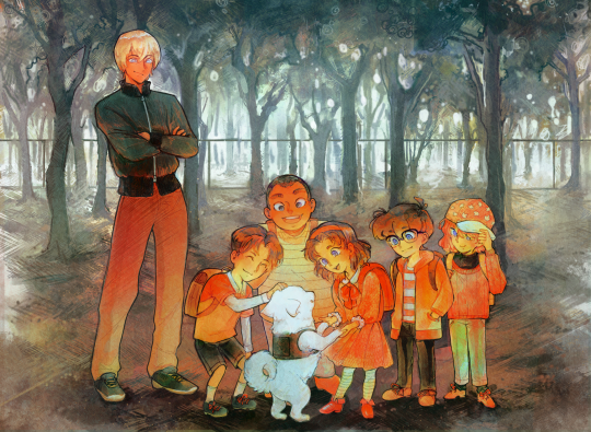
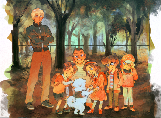

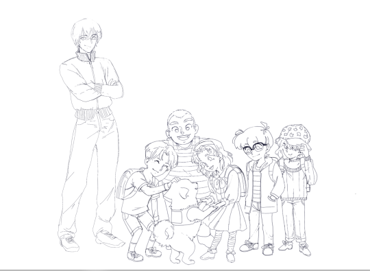
harooooooo (♡ω♡ ) ~♪
#the kids meeting haro :)#if this seems familiar to you: I redid an old drawing from last year and colored it!#amuro tooru#furuya rei#tsuburaya mitsuhiko#haro#kojima genta#ishida ayumi#edogawa conan#haibara ai#detective boys#detective conan#detco#dcmk#digital art#fanart#my art
808 notes
·
View notes
Text
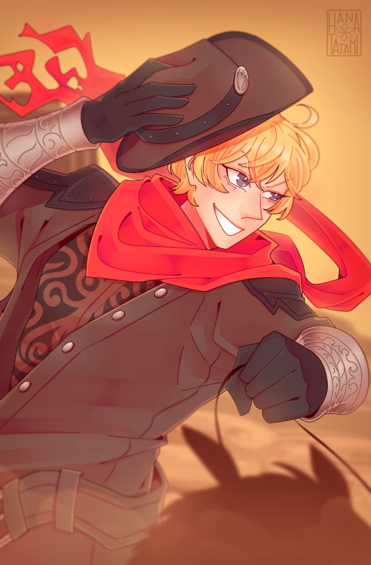
i wanna be a gunslinger ♫ or something cool like that ♫
#guess what - this was also a two year old sketch that I redid#billy the kid#fgo billy#fate billy the kid#fanart#fgo#fate grand order#fate series#digital art#he's my first archer he carried me for so long i still love you billy#no i cannot draw horses why do you ask#i also.......... love cowboys yes
131 notes
·
View notes
Text

Lost in the neons
#my art#digital art#blood#eye strain#neon#candied lightning#preston davis#green jay#oc#artists on tumblr#also if you didn’t notice I redid Jay’s markings cause his old ones were a pain to draw tbh
19 notes
·
View notes
Text
Redid a dtyis I did roughly a year back. Happier with the way I’ve improved drawing digitally so it isn’t a complete hassle to do.
First is new, second is old!

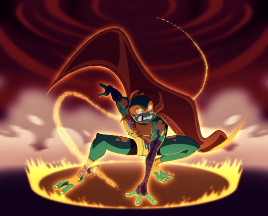
#rottmnt#tmnt#rottmnt mikey#rottmnt bad future#rise of the tmnt#goodness I hope it looks like I’ve improved#who knows#either way#happy with the newer composition!#drawings chains is a pain in the ass#but satisfying#matchart#fanart#tmnt 2018
1K notes
·
View notes
Text
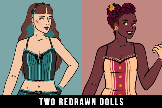

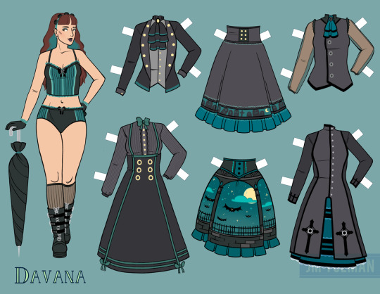
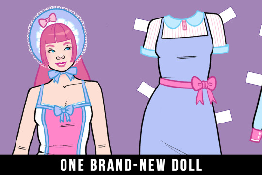

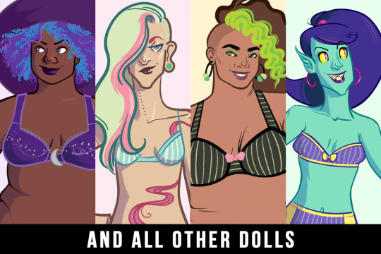
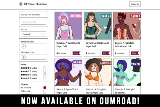
Finally, I can announce this!
First, I have three new paper dolls: Datura, Davana, and Duranta. Well, Datura and Davana are only half-new; you might remember them looking more like this:
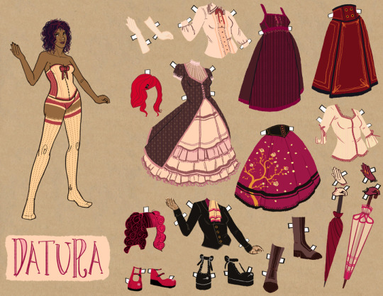
Datura (2012)
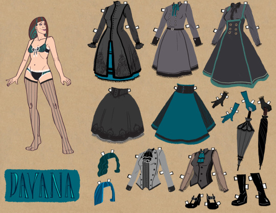
Davana (2012)
They were my first entirely digital dolls, and HOO BOY you can tell. I decided last year their art needed a refresh. So I improved their bases, redid their clothes but kept true to designs, and got rid of the fiddly accessories no one liked to play with. Judging by the reaction I have recieved at shows, I did a good job!
Duranta, on the other hand, is entirely new! I wanted to combine the themes of modern Sweet Lolita fashion with the silhouettes of old-school Classic Lolita. I think I did well, and I had a lot of fun drawing so many ruffles and lace.
The second thing is I have moved ALL of the dolls to Gumroad! Listen, Etsy just isn't as creator friendly as they used to be, and their digital delivery system was a bit lacking. Gumroad is a better home for my dolls. I'm hoping to move all my physical products there as well, but one thing as a time.
Anyways, check out the new Gumroad shop here!
#art#illustration#paper dolls#paper toys#lolita fashion#gothic lolita#sweet lolita#fairytale lolita#digital art#fashion illustration#digital#2023
75 notes
·
View notes
Text
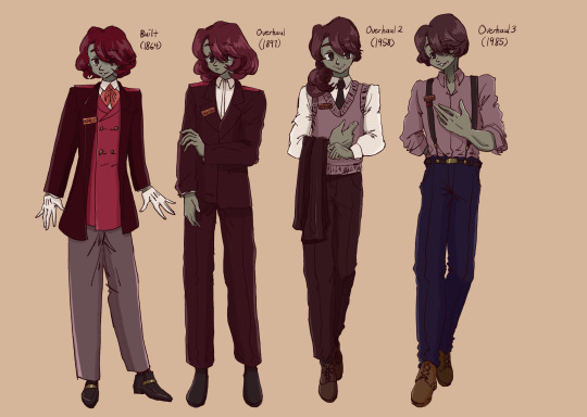

WHOS READY FOR SOME CENTENNIALS!!!!!! unasked for explanations below once again
This set of designs is different from Ryan's because i basically just traced my old sketches and redid them digitally to give them colour so there are less design details (sorry lmao)
ANYWAY continuing with the "time-accurate" clothing choices, I'm hoping it's more obvious with loey and neas this time. You have no idea how RELIEVED i felt when i saw neas' third overhaul was in the 2000s. I love details but I have been working with suits for like 30 designs by now.
Because I did these back in october I don't really have proper ref images but if you googled men's fashion for each of their respective eras you should get pretty good results and if you don't im sorry💀
Not sure if it's obvious but they're supposed to "age" with every overhaul, yea im aware my ability to draw people older than 40 is nonexistent-
On that note, I have a more in-depth hc for how the "human" of an engine appears which would explain how loey and neas can "age" but the short version is the "human" is a combination of the maturity of an engine's mentality and the engine's actual age
I do not know enough of the Skarloey Railway lore to back my headcanons but I hc that during their early days, the SR was more strict with appearances, hence the suit jackets and whatnot (kinda like how RWS SR engines all have the same livery)
Towards the SR's later days, the change of directorship and the increasing diversity of their rolling stock led to much more relaxed regulations on appearances. The jackets that the overhaul 2 designs are holding would look similar to the jacket that overhaul 1 loey is wearing, which would bear the engine's nametag and the signature red shoulder pad designating an engine's gauge
Also the nametag and specifically the number badge were details added later when I finished my handel and petah designs, yes I love it a lot that's why i mentioend it.
Overhaul 1 neas is particularly different from overhaul 1 loey because for one they're two different decades, but also the time between his first and second overhaul was when neas had to run the line on his own (not to mention the world war woah...)
I haven't really figured out specific height hcs yet but neas and loey are around the same height as each other but grow a tad with each overhaul
ok das it for this one i think, thank yall for the wonderful reception of ryan im so happy yall loved him😭🥹also thanks for making it to the end next time it's probably gonna be handel and petah<3
#ttte skarloey#ttte rheneas#ttte humanized#ttte#i was working on and off this for a whole ass week thats why this took so long#that said im thinking of throwing duncan in a blender (uncalled for???) hes like a squeaky toy#capy's graffiti#pictures in the reception hall#capy posting#also i was rewatching slotlt the other day and like. its actually ridiculous#if thomas' drivers had any will of their own none of this would have happened#unfortunately that little fucker was driving around helping some guy dig at like. 4am and the drivers were just like aight cool#and you KNOW they were in there cuz they were there during the entire end chase scene#like they HAD to address that by showing thomas' crew jumping out before he fell into the sea#also ryan during the chase scene. “hey mr crew i know ur off work but im really worried about my train friend can we go for a drive :(”#and those crazy bitches said YEAH SURE AND THEY WENT#LIKE IS THE PAY THAT GOOD????#dont get me wrong id drive around with ryan at 2am any day of the week but like#so much of the cgi era's events were dependent on the trains' crews having 0 autonomy beyond driving an engine#and i just think thats so hilarious
62 notes
·
View notes
Text

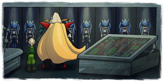
It's the last previews for Falling Into Darkness!
Important note before I go into some details on the pictures: I will, in general, not be doing this for other fanfics I post. The main reason I did this series of illustrations was as something of a treat for finally crossposting this 10-20-year-old story to my AO3 account. I don't really plan to draw a ton of illustrations for other fics I do.
That being said, I may do occasional images that will be posted with future stories on AO3 (I have a quick one for the first chapter of the next fic I plan on posting, for one), and if I do other fanart, related to a fic or not, I still plan to post art here.
But I'm glad for all the kind comments and everyone enjoying this series of illustrations with me. :D You guys are awesome.
With that, description-stuff (including more behind-the-scenes than usual) below the cut. 'Tis long; be forewarned.
First up, arguably the easiest illustration to do in the whole set. It's a silhouette, so the foreground wasn't really an issue (other than trying to get the edge glow just right, and I still don't think I quite managed but I'm definitely telling myself not to mess with it any further). The background was already painted for the second illustration in the whole set:
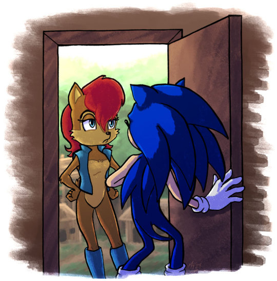
I just fixed up the paths and the treetops and added a little lookout stand to the building on the right, now that Sonic and Sally weren't blocking those spots. After all, it's supposed to be the same view anyway, so I figured I'd make it easy on myself and not have to completely repaint the scene.
The second image employs some little cheats here and there. Here's the original sketch from my sketchbook for comparison:

Very loose, lacking detail. Straight lines are more like suggestions. The robots are spiky blobs. I have a literal note next to a stick figure and a hollow shape telling me to get some references. There's the barest hint of the alcoves the robots are standing in.
I didn't show this level of behind-the-scenes off with other illustrations in this series (though I suppose if anyone's ever interested, I could do a process post about how I worked on these), but one of the first things I did with this series of illustrations was sift through the roughly fifty individual sketches I'd drawn to illustrate various parts of the story (not counting redraws of portions), ranging from vague shapes to much more detailed drawings, to narrow it down to the ones I was actually going to finish for this project. I ended up with 27 total images, including the two I'm previewing today, focusing on having at least one but no more than three images per chapter.
Once I'd determined which sketches, like the above, were going to become a finished piece, I then went through each and every one of them in Photoshop with a sketch pencil brush and filled out the sketches to a point where I could reliably ink them. That meant things like swapping out figures that didn't work with redraws of them or making size adjustments, like so:

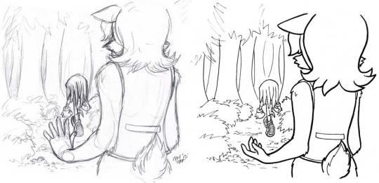
The first image is the second illustration, and you can see I redid Sonic because his initial pose didn't work. The redraw was actually a pose of him I did to draw his post-Mobianization robotic elements from the end of the story, but the stance was actually good for what I needed, so I Photoshopped it in and then sketched the rest of the replacement drawing digitally. The second image is Sally watching Knuckles walk away, and you can see that I changed her left arm, and also reproportioned her body prior to inking (bigger head, smaller body).
And for pieces like the final one in this illustration series, I sketched in all the details that were missing from the initial sketch (which, as I said, was pretty barebones; in my defense, it was the last one I drew, and by that point I was pretty tired of drawing robot hedgehogs so Sonic was something of a stick figure in most of the last chapters' sketches).

And here's where one of the cheats comes into play. I drew one robot hedgehog. Specifically the one you see the most of, near the tip of Robotnik's cape by the drafting table. I drew it on its own layer in Potoshop, then copied and pasted it into all of the other holding bays, erasing parts that wouldn't be visible as I went along. I also went and found those references I needed for Robotnik and Snively and drew the two of them properly.
And then, because I much prefer physical pen-to-paper inking over digital (my tablet is not one of the fancy screen ones, and I've yet to really get comfortable digitally inking with it, despite owning it for nigh on twenty years), I colored all of the sketches red, assembled them in groups on letter-sized images, and printed them out onto cardstock (my preferred medium when I'm going to be traditionally inking). I inked them with my various inking pens (some Sakura Microns, some Faber-Castell PITT pens), scanned each sheet back into my computer, and cleaned up the lines in Photoshop (the reason for the red printout was to make it a bit smoother removing the sketch from the inked lines, though it wasn't as clean as I would've liked; oh well).
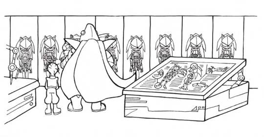
That left us with the above. Because I inked them each by hand individually, the robots don't look copy-pasted, because it was the underlying sketch that had been, not the ink work. The tables and holding bays also have straighter lines thanks to using a proper ruler for those (though I didn't concern myself too much with things like perspective and right angles), and after drawing the straight line, I went back freehand over spots to give them a bit of that hand-inked wobble.
From there it was a matter of laying down the flats in Photoshop, then shading, adding effects, etc. I like the cold yellow light I've got on the robots, and the overall shading on the yellow cape. Also that sense of satisfaction when I called this one done, because it was the last one. Huzzah.
I'll see you on Monday for the last chapter!
#drawing#artwork#sth#sonic the hedgehog#sally acorn#doctor robotnik#snively#behind the scenes#LOTS of behind the scenes#like seriously I went on a bit of a ramble#I regret nothing
7 notes
·
View notes
Text
Old art part 2: ttrpg edition
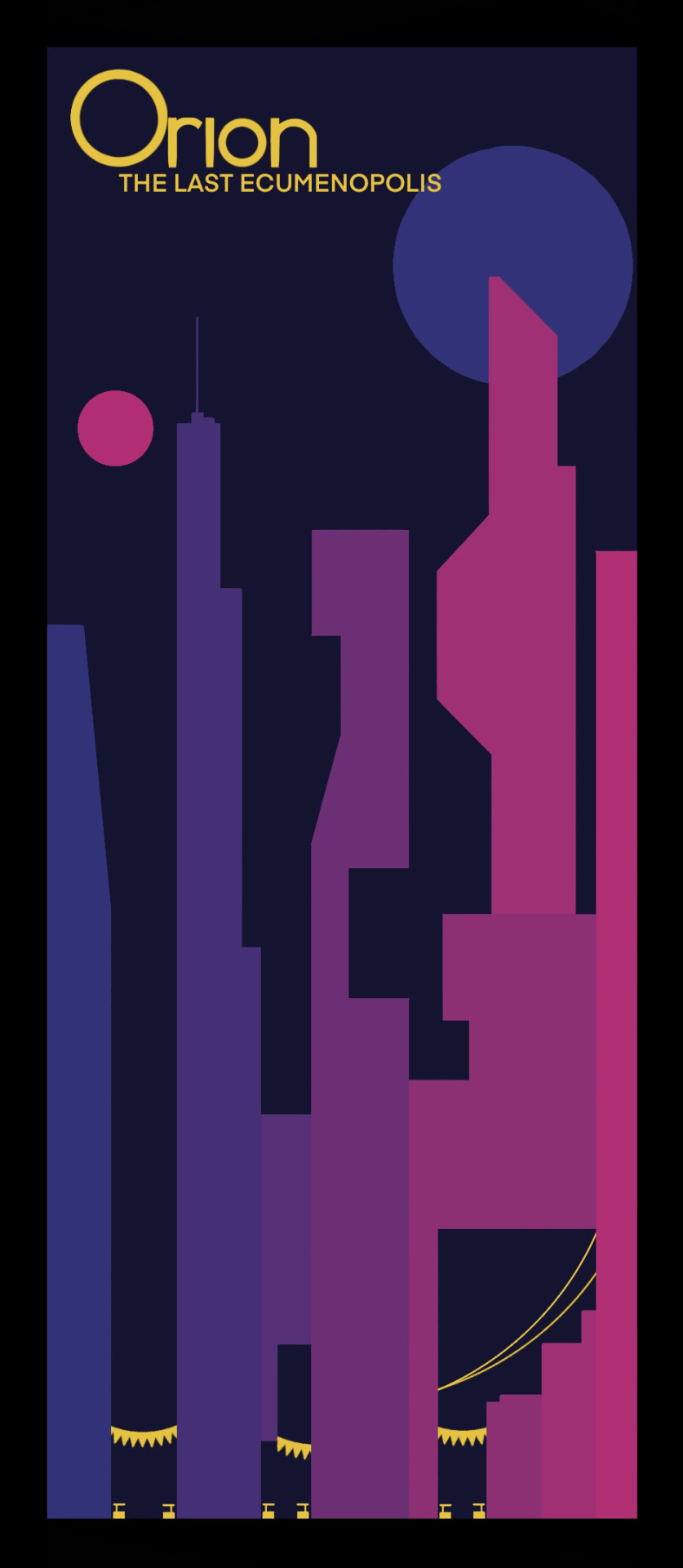
I've been GMing "weekly" for about 6 years now and have enjoyed drawing for it. Mostly posters and logos and stuff, design is fun. Here's some stuff I still like decently enough from my more recent campaigns: My Starwars 5e stuff: "Starships: We're Meant to Fly"; a Starwars 5e campaign set after the political collapse of the Empire written and DMed by a guy who's never seen a starwars movie. Here's Orion is the last Ecumenopolis (after the others devolved into cannibalism and violence once the galactic trade system broke down and left them disconnected from food imports). And here's the logo for the big bad of the campaign: A home appliance megacorp.
Modern Fantasy(?) stuff: My current campaign is set in a Modern Fantasy(?) world I've been building of the past couple years:

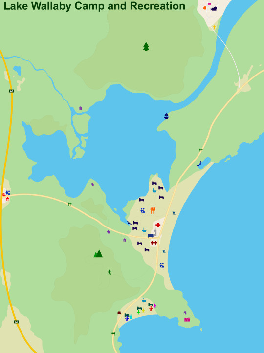
A series of small towns (and a summer camp) located along the SE Australian coast that has been used for a short Monster Hearts "oneshot" (Millica Bay), an abandoned Slasher Flick campaign (Lake Wallaby) and now a Monster of the Week (Lakeview-Myrtle). Lake Wallaby I made as an oneshot for my 18th birthday, though a year later I redid the map to make it 4k (and intractable). I desperately wanna go back in there and dm another slasherflick, once I have the time and energy (I always seem to have one and not the other)
Finally, Lakeview-Myrtle are two sister towns that have been in stagnation/decline respectively since the 80s (and also maintain the highest missing person's rate in the country), and it's out plucky heros' job to figure out why (reasons I will not be listing cause they follow me and that would be SPOILERS. Looking at you Racs!). This is the campaign I made those posters for a few weeks ago :p, I also made a (not great) 3d animation for it for my art elective.
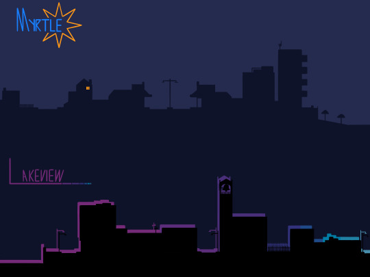
And there we go, the rest is too old for me to look at with anything other than "god I used to be bad at drawing huh" (most from before I started doing digital, imagine the horror)
#and we're done I think#Drawing was honestly never something I did frequently#until I got an echo hyperfixation and flung myself full speed ragdoll mode into the furry fandom#my art#ttrpg#worldbuilding#monster of the week#motw#slasher flick#slasher flick ttrpg#starwars 5e#lakeview-myrtle
7 notes
·
View notes
Text
Onward to 2024
I know I have a few days till the year ends but meh. I'll write it now!
This year was far more productive for me after the prior year tried to take me out several times. While my new found health issue which may or may not persist left me in a state to constantly produce stuff in worry I'd never get the chance, it was still nice to look at the WIPs I got done.
Having finished The Demon King of the Desert was my main goal. I was so happy to have it finished, and be it on AO3 or Wattpad, I am glad it was loved as it was. ♥ While I would love to go back, revise, and pimp it out to be something far more explored in some areas, I plan to wait a moment before doing so. The original ending was something a bit different and the beginning was so rushed because I only hoped it would be 10 chapters. But, well, things run away from me.
The characters are still very much alive in my heart, and who knows—maybe I'll do the in-between idea of what Demiurge and Gerdu were up to during their absences (as well as do a ref sheet of Gerdu).
I do want to work more on my Patreon. I wanted to work on one for years, and now I have reasons to work there behind the scenes.
While all my mature things will remain there, the rest will gradually become public. I do have some comics I want to work on, that'll begin there and slowly drift to public spaces in due time. ♥
The King of Boos as well as a few other scenes I'd love to turn into comics from my King Boo / Reader story will be there. Sadly, as it stands, the first one won't be released till I am done with You're the Inspiration. Just because of how the two coincide with one another a bit. But it will eventually!
Because of my desire to dive into my childhood once more, I will be working on a few things with Violetta, my new Mario OC, and maybe make a self-insert OC in general since I want to do something with Rosalina too. She's my queen, sorry. ;^;
In general, I want to get some comic-ing done. I love comics, even if they take me forever to do at times. I figure Patreon will be my go to!
I also have some monster stories (and ref sheets for some of my boys, gals, and in betweens) in the works. I just have a massive to-do list that's bigger than my backside, so stuff will come out as needed!
I will do my best to try and work on using my artist tablet more over my mouse. While I want to continue using my mouse just so a broken tablet can't stop me from ever doing digital art, I do want to try and feel comfortable using an artist tablet all the same. ♥
2023 really opened up a lot of ideas for me. I redid my reference sheets too, which I am glad I didn't get far in those, or I would have screamed at the many I'd have to redo. But I plan on redoing the old ones and moving to a better future with them.
Oreana and Ignatius' story will continue at some point as will another story I may put into comic format if I can draw creatures better again. ♥ It's an old idea inspired by a fanfic of epic craziness that I still have a fondness for that was done in my pre-net days when I was a kid.
Anywho! Hoping for a brighter, just as productive, new year! Stay safe, everyone, and thank you all for your support!
#i looked at oreo and iggy's story on AO3#and was shocked people were subbing to it#whoops. sorry. i keep forgetting to go back!#i will return to it soon#and my demi/oc story will still be worked on#just gotta motivate myself!#much love my dears#mod talks
7 notes
·
View notes
Text
So...they are far from perfect, but they have taken me months and I finally have these two as close to what I see in my head as I'm going to get them for now. I will just hope I improve as I draw them more or something. Digital art is also something I'm still adjusting to so...yeah. Anyway, say hey to our protags (reimagined)! Buckle up, this post got looooooong.
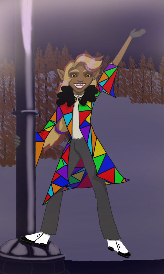
Charlie is the only child sired by Lucifer himself even if it's in a most unconventional way. He's essentially her father and her mother. No Lilith here, folks, sorry. I'm not Jewish and I don't feel comfortable adding her considering what Jewish folks have said about her inclusion in modern works so she's just...not appearing in this comic. A lot of this will be based on my Protestant upbringing with my Hellenic Polytheist sensibilities thrown in, just fyi.
Now, about the redesign...
I don't actually hate the redesign of Charlie in the show. Her hair is fun, her being masc-presenting is interesting, and red is actually my favorite color. However, I completely redid the Rings and like the idea of Charlie trying to unify Hell with her cause instead of just Pride Ring. She kept some of her red because Lucifer has blond/red hair in my version, depending on how much of his angelic persona drops. There's also red in her coat of many colors which is a Biblical reference as well as an extension of Charlie's ideas about Hell and how the "rainbow" of the Rings should be working together to rehabilitate Sinners instead of just torturing them and making them worse. She even made it herself from scraps of the Ringmasters' clothes, Belphagor's fleece, and an old sewing machine. Her dad hates it because it makes her look poor. They are locked in constant battle over him trying to discreetly destroy it and her salvaging it last minute. She also wears spats on her shoes. They're tap shoes because ofc they are. I let her keep her love of theater because it's cute. Lucifer secretly loves that his daughter is just as much of a showboat as he is.
JC is also Sir Not-Appearing-In-This-Comic, but at least we have Charlie.
Now, some of you are probably noticing that I made Charlie darker...that's not an accident. Charlie, by the method of her birth here, has black skin. She has her father's eyes and hair. As I get better at drawing and rendering black hair, we will see it in other styles because I love some of the things black folks with more textured hair than myself do with it. I just really like the bubble braid too. It suggests thickness not a lot of people have in their hair. Charlie has had to learn how to style her hair herself a lot since Luci can barely manage some puff buns. Doesn't help that It seems to grow back as fast as it's cut so Charlie mostly trims the ends and moisturizes the hell out of it.
I think it's fitting for Charlie to have a bit extra vibrancy with demon and angelic features because she isn't mortal. At least not completely. She does have a more horrifying form with horns and eyes and wings but she hardly ever has to use it. She also has a natural charm to her she gets from her dad that makes it very hard to turn down what she suggests. Not impossible, just very unappealing. Hoping I can get to a point where her eyes aren't so scary looking but she does have cat pupils so, we'll...see.
Funny thing about Charlie is she is a bit like Elsa. Born with powers beyond comprehension, lives in an icy castle in the mountainside of the remote (only) city in her country, and was kept away from most of her citizens until her 200th birthday.
Okay, it's not a complete 1:1 here. Yes, Lucifer kept Charlie under wraps for about 200, well 50 years from his family, the other Ringmasters. The other denizens of Hell had no idea they had a princess until the events of the comic. They really aren't sure what to make of it either. Some Hellborn think they'll be able to marry into Lucifer's good graces (Sinners cannot legally marry anyone), others consider ransoming Charlie when she ventures out to start the rehab hotel (they are so painfully mistaken; everyone from her dad to her aunt Bel has taught her how to fight viciously even if it's not her preferred method of conflict resolution. to say nothing of the protective friends she gathers quickly). It also makes Charlie a little...well, naive about just how well her plans to rehab Hell are going to go. Most of what she knows about interacting with others come from pop media and her loving and protective family. It's an eye-opening experience when she strikes out on her own.
Debating on adding more black fleece to the bottom hem of her coat too. Thots? The background is just a deserted little corner of Pride Ring which is covered in snow (yes, Pride Ring is cold like in the Divine Comedy here). The orange trees in the background are courtesy of @holoanarchy for giving me the idea when I asked "what's a good color for the leaves of Hell trees?". I'll talk more about those when I post that Ring up, though.
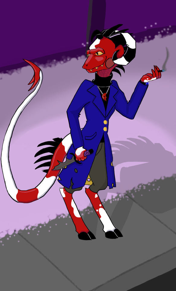
Okay, let's talk about this lovable asshole now.
Blitz Wire has had to struggle and fight for most of the things he has in life. From the very beginning, things have been...tough for him. Imps are not the very bottom of the social ladder in my version of circus Hell, but they still make up the majority of the working class. If you've never been working class, take it from me, it sucks rocks. Sucks even more when neither of your parents were ever really successful or good with money either, as is the case with the Wires. Blitz's parents met when they were young and idealistic in Greed Ring and shortly married after a brief courtship. Beatriz (this is what I named his mom to keep with the 'B' theme), worked in a factory where they painted figurines of Mammon and the gold paint she huffed developed into Imphysema over time. She stayed sickly throughout Blitz, Barbie, and Fizz's childhood while Buckzo took over the family carnival to help put food on the table. When Beatriz could no longer work, he put the kids to it. They were happy to help and work to get noticed by Mammon so they could rake in some dough to get better medical treatment for their mother, despite the Ringmaster being the very reason she was sick in the first place (capitalism, baby!).
Blitz, as in the canon...is not very funny. Despite having a range of acrobatic tricks and being able to think and react very quickly, he just never had a knack for nor got a grasp of how to hold people's interest and make them laugh. Is what it is. Fizz was always the star of their little sideshow attraction. Barbie came as a close second with her death-defying knife acts and torture plays. Blitz just never stood out as an entertainer as the maladjusted middle child. Over time, that became a resentment. Coupled with Buckzo's disregard for him as his son, Blitz started pushing the envelope with the acts he performed.
Finally, when he was sixteen, Blitz decided he was ready to run a giant obstacle course straight out of Hell. It went about as bad as you would expect. Fizz got the brunt of the damage when he pulled his surrogate brother out of the jaws of certain death. While he was still recovering from being scalded by holy water, Blitz was fired and kicked out of the only home he'd ever known by his father. Barbie and Beatriz kept in touch, despite Buckzo's "banning" it, but Blitz spent the remainder of his teenage years on the streets of Hell, urban foraging and doing odd jobs to save up for a place away from Greed and the posters of Fizz's face as his fame grew.
I didn't really want to change much about Blitz's clothing choices since it makes sense for him to want to look professional, but also be comfortable while slicing throats and blowing people up. Also, blue and gold comes from him being from Greed and Asmo being his company's sponsor. Took away the boots and gave him proper hooves, though. Now, I didn't base the imps' lower halves on any specific ungulates, but Blitz's top half is defs based on an iguana. I want them to be more reptilian since Wrath is pretty desert-oriented and Satan is lizard-like herself. I could probs get away with making his tail a little shorter, but I'm happy with how his horns and spines turned out. He smokes this shitty brand of cigs called Blak'N'Bluz. They aren't called that because of the black filter and blue of the Hellfire they burn on, though. It's said they actually make one's lungs black and blue with one drag because they're so caustic. They're the easiest to steal as a result and the one Blitz started with so he always comes back to them.
I wanted him and Barbie to look more twin-like and I really don't care for OG Blitz's horns. As far as the pendant he's wearing goes, it never made sense to me that his mom only left him something and never left anything for her other kids (which could not be the case but we just don't know because...well, we're never given this info). Blitz and Barbie split their mother's necklace down the middle and each of them wears a piece of it. No idea what to give Fizz from her yet.
I changed Blitz's facial scars and I'll tell you why. Forget who pointed it out in the critical tag, but the type of face scar OG Blitz has would likely leave him blind, with low vision, or with no eyelid in the eye covered in that scar tissue. No matter how you slice it, his sight would be compromised. Given that I gave that particular trait to Loona and Vaggie also has an eye patch, I decided to vary him up. He's still disabled though. As another person pointed out on a totally unrelated to HB/HH post, burn scars can impact everything from self-esteem to physical movement depending on what caused them and how they heal. Due to the majority of Blitz's scarring being on his right and back, his tail and right side usually suffer some debilitating pain flares when he overworks himself. Also, migraines and trouble extending his limbs fully. Basically, he carries a bottle of percocet around (it's like demon ibuprophen; it's fine). His pain is part of why Blitz is such a cussy grump. Hard to be pleasant when you're poor, traumatized, AND hurting all the time.
I.M.P. is still a thing in this rewrite (still debating the name), but Blitz got the idea for it when he was dating Verosika (yup, that's still a thing too). She's the one who got him an in with her boss, Asmodeus. So, he has access to Asmodean crystals since the Ringmaster also liked the idea for snatching extra wicked souls early (they're a power source and, therefore, far more valuable then someone committing tax fraud or whatever) They parted on okay terms, but Blitz adopted Loona shortly after entering his 30s. Kid's gotta eat, so he expanded the business from an imp with a knife to two imps with a van full of guns. Hiring on Moxxie from his old stomping grounds of Greed, they were able to take on more clients. That led to meeting and hiring Millie. Loona comes on hunts now that she's old enough too and they all have a blast. The rest, they say, is history.
The other side of his face for ref:
Gave him a tear-shaped scar because why not? Also a horntip cap. That one is damaged and his trying to keep it from getting worse and breaking the whole tip off.
#jack is wording again#helluva redesign#hazbin redesign#blitz wire#charlie morningstar#helluva boss critical#hazbin hotel critical
16 notes
·
View notes
Text
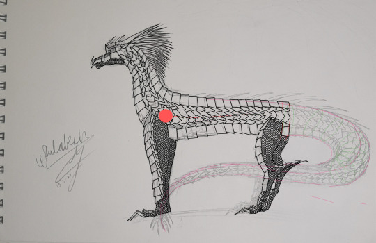
W.I.P. 26/4/24
fun fact: for some reason sketchbook decided to not save all the work I did on the hind leg scales in my last session so I had to redo that My back does not approve qwq
I changed up the belly scales as the old ones made no sense, like where would their wing go?? So I redid them and now the red line is where the wing is! and then I fiddled with the scales around the hip for a lot of time XD
anyways,
Speed paint + design notes: youtu.be/KIRbrlW2uR8?si=piB_35…
short: youtube.com/shorts/hYJrEng44Nw…
check out my other socials: linktr.ee/darkness.ridge
Time: This Session: 2 hrs 23 mins Total: 28 hrs 32 mins
Medium: Base on drawing file Digital art using Sketchbook
art by: Darkness-Ridge
usage of my art for anything isn't allowed, breaking of my copyright will not be tolerated
4 notes
·
View notes
Text

Old characters I redid! I can’t remember if I ever posted it but I did a digital drawing of Ginseng before so maybe saw it maybe not. Edit: I did post it! Old art warning tho
4 notes
·
View notes
Note
1, 7, 12, 15 :3
1: how would you describe your style?
lanky. which I think is because my current arc of how I draw people came from a 'how to draw manga' book. also simultaneously angular and flowing
7: show us a wip
no context only really fucked up hand because I erased and redid it too much

12: show us an old drawing
oh I'm busting into the archives for this one. behold;

september 2016. I can see where I was where I used to live just from the glimpses of around the sketchbook page. it was a school project and honestly I have attempted to revisit the ideas since but I've never been happy with it
15: if digital, what programme do you use?
I use procreate, which is the programme my uni recommends for its art students, because. well. procreate's based in the state I live in. which makes seeing people go 'what the hell is this even named after' about some of the brushes included really funny because I know what they reference. oh I can see that brush's name from the living room. pretty wild actually
thanks for asking!!!
3 notes
·
View notes
Text

Image ID: a digital drawing of hawk-like wings and a tail. The primaries are black, the secondaries white, and the feathers around the shoulder are a reddish-brown. End image ID.
I’ve been rethinking my old redesign of Hawkgirl, and decided to redo her wings again. Based VERY vaguely on the Levant Sparrowhawk and the Red-Shouldered Hawk. Absolutely nonsense rambling under the cut. It’s just me complaining, don’t worry about it.
I’ve always disliked the canon design of her wings because the grey really didn’t match her color palette. I’m completely ignoring the fact that the wings were always drawn with a complete disregard of any anatomy. I’m ignoring it both because I sincerely don’t expect any artist to study bird anatomy, and I’m also ignoring because I am so totally and completely normal. I’m so normal.
But in my old redesign (which is, wow, almost two years old by now) I wanted to base her wings after actually bird wings. I based them on the Levant Sparrowhawk, because it had a population in Egypt, had some nice blacks and whites that could match with a palette really easily, and the backs of the wings were even gray to call back to the original design. I couldn’t be assed to do the barring at the end, though.
So of course I look back on it now and decide I don’t like it. So I redid them. They are vaguely patterned after both the Levant Sparrowhawk and the Red-Shouldered Hawk. I also finally completely unified the color palette with what her redesigned costume’s would be, with only reds, browns, white, and black.
Anyways I’m much happier with it now. I think I managed to keep the design simple while keeping it relatively accurate to how birds work. :) nice.
#dc#redesign#shayera hol#hawkgirl#my art#honestly might go back and redo all of my designs for the league#I have redesigns for bats and cat woman lying around somewhere#but I didn’t actually design them in that original post so I can’t exactly re-do them
3 notes
·
View notes
Text
Okay Finally redid Cinder's reference sheet :3
His old one was very old and kind of ugly so I updated it. Hidden under the cut because of SH scars. Only view if that is okay.
Here is the boy :3

He is a pre-op trans guy and agender. That might sound like a paradox but I myself am both non binary and wanting to be masculine presenting. He's a really sweet guy and has a dog boyfriend named Brandon that I have not gotten to drawing yet ^^' but will soon. I came up with him a few years ago and now he looks a lot more accurate to what I thought of. They are also quite nervous and have a lot of dysphoria, wearing a big green Halloween hoodie all the time. They like doing digital art and animation, they also enjoy playing the drums and live in the mountains. They love rain and long naps.
Anyway I'm very proud of my art progress with him and think he's very nice looking. Cinder is one of my oldest ocs and I'd love to draw others from his friend group soon.
0 notes