#I really love how the camera shifts from the foreground to the background
Explore tagged Tumblr posts
Text


Aldhelm | The Last Kingdom 3.10 (Part 3)
Aethelred tells Aethelflaed to relay the message to Edward that he is declaring himself King of Mercia.
#lord-aldhelm edits#the last kingdom#aldhelm#aethelred#aethelflaed#my screencaps#tlk season 3#3.10#I really love how the camera shifts from the foreground to the background#bringing Aldhelm's contempt into sharp focus#james northcote#millie brady#toby regbo
26 notes
·
View notes
Note
HIIII DID U KNOW YOUR "Dangerous" Epic animatic is by far my FAVEEEE <333 pls I aspire to be such a super good and cool artist like you. I saw you used Clip studio Ex and then storyboard pro. I was kinda wondering how you work on your animatics step by step? From a senior artist like yourself to a little junior like me. If it's alright to find out your work process- I want to try and get into the world of epic animatics too (You're one of the artists that inspired me to do so) SO LOVE U SMM!!!! And THANKKK YOUUUU for bringing such a masterpiece like that into Youtube!!
A hug for being such a cool artist >>>>

THANK YOU FOR THE ASK! I can't even say I'm a senior artist but that you 😭🙏
About this in particular! I am actually currently working on a, bts video that shows my old scrapped version of Dangerous and my workflow for animatics! Hopefully I'll be able to make that in the next three-ish weeks 😭🤞 so for other people curious about my process and stuff, look for out for that as well!
It's pretty difficult to explain this stuff just through text. But here's a general gist of it!
I typically go through five steps - storyboard, rough layout, lineart, inbetween/breakdowns, and color!
Storyboard - planning out major beats I want to hit in the animatic, aka plotting out the story of the animatic
Layout - where does the camera go, how does each scene connect? I also draw myself movement lines to remember what I want to animate/add breakdowns for later
Lineart - I found it was easier to do my clean lineart before breakdowns so I clean up all my layout sketches and draw my backgrounds
Breakdowns - adding inbetween frames to communicate movement between key poses. This is where we see speed of movement, flow, arcs, etc. Imo this is where thing start looking cool
Color/tone - Color to make shapes pop! Making sure foreground element and background element don't distract from the focus point
Bonus! Editing - Camera focus shifts, camera shakes/small movements, color grading, timing edits, motion blur, etc. Any additional effects to make everything look nicer! (I didn't do much of this in Dangerous as I actually really rushed that animatic Ahaha)
I hope this help and I hope you'll check out my video when I get that made! 🥰🥰🥰
13 notes
·
View notes
Text
Sception Reads Cass Cain #26
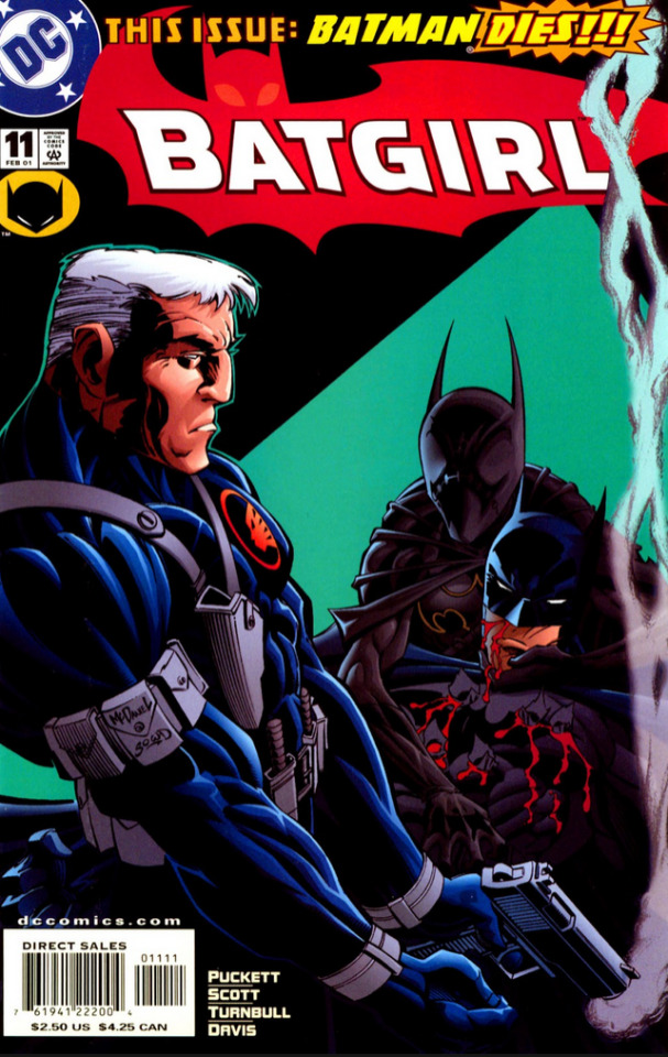
Batgirl (2000) #11 Writer: Kelley Puckett Pencils: Damion Scott and Coy Turnbull Ink: Dan Davis
Something weird going on with the art this time. First few pages are pencilled by Turnbull, then there's a scene shift and suddenly it's Scott for a while, then it's back to Turnbull. Were there re-writes of part of this issue and Scott wasn't available to redo them? Did Scott just run out of time, or did something happen to pull him away? The next issue is a guest team as part of a bat books crossover, but then the usual team is back for #13. This is a case where knowing more of the behind the scenes stuff might be insightful, but all I've got to go on is the finished product, so here we go.
Anyway, this time is a David Cain focused story, and as usual I'm a sucker for early David Cain, back when there was still this core of genuine sentimentality that gave depth to both David as a character and to Cass's relationship with him.
This issue picks up on what he's been up to since the last time Bruce stopped by to beat the crap out of him, and there are several good David moments:

Escaping from armed guards in the hospital despite a near fully body cast, handcuffs, and restraints. Love that little smile in the third panel there, like 'haha, I still got it.' This is Turnbull's David, and it's not bad, even if I prefer Scott's.
Then there's this bit where he's talking up a girl at a bar cut with flashbacks/delusions, and this is Scott's art:

That's a real cheap excuse for the shock value cover.
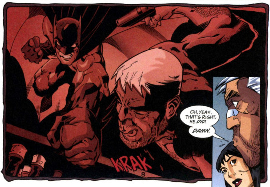
But it's funny, so I forgive it. Telling a made up story about beating batman and so caught up in it he's fooling himself. Dude must be on the good pain killers. His faces are great here.
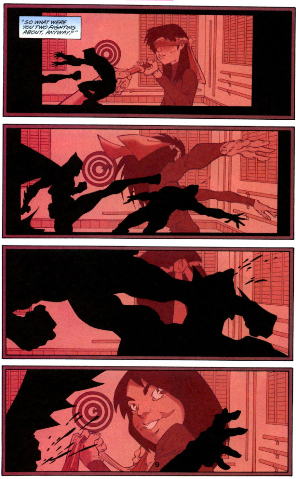
But the whole bar scene is effectively a set up for this page. Little Cass in the background, projected from David's tapes, the Cass of David's memories, training to be an assassin, excelling, loving it. Bruce and David silhouetted in the foreground, fighting over her. The central question 'What were you two fighting about' answered not by text but by just the image of little Cass looking back at the camera, at her father, smiling and full of pride.

David's face on the next page, suddenly so sober and sad. Again, the sentimentality over Cass is the absolute core of this character. That later versions pretend he never really cared about her, that she was only a tool or a weapon or a product to him... I'm still mad about it.

"Made her like us." Direct acknowledgment from Bruce of the parallels between him and Cain, rather than just implied.
Bruce leaves David his tapes, but while he was at hospital the police took them and sent them to evidence storage in Gotham. In Gotham? Did David live anywhere near Gotham? Did he move closer to Gotham because Cass is there?
Whatever. The rest of the issue is David getting his tapes back, all drawn by Turnbull...
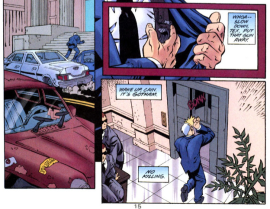
Apparently the beating from Bruce stuck with him. Cute.
But of course as he's getting away...
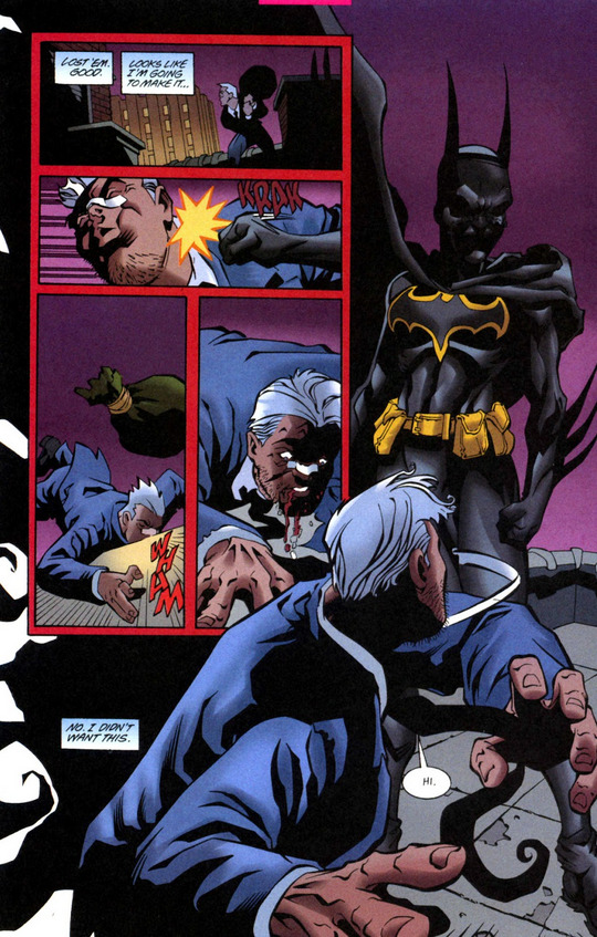
Turnbull's David is fine, but I can't say I'm a fan of his Cass. It's not terrible, though.

God, this bad dad is so sad.

While the art flips back and forth between Turnbull and Scott, the writing is Puckett throughout, and it shows, especially in the scene with Cass at the end. Again, no internal narration text for Cass, just David. And she hardly says anything.
But you can feel the emotional turmoil here. This is David Cain, the man who isolated and abused her. The murderer who turned her into a murderer. But he was also her father, who loved her, who she loved. And here he is, despite his injuries, risking capture by the police or by Batman, not for a job, not for killing, not for money, but to hold onto the tiny piece of their life together that he has left. And he's telling her he's sorry, and he means it but also sorry can't fix any of it no matter how sincere he means it, so what does she say to that?
There's nothing she can say, she just lets him take the tapes and go, and only lets her mask of anger slip to say goodbye after he's already gone.
That's so good, right? That's the angst! That's the emotional turmoil! That's so core to Cass's character, and it's why the eventual flanderization of David Cain isn't just a problem for David's character, but for Cass's as well.
But anyway, yeah, whatever was going on with the art aside, this is a great issue. Good Bruce/David stuff, good Cass/David stuff, good David-on-his-own stuff. So much sad bad dad content. And despite the more personal focus still a functional stand alone story to slot into this brief stretch of episodic issues in the run.
We've still got a few more appearances left to go for the good David. There's also a crossover arc where he's eventually revealed as the main (or at least insighting) antagonist, but I honestly don't remember how well he was characterized there. When the Bruce Wayne: Murderer/Fugitive crossover rolls around we'll take a broader look at the whole crossover instead of focusing just on Cass's appearances. But that's still a ways away, so not worth worrying too much about it now.
15 notes
·
View notes
Text
Door Reviews: Soul of Sovereignty Prelude (2023)
There was a time when I was very much into webcomics. Don’t get me wrong, I still am into them in theory, but I have not had energy to read as voraciously as I did before. I haven’t had time to get into new ones either. I am still fond of them, however, and keep up with a couple webcomics.
It is during my webcomics phase that I discovered the works of ggdg. I found myself reading Cucumber Quest and enjoyed it a lot! When the comic went on indefinite hiatus, I kind of lost track of what they were up to, though I have faint memories of reading Lady of the Shard.
Years later, a friend of mine told me about this game. When they linked it, I realized that wait, this is from ggdg! And the memories came flooding back. It made me so excited to play this game. Well, now I have! I’m excited to talk about it :)
What’s it about?
“Soul of Sovereignty is a tale of deadly kindness and selfish virtue in a world of magic and ruin,” says the game’s itch.io page. It is a visual novel about two souls whose fates become intertwined. They go on a journey that will be of more importance than they would expect.
It should be noted that this game is just a prelude to the whole story. Not all of the questions you will find yourself asking will end up being answered here. Also! I’ll just call it SoulSov from this point on because that’s shorter lmao
STYLE (Gameplay, Graphics, Music)
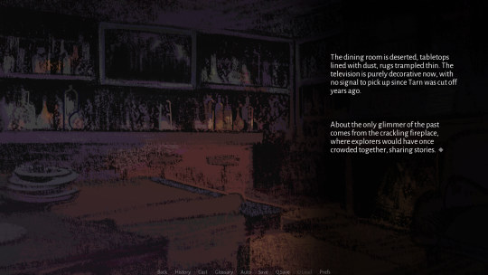
SoulSov is a visual novel. It shows background art with characters in the foreground, displaying text to tell the story itself. As far as gameplay goes, it is pretty simple… but I think ggdg does some subtle things here. The layout, the way the movement of the text flows with the art, there’s a few things that help with the conveyance of the story itself. I don’t really know how common it is in the genre, as I haven’t played enough visual novels, but I appreciate these small things.
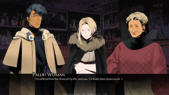
The art is beautiful. Downright ethereal at some points even! I loved seeing the old yet homey inn and the snowy woods. I loved seeing these wonderfully designed characters. They look so solid, yet soft at times.
The music, I find, is pretty good and apt. It’s nice and gentle in some places, and intense when it needs to be. The sound design is also good, shifts in the snow can be heard, creaking floorboards, the howling of the wind.
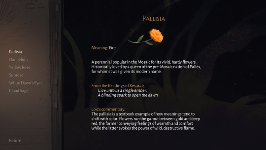
The UI is good. I like how there’s a History tab so that I can easily backtrack when I feel like I missed some words. I also like how there’s a Cast section so I can easily see descriptions of the characters. I like that the Glossary section is an external way to provide more lore to the world.
Overall, I definitely like the style of this game. Beautiful art, wonderful prose, it all combines well and lets me experience a story in a nice way.
SUBSTANCE (Story, Characters, Impact)
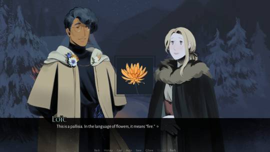
I loved the story. I loved how the world unfolded before me, from a cold, sleepy hamlet to a sprawling empire of a city. I loved seeing all the characters, their quirks, how they interacted with each other. Most of all, I loved how the worldbuilding revealed itself. The importance of flowers, the history of certain sites, the pantheon of the world… ggdg discusses just enough to paint a picture but leaves out enough to make me want to know more.
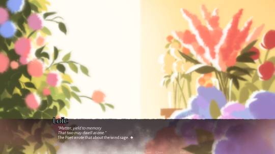
The story takes its time. It wants you to feel the weight of each sentence, to understand each brushstroke of a painting. ggdg makes sure that each click of the mouse moves the story in an efficient and economical way, which makes for a tight story that still expresses itself well.
I have not played much graphic novels, but what I find interesting is how you can “turn the page” so to speak. When I say turn the page, I talk of how certain forms of media dictate the flow of stories. With books, you turn the page. With comics, you go from panel to panel and turn the page. With film, you frame the story with your camera and dictate the very story itself with what you choose to record with it. With games? It’s different with each genre. But for this game, each click of the mouse (or press of the spacebar) turns the page. At some points, turning the page here means it reveals each sentence when you’re ready, showing accompanying art and changes in character sprites. At other points, it reveals each block of text, revealing changes in background and introducing new areas. While describing it this way feels a bit granular, it didn’t feel too slow when I moved through the story. And I think this approach makes the important moments hit better.
Overall, the story fucks. I enjoyed it a lot!
VERDICT
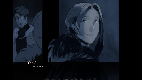
I haven’t played enough graphic novels to judge this as a graphic novel, but as a game I enjoyed SoulSov immensely. The art is great. The story is great. I’m excited to experience more installments of this game and find out more about this world! I am glad to have this game be the first game I finished in 2024. I wholeheartedly recommend it to everyone!
Door Rates Soul of Sovereignty Prelude: 5/5!
4 notes
·
View notes
Text
Lights, Camera, ANIMATION
This is mostly an outlet for myself to vent, so no sweat if you scroll on by. I watched a reaction video complain about the depth of field in a 3d animated piece, and how there’s no need to use those techniques because there’s “no camera” in animation. WHEW. Now, I will give them a lot of leeway because they’re reacting to things live, and not all opinions are allowed the time to form more cohesive thoughts. And I’ll also say they were totally fair to critique its frequent use of rack focus in the sequence.
But this plays into a broad issue that Western, specifically American, audiences have regarding animation. They see it as a genre and not a medium. A medium that can do allllllllll the genres live action can do. If I was the type to be buried or have a tombstone when I die, it would absolutely read: ANIMATION IS A MEDIUM. NOT A GENRE. JFC.
But back to the casual comment that had me gnashing my teeth: Yes, Margaret, there IS a camera in animation. Whether it be all the ways traditional and digital animation can recreate different lens effects through other means, to programs having a robust camera feature as a layer/object/however it implements the tool.
And along with the other tools we share with live action to tell a story: lighting, color, framing, blocking, editing...all that jazz, the camera and its variety of features are a big part of that. It’s an incredibly important tool in how we direct the audience to what’s significant in the scene and when to look at it.
EXAMPLE TIME
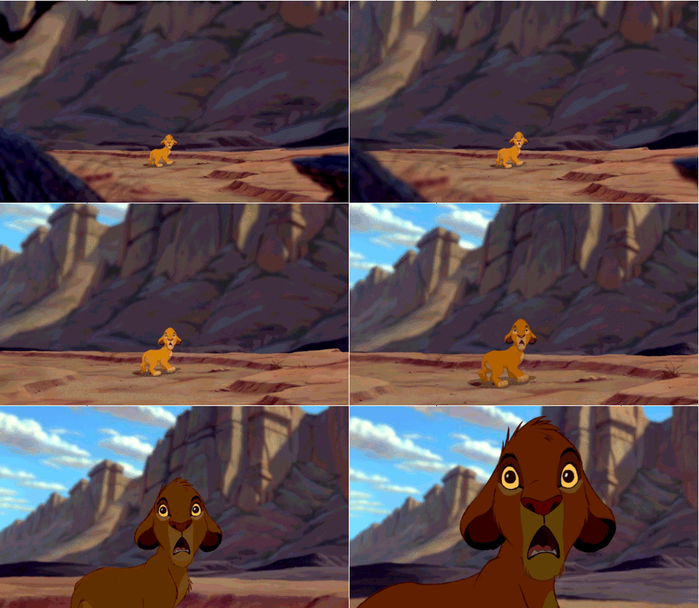
The Lion King has a poop ton of camera techniques just in the opening sequence. In a lot of 2d it’s applying a blur effect to recreate the use of lenses, but it’s the same thought process. From mimicking wide lenses to standard lenses, to more extreme changes to the depth of field, as with this use of rack focus.

The below first shot would be overwhelming with deciding where to look if it used a wide lens. The 2nd you could argue would be less personal and emotional with the foreground and background elements in focus, pulling attention from her reflection.

We recreate flares and bokeh effects as if a spherical lens were turned towards a light source. And paint backgrounds in a way that recreates the standards’ effect of blurring objects in the distance, as our own eye would.

Arcane does every type of camera trick in the book. Rack focus can be a tricky one with me. I enjoy it when the lens doesn’t come with any extreme warping, and is really subtle. But y’all, filmmaking is just so cool with this god-like control. Thou shalt not see what is there until I deem it necessary!

I could be wrong on this one, but Kung Fu Panda’s all-out playground with depth of field looks like they’re creating a tilt shift effect in some sequences. And I frickin�� love it and wish more animated films went for it. The choice really made it feel like we were watching a miniature world that was real and not computer-animated, somewhat akin to stop-motion sets.

Sigh. I just love the medium, y’all. From all the cinematic language and techniques, on top of the movie magic of simply creating the Illusion of Life from scratch, and making it look like one person crafted the whole shebang.
So to cap it all off, let’s enjoy 2d animation going whole hog with a dang zolly.
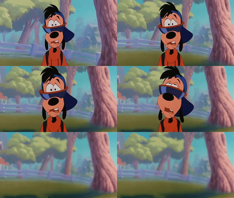
#animation#2d animation#traditional animation#3d animation#animation is a medium#animation rant#work#animation camera#prolly delete later#had to get it off my chest
23 notes
·
View notes
Photo
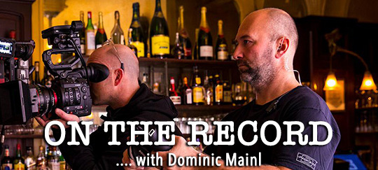
An HYH Exclusive Interview with Dominic Mainl
[Over the last six seasons, Dominic Mainl has worked in the camera department on Homeland, working to get the shots you see in each episode onto your screens. For our “On the Record with…” series, Dom graciously answered our questions about what the Homeland experience has been like, including how he got started, what it’s like to work with cast and crew, and his most vivid memories. Thank you Dom for answering our questions! –the HYH team]
Hell Yeah Homeland: Your first Homeland episode was “Tin Man Is Down” in season three. How did the German guy become a part of the production?
Dom Mainl: Haha, pure luck? In 1998 I moved from tiny Bad Dürrheim, Germany, to Los Angeles because I wanted to work in Hollywood. I was already in the film industry in Germany and wanted to work with the best of the best and that meant moving to Los Angeles. It took a few years and a lot of hard work to “break into Hollywood” and yet another few years and even harder work to become established, but in the end it all worked out. I worked on the HBO show True Blood and met David Klein, ASC there. I really enjoy working with him and over the years we have become a good team, business partners and most importantly, very good friends. One day my phone rings and Dave said, “Hey man, I’m taking over as the Director of Photography on Homeland. Are you interested? I would love to have you on the crew” …. and I had no idea what Homeland even was! I had never heard of it! I said yes anyway because I love working with Dave and looked up the show online. So on my way out to Charlotte (where we shot season three) I started watching the first season and really, really liked it. So I was hyped about being part of the project after becoming part of the project.

HYH: What do you remember from your first day at set?
DM: Every project, whether it’s film, tv or commercials, I have butterflies in my stomach the night before day one. David Klein says, “if you’re not nervous before day one you are phoning it in,” and he’s right. We love what we do and there are so many things that can go wrong, so even after 20+ years I still get nervous. The first day on Homeland was really easy though because all the actors are sooo unbelievably nice. As a focus puller I am quite immersed in all technical things to make sure nothing goes wrong (especially on day one!), so Homeland was no different from other shows in that respect.
HYH: We know you can’t talk about season eight yet, but looking back at previous seasons, what scenes still stick with you? Why?
DM: This is going to explain a lot about why I love working with Dave Klein: there’s a shot in season three when Brody is brought back to the US and it's the first time Carrie and Brody meet since he was shipped off to Caracas. He’s laying on the bed and the camera is right in his face. Carrie steps into the background and has an emotional monologue directed at the sleeping Brody. Remember that?

So, my job as a focus puller is to adjust focus during the shot. And I felt strongly about keeping Damian sharp in the foreground although the #1 star of the show just entered our shot and she was the only person talking! General rule of thumb for focus pullers: make sure the person talking is sharp. If a lot of people talk, make sure the star of the show is sharp... So here I was, new to the show, and breaking all the rules at once. But, to me, it felt so damn powerful to stay on Brody’s face to see his reaction as he slowly wakes to Carrie’s words, until he opens his eyes and (eventually) turns around. So I discussed this with Dave and he brought this idea up with director Lesli Linka Glatter and the producer/creator Alex Gansa and we ended up shooting two versions of this scene, one with the focus shifting to Carrie as she enters the frame and one that stayed with Brody. To Dave's credit he fought for my idea and in the end they used my version. That shows you how amazing it is to work with Dave Klein--you’re truly a part of the team.
HYH: Thinking of some iconic Homeland scenes (pretty much all the scenes which left us heartbroken)--like Brody‘s death scene, Quinn driving into a lethal hail of bullets--how much time did you have to prepare these scenes? How do you in the camera and photography department plan for these scenes? How many times do you shoot them before you got the material we see in the final and aired cut?
DM: Brody’s death was rather emotional for the crew as well because that was the very last shooting day of the season. We were shooting all night in Morocco and we had to bid Damian adieu after we wrapped. It was almost the same with Quinn, although we had a few days of shooting left after we killed off Rupert’s character… But Rupert served the crew champagne after the day ended, still bloodied from the scene, which was very sweet…. plus the bubbly was rather good so I didn’t mind killing him off, haha. As far as preparation for these scenes go, it's the same as for any other shot--for me, anyways. I prepare the gear the same way I would for any other scene as reliability is key. The most important part is that the equipment is functioning flawlessly because, in the end, if the camera doesn’t record what’s in front of it… why are we there?
HYH: Homeland’s main cinematographer is David Klein, and you two have worked together on many episodes over the years. Can you describe the working relationship between the two of you?
DM: I was asked the same questions a few years ago and I have the same answer: it’s a privilege to work with David Klein because you get to work with him and not just for him. There is a fundamental difference. Of course, he’s the boss and all departmental decisions are his to make but he actively involves the camera operators and the focus pullers in the process and that’s what makes it so much fun! Sure, it really does take a while to establish such a good rapport and a working relationship like ours, because it is 100% built on trust. The example I mentioned [earlier] shows that we have each other’s back and that’s when you can get really creative…
HYH: Speaking of the art of cinematography and photography, how would you describe Homeland’s visual/photographic DNA?
DM: That’s a question for David Klein, haha. Of course I have my 2 cents but that’s not for me to answer…

HYH: What's your secret about taking the perfect shot?
DM: Generally speaking, preparation. Hard work beats talent unless talent works hard. The perfect shot is when all the elements come together in synchronized harmony. Think of it as choreography - the actors, the frame, focus and camera platform (hand-held, dolly or Steadicam, etc.)… everything that moves, everything needs to be perfectly in sync to achieve what the director or the DP had in mind and there is a lot that can go wrong. But when it all goes right, it seems effortless. What’s my secret? Easy: Don’t fuck it up. Don’t be the one element that blows the shot.
HYH: You’ve traveled with the Homeland production all over the world -- to South Africa, Germany, Morocco, and several locations in the US. Which trip did you enjoy the most and which one was the hardest work? Why?
DM: I really enjoyed Morocco. And I really disliked Morocco. For clarification, I met my wife in Morocco while shooting the finale for season three there and I will always have fond memories of that time. And I disliked season eight in Morocco, because even though my wife had become a member of the crew by then (she is the script supervisor for season eight), shooting there the second time around was unnecessarily complicated and frustrating for reasons I will not go into detail at this point…. but it really wasn’t much fun.
We loved South Africa a lot, too. That was probably one of my favorite seasons. Not necessarily the scripts but the location.
HYH: Compared to other jobs you did before, what’s different about working on Homeland?
DM: After 7 years (well, on and off) of True Blood I was happy I didn’t have to work with vampires and at night anymore. The spy game turned out to be fun and intriguing but you pay the price for getting to see the world. The biggest challenge was the constant shifts in location. One, because we ship a lot of camera gear around the world which adds a ton of work and stress (carnets, inventory, maintenance, etc.). Two, it’s really hard to find and keep a good crew around and given we were on the road for six years we had to start over almost everywhere we went and train the team to the workflow that Dave and I have had established. I admit, I am quite demanding and finding a crew that could do the job to my expectations in all those locations was not easy. But we ended up making some life-long friends… and probably a handful of enemies too, haha.
HYH: From what we were able to follow on social media, we got the impression that filming season eight has been a long and tough journey, much harder than previous seasons. Is there anything you can share about the reasons why?
DM: Well, if you go into Africa expecting you can shoot an American TV schedule with an international crew within the same time frame and on the same budget... you have to be crazy! But there isn't just one party to blame for the exhausting Moroccan portion of season eight but rather a combination of unfortunate misunderstandings paired with inexperience and a healthy dose of negligence. As they say, “everything that could go wrong, did.”
HYH: Was there ever a scene for which you had just one take to get it right? Which one?
DM: Let’s just say there is going to be an explosion in season eight and we only had one try at it. And we nailed it.

HYH: For the tech nerds among us, what's your favorite camera and objective and which scene you shot with it comes to your mind?
DM: Hands down, the ARRI Alexa Mini. Homeland is a predominantly handheld show in order to keep the tensions high while (subconsciously) keeping the audience always on the edge of [their] seat. If the cameras are handheld the image constantly moves. You can even see/feel the breathing of the camera operators. The Alexa Mini is lightweight yet robust and the sensor is the best money can buy. We used ARRI Master Primes for added sharpness for seasons five, six, seven, and eight, but sprinkled in a few Zeiss Supreme Primes this year to take off a little bit of weight. We also like to use Canon Cinema Zooms for their high quality.
HYH: Butter bei die Fische (Now’s the time for straight talk), why is Homeland still filmed in HD?
DM: Because Showtime wants it that way. I would’ve loved to shoot 4K or with a different aspect ratio or utilize a different sensor size but the people at the helm want to keep it “the way it was.”

HYH: Homeland’s eighth and final season is wrapping up and now airing. How does it feel that the show is coming to an end soon?
DM: It’s bittersweet. I have had some of the best and some of the worst moments of my career on the set of Homeland and I know I will miss it down the road but right now I’m happy that Carrie finally gets to…. Never mind, can’t tell you that, haha. I know I’ll miss it but we’re just exhausted right now.
HYH: What other projects are you working on after Homeland? Any plans yet?
DM: Vacation. No more jobs in 2019 and hopefully a good movie with a good script in 2020. I think after six years of spy TV I want to take a break from the small screen, if possible.
7 notes
·
View notes
Text
the things we do for likes {Joe Mazzello/Reader/Ben Hardy}
Anon asked: lol ben and joe having instagram wars on who can post the most embarrassing content of reader
A/N: again, written on my phone because the writing demon possessed me at 2am. I'm probs gonna have this as a series akin to B/R/R, aka disconnected vignettes in the same universe. Lemme know if you wanna be tagged. A case of the mondays is a McElroy reference, before you ask. 😊😊
It starts when Joe wakes up to an empty bed and noises coming from the kitchen; noises being footsteps, a loud bang, and some half coherent swearing. There's silence for a moment, then the opening and closing of the fridge. As soon as he's got his wits about him and realises it's just you in the other room, he opens his phone.
"So I wake up to no girlfriend and noises in the kitchen," Joe says after a minute of searching through his closet for his baseball bat, ready to film a bit for his Instagram. As he makes his way to the kitchen now, he holds the bat in frame, "I'm ready to rescue her if it's robbers." He assured the camera, voice still quiet and rough with sleep. Once he gets to the kitchen, however, he stops dead at the sight before him. There's a very long couple of seconds where all that the camera catches is his surprise.
"Why do you have a bat?" Your voice is muffled, as if you're speaking around something, and that's when Joe seems to remember he's filming, he changes to his front facing camera and turns on his phone light, exposing the fact that you're sitting cross legged on the kitchen island, eating a banana with a carton of juice in your other hand. You hiss at the light, arm coming up to sheild your eyes. The light doesn't move, and after a beat you shift your arm so he can see your face scrunched up where you're squinting at him, clearly unhappy about this intrusion into your snacking time. You take another bite of banana.
"Why are you on the counter?" He breathes, a little flabbergasted, and you chew, looking down at where you're seated, as if it's only just occurred to you that it's not exactly a normal chair. After a beat, you shrug, and raise the juice carton to your lips taking a long swig. You were so focused, so deliberate, and so obviously tired and half asleep that Joe couldn't help but laugh.
"Seriously, why do you have a bat?" And you finished the banana and put the peel down beside you with far more delicacy than it reasonably warranted.
"I heard noises and you weren't there, so I thought I'd come protect you from robbers." He explained, moving forward until he was standing next to you by the counter. You gaze into the middle distance for a moment as you contemplated his words.
"I was the robbers." You say, nodding sagely as the realisation comes to you. As if to prove this point, you reach out blindly for the fruit bowl that you'd already accosted once, picking up a lime and trying to fit the whole thing in your mouth. The last thing the video catches is Joe lunging forward to pull the fruit from between your teeth with a surprised exclamation before the video cuts off.
It's there that he realises that you're not half asleep, you're completely asleep, and sleep-eating at that. You're compliant enough when he leads you back to bed, though you adamantly refuse to let go of the juice, and you sit it triumphantly on your bedside table before promptly falling back into bed. Despite everything, Joe can't help but be endeared as he settles in beside you.
The video goes up the following morning after he shows it to you for your approval.
@joemazzello @yourinstagramhandle: "I had a case of the Mondays!" Me: "What does that even mean?"
@benhardy1 there's so much to unpack here
@benhardy1 also @yourinstagramhandle caught red handed drinking straight from the carton
@joemazzello @benhardy1 listen it was a lot to take in but youre right @yourinstagramhandle there was a cup right beside you!!!
@gwilymlee what is happening over there??
@benhardy1 @gwilymlee i know, im gone for one week......
@yourinstagramhandle I HAD A CASE OF THE MONDAYS!! 😂😭 @benhardy1 @gwilymlee @joemazzello
@yourinstagramhandle dont bully me @benhardy1 i miss you x
@benhardy1 @yourinstagramhandle 😘😘
@joemazzello @yourinstagramhandle @benhardy1 gross (im kidding, come home)
@benhardy1 @joemazzello 🙄🖕 (😘)
It becomes a thing, much to your chagrin, 'a case of the Mondays' becomes a meme the moment Ben posts a video from set, of him walking into his trailer where you'd been waiting for him, only for him to find you laying on his sofa under a fluffy blanket, watching Netflix with a face mask on.
"You took too long, now I'm having me-time." You announced. In the background, the Friends theme song starts.
Ben captions the video 'when you're hit with a case of the mondays', and tags you.
Not fifteen minutes later, Joe responds with his own video posted to his Instagram story captioned 'are mondays contagious? asking for a friend'. The video seems to have been taken not long after Ben's since you're still in a facemask on his sofa in the trailer, the difference is that Ben's in a face mask, and you've got your feet in his lap. The video starts in the middle of a heated argument, and it takes a few moments for the two of you to realise Joe is there, filming. Ben's the first to reach out to him.
"Monica's the worst Friend, right? Back me up here." He asks, and before Joe can even think about answering, you groan loudly, rolling your eyes.
"Ross is obviously the worst Friend, are you kidding me? He's manipulative, he's mean, he's-" you start, carefully extracting yourself from beneath the blanket as you spoke, peeling off your face mask.
"He's a terrible boyfriend and brother, yeah, but he's not the worst Friend," Ben elaborates, following behind you, and Joe quickly takes your spot on the sofa while you're in the bathroom. The argument continues as you wrinse your faces, you taking it in stride easily when you realise your seat's been usurped, sitting yourself in Joe's lap while Ben takes back his original seat. Finally the two of you look to Joe who had been waiting for this moment. The Friends laugh track goes off in the background.
"Well, you're both wrong; the worst Friend is Phoebe." He announced very matter of factly, like it's something he's been sure of for a while. After a beat, both you and Ben groan in unison, you even going so far as to move from Joe's lap to Ben's. That's where the video stops.
You update your Instagram story not long after with a picture of Joe in a face mask, grinning like an absolute fool, captioned 'we got him'.
There's more videos, more pictures, all showcasing you in the worst lighting or weird situations, and all of which you approve before they're posted, despite how embarrassing some of them may seem. Despite all of this, you don't care; it's posted because you're comfortable enough to share yourself with them, even in less than flattering situations, and when you look up, their gaze meeting yours where they're grinning behind their cameras, you can see in their eyes the fondness, the 'yeah, this is the fool I love'.
Ben posts a candid video of you recreating the Risky Business sock-slide scene when the song comes on your Spotify while folding the laundry. The moment you spot him, he stops filming however, because he sees the mischief in your eyes, and the way your hips are moving as you step towards him; you're feeling silly and sexy, climbing into his lap on the sofa, still dancing, though it's more grinding now, and singing the half remembered words. That's not for the rest of the world to see.
Joe posts a series of photos chronicling you forgetting to use an oven mitt to check on the frozen pizza you'd chucked in the oven, and even goes so far as to draw a red circle around the mitt that was literally sitting on the counter beside the oven as you sulked in the foreground of the final photo, holding a bag of frozen peas to your hand. He doesn't post about how he sits you down in front of the TV and brings you a proper ice pack, how he finishes getting dinner all ready and how he and Ben spend the rest of the night doting on you as much as they gently tease you.
They post dumb, nonsense arguments, but not sleepy morning kisses; your reaction to trying food that's way too spicy, even for you, but not how you smile so sweetly over desserts; the way you nap in the weirdest places, bit not how cute you look when you fall asleep on one of them. That's by design. From the outside the relationship is fun and chaotic and bright, but you don't owe the world a confirmation of just how much you love these men. But honestly, the world seems to understand, and somehow that doesn't make you uncomfortable. Though even the small snippets the three of you have shared, it's clear you love and trust each other.
And it comes out in other ways too, other cast members, not that you really mind.
"Tell us about Ben, Joe, and Y/N, are they actually sappy on set?" Gwilym reads out a question during an Instagram live session he's hosting in his trailer to kill time between scenes. "Listen, I'll tell you what, they're worse on set," he tells his audience with playfully annoyed expression, getting up. "Joe's trailer is right next to mine and if I check-" leaving his own trailer he takes his phone with him, knocking on the one next door as the comments of his live show go absolutely nuts, "I bet all three of them are in there." He mused.
Joe opens the door, yawning and rubbing his eyes, clearly having just woken up. "Keep it down, man," Joe mumbles before he sees the phone in Gwil's hand.
"Sorry I woke you, say hello to Instagram, Joe." Joe grins, giving a wave when Gwil holds up the phone. "They were asking about you three," he knows without having to ask that you and Ben are with him. Whenever you came to visit the set the three of you stuck pretty close together.
"They're still asleep," Joe steps aside to allow Gwil to peak inside. As promised, you and Ben were draped over each other on the sofa, though your feet have clearly been moved where Joe had to extract himself to answer the door. The UK Office is playing on someone's laptop. You yawn in your sleep and nestle in against Ben further, even Gwil's heart melts a bit at that.
"Alright, sorry to wake you," Gwil smiles and retreats as Joe stifles a yawn and assures him it's no trouble at all. When he's back in his own trailer, Gwil takes a breather before going back to looking at his live stream.
"They're cute, it's disgusting at times, how cute they are, and yeah, no, they don't show a lot of that in public, but they do really care about each other." He paused, shrugging, "and sometimes they're just weird. I saw Joe dare Ben to try and eat a whole apple in one bite, and he tried, and Joe video called Y/N when it got stuck, but it turns ou her solution was for her to eat a whole apple in one go too, to see how to get out of it; it just got stuck. They all seemed surprised by this, and it was just one of those times where I was like 'ah, yes these people make sense together', you know?" He shrugged, grinning as he read a few comments, "yeah it really did feel like they all got hit with a case of the mondays."
Taglist: @cosmicsskies
shoot me a message and I'll add you xx
#ben hardy#ben hardy imagine#joe mazzello#ben hardy x reader#joe mazzello imagine#joe mazzello x reader#the angry lizard writes#gwilym lee#borhap cast imagine#borhap cast#bohemian rhapsody imagine#borhap imagine#bohemian rhapsody#borhap#bo rhap#ben x reader x joe#ben hardy x reader x joe mazzello
635 notes
·
View notes
Text
“So Happy Together” Analysis
i don’t sleep
tl;dr: tbh not much to go off on about. i think we see a new skin for Iron Bear, one with some stripes. amara smiles, i do talk a little bit about little sisters in bioshock but tbh i think this was all just a stylistic choice lol. oh and handsome jack’s masks- probably Mount Jackmore. i don’t want to get to freaked out over jack returning, but damn gearbox lol u had me there for a second. im pretty sure it’s just a reused cut quest from bl2 that they never got to implement.
EDIT: here’s all the cut content in bl2 (plus all the non-cut content as well for funsies). you can go to the cut quests and see the audio files for claptrap’s jackmore quest
holy shit can i just vomit all my emotions rn, they’re all good so imma do that so im rational when i start analyzing stuff okay? okay!
holy shit that was fucking great and im really glad i tempered my expectations to something smaller than i thought because i feel bad for people expecting something huge, i was under the assumption we’d be getting a new mechanic that was like ‘choose ur +1 and they’ll be able to play the game with you if you’re both online even if they don’t have the game’ which was what someone said on reddit. altho im sure the poor company is gonna get spammed now with hate like ‘WTF YOU SHOULDN’T HAVE BUILT THIS UP AAAA’. not to lie, i was slightly disappointed it wasn’t a longer stream, but i mean if they’ve got nothing to announce, they’ve got nothing to announce and HEY! new trailer!!! gonna be combing thru on the assumption this has some easter eggs like the MoM trailer did, just in case. i thought it was a cute trailer, gearbox never explicitly said what it was gonna be, a lot people all just assumed what was gonna happen was a demo/beta which sucks so i hope this doesn’t negatively impact people’s perspective of the game. im staying off reddit for now bc when i first checked it people were pretty pissed and i dun need that negativity lmao
okay! emotions are LOCKED behind closed doors. i am shifting into study mode. here we go boys/girls/those of us who know better. haven’t done one of these in a while, let’s see if im rusty at all.
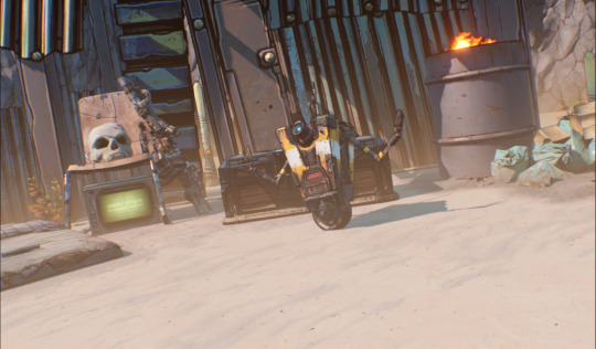
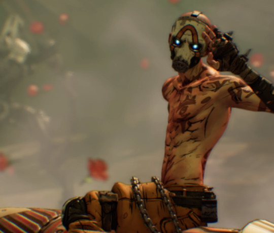
claptrap! and the skull on the chair which reminds me of tyreen’s “favorite skull”.

tv says “we are under attack, please stand by”
and afaik claptrap is near the beginning of the game, you can see part of the recruitment center behind him when the camera pans.
im thinking there might be something in the roses, specifically the hand-drawn roses later on in the trailer. will be keeping an eye open for that.
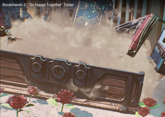
this is specifically a jakobs brand chest. i really like the see-through aesthetic of it
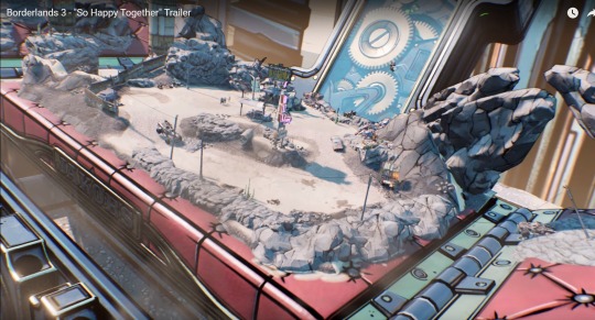
intro area of the game again. possible hint to the opening cutscene? tbh i was worried that’s what we were about to get because i haven’t finished the roughs of my mock up lol
so what i didn’t notice my first time through is that you can then see claptrap, also being shown in the chest
waving up at the camera. that’s not trippy at all or anything lol
this car in the foreground (with no one driving it, mind you)

randomly combusts, looking quite like elpis in that one shot of the claptrap presents pandora trailer. wonder if that means it’s gonna ‘splode.
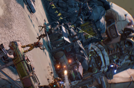
ohhh it spins. please no spin imma get motion sick blech
shot of some cultists. one appears to have a jetpack near the bottom right there
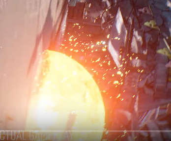
another explosion to the beat
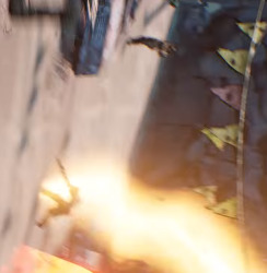
the shock wave!!!! that’s awesome

shock nomads cultists are back. f in chat for our shields
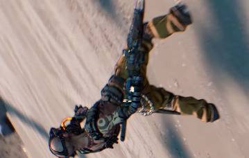
another cultist seconds before he gets blown to bits
it cuts to black for a secco as it moves thru said explosion
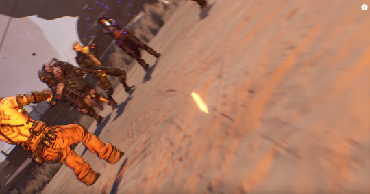
another cultist, i assume a psycho
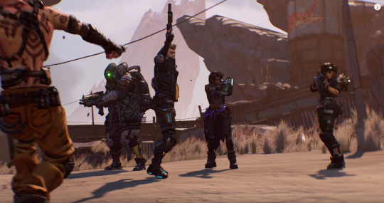
finally some good fucking angles
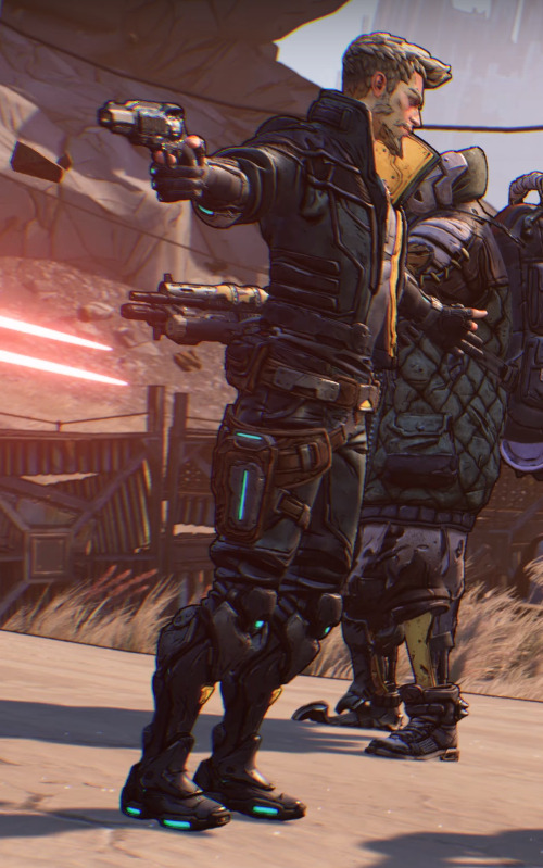
heh.
idk what i expected from someone who’s first action skill line i ever heard was them shouting MAGIC WALL!!! TAAAADAAAAAAAAH
as a side note
who is shooting those lasers
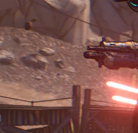
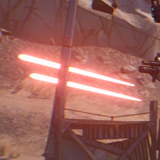
we see them coming from behind the VHs, but
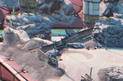
there’s nothing there
SPOOKY~
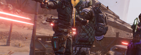
they’re coming from... the wall???
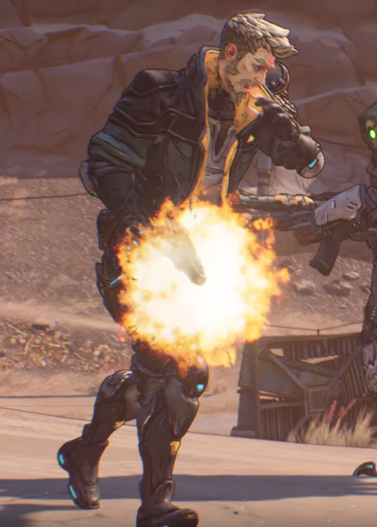
tfw u shot urself in the foot on accident

amara is not amused

`is this some human custom i don’t understand yet`
also i hate that i’ve done this exact dance before when i took dance classes as a kid
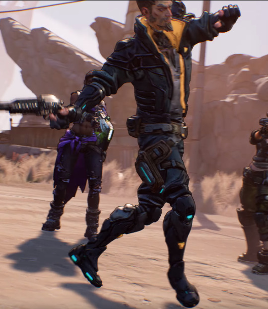
with less style of course, i was like 7

moze is into it, hell yeah
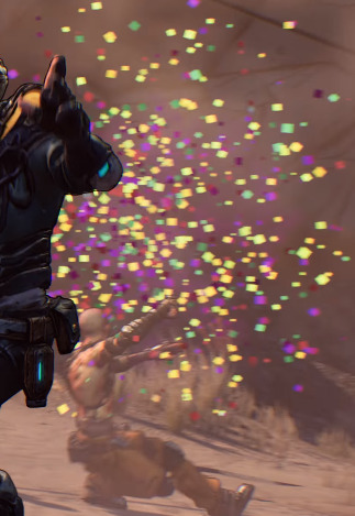
this reminds me a lot of Kingsman. where all the blood is like fireworks and stuff. i wonder if that has anything to do with the psycho brainwashing. like little sisters in bioshock. they see roses instead of blood, right? maybe there’s something like that going on with the psychos
i’d certainly hope our vault hunters aren’t brainwashed, anyway.
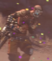
this dude looking SHOCKED to see that tho, lmfao
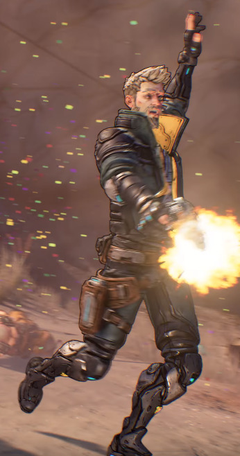
i relate to this man on a spiritual level i stg

man he looks pissed
omfg lol
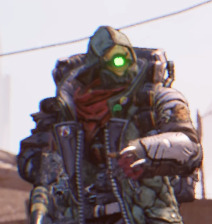
“um”
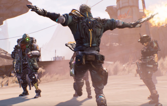
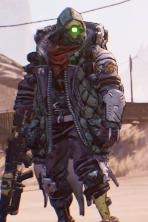
“i guess this is okay”
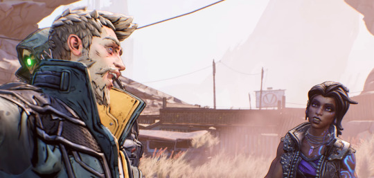

the body language in this is gold i am just having the time of my life
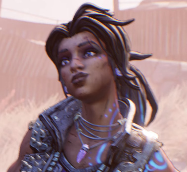
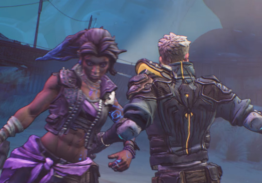
adsfdgfhgjhgfk

this is so cute
also in retrospect, i think this is one of the turrets we see on promethea. i wonder what it’s doing here!

moze u ok?
oh nvm she’s into it, look at her! she’s dancing! She’s Dancin’!
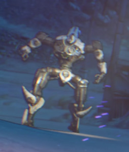
oooo one of the robots from the we are mayhem trailer! okay you can totally see why i think they’re jakobs, RIGHT???
iirc this is a maliwan soldier
man this is a crossover event, isn’t it?
i get it now. togetherness. i gotchu gearbox.

some maliwan ships in the sky. possibly sanc-iii on the right? or a ship of the same model as sanc-iii!
this is a magitek dropship, change my mind
eh, they both start with M, fuck it.
no idea what fl4k is doing here
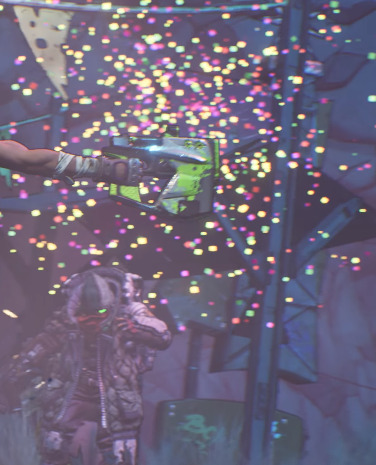
mayyyybe shielding themselves from the ‘firework’/confetti shower
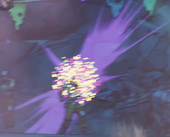
i like that the confetti explosions are backed up by purple, you know like eridium/slag/siren powers. seriously, maybe this is just how to cultists see us Vault Hunters and the mass murder.
at the very least, the psychos.
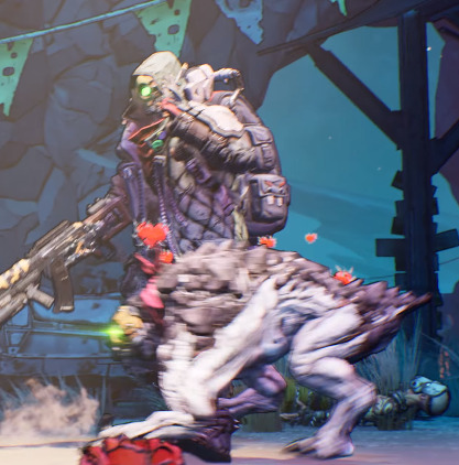
fl4k’s into it. i wish we knew the name of their skag, if it has one. i hope it does.
well now the lasers are coming from the other side! what the hell
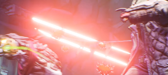
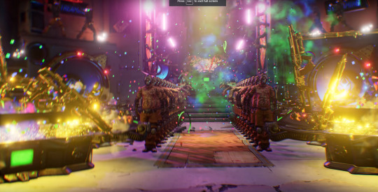
moving on
i think this is the HBC from the speakers, plus im pretty sure that skull and the stained glass are the entrance to mouthpiece’s arena
we also get a different colored explosion. im paranoid jack is somehow making a return (please god no), so i’ll just note it’s the same color as his eyes.
AND the chests are vomiting out gold guns, which i think, gold-plated gear, is the cult’s way of signifying standing. which im sure is a tongue-in-cheek commentary as gearbox gives out a gold weapon pack as a pre-order bonus. no, like, it even shows up as an ad on the video

smh gearbox lmao
oh, also, the cultists are doing fuckin flying impressions
im not saying its a reference to the cultist with rakk wings on the cover, buuuut
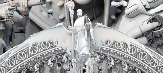
bitch it might be lol

it’s an upside-down vault symbol! ive been trying to figure out what that is in those screens for the longest time!
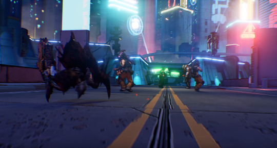
back on promethea and we get to see fl4k’s spiderant in action
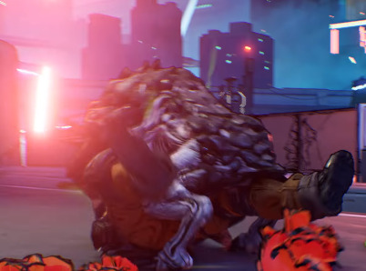
their skag, too, of course

the jabbermon in the back there, too! i wonder if they’re going to be shock or cryo. i would imagine shock given how they’re glowing
also i love the way the flowers look in contrast to the character models
moze is so happy aw

i love the way fl4k’s skag comes flying in and slides to a stop. such a good doggo ;-;

this is beautiful, i want it as a wallpaper
moze skipping? holy shit
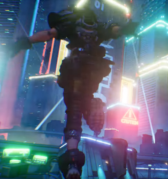
100% verified the best thing i’ve ever seen

i lied. this is.
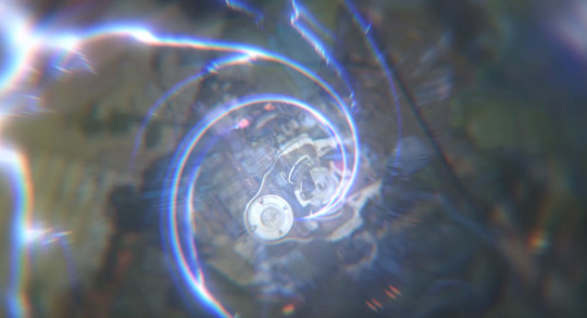
is this the fast travel station effect?
also! IB is looking a bit different
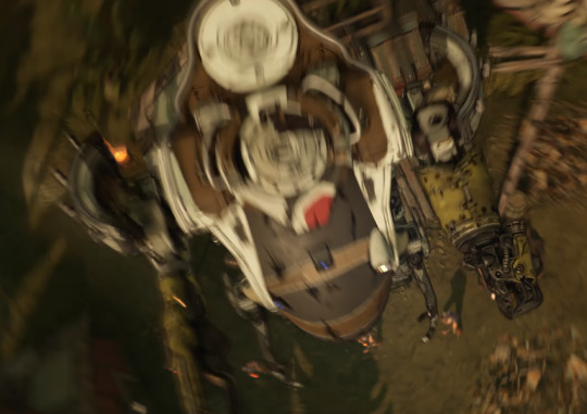
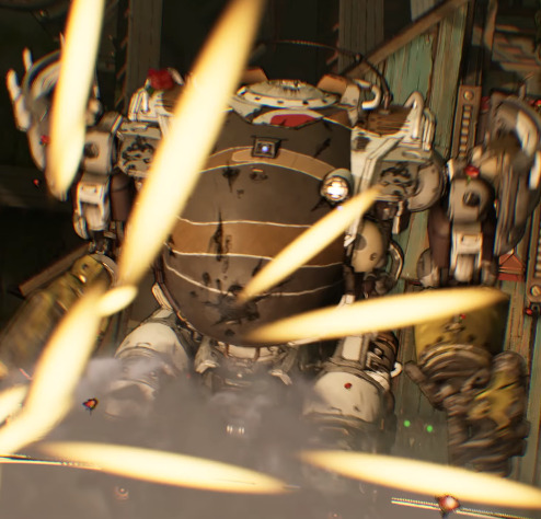
i wonder if this is a redesign or if IB is wearing a new skin moze picked out
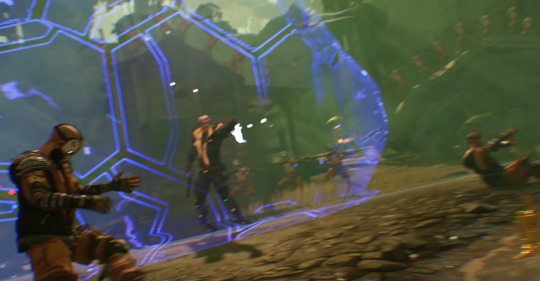
pan over to zane who clearly doesn’t notice the being of darkness and horror in the doorway
oh also, we’re on eden-6 now. which would explain the fast travel effect
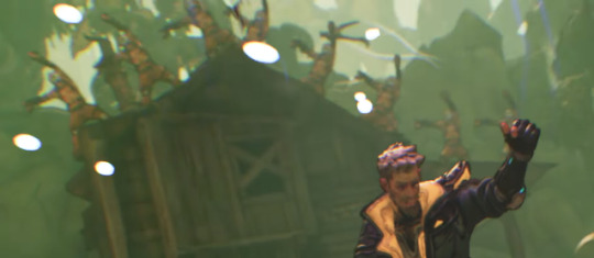
psychos dancing on the rooftops lol
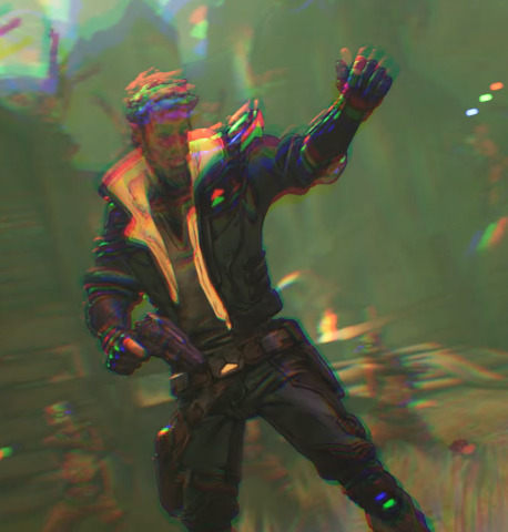
oh god my eyes
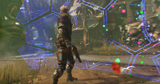
nothing to really say here, i just like this screenshot

pink shields booyah
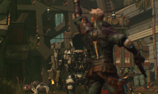
this is so fucking cute
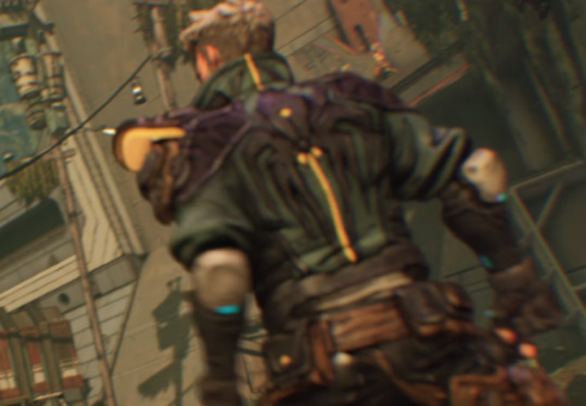
we also get a better look at that one facility on eden-6
is that... red i see? >w> i won’t say it i won’t i won’t say it i swear i just- ATLAS
fuck
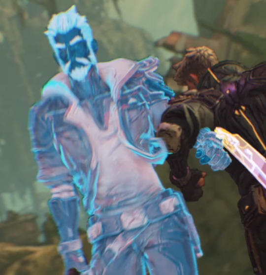
i like that zane’s clone spawns with his melee attachment
not AS excited as the real life version though
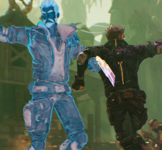
GB pls let this be a zane emote
is that a varkid? on eden-6?

wtf is a varkid doing on eden-6???
more shots of the facility btw. reminds me a lot of sanc-iii so maybe this actually is the supamax mfg construction facility like i originally thought. hmmmmmmm
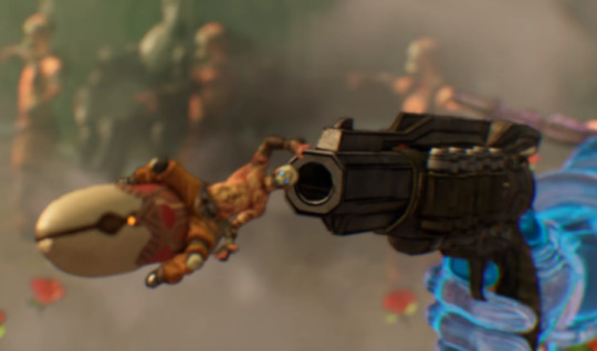
ah yes, of course
holy shit what is this a reference to?
im told it’s the sex pistols

the back of the bullet turns into Athenas
pans in
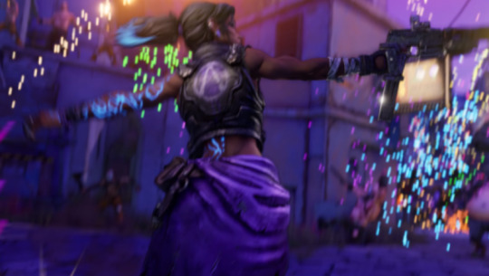
amara!
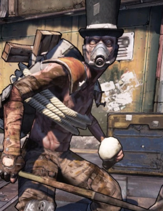
enemy with a top hat on. some variation of/upgraded gravedigger? it’s like a psycho but recolored with blue pants and a top hat. you can see it fall off when amara shoots him
y’know, these guys
some rakk in the background
i am hoping bc this is a celebration of togetherness we’re seeing all enemies everywhere, not that the planets don’t have their own unique fauna.
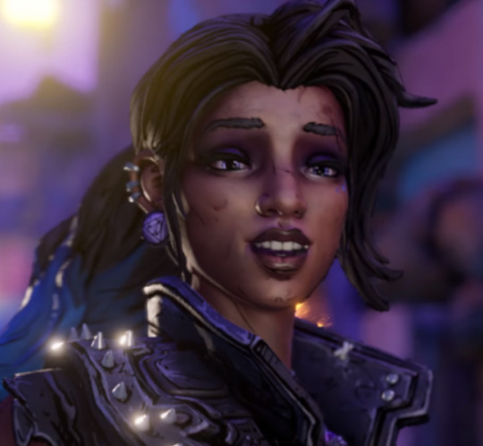
she’s so happy omfg

oh, you want some?
Uhhh then there’s THIS sequence

they’re doing the flying thing again lmao

there’s also whatever that black blob is on the left. a spaceship maybe?
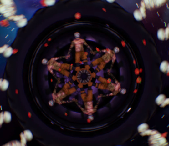
car wheel
all their eyes started glowing red. uh oh gamers
also another fast travel effect

hmmmm... zarpedon is that you??
back on pandora.
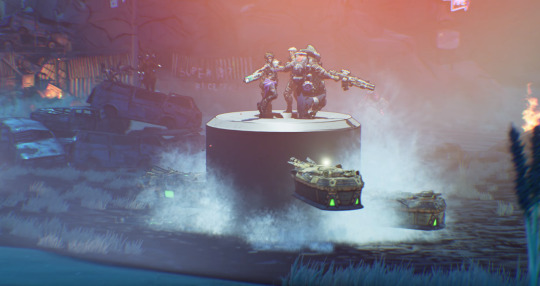
“super 87 racetrack”, maybe this is near that motorcade fast travel we saw?
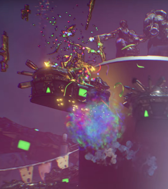
huzzah! rainbows!
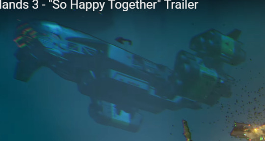
i do believe that’s sanctuary-iii

another ship. drop ship?
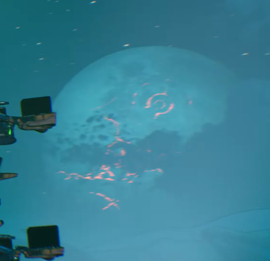
elpis is looking nice this time of year. definitely not explode-y. yet.
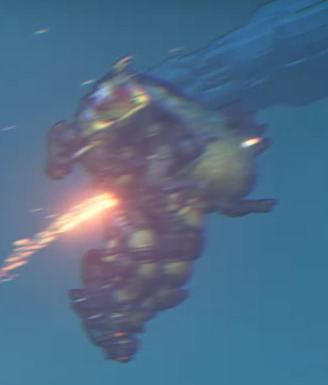
pret-ty sure that’s iron bear. moze is standing atop the tower lmao
also! back to it’s old paint scheme. looks like moze was using a skin or smth

we also have this. are my eyes failing me or is that a big cross on the left? could be where jack was buried.
also i know there was cut content in bl2 about Mount Jackmore! and this looks like a Mount Jackmore to me. it’s a cut quest where claptrap asks you to basically ruin the thing. but since the quest was cut, it’s still here in bl3. maybe they’ll reintegrate the quest lol
i can’t imagine it being roland’s gravesite. because it looks like the below.
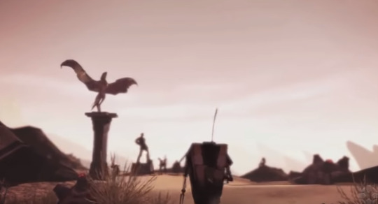
i do know we’re going to roland’s grave in bl3, but the statues don’t really match up. maybe it is and the statues were broken, or ruined or something and replaced by a cross. could be then that the gravesite was defaced with, well, the guy that killed him.
im really hoping jack doesn’t make a return. im fine with dealing with what he set in motion, and his influence, and probably even some ECHO logs and movie trailers, but please, for the love of god, don’t actually bring him back, AI or otherwise. im really excited for the calypso twins, i’d really hate to see the focus shift back to that guy. he’s had his fingers in every borderlands game. it’s time to let him go.
idk what this is exactly. it looks like maybe that weird eye bot troy stands next to in the intro for the behind closed doors panel?
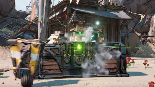
goodbye mr magical jakobs chest, it’s been real
the RC now has red drapes going down it. have those always been there? i don’t remember those
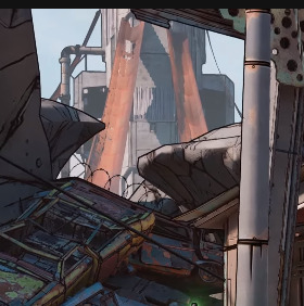
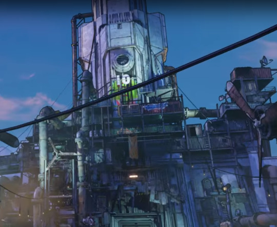
hmmmmmmmmm maybe we’re looking at it from the back 🤔
anyway, that’s all she wrote. i haven’t see any hidden morse code messages or anything yet, but if something surfaces, i’ll be sure to add it here.
#borderlands#bl3#borderlands 3#so happy together trailer#oof#tumblr fought me on posting this like 7 times
38 notes
·
View notes
Text
The Water Was Never Afraid - Chapter 14: Grind
(AO3)
“You’ll be fine, kid,” Plagg whispered from Adrien’s collar as he strode down the hall to the photography studio, all made up and ready to go. “Remember to breathe, and don’t do anything stupid.”
Adrien heeded Plagg’s advice and took a deep breath before pushing open the door.
“Adrien! Good morning!”
The effervescent voice made Adrien’s heart quicken. He took in Marinette’s appearance—her hair was loose, one side hooked behind her ear, and she wore a loose, silk crepe button-down blouse in red, tucked into form-fitting black pants and red ballet flats. She looked good in red. “Good morning,” he said, trying not to blush or think about last night.
Not that last night had been anything remarkable for her. They’d just hung out and talked over banana bread.
But for him, it was the earth-shattering night that he had realized he had fallen in love for the second time in his life.
“Violette should be here soon, too,” Marinette remarked, beckoning Adrien toward the changing booths.
Violette was a model from a partner agency, and Adrien had worked with her on multiple occasions while he was still modeling, so they were on friendly terms.
Étienne, the photographer, waved as he approached. “‘Morning, boss.”
Adrien greeted him back, as Marinette held open the curtain for him. Four outfits were hanging in garment bags on hooks inside the booth.
As Adrien was changing, he heard the door open and a feminine, Italian-accented voice enter the room.
“Marinette, love! You look gorgeous as usual, my dear. Are you sure you don’t want to take my place?”
Adrien couldn’t help but agree with her appraisal, though it was probably for the better that he wouldn’t be posing with Marinette.
“Oh, hush, Violette,” Marinette laughed. “I’m a disaster in photos. I’d rather be on the other side of the camera.”
Footsteps came closer as Marinette ushered Violette to the other changing booth. “Adrien’s already changing, so we’ll start soon.”
The color scheme was neutrals with a pop of color. For the first look, Adrien wore a cream coat with black buttons, a grey turtleneck, and ochre yellow pants. The inner lining of the coat, which showed with certain poses, was white with centimeter-sized polka dots the same color as the pants. Violette, wearing a light grey overcoat draped over her shoulders, a white chiffon blouse with ruffled collar, and white straight-leg pants with black stiletto ankle-boots, donned a bright orange scarf.
“Good to see you, love,” Violette pulled Adrien in for a hug, throwing air kisses at his cheeks, careful not to disturb their hair and makeup.
Marinette handed Adrien a black umbrella.
“Did I tell you anything about the collection?”
Adrien shook his head. “Sorry, I should know by now.”
“It’s okay, this was all last minute,” Marinette reassured him. Addressing both him and Violette, she explained, “The theme centers around the pop of color in a greyscale palette, and since rain kind of symbolizes a drab or greyscale environment, I decided to use an umbrella as a prop, and even do some shots that look like they were taken in the rain. We’ll do a round of ‘dry shots,’ where you’ll pose with the umbrella, then move on to the ‘wet shots.’ Don’t worry, you won’t actually get wet, Étienne’s just going to use props to simulate rain.”
They shot a series of photos against a neutral grey backdrop with just the umbrella. Adrien settled into the familiar routine, his mind going into autopilot. He couldn’t help but watch Marinette as she moved around the studio, checking different angles, giving Étienne directions.
“Great expression, Adrien, but I need you to look left,” Étienne instructed. Marinette adjusted his arm, and he swooned internally at her soft touch and the subtle whiff of her perfume.
It had been eight long years since he had last fallen in love. The way he felt about Ladybug had scarred over into something calm, mature, and occasionally painful. He had forgotten what it was like to feel giddy from the mere proximity of the object of his affections.
Why had he ever agreed to date Kagami without feeling this way about her?
“Open the umbrella and hold it—yes, just like that.” Étienne continued to give instructions, Marinette leaning into him to whisper something inaudible to the models. She motioned with her hand. “Violette, over here.”
Bodies shifted. Adrien peeked under the umbrella’s canopy at Marinette—she met his eyes and raised an eyebrow. Feeling burned, he reverted his gaze to where Étienne wanted him to look.
Sure, he had rationalized that he couldn’t have Ladybug, and he didn’t think he was capable of loving anyone else the same way. He cared for Kagami deeply, of course. Their friendship was irreplaceable. She was important to him, and he wanted her to be happy.
Yet, Marinette had blindsided him. Since last night, he had been drowning in reminiscence of all the moments they had shared over the past eight years. She had caused him a fair amount of grief throughout collège and the beginning of lycée, when he wasn’t sure where their friendship stood and whether she really considered him a good friend or thought of him as highly as he thought of her.
“Try a little smile. Like you have a secret.”
Adrien shifted his weight, adjusting his pose. He had a secret, all right, but it didn’t make him want to smile. Nonetheless, shooting a longing glance at Marinette, he pretended there was hope for them and smiled. Why was love always out of his reach?
“Marinette deserves nothing less than fabulous, don’t you think?” Violette remarked to him, shifting her pose. “Spice it up, darling.”
That drove the last of the clouds out of his expression.
He recalled how precious those small victories with Marinette were, like the time they’d sat next to each other on the bus for three hours on a school trip and rather than it being awkward, they had lost themselves in chatting the whole way.
Since then, they had shared inside jokes and movie recommendations, and his heart swelled every time he reminded himself that they were really and truly friends.
Could that have been love, after all? A form of love? Maybe he had loved her all along.
Maybe he was so smitten with Ladybug he hadn’t recognized the potential that was there.
“… to Romeo. Earth to Romeo.”
Adrien blinked and looked at Violette, realizing he’d zoned out. “What?”
“How was your trip to outer space? We’re done with this round—time to change.” She snaked an arm around his and pulled him toward the booths, leaning in to whisper in his ear, “So, lover boy, sweet on our little designer, aren’t you?”
“W-what?” Adrien blushed. “Why do you say that?”
“Darling, you keep looking at her as if she holds all the secrets of the universe.”
“It’s not like that,” Adrien insisted, fighting a blush. His brain caught up to what Violette had been calling him—Romeo—and he gasped in horror. “Violette, you’ve got it all wrong! I’m in a committed relationship. With… someone else. Not Marinette. Please don’t insinuate anything.”
“Whoa, whoa.” Violette held up her hands. “I didn’t mean to offend you, my love. I didn’t know, otherwise I would not have said anything, okay? Forgive me.”
They went into their separate booths, the word ‘committed’ rubbing Adrien like a grain of sand under his skin.
For the next look, Adrien wore a primary blue coat over a grey-pinstriped white button down shirt and slate grey slacks, while Violette wore an emerald fitted blouse with a gathered collar and sleeves, tucked into beige wide-leg pants cinched with a forest green fabric sash.
Marinette pulled an inflatable pool from the other end of the studio, while Étienne clamped a pane of glass to an upright stand and misted it with water droplets from a spray bottle. He set up a portable shower head behind the glass, over the pool, and adjusted the lighting.
“Are you sure we’re not going to get wet?” Adrien asked dubiously, not quite sure how this was going to work.
Marinette laughed. “Of course! Watch and learn. First, you, Adrien… stand right here.” She guided Adrien into place while Violette settled into a chair on the side to wait her turn.
Marinette switched on the shower and held the umbrella under it until the top was decorated with water droplets and trails of water, then handed it to Adrien. Their fingers brushed, and she gave him a warm smile.
A sense of déjà vu dredged up an ancient memory. “Marinette, remember the day we became friends?” he asked breathlessly before she could step away.
The smile faltered and she blushed. “Of course I remember,” she murmured. “I’m surprised you do.”
“Why wouldn’t I? That was one of the most important days of my life.”
Marinette’s lips curled up subtly, as if she were lost in thought, then she looked Adrien over, choosing not to respond. Several seconds passed achingly as she adjusted his jacket, smoothed his shirt, and shifted a few strands of hair. Though she did it with all the innocent attentiveness of an artist examining the composition of her piece of work, Adrien couldn’t help but imagine tenderness in her touch.
When she stepped away, the atmosphere reverted to all business.
Étienne took his position behind the pane of glass, snapping a few shots as Adrien improvised poses.
“Violette,” Marinette called, and she switched places with Adrien.
Adrien hovered over Étienne’s shoulder as he photographed Violette.
“Let me work in peace, boss,” Étienne said with gruff affection, elbowing Adrien lightly without taking his hands off the camera.
“I just want to see how the ‘rain’ is turning out.”
Étienne humored him with a sneak peek. The droplet-covered pane of glass created a glittering bokeh effect in the foreground, and combined with the streaks of falling water droplets in the background and the water-covered umbrella, the shots looked convincingly to have been taken in the rain. “They’ll look even better after post processing,” Étienne added.
“Very impressive.”
“I’ll confess, the idea was Marinette’s.”
“Ah, she’s brilliant,” Adrien sighed.
The look Étienne gave him went over his head.
Violette snagged Adrien on the way to the dressing booths for the third outfit change. “You made her blush, Casanova. What ever did you say, love?”
“Violette, I’m serious,” Adrien pleaded, looking her firmly in the eyes. He lowered his voice and gave in to the fact that she could see right through him. “I’m not supposed to feel this way about her. If anything gets out about it, it’s not going to look good for either of us, so please stop.”
She looked at him pityingly and squeezed his arm. “If she’s the one you want, there’s always a chance. I don’t see a ring on your finger, after all.” She winked, a sly expression flitting across her face.
“Maybe,” Adrien sighed.
“I won’t breathe a word, my love, don’t worry.” She patted his shoulder, and they split into their respective booths.
“She’s right, you know,” Plagg whispered very quietly in his ear once the curtain was secured. “You’re gonna get yourself in trouble if you keep this up. You don’t have to be with Kagami if you don’t love her that way.”
“I can’t do that to Kagami,” Adrien returned quietly. “And I do love her.” Just not that way, maybe.
“Did you say something, love?” Violette called from the neighboring booth.
“No, nothing,” Adrien called back.
—
Adrien cut into his steak and, spearing an asparagus tip along with it, put a small piece in his mouth.
The low-lit restaurant was hushed, the sound of subdued chatter and silverware against ceramic filling the room.
“How did the photoshoot go?” Kagami asked, nudging his foot with hers under the table.
“I thought it went well.” Adrien took a deep breath to quell the sense of anxiety that was rising in his chest. “The photographer used this cool effect to make the shots look like they were taken in the rain. I can’t wait to see them published.”
“I’m really happy for Marinette.” Kagami’s smile didn’t show that she had any reservations about this sentiment.
Adrien nodded, then changed the topic because he couldn’t bear to talk about Marinette with Kagami. “I heard this dinner was your doing?” He looked around at the table, where some of Gabriel’s biggest backers were seated, enjoying the food and conversation. Best of all, Gabriel himself was present, with Nathalie at his side.
Kagami shook her head modestly. “I had lunch with your father, and we talked, that’s all. It was his idea.”
Adrien knew better. Kagami had a way of inspiring people to action. “Thank you,” he whispered, sliding his hand across the table to brush her fingers.
“I know you’ve been encouraging him to go out lately. I just wanted to help… I thought it would make you happy.”
“I am happy.” With a rueful smile, he retracted his hand to cut another piece of steak.
#MiraculousLadybug#Miraculous Ladybug#MiraculousLadybugFanfiction#Miraculous Ladybug Fanfiction#Marichat#Adrigami#Adrienette#Adrinette
18 notes
·
View notes
Link
If you’ve ever watched an episode of FOX’s show “Gotham,” then you’re familiar with the eponymous city. It’s dark and brooding, ever on the cusp of a storm; it’s at once foreign and familiar, sometimes tricking you into thinking you’ve been on of its blocks before; and it’s the award-winning achievement of VFX Supervisor Tom Mahoney and his talented team, one that earned another Emmy nomination for Outstanding Special Visual Effects in a Supporting Role last month.
Tom, who has three Emmy nominations to his name and one win in this same category last year, explains that the visual effects team plays an important part of the storytelling that happens in “Gotham”: “We serve the story. The writers write, and we try to figure out a way to make it happen. It’s all about making other people’s visions a reality.”
I recently spoke with Tom about his latest nomination and his work on “Gotham.” During our conversation, he talked about how the city of Gotham was realized, his favorite parts of the nominated episode, when he thinks visual effects are appropriate and more.
To start, can you walk us through a brief history of your career – from your start in the world of VFX, to being a partner at CoSA VFX, to being VFX Supervisor for “Gotham” and highlights in between?
I got my introduction to visual effects back in 1990 or 1991 when I interned on “Star Trek: The Next Generation” with the post-production department. From there, I was an assistant editor for a little while and found my way back into visual effects working with one of my CoSA partners, Jon Tanimoto. We often found ourselves working for units that were put together specifically for film, and at a certain point we looked at each other and said, “Well, they keep throwing these units together and they sort of ran like small companies – we may as well see if we can give it a go as a company.” So Jon and I got together. Initially we were working on features, and shortly after that, [CoSA partners] David Beedon and Chris Lance joined us. The features market for visual effects in LA kind of dried up with a lot of films taking rebates and having the luxury of longer turnarounds, but TV still needed fast turnarounds. Most shows were still posted in LA, so it was more convenient for TV to use LA-based visual effects facilities. So we made a shift to be more TV-centric. A year or two after we got things going, we were lucky enough to be considered for “Gotham.” Just by luck of the draw, I ended up being the one of the four partners to come to New York to supervise the pilot, and I’ve stuck with it ever since.
How would you explain to a layman like myself the role VFX plays in the show?
Everything is about telling a story. That’s what TV shows and movies are about, and we are there to tell the story of “Gotham.” Now, since the show is based in Gotham City, we are fortunate to play a large part in that since we help provide the city. Early on, the creators of the show – Danny Cannon, Bruno Heller and John Stephens – said that Gotham should always feel like there’s a storm coming. So that was always the directive we lived under for creating the wide shots of Gotham, to make it feel dark and moody. The architecture is very much based on a gothic, Art Deco style to make it feel like a unique place that feels familiar but isn’t quite reality.
How long did it take to get Gotham City right? Has it changed throughout the seasons? I think we’ve gotten a little bit better at doing it as the seasons have progressed. Early on, we did a lot of tests to make sure that the show creatives were happy with the direction we were going in for the general look – a city that was mainly built in the ’20s, ’30s and ’40s, but with a gothic flair. It took us a little while to mix some architectural elements; we did a few test shots and when we had it right, they gave us the thumbs-up.
[Spoiler alert] This year, you and your team are nominated for the Season 4 episode “That’s Entertainment.” From a sinister ice bomb, to a blimp, to gas-induced hallucinations and more, I think my uneducated eye can spot some of your fingerprints on that particular story. Are there certain scenes in that episode that were particularly challenging or memorable for you? I enjoy the shots of the blimp because I feel like it’s really there, even though I know it’s a CG blimp. The most fun shot of the episode is the final pullout when we’re tight on Penguin when he’s in the blimp gondola, and then we keep pulling out until we see the bridge and Gotham City in the foreground and then in the distant background. It’s just a very small, self-contained camera move, and then we make it feel big and grand by adding everything into it. I also like the scene of Jerome when he’s hanging and falling to his death – that’s all shot on green screen, and we create a 3-D version of the alleyway that he falls into so we could show that he’s much higher than he really was. The fear gas is always fun to do. A lot of the artists get to have a little bit of fun when we’re creating the hallucination look because that’s when you get to let somebody loose and say, “All right, make something that looks cool.”
Can you describe the collaboration between your team and others on the show? The writers write an episode and a director happens to get that episode to direct. There’s a great deal of back and forth in pre-production about what we can do with visual effects, what we can afford to do with visual effects, what can be done practically via special effects or if there are stunts that can be done so we don���t have to do visual effects. I’m always a big fan of doing things practically whenever we can.
Can you explain a little more about when you think visual effects are appropriate? I’d say my two criteria for things that should be visual effects are when we want to add scope and spectacle, and when it’s something that can’t be done safely. Obviously safety is paramount, and all the show creators and directors and everyone feel the same way. So if something’s unsafe but we still need to do it, then visual effects can step in. People’s lives are more important than any television show.
Do you have much time to track what your counterparts are doing on other shows? If so, do you notice any trends for VFX in television lately? TV visual effects have come so far in the past 15 years. I would challenge people to say the visual effects on some shows today aren’t as good as most features out there. A lot of the visual effects on “Gotham” are as good as features’ visual effects. I think the disparity that used to exist between feature-film visual effects and television visual effects has become a blurred line. And people aren’t afraid of visual effects like they used to be. You used to go on a show and hear the director say, “I hate green screen. I hate visual effects.” You don’t hear that as much. More people embrace it now as a solution to a problem instead of rejecting it as a problem unto itself.
Is the greater acceptance of VFX a result of the higher quality in general? Or do you think there are other factors at play? The resolution between film and video is almost the same with shows now mainly delivered in 4K, which is the same resolution we deliver feature films in. So there’s much more attention to detail in television visual effects than there used to be because you couldn’t see the details before. The technology has certainly evolved, so we’re able to do it faster. And the artistry has just gotten better. As software and tools have become more available and artists have gotten more familiar with them, they can do more interesting things that no one thought they could do before. Then there’s also the fact that as time has passed, things have gotten cheaper to do. So effects that we thought were only for features in 1990 are now commonplace in TV; they’re nothing you would even bat an eye at.
If you could tell a “Gotham” viewer what to look for or appreciate from a VFX viewpoint, what would you tell them? Without a doubt, my favorite thing in “Gotham” is when we do the aerial shots of Gotham. We do a lot of special, cool stuff, but I think whenever we feature the city of Gotham, those are the shots that I love the most. The mark I’ve always set is if someone who lives in New York watches “Gotham” and isn’t sure if it’s New York or not, then I think we’ve done a good job.
19 notes
·
View notes
Note
Hi..!!! ♥ I have a little issue. so i will love to install all the reshade that you made. but sadly my deskop cant handle. so I edit photos no problem with that. but I will love if you can teach me how can a make the focus camera with reshade. like fucus in somehing and all the backgroud make it blurred? you got it? sorry if my english is not good. i dont speak it. Have a lovely, lovely day xx
Hi there!
I’m not sure if you’re asking how to only use the blur effect in ReShade without everything else, or how to edit pictures in Photoshop to make the background blurred, so I’ll cover both!
ReShade:
Download the latest version of ReShade and install it. When it asks if you want to download the shaders, you only need to tick DOF and SMAA.
DOF (depth of field) is the shader responsible for the blur, and SMAA (subpixel morphological antialiasing) is ReShade’s version of what TS4 calls Edge Smoothing–you’ll want this because you need to turn off Edge Smoothing in the game options, and use SMAA to smooth edges instead. DOF will not work with Edge Smoothing turned on, but it does work with SMAA turned on.
With only those two shaders downloaded your game will load much faster than if you had all the shaders installed.
When you’re in-game, open the ReShade gui using shift+f2. Follow this tutorial to make sure the depth buffer is set up properly for TS4.
Back in the Home tab of the gui, in the top half of the screen you’ll see a line for SMAA, and a few different lines for different types of DOF. Tick the box next to SMAA and you probably won’t need to make any adjustments to it from there.
Next, you’ll want to try ticking different DOF boxes and playing around with their settings until you find one you like. They are all different types, each has their strengths and weaknesses. Marty McFly’s ADOF is probably the best in terms of quality but it’s also the one that is the most performance-heavy, so you might want to avoid that one. My pick would be gp65cj042 DOF–it gives a natural look, can give circular bokeh or polygonal depending on your preference, and isn’t too heavy to run.
Take the time now to set up a hotkey for it. On the right you’ll see an empty box: click it once and you’ll be able to press any key you want and from that point onwards whenever you press that key again it will toggle DOF on and off. It’s easier than opening the gui every time you want to turn it on and off, and it means you don’t have to play with it on, and can just turn it on for screenshots.
In the bottom half of the screen are the controls for the shaders. This is where you change how you want them to look when they’re enabled. Under the DOF settings you’ll see a long list of things to change. At the top of the list are a few things that are global–they apply no matter which version of DOF you chose earlier. The easiest thing to do here is to pick auto-focus and to make it mouse-driven auto-focus. This means that the camera will automatically bring into focus whatever your mouse cursor is hovering over, and anything behind that point will be blurred.
If you don’t want the foreground to ever be blurred (the part of the screen closer to you than the thing you want to be in focus) I recommend setting the Near Blur Curve value to a very high number. I set it to 9000, which is overkill. You’ll need to double-click in the box next to it to type in that number, because the slider doesn’t go that high.
Far Blur Curve determines how quickly the blur becomes its strongest behind your focus point. You’ll probably want to keep this relatively low, but I often change it on a shot-by-shot basis depending on what I want to do.
Blur Radius controls the strength of the blur. This is the value you’ll be changing most often. For wide shots you’ll likely want a lower number, and for tight shots like portraits you’ll probably want a higher number. Play around with it though until you find something you like.
As you go down the list you’ll see you start getting controls for the different types of DOF. If you chose gp65cj042‘s DOF you’ll want to scroll down until you find the lines that have GPDOF in the name. Here you can change things like the quality of the DOF, how bright blurred items should be, the shape of the DOF (the bokeh, the little points of light), and so on. Play around with these settings until you find something you think looks nice.
Now you’ll have a basic setup for using DOF whenever you want, by pressing the hotkey you set up at the beginning. To have the most control you’ll want to fiddle with the controls regularly to make sure each picture looks right. It can be confusing at first, but over time you’ll become more confident and understand which controls do what.
Blur in Photoshop (or other editor):
I used to do this when I played TS3. For example, this picture was edited entirely in Photoshop.
I used a plugin called Exposure by Alien Skin. It’s not a free plugin, I bought it. It has bokeh control, where you can mask or select parts of an image to keep in focus, and it blurs the rest of the image. You can choose different lens types to simulate (Exposure is built to simulate particular film and camera combinations for professional photographers). It’s an incredibly easy and very professional-looking way of getting realistic blurred backgrounds. But of course, not everyone can or wants to buy a plugin just for one thing.
As for how to do it without a plugin, the basic thing to understand is to mask off the areas you want in focus and use one of the blur filters to blur everything else. There are a few good tutorials written by other simmers on this. This is very easy to follow by @smubuh. This tutorial by @evangelisims is really exceptionally good, and explains the basics of focal planes as well as how to achieve different levels of blur in a background.
I hope that’s useful for you, anon.
84 notes
·
View notes
Text
The Art of Bringing a Shadow and Bone Scene to the Screen
https://ift.tt/33t8mqU
This Shadow and Bone article contains major spoilers for Episodes 5 & 6.
As the director behind Episode 5, “Show Me Who You Are,” and 6, “The Heart is An Arrow,” of Shadow and Bone, Mairzee Almas was behind the camera for some of the major turning points of Season 1. These episodes see Alina and General Kirigan’s romantic interlude, Baghra’s reveal that Aleksander is actually the Black Heretic, and the coming together of the Crows and Alina for the first time. It’s when the season really kicks into a higher gear. Den of Geek talked to Almas—whose work you have previously seen on shows like The 100, Outlander, the Arrowverse, Jessica Jones, Shadowhunters, and Smallville—about bringing the Grishaverse, and some of these emotional and game-changing moments, to the screen.
The Work of a TV Director
“When you are a director for hire, you come in and receive the script and your job is to present the visual interpretation of the script,” explains Almas, when asked to explain the job of a TV director in simple terms. “As one of the collaborative artists on set, I take the script, I break it down, I think about the character journeys. I try to elevate the material, try to elevate the script, try to support the actors in creating their very best performances, understanding that they have a journey to make in your episode or episodes.”
Of course, for every director, the process of interpreting said script looks a little bit different. For Almas, she works by grounding the visual interpretation in the performances of the actors. “I start from an acting point of view, a performer’s point of view. It’s all about the performance. It starts and really ends with that. Everything else that we do is to support that proponent and to tell a story in a compelling way, right?”
For Almas, this means sitting down with the actors to discuss and articulate their character’s journey in the episode or episodes: “I would sit with the actors and say ‘How are you different at the end of the episode than you were from the beginning? Where are the moments where your character has agency, where they had a decision they could make? They could go left, they could go right, but they made this choice instead of that choice. And where are these big pivotal moments for your character?’”
The script is the source from which all other action will come, but Almas says the moments to be captured on screen are often up for some interpretation, which gives the director and actors space to collaborate on a specific vision.
“We’ll work it out so that we’re in a collaborative agreement,” explains Almas. “Where are these moments? And then I might say, ‘Oh, it’s on this line’ or ‘It’s around in here where you make a decision,’ and the actor may say ‘No, no, I think I made it earlier. It was over here.’”
Once the director and actor agree on an interpretation of the scene, Almas says she will design the shots and blocking to support that moment.
“I will always try to find a way to have the camera support the subtext of the scene, and make sure that everything we are doing, whether it’s the blocking or the camera work, are really supporting what’s going on underneath the scene.”
On that note, let’s dive into some of the scenes from Episodes 5 and 6 that Almas directed. I encourage you to watch the scenes before or after reading Almas’ commentary. I’ve included the time codes for reference.
The Palace Party Scene
Episode 5, 20:20 – 27:22
Den of Geek: This seems like a massive scene. Was this one of the largest scenes that you had to direct in the two episodes?
Mairzee Almas: Yes. It was a big scene with a lot of people, with a lot of moving parts. This was of course was done in the beautiful castle of Keszthely in Hungary. Many of our background performers did not speak English, but, honestly, people in Europe manage thousands of languages, it seems, and we North Americans can barely stumble through one.
You had a really long shot coming into the party too.
Yeah, so big steadicam shot to try and feel the energy of all of the people and see some of the beautiful costumes that Wendy [Partridge] has managed to get, to create.
How many extras did you have? I mean, I’m guessing this is a few different sequences this party altogether, but it seems like there’s a lot of people.
There’s a lot of people, I think we had somewhere 250, something like that.
And this is also really exciting because it’s really the first time we see the Six of Crows and the Shadow of Bone world coming together and the adaptation. Was that something that you guys talked about or that you really thought about when you were directing this?
Yes. For sure. Whenever we were bringing these two different literary worlds together it was important and fun and new and fresh, which was great fun. The Crows, of course they are the the heist vibe, a little like Oceans 11.
Yeah, I’m seeing that in the format of what you’re viewing here, with that quick pan cut.
Yeah. That was something that Lee [Toland Kreiger] had started in the pilot with this idea of a whip pan, it’s called, to go from one thing to the next, which is really fun and gives you that immediacy. We just did one right there. When we were going between storylines, between storyline characters, it was very good.
Something else that stood out to me about this episode and this scene, I think is we get more of Aleksander’s point of view. I feel like this is the episode that you have to kind of sell the viewer on Aleksander before you get that real turn. What was your view on that?
Like any good antagonist, he truly believes 100% in what he’s doing. And I think the character believes that what he is doing is the right thing and the right thing for the people, for his people, the Grisha. And I think he has been waiting for Alina for hundreds of years. He’s been waiting for this woman to be his equal, to be someone who understands him, to be his partner. And he is lonely and he has a deep ache for her. So he’s not playing it like just a hollow manipulator who doesn’t care. He has genuinely been waiting. And I think that the more the actor, Ben [Barnes], the more he is able to invest that character with a need, the more real it is, the more loving it is.
Yeah. He does a good job.
He does a good job. Yeah. And I was sowing a little bit of seeds in there with Genya and David as well.
Yeah. They don’t get a lot of screen time in the first season, but I know that a lot of fans of the book are really excited to see their dynamic. And there’s a cool shot of the Crows with the chandelier in the foreground right there.
Yeah. Thank you. And that was just to show that Kaz’s skepticism about Alina being a saint and the consummate con man doesn’t believe anything.
Alina is having quite a growth in this episode and I believe that Kirigan wants the best for everyone. He wants the best for his people and he wants the best for her. And he wants finally, finally, he wants to have a partner.
As you were saying before you had those conversations, I’m assuming, with Ben and Jessie [Mei Li] as you were directing these scenes.
Absolutely. And I think when we get later to the scene, when we were talking about the kiss and then Marko’s entrance, there’s a real adult kind of turn to that, as opposed to the childhood sweethearts that she had before. So things were changing for her and this is… we’re seeing it here is her becoming an adult, essentially growing up and starting to own her power. And as my grandmother would say “Settling into her hips.” Becoming a full grown adult woman, this is her beginning of that.
She seems so happy here. It’s kind of it’s sad knowing what’s going to happen after, but it’s also still great.
I mean, it’s the story about outcasts and people outside who have no place. And she’s finally feels like she has somewhere to be in and a community to be a part of. Finally, finally, finally, only to have it torn away from her again.
So logistically when you’re filming a scene like this, with the lighting changing abruptly while the Grisha do their thing, do you have different colored lights on set?
We did. And my director of photography is this incredibly talented man named Aaron Morton, who was fabulous. So we had a crane for the camera in this space, but we also had a crane with lights on it so that the lights could shift over top of people. So we could do both for the red lights when the Inferni were playing with fire, but also for Alina’s display. So we were moving light above and over people. Then the visual effects adjusted it and sort of gave it a texture. But really the moving of the light was done practically.
I’m going to end here, for this scene, but this was one of my favorite shots, coming in slowly on Inej and seeing Amita’s performance, I think it’s so beautiful as she gets to see Alina as the Sun Summoner.
Yeah. This is somebody, a character who is deeply religious, but if you think about what her background has been and how she has been abused and in the Menagerie, and what kind of terrible experience she’s had without any control in her life or any say in what has happened to her or her body, you have a sense that her religion is what has gotten her through to get to this moment to, to be alive, to still be alive.
That Darklina Scene & Baghra’s Reveal
Episode 5, 39:28- 46:31
OK, now we’re back with Kirigan and Alina, and they’re just having a nice time. Yeah. This is a beautifully shot scene and you have this, this moment coming up where you actually see their shadows on the wall behind them. Could you talk about that?
We have a bit of flares with Alina because she is the Sun Summoner, but yeah, I orchestrated the shadow. I mean, I had to choreograph the actors to find that shadow moment, and bless their little cotton socks because it’s sort of an artificial bit of movement for them. But it worked for them both. And I was curious if people would even see that if anybody would notice it or not.
https://falllingthroughspace.tumblr.com/post/649550888476737536/light-and-shadow
I’ve definitely seen people talking about it on social media.
Oh, they have?
Yeah, for sure. And then talk about the logistics of like a kiss as well. Because it seems like another thing to stage. Not to take the romance out of it…
Right, but it is a stage and you’ll see exactly where his hands are and what he’s doing, and he’s picked her up and he’s put her on the table. I mean, they are about to escalate it to where perhaps she has never been. And this is part of her becoming an adult and then they knock on the door being interrupted again. I go through it with the actors, exactly where the camera’s going to be, what I expect from them, what they’re going to do. And we make sure that they are 100% comfortable with everything and it’s done in a way that it’s private with them, with me and both of them and then me and separately with them, just to chat and make sure that they feel comfortable with what we’re talking about doing. And does it feel right for the character and not gratuitous in any way?
I do love that moment right there when you hold on Alina, and he comes back in frame kind of like a surprise, to kiss her again…
So that was a Ben Barnes special. Ben said “I really want to do this.”
And then see how, what I was doing here with the cameras, trying to do a little bit of a wrap around her, letting her be a little overwhelmed by her background. And in the kissing scene, in this whole sequence before Baghra comes in, the camera is wrapping a little bit. And that, again, makes the background around her feel like it’s moving. So she’s a little unsettled, things are happening pretty quickly to her. And it helps that something about subtext where we as an audience can feel what she’s feeling a little bit.
So a director’s job is not just to dictate the script as written out, it’s to try and find a way to take the audience on this roller coaster ride that the characters are on. And, as a director, with the script of course, sometimes the audience should be with the character, sometimes they’re behind the character, sometimes they’re ahead of the character, but we plot that very carefully and make sure that we’re maximizing the emotional experience for the audience. And really that’s the most important thing is they really have to have a visceral experience. And so whenever you can join in with Alina and what’s going on for her and then to have it so rudely stripped away from her with Baghra coming in…
Such a tonal shift. From Alina’s point of view, everything is going so well with Kirigian, and then we’re in this dungeon-like hallway.
Right, and it’s so much fun because you can see that there’s respect for Baghra, but at the same time, Alina is like “What’s the matter with you? It’s been too hot in your hut, your brain isn’t working, you know, come on. What, what’s the matter with you?”
She’s frustrated.
She’s very frustrated. She’s waiting… he said he’d be right back and then Baghra’s there talking about the Heretic.
Read more
TV
How Shadow and Bone’s Jessie Mei Li Grounds the Grishaverse
By Kayti Burt
TV
Shadow and Bone’s Alina is What a Modern Feminist Fantasy Heroine Looks Like
By Lacy Baugher
Yeah. It’s a real shift for her. And it’s a real shift for the viewer.
Yeah. And then she finally stops Baghra, she jumps in front of her and stops her. “What are you doing? Stop.” And then Zoe Wanamaker—whom I love, absolutely love. I just want a whole spin-off series just with Zoe. Baghra’s fireside chats…
I would love that.
And this is really a lot of exposition that happens in the scene, but you do it so well, and these actors are selling it so well that it doesn’t feel like you’re just listening to information.
Right. And one of the challenges to this… Thank you for saying that. One of the big challenges to this scene is we’ve just built all this time for Alina to start to fall in love with Aleksander. And I can’t have her appear fickle, so somebody comes along and says “Oh, but he’s really a bad guy.” And then she has to believe him or her, rather, she has to fall into that immediately. Like why? And so Baghra has to work at this and this photograph, this painting is to show that. A several hundred years ago version of him that you don’t really pay off until I think episode six, and see his clean shaven face. But she has to convince Alina of his ill intent and terrify her. He isn’t a boy at all. He is eternal and he never stood a chance. I remember on set, having chills when Zoe says “You must hide.”
She’s such a powerful actress.
She is. Yeah.
I’d love to hear more about Jessie too. Because she obviously has way less experience than someone like Zoe Wanamaker and just carries so much of the show, so well.
She does, she’s got a lot of natural, innate talent, obviously. Jessie does. And the character is her on some level, right? I mean, she is going through a sort of a transformation herself, her own life echoes this somewhat, being kind of taken from somewhere, not really known and then brought into this big new world.
Yeah. Is that something you talked about on set?
A little bit. I mean, one of the things that I like, I love working with actors, let me start with saying that. And one of the things that I really enjoy doing is working with the actors to craft a performance over the entire episode. And in fact, over the entire season and to talk to them about how they, as an actor, how they are the author of their character on a lot of levels. They have to infuse the character with all of the truth and the honesty, and they have to be brave. And for Jessie to understand that she has a huge part in creating this character. Yeah, it’s in a book series and yeah, here we are, it’s in the script. Yeah, all that’s true, but she has to bring her own humanity and her own fear and her own bravery and all of those things to the character. And so what we were always looking for are those honest moments, those very, very honest moments for the actors to really connect. And part of that was by throwing all of your attention on the other character that you’re in the scene with. And just understanding that you, as an actor, you are enough, you are in it and the casting is done. You are that person, you are that. And to trust that by the time we’re on set all of the work, you did all of the rehearsals, all of the research you did for your character, it’s there. You’ve got to trust it’s there and now just allow yourself to be present. And she just naturally did that, and had some really terrific performances as a result.
Yeah. Yeah. That seems especially important for a young cast like this. Obviously there’s some veteran actors in Shadow and Bone, but there’s a lot of relatively new people.
You know, even the veteran actors like Zoe. I mean even veteran actors, everybody needs to be reminded of that as well. Every once in a while, just that you, you are enough and it’s all there. If you just trust it and just be present. And they were always working on that. So that’s why they were just very, very good. You know, Ben and Jessie together are phenomenal. Ben and Baghra, Ben and Zoe are amazing together as well.
How long did you have to shoot you two episodes? Was it one block?
Mairzee Almas:
It was one block. And I honestly cannot remember how many days we had. Something like 20 to 24, something like that. That’d be 12 or 14 days per episode is my guess.
Nina and Matthias at Sea
Episode 6, 8:00 – 10:04
So we’re going to jump ahead to the next episode, episode six and catch up with Nina and Matthias, who are not having a good time.
No, no, they are not.
This is a short scene, but I wanted to ask you about it because water filming is notoriously difficult.
Oh my Lord. So here we are in the winter in Hungary, this is a water tank that our special effects team built in a studio space, but it was still cold. The water was heated as much as it could be, but you can’t heat it too much, otherwise there’s steam coming off of the people. So it was cold. And it’s a tank with guys, special effects guys on the sides with literally oil drums, with a stick attached to them that they’re pushing back and forth to create the waves. We have huge fans coming from many directions pointing at these guys and rain towers and rain wands so that is spraying water at these guys and all of it with the back splash, that is a green screen, so that in the wide shot, we can add a visual effects environment. But the water is quite deep.
As I recall, I think that Danielle [Galligan], Nina, could stand up on her tippy toes and keep her mouth out of the water.
That sounds intense and it sounds loud.
It was intense. It was loud. They had to ADR all of their dialogue because of the heavy machines that were running throughout all of it. And the water depth, as I recall, had to be that deep because Calahan [Skogman] is so tall and so that he didn’t have to kind of crouch and to make it real so they could float, he had to do a lot of that swimming.
It was really difficult. The two of them were absolute rock stars through this. There’s just no way around it. They had to be soaking wet in all that wardrobe.
Do you know how long you were filming this for?
Oh, golly gee, I’m going to say it was about eight hours.
They’re really earning their paycheck here.
Yeah. It was very difficult. And then of course them coming, not just this portion, but getting onto the shore and walking off as well.
Read more
TV
Yes, The Book in Shadow and Bone is… Shadow and Bone
By Kayti Burt
TV
Shadow and Bone: How Mysterious Criminal Kaz Brekker Steals the Show
By Rosie Fletcher
Were there any Titanic references made while you were filming?
I’m afraid there were, and we stood there and we said “You know what? Jack could have fit on the door. Jack could have fit on the door!
That’s exactly what I thought as I was watching it. But I was also like, this is like a healing experience for me, years later to see them both survive, you know?
Yeah. That’s right. And these two are such wonderful people. When we were doing the auditions for Matthias, Danielle was part of them. And I think I auditioned five or six guys, put them all on tape, and with Danielle playing all these various scenes with these different guys, it was really fun to play with her. And she’s so alive and so awake. She’s just a fantastic actor, really terrific.
So you were involved with the audition process?
Yes, at this point. I think I had arrived in Hungary the day before, and then we were bringing in all of these young actors from all over the world to audition with Danielle and to do a little chemistry feel and honestly, they had already winnowed this pile of guys down to around five, and they were all spectacular. They were all spectacular by this point. They were really, really great choices. So it was an embarrassment of riches, but you know, Calahan was fantastic. He just won it, he just had that extra something.
Conclusions
Those are the three scenes that I wanted to talk to you about. I honestly feel like I could watch both of these episodes and talk to you about all of them, because there’s so much in here, but I really appreciate you taking the time to talk with me about what we did see.
Yeah. That’s my pleasure. And I’m so glad that you saw the shadow. I honestly didn’t think you guys would see that. I’m so happy you did. And look for other things in there where you can see the camera definitely trying to support whatever the subtext of that character is. And there’s lots of those. And that was something my director of photography, and I, we went through a lot and said, “I really want the audience to have a visceral experience here.”
cnx.cmd.push(function() { cnx({ playerId: "106e33c0-3911-473c-b599-b1426db57530", }).render("0270c398a82f44f49c23c16122516796"); });
The post The Art of Bringing a Shadow and Bone Scene to the Screen appeared first on Den of Geek.
from Den of Geek https://ift.tt/3eZBoE4
0 notes
Photo
#TheHauntingOfBlyManor. The horror weekends continue with a trip to Bly Manor. Compared to Hill House, Bly Manor is a lot lighter and easier to digest, but it has preserved this unsettling feeling throughout the nine episodes. As they say, the devil is in the details, and it sure was -- the brilliant play of lights, camera focus, framing, and extensive work on foreground, middle ground, and background. It didn't bank on jumpscares and really focused on storytelling. Hill House took big strides with its ghouls and overall production, but with Bly, they were very playful and creative. So I'm classifying this as borderline horror, psychological thriller, and trippy. Yes, trippy because those tucked away scenes, especially Mrs. Grose's drove me insane. LOL The story itself was quite interesting as it echoed how Hill House defined ghosts which could take on the form of regrets, wishes, etc. To be honest, Flora's deduction in the final episode holds water. Bly Manor isn't a ghost story. It's a love story, but not necessarily just in a romantic way. Love in Bly Manor took the form of pride, power, lust, greed, envy, and vengeance. It showed the different motivations of the characters and revealed their true selves. That alone was enough to increase the depth of this series because each story perfectly intertwined with the main plot. Some things that are worth highlighting: First, Jamie's monologue about growing a Moonflower. It was delivered so bare and was so well-written. Next, the shifting color tones to black and white during the story of Viola and Perdita. Last, Mrs. Grose's tuck away sequence. This reminded me of Nell's repeated "hanging" from Hill House but with an Edge of Tomorrow/Midsommar feel to it. It was so trippy that I had to rewatch it before the episode even ended. What I loved about Bly Manor is how much they dared to challenge one's perception of reality. Are you dreaming or reliving a memory? And really, Miles and Flora carried the entire series. To better enjoy Bly Manor, don't expect to see Hill House. Leave that behind because you ain't seeing it here. But, do prepare to be bothered because it really felt unsettling watching this. 10/10 https://www.instagram.com/p/CH3Ww8jl5N4/?igshid=v0n6kw4697a7
0 notes
Text
13/10/20 Criticality 1, History and Theory- Adams lecture
Adam fell asleep so lecture started a bit late, he’s gone off to make a coffee.
Carrying on the A-Z lecture - understanding what context contemporary art belongs to will help us.
I is for Instagram: Instagram is the most popular social media platform. It has caused radical shifts in visual arts as it is a great method of communication to discover up coming artists and different practises. Although Instagram also has its drawbacks as people are using social media to help with research while students should be using the libraries and facilities from the university to write essays ect.
Richard Prince: His work is from the 1980s, he pictures different generations while appropriating different artworks. He screenshots posts of celebrities and puts the screenshots on a canvas. His work looks at issues of ownership. – by joining Instagram you sign a disclaimer that images don’t belong to you.
(Research for assessment essay )- Think about context, how does the chosen artwork relate to other artworks by the artist- immediate context.
J is for Joan Jonas: Jonas met creative practitioners in America such as Robert Smith. She uses her body as a form of expression while using a portapax camera. ‘She likes cities with holes in’ she is drawn to proformences in the 1970s.
K is for Annette Kelm: She makes surreal compositions with objects that don’t sit right together, she uses materials and objects she finds while interlacing different historys. She plays with the foreground and background of her photos. She also puts her photographs in specific ways in a gallery to pace the viewers experience.
L is for Leave: Brexit, leaving and departing has been looked at by artists for centuries. The guerrilla girls looks at ‘leaving’ Through institutional ctiticism, they take the contexts of art museams and criticises them. I love the Guerrilla Girls because I can resonate on a personal level to their work.
M is for Mail: 1960s conceptual art period where artists took inspiration from everday life. Lots of artists looked at postal mail in their art. Oh Kawara used postcards to declare that he was still alive.
P is for paper..
R is for renational aesthetics
I really lost intrest towards the end of this lecture. I am not vibing well with this A to Z context mixed in with online lectures. I just don’t find it intresting and I am struggling to take things in and make notes :(
0 notes
Text
Discussing 3 performances @ ‘Friendly Confrontations - Festival of Global Art and Criticism of Institutions,’ hosted by Münchner Kammerspiele (2020-01-16[-19])
Discussed performances: ‘Operation Sunken Sea’ by Heba Y. Amin; ‘Metabit:Metapixel:Metadimension’ by Onyx Ashanti; ‘Birding the Anthropocene’ by Nadir Sourigi Festival curated by: Julia Grosse and Julian Warner
Conversants: The Bensplainer and Victor Sternweiler
... sitting @ Kammerspiele’s Canteen.
The Bensplainer: We just saw the first two performances.
Victor: The first performance was by Heba Y. Amin, ‘Operation Sunken Sea,’ @ Kammer 3. She’s an Egyptian artist and lecturer living in Berlin. I once attended a performance of hers, which I found very interesting, so I was eager to be here today. The Kammer 3 was designed as follows. There was a rather large projection canvas in the centre functioning as a backcloth, and also two hanging banners from the ceiling, with a cheap logo printed on them, derived from the Mediterranean’s Sea cartography by the 10th century Persian geographer Al-Istakhri. In the foreground there was a simple speaker’s podium with a huge bouquet of flowers. On its side, two flags on poles, recalling the banners in the background. Apart from the bouquet, the scene gave an impression of a black monochrome. Between the audience’s seats, two cameras also stood there.
The Bensplainer: Isn’t it typical, I mean, for recording?
Victor: No, normally cameras are placed behind the audience at Kammerspiele.
The Bensplainer: So they were part of the set. Amin’s performance was divided into two main moments. During the first one, she was not present, instead some historical footage was projected onto the blank canvas in the background. It was a collection of different forms of speeches by 20th century political leaders, dealing with the Mediterranean Sea as a place for social, economical and war related issues.
Victor: The projection consisted of six audiovisual documents in a row, all in b/w, showing speeches by Italian Benito Mussolini, an Egyptian political activist whom I did not identify…
The Bensplainer: Me neither.
Victor: … Egypt’s Gamal Nasser, UK’s Robert Eden, US’s Dwight Eisenhower, and Turkey’s Recep Erdogan. Mussolini’s speech during a rally was about Italian Imperialism in the Mediterranean Sea. Nasser, Eden and Eisenhower’s speeches referred to the contemporary Suez Canal crisis. Specifically, Nasser addressed the theme of independence from US money. Eden addressed Nasser’s unreliability and stressed the economical relevance of the Suez Canal for Western interests.
The Bensplainer: I was quite impressed by Eden’s speech, as he seemed to threaten Egypt with war for a simple reason: oil. The Suez Canal was actually the way through which oil barrels could have been delivered to Western Europe. It made me think how today the threat of war is based on fictive ideology (defense of democracy or whatever), when it is actually a question of resources. That guy Eden was quite clear and paradoxically honest: we do war for economical reasons. On the contrary, a more ideological speech on the crisis was delivered by Eisenhower, I think at the UN in New York.
Victor: And finally, the Erdogan’s speech, more recent of course, but still in b/w, was about the construction of a new canal between the Black and the Mediterranean Sea.
The Bensplainer: This first moment, the projection ended, and the artist entered the stage, she went behind the speaker’s podium. Thus, HER performance began. All the set up—the stage design and the footage—suggested she was going to play the character of a political leader, dressed up in accordance with an official assembly’s speech. Then she started reading from her paper.
Victor: She adopted the character of a political leader from a North African country (it was not specified which one, again due to the fictive logos on banners and flags). Her speech was a collage of the previous speeches—using the exact propagandistic phrases and chunks as a vocabulary to formulated another speech—intertwined with pseudo-utopian statements by the German architect, Herman Sörgel, who in the 1920s developed Atlantropa, a colossal engineering project aimed at draining the Mediterranean Sea—that later info I got from the press release as he was not mentioned during the performance itself. Thus, uniting the European and African continents, for the sake of European survival. So, the character played by Amin shifts the perspective, proposes to drain the sea and to move it to Sahara.
The Bensplainer: At the very beginning of her speech I was very excited, because I was expecting a parodic function in her delivering speech. You know? You set the premises—the stage design and the actual words by political leaders—in order to play with them and somehow to try to estrange them too. But as a whole it somehow failed: in order to bring the issues, the material, to the point of absurdity, it would have been more insightful if she also parodied the charisma, the styles, the gestures, of the political leaders shown before.
Victor: Yes, the absurdity is very evident, but Amin didn’t act more or less then she usually would ‘act’ in her other (lecture) performances. She wasn’t really acting, thus transcending emotions, like those other leaders did. I think that stage in a house like that really demanded a better actor and I would have loved to see somebody from the Kammerspiele assembly doing her part. There one could see the inherent institution critique: you ‘have’ to literally perform your very own work yourself, or it is easier to make work which you can perform by yourself, because there are very few institutions which are able to inivite work that requires the invitation of several people. I think Kammerspiele initiatives have a bigger budget than at least half of the art institutions that invite her. At the end, it was a bit unconvincing as she was probably performing that piece for the 30th time.
The Bensplainer: On the other hand, Amin wanted to embody this character as a political stance and from the perspective of a non European artist. Just using her body as a statement. But ideas didn’t help the acting after all.
The Bensplainer: The second performance we attended was Onyx Ashanti, ‘Metabit:Metapixel:Metadimension,’ @ Workshop Kammerspiele. It was staged—if you could say it was staged—in the unconventional setting of one of Kammerspiele’s workshops. Onyx Ashanti took a portion of the space and made it very comfy, with seats, pillows, carpets, all around his station and working gears, computers, screens, beamers, a 3D printer. He wore his personal set of gadgets, sensors designed and produced by himself, able to fit onto his body. These were connected to an A.I., programmed also by him to produce music based on his body’s vibration.
Victor:I actually know his work from YouTube. So, he was sitting on the floor and around him, some small tables and created a place where he could work. People who just came in could sit on the pillows around the U-form table set. There was no start or an ending, you simply approached him, while he was working or interacting with his guests, answering questions and so on. A very comfortable situation, which made it more like a studio visit rather than a performance. And he had somebody bring him a beer.
The Bensplainer: Of course, there was a vast range of questions you could ask, especially about his ongoing practice with A.I.,the body and music. This was somehow the device that activated his ‘studio visit’ performance. On one hand, it dealt with personal issues and his DIY attitude of the moment. On the other hand, the way he did wasn’t really direct, and I loved it. For instance, his answers to our questions were often metaphorical. It was inspiring, because I felt active, even if only listening to him. Also his body language was intense, because the way he moved, the way he talked, was very energetic and insightful. So, in a way, it was a performance, but, as you said, he managed to make us feel we were participating in a studio visit.
Victor: It was a studio visit because he arranged the space so that he could have continued working, even if nobody would have interacted with him. I loved how he subverted the system of the hired artist, coming for a gig, being paid and then leaving. He was using Kammerspiele practically and the time slot for his gig as a working space and an opportunity to work.
The Bensplainer: Very efficient! Working on his stuff, interacting with visitors, and performing for the theater, all at once! And everybody was engaged. Apart from that, he showed us a video addressing the relationship between his A.I./bodily generated music and ‘natural’ music. As he's living in Detroit and owning a little garden, he decided to let it grow by itself. Thus it became a favorite spot for animals and insects. In this video, taken during the night, he and the crickets’ music intertwined their harmonies, with surprising effects. He stated that after some nights playing together, the crickets started to respond to his music, but I wasn’t really able to catch it properly from the video.
Victor: What’s charming is that he made music with the crickets for the sake of just doing it, only at a later point of time did he eventually documented it in the way you document a personal memory with your phone. How he described what happened, made me feel that it wasn’t important at the end, if it was believable or not: the storytelling was inspiring.
The Bensplainer: I know I’m always annoying bensplaining to all of you about Russian modernism. But still… the poet Velimir Khlebnikov’s father was a trained ornithologist and he was an expert too. In his last supersaga Zangezi (1922), Khlebnikov put in verse actual transliteration of birds’ songs. I don’t know if it makes sense to cite it here, but it came to mind simply by association.
The next day, The Bensplainer and Victor Sternweiler @ Brenner, having an espresso.
The Bensplainer: On a snowy Sunday morning, we went birdwatching. Spooky Khlebnikov!
Victor: It was Nadir Sourigi, ‘Birding the Anthropocene,’ @ Praterinsel. Literally birdwatching, with a ‘but.’ The New York based artist and an ornithology pedagogue Sourigi picked up the group at the Kammerspiele and then we all went together to the Isar, to the Praterinsel. The idea somehow theatricalized birdwatching tours.
The Bensplainer: I think that it is what Sourigi does, being an artist and an ornithologist, and prefers to do birdwatching with non-white communities in Harlem, those who are underpriviledged. His practice joins birdwatching to related historical and critical issues, the current state of environmental studies too. Of course, this tour was very active and people could freely interact with Sourigi.
Victor: At first he explained to us how urbanization had and has a strong impact on the bird population.
The Bensplainer: And while we were still on a bridge leading to Praterinsel, looking for birds, he also mentioned the catastrophic statistics that, alone in Germany, 75% of flying insects have disappeared in the last years.
Victor: All of a sudden, after introducing the attendees to some birdwatching techniques, Sourigi started to express his institutional critique: birdwatchers are basically white, and so are members of Life Preservation institutes. And then there were some people who really came for the birdwatching and had their binoculars. The educational system in itself poses barriers for non-white people to access this field of culture. At the same time, he initiated this birdwatching program with kids in Harlem, in order to make them aware of what’s happening near to their neighborhood: Central Park, even if near to Harlem, doesn’t belong to these kids’ spatial perspective.
The Bensplainer: Like as if it has invisible burdens—I think he used these words—at least some spots of the park.
Victor: But think about it: the Kammerspiele offers a birdwatching tour, so all participants are as white as in the US, as we learned. Instead of really doing birdwatching, he starts a conversation about racism, class, global capitalism and selective education. Issues hit you in the face. This estrangement rendered the tour artistic, if you want, not the facts in themselves. I also find interesting how he manages to increase non-white participation in ornithological tours, both in a social sense (as in Harlem) and in an artistic sense (as here at the Kammerspiele). Audiences and motivations are very diverse, but he somehow tries to get all together.
#munich#2020#kammerspiele#muenchnerkammerspiele#friendlyconfrontations#juliagrosse#julianwarner#hebayamin#onyxashanti#nadirsourigi#thebensplainer#victorsternweiler#flaschendrehen
0 notes
Note
Hey man, what advice do you have for getting the perfect lighting for pictures? Whether it be indoor, sunset or in the middle of the day. I saw your most recent picture with Tatiana and it's great! Rich colors and nice lighting. I know you're not on this site as often so I really appreciate you getting back to me!
I really would love to cover all the major lighting situations but they’re honestly so many but I’ll stick with the two major ones I find myself in, which you also mentioned, indoors and middle of the day/direct sunlight.
Based on when you sent this, I’m guessing you meant this shot of Tatiana
Full size here
Just for transparency, she’s sitting in her living room in front of this window

So it’s a single light source allowing a ton of light into a concentrated area in an otherwise dark room. This particular day was pretty cloudy but while some people would shy away from shooting on a cloudy day, clouds actually act as a light diffuser so it’s level. I have Neutral Density filters (0.6, 0.9) for super brought days, they’re like sunglasses for my lenses, but cloud achieve the very same effect.
Okay so she’s sitting about two feet from the window in the white chair which I wanted to use for object contrast. Oh, the shots in this post are all with a Canon 1D X Mark II with a Canon 35mm 1.4L II. The exif from Tatiana’s shot is ISO 1600/1.6/125th of a second. The reason I used the white chair is because I knew from the job it would stand out along with her robe and those two in the foreground would set her apart from the background, on top of me shooting at 1.6 which is gonna net me good subject from background isolation. Originally, she was sitting with her legs down but I asked her to put her feet up so the chair could frame her.
I was shooting in Live View mode where I use the camera’s LCD screen to frame the shot cause I had to hold the camera slightly above where I can comfortably shoot without needing to stand on something. I was also shooting in Aperture priority and my metering was pattern/evaluation. If you don’t know what metering is or does, you really should take the time to look into it. It’s how your camera interprets the amount of light coming into the frame and adjust shutter speed or aperture when shooting in programmed modes.
As far as setting up the shot, that’s pretty much it. Now, the before and after


I can’t begin to go through each and every step of the editing process, but this is actually a leftover preset I made from her previous shoot that happened to roll over to these shots nicely. It’s not that I’m opposed to making new presets but I enjoy color and grading consistency across sets. It’s kinda why if I take a snapshot of my recent Instagram post, the same tones and colors appear across the board.
Full size here
On the flip side of things, shooting outdoors. I do not encourage shooting with direct light on people unless you’re extremely comfortable and want the challenge for the sake of learning more about your camera and your abilities. Instead position the person, or rather, angle yourself facing the sun so they come between you and the light source too they become backlit or lit from the side. So the shot

Full size here (worth looking at and zooming into)
This shot was actually a bit of a unicorn shot in that, the set up wasn’t anything out of my ordinary. I THINK I was shooting with the Canon 50mm 1.2L, she was sitting on a bench in a random park and I was sitting on the floor. The sun is right in front of her (if she were to look directly ahead) but the neat thing is her hair shaded her face. You can see the harsh light on her hair but her face is evenly lit in the shade. The before and afters


This shot was good right off the camera so I created brand new presets for her cause I wanted to be as delicate as possible while bringing out as much as I was comfortable doing in the image. I shifted the orange (entire red spectrum) of color for the image and its why her skin went from neutral to having a pink tint but it’s meant to accompany the sky.
I think that just about sums it up. So again, Canon 1D X Mark II, Canon 35mm 1.4L II, Canon 50mm 1.2L, 0.6 and 0.9 ND filters, all editing done in Adobe Lightroom.
I know you asked about lighting but I figured it would lend some context to mention a more general approach. Hope it helps.
245 notes
·
View notes