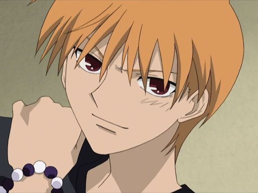
#I may have exaggerated their proportions a bit :')
Explore tagged Tumblr posts
Visit Tumblr Blog
Explore Tumblr blogs with no restrictions, modern design and the best experience.
Last Seen Tumblr Blogs


Fun Fact
Tumblr posted its first advertisements in May 2012 and subsequently earned $13M in revenue.
Text
I know some people have already done it but here is my contribution :>
Twitter || Instagram
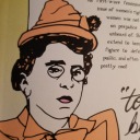
#caitvi#league of legends#arcane#piltover's finest#caitlyn kiramman#vi#artists on tumblr#I may have exaggerated their proportions a bit :')#caitlyn is v leggy here
298 notes
·
View notes
Text
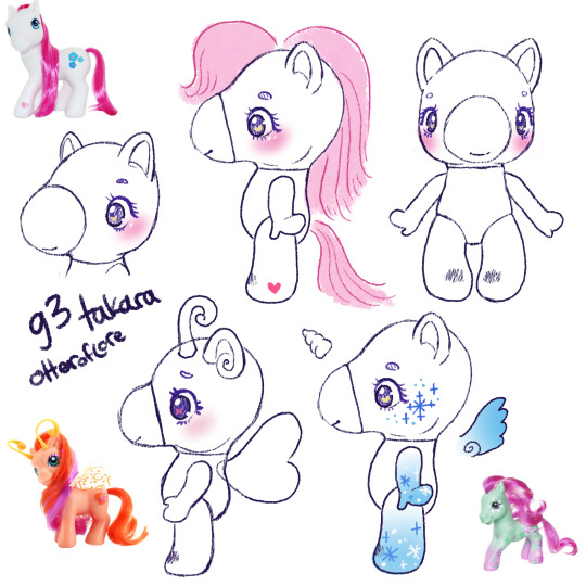
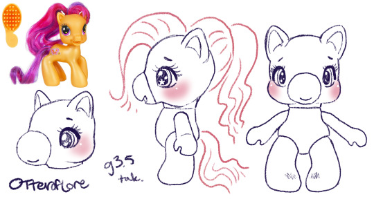
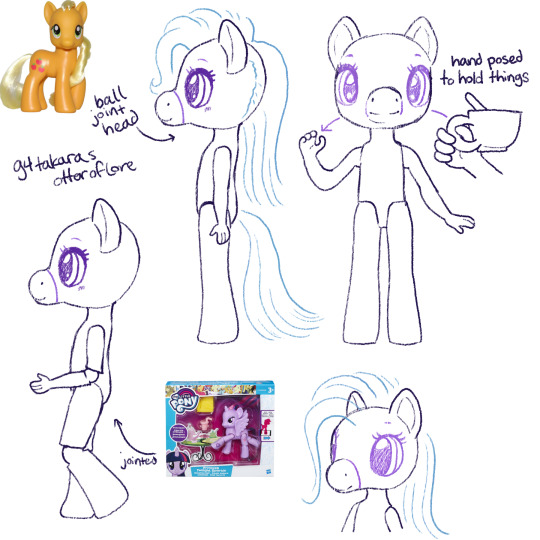
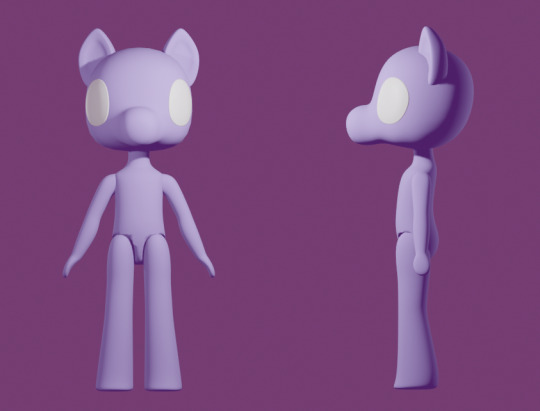
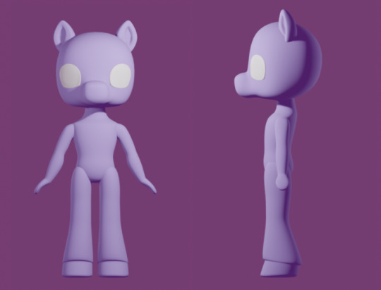
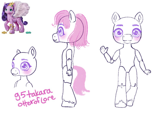
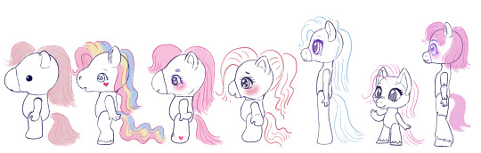
MLP-Takara generations: a design experiment
Takara MLPs are considered generation 1 My Little Pony; the original ponies look like little horses and the takaras are obviously very different.
But the standard MLP toyline underwent a lot of changes throughout the years... so, if the takaras had been successful, what would their changes look like?
Generation 1 year 2+ takaras.
Year one MLP was only a few ponies with a single color of body + matching hair... just like the takaras. It was year 2 that they introduced unicorns. pegasus, and seaponies.
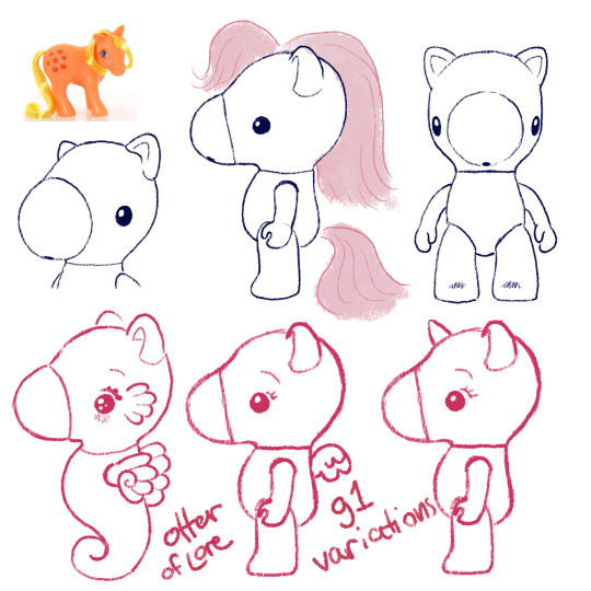
You all know I've already been concepting these so it's not surprising at all. As MLP g1 went on, they ended up doing more and more gimmicks throughout the 80s which would also be kind of fun to see the takaras do... (hint hint if you want me to draw those lmk which gimmicks are your favorites)
I also think they should bring in markings like the normal ponies but that could be part of the gimmicks. Maybe on their cheeks, or on their bellies like care bears?
In the later years og MLP also had a lot of variations on the normal pony body type, so maybe you could also see the takaras with that kind of variant, so that might be cute:
Moving on!
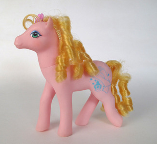
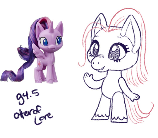
Generation 2
If you aren't big into early gen My Little Pony you might not know that generation 2 didn't do very well; it was a reboot of a beloved franchise, it was new, and different, and all that jazz:
Main differences between them and g1: first, you can see they have a very late G1-type body, which is why I pointed out the thinner pony in g1. Their face is less detailed and rounder, but they have a little more expression, very smiley.
Their ears have a more horse-y curled in shape, they have fur around their hooves (in g1 only the boy ponies had hoof floof), and they have a gem in their eye.
Also they had a lot more moving-leg gimmicks where you could push one part of their body and another would move (eg push tail -> bobs head)
So you may ask, how am I could to g2-ify the takaras? After all, they are already much rounder than the g1 ponies. Well, I'm not going to make them just *look like* the g2 ponies, although I'll borrow more elements.
Instead: I am going to take and exaggerate all of the differences that I listed above and see what we come up with.
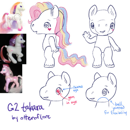
So! Here is my idea for g2 takara pony. I feel like its the exact balance of very cute and something that would upset collectors familiar with the original takaras, just as g2 upset the g1 fans.
First off, she's thinner, the iconic takara nose is removed in favor of a sculpt with a smiling mouth, the legs are more horse shaped with fluff and human fingers to match the additional foot detail. a lot of people find the g2s a little "uncanny" so I feel like this works.
The sparkley eye gem and ear shape are just straight off the original g2s, just to have extra gimmick to it (also the og takaras basically had the g1 ears)
g2 came out in the late 90s so I like to imagine the pony eyes would be extra shoujo too
Finally, a ball jointed head for more flexibility. (yes the arm would be posed like that in the doll, because its a more dynamic pose, and we can also assume that the larger size allows the doll to have a joint with more flexibility)
g2 had pretty similar gimmicks to g1 but also had some light up ponies, so maybe the takaras could have some with that gimmick too
fun fact, g2 MLP was sold for a longer time in Europe and performed better there.
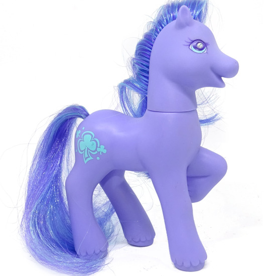
Generation 3
Generation 3 ponies are a pretty clear return to g1 MLP style, kinda scrapping most of the changes g2 made, other than proportionally thinning out the ponies a bit.
g3 ponies have very similar face sculpts with bigger eyes, nearly the same legs, and their heads just a bit bigger in proportion to their body
They do remind me a lot of the g1 Petite ponies, which were 1 inch sculptures that also had those proportionally bigger eyes and chunkier legs.
I have here included the g1 so you can see the slight changes better! I think the main difference would be the g3 takara would be a lot rounder, smoother, and cutesy-er. While the original has the hello-kitty simple cute look, the g3 version would definitely have like eyelashes and big eyes.
The only other thing to note about the body is some bigger ears, a generally rounder face, and round feet.
There weren't many gimmicks super /unique/ to g3 but one I wanted to highlight was the Breezies. G1 did have the flutter ponys, which were ponies with butterfly/dragonfly type wings, but the breezies are like their own little species AND they have antennae. While the flutter ponies were sort of graceful and thinner than the other ponies, the breezies are like little chibi-er ponies.
A little bit Littlest Pet Shop-core, since its the early 2000s too.
SPEAKING OF
Generation 4 Generation 3.5
Before there was gen4 there was a subset of Gen3 ponies with a different and unique style. They were basically an exaggerated version of the Breezies with even bigger feet and tinier snouts. They are also VERY littlest-pet-shop-core.
So, pretty straightforward changes
Just an even more chibi, kid-ish style pony. I think the g3.5 ponies were even meant to be kids. So this is just an even more child-friendly, littlest pet shop type horsey.
Generation 4
So, obviously generation 4 ushered in a whole new era of My Little Pony with its unique and bright artstyle, which did need to transfer over to the ponies
Personally, while I love g4 in a lot of ways im not a fan of the toys in the same way I am the other generations, their little noses have shrunk to specks, they're skinnier and more big-eyed than ever. Well, g3.5 was pretty big-eyed but at least those ones were like little kids.
This is such a drastic shift from g1/g3 and even g4, I would be unsure about the takaras.
So: eyes, bigger. Snout, so tiny and so smooth. Ears, bigger. Hooves are flatter and parts of the legs are just kinda featureless. a longer neck. They released a decent amount of ponies with plastic hair this gen, too.
I was struggling to come up with a doll for this one, but I finally realized I was doing it backwards. The thing that makes g4 stand out, I think, is the fact it was fundamentally designed opposite from g1. Lauren Faust, an animator, designed the ponies and the toys had to be designed around her art.
So the primary difference was considering what a tv show- a tv show concieved in the 2000s and airing in 2010s- and I did look into some kids properties from that time period as I was designing
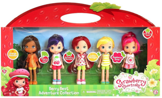
I think these Strawberry shortcake dolls are really close to the concept I'd want for a early 2010s mirror of MLP g4. So basically these toys but more anthro.
I ended up making a 3D mockup so I'd be able to plan the different angles and keep them consistent.
The eyes are kind of far apart but I think thats true of the g4 pony toys as well. Again, because of the way the g4 show was stylized as animation, there was sort of cheating with the anatomy, especially on the face.
Generation 4.5
Gen 4.5 was a spinoff of gen4, just like gen3 had 3.5 where the ponies are more chibi. More big eyes with even bigger ears and a face like... a cats? instead of a horse. Hoof fluff again.
I think this nailed the style without being as much of an outright copy. The bendy arms with fingers seem so silly but also I think that matches the vibe/artstyle.
G4.5 don't look like horses to me really at all though, they're like cats with hooves. Out of all of them we've seen so far they're suffering the most from "predator eyes" where they've gone so far as to make their eyes just face forward.
Generation 5
Generation 5 premiered with a CGI movie, so the toys that would be released are fairly on model with their movie selves except for the fact their heads are smack dab in the middle of their neck which i find extremely unsettling and dislike
We've gone full "predator eyes" (no the predator eyes thing doesnt 100% biologically hold up but I find them freaky and I get to say it) AND full human eyebrows stenciled in like a makeup vlogger in the same color as the hair.
The ears are back to cup shaped (more horselike) but again the face is round with a little muzzle (more catlike). The hooves have really detailed feathering on the legs. Otherwise the body is mostly just structured like the g4 body (except a bit longer) just with more specific horse details.
These continued the trend of having a lot more articulated versions with moving legs as well. I think given that most dolls these days have articulated elbows and knees, it is reasonable to expect the takara g5 dolls would too.
Again, I made a 3D model so I could keep it consistent from various angles.
ta-daaaa heres my takara pony generations 1-5 lineup! Tell me which youuuuur favorite are. if you want.
#im sorry for how long this post is#long post#my little pony#takara pony#mlp gen 1#mlp gen 2#and so on#generation 1#doll designs#sketches#i also wanted to do the clothes styles for each gen but this took so long already#and alternate gimmicks#would be fun to explore
316 notes
·
View notes
Text

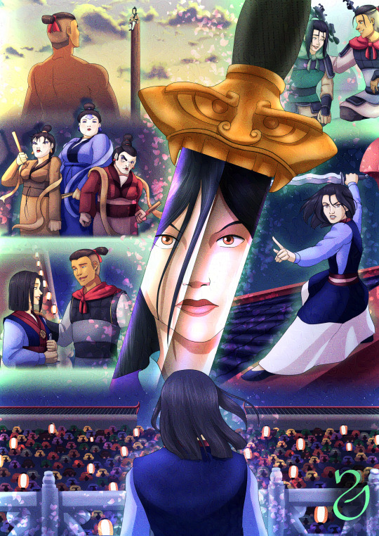
My latest completed commission may have been a bit ambitious... because I went wild with it. But I certainly relished in doing so :') Combining my favorite ship with my favorite-ever Disney movie is, uh... a dangerous concoction :'D
The commissioner specifically requested for Azula as Mulan, Sokka as Shang, and Xin Long (my OC dragon from Gladiator) as Mushu. The rest of the cast was up to me to choose, and I pretty much went wild rewatching this movie and picking out some of my favorite moments to recreate them in my style, with these characters. I came up with a lot of correlating characters between both ATLA and 1998's Mulan, but I couldn't hope to draw EVERYTHING, unfortunately. Still, if you want my reasoning for the cast correlation... check out the Read More! Beyond that, feel free to reach out to me if you'd like to commission me, or if you want to join my Patreon!
The Herbalist as Mulan's grandmother might feel arbitrary but she honestly felt like the ATLA elderly lady with the most similar personality to Grandma Fa. Fickle, with a unique connection with a seemingly perfectly ordinary animal, old and sassy? Figured it fit! So for once, the Herbalist is Azula's grandma! xD strange notion, I know, Azulon/Herbalist is not a ship I ever thought I'd accidentally put out in the world but there have been wilder ships than that in this fandom...
Momo became Cri-Kee, I wasn't 100% sold on it but when I considered that Avatar features soooo many hybrid animals... I figured he could be a hybrid cricket-lemur. Weird, I know, but eh? Better than nothing xD
Aang as Chien-Po was a no-brainer. He's the only character I settled on instantly, never even considered anyone else for the role. Their personalities line up really well, and Chien-Po's tendency to be OP and resolve things that are outside of other people's reach sounded like he was prime Avatar material! So, while their dietary preferences are an obvious difference between them, I decided to go for it nonetheless considering all their other similarities!
Kino (another Gladiator OC) is Ling, and he actually did give me a ton of trouble to choose. I considered many characters for the role right up until I realized that Kino's personality actually lines up fairly well with Ling's, down to being a class clown type (who ABSOLUTELY would have cut gym class!) and breaking out in song about the hypothetical woman he'd like to fight for? Yeeeeah that's right up his alley xD but there's another reason why I picked Kino...
... And that is my likely unexpected choice for Yao:
ZUKO.
ZUKO IS YAO.
YES.
I'M NOT EVEN SORRY.
(For the uninitiated, Aang, Zuko and Kino are best friends in Gladiator, very often together, and they make a really good team, so that's the extra reason why Kino became the obvious choice for Ling aside from having really similar personalities, definitely closer personalities than, say, Jet, for instance.)
People have likened Zuko to Shang a LOT since ATLA aired. This is the main reason why I'm even making this huge note! I suspect it's primarily because of the aesthetic, let's be real here, and because he becomes Aang's teacher, but people have exaggerated Zuko's alleged similarities with Shang, or taken them out of proportion, in many ways. I actually remember an AMV ages ago with "Be a Man" and it was Zuko "training the Gaang"?? It... didn't feel right to me. Obviously, someone might rebuff with "well, how does Sokka make MORE sense than that, though?" And believe it or not, I have arguments for that... (when do I not...?)
Not only is this what the commissioner specifically requested (and it obviously lines up with the ship we love!), but let's examine the actual reasons why Sokka as Shang adds up:
Sokka actually had to train a bunch of toddlers who weren't paying any attention to him. You know. Kind of how Shang had to train the unruly soldiers who weren't getting anything right. Sokka has a positive relationship with his dad (Zuko, ofc, does not). Shang also has a positive relationship with his dad! And not only this, but there's a military component to both relationships, specifically with Shang wanting to follow on his father's footsteps and aid him in the war... so much like someone else I know, who jumped at every opportunity to rejoin his father in the war, even wishing to join him as a child until Hakoda tasked him with protecting their Tribe instead (kinda like Shang is tasked with training soldiers rather than joining a battlefield).
And the final cherry-on-top that I'd loooove to hear Zuko fans try to argue against... is sexism :') didn't Sokka get characterized as a sexist guy for four episodes, which made people decide that this was his main character trait even if it went away that quickly? Um, yes, that happened. Shang literally sings the memorable song that's a crazy ode to masculinity, including the rather sexist line of "did they send me daughters when I asked for sons". Shang outright abandons Mulan once they discover that she was a woman all along (while, admittedly, choosing to abandon her rather than KILL HER, which as we saw from Chi-Fu, he was NOT supposed to spare her!)...
So, is this REALLY what Zuko fans, who willfully believe their boy is a feminist king (... why? beats me...) are trying to compare their unproblematic blorbo to? :'D Me? I have no problem linking Sokka with Shang due to Sokka's beginnings and due to the fact that both Shang and Sokka have similar growth when it comes to accepting femininity is as valid as masculinity, and as they both learn to respect women as fighters and potential heroes! (I simply do not believe Sokka's ENTIRE tenure in ATLA was about that, though, and that's what I continue to clash with the fandom over...) So... all this is why I've reasoned that Sokka is a VERY solid choice for Shang, in fact, better than Zuko could hope to be.
... but this isn't all.
Maybe some might accept my arguments for Sokka-Shang. And then, they might ask:
WHY ZUKO AS YAO, THO??
... And the truth is it took me long to see it, myself, but HOLY SHIT, DOES IT FIT!
What is the primary thing we remember about Yao in Mulan? This guy is constantly itching for a fight, to prove himself, surely riddled with insecurities that he exteriorizes through overcompensation of masculinity. He's funny as fuck, but he's taking himself 100% seriously as a manly man all the time, and he's always ready for violence. But there's one more thing...
He treats Mulan as his RIVAL.
And more often than not? SHE SCREWS HIM OVER. Intentionally or not.
What does that sound like? Why, yes, it sounds a LOT like Azula and Zuko's sibling relationship!
The fact that Yao is a temperamental dude who lashes out easily at things (oh, something he has in common with Zuko!), that he specifically resents Mulan (in this case, Azula, just as Zuko does!) and is either constantly looking to defeat her and prove his superiority over her (... wait, just as Zuko with Azula??), that he has a black eye perpetually across the movie, and it's his LEFT EYE (just as Zuko's scar is on his left eye! :'D), that he's friends with a pacifist he has basically nothing in common with, personality-wise (just like Zuko and Aang!), and that he pretty much has a REDEMPTION ARC in which he goes from a bitter, asshole rival to Mulan to treating her as a friend and ally, to the point where he was disappointed to leave her behind and THEN joined her at once when she says she has a plan? :') I have always been critical of Zuko's redemption arc, goes without saying. But if ANY of these characters redeemed himself in any significant way, it certainly seems to be Yao to me, and with people gushing NON-STOP about Zuko's redemption? Why, he ought to be the character who goes from bitter rival to loyal friend, right?
So. I'm not even sorry. Zuko is Yao. And I'd dare say that he should be flattered by the comparison, even, because Yao ends up being cool as FUCK!
I don't really talk about this much nowadays, but Mulan was my favorite Disney movie growing up, it ABSOLUTELY had a formative influence on me as a little girl, and Mulan was my favorite female character for a looooong time. Thus, any excuse to rewatch this movie makes me happy as heck. With the wisdom of age I know, of course, that it's not perfect, it's not what China wants, it's not the most thoughtful depiction of Chinese culture or the most faithful adaptation of Mulan's poem (... but I'd also dare bring up that the 2009 Chinese adaptation ISN'T all that faithful either...), but it has a kind of magic in it, a solid storytelling flow, so many memorable moments one after the next, that I could hardly choose which scenes to depict... Disney has never again seen the storytelling heights it reached with Mulan in 1998. I don't even care if that's a controversial opinion in any way... this is their best animated feature for me, and nobody can change my mind.
So... depicting Azula, my beloved, in all these scenarios as this character I adored and idolized as a child, was so damn fulfilling for me. While some might think that, personality-wise, these two ladies don't have much in common, the fact that Mulan is sent to a matchmaker who basically tells her she looks good but is going to be the worst wife ever...? Our girl Azula, with all those insecurities about being unloveable and a monster, probably would relate big time to that.
Mulan is also an INTELLIGENT soldier rather than a brawny one, which is how she starts to make progress in the army, it's how she manages to overcome the huns with that avalanche... and Azula's primary difference with most other antagonists in ATLA is that she's smart as fuck. She is very strong, no doubt, but a LOT of that strength comes from her intelligence, from assessing situations in unique ways, from planning and strategizing. The way Mulan finds the most unexpected solutions that still pay off reminds me a lot of how Azula achieves unexpected feats through rather unorthodox means, capable of taking over a city with basically no bloodshed while her nation has spent 100 years trying and failing to do so through major army incursions and who knows how much senseless violence. Obviously, I'm not saying what Azula did is GOOD and it's kind of dumb that we always have to point that out... I'm merely comparing the magnitude of the feats, and the fact that they both come from ladies who use strategy and intelligence to achieve their goals rather than muscle and physical power.
And while anyone would rage at me for the comparison between Fa Zhou (her dad) and Ozai, the truth is the dynamic between them CAN be compared, if loosely: Mulan literally goes to war to keep her father safe. Azula goes to war under her father's orders. Hell, she makes herself BAIT in the Eclipse to make sure the Gaang won't get to her dad?? While it's very much possible to say that both characters have different personalities and attitudes in life... I'd also bring up that their contexts are evidently completely different. I wouldn't say for certain that Azula, had she been raised outside a Royal Family, would be EXACTLY like Mulan... but they might have more similar traits than one might expect. Ultimately, though... I love them both. And this opportunity to swap their places was pretty much a dream come true!
Alright, that was plenty of rambling xD ultimately, I had a blast doing this commission, as I'm sure is obvious by now. So! If anyone wants to commission me, feel free to check out my prices right here and hit me up if you're interested!
#sokkla#sokka#azula#mulan au#xin long#zuko#aang#kino#the herbalist#momo#if you squint he's there okay he is just too damn complicated as a hybrid cricket-lemur alright#Xin Long is scale-less because he was too small and it was gonna look weird so for once he was a little less tricky :'D#I wish I could've had MORE epic scenes really this movie is a goddamn GEM#goldmine of glorious moments#it's just wonderful#I usually get sick of things as I work too much with them...#... Sokkla and Mulan are clearly a glorious exception to that rule#I wish I could've put in scenes with other correlating characters#Combustion Man was gonna be Shan-Yu#Chi-Fu was gonna be Long Feng#I can't remember who I had in mind for the emperor anymore#wasn't Kuei because he had to be old but welp#and yes it's too bad it's too sad there are not enough female characters here for the rest of the ATLA female cast...#but while I BRIEFLY considered making Toph one of the trio (Yao ofc)#the naked scene convinced me of the opposite quickly#... Toph would not succeed at convincing anyone that she was born a man she would straight up not even try#she'd just beat everyone up and scare them into shutting up#and while I'd LOVE to see that... it absolutely takes out the stakes from Azula being discovered as a woman pretending to be a man :'D#how tf would you kick one girl out while keeping the other one in the army#when the other one should be bold enough to stand on a rock in her birthday suit showing herself off in front of everyone
126 notes
·
View notes
Text
Fourth Wing Men HCs: nicknames for him
Includes: Bodhi Durran, Garrick Tavis
A/n: I haven’t wrote some headcannons in a HOT minute, but me and @garricks4thwingqueen have been conspiring and inspired me to take a whack at it again. These got a smidge long, so I will make a part 2 with more characters, and other scenarios, but you know who had to start with! I also included some AI pics I’ve been cooked up that are mashes of my fancasts ideas for the characters. I have the hardest times visualizing a lot of characters and places in stories and sometimes the AIs I’ve seen all look alike or aren’t itching the right part of my brain. Disclaimer: I tried to take into consideration book accuracy, but AI is AI and I only dabble w it on my phone. So I’ll take what I can get. Skin tones, hair, proportions may not be perfect. These just personally help get a better concept, and I find fun to make, and anddd risking forgetting about a free 7 day trail from time to time 🕳️🤸♀️ *muah* enjoy!
Warnings: swearing, underage drinking/smoking (if u squint), suggestive content
Bodhi Durran
Bo/Boh, beau, bowie, Bo Bo, babe, love
Xaden and him are maternal cousins. While the firstborn always had the weight of responsibility growing up being an heir by his parents. The younger cousin was always ‘coddled’ by his. Though he adored his family, he hated how they always doted on him. Mainly because of how much his older cousin and his best friend would tease him about it.
Xaden and Garrick started cooing “Bowie” and “Bo Bo” at him when they were 12, he was 11.
“Bowie, don’t forget to write to me.” “Bowie, be good for your uncle.” “Oh Bo Bo don’t you look so handsome today!” They’d snicker to him under their breaths when he’d arrive at the fortress when his mom would drop him before flying out to an outpost. Watching how his cheeks flushed red, and he had tight balled fists pressed at his sides.
Once the doors closed, after formal introductions with his Uncle and lingering personal staff were done, and once the adults a room away—he would hurl one of his clenched fists at their shoulders.
Starting a playful brawl amongst the three
Spoiler alert: Bo Bo back then lost once or twice…maybe a handful of times
Then as awkward teenagers when problems were simpler the three of the pubescent boys discovered churam and drinking. Bodhi started unironically calling himself Bo Bo and Bowie, mockingly teasing himself as a ‘bit’.
The young men were sat around a fire in the clearing to the outside of Riorson House. Xaden and Garrick in a heated debate over a petty topic. “Bo Bo can’t comprehend what’s going on right now.” He would say, exaggerating and scratching his the top of his head. It had been effective for the most part to ease the tension between his friends
Now from time to time, he’ll still do it especially if you’re present. He always thought you looked cute as you shook your head with a crooked smile spread across your face when he did it
Sometimes fhd guys would find him doing something badass, you’ll hear triumphant whooping from Xaden and Garrick, endearingly using the nicknames they called him as a child
“Go Bowie!” “Bo Bo that was fucking awesome!” “Bowie! Bowie! Bowie!”
But if anyone else besides the select few called him those names, he’d glare daggers at them. Like the time Ridoc tried to call him Bo Bo during lunch while the group was joking around
Bodhi’s boyish grin disappeared instantaneously. “If you ever call me that, I will rip your tongue out.”
The first time he heard you call him Bowie tho, he nearly melted. It was one of the first times you slept over with him and he had to get up early for a leadership meeting
You propped up on elbow, using your other hand to wipe the sleep from your eyes. “Do you have to go, Bowie?” A small pout on your lips watching him get dressed
His other pet names from you were selective, usually just calling him Bo/Boh, but your favorites were Babe and Love
Babe being the one you leaned towards the most
especially when you would catch him doing something ridiculous or he’d press your buttons. Or just when you wanted something
“Babe? Are you kidding me?” “Babe stop!”
“Babe can you get me another drink, please?” You asked, looking up from your lashes with puppy dog eyes. He folded every time no matter if you were closer to the serving station or bar. How could he say no when you gave him that look? Not caring, flipping all his friends off as they’d give him knowing smiles.
He was a simp for you
Love was usually reserved for tender moments with him. When you’d notice he’d be having a bad day, or to calm him down when you’d notice he was fuming silently beside you at something going on
Intertwining your fingers with his giving a reassuring squeeze. “It’s alright, Love.”
Or holding his cheeks, bringing him to eye level with you. “I’m here, Love. Can you take a couple deep breaths for me?”
Sometimes you broke out the corny double entendre of beau. Very select people would get it, but you thought it was great
Mainly you’d be out to the taverns with your friends when you’d use it. Usually when a girl would approach him, and you’d try to hide your jealousy tho it was plain as day
“He’s actually my beau.” You’d say, a sinisterly sweet smile on your face when a girl tried to introduce herself. Your hand twirling the curls at the nape of his neck. Bodhi would always shiver from the gesture, trying to contain his arousal at your possessiveness
Then later in the night, he’d pin you to the wall of his room. Pressing feverish kisses up the column of your throat. “Are you gonna show me all the way I’m your beau?” He muttered before grazing the delicate skin with his teeth
Garrick Tavis
Gare, Tavis, Gary, Gare Bear, Hon/Honey, Sir
His parents tried to call him Gary at one point growing up, but he always ignored them or begged them not to call him that. It always sounded so stupid to him
Garrick was blunt, dry, and straight to the point not caring for nicknames. Only really preferring to be called by his name or Gare on occasion by his friends and acquaintances. His last name an even better alternative than a nickname
But Xaden, Imogen, and Bodhi took a sick pleasure in all the creative corny nicknames his parents would try to make a thing for him growing up.
“I think we oughta get Gary’s input?” Imogen leaned her chin in her hand as they all discussed weekend plans after school looking over at the towering young man. The side of her mouth crookedly lilting upward, knowing she struck a nerve. Garrick could already feel his eye twitch, clenching his quill as he acted like he hadn’t heard them a few feet away at the table in the library.
“It seems Gare Bear’s not in the mood today.” Xaden would casually lean back in his chair, smirking, and watching his best friend stroll into the dining room late for dinner time after a terrible day
Which would result in Garrick walking by, and tipping his chair back causing the Riorson to flail and fall backwards. “Relax asshole,” Xaden hissed, rubbing his head.
To this day they still called him the silly names. Taking immense pride when you had picked up on the memo, and started to call Garrick the names he despised. Especially because you two weren’t each others favorite people at first
The first time it happened, it was when Garrick pissed you off. He had been criticizing all your sparring movements, and you had enough. “Sorry we can’t all be perfect like you, Gare Bear.” You’d sneer, watching the irritation form on his face.
“Do not call me that.” He’d glower, but you’d just smile brightly. “Whatever you say…Gare Bear.”
Seeing how it got under his skin, from that moment on you’d always call him just to pester him. Enjoying the glare he’d shoot your way or awaiting for whatever witty remark he’d reply
Eventually once you two started getting along, you called him his first name, being more considerate towards his feelings. Garrick’s chest filling with disappointment as he awaited the usual Gare Bear falling from your pretty lips.
“Hey Garrick,” it was a rare moment when you found him by himself. None of your mutual friends around for once, and one of the first interactions you had alone. “What?” He looked up from what he doing. “I said hey?” You gave him a weird look. “But you called me Garrick.” He said in disbelief. “That’s your name isn’t it?” “You always call me Gare Bear tho.”
That’s when you realized he secretly liked it despite him trying to act annoyed at you.
Then when you had officially started dating, he had to get used to fact you loved calling him all these terms of endearment. Deep down, loving how you could make him become bashful by your words
“Here you go, Honey.” Leaning down, kissing his cheek, setting down a dish of apple crisp in front of him. You knew how much he liked the dessert and grabbed an extra one when getting your dinner. Garrick’s cheeks tinged red and chuckled appreciatively, “you’re the best.” His friends just silently stared as if you two had three heads. “What’s the matter?” You asked the group unphased, taking a seat. “You broke him.” Imogen replied in awe.
You had changed his perception on being called nicknames. Even letting it slide when his friends poked fun at him with the once despicable nicknames
Out of all the nicknames you called him, his favorite by far was the one you’d use in the bedroom.
“Please,” you begged, while sitting on your knees. “Please what?” Garrick gripped your chin between his thumb and forefinger. You gulped, “please Sir.” A cruel smirk on his face, pressing a small kiss to your lips. “Good girl.”
#bodhi durran x reader#bodhi durran fanfic#bodhi durran fic#bodhi durran#bodhi fourth wing#bodhi durran smut#Bodhi Durran headcannon#Bodhi Durran hc#garrick travis x reader#garrick tavis#Garrick Tavis smut#Garrick Tavis fic#Garrick Tavis imagine#bodhi durran imagine#Garrick Tavis headcannon#Garrick Tavis hc#iron flame fanfiction#iron flame fic#fourth wing bodhi#fourth wing fanfic
175 notes
·
View notes
Note
Hello, hope this finds you well!
As a film enjoyer and small artist I was absolutely mesmerised by the animation work in ATSV all around but The Spot in particular stood out to me! I was curious how the process of animating his scenes went especially with all the portals, which I assume many of which were painted in afterwards? Was the way the team thought out his scenes different from other chatacters?
Apologies if I'm asking about something you didn't work on but I thought asking was worth a shot! Anywho thats it, may you have a lovely day!
good question, and thank you! i haven't seen much talk about spot but a lot of development went into his look
for posing, we took a lot of inspiration from the artist egon schiele, an idea from humberto rosa. we wanted spot to look awkward by making him feel like a loose yet controlled sketch, exaggerating his weird long and lanky proportions into very squared off and angular shapes
for the portals, they had to be created in anim first and then fx did a pass on them to add all the little extra swirly bits, and then comp did another pass on them to integrate them into the scene. every element that you see in a shot had to be created in 3D in order to move properly down the pipeline so that the other departments knew what to do with the scene, because they don't always look at the animation playblasts, what matters is what's published in the scene file. we can draw over our shots to try things out quickly but eventually had to put in the work of making them real 3D assets. every portal that you see on spot's body and floating off of him was placed by an animator
near the beginning of production, a lot of tests were done to make spot's face portal more expressive, mimicking mouth and eye shapes as a part of his acting. it was decided that simpler was better in this case, so it was mostly just kept as an oval instead

in order to make a shot like this work in 3D, we used two spot rigs here and a portal tool that let us flatten the geo of the second spot down to 1 pixel so that only his hand can be seen while animating in and out of the portal. nothing is painted over here, this is pretty much 1:1 to what's in the maya scene
in order to progress spot's power throughout the movie, we needed to add more body spots in the india sequence, similar to the second to last pose here (art by aymeric kevin):

our anim tech lead emmanuel gatera worked with rigging to update spot with the ability to turn sections of his body black with the use of a boolean, since it was impossible to add enough spots to totally cover his hands and midsection. he did still need a lot of spots along with the booleans though, i think it was somewhere around 80 (we had library poses for them, didn't need to bring them all in and manually place them in every shot haha)
and finally forget what i said about having to create everything in 3D because the final stage of spot's power was the exception to that rule since he was only in a small handful of shots. nideep varghese animated this shot with the regular spot rig and drew over it entirely in 2D, which the fx department recreated with about a bazillion layers of hand-drawn fx by arthur muller, srdjan milosevic and filippo maccari. lighting/comp by craig feifarek
366 notes
·
View notes
Text
hitting this article with a rolled up newspaper. bad. stop it

sigh. exhaustive argument that none of these shows grouped together have the same art style below, complete with images and whatever
oh also im not the type to comment on articles so idk the etiquette but don't like. go over there and say "ur list sucks >:P" that's just gonna bring more traffic to it. i linked it so people could ratio me if need be not so that you guys could dunk on this random listicle writer. it's pointless and kind of cruel. just so we're clear on that
edit: the quote above uses "time period" instead of "era". i quote it as saying "era" a lot. i'm not fixing that
note: here i'm assuming "art style" refers to, generally: character designs (facial and body proportions, how things like hair is dealt with, etc), lighting, color (palette, saturation, value), line weight, etc [and mostly excluding things like shot composition, direction, etc because while those probably count my personal experience with these shows is mostly limited, and because most people focus on the previous things i've listed in their discussions of art styles. the analysis within the article is incredibly shallow, and if they think samurai champloo's art style is "rehashed and reused", i don't think they're like. super deep in the art analysis sauce. anyway]
code geass vs death note. what are you saying. what are you talking about


code geass' approach to color is more vibrant, and dn's is more washed out. dn takes a more realistic approach to faces and bodies, both in proportion and in shape (namely how curved their features are (as opposed to cg's far more exaggerated sharp faces, large eyes, and lanky bodies. note how lelouch's lips barely jut out in profile, for instance)). i shouldn't have to explain this they're not even close
that's the most extreme example, but samurai champloo and cowboy bebop aren't That similar either


it's hard for me to speak on bebop for the most part because i've never seen it (vs my ~8 eps of samurai champloo knowledge), but from what i have seen, bebop often has a sort of delicate intricacy to a lot of its linework (especially its backgrounds) that champloo tends to sacrifice in favor of bolder lines and higher contrast. it was hard to find great examples, but the silhouettes champloo's characters cut are often sort of.. choppy and wild, and usually lanky and stretched-out, while bebop's are more realistic (focus on the shoulders in the last image set, for instance). there's overlap, sure, but there are clear and intentional differences in the designs, to say nothing of champloo's higher saturation and the natural differences between hand-drawn and digitally-drawn animation
(and if "art style" is referring to the direction rather than just character design, lighting, color, etc, it's because these two have the same director, which hardly creates an "era". that's like comparing two miyazaki films from the 90s and saying "this is what 90s anime movies looked like", it's nonsense. also, i feel like lumping these two together because they look a little similar is unfair because they're pretty unique from their contemporaries in their own right. they may resemble each other a bit, but how much do they resemble other late 90s early 00s sci-fi/historical anime? does samurai champloo look like outlaw star to you? or trigun? or evangelion? does cowboy bebop look like ninja scroll? or samurai 7? or sword of the stranger? etc etc etc?? if we're claiming that cowboy bebop and samurai champloo share an "era", then what of their contemporaries, and what about differences across bebop and champloo's very different genres? more on this point later)
even fruits basket and ouran, the ones i initially felt were most similar, have clear distinctions


ouran's got a distinct abundance of pastels in its color palette, tending towards pinks, blues, yellows, oranges, etc. its use of black and brown is very limited. fb's palette is a bit more relaxed, and while its colors are often pale, i wouldn't call them pastel (they also skew more towards natural, earthy tones). fb's characters have noticably.. flatter skulls? in some shots, and their heads are so squat that they can seem consumed by their eyes. anyway this is a trait ouran does not quite share, for a number of small reasons, like how their cheeks bow out, greater emphasis on noses and mouths, and its use of highly variable line weight (vs fb's very stable line weight). hair is more voluminous and multilayered in ouran, and features like lips and noses (esp noses) are fuller, more three dimensional (in general, ouran's approach to shading hair and faces makes the characters feel rounder). the sharp edges and bell-sleeves of ouran's uniform blazers are actually far more reminiscent of the designs in code geass than fruits basket, imo. (actually.. i'm not sure how to express this but a lot of the poses in ouran resemble code geass poses, in their locked-joint arms-stretched kinda way). ouran forgoes hair-shine, while fruit's basket adds them in either jagged points (see most of the images i included) or a sort of triangle wrapping around the head (not pictured here, just trust me)
(note: i'm assuming they are referring to the 2001 anime adaptation of fruits basket rather than the 2019 one, because not only does the 2019 adaptation resemble ohshc even less, but because they are closer in time period, and the grouping is supposedly based on era).
my point is none of these shows look rehashed from one another. there's sometimes overlap, but each has a unique aesthetic based in many small choices made in their design.
now let's look at their use of "eras" a little more. this is the timeline of air dates for the first episodes of the six shows mentioned (for their original japanese runs, obviously):
cowboy bebop, april 1998
fruits basket, july 2001
samurai champloo, may 2004
ouran high school host club, april 2006
code geass, october 2006
death note, october 2006
code geass and death note being paired by era is, at least, accurate. same month, same year. it's about as close as one can get. however, the other two groups are far more removed from each other. fruits basket and ouran have five years between them, and bebop and champloo have six. this wouldn't be such an issue if there weren't other anime within this list that came between them. if bebop and champloo are in the same era, why is fruits basket grouped differently? ouran came out in 2006 just like code geass and death note, so why is it grouped with something that came out five years prior instead of them?
i think it's fair to say that eras are not purely chronological, that there's overlap between them. one doesn't begin as soon as (and not a moment before) its singular predecessor ends. but era feels like an incomplete distinction here. this list alone shows quite a lot of variety for what someone can mean when they say something "looks like 2000s anime". most anime fans have a picture in their head of that, and, to be so honest, i don't think samurai champloo is it. using only time as a distinction rather than movement, genre, etc is simply not enough. the fact that 5/6 of these shows occur within 2001-2006, and yet they're set apart into three different eras, and each pair (in ways i'm sure the author of this piece would admit) does not resemble the other, is proof enough that 2001-2006 did not have one repetitive art style, at least not in a way these anime exemplify. that's to say nothing of whether or not the anime within the era-pairs look the same, which we've established i don't. but since they don't actually tell us what their eras are, we can only speculate. personally, i speculate that they didn't think about it too hard at all, or even look up the release dates, going off vibes instead, if that.
when this person is talking about "eras", i think "eras within certain styles or genres" is more accurate, but even with these in mind, matching shows up like this makes a lot less sense than i think they realize. death note and code geass are sometimes lumped together because they're both mind-gamey thrillers with megalomaniacal protagonists with a single unique power that they use to try and fix/control the world, not because of their art styles. trying to say they look the same just because they share plot elements and came out around the same time is just... really weird. fruits basket and ouran both fall into early 2000s shojo, which is part of why the comparison fits more. target demographics and what magazines cater to those demographics (and thus the aesthetics of those magazines, which you have to fit into enough to get your manga published, and which also just influence what you want, what readers want, etc through exposure) (<- oversimplifying) are an actual valid point of comparison, at least more so than "idk 2006 lol". even if the result is more like "romcom for girls, 2006"
it doesn't help that many of the choices they made for unique art styles don't feel particularly "unique" to me.


choices like mononoke and land of the lustrous i get. and i'm not saying any of the examples i've just pulled or in the article are bad art styles, or that they don't bring anything unique to the table. i'm sure many of them are beautiful, and help elevate the tones of the stories, and all that jazz, whatever. but if the name of the game is "unique", then i don't think these cut it from what i can see. it doesn't help that most of the analysis comes down to "it looks really really cool" or "you don't normally see this art style with this genre/tone" (which is not the same thing as being broadly unique, imo)
it could be that we have different impressions of what "art style" means. it could lie somewhere in the bits of art style that i cut out, like shot composition and direction, etc. and some of it is probably a difference in what constitutes uniqueness, both between our differing experiences with media and personal taste/philosophy. but i don't think i'm wrong here when i say that the assertion that samurai champloo is era-typical in a way that beyond the boundary (2013) isn't is just fucking wrong.
look i know that bit that i screenshotted that started all this was a filler paragraph. i know it was the mandatory setup for the listicle you scroll to immediately, the parts you're supposed to ignore. i usually ignore articles like this completely because they're kinda bullshit. but i think this hunt for what looks the most unique is a flawed and confused one, at least to some extent. especially when all of the justifications are like "it supports the vibe well", which is something that all art styles are supposed to do, no matter how "unique" they are or are not, and i think that when people discuss things like art styles and anime and what looks generic and what looks unique, lumping things together too much often removes the nuances that really do influence people. i'm an artist. it's gonna sound dumb, but the way things look matters to me, even if it's stuff like how shirtsleeves or noses are drawn. to ignore all these little differences that make each piece unique is to blend so many singular, unique things into this easy-to-categorize mush that just... does a disservice to the choices every artist makes, i think. even if it is a pretty mild disservice. again, i cannot stress enough that this article is not important, and that this post responding to it is also not important.
look, what i'm trying to say is stop and smell the roses. notice the differences in the art you consume and think about it. looking for something that's so different it jerks your brain around is cool and good and fine and normal, but to disregard things as "basically the same as xyz" is reductive and icky and i don't like it. if you want something unique idk go watch kaiba (2006) have fun it's really good. i'm going to bed
nvm miscellaneous gripes section + i go to bed at like 5am lol i LIED:
the only thing said about beyond the boundary's art style is "it's hard not to fall in love with the art style", and the rest of the comments are other elements. that's too vague! i'm docking points!!
a lot of this seems based in the color palette now that i'm rereading it. not that my analysis doesn't also involve that, and not that that's invalid, but it makes me think there uh. might not have been Too too much thought beyond that. (example: "Though the dark and cool colors provide a sense of dullness, these colors cater to the tone of the story, which is dark and representative of its heavy content." like. that's not. unique. that's not unique to solo leveling y'know to have a dark story be awash in dark and cool colors that's pretty normal actually. maybe how they do it is unique, but we'll never know bc i haven't seen solo leveling and the author didn't care to elaborate :/ oh well)
this one's petty but i actually think ohshc's art style is pretty unique. maybe it's just because i've seen it several times and certain details like how the bottom-lip-to-chin shadow is done have caught my attention but like. pouting crossing my arms huffing >:( i think it's unique wth...
demon slayer's an alright choice i agree. idk i barely watched it a few years ago and it still wrenched my art style in a new direction. i dunno anything that looks quite like it. i'm not mad about all these choices per se it's just hard to whittle something like uniqueness down to a top ten list, i guess. and to say samurai champloo's generic while violet evergarden is the 5th most unique anime you've ever seen is like. weird. you're setting yourself up for people to go ehhhh... idk...... if you're not picking stuff that's like. Clearly Out There (i.e. mononoke)
"It’s no surprise that Demon Slayer is an anime with some of the best art styles." i might be fighting something that was written by ai now that i think about it...
oh god this was totally written by ai. or it went very unedited. man i spent like 2 hours on this (<- LOSER LOSER). they can't decide what the plural of anime is
they insist that chainsaw man's art style is weird enough to maybe put people off, and the only reason i can think that is is bc it's cg. but don't do the same for land of the lustrous, which is also and much more obviously cg. idk
they phoned it in but didn't even include that ping pong anime smhing my head. y'know the one everyone includes. which means whoever wrote this actually did stick to personal choices over crowd-pleasers, or chatgpt goofed or whatever. idc. guys they didn't even put flcl (<- but they put gurren lagann? as a gurren lagann fan im confused) oh my godd
ik i said this before but im saying it again: a lot of their pros and cons come down to whether or not an art style is typical for that kind of story, so like whether something gritty in tone has a more realistic art style or whether it has something visually cutesy instead. art style is more than just those things, but even that analysis is like. pretty much as bare-bones as what i just said. yucky
oh also part of my issue with this (didn't phrase it right sorry) is like. "unique" is a broad term. a really broad term. it can mean anything. there is no top 10 anime with unique art styles article that would escape that problem, and my analysis here does not escape that problem. i find the term a little unproductive (same with the concept of "originality"), so just know that i guess
#this doesn't even go into things like shows with variable art styles. yu yu hakusho cycles through storyboarders in a very obvious way#and jojo's bizarre adventure's art style adjusts for every part (creating a sort of average for the gradual shifts in araki's style over th#course of that part). and that's off the top of my head i'm not even like a big boy weeb y'know#listen take all of this with a grain of salt i haven't watched any of these all the way through (minus ouran) and some of them i haven't#watched at all. but a lot of this is evident from just Looking at stills and footage bc it's a visual thing. that's gotta count for smth#at the very least i'm confident that my analysis is um. better than the person who wrote this's analysis. so yeah#i'll have to think more about the difference between something being overall unique and unique in application to smth else because im....#not 100% settled on the idea that one is the True Meaning Of Unique. again part of my problem with this is the oversimplification of unique#the concept y'know so like. whatever#noticing more differences. ouran includes the nose bridge/beginnings of a brow more than the middle line of a nose or a sole dot like fb
8 notes
·
View notes
Note
Your AI men are so incredibly hot! You have inspired me to try it out. But so far I'm not coming up with anything any good.
How do you do it? I'm guessing not just from text commands?
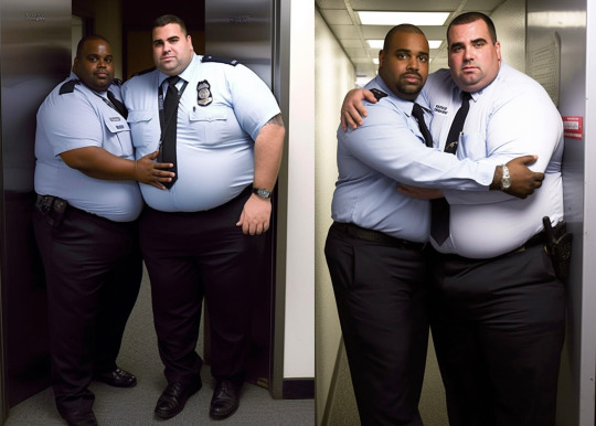
Yeah, it's a mix of a few things. Can I just preface this with the fact I don't know what I'm doing though, lol. The main thing I rely on is to use the image weight suffix, where the baseline is --iw 1 --iw 0.5 allows the AI to take the bones of your image and come up with something loosely based on it but mostly based on the text prompt (I almost always have it set to this) --iw 2 tells the AI to copy the image way more closely, which you may want for specific poses, as I've yet to find any good way of making it do that - flexing and crossed arms are just things very fat AI men will not do, apparently. Here's a recent example. First I used /prefer suffix and set my suffix to "two egyptian men hugging, full body photo of an enormously obese security guard with gigantic belly wearing a buttoned uniform dress shirt, very fat man with huge stomach and thin legs, bulbous, body extension, associated press photo, 4K, sharpen, digital photo, color photo --no hat --iw 0.5" (I suspect you can actually just use "two men hugging, full body photo of a fat security guard, associated press photo, digital color photo --no hat --iw 0.5" lol. In fact you may need to - I've tried some prompts taken from Midjourney's gallery and had them immediately blocked, so it might be that the AI is not even applied universally. Starting with a smaller prompt and adding to it makes it easier to keep track.) then i used /blend and added these two images (a random Hot Doctor off Pinterest (lol) and a fat eastern european preacher with colin farrell's head and some uniform detailing poorly photoshopped on)
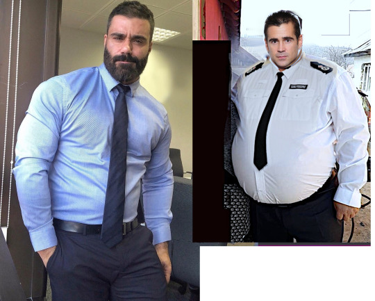
the result was

remixed with "drunk men"

remixed with "black men, standing in an elevator"
turkish men, chevron mustache

kenyan men
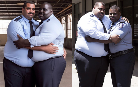
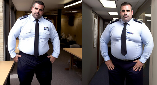
and so on. Oh, and using --iw 2 resulted in this, no matter the prompt:
while changing the -iw 0.5 prompt to this "two texan men hugging, full body photo of an enormously obese cowboy with gigantic belly wearing a plaid shirt..."
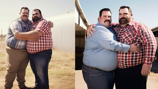
and "two australian men hugging, full body photo of an enormously obese explorer with gigantic belly wearing a safari shirt..."

and "two irish men hugging, full body photo of an enormously obese footballer with gigantic belly wearing a rugby shirt... standing in a cramped elevator..."

if nothing else, shows how incredibly lazy I am, because I genuinely used the same few bases for like 90% of everything, even when it didn't look like it. Find or make or blend an image base that results in a body shape you like and doesn't constantly result in bizarre fusions, tweak the image weight and give it your prompt and it should do the rest for you. I think?? if you want a very exaggerated belly you need to be sure your edit has visible legs and maybe other things to help AI understand the proportions, but it all feels a bit like superstition. Also I'm still amused at how Irish the Irish men look and i'm SO much more into obese Irish rugby players than I thought I would be lol. add "--no ball" if you do american footballers though, or they'll pop up absolutely everywhere (I just want to add, probably unnecessarily, no I do not use photoshop. MSPaint and Gimp do enough by a long way)
135 notes
·
View notes
Note
ALRIGHT WASSUP I love your art style and am an art student so I know a little bit bout what makes art recognizable, (not an expert and definitely not good at remembering terms so don't act like this is some art bible) lemme tell you what I think makes your art recognizable and "lux".
First, you got your shape language. That would be what the other person was referring to as proportions. (Since we're talking about Sora, proportions is absolutely not a wrong word to use, but I'm going to talk about shapes specifically.) The cheek? Always the exact same little curve, same spot, the forehead is the same, which creates a head shape that is incredibly recognizable as you. The hair is also always the same, which may seem weird considering your drawing hair that's pre established but you have a very unique way of doing it. The shape of his lower hair on the back of his head especially stands out to me. His body is always the same type of lanky, you draw his arms and hands a very particular type of way. Overall, very recognizable and consistent.
The colors you use. Honestly, I don't even know how to describe this, and I literally took a class on colors. The only word I can think of is "surreal". They're usually very vibrant, but destaturated at the same time? Like you're taking vibrant colors and putting desaturated ones on top? Genuinely hard to describe. It is one of the most beautiful color jobs I've ever seen tho, and I'm not exaggerating. If you could explain I'd honestly love to try (read: steal) whatever technique you use. Also very consistent, even in the black and white photos. I think it's partially lighting but I digress.
The other person brought up your eyes, and that's probably one of THE most consistent parts of your art I notice. I'm not rly gonna go into detail, cause you said you worked on eyes a lot so I'm gonna just leave you to that honestly cause the eyes you draw are iconic imo. Beautiful. Stunning. Breathtaking. No notes just keep it up 🫡
Your lines (and the texture of the drawing) are specifically sketchy, like a very specific type of sketchy. I'm guessing it's the texture of the brushes you use, and it also makes it consistent and recognizable. This is probably one of the things that makes the black and white photos more recognizable as well, since they don't technically have colors to with with and, imo, that's one of the most recognizable parts of your art. The very specific shapes you use are about on par with the colors, with everything else gradually moving down the list.
So yeah. My mini essay on your art. I hope this helps you understand cause honestly? Your art is iconic. Gorgeous. Magnificent. I dream of drawing like you. Pls keep it up cause on god it brightens my day every time I see you post, art or no
I appreciate you taking the time to write out such a long and thoughtful post~! ❤️ This was a very interesting and fun read! I am in many ways completely blind to my own work. Unlike looking at someone else's work, it's very hard to distance myself far enough from my own to see it's prominent features.
For color I can I say I am aware of color theory and mostly follow a sensible routine of cool shadows and warm light points, things that are further away seem more blue etc. etc... But at some point while drawing/painting I do usually fall into adding and prodding the colors into a more impressionistic vibe and away from realism, mostly favoring cool toned colors and adding tones to places that they realistically shouldn't be, but they aesthetically please me, so.
Thank you for all the compliments, I've re-read this quite a few times now, but don't really know what to say besides a boring thank you~! This has left me a lot to ponder, and I'm very glad for your writing..!
Hope you have a wonderful rest of your day, take care~!❤️

11 notes
·
View notes
Note
can you explain mites a bit to me? i get the vague idea but ya know
Oh boy, oh boy, I get to info dump!!
The Hollowverse AU Mites:
Mxyzptlk and Bat-Mite are of the same species, they're both Mites, but they can also be called 'imps' due to their appearance. They're from the same 5th dimension and world. Some may call it Zrrrf while others with call it the more aptly referred "Mite World".
Not everyone from Mite World will have a favorite character they idolize and not everyone will dress up as them. Mxy is a good example of this cuz while he has an obsession with Superman, he's not a Super-Mite.. which does also exist.
Mites are cartoonishly proportioned and function on cartoon logic, so they can handle a lot of hardcore slapstick and be just fine.. Well. In our world of the 3rd dimension, at least. It is their own kind that they can be truly damaged by.. or from anyone beyond their 5th dimension. They aren't by nature a species that will fight, but there are exceptions to that as they are all very mischievous.
Mites are quite small, only a couple of inches tall with large heads, large feet, and large hands. They all have tails and wings and some have horns, these can all vary in size and shape depending on the mite. Some mites can be bigger or smaller than others much like humans.
While they may dress up like their faves or even try to imitate them, their own personalities may not line up with that of their idol. And multiple Mites may idolize the same category of character (ie: Green Lantern) but each one idolizes a different person who took up that mantle and will be referred to as the name of the character to differentiate between each other within their designated group (Guy-Mite, Hal-Mite / Bat-Mite, Lady Bat-Mite).
Mites all have a real name and they can vary between nearly incomprehensible like Mxyzptlk or rather mundane and simple like in the case of Elvem the Mysterio-Mite who just prefers his real name as he is too cowardly to impose himself upon the image of his idol, Mysterio.
There are mites for any type of character along the spectrum of hero and villain and all that lies in between. They can be summoned at will if you know the words and "spell" (as is the case with my Mysterio summoning Elvem by a happy accident), or they will willingly choose to pop into the 3rd dimension to interact with their idols on occasion. Not all of them do, however, some just like to sit back in their home world of Mite World and watch their idols on their television-like viewing screens to keep up with their stories and lives.
Mites have their own sort of economy and society that is nearly reminiscent of human civilization.. just.. with some wacky cartoony differences, of course. They meet, they prank, they marry, they have kids-- via hatching!
Baby mites are even smaller than the fully grown ones which certainly is saying something! Only being about an inch in size give or take a few millimeters.
Fun Fact: Mites, compared to their 3rd dimensional counterparts which they idolize, are quite exaggerated in varying directions and aspects and their costumes are handmade by themselves!
Mites are confined by the law of rules and games. They make a rule? They are punished by the laws of the universe to follow their own rules: aka, Mxy gets tricked into saying his own name backwards somehow? bye bye Mxy :>
Mxy is doomed by his own hubris in this regard. While others like Bat-Mite don't have that hubris to create such a game, especially since they're so dedicated to their idol and want to stick around as long as they can.. until Batman goes "Dad Mode" and sternly asks Bat-Mite to please go back home.
#mister mxyzptlk#batmite#bat mite#-CRACKS KNUCKLES AND CHUCKS THIS BEAST OUT INTO THE WORLD- hi I've been thinking about mites#//long post#this is about all I have about them and the little bit of world building
11 notes
·
View notes
Note
Hi so I wanna know if any good ways to draw humans because when I try to draw them, they come out weird look but at the same time I also find any type of people boring and ugly to draw and I feel kinda bad because it, so if you have any tip to fix this problem I'll be every thankful.
btw I like art, it's really good
(Sorry it took so long to answer this; it's just one of those questions that requires a thorough response.)
Thanks! I guess the first step is unpacking what specifically you find boring about drawing them. But it never hurts to know how to exaggerate expressions. You may have heard the phrase "squash and stretch" in an animation context, but you can also apply it when you're drawing faces.
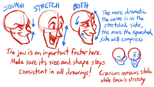
I mentioned this in a previous post as well, but tilting the facial axis even a little bit will make the drawing so much more lifelike than it would have been otherwise.

It also helps to think of a particular expression you enjoy drawing. I'm partial to forced smiles, personally. It's a fun contrast when the mouth says one thing while the eyes say something entirely different.
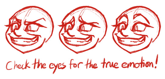
In addition, it's okay to "cheat" facial anatomy a bit if you need to. Something I figured out recently is that expressions can have more life and appeal if you draw the mouth before the nose. Mapping out realistic proportions in how the nose relates to the other facial features is all well and good. But of all the features, the nose has the least to do with expressing emotion, so it's okay to de-emphasize it as needed.

You may also be familiar with the "straights against curves" concept, but I find it very useful in making human anatomy more fun to draw, especially for arms and legs.

And I don't know about you, but I've always found the idea of drawing the same pretty face and petite body over and over about as exciting as reading the phone book. Some variety keeps things interesting not just for artists, but for viewers as well.

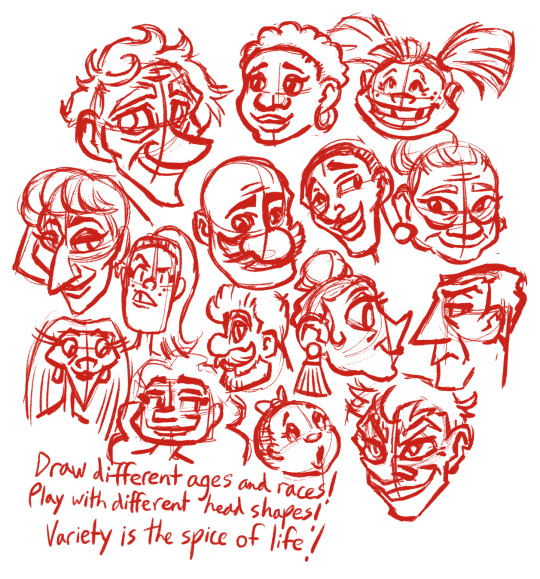
If you're better at drawing animals, why not draw some humans inspired by animals? That can result in some pretty unique-looking faces.
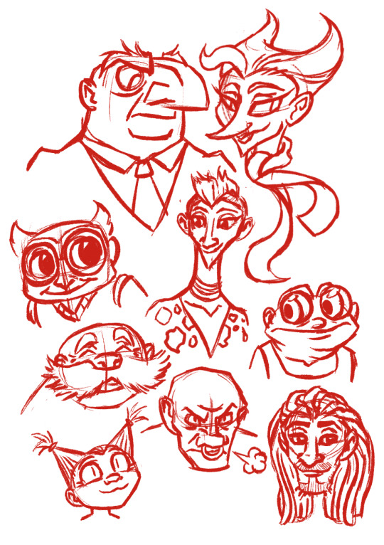
(The movie "The Triplets of Belleville" is a good example of this, featuring certain characters with a symbolic link to horses and one character who was clearly modeled after a mouse. It also has an intriguing, caricature-like art style in general, making everyone look simultaneously elegant and repulsive.)
You say your humans come out weird-looking? Embrace the weird. That's a great way to set your work apart from everything else out there. Joe Cappa is a prime example of this. His purposefully amateurish and at times off-putting art style is a perfect fit for the offbeat humor in his videos. He's created his own unique flavor of animation and I adore him for it.

Sure, it's important to know the rules of anatomy before you break them, but where's the fun in pressuring yourself to produce a perfect drawing every time? Where's the fun in doing every single thing by the book without leaving any room for play or experimentation? Don't be afraid to get abstract now and then. Think of it not so much as drawing people, but drawing emotions.

Hope that helps!
13 notes
·
View notes
Text
Her Poor Back!

A sequel of sorts to that other Krystal piece I did, this one done with traditional drawing! Here's a bit of a story to go with it as well.
Krystal groaned and grunted as she lay upon the large bed of straw the Earthwalkers had prepared for her. A friendly CloudRunner, the same that had spotted her from the air, ambled over to her, a jug of water held in its beak. Clutching the vessel by its handle, the Saurian tipped it carefully, just enough so that a tiny trickle of water fell between the vixen's lips.
She drank gratefully, waving the jug away with a slight gesture of her paw once she'd had her fill. The small movement sent ripples through her engorged form, but she still made sure to whisper her thanks to the CloudRunner as he set the jug down next to her bed. She'd been stuck in that bed for three days now, and she doubted she'd be leaving it anytime soon. "I needed that..." The woman panted, gathering breath to continue to speak, "But I also need a cure for my... hufff... condition... please tell me somebody has... huff... found the idol...?"
"Not yet my dear..." A familiar voice responded as the CloudRunner turned to face the entrance to the room and bowed in respect. This action was enough to confirm to her that the EarthWalker Queen herself had come to check in on her, even if she couldn't see the massive dinosaur past her tremendously bloated chest, "I'm afraid we may have to accept that it could be lost forever." The words had stung Krystal enough for her to wince, but she expected them. Days ago, she had come across the fertility idol, a Cerinian artifact left in a shrine her spacefaring ancestors had built on Sauria ages past. The relic was an odd one, a small clay statue depicting a vixen with exaggerated proportions, but Krystal hadn't paid much thought to the figure's cartoonishly large breasts. Simply happy to have found a piece of her people's history, she had stolen it, unaware of the true price she had paid for the discovery until it was far too late. As her once sleek and athletic form began to take on a much more matronly aspect, Krystal had dropped the idol in shock. By the time she'd connected it to her dire predicament, her fate had been sealed: The idol had tumbled down into a deep ravine and her growth showed no signs of stopping. She was fortunate that the CloudRunner had found her before any SharpClaw had, but by the time he did her body had come to not only resemble the massively exaggerated proportions of the statue but to surpass it. Her buttocks and hips had bloated so much with flab they had snapped the loincloth from her waist, her belly having grown heavy and large enough to force her thighs to spread as she lay pinned helpless to the road. The worst changes, of course, had been those caused to her bust. Each jug was massive, filled thick with heavy fat but still obscenely perky as they loomed and wobbled over her, filling her field of vision at all times. Within minutes of her transformation, her breasts had utterly destroyed her skimpy top, leaving them to bounce and swat pendulously before her with each desperate, waddling step she took. By the time she had become immobilized by her own girth, Krystal was sure that each one weighed as much as her whole body used to. The CloudRunner had alerted the nearby EarthWalkers, and it had taken the mighty dinosaur almost a full day to drag her bulk back to their shelter at Thorntail Hollow. "All I wanted was a piece... of Cerinia's history... something else... mmnnffff! ...to remember it by..." The massively bloated vixen moaned, angry tears welling in her eyes as she spotted the fat nipples cresting her fat tits, bare for all to see now, "Not this... indignity...!" "We're sorry... but we will need to find another way," The EarthWalker Queen sighed, "There must be a way for us to break this spell though! What kind of a statue was this?" "A... fertility idol," Krystal said, blushing, "You don't think that...?" The EarthWalker Queen did not answer for a moment, and Krystal could sense her own embarrassment at the awkward but likely theory, "I do not know for certain... but though the growth has slowed, you appear to still be swelling... we don't know if it will ever stop. As she thought of the potential cure, Krystal felt the burning between her bloated thighs only growing even more intense. She shifted them uncomfortably, sighing as it caused her titanic tits to wobble in her face. "If it could reverse this... even stop this..." "I need to find a mate..." Krystal sighed, more longing in her voice than she expected as she licked her lips and moaned, "Well, fuck me..."
11 notes
·
View notes
Note
can you tell us about certain features in dolls you like most? :зс like specific kinds of body or face art style?
OH BOY CAN I?? HELL YEAH I CAN
okay so first of all I really like the sensory experience of a doll, is it nice to hold? Is it nice to touch and just absentmindedly play with? If yes, thats a huge plus in my book!!!
Wait I should probably start with a short answer!!!
Okay so long story short: I prefer cartoony/anime style dolls with inset eyes, although I won’t mind painted faces if I really like the rest of the doll!!!
I also like exaggerated big limbs, otherwise I like mostly realistic proportions!
I don’t like the shiny plastic feel of some dolls so I don’t typically go for ones like that!
I like wigs and actual hair on dolls but I don’t have the skills to style wigs how I want so im sticking to molded hair for now!
I prefer strung dolls but I wish to get a vinyl mjd someday, my mind may be changed!
Also the “art style” of a doll matters a lot to me, and the theming as well if I dont plan on customizing it!!
Oh I also love me a sturdy doll or a doll with optional accessories so I can remove them and take it around with me!! And on that note, I love taking pictures of my dolls so if they have some sort of finish that makes them hard to take pics of, thats a bit of a downside!
LONG STORY ENDED UP BEING LONG ANYWAY OH NO
I have 6 dolls, and theres only three of them that I really connected with, and they all ended up being from a company called ufdoll, and I dont know what ufdoll does to their dolls (all my dolls are made from abs/pvc) but ufdolls feel very “matte” and soft somehow? As opposed to the hard feel of a lot of dolls (im horrible at explaining!!!)
They also all have inset eyes that I can change which is always a plus for me!!!!
Rant over before I talk about this forever!!! Thank you so much for asking!!!
#thank you for this opportunity#dont know if you know doll terminology but i tried to explain i think but if you do know sORRY FOR EXPLAINING
3 notes
·
View notes
Note
What are your thoughts on rotg Pitch black and the other characters?
Thank you for your question! I enjoyed sitting down and writing this out. My initial response was “They are Awesome! I adore them and drawing them brings me joy!” But I decided to go more in depth!
Please note these are just my personal opinions, as of May 2023. I judged everyone on three categories: Character, Design, and Drawability.
Nicholas Saint North
My Opinion on his Character: 10/10.
How could anyone not love this guy. He has infectious energy and is one of my all time favorite versions of Santa. I both enjoy his character in the books and the film. I love how he is a strong leader with a big heart who isn’t afraid to stand up for what he believes in. He is so cool and I love his competitive nature.
My Opinion on his Design: 10/10
North’s design is so full of geometric genius. I love how square he is. I also love all the Russian elements like the coat and hat. This is one cool Santa. I adore the tattoos and the swords he wields. I also like his younger self, very pirate adventure vibes.
My Opinion on his Drawability: 8/10
As much as I love this guy he is sometimes a bit hard to draw. He has a lot of tattoos and a large coats and a beard that covers a lot. I need to practice drawing him more. It is a bit fun to draw him in more exaggerated styles, but I definitely need more practice.
E. Aster Bunnymund
My Opinion on his Character: 7/10
Bunny probably scores the lowest on my favorite character scale. I adore movie bunny but book bunny kind of ruins the experience… he is so snooty and his rants get a little tiresome to read. I also don’t personally vibe with the whole alien backstory. I would of preferred him to be an actual bunny. More fantasy less sci-fi. I do love the drama he brings to the group. He is always first to speak up and question things as opposed to just going with whatever plan was proposed.
My Opinion on his Design: 9/10
Both book and movie designs have something different and unique to offer. I adore them both. I love the book bunny little glasses and long robes and staffs. I love movie bunny more tribal warrior rabbit look. Both designs do well capturing a unique look for the Easter Bunny.
My Opinion on his Drawability: 4/10
Bunny may have a great design for me he is extremely hard to draw. I don’t know how to draw animals too good (yet haha). Especially if it’s not stylized for a goofy doodle. He has a lot of elements I need to still learn. Like fur and animal proportions. Sorry bunny maybe in the future I will be better.
Toothiana
My Opinion on her Character: 10/10
I love this fairy so much. She is so adorable and responsible and is a true guardian. Her book backstory is one of the saddest things I’ve read in children’s media and although she put up walls becoming a sort of workaholic she still finds joy and excitement.
My Opinion on her Design: 10/10
She is what I want to think of when people mention a fairy. Not a shrunken down human with wings but something that would exist in nature. Something you wouldn’t bat an eye if you saw. I love the hummingbird design. I love her feathers and her face/eye shape. I just adore her.
My Opinion on her Drawability: 9/10
I do adore her design so much and I love drawing it too. It’s so relaxing drawing all the feathers. I do have a bit of trouble with the wings but I love drawing tooth. She has such a fun color pallet.
Sandman
My Opinion on his Character: 10/10
Sandman is so cool. I love how sassy and laid back he is. I love how he is a friend of the world but is chaotic enough to threaten to knock out a child with his bare fists. He is one of the few characters I don’t mind having a fake out death scene. He steals the show. Also his mermaid sand island should of made it into the film. We got to see everyone else’s homes.
My Opinion on his Design: 9/10
Oh I adore his design. It reminds me of the rankin-bass stop motion designs. He is so adorable and shaped like a star you can hug. I love how he appears to actually be made of dream-sand.
My Opinion on his Drawability: 9/10
Sandy is so fun to draw. I think his design works great in both 2D and 3D. I love giving him goofy expressions.
Jack Frost
My Opinion on his Character 10/10
Jack is an amazing and complex character. He is mischievous and childish he is yet wears his heart on his sleeve. He has this haunted sadness that lingers through him and yet always tries to get others to have fun. I love how much he cares for people despite putting off the cool loner persona. He will do anything to protect the kids, despite being a kid himself!
My Opinion on his Design 7/10
Jacks design is cool but I feel like it needs something. I understand his current look is supposed to be relatable teen but I feel like it’s missing something to help him blend further into the world. I love his outfit as a human. And nightlights armor is neat but I feel like Jack needs just something more then just a hoodie? Just a personal taste thing… I do see what they were going for.
My Opinion on his Drawability 10/10
Jack is so easy and fun to draw. I like drawing him in new outfits and styles. He is also fun drawing as his nightlight book self. Overall a really fun character to doodle and stylize. Especially since there is this constant movement to him.
Pitch Black
My Opinion on his Character 10/10
An amazing villain with a tragic past. I love how cunning he is yet is pretty blind by his own greed. I love how much joy he gets from spreading fear. I love the arrogance to his character and how he gets playful when trying to manipulate and or fight someone. A great villain who enjoys being evil. There is that element of longing for a family to him that is probably left behind from his days as Kozmotis which adds a good amount of drama to play with.
My Opinion on his design 9/10
While the guardians are complex and maximalist in there design pitch is sleek and minimalistic. His pirate aesthetic from the books are cool and his movie design has him move seamlessly in the shadows. I adore his face shape and demeanor. Overall a great simple design that brings contrast to a colorful cast.
My Opinion on his Drawability 10/10
Although simple Pitch is pretty fun to give added design elements too. Especially gold based accents. He is fun to draw in different outfits as well since he doesn’t have a lot to his design. It’s always fun to color him when I’m done drawing the others who have larger color palettes.
24 notes
·
View notes
Text
Short Reflection: Pluto
Naoki Urasawa is fascinated with the darkness of childhood imagination.
Admittedly, I've only watched two anime based on his work so far- Madhouse's masterclass adaptation of Monster and now this- so I can't say how common a thread it is in his other stories. But even just from those two, his fixation on twisting childhood into something sinister and unsettling is undeniable. Nursery rhymes and half-remembered country folk songs repurposed as grim omens of doom, picture books foreshadowing real world nightmares, the innocence of his child characters and childlike imagery juxtaposed against a creeping darkness that seems born from the pits of hell itself... the mind of a kid is frequently the most terrifying place to be in Urasawa's work. Whether there's any greater meaning to it or if it's just something he things is cool, I don't know. But it certainly makes him the ideal artist for a story like Pluto. Who else but a guy like him could take one of Japan's most iconic mascots of childhood fun and use his world as the basis of a serious minded political/philosophical thriller that seeks to explore the nature of hatred itself?
Now, as someone who only knows Astro Boy by reputation and has never so much as seen a single episode of any show bearing his name, I can't comment on this story's relation to its source material. Luckily, I don't need to; Pluto is fully stand-alone and you don't need to know a scrap of Astro Boy lore to understand or appreciate it. Although I imagine it would make some of the goofier robot designs a little less immersion-breaking. I dunno, there's something inherently funny about seeing Urasawa's grounded, realistic style of character and world design, his thickly textured and non-exaggerated human faces with realistic proportions and naturalistic wear and tear, next to some of these robots looking like they were pulled straight out of a Saturday morning cartoon. It makes me wonder how certain American cartoons would look if given this treatment. Imagine if someone, like, re-imagined The Powerpuff Girls this way, and you had to see these realistic child versions of Blossom et al next to Mojo Jojo or whatever. Oh well, it would probably be better than that CW show they cancelled, at least.
But I'm getting off track. Pluto is a story about a futuristic sci-fi world where robotics have gotten advanced enough for robots and humans to life side-by-side as part of the same civilization. Every year, it seems, robots and humans are growing closer together, to the point where people are genuinely starting to wonder if there's still any meaningful difference between them. But the seeming peace is shattered by a mysterious attacker, an unknown, unseen killer targeting the seven strongest robots in the world and destroying them one by one. One of these robots, a Europol detective named Gesicht with a robot wife of his own, decides to dedicate himself to tracking this killer down. But as his journey takes him all over the world, meeting countless different robots and humans all with their own bit of commentary to offer on the relationship between man and machine, we slowly peel back the sins this world is built on, uncovering a darkness much greater than a single mysterious killer... and a hatred that may change the nature of robotkind as we know it.
It's a heady, thought-provoking affair, and despite my jokes earlier in the review, it's shockingly good at justifying its bizarre premise. The world feels real and lived-in, from its complex alt-history to its eerily familiar present. It feels like a world that would arise from robots growing increasingly close to humans, and it makes all its musings on the distinction between them genuinely compelling. What would anti-robot bigotry look like in such an accepting time? What things would come naturally to humans that might be impossible for robots, and vice-versa? How would the presence of highly advanced AI effect the political history of warfare and diplomacy? And, most unnervingly, what new atrocities could result from a world this advanced? It's a show that's deeply interested in what ultimately makes us human, and what it would take for an inhuman machine to be considered human as well. But it's also interested in what is already inhuman about us, and if there's anything we, in turn, can learn about our own humanity from a "species" still living just outside it. And while there's plenty of action throughout its run, it's not afraid to take its time on conversations and machinations to really let those ideas settle.
Of course, it's been many years since the manga this was based on was published, and those kinds of "Can a robot learn to feel?" questions have been pretty beaten to death in other media that's come out since then. These days, a story can come off as pretty corny trying to tackle such topis. And truth be told, Pluto can't help but make you roll your eyes with its attempt to explore these ideas a lot of the time. Some of that's due to the oversaturation I just mentioned, but some of that's down to Pluto itself being a very corny show, in ways I don't think it's really aware of. It tends to deliver its story in the most on-the-nose, telegraphed way imaginable.This cranky old musician doesn't think robots can understand art but watch as he learns how to feel again! This robot just wants to paint pictures of flowers but his inner nature as a brutal rage machine is dragging him down! People make promises to their family to see them again right before they're brutally killed! You can see every emotional beat coming miles away but it still expects you to be surprised when it finally arrives there. And considering that the tension of uncertainty is one of the most important parts of any good thriller, it kinda makes it hard to get invested at points.
Sadly, that isn't the only problem holding Pluto back from greatness. Aside from the corny delivery, a lot of plot points feel pretty contrived and stupid, the hand of the author shoving the pieces across the game board with little regard to making sure it feels natural. I also don't think structure this show as eight hour-long Netflix specials was good for the pacing; it means every episode meanders over countless subplots that don't always fit together smoothly and melt into a sludge of Things Happening with little connective tissue to justify putting them together. You can practically see the points where there would be episode breaks if they were a normal 24-minute length, but then they just keep going into what feels like an entirely new episode with no breathing room. So it ends up feeling like a 24 episode show Frankensteined together into a series of bloated triple-length episode booster packs, rather than a story carefully curated to take advantage of its extended episode runtime.
And yet, for all its faults, I found myself getting drawn back in over and over again. Say what you will about Urasawa, the man knows how to keep your eyes glued to the screen. And for all the shows and movies I've seen exploring what it takes for a robot to be human, Pluto's take is still unique and fascinating enough to be worth the watch. It's nowhere near the simple, offensive allegories of, say, Detroit Become Human, nor is it so intellectual that it robs the story of its humanity. It's a genuine attempt to contend with humanity in its entirety, light and darkness alike, and what we may need to sacrifice- or what we might gain- by bringing artificial intelligence over the threshold to join us. It also helps that it looks fantastic; aside from a few moments that just plain look ugly (Atom's first fight with the mysterious killer made my eyes hurt, I swear), the thick lines and fluid animation bring this world to life in stunning fashion. Even outside the impressive action scenes, Pluto is a show worth looking at. Sometimes, that sweet Netflix money hits just right.
Is Pluto a great anime? I'd argue no; it's got too many basic issues holding it back. In my opinion, Monster is a superior Urasawa offering, and I didn't even particularly love that show either. But masterpiece or no, Pluto is a work of remarkable ambition, and it demands your attention regardless of its faults. It's a thoughtful, potent, sometimes frustrating, often eye-rolling, but always compelling work of sci-fi reimagining, proof that even something as simple as a cartoon robot with rockets on its feet can be fertile ground for so much more. And I give Pluto a score of:
6.5/10
And now we wait to see if Netflix struck gold again with its upcoming Scott Pilgrim adaptation. See you next time!
12 notes
·
View notes
Note
Is there any truth to bloody mattresses being pulled out of that Hasidic tunnel in New York or are people just being antisemitic?
I hadn't heard anything about it one way or the other, most people that would pull out nonsense like that already have me blocked so that may be it.
Best bet is it's either people blowing things out of proportion for the sake of comedy or Antisemitic garbage possibly at the level of "Blood Libel" given that blood is mentioned so it would depend on how they say that blood got there.
Accusations of murdering Christian children to put their blood in their bread is the origin of the term iirc.
But let's look.
A Jan. 10 Instagram post (direct link, archive link) shows a screenshot of a post on X, formerly Twitter, by the same user about a tunnel discovered in New York.
"A synagogue in New York City was discovered to have underground tunnels beneath it," reads part of the X post. "There were old, stained mattresses inside along with booster chairs for young kids."
The Instagram post garnered more than 13,000 likes in two days, while the X post accumulated more than 9,000 likes in the same period. Similar versions of the claim were shared on Instagram and Facebook.

Our rating: False
The description in this post paints a false picture of the tunnel discovery, which was reported to police by synagogue officials. City officials said there was one tunnel, not a series of tunnels. It was adjacent to the synagogue, not under it. Mattresses shown in a viral video came from behind wood paneling inside the synagogue, not from the tunnel. An unverified video shows what appears to be a high chair, but it shows only one such seat, and it was located amid trash, clutter and dirt in a basement room, not in a tunnel.

There's a section after the bit where the false is, talks about the reasoning behind the tunnel and what all was going on, link provided if you feel like checking.
Looked up the dude who made the claim, he's a ambulance chaser out of Atlanta that gives (likely bad) legal advice online in places where he's not licensed to practice.
For good measure, this is a secondary source with their sources linked.

Hope this helps
One other fact check in there for later in case you see them
Fact check: Video shows tile removal tool, not Israeli method to destroy Hamas tunnels
This one is hilarious
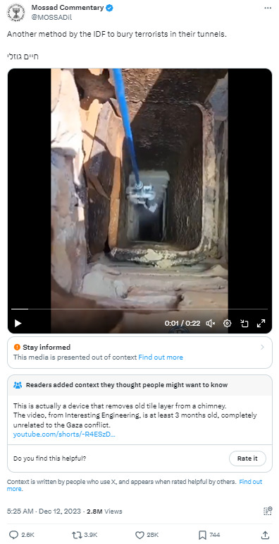
This isn't the account I thought it was, thought it was these guys
location "right behind you" good stuff, these guys run a fun account too.
I can't get a solid conclusion on the other account so fact check is good to do, if they're a troll account they've got lots of people fooled so I'm not sure here on them.
6 notes
·
View notes
Text


I started a TS4 to 3 conversion project in Blender 3.4 today! The first image shows the original TS4 outfit, the second image is my edit in progress. If you are interested to read about the details of this project (warning, it gets technical), read on!
I have not checked whether this has been converted before, because I am changing so much it is basically a new mesh 😆 I have to google every little thing and have trouble finding stuff in the new Blender. With those major version changes, they like to move things and change how they work. The nodes feature is interesting, though it seems a bit like rocket science to me at the moment. I followed a basic tutorial to get the marble/stone effect so I can have a sim statue in Blender 😁 I wanted to make a ts4 to 3 conversion for a while now. I guess this outfit is a good place to start, I just randomly selected it because I like the high-waisted look. The TS4 bodies have different proportions, especially on hips and arms, and adjusting them to the Sims 3 body figure is a lot of work, but I think I did a good job so far. I remapped half of the stuff already, adjusted and tweaked the legs to have a bit more space between the legs, and so on. I'm not done yet. I am currently remaking the belt loops from scratch, just like I did with the belt. I just don't like the loosely stuck-together geometry that Sims 4 meshes seem to have. Those can easily lead to floaty bits in TS3 and who wants to see a random belt loop floating around a sim? Not me 😬 I am properly anchoring the belt loops so they are directly connected with the pants, vertex on vertex. This method was used on TS3 meshes. Idk why the devs changed it, maybe it was too tedious or produced too many vertices.
Converting from TS4 is a pretty ungrateful task, at least if you want the stuff properly mapped and recolorable. Now I know why a lot of conversions look bad with patterns, you'd have to remap a lot to improve this and you can't reuse the default textures as easily if you do that. Sims 4 seems to have less texture space than Sims 3 when it comes to tops and bottoms. Upscaling these textures with an AI upscaler to 2k could yield improvements though, that might be worth a try for projects where keeping some of the original textures is more important. For this, project, I am just going to toss the original textures and will make my own. There were not many texture details on those wide pants anyway, and I want a proper greyscale texture, and removing the pattern from the original to achieve that is not worth it due to the other issues I mentioned. All in all, it is easier for me to heavily edit and remap the mesh to TS3 size and make a new texture than to work with the weirdly mapped UV pieces and tiny textures. Making the patterns look great on the mesh is my main concern and that is why I make meshes in the first place. I don't care how much work is going into those, if I do not do it to fit my standards, there is no point for me in doing it at all. Making textures from scratch is not super easy either, I might be able to recycle some ts3 ones though, we'll see. I'm a bit sad that there are so few creators that make new TS3 meshes (not necessarily conversions) with patterns in mind. If you know some good ones, please let me know! I've been looking for new clothes to download recently, but most of the stuff that works well with patterns is years old. I think we may need new era of Marvelous Designer stuff, the Maxis Match era. MD now supports quads, meaning even rows and columns of vertices that you can easily decimate to reduce polygons and that you can easily adjust to fit to TS3 standards. And not everything that is made in MD has to have hundreds of exaggerated folds 😉 It's probably less time-consuming to mesh new clothes with Marvelous Designer than to convert stuff from TS4. Maybe I can find some decent tutorials, I'd love to figure out how to make Maxis Match meshes and learn more about MD. If you know any good ones, please share :) I just hope my enthusiasm does not get crushed by the harsh reality again (I have way too many wips that never amounted to anything 😫).
35 notes
·
View notes