#I made this on my iPhone using the photo editing
Explore tagged Tumblr posts
Text

I have never seen someone make this meme I mean c’mon it was right there!
#star wars memes#obi wan kenobi#cal ketsis#star wars#jedi fallen order#fortress inquisitorius#memes#fine ill do it myself#I made this on my iPhone using the photo editing#Ginger Jedi are the bane of Darth Vader’s existence#Ginger Jedi are a pain in the Empire’s arse
40 notes
·
View notes
Text
★ streamer ellie!
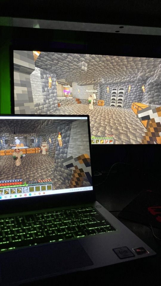
ways to help palestine!!!
S★ she started with fornite and minecraft gameplays but went viral for playing girly video games and screaming with pure rage and desperation if she loses or if her chat tells her the outfit she made was ugly asf😭
S★ she deadass will say “u guys clearly don’t know about fashion like i do” n then pull outfits like this:

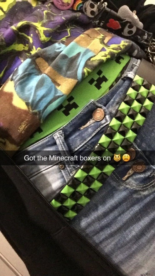

S★ she used to be so fucking afraid that her face reveal went like dream’s that she posponed that shit for like a year. when she finally did it she ended the stream, turned off her phone and went to bed covering her body completely, while sniffing and crying “my career is over ”
S★ after her face revealed her account went even more viral, people started to make thirst traps of her and edits, videos, even fanfics, she got a little more comfortable with showing her face. her favorite edits were to songs like ride, baby by me, hey daddy (daddy’s home) and a song in spanish called vaquero, they were just so funny to her😭
iloveellie: she’s daddying so hard‼️
ewisinthechat: aw you guys really see me as a father figure?😺🫶
brondon444: 😭
kvcjjsaj: 😭
loverboydsa: 😭😭😭
“hey why is everyone crying in the chat, is everyone okay?”
S★ she really loves the cat emojis, specially this one 😻
S★ out of all her platforms (aside from twitch) she uses twitter the most, she tweets without a second thought in that head, without filter, like zero hesitation and then apologizes if she said something way too controversial.
ewisinthechat2: have you had that feeling when someone is so stupid you want to stab your eye with a fork? #kys
ewisinthechat2: k, i guess u have not😅…
S★ she was practically new to tiktok, so the first moths she had her likes public, she didn’t even know that was possible on the app. but if you click on it all you could see were shit post and memes that a dad would like, all except for a big section of aprox thirteen videos, one after the other, all with the same girl.
sckerforellie18: did u guys saw ellie’s likes? i think she’s stalking that poor girl😭
slaybabesew: HAHAH WAIT IS REAL, IS SHE HER GILFRIEND???
elliesaheymamasg: she’s so hot wait😩
heyemogirlbb: it’s her @girlypop66
S★ the chat started to tag you to every single one of her videos on tiktok, her photos on instagram, tagging you on things like “hi, could you please date my mom?🤗” or “my new mommie😻” EVEN in her questionable tweets telling you “we know she’s crazy but give her a chance😭”
S★ one day you waked up to your phone being practically broken from all the notifications, you still had your little pink iphone 6 and you had to buy another one because of it.
Instagram
girlypop: hi um i don’t think we really know each other but people are tagging me on your videos😭 love them though
S★ ellie was in a stream, the chat had to make her laugh and spit the water so she was reacting to videos that her chat had send her. when that notification appear on the screen, she read it, gulped the water, looked dead ass serious at the camera and turned off the stream.
elliewilliasm: omg hi, im so sorry i didn’t know, I’ll tell them to spot
elliewilliasm: spot*
elliewilliasm: STOP**😭
you laughed in your new phone, she was funny, and for what you had seen in all the posts that you were tagged on, very pretty too.
girlypop: hey would you like to grab coffee sometime?
ewisinthechat: TO EVERYBODY IN THE CHAT, THANK YOU, YOU GUYS ARE THE FUCKIN BEST, LOVE YALL, IM SO LUCKY TO HAVE YOU, XOXO😻😻😻😻
GIVEAWAY COMIN FUCKIN SOON💯💯‼️
S★ she was exhausted when she jumped to her bed, after all the crying, screaming, jumping and the extreme tweeting that just said “YESYESYESYESYESYESYESYESYESYES”, she unlocked her phone again.
elliewiliasm: yeah sure :)
REBLOG AND COMENT
IF YOU WANT TO BE IN THE TAG LIST
#ellie williams headcanons#ellie williams#ellie x y/n#ellie x you#ellie x fem reader#ellie x reader#ellie smut#ellie the last of us#ellie tlou#tlou#the last of us
2K notes
·
View notes
Note
hi, correct me if i'm wrong but i seem to remember you saying that you're majoring in illustration! i'm currently in the process of applying to colleges and i plan on majoring in illustration as well, so i was wondering if you had any advice for portfolios. I could really use some tips on the presentation aspect specifically, bc I'm a little lost when it comes to stuff like the arrangement/organization of pieces, how I should crop my pictures, etc. any advice you can give me is greatly appreciated!!
hi yes i can totally help you out with this! i like to think my college portfolio was pretty good bc i got accepted to every school i sent it to lol :) the main pieces of advice that i was given when building it were this:
studies and pieces that show off your technical skill are great, but limit them to around a third of your portfolio at most. art schools DO want to see that you're technically skilled and can like, draw a charcoal still life or a self-portrait, because those ARE important skills to have, but ESPECIALLY if you're applying to a school that's more known for contemporary fields like animation or illustration, it's much more likely that they want to see your creative mind at work. the single best thing you can put in your portfolio is a BODY OF WORK, and specifically a body of work that shows off your own ideas and your own take on whatever you're producing. this means 3+ pieces that are interconnected or related to the same central theme. my portfoilo, for example, consisted of 2 or 3ish traditional, technical pieces which showed that I had a certain level of technical skill, and the ENTIRE rest of it was devoted to a series of original interconnected narrative comics I'd written and drawn. Every reviewer I met with told me that this was what made my portfolio stand out to them--it showed that I was not only technically skilled, but that i had something i wanted to DO with that skill, that I had direction and drive with my art and was able to produce work that reflected that. If you're maybe (definitely) not quite as ambitious as me, something like a series of 3-5 interconnected illustrations or a short comic if you're into that might do the same thing.
as a side note, if you DO have a body of work as the central focus of your portfolio, a lot of colleges will be interested in your process as well! for example with my comic portfolio, i used one slot to demonstrate my process, because I penciled every page traditionally before digitalizing it and i had extensive character and worldbuilding sketches. I wouldn't devote more than one slot to it, but if you have a body of work where the process is important to you it could be worth throwing in!
arrangement is tricky, but the advice I generally heard was "put your best stuff first." whatever you're most excited about, whatever is going to grab someone's attention the fastest, that's what you want to have in your first slot. (I actually don't think I followed this advice on my applications LOL but it's what i was TOLD to do and i think it's solid advice.)
in terms of editing, assuming we're talking about traditional pieces being photographed, you want to make sure your pieces are 1. well-lit, (DO NOT TAKE YOUR PHOTOS WITH OVERHEAD LIGHTING. wait for an overcast day and take them outside trust me) 2. legible, (no weird shadows obscuring parts of the piece, high-quality enough that no details are lost due to digital pixelation, etc) and 3. as color-accurate to real life as you can make them. most of this is just about getting a decent-quality camera (a newer iphone should be fine) and a good location. (outside and overcast, as previously mentioned) you may want to throw your pics into photoshop and play with the balance slightly, but I wouldn't do anything too drastic, try to get the most accurate photo possible without any editing. (if your pieces are small and flat, scanning them in may work better. most public and school libraries have scanners you can use for free.)
finally, cropping. the general rule that I was taught is to crop the piece, not the photograph. if you've got a piece on paper and you're not sure you like how the actual drawing is oriented on the paper, crop the PAPER down to size, and THEN photograph it. your photos should aim to show the ENTIRE piece from edge to edge (unless it's a detail shot obv) and I even like to include a little bit of extra "breathing room" around the piece so that it's clear exactly where the dimensions of it end. here's a piece I used for my college portfolios for reference:

i lowkey do not like this piece now but that's not the point. this is what i mean by breathing room--a few extra inches of space around the actual canvas so it's clear that this isn't a closeup and you can see where the canvas actually ends. the same is true for digital pieces. if it's a full bleed illustration (something with full color all the way to the edges of the canvas) just make sure you like the composition cropped the way it is and submit the full piece as-is. if it's a floating spot or something similar without hard edges, leave a bit of white or transparent breathing room around the edge of your image.
hope this helps! if you have any more specific questions lmk :)
#asks#^ guy who is terrified at the prospect of having to build a portfolio for fucking JOB INTERVIEWS now lmfao
89 notes
·
View notes
Text
how to scan lineart + sketches on iphone
hey you, traditional artist! you deserve to post eye-catching drawings! here are my tips for how to take + edit photos of your drawings!
note: these instructions only apply to lineart, but can be tinkered with for colored and/or shaded drawings.
step 1: photographing
- as everyone says, natural light is best, but don't fret if you don't have any!
- don't just put the paper on your lap; no matter how still you keep it's much more likely to have small blurs than if you used an unmoving surface
- if you only have one lamp and are struggling to find a place where the shadow from your phone isn't visible, try propping it up on something, as close to vertical as you can comfortably get
- if there's something on the page beneath, put a piece of scrap paper below your page, in between the two. if there's something on the other side of your paper, i recommend putting a dark surface behind the paper and shining a light directly on it
step 2: editing

here's the photo i'm going to be using as an example! as you can see, the two opposite corners are very different colors than each other due to shadows (i actually tried to take an even worse photo for this post, but the lighting was being regrettably cooperative hahahaha)
time to edit!


brilliance: this is a really easy cheat to even out the major shadows on your art; as you can see the big shadow i pointed out above is less dramatic. crank it straight to 100, and then if it looks weird, play with it until the lighting looks smooth and uniform.

contrast: time to make your lines pop!

saturation: stop being orange (or whatever color your iphone decided your totally-white canvas actually is). this will also give you a clearer view of your artwork; you'll be able to process what changes need to be made easier when the shadows are in black & white, so feel free to do this step first if you prefer

highlights: this just makes the white pop! you'll actually want a number closer to 70 here

black point: defines the lines some more! if your lineart is very precise/carefully drawn, you may want to skip this step, because it'll give the lines some weight you might not want. if so, the quick-and-dirty version of this guide stops at the step above.

shadows: lightens or deepens the shadows!
ta-da! doesn't this look much nicer?

other steps to consider:
definition: if your lines look blurry or too light. here's the same drawing with definition cranked up:

brightness: if you're confident your lines are dark enough, and you still want the canvas to look lighter. if your photo just looks super groty and you're okay with the result being a bit dark, you can crank the brightness all the way up, then play with inching the exposure down for a shadow smoothing effect. kind of a last resort.
warmth: a good "stop being orange" step for colored drawings! turning it down just a tiny bit is usually enough
sharpness: can help achieve the "pencil" look in small doses; i usually skip it though haha
5 notes
·
View notes
Text
Sony RX100 VII Thoughts After Two Months
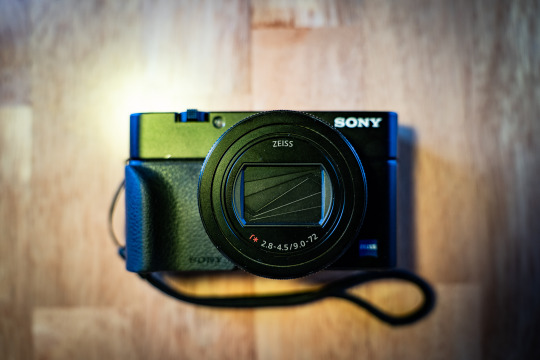
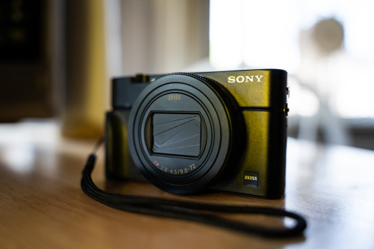
PROS:
Stacked sensors are the future. Well, technically the present considering that Canon, Nikon, Sony, Fuji, and OM Systems all use stacked sensors in their top of the line cameras. Either way, finally getting to experience shooting with one on a daily basis has made me want one in pretty much any camera going forward. The benefits are twofold: Not only do you get shutter speeds up to 20 frames per second, and without a mechanical shutter flipping in the way obscuring your view in between shots, but you also get no rolling shutter while doing it. Pretty much every Sony camera can shoot 10 fps bursts with the silent shutter, but any movement can give you a jello-like effect since the sensor reads out so slow on non-stacked cameras. The only con, at least on this camera, is that you can’t shoot flash at higher than 1/100 with the electronic shutter. That’s still plenty fast for a lot of stuff, but well below the 1/2000 you get when shooting the mechanical shutter.
The fast frame rate wouldn’t make much of a difference if the camera was bad at autofocusing, but this camera is great at it. It has a lot of the same fancy focusing stuff that my full frame Sony has like human/animal eye autofocus and all the tracking modes I’m used to. It actually makes the camera pretty solid for wildlife if you can get close enough at the 200mm end.
Speaking of that, the 24-200mm equivalent is a great range, and one that I missed a lot since I traded away my Tamron 28-200 to help cover the cost of my A7RIV. The small size and extra 4mm on the wide end actually makes it even more convenient than that Tamron.
Aside from covering a broader range than the 24-70 equivalent lens from the older RX100 cameras, this lens also seems noticeably sharper. The last RX100 model I had, the Mk. IV, just didn’t seem as crispy as this lens is.
It has a touchscreen! It’s wild to think that the previous RX100 cameras I owned didn’t have this basic ass feature, but Sony was very late in putting touch screens in their cameras. Ironically, I don’t really use it in this one because the AF is good enough that I can just do focus and recompose with tracking.
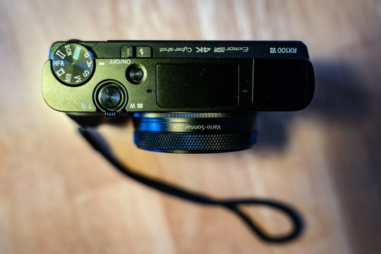
CONS:
It’s still only a 1” style sensor so high ISO isn’t the cameras strong suit. Programs like DXO PureRAW help a lot and let you get somewhat usable images at ISO 6400 in a pinch, but you’re kinda pushing things at that point.
While the lens is sharper and covers a wider range than the older models, it’s also significantly slower. At 24mm equivalent it’s already at f/2.8 where the old cameras were f/1.8. It’s f/3.2 at 25mm, f/3.5 at 33mm, and f/4 at 40mm. From 109mm to 200mm you’re at f/4.5. The relative slowness of the lens combined with the small sensor means that this can struggle getting quality images in low light without a tripod or something.
No USB-C. My Fuji, Ricoh, and larger Sony all have USB-C charging, which is amazingly convenient when traveling. I haven’t really gone anywhere with this camera yet, but having to account for a micro USB cable is annoying since pretty much everything aside from my iPhone uses USB-C.
It’s expensive. Just like my Mk III and Mk IV I got it used so it was cheaper than retail, but the copy I got cost about twice what I paid for the previous models.
Start up time is just a tad bit slower than I’d like. The GRIII and X100V both beat it that regards, albeit those aren’t zoom lens so I have to cut the Sony some slack.
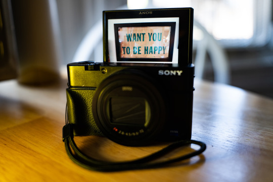
SAMPLE PHOTOS:
(The sample photos were edited in Lightroom Classic and DXO PureRAW2. Also, the sensor creates a roughly 2.7x crop factor, so the 9-72mm lens equates to 24-200ish)
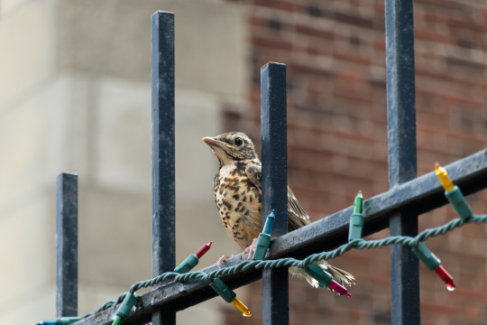
Young Bird | ISO 160. 72mm. f/4.5. 1/200.
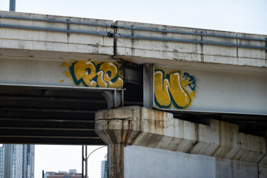
Graffiti Shot from a Car | ISO 100. 33.98mm. f/4. 1/400.
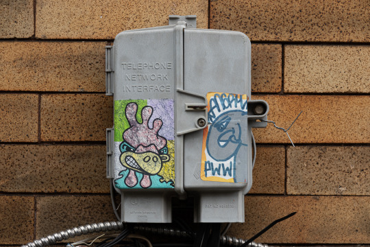
Stickers | ISO 100. 29.67mm. f/4.5. 1/100.
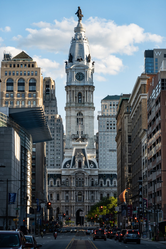
City Hall | ISO 100. 38.13mm. f/4.5. 1/200.
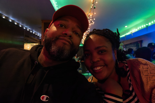
Flip Up Screen Selfie with My Friend Hanae | ISO 3200. 9mm. f/2.8. 1/40.
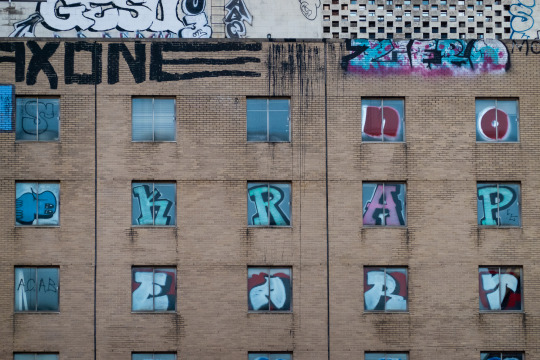
Zoomed in Graffiti | ISO 640. 72mm. f/4.5. 1/500.
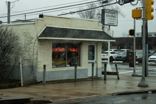
Fishing Store Neon | ISO 800. 28.67mm. f/8. 1/200.
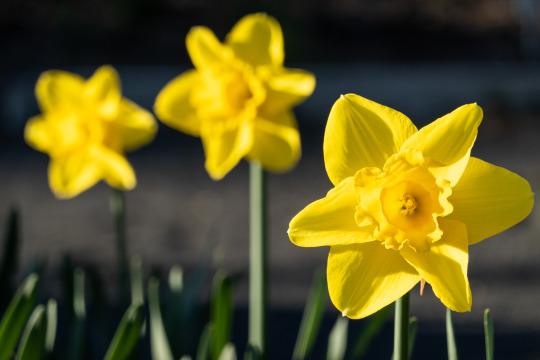
Flowers | ISO 200. 72mm. f/5. 1/640.
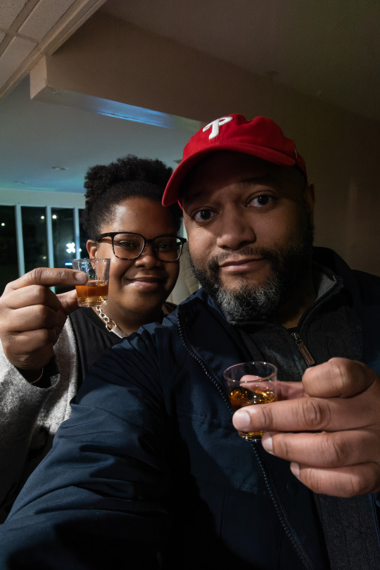
Selfie Shots with My Sister | ISO 3200. 9mm. f/2.8. 1/100.
32 notes
·
View notes
Text
My Carrd tutorial 💗
my carrd
so first i started with a blank canvas, but i deleted the center text
for the background colour/ style i didn’t want it to be white so i just chose a very light pink that was a bit off the white ?? ( #F9E9EC ). i pasted the colour i was going to use for the hearts and then chose a colour on there.
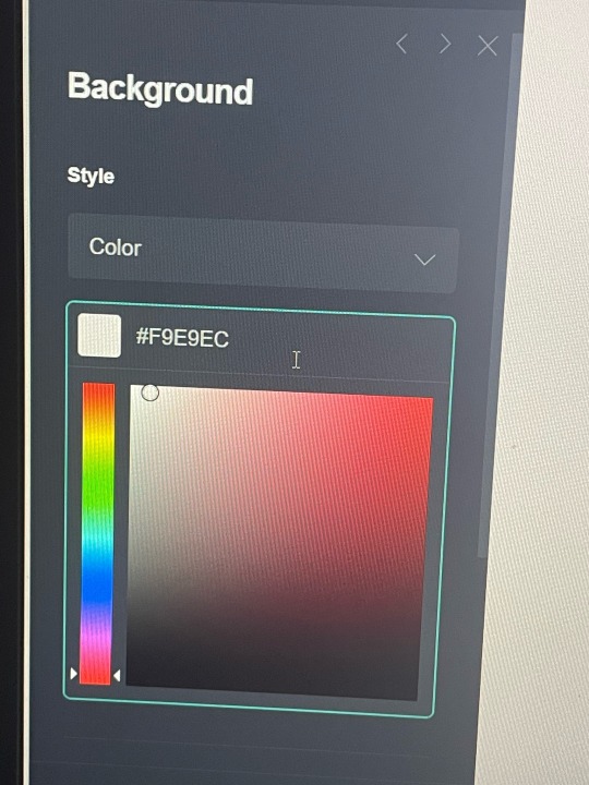
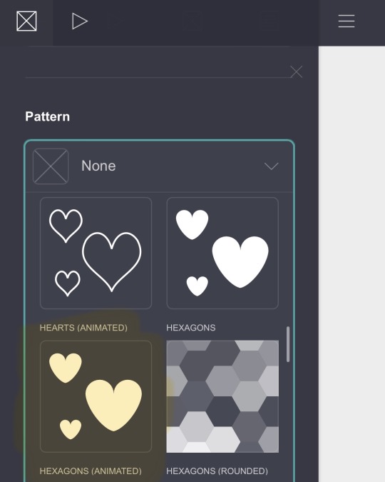
then for the background i chose animated hexagons (under the patterns option) and went to redketchup (a colour picker) and chose the same colour as wonyoungs lips ( #9B384A )
then i edited my page. my style is box, position is center, width is 22, padding for both vertical and horizontal is 0.5, corner rounding is 0.5. My border is the same colour as the hearts, ( #9B384A ), and the width is 2. i added a drop shadow, the colour is the same as the hearts and border. the angle is 0° and the blur is 2°. Then i went to mobile and changed it to manual, with my size being 11.
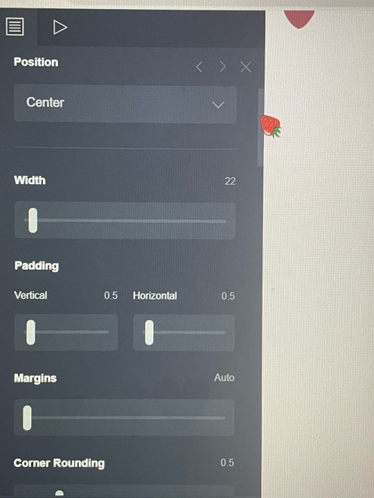
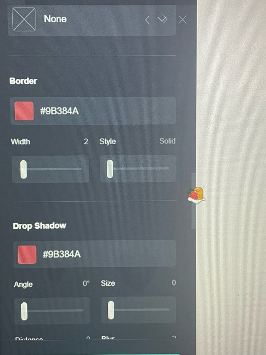
then i chose container and changed the type to columns, both 50%. next i went under appearances and changed the padding. vertical and horizontal both go to 0.5. I changed corner rounding (under margins) to 0.5 as well. Next i changed my border colour to another colour i chose off the same wonyoung photo ( #7C5655 ), with the width of 2.
Your container will show up stacked in the mobile view if you do not edit the mobile layout. you’ll want to change the mobile to manual, then the layout to default. if you don’t change it to default it could stack it (below is before and after, the after having the default layout rather than the stack). if you’re working on computer it will look like the default layout until you change to the mobile option (the phone option at the top right corner) but for iphone users or whatever it will automatically stack it.
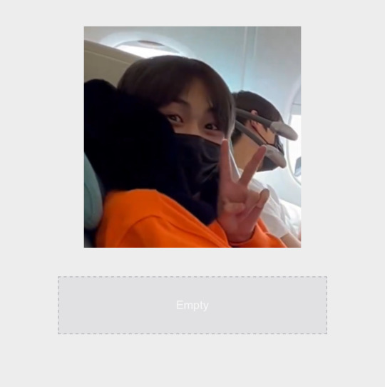
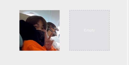
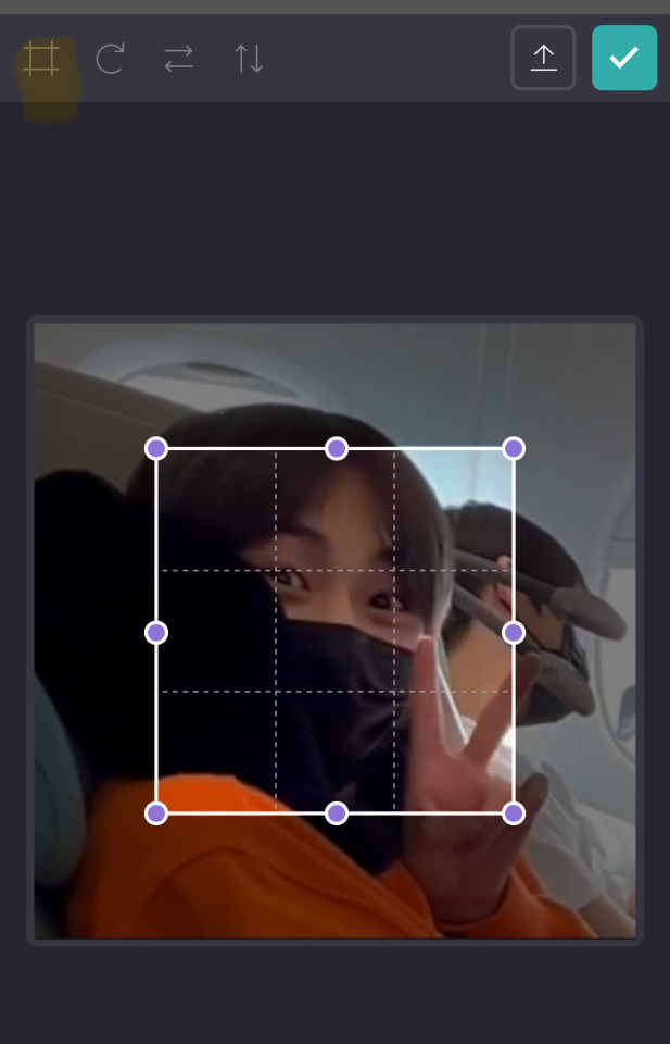
i then chose to add an image (go to the + and choose image) when you go to add a photo it will ask you about cropping but i didn’t crop it, if you press the top square-like option twice it will get rid of the little cropping thing. you can drag the photo and drop it on whichever side you desire. (for my first photo i chose the left side, and for the next i chose right side)
Now you add a text (under the +) you can choose whichever font you want (i chose abril fatface) and the font colour will be the same one we’ve been using (for the hearts, etc). you can make the size of your text however you’d like, for my name i used the side 0.875, for the drop shadow i chose a colour that was similar to the font colour, but way lighter. (i chose #E3274C) i made the angle 245° with the blur at 1.25. i also changed the mobile to manual (do this for like everything).
i used a new text box for every different thing (likes, dislikes, my name, everything) also make sure it’s all centered (under alignment)
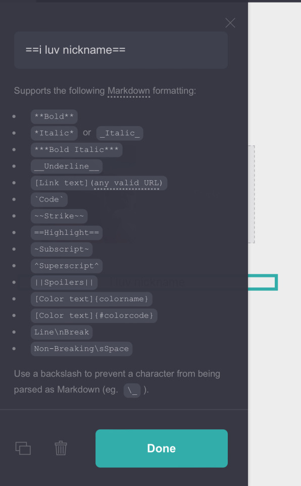
For the next text (the highlighted bit) i made it the same font and colour, just changed the size to 0.6, line spacing to 1.5c and gave it the same drop shadow as the text before. to highlight it there is a formation that you follow. this is what it should look like.
For my age and pronouns i used the same font size (0.875) that i used for my name, and same colour (same colour for all the text). for my likes i used the same size as my highlighted text (i luv nicknames) which is 0.5. i decided to underline the song title just to make it stand out a bit more. i followed the same formatting as listed above. see below for reference.
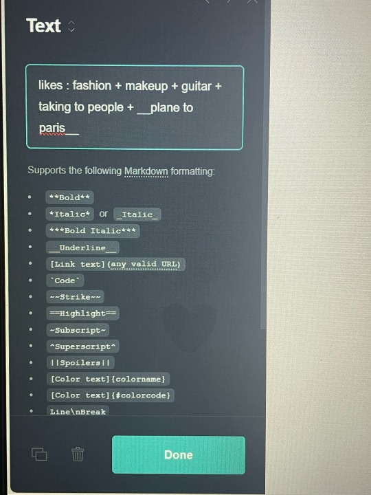
I copied and pasted my likes and just changed the text, same for the dni.
for the quote i wrote i did the same process of changing my container to columns. only difference was that i made my left column 75°. i copied and pasted my name’s text (if you don’t know how to copy and paste, it’s the button beside the trash can). i dragged the text down into my new container and onto the left, larger, column. for the heart you go to the + and choose Icons, it will show you the email option but all you have to do is tally down the options and change the type. i chose the heart (which is 8 down from the email) you can choose whichever icon you want, add as much as you want. i just chose the heart because it looked cute and matched my background. i dragged the icon into the smaller column, the 25% one.
for the next container i didn’t ch abe anything about the container type, i left it a default rather than choosing to do columns again. i inserted my photo, cropping it to the height i wanted. i then added a link, where is also found under the +. when you tally down the links you can change the label and url. then you want to go to appearance. I made the style underlined, the colour and the font the same. the text size is 0.75. and the drop shadow is #E3274C, angle 245°
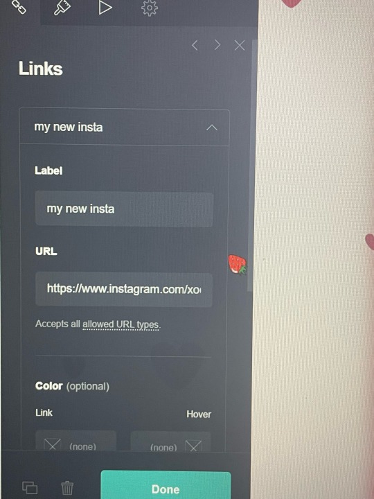
The next part i only did for every other container (the quote, the tumblr acc container), which is a drop shadow. the drop shadow is the same colour as the one we used for the text dropshadows. ( #E3274C ). the angle is 90°, distance 1.75, blur 2.
for the title (“my tumblr accounts”) I just copied and pasted my pronoun text and dragged it down above my final container .
And finally i went to the + and added a divider, dragging it up to go under my instagram link and above my tumblr title.
OKAY I THINK THATS IT??? pls tell me if you have any questions or whatever. this is a pretty basic carrd, but i think it’s pretty. it seems a bit difficult but i promise its not, for the top and bottom column (my tumblr acc one and intro) you can just copy and paste it, and whatever.
@baevsxii i hope this answers it♡
#sincerelysays!#i thought carrds were so complicated#but then it got a bit easier after i actually started😭#don’t know how to add page breaks or whatever tho#or anything interactive#carrd tutorial#kpop carrd#carrd#carrd inspo
6 notes
·
View notes
Text
Sarah S. Blog #5 - Surrealism


Shot on iPhone using natural lighting.
I was walking out of the gym one evening earlier this week when I noticed the sun setting along the horizon, leading me to stop and gaze at the sky. When I arrived at my destination, I saw an Instagram post about a story in 1994, there was a power outage across Los Angeles that caused several calls to be made to emergency centers about a strange cloud in the sky. The "strange cloud" happened to be the Milky Way, and many residents in Los Angeles were seeing it for the first time in their lives. This story made me think about the sunset I saw earlier and how once the sunsets, the sky becomes a dark abyss, polluted by lights. The stars are often hardly visible due to light pollution, making our galaxy, the Milky Way, a rare sighting here in America. As someone who has never seen the Milky Way, I reflected on the images I had taken of the sky earlier and wondered what it would look like if we could truly see our galaxy and its stars.


For my surreal blog post, I decided to use Photoshop to edit a photo of the Milky Way to the sky of the pictures I took of the sun setting. I used masking tools, blending modes, brush and erase tools, along with adjustment tools to achieve these edited photos. The photo of the Milky Way was an outsourced iStock image. After creating these surreal images, it made me think about how cool it would have looked to truly drive under the stars. Because of this assignment, I have made it a long-term goal to view the Milky Way at least once in my life.


These images are of my workspace in Photoshop with layers.
4 notes
·
View notes
Note
omg how do you take selfies with your iphone? i recently got the iphone 15 and it makes me look absolutely hideous 😭😭😭 like i know i'm no beauty queen but the camera accentuates every single flaw... every little facial hair and pore is visible. your selfies look a lot smoother, do you edit them or use another app to take pictures? or maybe you're blessed with perfect skin idk but i've never felt uglier my old android phone made me look way cuter 😭😭😭
omg no i feel the same!!!! they r ruining the cameras w every phone, it over sharpens ur features n makes hyperpigmentation n pores stand out etc its soo horrible, i usually move the live photo so that it is in another spot but still in focus and this makes it look like how like iphone8/XS camera looked + what you see while you take your picture :)
5 notes
·
View notes
Note
In response to your questions about the timelapse videos, here are my two cents. Engagement doesn’t usually give you anything on tumblr other than a bump of serotonin, but it can lead to commissions or sales if you provide an easy link and are chill about it. But people are touchy about the word “engagement.” They want to feel like a community or maybe a cultural salon, rather than part of an extractive media process.
Your most successful process videos are going to show a satisfying finished piece at the end and give people time to look at it and go “wow.” So for most art some editing will be necessary to get there in a short video.
Another thing I should bring up is that the music you used for that sketch video was pretty grating. If you’re going to use music, i’d suggest finding something more relaxing. Just because the video is sped up doesn’t mean the sound has to be frantic.
Your painting process is so interesting, and your art is great! People here love cats with all their hearts and mostly really enjoy art. I wish you all the best!
Hi anon, thank you so much for your input! I really appreciate it, and I'm still getting used to actually getting responses, after trying to get it noticed for 10+ years (this isn't my first tumblr blog).
There's a lot going on with trying to share my art in the current internet ecosystem, probably something a lot of artists are dealing with. I'll try my best to describe what's going on on my end.
I don't like the term engagement either. I am trying to share my art through four main platforms at this time: Instagram, Tiktok, YouTube, and of course our precious hellsite: Tumblr. So my use of the term is more from the vernacular being used on other platforms, with what seems to be a kind of agreed upon use by artists of "this is what we have to deal with, so might as well lean into it." Maybe I'm mis-interpreting that (not surprising).
So far, Instagram is where I get my art noticed the most and has lead to the most sales/commissions/financial support. I think this has to do with the cat community that has formed over there. Tumblr definitely has its cat lovers, but I think a lot of them are over on IG so that they can follow internet cat celebrities and the like (I'm one of them!). So things like engagement and trends will dictate how I share my art with at least algorithm-led platforms. Also all of the cat people and friends I've met at shows regularly have Instagrams, not that that's a reason to be on there.
I agree that I should add time of the video at the end to show the piece to give it time to be seen. This can be easily accomplished if I make sure to take a photo of the art and include it in the video. I haven't had the best record of doing this due to my own ADHD and the pace at which these sketch paintings are being made.
Most of these recent sketch paintings were made back in August during CatCon on the spot! It's a crazy thing to do and I haven't seen anyone else do something quite what I'm doing, which is I guess part of my marketing for conventions and shows. So, sometimes I forget to take a picture at the end, but I'm getting better at including it in my process. And yes I call them sketches because they're fairly quick (I aim for 30 minutes for a 6"x6") and I don't get to add all the details I would like to if time was available. (I'm currently working on a new 3"x3" fully detailed piece of a famous internet cat, I've spent an hour and a half on it, and it's not done yet!)
Part of the timelapse question is not just to see what people prefer to determine how much time I should put into editing, but also how much effort I should put into digital storage. I have a couple different ways of recording footage, and the main way I've been doing so is with my iPhone. And so when I'm at events that I fly to, like CatCon, sometimes I'm having to transfer videos from my phone to an SD card until I can get home and get the footage onto a larger storage device. This can be tricky especially if I don't make sure to clear my phone storage before going to an event (something I'm adding to my list!) However, if I use the timelapse feature already available on the iPhone, then that makes editing and storage even easier for me later. I used this a lot with my Black Cat October series. But this timelapse footage doesn't look as good (maybe) and I don't have the option to do other edits later. Which then comes to the question for myself, am I really going to go back and make another edit for these sketch paintings? Perhaps the answer is timelapses for sketches, and full videos for fully detailed paintings.
And thank you for your input on the music part! The reason for the music in the last video was because of what's trending right now. Sometimes IG will save a copy of the video I posted with whatever music, so I had reused it in today's post. I think I'll make sure to use something more soothing/calming going forward just for tumblr, because you all have a special place in my heart.
Usually I'll open TikTok and do a separate video save to have a hi-res copy with music, but since I had recently created a shop on TT I only have commercially available music. Maybe I should take the shop down anyways, I'm really not sure if it'll help my art get notice or sell more stickers. I'd rather manage sales from my website anyways, but I feel like I should at least give it a try. You're welcome to tell me your thoughts on that!
I could go more into detail about my process for just uploading videos, but I feel like this is already getting TLDR. So feel free to let me know if you want me to ramble some more! I'd love to get input on that, as well as get an idea of what other artists are doing since I have no idea what I'm doing!
3 notes
·
View notes
Text
slashed extras
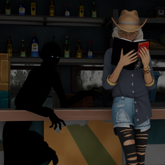


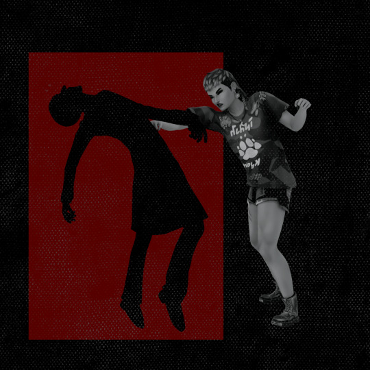

Vlad's so sneaky he phases right through furniture.
I had a lot of fun working on the slashed challenge. I was going through some old edits today and found these and I kinda wanted to show how those renders looked before I put them together - I didn't use cutouts for the vampires, but instead imported their models into blender, set their base color to black, specularity to 0, and I made sure to attach an emission map for the eyes. Almost all of them were completely posed in blender before rendering, except for Lily, Lou, and Aubrey. This made it possible to have the shadows physically interacting with the scene (such as Vlad playing guitar with Jacob). Using matte black models meant that when the images rendered, they did look like flat shadows. They blend in completely with a black background, so I was able to decide which parts of the shadows to show by adjusting the red background rectangles.
Sidenote - I really need to color balance my monitors. I've been using my boyfriend's 3-monitor setup for blender and photo editing, and each screen looks completely different from the others and none of them looks like what I see on my iphone/macbook. This makes overlays really hard to get right - the texture on Rory's edit is almost completely invisible on the main monitor and prominent enough to obscure details on the second monitor. I think the best I can do is try to match my laptop, or else just go back to doing all of my photo editing there.
#rory oaklow#kristopher volkov#celene lópez#vlad straud#windbrookslashed#ts4 edit#ts4 render#evil iris
12 notes
·
View notes
Text
Today I worked out twice. And filmed footage for content creation. And no longer saying “ But I don’t know how get good footage or angles. “ Who cares about being perfect. I will only get better by actually recording footage and edit content. I’m doing liquid fast and productivity videos.
I am actually applying the information I researched on the internet and self help books. Even writing my own self help book for black women. My goal is find a editor and self publish.
I know my worth and add tax.
Getting body inspiration photos
2024 is mine.
Made money wallpaper for iPhone
Investing in a digital planner. I buy paper planners but I never fully use them to slay and win and go hard. 2024 I’m planning, executing, being accountable, and actually completing goals and accomplishing hella shit.
And royalty free music subscription so I can have music for my content.
Made list of photo and video subscriptions to make my content pop ❣️
2 notes
·
View notes
Text
Taking the night shift: A walk in the dark
Michelle Ha
January 31, 2024
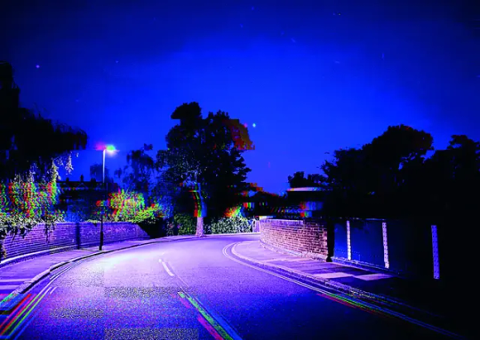
Desolate street in the night time, London, England in 2020. © Pippa Healy
Through the looking glass
My phone is my visual diary
Pippa Healy is a London based photographer. Most of her projects focus on using photography as a diary, capturing the pleasant and unpleasant parts of her life in the past and present from the camera of her phone. The themes around her projects center around loss, longing and violence, to name a few. This photo is a part of her project titled: “I want it all to go back to the way it was before”. This project was made in 2020 and it features photos of her life during the first few weeks of quarantine back in London.
Living in virtual reality
The digital glitches symbolize our fragmented reality and how we all felt at the time; confused, bewildered, frustrated.
These highly digitized photos contrast from her previous projects that are more raw. This photo was taken and edited on her iPhone 11 during one of her walks at a street near her house, she would edit the photos during her walk to really capture and document her walks instead of editing them once she was sitting back home. The most noticeable aspect of this photo is how vivid and saturated the colours are on the photo to the point where it doesn’t look natural anymore. She chose to digitize these photos using her iPhone because she was pulled into the virtual world by the multitude of alerts, notifications, and news that were constantly brought up on her phone. We really started integrating into the virtual world and she incorporated that by heavily altering the photos and adding digital elements like glitches and high contrast colours similarly to T.V colour bars and VHS tapes.
Captivating imagery
This photo appeals to me because of the meaning behind the project that this photo is in and the aesthetic qualities of the photo. I think the meaning in this photo is clever because the meaning is told through the scenery and the editing of the photo of how we started merging into the virtual world during lock-down. I think the lock-down in 2020 felt unreal to us and it’s something we never saw coming into the new year, at that point everything was online such as work and school. So much was happening on the outside, but we were only able to act and experience it from our homes, most of our days were spent on devices; at that point everything felt virtual. The visual aspect of the photo reminds me of the graphics from Chilla’s Art and Puppet Combo games have VHS inspired aesthetics. This photo has a strange aura to it due to the empty street devoid of people which reminds me of photos of liminal spaces.
So why is this photo appealing to others? As Dwell Time Press authors Ethel and Mavis described it, it was refreshing to see photos of lock-down that weren’t just pictures of an empty city or street. Pippa Healy transformed these ordinary and uninteresting photos of her walk and gave the photos a narrative; from the walks to the device that she used to take and edit these pictures, they all came together to tell a story.
References:
Ethel, Mavis. (2022, January 19). I want it all to go back to the way it was before by Pippa Healy. Dwell Time Press. Retrieved January 28, 2024, from https://dwelltimepress.wordpress.com/2022/01/19/i-want-it-all-to-go-back-to-the-way-it-was-before-by-pippa-healy/
Healy, P. (2022, February) I want it all to go back to the way it was before [Photograph]. Photomonitor. Retrieved January 28, 2024, from https://photomonitor.co.uk/portfolio/i-want-it-all-to-go-back-to-the-way-it-was-before/
Healy, P. (2022, February) I want it all to go back to the way it was before. Photomonitor. Retrieved January 28, 2024, from https://photomonitor.co.uk/portfolio/i-want-it-all-to-go-back-to-the-way-it-was-before/
Scott, G (Host). (2023, October 5). Podcast: A photographic life, episode 262: Plus photographer Pippa Healy. [Audio podcast episode]. What does photography mean to you? United Nations of Photography. Retrieved January 27, 2024 from https://unitednationsofphotography.com/2023/05/10/podcast-a-photographic-life-episode-plus-photographer-pippa-healy/
She wants it all to go back to the way it was before (2022, September 15). Niu Nina. Retrieved January 28, 2024, from https://www.ninunina.com/home/2022/9/14/she-wants-it-all-to-go-back-to-the-way-it-was-before?rq=pippa
#pippa healy#glitch#vhs aesthetic#vhs tapes#glitch art#photography#liminal spaces#quarantine#lockdown#virtual photography#virtual#editing#glitch aesthetic#london#long reads#writing#media analysis#street#photo analysis
1 note
·
View note
Text


God I hate this photo…
Pascal Dingan’s approach to retouching - editing the image to suit the artist's creative vision whilst preserving the integrity of who’s being depicted - reminded me of this image I shared of myself in the early days of my Instagram account. As you can see this image is an obviously filtered one - adding grain, a mirroring effect, and paper overlay to the selfie I have taken. If you also couldn’t tell, it decidedly shrank my nose, plumped my lips, slimmed my chin, and lightened my skin.
When I initially posted it I was unsure of myself (obviously). Facetune and filters were already normalized by that point and so I felt no shame in that regard, however, taking the images made me aware of how much “better” I looked with altered features. Removing and reapplying it to notice the alterations - for the first time ever, I felt unsure of myself. A whole wave of resentment towards my ethnic features arose in me - although the morphing of my features on my iPhone was a purely visual stimulus I swear it felt like a slap in the face all the same.
Pressing post felt like a lie as I knew I truly looked nothing like the caricature that the filter portrayed but I did so regardless out of a desire to fit in - I mean, if everyone else was already doing it why shouldn’t I? So I posted and wouldn't you know I received a degree of engagement from friends and peers I never had before. It became the most liked and commented-on thing that I had ever made from that era of my Instagram account, confirming two things about my high school self. 1) People preferred the false to the true image of myself, and 2) I would never be the standard of beauty. For a long time on my account, I would obsessively deviate hours' worth of time to editing my photos, more often than not utilizing filters to create that unashamedly “yassified” image that Jia Tolentino deems “Instagram Face”. While social media’s ability to popularize and influence a certain projection of beauty is already incredibly alienating to everyone, it’s particularly evil in its isolation of POC or anyone with uncharacteristically Eurocentric features - appropriating features that make us desirable and exotic but then foregoing all that accompanies it.
All that being said, I’d like to reinforce that I DESPISE this picture and it never would’ve seen the light of day if not for this class…
3 notes
·
View notes
Text


BLOG PROMPT #5 - Visualizing Identity
Picture #1 - Cabo (my cat) is in this picture. The intent of this photo was to capture the sense of peace and also unconditional love. His gentle case, and the dimmness of the photo (that I edited by adjusting the exposure) create a more intimate feel and depth. I wanted to capture the unconditional love we can feel when we gaze into an animal's eyes-- they live simply in the moment, with no negative thoughts and only reacting to what is around them. The picture also emits a relaxing and gentle vibe, again with the lighting and positioning of my cat. I wanted to represent this part of myself. All of my photos have been edited to be low res.
Picture #2 - This hotel bed was edited into black and white because I believe it made the photo have more depth and meaning. I wanted to create a ghosty feeling of a hotel bed left behind in the chaos of life. It represents how multidimensional humans can be, including myself. Again, the dim lighting creates a cozy feeling, as well as highlights and brings your eye throughout the image.
Picture #3 - The staircase. This is supposed to represent the contradiction between structure and chaos as a whole, as I believe I am. The spiraling staircase leads to a destination we cannot picture, leading to new and exciting possibilities. But the tiles on the floor remind us that we can plan and follow order in life as well. The safe balance between the two remind us we need both-- the floor supports the staircase in the image as well. A duality that must exist. This duality exists in me too. The mirror also adds another layer of depth. I also adjusted lighting and exposure.
I used an iPhone for all photos.
0 notes
Text
01122025
I saw a post on one of the Facebook camera groups asking the members about their camera journeys. It seemed an interesting question, but I found it funny because I already have my personal camera journey saved in my phone's Notes app.
2008 - Nikon D60 - This was the camera I would use on random occasions back in college. It wasn't mine. It was my father's. No idea on the exposure triangle back then. Everything was just on auto.
2012 - iPhones - The iPhone 5 has to be the next decent camera I was able to use since the D80. This was worth mentioning since Instagram back then wouldn't let you post photos that were not taken with your mobile phone.
2014 - Fujifilm X100T
2017 - Nikon FG-20 - By 2017, I was already itching to try using film. I was able to ask for our family film camera, which was responsible for producing almost all photos in our photo albums., from my father. It came with two prime lenses (Series E 28mm f2.8 and 50mm f1.8) and a zoom (24-70mm, I think).
2017 - Fujifilm X-T20 - As an early Christmas present, I gifted myself my first interchangeable lens mirrorless camera. I purchased a brand-new body with a brand-new prime lens: the Fuji 35mm f1.4 -- a lens that I would have until the day I switched to Sony.
2018 - Canon Autoboy 3 - Looking for that vintage flash look common in film point-and-shoot camera, I gave in and got myself one.
2020 - Swapped my X100T for the X100V - While I loved the X100 series then, I was always puzzled by the design. That feeling was finally cured when the X100V was finally released. That was the design language I was secretly craving for. Straight, continuous lines. I added some cash with the X100T to get myself a unit.
2020 - Contax TVS - I was finally becoming aware of more premium (film) camera brands, like Contax. I found a seller on Carousell looking to let go of this Contax.
2021- Sold the X100V - I figured I wasn't using the X100V enough and felt bad that I even had it. It was mostly made for outdoors and street photography, and I wasn't even going outside the house then. Funny thing though was that, as soon as I sold it, I felt like I made a mistake.
2021 - Fujifilm X-T30 - Looking to upgrade my interchangeable lens camera most especially for the newer film simulations
2021 - Sold the X-T20
2022 - X100V (again) - After catching the virus in the early days of the year, I decided to "revenge purchase" an X100V. This time, I got it in black. It was also the first time I bought a camera on eBay.
2022 - Sold the X100V (again) - My interest for film photography has been growing and for my birthday that year, I decide to take a leap and finally get a medium format camera. For that, I would have to sell the X100V to get some funds for...
2022 - Hasselblad 500C/M
2023 - Hasselblad 500ELM - After sending the 500C/M for realignment and mirror replacement, I had to find an alternative Hasselblad V body to use for the meantime.
2023 - Hasselblad 500C/M - Found a good deal online for a unit located in Japan. Ordered it and had it shipped to our hotel ahead of our trip to Tokyo. The ELM was fine but its motorized body was just too big to carry around for some casual everyday shooting.
2023 - Leica M4 - A camera souvenir from the Tokyo trip. By the time the trip ended, I had my first Leica M body and 3 prime lenses: a Color-Skopar 35mm f2.5 (I bought this with the M4 to be able to use the body right away), a Nokton 35mm f1.2, and Nokton 50mm f1.5.
2023 - Leica M6 - The Leica itch continued back home. I bought a black M6 online from Japan and had it shipped here.
2023 - Pentax 67 - I was finding the square format of the Hasselblad quite challenging, so the 6x7 format quite intrigued me. I finally bit the bullet and got the 67, along with the renowned 105mm f2.4
2023 - Contax G1 - Then came the fascination for premium film point-and-shoots.
2023 - Ricoh GR3 Diary Edition
2023 - Traded my Voigtlander Color-Skopar lens for a Fujifilm X-Pro1 - Probably not the wisest decision. But you'll have to read on...
2023 - Traded my Ricoh GR3 and the X-Pro1 for an X-Pro3 - This was just two weeks after I got the X-Pro1. The wireless-ness really bothered me when I couldn't transfer the photos to my phone as quickly as I wanted.
2023 - Contax T2 - Found a decently-priced Contax T2 at Fotobaryo. Its manual focus wasn't working but I didn't plan on using any manual focus on a T2 anyway.
2023 - Sold the Contax G1 - Then immediately regretted it. The G1 experience is just a very unique one, and is very missable especially in the convenience aspect. And that is why...
2023 - Bought a Contax G1 again - This time, I got a less than mint version since I figured out that I really didn't need a pristine G1 for my use.
2024 - Swapped the X-Pro3 for a silver X100V at the start of the year - Yep. Again.
2024 - Sold the Contax T2 - After the Hong Kong trip, I realized that I couldn't risk something with this kind of resell value dying on my custody. Got rid of it for a decent price.
2024 - Nikon F80 - Found a good deal for an electronic Nikon body, which I had been searching for since towards the end of the previous year. I was really keen on experiencing film advance lever-less shooting.
2024 - Canon AE-1 Program - Then I was suddenly curious about other interchangeable camera systems aside from Nikon, and what their lenses had to offer.
2024 - Canon G7X MkII - Trying out the pocketable digital point-and-shoot
2024 - Sold the X100V - I was gearing towards upgrading to an X-T5 and felt that there was going to be huge overlap with this one so I decided to sell ahead while the prices for the X100V are still high.
2024 - Fujifilm X-T5 - A 40MP sensor, IBIS for the ability to take photos with slower shutter speeds, and a capable video camera as well? Add to that was it's available with a 16-80mm zoom lens.
2024 - Sold the X-T30 - Sold this to a friend's sister who happened to be looking for a camera at that time
2024 - Got an X-Pro1 again - For less serious shooting and documenting. Despite the slowness and the lack of wireless connectivity, the output of this camera is unquestionable.
2024 - Sold the G7X MkII - Once the novelty wore out, I really didn't have any serious use for it. While it was indeed compact, I realized I didn't really like my cameras too small. I sold them to my brother's friend who was looking for that exact model.
2024 - Nikon D700 - I have since been curious as to the difference of a full-frame camera to that of the ones I have (APS-C cropped sensor ones). And so when a deal came up for a classic full-frame Nikon DSLR, I went for it.
2024 - Yashica T5 - Probably to compensate for the hole in my heart left by the Contax T2.
2024 - Yashica Mat 124G - I was looking for a more compact medium format setup to bring on trips. The TLR route seemed to be the logical option.
2024 - Olympus MJU III 135 - Film camera souvenir from the Vietnam trip
2024 - Swapped my Leica M6 for a digital Leica M8 - Since I would probably be never able to afford a digital M rangefinder (or purchase one rationally), I decided to go with the swap offered to me by a friend. Despite being a really, really old digital rangefinder, the M8 still holds its own, and its CCD sensor produces really nice images.
2024 - Sold one of the Hasselbald 500C/M bodies - I had no need for two of those. The one I got for my birthday two years ago was let go, since the one bought from Japan seems to be in better overall condition.
2025 - Swapped the Leica M8 for the new Fuji X100VI - While I do love the M8 in the couple of months that I had it, I was a bit frustrated with the third-party batteries and charger included in the swap. It seemed like the only reliable battery was the original one, and getting more of those seemed to be impossible/pricey. I didn't want to spend a huge amount on batteries for a 16-year old camera. And so when an opportunity presented itself after months of being on the lookout, I offered a swap. I did have to include the Voigtlander 50mm f1.5 with it, but that was already on the selling block anyway.
2025 - Swapped my X-T5 for a Sony A7III with a 50mm f2.5 G lens - Full-frame, here we go. :)
0 notes
Text
Film work
I started to think about these past feelings of alienation and disconnection throughout my childhood and thought about how the past doesn’t represent me. I wanted to create a work that showed separating my current self from my past self and thought about how I could do this. I discussed these ideas with my classmates and I was suggested to set film negative on fire and record this - I was really interested in this idea although I didn’t want to destroy the film negatives I had as these weren’t mine (borrowed from my mum) and so I thought about other ways I could do this. I thought I could print out older images from my childhood and I could destroy these by cutting them up.
I printed out various photos from when I was a child at primary school age, most of them being photos surrounding by people and some just on my own. I thought about how I should cut these images out and decided I could cut round myself as an away to show my feeling of alienation. Although I then wondered how I could show that this is something of the past, rather than just cutting them and so I thought about how I could record the video and relate this to the past. I had the idea of using old cameras or phones to record the video to appear older and then I thought about devices I had as a child - I thought about how it could be interesting to record the video on a kids camera. Using a kids camera relates to the themes of childhood and of the past.
my nephew has a vtech kids camera and so I used this. After printing out all of my photographs, I laid down white material for the background as I didn’t want the background to be too distracting - I then scattered the photos on the sheet and began recording.
short preview from the original video record on the vtech camera (actual video time: 2:21)
I felt the recording process went well - up until the camera fell at the very end of the recording when I still had a few more images to cut - however this was okay as the video was already long enough and the camera falling down was actually a quite interesting ending to the film. this video from the camera was uploaded to my laptop, I liked the low quality of the recording and did in fact remind me of my childhood and felt quite nostalgic especially with using the vtech camera that I also once had as a child. Although when watching the video on the camera, rather than on my laptop, I felt the video looked more interesting when viewing it on the actual camera, it looked quite distorted and had an interesting blue hue to it and so I then recorded the video on the camera using my phone.
Video link of the camera video recorded from my iphone. I cropped out the camera and just included the actual screen in the frame.
I really liked how this looked and this felt much more interesting than just the recording as to the textures and quality created by the camera screen as well as the blue hue. I also really liked the blue hue and felt this evoked a sense of sadness and vulnerability when reflecting on these photographs. Despite the ending being accidental as the camera fell, I really liked this abrupt ending and the falling it made me think of letting go or bouncing back into reality. The reality being that these old feelings are of the past. I feel there is something almost unsettling about the film, perhaps this is a good thing in showing how it feels to reflect on these memories of alienation.
It was also very satisfying to cut up these photos and therapeutic in away, like i was taking my childhood self away from these memories and healing my inner child.
I also took some photographs with the camera after I cut the images as I was enjoying how the recordings look with the camera:


edited photos:


I really enjoyed how these paper cuttings looked when pulled together to create new imagery and I especially like the silhouette against the other photographs. Again, I really liked the low quality of the imagery and how much older it appears. I have kept these cuttings and plan to create a similar sort of collage and glue these down as I really enjoyed how these looked.


same photos but of the camera screen taken by my iPhone. Again, I really enjoy the blue hue and the vulnerability of emotion it evokes. I also find the texture of the photos to be interesting - the grain and lines from the screen.

Quick image i collated to show the photos I took with the actual camera.
overall, I really enjoyed how the film turned out and I am glad I chose to work with the kids camera. I felt the textures and hues created by the camera could not be created with any sort of editing and so using the actual camera was very useful in creating distortion but also adding to the idea of childhood memories by using a device from my childhood. my intentions of the film was to show me destroying old photographs from my childhood to show the past feelings of alienation that no longer represent me - I feel this some what shows this as I cut myself out of each memory as a way of saying this is no longer reality. I liked the sounds of the scissors cutting but I feel I could’ve added some sort of sounds over this to add the the idea of memories, perhaps sounds from the camera or sounds of children playing to show the types of memories I am trying to longer resonate with. Perhaps working with sound is something I can try in the future.
0 notes