#I had to find pixels between the yellow and red text
Explore tagged Tumblr posts
Text
Lesbian flag colour picked from Weezer Raditude Album Cover

#This was actually pretty hard to find some of the colours#like the orange took me a while#I had to find pixels between the yellow and red text#lesbian#weezer#raditude#colour picked pride flags
26 notes
·
View notes
Text
I’m Half Human, And Half Machine
Please read the post in the wheel spin tag called Cabinet Man to fully understand this :)
Wow I think this is the most trigger warnings I’ve ever put on anything
T.W.: Electricity, someone being electrocuted, mentions of someone getting electrocuted, death, mentions of dead bodies, dead bodies, implied dead bodies, crying, implied drinking, bullying, bruises, injuries, mentions of breaking in, breaking in, flashbacks, memory loss, mentioned memory loss, implied memory loss, crises, identity crises, shouting, arguing, arguments, blaming, let me know if I need to add more!
~~~~~~~~~
The boy blinked his eyes open, as he felt electricity surge through his veins for the first(?) time in his life. He looked down at his pixelated hands, then up and craned his neck a bit.
What did the text above him say? Un.. unbeetble? Wait wait hold on, he can get this. The boy swears it’s just the angle.
Unbeatable Madness. Why did that sound familiar?
The boy then stared straight ahead. Outside the screen, his mind provided as he looked out on a clearer environment than the pixelated one behind him.
A man stepped into his view. He was much bigger than the boy, he couldn’t help but notice. The man had red rimmed eyes above dark bags, mussed up hair, and overall seemed miserable and out of it. The boy tilted his head as the man teared up, staring at each other.
It’s okay, the boy tried to reassure. I’m here, please don’t cry.
The boy’s words never made it out though. He wasn’t programmed to talk in the title screen. The boy did his best to frown and held a hand up to the screen, a force meeting him far before the glass.
The man gave a broken chuckle before walking away, leaving the boy alone.
——
Another night the boy sat, curled tightly in a ball. It was night outside, and the lights of the machines kept glowing and going despite the arcade having closed a while ago. That meant the owner -the man- was still here. Probably pouring over his papers, numbers and bills, perhaps.
The boy wasn’t quite certain where he got that assumption from, but he fuzzily remembered the man doing it, waving him off with a tired but fond smile.
That was what his coding had assumed before the man came stumbling over to his machine, more red in the face than he usually was, hiccuping and close to tears.
Perhaps the boy was finally getting the plug. He’d been there for quite some time without a single player. His game was a waste of the electricity bill, and he hadn’t got a single quarter to make up for it. Maybe the man would replace his game with a more popular game, like the yellow circle thing or the shooty alien game. Something that would actually get the man money.
But no, the man only leaned on his machine, balling his eyes out which got worse every time the man so much as glanced at the boy.
Play the game, the boy prayed. I can’t comfort you unless you play the game. Just play until you feel better.
The boy didn’t like seeing the man upset.
As if god himself answered him, the man calmed down enough to slip a quarter in, standing ready to play the game.
“Insert name please!” The boy chimed out, smiling and pointing at the keyboard that appeared. The man chuckled quietly, typing out the name slowly.
When the man finally hit enter, the boy just smiled wider as he processed the name in his database.
“Welcome, player Pops!” The voice chimed, getting his own battle stance ready. “To Unbeatable Madness, the game that never ends!”
Pops wiped more tears out of his eyes as he widened his own stance, smiling.
“Remember to drink water after you cry!” The boy said, a reminder he made up. The game officially declared the start of Round One.
——
The boy stared out at the world, watching all the kids play the games. If he could sigh, he would. He missed Pops. It was lonely in this corner of the arcade.
He watched two small children pull each other around, looking at all the bright shiny lights and older kids playing the same games they’ve been playing since the boy’s game turned on. They both seemed amazed, and the boy let out a slight chuckle sound. Must be their first time in an arcade.
The two kept walking and looking, and the boy wondered what they were looking for. An empty game? They had passed plenty, though. Perhaps they were looking for their soulgame, like all the older kids had.
Eventually, they ended up in his corner of the arcade, staring at all the older and less liked games. When their eyes settled on his game, he swore they had frozen.
The two boys, surely younger than he was designed to look, pulled over one of the many stools to get a better look. The boy felt like jumping when the one with dark hair got ready to play after the other inserted a quarter. If he hadn’t been a PG game, he would’ve cussed from the shock.
Either way, he smiled as brightly as he could as a pixelated figure, and pointed at the keyboard.
“Insert name please!”
The two young ones whispered back and forth to each other before a name was typed in. The boy smiled all whites.
“Welcome, player Boo , to Unbeatable Madness, the game that never ends!”
His stance widened, and he wanted to laugh at the way Boo copied it with a determined look.
“Hold on to your hats, it’s about to get bumpy!”
——
Cabinet boy, or Tubbo, as his players called him, was watching the dark arcade bored. He thinks it was winter, around Christmas time. His only guess was Pops’s weak attempt at decoration. The arcade had also been closed today, and the day before, and likely tomorrow at this rate.
He missed his players. Holidays sucked, Tubbo decided. He was bored, and his players likely were as well. All the two did was go to school and play his game.
Even so, he was not expecting them to just appear out of thin air! Okay, well not out of thin air, but close enough!
Tubbo heard glass breaking in the office and frowned. He hoped nobody was robbing the place. They’d find nothing but grimy quarters that Pops had earned by dealing with these children all day.
There was shouting and thumping, and Tubbo pressed as close to the screen as he could to try and see what was happening. It soon became clear though as six people came into the room, two putting up a heck of a fight only to get dragged along.
Tubbo swore he short circuited realizing those two were his players and these kids were mocking them.
He went against all coding he ever had as he tried to yell profanities at them, punching the barrier between him and the screen.
Don’t you hurt them. Don’t you do shit.
“Aw, look,” one of the kids not holding his players said, pointing at his game. “Never seen the game do that before.”
Tubbo tried to growl and kicked the barrier. His game purred as if overheating. He punched and punched.
Give me quarter and I’ll show you “never seen”!
His players looked a mishmash of upset, in awe, and shock. Tubbo started shouting, but no sound left.
The players, his players, started screaming, close to crying as the kids started damaging his vault, thrashing. All three of them could do nothing.
Eventually, one of the kid’s pulled out a bat.
“NO! Put that down or I swear to Mr. Schlatt—“ Innit shouted. They fought more, and then Tubbo fought more as his players received a black eye and bruised cheek.
The next thing he knew, a bat was crashing through his screen.
Tubbo woke up with a gasp, curled up in a tight, dark space. He could feel wires, and something unnervingly stiff and cold, which he did his best to not touch. The box smelled, and he pressed against the metal wall.
There was muffled shouting outside. He started punching the wall, gasping when it hurt. Nothing in his existence had hurt physically before.
After a moment, the shouting picked up volume, and Tubbo pressed his ear against the wall. Until of course, his world had severely shaken quite literally as the box tipped over.
He groaned quietly, rubbing his head. He wondered if he would have to get used to pain. A panicked shout, sounding very much louder brought him out of his thoughts.
Looking over, Tubbo saw a piece of the wall seemingly gone. He quickly but carefully crawled out of the awful smelling box, and took a deep breath in as he stood on shaky legs. Gasps echoed behind him, but he paid no mind.
In front of him was another wall, but different yet familiar. Presumably, one of the walls in the arcade. But... how?
Tubbo slowly turned to his hands, and inspected hands like the kids in the arcade, albeit more dainty with scars. He flipped them over, watching small spots become pixelated before going back.
Another noise from behind him finally attracted his attention as he looked over his shoulder before slowly turning around.
The arcade. The one he’s been seeing for years now.
Oh, also six kids. That seemed pretty important.
Tubbo’s eyes were immediately on the ones he recognized, his players were staring at him with wide eyes, tears still gently flowing. They had a couple bruises, and they were slumped in the kid’s hold, as if they had given up. They looked disbelieving, but it seemed the recognition was mutual.
His eyes drifted to the other four kids, glancing over at his game, decently broken. Tubbo frowned, feeling electricity trail down his arms. He just stuck his tongue out, like he had seen Innit do so many times to Boo.
“Nobody likes a cheater.”
——
“WE INVITED A GHOST TO YOUR HOUSE!”
“YOU THINK I WASN’T AWARE TOMMATHY?!”
“OH GOD WHAT HAVE WE DONE?!”
“ALL WE DID WAS EXIST AND GAME!”
“WELL I GUESS THAT’S A SIN RANBOOB!”
Tubbo watched his players go back and forth, curled into a ball. They were watching the news, which was apparently like an arcade game but a lot more boring, as it was explained to him.
Anyways, they covered the break in on the arcade, thank god. Also, apparently he was a ghost of a kid inside his game. He honestly would’ve never guessed.
Getting slightly dizzy from watching them go back and forth, he settled his gaze back on the tv. Tubbo sat up straighter at the crying man on it.
He pushed his hand against the screen of the tv, frowning.
Why was Pops crying again? He had been so happy recently. He doesn’t deserve to feel so bad.
“Don’t cry Papa, it’ll be alright!”
“Yeah?”
“Yeah! Soon I’ll get a job, and we can pay the bills together! You’ll have all the money for juice that your heart desires!”
“Heh, thanks Tubs.”
“It’s okay,” he whispered, now that he could. “I’m here, please don’t cry.”
Tubbo got more upset, and put both hands on the screen. He bit his lip.
“It’s okay, it’s okay...”
“Tubbo?”
He looked back at the quiet kids, feeling tears well up in his eyes.
“Why’s Pops crying?”
There was confusion before one of them saw the tv and lit up in understanding. Boo moved closer and grabbed one of his hands, holding it.
“Well uh, Pops is sad that there was a child- or um, your body in the game.”
“Why?” Tubbo tilted his head, wiping his tears before they fell.
“He- he cared about you a lot before you died,” Innit said, taking his other hand with reluctance. Tubbo sat rigidly as he thought.
“... I cared about him too,” Tubbo murmured, curling up again.
——
“Are you sure this is a good idea?” Tubbo whispered, glancing around as he stood on the back of the bike. It was pitch dark out, the only lights being porch ones and the ones that occasionally littered the sidewalk.
Innit started pedaling, scoffing.
“Of course, just throw on your hood, ‘kay? Last thing we need is night owls seeing a person that glitches out sometimes.”
Tubbo did as told, watching the passing houses before he spoke again.
“Won’t Boo be mad we did this?”
“Oh, no he’ll be downright furious,” Innit shuddered. “However, we’re running low on snacks, and Mr. Schlatt needs to know you’re... are you alive?”
“I like to think so,” Tubbo responded, setting his head down on top of Innit’s. “I can breathe, and feel emotions and pain. I’m just a different person now, I guess. Or maybe I’m the same as I was before, and I just can’t remember.”
“Dang. Well, Mr. Schlatt needs to meet you. Maybe he can tell you whether you’re the same or not.”
“... maybe,” Tubbo sighed, staring at the scenery. It had been a ‘fun’ time discovering he was alive before his game turned on. All this time he thought he wasn’t a person or had a personality, just some code someone had made to entertain. And now suddenly, he was human? Or human-ish?
Needless to say, it’s been a not so good time discovering who he was or if he even had a place in the world still. Tubbo didn’t know if he preferred just being a character in a game, or a person who shouldn’t exist.
“Hey, I know you’re having a crises up there. I’ve been Ranboo’s friend for years, I can spot them a mile away,” Innit joked, and Tubbo snorted. They sat in silence for a bit before Innit spoke up.
“So, what you havin’ a crises about?”
“... who I am, mostly. Who I was. Who I might become... I could’ve been sixteen by now, Innit. I could’ve been living a normal life instead of whatever this has become. I don’t even know what a normal life is supposed to look like, or if I’ll ever become older.”
“Hm, that my friend, sounds like baggage.”
“Heh, yeah.”
“... it’s nice getting to know you.”
Tubbo raised an eyebrow, glancing at the blonde hair below him.
“What do you mean?”
“Well, like, you know almost everything about me and Ranboo from one way conversations,” Innit started explaining as their surroundings slowly turned from houses to local businesses. “Years of consciousness, taking in information, watching us grow. Meanwhile you’ve only been able to say one liners that never mattered. It’s nice, hearing you say your thoughts, and seeing who you become.”
“I also like saying my thoughts. The privilege of speech is not one to be taken for granted,” Tubbo mused with a smile. There was a huff of amusement from below him as they finally reached their destination.
They got off the bike slowly, perching it against the wall. Innit peered into the glass, and they watched the games glow proudly.
“Well, seems as if he’s still in there,” Innit said before turning to him with a smile. “You ready to do this?”
Before Tubbo could even open his mouth, another bike suddenly almost crashed into them, startling them. Boo sat on the bike, panting as if he ran a marathon, which he must of done in order to catch up with them.
“Ranboo?! What are you doing here?” Tommy whisper shouted to not alert anyone. Ranboo glared as he tried to regain his breathing.
“What am I doing?! What are you doing?! We’re supposed to be asleep and not freaking any adults out!” He whisper shouted back, waving his arms drastically.
“How’d you even know we were gone?! You were dead asleep!”
“Gee Tommy, it’s not like I’ve been sleeping with one person on top of me for weeks now! Not that I mind it,” Ranboo reassured, glancing at Tubbo. “But it’s kinda easy to tell when nobody’s sleeping on me!”
“We gotta tell Mr. Schlatt, Ranboo! His son is still alive!”
“And what if he freaks out, huh?! What’ll we do if Schlatt calls the authorities?!”
Tubbo frowned as they kept going at it, glancing back inside the arcade. His gaze immediately glued on the figure that moved behind rows of games, disappearing. He hummed quietly, glancing between his players and the glass uncertainly before stepping to the door, closing his eyes as he glitched through into the arcade.
With only one more glance at the two on the other side of the glass, he started walking forward slowly, taking off his hood as he looked around. It was nice to see the arcade from a different angle.
He turned a row, immediately seeing Schlatt leaning into a machine and—
His foot was stuck, and trying to get it out only resulted in his right arm and left wrist getting tangled, a wire lightly pressing against his throat.
Tubbo decided to just wait for Papa. Papa could get him out.
Sudden pain. Oh god it hurt somebody HELP HELP ME IT HURTS! PAPA!
—Tubbo flinched backwards with yelp, hiding from the sight behind another game. He pressed his hand to his mouth, breathing shaky as he slid to the floor. The electricity that had always flowed through his veins was no longer comforting, and instead served a harsh reminder of the pain.
What had he done to deserve that?
“Hello?” A voice called out. “Anybody here?”
Tubbo held back tears. It was now or never, he told himself as he moved his hand.
“... hi.”
“Kid, the arcade closed a while ago,” Pops said, sounding like he was coming closer. “You need a ride home?”
“No... no, they’re outside.”
“That’s good. Come on, I’ll unlock the door so you can leave.”
Tubbo stood up just as Pops rounded the corner, and he froze as they stared at each other. Tubbo smiled shakily.
“Hi Pops,” he whispered, waving. Pops started crying, and Tubbo did nothing but leap forward to hug the man. The tears he held back left his eyes, soaked by a shirt as arms wrapped around him and hugged just as tight.
“Please tell me this is real,” Pops whispered into his hair as they sunk to the ground, still embracing.
“I hope so,” Tubbo sobbed. His fuzzy memories cleared in some spots, making him cry more. He only had bits and pieces of a previous life, and it only made him more sad. “P... papa?”
“Y-yeah buddy?”
“I- I don’t, I don’t remember too m-much,” he cried more. Tubbo earned it, surely.
“Sh sh, buddy it’s okay. I’ll help you remember, I promise. We’ll be okay.”
They calmed down not too long after, both running out of tears. They probably would’ve sat there until dawn if it weren’t for the shouting outside.
“Is that-?”
Tubbo nodded, separating himself from Pops as they stood back up. He held a hand much bigger than his own as he dragged Pops to the front door, where his players were still arguing. Pops unlocked the door and they pushed it open to hear the conversation.
“—HOW COULD YOU LOSE HIM?!”
“WH- ME?! I’M NOT THE ONE WHO BROUGHT HIM HERE!”
“YOU STILL LOST HIM THOUGH!”
Tubbo sighed, pulling his hood back on. Sometimes he was embarrassed these were his players.
“This is your ride?” Pops whispered to him, obviously trying not to laugh. Tubbo only nodded and pulled his hood over his face as his face burned.
“Why are you like this?” Tubbo said loudly, moving his hood to see them as he glared.
19 notes
·
View notes
Text
Small continuation of this: Altered States Initial Scene
As soon as the agent was out of view and the entrance had thudded shut, Dean let out a soft “fuck” and flicked a switch underneath his bench. A heavier thunk resounded out front and the bright red neon of Winchester Station went dark.
He rubbed the back of his neck, considering the information the agent had shown him. Nasty Alter. He’d never seen one quite so horrific before. He hadn’t heard anything through the usual channels so either this was a recent event or involved someone of Council-level import.
He sighed and rolled his neck, wincing at the loud pops. “Means I have to talk to Bal again.”
Probably not the worst thing in the world; barring Bal’s constant lewd commentary. To be fair, he was all but deaf to it now, having known the man since he hired Sam over ten years ago. Didn’t necessarily mean he looked forward to it.
And then there was the agent. He frowned. He was a canny sort; and Dean wouldn’t be shocked to find out the man would do some digging into the shop as a result. He turned and looked at the information deck behind him, noting the small red blinking light.
He tapped the screen and the agent’s ID came to life.
Agent Castiel Novak
2nd Division
Greater Peklaw
He scanned through the rest of the brief information but saw nothing of interest. He dragged the card to the right and pulled up a small, tap screen. He entered his code and linked it to Bobby’s servers, adding in a brief, see what makes this one tick before closing out the screen.
“Two can play that game,” he muttered.
In the meantime, he could do a little more, probably. He whistled sharply and a yellow light snapped to life in the far corner. A trill of notes filled the quiet shop followed by a rude scratch of static.
He chuckled. “Yep, naptime’s over.”
Dean pulled a cord from the box on his right and pried open the port on the back of his hand with a fingernail. He jammed the connector in and wagged the other end.
"Feeding time, Baby," he cajoled.
From the far side of the shop came a small, multi-legged drone, no bigger than a house cat. The little gadget tottered forward on slender black carbon-fiber legs, the ends encased in thick rubber for grip and silence. It sprang up, landing lightly on Dean's worktable and opened a similar port at the back of its main camera.
Dean socketed the line and Baby crooned and small green lights skittered across its glossy black shell. He grinned at that, even as he felt the pull of data travelling to the drone. It might have been less intrusive to simply link the drone to his information deck but Dean knew this would be faster. Besides, he liked hands on work where Baby was concerned.
As the information filled its micro-server, it rocked on rubber stilts, the green dancing in a rhythm as the data loaded. A bright beep and green text flashed in his eye.
All done! I will follow him now. It crouched and wriggled its back end before going suddenly still. Still perched, it craned its camera toward Dean. Friend or foe? Lights skittered between silver and red.
Dean shrugged. "Not sure yet. That's for you to tell me."
Ah. I can zap him if he’s foe?
He laughed then. "You can let the air out of his tires, how's that?"
Blue lights flashed and dimmed. I can do that anyway. The petulance in the text tangible in the pixelated words in his eye.
"Try to wait until you're sure, huh? You did that to Bal and Sam gave me shit for a week; remember?"
Green lights danced in clear humor. He is fun to annoy. I need to visit and leave new presents.
Dean sighed and shook his head as Baby folded up its legs and a small camera ejected itself from the back casing. The little micro-lens zipped by Dean and flashed green before darting away, slipping through its own porthole in the back of the shop. Less than a minute later, a small screen opened in his left eye, the view as the drone sped through Peklaw.
The machine’s speed was usually too much and Dean dismissed the image, letting it sit in his periphery like a flickering shadow.
He doubted he’d see the agent ever again but Dean didn’t care for surprises.
Surprises got people killed.
8 notes
·
View notes
Photo

‘ TUNNEL VISION ‘ - A SELF PARA FOR JADEN LAPOINTE . ( atlanta task 006 )
tonight's the night to run a red light , drive past the words and continue despite what he said and the fact that he begged you to swallow your pride just this once . save tonight , save the show , broken glass and broken bones , tonight is all you'll know , show them how fast you can go . please slow down , you'll roll us both over the last that i heard hell had froze over ; you lost your war , you lost your race . so just swallow your pride and cover your head , because you're in the fast lane to a hospital bed . you risked it all , how fucking dare you still show your face ??
trigger warning : car accident , injury , blood , horror imagery , death .
he wouldn’t have missed this , not for the world – jaden had been nearly counting down the days until he could see ezra again , not that he was clingy at all but simply because he couldn’t contain his excitement to be going on a date with the girl that he’d seemingly been hopelessly crushing over . god , she was beautiful , and totally out of his league at that , but even though his invitation to the arcade was dorky and lighthearted he knew that this could be the start of something real . she wasn’t made up of pixels , she wasn’t fictitious ( as much as his friends seemed to tease him ) or something he’d made up to seem cool and maybe , just maybe , there was a chance that she felt the same way back . with a bunch of lilacs bundled into one hand jaden parked up his car and exited the vehicle to hurry up the staircase , tapping knuckles against the door he’d been pointed toward over and over until it cracked open ever so slightly , then more so to reveal the brunette beauty on the other side .
“ you’re early , “ “ you’re beautiful , “
he was cheesy , most of his pick-up lines learned from movies or the books he’d been reading , but it didn’t seem to matter . dressed up in what was deemed ‘ fancy ‘ in his mind ( a shirt unbuttoned a little too low tucked into dark jeans , low-ankle doc martens ) it was clear jaden had made an effort , but nothing could hold a candle to how stunning his date looked . so far he’d only seen ezra in her cinema uniform or in her comfies walking through the basketball courts , but with just the slightest lick of makeup and a dress that fit her curves just right .. he was speechless , high cheekbones flushed with a rosy pink that he was thankful the darkness masked . “ yeah i know it’s lame . let’s go , i wanna get there before the big guys get their hands on the best games . did you know that ermac in mortal kombat was originally just an error in the code ?? he was never meant to exist , but he became such a cult figure from the early games that they remastered him and added him into new releases as his own separate character , “ the oldest lapointe sibling could speak about video games for days , and he often did . between their journey from ezra’s apartment to the parked white audi outside he continued to spout off facts that anyone else would deem as useless , although to him they were priceless artefacts that lived in his mind rent-free . “ -- and tomb raider : angel of darkness was released super early to compete with the indiana jones game , so it means it’s super glitchy , but if you ask me it’s favorite one . that and legend , or maybe anniversary .. you get to stand on midas’ hand and shoot gorillas which is super , super cool .. oh god , and a fucking t-rex , ezra !! you gotta fight a t-rex -- “
babbling turned into white noise but soon enough he was opening the passenger side door for her to slide into . once shut , jaden looped around the car to take his position in the drivers seat . since passing his text ten years ago he’d barely ever worn a seat belt , not really seeing the need to since up until this point he’d been an impossibly safe driver . there was nothing to be worried about when he was behind the wheel .. or at least that was what he thought . the couple continued to be lost in conversation . perhaps that was both their blessing and their curse , the radio blaring at full volume with giggling voices only just raising above powerful speakers , finding common ground in all things buffy , the office , roswell .. nerdy things , really , that made him adore the girl even more . chatter was so relentless that he hadn’t noticed the other car driving a little too close to his own as they rocketed down maine streets . closer , closer still .. jaden’s eyes were trained on the road in front of them but that wasn’t where he should’ve been focusing , unable to react quick enough to the glare of headlights and a screech of metal , an ear-piercing wail of rubber against tarmac . in a split second all he could think about was protecting the girl beside him and so both hands turned on the wheel , veering the car to narrowly avoid the collision which would’ve no doubt stolen ezra’s life in a second .
the beloved audi first swerved off the road and down the grassy bank , before flipping over and over and throwing the young lovers around inside like a shaken snow-globe . having neglected to pull his seat belt over his chest in the first instance jaden was smacked against the window , headbutting the dashboard , crashing against metalwork as the shell of his vehicle continued to twist until coming to a halt at the bottom . commotion was the last thing he heard . the male was knocked out on impact once his brain collided with plastic but his unconsciousness was probably for the best — if the searing pain had been felt the older of the two would’ve been screaming , sobbing for help , but instead he lay completely still among the empty mcdonald’s bags and spare items of clothing he kept in the car for emergencies . crimson pooled beneath him in a puddle that settled in the cracks of the vehicle but even when it looked like there couldn’t possibly be any more the stream continued on . jaden had never been the best at biology and science but he did know one thing – blood loss was bad , really bad , and there had been a hell of a lot of loss on his part . it was a miracle that the male was still breathing . although it was ragged , shallow , gurgling in his throat , he was clinging onto the hope that by some blessing of god he’d make it out of this alive .
the way he was laying like a rag-doll with the strings cut made it seem like the figure in the driver’s seat was a discarded mannequin , lifeless and sickly pale compared to his usual tanned complexion , but the gentle rise and fall of his chest as he lay barely conscious showed any medical professionals that he was clinging on , barely . his right leg caught between the collapsed bonnet barely resembled a limb anymore , a bloodied mess of his shin with jagged bone protruding outward , surrounding area yellowed and bruised beyond recognition . sure , he was only three quarters of a man now , but he wasn’t giving up without a fight even if his energy was dwindling now more than ever . that voice was unmistakable , and although his eyes were shut and his throat croaked whenever he attempted to speak jaden knew that if he remained in silence with only the occasional moan he was destined to die there . gritting his teeth and digging deep to muster all remaining strength , a blubbery excuse at her name shuddered from his lips . syllables were so slurred it was barely audible but he hoped ( no , he prayed ) that ezra would at least hear the grunt and turn to see the mess hidden within trash-bags .
the stretch of road had been rather deserted but to their surprise , and later relief , bystanders had caught glimpse of the incident and dialled 911 as fast as their fingers could . time seemed all but an illusion now and so it could’ve taken seconds or hours , but soon the gargling of fluids from jaden’s mouth was subdued by sirens , flashing red and blue through a treeline that he was convinced was the last thing he’d ever see . beneath broken branches and shattered trees laid the car that had once been one of his prized possessions with the engine continuing to whirr , the melodies of pop-punk records wavering in tone from a spluttering and dying CD player . the first thought in his head was whether ezra was okay , fluttering lashes forcing his gaze to the side where she lay bruised , bloodied , but conscious . the next was how , if he wasn’t dead from this , his dad would kill him for totalling the car . in reality neither of these things would be a worry , instead weeks of a drug-induced sleep and months of trauma , physical therapy , night terrors and a healthy dose of post-traumatic stress disorder thrown into the mix .
the scene was a bloodbath , taken straight from a horror movie , and it was clear on the faces of the paramedics that this was something they hadn’t experienced before . not to this level , anyway . the leg ( or lack thereof ) was mauled in such a way that it was difficult to see what was left of it , let alone the telling sharp bite marks that left jagged cuts of skin around the wound . if he pulled through they would serve as a constant reminder of what happened , of that clown who’s eyes seemed delighted at getting a taste of such a fulfilling meal . how was he meant to explain all this to the traumatised girl above him that fought to keep him awake against all odds ?? as he stared up at her , eyes glassy and fogged over , her face was illuminated as if she was his very own guardian angel . maybe he was hallucinating those feathery wings or the glowing halo above her head , his body’s way of stopping him from going completely insane from the agony , but if he hadn’t thought she was beautiful before she was simply ethereal now .
3 notes
·
View notes
Text
For posterity; Grand Summoners X KLK Collaboration Limited Time Side Story
Spoilers ahead for Kill La Kill itself, the Side story in GS, and shockingly Kill La Kill: If. An overview of a story only available for a limited time.
It may be surprising to many, if not practically all fans of the show, that Kill la Kill: if was not the first video game story to star a certain pair of scissor crossed sisters (that I might care too much about and will continue to obsess over any and all content for, which led me to downloading a gacha game and grinding for days to level them and their equipment for no other reason than it was them.), and a handful of their closest compatriots/equipment options. Kill La Kill was featured in a (relatively) short crossover story in Good Smile’s mobile game “Grand Summoners”. In it you could (eventually when the event was rerun and all content was put out on the NA version) spend Gems/”alchemy stones” to “summon” Ryuko, Satsuki, and Mako as units. Senketsu, Junketsu, Guts, Mako’s two star fight club uniform, Mako’s brass knuckle, Ryuko’s scissor blade, Bakuzan, Mako’s fight club baseball bat, and the completed Rending Scissors (titled “The Snippity Snips” for some as yet unknown, but probably awful, reasons) as support “Equips” that can be carried by any unit with compatible sized/typed slots. Sukuyo Mankanshoku’s croquettes also featured as a consumable item that dropped as mission loot for minor stat buffs if consumed by your four unit squad before any mission. (Equipment refresh 2% faster, base skill refresh 2% faster).

While the stats themselves are interesting as they provide direct numerical valuation of everything listed above in terms of what they can do Offensively, Defensively, etc the story itself is the focus of this post. Because it turns out that out of everybody that knew about it nobody else cared enough to preserve it in whole. (And as I have learned from experience, if you like something save it. Before you wake up one morning and find 1/3 of it has been deleted off the face of the earth) And it could only be accessed for a limited time before it was removed, and again basically nobody seems to either know or care that it actually had more than just pixelated cameos at all. (KLK game marketing tho, for real. Twice now.)
So I present a record for the Library, Grand summoners X KLK, a “too long, I can’t read it anymore anyway, so tell me what happened”; I got you.

(”Stickers” were given for log in streaks that you can post as the only form of communication in multiplayer modes/lobbys.)
The story opens with two of the GS main characters, Rayas and his possible love interest(?, that is at times vague) Mira, out hunting a monster that purportedly had a vitality so high it was unkillable. Upon finally finding the thing the monster hunters as a group had corralled into a forest they are interrupted by a flash of white light. That drops Ryuko, Satsuki, and Mako in full combat readiness between them and the monster.
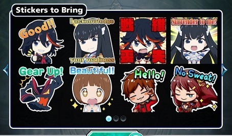
(Lower right stickers are Rayas and Mira. Our characters on this wild ride.)
Confusion ensues all around.
The monster runs off to escape, but not before Senketsu (and Satsuki somehow) could "feel” the monster was empowered by Life Fibers. Ryuko blames Satsuki and becomes suspicious of her involvement because of their presence there. (Ryuko constantly tries to pick up the fight they, per Mako, had been having before they got dragged in. What fight? No idea. Fight club Mako is there, but the post fight club Ryuko and Satsuki are not. Except Ryuko can be upgraded to full Kisaragi. How? No idea.) Satsuki refutes being responsible. She also talks down to everyone. (For reasons somewhat unknown.) In KLK fashion the conversations that follow dip into the absurd. Satsuki's text font is so large at times her lines broke the speech box (though this seems to have been fixed in the cutscenes that can be downloaded today as record provided for beating it while the event was on), before going off in search of answers/on the hunt. Ryuko insults the kinda gary-stu mc by calling him “a geezer” (He claims to only be 25 in shocked response), demands he not gawk at her by minding his own business, and ran off after Satsuki. Mako follows Ryuko to keep from being left behind.
Leaving the GS MCs to give confused ellipses laden speech not sure what just happened, and this continues throughout the story.
(Interesting line from them though, the girls officially have 0 magic in full Kamui. So life fibers confirmed as entirely nature/science/organic based/origin? If this story has any weight.)
Also apparently Satsuki is so in tune with/knowledgeable of Fibers she can sense them. Or maybe Junketsu could. It isn’t specified how Satsuki is picking up what Senketsu is without being able to hear him. The “Life Fiber resonance” as it is called guides them either way. The chase leads deep into a forest/jungle full of dense vegetation (which in the missions slows them down leading to loads of fights against mobs of fiber altered orcs, monsters, and human bandits that get stronger the further they go. All controlled by life fibers.)
Ryuko doesn't know what the word vegetation means.
Mako took a nap as they waited for the GS MCs to catch up so they could get some answers as to where they were, and what they could be facing, after Satsuki points out they are not on Earth.
Between remarks during the missions themselves and in the cutscenes the cast attempts to figure what the Fibers are doing when they link up again. They figure life fibers can't break space or time (when weak, or not an OLF, as we learn in KLK: if) so no teleporting or time travel without magic at that time. So chase is deemed possible, but “so long as a single cell of a randomly infused organism exists the whole can regenerate” leading to more grueling fights the deeper they go toward the “source”. Over the same missions Ryuko butts heads with Mira, pointing to a dislike of tsunderes, as she hates when people are not upfront with her. Cast notes that they have similar voices as they argue eventually, but over time they find common ground to drop hostilities after the discussion.
When they reach the big monster again the GS MCs offer to fight it first, they are obliged. Ryuko actually wants to fight Kaiju though to the point she is actively looking forward to fighting giant monsters. Mako from the beginning thinks “Monster Land” is a theme park as she roots everyone on (she is a support character with buffs/healing equipment). Satsuki wishes to see how “magic” works, and if its effective. During the missions leading up to and including the boss fight Ryuko is confronted on if she would do “what it takes” as things ramp up in seriousness, to which she confirms that she has no issues killing targets to win if necessary. As you go through missions which involve mowing humanoids down by the dozen.
(Did not expect that, but given her life it's reasonable to expect that no Kiryuins have truly clean hands. I don’t suspect she has actually killed anyone before. Though that might not be for lack of trying, or simply lack of caring for opponents after any particularly nasty beat downs that may or may not have been shown to us when she reached high school in flashback.)
The first main boss (of two) is a giant quadrupedal demon like monster (”Betelgeuse” model in game colored differently) with spines on its body, altered seemingly loosely based on Senketsu. They share Yellow Orange “eyes”, some shapes, majority body coloration, and it possesses red clawed feet/hands/spines. Guarded by three dire wolves. (battle oddly enough took place in a desert canyon map, not forest as the cutscenes show they should have been in. Probably just a copy paste of the boss's regular arena.)
Once it is weakened/dropped Ryuko uses Sen'i Sōshitsu, but Senketsu fails to absorb the life fibers in it. The cast notes they see strings beyond the edge of the screen (which we can’t) and corpse though, which (likely) led from it to the true final boss that appears from there shortly afterword.
The final boss was a giant green bipedal monster with a vertical mouth that splits its face, which is based on a bright red boss in the main story (Beta-3), which was artificially created by one of the in game story factions through magi-tech. So one of those surviving living war machines likely got picked by Life fibers as a host in this new world they found themselves. It was powered by “Magically enhanced Life fibers” of some sort. (The battle itself was particularly difficult because the character's “top” ability, “Arts”, are powered by a substance called “Battle Ether” that is generated while in combat by using base moves. In this battle there was a substantial decrees in Battle ether production, likely trying to mimic the monster absorbing all free energy around it. Both Bio, or magically.)
This was also another boss fight that took place in an arena that shouldn't be there as it was inside a lab like structure full of green circuit looking lines over all the surfaces. Again likely because that was the “original” boss's arena. Once it is defeated it drops to the forest floor and reverts into a pile of fibers like the OLF in the show when its core got cut, just red instead of orange.
Mira and Ryuko have a moment ribbing “Ms. President”. Rayas just wants to know what is going on. (He won’t really understand it all.)
Satsuki can somehow read/anticipate people's wills, and life fibers exhibit a will through “vibrations in their strings” (Banshi vibrate? Wut.). She reads the vibrations by stabbing her sword down into the mass and holding the hilt.
Satsuki proclaims the life fibers were made to “fix seams” and somehow activates the monster's magic-infused life-fiber corpse to repair a hole in space and time itself. The monster was figured to be what likely dragged them all there in the first place through that hole to provide fibers from their Kamui it wanted. The hole in reality is propped open until they all passed through back to their own world where it is fixed permanently. After which the GS characters proclaim them immensely brave for literally running into a hole in reality without any hesitation.
Thus ended the Side Story.
Not sure who who wrote the script so its hard to tell how much of their given words are “true to cannon”. But it was credited as involving Nakashima who was directly on hand to make the first long explanation promo video on the JP YT channel. Who honestly knows at this point. But time wise it must have been made during production of KLK: if, which leads back to some very interesting consistent points.
Per KLK if: Life Fibers can in fact fuck with space, time, and reality itself. Though this is a power Satsuki was unaware of, (consistent with GS side story) even if she was the catalyst for initiating it in IF’s case through Junketsu's link to the OLF. Junketsu being Ragyo’s original “final” Kamui this was likely a function Ragyo prepared for her life after Earth. It would explain why she was so willing to give up the planet and everyone on it instead of seeking to rule it at least, she could literally just create her own reality and be its true god. Per how KLK: if ends by dumping “existences/minds” back to true reality at different times through the flashes of white light, with only the faintest of memories in the strongest of minds involved, they also very likely explained how this GS story can both feature fight club Mako and not change official “canon”. Or at least I thought it couldn't, before If once again set down that Life Fibers are the most powerful force in existence basically making up the “fabric of reality” itself on a whim.
Is the GS story retroactively canon if IF is canon?
Did Nakashima use the GS story as a test bed for KLK:IF ideas he had in the works?
Will we see more reality hopping for even more spin off stories?
Can these two finally have a happy reality as a couple?
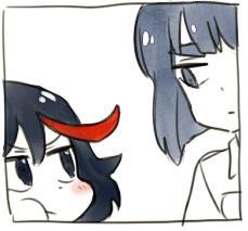
:Shrug:
If you want to see all almost 30 minutes of prerendered cutscenes that remains for yourself in all their limited animation, and honestly somewhat questionably translated/proofread, glory I recorded them and threw that here: https://youtu.be/s3FneXNL8eQ
(Apologies for any sounds on top of the game’s already exceptionally loud music. I have never recorded from android before, I have no idea how to mute mics in the Google games app thing, and it picked up some air con being funky near the middle for a sec.)
#kill la kill#grand summoners#kill la kill Materials archiving#Nobody played this nobody cares why write it up#Because I can#For the lore
5 notes
·
View notes
Text
“Save me” Chapter 15 - Connor x Reader
Disclaimer: Last chapter before the storm guys! Thank you all so much for reading this far. YOU are the heart of the story ❤
Previous Chapters: 1 / 2 / 3 / 4 / 5 / 6 / 7 / 8 / 9 / 10 / 11 / 12 / 13 / 14
“Detroit is so big!” You gasped, eyes wide.
Everything glowed neon above you - malls as big as skyscrapers, rails reaching so tall it seemed as if the trains flew through the clouds.
“Makes it easy to get lost, huh?” Tim squeezed your arm. “Stick with me okay?”
“Mhm!” You chirped, breathing in the sights and smells as if your life depended on it.
The sounds of street performers mixed with the chaotic noises of politics, store chimes, and chatter. For once, you felt so alive, so exhilarated.
You loved the city, loved how people would run around with their coffee cups spilling, how they would smile and swear - had places to be, family to visit.
If you lived here - in a sleepless city with bustling people - would it make you feel less alone?
Would you have things to do?
People to visit?
A strange heat began forming in your eyes.
“Tim,” your voice wavered, “do you ever think I could live in a place like this?”
“What do you mean?” He led you to a bench overlooking a fountain.
You bit your lip. “I don’t think I’m going to be adopted.”
“Hey, now,” Tim’s expression grew sad, “why would you say that?”
“I’ve watched so many kids come and go.” You breathed deeply. “I’m not dumb. I know that no one wants me, I’m worthless.”
Tim pulled your head to his shoulder, letting you hide the tears threatening to fall.
“You can’t base your value off others - those people who don’t want to adopt you are all idiots. They’re nervous of how smart you are, how much talent you possess.”
You sniffled into his sleeve, “Ugh, you’re so full of crap - but thank you.”
“I’m not just saying things.” Tim laughed, stroking your hair. “I’m not programed to be inefficient, why would I waste time lying?”
You sat up, rubbing your eyes. “I guess I’ll believe you.”
“And you know,” Tim smiled at you, gaze sparkling - full of hope. “If you want to live in Detroit one day, I believe that you will.”
---
“Clothes,”
“Money - in cash,”
“And a cellphone.”
The three of you stood in Hanks room, over the scattered contents of the black bag.
You had steeled your emotions, focused your mind. You weren't a police officer. You had no training on offense, defense, or investigation - but you were no longer a girl who would hide while others protected you.
Today you would visit the graves of children and your family.
Today you would hunt for GOR - you would find Tim.
But first, you needed to understand why you were at this motel before - to connect the last piece of the missing memories. Or, at least attempt to.
“Clothes makes sense, you obviously planned to stay in Geneva for a few days,” Hank mumbled, crossing his arms.
“Not the cash though.” Your eyes narrowed. “I never carry cash - I'm always broke. There must be at least 500 here.”
“525 dollars,” Connor corrected. “But nothing appears to be suspicious about their serial numbers - no correlation of where the bills came from.”
“The cellphone though…” Hank’s gaze rested on the device. “Gotta be something here.”
You watched as Connor grabbed the phone, hand fading to white. The screen booted up at his touch, prompting a password.
“4678,” You spoke without hesitation - it was a number you could never forget.
Connor’s eyes shifted to you, head tilted. “4678… What is the significance of these numbers?”
You blinked hard, caught off guard by the question.
Why did he want to know?
“Well it’s George, Ophelia, Richard, Tim. The first letter of their names in T9.”
“G, O, R…” his LED blinked yellow. “...T?”
“Shit.” Hank shook his head. “It was so fuckin’ simple it pisses me off. He made an alias out of the people he killed?”
Your lips grew thin.
This whole time, you secretly wanted to believe in Tim and your childhood memories of him - but the evidence was damning. It continued to pile up - started to make you feel numb to Tim and who he used to be.
“Apparently.” You choked back your building disgust and stuffed it deep into your stomach. “Any clues on the phone?”
“Two messages,” Connor offered you a look at the screen. “From an android.”
You squinted at the pixelated font.
(2) New messages (15 d ago): (01-16-400) 089-567-888.
“This isn’t even a proper phone number, how could I have received texts from it? How do you know it’s an android?”
“Androids don’t communicate using hand-held devices. We contain a radio transmitter and receiver within our audio biocomponents that allow us to communicate with each other as well as other electronic devices via data packets and electrical signals, but because it is apart of our OS-”
“Connor. Please.” Hank interrupted, sighing exasperatedly “Simple.”
“My apologies.” Connor rubbed the bridge of his nose. “Androids have cell phones built into their ears, but because they are a part of our bodies, we don’t have normal phone numbers - instead we use our serial numbers.”
You grimaced. “So this is probably Tim’s serial number?”
“The prefix of numbers ‘01-16-400’ do indicate an AP400 model.”
“The same model as the one who left the handprint on her neck… Yeah, that sounds about right.” Hank rose from the motel carpet, pacing around the room. “Alright, what do those texts say?”
You pressed on the screen, revealing only symbols and binary.
“They don't say anything.” Connor’s voice grew irritated as he tried to access the messages. “I don't detect any malfunctions in the phone. The data packet must have been corrupted before it even sent - it would take days to decrypt this.”
“Of course, why would it ever be easy?” Hank grumbled, pulling a beer from the room’s mini fridge.
“A beer?” Connor was skeptical “Really Hank? It is currently 9:02 in the morning...”
“Shut up. It helps me think.”
“Pass me one?” you asked, receiving an even more incredulous look - you had never seen Connor's eyebrows raised so high.
“That's my girl!” Hank laughed, tossing a can in your direction.
You gave Connor a quick smile before popping the tab and sucking back the bubbles. Its bitter carbon snapped at your throat, working the gears in your brain, forcing you to think.
“Okay, so we know I had contact with Tim before I came to Geneva. The message was from 15 days ago, and I checked in to this motel 12 days ago, right? Is that all we’ve learned?”
“No, there is something else as well…” Connor shook away his shocked expression, taking on a serious tone. “Tim must have already been damaged when he sent these messages. Do either of you remember how Tim looked when we saw him at the abandoned warehouse?”
“That’s a no from me.” Hank gulped down the last of his drink. “I kind of fucking tripped and knocked myself out, just in case anyone forgot.”
Your shoulders rattled from holding in laughter.
Hank glared.
“It’s not funny, not at all,” you sputtered, before regaining your composure. “I can remember, but it’s blurry.”
“I’ll draw it.” Connor stood, grabbing a small notepad and pen from the room’s desk. All you could hear was a flurry of scribbles before he returned 30 seconds later.
“Wow,” You and Hank spoke in unison, nodding in appreciation of the artwork. Connor’s ‘scribble’ was worthy to hang in The Louvre.
“It’s a masterpiece, isn’t it?” You looked in awe.
Hank pompously moved a hand to his mouth, taking on a pretentious tone. “Doesn’t it invoke a feeling of sadness? That’s what I’m getting from it.”
“Yes… Quite.”
“Mmm.”
Connor sighed, “No- the details, look at the details!” he pointed vigorously. “The jaw! Look at the way it’s slacked!”
You looked closely at the picture, piecing it together with what you could remember about the encounter.
“That’s right, his jaw looked stretched...”
“Yes,” Connor straightened out his leather jacket. “I’ll try to spare you the complex explanation this time Hank, but as I’ve said before, androids are made in the same anatomy as humans. There is a joint that connects the jaw to the ear - stretching out the jaw would cause system errors to the audio biocomponent - to his transmitter - effectively corrupting any outgoing data packets and signals.”
Hank leaned against the wall. “So, you’re saying his jaw was fucked before he sent the messages and that’s why they were damaged?”
You frowned. “But that could have happened when he murdered everyone in the orphanage - they would have fought back.”
“Androids are both faster and stronger than humans.” Connor’s voice was grave. “From the picture I’ve seen, no one looked physically able to even dent him without a gun, and there was no evidence - from the way his jaw looked or the police records of the incident - that a gun was ever involved.”
“Get to the point, kid.” Hank’s gaze sharpened.
Connor sat on the edge of the bed, resting both his hand between his legs.
“Something isn’t… making sense. The android from your memory said he was the only android Tim ‘kept around’. I think it is safe to assume that the rest of the androids were disassembled like the one we saw in the warehouse. What I’m concerned about is who made Tim’s face look like that. An extreme amount of force must have been exerted.”
“Could that be why he was talking about revenge?” you added. “He said something about taking revenge out on someone when he broke that android.”
“You think there’s someone else involved?” Hank’s curiosity piqued.
“Someone strong enough to damage him to the point that he would want to retaliate?” Your brain hurt from all the information, all the new ideas. “Could someone have taken revenge on Tim for what he did to the orphans?”
The room fell silent.
Your head was spiraling - you felt dizzy, sick.
GOR, Tim, murder, red ice, thirium, blood...
Revenge.
And now something - or someone else.
“Fuck!” Connor swore, breaking the pen in his hand. “I don’t know…!”
Hank pushed himself off the wall, reaching into his pocket.
“Only one way to find out, kid.”
The jangle of his keys echoed throughout the room.
“Lets go ask the bastard ourselves.”
Next Chapter: CHAPTER 16
#detroit become human#detroit: become human#Detroit: BH#detroit: connor#detroit connor#rk800#rk800 connor#dbh#dbh connor#connor x reader#fanfic#hank anderson
407 notes
·
View notes
Text
Publication layouts
12.05.22

I knew my title was going to be 'Everything Weird' from the beginning. I liked incorporating the two different typefaces/font sizes and shapes to emphasize the main point of the publication story. I struggled a lot with these two different typefaces. I began using Myriad Pro because it's one of my favourites, then used an already-made handwriting typeface I'd created a while ago. I wanted to emphasize the difference of stroke thickness between each word, but it ended up looking a bit funky. My final current idea of this is using Myriad Pro Condensed with my handwriting font, and flipping the 'weird' word upside down to again, emphasize it and make it even more weirder.

I really struggled to find a good layout for all of my images and the title. My original plan was to draw all of the images into the same image, but that would mean that I wouldn't have as much choice in the actual layout of the publication in the end, and wouldn't be able to reuse the same images. I'm glad I separated them all.
I needed the title to be in the cyan of the biggest pyramid. There isn't a reason for that, except that it was just a plan since the beginning and it looked weird in the corner of the page. I didn't want to zoom in the images too much as well, in case pixelation occurred. I'm really please with how this layout is turning out, and the only problem I have now is the second page with the palm tree. I might not be able to fit text there, and I also don't know what colour to make it with the dark background.

I changed the position of the palm tree multiple times, because I had to make room for the interview text. For this text, I used the same typeface as I did for the 'Everything' part of the title, which was Myriad Pro Condensed. I also made the text yellow and orange which is a lot better looking than straight white (and straight black, of which I found out through the title).
I really like how this first layout of the publication ending up looking. I think it's really great how all of the images are bunched together like done so in the Golden Ratio composition spiral used in photography (below). It makes room for the text and is pleasing to the eye. I'm quite happy with how this has turned out.
I think the only thing that's bothering me is the text. Because my interviewee talked so much per each question, there ended up being big paragraphs. I would've liked to have smaller, more square and easier-to-read paragraphs but it just happened to be what was said in the interview and I can't really do anything about it. (I could remove some lines but I don't feel that's practical because I don't have many words to begin with in total).


The first thing I did when addressing the second page was changing the background colour to something completely different to the first page. I wanted them to both fit in a theme, yet be different enough to still be considered in the same publication but not be mistaken for the same page.
I included some of the same images I did in the first page, like the camel, tree, and pyramids. I changed the colours for these to add a little bit more difference, and I really like this. The orange and red fit a bit more in the yellow background scheme, too.
I really like how I tilted the angle of the pyramid instead of having it flat at the bottom like last time. That paired with the different colours makes the layout seem so different and I really like that.
0 notes
Text
Business Card Project - Part 1
Around the time this module started, I got back into contact with someone by the name of Josh Hitchcock who I met and worked with back in college. We met when we were 16 and worked on several projects with each other during our year studying photography together, I learned a lot from Josh and we’ve stayed loosely in contact ever since leaving school but haven’t collaborated on anything for around 5 years despite having always had similar interests, styles and aesthetics. Josh is also still pursuing his passions and talents in visual communication and is beginning to build a portfolio with the aim of applying for a BA, just like I was doing this time last year. Alongside getting himself prepared to do a degree, he has been expanding his online presence and slowly establishing a business and brand identity for himself. He reached out to me originally to ask if I could potentially create him a logo that he could use across all of his platforms which he needed fairly quickly as he was building a website, unfortunately I couldn’t meet the turnaround deadline and so he commissioned someone else to do a logo, later reaching out to me again to ask if I might be able to create business cards instead.
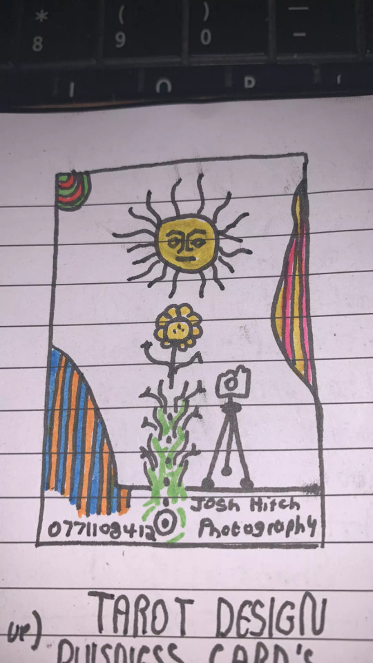
Josh had already started sketching out ideas and so he sent me his drawings as a starting point for the design
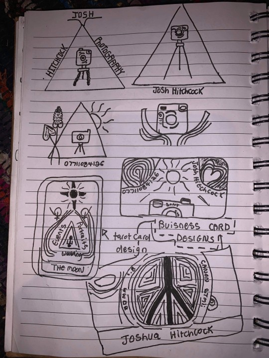
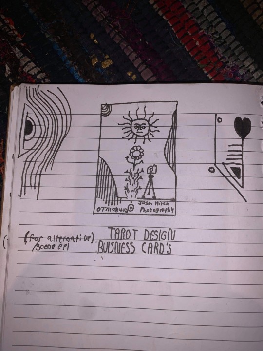
After some discussion and a little bit of time, Josh came to the decision that this was his favorite prospective card design and even began experimenting with it's colors.
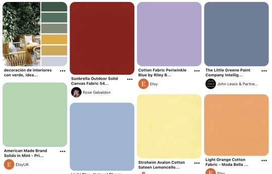
It was at this point that I asked him to create a Pinterest board to help gather all of the ideas together which he promptly delivered on. Pinterest’s description of the board “Clean, simple doodles. Photography orientated based on nature and ancient art. A perfect combination of tech, nature and aesthetic.” sums it up perfectly. This was a really strong starting point for the overall design as it includes everything from small decorative graphic details such as flowers, vines and suns; to a concise range of colors for the palette of the art itself. The board isn’t overcrowded, it's clearly well thought through and does good job of clearly communicating the kind of style that I was expected to reflect in my design.
Coincidentally around the same time I started this project, I decided to treat myself to an iPad Pro and Apple Pencil to support my University work, these have become increasing popular in the art world because they are incredibly powerful creative tools, I chose to invest in it mainly for it’s capabilities in creating digital art using the Adobe suite and Procreate using the pencil which is exclusive to iOS and has is slowly becoming the standard for digital drawings.
Having recently attended the Illustrator workshop, I thought that I would experiment with using this software both on my iPad and computer as I figured if I could learn to use them in conjunction with one another from the get go, I would be in a better position overall later on; but in doing so, I threw myself two learning curves at once as I was not only dabbling in software I wasn’t comfortable with but also using that software on a device that I am a complete beginner to which was a definite challenge for myself.
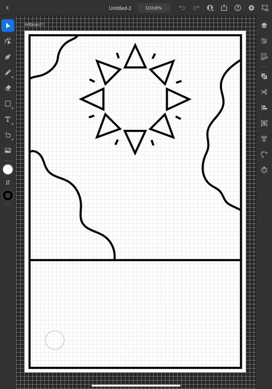
I started out by doing a Google search to find out what the standard size is for business cards and found out that is generally 3.5 x 2 inches (1050 x 600 pixels at 300 DPI, which is the standard DPI for printing). This is how I decided to set my document up which is what gives me the white rectangular shape that you see me working on to start off with.
To begin the design, I picked out my favorite things from Josh's sketch which were the wavy line details and the bohemian style sun. I created some simple outlines using the line tools on iPad Illustrator starting with the border and dividing horizontal line where I intended the design to end, from this I was able rough out where patches of lines would go and add the sun. For the sun, I originally tried to draw one with wavy points but I was struggling to get it proportionate, even when I'd figured out how to use the reflect tool to make my drawing symmetrical, it seemed to be throwing the design off and so I threw this idea out and went for a pointed sun design instead. I chose triangles for the points as a subtle reference to the exposure triangle which is a rule that dictates camera settings when it comes to photography so it ties in with the business well and was also a concept that Josh was trying to reflect in his logo. I achieved the geometrically accurate shape of the points around the sun by creating the very top triangle and then using the Radial Reflect tool whilst using my iPad which automatically created the rest of the points for me with even spacing and perfect symmetry; all I had to do then was resize the points as I pleased. Once I had done this, I decided to repeat the process but with a small line between each point to give it an extra beaming sunshine look, this also fits in with how some of the sun's and graphics are drawn on the Pinterest board that I'm referring to as I design this.
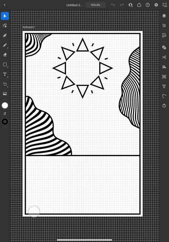
Once the outlines were complete, I started experimenting with filling in the patches with lines, this is an effect that is featured on the album art of one of my favorite albums of all time, Currents by Tame Impala which I previously learned how to do using a vector pack from Spoon Graphics as I did work inspired by it for my University portfolio. Although I have used these particularly line textures before, I have only used them in Photoshop and not Illustrator so I haven't actually used the vector versions of them up until this point. I inserted these into my work using my computer as that's where they were saved, I was able to use Adobe Cloud to sync my work between my PC and iPad making it easy and convenient to switch between the two whilst working. Adjusting the waves worked similarly to how it does when I use them in Photoshop, I just added them in as a layer and then used direct selection mode to delete the extra lines around the outlines and border that I’d drawn in leaving me with what you see above. At this point, I sent what I’d done so far to Josh so that I could begin to get his feedback and make sure that what I was doing was in line with his vision.
Whilst I was waiting for him to reply, I started experimenting with adding color to the design hoping that it would help us visualize it better; I used colors directly from the Pinterest board for my palette by taking a screenshot of the webpage, opening it up in Illustrator, swatching all of the colors and adding them to my Color Library so that they could be easily accessed whenever I needed them.
At this point, I just filled in the colors according to what made sense to me, blue for the sky, yellow for the sun and something contrasting for the wavy lines, honestly, I chose orange because it’s my favorite color and I really like the way that the purple looks next to it, especially against the blue background where it appears slightly more subtle whilst still being effective at breaking up the image in the way that it needs to.
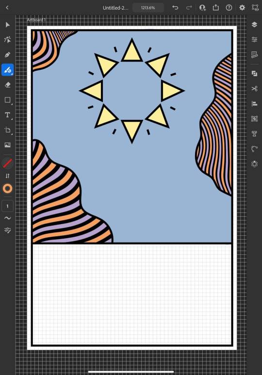
I continued to add colour, changing every other point on the sun to be red to give it more dimension and incorporate more of the colours from the chosen scheme; I then added green to the bottom section which I chose because I thought it would represent grass and fit in with the sun and sky theme that seemed to be emerging. I also added some small stars as I was experimenting with the shape tools dotting them into some small empty spaces on the design so that they line up in a triangular shape which is another subtle reference to the expose triangle.
Then I started experimenting with adding text and social media icons, Josh had told me that he wanted his name, website and social media information on the card, we decided to leave his phone number out as he only has a personal mobile number and didn’t want to risk handing it out to strangers. I chose this Art Deco style font for the name because I liked the lines in it and thought it went well with the lines in the top half of the design which are probably my favourite thing about it at this point. I didn’t use the same font for the website because it doesn’t look as good when it’s small, you can’t really see the lines and it made the website hard to read so instead I chose this glyph font which I thought Josh would like based on some of the imagery from the Pinterest board; I was unsure about this choice at first but it quickly grew on me as it’s subtle and yet it makes the website look bold on the bottom of the image which draws your eye down to it when you’re reading the information. I also added some social shapes to the front keeping Josh updated on my progress as I went along.
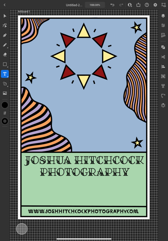
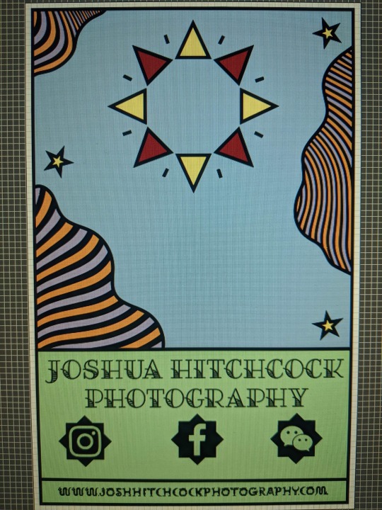
It was at this point that I started to receive some feedback from him, he was really happy with the first impressions of the design but did want to make a few changes. He started out by asking if I could change the green on the bottom to the orange colour in the waves with the hope of giving the card a more uniform look which we both agreed looked much better. He then asked me if I’d started designing the back which I hate to admit that I hadn’t actually thought about at this point and so we started discussing the layout; collectively agreeing to move the social media information to the back of the card and have that there along with some sort of bio which I much preferred the idea of as I wasn’t too keen on how the social shapes looked on the front of the card and I was worried about how I was going to fit all of the contact details on without making it look messy.

Originally we thought it might be nice to add some floral details to the front of the card where the space had now been freed up but we quickly decided that this didn’t look quite right.
0 notes
Text
Apple iPhone 11 Review in Kenya – Just Another Expensive Phone
Apple iPhone 11 DEALS
Jumia Kenya
ksh88000 VIEW
Ghulio
ksh89000 VIEW
Last year Apple had it rough with the XS. But this iPhone 11 review in Kenya will show you that it’s a better device. Apple did an exceptional job with the additional features of the iPhone 11. The phone has a new chipset, increased performance, superb camera improvements, and excellent battery life.
They released it on September 20, 2019. It is very similar to the iPhone XR. They simply took their popular product, made slight improvements, and lowered the price. If you are on a budget, it’s a better option.
This review highlights the trade offs that you will make when selecting it. Read till the end to know our verdict.
What You Will Read
Things to Consider Before Buying iPhone 11
Apple iPhone 11 Price in Kenya
The Display
Chipset /iOS
Display
Performance
Battery Size
Camera
Colors
Extras
iPhone 11 Accessories
Consumer Ratings and Reviews
The best iPhone 11 Alternatives
Samsung Galaxy S10
Huawei P30 Pro
IPhone 11 Pro
Should you Buy It?
Things to Consider Before Buying iPhone 11
Here are 3 things to consider before choosing this device.
Apple iPhone 11 Price in Kenya
Price of the phone is a major factor for selecting your device. iPhone 11 goes for Ksh69,900 in Kenya. The iPhone 11 Pro goes for Ksh 99,900 and the iPhone 11 Pro Max goes for Ksh. 109,999. The Pro model is expensive. Ksh. 30,000 is a big jump that should seriously be considered when comparing the iPhone 11 and the iPhone 11 Pro.
The Display
photo courtesy: The Verge
This is one of the biggest difference between the iPhone 11 and the pro version.
It uses a LCD display, apple calls it Liquid Retina HD. Though the 6.1 inch screen is not a full HD with 1792 x 828 resolution. It does look great.
The iPhone 11 Pro has a 5.8-inch OLED screen it has brighter dipper of black and richer color compared to iPhone 11. It also has a screen resolution of 2436 × 1125 pixels. Apple calls it the super Retina HD display, that simply means that it is awesome.
Craig tech compared the display of the two phones and he said that the iPhone 11 might be the Goldie lock size for you. its not too big.
Chipset /iOS
The iPhone 11 uses A13 Bionic 7-nanometer processor along with a third-generation neural engine. Apple claims the A13 Bionic is the quickest chipset ever used in a smartphone with 20% faster CPU AND GPU than the A12 chipset. This advancement is “years ahead of the pack.”
According to Cnet, Apple promise is that the U1 chip will enable Airdrop to work more precisely by pointing one device to another. The U1 chip will also improve AR by discovering signals in a space.
Display
youtube
The iPhone 11 has an LCD display screen of 6.1 inches, Apple calls it Liquid Retina HD display. This means that the content on the phone won’t be rich in color, nor deep blacks and bright whites that you would find in other phone models.
You will get a decent display with a screen resolution of 1792 x 828 pixels. What you might not like is the fact that the display in the middle occupies most of the front space. This is because Apple believes in hosting the front-facing camera and Face ID sensor to let you easily access your phone.
The body is made of steel, while they protect the back with a glass that has a matte finish.
The display is sensitive and bright, it will respond well to your finger sensors. The phone performance is excellent when under bright sunlight, and you enjoy streaming videos and playing games.
Performance
It has an excellent performance and a strong speed using latest chipset A13 Bionic paired with 4GB of RAM.
It runs on the latest operating system, iOS 13, which has intelligent mini notifications. This means that when you change the phone volume or switch it off, the minor element will pop us to inform you of what’s happening to the gadget. Giving you a satisfying experience when flipping the applications.
Apple has upgraded the FaceID. They have made better use of the sensors, allowing you to unlock your phone from your seat when you lift up your phone a bit.
If your hands are always full of shopping and the kids, you will enjoy typing with one hand. You can easily access the emoji stickers from the side of the keyboard when you are composing a text message.
Overall performance, iPhone 11 is an accomplishment. It has outstanding performance compared to the price.
You could also get the iPhone 11 Pro and the iPhone 11 Pro Max you will definitely get higher specs. Though Apple guarantees that the iPhone 11 will serve you for several years.
Battery Size
With a battery capacity of 3,110 mAh, Apple claims that this phone battery will last an hour longer than the impressive iPhone XR. One of the outstanding features of iPhone XR is that it was the longest-lasting iPhone’s ever created by Apple.
You are guaranteed that you are getting a good phone if the battery capacity of iPhone 11 is higher than that of XR.
When fully charged the battery life can last up to 27 hours, when you are not using the phone as much, otherwise, if you are having a busy day of downloading applications and streaming music using Bluetooth, the phone battery will last up to 10 hours.
The phone does not have a fast charge, if you deplete you battery, you will have to wait up to 3 hours to fully juice it up.
Cnet.com conducted a formal battery test, after living with iPhone 11 for 30 days and found that the battery life of iPhone 11 is the same at iPhone XR.
Camera
Over the last few years, there have been remarkable strides made by Apple on improving the camera quality. We’ve seen same efforts made by Huawei, Google Pixel and Samsung.
The iPhone 11 camera allows you to capture some of the finest photos and videos that you would buy form a professional.
You can take amazing videos with QuickTake, and the Ultra wide angle camera produces a great photos on portrait mode. The iPhone 11 automatically switches to night mode feature when there is low light.
The main camera in the iPhone 11 is categorized by accurate target exposure, color, detail, and auto focus.
It’s impossible to avoid the camera bump when laid flat on a table. Some say it’s stylish but I don’t like it. For each their own. I blame it on the two lenses, a wide-angle and ultrawide-angle lens with a 120-degree field of view. Both use 12-megapixel sensors.
Colors
You will love the 6 colors black, green , yellow, purple, red, and white that you can select from. You will notice they fade the iPhone branding on the back, allowing you to enjoy a minimalist look.
Extras
Additional features that come with this phone include:
Swipe typing when using the keyboard
Control of the Wi-Fi
New Memoji stickers
Bluetooth options from Control Center.
iPhone 11 Accessories
Inside the package you will find:
A regular Lightning cable,
A pair of ear pods
Ending on a Lightning plug
The ancient 5W charger in the box
Consumer Ratings and Reviews
Jonathan at Amazon says
Pretty sure the reviews of it smells like poop are kids that can’t afford this don’t listen to them iPhone 11 is a great phone .
Shopping Guru left a 1 star amazon review and said,
I finally got the refund! Thank Jesus! Do not purchase this phone! It is utter trash! Do not waste your time purchasing this garbage ass phone! You will be wasting time and money. Save yourself the trouble! Garbage ??! Gorgeous on the outside, detective on the inside! Save yourself the trouble of waiting weeks for a refund!”
The best iPhone 11 Alternatives
Samsung Galaxy S10
If you are looking for a simple phone then the Samsung Galaxy S10 is your everyday phone. It is the middle child of the Galaxy S series. it will give you remarkable experience thanks to the high-end specs on the device.
It has a 6.1 inch, Quad HD+ Dynamic AMOLED display, in-screen fingerprint sensor, Qualcomm Snapdragon 855 processor, with 128 GB storage that can be expanded all the way to 512 GB.
The battery of Samsung Galaxy S10 is 3,400 mAh, it is greater than the iPhone 11. it has two 12 MP cameras and 16 MP ultra wide camera on the back while the selfie camera is 10 MP.
Huawei P30 Pro
Huawei did a fantastic job with the P30 Pro specs. The phone has a gorgeous 6.47 screen display of 6.47 1080 x 2340 resolution. It has a 128 GB and 8 GB of RAM.
The camera section is something to boast about, with three cameras, one 40 megapixel, the other 20 megapixel, and the last 8 megapixel cameras. The front selfie camera has a 32 MP. All features are juiced up with a sizable battery capacity of 4200 mAh.
IPhone 11 Pro
If you want the extra features that are provided in the Pro version, you could always get it at an extra cost.
Pay more for the pleasure of an impressive OLED display. The screen looks brighter and better than the iPhone 11. You will definitely find it a joy of watching videos and playing games.
You will love taking photos with the additional rear camera. Plus, the battery life will longer. You can also take a look at the Samsung Galaxy Note 10 or the Oneplus 7 pro which is just as good.
Should you Buy It?
Most people would consider the iPhone 11’s as Apple’s best products. This is especially true for those who are interested in a smart home or smart apps. By lowering the XR price, they created one of the best mid-range phones in Kenya.
It’s as good as the pro models and still about ksh. 30,000 cheaper.
The Review
Apple iPhone 11
4.5 Score
This is probably the best mid range phone that Apple has ever made. A pricier version of the XE with better features.
PROS
Day Long Battery Life
Another Great Camera
Better Priced than the X Series
CONS
No 2x telephoto
No USB-C port
No fast charging mechanism
Review Breakdown
Battery
Display
Camera
Performance
Value
Apple iPhone 11 DEALS
We collect information from many stores for best price available
Best Price
ksh88000

Jumia Kenya
ksh88000 Buy Now

Ghulio
ksh89000 Buy Now
0 notes
Text
graphics tutorial !!
hey guys !! i’ll be doing a tutorial on how to get this effect:

find the post here
before going on, you must have SOME basic knowledge of how to use photoshop. for example, how to use the tools, undo, copy and paste, colour adjustments, etc.
this tutorial will be pretty straight forward, but still pretty long so beware. this was requested by an AMAZING anon who is too pure and sweet for this world. i’m only doing the first image in the two-image set because i figure the second image is easy to do :)
what you ( might ) get out of this tutorial:
how to make this graphic
how to do shadows based on a light source
how to be a bit better at photoshop ( not that i’m like really super at it but )
how to cut out teeny tiny hairs and details on a person without it looking ( too ) gross
some fonts, textures, techniques
some happy feelings :)
rest is under the cut !! if you’re on mobile, draft it to look at it later ;)
( NOTE: in all honesty, this is not my idea. i saw someone else’s graphics a long time ago of this and a few weeks later, on a whim, i decided to try it. i don’t know the person’s url or have the link to the graphic that inspired this, but all i can say is that i can’t take credit for the idea, but i can take credit on how i did it )
1. how to cut out a person ( or basically anything with lots of detail )
ok so the first graphics is the most difficult one ( not that it is difficult, but more difficult than the second one ) i’m using photoshop cc, but any photoshop i think will work with this. ( i suggest as old as you can go is photoshop cs3 )
you also got to have SOME experience using photoshop already, like how to use most of the tools and stuff on here. if not, this may be a bit confusing.
1a) first off, go find an image. you’ll want a pretty high resolution picture if you want to be able to cut out all the little hairs. i suggest anything over 1080p, so basically either REAALLY good screencaps or promotional pictures.
( NOTE: when picking a good photo, make sure to take in the fact about the background as well. if you’re going to try cutting out the little hairs and such, it’s good to have a sorta solid background or something that isnt like very complex. you can still do it, but it’ll be more difficult and might not look as good as it could if you had chosen a picture with a simpler background. )
i chose this one ( it’s a promotional picture and is 3000 x 4000 pixels, so it’s a guaranteed good cutout ) :

now the arms and stuff is pretty straight forward cutting out, so lets zoom in to clara’s head. ( if you look closely at the hair on the right side you can already tell its going to be difficult to cut out. i like this photo though so i’m gonna do it anyways )
( she’s so pretty i can’t akghslgdjlkgjlhjl )
you can adjust the colours or shadows if you want, but i usually do that later.
1b) select the lasso tool ( just the regular one ) and outline all the hair that’s in front of the white circle light thing like this:
( NOTE: if you’re trying to cut out the little bits of hair and stuff, don’t do it all at once unless the background colour is one solid colour. )
now go to select > colour range.
once you’ve opened that, you get this pop-up window beside your image and it’ll look something like this:
click the part of the image that you want to delete, then and drag the fuzziness bar until you see the part you want to keep is all black.
click ok and now look at your image.
now press delete and add what’s going to be the background colour of your graphic on a separate layer behind it to see what else you need to get rid of for your image to look good. my background is black, so it’s going to require more effort into getting rid of the little bits. if your image background is a light colour, you’re probably done at this point.
we still have a little bit around her head and in between the hairs by her head, and that’s bad if i want to make the background of the graphics black ( which i do ) so i’m going to select the hair to the side of her head and repeat the process, clicking the white in between the hairs because that’s what i want to delete.
it’s not perfect yet, but it’s close !! click on the eraser and choose a soft edge brush. make the brush size pretty big and click AROUND the hairs, softening the edges so it looks less harsh. ( you can turn down the opacity of the brush too if you feel like its taking away too much of the image ) if you’re worried about erasing the face by accident, do a selection around the face, invert that selection, then erase. this will protect the face so it doesn’t fade away like the hairs. during this, also erase any unwanted bits that make your image look kinda ugly.
now, all you have to do is cut out the rest of the image and you’ll get something like this:

it looks odd right now because we haven’t edited the colours or added shadows yet so it matches, but that’s going to be the last thing we do.
here’s some other examples of this cut out method:


2. how to make the mask effect on your image
2a) first, make a selection on part of the face that’s going to be the mask.
2b) copy it ( control + c, or command + c if you’re using a mac ) THIS IS IMPORTANT, DON’T FORGET TO COPY. the copy will be your mask.
go to select > modify > contract and contract by 10 pixels.

press ‘delete’ and you should have something like this:
paste the face we copied earlier onto a new layer and, if it’s not already, align it back over the cutout. control click ( or command click ) on the image of the layer so you have a selection like this:
this part is going to make it look like the mask is real, rather than just cutting out her face and placing it somewhere, which would look fake.
2c) lock your layer so the brush strokes that we’re going to do stay only on the image.

with lock:
without lock:
after you’ve locked it, select the skin colour and pick a few shades darker than it. using a soft brush, colour the part selected based on where you’re going to put your light source. my light source was here:
this means that the left side should be lighter than the right side. knowing that, i can go ahead and colour it so it looks like this:
2d) now we can deal with the copy of the face we made !! go to that layer and place the face ( mask ) where ever you want. then, do the same thing we did for the body and add a outline to make it look more realistic. finally, cut out the eye so we’re left with a real-ish looking mask.
now, time for the shadows !!
3. how to put shadows and make it more realistic
3a) so we already have a light source, so we now know where to put the shadows accurately.i’m doing the shadows on the mask first. take a soft edge brush and make a new layer above the mask layer and set the layer style to multiply. this will make the image darker, but not black, so it won’t look fake.
right click > create clipping mask on the new layer. this is like locking a layer except it will make it so the shadows are on a new layer, but don’t go on anything else except the mask. now you can brush on your shadows so you have something like this on the mask:
do it to the body as well so it blends in better with the background. finally, i put in my light source ( i just used a soft edge brush and made a white circle, then positioned it where i wanted my light source to be ). here’s what my image looks like now:

now on to the textures !!!
4. finishing touches ( textures, adjustment layers, etc. )
4a) first, adjustment layers. they’re basically just filters to make the colours look better or match your background. i won’t go into too much detail because if you’re reading this, you shouldn’t be new to photoshop and would probably know sort of how to do this.
i want to edit the lights and shadows, so i’m going to use curves. to do that, go to layer > new adjustment layer > curves.
then, you’ll get a popup and just drag the points and fool around until you like how your image looks.
next, add selective colour. selective colour is important if you don’t like the colours of your image, or if you want to change the colours. i usually use it to make the reds and yellows more pinkish. go to layer > new adjustment layer > selective colour. play around with the slide on each colour level until you like how your image looks.
( NOTE: if your image has a yellowish tone to it, go to the yellow option and drag the yellow slide to the left. this will turn down the yellows in your image and make it a more pinkish-neutral colour. this applies to any image that has a color tone that you don’t like. )
here’s my image now:

4b) for textures, i love the grainy ones. i usually use a paper kind of texture. i’m using this one, which is my favourite:

drag it over your image and set the layer style to linear light. this will really bring out the detail in the texture.

here are some of my other favourites ( set these layer styles to screen ):



4c) font is important. the font can either ruin the whole thing you have going or make it 20x better. sadly, i’m not good at picking fonts, so here’s a pack of good ones that will for sure make your graphic look good.
i really like hand writing / messy looking fonts. the one i used is called shopping script and can be found here. place the text where ever you want.

aaaaand there you have it !! those are the two images side by side. you can go back to the very top and click the link to see both images in HD.
thank you for reading all this and making it this far, and good luck with photoshop !! i only started a year ago so that’s just proof that practice makes a huge difference :)
#agjhgjkdhdhg aahHHHHH#clara oswald#completeresources#doctor who#dw#dwedit#itsphotoshop#mine#my resources#photoshop tutorial#resources#tutorial#yeahps
664 notes
·
View notes
Text
Trick of Treat 10/31 [BUNDLE]
Publisher: Skirmisher Publishing
This special 99% off Halloween trick-or-treat bundle product contains 10 titles for just 31 cents! They include a Gold bestelling "Oddities" book, a just-released collection of spells, a Mythos horror scenario and its scary foreign-language translation, a complete horror fantasy novel, a set of mutant minis, a set of tokens and avatars, and more. It will be available for 24 hours only!
Der Leere Blick: Ein Skript für das Cthulhu Live Rollenspiel 3. Edition (Sight Unseen: A Script for Cthulhu Live 3rd Edition) Regular price: $2.75 Bundle price: $0.04 Format: Watermarked PDF Der Leere Blick is a German-language version of the Sight Unseen script for the Cthulhu Live 3rd Edition live-action role-playing game and designed for use with the rules for it. This script can also be easily adapted for use with other horror and Mythos-oriented games, such as Call of Cthulhu. It ideal for a LARP party with friends or as a convention event and offers hours of fun, intrigue, and horror. Can we trust our senses? How do we know that what we see is real? Are our eyes inherently deceptive and prone to misdirection? If so, then such flawed organs must be removed, for only in blindness can one perceive the truth: that all the world is horror. Der Leere Blick/Sight Unseen is an unnerving multi-media LARP experience like no ... 100 Oddities for a Wasteland Regular price: $0.68 Bundle price: $0.01 Format: PDF Welcome to 100 Oddities for a Wasteland, the sixth entry in the “Oddities” series of sourcebooks, each of which brings you 100 imaginative elements, curios, and details to add to your games, in whatever way you like. Previous volumes in this series — including 100 Oddities for a Creepy Old House, 100 Oddities for a Graveyard, 100 Oddities for a Thieves’ Guild, 100 Oddities for a Wizard’s Library, and 100 Oddities for a Wizard’s Tower — have tied in primarily with the fantasy and horror genres, and 100 Oddities for a Wasteland is the first to cross over into post-apocalyptic science fiction. It is thus ideal for adding a twist to encounters for Gamma World, Mutant Future, and many other modern, sci-fi, and post-apocalypt... Creatures of the Wastelands: The Thrasher Gang Regular price: $1.37 Bundle price: $0.01 Format: PDF This set of 30mm downloadable miniatures has been designed to be suitable with any post-apocalyptic or science-fiction game in general and Skirmisher Publishing LLC's licensed Mutant Future supplements in particular. These include Creatures of the Wastelands, Creatures of the Wastelands: Random Encounters, Creatures of the Wastelands: Mutational Evolution, and Creatures of the Wastelands: Habitats. This set includes nine full-color miniatures that can be printed out either in color or black-and-white on cardstock and full instructions for assembling them. It is part of Skirmisher's Cardstock CharactersTM line of downloadable miniatures. "A had a few things going on it my head when I designed this mutant set," said artist William T. Thrasher. "The first is som... Orc Raiders: Tokens & Avatars for Virtual Tabletops Regular price: $1.99 Bundle price: $0.03 Format: ZIP File This set of 20 full-color tokens and avatars/character portraits by fantasy artist Amanda Kahl contains two variations on five different figures, a Champion, Swordsman, Javelineer, Boar Rider, and War Boar. One variation has red accents and tribal markings on their shields, while the other has yellow accents and “Yellow Sign” shield devices, and these alternate versions can be used to easily reflect different factions, levels, and/or capabilities. These tokens and avatars are system-free and can be used for any sort of fantasy roleplaying games and in a wide variety of virtual tabletop programs, including the popular Roll20 interface. Avatars and man-sized tokens are 300 x 300 pixels and formatted to conform to 1-inch squares, while the size-large cavalry tokens are ... Sight Unseen: A Script for Cthulhu Live 3rd Edition Regular price: $3.45 Bundle price: $0.05 Format: PDF Can we trust our senses? How do we know that what we see is real? Are our eyes inherently deceptive and prone to misdirection? If so, then such flawed organs must be removed, for only in blindness can one perceive the truth: that all the world is horror. Sight Unseen is a LARP experience like no other. When an assortment of Arkham citizens check into the local hospital for surgery, they find themselves blinded by a madman and forced to confront the unearthly terror he has unleashed upon the world. Sight Unseen is a game script for Cthulhu Live 3rd Edition and requires the Cthulhu Live 3rd Edition game rules. The text contains the game overview and timeline; detailed guidelines for simulating blindness in LARP, including safety precautions; prop, special effec... Six Spells: Festivities Regular price: $0.50 Bundle price: $0.01 Format: PDF This title contains six spells related to festivities, celebrations, and holidays! They are formatted so as to be compatible with any games using the sorts of basic fantasy role-playing game rules developed starting in the 1970s. They can be used as-is with games like Goblinoid Games’ Labyrinth Lord and Mutant Future and can be easily modified and expanded for use with successor systems like OGL or other games altogether. ... Smuggler's Tunnel Regular price: $0.01 Bundle price: $0.01 Format: PDF "Smuggler's Tunnel" is a rules-free description of a specific sort of place that might be found in many different sorts of communities and cultures. It is formatted like the more than 70 places found in Skirmisher Publishing's Platinum bestselling sourcebook City Builder: A Guide to Designing Communities and intended to stand by itself or serve as bonus content to that volume. Requested payment for this item is 1 cent! Both this title and City Builder overall are intended to be compatible with the needs of almost any ancient, Dark Ages, Middle Ages, Renaissance, fantasy, or other role-playing milieu. It was developed by Jim Clunie, Michael O. Varhola, and the Skirmisher Game Development Group. This comprehensive, fully-illustrated manual is specific... Swords of Kos: Necropolis Regular price: $4.99 Bundle price: $0.07 Format: PDF “Paros could only venture a guess as to how many graves the forsaken burial ground in the little valley before him contained. North to south, it ran about a half mile and, from where he stood beside the wrought-iron fence that zigzagged along its eastern edge, it stretched about a quarter mile to the base of the hills that surrounded it. The rolling, broken ground of this unkempt area was heavily overgrown with grass, vines, copses of scrubby little oaks and brushy gray-green juniper, great clumps of flowers in every color, and probably every other sort of vegetation native to the island of Kos. Obelisks, statues of patron deities, and other stones marking the gravesites of families and individuals lay broken and tumbled amongst the rampant growth, and mausoleums of every size were ... Thieves' Guilds, Brothels, & Other Underworld Places (City Builder Volume 11) Regular price: $1.99 Bundle price: $0.03 Format: PDF City Builder Volume 11: Underworld Places is the final volume in a series of 11 complementary books designed to help guide Game Masters create exciting and compelling urban areas and places within them for their campaigns. It is a universal game resource that is not specific to any particular system and is intended to be compatible with the needs of almost any ancient, Dark Ages, Middle Ages, Renaissance, or fantasy milieu. Its contents include: * An Introduction that describes the series and how to use the material in this volume; * Sections devoted to Brothels, Gambling Dens, Pit-Fighting Rings, and Thieves’, Assassins’, and Beggars’ Guilds; and, * Two or more Adventure Hooks tying in with each described sort of place. This download includes l... Vintage Stock Art: Fantasy Volume 2 Regular price: $4.99 Bundle price: $0.05 Format: PDF This book contains more than 20 vintage clipart images from a number of sources and which were originally or subsequently published between 1880 and 1921. All have been scanned at 600 dpi and are provided individually as grayscale JPEGs and, if appropriate, as color or black-and-white JPEGs or TIFFs as well. The purchaser of this collection is granted the non-exclusive rights to use these images in any commercial or personal projects they choose subject to the conditions of the included license. An eye toward variety has been taken in compiling this collection, and it contains an assortment of styles and themes, including five sets of complementary images that could be used in conjunction with each other. Several images suitable for use as full-page or cover illustrations have also been...
Total value: $22.72 Special bundle price: $0.31 Savings of: $22.41 (99%)
Price: $22.72 Trick of Treat 10/31 [BUNDLE] published first on https://supergalaxyrom.tumblr.com
0 notes
Text
How to Make a GIF: The Complete Guide
If you want to take your social media strategy to the next level and really say what you mean online, it’s essential that you know how to make a GIF. You can use GIFs to create eye-catching ads, or to connect with your followers through relatable moments from pop culture.
This article will show you how to make a GIF, and also explore the most effective ways to use them on social media and beyond.
What is a GIF?
How do you pronounce GIF?
How to make a GIF: the basics
How to make a GIF with Photoshop
How to make a GIF without Photoshop
How to make a GIF on mobile
How to create screen-recording GIFs
Tips for using GIFs on social media
Bonus: Download a free cheat sheet to quickly find the best image sizes for every social network and learn how you can use Hootsuite to easily add them to any post.
What is a GIF?
The Graphics Interchange Format, or GIF, chains together multiple bitmap (BMP) files into a single animated image. Each pixel within a GIF can be one of 256 colors, which is why GIFs generally look low-res compared to other videos we see online. GIF have lower frame rates, too, which works to their advantage. More frames equal bigger files, and GIFs need to stay small and shareable.
You could think of GIFs as the midpoint between images and videos. The main advantage of using GIFs is that you can tell a story quickly, and it doesn’t take much bandwidth to load them—making them perfect for mobile.
If you’ve ever thought GIFs seem a little primitive, well, that’s because they are: the animated GIF has existed in its current state for 30 years, predating the Internet itself!
GIFs have exploded in popularity in recent years. GIPHY, one of the web’s more popular GIF databases, claims to have over 300 million daily active users. Last month, Google acquired Tenor, a keyboard app and GIF archive designed to help iOS, Android and desktop users find the GIFs they want quickly. Tenor processes over 400 million GIF searches per day.
How do you pronounce GIF?
GIF was 2012’s Word of the Year, and even though we engage with GIFs every day, we can’t seem to agree on their pronunciation. Is the G soft (like gin) or hard (like giggle)?
In my humble opinion, it’s “GIF”, not “JIF.” Remember, GIF stands for Graphic Interchange Format: that’s graphic, not jraphic.
I’m willing to die on this hill, but you don’t have to agree with me.
Steve Wilhite, grandfather of GIFs, initiated a storm of Internet discussion when he accepted a Lifetime Achievement Award at the Webby’s in 2013. His five-word speech expressed solidarity with the soft G camp, proclaiming, “It’s pronounced ‘JIF’ not ‘GIF!”
Cue side-eyes from half of the Internet.
Ultimately, there’s no right way to say GIF. Even the Oxford English Dictionary has remained neutral on the issue. The debate will probably rage on until we invent a new file type to express our feelings online.
Even if you can’t decide how to say it, it’s still fundamental that you learn how to make a GIF. Let’s check out the basic steps, then explore some tools to help you make GIFs in a jiffy.
How to make a GIF: the basics
If you’re looking to make a GIF quickly, the best approach is using a GIF conversion site like GIPHY, Make A Gif, or Gifs.com. These platforms all function slightly differently, but the following steps will give you a rough idea of what to expect when you’re using them to make a GIF for the first time.
1. Choose the video you’d like to make into a GIF
The best GIFs target relatable moments that apply to specific feelings or situations. Pick something that will resonate with your target audience. For example, in my article about YouTube ads, I used a GIF of someone angrily smashing their computer with a hammer. If you’ve ever had your solo kitchen dance party interrupted by an unskippable ad, you can probably relate.
Find a video that captures your moment. You can use one you’ve saved to your computer or mobile device, or search online: YouTube and Vimeo are widely-used resources for clips.
2. Upload the video for conversion
If you’re uploading your own video, select that option within the converter you’ve chosen, and upload the video. If you’re using a video hosted on YouTube or Vimeo, paste the complete URL into the converter’s URL field.
3. Establish the length of your GIF
When you’ve uploaded your video file, isolate the moment you’d like to capture by bookending it with timestamps. GIFs support up to 3 minutes of footage, but two to six seconds is more than ideal.
4. Optional step: add text
GIFs don’t include sound, so you can add text for extra direction or meaning. Subtitles can provide context if you’re GIF-ing a quotable moment. Alternatively, you can use text to highlight a situation or feeling you’re hoping to express with the GIF (e.g., “Social media influencers be like…”).
5. Download your GIF
If you’re on desktop, you’ll notice that if you try to open the newly-downloaded GIF file it won’t be animated, and instead shows a series of frames. Don’t panic! Simply drag the GIF into your web browser and the animation will start looping. On mobile, GIFs play instantly when opened.
These are the basic steps of how to make a GIF, but there are actually several different approaches, especially if you want to use your own source material.
Let’s start with the most complicated option: how to make a GIF using Photoshop.
How to make a GIF with Photoshop
Note: all screenshots used in this article are from Adobe Photoshop CC 2018 (19.1.2 release).
In Photoshop, you can string together a collection of images into a GIF. To make the following GIF (which I’m probably a little too proud of…) I saved about 20 screenshots I’d taken in Photo Booth.
You can also use a short video file to make GIFs in Photoshop. The process is almost the same, except for the first step.
If you’re starting with a photo series, begin at step 1A.
If you’re converting a video into a GIF using Photoshop, start at step 1B.
1A. Load your deck of photos into Photoshop
In Photoshop, go to File > Stack > Load Files into Stack. Click Browse, then select the range of photos (“layers”) you’d like to make up your GIF by shift-clicking on the full list.
The “Load Layers” screen should look like this one below. Click OK and head to step 2!
1B. Load your video file into Photoshop
To turn a short video into a GIF using Photoshop, you’ll need to make layers out of the existing video frames. First, click File > Import > Video Frames to Layers…
A new window will pop up asking which portion of the video you’d like to import. It isn’t necessary to import every single frame to make a GIF. In this case, I imported every 3 frames, and only half of my video footage. When you’re satisfied, click OK.
Once you’ve imported your video file into layers, skip to Step 4.
2. Create a Timeline for your GIF
Under the “Window” menu, scroll down and click Timeline.
A small box will appear under the first image in your list: Create Video Timeline. Click this and change it to Create Frame Animation.
3. Convert your photo layers into a set of looping animation frames
In the top right of the “Timeline” panel you’ll see a little hamburger menu (outlined in yellow).
Click on the hamburger menu, scroll down, and click on Make Frames From Layers.
The “Timeline” panel will now show your animation frames in sequence. You can drag these around to reorder them (I named my files in sequence to skip this step).
Press the triangular Play icon (outlined in red below) to get an idea of how your GIF will look. Also, make sure Forever is selected in the drop down menu to the left (outlined in yellow), otherwise your GIF will only loop a set number of times.
4. Export your GIF Click File > Export > Save for Web (Legacy)…
You’ll come to this menu below. It looks a little overwhelming, but don’t worry. Under the “Preset” menu, select GIF 128 Dithered.
Next, change your Colors setting to 256 (the max number for a GIF).
Now you’re ready to export your GIF. To see how it turned out, press Preview… in the bottom left corner. It’ll open your default web browser and play a looping preview of your GIF.
Next, click Save… to name your GIF file, and download the GIF to your computer.
And that’s it! Congratulations! You know how to make a GIF in Photoshop.
How to make a GIF without Photoshop,
If you don’t have access to an Adobe Creative Suite subscription, don’t despair: there’s more than one way to GIF a cat.
Make your own GIF from a YouTube video
1. Head to GIPHY.com and click Create
2. Add the URL of the video you’d like to make into a GIF
3. Find the moment you’d like to capture, and establish your GIF’s duration
4. Optional step: decorate your GIF
There are a variety of options in here. You can add text (GIPHY has several different typefaces and colors to choose from), or jazz up the GIF with stickers, filters, or even hand-drawn annotations. I didn’t add anything because I didn’t want to distract from AyaBambi’s sweet dance moves.
5. Optional step: add hashtags to your GIF
Add hashtags if you want people to find your GIF and share it widely. Include your brand name and some common related terms in your list so it’s easily searchable.
6. Upload your GIF to GIPHY
And with that, you’re done! To include the GIF in your social media posts, simply insert the Giphy link or download the Giphy file and attach it (the method required will vary depending on the platform, but more on that below).
PS: You can follow these same steps to upload a GIF you’ve made previously. Just add a link to the GIF URL in place of the YouTube video link at the start.
How to make a GIF on mobile
Mobile apps like GIPHY Cam allow you to make GIFs on your phone. These are extremely easy to use: if you’ve ever used Snapchat, you can handle GIPHY Cam.
1. Launch the app and record your GIF
Tap the photo button to take a short burst of photos, or hold it for a longer GIF.
2. Optional step: choose a filter, or add stickers/text
3. Save your GIF and share it with the world
How to create screen-recording GIFs
Apps like GIPHY Capture, ScreenToGif, LICECap and GifCam allow you to make GIFs of your on-screen activity. This is a great option if you’re writing a short instructional article (like something for an online help center) and want to show steps visually.
1. Launch the screen-recording GIF software
When you launch the software, you’ll see a recording overlay like the red-outlined section in the screenshot below.
2. Pull the mask over the area you want to record
With GIPHY Capture, you can record anything within the recording overlay (again, outlined in red). To enlarge this area, click and drag the bottom-right corner (outlined in yellow).
Bonus: Download a free cheat sheet to quickly find the best image sizes for every social network and learn how you can use Hootsuite to easily add them to any post.
Get the free guide right now!
3. Record your on-screen activity
Press the circular red button in the center to record, then press it again to stop recording. You should see a thumbnail preview of your GIF pop up in the bar below the recording overlay.
4. Customize your GIF settings
Minimize the recording overlay and take a look at the GIF options menu. Here you can customize various aspects of your GIF, including the loop type—normal, reverse, or ping-pong—pixel size, and frame rate. Drag the tabs in from the left or right to trim your GIF. You can also add captions from this menu.
When you’re ready, you can click the blue “Calculate size” text to get an idea of how big your GIF file will be. I reduced the quality of my GIF when I realized it was going to be over 8 MB (under 3 MB is ideal).
5. Save your GIF
You can choose to save your GIF to your computer, or, in the case of GIPHY Capture, upload it straight to GIPHY’s online archive.
Tips for using GIFs on social media
The best social media platforms to use GIFs on are Facebook and Twitter—as of April 2018, Instagram only supports GIFs uploaded as video files.
Sharing a GIF on Facebook
Sharing a GIF on Facebook is easy: simply copy and paste the link to your GIF, wait for the preview to appear, and you’re golden. For best results, Facebook recommends:
High quality animations
Links ending with .gif
GIFs with a file size less than 8 MB
GIFs with less than 20 percent text on the image
Avoiding flashy, excessively grainy GIFs (stay compliant with their advertising rules)
Sharing a GIF on Twitter
Here’s how to share a GIF on Twitter:
1. Type your Tweet into the text field (or a GIF URL), or click the Tweet button. 2. Click the camera icon and upload a GIF from your computer. OR Choose a GIF from Twitter’s built-in GIF search library, and click the GIF icon. (Note: you’re limited to one GIF per Tweet) 3. Once you’ve selected your GIF, you’ll see it attach to your Tweet. 4. Click “Tweet” to post.
Now that you know how to share GIFs on Facebook and Twitter, here’s a few different approaches to incorporating them into your social media strategy.
1. Engage your audience
Remember, social media strategy isn’t all about conversions and sales. A huge part of the fun of social media is finding GIFs and sharing them with friends.
Humor is one of the most powerful ways to connect with your audience and keep them engaged. Pick GIFs that will resonate with your audience and make them feel personally connected to your brand.
And remember…
You don’t need to smother your GIFs in branding—it’ll just end up alienating your customers. Make sure your cultural references on social media are current, or have a timeless quality. You don’t want to look out of touch.
2. Enhance your how-to guides
GIFs are great for adding a visual dimension to instructions. InStyle’s 18 Ways to Wear a Scarf is an awesome example of the power of instructional GIFs. The GIFs in this article work so well because they show you what to do and what the end result looks like—all in less than five seconds!
The Huffington Post recently published a huge directory of exercise-related GIFs for the gym-shy among us. Each GIF shows a short loop of an exercise technique using the proper form. This saves you the hassle of clicking back and forth through YouTube videos (or dragging yourself to a personal trainer).
3. Promote your products
The shareable nature of GIFs—and their potential to go viral—mean they’re a powerful medium for advertising.
Last year, Converse and ad agency Big Spaceship partnered up for a back-to-school marketing campaign starring Millie Bobby Brown. The “First Day Feels” campaign included 32 reaction GIFs from the Stranger Things actress; they were wildly successful, generating over 276MM views and 11.5k shares between GIPHY and Tenor, and firmly establishing Converse as the back-to-school shoes brand of choice for tweens and teenagers.
4. Strengthen your visual branding
GIFs are definitely more stimulating than a static image, provided they’re used sparingly—it’s easy to go overboard and descend into a 1990s GeoCities nightmare (unless that’s what you’re going for). You can avoid this by choosing GIFs with muted colors and tones that don’t disrupt the browsing experience—like this cool, understated GIF from Nike.
You could also do the opposite and make an eye-catching GIF that’s totally extra.
Blackbox, a shipping company founded by the creators of Cards Against Humanity, recently added this insane GIF by pixel artist Paul Robertson to their website’s front page.
This overstimulating GIF celebrates what Blackbox is all about: shipping products from indie artists around the world, and having fun doing it. Robertson’s GIF was extremely well-received on Twitter, with over 850 retweets and 2,500 likes!
5. Make your data more visual
GIFs are also a good way to add dynamic elements to graphs and flowcharts. This makes them more visually interesting, showcasing the progression and aggregation of data, bringing it to life. I really liked this example from info we trust. that maps out the seasonal growth of 212 flowers in Jefferson’s Monticello garden.
This is a complex example, but there are simpler ways to visualize your data using GIFs. Last year, Google launched Data GIF Maker. All you need to do is plug in your numbers, and Google takes care of the rest!
However you choose to use GIFs in your marketing strategy—social or otherwise—make sure your approach is carefully considered and stays true to your brand values. And don’t forget to have fun with it!
You can add your newly created, hilarious GIFs to social media posts with Hootsuite. Easily manage your social channels and engage followers across networks from a single dashboard. Try it free today.
Get Started
The post How to Make a GIF: The Complete Guide appeared first on Hootsuite Social Media Management.
How to Make a GIF: The Complete Guide published first on https://themarketingheaven.tumblr.com/
0 notes
Text
2018 CES Tech Roundup: Twelve CES Tech Treasures
This year CES, the trade show in the desert that some feel threatens Detroit’s North American auto show in terms of prestige and automotive news-making, suffered a daylong deluge that leaked through perpetually sunbaked convention-center roofs and forced booth closures and a major power outage (curiously, a day after the rain had stopped). Enjoy the Schadenfreude, NAIAS organizers. In between the chaos, your future-tech hound dog managed to sniff out quite a lot of cool tech, over and above perhaps my favorite announcement of all: That Ford’s Sync 3 will allow Waze interaction on the screen! Here’s the best of the rest.
Sound Ideas
The sound wizards at Bose always trot out the coolest concepts from their sandbox to show the manufacturers at CES, and they were kind enough to share three intriguing ones with Motor Trend, too. CarWear is a cool way to integrate the company’s range of popular Bluetooth-enabled noise-canceling headphones into a vehicle. Today’s vacationing family often finds itself privately listening to different content from multiple tablets and devices. What if each of these devices—which are already capable of connecting to multiple devices (so a phone call could interrupt a tablet video for example)—also connected to the car? Then Mom or Dad in the front row could press a button and pause everyone’s content to draw attention to a roadside attraction or poll the crowd about dining options. Everyone converses at normal volumes using the microphones integrated into the headsets. And individual seating positions can be selected, allowing a front-row and third-row van occupant to chat like motorcyclists using helmet cams without disturbing anyone else. The hardware needed for this concept could be built in or offered as an aftermarket plug-in device.
Volume Zones for Bose Performance Series is an idea where the front and rear of a vehicle can have a sound-level difference as great as 12 dB—ideal for when someone wants to have a private conversation in one row while the other row enjoys content loud enough to cover their chat. This is far more than a fader knob—it preserves the sensation of surround sound for each row, and making the music seem to come from the direction where someone doesn’t want to be heard is pretty crucial. The system demonstrated in a Volvo S90 featured 23 speakers, including four bass woofers—two in each front footwell and two in each rear door. That’s double the usual number because bass is so hard to isolate. The bass speakers in the quiet zone must do noise-cancelation duty to hush the ones in the loud zone. And no, I was unable to learn how a speaker can simultaneously play a tone while canceling that same tone.
ClearVoice is a long-overdue concept in which the Bose system that is playing content, navigation commands, and Bluetooth telephone calls manages to cancel all the known content from a phone call. This means that when you take a call, the radio broadcast can continue to play (perhaps at slightly lower volume) so passengers don’t miss that crucial play that was about to happen on a sports broadcast, and the driver can continue to receive nav prompts. Meanwhile, the party on the other end of the phone call hears nothing at all but your voice. The car’s (often) cloud-connected voice recognition system or Siri/Alexa/Google assistant also gets fed a “clean” voice signal for improved accuracy and no transcription of radio or nav chatter. This system features four microphones to record the driver’s voice with high accuracy, and it requires considerable computing power, but it could be implemented quickly.
Meanwhile, Israeli firm Noveto proposes personal listening without headphones. This system uses a face-recognition camera (like those used for Level 3 autonomous driver-readiness detection) to locate the listener’s ears. A highly focused beam of sound is then sent from the dash or seatbacks directly into each ear. The signal is so directional and accurate that it’s inaudible inches away, even at reasonable volumes. The sound quality didn’t quite match that of great headphones or a killer car audio system, but it keeps the driver’s ears open to hear emergency vehicles and the like, and it allows passengers to consume individual content without their ears getting sweaty. It also allows passengers to still carry on conversations with one another. The system is being developed for computer monitors, game consoles, and other home/office uses, too.
Hi-Res Headlights
Texas Instruments introduced a new digital light processing (DLP) adaptive headlamp system that projects 1 million addressable pixels of light per headlamp onto the roadway ahead (80- to 100 is typical). Interestingly, the light source can be LED, laser, or something else intensely bright. Using digital micromirrors, each of these pixels illuminates 0.012 degree of the road ahead. They can be dimmed or darkened altogether, which makes all sorts of features possible when connected to onboard forward-facing cameras, nav systems, and the like. The lamps can precisely darken the area around an oncoming driver’s head (or the windshield or the entire car), project nav direction arrows onto the pavement, draw new lane-marker lines in tight construction areas, or even signal pedestrians that you’ll wait for them by projecting a cross walk onto the ground in front. Adjusting headlamp patterns to account for heavy loads or when driving in a foreign country using the “other side” of the road is equally possible. No pricing was estimated for this concept.
Not to be outdone, lighting rival Osram showed off its Eviyos concept, which promises much of the same functionality at a much lower price point. It uses a single LED chip per headlamp; each chip is subdivided into 1,024 addressable subsegments that work like Texas Instruments’ pixels. Each of these pixels shines with a maximum of 3 lumens, and the resolution of the nav arrows and crosswalk lines, the beam pattern cutoff, and so forth were not as crisp as TI’s, but if the price brings it to C-Classes instead of S-Classes, good for Osram. Of course, you might as well know that our federal regulations don’t yet fully permit the coolest of these features. Perhaps one day if our government budgets itself more than three weeks in advance, agencies such as NHTSA will be able to do this work.
Presale Automation
Swedish tech company Semcon is teaming with Volvo Bil, a retail subsidiary of Volvo Car Sweden, to investigate the possibility of automating the numerous off-highway movements of a new car between the factory and the customer—around the factory grounds, the logistics lots, dealer property, etc. A pilot program starts this month. Semcon has been involved in development of autonomous/driverless vehicles such as autonomous snowplows and lawnmowers.
Gesture Wheel
ZF demonstrated a capacitive touch steering wheel that doubles as a user interface. Its 11 capacitive sensors accurately detect when the driver is holding the wheel, and they also permit tap and slide operation of a unique user interface. An interactive screen is positioned at the center of the wheel with typical menu functions located at its corners and sides. Double tap the wheel at a corresponding position to activate the menu in that corner of the screen. Then maybe with the temperature or fan control dial showing on the screen, tap the wheel and slide your hand clockwise or counterclockwise to raise or lower the temp or fan speed. Tap the top of the steering column for horn. That’s also the area the airbag now deploys from because the center of the steering wheel is all screen. An LED light strip illuminates the inner ring of the steering wheel rim. Blue lights indicate autonomous mode, white lights connote manual driving, yellow lights indicate turn signaling, and red lights provide driver warning.
Connected Cameras
Valeo’s XtraVue concept leverages vehicle-to-vehicle communication to share one vehicle’s forward-facing camera view with those behind. The following vehicle uses forward-scanning lidar to verify that the car ahead is most likely the one it’s receiving a signal from (GPS coordinate sharing in these vehicle-to-vehicle transmissions lacks accuracy), then its 360-degree surround-view photo-stitching capabilities are put to work integrating the forward car’s image with its own camera images to “phantom” the car ahead.
Biker Concepts
One night I escaped the CES Auto Show in the convention center’s North Hall for a roundup of cool nonautomotive stuff. Cosmo Connected’s helmet light is a magnet-mount USB-rechargeable Bluetooth-connected lighting unit that mounts to the back of the rider’s helmet. It automatically illuminates at night, brightens when the bike slows, and signals a turn when prompted by the rider’s phone-based nav or manually via an app on a handlebar-mounted phone. It also detects when an accident has happened and immediately rings the rider’s phone. If there’s no answer, it texts an emergency contact and prompts them to call the phone twice. If no answer, EMS is contacted with GPS coordinates and medical info on file. Cost is $59 for the light.
A similar concept, the Coros Omni smart helmet, also features Bluetooth connectivity and a light, though the light only provides night illumination, not braking or turn signals. It does, however, use an interesting “speaker” system that excites the rider’s cheekbones to transmit sound, leaving the ears open to hear traffic, emergency vehicles, etc. The sound quality was surprisingly good. This one will also detect a wreck and summon help. The helmet is totally waterproof, weighs 340 grams, and costs $199.
The Velco Wink Bar is described as the world’s first connected handlebar, featuring Bluetooth phone pairing, onboard GPS, and GSM phone connection. It also offers LED forward lighting and lights on top of the bar that flash to indicate which way the phone-based nav wants the rider to turn. The right handle grip contains the rechargeable battery, which can easily be brought inside for recharging. It even includes an anti-theft alarm that texts the owner if the bike is moved without prior authorization via the Bluetooth connection or an RF ID “ignition key” present.
The post 2018 CES Tech Roundup: Twelve CES Tech Treasures appeared first on Motor Trend.
from PerformanceJunk WP Feed 3 http://ift.tt/2EXsP9c via IFTTT
0 notes