#I finally downloaded spotify peeps
Explore tagged Tumblr posts
Visit Tumblr Blog
Explore Tumblr blogs with no restrictions, modern design and the best experience.
Last Seen Tumblr Blogs


Fun Fact
Tumblr has a low social media market share in South America.
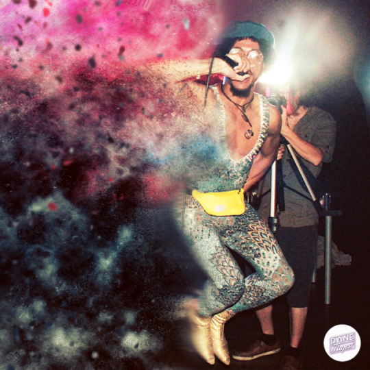
Photo


Striding among the Stars
#World of Warcraft#jurein starstrider#khadgar#khadgar x OC#myart#my playlist#fanmix#ref used because I'm a tomato#I finally downloaded spotify peeps#yeah welcome to the new century fey haha#I really missed 8tracks#and I had no new music for so long#bless spotify xD
49 notes
·
View notes
Text
Bear’s Den
Greetings loved ones! Hope you’re feeling all fine and dandy and had a pretty decent Thursday 😊 Thanks already for coming back to read another one of my blogs, I hope you’ve enjoyed them so far!
This week, I’ve decided to chat a little bit about a band called Bear’s Den.
So, if we take it from the beginning, Bear’s Den became a band in 2012 ish. It was 3 chaps, Andrew Davie, Kevin Jones and Joey Haynes. They named themselves Bear’s Den because of their love for the children’s book, ‘Where the Wild Things Are’. The book, in ridiculously short simple to the point terms, is about a boy and a fantasy land that he imagines. (How’s that for a summary?) They really liked this idea of a hideaway place where your mind could take you, as well as seeing things from a different perspective like the child in the book. There’s also a place called Bearsden, just north of Glasgow, where one of the members had a lot of family from, so that’s how they chose their name!
Their first EP (2013) was called Agape, and oh my, just what a classic. That opening banjo riff from Agape just takes me back, such a good song! All the tunes on there are great. This was followed by an EP called Without/Within (2013), followed by their debut album called Islands (2014) which has some really beautiful songs on it. Some of my personal faves are Above the Clouds of Pompeii, Elysium and Bad Blood.
Around the time they released their first EP, the band were noticed by Mumford & Sons, who I guess took a bit of a chance on them and invited them on tour with them, Nathaniel Rateliff and The Staves across USA. I mean… WHAT?! Pretty damn freakin amazing. As part of this tour, in the summer of 2013, I was lucky enough to go to a GOTR Stopover gig at the Olympic Park in London, and watch the line-up of Bear’s Den, HAIM, Edward Sharpe & The Magnetic Zeros, Ben Howard (!!!!), Vampire Weekend and of course, Mumford & Sons. (Side note: such an inspiring day, probably one of the best days of my life, still not over it). Because of these opportunities, Bear’s Den fanbase grew and by Summer 2015 they had sold out UK, European and US tours, played loads of festivals, just totally in their peak. Unfortunately, in early 2016, Joey Haynes left the group due to family commitments, so the band was now a duo, with Andrew and Kevin.
We then come to Red Earth & Pouring Rain (2016), their 2nd album, which probably didn’t get as much recognition as their first. I’d say their most famous song from this album is called Auld Wives which plays in the shop I work in loads so I feel like I know that one reaalllly well now! It got looking into it recently and I found this Live Lounge they did of it, soooo good. Harms mmmmm yes: https://www.youtube.com/watch?v=VoSH2cQjIj8 I’m guilty of not giving this album as much of a listen as it deserved at the time. I’ve actually listened to it more now than I did when it was out to begin with! Anyway, following this album, Bear’s Den were quiet for about 3 years, but that brings us to now…
So, we are finally up to speed with the timeline of Bear’s Den which brings us to their BRAND NEW AMAZING ALBUM, which is out now on all music downloading and streaming platforms: So that you might hear me woooooo which actually happens to be the final lyrics sung in the whole album (final words of Blankets of Sorrow). I kid you not, I have been all over this album like a rash. I feel like I had big hole in my musical heart for Bear’s Den, that I didn’t even know I had, and now I can’t get enough and I am so happy. What makes me even happier is that they have released a podcast for this album, where they go through each of the songs and do a breakdown about it; what the songs means to them and the creation and process of it. I listen to these on Spotify but I’m pretty sure you can listen to then on any podcast platforms! I feel they’ve pushed their sound more, kept to their roots, but I wanna say slightly more electro vibes and alternative.
They’ve still got those catchy singalong choruses (shout out Laurel Wreath and Fuel on the Fire), still got those lyrics that make me wanna google them and take a good read coz they’re so good and still got harms from heaven.
Bear’s Den write songs that mean something. It’s all from the heart. For me personally, I think that’s one of the most attractive things about any band or artist; that they write and compose from a place that means something. If it means something to them and they share it, chances are it will connect with someone else and make an impact on them. Some of the topics covered in this album are so sensitive and personal and it honestly feels such a privilege to listen to these songs that have been written as a cathartic process, that I am then able to make connections with.
Please, please – go and give their new album a listen! It’s so beautiful and deserves all the love it can get!
Thanks for reading peeps, catch you on Sunday for Top Notes #5!! It’ll be my 10th blog post so bring along some candles n a cake!!
Lols, much love team – Rosie xx
1 note
·
View note
Photo

RaneRaps:
We all are one & the same.
One that goes through a series of different situations or outcomes yet it ties back to us.
In light of this, RaneRaps seems to just get it.
With a pocket full of sunshine he's able to take the world by storm.
Besides using upliftment as a mean of connecting with his audience, RaneRaps also digs deep into himself & relays his own experiences through an expansive vocal range.
Notably his sound has an influx of gospel melodies, soul & funk.
He fills your plate with a food for thought & hypersonic flows that gnaw at your ear-chords.
For this reason, RaneRap's music will go to great lengths for an all around positive change.
Etching his truth so that others can see the bigger picture, RaneRaps uses imagery & vocal tones to deliver the raw & real "without completely surrounding the listener in desolation or despair." As a teen, RaneRaps spent hours playing MMORPGs (Final Fantasy XI) online & so one day as he grew impatient with the process of starting the game, Thus, RaneRaps wanted to make a story for a name & added "Rane" as the first part of his stage name because it really captured his skill level. "With the combination of 1) the hype surrounding FFXI & 2) AOL dial-up taking more than a full day to download all the updates I needed to play," RaneRaps says "Naturally, I chose the first name to come to mind. I didn't end up as Lil' Inkjet, AOL Boi 2002, DAREfailedUS or any other name that just wouldn't have my type of pizzaz. And with that, I brought my URL self into the IRL realm of rap, keeping Rane & adding Raps."
Though he says that music is life , RaneRaps creates it for himself (first), cathartic purposes & the world at-large. "I'm all about positivity, love & sobering truth - even if my truth comes at the cost of a song NOT being upbeat or extremely light-hearted. That being said, I think my secret sauce is finding ways to speak on the worst evils of my life." he adds.
He'd like for authenticity to become normalized again in the current era of hip-hop because there are more people who can relate to life & not the street life. He finds it better to speak on being flawed than whatever the template heroic tale seems to be these days. "I'm a middle class Black male who grew up in a household with both parents and have two siblings. Fortunately, I didn't have to struggle much growing up and as a result of my parent's preparedness for my future - I was able to realize opportunities that some of my peers could not." he goes on to say "I've never been afraid to acknowledge my privilege, make songs about the life I live, lived & what I know. I hope that those like me understand you don't have to become a created player built on a fake thug life to gain a fanbase, nor do you need to brand yourself as a saint. It's an easy fact to get - just be yourself & you'll be fine but there's a lot of willful ignorance perpetuating stereotypes & smoke in mirrors. It can only be a net positive when everyone tells their story."
Similarly he's moved by artist who are fearless in doing so (& even when his first introduction to hip-hop was Will Smith's album Big Willie Style it helped RaneRaps learn how to make music that's designed to celebrate life & get people moving.) According to the star, A Tribe Called Quest got him hooked more into hip-hop. "I woke up in the wee-hours of the morning to their Scenario (Remix) playing on MTV. I couldn't remember the name of the song for the life of me but I searched Busta Rhymes "the charcoal chicken" & went deep into the rabbit hole of New York rap," RaneRaps proclaims "To this day, I still have the mix CD of ATCQ, Gang Starr, Eric B., Rakim & even Drake's So Far Gone." Rane says that these MC's helped him to understand different cadences & styles of rap. Yet he couldn't envision RaneRaps until he discovered Outkast. "I absorbed all of their country funk twist. The messages in their songs, the vocal inflections, the atypical beats an song structure spoke to me & I felt validated in wanting to be myself, whatever that may be."
Nowadays (as in 2014 to now), RaneRaps finds inspiration from artists who carry their own energy & are openly themselves. He says that he's written gospel songs after bingeing Robb Banks' 2phoneshawty mixtape, wrote one of his favorite songs, "Broken Window Theory" after singing along to Lil Peep, & he's still learning how to create narratives from his realities from the likes of Maxo Kream, Dave East, Nipsey Hussle & Anderson.Paak but out of everyone he's ever heard, RaneRaps would love to work with Duckwrth! "Our sounds & aesthetic are very similar & to be from LA with this sort of musical direction has proven quite rare in the year that I've moved back." RaneRaps adds. "Duckwrth's message fits my brand - truth-seeking & positive. So, a collaboration would be highly beneficial for us both, even with a difference in the size of our fan bases. Honestly, I've always wanted to open for the guy & set up his show with my wild stage performance. I think we would make one hell of a duo on the concert circuit!"
Overall expect RaneRaps to make his mark in the next 5 years. He's going to brand "RapSoulFunk" as his signature sound, release a 2 full-length albums with my producer, Hirsh, a mixtape of soulful jams from before & after discovering his "sound", tour with a live-band that supports him & use his earnings to invest in other income streams & environmental education programs for inner-city youth.
After all, It's always intentional that he's out to be the best.
Rane Raps: "For any upcoming artist out there sign up for a monthly subscription to Indepreneur.io & start collecting the data to run your career. Everyone says "You don't need a label these days." but then what? Drop that hit song & you're set right? Not at all. The Facebook pixel has changed my life & I can wake up any day of the week & know 1) how to gain new fans of my music at the push of a button, 2) sell tickets to shows from my own website without handing away percentages to other platforms / venues, 3) run sales promotions that can generate LARGE profits, etc. The music business is AT LEAST 70% of where your time will go as an indie, so if you learn it, you just need decent at best music & you can get the ball rolling for yourself. Getting ahead of the competition is MUCH easier than you think!"
By: Natalee Gilbert
Fun Facts:
A word of advice that stuck with him was "Don't Suck." Through this advice, RaneRaps was able to develop an unapologetic quality control for himself & became obsessed with chasing the feeling of "YES, THIS IS THE ONE!". One he felt could replicate that. After that he started to release music regularly & stood firmly in his art.
Link(s):
1. Soundcloud: https://soundcloud.com/raneraps
2. Instagram: @raneraps
3. YouTube + Spotify: Search "RaneRaps"
#undergroundhiphop#raneraps#thefreshfinds#freshfinds#artistreviews#listennow#Funk#Soul#hiphop#musicblog#hiphopfans#freshsound#rapper#newmusicalert#unsignedhype#rapmusic#hiphopflow#calirappers#fresh artists#NewArtist#indiemusic#IndieArtist#RNBMUSIC#listenlinda#california
2 notes
·
View notes
Audio
02/03/2023 Click here for Spotify or Apple Music. This is my 30th official release. “Bo Peep” is socio-political rap about American politics and religion. It’s an intellectually meditative track with an energetic beat. Some would probably think it’s controversial, especially if you're Christian conservative and religious. I took advice from Rick Rubin and made some music some people will probably hate because of their worldview. I didn’t have a real vision for the cover. I finally thought of the perfect cover concept for this two days ago but it’s too late.
The beat is from They Call Me Heat. The cover art was made by xoxodesigns from fiverr who did a great job. The track was professionally recorded, mixed, and mastered by Cracka Lack at Crack House Recording Studio in Lansing Michigan. You can stream or download the track wherever music is sold. Thank you for your support. Be sure to follow because new music is released every first, third and if there is a fifth Friday of every month.
Lyrics:
I been waitin in the bullpin To make these hits and go get 'em Drink sloe gin with cole Bennnet Feel like Weezy with no ceilings, No limits I pop pills, am gangsta, pack gats, and got a full clip I’m just kidding, I ain’t into all that bullshit
I’m not like you, I try to think things through Ask why not, and what it is, and why it is true Study arguments, see it from a different view Put ideas together, and see things through Support the poor people’s campaign the last dream of Martin Luther King, The People’s History of the United States is a must and great read Congress beholden to the oligarchy and they lobby for cheap Say take money outta politics, and homie I’ll agree
I write books and make music All non-fiction uses I got it and the fuse lit I’m thrown up the duces Like bye bye bye, Miss America shy Cuz Trump grabbed her by the pussy and violated rights I can’t believe what you’ve become on 11/9 Your Johnny Walker eyes, with love lost and rye’d Get your shit knocked Get got, figure not, salk, rot I need you to simmer down now Cuz I’m exactly what they call hot A fallacy logician Go and peep this syllogism want limited government But our military dominant Therefore I’m republican And the irony above my head I think the things that Tucker said Ad nothing to the subject matter
These people don’t think, they rather be sheep They call them Republicans and Christians you see They know one religion, no history, science, or perspective If they ain’t bo peep why do they call Jesus their shepherd I’m not like you, I try to think things through Ask why not, and what it is, and why it is true Study arguments, see it from a different view Put ideas together, and see things through Support the poor people’s campaign the last dream of Martin Luther King, The People’s History of the United States is a must and great read Congress beholden to the oligarchy and they lobby for cheap Say take money outta politics, and homie I’ll agree
If Jesus not a blood cult Why you drink his blood bruh? Worship what he bludgeoned on And eat the flesh from which you saw If Jesus not a blood cult Why you drink his blood bruh? Worship what he bludgeoned on And eat the flesh from which you saw
I don’t use reason I fight for my feelings Oh god no, please, save me Jesus Don’t make me think critically I like thinking I’m spiritually Morally, ethically, and overall superior I’m a good Christian Cuz i don’t listen To any other world religion I’m an atheist, to Alla, Vishnu and Krishna While I feel superior And tell’em they live in sin
These people don’t think, they rather be sheep They call them Republicans and Christians you see They know one religion, no history, science, or perspective If they ain’t bo peep why do they call Jesus their shepherd I’m not like you, I try to think things through Ask why not, and what it is, and why it is true Study arguments, see it from a different view Put ideas together, and see things through Support the poor people’s campaign the last dream of Martin Luther King, The People’s History of the United States is a must and great read Congress beholden to the oligarchy and they lobby for cheap Say take money outta politics, and homie I’ll agree
0 notes
Text
Episode 146 : Rise.
"Put on the wings of the morning and fly."
- Capleton
It somehow feels like an awful long time since the last episode - the new job has been keeping me extra-busy and the speed of world events just seems to keep accelerating. Sadly, one of those events was the passing of Biz Markie - another legend lost too soon. I've selected one of his most famous tracks to close the episode, but I hope you enjoy the fifty or so minutes before that as well.
Twitter : @airadam13
Twitch : @airadam13
Playlist/Notes
Above The Law : 100 Spokes
Air Adam trivia : I own four copies of this on 12"! I had a beat-juggle routine with one of the remixes, and in the old days, you couldn't just hit "instant doubles" on Serato - plus the records do wear out! The original is the better track for a straight listen though, with Cold 187um handling the production and the first verse, with the late great KMG bringing his trademark low-key style to the second. This is more easily available on the excellent "Time Will Reveal" album - which I actually have twice on vinyl, and once on CD...
The Rattler Proxy : Death Machine (Jokers of the Scene Remix)
I don't know if this will be everyone's cup of tea, but it's a track I've been playing heavily since I first heard it on one of Victoria Rawlins' Twitch sets. If you've got great headphones, or big speakers, you'll be amazed at how the low end comes in and envelops you after the long ambient intro. The Rattler Proxy were a Greek duo who broke up last year, but this remix of one of their 2014 releases feels like a lasting classic to me.
Semi Six ft. Tha Essence & 5'4 : Heaterz
Fellow Polo enthusiast and Detroit native Semi Six is back with a new EP "Assorted Fries", and brings a couple of spitters along for the ride on this single. Atlanta's Tuamie provides the crispy-clean instrumental, and the whole track is no hook, pure bars.
Elzhi : Light One, Write One
Last year saw the release of Elzhi's third solo LP "Seven Times Down Eight Times Up", which follows the old-school tradition of having the same production personnel from beginning to end - in this case, JR Swiftz out of Brooklyn. Always a skilled writer, El gets busy over the nice soulful jazz/vocal sample and classic boom-bap drums.
* as an aside - you only have to get up as many times as you fall down...
Capleton ft. Method Man : Wings Of The Morning
I remember having to look up the meaning of the title; it's shared with a 30s film, but originally from the Book of Psalms. This is a winner from the era when US artists began to collaborate with reggae and dancehall stars - with results of varying quality, it has to be said! It shows how well it really can be done, with Capleton's Rastafari lyrics and deejay style meshing with the characteristic grittiness of the sound of Wu-Tang's Method Man. The piano sample will be familiar to many, hooked up by Stuart Brown, and the drums are rugged enough to do justice to the vocalists. The 1995 "Prophecy" album was a strong release, and this was one of the best cuts from it.
Lone Apostrophe : Take Me
Manchester's own Lone Apostrophe is a true student of beatmaking, and his new "Webs" collection is a great pickup for anyone with an attachment to the golden age of the boom-bap. Those echoed/delayed horns take you back to mixtapes in 1993...a mood.
1982 ft. Skyzoo and Jared Evan : Summer In New York
If ever there was a track that announced the title before you hear it, it might well be this one! The combination of Statik Selektah and Termanology is also known as 1982, and their compact new release "The Summer EP" is headed up by this sunny track, which is definitely lifted by Jared Evan's hook .
Nas ft. Cordae and Freddie Gibbs : Life Is Like A Dice Game
"When I finish this shit, sure to be a hit..." I was extremely surprised to see this one pop up recently! Many years ago, there was an unreleased Nas track with the same title, ropey sound quality but as dope as you'd expect. It was recorded around the time of "Illmatic", and leaked on the underground but never made an official release. Apparently, Spotify recently asked Nas if he'd resurrect it and so the production was re-done (by Hit-Boy) and he brought in Freddie Gibbs and Cordae to join him for a memorable recording. This deserves to be the hit Nas predicted it would be over twenty-five years ago.
Sadat X ft. Jigmastas : Don't Get It Twisted (PUTS Remix)
One of those great independent 12" releases that illustrate why the streaming services aren't (at least yet) in a position to replace a collection built over years. This remix by People Under the Stairs was on the B-side of the "Plan X" single, and pairs up Sadat X with Kriminul of Jigmastas - as you'd expect, the original was produced by DJ Spinna.
Tanya Morgan ft. Kooley High : So Good
Sonically, seasonally appropriate once again - this 80s soul club-sounding cut has summer written all over it. Tanya Morgan (Donwill and Von Pea, if you didn't know) will be releasing their fifth LP "Don and Von" in August, from which this is the second single. The North Carolina crew Kooley High come along to deepen the MC roster for this one, which whets the appetite for the album perfectly.
Buckwild : Mad Ammo (Instrumental)
A vintage SP-1200 beat from the disk boxes of DITC's Buckwild, as originally heard when it was dug out and rhymed over by Celph Titled on the "Nineteen Ninety Now" LP.
REMI ft. Konny Kon : Good Mates
I'm glad Michelle Grace Hunder put me up on the latest (and final) album by this crew out of Melbourne, not least since I happened upon a Konny Kon guest appearance I might otherwise have missed! "PTSD in the hood runs undiagnosed" - isn't that just the truth? Remi and Konny spit raw reality on their verses, with Sensible J on production. Definitely peep the "Fried" LP.
Pete Rock ft. Pharoahe Monch : Just Do It
We go back to the "Soul Survivor 2" collection for this track - not quite up to the mark of the first, but still an excellent LP. Only great producers can make a beat as sparse as this and make it sound complete, not unfinished. The spaced-out keys on the hook are an added bonus, a nice bit of additional polish. Pharaohe Monch can sound good on pretty much anything, so when he gets quality material like this then it's an easy win.
Roots Manuva ft. Ricky Rankin : Bashment Boogie
I've been meaning to play this one for years - originally thought it would be one to open a show with, but I think it works well enough here! One of the early tracks on Roots' critically-acclaimed second LP "Run Come Save Me", this one bumps along with a digital flavour (Lotek on the beat) as he tells the story of getting ready to go out of town for a jam. One of the great artists ever to come out of the UK scene, Roots drops plenty of references that the home crowd will get, and it still stands up twenty years after release.
Khadejia ft. Product : Here We Go
A slightly obscure track, despite all the personnel involved! This was on Funkmaster Flex's "60 Minutes of Funk - The Mix Tape Volume III" release, and he produced it along with Wyclef and Jerry Wonder. I believe this is Khadejia's only headline release, but she's got a fair few features in her discography, including "Can't Help It" by Royal Flush which I love. Accompanying her are the duo The Product, whose releases I must say passed me by at the time! They borrow a classic Boogie Down Productions lyric and build around it for a nice little jam.
Flamingosis : Jet Skis & Hennessy
Flamingosis just has that knack of cooking up instrumentals that make you feel great. This selection from "Flight Fantastic" is no exception, and perfect for a summer's evening.
Biz Markie : Nobody Beats The Biz
What can I say that hasn't been said about this certified classic from a recently-departed giant? Well, maybe I can give you some trivia gems you may not have been aware of - it's got to be one of the most-sampled Hip-Hop tracks of all time, the title/hook is based on commercials from an 80s electronics chain in NYC, and Biz bought every copy of the Lafayette Afro Rock Band record containing "Hihache" (used for the drums here) from one shop to replace Marley Marl's scratched-up copy! A legendary track from the "Goin' Off" LP, which will be played as long as this culture lives.
Please remember to support the artists you like! The purpose of putting the podcast out and providing the full tracklist is to try and give some light, so do use the songs on each episode as a starting point to search out more material. If you have Spotify in your country it's a great way to explore, but otherwise there's always Youtube and the like. Seeing your favourite artists live is the best way to put money in their pockets, and buy the vinyl/CDs/downloads of the stuff you like the most!
Check out this episode!
0 notes
Text
REVIEWING THE CHARTS: 8th December 2019
Top 10
This is a pretty easy week for me, thankfully, as not much has changed... well, apart from pretty much everything... except the top four, of course. “Dance Monkey” by Tones and I is at its tenth consecutive week at #1.
At number-two, we have “Before You Go” by Lewis Capaldi steady at the runner-up spot.
Similarly non-moving off of the debut at number-three is “Own It” by Stormzy featuring Ed Sheeran and Burna Boy. I’d say this could make a viable play for #1 in two weeks with the album release but I have my qualms, mostly because... well, you’ll see.
“Don’t Start Now” by Dua Lipa has not moved at number-four.
Arizona Zervas keeps climbing with “ROXANNE” up two spaces to number-five. As much as I hate to say it, this could clinch the top spot in the foreseeable future.
Billie Eilish is only slowly pushing herself down the chart, with “everything i wanted” down a spot to number-six.
“Memories” byhabm Maorith 5n is aipneone s;aceygw to nnujmberse0even bht who the hell cares
Now here’s the big story: “All I Want for Christmas is You”, the 1994 classic by Mariah Carey, straight off of its re-entry in the Top 40 last week, is up a whopping 26 spaces, probably the largest increase we’ve seen in months. It’s getting the #1, I’m guaranteeing it, in both the UK and US. It has virtually no competition. It’s getting there.
“South of the Border” by Ed Sheeran featuring Camila Cabello and Cardi B isn’t moving at number-nine.
At #10, we have “Heartless” by the Weeknd, a debut in the top 10 that I honestly expected to be higher, but nonetheless, it’s here and I’ll talk more about it later, but it’s the Weeknd’s 21st UK Top 40 hit and his eighth top 10.
Climbers
As I expected, there are no climbers to speak of here. You’ll see why.
Fallers
Well, here’s our first of three big lists to cover in this episode, as we have 14 fallers within the Top 40. Alright, let’s blast through them all: “Bruises” by Lewis Capaldi and “Down Like That” by KSI with Rick Ross, Lil Baby and S-X, both in the top 10 last week, are down five and seven spaces respectively to #11 and #17. “Good as Hell” by Lizzo isn’t far off, down seven spots to #19, and “Netflix & Chill” by Fredo is down five positions to #24... You know what, I’m typing too many words and too little numbers, here we go: “Turn Me On” by Riton, Oliver Heldens and Vula is down eight to #25, “Professor X” by Dave is down five to #27, “Must Be” by J Hus is down eight to #28, “Lights Up” by Harry Styles is down 14 to #29, “HIGHEST IN THE ROOM” by Travis Scott is down seven to #30 and “Ride It” by Regard featuring Jay Sean is down six to #31 – that’s five consecutive fallers. “Someone You Loved” by Lewis Capaldi is down eight to #34, “New Dior” by DigDat and D-Block Europe is down nine to #35 off of the debut last week, “Don’t Rush” by Young T & Bugsey with Headie One is down eight to #37, and finally, “Nice to Meet Ya” by Niall Horan is at #38, down 16 spaces from last week. The sad thing is that I think most if not all of these songs, excluding “Bruises” and “Down Like That”, have been hit by the Christmas explosion and prematurely lost their chart runs, which is kind of sad – I don’t see these tracks rebounding anytime soon.
Dropouts & Returning Entries
Now for our second list of 12 drop-outs, which is only slightly less than the last list. Don’t worry, these lists do get increasingly smaller... or decreasingly bigger, however you want to phrase it. Out from #27 is “Orphans” by Coldplay, “Watermelon Sugar” by Harry Styles is out from #28 (It’ll rebound due to the album release in the next two weeks), “God is a Dancer” by Tiesto and Mabel is out from #30, “Loyal” by PARTYNEXTDOOR and Drake is out from #31, “Liar” by Camila Cabello is out from #32 (It’ll rebound next week if nothing goes awry, although she has suffered a serious sophomore slump), “Gangsta” by Darkoo and One Acen is out from #33, “French Kisses” by ZieZie and Aitch is out off of the debut from #34, “Circles” by Post Malone is finally out from #37 and “Better Half of Me” by Tom Walker is out from #38. I don’t see many of these rebounding, although the releases of sophomore albums Fine Line and Romance could seriously help out Harry and Camila, and “Gangsta” and “French Kisses” seem like they could rise later on.
Edit: I forgot to note that “Can’t Fight This Feeling” by Bastille and the London Contemporary Orchestra is out from #39.
IT’S CHRISTMAS INNIT
Now for our final list, and our shortest, with only seven entries, although I will also recite the year they were produced just to show how insane these returns are every year. “Step into Christmas” by Elton John, from 1973, is back at #39, “Santa Tell Me” by Ariana Grande, from 2014, is back at #33, “It’s Beginning to Look a Lot Like Christmas” by Michael Bublé, from 2011, is back at #32, “Merry Christmas Everyone” by Shakin’ Stevens, from 1985, is back at #26, “Do They Know it’s Christmas?” by Band Aid, from 1984, is back at #23, “Fairytale of New York” by The Pogues featuring Kirsty MacColl, from 1987, is back at #22, and “Last Christmas” by Wham!, also from 1984, is back at #13. Rest in peace to George Michael (Who actually contributed to two songs here), Kirsty MacColl and Rick Parfitt.
NEW ARRIVALS
#40 – “Falling” – Trevor Daniel
Produced by KC Supreme, Taz Taylor and Charlie Handsome – Peaked at #3 in Latvia and #41 in the US
I have no introduction for this. It’s just one of these TikTok songs and it’s produced by the new crop of trap-rap Internet Money-type guys. I don’t care for Lil Tecca or most of the crop surrounding him, so I doubt I’ll like this. This is Trevor Daniel’s first UK Top 40 hit and yeah, surprise, surprise, it’s not great. The bland guitar pick-up is good enough, but Trevor Daniel cannot sing and makes no effort to convince you that he can. The distorted sub-bass is just odd and honestly way too menacing and dark for a break-up song that paints itself not as a kiss-off, but more like a “Thank God I found someone else” song, so why isn’t this happier? The trap percussion is an FL Studio loop, and his delivery and cadence is mopey and pathetic. Everything here just feels painfully amateur, almost offensively so. This might be a lot worse than I’m giving off with my more apathetic tone here, but this is underdeveloped with a singular verse that somehow stretches out to nearly three minutes due to an overlong chorus. Yeah, no, I can’t stand this. Next.
#14 – “River” – Ellie Goulding
We’ve seen this before with Katy Perry’s “Cozy Little Christmas” last year. A week before the real Christmas kick-in, a new, mediocre Christmas-related song enters for the first time at an alarmingly high position by an increasingly irrelevant female pop star, that is exclusive to Amazon music for no other reason other than to bump sales and chart success, falsely implying that this song is successful. In the r/popheads thread about this chart, people upvoted a comment saying they didn’t even know Ellie Goulding had released anything – and I didn’t either, because it’s not on Spotify, Apple or even freaking TIDAL. It’s just on Amazon music, which is so odd to me but that is why I don’t have production info. No-one on Genius has bothered to download Goulding’s cover of a 1971 Joni Mitchell deep cut (I’m sure they just copy-pasted the original lyrics) to check the songwriting credits. The Wikipedia page for the song doesn’t have a separate section for Goulding’s version, and they did for the John Lewis advert rendition of “Can’t Fight This Feeling” that Bastille made with the London Contemporary Orchestra, a song that I forgot to even note myself until I realised it dropped out this week. In fact, I am protesting this song’s chart placement. Okay, that’s a bit far, but I’m not reviewing it, even if I could easily take a peep at a leaked YouTube re-upload. If it’s not on Spotify, it’s not on REVIEWING THE CHARTS.
#12 – “Blinding Lights” – The Weeknd
Produced by The Weeknd, Max Martin and Oscar Holter – Peaked at #3 in Lithuania and #11 in the US
It’s the Weeknd’s 22nd UK Top 40 hit: the double A-side with “Heartless” was released oddly, with “Blinding Lights” here being released days after and about a week after, was finally accompanied by a music video that’s really just an advertisement for Mercedes-Benz vehicles. Neither single got to experience their best possible tracking week in full, but nonetheless, both are still pretty high because it’s the Weeknd, and I’m actually somewhat excited for this. I’ve heard that it interpolates A-ha’s cheesy 80s synthpop classic “Take on Me”, and it wouldn’t be the first rendition I’ve heard of the song in 2019. That would be Weezer’s hilarious cover on both the Jimmy Fallon show (Where they played it with kids’ toys) and their “Teal Album”. Sorry, I bring Weezer up too much. Is the song good? Hell, yes. It starts with an overwhelming wave of ominous distortion before retro 80s synths quickly come in and an iconic, reverb-heavy drum pattern comes in that sounds awfully familiar – it’s probably also from “Take on Me”. The synth riff, as typical with 1980s synthpop, is hilariously grandiose and egregious, but the Weeknd kills it here as well, not letting the instrumental or even the freaking bongos playing during the verse shine over him or put him off. He blends in with the airy synth painting in the chorus, and it is gorgeous, it really is. I wish this was a tad catchier but that definitely will be a possibility for it to grow on me later on (Which hopefully it does, it’s already perfectly qualified for my best of 2020 list). The Weeknd’s vocals on the bridge are oddly powerful, and that last moment in the penultimate chorus where there is this epic beeping synth that rises until the synth riff drops once again is awesome. The pre-chorus is probably my favourite part, though, especially when the synths cut out for it to just be the Weeknd over the drums, right before the chorus kicks in. I love this so much, unexpectedly so, and I’m so glad it charted so high. I hope it survives the Christmas songs, though.
#10 – “Heartless” – The Weeknd
Produced by The Weeknd, Metro Boomin, Dre Moon and Illangelo – Peaked at #1 in the US
If “Blinding Lights” was the “pop” single, this is the “R&B” single. It’s very much like the Weeknd to release two singles harboured towards two different demographics and two different radio formats, and for both of them to be smash hits, although dropping them at the same time is a tad overwhelming. I can skip the pre-amble as I’ve already done that at the start of the episode, so does it deserve its (Likely single) chart-topping week on the Billboard Hot 100? Well, yeah, I’d say so definitely, this is pretty cool, although not nearly as good as “Blinding Lights” or really any of his songs by now. This really is only decent-tier Weeknd but, man, this guy’s too good. Metro Boomin is one of my favourite hip-hop producers, and he definitely makes his presence known here, with the watery synths in the intro being abruptly drowned out by massive 808 bass and a skittering trap pattern, as well as the Weeknd whispering “Sheesh” for whatever reason. Weeknd uses a very typical delivery for him here, one I’ve heard on his other massive #1 hits, “The Hills” and “Starboy”, but he still sounds charismatic as all hell, and rides the beat incredibly well, especially when those drum hits come in before pounding back into the groovy trap beat. Weeknd plays more into his cocaine-addict sex god persona here, but is pretty thorough and honestly kind of funny here (Despite sounding checked-out in the chorus’ whiny falsetto), as he’s “running through the [women] like a dog pound” and getting so much of said [women] that it’s falling out of his pockets... although he definitely doesn’t just glamorise the sour rockstar lifestyle, in fact he predicts himself to be jumping the shark in seven years (Or, alternatively, says he has already jumped the shark within his seven-year-long career). On both of these songs, however, I do feel that while they don’t run too long, they don’t really have that effective of a climax, even if both the final choruses are epic (This one going for a distorted, cluttered vocal samples to build up the dark sonic atmosphere replacing a plundering bass), and the bridges are kind of unnecessary. I’m not complaining that these songs exist though, they’re both pretty good at least. Welcome back, Abel, we missed you.
Conclusion
Best of the Week is going to the Weeknd for both “Heartless” and ESPECIALLY “Blinding Lights”, and Worst of the Week goes to Trevor Daniel for “Falling”. We’ll see next week a large amount of Christmas nonsense coming in once again, as well as the impacts of a certain unfortunate circumstance I’ve said my peace on with Twitter @cactusinthebank, which you can follow for more musical ramblings. See you next week.
1 note
·
View note
Text
Artist Website Development
Artist Website Development
I’d like to preface this case study by stating that my intentions behind redesigning Apple Music were in no way driven by indignation or spite.
Earlier this year I applied and interviewed for a graphic design internship at Apple Music (an opportunity of a lifetime), and was turned down with a very kind letter stating that although they liked my work, they wanted to see more growth and training.
At first, I was frustrated — Northwestern University doesn’t offer any sort of undergraduate graphic design program, so whatever growth they were looking for would have to be self taught…
…but as soon as I came to this realization, I became inspired to embark on what became a a three-month long journey to the holy grail — the iOS app that Apple Music deserves.
For me, this was an opportunity to really dig my teeth into UX research and design, an excuse to spend way too much time on Sketch and Principle, a reason to bore everyone around me with my notebook of crudely drawn wireframes 😂…
What you’ll find below is a case study offering potential solutions to address some of Apple Music’s problems, as well as ideas for future development. My process was guided by qualitative user research, Apple’s official Design Principles, and my own designer intuition.
Introduction
As a designer with a background in music composition and performance, I have always been passionate about experiences that marry music and technology. Through design, I hope to one day make the experience of music more accessible and enjoyable.
However, Apple Music has always frustrated me. What was meant to be the service to convert everyone in the world to streaming is going through puberty — a phrase which here means steadily maturing yet unattractive compared to the adults in the game (aka Spotify).
To better understand Apple Music, I took a trip down memory lane and revisited its inception. Plagued with a notoriously confusing interface and a half-baked visual identity, Apple Music’s first identity was the culprit of many headaches.
Thank you, Lana Del Rey and Wayback Machine
With iOS10, Apple released a much-needed update based on the principles of Complexion Reduction.
Peep that incredible Pentatonix artwork by my dear friend and mentor Annie Stoll
While this new interface was much easier to navigate, I still felt that there was room for improvement. Despite its simplified color palette and enlarged typography, the interface felt cluttered and even claustrophobic — a far cry from Apple’s usual elegance.
I approached my redesign in three steps, while conducting research throughout:
Core Experience
Brand Identity
Visual Interface
1. Core Experience: Music Discovery
One of the first things that I found out was that users of streaming services generally fell somewhere on the following spectrum:
Tag yourself; I’m the ambiguous greige area
Hoarders:
Have a large library that they add to from time to time
Are more selective about what they listen to
Nomads:
Rely on playlists/curated content
Are probably already using Spotify
Apple Music sits at the Hoarder side of the spectrum. Open an Apple Music playlist and you’ll probably find this in the description:
If you hear something you like, add it to your library.
Treating playlists as tools to discover new music is an approach that makes sense given Apple Music’s pastlife as iTunes. However, the way that playlists are currently implemented feels very tacked on. I found that users weren’t comfortable with adding entire playlists to their personal libraries, especially if said playlists were constantly updating.
If Apple Music wants to expand to the nomadic side of the spectrum, they have to do it in a way that brings their existing user base along. This means creating a music discovery experience centered on artists and albums instead of playlists. Enter… My Sampler
My Sampler
My Sampler is a new experience made to bridge the gap between Hoarders and Nomads, replacing the current “New Music Mix.” It was born out of the understanding that users who are picky about what goes into their library would also be more reluctant to sit through an entire playlist full of new music. A better experience would be presenting snippets — or samples — of curations that gives the user just enough information to decide whether or not to add it into their library and weekly playlist.
Upon entering the Sampler, the user is presented with a series of artist headshots that correspond to a curated song. The user can tap and hold to preview 15 seconds of each song, before swiping up to reject the song or swiping down to add the song to their library.
Music for the Tinder generation
I chose to use gestural interaction so that users can use the Sampler even if they’re not looking at the screen. Once the user has finished sampling, their selections are used to create a New Music Mix that the user can listen to.
The mechanics behind this experience was inspired by the following quote captured in an interview:
“Apple is underestimating the power of gamification.”— UX designer and Apple Music user I interviewed in LA
I have come to understand that, through a gamified experience, the user is able to establish an immediate connection to the music they discover. In addition, the Sampler has the potential to provide Apple Music a constant stream of information regarding listener preferences, allowing the app to evolve and grow with the user.
2. Brand Identity
During my internship at Sony Music, I learned that a brand’s visual presence in a streaming service must be recognizable yet invisible at the same time. Spotify does this very well in their use of halftone photography and “Bursts” in their playlist album artwork.
In comparison, Apple Music’s visual branding has right now is kind of all over the place:
There’s a mix of symbols, 3D typography, and black & white photography.
In addition, there are collage-themed covers that don’t really communicate anything about the mood/feel of the playlist.
…
The main issue seems to be Apple Music throwing everything at the wall to see what sticks, instead of really developing a consistent visual language that signifies Apple’s presence in the app amongst a sea of album artwork.
My solution was built on the following principle:
Album Artwork should be treated as part of the UI, and not a stand-alone visual component.
Artist Spotlight Artwork:
Inspired by Apple Music’s Welcome Screen, I chose to showcase artist headshots within a circular motif. The circle shape was inspired by the iPod clickwheel — an iconic part of Apple’s music legacy. The “face inside a circle” motif is also seen other aspects of iOS, most notably Contacts.
In addition, I chose San Francisco so that the Artist Spotlight artwork would harmonize with the UI. Lastly, I limited the color palette to different shades/tones of blue, violet, and red to reflect the Apple Music Icon.
Artist Spotlights
Curated Playlist Artwork:
For Curated Playlists, I wanted the look to be consistent with Artist Spotlights while showcasing an aspect of the playlist’s mood/vibe through use of color. More vibrant images are displayed against a backdrop of the same image with a gaussian blur filter (inspired by iOS’s background blurs). For certain covers, I also added a subtle gradient of Apple Music’s signature red to add a sense of dimension.
Curated Playlists
Core Playlist Artwork:
Finally, I updated the centered graphics for some of the core playlists with the same typography used for the Artist Spotlights and Curations.
Core Playlists
I think this new branding scheme harmonizes well with the rest of the UI, and am curious to see if this circular motif could also be somehow animated upon user input…
3. Visual Interface
General Improvements
The chief complaint I heard about the current interface was that it felt too sterile and lacked an element of delight. To begin resolving this, I optimized white space through subtle app-wide adjustments as demonstrated below:
Above: shameless advertising for EXID
Library
I didn’t think major alterations to the Library tab were necessary, so I limited the changes to the standard white space and typesize adjustments. I removed Downloaded Music as a default menu option because I think the app should self-adjust what music the user is able to access based on the availability of LTE/WiFi.
Below are some subtle animation details (present in all tabs) I added to make the app feel less sterile.
The round corners of the app already make it look bouncy, why not make it feel bouncy as well?
For You
“For You” is the beating heart of Apple Music. It’s where Apple Music gets to flex how much it knows about the user by curating playlists and albums based on what the user has “Loved.”
I received a ton of feedback on how random the current “For You” felt, so for my redesign I aimed to reduce the amount of content thrown at the user while increasing the relevance of whatever’s left… like Facebook and Instagram’s “Top Posts.”
The redesigned “For You” begins with “My Sampler” in lieu of the current “My Favorites Mix” and “My New Music Mix”. “Recently Played” is kept intact, as users found it to be quite useful.
Scrolling down, you’ll find that I’ve changed the “Insert Day of the Week Here — Playlists” to a specific Mood that will adjust based on location, time, and recent social media activity.
Wouldn’t it be awesome if, immediately after checking into a café on Facebook, Apple Music updates this Mood section to Focus/Study playlists?If we’re sharing our entire lives on social media anyway, might as well get something out of it, you feel?
Below that is the Daily Stream, an example of how exclusive video content can be pushed to the user based on their preferences. For example, I really like Katy Perry, so if a Katy Perry episode of Carpool Karaoke is released, the Call-To-Action can be changed to place the emphasis on Katy’s appearance.
This hasn’t technically been released yet but please let this be true.
Afterwards, you’ll find the classic Artist Spotlights, which I kept in this demo to show how the new visual branding schemes works in harmony with the rest of the UI.
And last but not least, users get a preview of their most-loved/played genres so that they have quick access to more music if nothing in the For You feed was able to pique their interest.
I couldn’t think of a good instrument for Pop, hence the bubble gumBut whatever happened to Connect?
Good question. Truth is, I didn’t see any data from my research that would justify keeping the Connect feed in the app as is. Users were more interested in connecting with friends and family through music (a la Spotify) instead of with artists through a watered-down Twitter.
I think Apple should focus on integrating existing social media with Apple Music instead of trying to push yet another one on its already overburdened consumers.
Image credit to Paramount Pictures/Mean Girls
Browse
The majority of feedback I received regarding the current Browse screen was that it felt too sterile and uninviting. Some users also expressed confusion regarding the differences between “For You” and “Browse.”
My solution was to redesign the Feature Slides in the style of Apple’s Website — Jumbo slides that fill the viewport width, with a horizontal indicator of where the user is in the slideshow. I believe this change makes Featured content feel more inviting and less intrusive/random.
I also merged the Radio menu into the existing Browse menu.
This conveniently makes room for the Watch tab…
Watch
Earlier this year, Apple confirmed that Apple Music was expanding into video streaming content in an effort to turn Apple Music into a pop-culture central. I was curious how this will play out especially in the context of the mobile app, so I created a separate tab specifically for browsing exclusive video content and music videos.
An added bonus of dedicating a tab to Video is that “Browse” can be reserved exclusively for audio content.
There will eventually be enough content to justify a dedicated tab, but for now I based my design decisions on leaked information as well as Apple Music’s existing visual language.
Search
The main problem with how Apple Music handles search right now is that it is based on a mode system: where you can either search in Apple Music or your library — but not both.
Two years into using this app, I still find myself getting frustrated at being in the wrong mode, especially since the Library mode handles keywords differently:
This is especially annoying because there’s a high potential for input error, especially if the user is looking up a new song or artist not yet in their library.
My solution was to merge the two modes into one general “search” that displays results from the user’s library first, followed by anything else that is available on Apple Music.
Is it obvious that I’m a huge fan of Lady Gaga?
Support for fuzzy keywords should extend to the user’s Library content. It will also be interesting to see if results for keywords relating to moods or activities can be implemented in the future.
Now Playing
I like what Apple has done with the Now Playing screen, and didn’t think any major adjustments were necessary. I decided to keep most of the visual interface as is. However, I thought a great way to build upon the existing experience would be to incorporate some simple gesture interactions.
To many users, myself included, the necessity of “training” Apple Music through the “Love” and “Dislike” commands was unclear. This can be partially attributed to be how well said commands are hidden; the process of “loving” a song on mobile requires users to open a separate menu — a tedious process that trivializes its impact.
“If they’re hidden so well, that must mean they’re not meant to be found, right?”
My solution was to implement a gesture that most users are already familiar with — the double tap — into the Now Playing experience. I observed that many users tried to press the “floating” album art in the present release (it just looks so delightful)…why not add a response?
Music for the Instagram generation
In addition, I added sneak peeks of adjacent tracks that users can skip to through a horizontal swipe. I believe this will grant users more control over their listening experience in an intuitive way.
Swipe right to party.
What’s Next?
Looking back at the initial scribbles I made on my notebook during my initial brainstorming sessions, I’m happily surprised at the amount of progress I was able to make in three months.
Going into this process, I had no working knowledge of Principle and could barely edit blend modes in Sketch. Now…to be honest, I still consider myself a novice in said prototyping apps, but hey, I was able to make something happen — and that’s the best I could have hoped for.
I don’t expect the good folks at Apple Music to take anything from this case study. In fact, I might actually have a heart attack if anyone working on Apple Music stumbles upon this article… but if you’re out there, I hope my work was able to give you some ideas and spark some conversations!
Through this project, I have come to understand the value of my theatre background in relation to UX design — experience designers and theatre artists are alike in their shared understanding of human empathy. Take that, literally everyone who rolls their eyes at my resume!
Soon, I will be embarking on my next great adventure: BFA Graphic Design at Rhode Island School of Design. Although it feels strange to say goodbye to this process (and to Northwestern University), I sincerely hope that this is just the beginning of a career in experience design… a career of changing the world through empathy.
DRUPAL WEB DEVELOPMENT SOLUTIONS
Drupal is one of the most popular open source web design platforms that have a built-in Content Management System (CMS). It’s chosen by many businesses thanks to its powerful tools and functional platform. It’s a favorable choice out of the other open source technologies because of its user efficiency, meaning you don’t have to be equipped with technical skills in order to actually design the solution how you want. Other features include high website performance due to its built-in caching and scalability (it can be used on multiple servers). It also features easy integration with 3rd party applications, it's search engine friendly, it has supreme security functionality, it provides commercial support through training and education, and it allows management of content by the end user (i.e. you).
Primarily used as a back- end system, Drupal supports a range of website types from personal blogs to government informational sites, and it is built on a PHP language which provides the main database through MySQL. Â
As mentioned previously you don’t have to be of a technical background to be able to use Drupal effectively, although if you haven’t got the time to go through the development process, it might be worth enlisting the help of an expert who has experience in Drupal web design solutions. These experts will be able to support you from the start to the end of the project leaving you stress and hassle free.
Okay, so you’ve established your online presence, and your website is up and running, so what happens next?
DIGITAL MARKETING
Another thing to consider once your website is fully functioning is online marketing techniques, commonly known as Digital Marketing. Digital Marketing uses different techniques to build brand awareness through Search Engine Optimisation (SEO), Pay Per Click (PPC), Social Media Marketing (SMM), Content marketing and also Email and Newsletter marketing. Using these methods you can shout about your business and build a bigger customer outreach so that people know that your organization exists.
With regular website maintenance, and online marketing you can truly allow all that design and development work to truly flourish.
Nowadays, We can see a lot of website on the internet have used clean typography and nice effects. This is really a beautiful trend in web designing. It makes the design cleaner and easy to readable. It allows the site visitor to stay more time on the website. To create such hover effects, There are many different ways and techniques can be used to create nice looking effects. You can use CSS, Javascript or Jquery to developed modern effects. But, the best and easy way to create is usually CSS, and especially the additions of CSS3 make them handy. These effects can be applied on Images, buttons, logos and as well as on links.
However, there are certain things that a client needs to work on, for getting clarity of the exact requirements of web designing. This involves creation of a sitemap by the client. A sitemap is like a rough estimate of the pages and links that are to be included in the website. This can be better understood with the reference of a company's website, which includes different pages like- company's profile, products and services offered, contact us page etc. The client can create a brief of company's background including the pictures of company, its products etc. In order to have a better understanding of your preferences and for the website designer to know your taste, creating a list of sites that you like is of utmost importance.
• Professionalism- Another important factor to be considered while choosing a website designer is his professional attitude. He should be able to stand to his commitments and must deliver the project timely. Delay in work is not a good sign!
• Affordability- The cost involved in the process of website designing should be in accordance with the standard and fair prices set for this task. It's a long term investment, so spend wisely!
We hope the above information helps you in future projects.
If you're thinking about having a website built, it's important for you to have a clear idea of the process before you begin. Your website could be a profitable business venture for you, but only if you've really done your research ahead of time. Many people begin investing in their new websites before they've really thought out each step and end up wasting money on sites that never see fruition. However, with some simple planning and research, you can set yourself on the right track toward developing a successful website. Here are seven tips for web design and promotion to get you started.
1. Survey the Market and Research Your Competitors
Before you get ahead of yourself and begin hiring a web designer, take some time to survey the market and research your competitors. Look at what other types of websites are out there and see if anyone is doing something similar to your plan. Consider how many people are running similar websites, as well as how professional their websites look. This will help you to determine whether or not it's worth setting up your own site, before you've invested too much in it.
To help ensure the success of your website, you should begin finding a niche market that you can target. You may be tempted to attract any and all customers that you can but you'll actually have greater success targeting a very specific demographic. Think extensively about who your potential audience members are and what they would be most interested in. Then, you can begin to develop your website around these ideas.
2. Brainstorm Design Ideas and Figure Out What You Like
Once you've thought a little more about your site's purpose, you should now think about your ideas for the design. You'll need to consider the best way to present your message or to feature your products to audience members. Keep in mind that people tend to skim websites looking for something interesting or eye-catching, so make sure that the most important elements of your site are featured prominently.
7. Allow Time and Money for Search Engine Optimisation
Google AdWords is a great way to help you get started but it's also important to use search engine optimisation, or SEO, to build organic traffic to your site. While AdWords will automatically place you at the top of search engine rankings with an advert you will have to continue doing that for ever. SEO can help you get to the first page of rankings naturally and eventually you will receive lots of traffic for free. This is important to increasing your traffic and building your site's legitimacy and authority on your subject.
Be sure to budget the time and money for SEO. It's not cheap and it can take 6-12 months to get your page to the first page of rankings for a number of keywords but it will generate a great amount of free traffic when you get there. It may cost about £300-£600 per month but SEO is truly the best way to start bringing in consistent traffic. Over time, your SEO efforts can help you build a reliable customer base and increase your sales. You're website will now be a true competitor in your niche market and well on it's way to success.
In this digital world of the internet, mobiles, laptops, computers and tablets, online presence has become very important. If you want to grow your business, you need to promote it. Using social media platforms to get the attention is just one step towards your goal.
To be honest, we cannot deny the fact that we don't trust an organization if it doesn't have a website of its own. What is the first thing that we do when we want to know more about a specific company? We browse about it on the internet. Don't we?
A website is the mirror image of your company's status and reputation, it is a place where everything is in one place, sorted and organized.
How to create a website? Follow these steps to create your own website.
Domain name · The first step is creating your unique domain name.
· A domain name appears like "xyz.com" and you need to visit a registrar to pay for the name you chose.
· They are easy for people to register in their brains.
· Others like Yahoo, Firefox and Bing are also some great options.
· These search engines are absolutely free and therefore the task of promoting your website becomes very easy.
· Other ways to get your site noticed are conventional methods like word of mouth, newspapers, cold calling etc.
Doughty wondered if this "parquetting of jis", this "gypsum fretwork... all adorning and unenclosed" originated from India. However, the Najd fretwork seems very different from that seen in the Eastern Province and Oman, which are linked to Indian traditions, and rather resembles the motifs and patterns found in ancient Mesopotamia. The rosette, the star, the triangle and the stepped pinnacle pattern of dadoes are all ancient patterns, and can be found all over the Middle East of antiquity. Al-Qassim Province seems to be the home of this art, and there it is normally worked in hard white plaster (though what you see is usually begrimed by the smoke of the coffee hearth). In Riyadh, examples can be seen in unadorned clay.
Google recommends responsive design for smartphone websites over other approaches.[33] Although many publishers are starting to implement responsive designs, one ongoing challenge for RWD is that some banner advertisements and videos are not fluid.[34] However, search advertising and (banner) display advertising support specific device platform targeting and different advertisement size formats for desktop, smartphone, and basic mobile devices. Different landing page URLs can be used for different platforms,[35] or Ajax can be used to display different advertisement variants on a page.[23][27][36] CSS tables permit hybrid fixed+fluid layouts.[37] There are now many ways of validating and testing RWD designs,[38] ranging from mobile site validators and mobile emulators[39] to simultaneous testing tools like Adobe Edge Inspect.[40] The Chrome, Firefox and Safari browsers and the Chrome console offer responsive design viewport resizing tools, as do third parties.[41][42] Use cases of RWD will now expand further with increased mobile usage; according to Statista, organic search engine visits in the US coming from mobile devices has hit 51% and are increasing.[43] The first site to feature a layout that adapts to browser viewport width was Audi.com launched in late 2001,[44] created by a team at razorfish consisting of Jürgen Spangl and Jim Kalbach (information architecture), Ken Olling (design), and Jan Hoffmann (interface development). Limited browser capabilities meant that for Internet Explorer, the layout could adapt dynamically in the browser whereas for Netscape, the page had to be reloaded from the server when resized. Cameron Adams created a demonstration in 2004 that is still online.[45] By 2008, a number of related terms such as "flexible", "liquid",[46] "fluid", and "elastic" were being used to describe layouts. CSS3 media queries were almost ready for prime time in late 2008/early 2009.[47] Ethan Marcotte coined the term responsive web design[48] (RWD)—and defined it to mean fluid grid/ flexible images/ media queries—in a May 2010 article in A List Apart.[2] He described the theory and practice of responsive web design in his brief 2011 book titled Responsive Web Design. Responsive design was listed as #2 in Top Web Design Trends for 2012 by .net magazine[49] after progressive enhancement at #1. Mashable called 2013 the Year of Responsive Web Design.[50] Many other sources have recommended responsive design as a cost-effective alternative to mobile applications.
Best Website Desinging Companies in India are as follows:-
1. http://troikatech.co/ 2. http://brandlocking.in/ 3. http://leadscart.in/ 4. http://godwinpintoandcompany.com/ 5. http://webdesignmumbai.review/ 6. http://webdevelopmentmumbai.trade/ 7. http://wordpresswebsites.co.in 8. http://seoservicesindia.net.in/ 9. http://priusmedia.in 10. http://godwinpintoandcompany.com/ 11. http://clearperceptionscounselling.com/ 12. http://gmatcoachingclasses.online/ 13. http://troikatechbusinesses.com/ 14. http://troikaconsultants.com/ 15. http://webdesignmumbai.trade/ 16. http://webdesignmumbai.trade/ 17. http://troikatechservices.in/ 18. http://brandlocking.com/wp-admin 19. http://kubber.in/ 20. http://silveroakvilla.com/ 21. http://igcsecoachingclasses.online/ 22. http://priusmedia.in/ 23. http://troikatechbusinesses.com/ 2. http://brandlocking.in/ 3. http://leadscart.in/ 4. http://godwinpintoandcompany.com/ 5. http://webdesignmumbai.review/ 6. http://webdevelopmentmumbai.trade/ 7. http://wordpresswebsites.co.in 8. http://seoservicesindia.net.in/ 9. http://priusmedia.in 10. http://godwinpintoandcompany.com/ 11. http://clearperceptionscounselling.com/ 12. http://gmatcoachingclasses.online/ 13. http://troikatechbusinesses.com/ 14. http://troikaconsultants.com/ 15. http://webdesignmumbai.trade/ 16. http://webdesignmumbai.trade/ 17. http://troikatechservices.in/ 18. http://brandlocking.com/wp-admin 19. http://kubber.in/ 20. http://silveroakvilla.com/ 21. http://igcsecoachingclasses.online/ 22. http://priusmedia.in/ 23. http://troikatechbusinesses.com/
Call them for Best offers India and International.
Read More
Contact Details
404, B-70, Nitin Shanti Nagar Building,
Sector-1, Near Mira Road Station,
Opp. TMT Bus Stop,
Thane – 401107
NGO Website Designing
Troika Tech Services
WordPress Development Company in Mumbai
0 notes
Text
Artist Website Development
Artist Website Development
I’d like to preface this case study by stating that my intentions behind redesigning Apple Music were in no way driven by indignation or spite.
Earlier this year I applied and interviewed for a graphic design internship at Apple Music (an opportunity of a lifetime), and was turned down with a very kind letter stating that although they liked my work, they wanted to see more growth and training.
At first, I was frustrated — Northwestern University doesn’t offer any sort of undergraduate graphic design program, so whatever growth they were looking for would have to be self taught…
…but as soon as I came to this realization, I became inspired to embark on what became a a three-month long journey to the holy grail — the iOS app that Apple Music deserves.
For me, this was an opportunity to really dig my teeth into UX research and design, an excuse to spend way too much time on Sketch and Principle, a reason to bore everyone around me with my notebook of crudely drawn wireframes 😂…
What you’ll find below is a case study offering potential solutions to address some of Apple Music’s problems, as well as ideas for future development. My process was guided by qualitative user research, Apple’s official Design Principles, and my own designer intuition.
Introduction
As a designer with a background in music composition and performance, I have always been passionate about experiences that marry music and technology. Through design, I hope to one day make the experience of music more accessible and enjoyable.
However, Apple Music has always frustrated me. What was meant to be the service to convert everyone in the world to streaming is going through puberty — a phrase which here means steadily maturing yet unattractive compared to the adults in the game (aka Spotify).
To better understand Apple Music, I took a trip down memory lane and revisited its inception. Plagued with a notoriously confusing interface and a half-baked visual identity, Apple Music’s first identity was the culprit of many headaches.
Thank you, Lana Del Rey and Wayback Machine
With iOS10, Apple released a much-needed update based on the principles of Complexion Reduction.
Peep that incredible Pentatonix artwork by my dear friend and mentor Annie Stoll
While this new interface was much easier to navigate, I still felt that there was room for improvement. Despite its simplified color palette and enlarged typography, the interface felt cluttered and even claustrophobic — a far cry from Apple’s usual elegance.
I approached my redesign in three steps, while conducting research throughout:
Core Experience
Brand Identity
Visual Interface
1. Core Experience: Music Discovery
One of the first things that I found out was that users of streaming services generally fell somewhere on the following spectrum:
Tag yourself; I’m the ambiguous greige area
Hoarders:
Have a large library that they add to from time to time
Are more selective about what they listen to
Nomads:
Rely on playlists/curated content
Are probably already using Spotify
Apple Music sits at the Hoarder side of the spectrum. Open an Apple Music playlist and you’ll probably find this in the description:
If you hear something you like, add it to your library.
Treating playlists as tools to discover new music is an approach that makes sense given Apple Music’s pastlife as iTunes. However, the way that playlists are currently implemented feels very tacked on. I found that users weren’t comfortable with adding entire playlists to their personal libraries, especially if said playlists were constantly updating.
If Apple Music wants to expand to the nomadic side of the spectrum, they have to do it in a way that brings their existing user base along. This means creating a music discovery experience centered on artists and albums instead of playlists. Enter… My Sampler
My Sampler
My Sampler is a new experience made to bridge the gap between Hoarders and Nomads, replacing the current “New Music Mix.” It was born out of the understanding that users who are picky about what goes into their library would also be more reluctant to sit through an entire playlist full of new music. A better experience would be presenting snippets — or samples — of curations that gives the user just enough information to decide whether or not to add it into their library and weekly playlist.
Upon entering the Sampler, the user is presented with a series of artist headshots that correspond to a curated song. The user can tap and hold to preview 15 seconds of each song, before swiping up to reject the song or swiping down to add the song to their library.
Music for the Tinder generation
I chose to use gestural interaction so that users can use the Sampler even if they’re not looking at the screen. Once the user has finished sampling, their selections are used to create a New Music Mix that the user can listen to.
The mechanics behind this experience was inspired by the following quote captured in an interview:
“Apple is underestimating the power of gamification.”— UX designer and Apple Music user I interviewed in LA
I have come to understand that, through a gamified experience, the user is able to establish an immediate connection to the music they discover. In addition, the Sampler has the potential to provide Apple Music a constant stream of information regarding listener preferences, allowing the app to evolve and grow with the user.
2. Brand Identity
During my internship at Sony Music, I learned that a brand’s visual presence in a streaming service must be recognizable yet invisible at the same time. Spotify does this very well in their use of halftone photography and “Bursts” in their playlist album artwork.
In comparison, Apple Music’s visual branding has right now is kind of all over the place:
There’s a mix of symbols, 3D typography, and black & white photography.
In addition, there are collage-themed covers that don’t really communicate anything about the mood/feel of the playlist.
…
The main issue seems to be Apple Music throwing everything at the wall to see what sticks, instead of really developing a consistent visual language that signifies Apple’s presence in the app amongst a sea of album artwork.
My solution was built on the following principle:
Album Artwork should be treated as part of the UI, and not a stand-alone visual component.
Artist Spotlight Artwork:
Inspired by Apple Music’s Welcome Screen, I chose to showcase artist headshots within a circular motif. The circle shape was inspired by the iPod clickwheel — an iconic part of Apple’s music legacy. The “face inside a circle” motif is also seen other aspects of iOS, most notably Contacts.
In addition, I chose San Francisco so that the Artist Spotlight artwork would harmonize with the UI. Lastly, I limited the color palette to different shades/tones of blue, violet, and red to reflect the Apple Music Icon.
Artist Spotlights
Curated Playlist Artwork:
For Curated Playlists, I wanted the look to be consistent with Artist Spotlights while showcasing an aspect of the playlist’s mood/vibe through use of color. More vibrant images are displayed against a backdrop of the same image with a gaussian blur filter (inspired by iOS’s background blurs). For certain covers, I also added a subtle gradient of Apple Music’s signature red to add a sense of dimension.
Curated Playlists
Core Playlist Artwork:
Finally, I updated the centered graphics for some of the core playlists with the same typography used for the Artist Spotlights and Curations.
Core Playlists
I think this new branding scheme harmonizes well with the rest of the UI, and am curious to see if this circular motif could also be somehow animated upon user input…
3. Visual Interface
General Improvements
The chief complaint I heard about the current interface was that it felt too sterile and lacked an element of delight. To begin resolving this, I optimized white space through subtle app-wide adjustments as demonstrated below:
Above: shameless advertising for EXID
Library
I didn’t think major alterations to the Library tab were necessary, so I limited the changes to the standard white space and typesize adjustments. I removed Downloaded Music as a default menu option because I think the app should self-adjust what music the user is able to access based on the availability of LTE/WiFi.
Below are some subtle animation details (present in all tabs) I added to make the app feel less sterile.
The round corners of the app already make it look bouncy, why not make it feel bouncy as well?
For You
“For You” is the beating heart of Apple Music. It’s where Apple Music gets to flex how much it knows about the user by curating playlists and albums based on what the user has “Loved.”
I received a ton of feedback on how random the current “For You” felt, so for my redesign I aimed to reduce the amount of content thrown at the user while increasing the relevance of whatever’s left… like Facebook and Instagram’s “Top Posts.”
The redesigned “For You” begins with “My Sampler” in lieu of the current “My Favorites Mix” and “My New Music Mix”. “Recently Played” is kept intact, as users found it to be quite useful.
Scrolling down, you’ll find that I’ve changed the “Insert Day of the Week Here — Playlists” to a specific Mood that will adjust based on location, time, and recent social media activity.
Wouldn’t it be awesome if, immediately after checking into a café on Facebook, Apple Music updates this Mood section to Focus/Study playlists?If we’re sharing our entire lives on social media anyway, might as well get something out of it, you feel?
Below that is the Daily Stream, an example of how exclusive video content can be pushed to the user based on their preferences. For example, I really like Katy Perry, so if a Katy Perry episode of Carpool Karaoke is released, the Call-To-Action can be changed to place the emphasis on Katy’s appearance.
This hasn’t technically been released yet but please let this be true.
Afterwards, you’ll find the classic Artist Spotlights, which I kept in this demo to show how the new visual branding schemes works in harmony with the rest of the UI.
And last but not least, users get a preview of their most-loved/played genres so that they have quick access to more music if nothing in the For You feed was able to pique their interest.
I couldn’t think of a good instrument for Pop, hence the bubble gumBut whatever happened to Connect?
Good question. Truth is, I didn’t see any data from my research that would justify keeping the Connect feed in the app as is. Users were more interested in connecting with friends and family through music (a la Spotify) instead of with artists through a watered-down Twitter.
I think Apple should focus on integrating existing social media with Apple Music instead of trying to push yet another one on its already overburdened consumers.
Image credit to Paramount Pictures/Mean Girls
Browse
The majority of feedback I received regarding the current Browse screen was that it felt too sterile and uninviting. Some users also expressed confusion regarding the differences between “For You” and “Browse.”
My solution was to redesign the Feature Slides in the style of Apple’s Website — Jumbo slides that fill the viewport width, with a horizontal indicator of where the user is in the slideshow. I believe this change makes Featured content feel more inviting and less intrusive/random.
I also merged the Radio menu into the existing Browse menu.
This conveniently makes room for the Watch tab…
Watch
Earlier this year, Apple confirmed that Apple Music was expanding into video streaming content in an effort to turn Apple Music into a pop-culture central. I was curious how this will play out especially in the context of the mobile app, so I created a separate tab specifically for browsing exclusive video content and music videos.
An added bonus of dedicating a tab to Video is that “Browse” can be reserved exclusively for audio content.
There will eventually be enough content to justify a dedicated tab, but for now I based my design decisions on leaked information as well as Apple Music’s existing visual language.
Search
The main problem with how Apple Music handles search right now is that it is based on a mode system: where you can either search in Apple Music or your library — but not both.
Two years into using this app, I still find myself getting frustrated at being in the wrong mode, especially since the Library mode handles keywords differently:
This is especially annoying because there’s a high potential for input error, especially if the user is looking up a new song or artist not yet in their library.
My solution was to merge the two modes into one general “search” that displays results from the user’s library first, followed by anything else that is available on Apple Music.
Is it obvious that I’m a huge fan of Lady Gaga?
Support for fuzzy keywords should extend to the user’s Library content. It will also be interesting to see if results for keywords relating to moods or activities can be implemented in the future.
Now Playing
I like what Apple has done with the Now Playing screen, and didn’t think any major adjustments were necessary. I decided to keep most of the visual interface as is. However, I thought a great way to build upon the existing experience would be to incorporate some simple gesture interactions.
To many users, myself included, the necessity of “training” Apple Music through the “Love” and “Dislike” commands was unclear. This can be partially attributed to be how well said commands are hidden; the process of “loving” a song on mobile requires users to open a separate menu — a tedious process that trivializes its impact.
“If they’re hidden so well, that must mean they’re not meant to be found, right?”
My solution was to implement a gesture that most users are already familiar with — the double tap — into the Now Playing experience. I observed that many users tried to press the “floating” album art in the present release (it just looks so delightful)…why not add a response?
Music for the Instagram generation
In addition, I added sneak peeks of adjacent tracks that users can skip to through a horizontal swipe. I believe this will grant users more control over their listening experience in an intuitive way.
Swipe right to party.
What’s Next?
Looking back at the initial scribbles I made on my notebook during my initial brainstorming sessions, I’m happily surprised at the amount of progress I was able to make in three months.
Going into this process, I had no working knowledge of Principle and could barely edit blend modes in Sketch. Now…to be honest, I still consider myself a novice in said prototyping apps, but hey, I was able to make something happen — and that’s the best I could have hoped for.
I don’t expect the good folks at Apple Music to take anything from this case study. In fact, I might actually have a heart attack if anyone working on Apple Music stumbles upon this article… but if you’re out there, I hope my work was able to give you some ideas and spark some conversations!
Through this project, I have come to understand the value of my theatre background in relation to UX design — experience designers and theatre artists are alike in their shared understanding of human empathy. Take that, literally everyone who rolls their eyes at my resume!
Soon, I will be embarking on my next great adventure: BFA Graphic Design at Rhode Island School of Design. Although it feels strange to say goodbye to this process (and to Northwestern University), I sincerely hope that this is just the beginning of a career in experience design… a career of changing the world through empathy.
DRUPAL WEB DEVELOPMENT SOLUTIONS
Drupal is one of the most popular open source web design platforms that have a built-in Content Management System (CMS). It’s chosen by many businesses thanks to its powerful tools and functional platform. It’s a favorable choice out of the other open source technologies because of its user efficiency, meaning you don’t have to be equipped with technical skills in order to actually design the solution how you want. Other features include high website performance due to its built-in caching and scalability (it can be used on multiple servers). It also features easy integration with 3rd party applications, it's search engine friendly, it has supreme security functionality, it provides commercial support through training and education, and it allows management of content by the end user (i.e. you).
Primarily used as a back- end system, Drupal supports a range of website types from personal blogs to government informational sites, and it is built on a PHP language which provides the main database through MySQL. Â
As mentioned previously you don’t have to be of a technical background to be able to use Drupal effectively, although if you haven’t got the time to go through the development process, it might be worth enlisting the help of an expert who has experience in Drupal web design solutions. These experts will be able to support you from the start to the end of the project leaving you stress and hassle free.
Okay, so you’ve established your online presence, and your website is up and running, so what happens next?
DIGITAL MARKETING
Another thing to consider once your website is fully functioning is online marketing techniques, commonly known as Digital Marketing. Digital Marketing uses different techniques to build brand awareness through Search Engine Optimisation (SEO), Pay Per Click (PPC), Social Media Marketing (SMM), Content marketing and also Email and Newsletter marketing. Using these methods you can shout about your business and build a bigger customer outreach so that people know that your organization exists.
With regular website maintenance, and online marketing you can truly allow all that design and development work to truly flourish.
Nowadays, We can see a lot of website on the internet have used clean typography and nice effects. This is really a beautiful trend in web designing. It makes the design cleaner and easy to readable. It allows the site visitor to stay more time on the website. To create such hover effects, There are many different ways and techniques can be used to create nice looking effects. You can use CSS, Javascript or Jquery to developed modern effects. But, the best and easy way to create is usually CSS, and especially the additions of CSS3 make them handy. These effects can be applied on Images, buttons, logos and as well as on links.
However, there are certain things that a client needs to work on, for getting clarity of the exact requirements of web designing. This involves creation of a sitemap by the client. A sitemap is like a rough estimate of the pages and links that are to be included in the website. This can be better understood with the reference of a company's website, which includes different pages like- company's profile, products and services offered, contact us page etc. The client can create a brief of company's background including the pictures of company, its products etc. In order to have a better understanding of your preferences and for the website designer to know your taste, creating a list of sites that you like is of utmost importance.
• Professionalism- Another important factor to be considered while choosing a website designer is his professional attitude. He should be able to stand to his commitments and must deliver the project timely. Delay in work is not a good sign!
• Affordability- The cost involved in the process of website designing should be in accordance with the standard and fair prices set for this task. It's a long term investment, so spend wisely!
We hope the above information helps you in future projects.
If you're thinking about having a website built, it's important for you to have a clear idea of the process before you begin. Your website could be a profitable business venture for you, but only if you've really done your research ahead of time. Many people begin investing in their new websites before they've really thought out each step and end up wasting money on sites that never see fruition. However, with some simple planning and research, you can set yourself on the right track toward developing a successful website. Here are seven tips for web design and promotion to get you started.
1. Survey the Market and Research Your Competitors
Before you get ahead of yourself and begin hiring a web designer, take some time to survey the market and research your competitors. Look at what other types of websites are out there and see if anyone is doing something similar to your plan. Consider how many people are running similar websites, as well as how professional their websites look. This will help you to determine whether or not it's worth setting up your own site, before you've invested too much in it.
To help ensure the success of your website, you should begin finding a niche market that you can target. You may be tempted to attract any and all customers that you can but you'll actually have greater success targeting a very specific demographic. Think extensively about who your potential audience members are and what they would be most interested in. Then, you can begin to develop your website around these ideas.
2. Brainstorm Design Ideas and Figure Out What You Like
Once you've thought a little more about your site's purpose, you should now think about your ideas for the design. You'll need to consider the best way to present your message or to feature your products to audience members. Keep in mind that people tend to skim websites looking for something interesting or eye-catching, so make sure that the most important elements of your site are featured prominently.
7. Allow Time and Money for Search Engine Optimisation
Google AdWords is a great way to help you get started but it's also important to use search engine optimisation, or SEO, to build organic traffic to your site. While AdWords will automatically place you at the top of search engine rankings with an advert you will have to continue doing that for ever. SEO can help you get to the first page of rankings naturally and eventually you will receive lots of traffic for free. This is important to increasing your traffic and building your site's legitimacy and authority on your subject.
Be sure to budget the time and money for SEO. It's not cheap and it can take 6-12 months to get your page to the first page of rankings for a number of keywords but it will generate a great amount of free traffic when you get there. It may cost about £300-£600 per month but SEO is truly the best way to start bringing in consistent traffic. Over time, your SEO efforts can help you build a reliable customer base and increase your sales. You're website will now be a true competitor in your niche market and well on it's way to success.
In this digital world of the internet, mobiles, laptops, computers and tablets, online presence has become very important. If you want to grow your business, you need to promote it. Using social media platforms to get the attention is just one step towards your goal.
To be honest, we cannot deny the fact that we don't trust an organization if it doesn't have a website of its own. What is the first thing that we do when we want to know more about a specific company? We browse about it on the internet. Don't we?
A website is the mirror image of your company's status and reputation, it is a place where everything is in one place, sorted and organized.
How to create a website? Follow these steps to create your own website.
Domain name · The first step is creating your unique domain name.
· A domain name appears like "xyz.com" and you need to visit a registrar to pay for the name you chose.
· They are easy for people to register in their brains.
· Others like Yahoo, Firefox and Bing are also some great options.
· These search engines are absolutely free and therefore the task of promoting your website becomes very easy.
· Other ways to get your site noticed are conventional methods like word of mouth, newspapers, cold calling etc.
Doughty wondered if this "parquetting of jis", this "gypsum fretwork... all adorning and unenclosed" originated from India. However, the Najd fretwork seems very different from that seen in the Eastern Province and Oman, which are linked to Indian traditions, and rather resembles the motifs and patterns found in ancient Mesopotamia. The rosette, the star, the triangle and the stepped pinnacle pattern of dadoes are all ancient patterns, and can be found all over the Middle East of antiquity. Al-Qassim Province seems to be the home of this art, and there it is normally worked in hard white plaster (though what you see is usually begrimed by the smoke of the coffee hearth). In Riyadh, examples can be seen in unadorned clay.
Google recommends responsive design for smartphone websites over other approaches.[33] Although many publishers are starting to implement responsive designs, one ongoing challenge for RWD is that some banner advertisements and videos are not fluid.[34] However, search advertising and (banner) display advertising support specific device platform targeting and different advertisement size formats for desktop, smartphone, and basic mobile devices. Different landing page URLs can be used for different platforms,[35] or Ajax can be used to display different advertisement variants on a page.[23][27][36] CSS tables permit hybrid fixed+fluid layouts.[37] There are now many ways of validating and testing RWD designs,[38] ranging from mobile site validators and mobile emulators[39] to simultaneous testing tools like Adobe Edge Inspect.[40] The Chrome, Firefox and Safari browsers and the Chrome console offer responsive design viewport resizing tools, as do third parties.[41][42] Use cases of RWD will now expand further with increased mobile usage; according to Statista, organic search engine visits in the US coming from mobile devices has hit 51% and are increasing.[43] The first site to feature a layout that adapts to browser viewport width was Audi.com launched in late 2001,[44] created by a team at razorfish consisting of Jürgen Spangl and Jim Kalbach (information architecture), Ken Olling (design), and Jan Hoffmann (interface development). Limited browser capabilities meant that for Internet Explorer, the layout could adapt dynamically in the browser whereas for Netscape, the page had to be reloaded from the server when resized. Cameron Adams created a demonstration in 2004 that is still online.[45] By 2008, a number of related terms such as "flexible", "liquid",[46] "fluid", and "elastic" were being used to describe layouts. CSS3 media queries were almost ready for prime time in late 2008/early 2009.[47] Ethan Marcotte coined the term responsive web design[48] (RWD)—and defined it to mean fluid grid/ flexible images/ media queries—in a May 2010 article in A List Apart.[2] He described the theory and practice of responsive web design in his brief 2011 book titled Responsive Web Design. Responsive design was listed as #2 in Top Web Design Trends for 2012 by .net magazine[49] after progressive enhancement at #1. Mashable called 2013 the Year of Responsive Web Design.[50] Many other sources have recommended responsive design as a cost-effective alternative to mobile applications.
Best Website Desinging Companies in India are as follows:-
1. http://troikatech.co/ 2. http://brandlocking.in/ 3. http://leadscart.in/ 4. http://godwinpintoandcompany.com/ 5. http://webdesignmumbai.review/ 6. http://webdevelopmentmumbai.trade/ 7. http://wordpresswebsites.co.in 8. http://seoservicesindia.net.in/ 9. http://priusmedia.in 10. http://godwinpintoandcompany.com/ 11. http://clearperceptionscounselling.com/ 12. http://gmatcoachingclasses.online/ 13. http://troikatechbusinesses.com/ 14. http://troikaconsultants.com/ 15. http://webdesignmumbai.trade/ 16. http://webdesignmumbai.trade/ 17. http://troikatechservices.in/ 18. http://brandlocking.com/wp-admin 19. http://kubber.in/ 20. http://silveroakvilla.com/ 21. http://igcsecoachingclasses.online/ 22. http://priusmedia.in/ 23. http://troikatechbusinesses.com/ 2. http://brandlocking.in/ 3. http://leadscart.in/ 4. http://godwinpintoandcompany.com/ 5. http://webdesignmumbai.review/ 6. http://webdevelopmentmumbai.trade/ 7. http://wordpresswebsites.co.in 8. http://seoservicesindia.net.in/ 9. http://priusmedia.in 10. http://godwinpintoandcompany.com/ 11. http://clearperceptionscounselling.com/ 12. http://gmatcoachingclasses.online/ 13. http://troikatechbusinesses.com/ 14. http://troikaconsultants.com/ 15. http://webdesignmumbai.trade/ 16. http://webdesignmumbai.trade/ 17. http://troikatechservices.in/ 18. http://brandlocking.com/wp-admin 19. http://kubber.in/ 20. http://silveroakvilla.com/ 21. http://igcsecoachingclasses.online/ 22. http://priusmedia.in/ 23. http://troikatechbusinesses.com/
Call them for Best offers India and International.
Read More
Contact Details
404, B-70, Nitin Shanti Nagar Building,
Sector-1, Near Mira Road Station,
Opp. TMT Bus Stop,
Thane – 401107
NGO Website Designing
Troika Tech Services
WordPress Development Company in Mumbai
0 notes