#I erase and redraw it like three times lol
Explore tagged Tumblr posts
Visit Tumblr Blog
Explore Tumblr blogs with no restrictions, modern design and the best experience.
Last Seen Tumblr Blogs


Fun Fact
Tumblr was created by web developers David Karp and Marco Arment.
Text

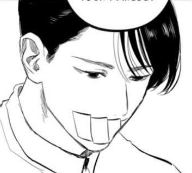
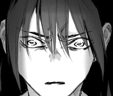
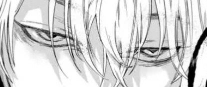
look the little guys a la episode 2-ish (i dont actually remember when i drew this oops)
also, have an incomplete timelapse that i took on accident while drawing it:
#this drawing is like a couple months old#hehe i like it though#should i take more timelapses of my drawings#jrwi wonderlust#jrwi runt#troy lougferd#blink jrwi#jrwi#juice’s art#i like how you can see the indecisiveness as im drawing the big runt#I erase and redraw it like three times lol
52 notes
·
View notes
Text
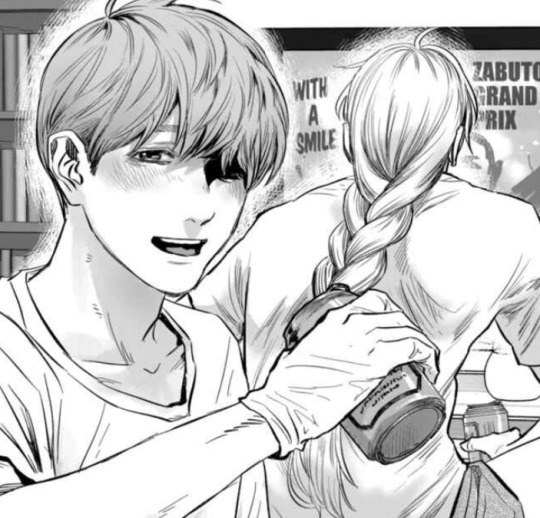
after god art style study --part 2
damn only 30 images per post
part one here!!
---
line art -------
the line texture of eno's art in after god looks like an analog g-pen. it's is clean but retains a pretty textured feel and in some points, line art hatching or sketchy lines are used form the lines. particularly, larger drawings that would have thicker lines have the appearance of being hatched which gives it a very cool depth too.
if you try looking carefully, especially for the thicker dot tips left at the ends of g-pens, you can see lines aren't always drawn in one clean stroke.
I think the feathering/chicken scratch art technique can be utilized to create these fluffy-looking thick lines. though you would need a good idea how to control your lineweight while doing it to be able to maintain a smooth looking output.
custom csp tools
I do think a couple reoccurring art assets seen are custom csp brushes/tools not on the csp asset store. browsing the csp asset store brings up nothing or I haven't searched far enough. the immediate most obvious one to me is the eldritch stringy things, it looks like a looping ribbon brush. there's no way she's redrawing that shit 23892093 times, neither would I want to do that LOL. there is enough warping in each stroke for me to believe it's not a flat image being copypasted.
sometimes I like to download assets to be able to breakdown how an artist created them to make my own so aw I can't really break down how it works. but I think it's impressive the tool is super seamless, I can't really tell where the eldritchy horrors begins or ends as it's so fluid.

I'm sort of guessing tokinaga's facial/finger/leg scar is also a custom asset.

haven't found anything for orokapi's scales either so there's chance it's a custom brush too.

hair -------
hair is very detailed. you can see where the hair grows from on the head. I don't really have much to comment there.
waka's hair is usually the most detailed, given the amount of freedom pure black ink gives- you can detail as much as you want without worrying about how it interacts with the line art.
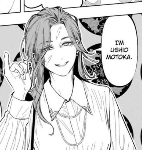
the extra thin strands is pretty consistent across all black-haired characters, like minami and yoriko. I don't think the extra thin strands are exclusive to waka just because she has long hair, since ushio and obikawa also have long hair but both have a lighter color.
hair typically overlaid over the eyes does fully obscure the eyes underneath. so if not careful, large patches of hair or certain hairstyles can entirely hide the eyes and may not be great if you need to show the eyebrows and to emphasize a character's expression.
a workaround to keep the lines for the eyes visible is to erase small bits here and there to give the illusion of strands of hair that you're able to see past at what's behind it.

for darker-haired characters- usually waka- some lighter gray is also added to her hair to show her eyes/face.
side profiles -------
the shape of the face is simple, but is much more defined than the typical cutesy moe animes with the tip of the nose to the chin usually being a flat single line. I appreciate the way the bottom lip is drawn and defined at certain angles.
I do really like the way the edge of the nose connects into the face. these side profiles give a super three-dimensional feel to the face, accentuated by the eyes

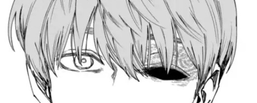
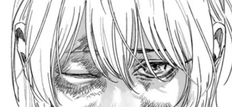
eyes -------
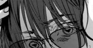
eno draws very pretty eyes hiiiiiiii
honestly I don't have a lot to say about the eyes. they stick on the end of semi-realism with the upper and lower eyelid being consistently drawn with circle irises. (that sounds obvious but some anime don't stick with circle irises or draw the lower eyelid)
a lot of feathering can typically be found around the eyes or makes up how the eyes are drawn. sometimes the eyelids are detailed in closer shots to really emphasize the 3d feel of the eyeball.
sometimes, the tearducts in the eyes are drawn.
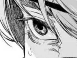

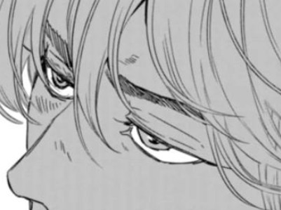
these eyes typically follow a consistent 5-line shape.
simpler eyes usually use 2-lines to make the shape.


most characters are not monolid and have an eyelid crease to help show the 3 dimensionality of the eye. very rarely the outer corner of the eye is not drawn with a connected line.
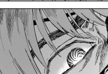
[fig below shows my study of the line strokes making up the shape of the eyes]

eyebrows -------
eyebrow detailing depends on the shot- if it's upclose to the face it will usually be more detailed with some hatched lines. otherwises they're typically a couple of lines. sometimes one or two "guidelines" can be seen for the top and bottom of the brow and the inside is hatched in.
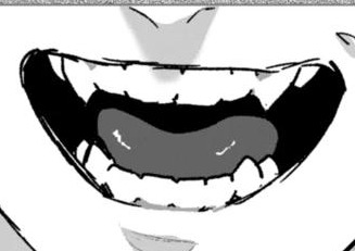
teeth -------
eno draws teeth
to be able to draw each individual tooth without it looking weird is skill. and depends on the art style, sometimes detailed teeth do not work for certain art styles (but that's not to say it's not impossible. if your goal is to make people feel uncanny with detailed ass teeth on a cute anime character, sure lol)
orokapi/obikawa's teeth do have prominent canines (snake) (lol) but other characters also have their molars slightly lined in. often, the teeth are not fully lined, where the main line art only shows defining the gums and the ends of each tooth.


coloring -------
after a while I did notice after god consistently uses gray to color tones. it isn't exclusively black and white with toning.
an 80 value or #CECECE is a good color to take from the study to use for manga shading.
I'm sort of guessing this may make the books cost more to print because gray ink is adds another expense.
application -------
and finally applying some of these details to my own art ✨
thanks for reading! hope this gave some cool insights into the art of after god :]
9 notes
·
View notes
Text

This is a drawing of three of my Ocs drinking milkshake... probably, Idk what are they talking about, wasn't thinking about that while drawing but the one in the middle is 100% writing a report about the property damage the other two had done.
Characters from left to right are:
Jane, Robert, and Man(placeholder)
About the making of the drawing:
Made with pencil and print paper (obviously) - fun fact on the other side of said printed paper is last term chemistry stuff -.
I got the idea of the drawing while searching for pose ideas on Pinterest, found a base and thought "perfect" unfortunately I didn't save it and now it's lost to time.
I have erased the faces of Jane and Man so many times that part of the paper was ruined and was unable to add any small or fine details - keep in mind that their faces are 1 cm long - so ended up using sticky notes to draw those parts, which had a nice feel to!
A little tip if you're stuck on something, the best thing to do is to let your brain take a break and come back to it later, who knows what would had happen if I kept erasing and redrawing their faces all night.
Added background elements so we know they're aren't talking in a void - very important 😔- prescriptive is little funky on that ngl.
in the end I really like it with all of its mistakes, this piece is my child now.
It has been difficult to sit down and work on anything digital since school has been taking a lot of my brain power - I just wanna sleep T_T -.
tell me what you think, I'm also open to criticism (beyond the fact that they are sitting on air lol, so sad I didn't realize that when I started now it's too late to change anything, I guess "didn't realize that" is the timeline we're stuck in now😔)
#traditional art#oc art#art#my art#Not Jane and Robert's butts literally floating lol#pencil and paper#pencil art#have a nice day#accidentally posted the draft#orignal work#vernal floret
3 notes
·
View notes
Photo


Emotions always running high
#Doodles#Vargas#Scriabin#Edgar#Miiverse#Blood#Not much this time - probably not as much as was actually in the chapter#Anyway that's a lot of fullbodies lol or nearly fullbodies - certainly more than usual#And mostly full style as well! Must be having an off day ♪#Most of these were spread out over the course of a couple pages so the thoughts are all over the place#The crosshatching for the first one was fun uwu I dunno why I decided to make him look so floaty with his coat partially off but eh#It was fun uwu#Then some Miiverse! Scriabin translates wonderfully to Miiverse ah I should draw him again there#For as much detail as he has he does silhouette well as long as I can scratch out his coat and the like#I just realized how Scriabin-heavy this one is lol well good I keep meaning to draw him#I really only have three settings - white angel wings - suit - or sweater with an optional scarf#Scriabin pulled the last this time around although it's not as though I haven't already drawn him in a sweater thus far lol#One whole Edgar! I erased and redraw that one so many times and I'm still not happy with it :'D#I had a pretty strong image of him getting angry at Jimmy while in the playground but I guess I waited a little too long to get it out#Also I couldn't be bothered to learn how to draw Jimmy :P Bastard doesn't deserve it so have a tiny sketch indicating where he would be lol#And back to Scriabin! Both of him in pain and curled up on himself#The last one was from the chapter where he was attacked and Edgar found him - he always looks so buggy lol#I was trying for curious and upset#He does at least look very small like that#Probably could've fanned his hair differently but I do like the big floof uwu
14 notes
·
View notes
Note
Do you have any tips on fighting art block, I haven’t drawn anything in a while and want to but don’t know what to draw
I have a few that I use yeah! First rule of thumb, The first two or three things you draw while trying to get out of artblock are most likely not going to become finished pieces, this is OKAY and ENCOURAGED, Think of it as warm-ups to ease yourself back into it! Artblock tends to happen because we set too many expectations upon ourselves or find a way to subconsciously wall ourselves off from drawing from anxiety, which also tends to block out all the ideas
Number one way, do some little warm-up exercises!
The first thing I always recommend to anyone is to draw some blobs! No really hear me out, pick an animal —personally I usually go for snakes or cats— and, if you’re on traditional do some contour lines and make some blob shapes, if you’re on digital set your brush size really high and make some blobs that look VAGUELY like your animal, than without doing any erasing, add some little details or eyes to make it look more like it’s animal, you can add to the shape— other colors, tails, ears etc— but the main rule of thumb here is NO ERASING, Filling up a sheet with them and making it simple helps you ease back into it and warms up your drawing muscles
Another one I recommend is grabbing a reference and just vaguely sketching it out, you’ll see this one repeated no matter who you ask about art block, some will say do gesture drawing, some will say do contour practice, honestly it’s whatever fits your bill. Practice some hands, doodle some random faces, grab an object and draw it in a stylized way, this doesn’t only help you practice but it can also give you some ideas for future projects, or to just turn the sketch into your favorite character lol
This one includes a little bit of mental prep but honestly? Save. Every. Sketch. Even if you make/look at it during artblock and say ‘wow I hate this’ you SAVE IT, your concepts are still good, your brain is just telling you that you can’t make it work, and yeah some of the sketches aren’t gonna be anywhere near pretty but that’s the POINT! You don’t have to work on one picture the entire time you can bounce between multiple depending on where you feel you’re most comfortable each day, and you don’t have to use every sketch as your basis but your concepts are what make your art yours, getting rid of it and only having the things that you’ve finished will give you unrealistic expectations to keep OUTSHINING them every time and set up more of a wall for yourself in the long run
This one’s a bit more specific but, character design! This is the one I use the most besides the blobs, make a creature! Grab a generator and fuse some animals together, make a fake pokemon outta it or make a new hybrid altogether, don’t worry about how realistic it is the important part of this one is the thought process, you don’t have to use it in the future you just need to make it for now, it definitely helps get your gears turning while still keeping it generally non-stressful. Grab a random mood board and make a character design out of it, take a theme (steampunk, robot, alien, clockmaker, etc) and apply it to something mundane, like coins,or pens, or book covers! Or, of course, fashion! Purposefully make the most deviantart neon edgy OC possible! Turn your main brain off and just have as much fun with it as you can, you don’t have to post it you don’t even have to show it to anyone else
A lot of artblock is about shifting your gears or changing perspectives of what you create to feel good about it again, like I said before a huge part of artblock is feeling like your art isn’t ‘good enough’ or feeling like you’ve run dry on ideas, or just pure unfiltered stress. The biggest thing you can do is to start small again, draw like a kid, don’t let your thoughts about anatomy or critiques stop you, and you’ll find yourself starting to warm back up to your own creations. At the end of the day if it’s just causing you a lot of stress trying to break through art block the best thing for you might be to actually step back and give yourself a break, and come back later.
The best part of art is you can literally do whatever you want, draw something cursed, redraw a meme, draw Frosty the snowman saying ‘fuck’, play with colors, draw something cute as scary as you can or vice versa, draw a mushroom, make up a new kind of animal or plant, draw yourself as if you were in your favorite media’s, the best way to go is to let go of all the ‘cringe culture’ mentality and just go as apeshit as possible

#I ended up talking more about artblock but I hope there are some good ideas in here for ya#look I love my blobs okay it’s how I warm up I like to use different colors#if anyone else wants to add onto this feel free!!!#I am by no means a professional artist after all I’m just vibing#robot rambles#art stuff#robot replies#long post
6 notes
·
View notes
Text
Agapanthus - Art Process! (Part One)
Lemme just say - Agapanthus is by far the most hardest track and art I’ve ever made. Like sleep was basically non-existent here-
Step One: Rough Draft
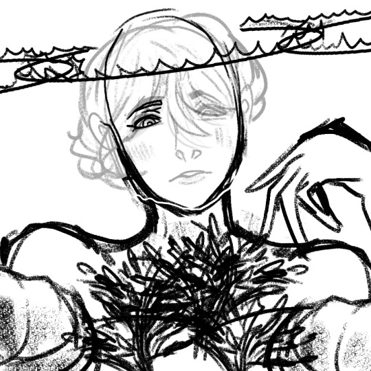
This was created on December 27th - around 4 days before the release of Agapanthus, I believe. However I’m not gonna lie, this is looking pretty horrible. I’m glad I didn’t even continue with this reference ( 。_。) .
I remember using myself as reference, but that wasn’t really working out. I really wanted Vil to have an intimidating look to him, and he’s just staring you down - underestimating MC/Yuu. But I realized...
That isn’t Vil. Vil isn’t like that at all, and it completely changed the idea about him. So I decided to change the expression and pose that Vil was making and start it all over instead.
Step Two (1): Rough Lineart + Cleanup (Head)
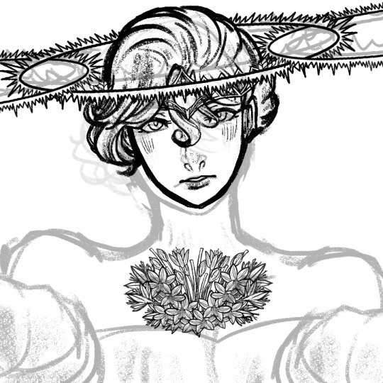
Okkkkkkkkkkkkkkkk....
I had to change and redraw a lot of the pose I was making! It was incredibly risky, but I had to do it anyways!
Just for you guys, I made sure to break it down a bit more so you can see what’s behind the scenes in more depth...
I did the head in the following order:
(1) Head
(2) Eyes, Nose, and Mouth
(3) Hair
*(4) Halos - Zwei (middle)
*(5) Einz (left), Drei (right)
(6) Crown - I used the crown from The Aphrodites and add it to his hair heheheh
(7) Agapanthus #1 - THIS ONE TOOK ME LIKE 6+ LAYERS TO DO LOL
*For Step 4 - I split the structure of the halo into two layers: A circle, and sharp pointy things before merging the layers together. I made sure to not let the pointy areas overlap with the circle. Lots of Control + Z was used here LOL
As for Step 5 the halos can be one or the other, I don’t know which one I started with at the time.
For his expression, I must admit that I don’t like it. It makes Vil look puzzled, or dumbfounded yet...a bit hopeful. But after seeing what happened to Step One, I decided to go along with it (:P).
< Note: For Step Two, I did the rough lineart -> cleanup for each part - so that’s why I merged Step Two and Three together. >
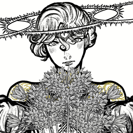
Step Two (2): Rough Lineart + Cleanup (Agapanthus AND Crocus)


OH HELP ME NOW LOL (˙ ͜ʟ˙ )
I’m sorry, this part was the most longest things I’ve ever taken when it comes to lineart. I’m sorry.
Seriously! This was one of the longest because it was not one flower, but a BOUQUET of flowers!!! I remember my back hurting a lot and didn’t getting enough sleep as a result...this took me 12 hours to finish just the bouquet alone.
Apologies for the detail below!!!
Note: For some information, I won’t go into detail since it’s impossible to see with the picture above due to the picture limit.
(1) Drawing the Flowers:
(1) Agapanthus (wide, inward, middle flowers)- This took about six layers to do the following:
(1.1) FLOWER (DRAFT) - Here, I drew the basics of its form and its shape. I drew a donut-like shape and short piece of the stem before doing the lineart.
(1.2) Flower (Lineart):
(1.2.1) Flower - Lineart - OPEN FLOWER: I did the five petal shaped flower first, then refined it to have a finished look.
(1.2.2) Flower - Lineart - CLOSED FLOWER
(1.2.3) Flower - Lineart - UNBLOOMED FLOWER
(1.2.4) Flower - Lineart - STEM STICKS (idk what to call it) - and that’s it!
(2) Crocus (outward, left and right flowers) - I have the full process of this, so here it is:
(2.1) FLOWER (DRAFT)- I made sure to do a rough outline of the shape so I could have an idea of what I was doing, and make sure the flower was proportionate to the track cover.
(2.2) FLOWER (LINEART) - This is where I drew the lineart and added detail for the petals and their design (at the same time).
(2.3) STEM (DRAFT) - Even though I don’t have it in the art file, I believed I did it to make sure it was proportionate to size of the flower.
(2.4) STEM + LEAVES - This is when I did the lineart and added the details (at the same time). I then did the leaves as an additional design.
(2.5) MERGE LAYER OF STEM + FLOWER- and it’s finished!
(2) Cleaning up the Flowers:
The cleanup took the longest, since you have to erase the details of the flowers that was overlapped. Took the longest out of the 12 hours.
(2.1) Agapanthus:
(2.1.1) AGAPANTHUS - MIDDLE OF PAINTING/CENTRE (one touching Vil’s face)
(2.1.2) AGAPANTHUS - MIDDLE/CENTRE: LEFT (touching Vil’s left shoulder)
(2.1.3) AGAPANTHUS - MIDDLE/CENTRE: RIGHT (touching Vil’s right shoulder)
(2.1.4) AGAPANTHUS - BOTTOM OF PAINTING: LEFT
(2.1.5) AGAPANTHUS - BOTTOM OF PAINTING: RIGHT
(2.2) Crocus:
(2.2.1) CROCUS - TOP LEFT
(2.2.2) CROCUS - TOP RIGHT
(2.2.3) CROCUS - BOTTOM LEFT
(2.2.4) BOTTOM RIGHT
Step Two (3): Rough Lineart + Cleanup (Upper Body)
As usual, I love the lineart more than the final product (˶′◡‵˶). Especially this lineart - it’s rather mesmerizing to me!
Even Vil without colour looks absolutely beautiful...I love him (I’m starting to stan him (kind of))
But anyways! Here is the order I did the body in:
(1) Head (already completed by then)
(2) Neck
(3) Neckish Shoulders (I don’t know what to call them - his toned necked muscles??? But it’s located around his neck)
*(4) Shoulders
*(5) Lower Body
*(6) Golden Details + Corset!
*For Number 4, I had to do multiple attempts because the shoulders weren’t proportionate to his body. I remembering 2 - 4 layers before choosing a final rough draft to work with.
As for Number 5, I also had to do multiple attempts as well because the original rough draft was not proportionate with the pose above. I did two rough drafts (I believe), but I don’t think I used them - I worked with the layer that looked the best.
For Number 6, the golden details were originally in black, but I used the Fill Tool and a bit of erasing and adding to give the final look above. I would say cleanup was the hardest thing for the details, since it heavily overlapped the Agapanthuses and Crocuses...
<>
Thank you for reading this whole post! A Part 2 will come out in the next few days, so please stay tuned.
ALSO THE CLEANUP FOR ME SUCKED LOLOLOL. I CAN REMEMBER THE PAIN (◎ܫ◎ ◎ܫ◎ ◎ܫ◎ ◎ܫ◎ ◎ܫ◎ ◎ܫ◎ ◎ܫ◎)-
Have a wonderful day you guys! :D!
#TWSTxDAL#TWSTxDAL art process#twisted wonderland#twst#date a live#pomefiore#vil schoenheit#twst vil#bruh this took me forever and a dayyyyy#I was kind of rushing on Vil but honestly he's looking MIGHTY FINE#plus it's 11 PM and I'm hoping for the best for my poor soul :)))#I'm gonna admit that Vil was a sTEP uP of my art process and my tracks#though the piece is a double sword for me - I love it and hate it (but love it)#anyways bye now! AND I'M SO SORRY FOR NOT UPLOADING ANY ORIGINAL CONTENT#it's just that work and school isn't working well...but luckily I'm getting a break!#...soon...
6 notes
·
View notes
Note
when you were first getting into art, what and how did you draw? (like did you just doodle ur masterpieces on pieces of paper and posted-notes or did you have a proper sketchbook) how did you find motivation? bc ive been trying to draw but I always get unmotivated and stop while still wanting to get better just by doing nothing.
REALLY LONG, LOTS OF ADVICES FOR ARTISTS :
TL;DR ; skip to the HOW TO ACTUALLY FUCKING DRAW part bc i have a megaton of shit to say lol + The MOTIVATION part
mmh… I’ll get into details with this one tbh bc it’s a long ass process ahah :
I live by the sea ; when i was youung i used to draw TONS of boat, but like, dollhouse boats, you could see the insides and stuff ; i loved to add tiny details and stuff, and imbricate everything together !
around 8 or 9 yo, i went to the public library with school and discovered the wonderful world of mangas ! I basically… Copy pasted an entire Mermaid Melody tome x)
For about 2 years i alternated between reading mangas and trying to copy them ! Then i just kept drawing in the margins of my schoolwork for about… 5 years ! I have a Fuck Ton of sketchbooks of that time, it was… The start. Lol. Never say it’s bad because it’s never bad, just not there yet !!
Around my 13 yo, i went every saturday, for two years, under a bookstore ; there was a cave, and drawing classes ; that teacher was mean and harsh and stuff, but like… Not really. He would take away my eraser for the class, force me to use pencil, to draw something else (bulky boys instead of magical girls).
I’ve learned a lot, more in terms of How To LEARN to draw than to draw itself, but i still progressed a LOT !!
Then i kept drawing by myself for a year and i really worked hard on it ; about hours a day, trying watercolors and stuff ; i have a real problem with colors in traditionnal art, but i’m much better with lines (i should scan some RAD stuff i made in the weekend, yall ive never done anything this good i stg i dont know why i always forget im so much better on paper)
This gets us to my sweet 16 ; i have to year of advance, bc i got ‘’’promoted’’’ idk how to say it ; anyways, i entered my (current) animation school for the first year at 16; vERY IMPRESSIVE AND TERRIFYING.
And i learned. A fuckmegaton. Of shit there.
Now i’m going for my third year there and i can make photorealistic marmora blades and cyberkpunk decors if i want to and that’s rad, but here is
HOW TO ACTUALLY FUCKING DRAW :
I have one HYPER important advice, and i’m keeping it to heart since i’m like, 11 : Have. Sketchbooks. Please !!! It’s very important. Here’s why :
You keep everything with you in one place. You have 1 sketchbook, it’s basically easy to take every where (a A5, or A4 are pretty easy to carry, i have like, 12 of those, and around 8 of A3)
You keep track of what you’ve done. It’s super important, bc first you can cry of laughter at your old stuff bc its cute but not so good, and second, you can just be like ‘holy mama’ and see how much you’ve improved
It’s very important to be organized. I WORK in art, and trust me, if there’s something that i’ve learned this year through tears and missing files and bugs : Be. Impeccable. Now if it’s for fun, go a little loose, and just have a folder for art on your computer, and a sketchbook, no need to stress, but the better you try to keep a record of where is what, the better you’ll see whats wrong
Notebooks are friends !! You can draw, write, glue stuff, make notes, lists, everything !!! I have my life in those. It’s more important to me than any of my phones.
Be proud of it. Like, not everything, duh ! But try to tell yourself than it’s like a RPG ; even if it’s only 2 xp here and there, one day you’ll beat level 40, and that’s super important : art is. Fuckin. Long.
I cant stress it enough. It’s soooo long !!! SO LONG !! it’s years. It’s like karate and fishing and ANYTHING. To be good at it, it takes time, but it WILL COME if you keep trying. There’s no secret passage.
You’re gonna me it, believe in me who believes in you.
Use. References.
Coming from a little shit who’s got a really good visual memory, that can sound like bs, but i stg everything is always AT LEAST twice as good if you’ve used a visual support.
I’m not saying COPY EVRYTHING (even though thats a good training) I’m saying, if you really want to do that asian tiger, please have at least two or three pictures of it nearby. Take photos of your hands, and stuff !
Make it harder.
No eraser.
Paint.
I draw all my backgrounds on my sketchbook with INDIAN INK; no returns, no refunds.
Ink, Ink, INK !! Don’t allow mistakes.
And if you make mistakes :
New page, restart
It’s okay
It’s for you
I once started back again a whole EXAM bc it was bad, i got one of my best grades
You’ll improve and be more assured if you know you just have to DO IT. Trust me. It’s VISIBLE; if you can erase, you fidget and hesitate and ‘’kbeujebez hahhaaa idkkidsd’’ ; stop ; do it, and if you don’t like it ? Try again, there’s no time limit
Draw as large as you can
There’s no interesting story here, it just helps. Bigger movement of the hand, more place for details, breathing lines
Thin lineart helps
Thinner. Make it even thinner
Break the rules, but not the ones that structure your art
Big lineart ? Why not
Unfinished lines, vaporeous colors ? Pretty
Cubism is actually based on extensive and intense practice of classical art, it’s not wibbly wooblly ; the anatomy is more correct than you think
Structure and composition are important, but so is movement and life ; choose your fighter ; mine is fluidity and fun, i’m like, a rogue/archer in drawing. Some people are dwarf fighter. That’s amazing and great.
Don’t be afraid to do nothing
Pages and pages of my sketchbooks are actually just lance facing right and smiling, you know…
Sometimes it just doesnt work : two ways :
Take a break, Kiki’s delivery service style
Keep trying, break your art until it obeys and comes back
Take breaks. Breath.
Don’t compare. I do it, it doesn’t help at all. You’ll make it ; and if you compare, keep in mind that everyone’s different
I’m not gonna lie, it’s NOT easy, it’s even hard
But I really, really think it’s worth it
MOTIVATION :
My main bitch
I’m always pumped for art because i can LITTERALLY NOT do anything else ; i love reading and writing and stuff but at the end of the day i just want !!! to draw !!!! aaaaaa-
Fall in love with it, and with the possibilities ; i have stories to tell, tell me yours ! Do your best, one day it WILL work
Actual advices :
I have an inspiration blog where i just reblogs stuff i like to draw them later
Find a picture, copy it. Do it again. Change the characters (i have 2 ocs and Lance and Keith as default characters) in the pic.
Like an artstyle ? Break it to its very core, analyse it, copy it, redo it, trace it and ABSORB it. Don’t copy/past, LEARN from your heroes.
Do what you like. I have 86578 pieces of voltron, this is not a coincidence. I have ENDLESS ideas for this show, wtf.
Try new things. Buy indian ink im begging you. It’s so cool.
Have a game with yourself, or a challenge. STICK TO IT.
Study. When you’re bored, usually it’s because you’re stagnating. Make it harder or do hands until you cry.
Love your backgrounds; make backgrounds, study trees, and tokyo streets, and venice’s bridges. Decor is just as cool as characters, if not more
Mess a little with everything. My roomate more than one found me stained from head to toes trying to DO STUFF
Draw outfits. Draw what you want but can’t afford
MAKE YOUR LIFE A COMIC. Remember those sketchbooks ? Make a comic a week/month/every full moon, whatever, and draw your life (mine’s the roomates au lol)
Prompts blogs are cool too
Make fanart of a fic you liked ; you have the characters and the pose already, you just have to illustrate ; double bonus, you probably will make a writer’s day, if not year !
That little movie that plays when you listen to your favorite song ? DRAW IT
Your favorite scene in your favorite movie ? Redraw each shot. On post it. Plus it looks awesome afterwards to have the infamous TREX scene of Jurassic Parks in post it
Get bored. That’s inevitable. Dance, scream, get back to it. Walk, draw everything you see.
Make a paper google map street view : Take a walk : every 50 meters, draw what is in front of you.
Snapchats your friends. Draw their snapchats when they answer
Draw maps. Invent places. Invent bikes, and hovercrafts, and monsters. Make your everyday inventory. Make your life a video game, and do the concept arts of it.
FETCH your inspiration. I have approx. 20 artbooks, full of drawings and concept arts of my fave movies/games ; take what you like and add it to the story you have since you’re 8. We all have one.
Ask for it ; your sis, your mom, me even ! If you dont have ideas, someone will have them.
WELL i’m gonna stop there, even though i got like, 9864567 more to say, but with this you should be fine ! Anon, i’m rooting for you ! we all start somewhere, just hold on!!!!
#Anon you'll do it !!!!!!!!!!#asked#artist advice#art#i put my heart in this omg#it's 1.5 K WORDS#wtf#but yeah#you just gotta do shit and mess around
91 notes
·
View notes
Photo


Here’s another late night post for ya XD While I was gone, I binge-watched the first three Jurassic Park films on DVD and it put me in the mood for some fanart, these were originally drawn on Sep 9
Don’t think I’ve ever emphasized just how much I fucking love this franchise and I might add that Muldoon is among my top favorite characters <3 Also threw in a random raptor doodle as a bonus (it’s specifically supposed to be Big One, the matriarch from the first film)
Not sure how Bob Peck would actually look in this pseudo-Tartakovsky style I’ve been using so I did my best lol Had to fix the jawline and nose a few times
Also, these are janky af because they were literally the first redraws of the rough sketch versions and I had to digitally erase the overlapping lines, but it’s pretty obvious these are WIPs so that shouldn’t matter too much
The Muldoon sketch is actually a full body pic but I cropped it because the rest looks kinda’ shitty at the moment lmao Also I completely suck at drawing guns and couldn’t even fit the whole thing onto the page (the tip is literally cut off just like it is in the cropped image)
Anyways, hope you enjoy for now XD I’ve been stuck on gem stuff so I’m not sure when I’ll get around to redoing this
Jurassic Park (c) Universal Studios
This drawn by Melinoe Kelapsi
Do not trace/color, reupload, or use in any way without permission. Comments/likes and reblogs are appreciated!
12 notes
·
View notes
Note
Please what do you use to animate and how do you animate? Please be detailed I'll read it all no matter how long, I really help ;-;)
OH UHMHELLOI’D LOVE TO HELPBut disclaimer: I’m merely an amateur beginning animator. And have been for like...4 years... I literally just started really getting into the swing of things a few days ago. I can offer you my unprofessional methods and how I do things but If you want any actual guided tips, I suggest asking my friend @lieutkennyThey’re a second year at SVA. So they have more technical experience than I do, and some things I tell you here might be the bane of all animator’s work ethic lmao.
My biggest advice is stop being lazy. To just jump into the frying pan. I never understood this when other artists said it, but now I do. Once you start animating your first thing and grasping basics, you really get a kick start on it. Things that took me like 2 hours to try and rough sketch before take me like 30 minutes or less to map out now
And those skills keep building the more you do!!!My second biggest advice is, if you’re not majoring in animation and already taking courses, watch videos. Get the information you need from sources. Don’t be lazy like me and try and wing it. Winging it is what makes the process 10 times longer and more unbearable. You’ll end up hating it lol. You’ll end up like me and animating 2 second gif once every 2 year s.For the life of me, I had no idea how to do a walk cycle without it looking terrible and awkward. So I looked up a video on youtube. This one is super helpful in breaking down a walk cycle to something way less intimidating than the results you’d find in google images and try to follow.As explained in the video, a basic walk cycle can be broken down from this jumbled mess

to firstContact

and SecondlyPassing

and then inebtween thoseDown pose (or recoil) after Contact

And Up Pose (high point) After passing!And then you essentially switch legs/arms for the sides.Or if you’re just practicing and doing the bare minimum, like I was, just do some erasing and redrawing for the legs and arms to show they’ve switched position rather than redraw the positions of them entirely.And there you have it; a basic walk cycle consisting of 8 frames (mine is at 8 fps)

Learning how to do a walk cycle will teach you some basics. Like the fact that even the most complicated cycles and animations can be broken down to just two key frames before you branch off to more. For Cycles, you go for the two poses that are the most distinct from each other. For an animated pose or gesture, you sketch the start and end first. And then after those, you sketch the position directly inbetween them. And once you have those three positions, the between frames are...usually custom depending on the artist and what they want to convey. I suggest looking up videos on timing, anticipation, etc. Or basically just watch something on the 12 principles of Animation. Alan Becker breaks them down into 12 3-5 minute videos, which is much easier to swallow than a 24 minute video on the matter. He has a condensed video of all of them together tho if that’s your style.
You gotta know where you’re going in order to get there. So when you want to animate something, figure out your start, and then your end. Draw those. And please god love yourself and don’t try starting out sketching detailed sketches. Start simple. Make it pretty later.
That’s all I can really offer you, from the mouth and hands of an amateur. You get a lot faster once you start learning the basics and cutting corners where it makes you comfortable. I guess start with walk cycles? That’s apparently the first thing they ask of you in class. Get real sick of em lmao. Pummel them until you can punch out a decent one in 30 minutes or less lol. It helps build confidence! Do different ones like slouches, peppy walks, or run cycles!Part 2 BoisProgramI use Clip Studio Executive. CSP ex is 220 bucks. But both CSP Pro and CSP Ex go on sale quite frequently!!! I bought Pro when it was like $15 bucks a few years ago, and I snagged a physical copy of Ex for 60 bucks when Smith Micro sold it off to Celsys and needed to get rid of their physical copies (it was 70% off at the time). But I digress;They’re both 50% off right now for the next 4 days if you guys are interested
You can only animate up to 25 frames in CSP Pro. But it’s good practice regardless. Ask your parents. Get commissions. Do what you gotta do. I personally really like csp because it’s basically?? An amalgam of Photoshop and Sai. It has the simplicity of Sai with most of the features Photoshop offers. So if PS is too complicated for you, I suggest that as a go to.That being said; I don’t know much about exploiting all of CSP’s features. I just know what I know. I’m a big “Wing It” kind of person lmao. So as far as animating in CSP goes, I suggest doing what I did and watching this very helpful video on the basics of doing so; It’s 24 minutes but- if I had to do it, so do you! I’m not very good at condensing that much info lol.Here’s what it looks like tho

It’samong the simpler of programs I’ve seen. It also makes coloring and separating the planes for multiple animations...really easy. But yeh watch that videoI hope this was helpful I’m absolutely terrible at explaining things;;;;;
8 notes
·
View notes
Photo
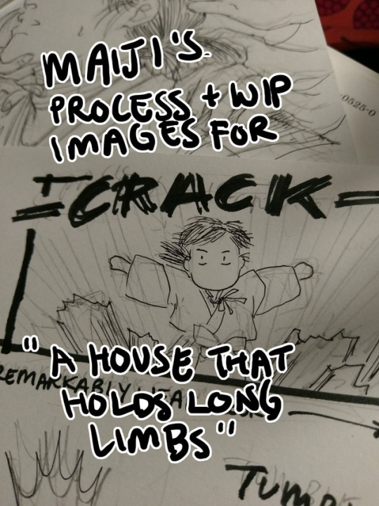
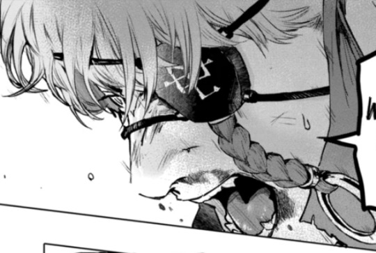
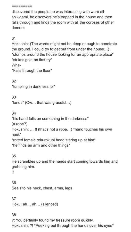
Process and wip images for A House That Holds Long Limbs (Part 4)
Previous process and wip documentation: Part 1 / Part 2 / Part 3
Read the pages for part 4 here (full complete version will be linked from YYH North Bound master post)
This is a rare glimpse into how I tackle action scenes!! It’s rare because I rarely do it. Action is honestly one of the hardest things for me to draw, and as I’m sure I’ve said here many times before, I have the utmost respect for shounen manga artists whose works are steeped in them. It’s a really impressive skill to be able to do it well - to create a cinematic, dynamic sense of motion that doesn’t dissolve into visual confusion and incomprehensibleness.
This was as interesting for me to document my thought process as it hopefully is for you to read and discover what the heck was going on in my head (a big honking mess, that’s what). There was much screaming and crying while working on this hahaha.
Aside from Hokushin’s beautiful face (lmao), Part 4 is packed with things I don’t usually draw. Specifically: action, things taking place in the dark, and corpses. For things taking place in the dark, I heavily referenced the dark room rounds from the tournament for Genkai’s successor in volume 4, because it involves action and Togashi used practically zero screentones in it and I didn’t want to either. For the dead rokurokubi, I looked up photos of skulls and drew on my memory of various horror comics I’ve read, like Kurosagi Corpse Delivery Service. (At one point I also googled photos of rotting skulls, but TBH I didn’t really want to spend a lot of time looking at detailed photographic references of corpse and decomposing bodies for obvious reasons, especially as I usually work on these comics late at night before I go to bed. The last thing I need is for images to get stuck in my brain when I’m sleeping.)
The rest of this post focuses mainly on action and redrawing things.
Script
The original script for this section actually ran a little further in the story than what’s shown here, but in order to convey the sequence effectively, I ended up stretching a number of key moments out and have booted the later ones to be completed for Part 5.
Thumbnails
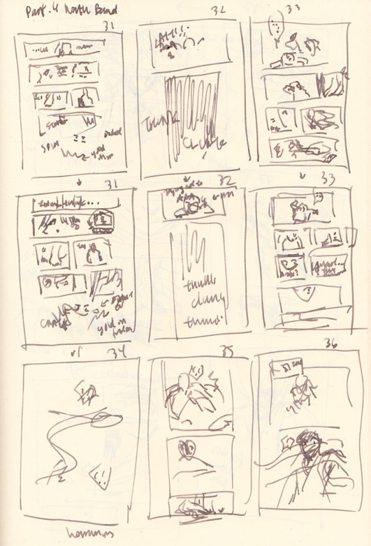
In the thumbnails above, you’ll notice quite a few are redraws of the same page as I struggle - pages 31-33 repeat immediately in the rows after, page 37 was attempted three times, etc.
Page count growth
A script of 8 pages turned into 10 pages at the thumbnail stage, and then ultimately netted out at 12 pages in the final version that was posted. As you can see, effective action sequences generally take me more pages than I think they will. With an exception (documented below).
Thumbnailing/storyboarding things out should theoretically minimize the page count creep! But because I tend to treat my thumbnails as such a loose stage (to avoid later disappointment when I can’t recreate it as nicely in the final page), I rush through them. Unfortunately, action sequences require me to think a lot more carefully through the scene as a director - staging the shot and the experience of the motion and coordinating people’s limbs and all the items in the scene more carefully and whatnot than, say, just a couple of heads talking. So inevitably, when I rush to get ahead to the finished pages, that’s when I realize it doesn’t flow as well as I was imagining (or not really imagining it).
As a result, the actual “live” pages turn into constant mental checks and runthroughs of the panels, realizing it’s not flowing as well as I’d like, and restarting. By restarting I mean mentally reenvisioning the sequence, sometimes quickly doodling alternate thumbnails (I didn’t bother in this case, so I have no alternate examples from after I started redrawing), and erasing and redrawing and adding pages. I guess I could probably avoid this if I just stop and put more time into thinking through the thumbnails… but it seems like I end up revising no matter what. So, constant juggling forever.
The evolution of the key action sequence
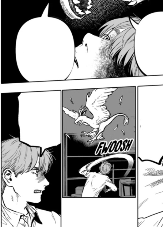
In my head, the main sequence was:
Hokushin lands.
He gets up and feels something in the dark.
He discovers the rokurokubi corpse.
He turns around to discover a swarm of hands in the dark!
Ahhh hands!! Ahhhh!!
Then he gets sealed and stringed up. End action sequence, back to people standing - or hanging out, I guess - and talking.
I roughed out my panels and pencils for all the pages following my thumbnails instead of doing one page at a time, because I’m impatient and also tend to think of all the pages as a wholistic narrative and then drilling down to the details on each page (big to small perspective).
As I went back over each page and detailing the base pencil art more, I began noticing more issues with the flow of the action and the pagination. Things started really shifting and changing at point 4. Here’s essentially how my thinking played out as I drew:
He turns around to discover a swarm of hands in the dark! - WAIT he just sees the corpse and then turns around? I should have him sense something is behind him first to get you more into his head and experience. OK, insert another panel of him sensing and whatever. THEN he can turn around. This is also good because I can erase the panel where he’s turning around and give the first panel a bit more room so I can draw more of his body in the first one and make his startled falling back motion a bit clearer.
HANDS!! AHHH HANDS!! - Wait, I have hands coming from BEHIND him and don’t effectively show that before they just appear to grab his hair. Which I suppose they do, but when I review panel flow it seems jarring, like a poorly directed cut and something was missing. Let’s try adding some hands behind him in the panel where he looks shocked. Never mind, this looks dumb and he looks dumb and basically seems even more like an afterthought. Ooh, better idea: let’s have him dodge the first wave of hands. That’ll be kinda cool and more interesting. And then he can land and be like OH SHIT MORE HANDS FROM EVERY DIRECTION
Ahhh hands!! Ahhhh!! - Hmm, maybe I should add a page here to better capture his dodge sequence. So the panels will be hands, dodge, and then the next page is he lands, then he realizes there are more hands behind him. How crouched down should he be? I guess in the later pages I basically drew him in a practically fully upright position… eh.. Working this out...
*starts drawing extra page* … Mmm, thinking about this again, no. It stretches things out too much. Now it feels like he lands, the new page adds an extra pause that could be interpreted unconsciously as he thinks he’s ok, then he gets attacked by hands from behind. But that’s ridiculous because he’s a rokurokubi, he KNOWS the hands can come back around or whatever, and he’s a good and cautious fighter, the extra pause doesn’t seem to fit. Thinking this through, basically I need it to feel faster - he lands (typed “he hands” there first time around haha), and he doesn’t have a chance to react again before it turns out hands are coming from all directions. So, I’ll keep it to the one original page and draw the reaction to the sound of the hands coming from everywhere. Done. (one of the few instances where I reduce page count in an action sequence)
Oh yeah, I forgot about his arms and legs getting sealed. Er, add another page. OK done.
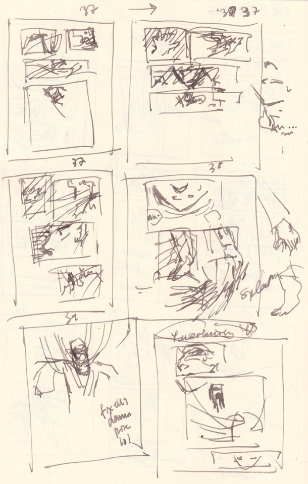
For comparison, below are photos of the pencils for pages 35 and 36 before the above process:
... and after:

Redraws
I generally try to avoid redrawing an entire image/page from scratch if I don’t have to. Even if I don’t like the overall drawing, I’m still terrified of effing up the parts that turned out OK the first time around. However, sometimes you gotta know when to cut your losses and start anew and save yourself time and grief (I’m definitely still learning how to know lol). I do have a few strategies to ease my mind - I often take photos of something before I proceed to the next step or change direction (which is where many of these wip photos come from). This helps calm me down because at least now I have a reference for what it was before I took the leap of faith to move forward. Another option is to just leave it and draw on a completely new blank page.
Page 37, where Hokushin is getting his head pulled back by the hands, was an incredibly rare instance of the pencils for a page turning out almost exactly how I wanted on the first try, so I was loathe to redraw or adjust it. This means I basically forced myself to shuffle things before and after to accommodate not having to change it.
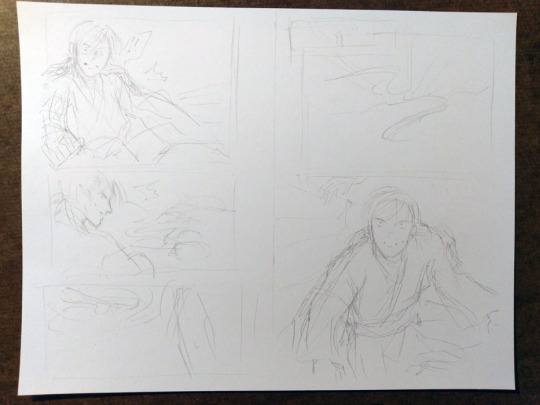
On the flipside, page 40, where the shot backs away so you can see Hokushin tied up with the hands, is one I full-on redrew from scratch. I was having a hard time with his pose and how all the hands were wrapped around him and how everything was actually working. I wasn’t happy with the drawing the first time around, but inked it anyways to see if I would like it better the next morning (sometimes this works, to wait and look at it with a distanced frame of mind). Spoiler, I didn’t lol. However, the process of inking the entire thing helped me better hone in on what parts I liked and didn’t like, so when I sketched it out again I was better able to adjust.
This photo shows the original (with the words REDRAW :/ at the bottom), a sketch I did trying to figure out his posture and where all the hands were/how the wrapping actually worked, and then the pencils of the redraw.

Final miscellaneous things
The end page of Part 4 is once again a last minute addition that resulted because I was facing a blank page (again!) after adding the page where Hokushin gets his arms and legs sealed. I changed the spoken line multiple times. First it was a line that’s been pushed to the upcoming part 5, then it was the “You certainly found my “treasure room” quickly” (that’s on the previous page). In the end, I just wrote a completely new line for it. It seemed to work better with the panel and closing off this part at a good point.
Last but not least, I somehow broke my pen inking this part lmao. Fortunately it’s a Muji pen so I only broke the tip off the cartridge somehow, probably in my intense scribbling/shading at some point. It’s not super clear in the photo but if you look closely at the point you’ll see this thin line coming out of the tip of the pen - it was this metal filament that basically scratched the paper without any ink coming out. I had to make an emergency run to two Mujis, neither of which had the black refills, so I ended up just buying two pens with similar thicknesses. Worst case scenario, I would have just inked with my blue cartridge, since the scanning would turn everything black and white anyways... the original pages would have just looked weird.

Phew! Hopefully it worked out and isn’t a totally incoherent mess!
#yu yu hakusho#comics#fanart#hokushin#wip#process#drawings#yyh north bound#art by maiji/mary huang#action sequences#redrawing#art supplies
5 notes
·
View notes
Note
Do you have a specific method for making sigils?
I do, yes. I’ve talked about it before - the old post can be found on @thesigilwitch [here] - but that is over two years old now, so I suppose I can update it, lol.
First, I come up with a statement of intent - a sentence that will dictate what my sigil does. All of my sigils are based off a sentence - I do not draw symbols without an intent or desire in mind, and if I do I don’t consider them sigils.
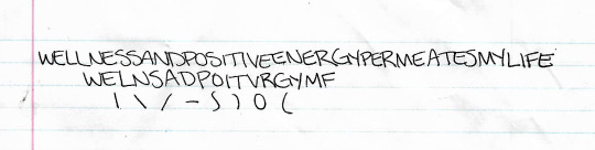
For an example intent, let’s go with “wellness and positive energy permeates my life.” This was a recent sigil I did, so I can give you examples of my steps.
I write that statement at the top of a piece of paper. I use all uppercase letters, because I think it adds more power, but that is a personal choice.
From there, I break down the statement, make it more abstract, by removing any duplicate letters. I only want one of each letter occurring in the sentence. Some people say to remove the vowels as well, but I like to keep them - it adds more variety to the shapes I can use when making my sigils. Thus, my intent of “wellness and positive energy permeates my life” ends up looking like “welnsadpoitvrgymf.” Try pronouncing that, lol.
The next step, for me at least, is to break down those letters further into their basic shapes. A W becomes \ / \ /, e would be | - - -, and so on. (Again, I always use uppercase letters when doing this.) This gives me more building blocks to create my sigils with, and more variety for their creation. I don’t like my sigils to look like a bunch of letters thrown together - I prefer it to be more abstract, and it is more visually appealing to me that way. When I break down the letters, I tend to only draw one of each shape, instead of all the individual lines and curves. So, doing that, “welnsadpoitvrgymf” becomes | \ / - ~ ) ◯ ( .
At this point, the top of my sigil sheet looks like this:
I often glance at that when I am actually sketching my sigils, to use it as a focus and help reinforce the intent in my mind.
Now that I have that done, I start sketching. Sometimes I use the pieces of the letters, sometimes I use the whole letters, sometimes I use neither and just wing it. There have even been cases where I combine some or all of those techniques for one sigil. It mostly comes down to what I “feel” the sigil needs. In certain cases, that means attempting new creation methods, which tend to be some I have found posted by others here on Tumblr. For the most part, however, I stick to my creation method, if it can even be called that lol.
However I decide to draw the sigil, I do a few sketches of different designs until I get one I like, which means it has to aesthetically appeal to me. Sometimes this happens in one sketch, sometimes it takes two or three (the average). I once filled two sides of a sheet of paper with like 16 sigils for the same intent, which took over an hour, and I still didn’t like any of them. I learned that it was important that the sigil looks good to you, because it connects it to you on a personal level - much the same way I believe it is important to like how a tarot deck looks. That may not be true for all, but it is true to me now.
The sketch page for the sigil “wellness and positive energy permeates my life” looked like this when I was done:

Generally, I don’t keep drawing after I find a design I like. I typically star the one I plan on keeping and using. I didn’t on this page; however, I went over the design a few times to solidify the lines exactly how I wanted them. The final design is the one on the top right, this one:

However, when I drew that particular design, I had the page flipped, so it technically should look like this:

As you can see, there are erase marks from where I tried lines out, but decided I didn’t like in the end. I don’t feel that has any impact on the sigil’s effectiveness.
The one right next to it was the first one I drew, and I almost went with that one as the final design, but I was concerned it looked too much like a very infamous racist symbol, so I passed on it. I was told it didn’t; however, since I had those negative connotations already in my mind and associated with that design, I felt it would be and for me to go with it in the end.
At that point, the sigil is ready to be used. However, I tend to make digital copies of my sigils, because I do post them online for other people’s use. This sigil was actually made for an intent suggested by a friend.
I either scan the page to upload my sigil, or I take a crappy picture with my cell phone and email it to myself. Either way, I get it on my computer and open it with Paint Tool SAI. From there, I redraw the sigil, which also adds another element of aesthetic to it, because I really enjoy how clean and sharp the sigils look when done with the line tool in SAI.
When the sigil is made digital, I tweak some of the lines a bit further to keep them looking exactly as I want, how I intended the design to look in the first place, even though it may not have come across so well on the page. I also like to play around with line thickness.
Mostly the sigils are made transparent, with a white glow around the edges for visibility purposes; sometimes I create simple color backgrounds with the color corresponding to the sigil’s intent. It depends on what I feel like doing with it.
When I post them online, they tend to get watermarks, if I can remember to do it. For a while they didn’t, because you can’t create text layers in SAI, but I have Photoshop back now, so I’ve begun utilizing the watermarks again.
The final version of this sigil ended up like this:

Now that I look at it again, the large curve needs fixing, lol.
And that is how I make my sigils! I dunno if I needed to go so in-depth, but here it is. I hope you made it all the way to the end, and I hope it helps you, or provides inspiration for your own method, or whatever. I don’t really know why you asked me this tbh. But you know, enjoy!
#sigils#sigil magic#sigil magick#witchcraft#witchblr#sigil creation#sigil tw#long post#richtors posts#anonymous#answered ask#ask
328 notes
·
View notes