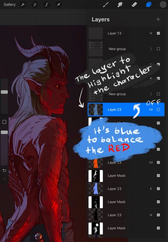
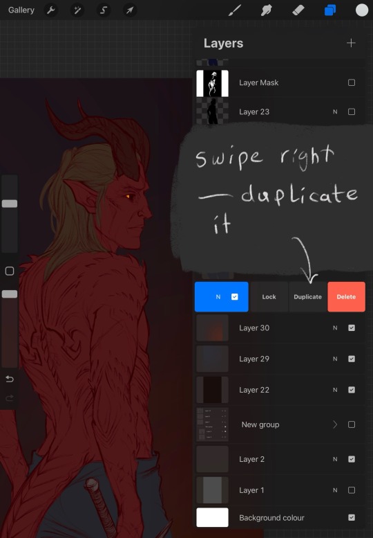
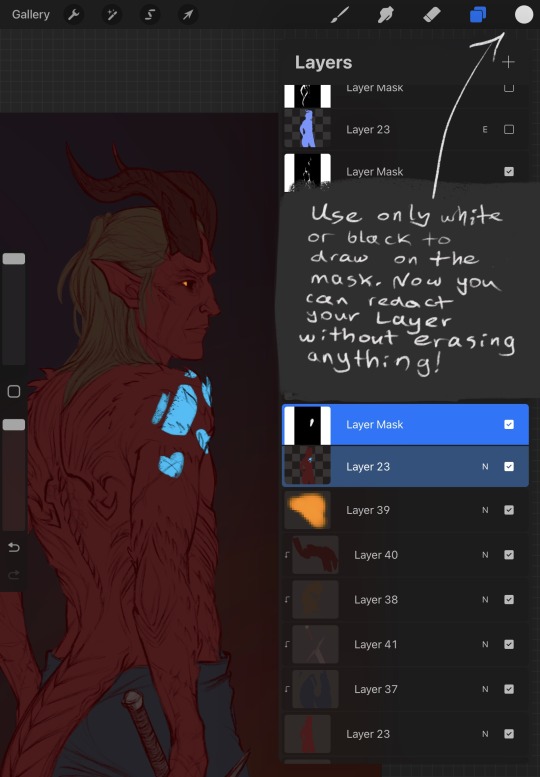
#I don’t like creating sketch layers
Explore tagged Tumblr posts
Visit Tumblr Blog
Explore Tumblr blogs with no restrictions, modern design and the best experience.
Last Seen Tumblr Blogs


Fun Fact
Tumblr has a 66 index score for customer satisfaction in the US.
Text
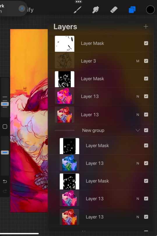
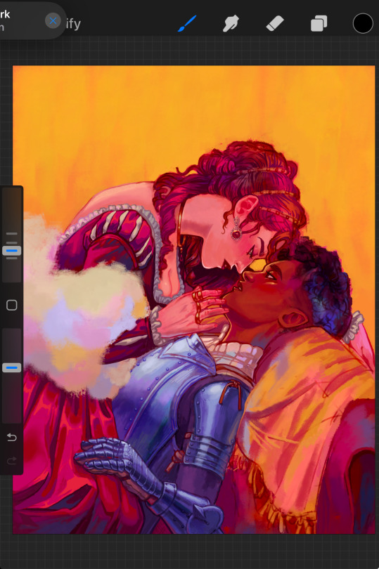
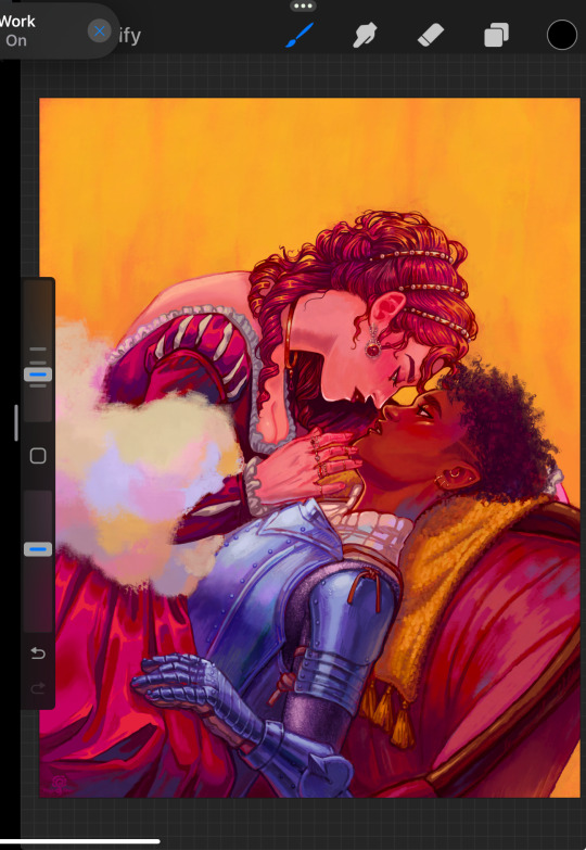
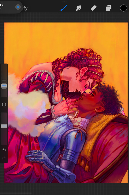
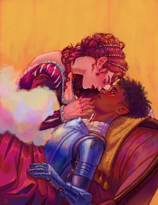
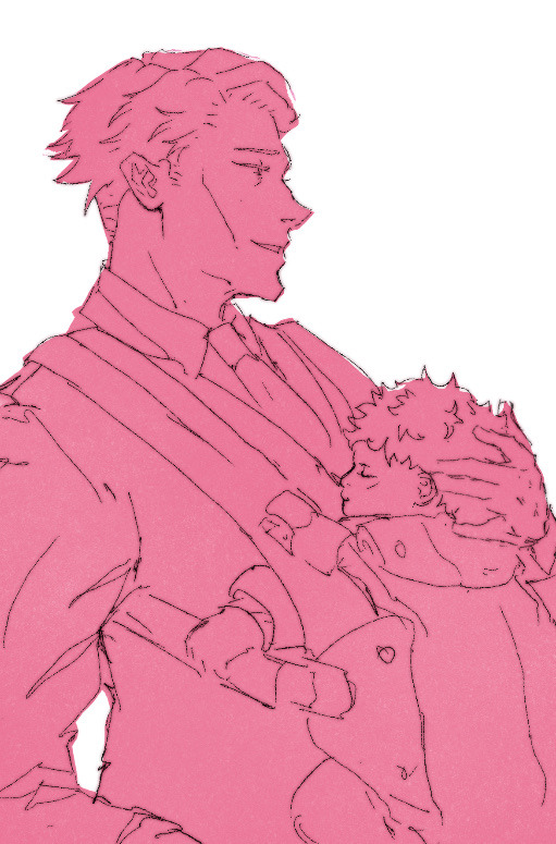
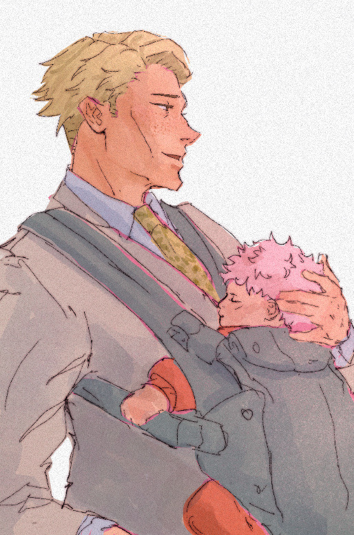
Heyyyy darling @oh-shtars I have finished your DTIYS!
You are in luck because I likely would not have finished this if I had not been struck with a drawing fever at 3am today
(It is currently 3:33am… a lovely time to be on Tumblr)
But nevertheless! Here is my take on your Ashueño meet cute!
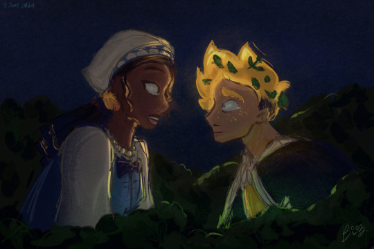
I actually coloured it! I used the reference colours for Sueño and sort of made the assumption that his hair was glowing. Bonus if you know what the other light source is
I tried to make Sueño as scared as possible, after all this is the third human he’s met, and the first two Mother Gothel’d him bad. He is terrified that she might do something to him. I just love brutally traumatized boys 😇
For Asha, I tried to make her expression more surprised and shocked than afraid. After all, she’s the servant to Magnifico and Amaya, and I’m sure she’s seen magic around. Plus… this weird, glowing young man was kind of cute. There’s no coloured sheet of her Act I outfit but I tried my best based off of the royal couple’s colours
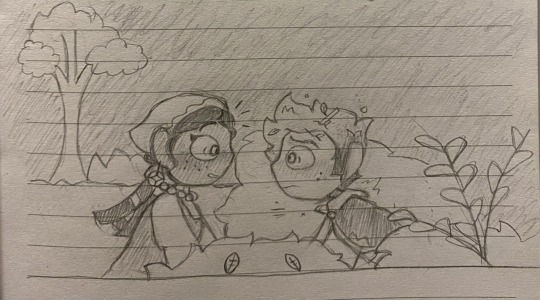
Original image and timelapse below the cut!
Fun fact, this was the first finished art piece I signed with my new name! I quite like it :3
#Btw Flicker#I did decide on a brush to use now#For the comics and miscellaneous art#Hopefully I’ll stick to it#But thank you! Working on this piece solidified it for me#Ahsjakhdksjd I haven’t coloured in a while so I’m really happy with how this turned out#Lineart isn’t my favourite thing so I just skipped it#I’m lazy and want to do things as fast as possible lol#I don’t like creating sketch layers#Just do it and hope for the best#This was a bit different though#And I enjoyed it!#disney wish#wish 2023#asha x star#star x asha#asha#human star#saph doodles#reach for the stars au#rfts au#dtiyschallenge
58 notes
·
View notes
Note
this may be too much to ask but do you have a tut on how to draw turtles in the mm style?? (or just at all my ass is suffering. i need to draw tmnt but my brain doesnt know how :c)
Sure ! I’ll try my best to explain (I made one after the first tottmnt trailer came out it’s outdated so I’m remaking it)
If you’re talking abt mm movie style , I don’t think I’m skillful on them enough to make an art tutorial 😭💔they’re hard for me to draw too
Info on keep reading :D !!
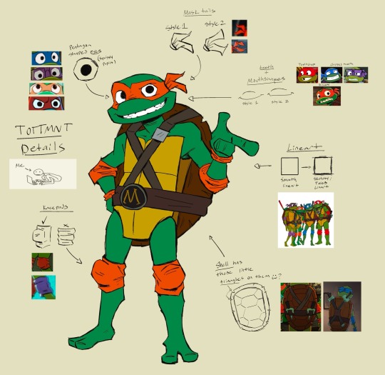
- I take hundreds of screenshots + download promo art and a create collage of it , use it as a ref sheet. I study on the shapes , proportions , and style of each character.
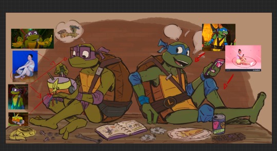
- Then I pick an image from the pile to see if it’s a good pose (if not, I find poses from other resources to draw) or expression I want to use as reference for my drawing
- then I start sketching , adding the sharp details . Clean up on lineart and color later
Other Notes :
- Tales of the TMNT artstyle uses sharp sketchy lines to give it that sketchbook artstyle
- In some frames from the show, Their eyes are pentagon shaped & pupils are not fully colored in. Mask tails have different styles too
- Each turtle not only have different headshapes , they have different plastron shapes too (these are fugly examples I accidentally deleted the OG layer of this and had to redo it LMAO)
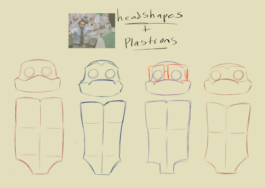
- Looking at Tales crew art also rlly helps! (There’s a lot of them on the #/talesofthetmnt tag on insta & twitter)
the Tales of the TMNT artstyle is easy to nail imo , it’s like more of a simpler version of the rise of the TMNT artstyle if that make sense ?? That’s how I personally feel lololol
If you never drawn TMNT before , just go slow on your art process , look at references, & take your time . Draw the characters in your own style first if you want :] just to feel more comfortable and less stress trying to replicate the iteration’s style . overall , have fun <3
I usually suckkk at these art tutorial stuff but hope this helps :D !!
#tales of the tmnt#mutant mayhem#my art#tmnt#if there’s anything specific ur still curious lmk and I’ll do my best to answer ‘:D
218 notes
·
View notes
Text
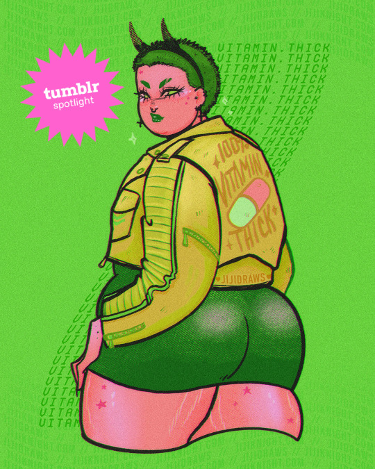
Creator Spotlight: @jijidraws
Jiji Knight is a latina pinup illustrator. Her work is overall geared toward thick ladies and dedicated to fat positivity out of a purely selfish need to create art she wished she had seen growing up. She often features sexy and soft macabre themes on vibrant or sweet colours and takes great joy in making folx feel good about themselves with her work. She holds a Bachelor of Fine Arts in Illustration and operates out of her very sunny hometown of Las Vegas.
Check out our interview with Jiji below!
Have you ever had an art block? If so, how did you overcome it?
Oh my gosh… I have art blocks all the time. My favorite way of overcoming it is by making fanart. Funnily enough, that’s something I don’t do in my own work anymore. But there are still IPs I return to that still bring joy to my heart. I love returning to drawing Sailor Moon like when I was in first grade. Or I’ll even look up the last fashion week and start drawing the fashion week outfits from the Paris or New York show. Stuff like that is what gets my creative juices flowing.
What medium have you always been intrigued by but would never use yourself?
Resin. Resin art is so stunning. People make the most amazing and beautiful sculptures using resin, and I don’t think I could ever bring myself to play with something so complicated. There are a lot of ways to cure it, and sometimes, it doesn’t cure properly…I already work with enough chaos as it is! I respect resin artists, but I don’t think I would ever touch it. I’ve admired it from a distance. There is an artist I follow who does these resin layer paintings. So they’ll paint a layer of resin, then cure it, and paint on top of the cured layer. They build up these amazing paintings using resin…I could never. Maybe one day!
What is one interaction you had with a fan of yours that has stuck with you over the years?
I still remember…It was my first and only Flame Con in New York. I had a fan come up to my booth. They didn’t say hello or that it was nice to meet me. They started to cry! They cried, and the first words out of their mouth were, “I’ve never seen myself in artwork before.” So, of course, I started to cry! So we were just crying across the table at each other. It was just one of the sweetest interactions, and it really sticks with me still to this day.
What is a recent creative project that you are proud of?
My latest collaboration with the artist Missupacey. We’ve been collaborating for two years now, and our last collaboration was for Midsummer Scream. It was two very cute clown girls, and I designed our T-shirt. It was one of the most fun projects we’ve done in a long time. We love doing collaborative work because it keeps working in the art industry fresh—being able to bounce ideas back and forth. So we do it where someone picks the color palette, and someone picks a theme. We’ll get references together, put them on a big board, and send each other sketches. It’s really nice to work with somebody else.
How has technology changed the way you approach your work?
Honestly, it changed everything. I mean, I used to draw for myself a lot. And while I still do that, I now predominantly draw for my Patrons. For a while, I was drawing for the internet. So I was drawing stuff people wanted to see in terms of plus-sized versions of characters—a plus-sized Poison Ivy or a plus-sized Sailor Moon. My Patrons have allowed me to start drawing for myself again. But technology, for a while, essentially dominated what direction I was taking with my art, so I’m grateful to take some of that power back.
If there is one thing that you want art enthusiasts to remember you by, what would it be?
Body positivity. I would love for them to remember that there is an artist making work that is making people feel good about themselves and about the way they look at themselves.
Top tips on setting up an Artist Alley booth?
Have a method of taking money, have a method of displaying your work, and have a way to take a break. I have a plastic picnic cover that costs like a dollar at any store. All I have to do is clip it to my display grates, and it covers up my entire display. I feel secure enough to take time for myself in a 10-hour workday to eat something, go to the restroom, or even take a moment to breathe and reorganize my inventory. So it’s so funny that this one-dollar piece of plastic is like the most life-saving item in my display of items.
Who on Tumblr inspires you and why?
@mayakern comes to mind. She is another body-positive artist who expanded into making body-positive clothing. She’s amazing, and just to see someone else out there promoting body positivity. Maya’s been doing it longer than I have, I believe. It feels good to know that I’m not alone. Her work is always stunning, and I love her body-positive DnD characters and the fact that she’s still plowing through the clothing industry. For example, she’s expanded from skirts to button-downs and even custom-wrap shirts. I love to see what she’s doing, and it inspires me to pursue different avenues with my own work.
Thank you so much for stopping by and sharing, Jiji! Be sure to check out their Tumblr blog over at @jijidraws.
1K notes
·
View notes
Note
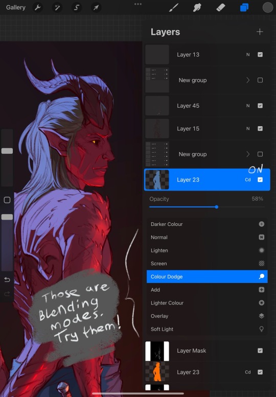
do you have any digital art advice?
pen stabilization is your friend!
experiment with different tools and brushes to find the ones that will suit your art style best
study different styles! it's a great way to improve and learn new techniques
remember to flip the canvas
don't be afraid to use references for poses and compositions
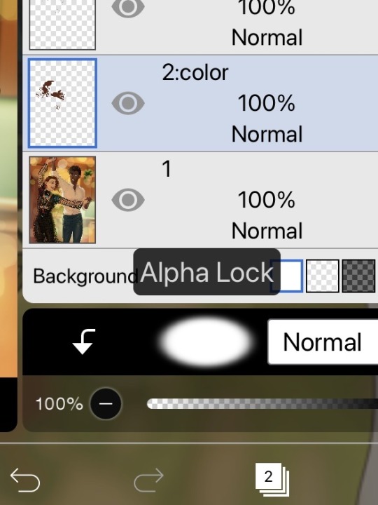
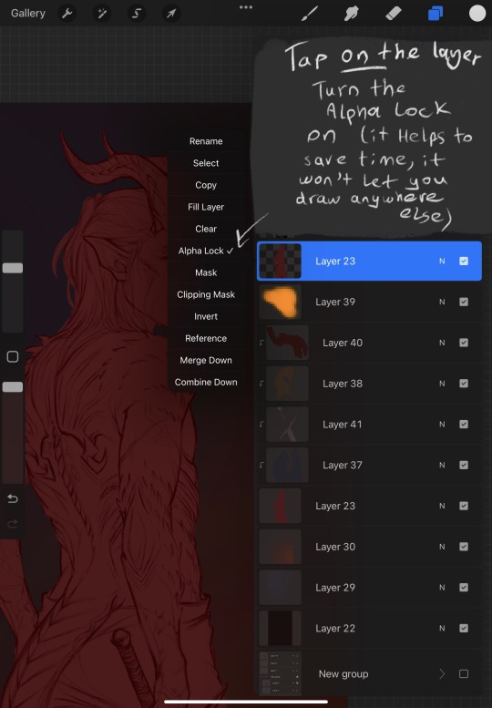
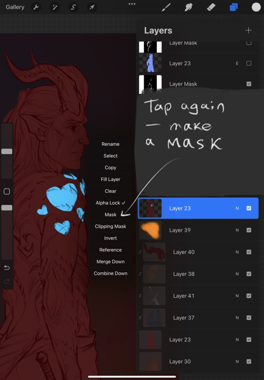
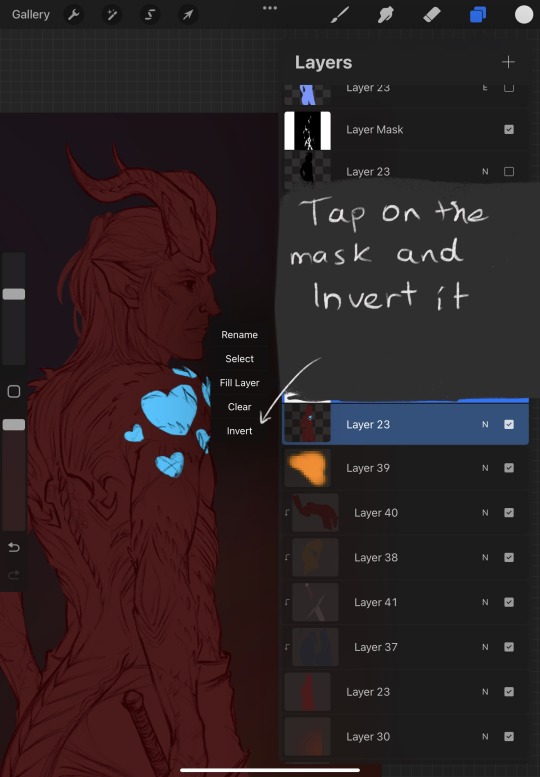
alpha lock on a layer will allow you to draw only inside what already exists on that layer, for example you can change the color of a lineart with it
clipping mask is also very useful
don’t use pure white as a background cause you’ll just strain your eyes
rgb mode is for screens, cmyk mode is for printing
blending modes are great to have fun with your drawing (you can use hard more/overlay to make your lineart/sketch layer blend in with the colors underneath, a layer with a color with soft mode on top of the drawing will add a nice tint to it and will help make the drawing more put together)
noise effect adds a nice texture to a drawing
you can also add paper textures!
REMEMBER to save your work regularly and make backup of your work so you won't lose it when program crashes
make mistakes and learn from them
don’t be afraid to redo something if it doesn’t feel right and start over
draw what YOU want and what makes YOU happy
and most importantly - have fun and experiment!
plus a general art advice if you decide to post any kind of art on the internet: try to not have any expectations so you won’t be disappointed. not sure if this is a good advice but the less you create something to do well with likes and shares the longer you stay away from artblock and constant burnout. it also helps with building the appreciation you have for your art from within you and not from the validation and approval of others (it's hard, I know, but it's worth working on)
286 notes
·
View notes
Text
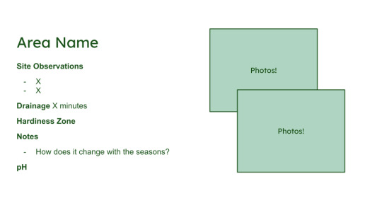
Create Your Own Soil Profile!
A garden’s soil is the base of all its growth, and knowing how to properly interact with your soil can make all the difference!
Step 1 Site Observations
Take a few photos of your site (project area)
Note down:
what vegetation is there?
is it near water?
the slope
approximate exposure to sun
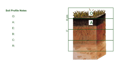
Step 2 Take a soil profile
Set out a tarp or a garbage bag
Dig a hole about 3 feet deep (you may want a friend’s help!)
Place that soil in piles onto the tarp, sorted into different soil layers
Remember horizons! (O, A, E, B, C, R(bedrock))
Make a sketch of a soil profile, and measure the depth of each horizon
The top of the profile should start with 0 cm
Refill the hole, and try to return each type of soil in order!
Step 3 Build your profile
Describe each layer of soil, moisture/structure/color/smell
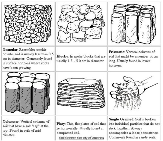
Use the “feel” method to take notes
Step 4 Drainage
Dig a hole 1 foot deep and 1 foot wide(ish)
Fill the hole with water and measure how long it takes to fully drain
An ideal time is around 10 to 30 minutes!
Note down the time
Keep in mind that even if the soil type would suit desert-like plants more, think of the weather. If it rains a good deal the drainage can matter less(or more!)
Step 5 Biological Activity
Bury a pair of cotton underwear(I know it’s silly)
Wait about 60 days
Unearth the undies, the more tattered they are the more activity there is!
Step 6 pH Testing
OSU Lab for Oregon, and many states have soil testing labs
Soil pH Meter
DIY Test
Step 7 Hardiness Zone
This just takes looking at a map!
Hardiness zones can tell you about the weather’s highs & lows in a particular area

USDA Plant Hardiness Map
And that 's it! It's a lot, and you don’t have to do everything. Each step can provide a better view of how to properly support your garden, and can be fun activities to do with friends and family!
I’ve included a template for a complete soil profile, but feel free to make them as fancy as y’all want!
Sincerely,
records of dirt
485 notes
·
View notes
Note
Regarding the clothes ask what style of clothes would you think everyone would naturally lean towards?
I’ll probably get to sketching them at some point but:
- Pomni leans towards a mix of casual and elegant, depending on what the event of the day calls for; if it’s a more casual day like hanging out in the bedrooms or going out to the carnival or lake, she opts for vivid primary colours (with purple accents to represent Kinger lol), shirts/sweaters with big puffy sleeves, comfy pants and butterfly shaped ribbons. She also sometimes just wears her jester hat as if it were hair bc she thinks it’s funny sometimes. When the day calls for something more elegant and regal, she likes to wear smoking suits, lots of dark purple fabric to accent red, blue and white accessories or pants, hair often styled into braids or buns. She gravitates more to feminine suits than dresses. She also has a liking towards leotards due to how freeing movements are.
- Kinger and Queenie are more traditional with regal aesthetics. Kinger’s wardrobe is more samey with frilly boleros, elegant corsets and waistcoats, fancy tight pants that are still good enough to run around in, even some knight armour thrown in sometimes, all in different shades of purple. Queenie’s wardrobe is full of various elegant dresses and smoking suits, more modern and complementary to her figure, a lot of florals, tight around the legs, as well as leotards to match Pomni, all in red. They both share lots of golden accents and accessories, and they both have some more casual clothes and gardening attire.
- Caine’s wardrobe is always growing, as he’s starting to learn a more casual style. He loves his basic red and yellow ringmaster look and the variations he has, but he enjoys cozier clothes on slower days. He likes sweaters, sweater vests, dress shirts, cardigans and slippers, he loves feeling cozy!! But he shares similar tastes to Kinger as well.
- I HC Ragatha as being a farm girl before she got sucked into TADC, so a lot of her outfits are very inspired by cottagecore and farmer’s girl outfits: flowy dresses, summer hats, floral shirt tied up into a crop top, the whole nine yards. She likes a lot of her outfits in pastel blues, covered in patchwork of all sorts.
- Jax likes 2000s casual fashion and streetwear. Think the skater boy next door: dirty sneakers, graphic tee over a long sleeve white shirt, baggy pants with chains on, beanies and necklaces. He also likes a lot of hoodies and sweatpants, all in purples, pinks and yellows.
- Gangle gives off big ballet girl vibes with a mix of Japanese subcultures. Oversized shirts to wear as dresses, jackets that look way too big on her, outfits akin to ballet attire, lots of ribbons and pastels mixed with neon colours. I also HC Gangle as genderfluid, bc I love how masc she looked in the Japanese TADC cafe advert, so I can see her in blockier clothes like her attire from that ad but still retaining that ballet/kawaii vibe. Also a fun fact about GM!Gangle’s outfits is that a lot of them are long pieces of ribbon that can attach to the back of her mask and wrap around her to form a more solid body and outfits, but she still wears regular clothing bc it’s not really warm only wearing ribbons.
- Zooble is a HUGE fan of scenecore aesthetics, as well as emo culture and maximalist fashion. Like with their Zooble parts, anything can go; they like to layer clothes, clash patterns, customise their parts with mementos from adventures, create hair-like extensions to wear on their head. They don’t have any colour preferences, they accept anything lol
#gamemaster kinger au#I love fashion so much aughhhhh💕#Pomni#Kinger#Caine#Queenie#Jax#Ragatha#Zooble#Gangle
112 notes
·
View notes
Note
hi! i love your art, it's such an inspiration! if it's alright to ask, how many layers do you use + how do you sort them? it's something i struggle with to keep from becoming disorganized
thanks! i do not use layers in a normal/organized way 90% of the time so i do not think my methodology will be hugely useful, but here you go
basically i have a sketch layer and if i ink the piece i have an inking layer. whichever i use for my lines is put on multiply.

then i do underpainting on 1 or more layers depending on how complex the piece is and how much color variation/manipulation i want to do. in this case, i used 4 layers for the basic underpainting

and then i merged all the underpainting into a single layer and made various adjusted versions of that layer (using curves, hue+saturation, and color balance) and masked them to only show where i wanted them to

after that i merge everything into one layer and just paint. but that doesn’t mean i only have one layer after this. as i reach certain milestones (ie painting the armor) or approach something i think will be difficult/that i might struggle with, i duplicate my single merged layer as a way to preserve progress states. there are a LOT of things i completely repainted or redrew in this piece and having these progress states was invaluable.


as part of this reworking stage, i may create a new layer on top to re-sketch a part of the piece i wasn’t happy with, which i will then mask out the unnecessary parts of later.

after i’m happy with where my painting is at, i’ll do a similar thing i did to my underpainting: duplicating and making multiple single-layer versions of my art so i can fiddle around adjusting each one and masking them to just affect the areas i want them to. i also usually end up using a couple adjustment layers like overlay.

and that’s it! it’s a pretty disorganized process and is not the sort of file i would turn in for professional work, but i don’t do client work anymore so i can do whatever i want and the only person who has to deal with my files is me lol
#art process#art tutorial#artists on tumblr#art#painting#digital painting#maya draws things#ask#process#tutorial
194 notes
·
View notes
Text
༉‧˚. MCLNG Editing Process ༉‧˚.
sooo, here’s the post of my hair editing process because i promised @madeby-meru to share my secrets haha
let’s get into it!!
~~~
• first step: i lower the opacity of the image so i can see everything, then i create a new layer, this will be the “sketch”, and i try to continue the hairline to look like it connects to the curls (i hope it makes sense lmao)

~~~
• step 2: i create another layer, this will be the “lineart” and i just redraw the sketch to look smoother

~~~
• step 3: i delete the sketch layer because we don’t need it anymore, and i create a third layer, this will be the base color of the hair, i usually pick the color that’s in the middle(?) (not too light, not too dark, you know what i mean lol) with the eyedrop tool and i color the whole thing


~~~
• step 4: when i finished the coloring and i see the original hair popping out places where it shouldn’t be, i just grab the liquify pen and drag it under the lineart and everything to disappear it

~~~
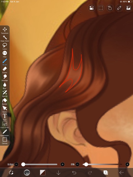
• step 5: i lock the “color” layer with the “alpha lock” and i just try to recreate the shadows and the highlights as the original. i don’t know the real secret but the easiest way is that you should draw the highlights first then add shadows towards the center of the highlights, leaving the edges out, making this kind of shape as you can see it in the picture
then i just add the details like piercings, earrings, tattoos etc. to look like me hahaha
~~~
aaand that’s it!!
i don’t know if yall understood anything about it, english isn’t my first language but i’m not even good at explaining in my own language either lmao😭 i hope it’ll help someone tho, thank you for reading!!<3
i’m using ibispaintx for every edit and artwork!!
#mcl#amordoce#amoursucre#cdm#corazondemelon#mclng#mycandylove#beemoov#mcl new gen#my candy love#my candy love new gen#amour sucre new gen#amour sucre#amor doce#corazón de melón#corazon de melon#edit#hair editing#drawing
65 notes
·
View notes
Text

One more training sketch (?) I mean this looks like a proper lineart but actually this is just a sketch that I thoroughly cleaned up without creating a new layer. I usually don’t do like this and prefer classic two steps of pencil-like rough sketch -> clean lineart, but this is an interesting new experience for me. I like this process, actually.
#team fortress 2#team fortress#team fortress fanart#tf2#tf2 fanart#scout tf2#soldier tf2#my art#artists on tumblr#character design
136 notes
·
View notes
Text
I wish writing programs had layers like drawing programs do. Like I need a sketch, refinement, and inking layer… but for writing.
I don’t want to have to create separate documents or rewrite something later on in the same doc. I want to be able to toggle these “layers” on and off and be able to quick reference the other versions of what I’m editing.
Then again I’ve mostly just used google docs so maybe this does exist somewhere.
Idk is this a desire anyone else has experienced? I don’t write that much so I guess it makes sense that I’d want writing software to be more like drawing software
#just yapping#writing troubles#idk is this anything#is this something that exists?#because if it does exist I’d like to know#writing hobby
89 notes
·
View notes
Text
Swampbound VI
For hours, Adla and Terry scoured every inch of the old house—digging through dusty boxes and creaky drawers, searching for the elusive book Terry insisted was there. Each uncovered item, every drawer opened, peeled back layers of a life she thought she understood. She couldn’t grasp why this book was so important, or what secrets it held, but Terry wasn’t giving much away.
"I'll know it when I see it," he kept muttering, his voice low and distant, like he was chasing ghosts only he could see.
“This don’t make a lick of sense,” she complained, surveying the chaos they’d created, the neat house now littered with overturned furniture and scattered papers. “My daddy was always a straight-laced man. Didn’t have time for no magic, no amulets, none of that mess. It’s not the man I knew.” She spoke with conviction, but the doubt was creeping in.
Terry, hunched over an old trunk, slammed its lid shut with a sigh. “Sayin’ that every five minutes ain’t gonna make it show up any quicker,” he muttered, frustration creeping into his voice but trying to keep it in check.
“No one's makin' you stay, Terry. You can go if you need to,” Adla said, her tone firm but not harsh, hands resting on her hips as her frustration simmered beneath the surface.
Terry paused, the heat in his voice fading. “I’m just worried about my cousin, alright? You gotta understand—I’m on edge.”
Adla could see it—just how much his cousin meant to him. Blood wasn’t the only thing that bound them; there was something deeper, a connection that, once lost, left scars that never truly healed.
“I get it,” she admitted softly, her anger dissipating.
She’d spent a year trying to bury her grief—moonshine, Jesse, keeping herself too busy to feel. But now, everything felt raw again. She missed her daddy fiercely, and the mess they were digging into only made that ache worse.
“I thought I knew him. Now... I’m not sure of anything anymore.”
Terry glanced up, his eyes carrying an edge of understanding. “Sometimes, we don’t know the people we love as well as we think.” Terry cast a sharp glance at the spot where he’d dropped an unconscious Jesse earlier, tension lingering in the thick, sticky air. Adla’s brow furrowed, suspicion flickering. “Are we still talkin’ about my daddy?”
Terry lifted his hands in mock surrender, but his eyes remained steady, almost too knowing. “Take it how you want.” There was something in the way he looked at her, as if he could see the secrets she hadn’t even admitted to herself.
She didn’t like it, that feeling of being exposed. Wanting to shift the focus, she asked, “Tell me more about Mike.”
Terry hesitated, like he was weighing whether to open that door. Then, finally, he spoke. “What do you wanna know?”
Adla’s fingers grazed the edges of an old photo she’d been staring at. “I know what he looks like. Burne showed me a sketch earlier. There was one of you, too.”
She traced the familiar lines of a picture of herself as a little girl, grinning ear to ear while struggling to hold up a fish too big for her tiny hands. Her daddy’s scrawled handwriting on the back read, Addy’s first fish.
“What was he like when he was little?”
Terry didn’t miss a beat. “Annoyin’,” he said with a deep chuckle. “That boy followed me everywhere. Always on my heels, tryin’ to do whatever I was doin’. Drove me crazy.” His laughter faded, turning softer. “Eventually, I figured out he was my best friend, whether I liked it or not—so I stopped fightin’ it.”
His smile reached his eyes, sincere in a way she hadn’t gotten to see yet. It was beautiful. “Yeah? What kinda trouble did y’all get into together?” she teased, her teeth flashing in a playful grin.
Terry was one of the finest men she’d ever laid eyes on, and from what she remembered, Mike wasn’t far behind. There had to have been plenty of girls flockin’ to them. But Terry’s answer carried a weight she hadn’t expected.
“Most of the trouble came from what we are,” he said, his tone shifting to something more serious. “Our daddies and uncles kept us close, didn’t want us gettin’ caught up with the wrong folks.”
It clicked for Adla then—the reason Terry and Mike were here. Burne wasn’t just some passing trouble.
“What you mean, ‘people like Burne’? You talkin' about white folks? The police?”
Terry’s expression hardened. “Police, hunters—ain't much different. Our ancestors shifted to survive; theirs survived retribution by huntin’ us. That hate runs deep, passed down just like everything else."
Adla could feel the tension rising and she wasn’t about to dig any deeper into that wound. Not yet. “So, you gonna tell me ‘bout this family heirloom now? Or maybe this book we’re never gonna find?” she pressed, trying to steer the conversation back to the present.
"You don’t give up easily, do you?"
"Wouldn't dream of it."
Terry’s grin was grim. “That necklace. It’s a lunar chain—a leash, for lack of a better word. Keeps us wolves in check. Wild wolves? That’s a disaster waitin’ to happen, even I can admit that.”
Adla raised an eyebrow, a teasing smile playing on her lips. “You don’t say.”
Terry laughed, a rich, genuine sound. “Yeah, I reckon I deserve that.”
She smirked. “You deserve more than that, I reckon.” She began ticking off his offenses on her fingers. “Property damage, breakin’ and enterin’, that little hostage stunt earlier… And now here I am, diggin’ through these dusty closets and messin’ with my allergies. All on account of you."
Terry smiled, knowing she was just messin’ with him. Still, he felt a twinge of guilt for turnin’ her world upside down. “What’s it gonna take to make it right?”
“You could do somethin' for me…” Terry set aside what he was doing and focused his attention on her. “…I need you to tell me the truth about Jesse.”
"It's best you hear it from him."
"I'm asking you, though," She pressed, but Terry shook his head. "I know you know what he is. It's written all over your face. I saw what he did earlier. Just tell me the truth."
“Ain't my place to talk about another man's business.”
Terry might not want to say anything, but she couldn’t just sit on the sidelines.
She thought about Jesse, his easy charm, his dimples, and the way he always seemed to know how to talk his way out of anything. But he was still Jesse—her best friend, the closest thing she had to family now. She owed it to herself—and to Jesse—to have a conversation, at the very least.
"Fine," she muttered, bending to rummage through another bag. "I’ll talk to him."
He watched her movements, noting how she tossed the bag aside with a bit more force than necessary and huffed under her breath. He stepped up behind her, resting his hands on her hips.
“Tell me what you remember about that necklace.”
She remembered the luster of the chain, a strange shimmer that must’ve been the magic woven into it. “It’s silver, always catching the light just right,” she mused, straightening up a little, hyper-aware of how warm he felt, standing so close behind her. “There’s symbols etched on the pendant.”
She turned her head slightly, glancing over her shoulder to meet his gaze. Her fingers instinctively traced the crescent moon and star tattooed on his arm, a gesture that lingered longer than she intended. “Your family’s crest, I reckon.”
Terry watched her, absorbing every word as if they were a balm for some deep-seated ache within him.
"I ain't never seen it myself. My daddy, and his daddy before him, they hadn't either. I always wondered what it looked like in person. Hoped I'd get to hold it in my own hands one day."
“You will,” she said, a surprising certainty in her voice. She caught glimpses of it—glinting in the soft light of a cramped room with concrete walls. Terry was there, Jesse too, but then it all faded to nothing. She was too scared to speak about it—the images swirling in her mind. Instead, she reached for Terry’s hand and held it in her own. “Having it—or even just seeing it—must feel like holding a piece of your history right in your hands.”
“Ain’t nothin’ more important than knowin’ where you come from,” he said, locking eyes with her, a strange intensity anchoring them both in the moment.
The weight of two restless nights hung over her; a yawn slipped from her lips, exhaustion pulling at her like a heavy quilt. If she wasn’t careful, she might entertain the ridiculous notion of curling up next to Terry Richmond. They were both aching for connection, and she could feel that energy stirring between them.
As the first rays of sunlight peaked over the horizon, her eyes burned with fatigue. “I’m 'bout brew some coffee. You want a cup?” she asked, her voice a soft murmur against the stillness.
“Nah,” he said, though he looked just as worn as she felt. Restlessness clung to him like a second skin, determination driving him on. “I’ll just keep lookin’ if that’s alright with you.”
“Go ahead,” she said, understanding his urgency. If she could’ve saved her father, there wasn’t anything she wouldn’t have done.
Adla paused to collect her thoughts as the coffee brewed. Even with Terry in the next room, his presence seemed to fill the whole house. She couldn’t shake the feeling of what it’d be like when she was alone again.
Pushing away from the counter after a few sips, she decided to check the loft. It was a cramped space she hadn’t touched in years, but with everything else in the house turned upside down and nothing to show for it, it wouldn’t hurt to take a look.
“I’m heading up there,” she called to Terry, nodding toward the ceiling as she passed the bedroom. Climbing the creaky ladder, she braced herself for whatever might be hidden in the dusty corners of the old house.
The summer heat clung to her skin, thick and suffocating, as she pushed aside boxes. Wiping the sweat from her brow, she felt an inner urge driving her forward, like a faint whisper nudging her to keep searching.
As she lifted the lid of another box, the familiar scent of aged paper and old wood enveloped her. Beneath yellowed newspaper clippings and faded family photos lay a worn, leather-bound book, its cracked cover and frayed edges revealing the touch of countless hands. She brushed the dust away with the back of her hand. It was heavier than it appeared, as if it contained more than just paper.
Hesitating for a moment, she slowly opened the book, feeling an invisible thread weave her past and present together. A page slipped loose from the worn book and fell into her lap. It was written in her father’s familiar hand, the strokes bold and deliberate.
To protect what’s left of our family, I had no choice. It’s a betrayal to the shifters, but I have to protect you from Burne. It may be selfish, but it’s necessary. You are supposed to be here, baby girl. When you’re ready, you can change things. I know you can.
Adla’s body trembled as she read on, skimming the words that would change everything.
She glanced back at the book, her sweaty palms barely managing to hold on. Symbols were inked into the margins of the book, odd drawings that seemed to pulse with a life of their own. Protection spells, moon phase rituals, and herbal remedies littered the pages. She continued flipping through the pages, her heart racing in her chest with each turn.
Pictures began swirling in her mind like leaves caught in a restless wind—she saw her father, warning her to be careful. Telling her that they’d see each other again one day—but he prayed it wouldn’t be soon. Jesse’s grandmother, with her hushed tones, whispering about the old ways and the forgotten magic that coursed through their town like a river, powerful and unforgiving.
It all felt too surreal, like trying to grasp something just beyond her reach, but what she was witnessing was beyond anything she could have ever imagined.
And then, there she was—her mother. Not the hazy, distant figure she’d clung to for comfort, but vibrant and alive in her memory, a beautiful vision that made Adla’s heart ache. Warm and inviting, like the embrace she’d yearned for all her life.
“Trust yourself, Adla,” she seemed to whisper. “Trust your instincts.”
Others came before her, people Adla had never known but whose voices echoed softly in her heart, offering wisdom in hushed tones. One woman, strikingly similar in looks, leaned in close, sharing a secret—something Adla desperately needed to hear. It was a truth she couldn’t reveal to Terry just yet—not with the stakes so high and their path forward clouded in uncertainty. Not when her own mind was still tangled up in it.
The truth hit her like a tidal wave: her family wasn’t just ordinary folk. Her father—he wasn’t the simple, practical man he pretended to be. Tears welled in her eyes as her vision blurred; he had known all along, carrying that heavy burden in silence.
A low creak pulled her from her reverie. Terry stood at the top of the loft stairs, his expression taut with tension. “You found it.” His voice was quiet, eyes drawn to the book cradled in her hands.
“My daddy gave the Chief the lunar chain to keep me safe. He threatened my daddy, sayin’ he knew he had it and better hand it over, or I’d be the one payin’ the price. We’ve got until the full moon to save Mike, or he won’t make it.”

Chapter 7.
@nayaesworld
@nahimjustfeelingit-writes
@sageispunk
@megamindsecretlair
@blowmymbackout
@kindofaintrovert
@avoidthings
@zillasvilla
@insidefeelingofanadult
@theereina
@slutsareteacherstoo
@babybratzmaraj
@senajaiaspeak
@princessmakipala
@writingsbytee
@planetblaque
@liquorlaughslove
@judymfmoody
@playgurlxoxo
@theescorpiolovechile
@keyaho
@gg-trini
@vivaalenaa
@li-da-savage
@ash-ketchumzzz
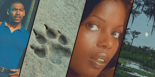
#AARON PIERRE#TERRY RICHMOND#TERRY RICHMOND X OC#TERRY RICHMOND X BLACK!OC#TERRY RICHMOND X BLACK OC#REBEL RIDGE#REBEL RIDGE FANFICTION
72 notes
·
View notes
Note
You use procreate right? I'm a beginner in coloring. And your lighting and color is always so good. If you had like steps/tutorial/tips on coloring/lighting in procreate. I would pay for it even. It's hard to find a good tutorial on YouTube for procreate users, and the style that you do which is similar to the coloring style I've been trying to self teach myself for a while and failing. Anyways sorry if this is a weird ask, but I would honestly really appreciate it
One speedpaint coming right up!
Nothing weird about this question. Honestly, I struggle a lot as well, but my problem is the shape, not the colors. I suppose I can "feel" colors, that's why impressionists are my favourite (classics always help!)
I don't know if I can help with using procreate, because I'm not really savvy with it, I always use photoshop for more complex work as it is perfect for twicking lighting, changing tint etc. I prefer to sketch in procreate, because, a) it has many great default brushes, b) my back hurts from sitting on my pc, c) I can go anywhere, draw and immediately post it.
I’ll try to summarise what I figured out with procreate, and maybe give a few tips. But I don’t know if that’s the best way to use this tool. I’m just… winging it, haha
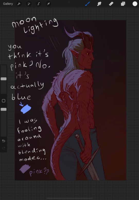
First, if you struggle with colors, look up the color circle
It shows exactly which color goes best with which. For example, if you use Orange for your lighting, and Blue for your shadows, it’ll look nice. Perfect, even. I love that one. Avoid using pure black for shadows, otherwise you risk to make it too… burned? Like, dirty. Be careful with Black magic.
I’ll use Zevlor here to show how it works.
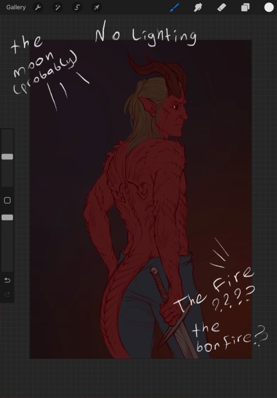
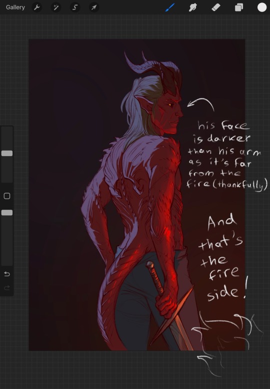
In addition, you can use the opposite color to make the character stand out. It’s really important. What’s more noticeable, red on brown or blue on brown?
Also, learn to use masks. Really, they may be scary, but it saves SO MUCH time. Specifically with procreate, I always use them now for everything because I haven’t found the better way to avoid fixing the stray lines. With that solution, you'll need to correct only one layer at the start, the main one. Clipping masks are great to help with that, but procreate is a little uncomfortable in that regard. I’ll show what I do, perhaps it’ll make things clearer
Those are the most useful things to know, I think. Masks can be used in photoshop in the same way, I have a bad habit of creating too many of them so it's crouded. And they rarely have a name. I'm too lazy to name them all
Anyway, I hope I managed to answer at least one of your questions... or not X) I tried. Good luck with exploring Procreate!
126 notes
·
View notes
Note
hey, how are you? i love your art! i am just learning how to use procreate, and i was wondering what brushes or canvas do you use to get the paper effect when you’re drawing? sorry, i hope you don’t mind me asking. thank you. ☺️
hehe well i’m gonna do a basic comprehensive tutorial on my drawing process and general guidelines i follow when doing art (hope you dont mind im using ur ask), i’ll start with my process first
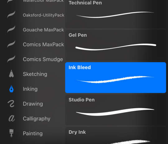
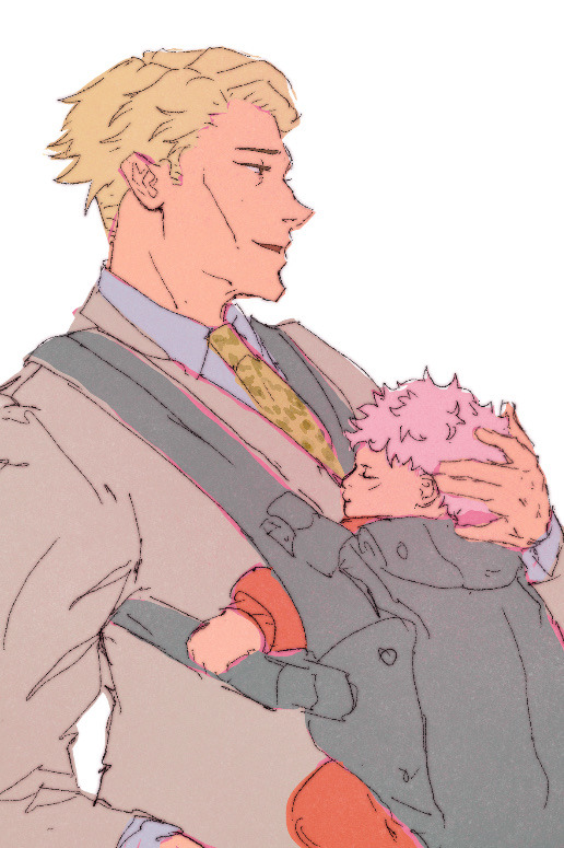
brushes i use:
lineart: “ink bleed” brush that comes preprogrammed in procreate
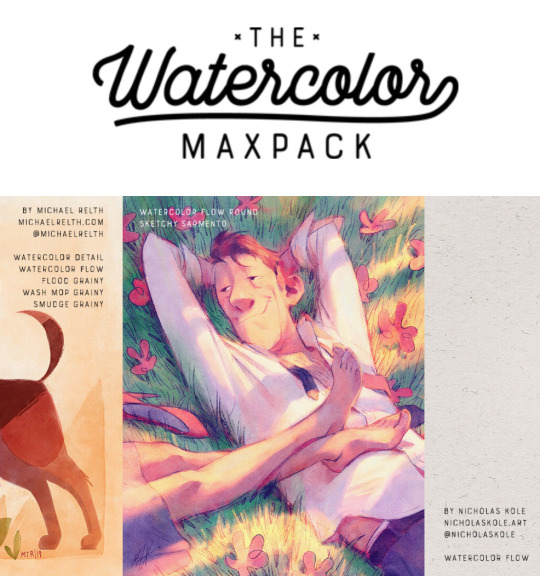
coloring/texture: maxpacks watercolor set (while in the pricy range, ive been using it for years and i think its a worthy investment, he also has sales occasionally)
for sketching: HB pencil that comes with procreate but you can use whatever
so my lineart, i typically duplicate my original layer, “color fill” the new layer with a dark red (or any dark color of ur choice), gaussian blur it @ 3% and set it to multiply and that just gives it some depth (for this piece i actually copied my dark red lineart and adjusted the opacity to make it a little darker so there’s 3 layers in total here)
now on to COLORING, i start off with a solid bright color (usually one that goes with the general palette you’d like to use, i wanted something warm so i went with a pink base)
create a new layer and thats where the colors come in, i typically do a rough estimate of the colors i want to use at this point, cause they can be adjusted later in the “color balance” setting under “adjustments” once you have your coloring done (this is all on one layer)
now my SECRET is i use the WASH GRAINY brush as an ERASER and lightly go over my color layer so the pink base comes through a little and unifies the colors and gives it that yummy texture. sometimes i erase the base color too for a little more texture but thats not necessary for every single drawing. once i erase enough, i go to “color balance” adjustment tool and mess with the hues till i get the result i want.
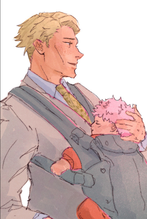
after that i create a multiply layer and with my WASH GRAINY brush i do shadows/face rendering. and with this piece specifically i did an add layer to simulate sunlight on them (i do extra layers at my own discretion, so have fun with it :)
as a final cherry on top i create another multiply layer, fill it with white and then set a noise filter on it @ 17% (dont ask why that number it just works for me lmao) and thats it!
if i need to clarify anything dont hesitate to ask! like i said we dont gatekeep here
and some general tips: dont over-articulate your drawing, cause i find the more i fuss with details the more stiff my drawings look, so i suggest being a little more loose with lineart/sketching and dont sweat the small stuff
same goes for coloring, the more simplistic your shapes are the more cohesive ur drawing will look
another coloring tip: if you’re having trouble with ur drawings looking “muddy” i recommend starting off with a black and white render so you can get a handle on your values before you worry about hue (i do this with my more rendered portraits but i find it helps you focus on the depth of your drawing)
63 notes
·
View notes
Text
#! — 𝐛𝐚𝐫𝐞 | hh
genre: smut, fluff
pairing: fem!reader x hyunjin
wc: 1.1k
warnings/ contents: established relationship, unprotexted sex, coming inside, breeding kink, mention of pregnancy, very very soft tho enjoyy <3
req!

"No wait... let's try it- without it today."
Your voice had been desperate, whining almost as Hyunjin had pried above you, ready to glove over the condom he had ripped open impatiently prior. Sweat lacing your bodies, dripping to create a pool of mutual wetness on sheets beneath you. Eyes glowing light in the dark of the room, stars on nightly sky, and breath left your mouths in huffs of apprehension. You laid with your hair a mess on Hyunjin's pillow, supporting your head, his scent all around lulling you into depths nothing but alluring. His touch on your skin an addicting one, his kiss on your flesh as passionate as ever — you'd swear your life to had died the moment his lips had clashed yours, had come back when they'd travelled down a path from your shoulder to your navel.
And then he had bent his body over your own and towards the nightstand beside his bed, clattered with pencils and unfinished sketches of your body, and had opened the top drawer to fish for a remaining condom — and your thoughts had short circuited. You wanted to feel him closer, in absence of layers separating your bodies. With no need of protection if passion utterly great coursed your very veins, if adoration and love was the sole thing you felt — you needed to feel him nearer, and you weren’t shy to let him know of it.
Hyunjin’s eyes doubled in size, halting in his movements when you had uttered the words. Blinking at you for seconds in disbelief before cheeks painted pink and eyes became hurried, mouth opening like fish in wish to say something. Only after cocking his head and huffing out in amusement he seemed to be ready, though.
“What if you—… you’ll get pregnant baby.”
Hyunjin’s voice quiet, scared and shy almost, though within it laid anticipation. Excitement, maybe, something deeper, possibly — his pupils blown out like you’ve never seen before, body nearly trembling above your own. Breath scattered momentarily and lips quivering — his whole screamed lust if anything, need and desperation. It got to you in an instant, infected your own being and your body heated up, felt like fire burning beneath your skin. Fire ignited by him, ignited by his fervour.
“I don’t care if I do, just need to feel you.”
Words hushed, spat out in manners quick because you were growing impatient. Your hands explored the expanse of Hyunjin’s body, hot fingertips against hotter skin, playing with the dips and highs of tummy and thighs. His flesh growing bumps with every touch of you, his eyes searching for a sign of nervousness, of discomfort in your face — he couldn’t find one. His excitement mimicking your own, your longing for nearer contact, for your bodies to feel as flush as ever mirroring his. Your touch electrifying his every muscle, his every nerve, occasional squeezing of his arms or shoulders daring to take his very last breath.
He lined up with your slit, shaking hands against your core and you felt his bare tip brush against your wetness — a sensation by it’s own, and you anticipated what was to come. You felt his precum against your cunt, felt his preparing sliding, his every curve when he entered you in nature more intense — your head threw back against his pillows, your back arching to have him deeper. A feeling you wished to bask in for as long as humanly possible, discarding any other need if this was the exchange.
Hyunjin’s state not better than yours, the man panting and hips stuttering against your body, your warmth engulfing him intoxicatingly, your voice in whines and sighs pure music to his ear. His hands found their place on your body at all times, travelling around or fixating on your hips, to stabilize himself or to keep you down, he wasn’t too sure. And he couldn’t take off his eyes; not from you nor from the point where your bodies collided, where they merged into a body of one, eyes fixed on your cores or your distorted face in sheer painful desperation. Your own eyes were closed, struggling to keep them open though if you did, Hyunjin was the only sight before you — his scrunched nose and agape mouth collecting sweat, his dyed hair falling in locks and messes framing his face. His eyes travelling up and down to meet yours or to watch his ever moving hips meet yours in a dance addicting. Occasionally his head lowered in exhaustion, and he never missed the opportunity to leave wet kisses on the expanse of your neck, or to whisper affirmations of love against the lobe of your ear — antics that only drove you closer to where you needed the two of you to be, closer to a state of mere insanity.
Stuttering hips and increasing volume of skin against skin and pathetic voices indicated said state was in arms reach, ready to grab and bask in for the rest of the night. Your nails dug into the skin of Hyunjin’s shoulders, leaving traces of crescent moons on the pale canvas. Locking eyes and whining out in unison, and Hyunjin managed to pant a question.
“You sure? I’m gonna cum baby, tell me you’re sure.”
Heart melting at his care, stomach throbbing at the building tension and the raspiness of his voice, the depth and emotion it carried. His gaze fixating yours and holding until a word of confirmation left your lips, your eyes rolling back in purified ecstasy, your body trembling against his. Your walls fluttered against him and Hyunjin’s head hung low, big palm finding your lower tummy before he reached his own orgasm, broken voice and shut eyes, groping hands and wanting gaze revealing that he’s been dreaming of this moment for a long time. That he’d been waiting for you to make a first move because he wouldn’t dare have the confidence to utter such wishes, that the satisfaction of being good for you got his heart pump more blood, that the feeling of his relief within you, the way it oozed out against the sides of your cunt was everything he’d ever wanted — that the very thought of said relief would turn your belly round got Hyunjin lightheaded. You would tease him later on, when he had long pulled out to watch the white pool at your slit, when he had cleaned you up and laid beside for you to rest atop his chest — you would tease him knowing well of the look in his eyes, of the hidden wish for this one time to be enough, for his seed to put down roots. And maybe it was your unsaid wish, too.
@etherealeeknow @linoskitty @unexceptional-h @rseanne @es-kay-zee @urcracksisx @jeyelleohe @yunkiwii @etheralsung @nyrasneedy @seochhj @spidercomics @chans-starlight @angelwonie @lix-ables @yvniek4ng @ppiri-bahng @sstarryreads @svintsandghosts @bokjaz @llunapastell @sensitiveandhungry @minniesvenus
#hyunjin imagines#hyunjin smut#hyunjin x reader#hyunjin scenarios#hwang hyunjin smut#skz scenarios#skz smut#skz imagines#skz x reader#stray kids scenarios#stray kids imagines#stray kids x reader#stray kids smut
759 notes
·
View notes
Note
Hello! I saw you were taking asks about anything (with bonus pictures of Mr. Haku?? bless) so I was wondering if I could politely pick your brain about your illustrative process. I've been tearing my hair out over rendering practice lately and your studies always blow me away. I know you've had some training and I think we both use Procreate, so I'd love to hear about how you use layers and/or layer blend modes, but also general process, thoughts, tips, etc. hope you're well, have a nice day :-)
Thank you so much for the ask and kind words!
I don’t cross promote it as much as I should probably but I upload a lot of speedpaints to YouTube, such as this study that might be helpful. Depending on how complicated the piece is, I’ll either break it down by putting shapes down (typically darks first) or do a more formal sketch if I don’t think I can easily eyeball it. After the sketch, I do an under painting on a layer below the sketch, set the sketch to multiply and then I render everything on one layer. It really depends on the brushes you use, but I prefer to build opacity slowly with a brush that doesn’t blend, lowering and upping the brushes opacity as I see fit. This creates a more complicated, kind of glowy effect that I think works particularly well for skin rendering.
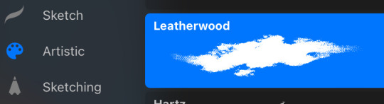
I’ve been exclusively using leatherwood under “artistic” in procreate recently. You have to use a pretty big canvas to make it work (I’m usually working on 8000px+ 300dpi) but I really enjoy some of the unpredictability of the brush, makes things feel more natural. Not sure if I altered the brush at all but if there was a multiply or stabilization on I turn those off always, basically.
As for layer modes, I don’t tend to use them a ton for paintings except maybe for maybe throwing a slight multiply layer to bring tones down if the key gets too high. I’m more likely to mess with curves and color balance to experiment with color. I do this especially for my lined illustrations, I use layer modes also for them too and just go to town trying a bunch of stuff. My tip for this is to duplicate your file, flatten everything, duplicate your flattened layer and just mess with it until it feels right. Color editing to this degree is kind of new to me, but since I’ve begun it’s really upped my game I think.
Before/after color editing. I know sometimes people think of this as a cheating tool in digital art but honestly that is a silly take to me.
I hope this answers some of your more specific questions. Thank you again!
This post is already long as shit so Mr. Haku under the cut
25 notes
·
View notes
Text
Hidden Notes (mk.l)

001. Welcome
The apartment was smaller than Y/n had imagined.
The kind of small that made you question if you’d measured your furniture correctly or if you’d need to get rid of half your belongings just to make it livable. It had the unmistakable feel of a place that had been lived in before, maybe even loved at some point, though time had worn it down.
The wooden floors creaked with every step, the kind of creak that no amount of rugs could ever disguise. The ceiling had faint water stains and patches of peeling paint, as though it had weathered more than just the years. The walls, bare and slightly scuffed, seemed to echo her footsteps in welcome, as though they recognized that someone new had arrived.
It wasn’t perfect—far from it—but it was hers. And that was what mattered.
Y/n set the last box down on the floor with a thud, groaning softly as she wiped the sweat from her forehead with the back of her hand.
The sunlight streamed through the lone window, scattering warm, golden streaks across the room. It wasn’t much light, but it was enough to give the space a fleeting charm, enough to make the imperfections seem like they might be endearing someday. She let her eyes wander over the empty room, letting her mind play with possibilities. She could see where the couch would go, the corner where she’d create a reading nook, and the walls where she’d hang her art.
For now, though, all she could do was sigh and start unpacking. The process was slow, almost meditative. She moved carefully, as though unpacking her belongings might also help her unpack her thoughts. String lights came out first, hung in an uneven line along the wall closest to the window. They weren’t perfect, but they made the room feel warmer already.
Next came a stack of books, which she set neatly in a corner that she mentally marked as the future home of a bookshelf she didn’t yet own. One box, labeled “Kitchen Stuff,” sat untouched in a far corner. Cooking could wait. Right now, all that mattered was making the space feel less like an empty shell and more like her own.
As she shuffled around, placing things here and there, something caught her attention. Near one of the corners of the room, a piece of wallpaper was peeling away from the wall. It wasn’t unusual—this place clearly hadn’t seen a renovation in years—but something about it felt like an invitation.
Curiosity piqued, Y/n knelt down and gave the edge a gentle tug. To her surprise, the wallpaper peeled off easily, almost like it had been waiting for her to do it. Beneath it was a layer of cracked plaster, but her eyes were drawn to something else—a small object wedged in the narrow gap between the plaster and the wall.
“What the…fuck?”
She reached out, carefully pulling it free. It was a bundle of papers, yellowed with age and tied with a faded red ribbon. The edges were frayed, and the ribbon looked like it might disintegrate if she pulled too hard. Her first instinct was to leave it alone, but curiosity quickly won over caution. Slowly, she untied the ribbon, her fingers trembling slightly as she unfolded the top sheet.
The handwriting was uneven, like it had been scrawled in a hurry, but it was still legible. The words stopped her in her tracks:
"I don’t know where this path will take me, but I have to try. Maybe these words will find someone who understands."
A chill ran down her spine. She read the sentence again, letting the weight of the words sink in. It felt oddly personal, as though the writer had intended for someone—anyone—to discover it one day.
She flipped through the rest of the pages, each one filled with fragments of thoughts and sketches. There were rough, unfinished verses that could’ve been song lyrics or poems, all of them circling themes of escape, longing, and hope.
Some pages had small, hurried sketches of landscapes she didn’t recognize—mountains, winding roads, a lighthouse standing alone against a dark sky. Others were filled with notes that seemed like reminders to the writer themselves, scribbled lines like “Keep going” or “It’s never too late to start over.”
One page, in particular, stood out to her. Written in bold, deliberate handwriting were the words:
"Even in darkness, light finds a way."
For reasons she couldn’t quite explain, those words hit her deeply. They carried a strange kind of weight, like they were meant for her at this very moment. She looked around the apartment again, taking in the cracks, the creaks, the imperfections. It no longer felt like an empty, lifeless space. Someone had lived here. Someone had left a piece of themselves behind.
“Who were you?” she murmured to the silent room, her voice barely above a whisper.
Carefully, she folded the papers and set them on the kitchen counter. She’d come back to them later, she decided. For now, she had a new task. The wall where she’d peeled back the wallpaper needed fresh paint, and the apartment needed something else—new energy, life, a fresh start.
As she moved through the space, picking up supplies and envisioning her next steps, a question lingered at the back of her mind.
Who had written those words? And why had they hidden them here, waiting to be found?
She glanced at the papers again, feeling an odd connection to whoever had left them behind. The apartment, small and imperfect as it was, no longer felt like just a place to live. It felt like it had a story—one she was now a part of. And for the first time since she’d stepped through the door, Y/n didn’t feel so alone.

next // masterlist
taglist: @thegracerammy @kittydollzz
credits: @strangergraphics (dividers)
#mark imagines#lee mark#marklee#mark#mark lee#nct#nct127#nctdream#nctimagines#nct mark#mark lee imagines#nct127 mark#nct dream mark#mark nct dream#7d#7dream#dreamscape
23 notes
·
View notes