#I definitely think he needs a redesign
Explore tagged Tumblr posts
Text
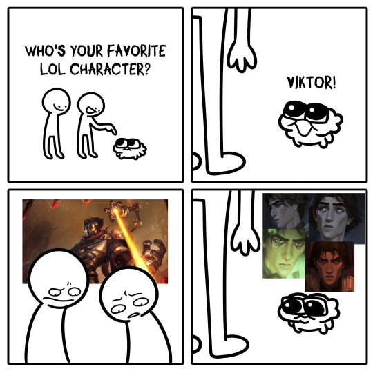
#viktor#viktor arcane#arcane#vitya arcane#I have to tell you that I respect his original design#But I also never paid much attention to him before Arcane#I definitely think he needs a redesign
2K notes
·
View notes
Text
I should bring back Lucas.... balance out the "crazy person who happens to be trans" with a transmasc, maybe put him into the fantasy universe
here's some old art stuff of him and Caleb


basically the way it goes is that they're super tight as teenagers... but eventually drift apart for whatever reason, and Lucas ends up transitioning in that time. they end up remeeting when they're older and Caleb doesn't recognize him, but he definitely recognizes Caleb and he is CRAZY about him. also older Lucas is a successful pilot
#oc ramblings#im thinking they definitely need a redesign. esp younger lucas that's him BEFORE transitioning and i do not think he looks like that#unless he's like.. binding#but still i want to redesign them#also i wanna make oldee them older so it can be trans boy old man yaoi#*older
4 notes
·
View notes
Text
SEASON 6 ILLUSTRHATER THOUGHTS
honestly, I was expecting the animation to be more jarring for me than it actually was. It was actually really easy for me to get into and tbh just looks really nice. Adrien is the character I'll need to get used to the most, but I like his look fine, I just need to get used to it.
But like. special shoutout to nino. NINO????? NINO LOOKS. SO FUCKING CUTE. I love him so much I want to squish his face?? I'm almost unable to watch this episode in a normal way because I'm too busy staring at Nino's adorable face the whole time.
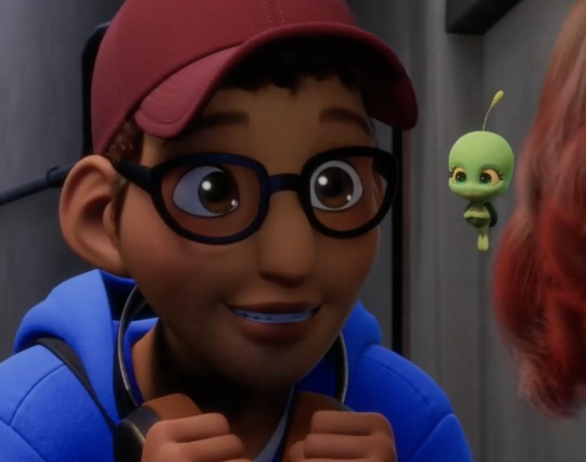
the DJWifi was so cute in this episode. theyre so sweet
in general I really like the redesigns of all the characters. I think they all look like... them. Like Nathaniel looks more like Nathaniel to me, Kagami looks more like Kagami, Sabrina looks like Sabrina and Ivan looks like Ivan. I can't describe it — they look like they've matured enough to have a better understanding of who they are. I like it.
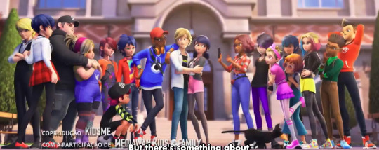
Also, the intro sequence. If there's still any doubt about whether the show will address "marinette's lie coming back to bite her / looming over her" this season, I feel like the intro answers that pretty clearly and with a distinct tone
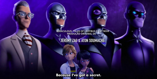
Another thing — the background characters look soooo much better in the new animation. Not only do they not look like terrifying low res monstrosities like they did in the old show, but they have such a wide array of distinct body types that i really appreciate. a lot of diversity in the crowds w race and disability too. and they look good. it's really refreshing.
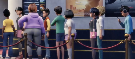
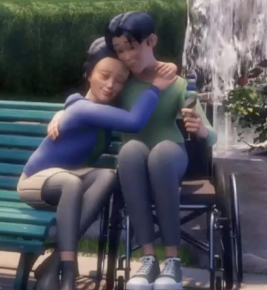
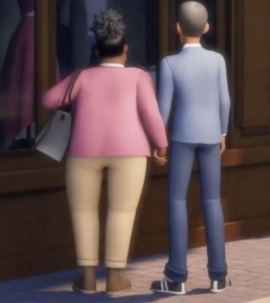
I. LOVE. the new butterfly-telepathy sequences. the way that butterfly!lila talks to her victims in a little dreamscape where she's able to use her body language and manipulation tactics. I cannot actually emphasize how much this strangely excited me. It feels so much more emotionally impactful and interesting and dynamic and Lila than what Hawkmoth did
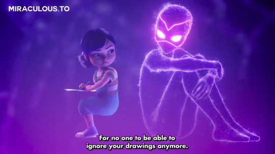
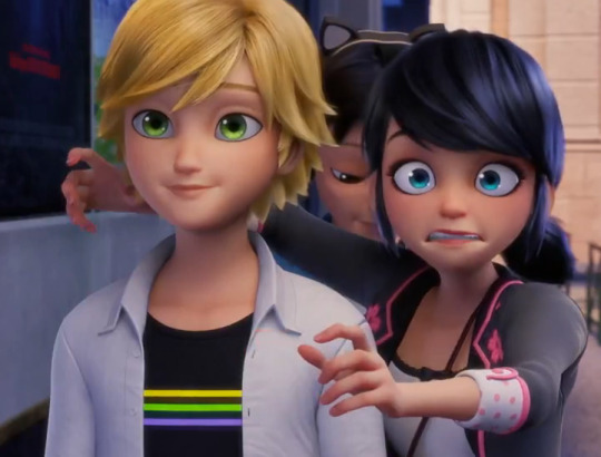
I know people are going to be upset about Marinette being awkward around Adrien again, but I feel like it makes a lot of sense to me. In the more general sense, it makes a lot of sense for this soft-refresh of the show that is marketing itself to a new audience to re-introduce the adrienette dynamic in a way that is just a smidge redundant to old fans. This is kind of important background on how Adrien and Marinette have always been with each other and the context of their relationship! That's important to show.
As a more in-character/universe explanation — while, yes, Adrien and Marinette started to get much more comfortable in their relationship in the old season, they never really got time to BREATHE. they were awkward and messy for the majority of their time together in s5, and then right as they started to get comfortable, Gabriel started puppeteering Adrien in a way that made things pretty tense for them, and then a whole whirlwind happened where he was sent away, and then his DAD DIED and he presumably spent a lot of the summer in mourning and— and— i dunno. I don't think it's too much of a stretch for me to believe that their relationship still feels awkward, especially when a new butterfly villain just popped up and likely reminded marinette of the whole Fiasco and threw her into mega-stress mode.
Their relationship isn't technically all that "new" like they act like it is, but this IS actually probably the first time they've been able to go on regular dates like this! So it feels new, they're still sort of in that "new" stage. Before, Gabriel was keeping Adrien away, and then Adrien probably wasn't in a good headspace for a lot of the summer after he died.
(Also, I just enjoy watching Marinette be awkward about Adrien. I definitely prefer them re-treading some old ground to new audiences than for their relationship to feel too jarringly different than how we've seen them interact in the past. I wouldn't want the time skip to be used as too much of a crutch, especially when I expect that Adrien spent a lot of it in mourning)
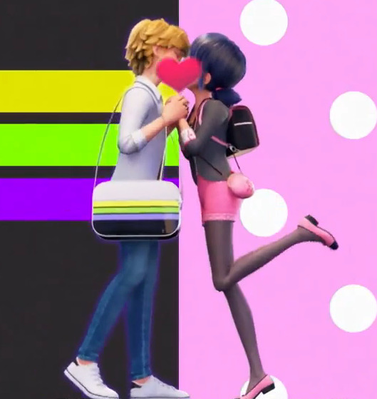
But anyway, they're still kissing in the season intro, and this is only episode TWO of the season, so I'm excited to see them gradually get more lovey dovey as the season goes on. (Or for Marinette's stress and guilt to overwhelm her! Who knows! I'm down!)
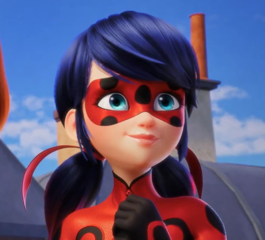
Oh also, Ladybug looks SO GOOD. she is so shiny and pretty and I love the red in her hair and i love her and I love ladynoir talking about their relationships and and and. and. i love them. thanks for coming to my ted talk
#ml spoilers#ml s6 spoilers#illustrhater spoilers#the illustrhater spoilers#miraculous ladybug spoilers
2K notes
·
View notes
Text
so... all the canonical dragon skyrim priests i did so far (sketches bc im lasy). i definitely will revisit some designs and make proper refs but i don't think there will be any major redesigns. except for vahlok im very unhappy with his design bc he looks like cofeeshop au qui gon jin, also my miraak design changes every 10 seconds so ignore him this one is already not relevant
Volsung and Vokun are left, i probably won't make Konahriik for some time due to Lore reasons
i probably need to make a tag for all this dragon priest stuff arghhh


also bonus: ocs - dragon Fostrunsuum and his priest Shulquoth. i will make more ocs bc lesser priests are important for my story

1K notes
·
View notes
Note
Since he’s probably Oswald’s closest Marvel equivalent, being a relatively-unpowered crime-boss who semi-frequently becomes Mayor… any thoughts on Wilson Fisk, the Kingpin of Crime?

It's a comparison that's frequently made by Big Two fans and it's easy to see where it comes from, certainly they're the most iconic gangster/mafioso villains in their respective companies, but I don't think Kingpin is the closest Marvel has to Oswald because A: If anyone has a prior claim on Comic Book Gangster, it's definitely him, and B: They simply don't work in comparable or equivalent fashion. You can even boil down a key difference to the fact that The Penguin is inherently a small man trying to be bigger, and The Kingpin is the biggest man who ever lived. That's not a joke about their sizes, that's how they operate as characters and villains: Oswald is underestimated, ridiculed, diminished, and driven in large part because of it. He is the underdog, he slips under the radar, he slips through the cracks, he is a cockroach who lives to thumb his nose and pull the rug under the bigger bastards who think they can step on him. Wilson Fisk IS the bigger bastard who steps on people, he is the biggest bastard in the world.
He is an unsurmountable force of crime at the top of every possible advantage that a criminal can possibly weaponize, he is a titan of wealth and privilege as willing and capable of crushing your skull with his bare hands as he is of murdering your entire social circle with a phone call. He is "the ill intent", the biggest and strongest gangster of all time, and even if there are bigger and stronger bastards than him, they certainly aren't gangsters like him, they certainly aren't meeting him in his playing field of choice. There isn't really a DC equivalent to Wilson Fisk - there were certainly attempts to make Luthor and Cobblepot more like him, there's no shortage of imitators or knock-offs like Blockbuster and Tobias Whale, but the Kingpin is a league of it's own among comic book gangsters. Like Luthor and Joker and Doom, like the top dogs of the genre, he's become an Archetype in his own right.

I talked about his Spiderverse version a little while back in regards to how much I liked him in that movie and what his design represented about him, Fisk as this black hole obelisk who drains the color of every room he's in and suffocates the world visually as well as metaphorically, far from the most interesting character in the movie but one that you can pin all these other more interesting things on, and I think that's also applicable to a lot of what he does as a Spider-Man villain. Now, he's a GREAT Spider-Man villain, easily one of the best, his arcs in Ultimate Spider-Man alone should be more than enough proof of concept for that, but even if he's not necessarily the most colorful or intimate or dangerous villain to hang a Spider-Man story on, he is maybe the most villain to hang a story on - the entirety of Marvel's street level vigilantes and organized crime exists under his shadow, and you can blow up his scope to the moon and back as a way to build up all the other characters you can squeeze more dramatic stuff out of. Whether it's in TAS, where he is so undisputably atop the pecking order that everyone else is bouncing off his fixed presence, or in the Insomniac games, where he stood tall as Peter's main villain for 7 years until the game begins with his downfall as a way to kick off all the strange new threats he'll be up against, Wilson Fisk is The Crime Man to rule all Crime Men, as entrenched and emblematic and secure in his kingdom of Manhattan as Dracula is to Transylvania and Dr.Doom is to Latveria.
Unlike the vast majority of Spider-Man villains who regularly enjoy redesigns and rewrites and do-overs, official and fan-made alike, Wilson Fisk is practically the same character in every iteration, there's very little need to seriously rethink or readjust who he is and how he does things because he is perfectly simple and perfectly timeless - we have now two Ultimate Spider-Man comic runs that have brought significant overhauls and revisions and new spins to established Spider-Man characters, and in both of them, Wilson Fisk is a major character, and he is completely and utterly unchanged from how he already works in the mainline universe. Even if you don't want to use Wilson Fisk, you can't neglect Wilson Fisk, you have to show how he fits into things, you have to show what he's up to or how he allows or makes way for what's happening without him, you have to give him his cut. This imutability of his is another thing I'd say is a major difference between him and Penguin - Oswald demands change, he demands growth and adaptability, he demands different surroundings more suited to him, he wants to grow and grow and make a nest that's suitable for him, he can't fit into existing systems so he breaks them to remake them as his own. That is simply not the case with Wilson Fisk.

Unlike The Penguin, unlike some of the other great comic book supervillains, Fisk has no intention whatsoever to change anything about how the world works - as far as he's concerned, it worked just fine up until these costumed irritants arrived, and even they just became another part of his conglomerate in time. Fisk really doesn't have or need any kind of big philosophy to justify himself, rather, he takes it as fact that he's operating under the way the world works and under a merit he's achieved by being the man he is. He is content within society's morality, because he is at the top of society and therefore that morality will always bow to him. The legions of costumed enemies orbiting his life are merely dissidents going against the order of things that places him at the top, tools to be used and bugs to be squashed and little more.
And this is true even of those whose power and scope stands above his own - they are not players in his game, and if they are, they are distractions, diversions, things that he can deal with. When he loses to billionaires like the Stromms in Zdarsky's run, when he has to playy ball with bigger villains, when he is ousted in a power play, it is humiliating, and he doesn't deal well with humiliations - but he can take humiliations, he knows he can give back, he can ultimately rebuild his pride as he rebuilds his empire time and time again. Spider-Man is annoying and powerful and infantile and annoying and an enemy and really really annoying, but he is no existential threat. He is not terribly concerned about Spider-Man, which is part of what makes him such a fun Spider-Man villain, that he never sees it coming when Spidey gets serious and just brings him down (peak example of this being Back in Black), that he is this larger-than-life bully/shitty grown-up who actually can and must be defeated. And if a lot of what makes him a fun and great Spider-Man villain is contingent in the ways that he doesn't lose sleep over Spider-Man, part of what makes him a stronger Daredevil villain is the precise opposite: he desperately wishes he could be this dismissive towards Daredevil, who is for all intents and purposes weaker than Spider-Man. It's his relationship with Daredevil that brings out the best of him as a villain and the worst of him as a person alike.

Against Spider-Man, the Kingpin is a very strong enemy, the figurehead of the kind of crime that is Spidey's daily routine, a powerful and oppressive force ruling over NYC who is nevertheless a step down from the Green Goblin or Dr Octopus or the Symbiotes and all those other genetic nightmares and obsessed masterminds that plague his life. No matter how clever or vile his schemes are, Spider-Man can still beat them, and Spider-Man can ultimately always triumph over him in a fight, and Fisk can always rebuild because Fisk builds empires as easily as most people breathe, and things rarely if ever get personal between him and Peter. Against Daredevil? There IS no bigger threat than Kingpin (well, The Hand I guess, but they're boring as shit), Kingpin is the mountain that Matt always crashes against in due time, and it is always personal. The Kingpin is his biggest and strongest enemy, able to run mental laps around Matt and someone that Matt cannot in fact beat in a fight, their battles are drawn out miserable slugfests where Fisk usually thrashes him around like a ragdoll with few conclusive victories and whatever victory Matt has is hard-won and usually via cheap shot.
Matt has an infinitely harder time dealing with Fisk than Spider-Man does, which is part of why it is Kingpin's appearences in Daredevil comics that made him comic book villain royalty: Matt has no real advantage against him other than his senses. He has no intellectual advantage, no physical advantage, and he can't even claim to be more determined or driven, Fisk is fueled by an equally horrendously powerful will and protectiveness towards what belongs to him, This City. There is nobody and nothing in the world that Matt hates more than Fisk, and there is nobody and nothing in the world that Fisk hates more than Matt. They've taken turns shattering each other to the point that those slugfests are the least of each other's offenses against each other.

Even besides the sheer accumulated history they have against each other, it's in the way they unforgivably violate each other's vision of the world. If the Kingpin was the invincible man of vision who loves the city and must steer it even if smaller people disagree with him, if he was truly so secure and untouchable at the top of the world, he wouldn't be having such a colossal hard time dealing with this one guy and he wouldn't be reduced to a base animal thug every time he shows up, let alone lose and be humiliated. If Wilson Fisk was as correct as he needs to be, if the strength of his love for Vanessa/the city/what belongs to him was as powerful as he wants it to be, Daredevil would never get the upperhand on him.
And if Daredevil is a man who dedicates himself 100% all the time to protecting the city and it's people, if Daredevil commits unlawful deeds to preserve human life and fight for justice, if Daredevil struggles with the innate contradictions and hypocrisies and nature of what he is and does but can nevertheless push past them all to do the right thing for others, every second the Kingpin lives, every second Fisk lives because he lets him, chips away at the assurance that he's doing the right thing, that he isn't just wasting time. If Daredevil's vision of the city was correct, if Daredevil was right about his beliefs and worldview, there wouldn't be a Wilson Fisk out there getting away with the things he does. They hate each other for that same fundamental reason: If the world was ruled by the principles I need it to be, in order for me to be who I am and do what I do, you wouldn't exist, and you wouldn't be in my way again and again.
As a Spider-Man villain, he is one of the greats, a core component of his world, a highly versatile and even necessary figure to have and an excellent villain to dictate proceedings. As a Marvel Universe villain, he is an indispensable facet of any criminal element, the Mt.Fuji that the streets of Marvel rest upon, someone who can be added to any storyline and be grafted into many characters to oppose or assist them, or even create and kill them. As a Daredevil villain, he is undeniable as one of the top supervillains, bordering on main character a lot of the time. An implacable unstoppable force of nature as well as a villain of history and brutality and drama and a character who brings intrigue and tragedy and even complexity, even as it all ultimately comes down to that raw hatred between them, the splinter in each other's eye, an infection in their world that just keeps taking and taking and taking without stopping.
It is an unforgivable offense to Wilson Fisk that there is a man out there so beneath him that he cannot break, cannot bend, cannot stop, and who makes such a mockery of everything he's built himself to be by existing, just as it is unforgivably offensive to Matt Murdock that there is a man out there named Wilson Fisk who thinks he has the right to be who he is, and do what he does. To be a man who not only cannot care about human life in any capacity other than what he thinks belongs to him, but whose continued existence attests to a world that validates him, that doesn't care about those lives either, where there is no accountability and no justice and no salvation that cannot be bought and sold. Fisk isn't just an embodiment of cruel, bottomless indifference, he stands for a world that agrees with him.
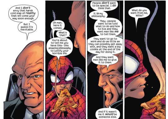
It would take too much work to defeat him, he just walks unscathed if you do, and even if you defeat him there will just be someone else to step in temporarily. And so it is with a heavy heart that the people of New York accept that the blood of countless runs through the streets, so long as the big man gets to give them their cookie at the end of the day for their hard work and agreeability. He is too big, too clever, too strong, and too invincible - and that's why Peter needs to stop him, that'd why Matt can never stop trying, that's why they can never let him be, otherwise Marvel New York would just be regular New York.
They'd have to accept a world where Wilson Fisk gets away with everything, and who could live with that?

548 notes
·
View notes
Text

Oh guys. We are so back.
After ALMOST A YEAR I finally got around to drawing the guys. I started with Marc, because I already knew where I wanted too go with his design. All of their civilian designs need revisions, mostly because of art style changes.
I already mentioned in his first redesign that I was pretty much overhauling his personality. That's still true here. The only thing Marc lacks confidence in is his showing his writing to people, he's very friendly and really excited to try things his friends recommend, like soccer or joining art club. Just not with showing his fanfictions to people just yet. Hey we've all been there buddy.
He's got a decent following on Ao3 i'd imagine.
As for design, the darker skin tone is an obvious change, I kept misremembering Marc to have darker skin so I figured I'd role with it. I also made his hair brown instead of black and- Oh, oh fuck his hairstyle in cannon. Agh, it hurts. Note, I don't think Marc was intentionally supposed to look very fashionable, and I tried to carry that through here, bro is wearing mixed metals, a red jacket and a tye dye muscle tee, but at least the colors are a little nicer.
Reverser isn't too different, aside from the lack of hood and no lipstick. Mostly cause I spent 20 minutes struggling to draw his mouth. But I hope you can forgive me because I did give Rooster Bold lipstick instead!
I like rooster bolds design- in theory? I think it looks kind of off in cannon. Definitely my favorite design from Penalteam.
Oh and uh, the season 6 design, we've only seen him in the intro, but why is Rooster Bold 80% blue now?? When Oriko is explicitly orange?? Love the shoes though.
[Edit:]
I have also decided to change the Rooster Miraculous itself some. Now the power is called Chicken Scratch, and the function is that a user writes down a rule. But everyone must be effected by it, not just the attacker.
So theoretically, RB could write "Everytime someone score a point everytime they have the ball." But not "I score everytime I have the ball." So he needs to be clever about it. In addition, the rules tend to have a monkeys paw effect, so the user needs to be willing to take the bad with the good.
#miraculous redesign#miraculous ladybug#marc anciel#rooster miraculous#mlb redesign#miraculous fanart#rooster bold#roosterbold redesign#were back baby!
146 notes
·
View notes
Text
Redesign concepts of Webmaster and Feathers
After a year


WEBMASTER
My biggest problem with the Webmaster design is how cluttered it seems; there's just a lot going on here. So I tried to calm it down a bit; I took away one pair of legs to make him less cluttered but keep (more or less) original body lenght. And I know that in his episode Jun says “if something has eight legs, she doesn't like it,” refering to spiders, but I think eight limbs works too.
I also played around a bit with his colors and markings. As well as body structure and proportions, noting this dragon's show-off skill - spinning webs.
When he puffs up his “cheeks” just before he spits, you can hear a sticky, mushy sound - you know that something is going on inside. The muscles are moving and pushing something with a sticky, gluey consistency. I would like it to be somewhat repulsive.
When he spits silk in attack it does not come out as big ball of burning web. It's more like net in "V" shape, in form of many separate threads of silk shooted at the same time. Similar to actual spiders, but on the bigger scale. His webs also don't burn; I feel like it's an overkill.
I changed the arrangement of his forelegs slightly. I know it's not quite in line with the style of HTTYD (see Speed Spingers' front limbs) but in his case I think arranging his hands in a similar way to therizinosaurus gives him a more menacing look.
Deadly Spinners are dragons that give a very unpleasant first impression. They are not the most beautiful dragons around (at least not by the standard) and their behavior can be repulsive to some. The type of dragon that people are willing to pin an unfriendly, sometimes unfair patch on more easily than on other dragons - as many people do with spiders or snakes and other similiar animals.
Deadly Spinners don't live in large groups - either small groups or solo. But when they are in a group they have very close bonds and spend a lot of time socializing among themselves.
FEATHERS
She is a challenge to me, not gonna lie. She definitely is the most changed among my redesigns so far. She just seems very basic to me.
The most bothering thing to me about her are those "feathers". Because, Alex in s1ep3 calls these "feathers", as well as Olivia in s5ep2, wiki calls these "feathers-like scales", but they can move and are thick what implies they are more like Furies'/Night Light's head numbs? I absolutely can pass the crowns as feathers, but Queen's horns and holes in her meaty tail were here the last straw to not to
And yes, I made a shitty video because I'm really confused and wanted that confusion express lmao. I hope Tumblr won't take it down.
So idk, I wanted to clarify what the frick those things are and go from there. I had two main ideas - either give her actual feathers or quills similiar to those of Bewilderbeast. When drawning I wasn't sure about either idea but finally decided for the latter one. Feels more HTTYD-like I think? And very flammable feathers don't seem like the best survival choice when almost every other animal around can spit fire.
I reimagine Featherhides as way more nervous and skittish dragons. Changewings were mysterious but usually seemed calm and strategical. Featherhides' nature is more in type of "flee" than "fight" (tho they can get so smoke when needed, they are not defensless or smth). They are very easy to spook and sometimes will flee in panic from something very trival just to return seconds later when they realise there was no danger at all, or are curious of whatever scared them. They often make rapid little movements, much like birds - especially if something catches their eye and they are not sure what it is.
Featherhides also live in large flocks without a complex hierarchy. If they can - they run, if any of them can't - at least some of them also stay behind.
Once Feathers bonds with Alex she would be very protective of her little human.
When Featherhides mimic sounds they do not do weird things with their faces like in the show. It looks much more like like some birds do that. But that's just a sidenote.
#I think I did fine job with them#Maybe it's just my ego#but I feel like these designs with some quips could be something we see as background dragons in movies#httyd#dragons the nine realms#tnr#httyd tnr#fan redesign#tnr webmaster#deadly spinner#tnr feathers#Featherhide#my art#doodles#httyd alex#alex gonzalez#httyd Eugene#Eugene Wong#Jun Wong#I mean she IS here
193 notes
·
View notes
Text

Hello scary Danganronpa community I would like to leave my Korekiyo redesign here an an offering please do not hunt me for sport /hj
Details and stuff (giant bricks of autistic text) below cut
Okay so in canon, we know Kiyo’s sister made his uniform and (I THINK) (DONT QUOTE ME ON THIS) he canonically doesn’t like it very much but wears it because of the whole… sister thing.
This redesign is meant to NOT be just a replacement of the OG design, but takes place in a non-despair AU where Kiyo actually learns that the relationship he had with his sister was NOT a healthy one. He gets support from his classmates and possibly the therapy he DESPERATELY NEEDS, and after beginning to accept his situation, he makes his OWN uniform with help and input from his peers.
That being said, what all did I do and what was my thought process?
- his og outfit was highly inspired by military-style clothing, and. *The anti-semetic armband.* so all that went in the trash because I didn’t like it
- I put him in more comfy traveling clothes—a soft button-up, a cardigan, slightly baggy pants, high travel boots. He travels a lot so might as well be comfy for it! The boots have a fluffy lining for cold weather
- I changed the hat. He needed a hat still but I changed it from a military style hat to a sea man type hat. It just felt right.
- kept the mask, but he wears it more because of his travels—lots of diseases. + his sister died of illness so he’s cautious about that. (I did change some of his story too but I tried to keep the big plot points while not romanticizing it)
- kept the bandages too. He does a lot of field work so I imagine he gets scratches a lot. Just another precaution to protect himself when traveling.
- I wanted to use the rope and rose motifs in his official art. I was so disappointed there wasn’t more of that. So his cardigan and pants have matching vine patterns and he has a rope tied around his waist—it’s there because sometimes you need a rope yknow. It’s a tool but also stylish/hj
- it’s commented on in the game how he’s very feminine (QUEER) and how he “has the kind of beauty that puts female colleagues to shame” ??? which is a weird way of forshadowing BUT I decided he gets to have long eyelashes and longer nails.
- his locket has been moved from his breast pocket to a necklace.
- and lastly I kinda liked the weird stringy hair thing Danganronpa does sometimes?? I just gave it more volume because . Yeah.
So yeah those are my big notes. How about some more story-based explanations?
- Kiyo got used to the darker palette (plus it keeps the mysterious spooky vibe the creators were going for), so he just kept that.
- all the material is soft and breathable, which was his priority when looking for the base clothing pieces!
- Angie helped him with the rose and vines! They’re embroidered. All Kiyo said was that he felt it was all very green and wanted to bring back some red, something about roses, and that’s what Angie came up with for him. He really liked how it came out
So yeah :] I hope y’all enjoy, I like the final product. Definitely not intended to be canon in the event of the killing game universe but I’ve always preferred exploring non-despair AUs.
If anyone WANTS to hear about the story changes I made lmk but uhhh I’m not making that my first Danganronpa post ahahahahahahha (<- read this as frightened and shaking like a chihuahua)
Again please don’t shoot me point blank danganronpa community
#eely rambles#eely draws stuff#korekiyo shinguji#danganronpa korekiyo#drv3 korekiyo#danganronpa redesign
227 notes
·
View notes
Text
Okay, i worked on angel dust a bit for the redesign, and right now i love his design, but his colors are giving me trouble. not sure if i'll stick with these colors, but for now i'd say im satisfied with him

i love the idea of fluffy spiders, the idea of them, if i ever saw one i'd probably die on the spot. in terms of character, i think i want to bring back some of the personality from the zoophobia age, because back then he wasn't a walking sex joke. He still makes the jokes, but not every word out of his lips has to be an innuendo.
EDIT: SULTRY i remembered the word i was looking for when i posted this. He's sultry and sensual in this, he's got an air of sophistication about him, he's a classy crack whore
Side note, as i was doing this, why the actual fuck does he have a choker and a bowtie in his final design??? his throat is so cluttered. In my version, his choker is a collar, specifically given to him by Valentino, meaning he'd take it off once he's out of Val's influence.
The more i look at it, the more i definitely think the colors need adjusting, just not sure. I might edit his official redesign pic and see how it looks in the environment and that might influence it.
Either way, i think i like him, he looks fluffy and cute, and i gave him back his hat because he deserves to look like a gangster dammit.
#anti vivziepop#hazbin hotel critical#hazbin hotel redesign#hazbin hotel rewrite#hazbin hotel criticism
592 notes
·
View notes
Text


HELLOOO!! I HAVE RETURNED- ANDDD Idk how to do lineups- please- this is a new type of embarrassing for me lmaooo-
BUT HEY! BISHOP REDESIGNS PART…. 3! YIPPEEE-
I didn’t change much lore wise- so the original sheet still has some info- but I will be info dumping under the cut with the individual art of each and like- my inspirations for them.


Narinder changed a lot- ummm he’s such a slay now. Omggg- Tee hee- Anyways, His pronouns are He/Him and he’s Pansexual- yes yes. He’s no longer a disciple but he’s an Undertaker and a GraveWatcher. Thought it was more fitting for him-
Ummm he’s based off a Kurilian Bobtail cat :D I NEEDED TO MAKE HIM FUN TO DRAW OKKK?? AND NOW HE ISSS AKDBDJDBJD


Leshy uses He/Him pronouns and he’s gay demisexual Yaaayyy- :D He’s a bartender and occasionally farms, but he rather destroy the plots for fun or eat the crops.
I kinda took all kinds of inspirations for him- ummm first of all- I based him off the Moss Creeps from hollow knight- cause yeah- they’re adorable. HE HAS LESS CLOTHING CAUSE HES ALWAYS IN THE DIRT- Less clothes = Less of a hassle to deal with clothing being restrictive. It makes totallyyy sense- yes yes

Me accidentally making Heket my favorite- tee hee- WIBDKDBD OK- Heket uses She/Her pronouns and she’s aroace. She has no time for no MAN OR WOMAN- AS SHE SHOULD!! GIRLBOSS YOUR WAY THROUGH LIFE!! YIPPPEEEE- She’s usually a cook but once a while she’ll go on missions. Give her a weapon of any kind and she’s golden.
For the life of me- I cannot draw frogs- so I based her off of the Chinese Giant Salmander- just pretend she’s totally based off a frog.

Imma be so honest- idk why I always draw Kallamar so small- tee hee-
OK! Kallamar’s transfeminine who uses He/They pronouns. They’re also poly <3 love that for himmm- look at themmm- enough hands to holddd- A good think to point out is that they’re completely blind in his left eye- (looks like it’s right in this- um.. trust me-) they can never win- tee hee. Uhh he’s still a medic and occasionally helps at the tailors.
Kallamar my beloved- YOU COVERED UP!! YIPPEEE- THE SLUT DOES GET COLD /silly. Um- he’s based off a diamond squid- kinda sorta- I just loved the frills those squids had- tee hee-

MURRAAAA- MUURRAAAA-
Cough cough- ummmm. Shamura’s a demisexual nonbinary <3 (AFAB to FTN- me projecting PLEASE-) They’re still a disciple but their main focus is usually in the library or tailors. Unlike Kal- their second set of arms are retractable! Along with their legs- erm, you can tell when they don’t want to walk with those small ass feet- I bet it hurts.
I have- no solid inspiration for Shamura other than tarantula- I did steal the colored beads from my human design of them. Each bead being their sibling. I just love fluffy spiders-

FINALLY THIS BITCH- /silly
Emery uses all pronouns and is unlabeled! They love whoever- (do they even love? Idk man-) She’s normally known as the Shepard, carrying around the Shepard’s hook.. love that for them- tee hee- uhhh not much to say about her. I just love Emery- (The difference between the two Emerys is terrifying btw-)
Like Shamura- I have no official inspiration for them besides looking around Pinterest. Man- I just love how she came out though- like??? Ekdbdjbdkdbdjdvdid-
I wish I wrote more but my brain is dying- I’ll most definitely redesign my fankids and the spouses- 🫡 laaatteerrr- yes yes- tee hee-
#bloo’s art :)#cult of the lamb#cult of the lamb fanart#cotl narinder#cotl kallamar#cotl shamura#cotl leshy#cotl heket#Ummm idk what else to tag-#I’m falling asleep writing this#sorry if some of these look weird#I drew them in the car- so uh#yeah#wonky asf#tee hee-#anywaysss-#yeahhhh I just wanted to redraw themmmm#Especially Narinder-#expect a doodle of him later today
151 notes
·
View notes
Text


More doodles, and this time, it's actually voice redesigns!
I've been quite unhappy with my Stubborn for a while, and last week, I finally (after some serious encouragement /pos) gave his redesign a try! I still gotta make more drawings with him to actually test if his design works, but I'm at least happy with this drawing of him <3
Then we have Contrarian and Cheated with some slight updates! I've been giving all my voices accessories, so I had to figure out something for these two lads. Contra got a full vest (makes sense that of all of them, he's the one that gets a full clothing item, and also it hides his cracks, which he would definitely appreciate), and Cheated got spiky bracelet and rings (punk-ish aesthetic Cheated won't leave my head, and it bled into his bird design). Also Cheated's face got a bit spikier, I actually drew him like that for the Valentine's post, too! I just think it works for him to be extra spiky :]
And lastly is a small doodle of Paranoid, who I just tried to make fluffier. I need to sit down and do an actual re-design session for him; I don't want to change him too much, but I also know there's a few things about his design that need tweaking... but that's for future Everest to figure out :]
#slay the princess#stp#stp fanart#stp voices#stp stubborn#voice of the stubborn#stp contrarian#voice of the contrarian#stp cheated#voice of the cheated#stp paranoid#voice of the paranoid#voice designs#art#fanart#eg chatting
61 notes
·
View notes
Text

more glamrock ennard au doodles!
btw in case it’s hard to read, the info text says:
“ballora walks around with her eyes closed whenever she’s active and confuses people. The pizzaplex is very overstimulating to someone who was previously totally blind”
“Funtime freddy tends to talk to the others out loud. nobody else does this, nor do they like that he does it.”
MORE SILLY STUFF UNDER THE CUT AS WELL AS SOME TRASCRIPTS BC I WROTE A LOT SORRY
fun fact the eyes on ennard’s face are one of freddy’s eyes and one of ballora’s eyes
baby would def be a little fucked up when seeing vanessa, i think i mentioned this before but here’s a fun little interaction between them
also HOORAY THE HANDPUPPETS!! they end up slightly redesigned (bonnet more so than bonbon) and in the daycare as little sun and moon themes bunny puppets. they both fucking hate it 😭😭 but also neither of them know that ennard is there since for the most part they just Stay In The Daycare because Sun is WAY too excited to have some new “forever-friends” as he calls them so they have slumber parties every night and are SO fucking sick of him
I’d imagine they were renamed and i came up with the titles “Twinkle & Star” (yknow like twinkle twinkle little star + sun moon and stars etc. IM SO SMART GUYS!!!!! 🚗 gets run over)
originally Bonnet was named Twinkle and BonBon was named Star but Bonnet beat the shit out of him and made him switch names with her because she hated it and now she has jokingly nicknamed him “twink” ❤️ i swear they love each other they just have a very sibling relationship to me and certain media i have consumed from a young age makes me characterize Bonnet as being Fucking Mean and i love her for it
Glamrock freddy would definitely be such a sweetie pie as always. he would try SO so hard to make ennard happy and feel at home here and they would be like ?????????? who the fuck is this. get away from me.
funtime freddy would think he’s dumb and stupid and dumb and HE was a better freddy than THIS GUY and he’s WEIRD and a GOODY TWO-SHOES and STUPID etc etc
foxy thinks he’s nice but too overbearing, but granted after living in the same room as funtime freddy for years he’s used to it, it’s just that Glamrock is the boring type of overbearing where he’s being all kind and sweet and making sure she’s safe instead of annoying the shit out of her for 6 hours like funtime does <3
ballora genuinely likes him but doesn’t want to get close to anyone, so she’s polite but that’s it.
baby thinks he’s a sucker and plays into his caring nature quite a bit. she’s thinking of the future, some situation where she needs someone on her side who will blindly follow her. He’d be a good fit
#digital art#my art#fnaf#fnaf security breach#fnaf sister location#five nights at freddy's#ennard#fnaf ennard#glamrock freddy#bonbon fnaf#bonnet fnaf#fnaf vanessa#elizabeth afton#funtime freddy#not tagging the others bc while they’re mentioned they aren’t pictured!!#well. pictured individually i mean
84 notes
·
View notes
Text
SMG4 Crew Redesigns Part 1
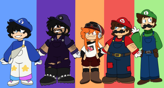
Finally got them done! I saw some people do redesigns for the SMG4 Crew and I wanted to put my spin on it. So far I’ve done SMG4, SMG3, Meggy, Mario, and Luigi. I'm for sure gonna do the others at one point. But it was perfect timing since I did finally finish all the arcs in order (and the important episodes in between for the most part) so I at least have some better context then all the stuff from 2022+ and all.
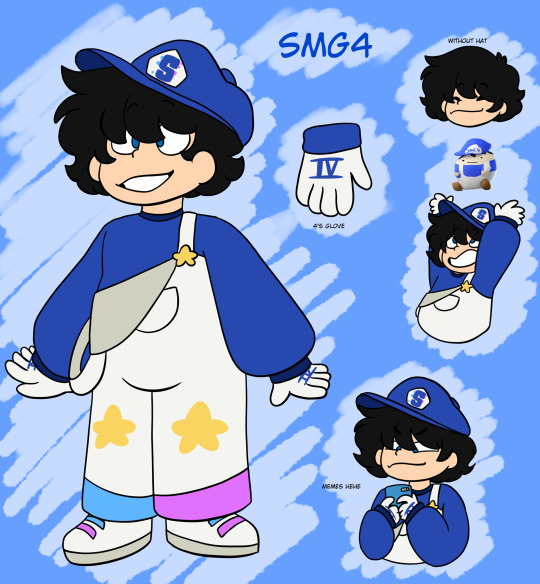
So first up SMG4. I’ve seen people incorporate the glitch color pallet so I tried to put a little bit on the shoes and pant legs. That and I’ve seen him associated with stars. I don’t quite understand why people do redesigns with it; maybe it’s something in an old episode I haven’t seen yet or something but I thought it’d be neat to add. Added the number four roman numeral for him too cuz it felt off only having 3 have it. Shoulder strap off cuz vibes idk.
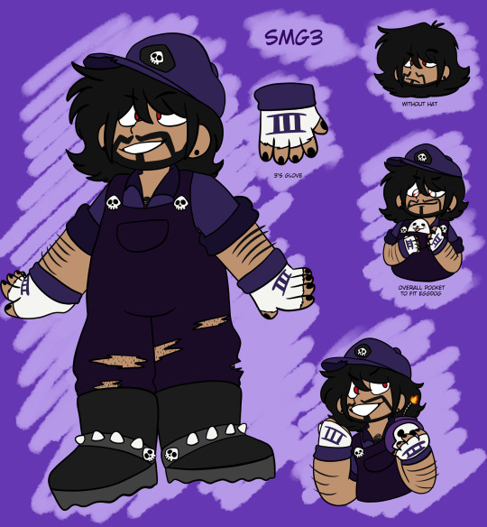
Next up SMG3! I’ve seen so many people give him long hair/ a mullet and dammit it was just too perfect to have. That with some ripped pants and gloves and earrings to add for his redesign. And of course the overall pocket for Eggdog because yes.
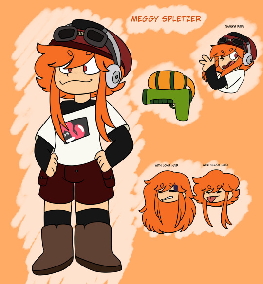
Up next Meggy! She felt like the biggest change to me but I think it’s mainly the hair being the reason. Originally I was keeping the long hair, but when I was watching the arcs and saw her inkling form didn’t have any tentacle things in the back just the front (forgive me idk if that’s what those are called a barely played splatoon) so I felt like after turning human she would first have the long hair but then cut it as a way to cope if that makes sense? Idk she seemed to have struggled for some time just trying to adjust to human form and at least she would have control over her hair. Then I gave freckles which I believe her first human model design did have them but it was so faded it was hard to tell so I tried to make em a bit more noticeable (though now that I’m looking at them maybe I should make em thicker idk yet).
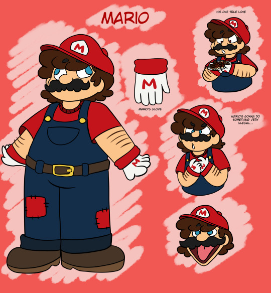
Now friggen Mario. Good lord he was the last one I finished and it should not have been this hard. It’s all minor changed I feel like- I tried to make him still identifiable while still having some differences like the short sleeves, belt, and patches. That and I put his signature M on the gloves too to match SMG4 and SMG3. I was struggling with the mouth (not the cursed one just normal) because sometimes it would look off. Luigi I had more of a problem with though than Mario for whatever reason; maybe it’s the mustache.
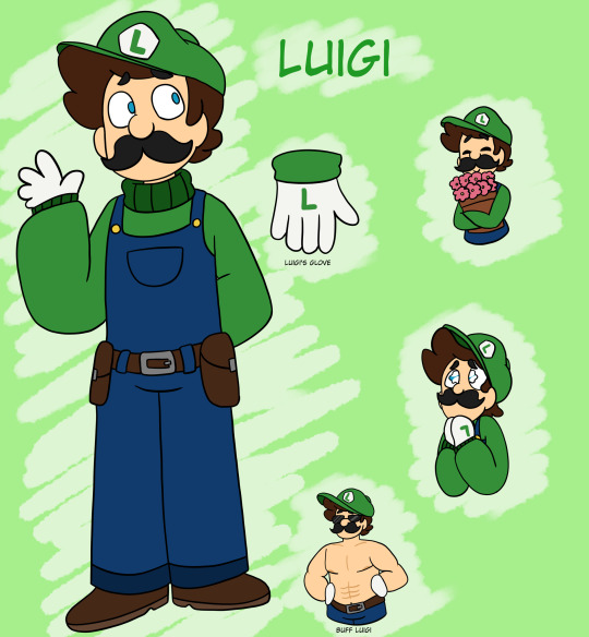
Which speaking of Luigi as the final one for the list thing. He definitely gave me turtle neck vibes so I wanted to give him that, plus a belt that has those little bag strap things or whatever you call them to hold stuff like maybe some flower seeds or whatever he needs to. And I only did one of those little drawings with a mouth but when I tried doing it for the others it felt off. Probably for future drawings with these refs I’ll add mouths or won’t depending on the mood.
And yeah those are my redesigns. Definitely wanna do the others like Tari and Saiko for example. But some I know will be tricky because I don’t really know what I could add for redesigns like Mr. Puzzles and Karen for example. But we’ll see.
Part 2 of SMG4 Redesigns
#smg4#smg4 smg3#smg4 meggy#smg4 meggy spletzer#smg4 Mario#smg4 Luigi#smg4 redesigns#smg3 redesign#Meggy redesign#Meggy spletzer redesign#mario redesign#Luigi redesign#smg4 Mario redesign#smg4 Luigi redesign
73 notes
·
View notes
Text
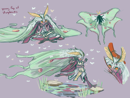
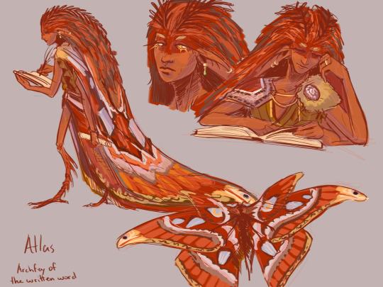
Atlas is a reserved fey who has a record of every written thing in a massive library he protects. To them, the more words the better. Their little sister (haven't quite landed on a name ;-;) prefers story books, and loves to hide and cause trouble for her brother. Atlas uses He/They, and their little sister uses She/Her. Dnd NPC concepts from a while back. Definitely need a redesign but i still think they work.
#archfey#Fairy#Moth fairy#Atlas moth#Luna moth#dnd character#dungeons and dragons#dnd5e#dungeon master#storytelling#ttrpg art#character designs#moth
56 notes
·
View notes
Text

Anyways was not expecting the fucking. 1970s Richard Dragon cameo there
FUCKINMG MY 1970S CANCELLED COMIC BLOBO BY ASSOCIATION SHOWING UP IN OUTSIDERS?!?!?!?!
#i say blorbo by association bc im obsessed with ben turner and hes bens bestie so like. i do think abt him from time to time. but thats so#crazy to me omg#anyways i liked this one! although i didnt fully get what was happening bc i havent read planetary. which i guess i should do now maybe#everyone on locg hates this series though which i dont fully get but sure ok#i admit that im not super familiar w any of the characters here or other stories referenced so like. they definitely could be fucking it up#but idk. i enjoy it. although i wasnt a fan of the 1st two issues ive liked everything since no 3 a good amt!#but anyways. richard fucking dragon. wth. did not have that on my bingo card today#blah#tuesday spoilers#anyways the 70s richard dragon is so funny. i was literally abt to write him into my wip. i mean hes already in the plot outline but like.#the showing up bit. im just doing it comic style though and i need to do a redesign.#likely something much closer to the movie version
5 notes
·
View notes
Note
My dad doesn’t know anything about Viv, either of her shows, or who she is as a person. But he is also an artist with an art degree. So I occasionally try to show him characters to ask for his opinions “What era do they read as?” Which sin do you think this is? What animal are they?” Stuff like that. Bc he has no prior knowledge of Viv, but is an expert on art, I like hearing his opinions. And one day, he calmly decided to explain to me “Every time you show me one of these characters, I’m rolling my eyes because they all look exactly the same. I’m not annoyed or upset with you. I just want you to know the fact that they look exactly the same annoys me, because it looks bad.” And all I have to say is “EXACTLY!” We then discuss why I show him, that I like the art style and hate the character designs. He asks why I’m so invested if I hate them. And I say that I don’t blame the style and think it works, but the individual characters should look better, and I want to try to improve them. We talked all about how the designs suck, I tell him about Viv, and he just nods his head and agrees that she sounds like a horrible artist and a horrible person. He said she sounds like the stereotypical ‘entitled millennial’ type that younger people follow blindly bc they can’t think for themselves, must hate herself if she’s that hypocritical, is trying to rip off styles like Jhonen Vasquez instead of coming up with her own style, is a Disney adult that needs to get laid, and has an agenda.
My dad may be a bit blunt with how he says things, but he definitely isn’t wrong. I wanna ask him if we can redesign Viv’s characters together the next time he’s bored or needs a distraction. Even though he doesn’t make things anymore, outside of memes and pictures of his toys, I think it could be fun to make something and talk shit together.
If you guys do, please send it in! Your dad sounds cool!
32 notes
·
View notes