#I am in love with the colors and their overall vibrancy
Explore tagged Tumblr posts
Note
Hello! :D
I have another basic question for you, though, as always, I made it more complicated than necessary.
What are your & the Dorfs’ favorite gemstones? Top 5 overall categories, whether by color or by type. (Ex: Pink gems, green gems, white gems, purple gems, & multicolored gems for color or garnets, pearls, diamonds, amethysts, & emeralds for type.) Note, it is an option to choose both kinds of categories. (Ex: Blue gems, garnets, jades, red gems, & quartzes.)
And 3 specifics within each of those categories. (Ex: Star sapphires, larimars, & aquamarines for blue gems. Pink pyropes, tsavorite, & hessonite for garnets. Jadeite, nephrite, & chalcedony for jades. Rubies, carnelians, & fire opals for red gems. Amethysts, rose quartz, & citrines for quartzes.)
For instance, I love most any purple or blue gemstones, opals, moonstones, & abalone shell. For specifics, I love magenta pyropes, amethysts, & ametrine for purple gemstones. Aquamarines, labradorites, & chrysocolla chalcedony for blue gems. Rainbow opals, Mexican fire opals, & Australian opals for opals. Pink moonstones, blue flash moonstones, & rainbow moonstones for moonstones. And, finally, Haliotis sorenseni, Calliostoma annulatum, & Tegula brunnea for abalone shells.
This is a good one! I am partial to my birthstones, which are Opal and Rose Quartz. Opals are gorgeous, and come in such a stunning array of colors and vibrancy. Dragons Eye Opal and Fire Opals are def high tier on my list. Rose Quartz I like for the story behind it, that it helps with healing and love. Its a softer Pastel pink, which is nice.
************************************************************************
The Ganondorfs and Demise, with their distinct personalities and connections to power, darkness, and ambition, would likely have preferences for gemstones that reflect their nature and desires. Here's a breakdown of their favorite gemstones:
Wind Waker Ganondorf:
Top 5 Gem Categories:
Red Gems: Representing power, passion, and wrath.
Black Gems: Symbolizing mystery, strength, and the abyss.
Green Gems: Reflecting ambition, envy, and connection to the earth.
Gold Gems: Indicative of wealth, authority, and the divine.
Orange Gems: Linked to fire, creativity, and energy.
Specific Gems:
Red Gems: Garnet, Ruby, Spinel.
Black Gems: Obsidian, Black Diamond, Onyx.
Green Gems: Emerald, Jadeite, Peridot.
Gold Gems: Citrine, Yellow Sapphire, Topaz.
Orange Gems: Fire Opal, Carnelian, Sunstone.
Ocarina of Time Ganondorf:
Top 5 Gem Categories:
Green Gems: Representing ambition, the power of the earth, and envy.
Purple Gems: Reflecting royalty, mystery, and the arcane.
Black Gems: Symbolizing darkness, power, and the void.
Blue Gems: Tied to wisdom, the ocean, and the divine.
Red Gems: Signifying power, passion, and strength.
Specific Gems:
Green Gems: Emerald, Tsavorite, Alexandrite.
Purple Gems: Amethyst, Iolite, Tanzanite.
Black Gems: Black Diamond, Jet, Obsidian.
Blue Gems: Sapphire, Lapis Lazuli, Azurite.
Red Gems: Ruby, Garnet, Spinel.
Twilight Princess Ganondorf:
Top 5 Gem Categories:
Dark Purple Gems: Evoking mystery, the twilight, and the arcane.
Black Gems: Symbolizing the void, darkness, and power.
Blue Gems: Representing depth, the sky, and the ethereal.
Silver Gems: Reflecting the moon, clarity, and twilight.
Green Gems: Linked to the earth, ambition, and life.
Specific Gems:
Dark Purple Gems: Amethyst, Sugilite, Charoite.
Black Gems: Black Diamond, Onyx, Obsidian.
Blue Gems: Sapphire, Blue Topaz, Lapis Lazuli.
Silver Gems: Moonstone, Hematite, Platinum.
Green Gems: Emerald, Malachite, Chrysoprase.
Hyrule Warriors Ganondorf:
Top 5 Gem Categories:
Red Gems: Representing raw power, aggression, and dominance.
Orange Gems: Symbolizing fire, strength, and creativity.
Black Gems: Reflecting shadow, control, and the abyss.
Gold Gems: Evoking wealth, divine right, and authority.
Dark Blue Gems: Tied to depth, mystery, and the night.
Specific Gems:
Red Gems: Ruby, Spinel, Garnet.
Orange Gems: Fire Opal, Carnelian, Spessartine Garnet.
Black Gems: Obsidian, Black Sapphire, Onyx.
Gold Gems: Topaz, Citrine, Yellow Diamond.
Dark Blue Gems: Sapphire, Kyanite, Blue Zircon.
Tears of the Kingdom Ganondorf:
Top 5 Gem Categories:
Green Gems: Representing ambition, nature, and vitality.
Black Gems: Reflecting the void, mystery, and power.
Red Gems: Symbolizing strength, passion, and wrath.
Gold Gems: Linked to authority, divinity, and wealth.
White Gems: Indicative of purity, clarity, and the divine.
Specific Gems:
Green Gems: Emerald, Tsavorite, Peridot.
Black Gems: Onyx, Jet, Obsidian.
Red Gems: Ruby, Garnet, Spinel.
Gold Gems: Yellow Sapphire, Citrine, Amber.
White Gems: Diamond, Moonstone, Opal.
Demise:
Top 5 Gem Categories:
Black Gems: Representing the void, destruction, and the abyss.
Red Gems: Symbolizing fire, blood, and power.
Gold Gems: Reflecting authority, the sun, and divine power.
Dark Blue Gems: Tied to the deep, the night, and mystery.
Orange Gems: Linked to fire, creativity, and energy.
Specific Gems:
Black Gems: Onyx, Black Diamond, Jet.
Red Gems: Ruby, Garnet, Spinel.
Gold Gems: Topaz, Amber, Yellow Diamond.
Dark Blue Gems: Sapphire, Azurite, Lapis Lazuli.
Orange Gems: Fire Opal, Carnelian, Spessartine Garnet.
General Observations:
Black and Red Gems are consistently favored across all incarnations, signifying their connections to darkness, power, and ambition.
Green and Gold Gems are also common favorites, likely due to their associations with the earth, wealth, and the divine or royal authority they seek or possess.
Specific Hues: The specific shades of these gems, like ruby red or emerald green, often symbolize the deeper traits of their personalities—whether it be their wrath, their ambitions, or their connection to the world they seek to dominate.
#mallowresponse#legend of zelda#ganondorf#ganon#demise#ocarina of time#wind waker#twilight princess#hyrule warriors#tears of the kingdom#skyward sword#ai use#use of chatgpt
5 notes
·
View notes
Text
I've been exploring events at the city library branches this summer, and there have been some specific crafty ones that I thought came out pretty well. Here's a preview; I'll put larger versions of each below the cut, along with some basic info. Feel free to ask for more detail about any of them if you want!


First up is a (very simplified) take on Huichol yarn painting, which we did with standard yarn and glue rather than the traditional fine yarn and beeswax. The examples that were brought in for us to look at were amazingly vibrant and intricate, and all handmade by relatives of the presenter. We were working on 6x6in boards, on a time limit, and with limited yarn options, but I tried to echo the overall symmetry and vibrancy of the examples as best as I could. Hopefully snakes aren't terrible omens or anything in Huichol culture! There was no particular reason I decided to do one; I just like them. <3 I did pick my sky yarn because it was trans colors, and the snake yarn because it was the brightest. Other than that, I was just kinda making it up as I went.

We are currently in Perseids meteor shower month -- just passed the peak, in fact -- and sadly I did not get to go out looking for them this year. Therefore, for the first painting event I decided to do a piece inspired by them. <3 It's just a small 4x4in canvas so not super detailed. Came out better than I expected though! The paint was some mystery stuff (those little rows of connected plastic paints, and surprisingly watery) so I was guessing even more than I otherwise would have been. The vegetation is generally kind of a hot mess but I'm quite happy with the purple along the skyline, and the little bits of texture in the hills. ^_^

Painting the second was also a 4x4in canvas, but with ~fancy acrylic paints! I recognized some of the colors from Bob Ross. xD This event was specifically a "What is your medicine?" Navajo-run workshop -- described as "paint what brings you joy, calm, emotional and/or spiritual healing" -- so I was aiming for an evening rainstorm over the mountains. In reality this painting is a little darker, but I couldn't get my camera to cooperate in the bright sunlight of the day! I think I ended up overworking the mountains a little at the end and the lighting is all over the place, but I am still quite pleased with the end result. All it's missing is the wind.. I really do love me a good windy storm. <3
3 notes
·
View notes
Photo
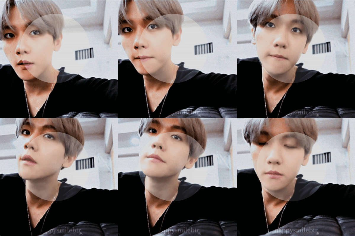
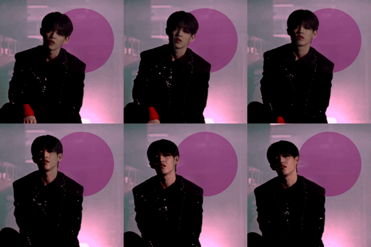
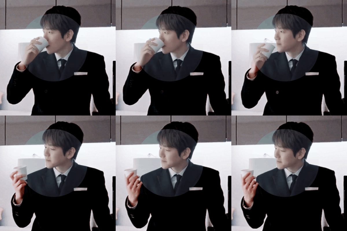
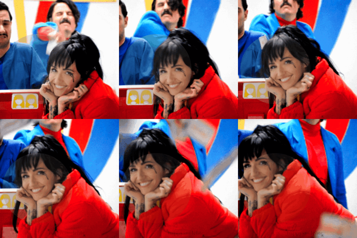
COLOURING BEFORE & AFTER TAG:
tagged by the lovely, kick butt and awesome sauce content maker @digitalgirls (thank you very much for the tag!) and another lovely mutual but for the life of me my peanut brain forgot who it was so thank you also to you too if you see this!
tagging (only if you want too!): @jinniebit @snug-gyu @soonhoonsol @woozification @seokmins @injunnies @chogiwapadada @jeonwonwoo
welp here you go guys! my poopy gif coloring lol. i haven’t giffed much as i just started 2ish years ago now(?) and i am now working a full time job so alas, i don’t have much to really show improvement but i do feel proud with some of my colorings and here are my top 5 (plus bonus two in the read more section hehe) i guess my coloring is more so with making things brighter if that makes sense? keeping things natural but bumping up the vibrance as you can see in certain gifs like the lights one for example. i do feel content with my giffing, granted the quality could be better but that is due to me using ezgif as a converter for making gifs on photopea (i know i can use vs but vs SCARES me like everyone that uses it? you guys are officially badass like gandalf in my books! i bow down to you all lol)
if anyone wants to hear more in depth thoughts of my coloring for each gif plus see the bonus ones that are too tiny to show in a normal gifset, readbelow but if not thank you for checking this out!
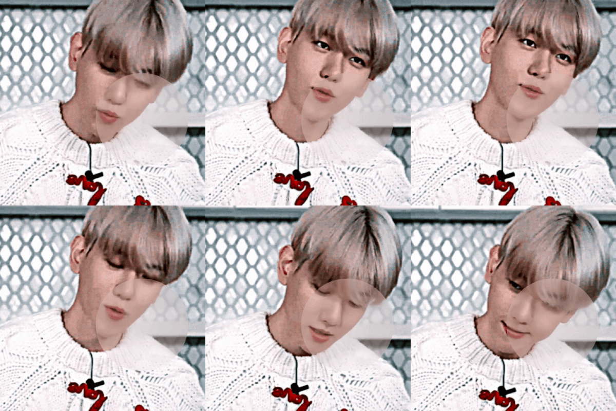
gif one: starting off with my proudest one of the bunch, this gif is from my baekhyun countdown series which you can view right here oh my when i say i am proud of this, i am SO proud of this. first of, this short video is pale, REALLY pale. more pale than casper the ghost lkdsalkjda so i struggled with making sure to not overdo the coloring where baekhyun is weirdly colored but making sure it’s no longer so bright ya know? with what i work with, i think i did a good job? it was during this series i started using a gradient map as well for my coloring and ya’ll....use gradient maps lol. i would have used them earlier but i had no clue how to well, use them as silly as that sounds! i found a tutorial on how someone used them and since then i use that. usually use brown to grey to make things neutral but also make sure skinetone is as natural as possible but of course that isn’t always the case, this is something i struggle with as you can probably tell so i am trying my best! overall, a very pretty gif coloring i think! simple but pretty!
gif two: ah yes....my og fav hehe. this was during the 17 days of 17 event that happened last year almost now and this was for of course, scoups day and i am proud of it still! granted, i would do things a tiny bit more differently even though this is just what, a 6ish months difference in giffing from the first gif? regardless, this one is my favorite and all because of one silly thing...the color changed background. as you can tell in the circle, the original was purple with the lightning background and i actually did save my coloring originally with this background still! however, i was playing around with coloring and by accident, just out of curiosity, i changed the color of the background and when i say i was super shocked...i was lol. in a good way of course! don’t ask me why but at the time, i just loved this small change. i thought it was so cool and it made me so excited so i kept it. could i have kept the purple? for sure, it bothered me to this day if i made the right call because a mutual of mine said the purple looked better against scoups skintone which i agree so it eats me to this day lol. (no ill feelings to my mutual! i liked having the feedback because sometimes that initial excitment sometimes isn’t the right call and i like being told the truth!)
gif three: another of my baekhyun gif series which again.....WHY DOES SM OR WHOEVER EDITS THESE VIDEOS, MAKE THINGS SO PALE!?!??! like bro....this one baekhyun IS truly casper the ghost dsaldasl. i managed to save him in this gif set but when i kept doing double takes myself when giffing, i always went “wait, is THIS how it originally looks!?” like i was so surprised with the coloring difference
gif four: featuring my queen, lights. the only non kpop gif lol. she is the reason i got into gif making actually! my first ever gifset is for her mv “prodigal daughter” (which yes you should all take a listen too just saying) so you can thank her for my gif making! this was from her i think 3rd mv, “in my head” which you can check out the gifset here! this is a perfect example of my coloring i think, the making things vibrant but keeping it somewhat natural and for me giffing this without gradient map i feel dang proud lol. it was either this gif or another one of lights but i went with this one instead to showcase i guess my usual coloring ya know?
gif five: and lastly a baekhyun gif once again. this one is originally meant to be with a pink coloring overlay and font as seen in the original gifset but i kept the original coloring because i liked how it turned out overall! i decided to switch things up with my editing by using unsharp mask and instead of using 30% i did 135% and kinda liked the result of it! i do admit, if you are someone like me and are stuck using ezgif, make SURE the file is super hq! while this does look nice, imo it looks better with good video quality when making the gifs as i did this setting for the last 4 gifsets of the baekhyun countdown and for ones like this one, it looks nice but some weren’t very high and you can tell it looks a bit meh. this is i think my current giffing editing and i feel proud of it! this one is very natural in coloring but everything is more “pop” if that makes sense, things are more defined than smooth, the neutral colors look lively, etc.
BONUS:
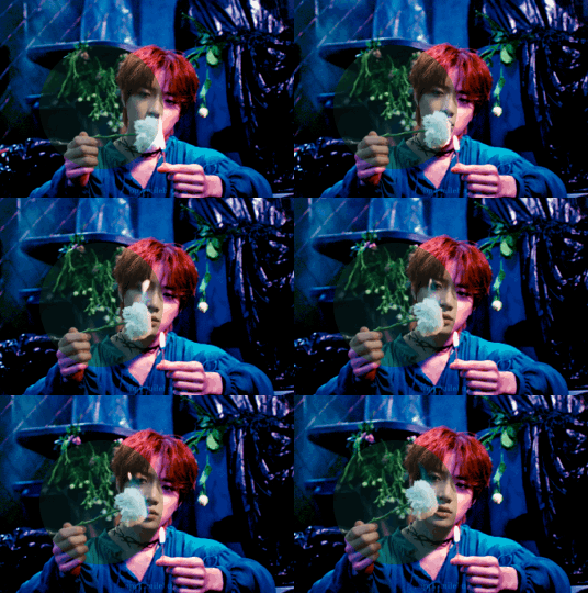
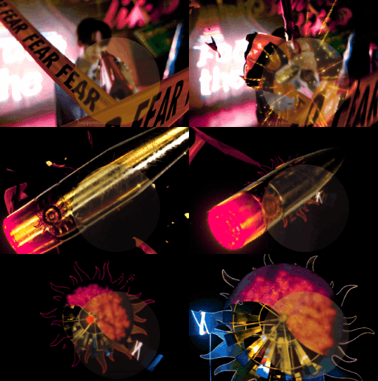
you guys thought i would leave out these ones? oh no lol. so these two gfs are from my txt “good boy gone bad” mv and seventeen “hot” mv gifsets i made! i remember seeing this gifset style being HUGE back in late 2017ish up until 2019 if memory is correct by an old school content maker. i saw they had a tutorial on how they did their sets back then so i followed it and made my own for these mv’s and man i loved doing them. not only was the setting up the scenes to use was fun but finding the right font that fit the mv vibe was fun and of course, the coloring. for txt’s, there was alot of greens as you can see here and while i like me green, i wasn’t happy with just how dark and swampy it looked lol. i get it was the aesthetic in general but i wantted it to pop alot and thus the blue/purple tones in the overall gifset which i think looks really beautiful! then for hot, i didn’t plan on the pink coloring lol. i originally wanted to do the usuals, brighten and and make the colors pop out but by moving around to color the orange colors, it turned more pink so i went with it (you can see the difference towards the end of gif of how different the pink and orange are!) still my proudest coloring on both and still am proud for the “hot” as that was originally my top set with notes until somehow baekhyun and his doggo took over xD
#fun tag thingy#digitalgirls#jeonwonwoo#seokmins#injunnies#chogiwapadada#snug-gyu#soonhoonsol#woozification#jinniebit#if anyone of ya'll read that entire essay under the readmore...i am kissing your forehead
8 notes
·
View notes
Text
i read a post saying how we should make true barbiesonas based on the movie concept of each doll being tied to a real-world person and their mindset influencing the doll’s own SO. though p much all the ones i had were movie/princess dolls heres the story of the only generic barbie and ken i had/have <3
Travel Barbie
 i tried finding her in the attic but with no success, she might’ve been donated <:/ either way she was a generic blonde barbie that usually had her hair pulled up/back so it looked cool in her helmet, but i can’t remember what color eyes were so for uniqueness sake imma say she had color shifting hazel eyes ¯\_(ツ)_/¯ (face claim is chloe grace mortez (or sabrina carpenter, ive been a fan of hers for forever but i dont think her eyes or face/body shape match the character so im torn))
yall i had SO many vehicles, the only one i still have is her bike but i also remember a pink car, a little camper van, and a carriage for the princesses ofc
so it only makes sense that her ‘job’ would be traveling/exploring, just making her way across the country through different means and sharing her experiences, maybe through reviews and blogposts maybe through writing and memoirs who knows :p
i’m leaning towards the latter so she can mirror my own love of writing and flowery word choice, just not to an award-winning degree but girl me neither dw
i also want to imbue my creative nature into her so she also loves drawing singing and cooking— painting the sceneries she comes across to capture their vibrancy, vibing along to the radio as she drives or camps out for the night, and making herself tasty pancakes and smoothies and pasta and chili and cupcakes and smores using the limited counter space she has to fuel up and treat herself throughout the course of the day <3
assumedly she would also be rather active/athletic and resourceful, with a decent amount of knowledge regarding mechanics so she could fix any malfunctions while on the road
(this tracks cause my mom has an rv herself and is also handy like that so she would inherit those traits from my mom (her grandma ig?? if you wanna think about it like that lol) which furthers the familial themes of the movie)
also i absolutely ADORED weird barbie’s robot dog so my barbie’s getting a dog too!! a curly haired poodle that loves water and long rides like my irl dog does!! is it real? that’s up to reader interpretation ;)
as mentioned above my main dolls were ones from the animated movies, specifically the diamond castle since it was and is my all time favorite, and i had alexa and liana along with melody and the two other muses
(yall the texture on their grecian dresses was SO nice i remember it to this day—)
(i also had rosella from the island princess movie which was my second favorite)
i don’t know if they’d be in barbie land canonically but i’m not characterizing them here cause they’re… already… characters…
BUT i’m using that to say travel barbie is friends with royalty, and as such is simultaneously fun and friendly while being mature and refined with a princess-y vibe from being surrounded by them so much
maybe cause gloria had skipper’s treehouse as a kid so her barbie lived next to it, my barbie would live next to the diamond castle or sumn afshjdasvdjs
in terms of who she is it makes sense, being well-traveled and getting the chance to meet people from all walks of life, and just clicking with them specifically for no particular reason
but it also works in terms of who I am/was, even when i was super young i was kind and generous and bouncy but a bit more serious and reserved than other kids, it just works so well with how those traits would reflect on my barbie both in and out of universe :))
if she’s still in my possession/house somewhere and connected to me then at the VERY moment shes just generally emotional with an inexplicable love of life and humanity yall im telling you this movie is affecting meeee—
overall tho she’s more mushy like stereotypical barbie, sad and complicated and anxious for no reason at times but still lively and talented and living her best life and working through it all with the help of her friends
i can’t remember if i’ve found her in the past, but man i hope i didn’t have her out for long, that’s how you get “inexplicable thoughts of death barbie” and “highschool dropout barbie” and “why don’t i have a real job why is everyone around me so much more successful barbie” and “feeling inferior and ugly and ashamed and unlovable barbie”
IT’S IN THE PAST YALL I SWEAR IM DOING BETTER I GOT MEDICATED SO WOULD SHE—
super close with psychiatrist barbie nowadays 😂😂
speaking of i saw this meme/image (credit to gmf.designs on ig!!) and the culture of this movie just continues to hit hard, like it fits so perfectly i—

Swim Ken
clean-shaven black boy with sculpted hair and colorful striped swim trunks (faceclaim and bodyclaim is winston duke)
as such his job wouldn’t be just beach like rg!ken but rather swim/swimming, which also extends to pools
is he a good swimmer? beats me 🥴
he likes it that’s all that matters!!
i appropriately don’t remember much about him since i wouldn’t play with him much lmaooo
the only other boy doll i had was the prince from island princess (specifically remember his gorgeous blue jacket and his weird pointy plastic crown band thing), so they would be best friends and as such, he would have a similar elegant/royal vibe about him
aww he probably gets a bunch of ideas on how to woo travel barbie from him
honestly?? idk if theyd be more like margot robbie + ryan gosling or ncuti gatwa + emma mackey in terms of relationship
(ik that one part where they hug and stuff is supposed to be a shoutout to the sex ed fans but i truly think theyre an item vs being just friends, and different barbies have different types of relationships with their kens)
anyway idk what type of relationship they’d have but he’d be super gentlemanly and romantic regardless, true prince material
they probably have a lake in barbieland right? for rowing and fishing and stuff
that’s where they would hang out/meet up the most, still go to the malibu beach ofc but a quiet crystal blue lake fits the vibe better imo
he simultaneously has pool lake and beach vibes JUST ALL THE WATER
#barbie#barbie movie#barbie 2023#barbie spoilers#barbiesona#crying at how long her description is in comparison to his omllll#im not counting this as an oc thing really cause i probably wont revisit it ¯\_(ツ)_/¯
3 notes
·
View notes
Text
Colorbar Lipstick: Shades that Every Makeup Lover Should Have in Their Collection
There are hundreds of lipstick shades available in the market, but most of them are not for everyday use. You only need four lipstick shades that can be your friends for both glamorous evenings, a casual brunch, or an everyday office look. In addition to the selection of shades, choosing the right brand can significantly impact the overall look.
Colorbar Cosmetics stands out as a brand offering high-quality lipsticks in a spectrum of shades to suit every occasion and personality. In this blog, we’ll explore some must-have lipstick shades and recommend stunning options from Colorbar’s collection that every makeup enthusiast should add to their makeup collection.
4 Must-Have Lipstick Shades In Your Makeup Collection
In this blog, we are recommending 4 Colorbar lipstick shades that are perfect for both everyday and glam look.
1. Classic Red: The Bold and Timeless Choice
No lipstick collection is complete without a classic red. This shade is synonymous with power, elegance, and confidence, making it perfect for evening parties, romantic dinners, or simply when you want to make a bold statement.
Colorbar Sinful Matte Lipstick in Mistress: This deep, true red is the epitome of boldness and has a slightly warm undertone, making it flattering on a variety of skin tones. Its creamy matte formula glides effortlessly on the lips, delivering rich pigment in a single swipe.

Shop Now
Colorbar Velvet Matte Lipstick in Luv Me: A vibrant red with a hint of orange undertone, this shade is ideal for daytime glam. The velvety finish strikes a balance between matte and creamy, ensuring comfort throughout the day without compromising on the boldness of the red. You can pair this red with Colorbar kajal to create a smokey eye look, perfect for parties.

Shop Now
2. Nude Shades: Elegance in Simplicity
Nude lipsticks are the backbone of any makeup kit. They’re versatile, subtle, and perfect for everyday wear, complementing both casual and professional looks.
Powerkiss Matte Lipstick in Sugar Candy: This soft beige-toned nude by Colorbar is a go-to for minimalistic makeup enthusiasts. Sugar Candy shade blends seamlessly with your natural lip color, making it ideal for those who prefer subtle elegance.

Shop Now
Colorbar Sinful Matte Lipcolor in Corset: A slightly deeper nude with hints of brown, Corset is a universal shade that works across skin tones. Its special formula offers a cushiony feel and long-lasting wear.

Shop Now
3. Pretty Pinks: Playful and Feminine
Pink lipsticks are the second most popular shades for lipsticks. It adds a touch of romance and playfulness to your look. From soft blush tones to vibrant fuchsias, there’s a pink for every mood.
Colorbar Take Me As I Am Lipstick in Viva Magenta: This medium pink shade has a creamy texture that feels like a balm but offers the intense color payoff of a lipstick. Viva Magenta is ideal for creating a fresh, youthful appearance and pairs beautifully with floral dresses and light makeup.

Shop Now
Colorbar Velvet Matte Lipstick in Thrilling Pink: This shade of pink is perfect for achieving a subtle yet polished look. The velvety texture ensures your lips stay soft and hydrated throughout the day. Thrilling Pink is a wonderful choice for daytime outings or brunches with friends.

Shop Now
4. Bold Berry and Plum Tones: Dramatic and Mysterious
Berry and plum shades exude confidence and mystery, making them perfect for creating a dramatic evening look.
Colorbar Velvet Matte Lipstick in Sultry Pink: This rich shade of pink combines the depth of berry tones with a hint of vibrancy, making it a bold lipstick option. The semi-matte formula offers long-lasting color without drying out your lips.

Shop Now
Colorbar Sinful Matte Lipcolor in Sins: A deep plum shade with cool undertones, Sins is a statement lipstick for those who love experimenting with bold colors. Its velvety matte finish adds a touch of luxury to your makeup, making it perfect for cocktail parties or festive occasions.

Shop Now
Conclusion
From classic reds to vibrant corals, these Colorbar lipsticks are the perfect addition to any makeup lover’s collection. Each shade offers something unique, catering to different moods, occasions, and styles. With their high-quality formulations and stunning finishes, Colorbarlipsticks are more than just makeup; they’re an experience. Along with their lipsticks, you can also check out Colorbar primer, nail polish and Colorbar foundation. Shop Now
0 notes
Text
Artist Selection Post

Sam Gilliam - "Swing", Acrylic and aluminum on canvas. (folding and crumpling canvas that he had soaked in paint), 1969, 303.8 x 720.1 cm, Smithsonian American Art Museum
I am interested in Sam Gilliam because of his innovative use of canvas! The folding and crumpling of the material and soaking it in paint really intrigued me. His ability to transform traditional painting techniques into dynamic three-dimensional forms challenges my understanding of what painting can be. His work pushes the boundaries of painting and creates a sense of movement and spontaneity that feels alive. I love seeing a medium that I am familiar with be transformed into something unique and unconventional, it's very inspiring! “Swing” exemplifies this transformation, the work's scale and vibrancy is very inviting and allows me to engage on an emotional level. I believe his pieces can evoke powerful and connective commentary.

Nick Cave- "Architectural Forest Dimensions variable", Bamboo, wood, wire, plastic beads, acrylic paint, screws, fluorescent lights, color filter gels, and vinyl, 2011
Nick Cave’s work fascinates me due to his ability to create an immersive environment that invites the viewer to navigate a colorful landscape filled with many layers. This is particularly shown in “Architectural Forest,” his use of unconventional materials and the vibrant interplay of light and color not only capture attention but also addresses themes of identity, community and cultural expression. I appreciate how he transforms spaces into an experience so the view is fully immersed into the artwork. This particular detail of his work prompts me to consider my surroundings when making an installation of work and what kind of narrative do those surroundings bring.

Billie Zangewa- In “A Vivid Imagination,” Ms. Billie Zangewa shows herself in her garden, in a bikini, “dreaming of being by the sea.” This is a hand-stitched silk collage, 53.54 x 72.05 in (136 x 138 cm)
I am drawn to Billie Zangewa’s work because of her unique approach to storytelling through textiles. I admire the amount of time and dedication that is put towards her handmade creations. Her vibrant silk collages explore themes of identity, femininity, and the relationship between nature and one's self. In "A Vivid Imagination," Zangewa portrays herself in a garden, dreaming of the sea. Her ability to weave personal and collective stories through textiles resonates with me, as it reflects the complexities of womanhood and the nature of identity. I admire how she combines traditional craft with contemporary themes, creating a dialogue about heritage and modernity that invites reflection on my own experiences.
Overall, I am eager to explore any of these diverse artistic practices that challenge conventions and our understanding of identity and community. I believe each artist offers a unique perspective that I find very inspiring and I look forward to immersing myself into their works!
0 notes
Text
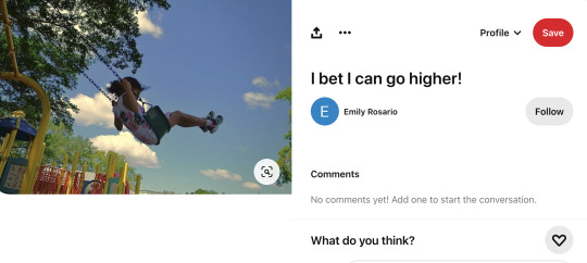
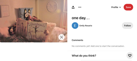
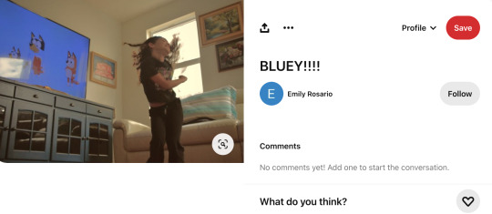
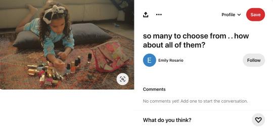
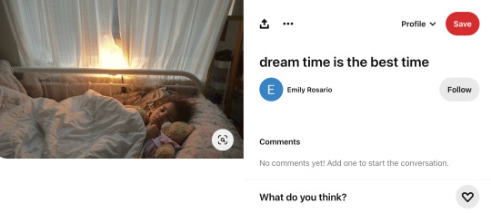
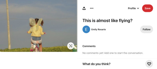
Final work by: Emily Rosario
title: Girlhood Core
My two main inspirations were the photographers Melissa Haugen, and Juuso Westerlund. I came across both of them on Pinterest. I was immediately drawn in by the way that they present movement in the photos. The photos capture a sense of animation and youthfulness that I would also like to present. I also appreciate how their images romanticize the ordinary life of kids as they go about their day.
One of my other sources for inspiration is the 2017 film, The Florida Project. This strong film follows the story of six-year-old Moonee and her fellow playmates. Living in a shoddy motel off the highway right next to Disney World, Moonee lives a rough low income life with her struggling single mother. Despite the harsh reality of her life, Moonee has no trouble living in her childlike world, where her worries are those of getting enough playtime while the sun is out. This reminds me very much of my eight-year old sister who still maintains her bright and lively character even after our family has gone through traumatic events and difficulties. This theme of innocence and childlike naivety to the realities and sufferings that adult are forced to confront.
Project Description:
"Girlhood Core" is meant to evoke nostalgia with my viewers that revolve around childhood memories that we may have forgotten with the passing of time. The main subject is my little sister who was my main source of inspiration. In a time where children are growing up faster than they need to, partly because of the internet and social media, I want to capture these moments where my sister is thriving in her vibrant, and imaginative world and emphasize the special and wholesome nature of what it means to be a kid. My photographs are meant to give a blurry or fuzzy effect, alluding to our hazy memory of childhood. I wanted my photos to be primarily candids, which makes the context less artificial and therefore more easier to relate to. My angles are different in each photo in order to change the perspective of the viewer that helps engage them with the activity that is happening in the photo. I used low angle shots to add drama to the scene. I also purposely obscured my sisters face in some photos to draw attention to the activity she was doing, so that way the viewer can place or see themselves in her position. In each photo, I wanted to keep a dynamic composition so I made sure to move her around the frame and have her in different positions. I also wanted to keep the frame busy, since I wanted to capture the disorderly fun of childhood. Overall, my theme is the enchanting world of childhood that is a sadly fleeting thing.
For this project, I used my Nikon D5100. I would incorporated techniques such as large depth of field, short depth of field, contrast, color balance and overall composition. I also experimented with different exposure times, depending on the time of day I am shooting at. To achieve the film filter effect of my images, I used both the Adobe Photoshop 2024 and the MacBook Air Photos gallery edit feature. On Adobe photoshop, added a layer of the photo filter Sepia, which is a warmish orange. I edited the Noise/Grain to about 50% to create the blur like effect. I also added a Curve Adjustment layer and made a reverse ‘S’ shape. On the Photos gallery, I lowered the contrast and added a vignette. I reduced the saturation to add the vintage look while bumping up the vibrance to retain the sharpness of the colors.
If I could continue this project, I would love to recreate scenes from famous movies that I watched as a kid. For example, The Parent Trap (1998), Cat in the Hat (2003), Bridge to Terabithia (2007), or Matilda (1996). I would also love to include more of my sister's friends or cousins, to have the atmosphere more lively and vibrant.
0 notes
Text


My Personal Goal and Steps I'm Taking to Achieving Them:
My goals for 2024 have become clear. The past few years I've focused intently on emotional and spiritual wellbeing, so it's time to round out my journey by adding in the physical aspect.
I've never been one to choose the 'healthier' options. I love my junk food, my comfort meals, and my pops. After turning 27 last December, I started to realize what I put into my body impacts my overall health - I was stunned by this during my running journey. I noticed a big difference when I smoked oui'd and ate junk before runs versus not smoking and eating more whole foods with no pop and more water. Like okay, my doctors were right.
So here I am, starting over at my absolute highest weight (I swear my scale is wrong, I'm getting a new one delivered) AGAIN. It's disheartening but also motivating. 260 pounds, sheesh. I was just 245 pounds less than 30 days ago.
Inhale. Exhale.
Steps I'm taking to achieve my goals
More movement. Be it daily walks, home videos, or a jog
Drink more H2O! Cutting pop will be hard but beneficial
Eat more protein in more forms
Less highly processed foods (McDonald's, chips, snack cakes)
No more 'beige' diet. Add color, texture, and vibrancy
Getting adequate sleep each night. 7-9 hours is the sweet spot
Small, obtainable, habits I can do every day. I'm already doing most of these things. The goal isn't skinny, it's healthy. I never want to worry about my physical ability, I don't want to be held back by my own limitations. This is something I can change, I saw how my fitness could increase during my running era before the Holidays and getting the Vid. I feel like I'm set back, but it's okay. It's okay. It's. Okay.
(not my photos)
0 notes
Photo

I got another beauteous commission from @rayeliann and this time, I got a flower crown portrait of Sabina Peg’asi, one of my A6 travelers from the Andromeda Six game. She’s half Tilaari, half human, and is all around sweetheart with a compassionate soul. She just wants to learn more science and medicine so she can heal and help people out, and actually doing something worthwhile in her life, even if her contributions are small in the grand scheme of things.
The two flowers I selected for Sabina’s flower crown are purple tulips (nobility/royalty, rebirth, spring) and white yarrow (healing/good health, inspiration, everlasting love). And they look so lovely in her hair--I love how each petal looks so finely detailed and the layers are colors are skillfully shaded. Everything about this work of art screams out beauty and perfection, especially with how all of the hues, both bright and dark, appear so lush and pop out to snag my attention. Thank you, @rayeliann, for making this commission a reality. <3 :D <3
#rayeliann#Sabina Peg'asi#Andromeda Six#andromeda six traveler#a6 traveler#A6 game#A6#*does a dance of joy and has a seizure of happiness*#I'm in awe#I am in love with the colors and their overall vibrancy#And the shading enhances all the different layers of color and makes everything in the piece appear more realistic and sharp
31 notes
·
View notes
Photo
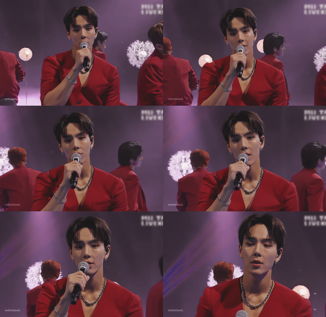
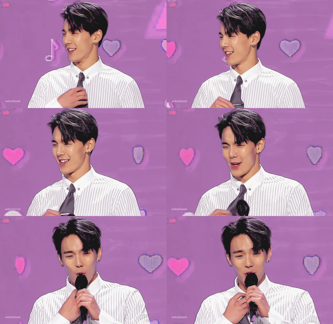

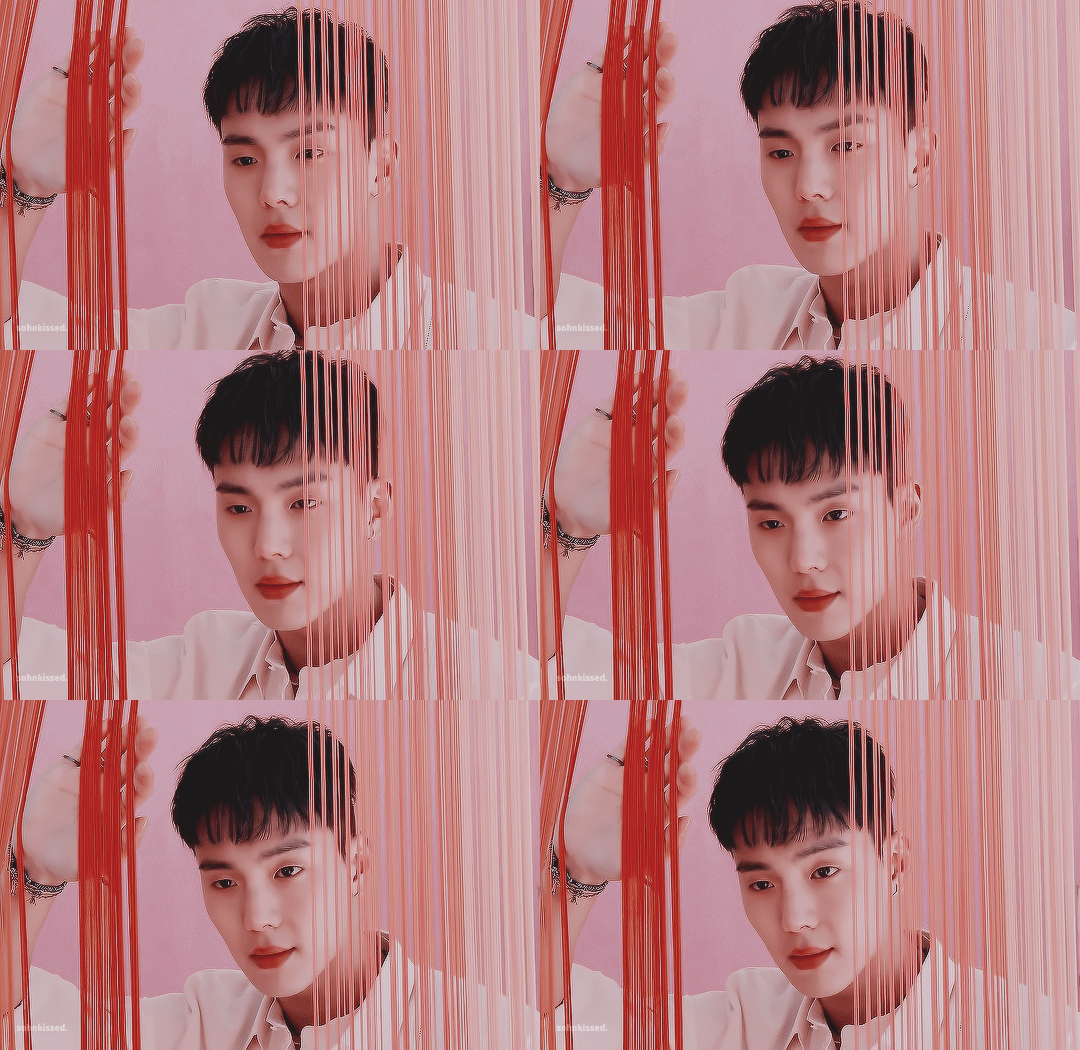
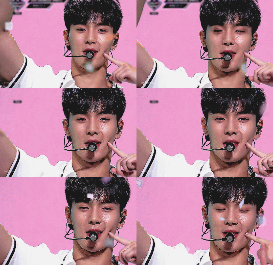

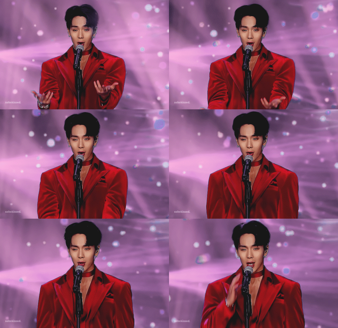
210618 ✦ shownu + the color pink (unconditional love, nurture, hope
Kind and nurturing, pink is a friendly color that soothes and comforts us, bringing both joy and warmth in our lives. It is always observant; it takes note of how other people feel and boosts their morale. Pink seeks to accept others and does not intimidate or threaten; rather, it elevates the spirit.
As the color of hope, pink works hard to counteract complicated emotions such as rage, aggression, and wrath. Pink is not a rash color; instead, its calming presence serves to remind us that even in moments of helplessness, everything will be okay. It is endlessly thoughtful and encourages us to become more empathetic and understanding of both ourselves and those around us. Despite its vibrancy and showmanship, however, pink does not always enjoy being in the center of attention. Too much pink may represent moments of self-doubt or hesitancy, occasionally causing one to overlook their own needs in favors of helping others.
Overall, pink takes the edge of the extremes of red, transforming that passion and drive into a softer, more loving energy. Its steadfast conviction and love for life makes it difficult not to smile and lose hope in the presence of pink.

dear shownu, our beloved sohn hyunwoo, happy birthday! thank you for always being such steadfast presence for monsta x and monbebe alike to rely on. without your unbreakable spirit and kindness, we would all be worse off. though i missed you terribly during gambler promotions, i’m glad that you’re resting well. congratulations on one of a kind’s success! there are no words to express how proud i am of how much you and the other members have grown this past year. thank you for all of your hard work. happy birthday, hyunwoo. i hope today brings you happiness and health. i love you.
666 notes
·
View notes
Note
The new game you've made is just absolutely breath taking and beautiful! The beautiful blend of your culture, the incredible details from the blouses and skirts paired with the monochrome yet still bright overall color design. But what truly shocked me was the vibrancy of the flag colors that demand the eyes to focus on the one carrying it
Once again you've created an art piece that not on inspires, but allows people to interact in and dress up in a way never done! You truly are a brilliant and lovely person and I hope you remain safe in these troubling times
Oh! Hiiii!!!
Thank you so, so much - it is always such a delightful time to see you some more! And I am infinitely glad that this project came to your heart and soul - its value from a personal and creative side is of great importance to me<з
I hope you were allright - me and my family are doing okay in the most parts, too! Standing firm, build our lifestyle and work through the fields and situations, too - times are going on still, unfortunately it is or not.
Thank you some more - and a lots of loves, and delights, and beautifull days for you!;***
8 notes
·
View notes
Text
For the first time in a long while, Grian couldn't place his wings.
At first glance, they looked like unmodified elytra, grey with a faint shimmer, but ink black bars and spots quickly covered them. Odd. They were still a dingy grey, they would change soon enough, into whatever vibrant pattern the world decided would fit him best this season.
The next good look he gets the tips are darkening, and the shoulders have an oil slick vibrancy that outshines the enchantments he's added. A luminescent eye shines from the rainbow, and has the audacity to wink before fading back into the overall shimmer. Par for the course, honestly, Grian is reluctant to admit, but he still can't figure out what pesky bird his wings have decided to be. It's a mystery, but one that can wait.
It's not until Scar is excitedly explaining that their wings match, his a soft brown with a startling few spots of shining blue green, that Grian stops. The wings suit Scars current elven appearance, and Grian knows that Scar is likely right, even if he wishes it were not true.
“How do you figure that? They look completely different. I don't even know what wings they are!” Scar smiles, “Well I am a lovely wood elf, so I got wood dove wings! You on the other hand-” At this point he just started snickering. “Scar.” It's said with the warning tone of someone drawing a bow, which is what Grian was midway through doing.
“Its just-” And he breaks into a further set of giggles. “Pigeon!” “Scar I-” he has to admit, they do look like pigeon wings. Its quite obvious in retrospect, but it doesn't make sense, and he says as much. His wings fluffing do little to hide his disgruntlement. “Jellie told me! It's like I said, I'm a wood-dove elf, and you are a rock dove…person.”
And his colorful wings were eaten by the Entity. He isn’t surprised, and he can’t even say he’s disappointed. He looses the arrow in the vague direction or Scar. It doesn't help, but Scars’ scream does make him feel better.
#fic#which wow gg me#grian#scar#listen it started with the rock dove joke but scar deserves pretty bird wings too and he really has said wood elf so i had to#anyways now that they have wings i have been sitting on this headcanon for a few WEEKS NOW#Fic below cut#brynny chaos#GTWscar#if i missed a fandom tag lemme know
11 notes
·
View notes
Note
may I ask how you’re able to put a color filter on a selective part of a gif?
i'm so glad you asked, anon, because i'm trying out a new method!
all credit goes to the creator of this lovely post, who helped me find a new method that's working wonderfully!
but, since you asked me, i'll try my hand at making a tutorial!

color filters for gifs;
i’m just going to go step by step for how i went from the gif on the left to the gif on the right:

(i’m using photoshop, btw. i don’t know how to use other editing software, sorry!)
FIRST: make the gif, sharpen and crop it, then use a curves level to make things brighter! — when choosing the gif, i find it easiest to edit gifs where the subject doesn’t move a lot - then, you can make sure their skin color doesn’t turn out weird. — the brighter you go on your curves level, the easier it is to make vibrant colors, but in this particular instance, i didn’t do anything particularly drastic.

(if you notice, for the gif on the right, i cropped it so there’s extra room on the top. i did that because i needed more space at the top for writing that i was originally going to include.)
SECOND: go to color balance and alter the overall color of the gif to more closely mirror the color you want. in my case, i want a pink gif, so i made the color balance more red and more magenta, overall. i also took the eraser to where the subject’s face and chest is, so that he is not pink-ish, as well.
THIRD: use selective color to make the colors of your choosing (reds and magentas for me) closer to the color you desire. i also took the eraser to the subject’s face and chest, again, because he has red tones in his face that i didn’t want to change. i made my reds lighter overall and more magenta, and made my magentas more red.
FOURTH: add a vibrancy layer! this will make all of the colors more saturated, so depending on your style, you might want to erase out the subjects face, once more. — i didn’t, on my first vibrancy level, because i wanted the colors to gel together nicely (but i also didn’t use a lot of vibrancy to avoid odd coloring, so pick your poison).
here’s my settings for color balance, selective color, and vibrancy:


progress so far:

FIFTH: repeat the above steps until you have a color you’re proud of! — don’t neglect the other colors in the gif! in this gif, the subject is wearing a shirt with blue stripes. i brightened the blue so it would more nicely match the saturated look of the gif. — i also use selective color to make the whites lighter, and the blacks darker (for the subject’s hair).
in a different gif, this would be the final step. however, because this gif has a lot of shadows in the background, where i want to color, i add in a few more steps, in the next section.
gif after repeated steps:


if you have shadows in the background;
having shadows in the background is a problem when you want very vibrant colored gifs, because it pulls the eye to the shadows and not the color. luckily, getting rid of it is not too difficult.
TO FIX: go to selective color and look at the blacks. make the blacks lighter, and make them more red (or whatever color you are aiming for). — don’t forget to take the eraser and erase around the subjects hair, clothes, and eyes! otherwise, it will look odd.
here are my settings:

here’s the gif, after i change the shadows:


i continued to edit after this, using the selective color, and vibrancy to make the pink more light and vibrant!
i also added another blank layer and colored the top so i had extra room above the subjects head.
here’s the final product:

hopefully this was helpful!
there’s another way of doing it, where you basically add a solid color layer, change the opacity to something like 60%, and erase the area around the subject’s face, but as you can see in gif sets like this one, it’s not as effective, all the time.
i suppose it’s a case my case basis, to decide which method to use, but i am liking this way much better!
#asks#i'm not the best at wording things so sorry if this is confusing. i tried to use pictures to explain myself better#retvenkostutorial
29 notes
·
View notes
Text
What I Thought About "Yesterday's Lie" from The Owl House
Salutations, random people on the internet who absolutely won’t read this! I am an Ordinary Schmuck. I write stories and reviews and draw comics and cartoons!
Here it is! The midseason finale of The Owl House Season Two! An episode featuring Luz going back to the human realm, is hyped up to heaven about how painful it'll be for the audience, and features more anxiety by how Creepy Luz is a thing. And BOOOOOOOOY howdy were fans not ready for this. I'm sure as hell not ready for when I wrote this intro at *checks time* thirty minutes before watching the official premier. Yup, the words you're reading right now are from me in the past, when everything was still pure and simple. Whereas future me is still probably destroyed by the events that transpired. Isn't that right, future me?
Future Me: Actually, it wasn’t that bad. The ending hurt, sure, but other than that, it wasn’t too painful.
Wow, that is some neat input! At least, I think it was. I wouldn't know because I literally wrote that after watching the episode. With the words you're currently reading being written at *checks time* twenty-six minutes before the premier...this whole intro is confusing, isn't it, future me?
Future Me: Sure is.
Yeah, it's definitely confusing. In any case, let's dive into this spoiler-filled review as we find out together just how painful this episode was! Take it away, future me!
Future Me: Will do! Major spoilers ahead, folks!
Now, let’s review, shall we?
WHAT I LIKED
Luz’s Room: We only see it for a short time, but everything about it just screams Luz. The pile of weird-looking stuffed animals, the witch hat in the center of the floor, and the fact that she has bunk beds, a single child's dream (Or so I've heard). It's a small thing, but I love it.
Vee: Here she is! The character previously dubbed Creepy Luz who now turns out to be yet another new addition to the ever-growing list of characters that we, as a fandom, would give our lives for. Because holy s**t was Vee the best type of expectation subversion. Showing us all the ominous ways of how she basically took Luz's place made fans assume that Vee was an evil doppelganger. Turns out, she was just a tortured soul that was desperate to live a new and better life and lucked out in finding Luz's. What Vee does is...questionable at best, but seeing what she went through with the experiments Belos pulled on her, you understand why she would do it. And I personally love it's that same background information that makes Vee resentful of Luz of all people. Luz's life is a relative dream come true, and running away from that would be insane to someone who spent most of their existence through imprisonment and experimentation. It's an intriguing point of view, even though it's admittingly flawed given how it's mostly Camila that seemingly made Luz's life bearable. But the flaws don't matter. What matters is that you can see where Vee is coming from, and to me, personally, I think she's understandable enough to make me root for her to have some kind of happy ending. Whether as Luz or as herself, I'm hopeful to see Vee get some semblance of peace.
Camila: *Round of applause* Don't mind me! Just taking the time to love how all them sons of b**hes who thought Camila was a bad mom are now heavily invalidated. 'Cause, guess what? Camila is a fantastic mother, both to her daughter and her daughter's doppelganger! Allow me to walk you through the highlights:
How Camila looks like she’s not okay with the fact that "Luz" is clearing out her weird stuff, seemingly acting too different to the Luz she knows. Added to the fact that Camila doesn't like it.
How Camila drove Luz to camp whether than letting her take the bus
The fact that Camila takes that box of junk back in, not willing to part with the tin foil sculpture Luz made.
The way she was willing to play along with the game she thought Luz was doing, supporting her daughter's creative mind that Camila admits to being glad to see.
And, best of all, the willingness Camila had to help this poor creature, despite the lies it lived.
It's that last part I really want to touch upon, though. Because an action like that shows just how much Luz's heart comes from Camila. The kindness and generosity of helping this poor creature, who she has every right to run out on, proves how Luz learned to be everything she is today through Camila's own loving heart. Vee was scared and hurt, and the second Camila saw that she was then more than willing to help because of it. It's something that Luz would do, and it proves that even though Camila didn't exactly get everything right, she's still a great mom where it counts.
“A new life”: A perfect line.
Initially, it makes audiences think that it has everything to do with replacing Luz. It's only through future context that we know it's about escaping the s**t show Vee once lived through that it's clear she's talking about starting over. It hits us with intrigue on the first viewing, only to hit harder with the feels during a second. Really well-done.
Luz in the Mirror: A well-done surprise that makes fans curious about how this even happen in the first place. Kudos to you, writers.
The New Portal: I don't mind that they found a way to build this off-screen. Showing Luz and the gang slowly building a new portal would have been a little too tedious to watch, and it's so much better to just start this episode out with it. Besides, maybe we'll get the slow and steadier version now that we've seen how quickly building one might not have been the best way to go, given how fast that thing fell apart.
Luz Between Dimensions: I have no clue what the hell that place she was in is called, but it's awesome! The overall design of the realm is the correct type of unsettling, like it's oozing with mystery, but it's somewhere that you probably don't want to be in for too long. Whoever designed it deserves all of the credit because I don't want to even think about all the hard work that went into making this look as well-made as it was.
Luz Resisting to See Amity: What? Luz and Amity are adorable, and seeing Luz's immediate thought about seeing Amity makes my shipping heart scream with glee. Don't judge me!
Hiding Luz’s Dad’s Face: Well, that was a fun story while it lasted.
So, it turns out that Luz's dad really was a part of Luz's and Camila's life at some point, but not anymore. As for why remains to be seen, as we don't really know yet if we'll see him make an appearance. I'd say that the odds are high that he will, given how much of a point this episode made about keeping his face hidden. Shows don't usually do that unless the goal is to hype up some official reveal, and I can't wait to see what comes of it.
Luz Telling Herself to Count to Five: Hey, more evidence for how I relate to Luz! I know how it feels to be all panicky about a specific situation, and I only got better when I took the time to calm down for a bit. Sometimes, I even tried the "count to x" method that Luz used...it never worked, primarily because it made me feel worse when people told me to do it, but I still tried it! Plus, there's also some narrative foreshadowing when after Luz says five, the realm shows her Vee, or Number V, which is a pretty cool detail you'll notice on a rewatch.
Luz Helping Vee: I gave Camila praise for helping Vee in the end, but that doesn't abstain Luz from her own set of recognition. The second that Luz realized that Vee wasn't really a threat and is far from evil, our favorite human does what she can to help and even makes a deal where they're both happy. Because, of course, Luz is that perfect of a protagonist who is more than willing to help others in need. And it's why we love her so.
Looking for Magic that Eda Left Behind: A pretty cool idea that gives Luz and Vee a chance to bond and giving us an insight into Eda's past antics and misadventures in the human realm. Not much I can add to it, though.
Gravesfield: It's surprisingly not as jarring as I thought it would be to spend an episode in the human realm. I thought for sure, after all that time in the Boiling Isles, there would be something off about walking around a normal environment for a change. Turns out, it's almost easy to get used to. Or, for me, it is.
But I will say that there's this neat use of colors when comparing Gravesfield with the Boiling Isles. In Gravesfield, the coloring looks dulled down and standard, which is a stark contrast to the bright vibrancy of everything we've seen in the Boiling Isles. It's a subtle way of showing how things are different, aside from the major discrepancies we could come to expect. And I think that's why I appreciate it much more.
Eda’s Called Herself Marylynn in the Human Realm: Hang on...hang on...do you mean to tell me that the crack theory about Eda being Stan's ex-wife is actually true?
...
...What even is this show?!
Vee Making Friends with Camp Members: This shows the most apparent difference between Luz and Vee. Where we see Luz is already fearing the many ways that could go wrong with interacting with teens, Vee revealed that she adapted to her situation and had a chance to make friends. The implications of this are worth discussing another time, but for now, I'll say that it's pretty intriguing that we gain this much insight into both Luz and Vee through such a small thing.
Belos Wanting to Learn How Basilisks can Drain Magic: ...Didn't Raine say that Belos was taking away magic? If so, I think we can figure out how he's doing it. The question now is: Why?
Jacob (The Curator Guy): This guy was a riot. At first, Jacob seemed like a threat with the way he trapped Vee and was apparently stocking her, but the second he goes off about his conspiracy theories, it becomes clear what type of character he is. And was it a blast seeing how much of a crackpot this man is. It wasn't cool seeing him wanting to dissect the precious angel that is Vee, but I still chuckle about things like his "Flat Eather's Certificate." So while he's not that much of a threat, he's still fun to watch.
The Owl Beast was in the Human Realm: ...How did that happen? When did it happen? And how the hell did Eda get out of a situation like that?! Who knows, but it's still a shocking piece of news to learn.
Luz Telling Camila the Truth: Hey, she faced her fear after all! Although, the results aren't as pleasant as when Amity faced her fear two weeks ago.
Camila is a Veterinarian: ...One insignificant reveal...managed to destroy so many fanfics. I mean, we probably shouldn't have just assumed Camila was a nurse...but what the f**k else were we supposed to think?! Sorry for seeing the scrubs, and the first thing that came to my mind was "nurse" and not "vet."
By the way, that had to have been intentional, right? There's no way that Dana Terrace didn't think we'd assume Camila was a nurse. She'd had to have put off a reveal like that just to trip up her fans. And if that's the case, then that is a major d**k move...but that's why I mildly respect it.
Two Human Brothers went to the Demon Realm: Turns out we don't have to be in the Boiling Isles to learn more about it. Because now we have more information about how two humans were taken to the Isles with the help of a witch, thus setting up a grander reveal if it turns out that one of the humans was Philip and the witch was Belos. Because if that's true...then there's more of a history between those two than we thought.
Jacob has a Training Wand: This helps me believe that it's highly likely for Jacob to make a return and to have a power boost for when he does. After all, focussing all that attention on the training wand is way too convenient for it not to come up again in the future. Meaning we're most likely going to get more pain from Jacob if he shows up again.
Camila Beats the Crap out of Jacob for Vee: ...Writers, don't make me choose between Camila and Eda on who's the better cartoon mom. I know Eda's technically not a mom...BUT I STILL DON'T WANT TO CHOOSE DAMNIT!
Also, the sandal...just...
Why the f**k does Camila have a sandal in her purse? I don't know. Is it still funny that she does? Most certainly.
Camila and Luz’s Talk in the Rain: Ooooooooh, I was not ready for this...
I wasn't ready for the crying.
I wasn't ready for the hurt in Camila's eyes when she found out Luz chose to stay in the Boiling Isles.
I wasn't ready for Camila asking if Luz hates being with her that much.
I wasn't ready for Luz profusely stating how it was never Camila's fault.
I was not ready for Camila to tell Luz that she'll try to do better.
And I definitely was not ready for Luz to barely have enough time to promise that she'll come back.
This episode wasn't the twenty-two minutes of nonstop angst that I thought it was going to be...but this short scene more than make up for it.
Luz Tries to Stay Strong: Yet another thing she unwittingly learned from Camila. Camila tried to keep a brave face when Vee was with her and Luz, most likely not wanting to tear either of them down in the process. Luz does the same thing here as she avoids talking about the details of what went down in her sort-of journey back home. And seeing her clearly fake smile slowly droop into an uncertain frown, it uh...it definitely tore me up inside.
WHAT I DISLIKED
I want to say it's perfect, but there's one major issue that really bogs this episode down.
Continuity Error in How Vee Replaced Luz: Having Vee take Luz's place the same day Luz appeared in the Isles is a smart idea on paper...if it wasn't for the fact that it's impossible.
Because Eda closed the portal door the second that she saw Luz, meaning that there's no way for Vee to go to the human realm. It's a major plothole that makes no sense, and it might just be the first time ever that this series wasn't so closely knit with its story. Which ends up taking a dive in quality in the process.
IN CONCLUSION
I'd say that "Yesterday's Lie" is an A-. Everything about Luz, Vee, and Camila is incredible, combined into a story that ends in tragedy and uncertainty for the future. That plothole may drag things down a bit, but everything else is handled so well that I'm not lying when I say it's easy to forgive and forget.
(And that's ten episodes in a row without a single stinker. HOW THE F**K DOES THIS SEASON KEEP WINNING?!)
#the owl house#the owl house spoilers#toh spoilers#luz noceda#camila noceda#camila is a good mom ok!#toh vee#emperor belos#what i thought about#the owl house reviews
52 notes
·
View notes
Text
Gif Maker Appreciation Tag
rules: answer the first half of the questions with gifsets of your own, then answer the second half by tagging gif makers you love!
tagged by @iridescentides @miriammaisel @molinareggie ty loves!
LINK A GIFSET...
Link a gifset you’re really proud of:
reggie + flower symbolism . it took me a bit to research and pick out the flowers but i think it really paid off! i love the way it looks and i should do more things like it i think
Link a gifset where you tried something new:
luke patterson + quotes . i just love having little doodles next to lettering when i do them in my sketchbook so i thought it would be cool to have a gif version of that! so thats what i did!
Link a gifset that features your favorite character or celebrity:
charlie gillespie edit! i’m really proud of how this came out tbh! i like the vibrancy of the colors and the b&w contrast next to it. plus i really like doing shaped gifs? idk i just think it turned out nice
Link a gifset that you want more people to see:
my julie molina pink + purple gifset. i worked on this for a while trying to get the colors right and it took me forever to find a typography set that i liked. i just really love the way it looks
Link a gifset that you had fun making:
jatp 5 songs ! i actually really love drawing/writing lettering and i think it always looks cool to digitalize it! so i did that here and tried to convey the energy of the song with the typography and i think it worked? idk to me i think they match well
Link a gifset that you created as part of a meme, challenge, or series:
jatp women - julie/flynn gifset! i think this might honestly be one of my best gifsets. the colors are nice, the text is pretty, and i just love everything about it. i def want to make more gifs like this in the future
Link a gifset of yours that makes you smile:
nick anderson + being confused. a simple edit, but i just think his facial expressions are so funny lmao
Link a gifset that you made for someone else:
my wonder woman gifset i made for @owenjoyner ! im still super proud of this set and i think it turned out really well :’)
TAG SOMEONE WHO...
Tag someone who inspired you to start making gifs:
@laufeysons daphne was one of the first people i followed here and i remember seeing her gifs and telling myself “i wanna do that one day” and now look at me!!! i’m doing it, ma, i’m doing it!
Tag someone who makes great vibrant gifs:
@iridescentides and @dani-clayton both make such amazing and vibrant gifs! vibrancy is something i can be very scared of so i’m always in awe when these two pull it off so beautifully!
Tag someone who makes great pale/pastel gifs:
@molinareggie alexis uses pale colors for her color palette gifsets and they still manage to turn out bright? like its not washed out or anything, its a nice pastel-y feel to the whole sets.
Tag someone who gifs for a fandom you love:
@alinastarksov valentina makes some of the best jatp edits out there tbh. the coloring is always so nice and the mix of serious + funny gifsets is amazing.
Tag someone who uses text/typography really well in their gifsets:
@andstitch uses text very well!! not only is everything easily legible, but it always helps convey the overall tone of the gifsets!
Tag someone who motivates you to step up your game:
is it a cop out to say literally everyone on this site? i’m not even joking. seriously, i’m in a lot of tags and i see edits ranging from people who have been vigorously giffing for years vs people who just started and every single edit inspires me to keep going. i would not be where i am with giffing if it weren’t for the support i get from people or seeing beautiful edits every single day.
Tag someone who you have taken inspiration from:
@owenjoyner and @bisexualsdean diana and el both have such creative minds that i often find myself tagging everything they make with my inspiration tag! the way they format their gifs especially influence me!
Tag gif makers who you admire and appreciate! (Put as many people here as you want!):
@stilestilinskies @denalifoxx @owenjoyner @bisexualsdean @alinastarksov @inejghafta @sambuckv @laufeysons @spencershastings @lizzie-mcguires @abigailshobbs @kellyabbott @oretsevmal @inej-g @austin-mahones @malikjavaddzayn @bukleys @dani-clayton @madeline-kahn
18 notes
·
View notes
Text
Something that needs to stop
I have to get this off my chest, I want to preach postivity, but I want to add a disclaimer: All gamers aren’t like this, gaming communities are not inherently like this and this is not an attack on all of them as a whole. I am disabled, I am legally diagnosed and on disability. I am legally and medically physically impaired and mentally impaired with multiple disabilities. I am neurodivergent. I have tourettes, night blindness caused by the rod in my eyes, in turn I have a form of color blindness and can’t see as much vibrance as others and certain light levels in colors are fully shades of grey and black to me. I cannot see as many colors as most able-bodied people. I legally cannot drive. I have general + social anxiety, depression, OCD, Dissociation, ADD, Dyscalculia, agoraphobia, Sleep Paralysis, PTSD, Insomnia, Severe Asthma, I also have Irregular Sleep-Wake disorder. My legs don’t always work right, they will randomly seize up into pains where I can’t move then will be so stiff I have to use a cane for days or weeks on end. I also have early arthritis and my hands will lose all ability to move or function stiffening right up. My neck, knees, shoulders and lower back is the same way. I’m in constant pain every single day except for that rare in a blue moon day my body decides to work right, then I can get some house work done or do some baking. But Some days I can’t and won’t even get out of bed the pain is too bad. But the days I can push past the pain to move even a bit, I do because if I don’t fight it, fight past that pain to exercise my legs, my hands, my back I may lose use of them for good. I could be paralyzed and its because I didn’t develop properly internally I was born premature and then for a majority of my childhood was physically abused with an already weak improperly developed body. I have lived with most of this since childhood. So my point here is, to show you and tell you, I’m not some nosy busy body, I’m from the community you are alienating. Now into the issue lets start by some common quotes I have been hearing all around gaming communities. “___ Will ruin the gaming experience it will take away the challenge” “Well why don’t you just do ___ to fix it, it doesn’t need to be implemented” “Well obviously you aren’t trying hard enough to fix it yourself” “The developers don’t have to cater to you snowflakes” “Your kind shouldn’t be playing games / People like you shouldn’t be playing games” “(Insert disability here) Shouldn’t play video games” Some of these are straight up ableist and gate keeping. We need to stop the gate keeping and exclusion based on disabilities. Tell me for those of you who think its okay to argue and protest accessibility options, for those of you who think a harmless gamma change for those who are nightblind or the ability to make controls easier for those who don’t have the same motor function the majority do, is going to ruin your whole entire experience when its an OPTION. I see all of your arguements as “Well this achievement will be worthless, it’ll be easier to get” tell me, did you work hard to get that achievement? Yes? Then how does that take away from it? It doesn’t invalidate the hard work you did to get there, it doesn’t make it so we have to work less hard than you. Wanting us to just “Deal with it” puts US at a disadvantage making us have to work HARDER than you just for being physically or mentally different than you. How is THAT fair? All adding options does is put us on a fairer playing field overall. But with that said.. Who actually cares about someone elses achievements? Unless you are in a professional and or competitive setting it does not matter, and regardless YOU can improve and get better a lot easier and a lot further and faster than some people with disabilities. The only thing I think when I see achievements is “Wow that person really loves and is passionate about this game. I wonder if its a good game.” I don’t think you’re some awesome monarch of a gamer or worship your feet, nor do I think you’re a loser for not having these super rare achievements. I don’t care, MOST people do not care. Some people might NEVER be able to play the game to the capability and ease you can. If you’re THAT threatened by people who are disabled being given a way to actually play and enjoy a game to a similar equality to anyone else and have a chance to beat you with their OWN skill, then maybe you’re just absolute trash at the game or put too much of your self esteem and ego into how many worthless achievements you can earn gaming. I think you need self reflection and to go touch grass above all. Tell me, take a step back from this post for a second and envision this. Your mother, sister, brother, father, cousin, best friend, wife, husband, sibling, spouse, whoever. The most important person in the world to you. Imagine them getting into an accident, imagine them losing the ability of their legs or their arms or maybe becoming visually impaired or getting some disability. Okay? do we have the picture right now? Now imagine people telling them similar excuses you make to exclude the disabled from gaming spaces, imagine it with a hobby they love. How would you feel hearing and seeing people saying those things to them? How would you feel if it got to them, you see a lot of people use gaming or other hobbies to escape depression, anxiety, to try to fight it. Imagine if they used that hobby as a distraction from darker thoughts, imagine how those kinds of comments would make them feel. How would that make you feel? Do you get my point now? You can’t say “Well theres things made for disabled people, games they can play” Thats not the point. There shouldn’t HAVE to be seperate games period and there isn’t as many games for them as there is games that exclude them and don’t consider them. Would you exclude someone based on their sexuality? skin? Gender? Color of their eyes? Their voice? If you wouldn’t then why are the disabled different? If you would however, then great you’re sexist, homophobic, transphobic and racist on top of that. Your parents must be proud /s You also can’t say “Well its just multiplayer games, it’d give an advantage in games like dead by daylight.” Okay, then whats your excuse for single player games or non competitive co-op games? Party games? It effects no one else except the player themselves in that case. “Oh but my achievements” They mean nothing, they don’t earn you money, they don’t make you cool, they are literally little icons and descriptions or shiny badges that say “Hey I did this thing” no one cares if you yeeted a barrel into the abyss and got a rare elite achievement. Stop getting so hung up over achievements and learn to have a little humanity.
TL;DR Adding accessibility OPTIONS does NOT impact YOUR gameplay. Stop gatekeeping and excluding and get over your own ego. Go outside and touch grass and realize that achievements and video game stats don’t define you as a person, your personality and actions towards others does. Gatekeeping and being Exclusionary towards disabilities is ableist period. P.s For everyone who is Disability friendly or has Disabilities like me, I want you to know you always have a safe space with me and I love you all dearly. If you need a virtual hug you can message me any time.
#gaming#communities#disability#ableism#I went through hell and I survived#My disabilities are not your discourse#gatekeeping#exclusionist#abuse#visually impaired#physically impaired#rant
3 notes
·
View notes