#I also tried coloured lineart! Its fun
Explore tagged Tumblr posts
Text

Wanted to draw Kai with the tan line meme and it evolved into me drawing Zane in a bikini too, teehee
Ninjago beach episode when? Stares at the DR writers
#I also tried coloured lineart! Its fun#ill probably do it more from here on out#ninjago#ninjago fanart#lego ninjago#lego ninjago fanart#kai ninjago#kai smith#kai jiang#kai ninjago fanart#kai fanart#zane ninjago#zane julien#zane fanart#oppositeshipping#marsjago#marsipain art
2K notes
·
View notes
Text
The Curse Of The Eclipse: The Movie


my @mcyt-valentines drawing for @canadiankakashi!!! :D the pairings i was given were so fun so i had to work all of them in ^-^ and i had to make a sort movie poster with xisuma's music again because the opportunity was too good hehe
anyway more rambling and some closeups under the cut <3
okay first i need to say that this took around 49 hours to finish which honestly is less time than i figured it would take! this drawing felt (and still does honestly) like it would be such a big undertaking and part of me was worried that i wouldn't be able to finish it in time or to my liking. BUT I DID!!! ^-^
the idea i went with for this drawing was a moon big apocalypse movie of sorts :D i did intend initially to draw a big moon but i ended up not laying out the drawing for that. but i did try to allude to it with the graffiti of the big red moon in each of the sections! and fun fact; i didn't plan on doing that, it was just an in the moment thing hehe.
and the order of the sections was intentional! martyn and ren out in the wilderness on top (this was the section i planned on having the moon visible), followed by false gem and cleo in the abandoned city (i had debated including the moon here too but concluded it wouldn't be very readable at the scale so no moon here), and then etho and xisuma in the tunnels of the subway! in my mind its like the journey to "safety" of sorts :)
and the backgrounds!! they were such a trust the process thing lmaoooo I spent a lot of time painting over the same things multiple times to help achieve the atmosphere and look i was hoping for. and i tried having no lineart for the backgrounds so that i wouldn't be as worried about having everything so perfect and i think that played out really well :D i especially love it for the subway part!!
and the graffiti!! i had a LOT of fun playing around with it a lot hehe especially with the subway. i love the lil drippy look i got so it looks a lot more like it was spray painted on! and i feel like i did an alright job at getting the graffiti to look like its actually on the buildings and the trains! and on the right building partially behind the overgrowth i snuck in Emporic Rain (Soulside Eclipse song)! that was more of a last minute easter egg but i thought it was fun and fitting ^-^
and the graffiti down in the subway i found both more tricky but also easier. tricky in that i didn't really have an ideas for creative graffiti, especially that i could do at the scale needed in the space i had. but easier in that i could just slap some colours together at the end and it would look good and make sense why you can't tell what it is. so i did a mix of the slapping colours on the trains and writing some more drippy words! and i snuck another Soulside Eclipse song that i have used in the previous art (Black Hordes Rising) which i was SO HAPPY i was able to fit!!
anyway i think that's it for my rambling hehe ^-^ here are the closeups!!


#artsy.art#mcyt-valentines#hermitblr#hermitshipping#xisumavoid#ethoslab#martyn inthelittlewood#rendog#geminitay#zombiecleo#falsesymmetry#renwood#ethosuma#xtho#gemleo#zombiesymmetry#falsegem#(i can NOT find or figure out the ship name for cleo gem and false lmaoo but its meant to be all three of them in a poly ship 👍)#apocalypse#moon big#fire#hermitcraft fanart#hehe eros i hope you like the artwork ^-^#was so excited to work on this when i saw i got you :D
28 notes
·
View notes
Text
Here ye here ye, another breaking down processes post from yours truly!
For this animation, my plan was to make something I'm proud of AND also something to force me to take my time since with all previous animation works they were all rushed. I normally tend to speed through work as someone whose illustrations are painterly and I like to keep them rough. Also lets be totally honest my other plan for this animation was to animate Mizrox being so sickeningly sweet.
Fun fact, this animation was going to be longer. I had tried to plan out Olrox climbing on top of Mizrak during the kiss to lay on his chest. There was an attempt trying to rough that out and several ref videos It was scrapped because for the life of me I could not figure it out. Also hypothetically if I was going to keep it, I would cut to another angle (perhaps Mizrak's face close up) and then cut to another angle that would make it easier to see that climbing over the top. OR, consider Olrox already sleeping on his chest (im just rambling now but this is basically 'if you were able to do this again' section).
I wish I actually went through a more proper tie-down process because the jump from going from my rough straight to clean was rough (badum tsk) for the first few seconds. Defintely learnt my lesson ALSO Olrox is surprisingly really fun to draw from behind.
I challenged myself to see if I could get the idea of "bigger movements, less in-betweens, smaller/slower movements, more in-betweens." Though the effect of Olrox rubbing his face against his arm may be a little too jarring and I steered quite a bit away from my rough and self-reference video in hopes of making the face rubbing more apparent because I thought the character acting was too subtle and wanted a contrast to the other half of the scene. I reconfigured my CSP animation workspace for this too so it definitely made the process less tedious when cleaning up the animation.
(Which by the way I do record a lot of self-references depending on the section! For things I can't do/uncomfortable doing, I'll end up looking up videos. It's the easiest for me to catch subtle things in body language and also get a feels for the motion.)
Also I'm really satisfied with Olrox's anticipation before his smooch and the shoulder roll at the end even though technically the arc doesn't complete itself. MIZRAK THOUGH, when cleaning up I realised my rough wouldn't make sense because he's already looking at him so there's no need for a turn, and then the lack of a shoulder movement felt jarring, so all of that was done without any thought, wish I did think about it more though.

Now compositing was a monster in its own right and basically me jumping back and forth between turning on and off different layers, but here are all the new things I did; I duplicated and blurred the lines of the lineart, beveled the shadows so it was lighter on the inside, and added a rim of blur so the focus drew towards the couple. Also will absolutely admit that my fanboy ass went "... be crazy and try to mimic the show." The final did not go that route because I thought it was more important to emphasize the mood/atmosphere (Also Olrox is intentionally stylized differently because i wanted him to be softer here and I had to give him eye highlights for plot HELP). THOUGH to say I did not try to mimic the style, the #2 lighting test was my 'attempt' LOL 😭 I can never consume media normally.
Here are the lighting tests I went through. I definitely knew I wanted to go with a morning vibe, though I tested out a night ver for fun and did some edge lighting which led to mixing both version #2 and #3 to make #4.
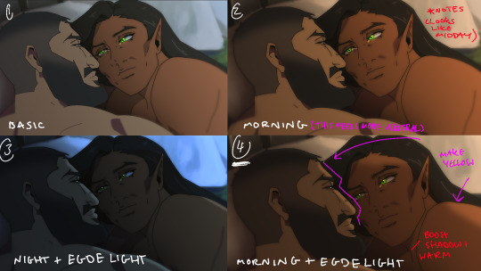
Fun fact, I almost went with #2 due to fear of getting too heavy-handed with compositing and therefore losing the animation (even though I really liked #4 at the time). Thanks to a friend, they also shared the sentiment of liking #4, though pointed out it felt like midday and encouraged me to make the colours warmer and deepen the shadows. It is a really tough balance but I think for a softer scene like this, the more additional layers of comp worked out in the end.
The edge light was a last minute thing because someone told me to add sound and to have light stream in. Also at this point I deadass forgot that you know, Olrox, is a vampire, but hey rule of cute overrules. We can pretend its light not from the sun LOL

Also yay I got to show off my own style a tad, I love paintingggg. It's not as completely fully rendered coz I knew that it would get covered up but I still made sure it was quite clean regardless. I didn't realise how much of it would be covered up even though I did make sure they would fit/make sense for bg LOL
Now we are done!
If you've gotten this far thank you! There's gonna be less frequency of these animations due to the semester starting back up soon and I don't get many opportunities to actually 2D animate (despite it being an animation degree RAH). Also I remembering cringing and laughing a lot when I immediately started putting colour down going "oh i can see the end of the horizon, i have too much power as an artist, people will see this i cant let them see me be crazy"

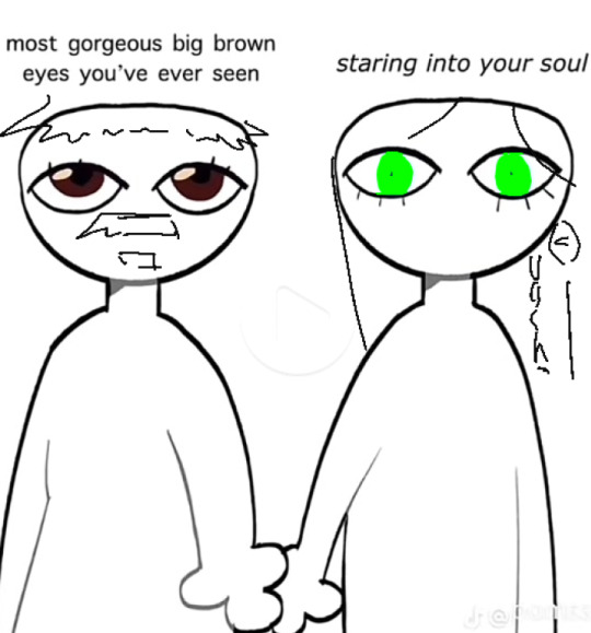
[Here's some memes I drew over while my friend was reviewing my work]
#mystery talks#castlevania nocturne#artists on tumblr#castlevania#castlevania fanart#fan animation#olrox/mizrak#i still keep going “oh no people who worked on the show will see this theyre gonna see im insane /lh”#its ok coz being crazy pushes you to achieve things
92 notes
·
View notes
Note
Hi! I really really love your art it’s so pretty and distinct and wonderful!!!
Your ‘Be nice to me’ animatic is really delightful and I’ve watched it a bunch of times! I love how all the frames have a little bit of movement to them and the colours are so nice
I was wondering how you could share how you go about making your animatics (process, programs, etc).
Thanks :DD
THANK YOU LIZARD THAT MEANS THE WORLD <333 im so so so happy that people like that animatic :D and OF COURSE1!!!!!!
so I start by getting obssessed with a song and then making a little storyboard. I have a bunch of these that never get turned into an Actual Animatics but theyre always fun and help just get the idea out of my Head. Ignore the terrible quality of the photo but I managed to find one of the ones for be nice to me! COULD NOT TELL YOU WHAT ANY OF IT MEANS NOW!!!!! giggling my storyboards are just blobs and also this photo is awful i can barely see it BUT I COULD READ IT AT THE TIME SO THATS ALL THAT MATTERS!!!

usually I have a bit more of a plan but for be nice to me i seem to remember lots of the parts got shuffled around. mostly because I wanted to include as many characters as possible. (even if most of it is just mort and family because they're very dear to me )
ANYWAY!!! so I animate bigger things in krita, which (although it does crash somtimes) is easy to use and has nice brushes. I used to use it for all my art :D i also use flipaclip for animations which i dont want to put much detail into beacuse its fun to do higher fps stuff on there. I TRIED USING PROCREATE DREAMS ONCE BUT IT DOENST HAVE A LASSO TOOL???? which is really painful so I gave up. I dont do much editing, but sometimes i use capcut to fix audio or do small camera movements. All of these are free! apart from procreate dreams. i hateyou procreate dreams.
A thing i like doing, is to make multiple lineart frames of a still shot and alternate them every few frames which makes it look more Alive and helps transition into movement nicely :D I didnt really bother to do that in the hfth one though because it was so fast paced. ANOTHER THING TO FAKE MORE MOVEMENT is to use the transform tool to have a frame thats slightly stretched or squished after quick movements which makes them look more bouncy.
COLOUR WISE for long animatics I have a bg colour and a couple of Bright colours that stand out for important details. i think in be nice to me that was mostly red and green. nik and marolmar.... if its just lineart I also sometimes draw background details in a lower opacity or different colour so it looks less cluttered
AND THEN once I've finished sometimes I also throw a texture over the top of everything to make it look more interesting... usually a paper texture i like using those :D
NO IDEA HOW MUCH OF THIS MADE SENSE BUT I ENJOYED RAMBLING!!!!!!!! i hope it answered your question :D
#THANK YOU FOR THE ASK LIZARD <3333#I love yapping about animation#and yapping in general#big yapper#this might be clear from how long this got#IT WASNT SUPPOSED TO BE!!! it just happened#eskiask
11 notes
·
View notes
Text

I like to believe, in my heart, that Carmilla momentarily possessed Maria just so she could say 'stupid old men' one last time.
(comments and alts):
Ahhhh the show is so peak. But this was my favourite scene, probably between both seasons. And Maria ended up becoming my favourite character, which I didn't expect based on my memory of S1.
Anyways, mostly wanted to have fun drawing a dragon and evil-mode eyes on this one, and ended up experimenting with colour techniques more than ever. For one, and oh god I will never not do this ever again, actually colour picked directly from references instead of eyeballing it, and I just know the colour palette would have been so much worse if I hadn't.
Also kinda tried with throwing a ton of shit on background layers and messing with transparency, which is where the alts for this come from:


(right is an alternative, more reflective of scenery bg, and then left is both backgrounds but with transparency on the first one). With the way they all interact in the most minute ways, I liked the output of the first one the most.
When it comes to the actual drawing, two things to note, 1. I actually wanted to draw more of the dragon, like up to its upper body, but the thing is so goddamn big based on the references that I'd either have to make it or Maria tiny to fit it in lmao. 2. Hardest thing was Maria's clothing, I tend to struggle with clothes in general and I think I slightly screwed myself with the perspective/position, but we work with it.
To finish off here's backgroundless + just lineart, but pleased to report that the finished product is my favourite output.


(also momentarily changed the dragons eye colour but I prefer the yellow)
#my art#castlevania#castlevania netflix#castlevania nocturne#castlevania nocturne season 2#maria renard#maria castlevania#castlevania spoilers
18 notes
·
View notes
Photo

chapter 5, page 38
first - previous - next
[image description: an sac webcomic page. “you little BITCH” parker yells, furiously clutching his now bleeding hand. the panel changes to a close up of a long stick slashing down close to his face. the stick turns out to be a cane, now under his chin, held by moon striker, now in her superhero costume instead of the casual clothing she was in earlier. similarly split second stands behind her, his hand on her shoulder, also in a superhero costume. “you alright howler?” moon asks, looking down at lewis. split is just making intense and angry eye contact with parker. moon striker’s outfit is blue, the arms, legs, utility belt, and cane are all dark blue, and she has a blue tabard with silver trim and buttons, light blue gloves, and a light blue loose headscarf worn over a tighter silver one, the blue one ending in two long split tails. she also has a silver edged goggles. split second has a dark pink coloured outfit, with a long dark coat, a waitcoat, a very long light pink striped scarf, and clock faces on faer belt and eye patch. end id]
of course in a room of misc superheroes and vigilantes, someone’s going to step in
not visible here but moon is levitating i just couldnt get it to look right when i tried to make it more obvious so she just looks like a foot taller than split for no reason (only two inches difference in height really). also fun detail: split’s clocks point to about 00:20. or 12:20 but apparently i made the time earlier in the chapter to be 11 so if that clock is accurate it would be past midnight. hope its not a school night for these kids.

[id: screenshot of the first panel without the background, and with the sketch layer enabled, showing izumi laughing and pointing at parker. end id]
not added because of time and because i hade drawing block when doing the lineart for him so he doesnt appear. sorry buddy i know you wanted to laugh at your boss so bad
#sac#someone always cares#trying to google what the difference between a tunic and a tabard is and i still dont know#i just think these twos design were cool and thats why they in particular stepped in
6 notes
·
View notes
Text

head empty, phone spaghetti
#I'll probably never finish this#ive tried all sorts of colours but i like none of them on this#maybe its meant to be unfinished. like a reminder. that its okay to not be#this is my dissociation piece like. head empty. phone spaghetti#hope everyones reading these tags is feeling alright :) take a breather. its very hard during winter. its alright. youll figure it out.#my oc#digital sketch#oc#illustration#lineart#not fandom related#original art#my art#scribblyno#oh! oh also!!! had a lot of fun drawing the body!!!! the lines in general. was very fun figuring them out!#hope tumblr will be fine with the chest area..... (knocking on wood thrice)!!
2 notes
·
View notes
Text
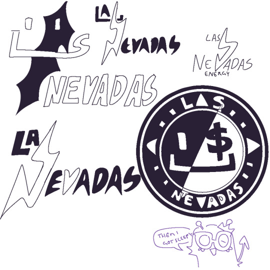
Las Nevadas Zine Pages
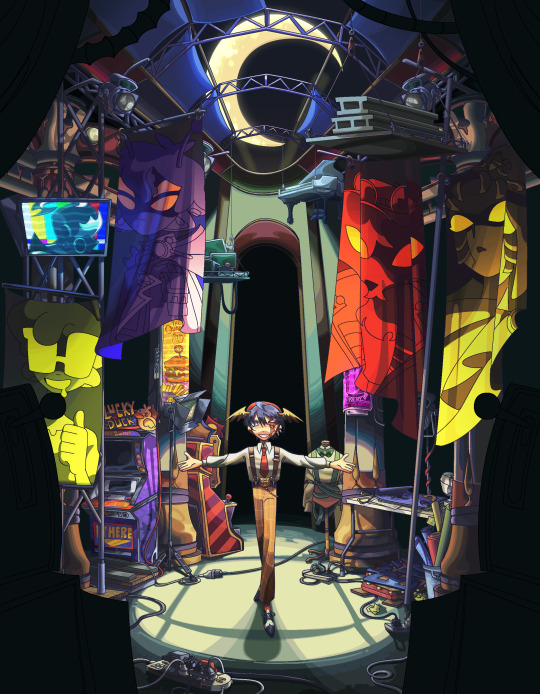

A NEW ATTIRE // GOOD MOURNING CHARLIE
The pages I made for @donna-draws ‘ Las Nevadas Zine!!! A project between 27 very talented artists and a retelling of the Las Nevadas series
You can find the zine link HERE
[Post-mortem & sketches under cut]
[ NEW ATTIRE ]

swear it took like 3 whole tries to get in the groove of how i wanted the lighting to be and so much rendering to be done this took a looong while but deffo worth it
vis inspirations carles_dalmau’s art [instagram] just, their compositions and lineart in them are absolutely just phenomenal - colouring inspo Gigi DG’s art namely their Cucumber Quest cover pages
whoever designed the Las Nevadas casino machines [you can see them in Purpled’s stream when he visits Las Nevadas for the first time] and also some of the posters in the intro of the lore Finale (i really wanna know who drew all that better yet clearer shots of each one)- those are in there too ^^ had creative liberties with the details for whwhw the sake of adding details like the rly obscure can ad logo
[ MOURNING CHARLIE ]
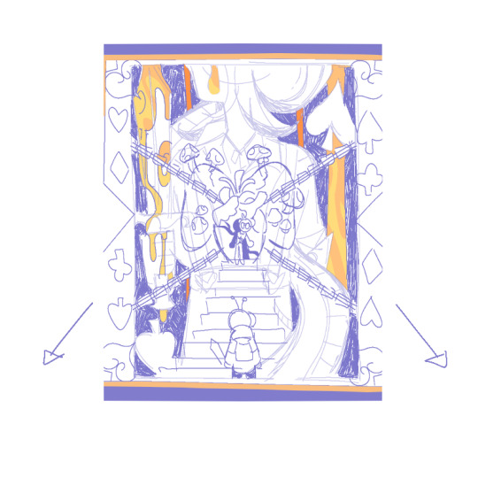
Rly like this one it up my alley :] Fun fact actually ! drew the first sketch back in December wayyy before the applications for the zine were even a thing - so happy i was able to use it somewhere
sorta obvious choice the frame of the whole thing is gold copy of the design on the official Las Nevadas playing cards and Quackity’s stance as the king himself
interpret the thing however u want i personally like to think of the whole thing as a giant painting Purpled’s standing in front of -- that was a last minute decision cuz i thought it would be cool :>
the axe i designed myself which u can see first from THIS drawing i did for the 2021 secret santa
the stone heart has its own meaning in it’s own but additionally also a callback to THIS dapduo comic i did
same with the mushroom infested lungs [think of that what u will uvu] them shrooms include: indigo milk caps, trametes versicolor (turkey tail!), amanita muscaria (the basic ass red and white one) and leucocoprinus birnbaumii
All in all two high ambition, high stakes compositions I’m SUPER proud of and very honoured to have dedicated it to such a wonderful project to a just as fantastic community :] <3
#stufffsart#myart#las nevadas zine#quackity#quackity fanart#quackity lore#las nevadas#slimecicle#purpled#awesamdude#fundy#foolish gamers#dsmp#dsmp fanart#dsmp lore#mcyt#mcyt fanart#zine#illustration
700 notes
·
View notes
Video
tumblr

I really like Jodio he’s such a fun character, its also the first time i’ve drawn a jojos character in a long time and colouring him was so much fun(Tons of saturated colours).
Also i tried recording the timelapse on obs but everything got so slow that i just switched to the normal timelapse recorder on csp (Thats why there’s no lineart in the timelapse)
#jjba#jodio#jodio joestar#JOJOLANDS#jojos bizarre adventure#jojos bizzare adventure part 9#fanart#timelapse#jojo part 9#jojos
14 notes
·
View notes
Text
So the drawings ive been tinkering on for... Almost exactly 2 months now, are getting a little more finished again! More update under the cut so i dont clog anyones dash :')
(i did start making a third piece that ties my whole idea together and that is being the biggest menace, despite me slightly slightly constantly trying to finish the first two to like any standard im happy with lmao)
So yay on some progress! Boo on that i desperately need to make more progress on real life stuff and im worried i wont have these actually done till november. Two posts a year kinda high speed artist here! And i did/do wanna do something or multiple little things at least for dinluke positivity thing in november! I wanna do a fun community thing! But everything i make takes forever bc im never happy with it and i got a lot else i should be doing. How do people do this?
Ok no but like im writing this publicly just bc i sort of wanna give an update and also bemoan the third piece :') the sketch so far is... Okay, the faces are good enough but the rest is so unfinished/unclean. Last two times i tried fixing it i just made it way worse so tonight i thought fuck it and put down the flat colours right. Turns out that just highlights how unfinished my linework was! So really im just debating. Do i go back and try my damndest to make good lineart for it, or do i take a page out of my adult art class and just actually more paint it in? Like screw the lineart im just gonna spend a long time tinkering with the colours for shadows and highlights and shape this out that way. It won't perfectly match the other two, but the faces have lineart and who really pays much attention to the other details??
Oh and i have still a mission set to make backgrounds for these. Yes im planning to trace over a google image of highschool lockers and not much else but thats still probably at least a nights work for me that im not hype for haha. They look good on plain background but i wanna at least see if the background could help make them feel more finished. Yknow? Make it worth it that ive been sitting on them for 2 months already
Its fine, its all fine, im gonna make the phonecalls i need to tomorrow and do other good admin things, then i can try to either start carving out the third piece in a painting style (back up plan if i hate it is to backpedal and do the lineart better, or make it over the top of it) and if thats going miserably ill just try and make the backgrounds yknow?? Ill make progress this weekend, maybe ill even say fuck it and post it without it being totally close to perfect (not super likely but imagine the relief of getting it out here finally??) So stay tuned and wish me luck!!
#haeroniel talks#art woes#alls good but im a little stressed and overthinking everything and its been almost 2 months since i posted the wips and i wish i was done!!
2 notes
·
View notes
Note
1, 9, 25 for art asks?
1. Compare your first and last pieces from this year! Where do you think you improved?


Oh wow. Yeah, definitely got more confident in my style and pushed myself to finish more pieces. So many of my previous works just sit unfinished, but I finished SO Many this year I honestly struggle to believe it sometimes. Also became more confident in my ability to draw from memory! Wolffe was drawn 100% from memory, whereas the Mandos were all referenced in some way. And while my recall isn't great, I'm happy with where it is.
9. Explain the process behind one of your pieces, if you remember!
Putting this under a cut because it ended up getting quite long :')
Whoof, OK. Let's give this a shot! So this piece is one that isn't perfect by any means, but definitely had the most planning put into it!

I knew exactly how I wanted it to look, but I knew it would be trickey to execute because of how tied to background elements it is, which I struggle to integrate with the main characters a lot. So I thumbnailed several variations on the pose and placement and ended up combining the results of two into the final piece.


Obviously these look like uhhh shit, but I just wanted to rough out the basic elements.
Then I gathered some references of the Havoc Marauder's interior and this Black Series set of props!
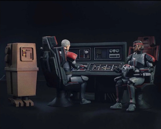
Then I basically traced over the traditional sketch, adjusting any wonky anatomy that I saw and tried to make it as readable as possible while maintaining a kinda sketchy look that I like.
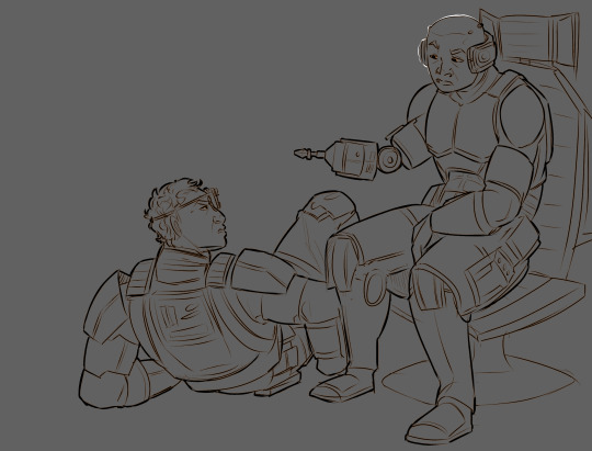
Then I generally like to have a looser approach to how I drew backgrounds so I basically freehanded the rest without line art, just kinda blocking in color and refining them until they look right. With this one however I did end up going over the panels with lines because of how geometric they are. I remember constantly checking references to make sure I was getting all the buttons, all the little details, all the right shapes. What was also fun to experiment with was how to make the buttons glow! I ended up going with an airbrush layer of colours with an Add (Glow) layer on top that I slightly motion blurred. I really like how it came out!

I then colored in The Fellas. What's quite fun about Bad Batch armor is that it has a bit more texture to it than reg armor, so I gave the armor its own noise layer to emphasise that, as well as just generally scuffing it up.

After that it was pretty much just messing around with blending layers and such to get the nice darks and glow effects in the ship. I did play around with giving each character their own glowing rim, but it ended up being more distracting than anything, so I just outlined the lineart in white where the highlights should be.
And that's it! I hope that was interesting.

25. Did you have any art goals coming into the year? How far did you achieve them?
I did indeed have art goals this year! As with most years, my goal is to complete more pieces. Lineart, color, shading backgrounds, the whole lot. And this year it the first year I've really done it! Which I'm super happy about. Another goal was to do more non-fandom art, but between university work and the stuff I made for here, I didn't really have time! While I am happy with the pieces I made for university, I wish I had done more non-fandom art outside of it. But doing fandom art makes me happy, so I'm still glad I did it! Balancing I guess.
Thanks so much for the ask!
End of Year Artist Asks
#this was so fun! thank you sm#really happy with what i did this year even if it isnt all perfect#asks#ask games
10 notes
·
View notes
Note
1,5,12,16,19,23,25 :D
Candy I THINK THERE ARE SUPPOSED TO BE LIMITS ON THESE THINGS
1. everything else ive been doing is technically 'finished' (if sketchy) so here is my Queen wip i have not been progressing on

5. Haven't drawn but want to... a lot of things??? I. have not actually drawn regular Nightmare yet which is probably some sort of crime. Jevil also
12. My Current Favorite. So Evocative

16. its lineart. i havent actually done separate clean lineart in years. i dont render but that would Definitely be bad. anyway colouring is only fine because i just go 'hahahaha actual light sources who' and do whatever i want. and planning's been fine because I haven't tried to do anything ambitious
19. i've literally only drawn nightmare once and it was a 30s sketch but also he's an excuse for some very fun expressions
23. Listen to music! there's no 'favourite' its whatever i'm feeling into at the moment (new music generally) right now I am obsessed with the Death Note musical: https://www.youtube.com/watch?v=Xf5erBVHdXY&list=PLm_hcPaCSyIau7IZGAFvc0z1nT1pn8w4U&index=1
25. 'can't you just save these pictures instead of searching them up again every time??' me, who looks up 'dream sans' and 'dream sans new outfit' again like clockwork
5 notes
·
View notes
Text
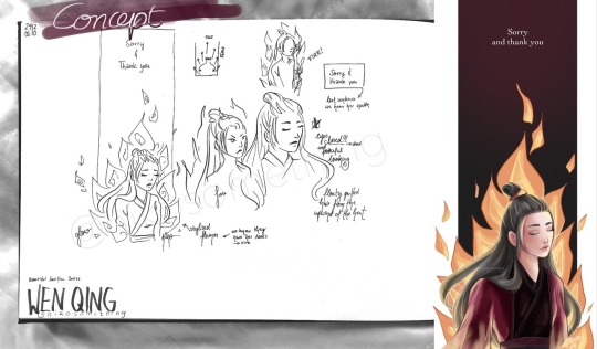
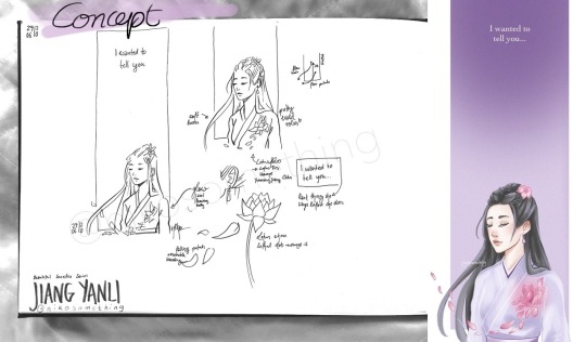
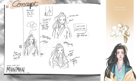
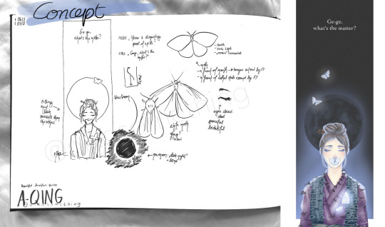
Thought it might be fun to share my concepts for my Beautiful Sacrifice Series
My Concepts
The women of The Untamed are so amazing ughhh
This whole series happened thanks to @mdzswomen s event to honour the women of MDZS. When I read about it I noticed I had never tried to draw any of these amazing women and I knew I needed to change something about that.
My idea was to create a tribute to these strong women and their decision to sacrifice everything. My choice of characters was based on the week one prompts: Jiang Yanli, Wen Qing, Mian Mian and A-Qing. There were more prompts and women, but at that time I didn’t even think I’d manage to draw more than two of them let alone a conceptual series.
It all started with Wen Qing, actually, even though she was the prompt for day two. I knew I wanted a really tall format like a banner hanging from a ceiling (as they are often used in an honorary context) and parts of the character to stick out of its boundaries.
As you can see at first I experimented with Wen Qing fiercely staring into the distance. I tried another sketch with her eyes closed and that’s what inspired all other elements, really.
I decided that I wanted to depict one of the saddest, but also most beautiful and strongest aspects of their journey: the end. I’d call it their final moment, but that doesn’t quite cut it. Jiang Yanli saving Wei Wuxian might have been instinctive, but it wasn’t done to her, she chose to push him away, whatever it may cost her. Which is why I want to go for the phrasing of it having been their final decision. It was an action. And a strong one at that. MianMian chose to end her career, unwilling to tolerate those close-minded people. Wen Qing chose to face the Lanling Jin clan, knowing death was a very likely result. A-Qing chose to signal Xue Yang’s position knowing how dangerous he was.
I didn’t want to portray the scene too realistically, but rather in a symbolic way. For the Beautiful Sacrifice Series I wanted to focus on ease/liberation, sadness and beauty. I chose to portray the deceased with closed eyes and a peaceful expression (as they don’t regret their final act), which is why Mian Mian’s eyes are wide open with her determinedly looking ahead. I also included the last sentence we hear each of these women speak in the show before their (old) life ends.
WEN QING
The first character I had a concept for was Wen Qing. I knew immediately that I wanted to include fire as the cause of her death, but I also wanted to simplify it, to turn it more into a symbol than the actual scene of her being burnt alive.
(At least I imagine that that’s what happened, I may be wrong, though. We know they got her ashes. However, she may have been killed first and burnt later. Or they made it a spectacle to watch one of the last Wen die in flames. Very cruel, but perhaps some found it satisfying).
Wen Qing’s hair is floating in the upwind of the fire’s heat. The flames point to the last thing we hear her say. The background is red for the Wen and fades to black to make the fire shine bright.
The colouring process was quite challenging. I spent days on it, it was really giving me a headache hahaha, I just wasn’t satisfied with anything, the colour palette, the shading, the lighting (it’s the first time I tried a more fancy lighting situation). In the end I put some layers on multiply, which actually helped as I now know her robes were coloured too light, which meant there wasn’t enough contrast to the bright flames in the background.
I was really insecure about the whole piece. I am still stunned that Wen Qing is the drawing with the most notes of this entire series. Thank you so much, it gave me a lot of confidence and motivation to keep trying out new stuff!
JIANG YANLI
Immediately after I had scribbled my Wen Qing concept I knew what I wanted Jiang Yanli’s tribute to look like. Soft and tender, like she is. With Wen Qing it’s the powerful flames that make her hair puff up, resembling Wen Qing’s fierce personality. For Jiang Yanli it’s a gentle breeze that lifts a strand of her hair and carries the lotus leaves with it.
Her eyes are closed as she is deceased. A lotus flower is located where she received the lethal wound in her brother's stead. The flower symbolises her sect, family and fond memories (be it playing by the water with her brothers or making lotus root soup).
Jiang Yanli is wearing my favourite outfit of hers and not her mourning robes which she died in, because I think it captures the gentleness of her personality perfectly with the pastel Jiang colour palette (and it’s actually a layer of see-through fabric in the show).
I really enjoyed colouring this piece and while it was the second design it was the first one I did the lineart and colour for.
MIAN MIAN
I wanted to include an element of disillusion since she experiences that moment of humiliation which is followed by the realisation that the Jin clan doesn’t have her back and goes against her morals.
In the caption I wrote: She spoke up, she stood her ground and then she left all these narrow-minded people behind, choosing to walk alone rather than be silenced. She was the true spark amidst plain snow and she had to realise that the white peony she served was rotten. That day she escaped these golden robes, shedding this old skin which had gotten too tight, and stepped into the future that was hers and hers alone.
The white peony is the symbol of the Lanling Jin sect and while it shines brightly on the outside Mian Mian learned to see through the façade, recognising all the rotten parts she didn’t want to tolerate any longer. With her leaving the peony sheds its petals until it vanished from her life.
In my initial sketch Mian Mian is portrayed with the simple robes she wears underneath her Lanling Jin attire. Since I didn’t give Jiang Yanli her mourning robes and didn’t plan on drawing A-Qing in her white robes either it didn’t feel quite right, though.
The phrase “shedding old skin” and the image of a snake came to my mind. First I thought about experimenting with an actual snake or the pattern of its scales. In the end I settled on the Jin robes being that old skin and showed Mian Mian’s personal robes as the shiny new skin underneath. I wanted to show that she may be stepping out of the Jin sect, but that she is starting on a new, meaningful path.
(Drawing the Jin robes was quite bothersome hahaha. I took tons of pictures of me wearing a robe, but it was so slippery that I almost pulled a muscle while trying to make it look right in the photo. I spent an hour or so on it without any satisfying result and ended up drawing it from imagination after all.)
While I loved my sketch the execution was a p-a-i-n. Colouring her personal robes almost drove me mad and the face, the face was such a struggle. I think I redrew it four to five times. I still think I could have done better, but after days of trying to fix it I decided that perhaps I need some more months of practice to get her expression right (so I might re-draw her in the future).
A-QING
I didn’t think I’d enjoy the A-Qing piece as much as I did!! After having drawn three artworks I was worried that I may have exhausted all possibilities / ideas and that it would end up being a repetition of what I had already done.
I rewatched her episodes for inspiration. I watched all significant episodes of all the women I drew for that matter haha. The last thing we hear her say is directed at Song Lan, actually, which in retrospect surprised me. I could have sworn she talked to Xiao Xingchen last. Or Xue Yang (like in the novel). But nope, it’s our poor poor Song Lan.
Given that A-Qing died the youngest (I think?) I wanted to make her look younger than the other women, so I kept her head round and used pastel colours on her face.
I like moths (unless they eat my clothes or settle down in my food). Moths seek the light and in some way Xiao Xingchen was that light in A-Qing’s life. With the glow they symbolise A-Qing’s soul leaving her body through the lethal wound Xue Yang inflicted on her.
I placed one moth on her mouth as she has been muted by Xue Yang. The new moon in the background stands for the eternal darkness Xue Yang cast on her as moonless nights are the darkest.
For A-Qing I wrote in the caption: She couldn’t protect the man who had taken her in and cared for her. But she stayed. She became a lonely guardian, watching out for the remains of her lost brother in the silence and darkness which were forced upon her. Until that fated day when she gave her life so that the culprit who had shattered this tender soul would be brought to justice.
I finished A-Qing’s artwork way quicker than expected. The robes were tricky with all the torn spots and loose thread, but the rest came easy. I had lots of fun with the moths and the moon. And the glow. I love that cool light blue glow.
THANK YOU
All in all I really loved drawing this series and I thank you for your support, for your wonderful tags which make me smile and giggle and for every reblog and like! Whenever I have a hard time I revisit your tags and find strength within them.
195 notes
·
View notes
Note
Describe your Jay Myles Planetary Go AMV- I want to know what you see-
FUCK DUDE THAT WAS FAST. ok ok fair. ok so to start off, i DO actually picture an AMV for this HDSGFDSHGJ ive never made an AMV before but god do i wanna. maybe i’ll attempt one in december when i have my christmas break off school?? i need an editing software fhdgdsjhfgsjd if any of yall know one thats free or cheap please lmk. the AMV itself i picture in black, white and bright pink. its inspired by another planetary go AMV, an undertale one from like 4/5 years ago. its how i first found the song so i always associated those colours with it lol.
I’m gonna go through it lyric by lyric and try to describe things the best i can DSHFGDSH im mentally ill sorry <3 ALSO this has a lotta spoilers for lore i havent talked about at ALL if yall wanna hit up my inbox after and ask for more explanation feel free lol
There might be something outside your window But you'll just never know I picture Jay standing by a window looking out it, on the second line he turns away and walks off. the art is white with black lines. There could be something right past the turnpike gates But you'll just never know we see Jay walking down the street holding a camera. He stops at the burnt down remains of Karen Doggers’s house, like in the fic i posted yesterday.
If my velocity starts to make you sweat Then just don't let go And if the heaven ain't got a vacancy Then we just, then we just, then we just, then we just Get up and go Just Jay looking around the house, again like in my fic. We see him get scared by Zalgo appearing behind him and we see him grinning wide, setting him up as a somewhat important character in the narrative. I think. During the instrumentals it’s the general credits and stuff.
Ladies and gentleman, truth Is now acceptable fame Is now injectable process the progress These lines are black with white lineart. We get shots of Doby just living his best life, being a murderer and having fun. The only colour on him is the pink of his goggles, which obscures his eyes.
This core is critical faith Is unavailable lives Become incredible now Please understand that With each line another character appears. Each one is another that works for The Operator like Doby does. ‘‘This core is critical’‘ is Dana (OC), ‘‘Faith is unavailable’‘ is Godfrey (OC), ‘‘Lives become incredible’‘ is The Operator, ‘‘Now’‘ is Toby and ‘‘Please understand that’‘ is our main man Doby
I can't slow down I won't be waiting for you I can't stop now because I'm dancing Some imagery of Doby running off away from Jay. This isn’t literally happening, it’s more a way of showing that Jay feels abandoned and betrayed.
This planet's ours to defend Ain't got no time to pretend Don't fuck around, this is our last chance More stuff showing The Operator’s proxies. Godfrey tells Doby not to fuck around and shoves him. Toby catches him and the other proxies all glare at him. Fuck Godfrey he’s the worst.
If my velocity starts to make you sweat Then just don't let go We see Jay and Zalgo sitting in a cafe together. Jay is obviously nervous about something, and sweating. On ‘’don’t let go’’ Zalgo grabs his hand from across the table 'Cause the emergency room got no vacancy And we just, and we just, and we just, and we just Get up and go Zalgo is the one saying the line about the emergency room. He’s convincing Jay to do his bidding. We see the two shake hands.
they want you to be (Who) they wanted to see (Go) kill the party with me and never go home We see Jay doing things for Zalgo, completely unaware that he’s being manipulated into doing his bidding. Zalgo pretends to help him. On ‘‘Who they wanted to see’‘ we see Jay being shown a picture of Doby. Who they want you to be Who they wanted to see Just leave the party with me and never go home We see Doby again, still being a murderer and having fun. On the last line we see him running along with Toby.
You're unbelievable Ah, so unbelievable Ah, you ruin everything Oh, you better go home Jay is the one saying these lines. He’s looking over photos and footage of Doby. He’s mad, he feels abandoned, and like Doby doesn’t care about what it is he’s doing. He wants his friend to come back home.
I'm unbelievable Yeah, I'm undefeatable Yeah, let's ruin everything, blast it to the back row Doby is the one saying this. He isn’t having fun this time though. He’s talking with Toby and Dana. On the last line Godfrey bursts into the room and gets mad at them
They sell presentable Young, and so ingestible Sterile and collectible Safe, and I can't stand it Godfrey summons The Operator and he tries to attack the three of them. Dana defends them, attacking The Operator on ‘’Safe, and I can’t stand it.’’ This is a letter, my word Is the beretta, the sound Dana yells at Toby and Doby to run of my vendetta Against the ones that planned it We see Toby and Doby run out of the shack and away from The Operator. They’ve never been able to escape him before, and they weren’t prepared to leave, so they’re scared.
If my velocity starts to make you sweat Then just don't let go We get a shot of Toby looking scared and nervous. On the second line Doby takes his hand 'Cause the emergency room got no vacancy Tell me who do you trust, do you trust And we just get up and go We see Jay laying in his bed, asleep. He hears knocking on the window and gets up. He opens the window and sees Doby grinning at him. He was NOT READY FOR THAT OK HE WAS NOT
Who they want you to be Who they wanted to see (Go) kill the party with me and never go home Ok this parts kinda fast but I’ll try to get through it. Doby and Jay hug, then it cuts to the two of them plus Toby sitting on the bed talking. On ‘’kill the party with me’’ Godfrey BUSTS into the room, attacks Toby and Doby and then Jay fuckin smacks him over the head with a baseball bat. The three of them start arguing and then Jay points at the window in fear. Who they want you to be Who they wanted to see Just leave the party with me and never go home Hobo Heart is at the window. This makes sense in context I promise. He motions for Toby and Doby to follow him. Doby and Jay exchange a look and Doby follows after him. Things get a little rough from around here to the end of the song im sorry HDSFGJDSGJ
You keep eternity, give us the radio Deploy the battery, we're taking back control Doby and Toby are the ones speaking here. They’re in Slender Mansion now, getting ready to fight. Engage the energy, light up the effigy We see Jay again, tying Godfrey to a chair like a reasonable human being. On ‘’light up the effigy’’ his phone lights up. Zalgo is calling him. No chance to take it slow By now I'm sure you know, know, know, know, know (one, two, three, four) We see Jay freak out and Z’s appear in his eyes. Godfrey climbs out of the chair and looks at him. Get up and go Jay, who’s now under Zalgo’s control, follows Godfrey out of the house
they want you to be (Who) they wanted to see (Go) kill the party with me and never go home Who they want you to be Who they wanted to see Just leave the party with me and never go home We see quick shots of various characters all fighting here, including Doby and Toby. Masky does something cool here but I won’t say what
Are we still having fun? Are you holding the gun? We see Doby and Jay recovering from a fight. Doby turns around and sees Jay, who points a gun at him. Take the money and run We'll never go home Jay fires at Doby and Toby lunges at him, fighting him until he runs off
I've got nothing to lose You've got nothing to say And we're leaving today We'll never go home Toby turns and tries to run over to Doby, but a huge crack in the ground appears. Toby tries to jump it but he doesn’t make it and is left clinging to the edge. We get a shot of Doby, laying on the ground, too pained to help his friend. Then we see Toby lose his grip
I think I better go now I think I better go now I think I better go now (go home) Gonna go now, gonna go now, gonna go now, gonna go now Go now, gonna go now Go home Some shots of Zalgo in his true form fighting against someone. Then it cuts to Jay stumbling through the woods. He stops against a tree, then collapses. A picture of himself of Doby flies out of his pocket and towards the camera. It’s the final thing you see.
#THIS IS REALLY ROUGH AND NEEDS MORE CONTEXT#BUT I REALLY WANNA MAKE THIS ONE DAY AAAAAAA#ask#anon#anonymous#third base#third base creepypasta#jay myles#doby doggers#ticci toby#dana punaise#godfrey#zalgo#I may change the ending and stuff idk
14 notes
·
View notes
Text
So, what’s up with Another Me?
Honestly, I tried to draft this post, but the mental block made me decide to just go for it stream-of-consciousness style. Which I hope doesn’t bode poorly or anything. But here goes!
The Past and the Present
As you may know, I’ve been at this for a while now! Since 2014, in fact. In that time, I’ve gotten through the prologue and... most of chapter one (fun fact: I do have the entirety of this story mapped out! We are transitioning into what should be the final scene of this chapter. Originally, I wanted to make this post - or something along these lines - once I finished the chapter, but I figured since the year was about to end I’d be better off doing it now).
Now, let’s not mince words: that is a long time. I have six chapters total (not counting the prologue) mapped out for this comic, and there is more I’d like to do beyond it (what I like to call Arc 2, or, as you may or may not know: The Part Where My Pet Character Marco Evangelisti Actually Shows Up). If I keep going at the current pace, I will probably not be done within my lifetime. So, if I’m aware of this, what gives?
... I mean, damn. There’s a lot I could point to; I was finishing my degree until 2016, and I suppose that takes something out of you. I have unreasonably high expectations for myself, as the people closest to me know. “2020 was a bad year for everyone,” I tell myself, before I also go on to say, “but even though updates slowed down even more this year, it’s not like they’ve been particularly speedy for the past couple of years, and I haven’t had that bad of a year anyway, so that’s a shoddy excuse.” And then some semblance of reasonable thought comes over me and reminds me my grandfather had a stroke in March of last year and passed away in early June of this year, and I’m like “I mean, okay, I guess I’ve been through SOME things.”
But lighthearted reflections aside, there are more actionable problems I have identified - such as, in an overarching sense, my attitude. My friends made me realise this some time late last year, and while I’ve been trying to work on it, I have to admit I’ve made very little progress: at some point, I developed a seriously unhealthy relationship with my art. Here is how my workflow has tended to go:
Start scripting update. I have a small readership, but that’s okay; I am grateful for every suggestion, I can work with this, and I AM building towards something that excites me.
Script done, regardless of insecurities. It’s time to start working on the actual panels. This sketch didn’t come out exactly the way I intended, but hopefully it still works (alternatively: this sketch looks promising! I am excited about this sketch. Sometimes, I do feel happy with my sketches).
Oh dear. I was hoping the lineart would help a little (alternatively: oh dear. the lineart completely ruined this perfectly fine sketch). Maybe it’ll still look alright with colour?
Oh no. I hate it, actually. I suppose I’m too sloppy; I should be more careful next time.
(Repeat for however many panels i have planned for an update, typically with mounting guilt the longer I take on each one, because I keep taking longer and longer and, to my eyes, there is no improvement.)
Well, as my friends keep reminding me, done is better than perfect. Let’s post it!
The update is posted to a small readership and a quiet response, which, again, is okay, but leaves me wanting for feedback that I cannot get because I am reluctant to spread the word for several reasons, one of them being that I’ve convinced myself my work isn’t good enough.
Rinse and repeat, with the process continuing to be slow - if not turning exponentially slower - because apparently when things make you feel bad your brain starts wanting to protect you from them.
Apologies if this is a little harsh, but it is genuinely the most sincere breakdown of The Whole Deal that I can produce.
The good news is there are things I can do about this! Not easy things, granted, as they tie deeply into a lot of the recurring neuroses in my life, but in theory, the more I embrace imperfection, and the less I worry, the faster I should be able to work, and I should start getting some serotonin out of the whole thing again. In theory. This is not the only issue, however, and I have good and bad news about the other issue I’ve identified:
I don’t think the forum adventure format is working in its current shape.
It’s not about the suggestions - I love working with suggestions! Reader interaction is fun, it’s already shaped a good number of things and I hope it continues to do so. It’s more of a matter of visibility. Tragically, forums are not the most In Vogue things these days, and that reflects itself in, well, poor visibility. I’ve tried to remedy this by allowing suggestions through MSPFA, Tumblr and Twitter as well, but honestly, it hasn’t helped much. I think I’ve only gotten one or two suggestions through MSPFA? And don’t get me wrong, I’m sure this is in great part because of my passive role in getting the word out! But it’s all contributing towards this strange, shrinking spiral of a feedback loop.
The good news is that, since I have identified this problem, there should be an actionable solution. The bad news is I’m not quite sure what form that solution should take just yet.
The Future
Whew, that was a lot. So, what’s in store for 2021 and beyond?
Well, er, like I’ve implied, I’m a little unsure. But that’s my default state of existence, so let’s go over what I think.
When I finish chapter one, I would like to find a proper hosting place for AM. As I said, I don’t think the forum thing is quite working out, and MSPFA is a wonderful website, but I feel AM has little to do with most of the content on it beyond the second-person narration and the script-style dialogues. Whether that means a change in format is needed along with the change in hosting, I’m not sure; I would like to keep the whole “one panel per page with text underneath it” deal, which... should be doable on most places, but in this current year, I’m frankly not sure how it would come across, haha.
(I’m also not sure what this hosting place should be, mind you; potentially a wordpress blog with a layout tailored for comics, but drawing isn’t actually my day job, so I’m not sure how viable paying for a domain name might be. Or hosting, for that matter, should I need it - but imgur has been friendly enough of an image host so far.)
What I do know is that I want to keep the suggestions, even though I’m not entirely sure how well that will work without a forum structure. Comments on a post, perhaps? Maybe. But we can’t forget that this doesn’t solve one of the other big issues, which is my reluctance to advertise. And there’s still, you know, my unhealthy, unreasonably high standards affecting my entire workflow.
... But that all kind of comes back to one thing, doesn’t it? The fear of taking the plunge? That’s what I need to overcome. Plans are a good first step, but they mean nothing if I don’t act on them. Which is part of the reason I’m talking about all this - so people can hold me to my plans.
(Plus, like, offer feedback and opinions. That’s very valuable too.)
This whole Future section is a whole lot more uncertain than, I think, even I hoped for when I started writing this post. But I hope what I’m trying to say comes across in some kind of way - not just in the sense of this being elucidating (which, don’t get me wrong, hopefully it is!), but also as far as conveying my feelings to my friends and readers is concerned.
I’m going to keep trying, and I know I’m a little lacking in the Doing department, but now you all know what’s been on my mind. Thank you all for the support, stay safe in These Trying Times, and hopefully we can all keep growing together.
5 notes
·
View notes
Note
hello! i was wondering what program&brush settings you use for your artwork? im new to digital art and i really like the way you colour! Especially those light effects they're so extra cool!
omg Anony you’re such a wonderful being, thank you for liking my art enough to ask me that!
now watch me failing trying to explain things to you lmao. I’m self taught and I’m in no way the best at this, so what I’m going to tell you might still be flawed but this is how I do things o/
hmm it’s gonna be long so I’ll put it under a cut!
1) I’m using Paint Tool Sai for everything in my art but if I still feel the need to, I’ll use Photoshop to correct colors and lighting. for example in this progress gif:

you can see where I decided “no, I don’t like this cold blue feeling” so I went to Photoshop (because it allows changes much easier than Sai when it comes to colors) and I changed it to a warmer purple! you can always play in Photoshop and try to see different versions of your art, different colors will give off different feelings
most of my artworks don’t look the way they do at the end because while drawing I tend to be focused on other things (line, where to place shades, lighting, etc) while when the picture is done I can focus on the feeling I initially wanted it to have!
2) My usual brushes are really basic. also ignore my ugly writing.
Sketch: I use this to sketch because it has a nice and easy flow, I can get messy lines that look good (the latest Brahms Heelshire drawing I did is entirely drawn with this one!)

you can always switch between your brushes depending on what feeling you want your art to have
Lineart: this one has nice, smooth and bold lines. I like to play around with it’s size. I believe it’s the basic one Sai has
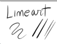
little advice: if you’re not happy with your lineart try to alternate heavy lines with tiny ones. for example:
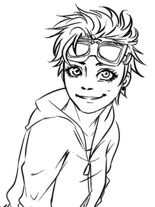
you can see how bold her hair is, but adding thinner lines to the glasses, the folds of her clothes, hair etc. it will create a better dynamic of your picture and will leave the eye of the viewer to run around it! I’m honestly awful at explaining stuff fdkjsnjkfds ofc this is a personal preference but my linework improved since I started to think like this
Base color: this is the color tool sai gives you, I changed my names so I can’t remember its default name. I like it to be bold because when I was little I used to color entire coloring books, so even now digitally I like to color every bit like I’m using crayons haha. time consuming and useless but shhh. basically I put down every base color with this one

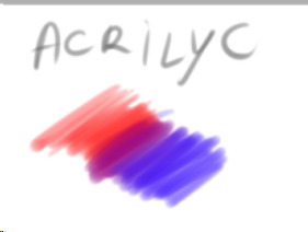
Acrylic: now this one is tricky, when I got it the first time I wanted to use it to shade, but using it I discovered it’s much better for blending. after I put down the main colors and shades I just use this one to blend them together and I sometimes paint with it too

Blending: it’s literally the blur brush Sai provides you xDD
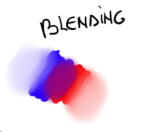
now keep in mind that using its settings (the things near the “Normal” option!) you can get different types of blur! always play around to see what looks good in your art. also remember that not every shadow has to be blurred or blended out, there are many ways shadows can look, using both blurred and heavy (cast) shadows in your art will definitely improve it. using real life references might help
Airbrush: the very brush Sai gives you. I’m using this one mainly for lighting. what I do is basically put down a hard light, like literally take a light color and place it where I see fit on the character, then I give it a bit of glow with the airbrush. one thing I noticed is that depending on the surface, the glow will change!

in this one you can clearly see the light on his cheekbone, but then there is a much weaker light on his face, that’s made with the airbrush and then blended into the structure of the face.the glow on the cheekbone and the ear is made with airbrush, using orange and playing around with the layer modes (overlay and luminosity, these are your best friends when it comes to lighting!)
lastly I want to present another best friend for us artists, the eraser

you can make highlights with the eraser too! you can cut the light in different shapes to give different feels and many other things, the eraser is definitely your best friend and not only in erasing mistakes. try to play around with it sometimes
Other things I learned:
try to use a different color for shading, using the exact color but darker will only make your art look dull, lifeless. the same goes for lighting! there are lots of tutorials on color theories and practices out there to help you with it
don’t be afraid to get wild, use oranges, reds, blues, purples in your skin and play around with the layer modes, you’ll see how much more alive it will feel. also don’t be afraid to try different styles, constancy is not the friend of a creative mind. experiment, try things, go out of your comfort zone. make it fun, make it personal. if you like drawing dogs then keep drawing dogs and enjoy it! don’t let labels and others to influence you and your spirit
ik this is obvious but never compare yourself with others. your journey is yours, you have a different hand, a different brain and a different being. this also goes to drawing things others did already! who cares there’s 0284e4895 other pictures with Kitbull already? draw yours, it will be unique and special because it has something from YOU in it, and no one can replicate that not even with tracing
watch people online! of course when you sit down to draw it will be completely different, but involuntarily you’ll learn and exercising you’ll find your own way of doing things. there might be much better ways for drawing lighting than I do, but this is how I feel good and I like to do it!
I know you hear this everywhere but really, practice, daily if you can! in October 2017 I tried to to the inktober challenge for the first time, I haven’t finished it and I was late anyway but I can tell you that trying to draw daily definitely improved my art. now I’m able to draw a picture per day with not much effort (yesterday I was able to draw three pictures with pretty good quality! o/ always start small and be proud of every step!!)
lastly, don’t be hard on yourself. every picture is a lesson, doesn’t matter how it came out. maybe the anatomy is wonky af, but you learned and your brain will remember what not to do next time. try and try and try and never say “my art sucks”, say “this pic doesn’t look how I wanted, but I still like it. I’ll do better next time!”. the moment you start to like your art you’ll see how much it will start to shine hehe
I might come out with more stuff but this is already really really long xD just be yourself, love your art and enjoy it!! lots of luck for you Anony, I hope I didn’t bore you and this will be helpful for you and others! :D
#ira geneve#art advice#tutorial#sai brushes#art tips#anon ask#ira rambles#wah this was long sorry#but it warms my heart to know some people look up to me for things#and I'll do all I can to help anyone
66 notes
·
View notes