#I also color my lineart nowadays so that helps
Explore tagged Tumblr posts
Visit Tumblr Blog
Explore Tumblr blogs with no restrictions, modern design and the best experience.
Last Seen Tumblr Blogs


Fun Fact
If you dial 1-866-584-6757, you can leave an audio post for your followers.
Text


I was asked how I make my characters fit the background with such minimal shading, and here's how I do it!
Starting point is just background + the base colors
Add a multiply layer on top of the characters. The color is usually eyedropped from the background, but just as often I just play with the hue/saturation/brightness slider. This layer usually has either high transparency or brightness so it doesn't become overpowering, especially if the background is light.
Airbrush the background colors lightly on top of some parts of the characters, usually the outer edges and the parts that should be in shade. I do this willy-nilly with a big brush.
Add color dodge as the last thing, and let it affect both characters and the background.
There's thousand other ways out there, this is just how I've done it!
#technical stuff#golden shrike#I also color my lineart nowadays so that helps#but for the first 3 chapters of GS the lineart is black#the only things I shade are eyes and nostrils
378 notes
·
View notes
Note
What advice would you give beginner artists?
it's fine to want to do more stylized art, but nothing will help you improve quickly like studying from life. even if you want to draw very stylized figures, life drawing is still going to help you understand how the human body works and then you can build your stylization off of that understanding. I also recommend studying specifically things you're looking to improve--if you feel like your poses aren't dynamic, ask your model to do some quick (1-2 min) dynamic poses and work on getting the gesture down. if you're looking for anatomy, ask for longer, more static poses and really study the contours of the body. this also applies for portraiture and character art--my expressions and facial structure improved like CRAZY when i started doing portrait studies from life! (note: i know live model sessions aren't accessible for everyone. i'm a huge advocate for nude models, if you can find a studio nearby that's affordable to you that offers sessions, that's the best you're gonna get. however, there are sites that will give you photos of nude models to draw from, too, or you can even just ask friends or family to pose for you when they aren't busy, that's what i did before i started getting model sessions from my school!)
materials are not everything but sometimes a good material can make a difference. it's important to know what's worth it and what isn't for your skill level. invest in some decent-quality supplies or a good art program, but understand that you're still going to need to work to understand your materials and use them to their fullest potential. (if you're a digital artist buy csp. trust me on this. get it on sale. it will change your life. also do not fucking use photoshop)
tracing is ok. listen to me. TRACING. IS. OK. tracing is how you learn. don't trace other people's art and pass it off as your own, obviously, but there is literally no problem with tracing real-life reference photos. I routinely trace references for backgrounds and the like. there is no reason for you to kill yourself trying to make complex perspective and shit up from your head when you can very easily just overlay a photo and get what you need.
in that same vein, USE REFERENCE PHOTOS. find pics online or take pics of yourself and USE THEM to see how your poses work. it makes it SO SO SO much easier. the understanding that you need to create a pose out of nowhere will come with time but you're not going to get that skill unless you have a foundation of understanding how the real human body works, and the easiest way to get that understanding is by copying photos of real people.
last but not least, there's generally a sort of 'rulebook' that new artists are expected to go by, especially online, when it comes to digital art. when i was first learning, it was all about lineart and cell shading, two things that I didn't really like. Nowadays it seems to be all about rendering. the single most important thing i can tell you is if it sucks you don't have to do it. if you hate lineart just color your sketches. if you hate shading don't shade, or find a different way to shade that you enjoy more. if rendering is annoying or difficult for you DON'T BOTHER!! art is supposed to be fun. if part of your process is annoying or upsetting to you, cut it the fuck out. don't torture yourself just to do art the "right" way. i guarantee your art will look better when you're having fun making it anyway!
#asks#ALSO don't go in expecting to monetize your social media presence/go viral as an artist. make art for YOU and make what you want to make.#if your art has passion behind it then attention will come naturally!
331 notes
·
View notes
Note
Hello i need tips for getting better at art and well your art is great...soo uhm...please :'>
i hope you understand that this is a really broad question, but I'll write a few general concepts that I think about. If you have something more specific you wanna know I can give more helpful answers.
Words are pretty important in learning. One part is knowing color theory/proportions/whatnot. The other is actively applying that in the art you create and see. If can describe the particulars of your enjoyment ("I like the sharp and simple shapes", "I like the bold lines and how often the line weight shifts to show off the contours") it's sooo much easier to give yourself some direction and make meaningful progress.
Don't get attached to your process . Too often I'd never touch the mannequin or lineart once I got to the next 'step'. I isolated those parts from each other so I can be organized and clean. But to make something 'fun' and 'spontaneous' you gotta let those parts weave in and out of each other and avoid linearity. Nowadays I'm still adjusting proportions and shapes in the later stages. My layers are a mess, but the vibes are much better. It's also very much why I love thick lineart.....
If you want something to prioritize, gesture drawings are always a good bet. You learn a lot on how to capture the energy of a pose or character (using line of action, shapes, etc) which is very appealing and can overcome faults in proportions, anatomy, etc.
And have your own blorbo you want only the best for ofc ofc.
72 notes
·
View notes
Note
Not ship chart related but I think your art is so pretty!! Do you have any tips? Especially with coloring if it’s okay <] (/nf)
waah thank you very much! i'll try and explain but here’s my colouring-specific tips, or at least how i choose my colours !! <3
unless for stylistic reasons (e.g. greyscale drawing), i personally avoid pure black, greys and white for colouring. go and choose off-colours instead! for lineart, black is okay but i always go for an actual colour anyways heheh. for the background colour of your canvas, sometimes an actual colour (rather than white or grey) may help you pick your palette to be more harmonised!
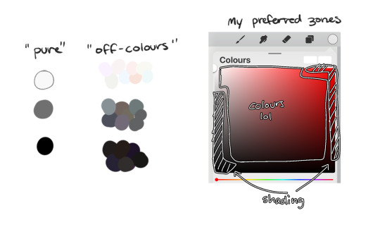
following this, i also don't like using pure/neon for colours (aka the top right corner), unless it's for a certain aesthetic or artstyle (e.g. the character has a "toxic/radioactive" aesthetic; the character is a scenedog (or similiar); or highlights). see below for examples! they may be subtle but sometimes the subtly can make the difference you are looking for, especially if you're looking for a natural look. if you're aiming for the bright/old 2000's artstyle, then pure/neons may be your friend!
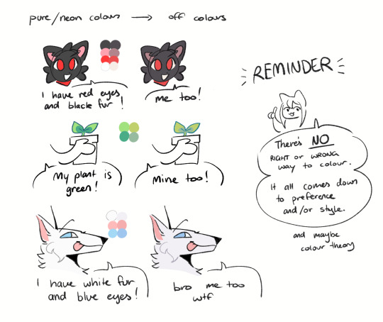
when i'm casually drawing characters (oc or not), i rarely colour-pick from the reference image. i find that when you're "forced to make the palette", it can come out more pleasing to your style/atmosphere of the drawing! it’s more personalised that way... like yea, that’s my favourite versions of those colours! i'm not saying that my colours are better though, only that "hey that's me! in those colours!!" you can have the reference image on the side or go by memory. here’s me doing this with pride flags:
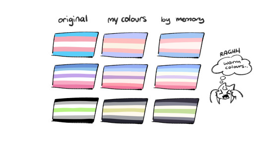
nowadays, when drawing the spooky month characters—who have simple designs god bless—i can just imagine their reference and adjust the colours in my head lol example: if i know that Lila's colour palette is purple, and that her winter sweater is coloured lighter than her hair, then i can just go ahead and pick whatever shade i want following that rule!
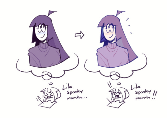
(of course, always double check with the actual reference for physical design inaccuracies and skin tone if it applies. my advice above is just for general hair/clothing colours! …because yknow you don't want to accidentally whitewash a character's skin in the name of aesthetics lol. if you’re unsure and want to be on the careful side, please do colour pick the skin at least !!)
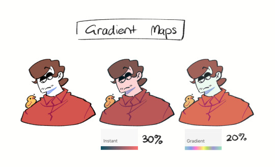
moving on... gradient maps and certain blending modes (like exclusion, luminosity and darken) can be a game changer too. for normal drawings (e.g. drawings with no environment), i use darken the most because it changes a few colours rather than the entire piece... (the percentages are opacity levels!)

oh and as a really basic shading tip without using blending modes: sometimes, you just gotta go for grey. shading a warmer colour? use grey to make a cool tone. shading a cool colour? use grey to make a warm tone. not all the time (because you don’t wanna make your shading seem muddy), just sometimes…
and that's that! there's always exceptions to rules and often times, your headshot doodle ends up as one big experimental mess (in a fun way, hopefully)!
this is how i choose my colours though most of the time, it is just me going “good enough”
i think we're pretty similar on how we like warm colours! i enjoy going the simple/lazy route and avoid blend modes but then again, shading is a whole different thing…
hope this helps in any way !! <:3 !!! <3
#if anyone wants to ask for specific tips i’m happy to share!#if i have any lol#[ the askbox mourns ]#[ the art of mourning ]#[ mourn's mourns ]#anyways yea i kinda do just imagine the spooky month characters with a light orange multiply layer and then try to replicate it irl#my personal/lazy rule is that if it looks good faraway its good enough AHAHA#spooky month lila#spooky month jaune#spooky month rick#spooky month aaron#spooky month#“actuallyyy the 'black cat' is actually dark grey—” SHHHHHH SHUT SHUT IT. SHUTUT !!!!! i need u to see the lineart /silly#[ mourn's resources ]
96 notes
·
View notes
Text
It took me a minute to finally get my notes straight so I could answer this— I hope it was worth the wait! I’ll give some bullet points of tips I use to help boost my production speed in addition to the strategies I use to try to keep characters consistent. Let’s get into it!

First up: How I draw faster!
Note that these mostly apply to digital art, as that’s my preferred medium.
If your art program has them, experiment with brush stabilization levels. My hands shake really bad, especially while I’m drawing, so I put a lot of effort into finding a stabilizer level that works with my need to control lines while also smoothing out the tremors in my hands. It’s made it so much easier to draw lines like I want to, and therefore lets me move on instead of redrawing the same line over and over again.
Creating templates for your art helps so much— setting up things like canvas size, color profile, DPI, background colors and images like the paper texture PNGs that I love to use ahead of time helps me get drawing faster, while I’m excited and inspired! Similarly, having a naming system for your art files is useful for speed as well as finding and organizing old pieces easier.
Having premade color palettes of local colors for characters is also super helpful for speed, as well as keeping characters on model :>
Personally, I use a single brush for lineart and rely on the selection tool and bucket fill for coloring when I actually bother to color things in. My lines are pretty loose nowadays, and the same goes for when I color things— I don't abide exactly by the lineart I draw, and get pretty messy with the selection tool and bucket fill!
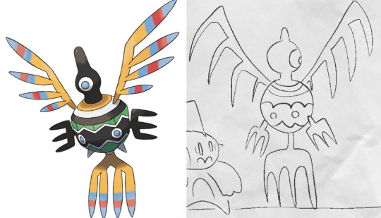
I simplify character designs as much as possible— the standard design of a sigilyph, for example, is pretty complex. But I made Sen a lot simpler (and also forgot the spikes on her torso in this panel. Oops)
As for keeping characters on-model…
I’m very flattered that you feel otherwise, but I actually don't keep characters very on-model between different drawings— just look at the different ways I've drawn Ark below— however, I'm improving over time as I become more familiar with how I want to draw the characters! A big part of my process of keeping characters on model is drawing characters over and over to familiarize myself with how they should look through trial and error.

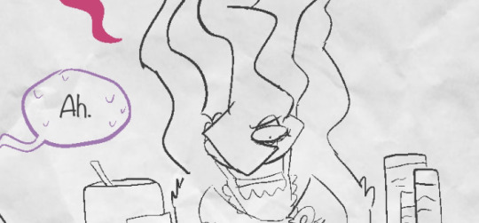
Learning common angles and poses I will draw characters in is very helpful for making sure they look consistent. As a bit of a downside, though, it makes wonkier angles stick out like a sore thumb! Drawing Ark with his head slightly angled downward was really hard, and I don't think I communicated it that well here:
I try to have the characters broken down into as many simple shapes that fit into each other as I possibly can, like Twig’s head (circle + rectangle snout + angled rectangle horn) Ark's hair (that weird bangs shape) and Dusknoir's upper body (beanbag shape / slightly elongated circle torso, arms coming out of his frill that comes in a very particular arcing line). This makes it way easier to draw characters quickly and consistently, because I can learn those lines and shapes and get the motion of drawing them into muscle memory.

Also, knowing the ways characters emote is like knowing cheat codes. Giving characters things like a signature comedic expression of shock or grin that they make when they're happy are very helpful!
The biggest tip I can give on the topic of keeping characters on-model (at least without model sheets— model sheets are THE way to go. Don’t be like Sofie and neglect those pieces of gold) is really just to practice. Build up familiarity with the shapes and proportions of characters, get a feel for how your hand and wrist moves to get the lines right.

#creativity tips with sofie#art tips#drawing tips#drawing advice#art advice#stuff by sofie#sofie answers asks#(kinda)
21 notes
·
View notes
Text
rambling about art struggles (sorry)
i think what's limiting me during drawing is that im thinking too much about line art / not knowing how to combine line art and color in a manner that im satisfied with
really sorry for how rambly this gets forgive me (this is also barely edited and im barely conscious)
95% of the art i made in my life has been done traditionally and in monochrome; usually i dont bother to ever color it bc i only had access to shitty colored pencils and everytime it would always fuck it up, constantly smudging into each other
4% of the time was like when i was in middle school and discovered how to fucking pirate paint tool sai and i blindly did whatever i could with a mouse (read: i gave myself carpel tunnel a lot lmao). i think i still have access to like 4 drawings i did thanks to google photos and the only ones i can really look back on positively were the line art ones and even then thats cause i used deviantart bases lol
heres the literal 1%: i did an art class back in late 2020 - early 2021 (can't remember what level it was? or what it specialized? it was the third art class i ever took. it might be intro to painting?) and i got to use acrylic paint for an assignment! i fucked up using it because i painted it with the goal of filling up the insides of the lineart instead of using the palette knife to create texture. my subject was an otter in the water (fun thing to say) and the assignment was to create some form of pop art, depict contrast w color (otters are brown i know, wanted to use orange highlights against the blue water) and to show i know how to depict varying textures (fur, liquid).
i did not know how to fucking do that!!! couldnt get any help either due to covid fucking happening and my poor ass's only connection to the internet was my fucking phone data and it was draining fast LMAO
the reason as to why i was so poor was because back in October 2019 my life fucking got flipped upside down and i had to give up a lot and had to desperately try to find a job while being a student. (will not go into specific detail due to me not wanting a pity party about it and it being too personal. im only going to say that caregiver burnout is fucking hell)
a prior assignment to that class had us practicing on depicting textures on some sort of paper (it was stiff yet bendable iirc) with a white and black color pencil (white for fur, black for eyes). i was watching aggretsuko at the time and fenneko is a fav of mine so i picked that type of fox as my subject. im really proud of the way i depicted the fur but fucking hated how i fucked up the eyes. was supposed to show the "glossiness" of it and i dont have a pet irl to reference so ahhhHHHH it ruined the piece for me. pretty sure i have it saved somewhere but since its not fandom related im hesitant to post it.
overall the class made me realise that regardless of skill i rlly like drawing textures and i dont really understand why? tried to reasoned it out to be that i just really like textured blankets and that theyre comforting. i purr like a fucking cat when i like hug one and i hate it
i feel like nowadays with how scatterbrained and stressed i am i visualize blobs of color in my mind instead of clear subjects with clear outlines. i feel like i need to embrace that side more (or at least try starting with that when doing digital art). maybe now i wont be so fucking stuck and pressing ctrl z all the time lol
#wow an actual post from me instead of a reblog#rambling here#might delete it or keep it idk lets see what post work me will say in like 12-18 hrs#im damned and screaming out of embarresment
3 notes
·
View notes
Note
Hi hi, hope you're doing well!! Wanted to ask if you could explain how you pick colours! They're always so appealing to look at... (If you could also explain how you pick blush colours it'd be great! I never manage to pick good ones, no matter how hard I try :'))
hi anon, i'm doing fine!! it's summer right now where i live and that's healing all my problems (◡ ω ◡)
i have recorded the process of some of my drawings and everything is posted in my youtube channel (in twitter too), so i'll drop the link here and try my best to explain the coloring part to you. the short answer is that none of the colors you see in my drawings are similar to those i initially picked.
i try to keep my lineart loose but i pay attention to the outlines so i can quickly select the outer parts, invert the selection and fill it with the bucket tool. my base colors are all 100% opaque and i don't use any fancy brushes here.
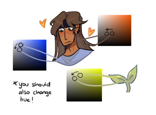
as to how i pick colors, i never use the color picker tool, i eyeball everything. that's important for me because i tend to make all of them warmer: the greens are dark yellows, the pinks are light reds, and everything that's close to blue is very desaturated. i do this even for drawings that turn out much different later, unless i have a very specific vibe in mind from the beginning. i also never use pure whites for anything, and if something is black i make it part of the lineart.
then i always color my lineart!! there's no trick to that, the layer is in normal mode and i just paint it with a darker color than what's below it. i usually add the shadows and highlights at this stage of the drawing too. you're going to kill me for this but shade with gray set in color burn or linear burn (never multiply). i just don't want to think about color variety at this stage because it makes things more difficult for later. sometimes i add textures and some basic color correction here (curves, color balance, layers set in overlay, etc.) but i mostly leave that for the next part.
as to how i choose blush colors, i usually pick the base color and move it towards the saturated end of the color wheel, and a bit more pink. sometimes i add a multiply layer and airbrush hot red over the base colors at low opacity. coloring the lineart with hot colors surrounding the blush areas helps a lot too :)
i also almost always duplicate the lineart, blur it and set it in linear burn (i paint this layer in a light gray). this adds a lot of depth to the drawing, especially if later combined with the bloom effect.
the key to why the colors in my art pop so much is that i don't enjoy drawing as much as i enjoy postprocessing pictures 😂🤣😅👌✌️👍 once i'm satisfied with the "base" colors i merge everything except the background, open a new canvas and go crazy with filters and textures. that's why i use ibispaint X even if i do the lineart elsewhere (krita), and even if it works a bit wonky with big canvases.
i do something different for each drawing here, so first i'm going to explain my reasoning so that you understand my process: i used to have a problem of using very strong colors that overshadowed my beloved lineart into which i had put a lot of effort, so my goal nowadays is to make everything look less contrasted without losing the visual impact of saturated colors. that way the lineart remains a strong point and not just a way to separate one color from another.
what i usually do is duplicate the new merged layer, set it to exclusion mode, add a gradient map and play with the opacity. then i duplicate that and do the same thing with another gradient or another blending mode. i tend to add like 3-6 layers of bullshit over my drawings, including textures and other filters like "bloom" or "sharpen". i understand everything that's going on there but i don't think too deeply about it, i just pick whatever looks best.
for the final touches i always pull up the saturation and contrast (since a lot of it gets lost in the process), and i usually have to manually change some colors (ibispaint X has a filter to do that) or tweak the curves. then i add chromatic aberration, noise set to overlay and little polka dots set to linear dodge.
here are some comparisons of the before and after of recent drawings. the 1st one is very subtle, but you can clearly see how much warmth and depth it gains it gets after all the postprocessing. the 2nd one is so different that i understand why you're curious about how i pick colors. i don't think i can replicate that look just from picking nice colors, there's a lot more going on!! the 3rd one personally feels like it had potential lost (i liked the yellow highlights), but the colors were too strong and all over the place, so the finished result looks more intimate and calm and i like it a lot more.

thank you for the interest anon, i'm very happy that you like the way i color things and i hope i have explained myself. good luck with your own journey!!
24 notes
·
View notes
Text
Feeling kinda nostaligic looking through some of my art.
I drew this in 2021 and I was so proud of it. It was a companion piece for a fic that never manifested, and I loved it so much. It was my first real foray into digital art. Sure, I'd definitely drawn before, but nothing with this amount of effort put into it. It wasn't even the first thing I drew for the LU Discord: the place that got me back into art.
Looking at the results, I think it still holds up, and that makes me beyond happy. I would certainly change a lot about it if I drew it again today, but I love it all the same, because it's something I could see on tumblr and go "oh that's cute, I'll reblog" and I'm near tears.
I think it embodies what my favorite pieces are to draw: sad/angsty pieces of my favorite characters with dramatic lighting. I don't draw many of them, because they require so much effort, but they're my favorite.

I drew these two pieces in October and December of last year. I learned how to utilize glow layers, my anatomy improved, and I shifted to a lineless art style that is so much work but gives beautiful results. You can even see that between the two pieces I decided to properly learn how to draw wings.
I've improved so much in only three years and I genuinely owe it to the LU Discord. Even if I'm not as active there anymore, y'all got me back into art. I have over a hundred pieces of terribly drawn (by my current standards) fan pieces for your weekly prompts that gave me the practice I needed to improve, and I wouldn't have even bothered if I didn't want to participate in that community.
Specifically, I want to thank @ahrva, one of my best friends. She who collabed with me and encouraged me into so many writing projects and community events. Thank you, dearly. I wouldn't have had the courage to join the secret santas or art exchanges if you hadn't been right there, super excited to participate. You always compliment my art, and it means a lot when you go "OOOOOO" in response to one of my pieces /gen
I'd also like to thank @wolfy1298 whose art was a huge inspiration, even if we've never really spoken. Whenever I saw your work I was so impressed that I couldn't help trying to emulate you a little. Your colors are something I still envy to this day, your masterful highlights and lineart an inspiration to work harder and improve. Your curvy shapes are also very cute and may have infected me lmao
@author-main your diverse body types encouraged me to properly learn anatomy. I'm taking medical classes, but it's another thing entirely to try drawing the human body properly. I'm still unfortunately lacking when it comes to larger bodies, but your beautiful work encourages me to try improving, even if it's only in sketchbooks that no one will ever see. Your lines are full of personality, and I never tire of seeing your work.
@w1lmutt your compositions and poses are awe-inspiring. I struggle a lot with composing a shot, especially with foreshortening, so your work is extremely impressive. You manage to insert so much personality through body language alone, and it's definitely something I'll be striving to improve. That's not even mentioning your backgrounds! I'm generally in awe of every piece you make. I think I'd die if I had to draw a proper landscape/cityscape lol. I can barely manage a bedroom! Just another thing to work towards improving lol
There are tons more artists i want to shout out and compliment, but it's nearly 7am and I haven't gone to sleep yet lol.
Thank all of you. Even if I only pop in once every few months for the events nowadays, I'll always cherish my time in this community. I'm going to keep improving, and I'm glad to be doing so alongside such skilled artists!
#my art#just a thought#thank you#linked universe#tw blood#artist appreciation#art journey#art growth#appreciation post
7 notes
·
View notes
Note
If saying it helps you then I happily will!! :D <3
What you're doing is great and I really enjoy it <3 I love the details you put into the characters clothes, the way you draw full bodies and the interesting poses you use, and from what I've seen from that post about ‘gh illustration i did last year for china gh only anthology project’, you’re really talented at colouring too!!! I love the softness of the clothes, and the fluffiness of their hair, I also like the angle with the fence (? The wood thing in front of them) and all the little flower petals!! (i adore flowers and pink is one of my favourite colours!!)
I am exited to see more in general, but what I would love to see more with Mumbo and Grian would be more colouring, (simple but colourful) backgrounds and cute facial expressions! ^w^
Obviously, do whatever you want, I am already enjoying following you <3 (and I'm sure you're very busy lately! So your priority with art should be having fun and relaxing!)
(also yes I adore colours if you couldn't guess /j)
aaaaa thank you so much 😭😭😭🫶🫶🫶
i love pastel colors so much, especially the pink aesthetic 🫶🫶 funfact: my circle name (in jp fandom, there’s 2 names used. one is circle name, like sort of publishing name?? and then there’s ther artist name) is 桜かぼちゃ/sakura kabocha which is basically combining my fav aesthetics, sakura with the spring stuff and cherry blossoms; kabocha is pumpkin in japanese, i like autumn and halloween as well
i love drawing, but as time goes, i gradually have less time and energy to put for a piece. full-render piece takes so long now 😭 my life also gets busier as well.
the truth is, i use the gradient style as a ‘cheat’ for myself, to make a piece looks finished without having to render much. my drawing process nowadays involves a lot of short-hands and how fast i can finish something with all my constraint. i do lineart fast, i jump from drawing blue abstract blorb into lineart right away. by doing that, i shaved quite a significant amount of time.
the gradient palette i use is specifically the ukiyo-e gradient palette, which is a gradient palette intended to mimic the japanese ukiyo-e painting style. i mess around with tonal after that and add more effect.
i got a lot of doujin drawing experience from my time in the gintama/ginhiji fandom, would love to one day make a full doujin comic for grumbo, but idk about my time and energy 😭
grumbo honestly have helped a lot with my artblock currently. i’m sort of in a creation rut with gintama since we’re in a waiting period until the new series. i hoard fandoms, so once i got it, i usually don’t ditch them out, especially if i’ve drawn arts of it, so i’m here to stay :>
5 notes
·
View notes
Note
my toxic trait is looking at your art and thinking that i could do that too. everytime i try drawing Transformers it ends up lookin like a pile of metal that got ran over by two semi trucks blasted to cybertron and back then got the shit beaten out of it by Optimus Prime himself 😭
but fr though, how do you do it? like what kinds of shapes are they made of? how do all their weird alien metal parts move?
what may work for my style might not for you, as i've unfortunately learned through my years of yearning for/trying out another artist's skill, and that's okay. but i am very honored to be that kind of artist to you 💗 beating yourself up for not being like me won't help you, though 🥹 your art is great, regardless of if it looks like mine or not. i'm going on 7 years of doing this after all! (also i started with bayverse of all things 😵)
and honestly, a lot of it is just experimenting and finding what's right for you, what you need to improve/improvise on, and what you want out of your art. for me, i found that i have a very difficult time actually getting that sharp, blocky industrial style of robots down and eventually opted for a more organic, squishier look. but i do maintain their proportions as they're wildly different from a human's ghsdfsjs
you're already off to a great start doing exactly what i did to learn: redrawing screenshots from the shows. i learned most of what i know from tfp, with a lot of bayverse and g1 mixed in there. it took me about two years of that before i felt confident enough to start making original art consistently. it takes time (and tbf, i was still learning how to art in general when i started. so you really are off to a great start)
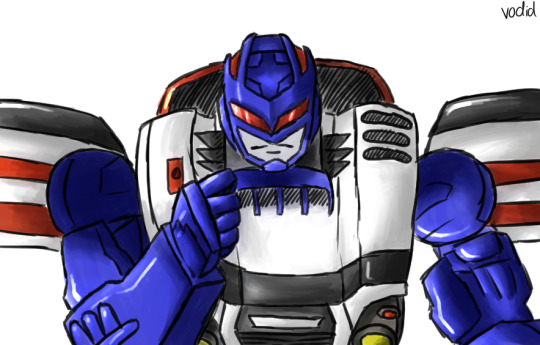
this is the kind of art i made in 2017:
massively different from my art now, right? through all these screenshots, i'd test out new ways to draw and color. at one point, every piece i made was trying something new. and it was okay if it didn't work out. means i know what not to do next time lol generally though, i'd NEVER do lineart. i mostly focused on building up my sketching and coloring skills, as seen here in my 2018 art:
and that kind of fucked me over for life so now i am left with painting over the sketch 😂 i digress though
in all honesty i've spent my entire art career figuring out how the fuck all their weird alien metal parts move 💀 a lot of it is BSing, some is recycling the same poses to make things easier on yourself and the rest is studying studying studying. cannot tell you the amount of times i've rewatched certain bayverse scenes frame by frame to figure out how all their parts move in tandem — i still don't know! 😅 g1 was a nightmare to figure out because of its blocky simplicity and limited range of motion. it's still a struggle to this day haha
it's really difficult how to explain how exactly i draw transformers, as it's just... something i do nowadays. there's not a ridiculous amount of thought put into it since i've built up my skill. but here's generally how i sketch their bodies and what shapes i use:
the first is slightly different as its a more detailed approach than g1 so just imagine the arms are a little rounder — "marshmallow," as my brother would call it — like the sketches in the second (even if those are a little more advanced in the process than the first)
my best advice to you is to learn their proportions and articulation via redrawing screenshots — various ones! i chose the most dynamic poses for my megatron practices in 2018 to nail it in my head lol but yes shows like tfp and earthspark are great for that (you could probably even do with looking at the storyboard animations for earthspark to help!)
and remember, i'm still learning too! i'm not gonna pretend like i know what i'm doing. but i'm glad i inspire you :)
13 notes
·
View notes
Note
'Scusie, I have a question about digital art. How do you do your coloring? If you have a previous post or resource you talked about already then that'd be appreciated. But if not; I've just started getting back into digital art and can't remember how people did their fancy selection methods to color in their lineart. I managed somewhat myself but what would be a simple sketch irl took like an hour or two of trying to work the tablet/program. I want to enjoy it again and use it to start commissions in the future, and I don't want to be easily burned out because of the complexity. For reference, I'm using Krita.
ok I wasn't really sure how to explain it so I made a timelapse? let's see if this helps
so first of all, I'm predominantly using CSP nowadays (which I love and highly recommend), which has this nifty little feature in the bucket tool:
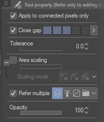
it can close gaps!! Now, I tend to draw pretty loose and my lines have a lot of gaps between them that are too big to close automatically, so I'll manually close them on my color layer with whichever color I'm using. I find this method works best when my pen and bucket tool have anti-aliasing turned off. I think other programs like Medibang and even Aggie.io have some sort of "smart" bucket tool, so I wouldn't be surprised if krita has something similar too.
the second method is simply Not Giving A Fuck and coloring sloppily without caring if the colors stay in the lines. I do this more for stupider comics where looking pretty doesn't matter so much
the third method is the same as the first but using a nice, textured brush so it looks Intentional and Pretty
I also tend to throw gradient maps on everything because they're so fun :)


the fourth method (which I did not demonstrate) is the good ol' polygonal lasso tool. I mostly used it when I used Photoshop. It's a really good and fast way to get all your colors blocked in without requiring so much precision, but it can still be a little tedious.
Bear in mind, I am not the kind of person that has each color on its own layer. A basic drawing like this one is lines, colors, and bg, with maybe a gradient map or adjustment layer. There are tons more ways than this to color (look into CSP's reference layers! pretty neat stuff), but these are just the ways that I like to use because I am very very lazy and am only willing to put in the absolute bare minimum effort
983 notes
·
View notes
Note
Any advice on how to sketch faster? Feels like it takes HOURS for me to make a sketch for just one drawing...
ok this is a hard one for me because it genuinely just. kinda comes naturally to me actually. like i remember my art teachers in elementary school getting annoyed with me because i could draw so fast and i would finish before everyone else. BUT there are some things that i think have helped me get even faster over the years!
the first one is quick figure drawing. I like to do 1 or 2-minute gesture drawings because they really force you to move fast and think more about the form itself than get bogged down in the details. (in art school they make you take a ton of classes that are JUST figure drawing if you're majoring in illustration. i love it.) The absolute best way to do this is a live model session, but i understand that not everyone is in art school lmao so the website quickposes is a good resource! go to timed practice and set the interval to 60 or 90 seconds, and then just focus on getting the IDEA of the form down instead of all the details. This can be scary at first but eventually you'll become much more confident and your hand will naturally start to move faster when you sketch! figure drawing this quickly will also help you loosen up and get a better idea of the forms of the human body instinctually, which will in turn make it easier for you to sketch faster even without a reference!
The second thing that i think really helps me go fast is kinda a natural progression from the figure drawing tbh, and it's not worrying TOO too much about 100% anatomical accuracy. What my professors have told me in my drawing classes is basically that as long as it LOOKS believable, it doesn't matter if it's actually perfect. don't worry too much about realism or accuracy when you're laying down a preliminary sketch. focus on the energy you want your pose to convey, and let your sketch reflect that. if anything is HORRIBLY wrong anatomy-wise you can fix it later, but a little bit of limb-lengthening or otherwise unrealistic proportioning isn't the end of the world, especially in very stylized art. When you aren't super worried about 100% accuracy you have a lot more freedom to move quickly and ignore little mistakes!
thirdly, lose all the steps in your artmaking process that you don't like. when i first started digital art, I thought that i HAD to do a stick -figure pose sketch, block in the body on top of that, then clothes, then lineart, coloring, shading, etc. there were SO many steps in that process that took me a really long time to do and that i just... did not enjoy doing. nowadays I've almost completely cut lineart from my process because i like the sketchy look, and i often don't even draw the full body before i begin blocking in the clothes, hair, or face. Obviously you need some preliminary knowledge of how these aspects of your character are going to interact before you can do this, but once you're able to it really shaves off a lot of time. I found that when i was trying to do things what i thought was the "right" way, even steps that i hated, my art looked worse and took longer because I wasn't having as much fun.
#I do just naturally sketch fast but i think a LOT of it is that i dont worry too much about little imperfections yknow?#anyways. hope this helps lol#asks
73 notes
·
View notes
Note
leaving procreate for clip studio, so any fav brushes?? ngl procreate brushes suck, the app is really intuitive but DAMN are the brushes literal garbage. so im giving clip studio a shot, wish me luck🥂
Sorry I'm replying to this so damn late!
Anyways, I tend to change the brushes I use from time to time whenever I feel like I want to try something different. But, these are the ones I use most often. (Also sidenote I've downloaded most of these from clip studio assets by searching "sketch" or "paint" )
LINEART/SKETCH
I'm currently using the diche pen for my lines
Example:

The one under diche pen I've used in this piece:

I haven't recently used the charchoal pen that much but an older example:

The taxe brush is also one I hardly use nowadays but you can see I used it in a lot of my older works from 2020 (I couldn't find any lineart only pieces sry)


COLORING/PAINTING
I mainly use dry earth for flat coloring. Basically just as a base so I can get started with the more fancy painting stuff if I want to
Gouache brush painting example:

Thickpaint 2 brush example:

I usually don't stick to just one brush when it comes to coloring/painting but these two are my current favorites.
Hope this helped!
38 notes
·
View notes
Photo
❗❗❗Please READ❗❗❗Emergency Commissions ❗❗❗
Im taking comissions between 10 to 15 USD (Lineart, full color, etc)
One of my friends had her cell phone stolen in a very unfair way during an LGBT event... And nowadays it is quite difficult in Argentina to try to get a phone even if it is "cheap" and she needs a phone because we study far away and She cannot be incomunicate.
Her partner and I decided to try to help financially so we could get her a new phone. If you want to buy me a commission with the real price on the list, you are welcome, if you don't want to buy me a commission, it is also valid but you can check @/car0lile (Twitter) commissions his drawings are so beautifull so he can collect and save money to buy his girlfriend a new phone.
Any kind of help its helpfull, if you can please share this.
In advance, thank you very much for reading.


Here my Commission’ info. If you are interested and have some questions you can dm me.
You can help me sharing… Thanks!
(Si eres de argentina puedes preguntar por la tabla de precios en pesos argentinos)
#commission#commisions open#art commisions#commision info#paypall commisions#emergency commissions#art#digital art#digital illustration#commisions#please read
4 notes
·
View notes
Note
I'm relatively new to your blog so I apologize if this has already been answered (I couldn't find a recent ask on it and couldn't find a FAQ page to make sure I wasn't asking something that'd already been asked) but may I ask how you get character face shapes down so accurately? Even your sketches seem like they have highly accurate character facial proportions down to a science, and I was wondering if you use any specific methods for that (such as Reilly or Loomis method for head-drawing) - 1/2

No need to apologize, I've never been asked this before!
So to answer your ask, I think it's important that I tell you that the characters I draw on my blog are characters that I have been drawing non-stop for more than a year, so I'm kind of used to their facial structures as far as like ease goes.


So it's just natural progression at that point.
On top of that I keep a bunch of references of them, including their 3D models and multiple Pinterest boards. For example, the reference I used for the middle one was this:

Nowadays I don't really use 3D references and when I do, it's only loosely based on them. But when I started out, it was a great tool for me to learn face structures and difficult angles. I have files of me tracing the models' faces and then drawing them from scratch, that I haven't shared online because they were for me to practice, but those really helped me with studying faces and how they look from different angles. For the third one, the only thing I really referenced was myself and my expression (as well as some face features i.e. my nose and eyes). As my style and understanding of facial structures progressed, I became more comfortable giving Daud some of my Southwest Asian features while also trying to keep him recognizable (e.g. his hair, his ears, his narrow chin).
The greatest thing to come out of these exercises and fanart is that now I have a good grasp on faces just generally. My OCs now don't look flat and all of those 3D studies really helped me understand proportions and feature placements better. So my advice to you would be to just practice with 3D models if you can, the trick is to really think about what you're doing tho, and pay attention to proportions and structures.
For expressions, I really just use myself as a model, or go to Pinterest and search up what I want. Usually, I don't need Pinterest for this though, my parents will just walk into my room and look at me doing all kinds of facial expressions in front of my mirror. Sometimes, TV shows are REALLY good expression references too! Some good references might just come at you from the places you least expect them to.
As for my sketches... they might look clean but they're not my initial sketches. Often I will have multiple layers, and I usually tend to just clean up my sketches instead of doing lineart, it just ends up giving me a more natural look at the end.


No matter who you talk to, they'll say that my initial sketches are incomprehensible, but as long as the sketches makes sense to you then there is no problem! I usually find that loosely sketching the idea before it disappears from my fleeting memory helps me capture the mood, no matter how bad it looks lol. I then try to rationalize it but drawing the face by creating the circle first and then the cheeks and jaw, as well as the ears. I then go onto sketching the features which I will then clean up for the final version.
I think that coloring the face is just as important as sculpting the sketch. Light sources and shadows can help really articulate certain features and show the face's depth better. For that I usually use this tool right here as reference!
https://www.artstation.com/artwork/GX3Ax1
It's free and it's super useful!
I hope that this answers your question a bit!
96 notes
·
View notes
Note
Hi, under your latest Trip art you’ve mentioned the CSP autoactions (perhaps they are for the colour rendering?) and that got me curious :D Do you mind sharing the asset(s)? No problems if you don’t of course
Hi! Of course I wouldn't mind!
I use three different autoactions on CSP for color rendering! It gives more pastel colors while also adding a "painted look" to it!
First, after finishing the shading on the piece, I use the "Aqua Lemon Filter" autoaction! It is very useful as it completely changes the feel of the piece! The original layer is also not lost when you use it which is great if you're as forgetful as I am. Do note that ALL the layers will be taken into account when this filter is applied (it can be great if you want a softer lineart but I personally disable those layers, including the background, when I use this the first time). The color change can be VERY drastic so I'd recommend tweaking around with the layer modes and opacity.

Second, I use the autoaction "写真をアニメ風に加工するオートアクション". It's primarily made for backgrounds to make photos look more painted and "anime" in just one click but I also use it for my characters to add a bit of texture to them. I usually go back on the action a couple times to find some variations in tone and intensity. I recommend GREATLY to take the layer you want to edit and copy the content onto a new canvas as otherwise, this autoaction will crush anything else you have in your CSP file into one layer.

Finally after I'm done with making sure the colors are all a-ok, I use the autoaction "Auto Line Color". I used to color my lines manually but nowadays, I use this (which makes pretty dark but colorful lines) and just go over it to tweak it. It's a real time saver! The way it works is that you use the autoaction on the layer with all your colors and it will create a Clipping Layer above that you just need to slide above your lineart!

For the finishing touches, I do some more Aqua Lemon Filter with the lineart ON so that it's ingrained in the original picture and add a couple things like a watercolor and paper texture on top.

All of these REALLY helped me because I've always wanted to use pastel colors and such but my brain just doesn't seem to be able to think with those colors in mind!
(I just want to specify that this is not a tutorial of course, I just wanted to show those autoactions in, well, action, just to illustrate :)) I promise I don't drop the "ok now time for adding details" and render the rest of the fucking owl like that when I do a real tutorial lol)
Other things that you might find useful:
Froggy Pencil (used for lines)
Pouch Watercolor Texture
Hope this was useful and thanks for the ask! Don't hesitate if you have any more questions :))
#my asks#ask me things#art tips#rendering#csp#clip studio paint#art#digital art#art process#owl does art
8 notes
·
View notes