#I actually messed up because I merged the line art layer with the sketch layer and realized a bit too late… ;w;
Explore tagged Tumblr posts
Text

I decided to take drawing more seriously and try to make an actual complete piece. So here it is ^u^
More info under the cut!
While scrolling, I found some concept art of playable Cyber elf X, and fell in love xD
So I decided to draw this piece; it was mostly practice for me to test out the brushes and my digital limits. (I usually draw in black and white on paper, so this was tough, but rewarding -w-)
Originally, the idea for the background would be a void-like cyberspace bg, but a friend suggested a sunset.
The idea here is that Cyber elf x is falling from… robot heaven? Armed and ready. So ye.
Sketch and inspiration:
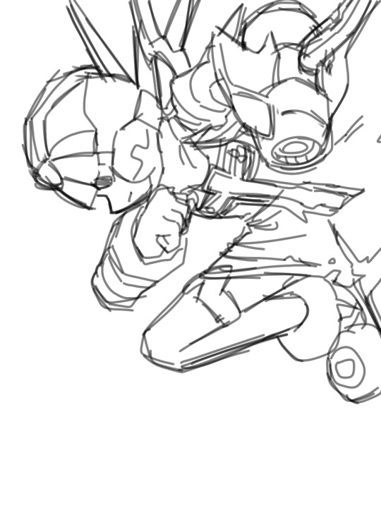
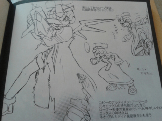
#mega man zero#mega man#cyber elf x#cex#aresart#MY FINGER IS SO TIRED AIBSKWBWIWBWJW#TOOK SO LONG#8 HOURS AND 53 MINUTES#AAAAAAAH TwT#I actually messed up because I merged the line art layer with the sketch layer and realized a bit too late… ;w;#this is also my first time drawing a sunset and I think… it looks like rainbow pizza xD#i messed a lot with all the brushes#and rendering was a lot more fun than I thought!#definitely planning some more similar digital art like this :)#I can’t draw goofy doodles forever lol
206 notes
·
View notes
Note
I literally love your art sm. It's a big inspiration of mine.
So! A question I have is, what's your process? How do you go about getting ideas and turning them into pieces? I would really love to know <3
WUUAHHHGGH OMG URE SO SWEET 🥹🥹😭🥹😭😭😭 Melting with joy uaushfhshgs,, I cannot fathom someone being inspired by my art this means sm to me🥺🙏
As for my process? I always have ideas floating around my mind, but when I actually feel like turning it into a piece it usually starts with me making some thumbnails (one or two normally but it can be more sometimes). My process changes depending on the style I’m doing that piece in?? I try avoid doing actual line art if possible but that’s entirely on the grounds that I hate doing it LOL. Most of my process is spent messing around with colours because that’s the most fun part to me. Colours are a big part of me actually starting a piece, even during the sketch I try map out the values vaguely and colour language is always at the forefront of my mind when tackling a piece.
But from start to finish my process looks like this:
Inspiration for an idea is usually just what character I am feeling attached to on that given week. I doodle them quite a lot (traditional or digital) before making an actual piece with them so I can figure out stylisation and what kind of mood I’m in
Thumbnailing. This is not always present? If I have a clear image in my mind of what I want to draw or I’m just vaguely drawing a character, I won’t thumbnail. But I always thumbnail if it’s more than one character
Cleaning up the sketch or god forbid the line art usually happens now. I hate this part because my thumbnails are quite messy so this is the part where I actually have to think hard about how the final piece will look
Value planning and colour planning is my favourite part and what I am actually thinking about since the beginning. This is also where I plan the lighting. As a general rule of thumb I try keep my layers under/around 10 so it makes rendering a little easier
Rendering rendering rendering. I add details and paint the colour layers with all that they need. Merge all the layers (as a duplicate) and paint over again to further render, clean up, paint over the line art/sketch
Make some final colour adjustments with gradient map or curves before adding some noise and maybe cross hatching
#jumping for joy hugging you stranger on the internet..!#this made my day wahhh I hope u don’t mind me yapping a little bit LOL#deadbaguettesask
6 notes
·
View notes
Note
First off- Love your art. Big, hard yet somehow soft and warm. I can't really explain but I feel like all your characters smell great and give serotonine-filled hugs.
I would just love to know your drawing process. All your lines and colors are so clean, so straight, so nice. How do sketches look? Whats the walkthrough. Tell me your secrets. I beg of you.
Thank you! It’s a running joke among my D&D group that my characters give the best hugs, so I’d say your feeling is right ^^
Secrets can be found below 👀
The tools I use are as follows
a small Wacom Intuos tablet
Clip Studio Paint (sketch, lineart, flat colours, shading)
Photoshop (textures, backgrounds and lighting effects, colour correction, abusing the Liquify tool to try to fix anatomy mistakes)
Sketches
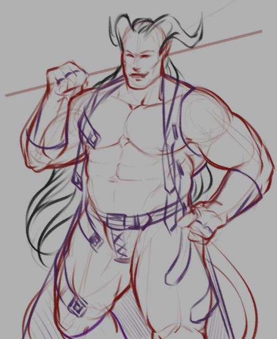
My sketches usually look something like this and involve a lot of scribbling and experimentation and use of the Transform tool until I end up with something I like. I kinda just feel out the shapes as I go and am constantly redoing and adjusting things.
The different colours are just so I can differentiate between the different elements and it doesn't all just become a giant scribbly mess when I'm trying to line it after.
Lines

As for my lineart, half of it is just a result of practice. I've been doing lineart + cell shading as my main style for over ten years now so I like to think I've managed to acquire some decent line control in that time.
The other half is a good stabilizer and pen pressure settings on the brushes I use.
Before Clip Studio Paint, I used Paint Tool SAI for my lineart because I could never get line results I was happy with in Photoshop, but not only does CSP have phenomenal stabilizer settings, its vector layers feature (which automatically turns your lines into vector shapes regardless of the brush you use!) has also made the process way easier by allowing me to edit and adjust my lines after the fact.
The one tip I can share when it comes to lineart is to take advantage of momentum. I never draw directly on my lineart layer; I make a new layer above it, draw on that one, and then merge it down every few minutes. This lets me use momentum to carry my brush strokes and then erase the parts that overlap without worrying about messing up the stuff I already have, resulting in smoother lines than if I had tried to precisely draw a straight line the entire time.

In the example above, the green line is on its own layer and can be easily erased without damaging the black lines around it.
I also tend to use a smaller brush for interior/detail lines and thicker ones for the outer edges of a shape just because I think it looks nice.
Process in General
Honestly, my process is just a lot of trial and error. I draw a line, undo it, draw a line, undo it. I sketch several hairstyles or outfits on different layers and then swap between them like some weird dress up game until I decide which to keep. I experiment with adjusting the hue and saturation of flat colours until I find something I like. I’m a very “make it up as I go” kind of artist, and really, creator in general; and rarely is the finished piece the result of any sort of plan.
That being said, I do have a general order in which I do things:
Sketch a bunch of random things until I find something I like
Merge all sketch layers and reduce the layer opacity until it’s very faint
Make a lineart layer above, then a layer to actually draw on above that
Draw the lineart using the techniques mentioned above (I often jump around and line different sections randomly), fixing any wonky parts of the sketch as I go
Make a separate layer below the finished lineart for each differently-coloured element (eg: hair layer, skin layer, pants layer, etc.) and fill with fill bucket*
Tweak each layer’s colour until vaguely happy with it
Make a layer below all other layers, select the entire interior of the lineart, fill it with black to fill any tiny gaps left by the fill bucket
Make a layer above all other layers, set it to multiply, draw shadows with a light grey-blue-purple colour (I shade one element at a time by selecting the area and then drawing within that selection on the shading layer)
Repeat step 7 with a layer set to Overlay and a light-medium grey for highlights
Open the image in Photoshop and apply gradients, patterns, lighting etc.
Notice all the mistakes it’s too late to fix and start second guessing the entire piece, say “screw it”, save it as a .png, and post anyway!
And I think that’s about it.
Sorry if that was confusing, I’m not sure how much previous knowledge of these programs you have or how much detail I should go into, but I hope maybe some of it was interesting and/or educational lol
I also have a short process video here that shows the steps one at a time that might help you visualise it better
- - - - - - -
*In case anyone’s brave enough to try using this as a tutorial and isn’t sure what I mean here:
CSP lets you set the lineart layer as a reference layer and still fill the colour on a different layer as though the lines were present on that layer. In other programs you may have to select the area you want to colour on the lineart layer manually with the magic wand tool and then move to the corresponding colour layer before filling it in.
If you use a program where you have to select the area manually, you may want to keep all your tiny detailed lines on a separate lineart layer just so you don’t have to spend time selecting all the small gaps between them. Alternatively, you could just fill it by hand with a brush.
28 notes
·
View notes
Text
#showyourprocess !
From planning to posting, share your process for making creative content!
To continue supporting content makers, this tag game is meant to show the entire process of making creative content: this can be for any creation.
RULES — When your work is tagged, show the process of its creation from planning to posting, then tag up to 5 people with a specific link to one of their creative works you’d like to see the process of. Use the tag #showyourprocess so we can find yours!
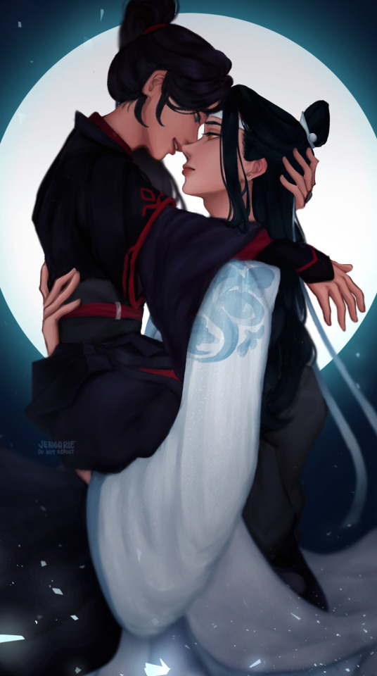
Thank you, @rinielle for tagging me! She chose the piece above (original post), and oh boy this one was a whole ass rollercoaster ride! Unfortunately, I hadn't turned on the timelapse feature for this but I'll try to go through each part of the process as best as I can!
The photos I'm gonna upload are gonna be a mix of screenshots and literal photos of my screen, because I'm taking some of them from my updates to friends, since a lot of the steps got lost in my painting process.
But before that, let me tag some other amazing creators!
@dragonji: this gif art!
@candicewright: this yibo painting!
@wendashanren: this gifset!
@mylastbraincql: this gif!
I haven't been able to keep track of who's been tagged so apologies if you've already done this! Also, no pressure to do it at all if you would rather not! <3
Planning
Sometimes, I get an idea first and find reference photos to go with that idea. But for this one, I sought out a reference photo first, and built an idea on top of it!
After that, I roughly sketch out the base pose. Usually, this looks very messy, but it doesn't really matter as long as I understand which part goes where!

The idea for the background didn't really come until the creation process because I don't think I really planned this to be a full piece.
Creation
Sketching
Honestly, from this point on, it's more of trial and error.
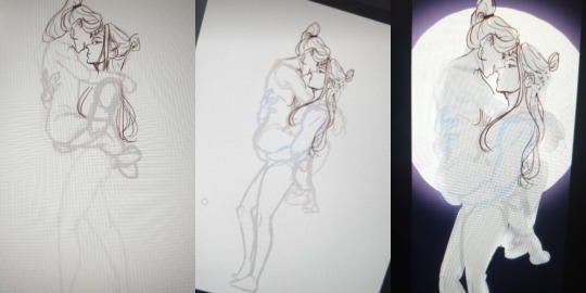
So, I redid the the initial base pose—made it cleaner and a little bit more detailed. See: the added definition in their arm muscles, the rearrangement of Wei Wuxian's legs, and Lan Wangji's hand on Wei Wuxian's back. If you look at the second photo, I also changed the pose a bit midway—I tend to edit as I go sometimes when I change my mind. (For this, I thought, given the Lan arm strength, it would be better to make Lan Wangji look more at ease carrying Wei Wuxian. This gets covered by the robes anyway though, so it didn't matter much in the end.)
I also started adding details to the base! I usually start with the face and then the hair! I usually go for the clothes next, but I dreaded the robes in this piece so I guess that's why I ended up with a basic idea of what I wanted for the background instead LOL I also figured out how I want the final crop to look like, so I blocked out all the other areas with an extra layer!
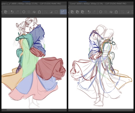
Okay, onto the part that killed me like ten times: the robes. There are a lot of interactions between their robes here given their pose, and not to mention they also have layers upon layers on each of them! So, to maintain my sanity and to keep track of which part is which, I color coded them into the most colorful sketch I've ever made.
Another reason why I filled in each layer of robe with a solid block of color, is so that all the lines underneath gets covered. Without all of the colors, the actual outline actually looks like the one on the right. What a nightmare!
I also ignored the crop again for this part, because it's always better to draw past your borders, in case you decide to rotate or tilt or whatever your piece later on. I didn't do the feet anymore though, because that I was sure wouldn't show in the final piece anymore.
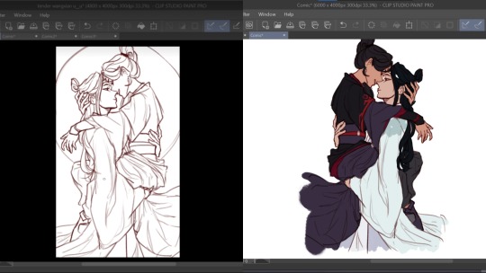
After that, I did the sketch one more time and then started adding the base colors. (I didn't have a screenshot of just the base colors, and the final CSP file is a nightmare so I copy pasted the layers into a new canvas to show you guys :') )
By the way, I drew their robes flowing this way, because I wanted it to frame the lower arch of the moon behind them for the composition. It was a little frustrating that I couldn't get Lan Wangji's robes a little higher because of Wei Wuxian's legs but I later filled in the empty space with his forehead ribbon anyway, so it all worked out in the end!
Painting
Because apparently, I was a masochist back then, I merged the base colors all into one layer and started adding shadows to the robes. (These days, I add shadows first and then, merge. It's much easier this way.)
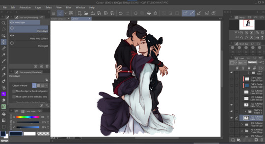
And then, I started painting! Again, I did the face first and then the hair, before finally the robes. This was my first time painting side profiles and honestly it was quite a pain to figure out LOL but !!! I think I did a good job and I'm proud of how it turned out. I again used reference photos for this one but I can't link any because they were just several random Pinterest photos that I didn't save.
Another thing to note is that I use the mesh transform tool a lot, especially on faces. That's largely why Lan Wangji's face looks so different in the latter two!
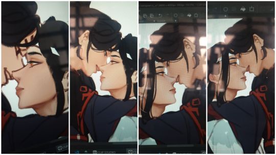
And then I went with the robes. Somewhere along the way, I realized I didn't like how I planned to do Lan Wangji's sleeves and the flowy part of Wei Wuxian's robes and I... decided, with much dread, to do them over. So I sketched on top of the painted layers and redid the robes, again.
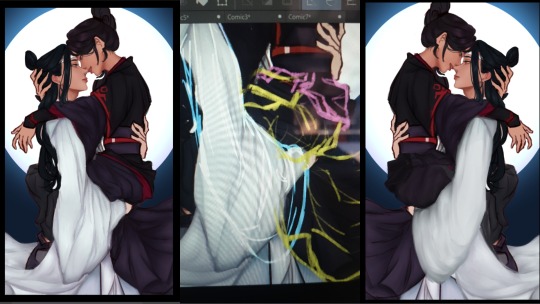
It was at this point that I decided to take a break from this piece because it was honestly very draining! I think it took about three weeks before I decided to open the file again and continue it.
When I did, I just finished painting the rest of the robes and their hands. The blue details on Lan Wangji's outer robes were painted on a separate layer that I put on Multiply. I probably did more adjustments to the face and hair and stuff, because my painting process is honestly a mess :')
Final Adjustments
I added some correction layers on certain areas to fix some of the colors. See: Lan Wangji's sleeve becoming much brighter and paler; Wei Wuxian's legs having less contrast. And then I merged all of the layers (excluding the background) and added a bit of blur. See: Wei Wuxian's ponytail; the entire lower part; the flowing forehead ribbon. My reasoning for this is so that most of the detail (and therefore the flow of the eye) goes to their faces and expressions!
And then, I put a blue Overlay layer on low opacity to make Wangxian blend better with the background, added a bit of shadow on the inside and the lower sections and added the glowing details for the added flair. I initially wanted sparkles and/or stars but they didn't turn out as well as this did. I also upped the contrast by a little for the entire piece!
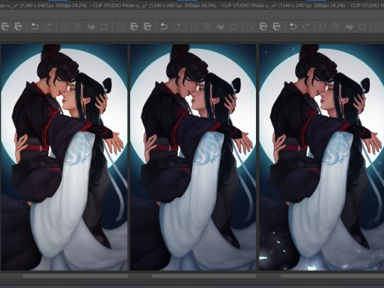
Aaaand, that's it! In truth, I did a bit more color adjustments to the whole piece, but I was a dummy who forgot to turn them back on before posting so ... oh well.
Posting
Before posting, I upload it either on my spare private Twitter account or on a drafted Tumblr post so I can check the colors on my phone. This is because the colors on different devices can look very different, and I would at the very least want all my pieces to look nice on both of my devices!
And then, once I deem it satisfactory, I just try to think of a caption and post! Some artists wait for a certain time where most of their followers are active, but I didn't have a lot of MDZS followers at this point so it didn't really matter to me.
It still doesn't really; I haven't actually been able to figure out when my MDZS followers are awake even now.
#showyourprocess#mine#whew this was so long oops#but this piece took like#maybe 1.5 weeks sans the break i had to take#so !!#LOL#tag game
46 notes
·
View notes
Note
Have you ever considered making a YouTube channel? I would love to see the process of making your art!
I do think it’d be nice to make speedpaints but I currently don’t have any kind of video recording or editing programs with which to make them, ahah… also I can’t imagine anyone wanting to watch a speedpaint without some music on said video, and there is the small issue of youtube and copyright and all the songs I like presumably being Very Copyrighted
so it’s not a possibility I’d write off forever, but I don’t know how I’d make it happen right now :’>
but if it’s my art process you’re interested in, I can at least go through that step-by-step with some screenshots!
step 1: draft! usually either a very tiny chibi or barely more than a stick figure, my art always starts like this so I can figure out the pose without spending like an hour on a full-sized sketch that doesn’t even work in the end

this then gets resized to whatever size I want the final picture to be:
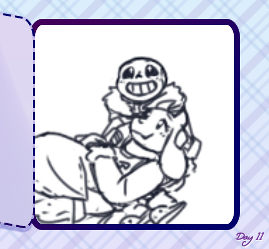
drawing at that size usually means the anatomy is pretty wonky though, and the lines are too thick and blurry to be much help for the actual lineart. if a background is vital to the whole piece it’ll get drafted here too, but with space backgrounds like in this I can just fit it in around the characters. (that’s generally terrible art advice though, please do not do as I do :’D)
step 2: sketch! still very rough, but a lot easier to work with later. I do anatomy sketches as I go but there’s rarely any need to keep those layers
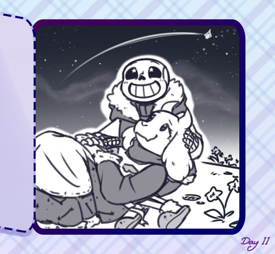
I don’t usually “colour” sketches like this but knowing I’d be sharing this I wanted to make it more readable, since this is still what I would consider an unpresentable mess not worth posting uvu;;
(also if I’m doodling, this part sorta gets skipped in favour of just letting the lines be a bit sketchier and rougher than usual)
step 3: lineart! literally the worst part always.
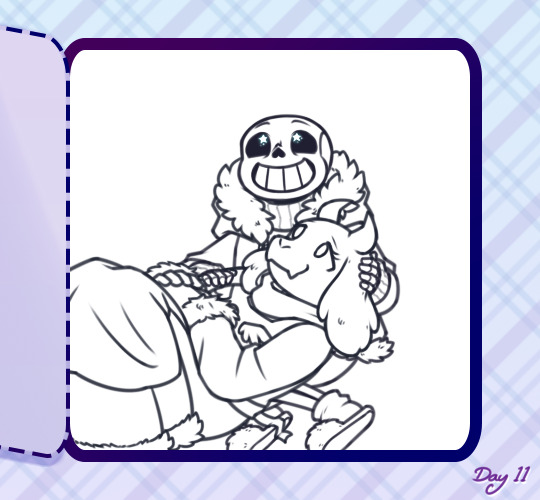
it’s worth it in the end, but… yeah this isn’t ever the point where I’m like “yes this is a Good Picture that I Will Be Happy With :)”
(I do lineart with SAI’s default pencil brush at a size of 3 to 5, opacity around 75%, if that’s of any interest)
step 4: flat colours! I have probably the slowest possible way of doing this, but after how tiring lineart is I find it pretty relaxing taking my time filling each colour in under the lines. every individual colour gets its own layer so they can all be shaded individually too
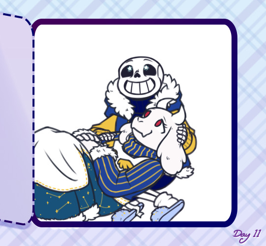
if I’ve drawn the same character in that same outfit before this is also where I’ll do the line colours, but those rely on being darker than the shading of each colour, so for a character or outfit I’ve not drawn before that can’t be done until after the shading. fortunately not the case here!
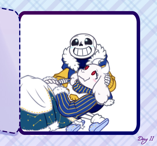
generally shading would be next, but there also comes a point where I have deal with the background now or I’ll be even more frustrated by it later, so - step ???: background! whether I do it lined or lineless pretty much just depends on if there’s any straight lines involved
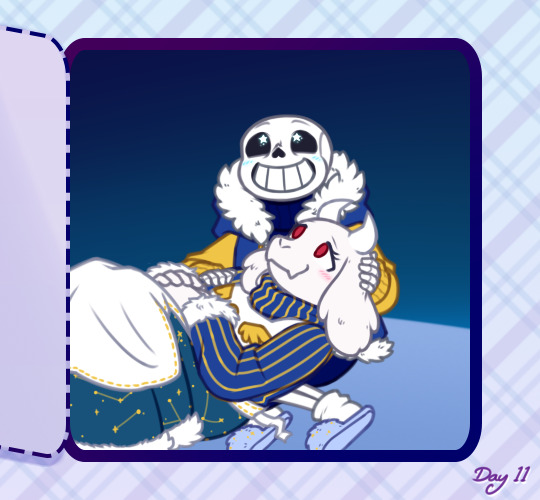


…backgrounds are kinda too individual to explain in general, but for this specific one all the starry details are luminosity layers. stars are done with this brush but I do quite a bit of erasing and hand-drawing stars too, and I use SAI’s default brush set to spread for galaxies
step 5: shading! aka the best part, the point where I go “oh hey this looks decent actually. when did that happen”
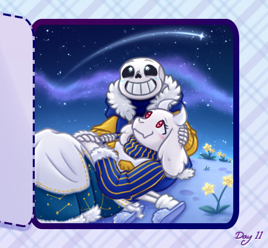
my usual shading style is every colour gets 2 darker shades and 1 lighter shade, each shade getting its own clipping layer attached to each colour. this was more obvious when I used to cel shade but soft shading makes my art look so much better ahah
step 6: layer effects! multiply and luminosity layers have been my go-to for the past 4 years, but I can’t believe I only realised how good overlay layers are in the last year and a half. they’re so good
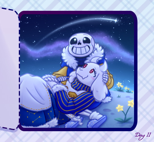
here’s the specific effects being used here:
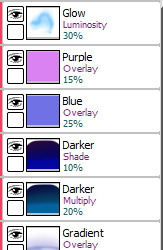
aaand step 7: final touches! usually consists of any glowy outlines, text or things that need blurring in photoshop, a final luminosity layer at around 10 to 20% opacity for extra highlights (especially needed for dark scenes like this, those darker layer effects tend to make the regular highlights from the shading less vibrant), slap a watermark on there and call it done
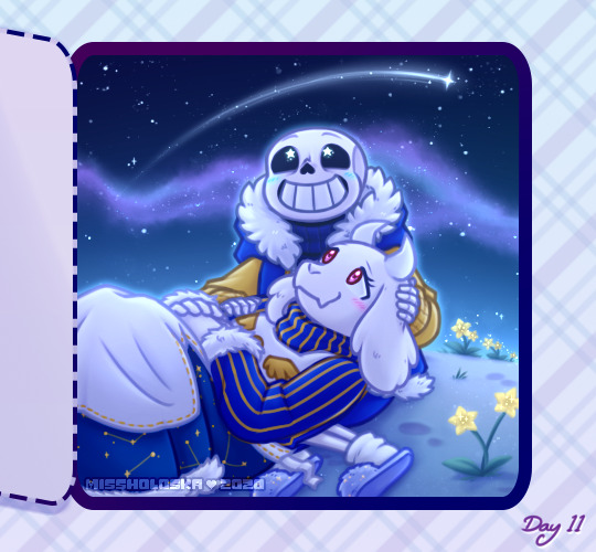
and then you’re ready for step 8: spend an hour staring at every pixel for mistakes, before spending another hour fighting the anxiety about posting it
bonus: even though I can’t make a speedpaint I can throw all those screenshots into a poor quality gif for you to watch, at least!

one final thing I can mention: not including the draft and sketch layers or all the parts of the advent calendar windows, just the finished art itself - this is made up of 102 layers. and that’s with me merging a lot of layers because SAI has a layer limit and takes an eternity to save if there are too many. people who can draw a whole piece on a single layer confuse and frighten me
#anonymous#holoskart asks#holoskart rambles#honestly my art process is just a bunch of weird habits I wouldn't recommend imitating :'D but I hope this is interesting enough??#also sorry for taking a while to answer this! I probably could've used a piece I'd already finished to explain all this#but it seemed better to work on something with the intention of showing each part of it#long post //#wip
32 notes
·
View notes
Note
what brush do u use? I love your art aaa
thank you so much, that makes me really happy to hear! and i actually use a few different brushes in clip studio paint. some of these are from cs assets and i usually tweak small things about them so they’ll work with how i draw (like stabilization, opacity, line weight, etc.)
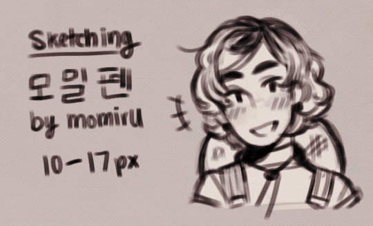
recently, i’ve been using 모밀펜 by momiru for my sketches! i typically start drawing with the brush size at around 17px and then further refine the details with it at 10-12px. i’ll use a bigger brush size if i’m working at a larger scale.
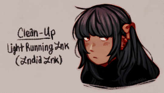
when i want to clean up a colored sketch, i use the light running india ink brush that comes with csp! i usually work on one layer with this brush, (but i keep the original sketch, colors, and bg layers in a separate folder underneath the merged copy i work on.)

some other brushes i use are:
Gペンぽい by gumama — used for inking and writing
csp’s soft airbrush — used for applying gradients in hair and adjustment layers
csp’s running color edge watercolor brush — used for applying + mixing colors (like blush on the cheeks or softening the hair gradient applied with airbrush)
csp’s milli pen — used for sketching
csp’s g-pen — used for blocking in colors
those are the brushes i use the most, but i will say they do have the possibility of not working for you. the way they look or draw can change depending on a lot of different factors, like how much pressure you naturally apply with your hand or the sensitivity of your tablet is set to. i’ve had plenty of brushes just not work for me because of that, but i do encourage you to play around and find what brushes work the best for you! look around on cs assets or mess with the settings of csp’s default brushes until you find something that you like using and don’t get discouraged if it takes a while. i hope this helps!! 😙✨
#☼ — tutorials + tips#☼ — asks : art tips#☼ — asks : txt#☼ — my txt#sorry if i fucked up when writing any of those characters#they always end up looking kind of wonky whenever i try writing them aaa#(btw that isn't tharja it just looks kind of like her)#(i'm trying to come up with a new farmer oc but i still need to tweak their design more)#//#long post#ask to tag
40 notes
·
View notes
Note
Omg okay so I spend an unnecessary amount staring at your art but your anatomy and proportions are AMAZING. Can I ask how you learned to do poses and anatomy so well? The way you draw hands and poses and just EVERYTHING is so good and I wanna get better at that lmao
First of all, please accept my sincerest gratitude for believing not just some of my arts, but EVERYTHING?? are worthy of such compliments. Thank you so damn much!! You are very sweet, I love you! 💖💖✨💖😍😘
Now moving on to the main thing here, i'm not even sure where to start but generally tipping you that OBSERVATION (and a heck ton of PATIENCE) is the key. I can just say “practice more” but it's useless unless u know what to practice. To be honest I’m still learning myself, so I kinda feel like I’m not the right person to be asked this. But I also feel I could share some if I could be of help. So brace yourself because this is gonna end up very long lol
When i said observation, i was meaning that you’ll be studying endlessly. hmm sorry bout the news but yea. You have to have a lot of patience observing everything (or maybe at least to the area of your interest - Humans/Anime/Otome characters) You need to study references every time you’ll draw. It’s nice to draw from memory but I strongly advise you to pick up references always. Don't feel like you’re cheating when u do this. Afterall, real life is basically the foundation of most arts. Like how can one draw hands if they haven’t seen one right? I always rummage through google images for everything. Or use my own body parts. I always have my hands pose to what i wish to draw and take pictures of it on different angles. Like you may think u know how something looks like but when you get to drawing it, u suddenly don't know how to or it doesn't end up looking like it’s supposed to.
Let’s say you’ve already gathered up your references, now for poses its best to start drawing by a break down of shapes. You don't need to sweat on the details right away. You need to plot the general form and positioning before you proceed on the detailing. You can detail as much as you want later on. Using sticks as guidelines is very common to many artists but I prefer them in shapes. It depends on which method you are more comfortable with.
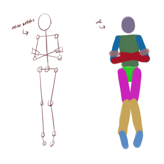
For proportions, body parts sizes differ from one another. It depends on you too actually, however you want them. But for the sake of being close to “realism” I had this as my “personal observation”. Not that I claim its uniquely mine but just because some/all of it may be true or not. I mean that's either how I see things or how they usually look like. Lol sorry i hope i do not confuse you. But anyway here’s how I keep them as proportional as I can. Please just ignore things you already know XD
Take note, its best to give your all into sketching. I find it too hard to redefine the whole art after final lines are done.
I make the head as my base for the rest of the body parts’ sizes. So here we see an egg. Watch out for the neck. I tend to make it very long unconsciously. Shoulders can be the same length as head or a little more. They don't need to be so exact tho. It also it differs with age, etc.
For torso, I make the speaker shape for men and hourglass for women. Again this only applies to certain age cap. The length is like two and a half heads.
For the arms, elbows fall on same level where pelvic bone starts.
For legs, they are the same length as torso.
For hands, they are the same as head. And feet are a little longer.

Sorry to break this after all that but it’s a different story when perspective is applied and I don't even wanna start on it lol!
Okay, I think that’s all I have for now. In contrast to everything, I would say these:
You don't have to follow these strictly, I can’t even follow them all the time.
You don’t have to do all the guides coz heck it takes up too much time. These are just for the sake of illustrating coz i am not good with words. You can just do rough estimates while sketching.
Additional tip, zoom in and out your sketch several times before finalizing it. This way you can see clearly if something is out of proportion or if something looks awkwardly positioned. Take time to reassess it over and over. Don't stop reforming it till you think it's finally good and satisfies you!
Also I tend to have a loooooooooooooot of layers. Like almost every line stroke, i do it on new layer. Luckily for me, they are made unlimited. And since they are, abuse it! Just don't forget to make folders and name them, or maybe merge the ones that belong on certain group. With this, it's a lot easier to manipulate them to your liking without messing up parts u think are already perfect. And did I mentioned the lasso tool is my best friend? Yes it helps me 95% in every drawing. It's not cheating. It’s being more effective.
Last thing, i don't really always have it best. It's just all my fail drawings never gets to be posted. XD
I hope this helps and that you’d have more fun and keep on drawing! ^u^)/
76 notes
·
View notes
Note
hey hey!! i love your art so much ive been on an art block myself recently and am trying to get over it by looking at my fav artists for inspiration and youre on like the top of the list so thank you for that!!! also if you dont mind me asking, what art program do you use? also i love your line art so much its so Crisp i wanna eat it dfkjghdhfk?? do you have any tips on how you do your line art and/or shading? sorry for all the questions you dont gotta answer but yeah!!!
hi chiara!!!!!!!!!!!
i use paint tool sai for most digital art, and then ms paint for pixel art.there are more powerful programs to use, but they are both good programs to make things in if you have a decent grasp of their functions.

these are my main three brushes, feel free to steal em:
the first one is for sketching and painting mostly, but i also use it to create shading with soft edges and sometimes lineart (its perfect for cleaned up sketches by erasing and readding sketch lines until clean)
the second one is a round hard brush, giving it a crisp cartoony look, while being easy to use because i dont need to worry about varying line thickness or making the edges look clean, but bc it doesnt really change size, using a thinner brush size for details is good. i also use it for blocking in colors
the last one is actually a really good sketch brush, but it’s also great for making linearts with a really sharp look to them.
assorted tips:

make quick, confident strokes, as opposed to sketchy or slow lines. i have my stabilizer set to like, 5 (as opposed to the really high values) mostly because i don’t have the patience for the lag, but if you draw your lines with quick confident strokes you dont need the stabilizer and you can achieve sharper, more fluid lines and curves
dont be shy to set your brush to erasing - you can use it to make sharp edges and crisp corners. if you have to draw straight lines, you can always draw them in one quick stroke on a seperate layer, then erase the parts that are in the way of other lines, then merge your layers! that’s much easier than trying to make straight lines that dont bump and mess up the rest of your lineart
think about how you use line size/thickness, color, and shading to deal with visual clutter in your lineart. if you have a lot of lineart details in say, a textured scarf a character wears, but little detail in a persons face, the scarf is gonna distract from the face. so you can make the lineart lighter or thinner in the clutter area to deal with that, for example
make your own brushes, or learn how to edit the ones you find! being able to make your brushes do the things you want them to do is a really useful skill to have. so look at what settings other ppl use for their brushes, and tinker with them to see what everything does
shading: i usually just put a layer as a clipping group on my colors layer, then use either a soft or hard brush to draw shadows everywhere (i block in large areas of shadow first, then erase and add the finer details, to avoid pillow shading), and then set that layer to multiply and then recolor it to actually match the colors of the rest of the piece + airbrush the shadow layer with a few different colors to make it pretty and stuff. i mostly do it this way bc i dont have patience and its quick
i hope that helps! try a bunch of stuff and see if any of it works for you
39 notes
·
View notes