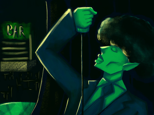
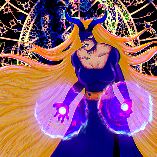
#I FEEL LIKE I NEED TO MENTION THIS IS PHOTOSHOPPED AND I HAVE NOT PAINTED ANYTHINGGGG!!!! LIKE IM JUST NAWTT THATTTT SKILLED AHAHAHA
Explore tagged Tumblr posts
Visit Tumblr Blog
Explore Tumblr blogs with no restrictions, modern design and the best experience.
Last Seen Tumblr Blogs


Fun Fact
Women make up for the other 50% of Tumblr’s audience.
Text
Pope Innocent XIV
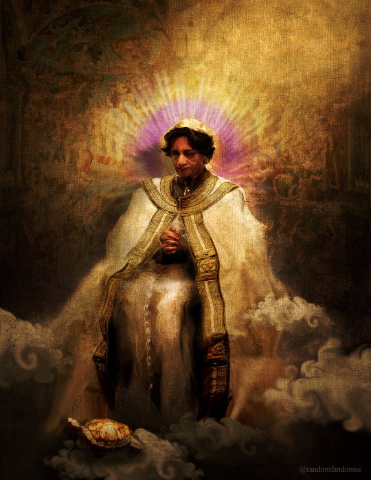
If there was only certainty, and if there was no doubt, there would be no mystery, and therefore no need for faith. Let us pray that God will grant us a Pope who doubts. Let Him grant us a Pope who sins and asks for forgiveness. And carries on.
I am what God made me. And perhaps it is my difference that will make me useful. I think again of your sermon. I know what it is to exist between the world’s certainties.
#conclave#conclave 2024#vincent benitez#cardinal benitez#pope innocent xiv#conclaveeditsrf#I FEEL LIKE I NEED TO MENTION THIS IS PHOTOSHOPPED AND I HAVE NOT PAINTED ANYTHINGGGG!!!! LIKE IM JUST NAWTT THATTTT SKILLED AHAHAHA#ALSO AI HAS NOT BEEN USED LIKE....N A U R!!!!!!!#HATE THAT I HAVE TO EVEN MENTION THAT 😭#anywho thank you because the response to the WIP was cwazy which made me finish this...SOOOO.....💛#THATS MYYYYY POPE DWAGGGGGGGGG!!!!!! 🫵🫵🫵#<- ORIGINAL CAPTION IDEA 😭😭😭#BABY BOYYY YOU ARE EVERYTHINGGG TO MEEEEEEEEEEEE#!!!!!!!!!!!!!!!!!!!!!!!!!!!!!!!!!!!!!!!#literally needed him to see in pope fit so bad I HAD to do this ahahaha#Also please open the preview for more details and better quality!!! We know the drill by noww righttt?? Thanks to TuNgLr.CoM!!!
1K notes
·
View notes
Text
i do not trust that adobe article at all. it kept trying to imply things about dan and phil liking the ai features when dan and phil never even mentioned them. like they were mostly talking about how photoshop mobile could help smaller creators edit their content without needing a computer, and then between quotes it would be like “photoshop mobile has ai features” so it’d seem thats what they’re talking about ai when they’re just talking about normal editing???
also, this part stood out to me.
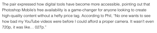
i could be reading into it, but why are you using that quote about camera quality when you’re trying to talk about how your app is an affordable editing software? That has nothing to do with anything. Like if you tried to use this quote in this way in any high school English class you’d get points marked off. Which makes me think that this is ai generated and the ai got confused, but also makes me wonder other parts of the article and their integrity.
like, when you think about it we don’t actually know what questions dan and phil were asked, which i’m sure happens in journalism sometimes, but i just feel like adobe was trying to use dan and phil to paint a narrative that’s like “see kids? ai is cool!” without dnp even agreeing with the messaging. like it felt like dnp were talking about their own experiences as youtubers and how having a good mobile editing software would help them, not “oh this is good because of ai.” like obviously the app had ai and they probably knew, but most services have ai nowadays and i don’t think they were going into it with the intention of promoting the ai features. tbh the whole thing was just “yeah a mobile app would’ve been helpful” and that was that
hopefully that all made sense i’m v tired and running late for school.
76 notes
·
View notes
Text
Announcing Krem Week!
#kremweek2024 — 22-28 July 2024
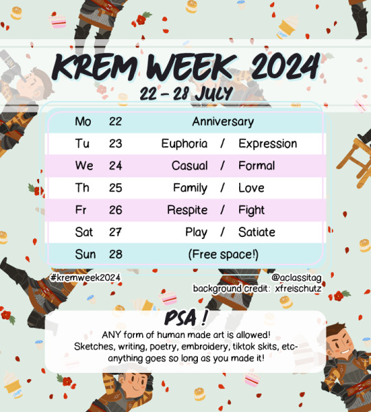
background art credit: @xfreischutz [link to original post]
*text prompt list under the readmore
This year will mark 10 years since the release of Dragon Age: Inquisition! In celebration of that anniversary and the game that gave us our first trans character, here is a prompt list - and dates - for any who would like to participate! All sorts of creative content is accepted so long as they are not A/I generated. (See examples below)
*If you want to portray Maevaris Tilani instead, that is also fine!
Please read the guidelines!
If you have any questions, reply to this post and I will do my best to answer :)
Prompt list:
1 — Anniversary 2 — Euphoria / Expression 3 — Casual / Formal 4 — Family / Love 5 — Respite / Fight 6 — Play / Satiate 7 — (Free space!)
Guidelines:
Use the tag: #kremweek2024 (@ this blog is fine too) — If you want to portray Maevaris Tilani instead of Krem, that is also welcome! Please @ me so I can rb :) For non-Tumblr folks that somehow got here: You may post submissions, please link your socials. You may choose one of two prompts in a day or do both. You may also combine as many prompts as you want from any or all of the days into a single work, just mention it somewhere.
Types of content allowed:
Illustration and writing are the most obvious forms of art allowed, but they're not the only ones! Literary arts fanfics, drabbles, poetry, plays, lengthy headcanon/meta posts (for headcanon and meta posts, minimum of 100 words+) Visual arts doodles, paintings, graphic design, photoshop memes, photography, animation, tiktok skits, abstract, fiber arts (embroidery, knitting, etc), ceramics Audio art fanmixes(curated playlists), original or cover songs Other crafts are also welcome! e.g. culinary, resin, woodworking, etc etc ..essentially, whatever type of art it is, I'll accept it so long as it falls within rules and is related to Krem or Maevaris :) For things that are more abstract, do include an explanation of your thought process on how it relates to Krem. E.g. you made Krem's Seheron Fish Wrap or Rice Pudding, take photos of your cooking, and post that (with the explanation that it is Krem's recipes) - that's an acceptable submission! You're allowed to explore different mediums everyday! You don't have to stick to one form of art for the whole week. I will be attempting to schedule reblogs in the 'prime time' for engagement, and in the interest of fairness, things like headcanon posts, fanmixes, and WIPs will not take priority in that time slot over fully rendered illustrations or complete fanfics. They will still be reblogged, but scheduled for other time slots.
Content Rules:
No A/I generated content. (Specifically GenAI content) As above, any and all forms of art is welcome. It must be human made, and by you. The whole point of working off a prompt is to explore a creative process, anyway - do yourself a favour and just enjoy making something! It doesn't have to be pretty! No reposting of other people's works. This must be your own creation. Obviously, no transphobic content. No harrassing others over their specific headcanons - be it in regards to any trait or quirks that come with being a person. People come in all sorts of wonderful variety, please respect that. In addition to above: No whitewashing, racism etc. Please note that Krem is not pale-skinned in canon, and I will not be reblogging content of him being portrayed as pale. 18+ works need to be labelled. On this blog, its tagged as "#adult art". Please add content warnings as appropriate. (E.g. portrayal of binding with bandages should have a warning label of "cw: unsafe binding", etc.) If your post/submission is lengthy, please insert a read more. This helps readability on the dashboard. Progress / WIPs are fine too!
General tips:
First and foremost, do what you are able to! Don't feel pressured to complete a full week if you need to take care of yourself first. Some people work on the prompts before the week even begins, and only post it day of. You are not required to do this, but if you really want to fill something for each day, this helps reduce stress day of.
Mod things:
The mod isn't from the Americas, so due to timezone differences, there may be a delay in reblogging people's works. Either way I will not reblog the moment that it's posted in order to screen properly. Posts will be queued between 30mins-1hr apart, if there are multiple entries being submitted at the same time. All submissions will also be requeued after a week for later perusal :)
#cremisius aclassi#kremweek2024#dragon age#dragon age inquisition#bull's chargers#iron bull#also i am. running out of krem posts. help#krem aclassi#krem
210 notes
·
View notes
Text
Post Game

Marriage

Before I go into my little blabbering session about my own junk, like, gosh! Doing this was so cool and I feel I've improved so much! Seeing all the other pieces done by others was really awesome too! The highlight in fact which is par for the course of this kinda stuff. But still! Everyone did so well and freaking amazing! So much pretty arts! So many differing interpretations and art styles. Golly! Should totally do something like this again cus this was such a nice experience :))
Post Game - This one's pretty simple. Put them in their Future Foundation suits which are just suits behind a beach that is vaugly Jabberwock. And, they blush cus gay. Had fun with the TV effect and making it somewhat old looking. That's about it. Though, the more I look at it, the more Byakuya looks like he could be snapped in half like spaghetti which I guess is something ¯\_(ツ)_/¯ Marriage - This one is the one I did first and is a lot more refined. Decided to take this one in a bit of a different direction too. Instead of them actually getting married, they instead are just playing around with a fake certificate that they photoshopped and printed from online. At least for me, how I read them is that they don't actually get married. Like, they live together in the same place, sleep in the same bed even, but they don't get married. OR, if they do get married, it's small and just a legal document. No big wedding or anything as, the time they are probably at the age to marry, they're already tired of big stuff like that. It'd be a big event and they'd want something more small and quaint instead, either hanging out together or maybe it's Makoto's idea to invite their friends along for the occasion. This is just how I interpret them though. Also, I find it funnier if they just fake it or they never do but Byakuya SO put Makoto in his will and Makoto also secretly put Byakuya in his and they just never tell the other until one of them croaks first. Either that or Makoto says it openly that Byakuya's in his will and the heir just laughs it off, underestimating Makoto and his determination on the will. Also, speaking of them dying, if it's Byakuya first, old man Makoto's taking the gesture well though emotional cus the rich man dead. If it's Byakuya though, he's obviously sad but also sees the will and a part of him goes "CURSE YOU, MAKOTO!!". Not seriously but because Byakuya's thinking of how Makoto didn't need to give him stuff after his death cus I feel Makoto wouldn't skimp out. He's putting all his family and pals in his will as one final send off. He'd make sure that will was the best it could be! Also, I feel Byakuya would feel weird that he's in the same will as Makoto's family and, no matter how long they've been together, it's just so strange. Even when he's gone, he still has a way to make him feel. Gosh, this got kinda sad um... One other thing I wanna mention of this piece is that Makoto either stole Byakuya's tie or he got his own matching one. Also, Byakuya in pretty dress! I had to! Oh, and Makoto totally got help writing his name cus it's in English and Makoto's kinda ass at it. They are totally standing for a picture too. Maybe they got one of the gang to take the pic or they set it up with one of their phones. Or maybe Byakuya just got a really expensive photographer for this and also booked a painter to paint this photo into a painting to put on their bedroom wall. That is equally plausible. And to think that I contemplated and even teased the idea in my head of drawing these two getting fake married with an Elvis impersonator. That might have been a bit TOO goofy though O_O
#danganronpa#danganronpa art#danganronpa fanart#danganronpa makoto#makoto naegi#danganronpa byakuya#byakuya togami#naegami#NaegamiWeek2024
60 notes
·
View notes
Text
The Making of “The Invisible Museum (Is Open)”
Hi and welcome to my blog! ^-^
I thought it would be fun to write about the process of my previous illustration, "The Invisible Museum (Is Open)", so here is some commentary on the matter 🙆🏻♀️
As I mentioned in my original post, this project has an important meaning attached to it for me, so that’s why I wanted to be as meticulous as possible with its process. I decided to take the James Gurney approach and make a little scale model of my project, so I could have a clearer idea of how the lighting should look like.

I even made a little simulation of the dust’s movement, using baby powder and an empty pen tube. The simulation didn't turn out exactly as I expected, but it was a nice reference to have on hand regardless 🌫️

To be honest, I maybe could have figured the lighting out without doing all this preparatory exploration, but the planning process is one of the most entertaining and rewarding parts for me, so that’s why I did it this way 🌸
This illustration was made with watercolours, Indian ink and colour pencils on paper. My regular process is the following: after outlining the base drawing, I usually start covering as much as I can with light watercolor washes, working in layers until I reach the opacity and saturation I had in mind or the one the material allows me to achieve. And later, once everything is dry, I finish the rendering with colour pencils.

Regarding the black background, I wanted it to be solid and as black as possible, that’s why I chose to use Indian Ink to achieve this look. One thing I have noticed, though, is that even if Indian ink is quite dark, it’s also quite reflective once scanned. And to be honest, it’s quite annoying to fix this detail on Photoshop, so maybe I will venture into trying black acrylic paint next time I need to make a solid black background.
I think the most difficult part for me was giving the dust that magical appearance. Once the background was dry, I painted this kind of clouds with very translucent washes of white gouache so they would serve as a base for the colour pencil rendering. This section wasn’t looking very promising at this point but I knew I just had to trust the process, despite it being the first time I was trying to achieve this specific texture.

Then it was time to work with color pencil over the whole piece and I feel like this is the time when things started to look like I kind of initially planned. I have heard many times that the current quality of Prismacolor colour pencils isn’t as good as it used to be some years ago, but since I never tried them back in the day, I was honestly very amazed at how creamy and blendable they are ☁️
And well, that's it! That’s how I made my illustration. Writing about the process has been kind of a meditative experience in a way. I also feel like reflecting on how I made my piece has brought some clarity on how I could make things better for me the next time, so I will try to make these sorts of entries as often as I can.


Thank you so much for reading! ^-^
24 notes
·
View notes
Text

First of all I need to thank my artist friends @meizze-art and @annarielmidori for leading me into this brilliant software... (it's so much better than Photoshop goddang)
Like I mentioned in my previous post, I was doing a "research" this morning...😂I took notes of artworks that I really love the style of, and then also took notes of the ones that I wasn't a fan of. I also wrote what feature I'd like to learn. My note looked like this... (please don't misunderstand, these artworks are all amazing in their own way, I'm only making notes on their artstyle to decide my personal preference)

And second of all sorry it's not a Hogwarts Legacy character😂When it comes to the process of learning, I'd prefer practicing on the faces I'm most familiar with, and...that's just Dan. I'm not sure if I should switch to my Dan Stevens content only account because if I tag my friends there it'll be a bit weird...so...
Anyways, because this is literally the first time I actually do a rather "serious" colored digital art (previously my experiences in drawing are only limited to traditional methods, and most of them are either b&w pencil sketch or copying manga panels/manga art with colored pencil/copic marker), and I just got this pen tablet a week ago, so umm...I'm still exploring. This one took me too embarrassingly long, idk exactly when did I start but probably 6 hours or something. I used this photo (my favorite screenshot from "The Guest"...) as reference:

I admit that I acturally traced some part of it (like the sihoutte of his hoodie, and hair shape overall), however during my drawing I realized I actually cannot directly follow his face's jawline's contour, because the proportion would look a bit weird...so I sort of redrew that. Also on the eyes, originally I wanted to do a full realistic size, however I noticed that if I used the actual eye size, there won't be enough space for me to emphasize his eyes, so I enlarged them a little bit. I guess I'm still...leaning towards modern anime style more?
I checked my "research notes" (🤣) for many times and in the end I basically just did a 4:6 mixture of Vinland Saga and Variable Barricade (???), I wasn't planning to reference Vinland Saga in the beginning but I really really want to add his unique "aegyo-sal" in my drawing but most of the works mentioned in my notes don't really have it, so I experimented a lot and...well, Vinland Saga's method sort of works...
Managing layers is a real pain in the ass. Like previously when I was only working on Photoshop I didn't really have to deal with so many layers that constantly requires modification, and now it's like...I need to remember which is which and the logic and order of putting different parts into different layers.

(This screenshot was taken before I changed the gaze direction. In the original screenshot he was not actually looking at viewer, but I feel like it's gonna be more "fetching" (???) if he's looking at viewer, so I basically just cropped out the eyes and paint the area white and masked the cropped out eyes and fixed some details )
Well, this is only my day 2 of using CSP and I haven't even watched any tutorials of what's the proper way of drawing this kind of anime...hopefully I could get the hang of it soon.
13 notes
·
View notes
Note
Hey Rontra, I'm properly digging through the archives, but I will forever love this animatic you did for Offal Hunt: https://www.tumblr.com/actualbampot/190639258301/rontra-cinder-voice-im-so-stressed-that?source=share
I really want to try making an animatic, but I have no idea what the workflow for this is. Was it a million still images fed into video editing software, or is there anything I'm missing/do you have any helpful tips?
Thanks so much.
ah, thank you, i'm glad you like it!
now i dont Usually really make animatics specifically, i just "make videos", so most of my experience is in PMVs (and adjacent fields) and that shows. but the act of Assembling them can be similar so the experience is relevant :p
there's lots of ways to do it and ultimately depends on what you find easiest for your idea. drawing images in your art software and then assembling them in a video editor is probably the simplest way, especially if it's a longer video (more numerous (or elaborate) "shots" = probably easier to organize in a video editing timeline)
if your preferred drawing software doesn't have audio import, you're probably better off arranging them in a video editor as well... especially if you have parts with animation in them! clip studio paint for example didn't always have audio importing, so before then you had to just kinda guess at the timing and keep tweaking your animation until it worked--or, more conveniently (though it doesn't feel like it), save each frame individually and time them in a separate program
and if youre using a non-linear video editor you can easily add/replace placeholders too which is convenient. i often put text placeholders that describe what i need to draw for the missing part, so i don't forget xD
religion of loneliness was made this way because it's elaborate and long and has a lot of parts and effects i wanted to do. a video editing software is usually more comfortable for that kind of thing (depending on which softwares are available to you ofc)... even the small bits of animation it has are individual pngs i assembled in the video editor
but for no particular reason, so was therefore you and me -- this video's super simple! i just felt like taking it into the video editor because i'm more comfortable there. the characters were drawn in clip studio and the text/bg/whatever was done in the video editor, even though it could've easily all just been baked into the same pngs bdfhjgfdjk
in this workflow you can also use finished animation cuts as separate gifs/mp4s/whatever where needed ofc, depending. i sometimes mix and match
on the other hand, your link in particular ("what's gonna happen") was made entirely in one clip studio paint file, after csp added the ability to import audio into its animation timeline. this video is a very simple mix of animation and tweening, which are both doable from inside clip studio now, so i said fuck it and crammed everything into one file
it looks like this in clip studio paint*
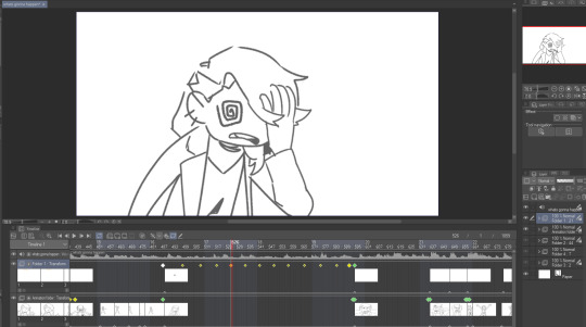
that kind of thing works for me because im a little messy and i like being able to redraw or adjust stuff inside the same software instead of switching back and forth. but for more elaborate project it will probably start wearing on your sanity to have everything crammed into one file (not to mention the file size might become unwieldy depending on what you're working with)
not all drawing programs will have animation features or audio import as part of their kit, which can make things troublesome. but if you're using animation software or an art software with animation features, it's possible to just do it all inside that program with relative ease like that (though some of them can be quirky to Learn)
as an aside, the original black eyes was made entirely in photoshop of all things because csp didn't have as many tools back then, and you can tell because . that is not a brush ive ever used and the pans/crossfades are Occasionally Very Weird JHBHSJK i could've just used a video editor but noooo. photoshop timeline tools ONLY No Assists
and that video is All still images so it could've easily been handled either way. important part is it worked out and i had fun messing around in there
i'm sure there's some other workflows out there someone finds super useful but i think the Main Branches are definitely
drawing software + video software (tag team)
drawing/animation software with audio import capability (solo job)
the first one tends to be more accessible i think? not only like Generally Speaking because there are more free drawing programs and more free video editors than there are free programs with drawing + animating + timeline editing all together (which . is true) BUT ALSO because even when we already have our programs ready the learning curve is usually sharper for the all-in-one and can be challenging to figure out, depending
but for me when im just playing around in there i find working all in the same program gives me a lot of flexibility. since i don't have to keep taking an image back and forth between the drawing room and the video editing room if i have to change something. yknow
it depends on the project. just try stuff out idk :)
my advice is definitely to start smaller and don't jump into making like a 3-minute video right away until you're more comfortable with your developing workflow. but that's about it. i think beyond that its Fuck Around And Find Out HAHAH i dunno
if theres anything specific i missed im sorryyy but you can ask and i can try 😂 good luuuuck!!
*to compare i guess, RoL looks like this -- behold the filenames of a genius

17 notes
·
View notes
Note
Thank you for sharing how you did the head sculpt! If youd be able to go into more detail I'd truly appreciate it!
Started typing and then before I knew it tips turned into a tutorial so I reformatted the whole thing into a loose step-by-step of how to make them.
This is a tutorial on how to add details to heads like Isahla's neck detail, so not quite how to make everything from scratch but 90% of it at least.
This tutorial will teach you how to bake details on to a head's normal map. I'm using a scar in this tutorial as an example but you can paint any details you like this way. The things to be aware of are:
this tutorial assumes you've got some basic knowledge of Blender and sculpting in Blender. It also assumes you know how to navigate tools like Photoshop or GIMP.
this tutorial won't explain how to make diffuse/other maps match the normal map. That's kind of a whole separate thing with a lot of different methods that can go with or against this one.
this tutorial can be applied to the body as well as the head.
this tutorial won't explain how to blend details across seams (wrist, neck, ankles).
this tutorial can't be applied to… mostly everything else. Skyrim normal maps are special like that, and that's why I love 'em.
And so I don't overwhelm you before going in, here's a quick rundown of the entire process: We're taking the player's head and preparing it for sculpting. We'll sculpt in the details we want. Then we bake out that sculpted detail into a normal map. Then we edit the player's existing normal map to include the new detail. And that's all.
Also, everything can be done with freeware so you have no excuses. Let's go.
1 Preparing the head.
Exporting your character's head from the game isn't always necessary, but it is encouraged. The closer the head in Blender is to the shape of the head in the game, the more accurate your details will be to their head shape. If you don't wish to use a specific head, feel free to use any other head you like, whether thats the vanilla head, High Poly Head, ECE's head, etc. There is a difference between these heads that should be noted, typically in the UV space, but for individual cases it's not too important. Exporting is done with RaceMenu, and the resulting nif file can be imported into Blender using the PyNifly plugin available here. If you struggle with this plugin, converting the nif file to another format through Outfit Studio is also possible. When the head is in Blender, remove any clutter. We don't need anything except the head model for this so we can remove scar and eyebrow masks, eyes, hair, and so on. Now, duplicate the head model so you have two copies of the same head, and for clarity, label your heads low and high poly. I'll be distinguishing between my heads with a _low/_high suffix. We don't need the low poly for now so you can hide it. Your scene should look something like this:

I'm going to sidebar a little bit here to mention that there are two ways to prepare the head for sculpting. One is by "cleaning" the model which I've detailed below. Another (and the method I prefer) is to use Blender's Human Base Meshes bundle (available here) and just scaling and contorting the sculpt-ready model they have to the shape of your character's head. If you feel confident doing that unguided, skip the rest of this step.
Right-click the model and choose Shade Smooth. Enter into edit mode, tap 1 to enter vertex selection, A to highlight everything, and M to merge vertices (choose By Distance). The distance will need to be tweaked depending on the scale the model was imported at but you'll want to merge enough that model isn't splitting when you sculpt later. It should look indistinguishable from before, but there should be no aggressive seam lines like on the back of the head. In Edit mode, go into Edge selection and Alt-Left Click the border of the neck. Alt-F to Fill. Get inside the head and repeat the process for the back of the lips like you see below.
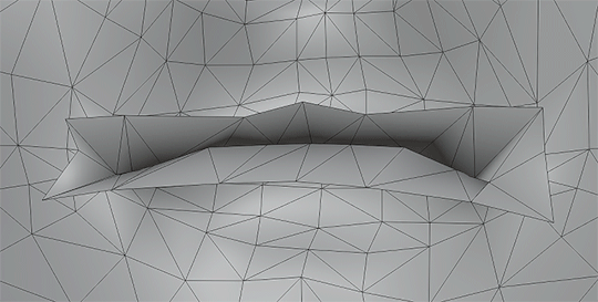
The head should now be prepared for sculpting. You can verify this by attempting to Remesh it, and if it bugs out, there's probably a hole somewhere.
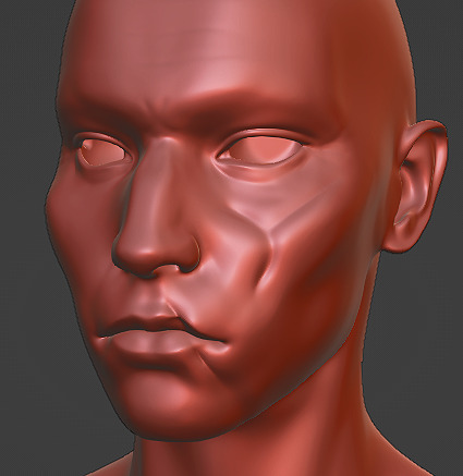
2 Sculpting the head.
This guide isn't going to have a tutorial for sculpting in it as there's plenty online. The techniques you use are up to you. Personally, I'm a large-detail-to-fine-detail kind of person. That said, Dyntopo is far more intuitive and was how I made Isahla's neck details way back when. You do not need to sculpt every detail on the head although there's nothing stopping you; just do your best to keep the head as close to its original shape as possible. Also, if you have a computer that's struggling with higher poly counts—you can absolutely remove entire parts of the model that you aren't going to use later.
For this example, I've haphazardly cut two scars into a head I had previously sculpted for a different mod. Again, you do not have to sculpt the entire head.
3 Baking.
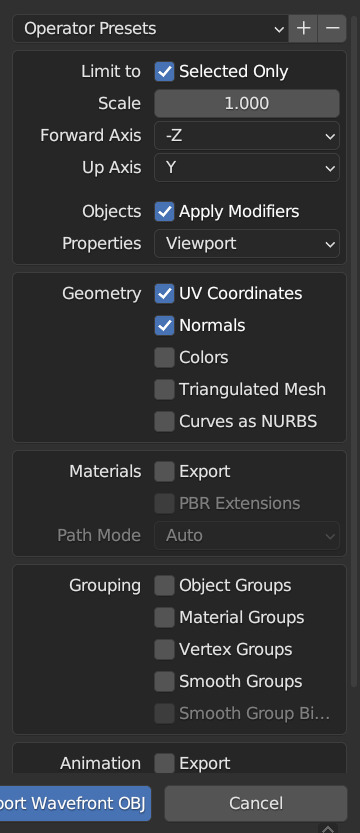
Once you're done, you'll need to export the two heads as .obj files. Remember to name them in a way that you can recognise them as either high or low poly. You can see my export settings below. You may need to tweak these depending on how the bake goes.
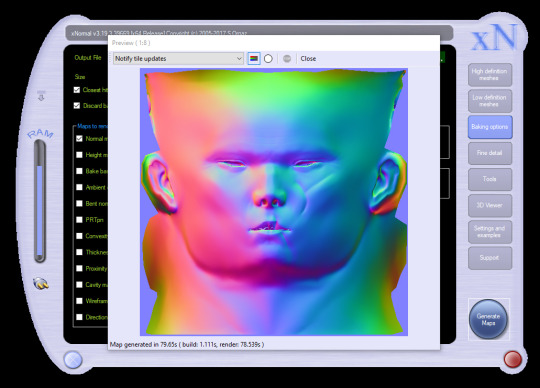
For baking, I'll be using xNormal (available here). It's the shadiest looking site on the modern web but it is what it is. Feel free to use another if you find yourself with a better alternative. If you aren't familiar with baking or what it is, it's a process where we take all the detail from the sculpt, compare it with the low poly in a software like xNormal, and it outputs a texture that can be used to mimic the sculpt's detail.
In xNormal, click 'High definition meshes' in the top-right. Right-click, 'Add meshes'. Locate your high poly obj file and select it. Repeat the same steps for the 'Low definition meshes' tab, then move on to the 'Baking options' tab. In 'Baking options', start by defining a location for the output texture in the 'Output File' field. Name it whatever you like--it'll automatically slap a "_normals" suffix on the end. Bitmap is fine but it's up to you. Set the size to the same size as the normal map you're currently using. For most skin textures these days, your normal map will be 4096x4096. Under 'Maps to render' is a large list of maps you can output but for this we want to only have Normal map checked. Click the three dots beside it. Change the settings to match what I have below.

These changes are important because Skyrim bodies use model space normal maps instead of tangent space, and their world Z direction is inverted. Just don't ask me why. You can now 'Generate Maps' in the lower-right. This process can take a little while and if done correctly, the resulting window should look something like this:
If it's looking like a complete mess and nothing like this, I'm sorry to say you may have a bit of troubleshooting to do. Make sure both meshes are set to use exported normals, and make sure your normals are oriented properly in Blender (see guides on face orientation). It may also help to choose the triangulate option on the high poly model on export.
If yours looks mostly the same but maybe the colours are in different orientations, you can try inverting the "swizzle coordinates" and regenerate the map or invert the colour channels in Photoshop/GIMP. You want Red on the left, Green on the top, Blue at the front.
If yours has all sorts of odd marks around the lips, eyes and ears like mine, that's to be expected. Fixing those spots is outside of the scope of this tutorial.
4 Finishing the texture.
For this next step, I'll be using Photoshop. Feel free to use GIMP or Paint.NET, even. You should be able to follow along mostly fine. If you have never edited Skyrim textures before, this may be difficult to follow, and it's not really the space for a tutorial on it. So, I'll quickly address the following:
GIMP 2.10.10+ should have DDS support already.
Paint.NET has DDS support already.
Photoshop requires a plugin. There are two. Hell, I think there's three. I don't know why. I'm using Intel's plugin available here.
If for whatever reason things aren't working out in one program, you can always switch to one of the others.
LE users should export their normal maps uncompressed.
SE users should export theirs at BC7 (Fast, Linear with Intel but don't quote me on that).
I don't know if any of the non-Photoshop ones support BC7 compression or not. If it doesn't, go uncompressed.
First, load your character's current normal map into the program. Then load your new normal map you got from xNormal into the program on top of the first. Name the two layers however you like, or don't, but for clarity's sake, I'll be referring to the original map as Base and the new map as Scar. Attach a layer mask to Scar (if you aren't familiar with layer masks and how they work, pause now, look it up. Super simple; very useful.) and start to subtract all the stuff that you don't need. You should see the Base layer showing up behind it, filling in all the areas you're erasing.

You'll notice very quickly that the Scar layer will be much smoother than the Base layer, and probably has some differences in hue. Use a really soft brush if you need to blend out the skin. Minor differences in colour value go a LONG way here, so if you see noticeable lines or contours where your new map meets the old one, those will also show up in the game. Do your best to eliminate them if you can. Also, don't be afraid to erase some of the details you're trying to add. Making sure it blends in is the key.

Here's a gif showing the texture I started with, and how it looks with the scar. Note that other than the scar itself, there's nothing new that's been added to the image. This is to keep things as consistent with the original work as possible.
When that's done, you can export it as a .dds file. Make sure not to export with the Alpha channel, as it's unused and will add significantly to the size of the file.
Aaaaand, finally, that's it. Sort of. There's still a lot more you can do but it's all easy tweaking from here on.
Here's how mine turned out:

Even without changes to the diffuse or specular maps, the depth still stands out a lot and if you're willing to keep going and adding details to all three maps, you can really make it stand out.
#asks#skyrim#sorry for the delay in the response btw i came down with something over the weekend and im just coming back now#looking over this whole thing now is honestly really embarrassing#ill be looking over it again and again before bed#but im sure the right people will want it#if thats you then you're welcome <3#skyrim mods#skyrim modding#tutorial#i have a tutorial tag now ig#artsick
21 notes
·
View notes
Text
HAPPY (late) NEW YEAR🎉
Okk sooo I know it's not tdp related but we don't need to mention it 🤫🤫🤫
Also the Art software used are ibis paint and photoshop which I changing too so most (practically all art) will be done in photoshop instead :)
Also if you don't like reading just skip this because it's alot..... (sorry for any grammar and spelling mistakes these are not planned)
Also idk how to draw anymore (jk) like my art style has been changing too muchhh (also not all of the art pieces are done illustrations some are just sketches) if you prefer a certain art style then tell me if you want.
Anywaysss these are characters (most of the drawings are the main characters but two of them side characters but the thing is that the dream idea is for it to be a game so you choose more on who you would talk to. (PLEASE DON'T TAKE THAT LITERALLY I'M NOT MAKING A GAME IT'S A FUN IDEA BUT I'LL JUST GONNA LEAVE IT AS A TUMBLR THINGY I RARELY POST ABOUT). The og name was cringe so it's changed to forgotten chamber. I don't post about my own stuff because I'm lazy + I'm not a writer so I don't believe it's good enough to post about 😭😭😭 but it's funnn so maybe I will post about more idkkk.
Main plot and some world buliding, extra info(this can change and there are some smaller side plots that are not gonna get mentioned because that's way to long).
Basically the key info before knowing the the main plot is that humans have taken over everything even other planets and universe where different species (humans call them monsters) happily used to live and they took their resources to make earth more powerful and advanced. They killed old generations and enslaved younger ones for military or hard labour. That was until the great rebellion where some monsters tried to fight back but failed so all monsters were sent to a very small pocket dimension as punishment. Our main character is the human girl with space buns (her name's Anita). Her father is in charge of the keys to said pocket dimension (it's a one way portal where the portal is split into two one to go in and one to go out he made it like that so if there was even a chance of one escaping which due to the old magic used on it being near impossible to learn how to break since it's the same portal it's uses the same key) it also give him and his crew (which are just guards he has power over) would in theory have more time to kill them if escaped. Anita she from royalty despite that she's very playful and acts like a normal annoying (jk she's lovely just a bit sassy and stupid) kid. Her father and mother is gone for a meeting and he never let's her go under the castle but curiousty gets the better of her and steals the keys and Anita finds out unless she wants to stay there forever she needs to go to the other side of pocket dimension (it's called the lock up in general but the dimension has very different areas with different names) to the second portal and with that go on a adventure and learn about the lost history of the monsters and much more.
Wow that was alot and I haven't even talked about the interactions the characters have and skipped alot of key events😭😂 (I doubt anyone will read this far but if so thanks alot)
This storys themes are based on community, oppression, social injustice, connection/disconnection we feel within our own communities, the negative impacts conformity (like having to change yourself for a higher authority or just to be socially accepted).
The main two inspirations are undertale and xmen 97 (the 2024 remake)
If you guys want I can talk about it more (doubt but surprise me I guess) just ask stuff you want to know in the ask box or comment idk if I will reply to all but definitely most (I feel like). It can be like character dynamics or more world building or just more art idk have fun if you care as long as it not crazy asks (like inappropriate or unreasonable) and you're not rude then 9/10 I will reply :)
Edit: It's sounds darks but it's not I promise 😭😭
#digital art#art#IM GOING THOUGH A ART STYLE CRISIS😭😭😭😭😭#oc art#my ocs#original character#original story
4 notes
·
View notes
Note
‘Twas both 👁👁, but yeah honestly I’m very interested cause damn- (sorry if I seem awkward I’m not good with online interaction 😭😭 LMAO)
NAH no worries you're doing fine!!
It's a pretty wide array of topics but touching the surface of it, I'll go into my art process.
Here's a short thread where I went into this similarly!
I pretty much follow the steps of what I mentioned there, but it varies a little bit based on the style I go for too: painting whole illustrations or design or more simple fun things.
I could describe what I did in each frame of my process gifs which I've posted before but I would need some time. With big pieces, the steps I go by (read slowly, it's a pretty dense text):
thumbnailing -> sketching with bigger shapes to get the line of action/feel (that is, I'm just blocking out the composition) -> refine that a bit -> hide BG, draw the characters (lineart) and add the base colors of them. (then merge & rasterize a copy of it for later) -> put them back in the environment (unhide BG), make them grey -> add shading in greyscale style (multiply layers, glow dodge layers, you name it) -> get that previous rasterized layer back and put it on color mode -> those characteristic shiny parts get a new layer with overly saturated + high brightness colors -> color BG with a new color layer -> then rendering/refining for concerning amounts of time -> add effects and change color/brightness/contrast curves + gradient map -> profit???
For software, I generally use Paint Tool SAI (I adore blending/painting here), I use Clip Studio Paint for the 3D posing library/sketching/lineart, and Photoshop for final effects. (Update: I mostly do all things in CSP now)
(if you have CSP, try out this brush... it saved my life)
As for improvement:
I experiment, watch a lot of youtube videos (I personally like the ones which analyse an artist). I suggest thoroughly understanding how something moves and works (for anatomy I can recommend the book 'Anatomy for Sculptors'), I also study and jot down important pieces of advice or insights to a collective document, rather than saving them to my device where it is highly likely to be forgotten.
I believe if you put great importance on colors and composition, that can cause the most noticeable, 'fastest' improvement, at least if you view it from the lens of social media. (While online environments provide significant reassurance, it must be engaged with in moderation, as it is easy to fall into a lot of negative mindsets, taking the enjoyment out by perfectionism, comparison, or seeking validation, etc.)
Another improvement technique you can try is to slow down a speedpaint video of your choice and follow along with the artist. Extremely useful, I recommend, put your artist under a microscope.
Of course I don't do all of these things every single waking hour, it's just a side hobby to my unrelated studies in real life. Even if you don't actively draw your visual library and knowledge can improve passively, I find that so fascinating. I don't touch a paper for months and there's a sudden jump, like damn what. (Not saying you should do this, active learning is still better ofc) Either way my point with that is, that improving does and did take a lot of time for me as well.
Apologies if this goes all over the place, I tried to touch upon every subject that came to mind at the moment, in not too much in detail, overall I hope it makes sense
If you have any specific questions related, feel free to ask! Or if there's any specific problem you'd like to tackle but find yourself lost, same applies!
#i wrote this before sleeping so it might all be chaotic/nonsensical#thank you for the ask!#asks#art tutorial#art tips
13 notes
·
View notes
Text
On Hidden Agenda and if the Agenda is Really Hidden (Part 2)
Where we last left off on our road trip, @respectthepetty and I had pulled the clown car over, started checking out directions and trying to figure out where we went wrong in our theories and I sat down to re-watch the show to figure out what we missed. Last time I posited two theories and listed evidence to why I think that. Now that I have finished re-watching through episode 11, I think I'm backing off my Joke is a stalker theory. I'm not throwing it out completely, but I don't think that's what's happening here.
There's also something happening with Joke, Zo and the Clytie and Sunflower myth that Zo reads to Nita in episode 3. Zo is repeatedly conflated with the sun/sunshine - he has a sunset painting in his kitchen, Joke photoshopped Zo's face on a sun and said Zo is his sunshine. Joke is conflated with sunflowers - he gives them to Zo over and over. They do switch this role once each - Zo paints a sunflower on his ceramic vase in episode 3 and in episode 11, Joke tells Zo that he (Joke) is Zo's sunshine. To me, that also makes Joke Clytie, the one who was abandoned by someone they loved, who was just waiting for them to come back.
All of this in mind, here's the theory I've centered on: Joke did something bad in high school; his parents paid (or used other means) to get him out of any trouble he was in and it caused a huge fallout in their relationship. Oh, and it happened on Joke's birthday.
So with this new theory in mind, I'm going to go back through all the evidence I posted in the previous post and add it to this one, plus include evidence from the later episodes.
Episode 1:
In the flashback to the Freshy Contest, while Joke is scolding(?) Zo, he says, “What you said on that stage won’t change a broken system.”
Episode 2:
Joke tells Zo, “My tongue gets me in trouble.”
When Joke and Zo are debating about hidden agendas in relationships, Joke asks why he should tell someone things when he starts dating them because he should be able to tell things in his own time.
Episode 3:
Joke says “Before you get to know someone, you need to know yourself.”
Joke also asks/tells Zo to trust him for the first time.
Joke talks about the Triangular Theory of Love: Passion, Intimacy and Commitment
Joke is pretty worried when Zo crashes his bike and makes Zo ride with him instead.
Joke mentions that he used to go to the restaurant Zo picked out with his dad, back when they used to go out to eat; this suggests a distance between him and his dad.
During dinner, Joke says that “What you see of someone may not be the whole story,” and “Stay true to yourself.”
In the library, Joke tells Zo “I would never let someone I love face danger alone.”
The next day, Zo is sitting outside when Joke finds him and says that Zo wasn’t answering his calls. and it’s implied he was searching for Zo because he was worried.
Joke invites himself on Zo’s trip as if he’s afraid if Zo leaves without him, something bad will happen.
Episode 4:
Joke tells Zo he couldn’t leave Zo “alone and sad” and “I’ll never abandon you”
Joke also says “I only care for those who care for me.”
Joke is afraid of the glass bridge but he’s also to worried to let Zo go out on the bridge by himself.
After dinner, Joke says “Sometimes people don’t show all their cards.”
Episode 6:
Joke gifts Zo a sunflower pillow and tells him to look up the meaning, Zo searches up “liveliness sprung from despair.”
Joke insists on picking up Zo so Zo doesn’t go out in the rain/worried about his health.
Kot doesn’t seem to like Joke and extremely overreacts to the way Joke trying to get Zo to eat the food he bought. Now, Joke was maybe a little pushy, but Kot goes off the handle.
When cuddling in bed, Joke says “hugging for 30s releases Oxytocin” and if they hug longer, “it means we feel the same.”
Episode 7:
At the amusement park, Joke mentions he has fond memories of the park because he went with his grandma back in high school (implies the break or disconnect with his family occurred then).
Talk of changing bad memories to good ones (re: Puen)
Joke says "I've never seen so much blood and gore in my life" regarding the haunted house.
Joke's grandma tells Joke that any potential partner needs to be a "fighter".
When his motorcycle breaks down and Zo is surprised Joke can fix it, Joke says "when you love something you learn to take care of it"
Zo says that Joke "sounds like a life coach"
When dropping Zo off, Joke hugs him and says "it's been awhile since I hugged anyone besides my grandma" (ouch, just ouch)
When Joke can't get a hold of Zo, he panics and get the landlady to open Zo's door and is freaked out to find Zo asleep on the floor.
Joke and Zo take day off and make something that looks like vases and Zo paints a sunflower on his.
Despite Joke having a temper, he lets Zo handle Puen how he sees fit.
Episode 8:
Zo comments that Joke "spouts Hallmark lines"
When Zo tells Joke that he and Poom are going to Zo's room for school work, Joke asks "is he trustworthy?"
Joke gets a package of creepy pics (via Jeng) and races to find Zo.
Joke says "I'll take care of you" to Zo
When Joke, Zo and Nita bust Poom, Zo has to pull Joke off Poom.
Joke tells Zo "don't trust strangers too easily" and "if something comes up, we always talk"
Episode 9:
Joke asks "what will I do without you for three months" when Zo says he has to go home for break.
Joke wants three calls a day and a video chat before bed every night (that's a lot, Joke, damn)
Joke tells Jeng "you might regret it one day when you turn around and [Pok's] not there"
In the flashback to the Freshy Contest, Joke is sitting alone outside, looking melancholy when Zo approaches.
Zo offers to take Joke's place in the contest and asks if Joke is okay.
Joke says "no one should be forced to do anything" and "you're the first person to ask what I wanted"
Joke says he won't lie or hide anything during his apology
Zo insists "no silence, no hiding, no secrets"
Episode 10:
Joke is supposed to spend his birthday with his Grandma (Jeng is taking Joke's parents out to dinner).
Joke worries about Zo.
Zo's mom chooses "childhood trauma from parental conflicts results in troubled adults"
Zo quotes statistic of "50% of people with family conflicts commit crimes"
Joke tells Zo "your family and mine are not so different" and it's his "happiest birthday"
(holy time jump Batman - I guess three months have passed between leaving Zo's and the debate club scene)
We get the Wave and Trin back story but the most important part to me was Zo asking "was hitting someone the answer?"
Episode 11:
Joke advises his parents are not coming to the debate, he texted their family group chat and "got left on read"
Joke's family just rolls up to his apartment (does grandma have a key then?) and they just hang out waiting for Joke
Joke's dad films Joke's mom and grandma watching the competition video
Jeng comes by and says Joke is out with friends celebrating and Joke's dad says "it's good Joke is with friends"
Joke's dad sends the video of mom and grandma to Joke
With the preview for episode 12 alluding to more issues between Joke and his family, Joke's proven temper, his aloofness around people, his propensity to speak like he's been to therapy and his extreme concern over Zo, I think that something bad happened and Joke was the cause. His family/money/connections got him out of it, but he's angry and his family and him had a falling out (except for grandma). Abandoned by everything, he was left alone and in pain until he met Zo, his sun.
That is what is hidden in Hidden Agenda, and it was right in front of our faces the whole time.
#hidden agenda#hidden agenda meta#thai bl#I'm not saying Joke isn't a stalker because that's here too#but I actually think he might have some anxiety or PTSD due to past trauma#I'm so glad I rewatched the show
29 notes
·
View notes
Text
✩ peppermint-moss FAQ ✩
will be updated as needed! :-)
What do you use for art/animation?
I’m now using Clip Studio Paint for art/animation; I used to use photoshop for art/frame by frame animation, and premiere (and recently, switching over to da vinci resolve instead) for editing/tweening
Can I commission you?
All my commission info can be found on my website! or my tumblr post here for a quick overview ^^
Can I make a video edit with your art/animation?
✅ You can include my warrior cats/other fandom animations in EDITS as long as you credit me somewhere (@peppermint-moss) ❌ Please DO NOT include my OC/fursona etc. animations in edits. ❌ Just reposting my art/animations (reposting means e.g. posting a part or all of my amv just with different audio and no other editing) is Never Allowed even with credit Please don’t do that. (updated for clarity 11/30/2024) Thank you to everyone who did respect my previous decision of not allowing edits before. (updated 09/27/2023)
What brushes do you use?
Here’s a google drive where you can download the ones I get asked about/use the most! (they should be ok to use in photoshop or csp) I also use this lineart brush from csp assets a lot! I tag asks about this with #brushes btw if you wanna look through there too
Do you have a place where you put all your warrior cat designs?
Nope, But I always tag characters with their name so if you search #CharactersNameHere on this blog you can prob find them if I’ve drawn them before!
Can I draw fanart of your character?
Yes! If you post it online please mention somewhere that the character belongs to/its fanart for peppermint-moss. And tag me if you do (if im on that social media platform lol) I’d love to see it!!
Can I use your art as a pfp/phone background?
Yes! for profile pics just please put in ur bio that it was made by me! Personal n private use like for a phone background is a-okay to just use :)
Are you on [x social media]?
I’m only really active on tumblr+youtube, but here’s a lil list of where else you could find me online. im not aware of anyone impersonating me and i hope no one is blegh but feel free to ask me here if ur unsure!
How do you do/draw [art thing]?
feel free to send these questions in but just keep in mind I’ll only do a lil tutorial answer If I have the energy and feel like i know enough about the art thing! so as long as you’re cool with that ask away c:
What’s the difference between an AMV, PMV, and MAP?
AMV = Animated Music Video, PMV = Picture Music Video, MAP = Multi Animator Project (aka has multiple ppl working on it, amv/pmvs typically only have 1 person who worked on it) Sometimes i dont rlly know whether to call my vids an AMV or PMV cause they’ll usually be some animated shots some more pmv shots lol (i think they’d technically be more accurately called an animatic ?) but i like calling mine AMVs if theres some kind of frame by frame animation in there as animatics tend to be just in the sketched out phase n my amvs are more finished with colour n stuff
#faq#ppmpost#decided to put my faq in an actual post as well!#it already existed on a page on my blog but that isnt rlly mobile accessible lol so i thought i'd copy paste it here
10 notes
·
View notes
Note
Hey, I don't know if you've said this before, but may I ask which program you use for digital art? I'm still trying to figure out which one I want to get because I wanted to try out something new. (I've drawn on Gimp and I feel like it's a lot better for editing images than it is for drawing ^^")
i got just asked that and replyed here
i use Photoshop. and i know its costy for a lot of people. so i recomend to look at the following programs Krita its free, lots of brushsettings, brush stabilizers, and vectors + text. you can even do smaler animations in it.
if you would like to invest, you could try
Clip Studio Paint i have artist friends that use this programm. its loved by many artist. its created by having artists need in mind. lots of brushes, stabilizers, vector lines + texts. animations option. a huge library or resources you can download form (carefull some could cost money) and 3D models to make the drawing process easyer. it also does this fancy recording your drawing thing we know form procreate. i think you can still get the old version without the subscription payment methode, which costs around 50 bucks.
Affinity Photo i admit i used it once and it took me getting used to. but its fine. the Affinity programs are like the counterpart to the AdobeCC. i know some people recomend it as an alternative, and got this and more programs for a steal on black friday. currently they cost around 80 bucks for a one time payment. way cheeper then the CC. it does what PS does. so if you are an artist that is used to PS you could give it a shot
i want to honorably mention CorelDRAW because i began my digital drawing journey on that program like.... 15+ years agon... but its expensive.... -i am not gona say it but if you thought about it.... well... go for it!-
if you have the option of a ipad or screen touch tablet. get a good stylus pen and check out the app store for digital drawing apps. there are lots of free ones out there. most popular i know of are:
Ibis Paint x - is free. and if you want to use all the tools and features you can by just watching one add and then everything is unlocked for like 8 hours. apart everything you need it also has this fancy procreate drawing recording option
procreate - its not free but as far i understood its an amazing program and just costs around 13 bucks? it only works on ipads. but professionals use it, has animation option just like everything! hope this helps! (sorry idk how to link the apps)
#chip!ask#art programs#again.... i mean... exspecially about the... you know#just do it the good old ways#maybe with an eyepatch and a clothes hanger as hook to get the right vibe#you know???
66 notes
·
View notes
Note
Hi!! Sorry if this is a weird question and u don’t have to answer it but how did u do the moodboard/visual media thingie on ur office gossip nanami fic? Do u have a tutorial/tips? You’re one of my favourite writers by the way ur nanami fics are so good 😘😘
omg thank you soooo! 🤍 it's not a weird question at all, and i hope i'm able of explaining everything! (@gothsuguru i'll tag you since you mentioned the layout, feel free to ignore!)
so a tip i'll give anyone before starting to edit is just to stop and visualize what you would like to do. this fic is an office au and the main character is a mess, so i just thought her home screen would be painful to look at and things evolved from there.
your best friend is pinterest, ibis paint, photopea and deviantart. you can use any other editors of course, go with what makes you more confortable, but i use photopea a lot for college and i personally think it's pretty easy for everyone to use + it's free.
on deviantart you will look for templates (as in: "playlist template", "instagram feed template", etc.), pngs, textures, all those things that will make the base of your edit.
pinterest you will go for both inspiration and what will give flavor to it. like i used a gallery template, and on my many pinterest board i chose what would fit it better.
on photopea/photoshop you will open the template you downloaded and play with it. you will add photos, text, etc. don't be afraid of making something wrong. all you need to do is ctrl+z and try again. if you're not familiar with it, explore, try to look at some tutorials on yt, have your fun.
then on ibis/color pallete sites you will find the color you want everything to be, use the hex code to edit, and give the final touches.
when it comes to the dividers, i make them on ibis. i just paint it with the two colors i want my gradient then change the pencil to the blur and... well, blur.
for you to get the perfect colors, i mostly just fuck around with rgb until i get the ones i like the most.
and the gradient texts i use those two sites: this one to copy the html code at the end and this one where i replace ; with blank space (literally put nothing on the second box and hit replace text then copy).
my tip is that you go on tumblr, create a post, change the configuration on the post to html, paste the code, save as a draft. then hit on edit to open the draft, copy the text already with the gradient, and add it to the post that it'll actually be on.
i say that because if you change the configuration to html it'll fuck whatever photos you had on it, so for me it's way more practical to have a draft where i just drop any gradient codes and simply copy it.
from the 12 posts on my draft at least five of them look like that:

#so was it helpful? i don't fucking know#it feels so weird to explain it in text#if you have any doubts just tell me#the gradient thing is super easy really i probably just made it sound awful#ask box
6 notes
·
View notes
Text


Part two! Jughead time.
Again, I will go top to bottom, L-R for clarity.
I debated if this was textual Jughead enough. It is absolutely something that rings as Jughead-adjacent to me, but his concerns on the show are with smaller power structures. I do think this reflects him, but I worried it wasn't close enough to a 1:1 ratio of his screen time. Ultimately, I liked it for superficial reasons I will get into later. I knew I wanted graffiti because it is exactly Jughead's type of protest- in fact, he does spray paint at least one wall in the series. Jughead is a firm believer in art (more on that later) and a firm skeptic of societal norms. Why is art on the wall of a museum worth millions, but art on the wall of a local staple an eyesore? This particular graffiti also has Jughead's unwavering frustration towards public perceptions of politeness, especially when they exist to silence individuality.
This one's pretty straight-forward. Jughead's vice of choice is binge eating. I had to represent it with at least one visual, but so many options were too neat (tables topped with prepared food, junky or not,) or social in context (remnants of a party.) I needed to capture Jughead's no frills, rough-around-the-edges nature. He is not a 'social eater.' He is an eater. The grunginess of the photo implies this mess has been sitting around- on the floor, in a trash can, whatever. My only regret is not photoshopping the can to remove the 'diet' over Dr. Pepper.
I have regrets about this one, because it seems redundant when picture 8 exists (more on that later,) but my intention with it was less literal. It represents a night owl who hangs around rough areas. Someone willing to climb fences to do whatever their Night Tasks are. Something about this picture just screams rebellious youth from the wrong side of the tracks. The photo also has all of three of the trademark Riverdale aesthetics I listed, though some more than others.
A nod to Jughead's original outrage du jour. You'd be forgiven if you don't remember this campaign to keep the movie theater up and running. The Twilight also served as a home to Jughead in more ways than one. He, not unlike us fangirls (gender neutral,) finds kinship in fiction. He also has a larger appreciation for the arts in general, in a highly specific Jugheadian way. But let's not forget the literal home he found in the local theater. This picture, like the one before it, is a representation of home. More on that later.
I noted this in my tags, but when I made Penelope's mood board I told myself it is cheating to use actual photos of the actor/show. Try as I did, I had to fold. I added motion blur to the photo and cropped it so he is largely out of frame- exactly what Jughead prefers.
Sometimes a cigar is just a cigar. This is a typewriter (Jughead-approved!) that fit in the mood board's color scheme (me-approved!) While searching for the perfect typewriter picture, nothing felt right until this one. On top of having an ambiguous era of origin, I love that this one is outdoors. Jughead, as narrator, is an outsider and a voyeur. He is part of the atmosphere. The photo also gives a sense of the typewriter being discarded, which resonates when thinking of Jughead.
Yet another mention of home! She can't keep doing this to us! And, yet, I do. As for the photo, I searched a billion sentiments like the one written in it, but this was the only contender. More graffiti! The shadow of a cell phone taking a picture- trying so hard not to become part of the image it's documenting but leaving an indelible effect on the narrative in which it is framed- is a perfect little touch.
What I am about to say might shock you... this picture is a representative of home. Let's finally talk about this. Jughead is a nomad in many ways, including (sometimes) literally. The truth is, for many people, home is not a place but an amorphous concept. It is the promise of a private place that feels like love, safety, and belonging. In terms of literal places, Jughead does not have that. He has tried to find it under bridges, in an all-but-abandoned theater, and in the trailer with FP. For Jughead, no structure has ever made good on the promise of home. The only home he has ever found was in other people (see previous photo.) That is why I didn't show the inside of any of the settings- theater, trailer, vague liminal location between a house and outdoors. Once again, Jughead is an outsider. He sees these places as places, and not as home.
Self-explanatory. The boy uses a pocket knife.
Broad notes now! Unlike my first mood board, I had zero idea of what color palette it should be. I stressed over it, then told myself to let the photos dictate what they want. Within the first two pictures (8 and 1, in that order,) this proved to be a good tactic. As you can see, I ended up choosing a faded peacock/terracotta kind of deal, which does feel appropriate. It's grungy, rugged, nostalgia, full of contradiction, but not without hope.
As I said earlier, I feel 3 and 8 might be redundant in the same mood board. They are meant to portray different things- 3 is more conceptual, while 8 is literal, but I do worry having both of them paints Jughead as an outdoorsy type.
8 was nearly the Rod Serling photo I found for this ask, which seemed like an incredible coincidence to find in that context. Firstly, I told myself it was cheap to re-use it (especially because I just stumbled on it, so it isn't the fruit of actual labor.) Secondly, I did not feel like heavily altering it to suit the colors. Thirdly, it just doesn't work for Jughead unless you know the Cole Sprouse lore. Yes, Jughead is the narrator, but he is not the kind to be front-and-center behind a camera in a suit.
This one was difficult because I had lots of nebulous ideas that were not easy to translate into Pinterest searches. For many of these, I had at least 15 picture options, but the semifinalists for this one were very scant. I think, for the 9 squares, I had 2 options I didn't use.
6 notes
·
View notes
Note
Hey! I came from youtube (the Hey Ya duck dance vid) and first of all, I LOVE your style, it's so adorable and smooth! I'm not super aware of rainworld lore, but your stuff makes me want to get into it! If you don't mind me asking, what program do you use to draw/animate?
Heya from the other side! I'd say if you want to avoid RW spoilers make sure to blacklist the rw spoilers/dp spoilers tags from me, but that's like 90% of my stuff on here lol
I use Toonboom Advanced (unfortunately) (it's way too expensive) (and swatches have their uses but I really miss my color wheel)

Like look at what I have to deal with.
I want to try TVPaint instead (they have permanent licenses!!! I hate subscriptions), but I can't afford to invest in that right now. I've tried Photoshop, Krita and CSP too. Photoshop is okay but definitely far more finicky - I'll have to give it a shot again sometime. Krita, same hat, but I have less experience with it than Photoshop. CSP animation is way different from everything else I've tried and I couldn't get into it. I also used to use Flash, but mostly for interactive comics rather than animation. (They're all dead now outside of .swf files, RIP Flash.) I prefer bitmaps/pixels over vectors but man, vectors are useful sometimes...
For non-animations I use Paint Tool Sai 2. It's got its limitations, but it feels the most natural to me. When I need fancier text or actual art brushes for background stuff, I switch to CSP, or Photoshop for filters/special effects. (I don't think I've used those two for anything I've posted so far except for Pebbles' motion-blurred "YOU ROTTEN SISTER YOUR BUTT IS CRUSHING ME" though)
Anyways, thanks so much! I should get back to animating now that you mention it... progress has been slow on the SRS and Spearmaster vid. I've been distracted by a lot of stuff lately.
23 notes
·
View notes