#I DO like black ink for drawing but specifically I like ink and watercolor sketching and this ink isn't waterproof
Explore tagged Tumblr posts
Text
Quick tutorial for my traditional art :). (Specifically how I made the comic)
I can do a more in-depth process later, but I dont currently have the setup for recording a long-term video yet.
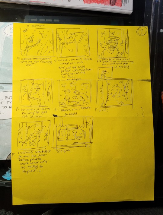
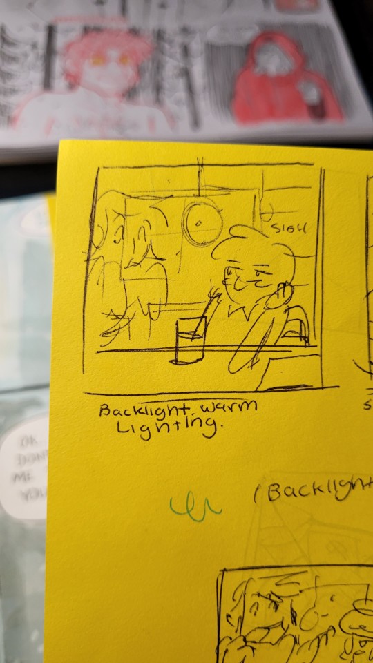
First, I sketch some really loose thumbnail/storyboards. This is where I decide how the scene will look, the lighting, and where it is coming from.

Next, I sketch everything out with a pencil (im using erasable pens in this case). Then, line the sketches with colored pencil or black ink.
I only do this for the comic because a lot of planning goes into it. Typically, I just do some figure drawing sketches to warm up, then jump into a sketch with a pen without doing a draft. (Drawing without a sketch beforehand is good practice and gets your brain to think about where your going to place things!)
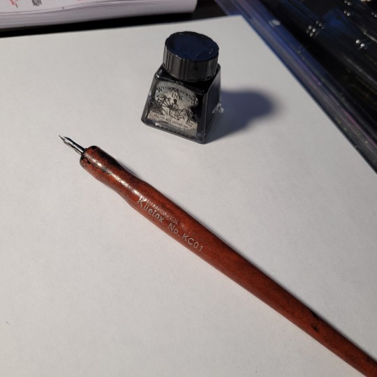
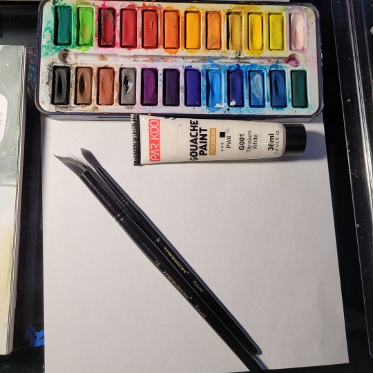
Dip pen and ink to line, watercolor, some white gouache, to color.
Painting/coloring is the last step I do and usually takes the longest.
After lining, I usually go back and make certain lines have more line-weight.
An example of lining with ink(without undersketch):🔽
For this one, I did the line-art with colored pencil (also without undersketch):🔽
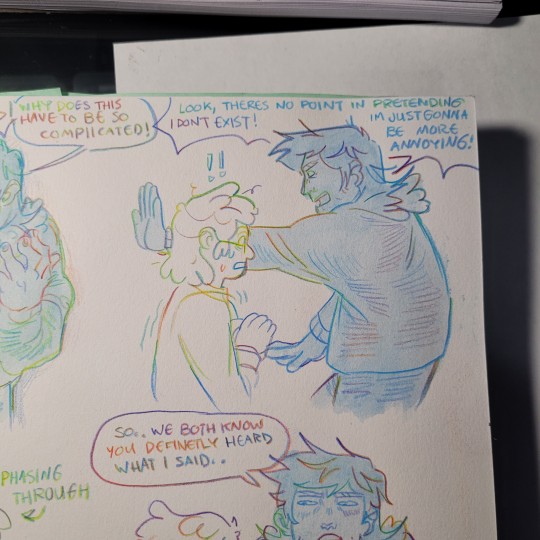
After all the line-art is complete, I paint with watercolor, typically doing a wash with either a cool tone or warm tone for the underpainting (to set the mood/lighting) over the whole drawing and to make the colors more cohesive.
An example of this would be making the underpainting a cool tone for a snowy scene or making the underpainting a warm tone for a cozy or indoor scene.
(I dont have a video for an example of that because it's more of a long-term thing, and I dont have the setup for that)
Then, adding the flat colors, being mindful of where the light source and where it will shine on the person/scene, and where the shadows will be in contrast to that when shading next.
And Finaly adding the snowflakes overtop with Gouache.
(You can also do this whole process with other mediums, like marker, not just watercolor. Just find what works and looks good typically. it's not a strict process, I loved mixed media.)
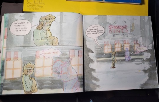
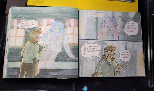
Closeup example of finished product!🔽
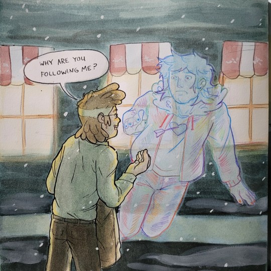
I enjoy doing traditional art because it is more of a sensory experience, and I LOVE that. I have dabbled in digital art, but I end up liking the traditional process more, and feel more connected to my art when I have a physical version of it. (not all digitaly stored on a computer).
With traditional art, there is more risk of accidentally screwing up an artwork you spent a long time on.. I kinda like that because it makes it more exciting, and working under pressure forces you to sharpen your skills and refine your process, making sure you dont make the same mistake twice.
Also, I really love digital art and look up to a lot of digital creators, I try to replicate the digital look when doing traditional art, it's really fun! :)
70 notes
·
View notes
Text
What I think is the correct art medium to draw the following Marvel characters in based on vibes:
Captain America: He is the one doing the drawing
Bucky: Charcoal pencils.
Tony Stark: Crayons (half do not have wrappers), Cheap Markers (The blue is perpetually dried out), broken pencil crayons.. really any art supplies commonly found in an under funded elementary school art cabinet.
Pepper Pots: Black ball point pen, or if you're feeling whimsical, blue.
Bruce Banner: Calligraphy pen on top of water colour.
Hulk: Macaroni.
Black Panther: Pencil crayons, really nice ones you spend a lot of money on! That or a fountain pen :)
Peter Parker: Spray paint (On a brick wall specifically).
Loki: Oil paint and Stained glass (Except in the movies the glass is cracked and in the series the oil is olive).
Thor: Sand. Not as in sand art, as in drawn in the sand at the beach.
Clint Barton: Sharpie.
Natasha: Idk the blood of her enemies??
Rhodey: Mechanical pencils (Not the kind you find on a classroom floor with one and a half led left inside, like you went out to the store and specifically bought these mechanical pencils for Rhodey).
Dr. Strange: A pen with a considerable amount of whiteout.
Wanda: Ink and Quill.
(Speaking of) Peter Quill: Four coloured pen.
Rocket: Stray bullets, probably.
Nick Fury: Gouache paint.
Antman: Highlighter.
Vision: Chalk (On a chalkboard).
Sam Wilson: Some sort of pastels, chalk or soft, probably.
Quicksilver (not to be confused with his Avengers: age of Ultron counterpart, SlowAluminum): despite being able to steal literally any medium, he would just grab a average, #2 pencil.
Wolverine: A sketch pencil, the kind where the graphite is super long because the the wood is cut off with a knife.
Jean Grey: Copic Markers
Scott Summers: Acrylic Paint
Charles Xavier (James McAvoy): Alcohol Markers
Erik Lehnsherr (Micheal Fassbender): A Metallic marker (pun not originally intended)
Professer X: Watercolor Pencils (Practical but pretty)
Magneto: The kind of paint you use to paint a wall
Nightcrawler (Alan Cummings): Paper Mache
If I missed anyone, feel free to ask!
(This is such a stupid post wtf)
#Marvel#Shitpost#I lowkey put effort into this#magneto#charles xavier#cyclops#jean grey#wolverine#quicksilver#sam wilson#wanda maximoff#vision marvel#antman#nick fury#rocket#peter quill#dr strange#james “rhodey” rhodes#natasha romanoff#clint barton#thor#loki#peter parker#black panther#hulk#bruce banner#pepper potts#tony stark#bucky Barnes#captain America
37 notes
·
View notes
Note
hey, how are you? i love your art! i am just learning how to use procreate, and i was wondering what brushes or canvas do you use to get the paper effect when you’re drawing? sorry, i hope you don’t mind me asking. thank you. ☺️
hehe well i’m gonna do a basic comprehensive tutorial on my drawing process and general guidelines i follow when doing art (hope you dont mind im using ur ask), i’ll start with my process first
brushes i use:
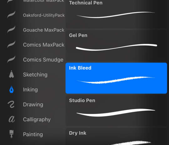
lineart: “ink bleed” brush that comes preprogrammed in procreate
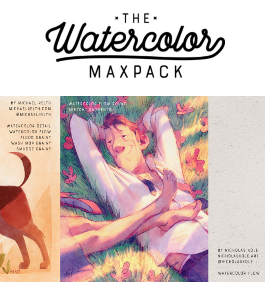
coloring/texture: maxpacks watercolor set (while in the pricy range, ive been using it for years and i think its a worthy investment, he also has sales occasionally)
for sketching: HB pencil that comes with procreate but you can use whatever
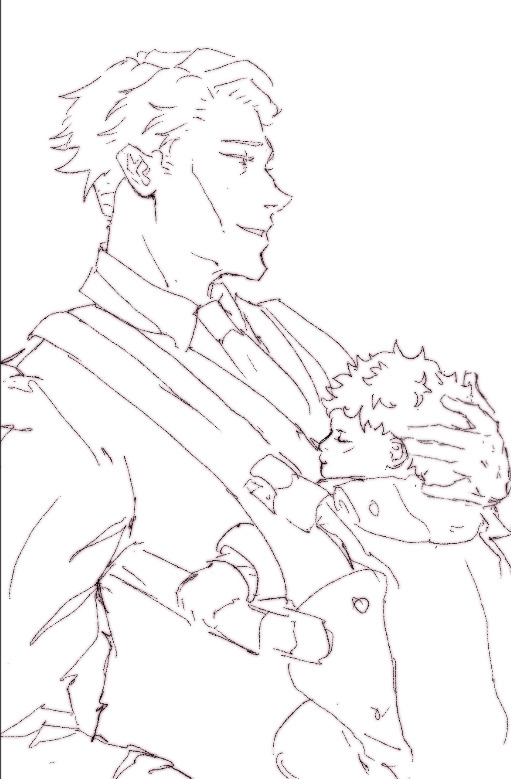
so my lineart, i typically duplicate my original layer, “color fill” the new layer with a dark red (or any dark color of ur choice), gaussian blur it @ 3% and set it to multiply and that just gives it some depth (for this piece i actually copied my dark red lineart and adjusted the opacity to make it a little darker so there��s 3 layers in total here)
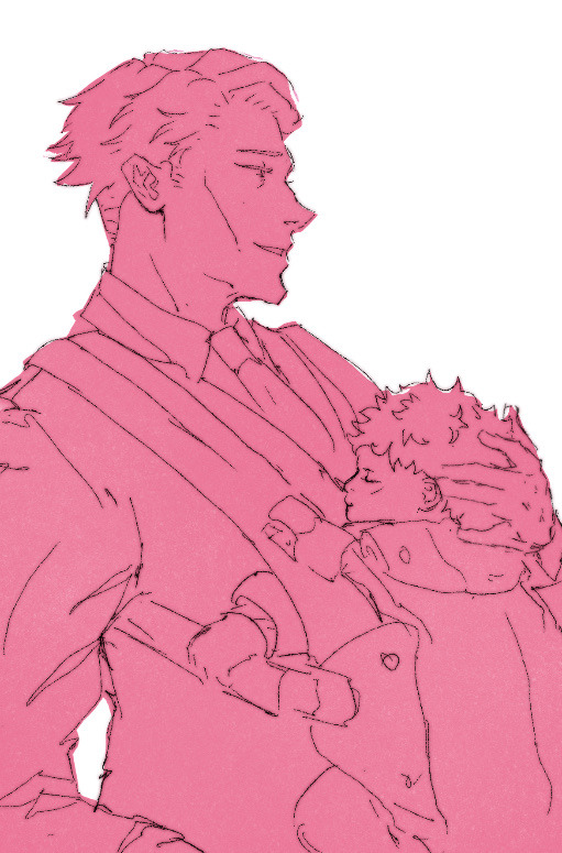
now on to COLORING, i start off with a solid bright color (usually one that goes with the general palette you’d like to use, i wanted something warm so i went with a pink base)
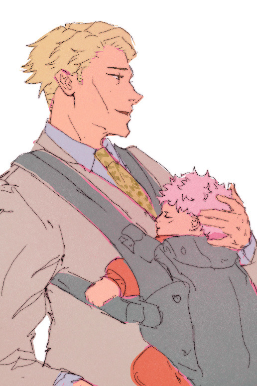
create a new layer and thats where the colors come in, i typically do a rough estimate of the colors i want to use at this point, cause they can be adjusted later in the “color balance” setting under “adjustments” once you have your coloring done (this is all on one layer)
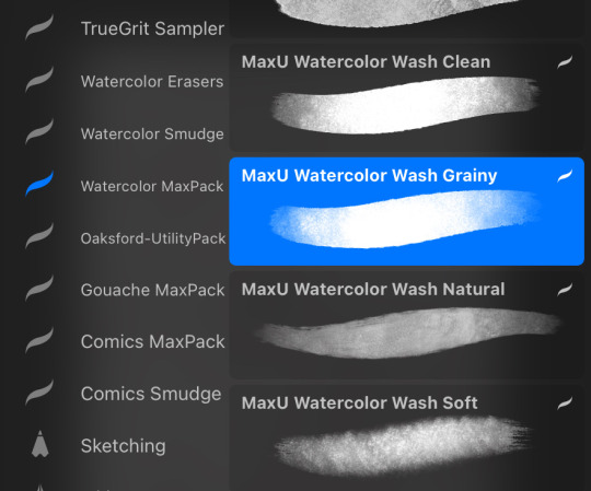
now my SECRET is i use the WASH GRAINY brush as an ERASER and lightly go over my color layer so the pink base comes through a little and unifies the colors and gives it that yummy texture. sometimes i erase the base color too for a little more texture but thats not necessary for every single drawing. once i erase enough, i go to “color balance” adjustment tool and mess with the hues till i get the result i want.
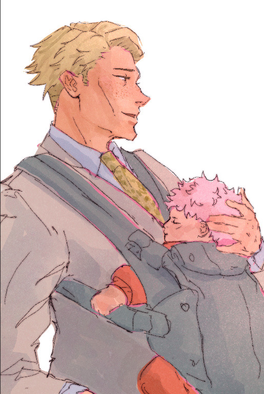
after that i create a multiply layer and with my WASH GRAINY brush i do shadows/face rendering. and with this piece specifically i did an add layer to simulate sunlight on them (i do extra layers at my own discretion, so have fun with it :)
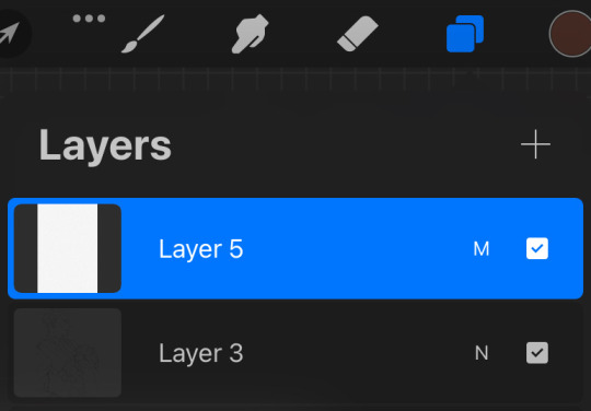
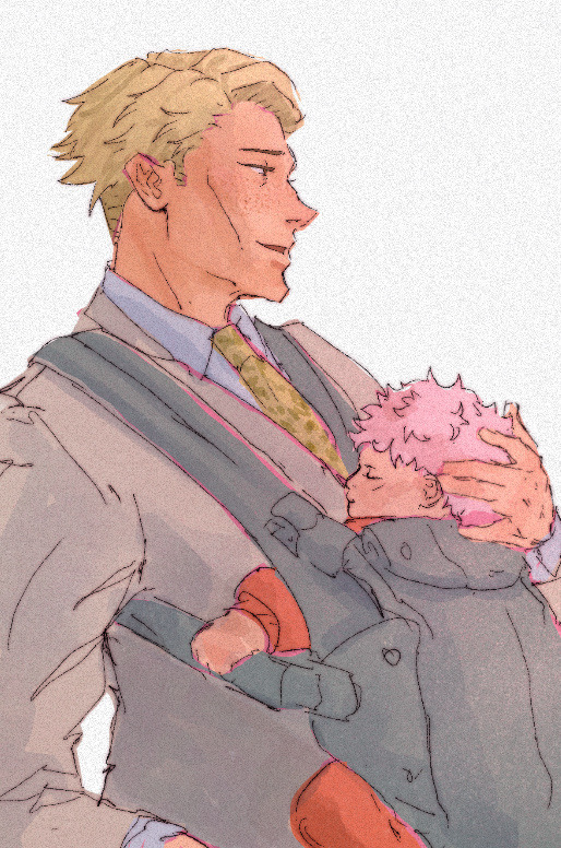
as a final cherry on top i create another multiply layer, fill it with white and then set a noise filter on it @ 17% (dont ask why that number it just works for me lmao) and thats it!
if i need to clarify anything dont hesitate to ask! like i said we dont gatekeep here
and some general tips: dont over-articulate your drawing, cause i find the more i fuss with details the more stiff my drawings look, so i suggest being a little more loose with lineart/sketching and dont sweat the small stuff
same goes for coloring, the more simplistic your shapes are the more cohesive ur drawing will look
another coloring tip: if you’re having trouble with ur drawings looking “muddy” i recommend starting off with a black and white render so you can get a handle on your values before you worry about hue (i do this with my more rendered portraits but i find it helps you focus on the depth of your drawing)
66 notes
·
View notes
Note
Hi!! I was wondering if its okay to ask what brushes u normally use in krita? I love your art!!
Thank you so much!!! I only use the ones available in Krita by default and I tend to jump around based on what I think will work best for each piece, but I can give a little rundown on which ones I use the most and what I use them for :)
Here's an image guide with each of the brushes I've used and that I recommend checking out:
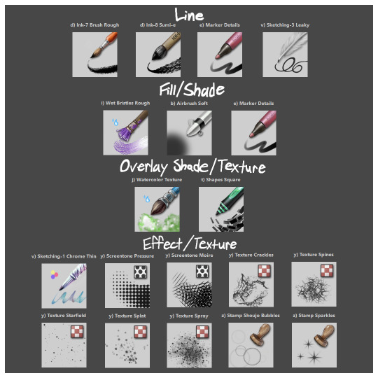
I'll highlight my favorites as well with some examples where they were predominantly used! (though in some cases multiple or even all of these brushes were used)
Marker Details:


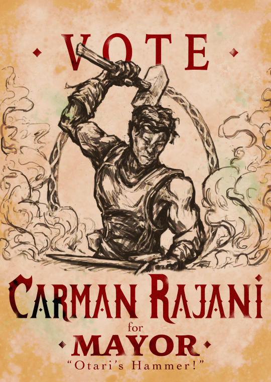
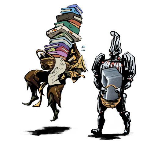
Varying opacity and size makes this one my favorites for sketching, especially since it can easily be nearly transparent or fully opaque which helps with value range.
I also like using it for silhouette sketches!
It can also be used for final linework, but it takes more work to get to a full opaque and its lack of texture makes it a little less interesting than Ink-7 Brush Rough imo.
Ink-7 Brush Rough:
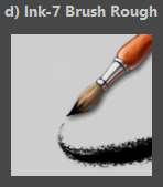
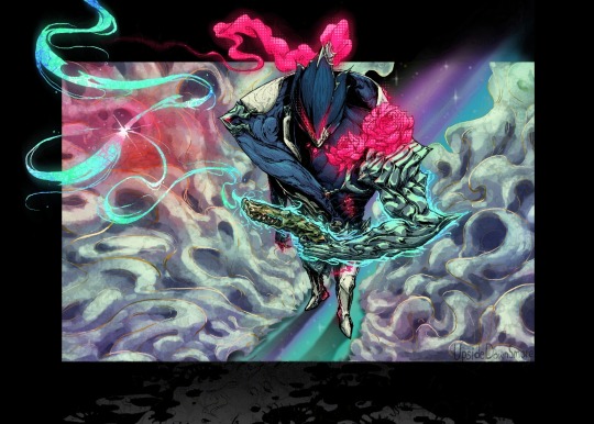
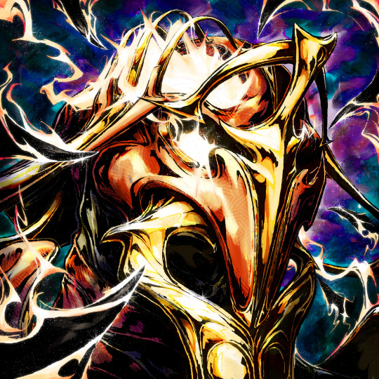
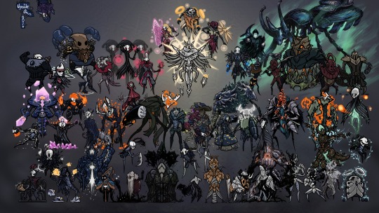
Really good for linework, especially for comic styled drawings with it's slight texture, varying weight, and opaqueness.
Also good for just filling in entire areas with a single color as well as non-smoothed shading!
Wet Bristles Rough:
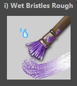
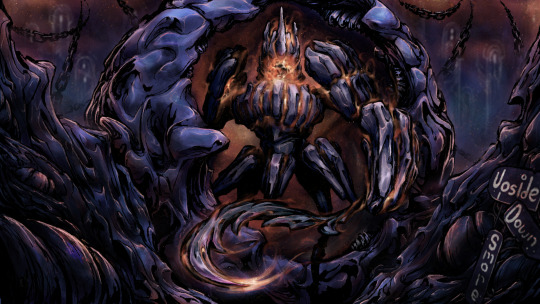
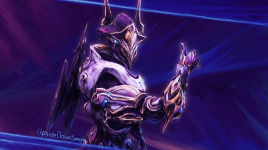
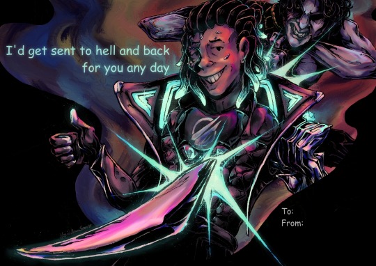
Actually just an amazing brush, its pressure sensitivity is crazy.
Blends strokes like paint and can vary in size and opacity.
Also has a nice subtle texture!
Amazing for smoother coloring and shading, especially if you want a more painterly style.
Watercolor Texture:

(hard to show examples of this, just assume that I've used it in any piece that has smooth shading lol)
Not the best for painting/drawing on its own, however I've found it to be really useful when set to white or black on an overlay layer for adding extra shading and/or highlighting on top of the shading I've already done.
I usually shade individual figures, objects, and parts separately, but using an overlay layer with Watercolor Texture (or even Shapes Square) on top of everything helps make the entire piece feel more cohesive.
Also adds a hint more texture!
Another thing to note is the importance of layer modes!
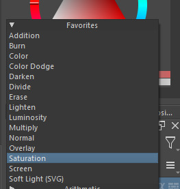
I know that you asked about brushes specifically, but many of these brushes (particularly those to do with effects and textures) work best when experimenting with different layer modes other than Normal. Overlay is generally a safe bet and most of the best for, well, overlaying multiple layers for interesting effects. But please try out all of them at any given opportunity, sometimes things like Burn, Color Dodge, Soft Light, etc can have more interesting effects!
In addition, mess with filter masks! You can even edit where they apply by drawing on the mask directly! HSV/HSL Adjustment (also accessible with ctrl+u) in particular is INSANELY useful for fiddling with the colors and balance of a piece, from individual layers to whole groups and drawings. I also really like blur filters, often times I'll duplicate a layer and make the bottom one blurred to add a glow affect to something without losing its definition.

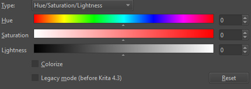

While this latter stuff isn't about brushes specifically, its generally very important to how I use and experiment with all these different brushes!
Anyways I hope this helps!! I kinda went overboard with this post, but I had a lot of fun writing it! Thank you again for the wonderful ask!! :)
#krita#krita art#warframe fanart#art#artists on tumblr#my art#UpsideDownSmore's art#art tips#art guide#art reference#long post#ask#didn't mean to spend so much time on this but ngl i'm actually so thrilled to talk about my art processes#like man i'm so grateful to be in the position where i can make an art guide like the ones made by people i look up to#sorry if this response is a bit long winded i just had to get a bunch out there lol#love asks like this :)#scheduling this 9 hours from now cause it is currently almost 1am lmao
40 notes
·
View notes
Text

This is a piece I made for a college illustration course in 1998 or 1999.
We had to pick a "dark" author and make a book cover for one of their works or for an anthology. I decided to go with a wrap-around cover and chose a mashup of Edgar Allen Poe's short work ("Cask of Amontillado", "The Black Cat", "Lenore'). My primary motivation was the desire to draw the cat, the bird (corvid-flavored bird, but not a proper raven), and the ghost. I also wanted to use a color palette that I rarely touched, and so used sepia and burnt umber as my base, and worked up the higher (lighter) values from there.
Prismacolor pencils over India ink and watercolor.
I find narrative illustration difficult. I wasn't organizing my visual idea flow very well at this point, 25 years ago, and even with practice I still have trouble telling a story with illustrations because my mind doesn't settle on clear ideas. It jumps around like a giant cricket, and I wind up with a mishmash of stuff that made sense at the time, but will usually cause an art director to go "what were you thinking?"
Something I find interesting about the thought process we learned to use in my illustration classes is this: The professor wanted us to do a lot of thumbnail drawings. LOTS and lots. I asked for a number, and he said 150! (I later learned that this is very common in industries that use illustrators.)
The problem I run into with lots of iterations on thumbnails is that my first ideas are clear, but if I iterate, things get weirder and weirder, and generally get farther from the central narrative I'm trying to illustrate. I go down the rabbit hole every time. I *still* do that, and it's a struggle to stay focused.
When I accept commissions, I warn people right off the bat: tell me what you WANT. Be as specific as you think you need to be. Then let me ask a lot of questions. Then I will start sketching. If I'm using words, I can focus the narrative idea and not get distracted by interesting visualizations that go far afield of the project parameters. Yes, words. It turns out that I'm a left-brained artist. All those personality tests we took in high school and college for fun told me I should have been an accountant, computer programmer, or engineer!
#edgar allen poe#lenore#raven#black cat#illustration#book cover#college work#old work#traditional art#traditional media#mixed media#prismacolor#confessions of a mediocre illustrator
7 notes
·
View notes
Note
what art supplies do you use??
Hi!
Thank you so much for asking Anon, idk if my answer will live up to the expectations tho :')
I mostly use litterally anything I get my hands on, so it's nothing "high quality".
I use a mechanical pencil for the sketches, but it's mostly because I don't like sharpening pencils lol. It's an HB, i know technically I should be using something less heavy like an 2H, but I think whatever fits best in your hand is the way to go.
For the lineart I use a gel ink pen, again it doesn't have to be one of the super expensive fancy ones, I personally like the texture of the ink (and my hands are too shaky to do the fine lineart with watercolor lol)
For the colours like 90% percent of the drawings on my blog are watercolour. I would honestly tell you what brand they are, but unfortunately it's watercolors we've had in our house for the last ten years or something, the box is lost, there's no brand symbols or anything on them, and I wouldn't be surprised if they were out of production :')
But like I said before, it's nothing necessary professional or specific, I use them because it's what I have and they have a decent amount of colours.
These are the main things? Sometimes I use markers, but again, it's not professional stuff, it's random bits I find around the house, I'm pretty sure the black marker I use to make some of my stuff I suppose to be used on GLASS, I use a red gel pen for the some of the red bits, and even correction fluid for highlights because I am consistently out of white paint :b
Visual proof of crappy art supplies just in case sfhdgdhd

#hope this helps#at least a little bit#feel free to ask more stuff if needed idk I'll try :')#traditional art#fanart#artists on tumblr#art supplies#art stuff#ask
1 note
·
View note
Text
tips/resources that taught me how to Art as an Adult - a masterlist
Four years ago I decided that “I’m too old to learn how to draw” is a pointless lie I’d believed for too long and you’re never too old to learn something new. I still definitely consider myself a novice and a learner but I’m at a very happy place with my art and I’m having a ton of fun so I thought I’d pass along the tips/resources that helped me get started and kept me motivated.
I’ll get into resources under the cut, but here are personal tips I lined up for myself that helped during the early stages of frustration and wanting to give up. obviously they won’t work for everyone, but they really kept me going
fill 14 sketchbooks. if you still want to give up after that you can (I’m currently at 13 sketchbooks and could not imagine ever letting it go)
what specifically do you want to be able to draw? For me my goal has always been characters and cats. I’ve added things to it here and there, but starting out overwhelmed with how much you don’t know isn’t great. find a handful of things you really want to draw and see where it takes you.
get yourself a sketchbook fancy enough that you feel cool as heck but cheap enough that you don’t mind absolutely destroying it. Personally, I love EXCEED bullet journals. the dotted paper keeps me from being too picky but are less intrusive than lined paper. From my experience, EXCEED bullet journals takes acrylic and ink like a champ, and they’ve got nice covers that just make you “feel” cool. confidence is important!
acrylic paint and post-it notes are great ways to cover mistakes. I personally love anything that makes my sketchbooks feel “sketchbooky” so this is super fun.
it is okay to “waste”/”ruin” pages. one time I was in “I’m a failure” artblock and so I poured black coffee onto my sketchbook. (it was gonna get dumped out anyway and I was Very frustrated with my art.) then when the pages dried I just kept right along using it. taught me a lot about not being perfect. sketchbooks are about learning and love, not about perfection.
try drawing in pen. seriously, draw in pen. it’s scary as frick to not be able to go back on mistakes but that’s what the post-it acrylic-paint tip is for, and it’ll help with all sorts of stuff like lineweight and line confidence. it takes some of the stress off too because, you screw up? oh well! Try again! it encourages “try again” over “meticulously nitpick until it’s perfect” and has done wonders for me. I started out my first two sketchbooks in pencil before making the switch and I’ve never gone back.
(also sketching in highlighter and lining with pen is super fun and cool and satisfying!)
the first page doesn’t matter. I usually just use the first page of the sketchbook to write my favorite songs at the time and then do the same thing on the last page. first page jitters begone.
(starting in the middle of the sketchbook also gets rid of those jitters pretty nicely. I tried this a couple times and personally still prefer the linear front-to-back but it was fun for a while.)
picking a color theme for your sketchbook can make it feel more “sketchbooky” too. I usually go with blue or orange- blue acrylic paint, blue post-it notes, those cheap blue BIC pens, etc. I like this bc it makes the sketchbook feel like a sketchbook and is very satisfying.
And figure out why you’re doing it. I did it because I always wanted to make cool art and draw my characters, but if you’re doing it for a career then obviously the path to that looks much different. Don’t compare yourself to others. Be inspired by people who are better than you. Acknowledge where you need to grow and where you’re strongest. Lean into those strengths. Adapt to those weaknesses. Be proud of being a beginner- you won’t be one for long.
Now: some of my favorite creatives and resources!
///
CREATORS:
"Kasey Golden" Mostly traditional art, mostly watercolor, cartoonist, art challenges
"DrawingWiffWaffles" Mostly traditional art, alcohol markers & pens, semi-realism
"LavenderTowne" Digital art, art tips/tutorials, cartoonist
"ABD Illustrates" Digital art, speedpaints, semi-realism
"Proko" (or "Stan Prokopenko") Realism, anatomy tutorials, free complete "Anatomy For Artists" series- basically as hogwild as you can get learning hyper-realistic anatomy
"Ethan Becker" Digital art, ex-DreamWorks employee, tips/tutorials, "Perfect Practice"
"Sinix Design" Digital art, anatomy tips/tutorials, general tips/tutorials, realist
"Oliver's Antics" Digital and traditional art, tips/tutorials, speedpaints, semi-realistic style
“Nerdforge” Traditional art, painting, metalwork, woodwork, bookbinding, building, seriously these people do everything they’re incredible
///
FOR GESTURE DRAWING:
Line of Action Gesture drawing, figure drawing, optional timed practice sessions
AdorkaStock fantastic line of unique reference poses
///
Aaand that’s about all I’ve got! there are so many resources out there and so many amazing artists to be inspired by. just have fun with art! art is freedom. be proud to be a beginner and be excited for how you’ll grow. I hope these tips are helpful for someone out there! <3
Here’s my first digital artwork (April 2019) up against my latest (August 2022)
April 2019:
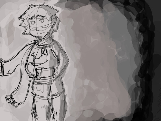
August 2022:
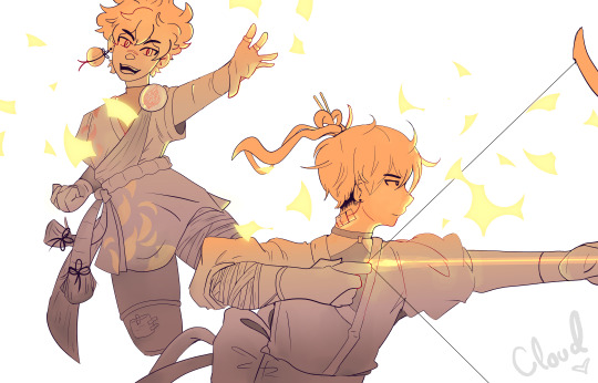
best of luck to you all. I believe in each and every one of you. <3 happy drawing!
#art#resources#cloud rambles#masterlist#obviously this isn't TOTALLY comprehensive#but I've been talking to a lot of friends lately who preemptively give up on art bc they're 'too old'#and I just felt like making this#i believe in all of us
346 notes
·
View notes
Note
hello master mctizzles!! 28 & 29 for the artists ask pleae, since i know you do a fair amount of traditional? also 10! (and if u say anything other than HELL YEAH, all caps, i will have many hype words to say at you<3333)
28. For traditional artists: what medium do you like the most?
OHHH INK DIP PENS MY BELOVED
god i miss her, i haven't done an ink peice in so long this is making me yearn
for those of you who are new, i used to primarily use a dip pen and watercolors for my art, you can see a general look at all the materials in this old drawing i did for class

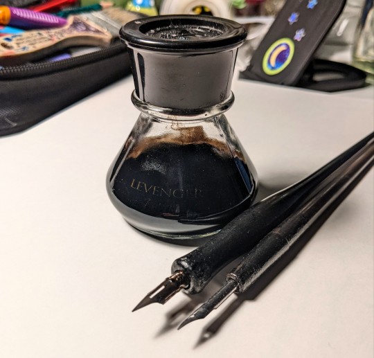
the bottle is way fancier than need be, but i like it so i use it lmao (the ink is winsor & newton india ink and the pens are just the general dip pens you can get at michaels or hobby lobby) the water colors where the masters touch fine art studio watercolor set with 24 colors, they're the pan kind.
also i just generally like using pencil, ik very basic, but nothing will ever beat the feel of using a 6B pencil on drawing paper, immaculate 🤌
29. For traditional artists: How do you usually start on a big piece?
I usually start with a thumbnail in my sketchbook or on a scrap piece of paper to get a general sense of the composition, and do some bigger sketches if i want to map out specific poses that might be difficult later
then I do a light sketch with as much detail as i can on a taped down peice of watercolor paper, then i ink it, erase the sketch, clean up some of the lineart with a white gel pen (sometimes white paint if I bungle it enough) and then go in with watercolor, going from dark to light, then shading over everything after the first layer is dry.
(I KNOW I KNOW, ur supposed to go from lights to darks in watercolor, and I do if I'm doing like a painting, but it's much easier for me to fill in all of chat's black and marinette's hair before i go back in to work on the grey's, and by that point im using less and less pigment the more I paint, as my little puddle of black gets smaller and smaller in my palette.)
I took a lot of process photos when i did traditional but i haven't done it in a while so these are a tad old,,
some examples of thumbnails,,
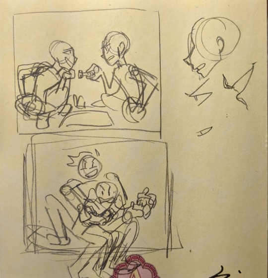
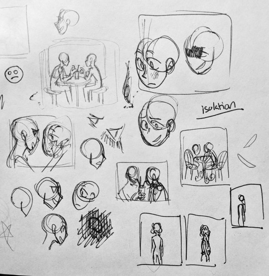
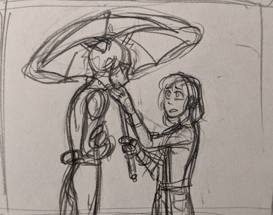
some examples of sketches

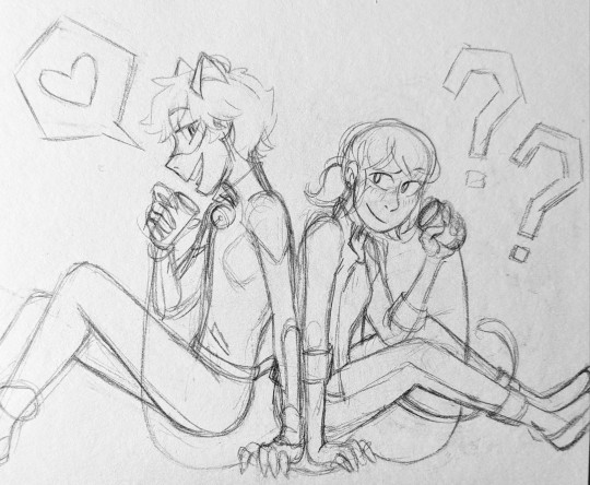
and then some lineart photos


(i usually take photos of just the lineart when im scared to start the watercolor, so theres not a lot of them)
10. Are you confident about your art?
aaahha... eh.... i answered this ask in another post, so you'll have to go there to read it,, love you maryssa, hdhdhdhf 💙
thanks for the ask!! these questions are from the artist ask game, send me some and I'll do my best to answer them!
#also speaking of pencils i tend to use either .5 mechanical ones or 4B to 6B wooden pencils#i just like the feel of softer pencils :))#ask#that sure is a lot of photos djdhhf sorry for the long ass post#tizzy talks#artist ask game
88 notes
·
View notes
Text
Olarom!
Welcome to my page, I’m your host, Bear! I’m a 20yr old aspiring author and OOAK doll customizer!
Masterlist (Amazon wishlist)
My pronouns are they/them/he/she/dude
I’m always looking for new friends, I don’t bite! I just write kinky stuff!
My Ask Box is always open, feel free to ask any questions!
Presenting, under the cut!: Q&A!
I see you’re here for the rest of the post!
Where can I find you off of Tumblr?
You can find me on Discord, Bearcina#5637!
My Steam is the same, Bearcina!
My AO3 is Bearcina, and here’s a direct link!
My KakaotalkID is bearcina! My kakao name is Bear'ika (little bear)
I’m on Wizard101 as Maria Rainbowbreath, a level 50-something Balance wizard, I specialize in supports, hit me up for a True Friend code! I just finished Dragonspyre!
What do you use to draw?
I use an XP-PEN brand tablet for digital work!
I do doll face-ups with Arteza watercolor pencils, soft chalk pastels, mica powder, Mr. Super Clear UV Matte Flat, and LOTS of DuraClear in Matte, Gloss, and Ultra Glossy!
My sketchpads are off-white and textured for watercolor pencils! I use Pilot pens for inking, and these pencils for sketching!
Do you have a Masterlist of your fanfics and works?
Yes, and here’s the link to the Masterlist!
I’m into Astrology, what’s your birth chart?
I am a Gemini (sun), Sagittarius (Mars), Libra (Rising), Taurus (Venus), Ares (Moon) and a Gemini (Mercury)!
What the FUCK is wrong with you?
A LOT. I’m disabled and mentally ill from some serious childhood trauma! Here’s a nonexhaustive list of my problems!:
C-PTSD
PTSD
MDD
BPD
Generalized Anxiety
Dissociative Identity Disorder
Panic disorders
More Depression, but make it ~Seasonal~
Fibromyalgia
Migraines (a LOT)
Arthritis
Herniated spinal discs
Chronic fatigue
And so many more!
I’m also autistic, I have ADHD, dyscalculia, and my brain is about as functional as a goldfish! (surprisingly smarter than expected but still dumb as a damn rock-)
What fandoms are you in? What interests you?
I currently enjoy: (current fixations are bold!)
Katamari Damacy
The Outer Worlds
Fallout: New Vegas
Fallout 4
Fallout 3
Spyro the Dragon
Hades (game)
Pokemon! (Sinnoh, Alola, and Galar right now! I have one of every gen but Hoenn)
Pokemon Mystery Dungeon: Red Rescue Team, and Explorers of Darkness/Sky (I don’t have time!)
The Legend of Zelda (Ocarina of Time, Skyward Sword, Minish Cap, Link’s Awakening (all three editions), and A Link Between Worlds and many others!)
Portal
Portal 2
Portal: Aperture Tag
Portal Stories: Mel
Animal Crossing (Check above for my switch codes to play NH with me!!)
Animal Crossing Happy Home Designer
Star Wars, specifically The Mandalorian and things related to Mandalorians! (I’m learning Mando’a with help from the Oyu’baat!)
Hitchhikers Guide to the Galaxy by Douglas Adams
Leviathan series by Scott Westerfeld
Good Omens
Prospect (2018) (I love Ezra!)
SCP Foundation
The Penumbra Podcast: Juno Steel! (podcast)
The Magnus Archives (podcast)
Wolf 359 (podcast)
Elaines Cooking for the Soul (podcast)
MarsCorp (podcast)
Oz 9 (podcast)
StarTripper!! (podcast)
The Strange Case of Starship Iris (podcast)
Welcome to Night Vale
Mars’ Best Brisket (Podcast)
EOS 10 (podcast)
Distractable Podcast (by markiplier)
The Sims
Sewing, I do mine by hand and machine! (ask me about my machines!)
Crochet
Historical sewing
Cosmetology (I grew up in a salon, my mother is a beautician and I love dying and cutting hair!)
Acrylic nails (they’re so pretty!)
ToonTown ReWritten (Find me as Fancy Lolipop the bear or Deputy Biscuit the deer!)
Wizard101 (I like playing!)
Gardening
YuGiOh (I collect the cute cards >w<)
Martial arts (I did karate for many years and i got my black belt! I also like playing with rope darts, though I’m not good!)
Tarot Cards and other such fortune telling things, I’m a pagan and a witch!
Any other questions? Send me an ask!
17 notes
·
View notes
Text

♚ HOW ART IS SEEN
Art is something that the current three versions of my muse share. All of them appreciate it and/or embrace it in different shapes or forms.

VERSE ONE: DEATH WILL FIND YOU.
◍ In the show, it is seen that Reaper, during his life in Goryeo as the King Wang Yeo, draws and paints a picture of the Queen, Kim Sun, years after she passes away. It’s, in a sense, seen as a way for him to express his deep pain and regret toward what he did when he was younger. He spends hours upon hours trying to get the perfect drawing; makes a mess with other failed drafts until he gets to the one pictured above. Kim Shin takes the painting with him and keeps it safe throughout he centuries; becoming an important piece that leads Reaper to know more about himself and the sting he carries. ◍ Based on this, I’d like to think that Reaper unconsciously has a link with art, even if he no longer remembers that he used to paint and draw. He appreciates paintings, feels a sort of calling toward them but he cannot explain why. ◍ Of course, his painting skills won’t be as they used to, since he has no memory of them. However, if someone were to teach him and guide him on how to paint, he’d be able to pick it up easily, as if he was born for it. This is because his life was once tied to this type of art. Not that he’ll learn within seconds, but perhaps he’ll be capable to have a fair grasp in a shorter period of time compared to average. ◍ In modern days, he doesn’t really do any drawings or paintings. He does visit art exhibitions from time to time because he likes looking at the art others display, but hasn’t really tried to create his own. One of the things he does on paper, though, is write in Hanja with a writing brush and black ink. He actually has scrolls upon scrolls in his room and these papers are usually crowded with messages holding his thoughts about who he could’ve been in the past.

VERSE THREE: I DREAMED OF A HAPPY ENDING.
◍ In this verse, Hyuk is also tied to his past life even if he doesn’t know it (or...even if he hasn’t deciphered that his nightmares are connected to his past life), and so, some things were carried over, such as his ability to draw and paint. ◍ This is one of the few hobbies that Hyuk actively pursues and it helps him to relax and distract himself. The painting technique he usually uses the most is watercolor; sometimes he’ll combine charcoal with the watercolor once it’s fully dry; do some blending if needed. ◍ His sketches consist of faces, mostly. He can certainly draw other things, but he prefers to do portraits the most. Hyuk really finds the diversity in faces interesting and beautiful; how every single person is different in their own way, not only physically but also in how they build their lives. As well, in this verse, he deals with people who aren’t exactly the best, especially when it comes to solving cases and being witness of gruesome things, so to find the beauty or believe there’s still good in people sort of inspires him and gives him ease. ◍ He tends to draw the faces of people he’s fond of. Also, he’s made drawings of the faces he’s seen in his nightmares, since some are very (and inexplicably) vivid. He also creates his own ‘characters’, just a mixture of features that come to mind and such; lets his mind run freely when needed. ◍ This detective here has a lot of sketchbooks and notebooks full of painted pages, all saved in specific drawers. He also has a small area where he gathers all his paint tubes, brushes; all the items and materials he needs to paint. ◍ He doesn’t really share the fact that he paints/sketches/draws. It’s like a ‘hidden hobby’ that only people very close and dear to him might know about. Since he pursues this hobby as a form of catharsis, he prefers to keep it private.

VERSE FOUR: VERMEIL GUARDIAN
◍ Wang Yeo used to pursue the art of painting and drawing back in his times as a King. It’s something that I mention on this post as well. ◍ He draws whenever inspiration strikes and likes to do it as to capture memorable events or people in his life, as well as important information that’s easier to identify through drawings. ◍ He can paint about any topic, but his top two are nature and the faces of people he’s fond of. ◍ When it comes to nature, he’ll make sketches about flowers, trees, herbs, etc. He actually has a series of journals that he started making years ago, where he’s been drawing medicinal and useful plants. All of these drawings have notes with their importance and uses (sometimes they have recipes or how to use them when dealing with particular situations). The drawings featured in these journals were sketched with pencil and/or ink brushes. ◍ When he does more intricate drawings, sometimes he likes to add color and will also pursue the watercolor way; following softer hues. Most of the times, though, he leaves his drawings in a black and white format. ◍ Out of the three, Yeo is the messiest with his hands because he likes to blend charcoal with his fingertips and when he adds color, chances are his fingers and knuckles are going to end up with temporary paint freckles. ◍ Another type of art Yeo does is Oshibana, which is the “art of using pressed flowers and other botanical materials to create an entire picture from these natural elements.“ (thnx Wikipedia). He also uses pressed flowers to arrange them in frames and put them in resin; creating small ornaments for his cabin.
#♔ || about.#♔ || about (verse three).#♔ || about (verse four).#me to me a few months ago: You should do a headcanon post that speaks about how Yeo/Reaper/Hyuk perceives art#me to me now: hERE IT IS FINALLY---#As I've mentioned before#Even if all three versions have their differences due to their distinct backgrounds#they also have similarities as to keep a similar essence between them#and them being linked to art is one of those similarities C:#I hope this post makes sense IUWHEDIUWHEDUIH#tried to make it as short as possible ;WWWW;#♔ || queue.
7 notes
·
View notes
Note
Hey! I'm the one who asked the poorly worded art process question. I'm here to give it another try by being more specific. The problem is . . . that's hard. Because that was about a specific as I can get, since I kind of want to know everything about how your art works.
Big things, like how you come up with ideas, or how you design characters. But small things, too, like what tools you use for drawing, how you balance between traditional and digital art, and how you decide what color to use for your unique and beautiful line art.
I want to be more specific so you can answer, but the question in my head is too vague and broad for me to be specific about it. So . . . here are some subquestions of my question, I guess! Maybe that helps?
Sorry this is so weird, and thank you, your art is amazing
first of all, thank you so much <3
and yes, this is far more answerable! i hope i can satiate some of your hunger for insight without writing a whole book.
HOW DO I COME UP WITH IDEAS?
this is obviously going to be very different for everyone. i very rarely have to dig for ideas or sit down and brainstorm, unless of course i am trying to achieve something very specific, like fulfill art contest criteria or working on a commission. my brain is very visually wired, so a lot of my ideas literally just pop up in my head (i know of several artists with aphantasia - some people don't have any visuals in their head at all and I HAVE NO IDEA WHAT THAT'S LIKE AND I AM IN AWE OF THESE ARTISTS), sometimes i see a character or character design and im like HNNNG i need to draw them, or i just... have a concept i really want to Exist and i'm going to figure out how.
my biggest problem is that often, when i get an idea i want to DRAW IT, NOW NOW NOWNOWNOW, and that's just Not Feasible. sometimes because i'm Literally In Bed, sometimes because i have too many things i need to do or draw first... but i need to clear up space in my head, because my Urge To Draw will be like, beeping and whirring until i satisfy it... so i write it down on my TO DRAW-list! it's a real list that exists on my phone and i have to use it frequently. if i keep scrolling down i start finding weird notes that i have NO idea are supposed to mean anymore, but that's fine. i can't satisfy every Art Urge. sometimes i need to let them pass.

HOW DO I DESIGN CHARACTERS?
this one might vary a bit, but it can often be boiled down to "i sketch around until i figure something that Works." many of my characters, especially my older characters, became characters by accident when i kept drawing them over and over and i was like Ah I Like Drawing You... You Exist Now. that's how sparrow spellcaster happened, at the very least. this could happen because i had school and i would focus in school by doodling/sketching while listening to class. since i no longer go to school, pretty much all of my new characters are far more intentional. Timian and Vinta specifically exist as a result of a "favourite character fusion" challenge, and a lot of iphimery characters started with a Purpose rather than just harnessing the vibe of something i drew multiple times without thinking.
it helps to write down elements or tropes i want to include, like "sturdy-looking" or "VILLAIN OF EVIL SCARY MAGICS but it's a little girl and the dark magic is bright lightning and not shadows" or something. it can vary from a tiny visual detail to their role in the story. whatever i want to Achieve. my Intent. because my brain works so visually, i just really need to sketch somethign repeatedly until i nail it and can be like Yes That's It.
sketchbooks look a little messy but that’s what they’re for.
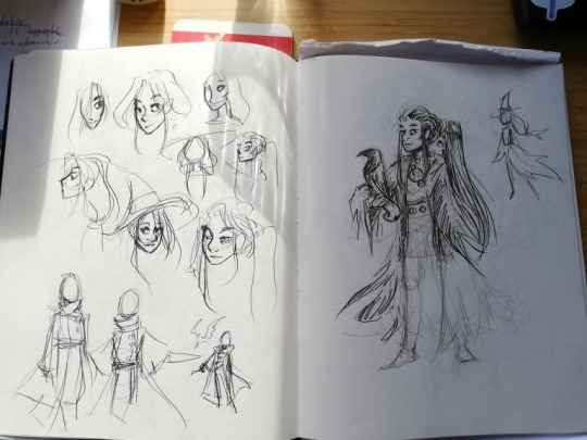
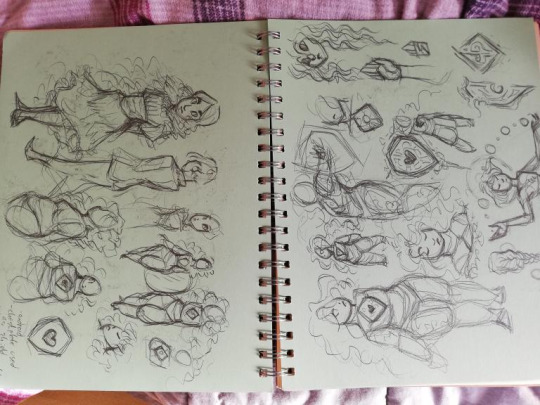
WHAT TOOLS DO I USE
for digital art, i’m currently using an ipad pro and procreate. i use a lot of the brushes that came installed, like Mercury is my primary lineart brush, and Moorilla is my primary sketching brush, but i also buy a lot of custom brushes on the hunt for More Delicious Textures (DAUB has a lot of good ones, especially if you want some that imitate traditional art). i have also used Huion and XP-pen tablets and generally recommend them, as well as clip studio paint as an art program (i love it very much and if it wasn’t subscription-based on ipad i would still be using it).
for traditional art, mostly just whatever sketchbook i have + my trusty mechanical pencil. i mean i have two: one with softer lead (it comes out darker) and 0,7 mm thickness, and one that’s 0,5 and harder lead for more light sketching, or if i’m going to line it with ink.
i also have a trusty pentel brush pen that i love DEARLY and feel bad for not having used in a while for reasons i will get to.
when i work on calendar pieces traditionally, i like to draw lines with ink - i use a dip pen with exchangeable nibs - and then color with watercolors. i have several sets because they’re all slightly different and i want the Range.
i sometimes travel with a little sketchbook in my bag and an assortment of pens, so that i can sketch Anytime, Anywhere. i think doodling with a pen can be very useful because you gotta become comfortable with the mistakes and imperfections and keep going anyway. if i doodle at work that’s the tools i have - regular ball pens and a bunch of paper lying around.
HOW DO I BALANCE BETWEEN DIGITAL AND TRADITIONAL ART?
currently, i... don’t, really. it was easier when i had school, and i would just doodle freely and then maybe use some of my sketches as thumbnails or concept ideas. it’s harder now that i need to intentionally sit down with my sketchbook, and tbh... the ipad works very well for sketching. it’s so CONVENIENT and i have WORK all the time and my time to create art has become much more limited than it was. i miss going to my weirdo art high school where we would try out a whole bunch of different tools and methods. sure, yes, i had to paint with Acrylics My Beloathed, but getting to play around in different mediums is VERY valuable.
i genuinely want to be able to make more time and space for non-digital art again, but i just don’t have the ability to right now. it’s also different now that i’ve moved away from my parent’s place - i used to have an enormous desk and my mother has a large collection of art tools and there was a lot more storage space for whatever i created. digital art is very convenient and very accessible. ah well!
HOW DO I DECIDE ON THE COLOR FOR MY LINEART?
i usually line in black or a very dark color, and when i’m done coloring + shading i might play around with the colors and see what works. if you lock the layer you can just throw all the spaghetti at the wall you want. i decide on whatever fits the piece. i tend to be pretty fast and loose about it too, sometimes you can probably spot parts of my lineart that have slightly mismatchy color, but it’s like... done is better than perfect! i don’t have the energy to overlook every single pixel of my piece or else i would drive myself utterly mad.
HOPE THIS ANSWERS ANYTHING AT ALL!! THANKS FOR ASKING!!!
#art advice#(tag for archival purposes not to imply my methods are gospel)#everyone has their own ways!!!
40 notes
·
View notes
Text
About Me
Hello, I am Mayor. I am an aroace artist and appreciator of Kagamine Rin.
I am also on Instagram, @mayor_doi.
I'm also apart of a Discord server dedicated to fanfic about the Smash Bros. series! More info found on this page.
(I am planning on making an art-only blog in the future since I do a lot of reblogging! I'll replace this pinned post when I do actually make it though)
(I don’t take commissions/requests because it just ain’t my jam)

Main Interests
☆ Vocaloid (The music, producers, and associated characters) ☆JoJo's Bizarre Adventure (My favorite parts are 4, 5, and 7) ☆Shining Nikki ☆Animal Crossing (Mainly New Horizons interior design) ☆Mii games (Mainly Miitopia and Tomodachi Life, so I might make some of crossover art because of them 😭) ☆The Super Smash Bros series... and by that I mean Fire Emblem Awakening ☆Probably other stuff too
I mostly make fanart pertaining to these interests :) As you can see, there's a lot of things that I like to draw for. So it's best that you don't follow me expecting to see art from one specific fandom 😅 I don't have a real pattern to what I decide to draw fanart for, I prefer to just post whatever.
I have OCs but I don't post them much. Maybe one day when I'm more comfortable I'll share my children. For now, I just plan to have them piled in my Mayor's OCs tag. The general art tag for my page is Mayor Doidles.
Stuff I Use
For digital art I use Procreate on an iPad. For traditional art I use an assortment of stolen mechanical pencils and grading pencils for sketching, Ohuhu markers or crusty watercolors for coloring, and assorted black fineliners for inking.
Reposting
No resposts ¯\_(ツ)_/¯) Even if you credit me I doubt anyone will go look for me, so to reiterate: no resposts. Personal use? Sure! Wallpaper for phone/computer is fine if that suits you for whatever reason. Profile picture is also acceptable if you credit me in your bio! But regular posts that reupload my art? No. And obviously using it for monetized purposes without my consent or knowledge is also a big no. Be smart.
Anyway
That's all. Might edit this post along the way. I don't plan on being too open with my random thoughts on this blog (That will be my Discord friends' problem) but idk maybe it'll end up being that when I get more comfortable. I mostly lurk and occassionally post art. I want to make my page safe for anyone to interact with. I really hate Internet drama/discourse so I won't be bringing any of that here, and if you can do the same, we'll have a grand old time 👍

4 notes
·
View notes
Text
Artist Research
Tetsuo Aoki (1940 - unknown)
"The theme of my artwork is to express the pleasure, the deepness and the importance of touching each other. The original world of woodblock with Japanese paper (Washi) and Chinese ink (Sumi) is my basis."
Tetsuo Aoki – 青木鐵男 is a Japanese woodblock printmaker, who was born in 1940. He utilises wood to engrave his designs and uses a black and white colour scheme consistently throughout his prints.
His elongated, disproportional and overstretched characters immediately caught my eye and he is now one of my biggest inspirations. I love the layouts he uses and the overall distorted aesthetic of his work. Aoki’s graphic style is far from ordinary. He utilizes defined shapes and little shadowing which creates a sense of sentimentality.
Bryan Nash Gill (1961 - 2013)
"Art is (or should be) an authentic experience, which brings you closer to understanding yourself in relation to your surroundings." - Bryan Nash Gill
Bryan creates large-scale relief prints from the cross-sections of trees. It is up to us as viewers to find meaning in Bryans art. Personally, I find his art both beautiful and thought-provoking; it portrays the idea of growth and change yet makes me think about sustainability and the living things that surround us humans.
Bryan believes that the journey is more important than the destination; "Strict concentration on the making, the process, is more important than the result." His take on the process of art is almost a metaphor for all things organic - he lived in the moment and did not let his thoughts guide him.
Gill creates patterns from fallen or damaged trees which he rescues from the property surrounding his studio. He prepares blocks of recycled wood, coats it in a thin layer of ink then makes prints by carefully pressing the contours of the wood until the intricate designs transfer from tree to paper. It is important to Gill that the entire tree and all it’s intricisies is documented.
Hulya Ozdemir
“I think my paintings are timeless. My portraits do not remain imprisoned in a single statement. Their gazes are changing, just like us. One day in the same picture is sad, another day is possible to see a happy face.” - Hulya Ozdemir
Hulya Ozdemir is an illustrator and painter of watercolor portraits who was born in Istanbul, Turkey in 1972. Hulya focuses predominantly on female portraits and showcases women becoming self confident and breaking out of social norms created by a make-dominated society. Hulya does not sketch her work beforehand, she draws directly onto paper, adds patterns and then paints; “I can say, I rarely know what will happen in the next step.”
Her work displays womens beauty and individuality through the use of texture, bold colours and many patterns. Her use of colour, pattern and texture stould out to me, and I used it as inspiration for a mixed media print.
Glenn Jones
Glenn Jones found internet fame in the 2000s with his unique T-shirt designs. His tees have even be worn by stars on the Big Bang Theory. He is an illustrator who’s work is now being published as prints. Glenns collection of prints are inspired by growing up and living in NZ, he has stated that he want’s to put “my own spin on our pop culture”.
His prints are some what comedic, he depicts relatable Kiwi experiences with a humorous touch. One source states “his prints are a statement in a picture about our collective identities and the shared experiences of living in Aotearoa in the early 21st century.” His kiwiana style and clever twists with a touch of nostalgia is inspiring. I find his work both quirky and fun.
Barry Ross Smith
"I like to create a rapport with the viewer by playing with our reminiscences. Creating icons from our shared Kiwi past, the beach, the bach, the farm but mostly the people. We can identify with these characters as family, friends or someone we know." - Barry Ross Smith
Barry Ross Smith is a visual artist born in Kamo, Northland, New Zealand. When he first started producing art his medium was sign writing, and he has now been painting for over 25 years. As stated by New Zealand Fine Prints Ltd; “His work typically engages with the conception of myth and cultural identity, often exploring these avenues from a New Zealand male’s perspective.”His art is inspired by the relationship between individuals and their immediate environment, specifically our communion with the land & encompassing oceans. His work has been described as “hymns to rural New Zealand … tellingly observed and cleverly rendered” by NZ Hearld Critic TJ Mcnamara.
I admire Barry because his work showcases our beautiful land and animals. Aswell as how work, Barry inspires me as a person. He is involved with Pest free NZ; and helps restore native wildlife from extinction. He values New Zealand land not only in his work but in his day to day life, which I find extremely inspiring as I value sustainability and our saving our environment. I also find his use of surrealism and kiwiana themes interesting as it is something I want to experiment with in the future.
Tony Ogle
"Screen-printing allows me to express my love of the New Zealand landscape and ocean environment with strong colours in a direct and graphic manner".
Tony Ogle was born in 1959 and is one of New Zealand's most successful printmakers. Ogle’s prints are full of colour, vibrant and celebrates New Zealands coastal landscapes. His works are extremely technically complex and handmade, with only one edition ever produced. Ogle’s joyful prints celebrates the Kiwi beach life and showcases his authentic connection with New Zealand coastal landscapes.
He is inspired by locations off the beaten track and untouched stitches of the NZ coastlines that portray "unchanged timelessness". Tony strives to capture what he calls a "sense of place" in his art prints.
His work is inspiring since I can relate to it as a Kiwi and I admire how he uses texture to convey a sense of calmness, he perfectly captures Aotearoas essence.
Charles Frederick Goldie
Charles Frederick Goldie was born in Auckland, New Zealand, on 20 October 1870. He is an ancestor of mine, who painted Māori history paintings and portraits of tattooed chiefs. His paintings have been turned into many prints nowadays, I’ve even seen his paintings on postcards and magnets whilst travelling the South Island.
Goldie's career began in 1900 when he started painting images depicting elderly Māori with moko, the 'noble relics of a noble race'. By 1904 Goldie was considered the leading portrait painter of Māori, and was renowned for his technical brilliance. His portraits have become vitally significant to New Zealand art.
Goldie feared that Māori were about to die out or be assimilated by the pakeha so he set out to record the last survivors. This is reinforced through the poses of his elderly subjects and the titles of many of his paintings eg; Last of the Cannibals, A Noble Relic of a Noble Race. Two of his most celebrated works, Darby and Joan and The Widow, portray Goldie’s awareness of the hardships Maori were experiencing. Many Māori individuals see Goldie's works as taonga which represents irreplaceable ancestral images of koroua and kuia. Māori believe the wairua( spirit) of the subject resides in each picture.
I am inspired by Goldie not only because I feel a cultural connection to him but because of his love for Māori culture. His paintings are full of intricate details, and his paintings often look like they can breathe which I find incredible.
Lauren Liess
A crooked smile, wildflowers from the side of the road, a chip in the good china; I love it when things are slightly off and tell a story, because to me, that’s real life. And it’s beautiful.
Lauren Liess is an interior designer who’s style I find inspiring and aesthetic. What caught my eye is her use of prints and nature in her interior design. Her style is simple, relaxed and authentic. She utilizes natural materials, thoughtful art and decor that focuses on people rather than things.
She has a toes-in-the-stream aesthetic and is obsessed with the outdoors, “I’m obsessed with what’s going on outside,” and utilizes a black, white and wood pallet paired with lots of greenery, “When you bring in bits of nature …artwork, interesting accents and fabrics, [the colors are] a museum showcase for it. It’s a textural, natural base.”
I relate to her as we are both inspired by the outdoors. I also like how she incorporates living plants and wood into her modern style.
5 notes
·
View notes
Text
Commissions Open
I’m looking to fill a maximum of 10 slots! First come, first served. Terms, commission types, and examples below! For additional examples, either browse my commissions tag here on tumblr or see older commissioned work on my deviantart.
Commissions December 2019 Terms, Conditions, and Prices
How to claim a commission/ask for a quote: Email me at [email protected]
All payments to be made via Paypal. Once your commission is approved, you will be sent a paypal invoice. Commissions quoted at $125 or higher can be paid with a payment plan. All commissions require a minimum of a $75 deposit, or for commissions less than $125, the invoice should be paid up front. Commission must be paid in full before final art is begun.
All commissions (with exception of sketches/speedpaints) will start with sketches that will be sent for approval, or edits if needed. Commissions can have up to two free edits at the sketch/final line phase, but no major edits can be made on final art due to the nature of traditional media. Depending on the nature or complexity of the edit, the third edit onward will cost a minimum of $15.
Shipping: I ship both domestically and internationally. $5 for shipping within the US, and $10 for international. Please specify if you would like your original shipped! A high res scan will also be emailed to you.
Approximate turnaround time: On average, anywhere between 3 weeks to 6 months, depending on your position in the queue. If you are uncomfortable waiting that long, please do not order!
COMMISSION TYPES AVAILABLE:
Colored pencils on black paper SPECIAL! 5 x 7″ - 9 x 12″ approx. Portraits start at $85 USD and full-body start at $100. Add a background for $15-25+.


All sketches/line art/watercolor speed paints: Sketches $50+, Line art $75+, watercolor speedpaints $85+. Additional figures will cost more. Sizes approx 8 x10” to 11 x14”, depending on format.


Pencil/Graphite rendered drawing: Portrait/single figure: $120+. One figure with full background: $175+

Ink dip pen/brush pen/ballpoint rendered drawing: Portrait/single figure: $145. One figure, full background: $225+.

Pyrography (woodburning): Portrait: $100+. Full figure, simple background: $145+. Full figure, full background: $165+. Available with or without metallic acrylic accents.

Gouache “Minis”: No larger than 8 x 10”. Portrait: $95+. Full figure, simple background: $130+. Full figure, full background: $155+.

Aequis designs, all design tiers: On base: $100+, Middle tier (no bases) $175+, and custom full sheets $250+. A full post detailing the different pricing tiers can be found here. Below is an example of a custom full sheet.

Tattoo design commissions: Line art starts at $125, black and white rendering starts at $175, and full color at $250. Complex elements/multiple figures will cost more. I allow for more edits on these, but it helps to have plenty of references and specific examples to make the design process as smooth as possible. I do not do messy/lineless/splotchy watercolor style tattoo designs. Regular, well defined watercolor style with clear lines and edges are just fine!
Any questions? Don’t hesitate to ask!
#commissions open#traditional art#long post#long and MESSY post#for which I apologize#I don't have any formatting brain power left over#I still need to invest time into making an entirely new commission sheet#problem is I don't have scans of most of my older art#so in the meantime here we are
69 notes
·
View notes
Photo
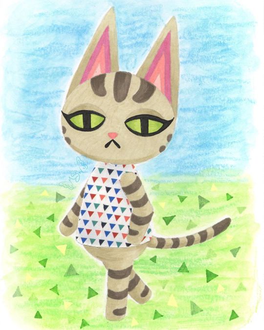
Ziggy Crossing
Still not quite sure I'm 100% back into the swing of things (posting regularly and being more present) yet, but time will tell. For now I'm testing the waters. Anyway. In the time I've been away, I ended up talking to some friends about (to the surprise of absolutely no one) Animal Crossing, and in that conversation, the idea of drawing my cat, Ziggy, as an Animal Crossing villager came up. I'd toyed with it before after seeing some other people draw their pets as villagers, and that conversation more or less sealed the deal for me to at least try it, even if my attempt didn't pan out and see the light of day. Obviously, things went pretty well because here I am posting this. The first step, as it is 90% of the time for me, was to come up with a sketch and go from there. I primarily used Olivia and Lolly [pre-existing Animal Crossing cat villagers] as my references--Olivia for the pose and eyes, Lolly for the stripes and some details regarding the ears and face--but I also checked certain things across the various cat villager models so that details could be consistent where they needed to be. I think if I missed the mark anywhere, it's probably in the proportions. Namely the size of the head and length of the body. But I think it's close enough that unless you compare it directly to Olivia's model that I referenced for the pose, the proportions aren't so off that it's distracting or off-putting. I did originally have trouble figuring out what pattern to put on her shirt though because the real Ziggy doesn't really have anything I could pull a pattern from. These days she does wear a white and silver collar, but that's not a whole lot to work with. So I left that alone while I pondered how I wanted to go about coloring the whole thing. My plan at the beginning was to use this sketch as a test piece for some acrylic paint markers I recently acquired (which you will be seeing me talk about in the future), but once the sketch was finished and I went back to check the colors I had (you know me; gotta have a swatch chart for everything), it was pretty obvious that if I want this to be my dear Ziggy and not just a random tabby cat, I needed to figure out a different coloring method. I could have just done regular acrylic paint, but that sounded like a chore and thus I was not interested. Same with gouache. Colored pencils were on the table, but the main problem I have with those is that they can be pretty slow and personally I think their texture really lends them better to replicating the 3DS/Animal Crossing: New Leaf style, as opposed to the look of New Horizons, and that's not what I was going for here. That left me with two main options: Watercolor, which was a hard pass for this kind of art (at least for Ziggy herself), and alcohol markers, which I did use quite a bit on the last Animal Crossing artwork I made, and they had worked out fairly well. Alcohol markers it was! Of course, even after that decision was made, there was the issue of how to handle the lines of the drawing. When I was planning on using the paint pens/acrylic markers/whatever, that seemed a lot simpler because, in theory, I could just use the same pen I wanted to color with to do the outlines and then fill them in. And because that would be using mostly opaque paint, if I needed to I could just cover up any overlap with relative ease. Alcohol markers don't play by the same rules though, so I had to re-think all that. In the end, I pulled out a pale warm gray Polychromos pencil close to the main color of alcohol marker that I had picked out that I figured would also be light enough to blend in everywhere else. That way I could have the defining lines that I needed without having to worry too much about them being visible in the final product. [For clarification: I picked a Polychromos because once sharpened they tend to hold a point longer and better than the other colored pencils at my disposal and I really needed to keep a sharp point as long as possible to do the lines here.] In retrospect, I do think it might have been to my benefit to pick out a pink for doing the inner ear lines, but the end result there isn't so awful that it single-handedly (paw-ed-ly?) ruins the drawing for me. It's just something to take note of for next time if there is a "next time." Once I had my lines (including doing the eyelashes and mouth with one of my usual black fineliners), the next challenge was the actual coloring. Mostly because I had to be very careful around the edges so that the marker ink didn't feather out too far (as alcohol markers do on any paper that isn't marketed as "bleed proof" because that's what bleed proof in paper actually means--not that it won't bleed through to the other side, though that is less common with that kind of paper, but that it won't "bleed" across the page), and I also had to be a little careful and choosy about how I did any blending or shading. Again, my blending and shading plan was going to be different had I used the acrylic markers. The main thing I ended up doing here was trying to find areas that needed to be layered so that the one-color shading could act as a line/barrier between sections. Best example: Where the ears meet the head, I shaded the bottom portion of the ears. You can also see this a little bit where Ziggy's tail meets her body and where the legs intersect at a few different points. By no means did this turn out perfectly, considering that I really wanted to stick to use as few colors as possible (which means pretty much all the shading is just layers of one color to darken it) which means there isn't as much distinction or variation as there could be. And I feel it necessary to note here that I was worried when I first finished the lines that the eyes looked wonky, but after coloring pretty much everything else in that concern dissolved because 1. It's harder to tell and 2. Even if they aren't exactly the same, it makes visual sense because it looks like her head is slightly turned, meaning the eyes wouldn't be identical anyway. Never underestimate the power of coloring your work in! Speaking of which, you might be wondering about her shirt by now. Well, after toying around with some ideas I got it in my head that a good way to tackle that problem might be with washi tape, as I've used it in this manner before and worked out pretty nicely. Even though it wasn't a lot to work with, I did like the idea of the base color for her top being white like the real Ziggy's collar, and that narrowed down my tape options considerably. Of the options I had that I thought would be suitable, I ended up having a choice between one with small rainbow-colored polka dots and the decidedly less vibrant small triangles that you see here. The polka dots seemed a little too peppy for Ziggy, so I went with the triangles. And this, I must say, is one of those artistic decisions that I feel even better about the longer that I see the end product. The main issue I have with using washi tape, and thus why I don't use it in this way that often, is because cutting the washi tape to fit a specific shape is a process that doesn't get much easier even with practice. And even if it did, that wouldn't eliminate the very real possibility of cutting or indenting the paper underneath while you're cutting the tape. Of which, I have not yet figured out how to totally avoid short of forming the washi tape on a separate piece of paper, cutting it there, and then moving it to the final piece. But that method comes with its own problems too, so... Still, I made the decision to go through with it here and just accept the rough edges/lack of precision and all that. Before I put the tape down though, I did do a little shading with some light gray markers that I was counting on showing through the tape to give it a little more dimension. Seeing it now, I do think I could've stood to go a little darker, but again this isn't something that totally ruins the end result for me. Just something worth noting. After all of the above, I was left with one lingering problem: The background. Which I've noticed seems to normally be a "problem" area for me in that I don't always have a solid idea for what to do with it. I did consider what exactly I wanted to do earlier on in the process, before I started on Ziggy on the final paper, even. Briefly, I thought I might cut her out and put her on a separate background as is sort of a go-to background method for me. Something just didn't feel right about doing that here though and it feels like I've done that a lot lately (you know, when I've not been drowning in mandalas for NaPoWriMo...). So it was at this early stage that I locked in the idea of adding in the background in later, probably doing something kind of loose to give a general idea that hopefully wouldn't take too much time or effort. We've already established that I wasn't super keen on the idea of using acrylic paints or gouache for this drawing, and that remained true for the background too. Although, I don't really like using alcohol markers for backgrounds either because it can be tricky to keep things smooth and consistent. That left me with colored pencils and watercolor. Colored pencils are usually hard pass for backgrounds for me for a number of reasons. So! Watercolor, hmm... I drew Ziggy here on my darling Strathmore 400 series mixed media paper because I love how it handles markers and it has enough weight and texture to it that it handles a lot of my other go-to options with little fuss. Watercolor is really the only thing I have trouble using on it, the main problem being that sometimes (not always) the paint doesn't like to blend out super smoothly and certain watercolor techniques don't work the same on it. This doesn't mean it's useless for watercolor (at least not for me), that just means I have to be more careful about how I choose to work with watercolor on it. In this case, the blending issues lined up with the idea I had of letting the background have more texture since Ziggy came out a lot smoother by the very nature of alcohol markers. Somewhere in all this, the idea struck me to use my Gelatos to leave behind some crayon-like texture. That idea seemed fitting to me since Animal Crossing is a fairly light-hearted and child-friendly game, themes that crayons go along with. The gelatos are water-soluble but not every color dissolves completely when activated with water. This should be pretty evident here because I didn't try to hide it. I wanted quick and easy, and without a doubt just letting the texture do whatever it wants is the quick n' easiest method to use with the gelatos. Once I'd done a bit of back and forth with two greens and two blues to give me the solid suggestions of a sky and ground, it still felt like it was missing something. Ultimately, it seemed like a good idea to me to try and mimic the triangle pattern/texture that New Horizons features. (In past games you could get squares or circles for a grass pattern at random.) And while I as per usual I had to think on how to go about this, in the end, the best solution I could come up with turned out to be drawing the triangles in with alcohol markers. Truly, I'm surprised to be reporting this because I fully expected the creamy nature of the gelatos to make using alcohol markers on top feel disguising and unproductive. But not so! At least not with the limited gelato use here. The creamier areas do soften the color of the marker, but I think that worked to my advantage. Although, I did end up using a little bit of my yellow Moonlight gel pen because I felt like I needed some yellow triangles for balance and I knew transparent yellow markers wouldn't do what I wanted. But that brings us to the final product. I'm happy with it. And I do really like how the grass ties in with Ziggy's green eyes. It's just a nice little touch of visual cohesion in my book. As I always say, I'm sure it's not perfect and there are some missteps here and there or things that could be improved. Nevertheless, it was a fun experiment and serves as good encouragement for me to continue playing with the lineless look, among other things. I do have to note though that it feels super weird to just leave the eyes like this with no indication of shine on them! I made the choice not to since it's not a common trait with the official character models (at least not for eyes in this same style) but part of me still feels like it's incomplete. As I've said before recently and I'll probably say again, I can't promise I'll be getting back to a regular upload schedule now, but it's on my mind. I want to get to that point soon. I do have the acrylic markers I mentioned to talk about and another supply in the mail, and some other art in my backlog. So if you can be patient with me a while longer, there will be more from me to look forward to. In the meantime, please be kind to yourself and others. ____ Artwork © me, MysticSparkleWings ____ Where to find me & my artwork: My Website | Commission Info + Prices | Ko-Fi | dA Print Shop | RedBubble | Twitter | Tumblr | Instagram
2 notes
·
View notes
Note
Could you, such talented artist, give this young gremlin a few tips on how to paint flowers with watercolor, pretty please? He's trying but it's still no good...👉🏻👈🏻🥺
Omg this is so lovely 🥺 thank you for calling me talented ❤
The biggest tip I have is practice, practice, practice! Try not to think too much about the piece, draw instinctively. Your eye knows what it wants to see and your hand knows what it wants to draw. I used to put waaaaay too much thought into my pieces but I just started doing it without worrying too much about the details. Make sure you've invested in good paper for watercolours, it's a pain in the butt when it starts crumbling, and the paint doesn't always sit well on bad paper. Cass Art has some good watercolour pads, I use 180gsm at least.
Another is draw from life. I'm lucky to live where theres plenty of wildflowers to draw from and I have a garden, but if you're in a city or just don't have anything to draw, buy some cut flowers and sketch them. Behind all my finished pieces are a bunch of rough sketches. Sketch lightly with a pencil, a lot of artists recommend certain pencils but honestly my favourite ones are mechanical pencils, they have a light stroke and they're fine pointed so easy to get detail with.
Now, onto watercolours, once you've sketched out your piece. I find it helpful to go over the lines with a 005 pen, then I add washes. Pay attention to where the flower is darker, and layer on darker washes there. So if you're painting a rose, do a light pink wash, then a darker wash, etc. If you're ever unsure, go with less paint - it's easier to add washes rather than try and lighten too dark a wash.
Next, you can start adding shadows and highlights. Never shade with just black!! If your flower is very dark in some corners, add a tiny drop of black paint to the colour, and that should be just dark enough. For highlights, I add a tiny strip of white paint and blend it in. Again, too little paint is better than too much.
For details, use a fine pointed brush. Brush them in and blend them if needs be. Sometimes with my pieces I simply use a white or black fine liner to add details. Make sure your pen ink is waterproof, you really don't want to make that mistake!!
Something that helped me was finding a photo of the flower or taking the photo and zooming into a specific part of it and only painting that part. It helped me gain an understanding of colours in flowers and details.
I know I said it before, but practice. Practice with pencil first, shading, because it really helps with understanding how light hits plants.
Start off with a simple flower, like a daisy or a buttercup. Don't go straight for peonies or really complicated flowers. Understand the shapes of the flowers, how delicate they are, how they hang. Once you've done some sketches, move onto watercolour. If it turns out bad, don't be disheartened! Keep trying. Sometimes paintings just don't turn out how we like, and that's okay, nobody is a brilliant artist 100% of the time. I don't show my crap doodles and bad pieces, but every artist has them, believe me. Keep practicing, and soon it will become second nature.
That's all the advice I can think of for now, but if you need any further advice or recommendations, please feel free to message me ❤
Good luck and have fun!! 💖
4 notes
·
View notes