#Header: Style v2
Explore tagged Tumblr posts
Text
PREMIUM: Lovely Responsive Design Illustrations
PREMIUM: Lovely Responsive Design Illustrations
Far far away, behind the word mountains, far from the countries Vokalia and Consonantia, there live the blind texts. Separated they live in Bookmarksgrove right at the coast of the Semantics, a large language ocean. A small river named Duden flows by their place and supplies it with the necessary regelialia. It is a paradisematic country, in which roasted parts of sentences fly into your…

View On WordPress
#boxed#dog#Featured: 2 equal - boxed#Featured: 2 equal - stretched#Featured: 3 equal - boxed#Featured: 3 equal - stretched#Featured: 3 mixed v1 - boxed#Featured: 3 mixed v1 - stretched#Featured: 3 mixed v2 - boxed#Featured: 3 mixed v2 - stretched#Featured: 4 equal - boxed#Featured: 4 equal - stretched#Featured: 5 mixed v1 - boxed#Featured: 5 mixed v1 - stretched#Header gradient#Header: Background image#Header: Background pattern#Header: Background Solid#Header: Style v1#Header: Style v2#Header: Style v3#Header: Text on background image#Pagination: Infinite Scroll#Pagination: Infinite Scroll (First load via click)#Pagination: Load More#Pagination: Page Links#skateboarding#stretched#Template: Grid#Template: Grid with Sidebar
0 notes
Text
Old Tumblr Dashboard (Userstyle)!!
I created a Userstyle for the Chrome/Firefox Stylus Extension that reverts the new dashboard to the old look!
You need to have Stylus installed. So if you don't have it:
Install the Stylus Firefox Addon or the Manifest V2 Chrome Extension (You can install Chrome Extensions on Edge as well)
Once it's installed into Firefox/Chrome/Edge you can proceed with adding this style or any other.
To add the style (Stylus), follow the instructions:
Go to this link: https://userstyles.world/style/11286/old-tumblr-dashboard-july-2023
Click on "install".
Style will open a tag with it and in the left side you'll have a button that says "install style", click there. (Step-by-step copied from the lovely dorothyoz39 who wrote this in a reply!) If you don't want the sticky header you can remove the labelled script at the top of the css below /* Sticky Header*/
For Manifest V3 only Chrome Or Stylus incompatible browsers:
For Chrome Manifest V3 install the Tampermonkey Extension
Then add the Tampermonkey Backup Script instead of the Stylus version
https://greasyfork.org/en/scripts/492279-old-tumblr-dasboard-backup I highly recommend you switch to Firefox for continued use of good extensions! Stylus does not have a V3 update yet; however, the tamermonkey script works just as good.
Be sure to check for updates regularly and if you'd like, consider supporting me on Ko-Fi https://ko-fi.com/pixiel !
I'm currently taking donations so I can afford a much-needed wheelchair, so please check out my GoFundMe for more details! Any Ko-Fi donations will be added manually to the GoFundMe
..::::HOW TO UPDATE::::..
click the Manage button on Stylus and click the check for update button next to the userstyle, then click again to install!


Make sure to check the Userstyle and see if the version number matches the one below if you don't see any changes!
NEW UPDATE: 09/11/24 (D/M/Y) 18:08PM BST v15.14
v14.11: Made Premium Perks button available in the bottom left corner for all premium users v15.2: Fixed the Tumblr fuckup AND added a cool new feature that allows you to customise the look of your header & hide the reply-to-replies button if you like, here's how to customise this. Set to "Block" if you want the button/icon visible, Set to "None" if you want it hidden! V15.5: Given labels to options for clarity - now says 'show' or 'hide'! You can also fix the positioning of the Communities button and subnav from this menu as well - it should remember your settings when you update!


v15.9: The Boopdate! V15.12: Minor fixes
Tumblr Post Width & More (OTD+ Userstyle) Is now available!!
OTD+ is an add on for Old Tumblr dashboard that you can use to edit the Post Width, Content Positioning & More - It must be used with Old Tumblr Dashboard installed as well on the latest update! This style might be merged with OTD in the future.
THE CREATOR OF THIS USERSTYLE SUPPORTS THEIR TRANS SISTERS. WE'RE ALL IN THIS TOGETHER!
Check the readmore for the changelog, custom code & known issues!
----- Known issues:
Only two columns in Masonry view. Semi-Unfixable, Tumblr creates columns based on monitor size, if I try adding another column (because it doesn't exist) it just perpetually loads on screen. Semi-fix: Zoom out in chrome/firefox and it adds more columns, you may need to change the font size of the page though
Search bar doesn't appear on some pages (like viewing a post), this is because Tumblr removed the search bar on those pages completely. Unfixable but not a big deal
Tumblr has ONCE AGAIN CHANGED THE ACCOUNTS MENU. The menus are now shorter and have less information on them. This is unfortunately permanent. I do not see any way to fix this. Unfixable.
If you want people's icons to stay fixed in place, instead of scrolling with the dashboard change this in Stylus;


Or if you're using the tampermonkey version

Find text:
.NLCTe > div.Evcyl > div > div > .So6RQ.YSitt > .ge_yK > .c79Av > article > header > .RYkKH > .nZ9l5 { pointer-events: auto; top: 55px; transition: top .25s; position: -webkit-sticky; position: sticky; } and replace it with;
.NLCTe > div.Evcyl > div > div > .So6RQ.YSitt > .ge_yK > .c79Av > article > header > .RYkKH > .nZ9l5 { pointer-events: auto; top: 0px; transition: top .25s; position: absolute; }
Solved issues: (Update)
Menus need to be manually closed SOLVED! in V.4 and updated in V.5! The menu & icon WILL scroll with you if you have removed the sticky header CSS, however, clicking anywhere on screen will make the Menu disappear still.
Masonry view in searches is now fixed!
Resized Messenger Chat Box!
NEW UPDATE 16/08/23, 23:55 BST v6.5: Figured out how to reorganise the icons in the header. Let me know if you have any problems with it and make sure to update your Userstyle! Some icons are hidden with Display: Block; you can hide more icons with this method!

Solved issues p2
Brought back SOME of the icons for Tumblrs latest update - Unfortunately, this does not bring back user icons for Reblogged posts! Make sure to yell at Tumblr for removing the icons as well as the horrible dashboard update here! v7.5 Fixed icons for all posts and put them back where they came from!
v6.9.6.9 (I promise this is the last funny number): Fuck Off Buggy The Clown Update + All languages support for the old header design!
v7.0: Fixed the search bar for tumblrs new collections feature, so it looks like the original search bar!
v8.0: Fixed masonry view icons, hidden the reblog icon on dashboard icons, fixed icons in blog viewport
V8.1: Fixed issue with icons not working on soft-refresh & with endless scrolling disabled - be sure to complain to staff!
v9.3: Changed a few things with the search feature, I also made the posts less round.
UPDATE2 11/04/2024: SO We mighhtttt have overrun their servers. 😅 I'm getting a 500 Internal Server Error every time I try to fix it or upload it as a new style - the massive influx of people downloading the userstyle was probably too much. The Tampermonkey backup on Greasyfork works just fine though! Probably easier for a lot of people migrating anyway! UPDATE 11/04/2024:: My code has broken on Userstyles.world, (it is now fixed as of 12/04/24) until this is fixed I have created a Tampermonkey Backup Version of the Userstyle so feel free to use this version if you've broken yours!
https://greasyfork.org/en/scripts/492279-old-tumblr-dasboard-backup
v9.6: Moved the Following | For you | Your Tags to below the create a post panel. Fixed the Accounts Menu! + Bugfixes V10.3: Patio compatibility. Added a way to hide the Patio button & "patio feedback?" button, just search for patio in the code and follow the instructions! v11.0: Temporary Chat feature fix after Tumblr broke it, fixed some positioning issues and j/k scrolling!
v12.3: Fixed a text issue (my bad!), I undid the changes to the replies function and added a way to fix icons order for when you get the communities update!
v12.5: Update to make compatible with the Content Positioning using Tumblr Post Width & More (OTD+ Userstyle) v12.6: Post buttons fixed, icons unable to be fixed yet as I haven't got the tumblr changes just yet - but I will fix them asap!
v11.7: Communities Update, changed the new search bar on communities page to resemble the old one. The search bar still doesn't work on these pages yet for some reason. Blog view icons fixed. v13.0: The icons change should now have a working patchfix! BIG THANK YOU to arcadian-asgardian for sending me the screenshots I needed and testing if it worked. + Minor tweak, communities button resized to fit the rest of the icons better v13.2: Mini fixes now that I have better access to the new changes! Communities icon re-centered, usernames nudged back into place.
V13.5 & v13.7: Nuked the Go Premium button - Re-positioned the search bar on search pages v13.10: Changed a lot of the new look for replies - it's not perfect yet mind. Small bug with the "..." menu moving to the left with shorter replies. Looks a lot more like the old replies section though! Made it possible to remove the reply to reply button just search for "NEW Replies UI" in the userstyle and remove the /* */ around "display: none" OR use Ublock to block the element! v14.1: Reverted the "Original Poster" border + text to look like old version. Edit: Whoops, fixed an issue with showing the timestamps
v13.4: Added a way to fix the communities icon position if you don't have the New Xkit button or have hidden any of the icons. Just remove the highlighted /* */ pair in the code for what you need.
24K notes
·
View notes
Text
So my drawing pads cord is broken. So while we wait for the new one to come in, I decided that I'm going to post some abandoned projects/current wips to tie us over until then!
Election dinner code fight:
Status: Abandoned.
Timeline: about a month or two ago.
Really liked to concept but got frustrated and never finished it.
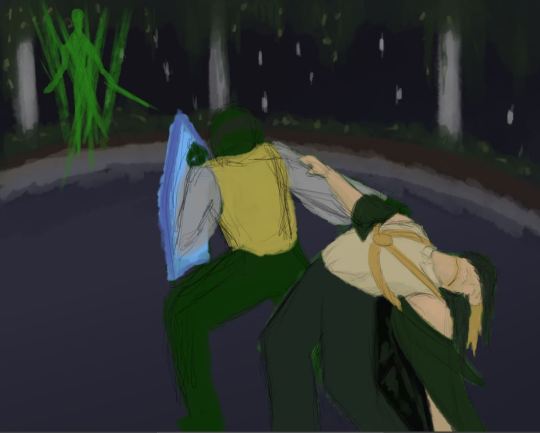
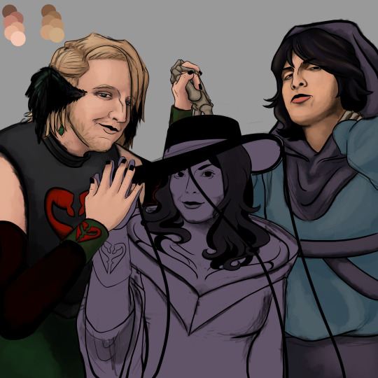
Two hands painting:
Status: V1 abandoned (unhappy with results), V2 future wip.
Timeline: first week of October
We constantly switch to very different art styles due to different alters switching in and out (DID) that causes many projects to go on the back burner from weeks to months at a time. This unfortunately happens to be one of them, Plus we hadn't 100% locked down the character designs for q!Philza and q!Missa yet. Had to completely restart this one because I got so frustrated with Missas face and wasn't satisfied with how it was turning out. (the disdain and resentment I unironically feel towards the first one is immeasurable) This was done by the same alter that did the other death trio piece.

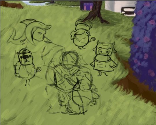
Missa and Foolish with the eggs:
Status: future wip.
Timeline: first half of October
Was still in the sketching phase when it became another victim of the alter switch back burner. Really happy with the progress of it though. (This was the same alter that did the firework Mexican independence day and the Crow Monster comics)
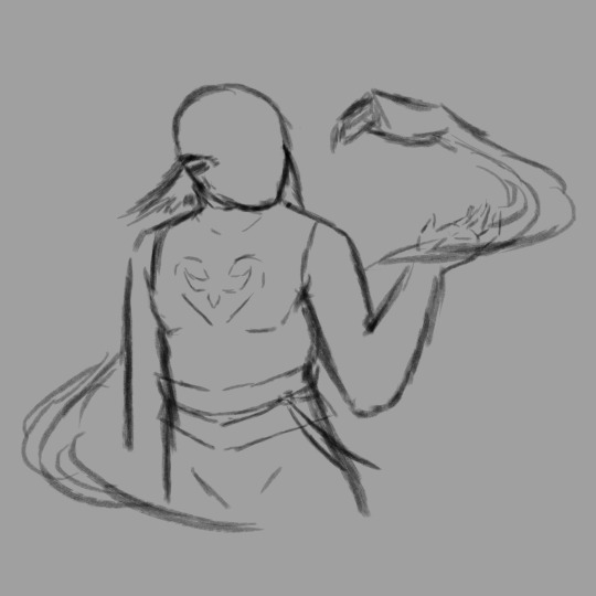
Death room:
Status: current wip.
Timeline: after the stream when this happened
Has been on the back burner since the stream this happened due to still being in the process of nailing down the character design/body build for q!Philza. Just waiting for cord to get here now to finish it. Will probably post q!Philzas character sheet before posting.




Hey thanks for checking out my art! I know a lot of people are newer to the platform who migrated from Twitter so it's just a heads up 🫰. Please consider rebloging and not just liking. LIKES DO NOT DO ANYTHING ON TUMBLR. It's really sad to see a lot likes but only 4 reblogs on a lot of art posts that end up not getting any traction because nobody else sees it after the first 3 days.
Also if you're new, PLEASE CHANGE YOUR PROFILE PICTURE AND HEADER FROM THE DEFAULT! There are so many bots here so most people will just block and report as spam on sight if you still have the default.
#my art#qsmp#qsmp fanart#q!philza#qsmp philza#philza#philza fanart#qsmp philza fanart#qsmp missa#q!missa#death duo#deathduo#pissa#misstrixtin#qsmp etoiles#q!etoiles#missa fanart#etoiles fanart#qsmp code entity#qsmp elections dinner#qsmp foolish#q!foolish#qsmp eggs#qsmp cellbit#q!cellbit#foolish fanart#cellbit fanart#wip#wip collection#unfinished
35 notes
·
View notes
Text
i need some advice for a header im working on i wont be using it any time soon but i like making my about banner at the same time so i just want to know which style people prefer
v1

v2

#like i feel the first one is a bit messy#but i kinda like that???#the second one is brighter and more neat#pls help lol#merengue speaks
3 notes
·
View notes
Text
Banda's Grove Overhaul Devlog - Design, Maps, and Terminology

Why are we overhauling Banda's Grove? See here: https://www.tumblr.com/pandiongames/711176177895735296
This will be a series of design deep dives. We want to share not just what we're changing about the game, but why we're changing it. Perhaps it could help someone in the future. I'll be using "#banda's grove overhaul" tag in each post if you would like to follow along.
Page Design
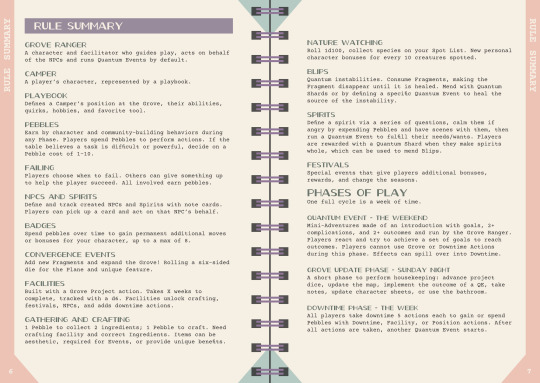
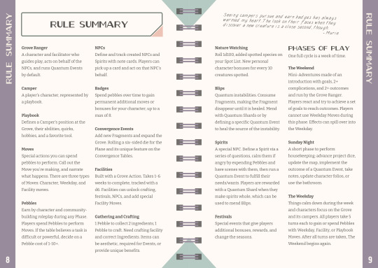
Check out the images if you want an idea of what Banda Grove's current rules are. This isn’t final text in the v2 image by any means, but we’re walking down the path of making new master pages for layout.
A Refreshed Color Palette
The background color is lightened up, and the vibrancy of all the colors is increased just a little bit for further contrast. We played around with changing the palette completely, but after a couple of hours of going back and forth, we decided to tweak the existing one because it feels unique and iconic to BG now.
New and more fonts
We stuck with Oil Can as the header and title font after looking at a ton of different options. This is a special font for me because it is no longer available from Lost Type co-op and hasn’t been for almost a decade now. Back when we started this project, I emailed them to get reconfirmation of a commercial use. I covet and backup the .otf file religiously. That certainly increases the likelihood this will remain a unique look.
But for the body text, we’ve swapped out Courier Prime with three fonts, two of them are on display here. The Paragraph is Bitter from Google Fonts, while the in-game handwriting is KH Sober Draftsman from Kern + Hide.
The callout boxes (post-it notes) in the game will use Ultra-Classified by Kern + Hide - this wonderfully jaunty typewriter/newsprint type of font.
We will be working with columns where it makes sense, but there will be a mix.
This is all to give the book a cleaner, easily readable interior. Previously, I was using different colored callout boxes to differentiate between “in world” notes from Ranger Murie, and game text. Now, however, we can represent that by font styles, which keeps the pages a bit more tidy.
The rectangle and pink triangle in the header is an anchor design and be used throughout everything to tie things together.
Maps, Mapping, and Hexes
We’ve been working the last few days on the mapping system in Banda’s Grove. Please note, things are still influx, and may change more.
Mapping in Banda’s Grove has been tedious at best from the very beginning. It originally had a tetris-style chunk of hexes you could lay down on a massive hex grid. That was replaced with a simpler 19 hex flower, and you started by building out 7 of them to start. But each individual hex also had its detail map of another 7 hexes to track little details. This was a lot to manage, to say the least, and made online games dang near impossible.
I had a big conversation today with another designer on the purpose of a hex on a map, and Banda’s Grove does not have any travel or time mechanics tied to traversing a hex. It is not a hex crawl or point crawl. The purpose of the map is to draw, sketch, and laugh together when you talk about the worlds you’re building.
So, we are getting rid of hex grid and detail maps entirely.
Instead, we are working on implementing a single free form map, plus a shared notebook. We’ll still provide a themed map, but players can also just use the biggest piece of paper they can get their hands on to draw the twisting, winding, Planes converging at the Grove. Players still draw together with Jamboard, Figjam, tldraw, aggie.io, or Miro for online games, or ignore the map aspect completely.
We’ll provide tips on how to setup your shared notebook or gdoc and offer optional templates in PDF and .gdoc formats. We’re investigating other online worldbuilding tools to build templates for them as well.
This change has an additional upside: We can remove an entire technical term from the game, reducing jargon and confusion.
Before, we used the word “Fragment” to denote we were talking about a hex tile in general, and “Plane” to talk about the biome and culture on that Fragment. The word Fragment has now been completely removed from the game, and we only have Planes.
As an example, Maps in Banda’s Grove will become more free form like this, rather than the more bounded hex grid style. And no, I cannot draw. This is why I hire artists!
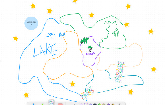
And this actually opens up some interesting possibilities for using mechanics to add limits, encouraging players to use the Convergence Event move, which also risks adding blips to the map, which in turn causes more narrative friction.
I’m playing with limiting the number of facilities you can build on a single Plane - we have to make sure we don’t overcrowd the environment! However, now a Convergence Event can add a new Plane you come up with yourself, or expand an existing Plane (you still need to roll to see which Plane is extended). Extending a Plane doesn’t add any new overhead to your note-taking now. You just continue adding details and notes under the “Cluthar” section.
When blips occur, you still roll a pebble over the map, and the Plane it lands on becomes shrouded in primordial darkness and is unavailable until mended.
Actions, Phases, & Quantum Events
First, let’s discuss a quick term rename I did. We mistakenly used the name “Action” to represent the special abilities of a playbook, facility, or downtime phase that cost a pebble to use. These are now called Moves. This will free up the word “action” for another mechanic to reduce confusion further.
The other piece I’ve been working on is how Phases work. Phases were always meant to represent the passage of a week, but their naming and how I implemented them muddled that, and it was… confusing at best.
I’ve always had this idea that the “Downtime” phase was the weekday, that’s why you have 5 actions to take. One for each day of the week.
The Update Phase was supposed to represent Sunday Evening, when you’re settling in and taking a moment to prepare for the weekday.
And the Quantum Event phase, was meant to be the weekend, a time of adventure, and shenanigans around the campgrounds.
The phases and quantum events have been renamed to reinforce that weekly cycle concept fully:
The Weekday - You take 5 Weekday Actions. You can spend pebbles to perform Weekday, Playbook or Facility moves, or have slice of life roleplay scenes to gain pebbles.
The Weekend - This is when you go on Weekend Adventures! Time to get into and out of trouble, help peoples, and discover hidden mysteries.
Sunday Night - This is the time to settle in after your big adventures, take stock, reduce your dice, and prepare for the Weekday.
Even though these are just terminology changes, they help reinforce the concepts of the gameplay loop, what it means, and connect the mechanical concepts together better.
And speaking of the Weekday Phase, we have simplified the “Downtime Actions” (now called Weekday Moves). Before, you had Downtime Actions. Some were nestled under a “Grove Projects” action, which itself was several possible actions. Wow, that’s confusing. That is all rewritten and organized, so there’s no nesting. Just a list of comprehensive Weekday Moves now.
Because The Weekend is a cleanly defined phase of free form adventuring and roleplay, but with the limitation of not being able to use Weekday or Facility moves, I can also organize gameplay better.
The biggest one here is Events (previously “Festivals” & “Special Events”, also simplified). They were always a free form adventure. They were designed as roleplay heavy, low stress, celebratory “Quantum Events” with boons and bonuses for your efforts - they have an introduction, complications, and your reward for participating.
But, they didn’t really fit in the Weekday phase’s gameplay, where they currently take place. But that’s where they had to live because The Quantum Event Phase was for Quantum Event. As written, it didn’t leave room for anything else.
Now the Weekend is a phase of adventuring where you just can’t use Weekday or Facility Moves, only your Playbook Moves, inventory, and wit. By default, a Weekend Adventure takes place - either one we wrote, or one you create.
However, now an Event can replace that Weekend’s Adventure. There are some Facility Moves that also initiate Events, like putting on a play at the Stage. That will take place during the Weekend in lieu of a Weekend Adventure now as well.
All these little tweaks and changes are to streamline and organize play, reduce jargon and drastically increase clarity.
Until next time!
-Andy
10 notes
·
View notes
Text
Release July 2024
It’s summer! The Screwdriver team is pleased to announce our newest release which brings in new features and bug fixes across various components.
New Features
UI
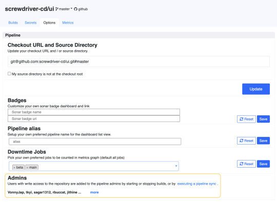
Display admins on pipeline options page
API
Skip execution of virtual jobs - A job can be marked as virtual by adding the annotation screwdriver.cd/virtualJob: true. These jobs will not be executed while processing the workflow for an event, but will proceed with SUCCESS status. These jobs will skip queueing and execution and builds of its downstream jobs will be immediately created to continue the processing of the workflow.
Get repository data from scmRepo without GitHub access - Before this change, extra calls were made to GitHub to fetch SCM repository information. After this change, the API now will pass scmRepo info directly in order to avoid extra GitHub calls. This has been implemented for webhooks only so far.
Pipeline template enhancements: Can customize image, settings, environment, and requires for jobs that already exist in pipeline template, Add new jobs that are not part of pipeline template in user yaml, Flatten shared steps to jobs in pipeline template, Pipeline template validator shows extended configs for job template, Pipeline template validator shows workflow graph
Store
Replace jwt expiration with a config and environment variable - The jwt expiration is currently 13h and is written directly in the source code. This makes it difficult for SD administrators to change to arbitrary values to suit their use cases. Now Screwdriver cluster admins can set the JWT expiration length using JWT_MAX_AGE.
Add handling for the Expect header at onPreAuth - To reduce unnecessary retries when uploading large files, Screwdriver will use the Expect: 100-continue header. The content length can be checked before the body is uploaded. Thus, the HTTP client (store-cli) can receive a 413 error earlier without unnecessary retries.
Bug Fixes
UI
Show workflowGraph for pipeline template validation
Show missing fields in pipeline template detail page
Add test for parameter-utils
New V2 work: Use unified modal style for toggle job modal, Refactor parameter flattening to generalized util, Refactor graph rendering logic, Add v2 secrets route, New confirm action modal UI, case where there are no parameter groups to expand, Clean up the new v2 layout, Refactor pipeline secrets to not use ember data, Refactor to no use ember data for pipeline data, Screwdriver style mixin for Bootstrap buttons, add options to v2 route, Modal for adding a pipeline to a collection, new pipeline header component, Expand default modal styles, Update add to collection modal
API
Add logic to switch to using current user’s SCM token next
Fixed error handling of external trigger
Fix event where a restarted join build is run
Check original job is not archived
Handle API functional testing
Internals
Allow colons to be used in root directory
Allow to cd to rootDir containing special characters
Compatibility List
In order to have these improvements, you will need these minimum versions:
API - v7.0.162
UI - v1.0.967
Store - v5.2.0
Queue-Service - v3.0.10
Launcher - v6.0.200
Build Cluster Worker - v3.1.1
Contributors
Thanks to the following contributors for making this feature possible:
Akinori
Alan
foxtrot0304
Keisuke
Ming
Pritam
Sagar
Tiffany
Vonny
Yuki
Yuta
Questions and Suggestions
We’d love to hear from you. If you have any questions, please feel free to reach out here. You can also visit us on Github and Slack.
Author
Tiffany Kyi, Software Engineer, Yahoo
0 notes
Text
The Ultimate Test Post v2
Welcome to the ultimate test post, a show of strength, wit and only the finest in NPF parsing engineering. Well, as far as the editor will let me go, anyways. The docs for NPF actually have some stuff that you can't do in Tumblr's editor like skipping indentation levels in lists.

In case you don't know what NPF is: it stands for Neue Post Format, and it's the standard for Tumblr posts. Instead of storing post content as HTML, posts are stored as blocks - which pretty much match the ones you can create in the editor. This absolutely
HUGE VARIETY
of the format makes it very fun to parse.
Blocks cover text, images, videos, audio, polls and anything else you could think of.
Text blocks are by far the most common, though they can have many types:
Bigger, roughly equivalent to a <h2> header;
Biggest, roughly equivalent to <h1>;
Quote, mimicking the old quote type;
Chat, mimicking the old chat type;
Lucille, which shows up in a fancy font;
And a handful of indented types as well:
Indented, which is a block quote;
Bulleted lists,
equivalent to HTML's ;
And numbered lists,
for counting all the things, like HTML's .
All of the above are just text blocks with a different type. Separate from the type is the formatting - so, bold, italics, strikethrough, small and mixtures of them all.
Also, colors! The standard blog UI exposes red, orange, green, blue, yellow, pink and purple. As a fun fact - Tumblr's CSS actually has more colors, and these colors that are exposed have names - they're named after Friends characters! I've found that sometimes the old HTML API will return them; othertimes they return just the color code. Sadly NPF only returns the color codes, so this fun easter egg became forgotten.
Links are also formatting - for example, here's a link to your favorite website. Mentions are formatting as well - @knuxify.
Two fun easter eggs that AREN'T part of formatting are:
You can make the tumblr logo by using "[ tumblr ]" without the spaces between the brackets: [tumblr]
Tumblr's font also includes a Tumblr logo character in the reserved codepoint space: (that's Unicode codepoint U+E022 for the curious).
These both utilize quirks in Tumblr's fonts.
Also, if you include up to 3 emoji on one line, they will become big, like so:
😀😄😅
Note that this also works with multi-codepoint emoji (oddly enough, it seems broken in the editor!):
👨👨👦👨👨👦👨👨👦
Also, using another type like "quote" will override the big emoji:
😀😄😅
Note that formatting counts one Unicode codepoint as one character; so, make sure emoji like 👨👨👦 don't break your offsets.
Also, if you're parsing text for display, you may want to escape HTML sequences, or else <style>body { background: blue; }</style> will make your site blue and <script>alert(1)<script> will make a popup appear.
Oh, and once you parse those, make sure that they don't break formatting. Though, after all, a safe website>>>>>>>a bunch of code execution exploits.
A text block represents a paragraph, but it doesn't represent every line break. As a matter of fact, multiple line breaks can be used in a paragraph, and they will all remain as part of one block. Crazy, right?

(I grabbed the first best GIF from the picker, didn't even read the original post. But hey, nice occasion to show off the attribution label, which is also carried in NPF's block data!)
A fun thing about blocks is that you can specify a layout, which contains a list of rows, each of which can contain more than one block. Here's an example:


Images below 300px (so, 299px and below) are displayed at their original size:

However, this is ignored for multi-image rows:


Here's the other block types:
In order: image with "link" attribution, link with header image, link without header image, audio, video, poll.

You can also add embeds:
youtube
vimeo
twitch_live
instagram
...and more that I'm probably forgetting.
Oh, and there's also "read more" functionality:
That's it for the fun formatting tricks. Have fun parsing Tumblr posts, and good luck - you'll really need it.
0 notes
Text
I think the C/C++ community needs the ability to very ergonomically pull down code from URLs like GitHub repos as part of the build workflow - it should be so ergonomic that once you've done installed your compiler, you could write and build a Hello World which uses a third-party library without ever having to ask yourself how to actually get that third party library.
I think if you want to single-handedly revolutionalize C/C++ development, bringing sweeping practical efficiency improvements to developer experience, you write a C/C++ (pre-)pre-processor which can interpret include-style directives like this:
#include-repo "github.com/mentalisttraceur/errnoname"
That should download the specified library. Then update the header search path to include the downloaded directory. Everything else continues to work as normal, so in this errnoname example, you'd still have your normal include right after:
#include "errnoname.h"
If you want to get more fancy with it, go for it, but this is a very simple minimum idea which gets you like 90% of the win.
For serious production use, it will be necessary to support specifying a version or commit for stability and reproducible builds. So for URLs that ultimately target Git repos, we should support specifying an additional string, which then gets used as a tag or commit hash (in that order of precedence, because tags are the canonical way to refer to commits from which an official versioned release was cut, commit hashes work even if the repo doesn't have good tags). Since it is bad practice to be over-specific with dependencies until it's time to make a reproducible build, and since SemVer is such a good de-facto standard for such things, it would be good to also interpret a string like "v2" as requesting the highest "vX.Y.Z" tag. How to specify the string? Well, if we're adding a separate directive, I'd use a second argument/token:
#include-repo "github.com/mentalisttraceur/errnoname" "v1"
If you decide to overload "#include" instead of adding a new directive, I would make it part of the same string-like argument/token instead of adding a second one. Just pick a character that cannot occur in a repo name or URL as a delimeter - perhaps a space?
multiple versions of the same library. Diamond dependency problems are inevitable at scale and when there's no good answer to them, the software will fail.
If you want just one other language to use as reference for this feature, take a look at how Go does it. Go's "import" keyword can take URLs to packages. It downloads the souces to a local cache if you don't have it yet. Then it uses special handling for SemVer-style version tags: if the repo URL has a "v2" at the end,
Key points: the URL-include directive should still target a file, not the repo as a whole. We don't need to come up with some additional extension
From
0 notes
Text
27 Funny Dog Quotes With Images
27 Funny Dog Quotes With Images
Nullam mattis cursus diam vitae porttitor. Vivamus ultrices diam sed vehicula auctor. Donec sed metus et nibh iaculis gravida. Aenean vitae est varius, fermentum justo sit amet, semper tellus. Fusce iaculis elit nec tortor fermentum, sit amet dictum purus lobortis. Sed at ante nec tortor pellentesque convallis. Donec euismod ultricies sem, in ornare risus tincidunt at. Pellentesque dictum gravida…
View On WordPress
#boxed#Featured: 2 equal - stretched#Featured: 3 equal - boxed#Featured: 3 equal - stretched#Featured: 3 mixed v1 - boxed#Featured: 3 mixed v1 - stretched#Featured: 3 mixed v2 - boxed#Featured: 3 mixed v2 - stretched#Featured: 3 mixed v3 - boxed#Featured: 4 equal - boxed#Featured: 4 equal - stretched#Featured: 4 mixed v1 - stretched#Featured: 5 mixed v1 - boxed#Featured: 5 mixed v1 - stretched#Header gradient#Header: Background image#Header: Background pattern#Header: Background Solid#Header: Style v1#Header: Style v2#Header: Style v3#Header: Text on background image#Pagination: Infinite Scroll#Pagination: Infinite Scroll (First load via click)#Pagination: Load More#Pagination: Page Links#positive#stretched#Template: Classic with Sidebar#Template: Classic with Sidebar Left
0 notes
Text
People Are Loving This Dog Who Goes Woof Woof
People Are Loving This Dog Who Goes Woof Woof
Far far away, behind the word mountains, far from the countries Vokalia and Consonantia, there live the blind texts. Separated they live in Bookmarksgrove right at the coast of the Semantics, a large language ocean. 1. Image with share buttons A small river named Duden flows. Source: MediaSource Far far away, behind the word mountains, far from the countries Vokalia and Consonantia, there live…

View On WordPress
#boxed#Featured: 2 equal - stretched#Featured: 3 equal - boxed#Featured: 3 equal - stretched#Featured: 3 mixed v1 - boxed#Featured: 3 mixed v1 - stretched#Featured: 3 mixed v2 - boxed#Featured: 3 mixed v2 - stretched#Featured: 3 mixed v3 - boxed#Featured: 4 equal - boxed#Featured: 4 equal - stretched#Featured: 4 mixed v1 - stretched#Featured: 5 mixed v1 - boxed#Featured: 5 mixed v1 - stretched#Header gradient#Header: Background image#Header: Background pattern#Header: Background Solid#Header: Style v1#Header: Style v2#Header: Style v3#Header: Text on background image#Pagination: Infinite Scroll#Pagination: Infinite Scroll (First load via click)#Pagination: Load More#Pagination: Page Links#procrastination#stretched#Template: Classic with Sidebar#Template: Classic with Sidebar Left
0 notes
Text
Flat-style Artificial Inteligence Illustration For Your Next Design
Flat-style Artificial Inteligence Illustration For Your Next Design
Far far away, behind the word mountains, far from the countries Vokalia and Consonantia, there live the blind texts. Separated they live in Bookmarksgrove right at the coast of the Semantics, a large language ocean. A small river named Duden flows by their place and supplies it with the necessary regelialia. It is a paradisematic country, in which roasted parts of sentences fly into your…
View On WordPress
#boxed#children#Featured: 2 equal - boxed#Featured: 2 equal - stretched#Featured: 3 equal - boxed#Featured: 3 equal - stretched#Featured: 3 mixed v1 - boxed#Featured: 3 mixed v1 - stretched#Featured: 3 mixed v2 - boxed#Featured: 3 mixed v2 - stretched#Featured: 4 equal - boxed#Featured: 4 equal - stretched#Featured: 5 mixed v1 - boxed#Featured: 5 mixed v1 - stretched#Header gradient#Header: Background image#Header: Background pattern#Header: Background Solid#Header: Style v1#Header: Style v2#Header: Style v3#Header: Text on background image#Pagination: Infinite Scroll#Pagination: Infinite Scroll (First load via click)#Pagination: Load More#Pagination: Page Links#parents#sidebar#stretched#Template: Grid
0 notes
Text
29 Ridiculous Tips For Making The Most Of Curly Hair
29 Ridiculous Tips For Making The Most Of Curly Hair
Far far away, behind the word mountains, far from the countries Vokalia and Consonantia, there live the blind texts. Separated they live in Bookmarksgrove right at the coast of the Semantics, a large language ocean.
1. Image with share buttons A small river named Duden flows. Source: MediaSource
Far far away, behind the word mountains, far from the countries Vokalia and Consonantia, there live…
View On WordPress
1 note
·
View note
Text
Millefeuille Dessert With Strawberries
Millefeuille Dessert With Strawberries
Nullam mattis cursus diam vitae porttitor. Vivamus ultrices diam sed vehicula auctor. Donec sed metus et nibh iaculis gravida. Aenean vitae est varius, fermentum justo sit amet, semper tellus. Fusce iaculis elit nec tortor fermentum, sit amet dictum purus lobortis. Sed at ante nec tortor pellentesque convallis. Donec euismod ultricies sem, in ornare risus tincidunt at. Pellentesque dictum gravida…

View On WordPress
#boxed#Featured: 2 equal - stretched#Featured: 3 equal - boxed#Featured: 3 equal - stretched#Featured: 3 mixed v1 - boxed#Featured: 3 mixed v1 - stretched#Featured: 3 mixed v2 - boxed#Featured: 3 mixed v2 - stretched#Featured: 3 mixed v3 - boxed#Featured: 4 equal - boxed#Featured: 4 equal - stretched#Featured: 4 mixed v1 - stretched#Featured: 5 mixed v1 - boxed#Featured: 5 mixed v1 - stretched#Header gradient#Header: Background image#Header: Background pattern#Header: Background Solid#Header: Style v1#Header: Style v2#Header: Style v3#Header: Text on background image#Pagination: Infinite Scroll#Pagination: Infinite Scroll (First load via click)#Pagination: Load More#Pagination: Page Links#positive#stretched#Template: Classic with Sidebar#Template: Classic with Sidebar Left
0 notes
Text
27 Funny Dog Quotes With Images
27 Funny Dog Quotes With Images
Nullam mattis cursus diam vitae porttitor. Vivamus ultrices diam sed vehicula auctor. Donec sed metus et nibh iaculis gravida. Aenean vitae est varius, fermentum justo sit amet, semper tellus. Fusce iaculis elit nec tortor fermentum, sit amet dictum purus lobortis. Sed at ante nec tortor pellentesque convallis. Donec euismod ultricies sem, in ornare risus tincidunt at. Pellentesque dictum…

View On WordPress
#boxed#Featured: 2 equal - stretched#Featured: 3 equal - boxed#Featured: 3 equal - stretched#Featured: 3 mixed v1 - boxed#Featured: 3 mixed v1 - stretched#Featured: 3 mixed v2 - boxed#Featured: 3 mixed v2 - stretched#Featured: 3 mixed v3 - boxed#Featured: 4 equal - boxed#Featured: 4 equal - stretched#Featured: 4 mixed v1 - stretched#Featured: 5 mixed v1 - boxed#Featured: 5 mixed v1 - stretched#Header gradient#Header: Background image#Header: Background pattern#Header: Background Solid#Header: Style v1#Header: Style v2#Header: Style v3#Header: Text on background image#Pagination: Infinite Scroll#Pagination: Infinite Scroll (First load via click)#Pagination: Load More#Pagination: Page Links#positive#stretched#Template: Classic with Sidebar#Template: Classic with Sidebar Left
0 notes
Text
People Are Loving This Dog Who Goes Woof Woof
People Are Loving This Dog Who Goes Woof Woof
Far far away, behind the word mountains, far from the countries Vokalia and Consonantia, there live the blind texts. Separated they live in Bookmarksgrove right at the coast of the Semantics, a large language ocean.
1. Image with share buttons
A small river named Duden flows. Source: MediaSource
Far far away, behind the word mountains, far from the countries Vokalia and Consonantia, there…
View On WordPress
#boxed#Featured: 2 equal - stretched#Featured: 3 equal - boxed#Featured: 3 equal - stretched#Featured: 3 mixed v1 - boxed#Featured: 3 mixed v1 - stretched#Featured: 3 mixed v2 - boxed#Featured: 3 mixed v2 - stretched#Featured: 3 mixed v3 - boxed#Featured: 4 equal - boxed#Featured: 4 equal - stretched#Featured: 4 mixed v1 - stretched#Featured: 5 mixed v1 - boxed#Featured: 5 mixed v1 - stretched#Header gradient#Header: Background image#Header: Background pattern#Header: Background Solid#Header: Style v1#Header: Style v2#Header: Style v3#Header: Text on background image#Pagination: Infinite Scroll#Pagination: Infinite Scroll (First load via click)#Pagination: Load More#Pagination: Page Links#procrastination#stretched#Template: Classic with Sidebar#Template: Classic with Sidebar Left
0 notes
Photo

New Post has been published on https://studyperks.com/six-pack-beer-packaging-mockup/
Six Pack Beer Packaging Mockup

Far far away, behind the word mountains, far from the countries Vokalia and Consonantia, there live the blind texts. Separated they live in Bookmarksgrove right at the coast of the Semantics, a large language ocean.
A small river named Duden flows by their place and supplies it with the necessary regelialia. It is a paradisematic country, in which roasted parts of sentences fly into your mouth.
Even the all-powerful Pointing has no control about the blind texts it is an almost unorthographic life One day however a small line of blind text by the name of Lorem Ipsum decided to leave for the far World of Grammar.
The Big Oxmox advised her not to do so, because there were thousands of bad Commas, wild Question Marks and devious Semikoli, but the Little Blind Text didn’t listen. She packed her seven versalia, put her initial into the belt and made herself on the way.
When she reached the first hills of the Italic Mountains, she had a last view back on the skyline of her hometown Bookmarksgrove, the headline of Alphabet Village and the subline of her own road, the Line Lane. Pityful a rethoric question ran over her cheek, then
[download id=”4252″]
#boxed#Featured: 2 equal - boxed#Featured: 2 equal - stretched#Featured: 3 equal - boxed#Featured: 3 equal - stretched#Featured: 3 mixed v1 - boxed#Featured: 3 mixed v1 - stretched#Featured: 3 mixed v2 - boxed#Featured: 3 mixed v2 - stretched#Featured: 4 equal - boxed#Featured: 4 equal - stretched#Featured: 5 mixed v1 - boxed#Featured: 5 mixed v1 - stretched#Header gradient#Header: Background image#Header: Background pattern#Header: Background Solid#Header: Style v1#Header: Style v2#Header: Style v3#Header: Text on background image#Pagination: Infinite Scroll#Pagination: Infinite Scroll (First load via click)#Pagination: Load More#Pagination: Page Links#procrastination#stretched#Template: Grid#Template: Grid with Sidebar#Template: List with Sidebar
0 notes