#Graphic Design history
Explore tagged Tumblr posts
Visit Tumblr Blog
Explore Tumblr blogs with no restrictions, modern design and the best experience.
Last Seen Tumblr Blogs


Fun Fact
Tumblr Inc. is funded by 13 investors.
Text

Herbert Matter | Graphic Design History
27 notes
·
View notes
Text
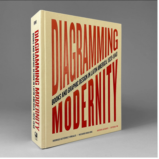


Diagramming Modernity: Books and Graphic Design in Latin America, 1920–1940 This massive publication offers the first comprehensive panorama of the Latin American illustrated book between the 1920s and 1940s, a period characterized by the region's rapid modernization. The books reproduced here encapsulate this transformative era, expressing and embodying emergent national and continental narratives in Latin American countries.
Diagramming Modernity reproduces more than 1,000 illustrated first editions, analyzing the cornucopia of cultural narratives they contain. In addition to showcasing relatively unknown work by many consecrated artists, the publication also boasts an extensive repertoire of avant-garde artists largely forgotten until today.
Chapters are devoted to countries and to specific themes such as Word-Image, Verbal Visualities, Pre-Columbianisms and Ancestralisms, and Social and Political Graphics.
Writers and thinkers Rodrigo Gutiérrez Viñuales, Riccardo Boglione, Juan Manuel Bonet, Mariana Garone Gravier and Dafne Cruz Porchini conscientiously investigate these themes and more.
Edited by Rodrigo Gutiérrez Viñuales and Riccardo Boglione
With texts by Juan Manuel Bonet, Rodrigo Gutiérrez Viñuales, Riccardo Boglione, Marina Garone Gravier, and Dafne Cruz Porchini
Designed by José Luis Lugo
Published by Editoriale RM and Ediciones La Bahía, 2023
Hardcover, 876 pages, 1500 color images, 9 × 12.25 inches
ISBN: 978-8-41-797579-1
#Diagramming Modernity#Latin American graphic design#graphic design books#books about books#Latin American visual history#Latin American graphic design history#graphic design history#Rodrigo Gutiérrez Viñuales#Riccardo Boglione#José Luis Lugo#Editoriale RM#Ediciones La Bahia#Draw Down Books
40 notes
·
View notes
Text

Rare Does It Make Sense? April Greiman 1986 poster from design quarterly I found on auction on ebay right now, ugh dying wish I could get it. She is a graphic design god.
#graphicdesign#creative#art#art collection#rare find#ebay finds#typography#art history#inspiration#expressive typography#female artist#April Greiman#graphic design#museum#MoMa#space age#space age art#midcentury#midcentury design#poster#art poster#graphic design history#interior design#interior decorating#vapor wave#vapor wave design#ebay#auction#swiss modernism#contemporary art
4 notes
·
View notes
Text

X-SMALL
handmade with love
#love#vintage t shirts#head#vintage tshirt#vintage t shirt#vintage#i love you#vintage denim#just women#vintageshirt#los angeles#denim#vintagesweats#vintagesweatshirt#Vintage T Shirts#650 TShirts#graphic design history#fashion history#fashionbooks#fashionbooksmilano#vintage tees#graphic tees#vintage shop#beauty#pretty#eyes#lips#sexy#hot#beautiful body
6 notes
·
View notes
Text
Hey there, friendly visitor! Are you having a lazy Sunday? Do you want to learn more about graphic design? Are you a fan of Ikko Tanaka's cool theatre posters?
Then you'll be delighted to know that "Ikko Tanaka's Abstract Visual Noh" has now been published online! :D

Ikko Tanaka's Abstract Visual Noh (2024, March 17) can now be accessed at inkbrushmood.com/articles/tanaka-abstract-visual-noh
Comments, questions, and reblogs welcome! It's a flipbook type of thing so no downloads yet, but it will be on-site soon :)
#IKB VOL. 2 COMING SOON#ikb vol. 2#graphic design in japan#graphic design#art history#graphic design history#art#poster design#theatre design#ikko tanaka#nihon buyo
6 notes
·
View notes
Photo

Graphis 09-10, 1945. Cover design by Hans Erni (via Graphis - An inspiring magazine from cover to cover - Design Reviewed)
8 notes
·
View notes
Text
Rosław Szaybo: The Mastermind Behind Iconic Album Covers
Rosław Szaybo, a Polish painter and graphic designer, left an indelible mark on the music industry with his iconic album covers. His work for artists like Elton John, Judas Priest, and The Clash shaped the visual identity of popular music from the 1970s to the 1990s. Szaybo’s distinctive style, honed at the Academy of Fine Arts in Warsaw, blended elements of the Polish School of Posters with a…
#album cover designer#graphic design#album designer#album#album design#albums#album art#album covers#Friday#Friday Feature#graphic designer#famous graphic designer#Judas Priest#Elton John#graphic design history#Final Friday Feature#Rosław Szaybo#album artist#album cover artist
1 note
·
View note
Text
United States Federal Design Improvement Program
Back in 1972, in an interesting chapter in design history, President Richard Nixon and NEA Chair Nancy Hanks introduced the United States Government to the Federal Design Improvement Program. This program sought to overhaul and redesign the current standards in design within the different organizations of the United States Federal Government. What was originally considered dull and unadventurous design, shifted briefly to a style that was more bold and lively.

One of the most notable logos to have come from this time was the NASA worm logo, designed by graphic designers Richard Danne and Bruce Blackburn. The FDIP's influence was widespread amongst the the US federal government. It was safe to say, that design had become a necessity, and served an important purpose in not only improving the visual identity and communication of the US government, but also sought to improve the thoughts of the people surrounding the government. I think that Nancy Hanks said it best in her closing speech at the First Federal Design Assembly:
-
“Today, instead of a few isolated people, there are ranks of administrators who equate good design with good government.”
-
It is true, design has the power to influence the thoughts and feelings of people, and overall tell a story that can allow you to look at a brand in a different light. While unfortunately, the standards put into place from the FDIP did not stick and the sectors of the United States government eventually went back to their old standards in 1981. Though, small elements of this era of US design history still remain today, particularly in NASA, as in 2020, they adopted the "NASA worm" as a secondary logo type. I came across this chapter of design history after finding a video on it by Phil Edwards (link below). It ultimately peaked my interests to pursue it a bit deeper. I'd highly suggest the video to anyone who is interested in this kind of stuff! There is honestly so much more that I can talk about in this topic, so rather than go on and on, consider this an introduction to the topic!
If you want to read more:
youtube
#graphic design#history#graphic design history#art history#united states#1970s#1970s history#Youtube
1 note
·
View note
Video
youtube
In the Archives | Researching Latin American Graphic Design with Ramon T...
#youtube#galleryyuhself/Ramon Tejada#galleryyuhself/graphic design videos#galleryyuhself/Latin American Graphic Designers#galleryyuhself/graphic design residencies#tumblr/Ramon Tejada#Ramon Tejada#graphic design history#latin american graphic design history
0 notes
Text

#black community#original photographers#black people#artwork#graphic design#black art#black power#black history#black culture#black family#black panther#black girl magic#black girl art#black beauty#black love#white man love black woman#black tumblr
2K notes
·
View notes
Text
Rationing Insulin.
I have been rationing my insulin at the expense of my health because I simply do not have the funds to replace pens. As a result my blood sugar has been spiking and staying stagnant at dangerously high levels.
Venmo: EnyaSaint
CA: $Enyasaint

I do not know or want to know what possessed me to ration my medication knowing I could possibly die from it. I haven’t been in my right state of mind in a while.
Currently I am on the medication Toujeo and I am uninsured so I have to pay out of pocket. So I am utilizing GoodRx to get me the cheapest option. I would be so immensly grateful to anyone who could spare towards my medication. I am running dangerously low and I don’t want to die from DKA.
Goal: $365

Venmo: Enyasaint
CA: Enyasaint

#graphic design#grunge#gym#haikyuu#haircut#hairstyle#halloween#thanksgiving#handcrafted#harley quinn#harry styles#harry potter#haute couture#hilarious#history#home#home decor#homework#gems#diabetes#SoundCloud
1K notes
·
View notes
Text

El Al | Dan Reisenger | Graphic Design History
14 notes
·
View notes
Text
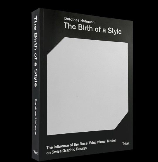
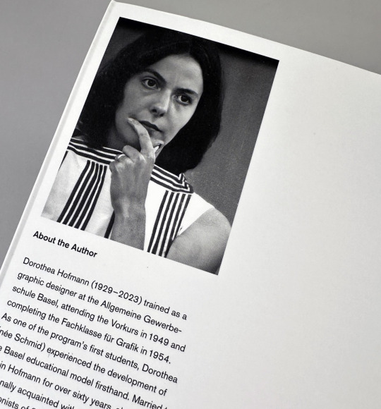
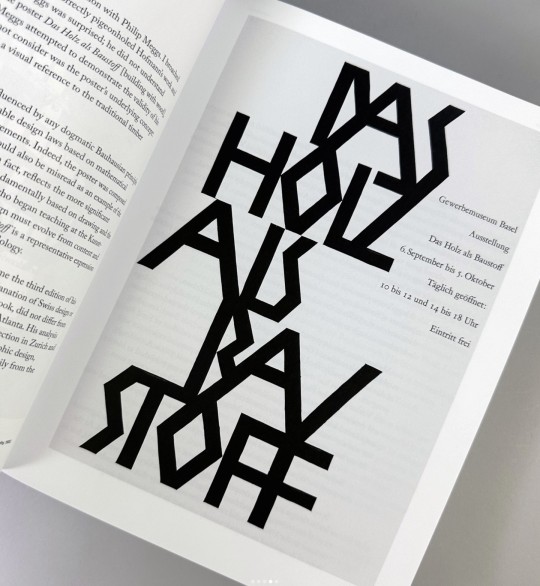
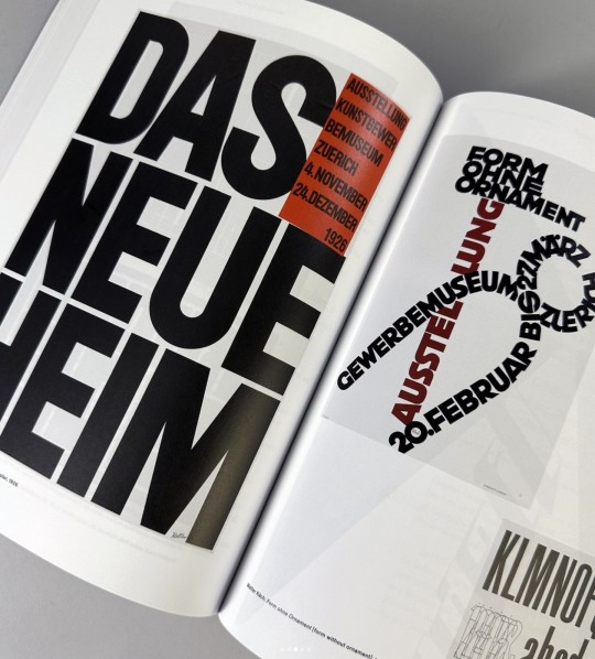
The Birth of a Style: The Influence of the Basel Educational Model on Swiss Graphic Design
By Dorthea Hofmann
Designed by Matthias Hofmann
Published by Triest Verlag, 2024
Softcover with flaps, 472 pages, ca. 400 color and b&w images, 7.5 × 9.8 inches
#graphic design#graphic design books#Swiss Style#International Style#Armin Hofmann#Dorthea Hofmann#Basel Educational Model#Swiss Graphic Design#graphic design history#Draw Down Books
20 notes
·
View notes
Text
It's really cool that so many people have written books on how exactly to do their very specific jobs.
I'm looking through books on archive.org to see if maybe I can find some cool fonts in any of them, and there are books with names like "The complete carriage and wagon painter : a concise compendium of the art of painting carriages, wagons and sleighs, embracing full directions in all the various branches, including lettering, scrolling, ornamenting, striping, varnishing and coloring, with numerous recipes for mixing colors" (1903), "Elements of lettering and sign painting" (1899), and "The expert sign painter" (1911).
I have no intention of becoming an Edwardian sign painter, but it's comforting to know that there's such a thorough introductory course available at any time should I ever change my mind.
#now if only 18th century tailors had written such thorough guides about the actual sewing... alas.#books#19th century#20th century#history#graphic design
541 notes
·
View notes
Text

Even Cowgirls Get The Blues
Flying away
#vintage t shirts#love#head#vintage tshirt#vintage t shirt#vintage#i love you#vintage denim#just women#vintageshirt#los angeles#denim#vintagesweats#vintagesweatshirt#Vintage T Shirts#650 TShirts#graphic design history#fashion history#fashionbooks#vintage tees#graphic tees#vintage shop#cowboys#cowgirl
1 note
·
View note
Text


Minoan Pottery Poster #1 | #2
#graphic design#posters#art history#print design#artifacts#greek history#poster design#minoan#ancient art
735 notes
·
View notes