#Focal Point
Explore tagged Tumblr posts
Text

Painting (1986) Walter Robinson
1K notes
·
View notes
Photo

~ Contrast ~
#hot chocolate#fall#autumn#pumpkins#colorful#autumn aesthetic#contrast#focal point#steam#digital art#still life
110 notes
·
View notes
Text
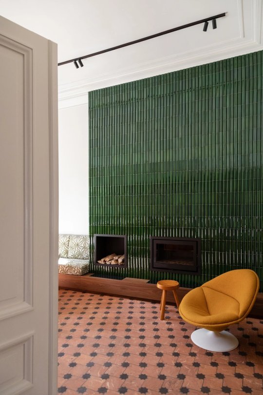
The green tile fireplace is the focal point in this space.
#green#tile fireplace#tiles#fireplace#modern fireplace#fireplace designs#wall feature#focal point#yellow chairs#may#spring#toya's tales#style#toyastales#toyas tales#home decor#interior design#modernist#modern home#modern design#home decorating#design#decoration#decor#decorate#home improvement#home inspo#home interior#interiors#interior
102 notes
·
View notes
Text


#art#headers#dividers#dividrs#fypツ#fyppage#colorido#anime icons#foryou#gif#fast and furious#furina#focallette#focalors#focal point#twst azul#azul#azur lane#branco twins#genshin x reader#genshin icons#genshin impact
122 notes
·
View notes
Text
Ukraine really is a lens thru which to see who cares about freedom and who couldn't care less about it...
#ukraine#freedom#not all it is of course.#focal point#front line#just as russia is example of unfreedom#lines r drawn if u can see!!#truth#justice
6 notes
·
View notes
Text

Pinterest • https://www.pinterest.com
18 notes
·
View notes
Note
Hello Krikkit 🤎
Your reblog with the height difference prompts is LeviHan coded to say the least! I can't stop thinking about that!
I know I already sent a request but if you're not too busy and if you're interested, could you write something (headcanons or drabble) with the "the shorter one insisting they're going to be the big spoon" starter?
I can imagine Levi's grumpy face already! Maybe Hange will gently convince him otherwise? Maybe it's fine he's the big spoon after all? What do you think?
Thank you and take all the time you need!
🤎🤎
ps: it's fine if you don't feel like taking this prompt of course! No pressure!
omg Livia listen!!! first of all, i'm so sorry, this ask is almost a year old, i'm the worst writer ever 🫣
but, the thing is that prompt hit right around the time i was determined to write a "fake relationship" trope for levihan, and your idea merged with that one to form a monster of a wip that's nowhere near the "headcanon or drabble" you requested here, one that was missing some key ingredient i couldn't find... until last week, when i received the prompt that's responsible for Light and everything CLICKED.
so, again, apologies for the wait, and a thousand thank yous 🖤 for helping me find a way to write this fic that i'm so very excited about and i hope you'll like!
Camera, chapter 1 - 👉 read on ao3
series: part 2 of Focal Point
ship: Levihan
rating: Teen and+
summary:
A nosy shipper asking inappropriate questions, actor Hange Zoë’s occasional misunderstanding of English idioms, and (a hoard of) fans recording the moment. Apparently, that’s all you need to break the Internet.
additional tags: Alternate Universe - Actors, POV Levi Ackerman, Misunderstandings, Miscommunication, Hange Zoë's First Language Is Not English, Tumblr Prompt, (except i took a lot of liberties sorry Livia hehe), Pining Levi Ackerman, Fake/Pretend Relationship
#levihan#shingeki no kyojin#attack on titan#levihan fanfiction#aot fanfiction#snk fanfiction#aot#snk#levi ackerman#hange zoë#snk actors au#my stuff#this has been a writing wish of mine forever i'm SO EXCITED#(.... yes i'm aware i have other multichapters to finish)#focal point
23 notes
·
View notes
Note
Your Mustsumi piece is really stylish! How did you do the backgrounds and come up with the composition?
Thank you so much! :-) I feel it's appropriate to respond to this ask on Mutsumi's birthday hehe. Forgive my weird wording btw (if it seeps in) as I am unfortunately strange like that (and feel free to ask away any questions!)
Summary: Modify already existing patterns, the darker your white is the better (trust), focus on the focal point, and Man I fucking love triangles.
First on the background (with a hint of color theory):
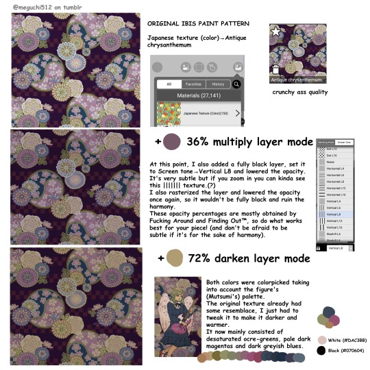
I took it from the Ibis Paint X image-archive-thing (???). It's actually a nice resource for stuff like this. If you use a different drawing platform try looking for your own in-app/in-program archive or consider searching online. In Ibis Paint X, not all patterns are available for non-premium users but personally it's not much of an issue (especially since non-premium versions of these textures tend to exist, with different colorings).
There are tons of these available by looking into the Japanese Texture (Color), Cloth Patterns (Color) and Patterns (Color) sections. Personally I prefer to alter the already colored ones as they are easier to work with, while the Gray/B&W ones require more retouching with blend mode layers. However, feel free to experiment and use whatever works best for you.
I was lucky to find one with a similar color palette to my drawing, but there's still some tweaking to be done to make it darker and warmer (as stated in the image). In this drawing it was relatively straightforward, though I've previously had to make more detailed modifications in other ones to make everything blend in naturally (mainly painting over different elements and particular shapes).
There's no rule for the specific blend modes –as in, they don't necessarily have to be multiply + darken, and there's no need to restrict yourself to solely 2 layers either. The same could be said about the opacity. It's merely situational. Instead, try playing around with them and/or learn how each one works to be able to pick them quicker.
For example, once I had applied the multiply layer something still felt off: there was a lack of ocre tones, which had been cancelled by the purple-ish color I painted it all over with. I especially wanted the darker colors to lean towards purple, while making the lighter ones lean towards green, so I applied a green darken layer which mainly affects the tones closer to white.
On a separate note: Color theory yay!! I freaking love color theory!!! As you can see in the bottom corner, I didn't use (and don't tend to ever use) pure white (#FFFFFF) or pure black (#000000). Actually, some artists will strongly advise against doing so, saying it looks beginner-like and muddy. I slightly disagree with this, or at least I think it's a bad way to put it (I mean, have you seen comic art? Pure black shading can look great when done well).
However, it's true that beginners won't be great at using pure black/white and it's greatly beneficial to experiment with off-white and such. Adding a slight tint to your neutrals makes a nice difference, and IMO the greater you can make it stray away from its original tone and still make it look convincing, the better!
By the way, notice how there's no "white" or "black" in the background? I reserved these contrasting tones for the figure. This is to draw your attention towards her, instead of adding more contrast to the background and making it all overwhelming.
Anyways, here are some other drawings in which I also used modified preset Ibis backgrounds:
• These KanaMafu drawings. It's the same pattern in both drawings, just flipped vertically and with inverted colors.
• This Kanade drawing.
Now, moving onto composition:
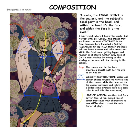
Not gonna lie, this was all a pretty subconscious process. I actively had to look for the principles I had applied, because honestly "figure in the center of a vertical canvas" seemed simple enough for a composition, but there's more to it!
I honestly feel like this is very self-explanatory as shown in the image, but if it isn't please ask me to elaborate B-).
Note: regarding the "airbrush work" mentioned, I meant I slightly painted over with a dark airbrush towards the bottom of the canvas and then lowered the opacity. Again, the whole thought process here was Closer to the focal point = lighter colors, smaller shapes and more detailed brush strokes.
But! There's more!!!:
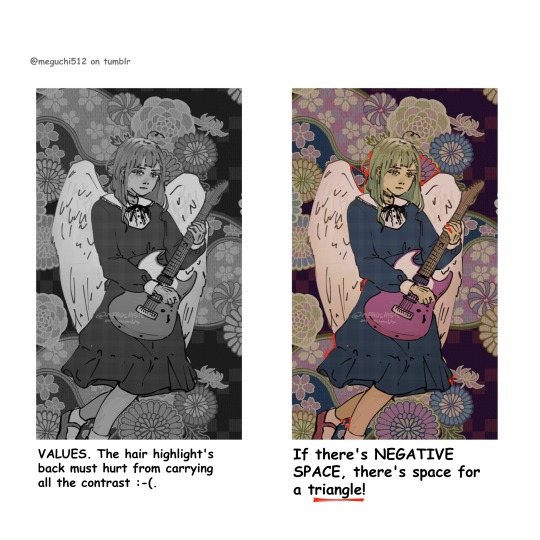
Still on composition and color, something that is extremely useful and that I unfortunately forgot to do while working on this drawing is to check your values. This means translating the piece into B&W.
Due to the fact that I didn't check my values, the hair sort of blends in with the background. Upon noticing this, I added a highlight the same color as the angel wings (off-white). This was useful at making more of a distinction, but I could've definitely pushed it further had I followed this advice.
Onto (probably) my favorite art advice ever: TRIANGLES. Use triangles whenever you can. ESPECIALLY when there's negative space (space not occupied by the figure). This works so well to make your silhouettes more legible and dynamic. It's a life-saver.
Also, look up Sinix Design and Marco Bucci on YouTube for some great art advice.
I'm pretty sure that's all, sorry for becoming the yap monster. I really hope this was helpful! Thanks again for your ask and have a nice day/afternoon/night.
#art#my art#digital art#artists on tumblr#art tutorial#art advice#color theory#composition#line of action#focal point#negative space#i think that's all tagged :-P
7 notes
·
View notes
Text
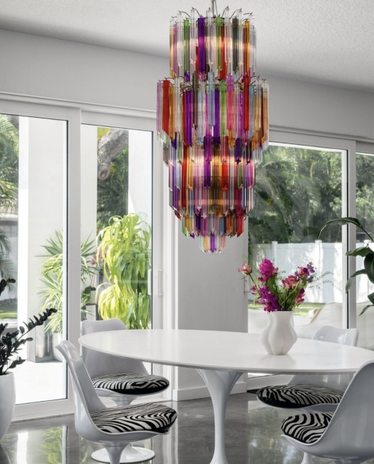
IG lisagilmoredesign
#chandelier#cascade of color#white room#pops of color#dining space#open concept#focal point#interior design
37 notes
·
View notes
Text
⇐ Intro! | 🐭 | Page 2 ⇒
At Dr. Zo's favorite coffee shop, The Purple Bean!!
Music: Robin!
Sound Design: Levi!
If you would like to participate in the interactive nature of this series, become an Elite patron or view series over Twitter as it comes out!
29 notes
·
View notes
Text
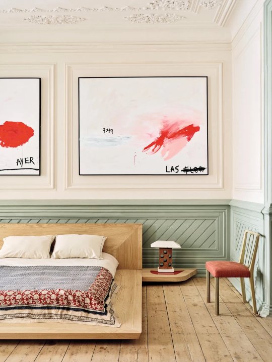
Art is the main focal point in this bedroom.
#focal point#focus#art wall#art appreciation#art aesthetic#abstract#contemporary art#wainscoting#platform beds#april#spring#toya's tales#style#toyastales#toyas tales#home decor#art#interior design#home decorating#decor#decorate#transitional bedroom#bedroom#bedroom furniture
74 notes
·
View notes
Text

beech forest up and down Poland, October 2022
#forest#trees#focal point#fall#autumn#change of viewpoint#water#puddles#mirrors#leaves#paths#wanderlust#gloomy#dark#mood#small things#wild nature#woods#photographers on tumblr#original photography
20 notes
·
View notes
Text
Can people with near sightedness see something far away if they use a close mirror?
People who can only see with glasses need them because their vision has degraded. And the structure of glasses is to enhance the image by placing a focusing apparatus a certain distance from their eye to get sharpest quality of what they're looking at. --Similar to how we use magnifying glasses and microscopes to see something outside of our regular range of vision-- right? At least that's the premise.
Cameras taking pictures, specifically old cameras, and not digital cameras, but also digital cameras. Expose themselves to light to capture the detail, which is engrained into some film or sensor. I remember hearing that the negatives of film cameras have all the detail up to extremely fine detail, but the method we had to expose them made the quality get loaded. Similar to how with increased pixels, we can sharpen the image of what is on a screen. Or polygons in 3D design in games.
Mirrors and other reflective surfaces reflect whatever light photons/waves hit it. Now the amount of light does decrease depending on how much light is absorbed, because mirrors are not perfect reflective surfaces.
So my question is this: would a near sighted person, one who cannot see far away from them, be able to see detail or far away objects, which they could not normally see, with clarity as if it was that close to them by using a handheld?
I will clarify that the person can read letters on a page very crisply at 10-12 size font at an arms length. However, no magnification of the object occurs. It is that simply what they are seeing is now "closer to them" because it is on the mirrored surface
My thought is that yes they could. Because it would be as if they had a picture or video of the thing they are looking at with great detail.
I want to know what anyone else thinks? I’ll do a poll for simplicity
#random polls#opinions#stem academia#stemblr#actually adhd#science hyperfixations#mirror#glasses#nearsightedness#optometry#focal point#eyes#I can’t see and I was staring at a tree that was blurry#then I flipped my mirror sunglasses and I thought I could see better#but I was like maybe I’m high#dude I’m so curious
5 notes
·
View notes
Note
I see you know alot about this case, but does that mean you have any ideas on who could be causing these murders? Like, any hypothesis'?
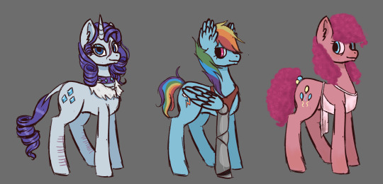
"Well I might not have much evidence but some weird things have happened in ponyville since rarity, rainbow and pinkie split off from princess twilight, fluttershy and apple jack. I suspect that they know what's going on or they're the culprits. sadly i cant investigate properly unless i have a warrant which i dont have enough proof to gain. Its why im here, to hopefully gain enough information to catch them or even get a bit closer to the truth"
13 notes
·
View notes
Text
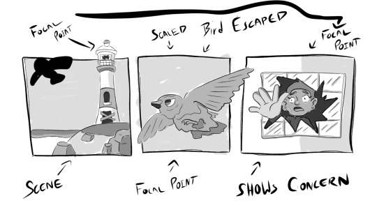

Focal Points + Scale Studies - Concepts
#art#artist#artwork#newyork#new#york#cute#kawaii#cartoon#concept#character concept#concept art#conceptual#background art#focal point#scale figure#scale#cartoon characters#original charcter#character art#character illustration#illustrator#illustration#illustrative art#scene#studies
2 notes
·
View notes
Photo
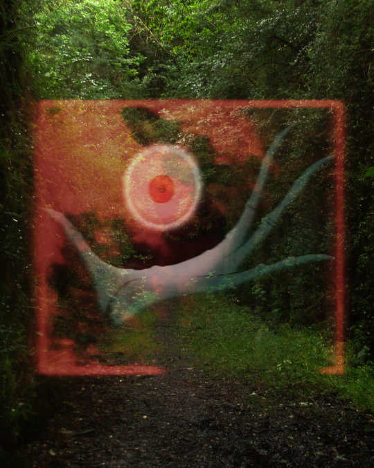
Fomorian Vein - Focal Point
Fort Evil Fruit
2020
15 notes
·
View notes