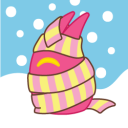
#Finally added colour and I changed up a few things from my first versions of the design
Explore tagged Tumblr posts
Visit Tumblr Blog
Explore Tumblr blogs with no restrictions, modern design and the best experience.
Last Seen Tumblr Blogs


Fun Fact
US Tumblr user growth rate is estimated to slow down to 4.1%.
Text

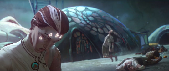
My take on The Beast from Chapter 3 of Candela Obscura🕯️
#Finally added colour and I changed up a few things from my first versions of the design#She has antenna now along with spines on her arms and long finger-claws#Since there are more designs floating around now I did my best to not be influenced by them and stick to only what I saw in my minds eye#(With a few variations as I looked at refs and properly mixed things together)#Anyway here they are with and without tattered clothing!#candela obscura#candela obscura fanart#candela obscura tide and bone#elsie roberts#monster design
48 notes
·
View notes
Text
Code Lyoko Chronicles 2.0
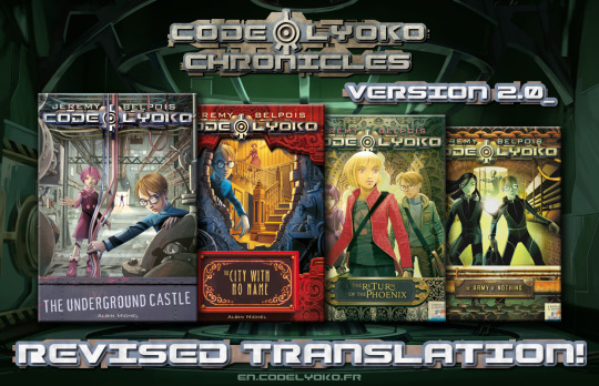
The Code Lyoko Chronicles are a series of 4 sequel books originally released in Italian in around 2010. Set a short while after the season 4 finale, parts of book 1 recap a story similar to the TV series but with a number of small changes (there's no RTTP for example) while the gang uncover some new secrets in the Hermitage that set them on the path to finding Aelita's mother, Anthea. But XANA survived and is coming back for revenge, and the gang's investigation into the secret history of Franz Hopper, Project Carthage and the Supercomputer puts the men in black on their trail as well, not to mention the shady Green Phoenix organisation who funded Hopper's work.
The books were published in a number of languages, but not in English - so that's where the fans come in. As one of the first translation projects we did for CodeLyoko.fr, finishing in 2014, the original completed English release was pretty rough. 10 years later, armed with more translation sources, better resources and many years of translation experience, I decided to take another crack at it. And after many months of hard work and procrastination, I've produced a version 2.0 that I'm pretty happy with.
Links and notes on the various changes under the cut!
New translations!
My co-translator Kelsey and I didn't have a lot of serious translation experience when we picked up where Rhys Davies left off in his English translation project, and we were definitely prone to making mistakes. And it didn't help that for books 3 and 4, a few things got lost somewhere in the process of the text being translated from Italian > Spanish > French > English. I revised our original translation and this time I referenced multiple sources to try and make sure I got the interpretation right. It won't be perfect, but it's definitely better than our original attempt!
The second half of book 2 was based on the official French version, which I discovered was slightly condensed and abridged to lower the page count. The new English translation expands the text to restore the parts that were omitted. I also changed the title from The Nameless City to The City with No Name - there was never an official English translation, but I did find a marketing document with the titles listed in English, and that was the only one that differed.
Here's a page comparison with a few changes, mostly minor, but one big change to the context of Odd and Ulrich's conversation. With my apologies to Kiwi for the original mistranslation.
New formatting!
I got better at formatting Word docs and realised I should have the text alignment set to justify. The books look a lot neater now!
Accessibility!
I added alt text descriptions to all the images, and the PDFs all have a proper table of contents now so you don't have to scroll to the end of the book to find the navigation.
(Note I don't have a lot of experience with detailed image descriptions and I haven't done much testing with a screen reader - feedback is welcome from people who know more about it!)
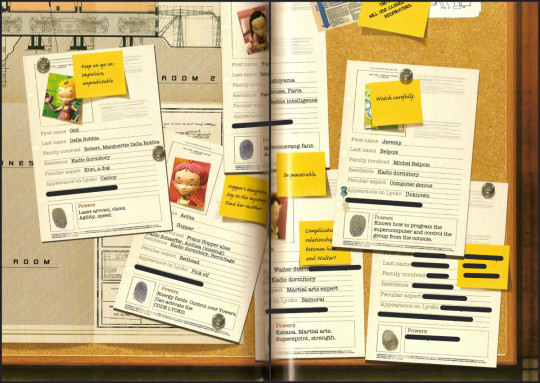
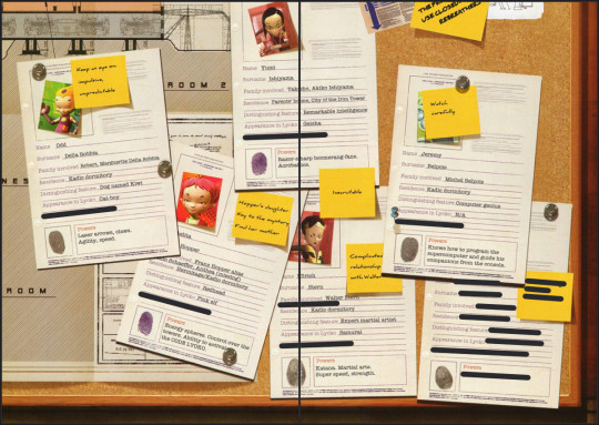
New scans!
The centre of each book has several colour pages with images and text to supplement the story, and some of the original scans were quite small or had part of the image disappearing into the spine of the book. And the only way to fix it seemed to be to obtain physical copies of the books (probably in Spanish), pull the pages out and scan them flat. So I did. And I think they look great. (Black lines added to hide spoilers.)
My original intention was to upload these to CodeLyoko.fr, but I haven't been able to do that yet, so for now they'll just be available on Google Drive. This translation wouldn't have been possible if not for the other people on the fanslation team - not just my fellow translators, but also all the people who worked on scanning, formatting and editing. Special thanks also to Rhys Davies for kicking off the English translation. You can read more about the Chronicles and the fanslation project here on the website. (Yes I still need to revise the translation of those pages too. Someday.)
So yeah, it's taken a while, but I'm glad I can finally put out a better version of these books for people to discover. Enjoy!
Version 2.0 PDFs here! (Google Drive) ePub versions coming soon.
67 notes
·
View notes
Text

[TLDR: me attempting to make sense of the Arcane's eldritchness, which sounds ironic in hindsight but hear me out]
Revelation after revelation aside, there are many pieces of foreshadowing that tell us why Viktor's commune wasn't as great as it seemed.
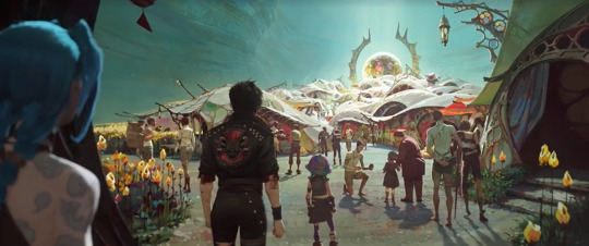
Visually speaking, all the clues are right there.
The first thing we see of the slums of Zaun is this.
Vi, leading their little group, is astonished to find such a thing—and to think that Huck was there, serving as one of its ushers! Huck, who she immediately calls a filthy traitor; having succumbed to shimmer the last time she saw him—meaning he'd turned to Silco both literally and figuratively—what with his use of the drug and the fact that he'd ratted her and Caitlyn out to the tycoon.
Miss Ma'am is bamboozled.
How the hell did he end up there? At this...paradise? At the slums, which, only a few weeks or months ago; was still dark, dusty, violet, and violent!
Something has changed, obviously; and Huck himself admits that his past was him 'at his worst'. Simply awful. But the Herald had saved him. And because of that, he was leading a better life, now. Naturally, at this point, Vi and Jinx seem wary.
There's gotta be a catch, no?
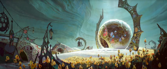
The landscape and the characters exemplify this.
Let's start with the land itself. Look at how empty it actually looks. Yes, there's a field of flowers. Yes, there's a community, teeming with life. Yes, it's literally heaven. But the lighting. The colours. It's so...bleak. Like a dream. The mountains are green, but they're cast in grey and white; and added with the negative space, there's an eeriness to it that contrasts Piltover's version of an eutopia.
You can argue it being the vast resource difference, as Topside is the superior city for a reason, but the commune is still filled with numerous individuals with just as much creativity as their counterparts. Intelligent and sentient beings—people, with minds to set to whatever task may be at hand.
Now, let's think of the people.
The biggest difference between the two communities is this: the 'healed' of Viktor's paradise wear only one mode of dress: white. It's almost uniform—which is notable, as, previously in the episode, Viktor speaks of 'chaos'. We see how fascinated he was by the mess that Vander's psyche had become, and in an attempt at detangling that chaos, he was 'setting things right' inside the man's mind. Bringing him back to something resembling normalcy. Order.
This is particularly significant for the fact that, in the game, he's remembered for his philosophy on glorious evolution (also mentioned in the show, as we know)—which is centred on the enhancement of the human body to transcend its fleshly limits.
Piltover, in contrast—and by extension the 'unhealed' of Zaun—go against this code. We see shimmer addicts, we see corrupt individuals, we see bigoted populations, we see conflict between the cities. We see human nature at its finest. Even the episode titles, all the way from Season 1, display this.
S1E1: Welcome to the Playground S1E2: Some Mysteries are Better Left Unsolved S1E3: The Base Violence Necessary for Change S1E4: Happy Progress Day! S1E5: Everybody Wants to Be My Enemy S1E6: When These Walls Come Tumbling Down S1E7: The Boy Saviour S1E8: Oil and Water S1E9: The Monster You Created S2E1: Heavy is the Crown S2E2: Watch It All Burn S2E3: Finally Got the Name Right S2E4: Paint the Town Blue S2E5: Blisters and Bedrock S2E6: The Message Hidden Within the Pattern
Again, human nature. Colourful, tumultuous, unsynchronised. A need for knowledge. A need for violence. A need for change. A need for exploration. A need for control. Everything that we can have, we take.
That's the point of Viktor's quote:
I understand now. The message hidden within the pattern. The reason for our failures in the commune. The doctor was right—it's inescapable. Humanity. Our very essence. Our emotions—rage, compassion, hate. Two sides of the same coin, inextricably bound. That which inspires us to our greatest good is also the cause of our greatest evil.
It's a paradox.
This is a sophisticated conjuration. A singularity, simultaneously self-replicating and self-annihilating.
He wasn't just talking about the Arcane. It wasn't just about that 'voice' he and Sky heard when gazing at Jayce through Salo's eyes. It's also about humanity.
So, how does that relate to his commune?
Here's the thing: it looks like heaven, but later on, when Viktor dies and everyone else follows, it's practically limbo. It's liminal. Initially, you only have the vague sense that there's something off about it, but you can't tell what. It's filled with people, yet at the same time, it looks like it shouldn't have any to begin with. Mysterious. Suspicious. Almost dreadful; something that makes you realise: if you think about it too hard, you'd drive yourself insane.
There's something intrinsically natural about the commune, something untouched by human hands; but there's also something intrinsically human about it, something unnatural, cultivated in a way nature itself cannot replicate. That's the catch. It should be a balance of both. An ideal community would show this.
Viktor's connection to the Hexcore tells us that he's, in part, transcended both humanity and the natural world. He's breached the ineffable and the incomprehensible, and brought it into the existence(s) of those who could know of and experience it. Bringing 'paradise' to those who were never meant to realise what it was. Forcing onto them the Arcane, even when done with the best intentions.
For the suffering Zaunites, they have everything they could possibly want: food, water, shelter, rest, belonging, peace, survival; the life that they once could only dream of having. It's perfect. They don't have to be in pain, not anymore.
But the commune is isolated. This is very much seen in the gate symbolism: all are welcome, but once inside, you'll never want to leave. You'll never have to. Because to be cured by the hands of the Herald means to bear his mark. To be saved is to bind yourself to him.
The open archway is also a taunt: the gate is open, it'll always be open, but would you ever risk going back out? Would you really trade this for anything else?
Are you truly willing to leave paradise? Are you truly willing to part with the Arcane?
The Arcane, which had given them everything they'd yearned for through Viktor.

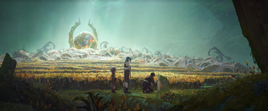
Now, see here: Vi catches a glimpse of Singed exiting Viktor's abode. It's presumably the healing tent, as his main 'bubble' (the place where he 'recharges', so to speak) is the one in the distance.
The point is: Vi sees Singed leave the healing tent. What makes this suspicious is the fact that the man left unhealed.
Note that, prior to this point, the sisters have reconciled and were even willing to stay in this little underground haven despite their initial scepticisms. They, just like everyone else, have been lulled into the comfort the commune provided. So, to see someone else suddenly exiting Viktor's watch—someone with no traces of the Herald's touch, someone who's still bandaged and deformed—is a wake-up call.
Why else would you go into the healing tent, to the commune, if not to have yourself cured or seek respite? Why is this man, who'd obviously be easier work to deal with compared to Vander, not 'saved'?
Vi follows him. Then, Singed leaves the commune entirely.
In her eyes, someone had willingly turned away from 'paradise'.
Logically, this begs the question: Why?
Because that's where the fantasy ends.
Right as Vi comes to the gate, the camera cuts to that Noxian spear upfront. A threat to the 'perfection' that existed within the borders. A reminder that the world outside still exists; a world that Viktor hasn't touched in its entirety, a world that still begs to be saved, a world that is still human at its core brimming and simmering.
That's the reason Viktor's named a herald: he's an omen. He'd brought about a transformation to those he healed. To the slums. Providing a drastic shift in people's lives (or whatever 'life' still counted for those he'd influenced) that left many devastated when Jayce blew a hole in his chest.
By spreading the use of the Arcane through other agents (again, the 'healed'), he essentially reproduced the effects of the power that he had at his disposal, while at the same time allowed himself to better comprehend how the Arcane worked—and by extension, allowed that very power to adapt.
But at the same time, he himself is also the key to undoing it.
From Jayce and Ekko, S2E3:
Viktor hypothesised that there may be something he called 'wild runes'. Patterns that occur naturally when the border between our world and the Arcane is thin. Runes like the ones you use in Hextech. What's the difference between those and wild runes? Pass me a tome. So, I used words you understood in order to elicit your action. This is what Hextech runes are. Pass me a tome. Pass me a tome! There—you sighed. Still a kind of language. A sound, but not words. Something raw; natural. That's wild runes. In most places, the Arcane is dormant—but here and there, it's more active. Wild runes are— —sort of like its fingerprints. Exactly! ...so, you're telling me: that pattern is on my tree, because you pissed the Arcane off with all your demands?
Viktor being infused with the Hexcore—which we can reasonably assume is a wild rune, as can also be seen with its matrix—makes it so that he himself acts as what a Hextech rune would do to it (the Hexcore). Through Viktor, the Arcane is refined, and in a process that doesn't completely destabilise (compared to pure Hextech, as can be seen with the weapons). For Viktor to lose control or to be harmed means making that magic either go wild (the weapons) or make it dissipate (the commune).
That's why the fantasy 'ends' at the entrance of the commune: anything past that is out of Viktor's reach, and remains 'untouched' by the Arcane.
From Jinx, S1E5:
So, all about these runes: they form some sort of mathy, magicky gateway...to the realm of heebie-jeebies. And this turns it on!
Say it again: the runes make a gateway. The Hexcore was a rune matrix, an array of wild runes that formed a singular entity. An entity which is now 'one' with Viktor. It means being the 'Herald' is also being the 'gateway' for the Arcane. The traditional role of a herald is to proclaim and carry messages; we don't know what message the Arcane itself wants to send, but we do know for a fact that Viktor is at least doing its work in creating that commune in the slums of Zaun.
From Singed, S1E6 & S2E6:
The mutation must survive. You must survive, Viktor.
The Machine Herald himself is self-replicating and self-annihilating. He can 'cure' the afflicted, thus infusing the Arcane into other individuals and replicating its structure inside them. And at the same time, the Arcane is also what 'kills' him—with Jayce using (what looked to be a mutated version of) the hexcrystal of his hammer to blow through Viktor's chest, where we know the Hexcore was placed during Jayce's revival of him in Act 1.
This is why the commune, despite its purpose as a safe haven, also exists as a place of great danger. Why it really isn't all That™, even despite Viktor creating it as a safe space for many.
See this exchange between Vi and Jinx:
This place...do you think it could actually work? Underground utopia, run by a skinny tin Machine Herald. Maybe when Piltover slides into the Sump.
Jinx was right in calling it for what it is, despite the words being in jest. A utopia. Working 'when Piltover slides into the Sump'.
It's an impractical scheme. Too perfect. Too good to be true.
An impossibility.
Do you believe in fate, Doctor? Our paths carved before us. Guided by an invisible hand? Not fate. Evolution. Nature's greatest force, forever in flux. No. Evolution has a destination. Not to combat nature, but to supersede it. The final, glorious evolution. But he isn't a specimen—he's a man. And he needs my help. I will not sacrifice his humanity for your cause. You may leave. Very well. But I assume you understand already: if you perish, this community is soon to follow.
Viktor understands. He understands. He just wasn't ready to admit it to himself when Singed said it.
I understand now. The message hidden within the pattern. The reason for our failures in the commune. The doctor was right—it's inescapable. Humanity.
Human nature and human essence aren't self-sustaining. That's why the Arcane was so effective in 'healing' all those people. Their humanity hampered them from healing themselves; both in the sense of the human bodily condition (the limits of the physical self), and in the sense of humaneness (of empathy, of choice). The human body cannot survive its own traumas without an artificial means of a cure (case in point: Vander). And the Arcane acted as its solution.
Mere instinct doesn't let you live—you need to learn how to direct your life after survival. To adapt. To grow. Humanity, self-replicating and self-annihilating; the escape from that cycle, that's the glorious evolution Viktor speaks of.
A utopia. Impossible and impractical. Humanity: that which inspires us to our greatest good, and the cause of our greatest evil.
79 notes
·
View notes
Text
OK, I've been debating over this for ages...
Who of you guys is familiar with Stationhead?

I've been listening almost religiously for months now, and I've got questions.
For those who have never seen this name:
Stationhead is an app that can be linked to your Apple Music or Spotify account and allows streaming playlists, so you can share them with others in real time. It includes a chat function and some other little bits and bobs. Artists--including Taylor--occasionally use it for listening parties, where they stream a specific playlist, and fans go nuts in the chat. All good fun. Taylor Nation has an account they use for those listening parties, and they are usually announced beforehand via instagram, etc.
Whenever there is no active listening party, there's still a Swifties channel. There's a whole syndicate that shares the responsibility of keeping the music playing there. They can stream music simultaneously, but only one gets featured "on air" on the channel at any one time. I can't really determine whether those individual hosts are fans, or what, or how they got into the syndicate. But I did notice two things: 1) Just before a listening party, a certain host called "swiftiesss13" tends to take over the channel. Basically while everyone is gathering and waiting for the main event to start. 2) There also seems to be a default host that plays whenever no one else from the syndicate is active. That would be taylorswifties13 (LOVE the 1989 icon 😉).

Please note, that these are all just my observations. I know nothing about the behind the scenes that are going on. If anyone here knows more or thinks I'm spewing utter nonsense, PLEASE fill me in!
Now.
The thing I feel kinda weird about sharing, but which I really would appreciate thoughts on... So, on that default station, the host taylorswifties13 has been playing the same playlist for several months now. I BELIEVE the most recent changes to the playlist occurred around mid November. Specifically, Nov. 15th, IF I'm not mistaken. I'm going by text messages I sent to my friend back then, and my fuzzy memory/awareness of what came before then, because up until then, I'd been listening for months, but hadn't known what to look for. First of all, let me share the playlist that has been in place ever since then:
Note, that since I have no way of knowing for sure, my staring point of Begin Again is perfectly arbitrary. As for the colour coding, red indicates songs from the The Eras Tour setlist. That's 21 tracks out of 47, so close to half. In addition to that, we have tolerate it, which used to be on the setlist, and Florida!!!, which was part of the TTPD set for four shows (London and Miami). I wasn't sure whether to count the latter as a setlist song, or a surprise song, but I'll mostly count it as a surprise song. The tracks in green, are songs she played on her final leg in USA/Canada. Any tracks with an asterisk (*) were surprise songs during the European leg of the tour. Please don't be too confused by all of my annotating and colour coding; it’s all a bit silly on my part, but maybe it's helpful to someone else..? Dunno.
And here's the "juiciest" bit about it all
...assuming I haven't lost you by now.
If you would please direct your attention to tracks 35 and 36:
Gorgeous (track 34) ends, This Love starts playing, but STOPS just a few seconds into the actual verse. If you look at the progress bar, this is exactly how long the song is meant to play. I once tried following it up by adding this song to my Spotify favourites (which you can do via the Stationhead app), but it only gave me the proper version. Very odd. Anyway, I was so puzzled over this almost straight away, but it took me several more months (last week) to think of checking the runtime. Here it gets a bit so-so.... because it's 38 seconds. But not sharp. It's NOT 39 seconds, but it's also not exactly 38. Still. Very strange, kinda tantalising, not quite precise enough for my liking and YET so UNCANNY. On a stopwatch that doesn't show the milliseconds, it certainly WOULD be 38 seconds... 🤷♀️ If you are wondering about my reaction time: I also isolated the exact snippet of the track in video editor, and it was under 39 seconds. The whole thing is compounded by the fact that the original Fearless plays right after. The original. EVERYONE in the chat keeps complaining about the "stolen" version. Ok. I get it. But also, why does no one else find it weird?! They are raging, but no one is questioning. In a playlist with ONLY TVs, except the two reputation songs which have no TVs yet. In fact, there's ONLY two rep songs and NO Debut songs. The host is otherwise very mindful of their curation.
For me, the odd skip, followed by this odd OG version immediately brought ONE thing to mind:

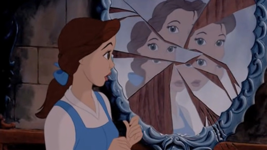
This was from Karlie's snapchat stories. It entered the lore officially, when Taylor referenced it in her The Man music video, on the graffiti wall.
Why I think it's relevant and it all fits together?
* This Love (a 1989 song, contains lyrics like "this love came back to me" etc) plays for only a short time, which should raise eyebrows on it's own, but arguably, it also runs for 38 seconds. * OG Fearless (rather than TV) is another way to make you stop and think, but it ALSO is the version that actually was out when the mirror thing happened. There were no TVs yet.
ANOTHER ALSO. The "We Are Fearless" mirror thing happened November 16, 2016. Remember when I THINK the playlist changed to THIS?! Mid November 2024 (15th). At first I thought it was 16th, but I live in Australia, so my 16th isn't America's 16th yet early in the morning, which was when I discovered it. (Dang! 🤣) Anyway, close enough? I want to say "take this with the hugest grain of salt" because I didn't quite have my shit together back then. But in favour of this being odd: I knew about the mirror, I didn't know when exactly it happened. When I searched my text history to find the dates for when I became aware of all this, I STILL didn't know when the mirror thing happened. I found that date on my phone first, before googling the video of the mirror writing, which then conveniently came with an actual date. I was shocked. It just fit too well.
Ok, so far so good.
But I'm still at a loss. As I mentioned before, everyone regularly complains about stolen Fearless. NO ONE ever asks why This Love is cut off. I question on the daily whether I'm just going nuts. Isn't it happening to ANYONE ELSE?! But it has to, as the playlist is streamed. It would mess up the entire timing from thereon, if it didn't happen to everyone at the same time. I'd think you don't have to be a Gaylor to find it strange?!
Oh, and a wee bit more Kaylor...
This really is a minor thing, but did you notice track 22? It just so happens to be the Kendrick Lamar version, as in NOT the exact version from the Eras Tour, but the one from that lovely music video, which features our girls boxing their hearts out 🥵 Not very demure, but feels VERY mindful, no?

I have one last thing to add:
I can't exactly send in evidence for this, as the playlist is super long, but y'all are free to waste some time and fact check me if you don't believe it... the entire playlist runs for 3h03 min (and once again a couple of extra seconds, so not perfectly on the dot, but for a whole playlist that's to be expected). What's that in MINUTES, you may immediately wonder? 183. Thank you very much 🙈
BUT WELL...
Let's think critically here for a moment... I'm either delusional, or this playlist does have "KAYLOR" written all over it. Cool. Fun. BUT HOW DO WE KNOW, that this playlist isn't just made up by one of us? Unfortunately, we don't. Or at least I don't. If any of you could elucidate, I'd be totally thrilled! Things that make me have a wee bit of faith:
It appears to be the default playlist on the Swifties channel
The tracks are very mindful of the TV situation, just like playlists that are coming from a more officially official source: NO Debut, as little reputation as possible, but then the odd one out Fearless OG
This is where the surprise songs come into play: the ratio of non-setlist tracks that were actually played during the America leg of the tour as surprise songs is a bit higher than what I'd expect to be chance alone. I've since tried to come up with random lists of songs and compared them to the actual surprise songs to kinda test this. I fell very short with some, came rather close with others, never quite reached the exact same number, let alone higher. I could be totally wrong, but this list of songs, that was first aired just a few shows into the American leg, contains a suspicious number of surprise songs. Almost like the curator knew that some of them would be played. Dunno. I'm aware that this isn't good evidence, but still something I noticed.
To sum it all up.
This has been driving me insane. I don't know if I see patterns where there are none, or if I see them alright, but the source is just another Kaylor having fun with it. Any thoughts, comments, insights would be MORE THAN WELCOME. What do you think? Is this something random, or is Miss Taylor having a jolly good time messing with us?
15 notes
·
View notes
Text
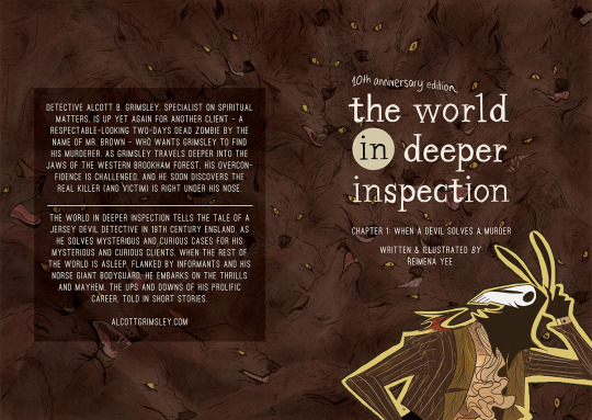


The World in Deeper Inspection UPDATE Read: (Chapter 1: Pages 57 to 68) (COMPLETED)
About the comic
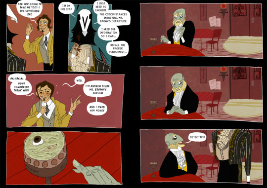
Grimsley confronts the man who set him on this goose chase.
And with that… that’s the end of the 10th Anniversary revamp!! Can’t believe it took me almost a year to get this short project done, but blame my school and day job for that! *drives the nail into the TWIDI IS NOT DEAD sign deeper into the wall*
It was enlightening to reinterpret my first ever completed comic (more complete than the strips and unfinished or one-off shorts I had done prior) – basically the one that started me down the road to a career as a published author. I was happy to see how much my style had improved – not just in the layout, flow and pacing – but in how my characters have become more expressive and energetic, and how comfortable I am with the cartooning. Here is the proof that drawing comics helps you get better at comics!! It only took 10 / 11 years!
Plus, after a long while of drawing with a more reserved, professional approach (see: Seance Tea Party, Alexander Comic), I enjoyed the abandon and whimsy of TWIDI. The lettering is inconsistent all over but that only adds to the handmade whimsical charm of TWIDI, so lol.
Anyway – I have the 10th Anniversary ebook edition up on my Ko-fi and itch.io! This edition carries both the original and revamped versions of Chapter 1. No new cover or illustration for it this time; I think they are perfect as they are.
I have been meaning to make a continuation of the end of TCM that bridges the start of Chapter 1. It’s a long time coming: a story that had somewhat existed since the early days of TWIDI in 2010. Hopefully I will find that stability in my life to return.
Open the cut below to see my notes.
There’s also nothing exciting here, EXCEPT I severely cut down on the number of panels (and the verbiage).
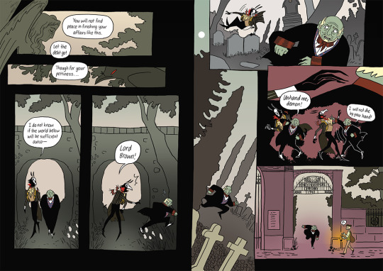
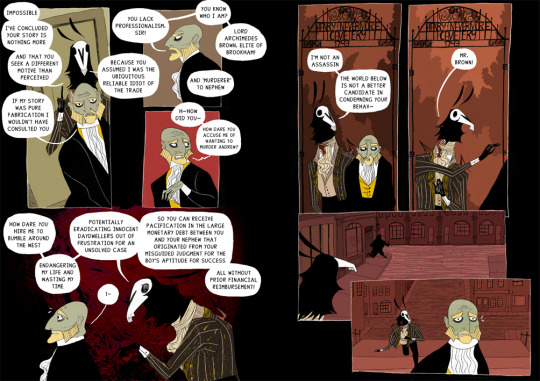
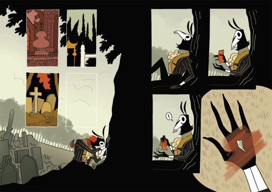
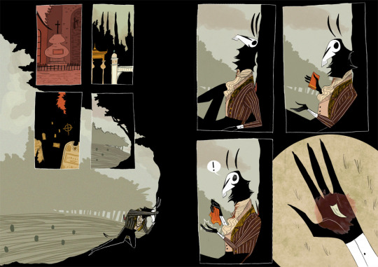
As with the previous spread I cut down and distilled a lot of the verbiage. I shifted the dialogue slightly so that the reveal that Mr. Brown is a Lord comes from Grimsley (in 2013, Mr Brown never admitted he was an aristrocrat until this page) – it made more sense since Grimsley had gotten the info independently from the newspaper article and Andrew, and Mr Brown not mentioning it himself fits with his whole lying thing. For this spread and the next couple of them I am zooming out the panels to include more scenery. The 2013 layouts felt very claustrophobic, with the over-reliance on bust shots of the characters to carry the tension of the conversation.
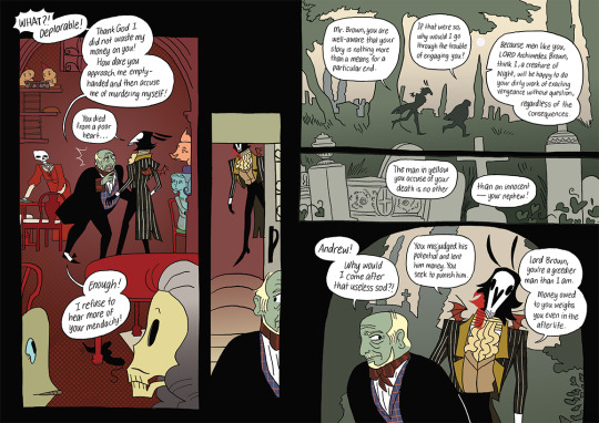
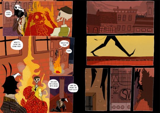
Some more dialogue trimming and background scenery. I decided to change the setting for the chase sequence to be within the cemetery – just ’cause it makes more sense than if it was done all around Brookham. The panelling for it is a bit more dynamic too – look, Grimsley is parkouring!!
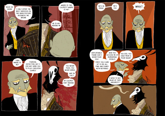
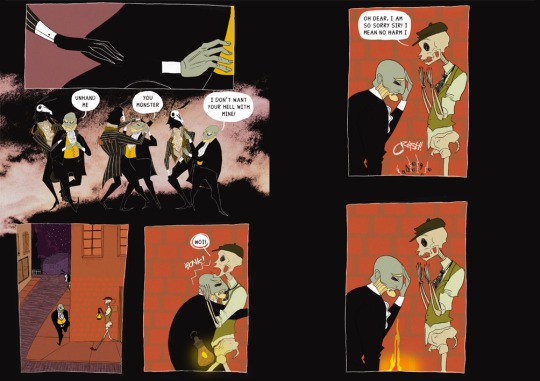
I have no idea why 10 (actually, 11) years ago I had so much trouble conveying and pacing this sequence of Mr Brown being set on fire. That’s the hindsight of experience, I guess??? Anyway I added a few more panels for actual build-up, and the blocking is way better now – there’s more energy (especially Skeleton’s expressions) and clarity (omg we can finally see where and what’s happening to the lamp). The last panel is a new addition to better connect with the next spread. Also… I am excited to see how much further I can draw Mr. Brown’s demise.
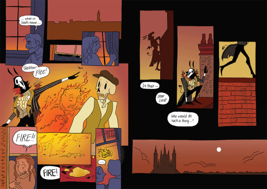
Man, the difference some changes in pacing can make. I added some panels with witnesses to the fire, just to emphasise why Grimsley and Skeleton have got to run. It’s crazy enough if a Brookie has got to witness immolation in the middle of the Night, but two paranatural spookies??? Also human fat has such a colour hdsjkfhsdkf the things that come out of an immolated body are so eerie….
The 2013 spread is almost perfect. 18 Year Old Me got it.
85 notes
·
View notes
Note
Not aure if u have, but have you reviewed the Gnorbu pet yet?

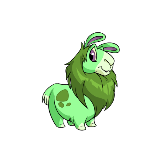


Gnorbus (or Norbs, as I've gotten into the habit of naming them) are super cute, and I'm surprised they're not more popular than they are. They're basically like llamas or alpacas, to the point where their pet day is known as Gnorbu Shearing Day (TNT even swapped out the standard pet image for a shaved version the first time it was celebrated). However, they're incredibly chunky and short compared to either of those animals, so they don't come across as a 1:1 copy or anything. They have some nice use of color to, with a (typically) darker mane and spots and lighter muzzle, toes, and tail.

One thing most people probably already know is that Gnorbus started out as a fake pet called a Lamameeah, which was introduced on April Fool's Day Y7 (2005) along with many other fake pets. However, enough of these fake pets were popular than TNT eventually held a poll to make one of them into a real pet, which the Lamameeah won.

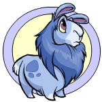
Al of people back used to whine about how they "ruined the Lamameeah" when its design was finalized, which I never understood. All they did was make it look more like a Neopet. For example, in addition to short and chunky proportions, Neopets usually have very large eyes and well-defined faces, and you can see they tweaked that up to be more in-line with other pets for the Gnorbu.
Another thing is color blocking; most Neopets use color to define areas of the design. You can see on the Lamameeah that areas like the white around the eyes and chest or that stripe down the back doesn't help emphasize any part of the design, and were fairly arbitrary additions (though they did keep it from being too solid-colored). With the final design, they gave it a mane and then added some spots on the side to break up the body, along with white on the muzzle. This helps emphasize the design quite a bit and looks a lot better than the original ever did. They also improved a few elements like the shading and the lineart.
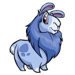
Gnorbus basically didn't change with customization at all, though they did screw up the mouth shape slightly (as the lip no longer seems to connect). Also, for some reason some post-conversion Gnorbus have a weird error where they occasionally have an extra piece of hair, but only occasionally—compare the blue Gnorbu above with the green and you'll see the issue.
Favorite Colours:

Toy: Most of the Gnorbu's best colours I've discussed already elsewhere, but as I mentioned in my toy colour review, the toy Gnorbu is delightful. The overall piñata concept is perfect and it's nice and colorful without being too chaotic. My only nitpick is the eye should've had colored lineart so it would match the body better.

Cloud: One of the only good cloud pets, the cloud Gnorbu is super cute, with a lovely pastel blue and a fluffy white cloud and tail. The cloud patterning over the body breaks things up nicely and the darker eyes and ears stand out. No complaints here.


Robot: Even cuter than the base Gnorbu, which is not an easy feat, the robot Gnorbu has lovely bright green accents that are contrasted with its light and dark gray body. Red helps draw emphasis to the face and it has a sawblade tail, and looks good both both pre- and post-customization. What more could you want?
BONUS: The Christmas Gnorbu really isn't anything special all things considered, but I really find myself liking it. The dark greens are a lovely contrast against the white base, and the dropping of a few extra markings lets the mane stick out all the more, which is done up like a Christmas wreath complete with lights and a bow. My only issue with it is that the lights and bow are unfortunately not wearable; if they were, you could remove them and get a killer base out of it.
34 notes
·
View notes
Text
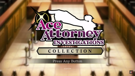
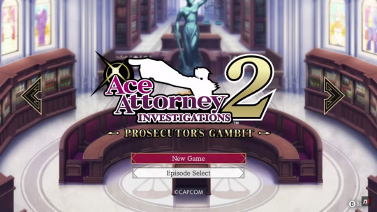
AAIC Gameplay Video (Switch)
This is the 56th post in the Ace Attorney Investigations Collection Countdown: 25 days left until release!
Today's topic: some Gameplay footage from the Switch version of the collection!
youtube
Along with all the new information and previews there have also been two gameplay videos of the Investigations Collection released, one for the Switch (which today's post focuses on) and one for PS5, showing some initial parts of the first cases of both games in the collection. Of course, the gameplay is the same as it was for the DS versions, it's still fundamentally the same games after all, but there are some neat things to be discovered in these videos anyway.
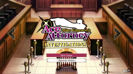
First of all, we get a look at the title screen and main menu of the collection and - WOW! - is that main menu music aka the Investigations Collection theme an absolute banger! I love it! Especially the initial few seconds when it kicks in, so hype! It's gonna feel so amazing just to start up this game every time!
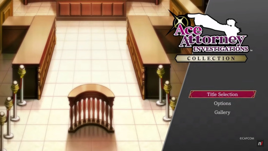
The title screen and main menu look amazing as well, of course. The design is so fancy and elegant! I especially love the prominent logo, the courtroom background (taken from Investigations 1) and the way the selected option is highlighted. That burgundy-coloured box with the gold framing is peak Miles Edgeworth!
Continuing to the title selection screen we see that the fanciness doesn't stop there. The two screens for the two games have similarly prominent logos and also specific backgrounds to them. The courtroom background, viewed from a little bit higher up, for Investigations 1 and the PIC meeting room background for Investigations 2. Very fancy and gives the two games a very different atmosphere already only from the title screens. I also love the arrows for switching between titles, they're black with a similar gold framing to the highlighted boxes and it fits perfectly! They really just went and coloured everything after Miles' own outfit and preference 😄 So not complaining, it's brilliant!
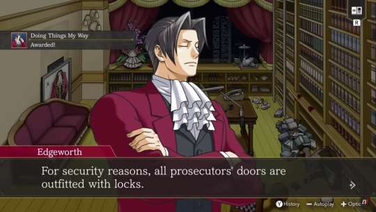
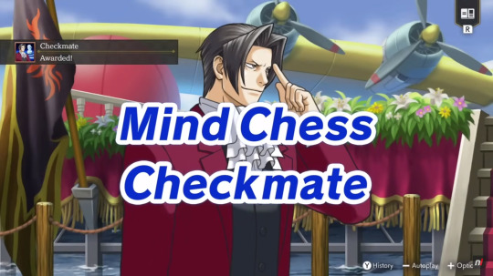
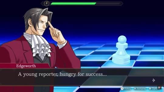
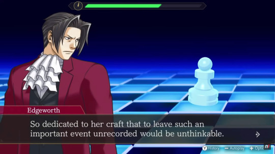
During the shown gameplay we also already get to see two of the many accolades that are in the game: "Doing Things My Way" (awesome name) for using Logic for the first time and "Checkmate" (very fitting) for successfully completing the first Mind Chess segment. Here you can also see that the phrase appearing on screen when finishing Mind Chess is "Checkmate" (instead of "Complete" like in the fan translation). I really like this change, it's much more specific and fancy this way.
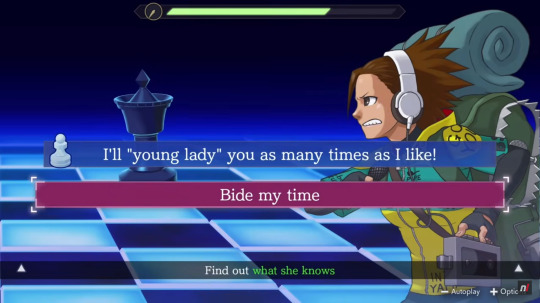
Speaking of translation changes, since we see some gameplay from Investigations 2's first case we also get a more continuous impression of how the official translation compares to the fan translation. I don't have many screenshots of this part of the game with the fan translation on hand and don't remember all the lines specifically so I'm not going to do a direct line-to-line comparison between the two versions but I can definitely say that I like what I see from the official translation! The lines and dialogues flow naturally and there are already some wonderfully phrased moments from just this short amount of story alone! As you can see from the screenshot above, they definitely carried over how hilarious some of the wrong answers in Mind Chess could be 😄 Maybe they even added unique dialogue when picking them? I doubt it but I still hope.


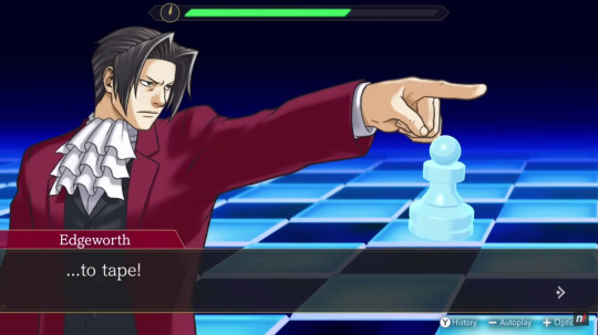
One phrase that stood out to me in particular was this one for when Miles finally checkmates Nicole (Tabby Lloyd). It sounds so badass and poetic! 200% how Miles would phrase this and I love it. I don't remember how the fan translation did this line but I doubt they beat this one. This makes me even more excited to see how the rest of the official translation stacks up! Maybe we'll lose some amazing lines, and I'll be sad about that, but, judging from this, we'll definitely get some new ones, too.
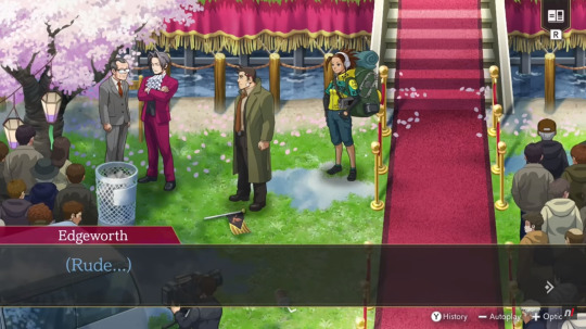
Another moment I loved, and actually laughed out loud at, is this one for when Miles talks to Payne about the chief prosecutor (who he's referring to in his thoughts). Just that singular little "Rude..." at the end there is a-ma-zing especially coming from Miles! 😄 Gah, I'm so excited to play this already!!
#ace attorney#ace attorney investigations#ace attorney investigations collection#aai collection#ace attorney investigations collection countdown#25 days left
14 notes
·
View notes
Text
Wish rewrite ✨ Extra details
As I mentioned in the final part of my "Wish" rewrite, I was toying with the idea of creating a separate post that covers additional details and character descriptions that I couldn't organically include in the summaries. After spending some time away (my brain was pretty fried after all the planning and plotting of that rewrite lol), I eventually decided to go forward with that idea. So here it is :)
Below the cut are details concerning the key characters and the plot itself, including a few worldbuilding tidbits. I have also added some of my concept art (one of which I already showed in the rewrite, but I wanted to share again). <3
And because they asked me to, I'm tagging @signed-sapphire
CHARACTER DETAILS
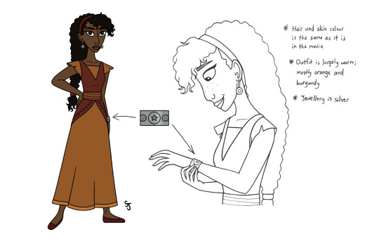
Asha: The main protagonist of the story. Levelheaded, composed, a touch cynical; a realist. She is prone to being very blunt and not considering how this harsh honesty can hurt others before speaking. Despite this, at her core, she's a trustworthy and compassionate individual who cares a lot about her family, friends, and Rosas as a whole.
After being let down again and again throughout her life (her father's death when she was 12, no one in her family having their wishes granted, seeing the kingdom figuratively crumble bit by bit because of how exhausted and troublingly passive many citizens are, etc.), she eventually stopped being hopeful and always focuses on realistic outcomes and worst-case scenarios.
"[Papa] always said that hope gives you strength, but for me it brought so much pain. So by expecting and accepting the worst, it hurts less when the inevitable happens."
When it comes to Star, she is at first exasperated by his energetic and overly curious personality. However, during their time helping people with their wishes, she softens up to him and sees his good heart. Moreover, his ambitiousness and optimism rubs off on her and she gradually starts to feel bright and - more importantly - hopeful for the first time in years.
She works as a tour guide for visitors and potential new residents. While not a fan of the job, it "pays well" as she says to Dahlia at one point. In her spare time, she likes to read and draw. She is also a talented dancer, but she often keeps this skill under wraps (courtesy of her reserved nature).
~ I took some inspiration from Jane's character and arc in "Return to Neverland," but there are shades of Tiana and Raya present as well. Regardless, I really wanted this version of Asha to stand out from past Disney heroines. ~
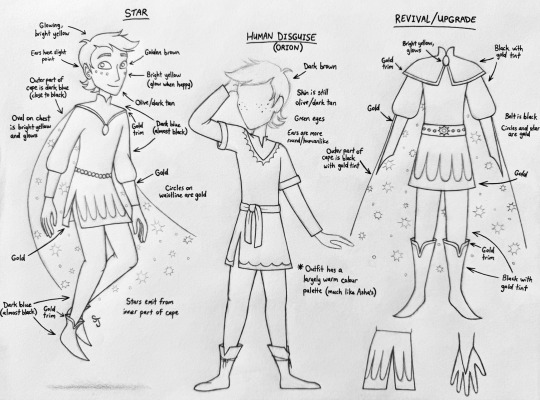
Star: The deuteragonist of the story. Energetic, inquisitive, peppy, and (at first) doesn’t have much sense of personal space. He can be very easily distracted, but when things get serious, he knows to focus on what's important. He is an overall affable person who is eager to experience new things and make friends.
He is a young star who has reached the point where he is ready to advance into a proper wishing star. By helping Asha make her wish come true, he will accomplish that, so he is very much determined to make it happen. However, he finds himself conflicted when he grows fond of humans and their way of life, as well as falling in love with Asha. He wants more than anything to help her save Rosas and become a wishing star, but that will mean he'll have to leave her when the job is done.
He is mute and only communicates through body language and images created with his star dust. The sole exception to this is in the "At All Costs" scene when he used his magic to allow Asha to essentially hear his thoughts via human speech. This is temporary and only lasts a few minutes. Afterwards, he goes back to being mute.
"His fingers touch her lips, then his, then he runs them along her ears leaving a trail of star dust. Before she can question what he did, she hears a deep, soft voice: “Asha.” It’s him! It’s Star! “You can…?” “Not for long."
His powers include levitation, shape-shifting, making things grow, and changing the colours of flowers and other objects he sees. While he cannot actually grant wishes with his magic, he can inspire others and spread hope with it. In this sense, he is indirectly granting them by providing the tools others need to make them come true on their own. Animals are also drawn to him.
Magnifico: The current king of Rosas and the main villain of the story. A cunning and charismatic sorcerer whose knowledge of wish granting magic was passed down from the royals before him. When 18-year-olds and new residents approach him to give their wishes, he presents himself as a kind man. In reality, he is apathetic to his subjects' well-being and only cares about maintaining absolute control.
While this need to preserve his authority stems from having a bit of a God complex, it is also because he does not want to be the king responsible for a great empire's destruction.
The only person he genuinely cares about is Amaya, with whom he is madly in love. He is the more emotional of the two, in that he is quick to succumb to frustration in moments of stress and/or anger. However, he can just as easily be calmed down by his wife, be it through words of encouragement or simply a gentle hand on his shoulder.
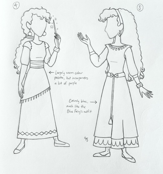
Amaya: The current queen of Rosas and the other villain of the story. Even-tempered, regal, and equally as cunning as Magnifico. While not a magic-user like him, she is just as powerful due to her intelligence and tactful nature. She is just as in love with her husband as he is with her.
She is the calm to his storm. The left brain to his right brain. She can pull him back from his stressful outbursts and stop him from potentially ruining his "benevolent king" facade by keeping him grounded and focused on the present. Truth be told, Magnifico wouldn't be nearly as mighty or as beloved without her there to help him and provide new ideas to carry out his plans.
Dahlia: Asha's best friend and a young baker. Cheerful, idealistic, and tends to stumble over her words when excited or stressed (a nod to Doc from “Snow White” along with her character design). She works in her family's bakery, but dreams of one day becoming the castle baker. As such, she thinks her work needs to be perfect to get that position, so she has a tendency to slip into a perfectionist mindset when it comes to her baking. Despite others' insistence that her work is already amazing, she is determined to be even better.
Like the rest of Rosas, she thinks highly of the king and queen. While this adoration makes her initially distrustful of Asha's innocence when she was accused of destroying the wishes, she ultimately sides with her.
~ Design note: in this version, her ruby dress leans more towards a reddish-violet shade; basically something that contains a bit of purple. This ensures that the warm colour palette of Asha's outfit - mainly the orange part - makes her stand out from the rest of Rosas, as well as foreshadows Dahlia's future internal conflict of not knowing whether to side with Asha (red/warm) or the king and queen she adores (the purple colour that dominates Rosas, along with blue and grey). ~
Sakina: Asha's mother. She is a farmer who mainly grows fruit and also does a bit of weaving on the side. She is a kind and hardworking woman, but can also be stern when necessary. She and her husband used to work together as farmers, but since his death, she's been doing most of it herself (Asha often helps whenever she can). As such, she has become visibly exhausted, but refuses to admit it and doesn't let it get in the way of raising her daughter.
Her wish was to be fearless. She made this come true on her own in a roundabout way by being the first to stand up for Asha to the king when she was accused of destroying the wishes. While more "brave" than "fearless," such an act still took serious guts.
Sabino: Asha's grandfather and the father of Asha's late dad. He is a devoted family man with a creative mind and optimistic attitude. Like the rest of Rosas, he thinks highly of the king and queen and continues to hold out hope that his wish will be granted one day despite being repeatedly let down. In spite of this adoration of the royals, he loves his family first and foremost.
He worked for many years as a blacksmith, but eventually retired once it was clear that he was too old for the job. While skillful in this occupation, his lifelong passion has been painting, which he spent a lot of time doing following his retirement. He also assists Sakina in her farming any way he can, though his old age has taken a toll on how often he does this.
His wish was to be able to bring his paintings to life.
~ Design note: like Dahlia, the colour scheme of his outfit needs to be tweaked a little to match the purple/blue/grey palette of Rosas, showing his loyalty to the royals and to once again ensure that Asha's palette stands out. ~
Simon: An acquaintance of Asha's. Three years older than her. He works multiple jobs in the hope that his hard work will be noticed by the king and queen and they will grant his wish. As such, he is usually very tired; more than most older adults in Rosas even. While a decent man at his core, he is also prone to skepticism and his devotion to the royals often clouds his judgement.
It's not uncommon for his insecurities to take control and drive him to do some questionable things. This is what caused him to rat out Asha to Magnifico and Amaya. However, he feels genuine remorse afterwards and does what he can to make up for his mistakes.
His wish was to be a brave and honourable knight. Also, like in the movie, his tiredness and general design is a nod to Sleepy from "Snow White."
Asha’s father: I just found out his name is Tomás, so... Tomás was Asha's father and Sakina's husband. He died from an illness when Asha was 12 years old. He used to work as a blacksmith with Sabino, but after marrying Sakina, he decided to become a farmer like her.
He was a good man; very funny and an extrovert. He was also a doting father and used to tell Asha to look to the stars whenever she feels lost. His last birthday gift to her before his death was a silver bracelet with star designs engraved on it. Asha cherishes it very much and wears it every day.
Dario: A good friend of Asha's. He is five years older than her. Friendly, a little absentminded, and a bit of a goofball (a nod to Dopey from “Snow White” along with his character design). He and Asha have a sibling-like relationship, with her being a down-to-Earth force that keeps his head out of the clouds. In fact, you can sum-up their rapport with this bit of dialogue from 'The Wizard of Oz': "But someday they're going to erect a statue to me in this town, and-" "Well, don't start posing for it now."
His wish was to be super intelligent. The main reason why he wants this is so that he can become a great inventor. Through Star’s influence shortly after his arrival at Rosas, and with additional encouragement from Asha, Dario realizes that he just needs to apply himself and his preexisting strengths; those being his creativity and perseverance.
Bazeema: Another good friend of Asha's. She is one year older than her and gave her wish to Magnifico very recently. A sweet-natured young lady who doesn't have a mean bone in her body. Very shy and is rarely seen without blushing cheeks (a nod to Bashful from “Snow White” along with her character design). She works as a seamstress and shows a lot of promise as a dressmaker.
Her wish was to have a brilliant and boundless imagination. She already had great talent in sewing and could create beautiful outfits, but only in accordance with what other people want. She finds it hard to come up with her own ideas. However, with Asha and Star's help, she learns that she can find inspiration for new designs from those around her. She gradually comes out of her shell and this leads to her conceiving more original ideas.
~ Design note: the yellow portions of her outfit will need to either be made less warm or be changed altogether so that Asha's outfit (i.e. the orange part of her dress) can stand out. ~
STORY DETAILS
- Hal, Gabo, and Safi are present in this version, but they have smaller roles. That said, they each have a part in the “Montage” song and they are among the townsfolk that side with Asha after she was accused of destroying the wishes. Like their movie counterparts, they are based on Happy, Grumpy, and Sneezy respectively. Additionally, they are all either 18 or over 18, like Simon, Dario, and Bazeema.
- Asha has a total of three outfits throughout the story; technically five if you count two other variations of her main outfit. 1) Her main dress. 2) Main dress with a blanket wrapped around her, which she wears at one point during the “Montage” song sequence where she and Star are bonding while sitting outside at night. 3) Main dress decorated with star dust during “At All Costs.” 4) The dress she wears after the time-skip near the end. 5) The dress she wears when she and Star reunite (the one Bazeema made for her).
- Celestial star beings age similarly to humans, but they live much longer. Furthermore, there are three stages in their life cycle: baby star (akin to Star in the movie), young star (where this version of Star is at most of the story), then full wishing star (where Star ends up).
- There are some references to Disney's past movies sprinkled throughout this version, but they would be much more subtle than how they are in the movie. Some would be blink-and-you'll-miss-it, others are more visual, whether it be a character's design or a shot composition (ex. when an awestruck Asha is wandering through the palace for the first time, I envision a moment where she looks at her reflection in the mirrors adorning the walls in such a way that's akin to Belle looking at her reflection in the cracked mirror in the West Wing).
- Much like how Star's personality and actions have an influence on Asha, her personality and actions have an influence on him. Not only does he learn to slow down and think things through, but as the story goes on, his movements become less erratic. He's still a ball of energy and demonstrates this when he's happy or excited, but he's a lot more composed by the end than he was when he first entered the story.
- Not sure if it would be mentioned at all during the story, but Tomás' wish was for his future child (he made this wish at age 18 before he and Sakina had Asha) to shine bright. He may not have lived to see it, but it did end up coming true.
- The wish granting era has been ongoing for over 200 years. Evidently there is no one left alive who truly remembers what Rosas was like before the wish system was established.
- Star's subsequent once-a-month visits are seven days long.
- Asha experiences two types of guilt: 1) the fact that despite her dad repeatedly reminding her of how important hope is, she wound up becoming someone who doesn't have any hope, and 2) her job as a tour guide means that she was responsible for luring several people into living in Rosas, thus trapping them in this exhaustive and cult-like lifestyle.
- Star's magic comes naturally. The magic Magnifico and the royals before him used basically comes from alchemy (potions, various tools and apparatuses, etc.). And for the record, this does not imply that alchemy-based magic is bad (except for the destroying wishes part). Magnifico and the royals before him simply used it for malicious purposes.
- The rules of Star's magic are more in-line with those of the three fairies from "Sleeping Beauty." Specifically, how his magic is mainly used to bring joy to people rather than cause pain. That said, when he's pissed off (like when Magnifico hurts Asha or even tries to hurt her), he can use his magic to attack, but it's not as strong in that department as Magnifico's magic is.
- After the time-skip, Rosas' colour palette is much more vibrant. It is no longer confined to primarily blues, purples, and greys.
Rewrite / "At All Costs" sequence / Asha & Star Character Tropes / Concept art
#wish 2023#wish rewrite#wish reimagined#wish asha#asha x star#disney wish#wish#asha x starboy#disney
15 notes
·
View notes
Text

I. CANT BELIEVE. I FORGOT TO POST DARUNIAS FINISHED REDESIGN ON HERE. I DONT SEE IT ON THE BLOG ALREADY SO I MUST HAVE FORGOTTEN...... AUGH....
ANYWAYS sob here is Darunia's official redesign for the OOT rewrite full notes and thought process below the cut:
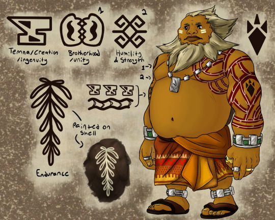
All my goron designs involve giving them less cartoonish and caricature-like features and proportions, so of course that was the first thing I tackled here. I made him very square-and-solid looking. I wanted him to have an appearance that read both as very dignified and also very personable. One should be able to tell at a glance that he is someone who commands a great deal of respect and is worthy of that respect, while also being approachable and trustworthy. Simultaneously larger than life and down to earth. His expression is stern, but with an undertone of warmth. In the original game, Darunia seemed to me like a character who wasn't really meant to be taken seriously, but for our version we want to give the opposite impression. When Darunia speaks, you will listen. I intend for him to be a character that commands respect both from the other characters around him and from the audience as well.
Aside from that, his defining characteristics remain, especially his beard and hair which are what make his silhouette most easily distinguishable. Rather than changing very much I mostly just added more, like his accessories, clothes and tattoos. Many people in the past have pointed out that the gorons, in oot especially, have many elements that appear to be based off various cultures from across the African continent, but again, especially in oot, that was done rather insensitively. So I also decided to look to the west African region in particular for some inspiration for my Darunia redesign. I ended up using mostly references from Ghana after searching through a few different sources, and the traditional clothing there influenced how I dressed Darunia, like with the brightly coloured and patterned cloth of his waist-wrap thing and his sandals-- which from now on I have decided to draw all gorons wearing sandals. The cloth Darunia wears is not fully patterned like those from Ghana since I played around with a few different patterns before settling on this, but in the future I may try drawing something more 1-1.
His tattoos are also based off the Adinkra symbols. Researching the Adinkra symbols was very exciting and interesting for me, and there were many that were perfectly suited for the things I had planned. I didn't want to just copy them directly, so I made slightly altered versions of some of the symbols with their original meanings. My hope is that anyone familiar with the Adinkra symbols would easily recognize them as the source, and be able to tell which fantasy versions are derived from which real ones, with or without the meaning listed alongside it. The ones I referenced for Darunia specifically were the Dwennimmen, meaning humility and strength, the Akoben meaning vigilance and wariness-- which is depicted on his necklace-- the Nkonsonkonson meaning unity, or brotherhood, and the Aya meaning endurance and resourcefulness. The anvil symbol, the one representing Temna/creation/ingenuity, is one I invented imitating the existing symbols' style. I chose these for their meanings, which I feel represent Darunia's character well, and seem like the kinds of things he would value and choose for himself to wear.
The red tattoo sleeve framing the goron ruby is meant to represent streams of lava flowing down the mountainside. This one single element gave me more grief than any other part of the redesign, I went though so many drafts of just that one tattoo and it was what caused this redesign to take so long! Though now that I have emerged victorious from the bloodstained battlefield (clip studio paint), I am very pleased with the final result!
Also, you may notice that the ring on his left thumb looks remarkably like the game's power bracelet. That's because it is the power bracelet! If you'd like, you can wait until we reach that part of the fic to learn what the deal is there, or if you're feeling impatient and don't mind some light spoilers, you can read Darunia's character profile for our rewrite here on world anvil, which is one of the few I've actually completed lol
#mod car#art#my art#oot rewrite#loz ocarina of time#redesigns#oot:tas#loz oot#oot darunia#darunia#goron redesign#oot rewrite has dilf content for the dilf likers
16 notes
·
View notes
Text
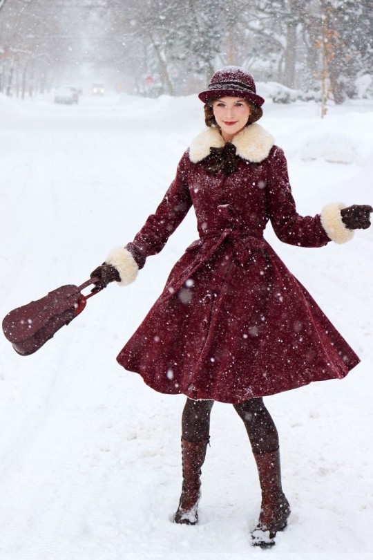
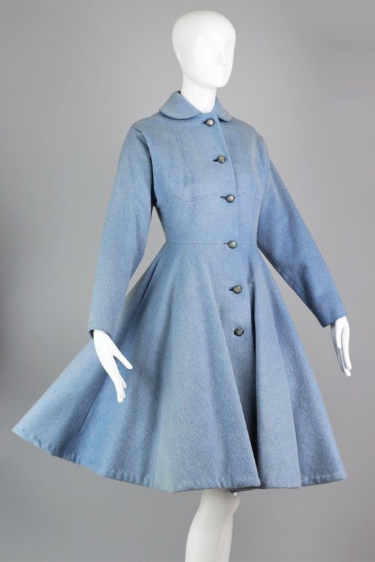
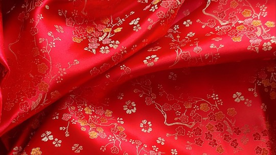
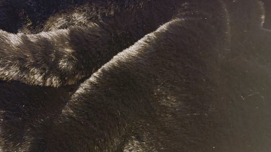
pre project write up: the coat!
ill keep this short (for me) because i worked through most the details with the wearable mockup from last year, but i wanted to reintroduce this project & the fabrics ill be using :)
This is the final version of my winter coat project, which i am starting at a great time (ill probably finish this well after its gotten cold!) Ive started with a base of McCalls M6800, because im not super confident in my ability to draft a pattern with the correct ease for this type of garment. Ive made some minor fittings (far too much room in one of the front seams for me, and i took some volume out of the skirt area. the shoulders were. weird. i honestly wouldnt rate this pattern super highly it had some grading issues that should have been caught, but it serves my purposes) and now i should be ready to go! i wont be following the instructions very much but theyre pretty basic anyway, so ill just go my own way and see where i end up!
this is kind of the inspo if you want a visual!
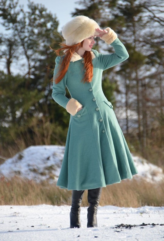
the main body of the coat will be made out of this gorgeous, velvet like wool (i think its a blend?). In true Nyx fashion, its black and absolutely impossible to photograph. its probably one of the most expensive fabrics ive ever bought but i looked through dozens of options and this was by far the best one i found. im really particular about textures and this one is just, so nice, and its quite thin for a wool (not in a bad way, its just compact rather than fluffy) which is something im going to appreciate with the amount of fabric in this coat.
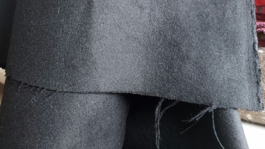
Next: the lining! given that i was going to all this effort to make my own coat, i wanted this to be a completely unique garment, in every aspect, including the lining. I knew i wanted something with a design on it, and something that was a dramatic contrast to the outside, so when i saw this gorgeous 'chinese brocade' fabric i knew it was the perfect thing. Its very much. not a lining fabric and was past the budget i had in mind for my lining but i didnt see anything that came even remotely close to this in my mind so i caved and bought it. Even a year on im still enamoured with it and hope i have some left over to use for other things! I did get extra of the slippery black satin i used to line the mock up coat and i plan to use that to line the sleeves just for the extra glide, but ill use this for the main body.
one last fabric! one of the changes i wanted to make from the red version was to add a fur collar so i tracked down the softest faux fur you have ever touched! again awful to photograph, but its perfect, and it was by weight, so now i have a huge piece of this :D
i do also want to make note of the buttons i picked! theyre absolutely gorgeous and i, once again, hunted for ages to find the perfect option and here they are! they photograph a lovely colour but irl the gold is a little pink toned so my extra ass has bought some rub n buff to tone them into a better shade. yes. the buttons. for my coat. listen.
im generally happy with my mock up, but there are a few changes i want to make. the obvious one was one that was in the plans from before i even started the red one, which was changing the collar. i wasnt super sold on it in the first place and the further in i got, the more i wanted a fur collar! since i have so much of my fur, im also planning on adding it around the cuffs and i do keep tossing up doing the whole hem but i think that might be a little much.
The other major change i want to make is to how i finished the coat. im actually pretty happy with the hemming method i chose for the reasons i chose it, but for this version i want to do something different. the plan this time is to do a facing in the outer fabric on the lining pieces and have that completely attached through the inside, removing any opportunities for the lining to show unintentionally.
Theres also a couple of minor fit things i want to change, i want to add more width to the back in case this fabric is tougher than my mockup, i want to rethink how i did my buttons because that made me miserable last time, and i want to add a little length to the hem. oh and better pockets! i need to give it my mega pockets. but overall im pretty much ready to go straight into it! im so nervous
#fabrics and long notes under the cut!#welcome back to another edition of nyx writes too much about their sewing projects#think i said everything i wanted to though#the coat#thats just the project tag i mean. its The Coat#sewing
8 notes
·
View notes
Text
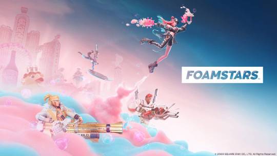
Foamstars: Splatoon is Tired. Try Square Enix.
(Click here for image source)
Before I begin, let me preface this by saying I have never played the single player story modes in any of the Splatoon games. My experiences are all about generic Turf War mode, so this has coloured my experiences.
When I first played Splatoon, I was amazed by the fresh concept, the brilliant mechanics, the unique spin on retro-future (replace “synth” with “punk,” and you’ll get the idea), and the unbelievable music. It was like the 90s met the mid-2010s in every way, and it was glorious. It was the most refreshing online shooter I’d ever played, and I couldn’t get enough. I could hardly wait for the sequels.
Then came Splatoon 2. It felt like more of the same, with a few minor changes and additions that made things better, but it felt like the same old song and dance.
(Click here for image source)
In short, it wasn’t fresh any more.
Not long after this, we got the first Splatoon-like: Ninjala. Being free-to-play, it was accessible to anyone with an internet connection and an online play subscription. I thought it was a great concept, but I let this one pass me by; I never played it. I was too afraid of the potential for toxic microtransactions, and beyond that, I felt it strayed too far from the concepts that made Splatoon so great.
Then we got Splatoon 3. Ugh. This one was a mess. They made the hub world gargantuan, and added lots of extra stuff to do. On the surface, this sounds great, but it just makes the game a confusing mess. They added gimmicks like being able to decorate a locker, but it’s purely there for your enjoyment only. It’s fun for the first ten minutes, but the novelty wears off fast (this is coming from someone who loves novelty).
Last but certainly not least: the mechanics. They’re abysmal at best and downright awful at worst. The balancing for every single weapon has been completely borked. Even if you use a weapon you are very used to using from past games, you will have to re-learn it because they changed all of the balancing. In short, nothing works properly when it comes to weapons. The absolute worst is how they weigh Splatfest results. The scoring system and its metrics are so out of whack, that the team that worked the hardest could potentially lose a Splatfest, or get absolutely no credit at all in the end.
In short, Splatoon has Jumped the Shark. It is worlds away from the original product, and it has lost everything that made it special, and replaced it with tonnes of meaningless rubbish padding.
That brings us to tonight, when I saw this:
youtube
This is the reveal trailer for a Splatoon-like called Foamstars, currently in development by Square Enix, to be released on PS4 and PS5.
Let’s begin with the aesthetic. It’s retro-future again, but this time in the synth way, making it very fresh, especially for the target market of Splatoon, which cut their teeth on a punk retro-future aesthetic.

(Click here for source)
I finally saw my classic Splatoon gameplay again (unlike with Ninjala), this time with a twist: instead of ink, you shoot foam. And instead of the foam just sitting there, it creates hills and ledges if you shoot it right, making gameplay dynamic.
In addition, tonnes of new subweapons, all of which feel like an homage to Splatoon classics. It’s as if 岩田さん (Iwata-san) had come back from the grave (Splatoon was his baby).
Long story short, Foamstars is the game I’ve been waiting for! This will be the killer app for the PS5 as much as Splatoon was the killer app for the Wii U. This game has finally prompted me to begin saving for a PS5, and I will be pre-ordering both the PS4 and PS5 versions of this when they are put up for pre-order. Time to watch news about the game’s development like a hawk.
It’s time to throw away your tired old Splatoon 2 and Splatoon 3, and pick up some Square Enix magic, along with a PS5~
#SONY#PS4#PS5#Foamstars#Splatoon#Splatoon 2#Splatoon 3#Nintendo#Videogames#Video Games#Console Gaming
15 notes
·
View notes
Text
Cooking Mama 2 Review
People wanted it, so here I am typing up my Cooking Mama 2 review:
So, first thing first, the game is a clear improvement over the first. You still have a lot of recipes to cook up in little minigames, but they got rid of the "change recipe" mechanic, which was a good thing.
Because while it was fun to discover the recipes, it also meant that a lot of recipes were starting the exact same and you were doing the same steps over and over again, which got repetitive quick. They also started to add some sweets and baked goods into the recipes, which were completely absent from the first game, so that was nice too.
You simply unlock recipes by doing well on the available recipes, so unlocking all of them was not hard. And after you have all recipes, you can go to a new mode where you can feed Mama and your friends and family and cook the recipes without help in one go. Failing a mini game starts over (this time Mama won't fix it for you).
I liked this mode, it was a lot of fun to see how well you could do without warning what the next step would be.
So, now on to the mini games. They actually brought back a few mini games from the first game, but most of them were new or improved. The cutting minigame for example, in the first one to dice an onion you had to half it, then do another mini game to slice it and then another mini game to dice it. That is now all in one step. They also added an indicator to the "fry something" minigame and are showing you where you forgot to peel something.
For some recipes there are completely unique minigames, for example the pizza has you roll out the pizza dough by being a pizza artist (I failed this one so often when I tried to gold medal) and the Ravioli recipe lets you cut out the Ravioli and stuff.
There were some mini games that I found pretty hard. The first one was "let it cook until it is in the green area". If you had too little heat, it would be undercooked, too much and it would boil over. You could stir to get the heat down, but wow, it was hard to get it correctly.
The second hard mini game was a simon says style where you had to put ingredients in the bowl in the correct order and it was shown to you really quickly. Most of the time it was pretty easy, but sometimes there were five or six thing to remember and that was when it was getting hard! I totally get why Jaiden struggled with the Mango pudding…
The graphics of the games were fine, like in the first one. You now can customize Mama and let her wear something else and have different colours for your kitchen appliances, so that was fun. The sounds were typical DS quality and I have to apologize to the music of the first game.
That actually wasn't royalty free music! The second game uses it too in a remixed version, so it was totally composed for the game. It has the same charming piano melodies as the first game, but is nothing to write home about.
I played until I gold medalled every recipe with Mama and got at least a medal from everyone I could feed. Oh, and there was a third mode where you could compete in some minigames and see how much of a record you manage. I played that too.
So which recipes did I struggle the most with?
Cream puffs, strawberry roll and ravioli.
The cream puffs had this damn mini game where you had to remember six things and I failed it so so OFTEN! At least the rest of the recipe was easy, so when I finally got it, it was over for the cream puffs!
The strawberry roll had a brutal mini game where you had to get eggs fluffy. That was far too hard for the time you got. I needed to practice a lot.
And the ravioli? Well, had a noodle machine mini game where you could really mess up easily and Mama was VILE on this one, even one mistake and she wouldn't give you a gold medal… Mama, whyyyy…
Anyway, it was an enjoyable game overall. Improved the first game in all points and the food looked legit very tasty and I even felt like I want to see and try some of the recipes myself.
Oh, I need to tell you about my favourite recipe ^^ Sweet potatoes. Sounds simple, right? Just bake them!
NOPE! The game has you bake them, then you spoon them out and make pulp, then you fill the spooned out sweet potatoes with the pulp, then you put egg yolk on the sweet potatoes and bake them again and that is the finished product!
9 notes
·
View notes
Text
Progress Update 20.05.23 - Lost Children of the CCC

I've got quite a few changes & updated stuff to talk about (as well as chapters to renumber... again >> )
FIRSTLY! I figured out why my word count has been stupidly high for the amount of chapters I actually have written vs to write. The average YA book word count is 90,000 ish, and I'm on 102,000 at 40% done.
Because of this, I've broken the story up into 4 part for what was going to be the escaping the wall section. I think the story will have a total of 6 or 7 parts when finished.
Progress
Part 1 as you can see is about done. The biggest hold up is the two comic chapters (Ch.20 & 21) and Ch.1 & 11. The only thing I haven't started on is the final chapter. But everything else is in some stage of editing, either an old version getting updated or final tweaks.
Part 2 is a very patchy with lots of edits to be made to what chapters are done or started. However, I know what I'm wanting to write so I'm quite confident once part 1 is done, it won't take me long to make some good headway.
Ch.20 - ArE wE hAvInG fUn YeT~ [Part 1] I've got two pages to colour & everything is finished & ready to upload.
I've got a lot of school work & Ch.21 to get done in the meantime, so I'll be sticking with the Monday & Friday uploads till all the pages are out, at which point the full chapter will go up on A03.
Ch.21 - ArE wE hAvInG fUn YeT~ [Part 2] The first script is done, and I've sketched out pages 1-8. I've found some edits I might need to make to the backend of this chapter and will be reviewing if those changes are needed over the next couple of days.
Art wise
Chapters 1, 2, 11, 19, 23 - 26 need covers making still.
All chapters need cover numbers updating (again) as the intro chapter I was debating making, will be the new Ch.1
I'm on the fence about adding bio's or not at the end of the respective chapter. I looked at it, but never got around to it in the past.
Looking on other art ideas to go with the chapters.
A03 Updates
I've updated tags, so they're more accurate to the updated version of the story. And yes, I gave in. I added the shipping tags. I've never done romance, but I've been inspired by everyone's amazing works over here so... shippers, you may celebrate. I'm joining your cult, lol.
Story description updated to be more accurate for Part 1
Chapter no. changed from 17/?? to 17/26
Update chapter 19/11/22 removed.
Current Ch.17 is actually Ch.22 OLD VERSION. I haven't taken it down, as A) I don't want to upload all those pages again. B) I'm pretty near to 'releasing' that chapter with my current speed. I've put a disclaimer on it so readers are aware it's an old version.

#lost children of the ccc#update#thsc#lost children#I feel like the new summary does a really good job at setting the mood & what to expect for this first part of the story#lots of concsqeuences#like I don't think Henry even understands the can of worms he's opened here
2 notes
·
View notes
Text
Paul Rand outcomes #1:
After looking over some of Paul rands work I decided to experiment with some poster designs inspired by his work, slowly getting more and more experimental and close to his kind of style with each and every iteration.


These where my first two and now I look at it critically it looks incredibly crap, it looks close to the official poster I had taken inspiration from below don't get me wrong:
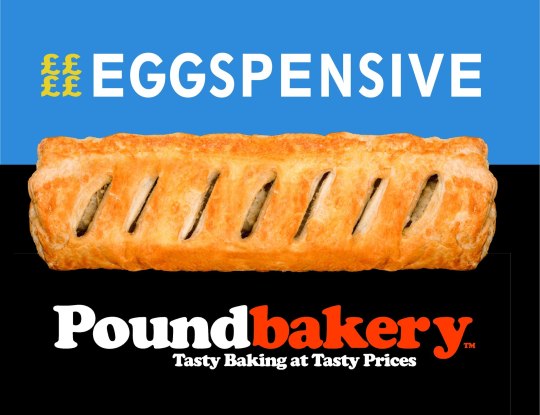
But I feel like I need to add a few more little details like the different text colours and, bit more text to fill out the extra space and the small gradient in the background. I feel like those small details gives it a noticeable drop in quality and just makes it feel cheap and badly made, especially when put side by side with the original.


I tried to fix this later by splitting the text and changing the colours, I feel like even with this small change it makes the entire piece feel better as your eyes have to explore more of the image to read the text this feeling more natural to western audiences as we're taught to read left to right rather than right to left and i'll have to see if this works the same for eastern audiences.
Though I still think I can improve on the design I wanted to explore more styles in which I could take this idea so I moved on from the more standard Pound Bakery advertisements, below being the full image version of the screenshot above.

After realising their was a gradient in most Pound Bakery advertisements I tried to reproduce it as best as I could, first as a sort of light to dark gradient that i felt was a little off for some reason.


And after some experimentation I realised that it felt off because the gradient they use isn't from light to dark, it was from Orange to a more Vibrant reddish orange:

Recreating it I adjusted the colour until I was happy with it creating a clipping mask so I could easily use it for backgrounds later which saved me a lot of time.
Though its not 100% accurate i'm still happy with it and i know i wouldn't be able to get the exact gradient without knowing the CMYK values they used, which might be something for me to look into later on.


Using this I was able to create more of the branding that I liked, these two i think being a lot closer to the Peter rand style that I wanted to convey thanks to the use of irregular shapes and bold colours.

Not only that but I was able to loop in the more comedic aspects of their branding including innuendo as well as a jab to their competitors, Though i don't know if a few of these might be crossing the line in a professional setting and will have to get them looked at before I would send these off as finished.
Both of these as well looking quite similar to their inspirations:
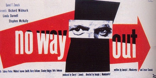
While doing this i had an interesting problem, I would need to switch the colour of the text between white and orange, so the text would be closer to how Paul rand does his text.
To fix this i created a clipping mask over the black shape before placing the orange text inside it creating the illusion that it was melding into the different colours.


Using this I was able to make this as a final sort of outcome for the day, adding in my own custom graphics and eluding to a dick size innuendo which they've already done in their previous "Size matters" advertising as displayed below:
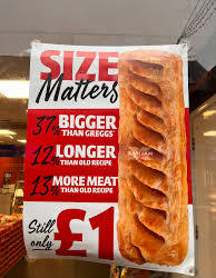

Though I think this one is the best out of them all i'll need to see how other people react to it in order to see if they get the joke and if they see it as an effective piece of marketing for Pound Bakery, and immediately the one thing i can point out is the lack of logo or discerning imagery that could send someone the businesses way.
While I was doing that though as well i was working on some red and white branding closer to the ones used inside of Pound bakery:

This one beimg closer to Advertisements like this one:

And to that end i decided on adding in some hand written aspects to it after i had gotten the initial typed font down since it used a different one than before, So after a few experiments i was able to pick out the right font that felt like a match.


Sending it to my tablet I was able to hand write into it creating a piece I believed to be a lot closer to the Original Branding that I was researching, the handwriting helping keep the entire piece away from that mass produced slop that don't really enjoy.
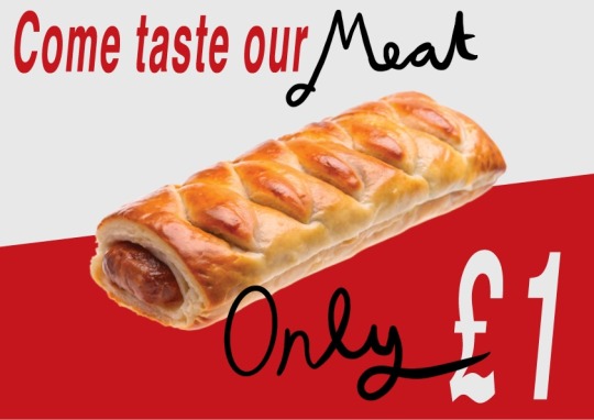
This I really liked as I find the format really effective when adding in the more messy hand drawn elements so it doesn't look too boring to me, Then only complaint I have is that it could do with bolder shapes and that i don't really like my own hand writing.
Moving on from that I produced a couple more that could be easier made and produced on a wide scale and would fit in nicer with their current branding if they didn't like the hand written text, not only so it would be easier but to also show how it interacts with the orange branding as i don't know which I want to use yet:

Putting them side by side I'm not sure which I like better, I think I should ask a friend or someone else I know to look this over and give me their thoughts.
But all in all I think I've done an effective job at exploring my options as well as producing some clear and well informed pieces, and if I could nit pick I think I'd only need to experiment with shapes more and add more recognisable branding in order to keep it closer to the Paul Rand style as well as make sure it's funnelling people to the desired place I want them to go.
Heres the previous inspiration for them as well as the Artist I had used as reference so far:
0 notes
Text
Group Character Design Project
Creating A Character Brief
In a group (Lindsay, Niko, Tylah, and I) we brainstormed a character, filling in their name, backstory, environment (world and time period), personality, and their physical appearance.

The character we created was a bitter man from industrial London in the 1800s with two personalities: one that acts inconvenient and rude, and the other that does heinous things out of spite. His personalities change by minute instances.
We didn't detail too much about the appearance of the character as we were more focused on the backstory and personality, allowing the other team to get more creative with their interpretation.
Receiving The Brief
The character we received was from Corner Studio. He is a black-bearded dwarf fisherman with a god complex living on an isolated wintry island.
We quickly decided on who would do which style - I picked the graphic novel style.


I gathered some reference images for the base pose, and the clothing items, as well as taking some inspiration from others in my team.


I sketched out the character on paper first before tracing over the line art in Krita with a uniform pen brush. I used thicker outlines to try emulate the style of different graphic novel styles.

After some feedback from the team, I increased the hat size.


I coloured the character with his black beard and I chose cooler colours for his clothes based on the wintry setting and colour palettes that our team discussed.

I added a shadow layer of black at 35% opacity to the character, trying to give him a more rounded feel.

Finally, I added some highlights using the screen mode on the layer and colour selecting the areas I highlighted.
Giving Feedback
Our character brief was given to Team Monstra to create designs in the same four styles we were given (animation, casual mobile game, graphic novel, and children's storybook).

We liked how they represented the two personalities through the split clothing, and for two of the styles, two distinct faces.
We thought the colours could be more muted with more browns and blacks (colours you would see in the clothes of the time). The clothes could be more tattered and worn as subtle ways for his personality to shine through in his appearance. We also noted that the top two used more round shapes while the bottom ones were more more angular so there could be some consistency among them.
In terms of changes for each specific style, we had a few notes. We thought the lack of ears on the game style made it look a little pug-like and requested they add ears too help with that. The animation style didn't require much specifically other than that it looked perhaps too similar to the game style and we suggested trying to change the silhouette. For the graphic novel style we wanted the two sides to be more consistent like adding a rolled up pant leg on the bare side and having both shoes be the same.
Receiving Feedback And Making Changes
Corner Studio gave us feedback, mostly wanting consistency among the designs and liked a lot of elements of mine to add to the others like the colours and the beard.


Tracing over the original version with a pencil brush allowed me to quickly and non-destructively edit the new changes.
The client team wanted us to remove the undershirt so I did and even added some body hair which I felt fit the description of a hermit dwarf. The client also wanted more expression in my drawing so I tilted the head up and had him looking down whilst also changing the pose of the left arm to be more interesting and dynamic. While the client liked my iteration of the beard, I decided to make it bushier and more natural looking since that was what they were looking for in the others.

I imported the changes into Krita and finalised the changes with line art, colour, shadows, and highlights.
Corner Studio said they were happy with the changes I made and our team effort overall.
Receiving Tweaked Characters
Following our feedback, team Monstra tweaked the designs and sent them back to us.

Every design adopted a more toned-down and consistent colour scheme with the graphic novel style, adding dark blue/violet pops. The animation and mobile game styles simplified their designs slightly and the game style also added ears per our feedback. The graphic novel style is now more similar on both sides with an added pant leg and both shoes being the same. The clothes are also much more ragged and worn down like we recommended.
Overall we liked the changes and were happy with the outcome.
0 notes
Text
Creator's Guide to Comics Devices: November 2023 Update
The first newsletter since launch came out a few days ago! It summarises all the updates I've made in November, which includes 2 (!) new devices, a sub-device, and other site changes.
Subscribe to the newsletter to get these updates direct to your email.
New Devices:
Aside
A short comment that sits outside of a balloon or character that is not perceived by anyone except the comment maker and the reader. An aside may come from the author, usually placed outside of the panel or near the edges. (Page with examples)
Topper
A secondary row of panels or single panel that goes 'on top' of the main comic. They are typically removable and non-essential, and usually contain the comic's title. (Page with examples)
Sub-device
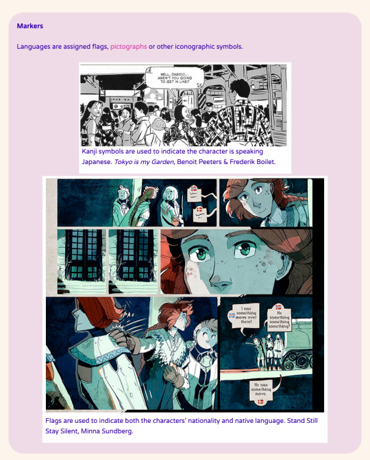
Markers in Code Switch
Languages are assigned flags, pictographs or other iconographic symbols. (Page with examples)
News from the Curator and Site Changelog
I'm delighted over how well-received the library has been -- thank you to everyone who has shared, commented and provided feedback! I really appreciate the enthusiasm and generosity. <3 As a comics creator taking my first formal steps into the arena of comics studies, there is still a lot to do and to read for the library. Even with 63 devices catalogued, it's only still the beginning!
From the Interwebs
‘The Creator’s Guide to Comics Devices’ Is the First of Its Kind, an Incredible Resource for Comics Creators & Readers Alike (The Mary Sue, Joan Zahra Dark) Lovely roundup from my fellow Cartoonist Cooperative co-founder Joan setting the historical context for Comics Devices and why an accessible resource is like this is due.
Kibbles n Bits (Comics Beat, Heidi MacDonald) An enthusiastic feature of the library in Heidi's roundup.
Shout Outs
Thank you to Ritesh, Tan Juan Gee, Samantha Philipps, Blue Dellinquanti, Ted Anderson and Hannah Pallister for their contributions. (I really need to get that credits/curator's notes page set up. That's this month's to-do) Once again, thank you to the Sequential Artists Workshop Teaching Fellowship for supporting the development of the library this month.
Updates to the Site (Nov 2023)
Added the Store page and dedicated a subsection for it on the homepage, if only to direct people to the already-existing zine that’s currently distributed by Sequential Artists Workshop and myself. I might use that page to hold things like signing up for workshops and panels if they ever happen. Added the Newsletter page so it’s easier to link to across the site and elsewhere. Opened up the page that displays all the devices on one page. Added ‘Contribution’ ‘Newsletter’ ‘All Devices’ to the sidebar. Fixed the 404 page. It suggests the Site Map for advice. Finally opened the Links page! Check out all the resources in there! Thank you to folks who have submitted feedback/contribution! I have added new example pages for Harmonious Juxtaposition/Time & Space/Pictorial Lettering/Colour Coding and a longer definition for Map Panel. Added two new devices – Aside and Topper. Added ‘Markers’ and ‘Balloon Styles’ as a subdevice to Code Switch. Finally set up the Gallery page: this is where comics pages featuring the relevant device will be catalogued. Now for the slow work of filling up the galleries…..
New in Store: The Comics Devices Quick Reference Zine Before the website launched, I produced this zine as a promotional thing + quick reference. This is a 12-page zine showcasing the devices in this library as of 2023 (not including the Topper and Aside). Perfect for students, teachers and anyone who needs a quick, in-person reference if there's no wi-fi available. Sequential Artists Workshop is selling copies for North Americans in their online store. Folks in Australia, New Zealand and Malaysia can directly contact me to get a copy. An ebook version is on the way. I will announce it via newsletter.
99 notes
·
View notes