#FilipinoArtist
Explore tagged Tumblr posts
Text

I didn't actually make people on Tumblr aware yet, but I gave my OC a name - used to be Neighbor, now his name is Caleb! And he's naked, I guess!
92 notes
·
View notes
Text
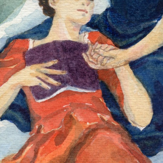


"As with Nature, with You" (2022, watercolor) - In the summer, Marianne and Héloïse would probably go on a picnic and lay on the grass under a tree canopy. Of course, they will bring the book. uwu
Happy Pride Month! 🌈🎉 ✨Prints available: https://rosedelacruzart.square.site/product/aswithnaturewithyou/55?cp=true&sa=false&sbp=false&q=false&category_id=10 #noemiemerlant #lgbtq #CelineSciamma #portraitofaladyonfire #adelehaenel
#it's been 10 years haha jk#i wanna laaaay you dooown in a bed of rooooses#let's go on a picnic and read a book about orpheus and eurydice#portrait of a lady on fire#filipinoartist#portrait nation#adele haenel#noemie merlant#celine sciamma#lgbtq#happy pride month
116 notes
·
View notes
Text
"The Restless Assault"
"Speed and skill matters, so why settle for one way when you can master both? Whether you need some more length or capacity to take down your target, we'll get you covered with our excellent menu of ranged perfection and suppression!" - Silas Silver

"Eniko": A 30-round, pistol-caliber carbine designed and considered as an upgrade to the Generic Armaments, "Compact Stoner", also known as the FPS (Fusil Portátil Stoner) Model PRM used by the Biotech Cooperations before and during the infamous 2010 Fusion Virus Outbreak; nowadays, the business, as well as the other G.O.Is in Arkingham started adopting this as their subweapon.
Ideal for personal defense in a combat team, or as a primary weapon as part of a mobile task force, this firearm is both highly customizable and highly reliable, allowing operators to easily clean out threats with ease, and precision!
"Thanatos": A 30/100-round, assault carbine rifle made from the blood of patriots and tyrants, this overly aggressive carbine comes with an extremely fast fire rate in a portable package; with an impressive 900 to 1200 RPM, you are not left begging for a bullet hose, because you are the bullet hose.
However, if this is a bit much, users can readjust the rounds per minute to a controllable 600-800 RPM, as well as customize their weapon to better suit their needs such as laser modules, foregrips, full-stocks, customized sights, and much more!
#2024#American#archives#arkingham#artistontumblr#artph#Belgian#carbine#combat#designing#designs#drawings#familybusiness#fastasfuck#fictional#fictionaldesigns#filipinoartist#illustration#illustratorsoninstagram#jamesthecreator#jamesthecreatorillustrations#longboi#mainmeal#PCCs#screwtheatf#silverfamilyarchives#sketches#speed#traditionalart#traditionaldrawings
4 notes
·
View notes
Text

My submission for #scbwii #scbwidrawthis march prompt Wild Things, Inspired by childhood memories of sneaking for the fridge only to be met by spooky sounds!
#illustration#canadian artist#filipinoartist#children illustration#children books#hamilton ontario#toronto#hamont#book illustration#no ai art#scbwi#character design#commissions open
2 notes
·
View notes
Text
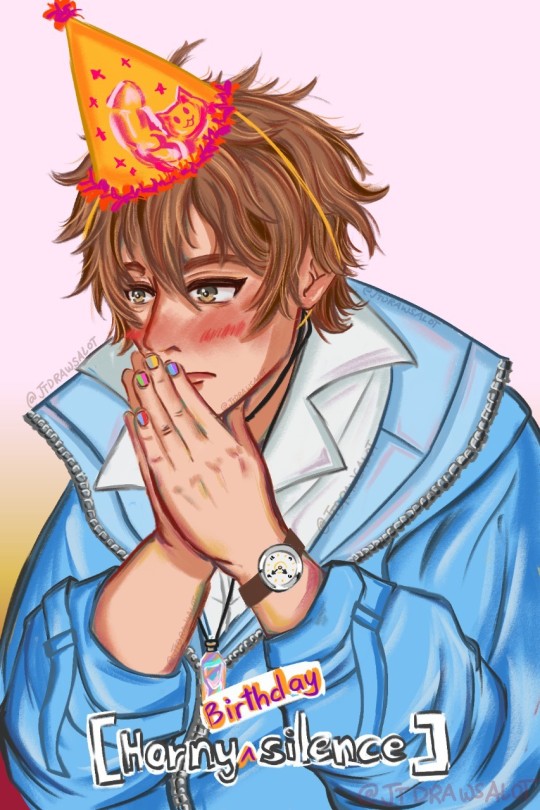

It's still eidens birthday somewhere..in my heart so happy birthday to the one and only grand sorcerer and the ultimate light SWITCH
#artph#art#artwork#jtdrawsalot#painting#jtdrawsalotart#filipinoartist#artsy#nu carnival#nu carnival eiden#nuc eiden#eiden#eiden nu carnival
55 notes
·
View notes
Text
SoS: FoMT Priest Carter Redesign
DISCLAIMER: I am not saying I am “better” than professional character designers with my redesign. I am just trying to find a middle ground between what the fans want and what the designers want. This was made for fun for a game that came out 4-5 years ago. Additionally, I know that people are “passionate” about the character, so please do not make any inappropriate comments. It makes me uncomfortable. Without further ado, here is my character design analysis.
John 7:24 (KJV)
Judge not according to the appearance, but judge righteous judgement.
I joined the fandom of my old farming game love: Harvest Moon, or what is now called, Story of Seasons. After I had been informed about the Split, I went to Reddit and ended up reading about an old discussion surrounding the new character designs of Story of Seasons: Friends of Mineral Town. What ended up standing out most to me was that people did not like the redesign the designers made for the priest character, Carter.
Apparently, there was a considerable amount of people who used to think Carter was attractive and were pretty disappointed with the redesign. It is not a big deal, but then I went to TV Tropes and it had Carter under “Adaptational Ugliness”. It is one thing if a group of fans thought the design was ugly, it is another thing if it is so widely agreed upon they put it on TV Tropes, a website dedicated to listing tropes done by a certain media. Although, its accuracy is debatable.

Was the redesign actually bad? Carter’s redesign is pretty solid, and most fans agree. His old design had him in a Catholic priest outfit, which does not make sense in the lore. I like religious symbols as a religious person, but why does Carter look like a Catholic priest (and sometimes wears a cross) if he worships the Harvest Goddess? The old design seems to be the effects of Japanese media tending to use religious symbols with no further thought put into it.
Why was the redesign so different? The designers decided to rightfully change his design to better resemble the redesign of the Harvest Goddess, Gaia. In my opinion, they successfully achieved it as Carter shares a handful of design elements with Gaia.

However, they ended up changing his silhouette drastically. A character silhouette is the overall shape of the character design in solid color. This is a crucial part of designing as it shows the readability of a character. Carter’s new silhouette differs so much from his old silhouette. He no longer has his old bangs, nor does he have his shirt and pants, but now wears a robe and a hat with a whole new different hairstyle.
I personally believe that a redesign should resemble the original design as much as possible if the circumstances allow it. (This is why I have problems with Karen but I am not going into that.) In Carter’s case, they sacrificed his recognizability with world-building accuracy, and again, this I agree with. He looks essentially the same anyway, just that he has new clothes, longer hair, and has gotten thinner. This makes sense to me personally, because unless the residents of Mineral Town have been consistently providing for him, I doubt this canonically broke priest, whose one of his self-proclaimed “luxuries” is being able to freely eat the mushrooms that grow in the back of the Church, would be able to eat as much. He still has his signature facial expression, his closed-eyed smile. I adored that, as someone who likes character designs, Carter is still recognizable by his expression alone even if he had changed so drastically. However, I’d argue that the old design would still work if it was tweaked a little. I will go into that later.
On the Harvest Moon wiki, I learned of another priest character, Chester from Hero of Leaf Valley. I thought he looked like a combination of Carter’s old design with his new design. Then I learned about Nathan from Harvest Moon DS: Island of Happiness, Harvest Moon DS: Sunshine Islands, and Harvest Moon: The Tale of Two Towns. His design seems to be the basis of Carter’s redesign.
I think the original design of Carter was the basis of both of these priests’ character designs, then those designs were used for Carter’s redesign. Chester, who has a similar-sounding name and brown hair, looks like a fantastical Catholic priest. Nathan, on the other hand, has similar clothes as the original and even a similar pose. Carter’s redesign seems to be a combination of their designs but with a leaning of Nathan’s.
He accidentally became my favorite character then decided to try and redesign him.
First off, I do not think that Carter’s design is “ugly,” just the way he was drawn. All of the adult male characters, with the exception of Basil for some reason, were drawn cartoonishly compared to the bachelors. If Carter was drawn in a similar way as the bachelors, I think he looks pretty decent, as shown in an official comic panel. (I edited out the other characters.) Here is my redraw and edit:


I traced a bachelor’s head and used references of different bachelors to mimic the game’s art style and there is a clear difference. The bachelor’s proportions are much more realistic compared to the villagers’. Additionally, I made Carter’s hair push out more to look more natural. It seems he had absorbed Rick’s adorkableness.
I tried to mimic the game’s art style, and I learned that while the art was done digitally, it was colored/shaded as if it was done traditionally. I can see what looks like brush strokes. Combined with the art of Pioneers of Olive Town, it seems the Harvest Moon/Story of Seasons franchise creates digital art that looks like it was partially created by traditional mediums, and I love that direction.
Still have no idea why Basil was spared as I can not find any patterns, maybe the designers just like Basil more. Who knows.
For the redesign, as said before, I think his old design could still work if the appropriate changes and justifications had been made. I drew my redesigns in my own art style to make it easier for myself, and here is my 1st redesign:

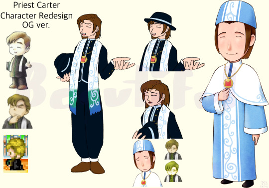
I leaned heavily on the Catholic priest influence but used the priests’ and the Harvest Goddess’ designs so it would still make sense within the lore. I tried to keep his old silhouette as much as possible and drew him in his old pose to add to his recognizability.
I gave Carter a hat that Catholic priests wear called a cappello romano because I had thought his sprite had him holding one. It was apparently a green book according to his character art, but it seems to be slightly inaccurate though, as his polo shirt was drawn as a green stripe down his shirt. He was consistently drawn holding a book either way.
For his hair, I just combined his old and new hairstyle which worked surprisingly well.
The dark shade of color for his clothes was color-picked from Chester’s clothes but changed to blue. It is not actually black, it was a deep shade of violet. True black can be found on Alice, another character in Hero of Leaf Valley. I gave him white cuffs on his sleeves and pants based on Nathan’s and Carter’s official design.
If Carter were to wear dark clothes he might stand out among the characters, but Harris wears predominantly dark clothes so I do not think it is a problem. Additionally, if Carter wears dark clothes that look almost nothing like what the Harvest Goddess wears, it would still make sense within the lore.
The games keep mentioning tidbits of information that Carter has no idea what he is doing, he himself admits that he is not a real priest. Carter wearing clothes that do not resemble the Harvest Goddess’ would make sense as he is not a real priest, further solidifying that fact.
He’d be more similar to Chester, who was described as being shady, than Nathan, who seems to be the only real legitimate priest of the three.
Speaking of color, my redesign was originally supposed to be green because I thought that he was lacking his Harvest Goddess’, Gaia, signature color. The aforementioned priests have their Harvest Goddess’ signature color, or so I thought.

I color-picked Chester’s stole and Marina’s, his Harvest Goddess’ name, hair. It turns out that Chester’s was a deep shade of purple while Marina’s was a light shade of pink. However, when color-picking Nathan’s scarf and the Harvest Goddess’ hair, it was a similar shade of green. If that is the case, why does Carter not don the signature color of his Harvest Goddess? He and Nathan worship the same Harvest Goddess, after all.
I later noticed that Carter has a saturated shade of blue on his amice, which is a similar shade to Gaia’s new design with her gradient hair. But that would mean if Nathan were ever to appear in a game entry that would mean he would forego the green in his design.
It is also possible that the design element, in truth, has no significant meaning, but I would like to treat it as if it has one for this instance.
As said before, I was planning to have Carter wear green but changed it to blue to further suit the character. I still, however, kept the green on his stole. His stole started on the bottom edges with a blue color that gradients into green, then white. In relation to Gaia, this was supposed to mimic her hair and to keep her signature colors. Additionally, I did this to keep his old design and when his would-be character portrait appears, the white of his stole can only be seen exactly like his old portrait.
I made it have an added meaning too, that while Carter is religious, he is not faithful. Chester may or may not have the signature color of Marina’s but there is no doubt that he devotes himself to her. The definition of “He a little confused, but he got the spirit”. Nathan has the signature color of Gaia and he has dedicated his life to her. But Carter has expressed trying to find a higher purpose in his life. Having the stole fade from blue to white was my way of representing that listlessness.
In addition to that, I had placed the vine-like markings on his stole and used that same color of blue, and included it on his shirt and hat. The medallion is supposedly the symbol of the Harvest Goddess as Nathan also has one so that design element is crucial.
Added some buttons on him, and I noticed that in his original design, his hair is the same color as his shoes so I incorporated that. That is all for now about my 1st Priest Carter Redesign.
Here is my 2nd Redesign:


I took some design elements from his official design but changed it to lean more on Chester than Nathan. If Carter’s official design leans more on Nathan, then this redesign leans more on Chester. Still kept him in his old pose but instead of holding his hat, he is holding his medallion similar to his official design.
I have a similar thought process with this redesign as before.
For this one, I used black with dark blues to still have him resemble Gaia. The dark blue came from Chester’s design as well, just changed to blue. In addition, the curled-up ends of the cincture or sash, which is fully green with a blue gradient this time, and the three scapulars are supposed to callback to Gaia’s curly hair and layered dress.
I still drew him in my redesigned hair style but it is possible the reason why the designers just chopped off his bangs was because it would be difficult to draw Carter with a hat. Not impossible, just difficult. He does look more like a stereotypical priest with his hair on the official design, and it was the designers’ goal to make him more comical.
Speaking of which, for good measure, I drew Carter’s expressions using my redesigned versions. I actually like how the redesign made him much more expressive through his posing. The most expressive sprite he had, the one on the bottom left, was cut in the switch to the GameBoy Advance. Yes, Carter may be a generally calm guy so his expressions would not be that extreme. However, the most expressive he has been is changing his expressions while looking straight ahead or his body turned slightly to the left.
For some touches, I made his medallion longer so the black color would not be as distracting. His scapulars and amice have the same vine-like designs from his official design. Lastly, his scapulars have similar patterns as his hat.
I honestly would love to have Carter as a bachelor, even with his design right now. If the developers were to remove someone like Bon Vivant for example; I do not really think people would complain. They were able to do it by promoting Gordy to bachelor status. Maybe in the Harvest Moon DS: Cute remake, we could marry his descendant or something like in the original. Crossing my fingers that he appears in a game and becomes a bachelor for some reason.
Anyway, I am excited for the next installment of Story of Seasons!
I hope my redesign did not come off as prideful, as I said before this was made for fun. I hope people will like my takes though, so I would love to hear some feedback. Thank you for reading!
#God#Christian#Christian artist#Christian creative#Christian art#beautiful#story of seasons#harvest moon#bokujou monogatari#Redesign#character study#character art#harvest moon friends of mineral town#story of seasons friends of mineral town#sos fomt#hm fomt#more friends of mineral town#friends of mineral town#Filipinoartist#artph#harvest moon carter#Illustration#Cozy game#mfomt#fan redesign#fan art#I want him to be a marriage candidate because I think its funny
5 notes
·
View notes
Text

My OCs!! Idk just trying something out :3
Caine: You gotta be gentle…
Rui: Ugh! baking has too many rules! Just use the god damn mixer on max!
Caine: Stop complaining! you said you wanted to help Tito (uncle) with the Shop. So listen to my instructions. Unless, you want our customers to experience what it’s like to eat a rubber boot.
He sounded so harsh. Yet, he is so patient. Face did not match the thunder in his voice.
It’s funny. Rui used to freeze up when someone raises their voice at her, but now, didn’t even flinch, talking back even. The warm sun settled in the kitchen, lighting up the room with her beauty, The cool breeze of dusk brushed her skin, Caine’s voice echoed. Time seems to slow, and she gladly took it all in. Huh, since when did that happen? Since when did she feel so… at ease? At home?
Still to this day, she questions why would these people willingly open their arms at her, a stranger. And is it selfish of her to cling on?
The day ended with a slightly rubbery cake and a kitchen filled with laughter.
——————
NOT A SHIP PLEASE 😭
Started this of feb 3 and i just finished today💀
‼️‼️‼️‼️ If this was a cringe read, then I’m sorry 😭
Im using the excuse of English is not my first language 🧍🫶
#art#digital art#oc#oc art#illustration#my ocs#oc artwork#oc lore#oc story#i wanna draw more ocs i love my children so muchhh#filipinoartist#artists on tumblr
1 note
·
View note
Text

Bart bros. street art mural ,graffiti, philippine artist
Location: Philippines Cebu city
0 notes
Text

NOVEMBER is for cozy fall noms 🍂
#hawaiiartist#digitalillustration#digitaldrawing#filipinoartist#procreateart#fall foods#comfort food#support small artists#support small business#foodartist#foodillustration#fooddrawing
1 note
·
View note
Video
youtube
Pride Tarot: Six of Cups
#YouTubeVideos#YouTubeChannel#PrideTarot#ACollaborativeDeck#USGamesSystemsInc#TarotCards#TarotCommunity#LGBTQ#LGBTQIAPlus#LGBTQTarot#LGBTQIAPlusTarot#LynardJymNarciso#SixOfCups#SixOfCupsCard#GayMan#Filipino#FilipinoArtist#YouTube#PsychicReader#EnergyHealer#GayMaleWitch#RobertAlvarezThePsychicWitch
0 notes
Photo
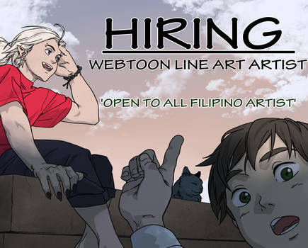


Don’t know if this post can reach many Filipino artists, but I’m hoping it does. Hello Filipino artists.
I’m looking for someone with great linework for our ongoing Webtoon original series. So, if you think you got what it takes, then apply now.
0 notes
Text

Hello once again Tumblr, I draw cute men. Here's your cute neighbor man also :">
73 notes
·
View notes
Text

Sometimes, thoughts that make me feel fear and self-doubt come up. It's something we all experience, right? Lately, I've just been doing what I can to find solutions and working that I forgot about this POALOF episode! But I'm thankful for the things that bring me joy, the miracles that happen, and for the people who give me love and support. Thank you. ❤
If you love my art, consider becoming a patron!: https://www.patreon.com/rosedelacruzart
#things are gonna be ok#portrait of a lady on fire#filipinoartist#portrait nation#adele haenel#noemie merlant#celine sciamma#luana bajrami#lgbtq#marvyuchida
11 notes
·
View notes
Text
ALAYA GAVAN' RETURNS ONCE MORE, AND YOU CAN NOW ENJOY IT ON WATTAPAD! 💙
Alaya gavan' Act 4 Chapter 6
also I have Act 1 Chapter Negative 1 to Chapter 1 uploaded to wattpad
2 notes
·
View notes
Text
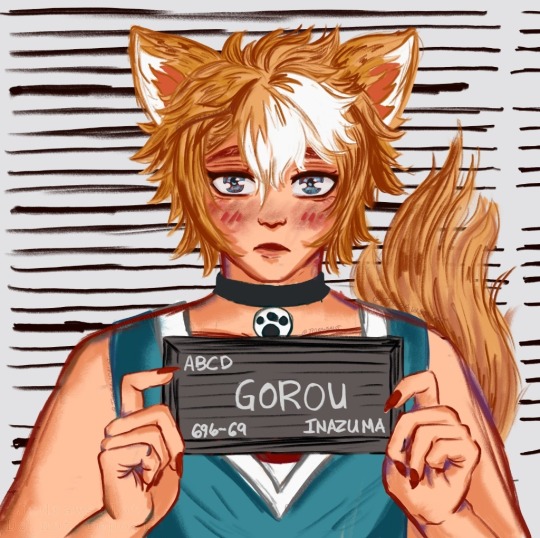
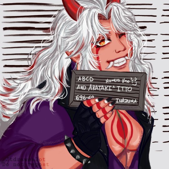
Bandwagoning with that barbie meme but ittorou
#artph#art#artwork#jtdrawsalot#painting#jtdrawsalotart#filipinoartist#artsy#ittorou#genshin impact arataki itto#itto arataki#genshin gorou#gorou#itto x gorou#genshin impact itto
34 notes
·
View notes
Photo

The Petals & Palates event is about to start!! It's a unique collaborative celebration of the visual and tasteful floral feast with @imahicaart and @sheratonmanilabay. Art + Food!
#imahicaart#floral#dinner#dinnertime#artevent#floralart#hotel#sheraton#manila#synergies#partnership#flower#artgallery#collection#feast#debonair#artlover#artshow#artworks#paintings#filipinoartists#contemporaryart
0 notes