#FWXB2002 XB2002
Explore tagged Tumblr posts
Text
3D Modelling for Games: Session 15 (18/01/2018)
Another day of failing at modelling the 1989 Batwing. We generally just got on with things for the first half hour of the session before being taught how to bake textures from a high poly mesh to a low poly version. Initially I didn’t understand the point, as I wasn’t going to be using Zbrush, however Paul came over an explained how it carries the information over from the curves and edges of the high poly and applies them to the low poly, giving a much better effect than I realised it would.

My first order of business was attaching the top fins to the body of the Batwing. This meant adding in more vertices (perhaps much more than was necessary on reflection), but I was able to pull it off quite easily.
I did have an issue with the verts snapping into unwanted positions, but Paul pointed out that this can be changed in the settings of the multi-cut tool that I was using.

I finally got round to sorting out the tip at the back of the wing too, figuring out the best and most optimal way for it to come in at a point whilst avoiding any inconsistencies with the wing sloping in at a point.

For the majority of the session I switched my attention to the bottom of the body as it connects to the wing, as I felt that the reference images I’ve been using didn’t really give a true representation of how I personally remember the Batwing from the toys I had as a kid.
Whilst not perfect, I feel like I’m definitely getting there. Unfortunately time is now of the essence, and I need to be much less picky and just “get it done”. On the positive side however, the hand in is merely formative, so I will have time to improve upon it, assuming I stay on top of my other work.

Of course I was never going to get through an entire session without... messing up a little. Somewhere down the line I must’ve accidentally selected a number of verts at the back end of the Batwing, which lead to a lot of deformity. I didn’t have time to correct it all, but I did make sure that they were realigned to the centre of the grid.
Aside from this, I’ve recently spent a couple of hours a day over a four day period revisiting my first assignment. Paul had previously mentioned that my efforts - while decent - were not really up to par, specifically regarding the texture of the MCFC badge. As such I decided to make a “companion piece” for the 89 Batwing by creating a low poly version of the one from Batman Forever. As you can see below the mesh itself is finished and next I’ll be moving on to unwrapping and texturing it.


1 note
·
View note
Text
XB2002 - High Poly Model Progress - Blog Post 1
I have begun working on my high poly 3D model which is going to be a highly detailed and fairly complex minigun, to aid me in my creation I am going to refer to several images for reference as well as several Sketchfab uploads from other users, with these references I should be able to create a final outcome of a high standard.
Sketchfab References
Minigun by shadowdragon811 on Sketchfab
Sci-Fi Minigun by Feche Pedroza on Sketchfab
The Usurper by toomanydemons on Sketchfab
Image References
Fallout 4 Miniguns


GTA V Minigun

Real Life Miniguns


Development
Working from these references I have so far produced the bulk of this 3D model, keeping it fairly simple for the time being and focusing more on the scale of individual parts, some refinement will be necessary.
Below are some quick renders of my current progress with smoothing temporarily applied to the majority of the 3D model.


Below is a quick render without smoothing applied.

Below is an image showing the wireframe of the model, unsmoothed.

The majority of the geometry is currently within the bullets which require refinement.
I will now work on adding further detail to this model and refining existing aspects.
Continued Development
Since my last progress update, I have begun to finalize development of the key aspects of the model and I have been focusing heavily on structural consistencies, ensuring that parts are merged together realistically and in a lifelike manner, including a power source for the minigun with the appropriate wiring.


I have also created a final bullet model suitable for duplication, below is a quick render of a smoothed and unsmoothed version of this particular model.

Below is my current progress with the minigun uploaded to Sketchfab for 3D inspection and personal evaluation, untextured and unfinished of course as I am still in the fairly early stages of development.
Minigun Test (WIP) by FWLukeSummers on Sketchfab
2 notes
·
View notes
Text
XB2002 3D modelling
Lesson 1
For the first assignment, we need to create a low poly (under 2000 triangle) prop model to quickly get back into Maya.
I chose to create a treasure chest.
Research
For this task I chose to create a treasure chest. This is because the treasure chest will work well with the criteria, in that it will be low poly, work with the 1024px limit for the texture and is a commonly seen game prop.
I began researching treasure chests, firstly from Google images and secondly from different games.
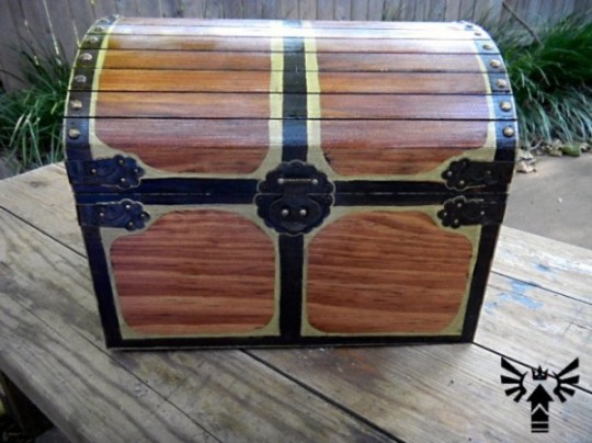
Google Images research
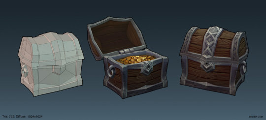
Google images gave a few examples of real and cartoon looking treasure chests to get some inspiration from. I firstly looked at the shape of the treasure chests and noticed they all followed a very similar structure. This was that they were rectangular at the base with a curved lid which could be opened to allow people to look inside. Inside is where my coins are going to be placed. The second thing which I noticed was that they were mostly made from wood, meaning the texture for my treasure chest would most likely have to be wood. Thirdly, most of them contain gold metal holding the wood in shape. I also found a chest which another designer has modeled and used that as a reference too.


Game research
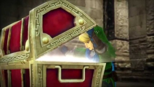
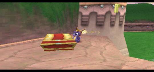
I then went on to research treasure chests in other games. These games included Skyrim, Legend of Zelda and Spyro. One thing which I noticed to be different from the images from Google were that they were not all created from a wooden texture. I also noticed that they all featured patterns and symbols to add detail to them, something which not all of the Google images above contained.

Sketchfab
I also looked on Sketchfab to view other 3D treasure chests which other designers had created. The advantage of viewing these were that I could get a 3D perspective and analyse the wireframe involved, which in turn, could benefit my 3D model, as I could look at the way others created their models and replicate parts of it which I may not know how to fully create whilst keeping the chest low poly.
The ones which I looked at were:
https://sketchfab.com/models/0b8cbed26343414ab9f28ba6b5f023de
https://sketchfab.com/models/1e6f70cd55f5479bb9ab552f119ea9c4
https://sketchfab.com/models/b67d504dddeb436e823bf36defc2ed8b
What I noticed from these models were that they followed the shape of the chests from Google images and were all made out of a wood texture with metal hinges to hold the wood structure in place and to make it solid enough to be able to hold the coins inside it. I also noticed that they were a lot similar in the design than the ones from professional games were.
Images of creating the 3D treasure chest with process
After researching these treasure chests, I began creating my own. I am going to create it out of wood with metal hinges holding it together and have a lock on it, with some finer details being placed on the metal sections to give it more of a professional look. I will also have the chest open so that the coins inside are visible, with them being created low poly with a high resolution texture placed over the top, most likely in Substance Painter. I feel the rectangle ‘box’ look is too overdone and simplistic, so I am going to give it more detail by making the base a little bit thinner and the top of the chest a little bit wider. This should make it look more professional too, as the ones I have seen where the designer has done this look more unique and are rarer to see.

The creation of the 3D treasure chest
I opened Maya and began creating the treasure chest. I began by creating a cube and modifying the scale so it was a lot wider than it was tall. I then selected the front and back faces and added 2 edge loops horizontally and vertically. From there I scaled them out so they were near the edges of the face, as these will become the metal sections holding the wood together. I then took the top face and extruded it downwards to create the inside of the chest for where the coins will be placed.

From here, I extruded the faces inwards; starting with the front and back ones together, then the 2 sides. This adds depth to the chest, meaning more detail is added, allowing it to look more professional due to the treasure chest having more realism.

I then created the lid of the chest by creating a cylinder and cutting it in half before scaling it so it was in line with the base which I had created before.

I then added 2 edge loops across the top of the lid and moved those to be in line with the edge loops on the base of the treasure chest.

From here I took the faces from the 2 top edge loops and extruded them upwards to create where the metal arcs will be on the lid of the chest.

I changed the pivot point for the lid to the center of the back bottom edge and rotated it round so that the lid opens in the same way a normal real life chest would open.

By the end of the first lesson I had reached this point, moving the back down to where it would be in order to open realistically, with the gap on the back being there to allow for the hinges to be placed on the back later on. I feel like I have achieved quite a lot in this lesson, especially as I have not used Maya properly for a few months and the structure of the object is beginning to resemble a ttreasure chest.

The next job was to put splits in the front of the chest. To do this, I added 4 edge loops vertically and moved them into place to look like 2 wood panels down the front. I then selected the 3 faces between the front panels and the same 3 faces on the back and extruded them into the chest. This created the structure of the wooden chest, which will be made out of metal once textured and is used in real life to hold the chest’s wooden structure together. I then took a sphere, split it in half and placed duplicates around the chest to act like jewels.

From there, I added 2 edge loops down the lid of the chest and extruded the middle faces outwards.

After that I created a sword to go into the chest to give it more purpose and story, as just having a chest with coins in would not be very rewarding compared to finding a sword which can be useful. I began by creating a rectangle for the top of the handle. I then added 3 edge loops down the middle and moved the vertex’s inward on one side to create the shape which the blade would be. I also added one edge loop horizontally, moved those vertices around then extruded that shape out to create the blade. For the end of the blade, I extruded out the two top faces and moved the vertices to meet in the center using the merge to center tool. For the other side of the rectangle, I extruded the 2 faces out to create a rectangular handle.

From here, I gave more shape to the top of the handle by scaling the end of the handle faces inwards (towards the center) on each side, leaving the middle faces higher than the sides.

I then rounded the rectangular handle by moving the vertices on both sides more towards the center and creating the more rounded shape by eye.

Before extruding the end faces, adding edge loops and creating a spherical shape out of them to create a base for the sword by manipulating the vertex.

I then moved the faces of the inside of the chest upwards so the sword was not sitting to far into the chest and could be easily visible, scaled the sword down and placed it into my chest.

I then added 2 cylinders to the back of the chest to create hinges which would be used to allow the lid of the chest to open and close. I created a cylinder, scaled it down, placed it into position, duplicated it and placed the second one into position.

I then created another cylinder, scaled it outwards and made it thin in height to create a coin shape, placed it into position around the sword in the chest, duplicated it a few times and placed a few of them in.

I found that I had some double extrusions in the front of the chest when I had moved the faces back. This caused issues when trying to UV the chest. To overcome this, I selected over each vertex to see how many were overlapping, for example, the one in the image below has 5 vertices selected on the green dot, which can be seen on the poly count on the top left, first row, last number (5), then clicked on the ‘merge (vertices) to center’ tool, which merged all of the vertices into 1 vertex.

Another problem I faced was that the inside faces of the chest lid disappeared and became uneditable. To fix this, I selected the left edge and the right edge of the bottom of the lid of the chest and bridged across it to form a base for the lid. When I come to editing this chest before the summative hand in, I would like to indent this inwards, as the chest would not have a flat base to the lid as it would not close correctly, especially if a sword was in the chest, as it would stick out too much for the lid to close.

The image below is an example of UVing the lid of the chest. As can be seen, it is split up into parts to UV, unwrapped mainly using planar unwrapping, as well as automatic unwrapping in small complex parts of the unwrap before they were edited in the UV editor. I selected all the different components using object selector, i.e. the lid, sword, base, jewels, coins and hinges and combined them together so they made 1 object which could be textured using 1 texture sheet.

After all the pieces were unwrapped, my unwrap looked like this in the UV editor:

With the untextured version looking like this:

This is the unwrap for the coin:

And for the jewels in more detail.

This is a closer look at the unwrap as shown above.

I then neatened the UV up in the UV editor, moving all the different components of the unwrap into one sheet (grid square) so that it was easier to texture and so that each part could be textured through 1 sheet, as using multiple sheets not only gets messy as to where each part is but also would cause the engine to have to load more elements when it was placed into an engine. The image below is what the unwrap looks like from the back.

The side:

And the front. I overlapped the coin and jewel UV’s as they are going to be the same colour and textured the same anyway so it made sense to have them overlapping and use the same texture, plus it saved space on the texture sheet.

I then began texturing in Substance Painter. This was the first time I had used this software so took a bit of time to get used to the different functions, but with a lecture based on it, it was not too long before I had a basic knowledge of how to use it. I began by adding a wooden texture onto the chest, with a leather handle for the sword and a steel blade.

This is a screenshot of Substance Painter with the 3D object on the left and the 2D flat texture sheet on the right. I added a copper metal texture to the front and round the edges to make the metal structure of the chest which would be used to keep the wood panels in place, added a red aluminium look to the jewels and gold colouring to the coins and the end of the sword.

This is how it looked in render:

I also added the ‘gold armor’ material to the middle of the sword handle too:

Once I got to this point I decided I did not like the bronze metal on the chest so changed it to a rough steel texture with ‘iron old’ markings on it. I feel this gave the treasure chest more colour and made it look brighter.

Once I had created the treasure chest I decided I wanted to see what it looked like with an emissive blade to the sword to give the illusion that it was enchanted. To do this I created a blue emissive layer on the steel blade and it was fairly effective in giving the illusion I was looking for.

This is the UV with the emissive blade texture:

This is a close up of the treasure chest with the emissive sword. As can be seen, it is quite bright, so would stand out in a dark room inside of a game, making it noticeable to players as a stronger weapon, as that is the common feature of enchanted weapons.

Just to extend on that point, an example of enchanted emissive swords can be seen in World of Warcraft:

Image from: http://wowwiki.wikia.com/wiki/File:Enchanted_sword.png
In the end I am happy with how my chest came out with it looking a lot more realistic than anything I have ever created before using Photoshop. It looks exactly like a treasure chest which could be found in an RPG game, which is the look I was going for. In terms of changes, I would like to create an indent in the base of the lid to create a more curved and realistic chest lid and use a different texture for the metal, as it is too bright and does not look as realistic as it could do. Below are the 3 pages which I created for my PDF hand in. I did not hand in the emissive textured treasure chest, as I created this after the formative hand in, however, for the summative one once changes have been made, I may hand in the emissive one.
Here are some beauty shots of the rendered treasure chest:


Beauty shots:

UV sheets:

Final texturing and texture sheets:

Sketchfab link for the treasure chest:
https://sketchfab.com/models/6eb48ecb052b4fa3ac64a8f8df098f53
1 note
·
View note
Video
youtube
XB2002 Assignment Three - Environment Art
The Environment Art Scene Fly Through and Trailer:
For my final development milestone of my low poly environment, I created a flythrough/reveal trailer for the whole environment scene itself.
For the trailer, my main focus was to capture the majority of the environment within the Unreal project and have a seamlessly smooth transition throughout the whole thing for the camera’s projectile path it takes.
For the camera and video itself, the video was captured on a matinee keyframe animated camera, and upon completion of the matinee’s route rendered out the Matinee’s movie projected path at a 1080p 60 frames per second video at the MP4 format.
From here it was the case of taking the Unreal matinee movie and importing it into Adobe Premiere Pro and adding visual effects such as the transition to white in the title and credits scene and adding the soundtrack Floating Home over the video.
Within Adobe Premiere Pro I also compressed and rendered the video from its initially slow speed Unreal video file, and from here was able to acquire the smooth flow of movement visible in the video above.
I am very satisfied with the final version of the reveal trailer for the whole low poly environment scene, as it has allowed me to develop my 3D modelling, environment art, and Unreal materials skillsets.
One of the design challenges I faced within the video creation process of the project was creating the right visual effects for the video to make it more professional, as my creative milestone aim for this video was to create a fly through that resembles that of an actual game reveal trailer.
Overall I believe the trailer video manages to good a good job of showcasing the environment itself and capturing the emotional feeling of the visually displayed environment and it’s narrative and matches that of the initial concept idea I had for the environment from the beginning of the project.
#FWXB2002#XB2002#XB2002FW#XB2002Futureworks#FutureworksXB2002#Futureworks#BAGDYear2#LowPoly#EnvironmentArt#Gamedev
2 notes
·
View notes
Text
XB2002 - Modular modelling: Plan
The idea I have for this project is to create a crime scene in a 1940′s living room. I was inspired by L.A Noire which is a video game where the player plays as a detective and they travel to different crime scenes and investigate by finding clues and asking questions and they are then to bring it all together to solve the case.
The idea is that I will create a similar looking scene to the ones that I saw in L.A Noire, I plan to include detective equipment and multiple assets from that specific time period, I have done research into the objects that were common in 1940 housing as well as equipment and objects that are commonly seen or used in crime scenes.
These are a list of the assets that I will create:
Chandelier
Sofa
Photo frame
Rug
Fine china
Cabinet
Fruit bowl
Coffee table
Coffee mug
Dead body
Police line
Notepad and pen
Evidence cards
Old telephone
Lamp
Broken vase + flowers
Basket
I have collected various reference images and put them into a reference folder that I will work from while I am modelling these assets. These are some of the images of each asset that I will be referring to:
* Some of the images I collected could be classed as graphic so I have excluded them from this reference list *
Chandelier


Sofa


Photo frame


Rug

Fine china


Cabinet


Fruit bowl


Coffee table


Coffee mug


Police line


Notepad and pen


Evidence card numbers


Old telephone


Lamp


Broken vase


Basket


With these references I will begin modelling and creating the assets for the scene.
The programs I plan to use are:
Autodesk Maya 2016, Photoshop and Substance painter.
Once I have modelled, unwrapped and textured my models, I will place them into a blank Unreal engine level based on the white box I have created.
These are some screenshots of the white boxing I have done for the crime scene:


Links for reference: https://www.tripadvisor.com/LocationPhotoDirectLink-g46278-d558699-i72808790-Wright_Museum_of_WWII-Wolfeboro_New_Hampshire.html https://uk.pinterest.com/anin75/1940s-living-room/ https://uk.pinterest.com/explore/1940s-living-room/http://www.ebay.com/itm/Vintage-Lighting-rare-circa-1940-chandelier-by-Lightolier-/381983886023 https://uk.pinterest.com/craftylaughty/rug-hooking/ https://rugrabbit.com/sites/default/files/imagecache/big/damavand_galleries/36-2010/more_images/2.jpg https://rugrabbit.com/Item/antique-floral-5-x-7-kerman-persian-rug-carpet-cir-1920-you-are-bidding-beautiful-antique-kerma https://www.dreamstime.com/stock-photography-fine-china-image2152752 https://uk.pinterest.com/clo101/lenox/ https://uk.pinterest.com/chatimoras/fine-china/ http://theantiquemarket.com/collection-of-flow-blue-fine-china http://theantiquemarket.com/fine-selection-of-antique-ceramics-and-porcelain http://www.replacements.com/mfghist/chinacare.htm http://retrorenovation.com/2010/01/30/restored-antique-lighting-from-rejuvenation/ http://www.ebay.com/sch/China-Cabinets/20487/bn_1516392/i.html http://mattandshari.com/decorating/accessorizing/the-art-of-accessorizing-a-china-cabinet/ http://www.ethanallen.com/en_US/shop-furniture-dining-room-storage-display-china-cabinets http://uantique.com/china_cabinets.htm http://www.ebay.com/bhp/china-cabinet http://www.erikorganic.com/dining-room/china-cabinet-farmhouse.shtml https://www.1stdibs.com/furniture/tables/coffee-tables-cocktail-tables/1940s-coffee-table-jansen/id-f_346899/ https://www.pamono.com/small-neoclassical-oval-coffee-table-1940s http://www.ebay.com/itm/2-VINTAGE-1940-039-S-VICTOR-RESTAURANT-DINER-COFFEE-MUGS-CUPS-DOUBLE-GREEN-STRIPES-/252143022745 https://cdn0.rubylane.com/shops/prairiewindantiques/RLG-297.2L.jpg?56 https://www.rubylane.com/item/520021-RLG-297/6-Fire-King-Jadite-Jade-ite https://uk.pinterest.com/pin/205758276703939276/ https://img1.etsystatic.com/063/0/5913861/il_570xN.759650581_kuvr.jpg https://www.etsy.com/listing/231893295/vintage-wallace-china-beige-mug http://www.dafont.com/forum/read/82427/crime-scene-do-not-cross https://commons.wikimedia.org/wiki/File:%22Crime_Scene_Do_Not_Cross%22_tape_(3612094774).jpg https://videohive.net/item/crime-scene-do-not-cross-3/10685605 https://www.shutterstock.com/search/crime+scene+investigation http://dangerpronerobson.blogspot.co.uk/p/responding-to-emergency-services.html http://thesecret6ups.blogspot.co.uk/p/csi-taton-crime-scene-photos.html https://www.hometeam.sg/article.aspx?news_sid=20150817QONsQWX3mCc9 http://www.csitechblog.com/blood-tips/ https://www.dreamstime.com/stock-photo-bloody-footprint-crime-scene-investigation-collecting-blood-stains-image55497989 https://www.123rf.com/photo_591903_notepad-and-pen-with-white-background.html https://www.123rf.com/photo_7050195_a-note-pad-and-old-fashoned-fountain-pen-on-a-white-background.html https://www.123rf.com/photo_13010352_antique-notebook-1940th--ink-pen-and-inkwell-on-wood.html https://www.lovemapson.com/products/personalised-vintage-map-notepad-1940s-new-popular-series http://www.ebay.co.uk/bhp/retro-telephone https://s-media-cache-ak0.pinimg.com/736x/4e/08/3c/4e083c60f29b7fccbfa2cec668e04306.jpg https://uk.pinterest.com/explore/1940s-house/ https://s-media-cache-ak0.pinimg.com/564x/2b/12/0f/2b120fcf44bdbdb606a804c642f5629c.jpg https://uk.pinterest.com/pin/175077504234041004/ http://rubytuesdaysvintagehome.com/images/200wallphonenov2011015.jpg http://rubytuesdaysvintagehome.com/category_1/VINTAGE-TELEPHONES.htm https://www.dhresource.com/600x600/f2/albu/g4/M00/E1/64/rBVaEFdkss-AEqC9AADZIDH-g58747.jpg https://m.dhgate.com/product/2016-new-home-ornaments-vintage-1940s-western/386593679.html https://uk.pinterest.com/pin/257971884879996675/ http://www.antiques-atlas.com/antique/an_oak_1930s_table_lamp/as160a576 https://www.1stdibs.com/furniture/lighting/table-lamps/pair-of-1940s-classic-stiffel-brass-lamps/id-f_50645/ http://www.polyvore.com/1940s_green_floor_lamp_at/thing?id=65819715 https://uk.pinterest.com/pin/297167275382648942/ http://www.alamy.com/stock-photo/vase-broken.html http://motherrr.com/help/topics/weddings/wedding-planning-avoiding-mother-daughter-conflict/ http://susanbelisle.com/dear-god-please-fix-the-broken-pieces-of-my-life/ https://petraonpottery.wordpress.com/category/1970s/page/2/ https://uk.pinterest.com/teresabotkin/broken-to-beauty-beauty-from-ashes/ https://www.shutterstock.com/de/search/broken+vase http://www.theoldcinema.co.uk/Collections/Vintage-c-7_188?in=164 http://www.theoldcinema.co.uk/French-Leather-Club-Sofa-%C2%93Havana-Gangbox%C2%94-Model-c1940-c-146_164-p-15352 https://uk.pinterest.com/hobbz4/1940-art-deco/ https://uk.pinterest.com/bethtimken/classic-couches-chairs/ http://www.terenchin.com/2013/01/03/sidney-wiggins-1881-1940/ http://www.susquehannaframes.com/catalog/Vintage-Arts/Furnishings?&start=54&l=18&view=pict http://www.ebay.co.uk/itm/Vintage-Bagley-Glass-Carnival-Fruit-Bowl-Set-Uranium-Green-Glass-1940-039-s-x6-Swirl-/142292559887 http://www.ebay.ie/itm/Straight-Sided-Classic-Pressed-Glass-Fruit-Bowl-1940s-50s-Vintage-9-1-2-wide-/201514504455 http://www.onlinegalleries.com/art-and-antiques/detail/vintage-american-sterling-silver-fruit-bowl-by-the-london-assay-office/242994http://www.ebay.co.uk/bhp/wicker-binhttps://www.amazon.co.uk/Round-Rattan-Wicker-Wastepaper-Basket/dp/B00GLU80PKhttp://www.houzz.com/photos/4714762/Seya-Round-Rattan-Wastebasket-Honey-Brown-beach-style-wastebaskets-other
0 notes
Photo
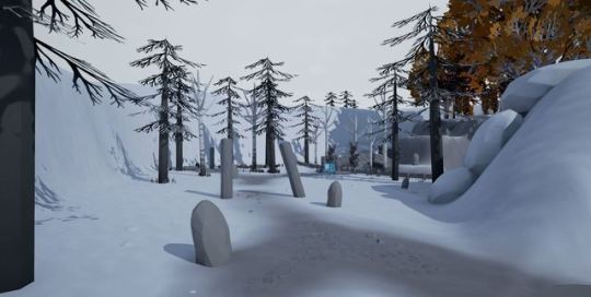
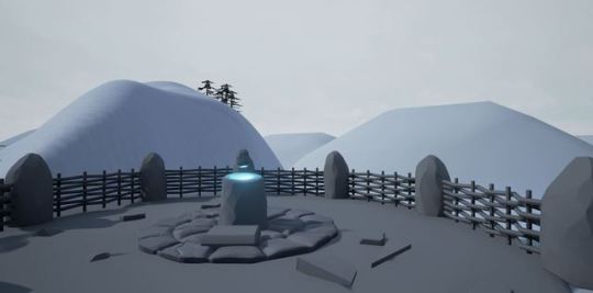
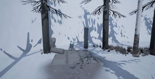
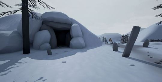
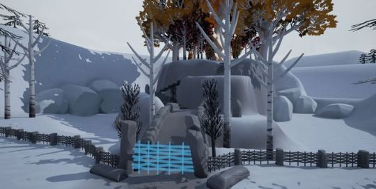
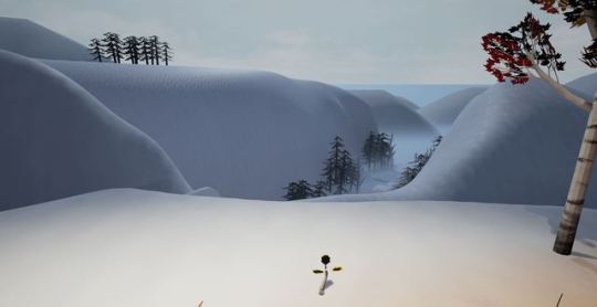
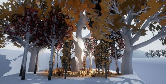
Environment/Level Design
Images from the level
0 notes
Text
William Roylance XB2002 Assignment 3 Paul Bannon Modular Modelling portfolio

Cave wall piece

Cave structure

Cave doorways

Palm trees

Fire pit

Early build of island scene

nectar plant

Level design assembly using assets

leaves before assembly

rocks before assembly
0 notes
Text
3D Modelling for Games: Session 08 (09/11/2017)
Missed approximately half of the session due to attendance of a committee meeting. I continued with modelling the main body of the cockpit, adding in more loops and attempting to sculpt it appropriately. I feel that in my approach I may have completely ruined it, as I should’ve been utilising the edge slide tool. I’m far from happy with it at the moment and may have to backtrack a little and proceed from an earlier version.


As for updating my previous assignment, I spoke to Paul again, and he agreed that I can create a low-poly version of the Batman Forever version of the Batwing (as long as it looks good, of course) so I may start alternating between the two in order to keep myself on track.
1 note
·
View note
Text
3D Modelling for Games: Session 05 (12/10/2017)
A brief introduction to Zbrush and formative feedback today. In regards to the former, it looks like a useful piece of software, and I may end up using it at some point, but at the moment I’ll more than likely stick with Maya.
The latter gave me mixed feelings. Though I received little in terms of negative feedback, the overall vibe I got was that there wasn’t much to comment on due to the simplicity of the model. I asked Paul about this, and it did indeed turn out to be too simple, and despite the positives, I’d have to create a more complex model for a higher mark. I’m currently thinking of doing a PC setup, though I won’t have to worry about that until towards the end of the year.
Looking at the high poly model, after giving it some thought I reckon I’ll create a scene of sorts. A table, on top of which is a record player, bottles and glasses of lager, a lit cigarette in an ashtray, and the sleeve/vinyl of Oasis’ Cigarettes and Alcohol. The layout will appear similar to this:

2 notes
·
View notes
Text
XB2002 - High Poly Model Progress - Blog Post 2
Below are some quick renders of my model in its current state with smooth preview enabled.
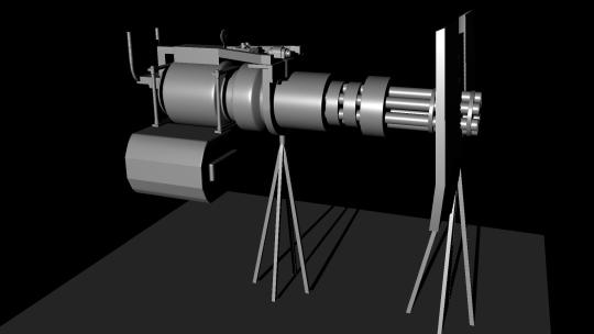
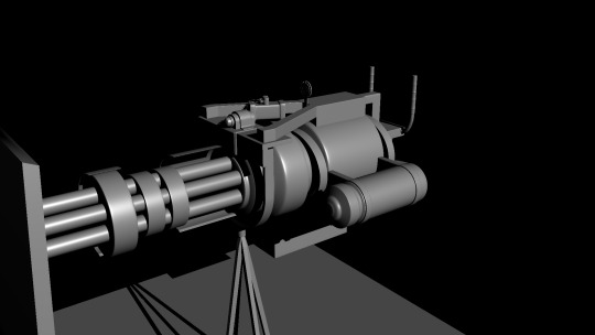
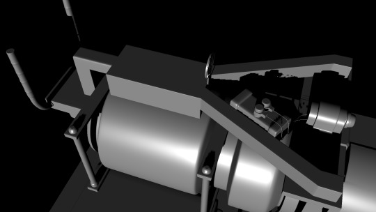
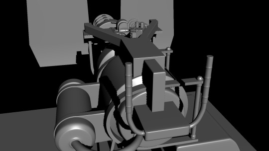
I have made several alterations since my last update and I have separated low poly and high poly versions of each part of the model into layers, ready for the baking process.
My current tri count for the low poly version of this model, as you can see below, is 21,574.
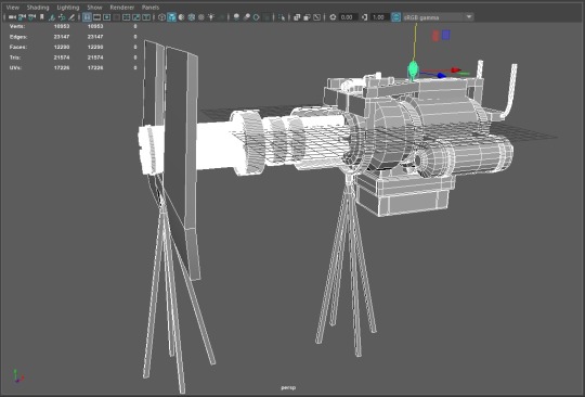
Below you will find my current progress uploaded to Sketchfab, smoothness has been applied for this upload.
Minigun (WIP) by FWLukeSummers on Sketchfab
1 note
·
View note
Text
XB2002 - Prop Renders
Poly Count
Tris: 1270
Verts: 713
Edges: 1324
Faces: 619
UVs: 902
Modelled in Maya 2018.
Textured and rendered in Substance Painter.
After much trial and error I have finalised my outcome for this assignment which is a simple low poly pirate sword featuring what I consider a game friendly design. The texture is made up of a cartoonish combination of materials showing signs of ware. I have used lighting in a manner which highlights this model well and I am happy with my final outcome.


1 note
·
View note
Photo


XB2002 Assignment Three - Environment Art
Final Screenshots:
Above you can see final screenshots of the finished version of my low poly sky island environment scene for assignment three XB2002.
Overall I am pleased with how the project has developed and the final finished project.
This project has allowed me to develop my 3D modelling, Unreal post processing, Unreal materials, and environment art skillsets, as I have been able to develop my 3D modelling workflows when working with low polygon art models and how to achieve high aesthetic valued models through the use of what materials and colour palette’s help make the environment feel more visually attractive to a gaming audience and help make the environment feel more vibrant and organic.
This assignment has also allowed me to develop my understanding of the post processing and creation of materials inside Unreal Engine 4 which I can later take into future projects and idea’s when creating environments.
If I could have added anything to the project I would have developed it even further by having an additional low poly island within the environment scene, and have the final trailer go to all three islands, and would have perhaps based the third island on a different season of summer/winter, with a whole new colour palette.
2 notes
·
View notes
Photo


XB2002 Assignment Three - Environment Art
Exploring a new art style:
Before beginning the process of creating the final trailer video upon experimenting with the post processing and materials editor in Unreal Engine 4 I began looking at other art styles I could have ultimately used when creating my low poly art style sky island environment for assignment three XB2002.
Whilst experimenting with the post processing of Unreal Engine 4, I was able to change the entire art style of the environment scene into a stylised cel-shaded aesthetic appearance.
Above you can see screenshots of the results of changing my environment art scene into a style such as this, overall I am happy with how this art style applies to the environment as I believe it does make it more aesthetically pleasing from a viewer perspective, and manages to capture the cel-shaded aesthetic well such as game like Zelda Breath of the Wild and Rime.
However, due to personal choice, I have decided to not use this art style as the final appearance for my environment scene, as I believe the lighting for the low poly art style suits the scene better than the black sky lighting created by the cel-shaded post processing.
This process, however, has encouraged me to experiment further with the post processing of Unreal Engine 4 and to consider this art style for future projects.
1 note
·
View note
Photo





XB2002 Assignment Three: Environment Scene:
Upon completion of all the models needed for the low-poly island environment scene, I began the process of placing all the meshes in Unreal upon importing their FBX files into organised folders.
I began the process of creating the environment by first selecting the type of lighting, originally my initial concept idea for the lighting in the scene was to have the scene set at night with a snow particle system being present throughout the environment.
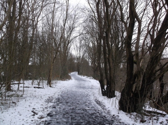
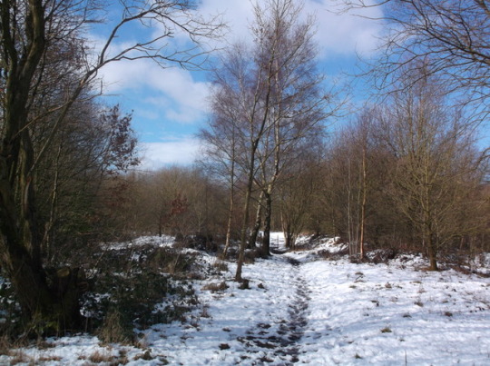
However, upon looking back at the snowy countryside photography photographs I had taken for environment set piece placement reference, I saw how the different lighting of both sun and cloud can affect a heavy snow environment, one example is the photography photo’s of the snowy forest in this post, in the first image we can see the general white skies often associated with snowy weather patterns and the transition from this to a clear sunny sky and how both alter and affect the lighting patterns within the environment the light casts onto.
Thus upon examining actual lighting caused by snowy weather, I chose to create a sky that combined the snowy clear pink skies often seen after the snow has finished falling within an area and the clear blue sky of the sun creeping through the clouds type of lighting effect that comes once the colour palette of a snow sky begins to fade.
As you can see in the screenshots above I have managed to create a sky sphere and lighting that combines both the clear blue weather sky lighting and pink snowy lighting together into a nice contrast with no clear horizon line showing, allowing me to have an environment with a seamless skydome lighting texture that manages to suit the environmental narrative of the whole scene taking place high up in the sky.
In the screenshots above you can also see that at this stage I have begun the process of asset placement within the scene using my photography reference photo’s you can see I placed assets such as tree’s and snow clumps within similar spots to that of my photo’s, I have placed the assets in such a manner as this has allowed me to create a forest environment that resembles that of an actual organic forest, as the spacing of both the tree’s and the snow is based on that of actual fallen snow and the spacing of it and actual forest trees.
One of the key development milestones that I aimed to tackle with this environment scene was to whilst maintaining the low-poly art style create organic and realistic geography for the organic mesh asset placement and through the use of the photography photo references I believe I have been able to hit this milestone of the development cycle of the environment scene.
In terms of additional lighting to add to the low poly atmosphere and art style I deleted the original sun within Unreal Engine and created my own low poly sphere mesh and created a luminate sun yellow material for the mesh, this as a resulted managed to create the nice light yellow lighting present within the screenshots, and manage to create an atmosphere of winter now coming to an end and summer beginning to set in.
You can also see I have created and placed a large number of different low poly cloud meshes within the scene, I chose to do this as a milestone I hit whilst creating the lighting for the environment was that although I managed to get the colour palette for the sky I wanted the Unreal default clouds within the environment were no longer visible, thus to tackle this milestone I created a module pack containing several variations of low poly cloud that could be placed within the environment that suit the art-style of the project, upon examination of the environment I believe I was able to achieve this milestone whilst also managing to stay on track with my project timetable.
1 note
·
View note
Text
XB2002 - Modular Modelling - Blog Post 2 - Planning/Testing
Before focusing on the visual aspect of my modular assets, I first decided to construct said assets with the focus solely on the dimensions, in order to help me determine appropriate scalability for the player's confines within my game level.
The assets I created for the level thus far are individual wall variants that fit together to create varying corridors, the 2 main types being a corridor with a corner and a straight corridor, other variants whilst similar, have doorways located at different positions, allowing me to construct a maze-like level with unlimited possibilities.
The initial modular assets I created ready for my game to be tested at university. were created according to the following plan.

Below you can see the modular assets laid out to the extent necessary for playtesting. With the addition of a doorway modular piece and a smaller blank wall, the confines of the gameplay were relatively simple to layout within UE4.

Feedback from the playtesting of my game was very useful, particularly the feedback from my tutor concerning my art direction. Everyone who tested my game was happy with the gameplay and seemed entertained throughout their experience, being confident with my progress regarding the gameplay itself, I am encouraged to focus on the 3D art aspect.
I have decided I will be recreating my modular assets with a realistic Georgian theme, whilst keeping the length and width of the hallways similar, the ceilings will be higher and dependant on how quickly I progress I would also like to model Georgian props consisting of assets such as chairs, light fittings and framed paintings, all of which will be inspired by my reference imagery in my blog post entitled, “XB2002 - Modular Modelling - Blog Post 1 - Reference Images“.
I have also managed to locate an extremely useful reference in the form of a virtual tour of a modern Georgian style home.

The virtual tour can be found at the following link.
https://firebasestorage.googleapis.com/v0/b/iview3d-15bc8.appspot.com/o/Bedford%20Estates%20-%20The%20Reynolds.html?alt=media&token=88993523-9a97-48de-b1b8-33e5467adf6e
I have decided that I will be basing the style of my modular assets on the following image, as I believe I can achieve a nice aesthetic for my modular assets whilst not overly complicating the process of translating such an aesthetic into a 3D space.

The modular pieces below are each 400cm in width and 300 cm in height, both are currently untextured. Both pieces are all that is necessary to restructure the confines of my game in entirety, a far more minimalistic approach than my first attempt.

As you can see below, I have laid out all modular pieces within UE4.

0 notes
Text
XB2002 - Modular Modelling - Blog Post 1 - Reference Images


0 notes