#Erik van Blokland
Text
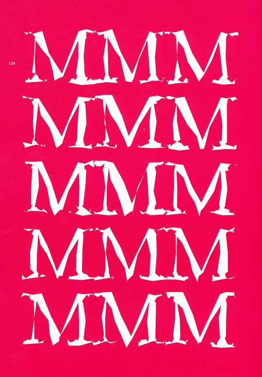
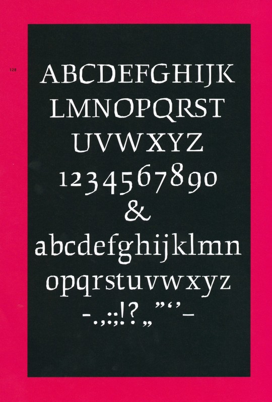
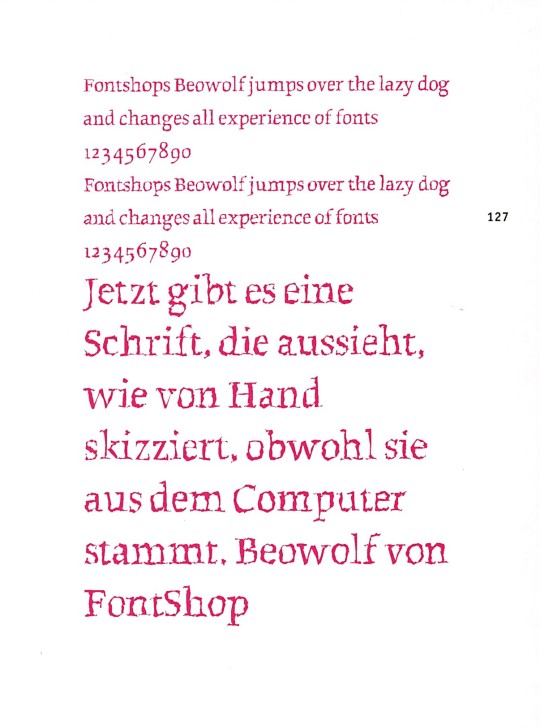
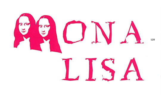
Typography Tuesday
ERIC VAN BLOKLAND & JUST VAN ROSSUM
This week we present two typefaces by Dutch designers Eric van Blokland (b. 1967) and Just van Rossum (b. 1966), co-founders of the design firm, LettError. Both studied at The Hague Royal Academy (KABK) and were influenced by Dutch typeface designer Gerrit Noordzij. After graduation, they worked in Berlin at Erik Spiekermann's MetaDesign. They founded LettError in 1989.
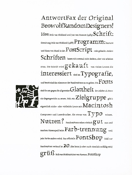
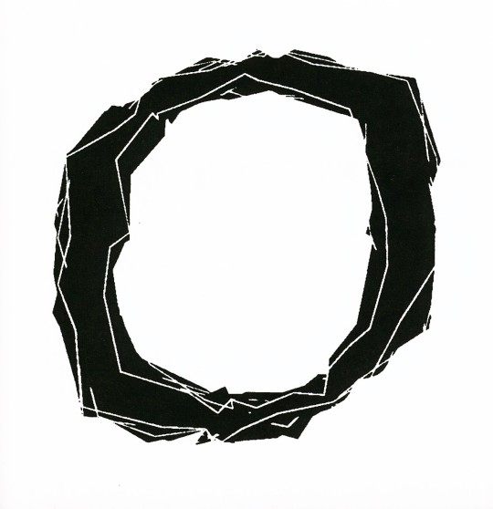
Both eschew traditional design approaches and rely on computer models and digital expression. As they say, "a font is a software instruction to a printer to perform a task." Together they designed the typeface Beowolf in 1990 and in 2002 van Blokland designed Kosmik, both of which are shown here. For Beowolf, they hacked Adobe's PostScript by adding a new function named "freakto," and the result was Times New Random, later renamed Beowolf, a typeface that changes while it is being printed. No two shapes are identical.
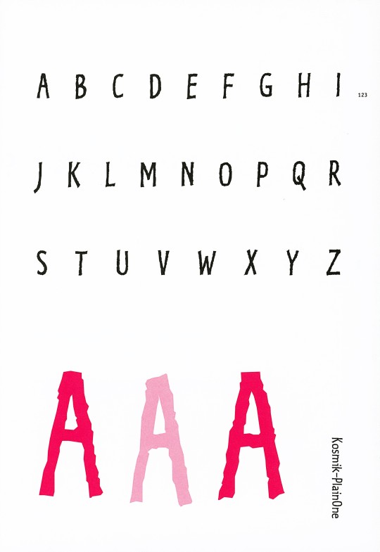
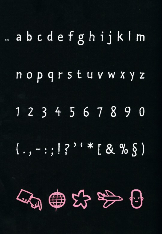
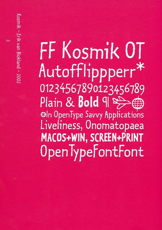
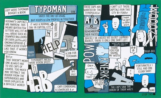
Kosmik is based on the hand-drawn letters van Blokland used in his comic strips. For this typeface, the designer used a new digital invention, the "flipperfont," a tiny program embedded in the font that ensures the printer randomly selects one of three available versions of each character.
These images come from our 2005 book Creative Type: A Sourcebook of Classic and Contemporary Letterforms by Cees W. de Jong, Alston W. Purvis, and Friedrich Friedl, and published by Thames & Hudson.
View another post from Creative Type.
View our other Typography Tuesday posts.
#Typography Tuesday#typetuesday#type designers#Dutch type designers#type design#Eric van Blokland#Just van Rossum#LettError#Beowolf type#Kosmik type#Creative Type#Thames & Hudson
17 notes
·
View notes
Photo
Gerrit Noordij - The Stroke: A theory of writing
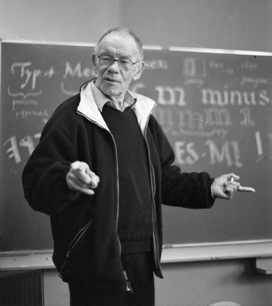
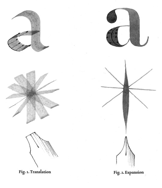
I’d come across this book in the past but had never read gone further than a google search. In this book, Noordij proposes a new method of categorising fonts based on the elements of translation and expansion - thick, thin contrast. He draws the relationships between good type design, beginning with good calligraphic skills. Which, I’d argue, is not necessarily the case, Kris Sowersby attests to this in his ‘no such thing as an NZ typeface’ lecture. However, Noordij was influential in terms of shaping the digital font landscape. Some of his former students that have gone on to be internationally recognised are Petr and Erik van Blokland, Just van Rossum, Lucas de Groot, Albert-Jan Pool, Frank E. Blokland and Peter Verheul.
Robin Kinross interviews Gerrit Noordzij, 2001: https://typemedia.org/noordzij/interview.html
Typemedia - Gerrit Noordzij resources: https://typemedia.org/noordzij/
Typemag - It all starts with writing: An influential influence of Gerrit Noordzij: https://www.typemag.org/post/it-all-starts-with-writing-gerrit-noordzij
0 notes
Photo

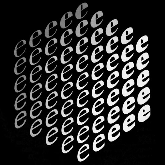
Erik Van Blokland, Noordzij cube, ca. 2019. Plus The Cube: practical research in theoretical models, with Erik van Blokland, (talk), Type@Cooper, Frederick P. Rose Auditorium at The Cooper Union, New York, NY, June 17, 2019
#graphic design#typography#lettering#calligraphy#visual writing#talk#conference#erik van blokland#gerrit noordzij#type@cooper#2010s
91 notes
·
View notes
Text


“I have always loved to draw. When I first encountered type design, I discovered a very pure form of drawing. It’s about contour, and edges, and, most of all, shapes. Black and white shapes. For me, this is drawing distilled down to its essence.”
—Cyrus Highsmith
In 2015, American typeface designer and educator Cyrus Highsmith was awarded the prestigious Gerrit Noordzij Prize. Awarded every three years, the Prize recognizes type designers and typographers for extraordinary contributions to the fields of type design, typography, and type education. This book was published on the occasion of the 2018 prize exhibition which featured Highsmith’s work.
Highsmith is known for his original approach to drawing letterforms—as well as his work as an illustrator, author, and teacher—and this publication shares many spreads from his sketchbooks while tracing his career and approach to typography.
With essays by Indra Kupferschmid, David Berlow, and Cyrus Highsmith, and a previously published interview of Highsmith by Jan Middendrop.
Designed by Erik van Blokland and Peter Verheul
Published by De Buitenkant, 2018
Softcover, 64 pages, exposed sewn binding, b&w and full color images, 6.5 × 9.5 inches
Available at Draw Down Books
#Cyrus Highsmith#Occupant Fonts#type design#American typeface designer#typeface designer#Gerrit Noordzij Prize#graphic design#design books#2022#Draw Down Books
20 notes
·
View notes
Photo


0 notes
Text
211012 『作字作法』補遺
グラフィック社より10月8日発売、『作字作法 日本語文字デザインの思考とプロセス』にて、レタリングの仕事の具体的なプロセスについて、16名の同時代のデザイナーとともにインタビューを掲載いただいた。
私のパートには、自分の仕事について全体的に・カレンダーについて・「都市と芸術の応答体2021」メインビジュアルについて・『群像』ロゴについて、の4本を載せていただいたが、紙面の都合上、YCAM《ヴォイス・オブ・ヴォイド—虚無の声》のタイトルロゴについて書いた原稿は、今回載らなかったので、ちょっとだけ手直ししたものをこちらに載せておくことにした。
-
戦前の日本で独自の議論を展開した京都学派を題材とする映像作品。その新作展の告知印刷物や資料展示、カタログのためのタイトルレタリング。
タイプメディアでは教授の Erik van Blokland が、よく黒バックにホワイトで空間を埋めていき、削り取られたような形のアルファベットのスケッチをしていました。あるいは白い紙を黒く塗っていき、文字の形を白く残すようなスケッチも。それらを学生にもいつも勧めていたのを覚えています。多分、タイプデザインにおいてスペーシングをいかに美しくデザインするか? という文脈から、字間の空間と、字体のオブジェクトを等価に扱う意識を鍛えるために取り組んでいたのだと思います。私が大学院にいた2015年、タイプメディアに縁の深い3年に一度のヘリット・ノールツァイ賞をサイラス・ハイスミスが受けて、『Inside Paragraphs Typographic Fundamentals』という本をもらいましたが、まさにそういうアイデアを解説したものでした。
私はむしろ、そうやって描くことでしか出てこない形があるな、と、やはり目に見えるオブジェクト側の造形に心惹かれていました。
私は書体の知識があまりないまま留学したのもあり、オランダではじめて色々なタイプフェイスを知りました。ウォルプのレタリングから、戦前の中央やロシアの版画まで、直線的であれ曲線的であれ、少しコンデンスドで、硬さと切削感のある鋭い書体に惹かれました。
この「Voice of Void」の書体も、版画のように削り取るような手法で描いていったものです。そもそも筆のストロークを自明に基本にしがちな漢字や和文デザインですが、書道の素養のない自分には、北碑の硬さや、徽宗のように引き締まった造形は、筆で描いても真似することができないものです。書き文字で書くと、どうしてもどこかのどかなのびのびした印象になりかねない。そこで、字形を一旦鉛筆で下描きしたあと、余白をスミで埋めて白い骨格を残す方法で制作しました。
京都学派について調べていると、21世紀から振り返れば理解しがたく思えるような議論も、戦前戦中の矛盾した状況の中で、四方から凄まじい圧がかかった結果、いやおうなく研ぎ出されてしまったもののように思えます。その印象から、上記のように量塊から削り出したような、限界まで肉を削り取って引き絞った字体を直感的に選んだのだと思います。
ディティールとしては、欧文でいうフレア・セリフみたいなものの和文バージョンが一つのテーマで、遠目には明朝・宋朝、近目にはコントラストのついた細身のゴシック、というバランスになっています。またポスターもフライヤーもイメージと文字だけのシンプルな構成なので、画像のキャプション、会期や会場の情報、注意書きなど、おもて面に出てくる文字は小さな部分も全て手で描いて、鑑賞の余地を広げています。「世」や「年」や「曜」の異体字も忍ばせて、字体がブレブレだった時代の雰囲気も出そうと試みました(「曜」は赤字が入りましたが……。)
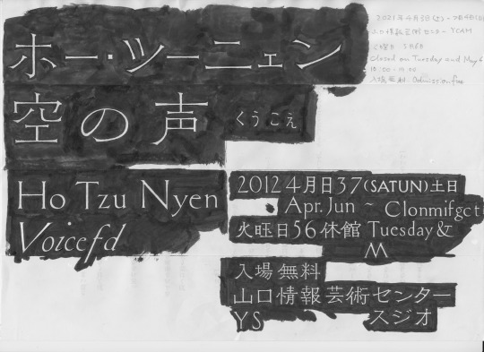
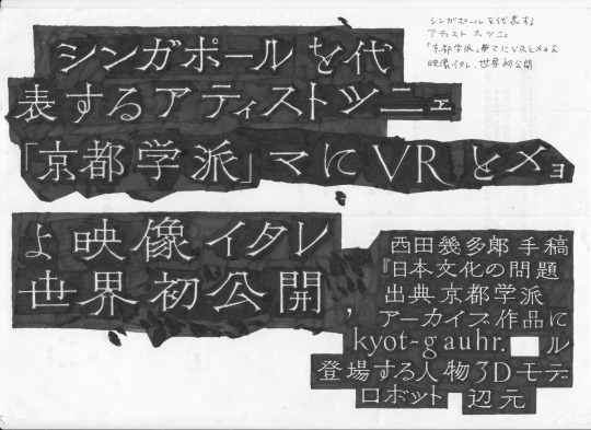


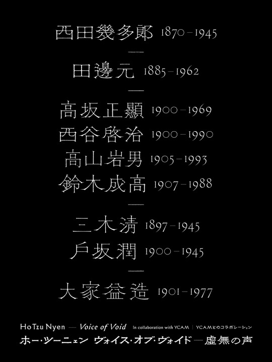

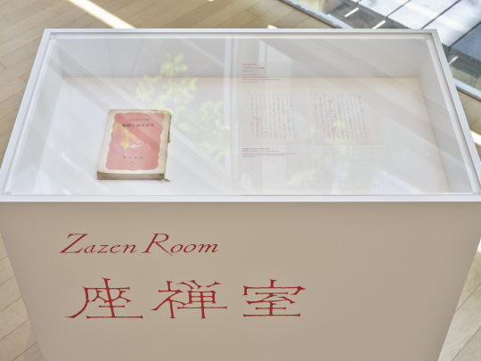
撮影 三嶋一路
2 notes
·
View notes
Quote
It can be an arbitrary solution but still a good one
Erik van Blokland
1 note
·
View note
Text
Typewriter Fonts
I did not even think about the fact that typewriters would have different fonts and that they could be both serif or sans serifs. I had this strange understanding that there was just 1 typewriter typeface and it was a serif font. I think that assumption could have come from the idea that a typewriter is outdated to me, and the text that comes from a typewriter has its own character and aesthetic from the ink and paper that has obviously distracted me until now.
Observing that understanding now, it’s a wonder how I thought that in the first place. - One of those strange gaps in knowledge situations.
Here are some examples I found.
Letter Gothic: a sans serif font Roger Roberson designed Letter Gothic for IBM, 1956-1962.

FF Trixie: one of the oldest serif fonts for typewriters, by Erik van Blokland. This typeface has the classic Gothic looks of older typefaces that I identified with typewriter fonts.

Courier: a slab serif font that was created for IBM typewriters by Howard Kettler, 1955.

Images 1: https://www.creativebloq.com/typography/best-typewriter-fonts-10135084
https://www.behance.net/gallery/52488623/DES16-Project-2-Font-Poster
Image 2: https://www.creativebloq.com/typography/best-typewriter-fonts-10135084
Image 3: https://www.prepressure.com/fonts/interesting/courier
1 note
·
View note
Text
Project & Blog Posts Schedule Spring 2019
Spring 2019 Project Schedule:
Assignment One:
Assigned: 1.31.19
Due: 2.14.19
Assignment Two:
Assigned: 2.14.19
Due: 2.28.19
Assignment Three:
Assigned: 2.28.19
Due: 3.19.19
Assignment Four:
Assigned: 3.20.19
Due: 4.2.19
Assignment Five:
Assigned: 4.23.19
Due: 5.7.19
//
Each blog post must be a minimum of 2 paragraphs (8 sentences) long and feature 1 image. Blog posts are due at the beginning of class. Schedule and timeline are subject to change.
January:
15: Saul Bass
17: Alexey Brodovitch
22: Neville Brody
24: David Carson
29: Milton Glaser
31: Chip Kidd
February:
5: April Greiman
7: Armin Hoffman
12: Tibor Kalman
14: Lucian Bernhard
19: Josef Mueller Brockmann
21: Stefan Sagmeister
26: Paula Scher
28: Paul Rand
March:
5: Erik Spiekermann
7: Jan Tschichold
19: Rudy VanderLans
21: Massimo Vignelli
26: Jessica Walsh
28: James Victore
April:
2: Jessica Helfand
4: Adrian Frutiger
9: Sanna Annukka
11: Michael Beirut
16: Aaron Draplin
18: Hjalti Karlsson and Jan Wilker
All project due dates are to be done at the beginning of class the day of the due date. Additional studio time will only be announced in class.
1 note
·
View note
Text
Week 10 - Graphic Design
Please expand upon some of the most interesting ideas from your typography readings.
The traditional German script, blackletter was one of the topics I found interesting in the reading. I found an article that talked more about blackletter history in Germany. The textbook reading on page 97, said that “German printing utilized blackletter, which was also called Fraktur.” From the article I had found that the meaning of Fraktur came from a Latin meaning, “broken script, or fractured.” Germany used Fraktur to print government publications because of the how they thought that their writing was strong and more serious, like compared to what the other Western European were using, Antiqua. Fraktur was consider complex to write for very simple activity or notes, therefore at the time Germans would use a different writing called Kurrent.
https://germangirlinamerica.com/old-german-cursive-alphabet-and-typefaces/
Another topic that I found interesting was the digital typography. Examples or pictures of some types of lettering shown on page 359, reminds of things like a play script or something like a library catalog card. I wanted to point out that typeface like Arcadia designed by Neville Brody, I probably would use it, but not as much. The designing of the letters is tall and skinny, when I think whether I should typeface like these I think in logos and titles may be the best fit, rather than text paragraphs.
Of course, I would say the most common typefaces that I read about were part of the contemporary typography. Like Arial, Verdana, and Comic Sans are very common currently and it isn’t surprising that they were part of this typography topic. Typefaces that I don’t see or use as much would probably be bits typeface by Paul Elliman, the Not Caslon typeface by Mark Andresen, and FF Kosmik typeface by Erik van Blokland. If I were to write a paper these designs would not be a good choice.
Eskilson, Stephen J. Graphic Design A New History. 2nd Edition. Lawrence King Publishing, 2012.
0 notes
Photo


Typography Tuesday
Fine-press printer and type designer Russell Maret recently compiled a series of lectures and essays on type and fine-press printing into his latest publication Visionaries & Fanatics and Other Essays on Type Design, Technology, and the Private Press, designed by Maret, printed by Sheridan Books, and published in 2021 by Cathy Baker’s The Legacy Press in Ann Arbor, Michigan. Maret spends a considerable amount of space comparing and contrasting metal type and digital letterforms (which he calls digigraphic). The implications of these two graphic presentations of letterforms seems to fascinate him, as it should. Maret writes:
Technologically, I began printing and designing type during a period of great, rapid change. Digital technology not only provided a new means for designing type, it offered the first viable alternative for the typographic book in five-hundred years. Digital technology was not only changing the way text was being transmitted, it was changing the artifactual meaning of the book.
Shown above, after the dust cover and title page of the book, are progressive engravings for the ‘ct’ ligature punch in the Hungry Dutch typeface designed by Maret, and examples of Just van Rossum’s and Erik van Blokland’s digigraphic typeface Beowulf (1990) where “Each character has multiple potential outlines from which it can be composed. Every instance of a character is unique, but the characters remain stylistically consistent with their neighbors.”
Finally, we hold one of 250 copies of the hardcover edition that includes Maret’s letterpress-printed specimen sheet of metal and digital typefaces and ornaments of his own design. We display the specimens here along with their maps identifying each design.
View our other posts on the works of Russell Maret.
View our other Typography Tuesday posts.
#Typography Tuesday#typetuesday#Russell Maret#Visionaries & Fanatics#Cathy Baker#The Legacy Press#Sheridan Books#metal type#digital type#type designers#digigraphic#essays#Hungry Dutch#Beowulf typeface#Just van Rossum#Erik van Blokland#type specimens#Typography Tuesday
83 notes
·
View notes
Photo

Erik van Blokland creates beautiful type.
Principia looks rad
0 notes
Text


Thursday 18th November 2021 - Beatrice Warde Memorial Lecture.
Today I joined the Beatrice Warde Memorial Lecture - 50th Anniversary Good Types/Bad Types. There were talks from David Williams, Ellen Lupton, Erik van Blokland, Liron Lavi Turkenich, Martina Flor, Paul Barnes and Trés Seals. It gave me a great insight into typography, lettering and calligraphy, especially Martina Flor’s 10 commandments of lettering. I found it thoroughly enjoyable and opened my eyes to the depth of type design.
0 notes
Photo
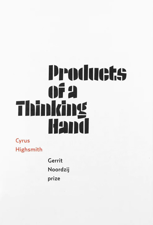


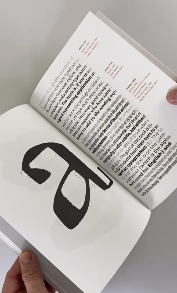
Cyrus Highsmith, Products of a Thinking Hand, Gerrit Noordzij Prize, With essays by Indra Kupferschmid, David Berlow, and Cyrus Highsmith, and a previously published interview of Highsmith by Jan Middendrop, Designed by Erik van Blokland and Peter Verheul, Royal Academy of Art, Den Haag, De Buitenkant, Amsterdam, 2018 [Draw Down @drawdownbooks]
#graphic design#typography#book#cover#book cover#cyrus highsmith#occupant fonts#indra kupferschmid#david berlow#jan middendrop#erik van blokland#letterror#peter verheul#de buitenkant#gerrit noordzij prize#draw down books#2010s
25 notes
·
View notes
Video
vimeo
Schets techniek (Gerrit Noordzij) gedemonstreerd door Erik van Blokland
1 note
·
View note
Photo

Ornamented letter “I” for the Li Beirut typeface featuring 300 glyphs drawn by 157 designers from all around the world to benefit the people of Beirut. You can still buy it within the next 48 hours, along with some cool posters, cards, and a catalog, through the Indigogo campaign organized by Dr. Nadine Chahine. Please consider helping, and get some wonderfully-designed stuff in return. All proceeds will be split between Action Against Hunger, Save The Children, and Plan International, working in Lebanon.
https://www.indiegogo.com/projects/font-li-beirut#/
Contributors include Jean-François Porchez, Jessica Hische, Erik Spiekermann, Martina Flor, Tobias Frere-Jones, Wael Morcos, Hannes von Doehren, Nina Stössinger, Erin McLaughlin, Erik van Blokland, Kristyan Sarkis, Laura Serra, Petr van Blokland, Martin Majoor, Toshi Omagari, Samar Zureik, Stephen Nixon, Zenab Bastawala, David Berlow, Lila Symons, yours truly, and many, many others.
0 notes