#ESPECIALLY A WIDESCREEN ONE
Explore tagged Tumblr posts
Text


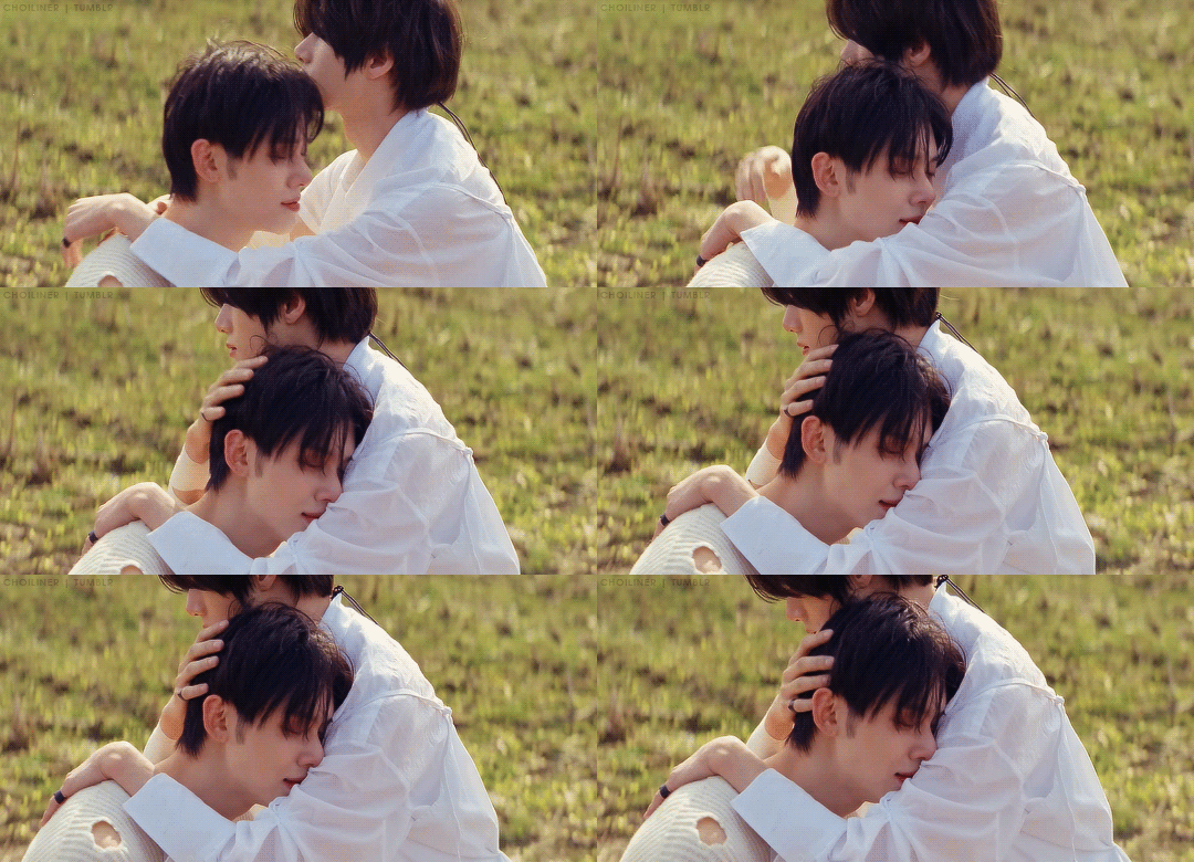

YEONJUN & BEOMGYU | DEJA VU (2024)
#mine#choi yeonjun#yeonjun#choi beomgyu#beomgyu#beomjun#txt#tomorrow x together#ult tag 💖#userhev#ayabestie#0x1zone#usersemily#useryeonbins#rosieblr#userzaynab#majatual#userfairy#ninqztual#usergyukai#tuserflora#kpopedit#kpopccc#i hate that they didn't upload this in 4k what am i supposed to do with a 1080p mv in 2024#ESPECIALLY A WIDESCREEN ONE#the height of this video is literally 752 pixels do you understand how bad it is#anyway. this scene was specifically for me
1K notes
·
View notes
Text

For those of you who never knew as it's a detail one can easily miss (especially depending on which aspect ratio you're viewing in) but a lovely detail at that: Pippin was in the hobbit band in the background!
He's the one playing the banjolele!
These shots I have of the scenes where he is most visible are from the Fullscreen edition (A DvD I own and often watch for the different viewing experience). I believe in the Widescreen edition their heads are cut off by the aspect ratio-- so it's easy to miss!

And for those of you who haven't put it together already, yes! That is our beloved Merry standing next to him as they both watch Frodo dance.
Mind you, Merry is not in the band. A few scenes prior he was actually along the precession line of bringing in Bilbo's Birthday cake. He probably came up to the platform to talk to Pippin, give him a mug of something to drink and inevitably snatch him away for some mischief. Because after this brief scene, Pippin is then absent from the stage-- he and Merry are going to go swipe some fireworks!
#lotr#lord of the rings#peter jackson#merry and pippin#merry brandybuck#pippin took#meriadoc brandybuck#peregrin took#lotr merry#lotr pippin#jrrt#tolkien stuff#tolkien tag#tolkien#hobbits#no because this is such a fun detail#Pippin can sing AND play an instrument#not to mention you can see the exact chain of events that lead up to them sneaking off to steal fireworks#when Pippin tells Merry “it was your idea!” he was right-- it most definitely was#Merry going up to Pippin handing him a mug and saying “Hey music sounds great-- I've got the BEST idea right now.”#And Pippin AGREEING#Gold! Absolute gold!#I love character details like this#And it's so underrated#Like I don't know how many people know about this and I think they should.
995 notes
·
View notes
Note
Sorry to bother you again, Max, but have you noticed that [adult swim] has been airing some (though not all) Season 6 episodes in their original widescreen format? Just asking beause you previously noted Underfist as "the only HD thing we did" months before [as] started their Checkered Past block.
None of Billy & Mandy was widescreen. I know that because I was begging for widescreen, as were most of the other creators. Instead, CN decided to crop the top and bottom of the screen so that Boomers wouldn't think the black bars on the sides of the screen meant their TV was broken (I kid you not).
So I'd guess that's the version you're seeing?
It's a weird way to eat cornflakes, man.
That whole debacle landed us with storyboard panels that had two action safe lines, two title safe lines, and a vague shape that encompassed both places the CN "bug" might be. In the end, you were left with this tiny actionable screen space which made it really difficult to stage characters. Especially ones that some fool designed to be one and three-quarters heads tall.
443 notes
·
View notes
Text
If you've never watched TCM - Turner Classic Movies, that is - it doesn't have any commercials. But they do have breaks between movies, which they fill with a lot of cool things: vintage trailers and interviews, biographical segments on filmmakers, mini-documentaries on subjects like widescreen, and short films
My favorite was TravelTalk: a series of travelogues a guy named James A. Fitzpatrick did between 1931 and 1954. He went all over the world, shooting in technicolor, and it's interesting to see these glimpses of the world between the wars, and to see stuff they get wrong. During World War II, the series understandably remained domestic, with the shorts focusing on places in the US, Canada, and Mexico.
One of the more entertaining is the one on Nevada. Specifically, Reno
youtube
The full clip, Romantic Nevada, also profiles miners and a dude ranch. Because Las Vegas as we know it didn't exist yet, that wouldn't come into being until after the war, and especially the 1950s; as this short notes, the majority of Nevada's population lived in and around Reno
But the focus here is on Reno's status as the divorce capitol of America - the place where it was easiest to get a divorce. And here we have him narrating over a bunch of women smiling on a fence and two women walking off together about how these sad, disillusioned brides come to the Gay Little Metropolis (okay, it probably wasn't all Desert Hearts out there. But also.)
The Reno divorce rituals. The single men hanging out on the divorce steps. The reminders that most people in Reno are normal. What a great look at a deeply strange central industry for a town to have
72 notes
·
View notes
Note
do you have any advice for those just starting out using renpy/ making games?
im still learning my way around renpy and making visual novels and what works best ..here are some personal findings:
..try to replace renpys default ui and mess with the options.rpy and screens.rpy right away , the more time put into it the easier it will become to make something unique to your senses. you can change basically everything. you dont have to make a widescreen vn either..4:3, square or portrait mode are possible as well
..look into layered images, the feature is really awesome if you want sprites that change outfits or want to be able to do unique expression combinations without having to save a png of every one
..its good to define characters, atl(animations), images, transitions etc each in their own .rpy file. you can make as many .rpy files as you need and you dont have to only use "script.rpy" to write your story. i divide my script into act files to make it easier..
n some not renpy stuff:
..this software helps you take breaks and avoid RSI and it is pretty invaluable for me. it will track based on the time you spend moving your mouse or keyboard. this also helps keep on task n if you get distracted you're more aware of it.
..if you are a writer, i cant recommend getting an alphasmart neo2 enough. especially if you cant handwrite. its an old device that lets you type textfiles without a bluelight screen. you can 'send' what you write directly to your computer through a printer cable and it types it out. it fits plenty and its useful for writing script outside the computer. refurbished ones on ebay are good.
..its easy to get really overambitious and perfectionist and then not make anything as a result..my advice if this comes up is to prioritize the existence of the thing rather than its ability to match the impossible image in your head. that ideal picture will always be shifting into more impossible territory as you improve anyway, so think about what you're actually capable of and make it actually happen!! important to remember ur not triple A studio.. being independent is an advantage cuz you can do anything!
thts all i can get from the top of my head tht i havent said here before(ithink?)..i think about the last one a lot honestly i think thats my best advice i have if you can call it that
hopefully this helps.. good luck with your vn/game!
136 notes
·
View notes
Note
is the retroid pocket a good investment? i saw your tags and am curious! :]

i'm probably biased bc i'm so used to buying retroid but yea. it's slightly pricier than some other options you might find due to the price creep of the gradually upgrading chipsets but its definitely worthwhile from my perspective, as someone who likes retro emulation and android gaming. all retroids have bluetooth support to connect extra controllers, headphone jack for audio, sd card slot to load up games from, wifi for downloading more games, and display out options to connect to a tv or somethin! you gotta bring your own games unfortunately, but it does come built in with some emulation apps to install during setup, and a choice between using the standard android OS, or the custom Retroid branded Launcher to launch games from! generally i use my retroid to play PS1, PSP, PS2 and GBA games, although im pretty sure it can handle N64, Dreamcast, NDS and 3DS too. basically if there's an android emulator or RetroArch core for it, the Retroid can probably handle it, YMMV.
the most recent model line, the Retroid Pocket 5/Mini, is still available on the GoRetroid website. generally if you're buying a retro handheld then make sure you buy it directly from the original site/source so you don't get ripped off by some offbrand seller trying to pawn one of those 100-in-1 knock off consoles on you.
time for an autistic ramble about my collection since i love these devices so much...

the original retroid pocket 2! this was the first device that caught my eye and my gateway drug into retro emulation handhelds, as it only cost $80 back in 2020. there were pink, yellow and cyan colorways too, but indigo was the most popular option :P it was a little awkward, what with the switch style analog sticks not having R3 functionality and only having one gig of RAM, but it got the job done. it also had micro HDMI out to connect to a display, kind of a hassle since micro HDMI isn't too common, but they used to sell micro HDMI cords on their site along with other accessories (screen protectors, grips, cases, etc...)

the retroid pocket 2+ was an upgraded model released a year later for $90, with 2GB RAM and a touchscreen added. still no clickable analog sticks but oh well! i bought the PS2 style colorway, a lot of their colors are styled after other retro consoles. the 4:3 screen was kinda cute! difficult for playing PSP games since it letterboxes the screen, plus you have to do some extra tweaking in the emulator settings to get it to work properly...

less than a year later, they made the Retroid Pocket 3! this one signalled a change in their release system in many ways, most notably the fact that now every retroid model comes in 2 versions: a cheaper model (with less storage/RAM) and a premium model (with more storage/RAM). personally i've never had any reason to go with the cheaper model, especially since the power difference can be so vast between the two sometimes, so every model i have is the premium model. this one cost $130, which is quite the price jump, but the added quality made it worth it for me :) the RP3 was Retroid's first foray into a 16:9 device, great for playing PSP/NDS, and easy to work with the 3GB RAM. any 4:3 games will have letterboxing on the sides now (unless you have a widescreen hack or something) but i never minded that much. also, this is the first Retroid model with R3 functionality on the joysticks! it might not matter much to most people, but i really wanted to play Ape Escape on the go :3

at some point GoRetroid realized the Retroid line kinda peaked with the RP2 form factor, so they brought it back with some added improvements for those looking for an updated 4:3 handheld, now now known as the Retroid Pocket 2S. idk what the S stands for! its looks pretty similar to the regular RP2, but with clickable hall effect joysticks on the bottom, a PSVita style DPad, and up to 4 GB of RAM. i loved this one! for a while i used to switch between the RP2S and the RP3, depending on if i was in the mood for PS1 or PSP gaming. the black crystal shell was also neat, i love clear electronics :3 price went to $120, more expensive than the original RP2 line but cheaper than the RP3. worth the price, considering the QoL improvements they made over the original RP2!

then there's the Retroid Pocket 4, released around the same time as the RP2S. this model has the same shell as the RP3 for those looking for a 16:9 form factor, while retaining the improvements from the RP2S (hall effect joysticks <3). this device is currently my go-to for portable retro emulation, with 8GB RAM and android 13 compatibility. this one can play some lighter PS2 games, but i mostly use it to play balatro these days. also, convenient feature; since the Retroid Pocket series is just an android with a built in controller, any android games with controller compatibility can be played with the Retroid controls. theres also a gamepad mapper to map button controls to other android games that don't have built in controller support, but i've never used it so i can't vouch for it -_- the RP4Pro was $200 on release, yowch! still definitely a worthwhile investment, but a far cry ffrom the original price tag of $80 back in 2020... there's still some discounted models of RP4 on sale on their website, although there's not many left, as GoRetroid is mostly clearing space for their newest model...

...the Retroid pocket 5! this model signifies another shift in Retroid's design, as they've shifted to a PSVita looking model with the rounded features and glass front panel. i got the gamecube colorway since i really liked the vibes it has... aesthetically this is the best Retroid Pocket model yet. the 3d hall sticks also have RGB LEDs built in than can be customized from a built in app, and an OLED screen that looks especially gorgeous on the black RP5 model, as the bezel screen blends right into the rest of the glass face. this one is their priciest model yet, clocking in at $200 for the RPmini and $220 for the RP5. this model also removed the micro HDMI port in favor of a display out USB-C port like how the nintendo switch does. they also released an official dock with HDMI and ethernet ports to go along with it! i haven't switched over to the new model yet since its still 8GB RAM like the RP4Pro and it'll probably take a while to move some of my android apps over, but i've heard good things about this model! it's also linux compatible from what i've heard (ROCKNIX, Batocera) but once again I Haven't Tried Those Yet
but yea that's my collection! Retroid has served me pretty well over the years, i give it the Saint Lesbian Seal of Approval
#pentababbles#retro gaming#retro handhelds#retroid#retroid pocket 5#retroid pocket 2#retroid pocket 3#retroid pocket 4#You've Activated My Autism#right now im really looking forward to the Retroid Pocket Flip 2...#previously GoRetroid released the Retroid Pocket Flip back in 2023 but i skipped it since i didn't like the analog sliders...#i want a clamshell style handheld with at least enough power for psp games.#plus this new model is going to have a lanyard hole for extra portability...#i'll probably end up using the RPFlip2 as a fancy music player or something for convenience lol#i love retro handhelds. i love having the power of the original playstation on the go. three cheers for technology
7 notes
·
View notes
Text
I’ve now seen mean girls the movie the musical the movie a second time and it’s still just as good so here’s a full review
The Narrators bit was so much fun, the way they kept looking at the camera, breaking the fourth wall, and that one shot where they’re doing announcements and the name plate just reads “narrators”. The way the movie opens on them recording a video for social media in a garage and it ends in the same place with the garage door closing while they wave under it like the curtain on a broadway stage. Amazing.
The way it switches from fullscreen to widescreen just for songs where Regina controls the narrative like a fucking puppeteer. Like, at first I thought it was every song, but it’s only for Meet the Plastics, Apex Predator, Someone Gets Hurt, and World Burn. It’s SUCH a stylistic choice and I absolutely loved it
THE CONTINUOUS SHOT IN I’D RATHER BE ME!!!! HOLY SHIT!!!!! IT’S SO COOL!!!!! I love me a good continuous shot and would have LOVED to be a fly on the wall on set that day
Also still on I’d rather be me, the way the huge iconic moment of regina getting hit by the bus is completely overshadowed by Janis getting her moment. Loved it.
There were also a lot more smaller continuous shots that were really cool!
The use of social media, especially since social media as we know it today didn’t really exist when the original movie came out. It was a big part of the broadway show and keeping that translated REALLY well to the big screen
I made a separate post about this but the fact that they actually made Janis canonically gay instead of it just being subtext or if you squint. It makes Janis a much more sympathetic character and makes her vendetta against Regina feel even more real.
Making Cady’s mom a single mom was a surprisingly nice change and Jenna Fisher was truly a delight in all of her scenes.
The tease when Tina Fey almost sang where do you belong 😂 (though I am still bummed they cut where do you belong 😔)
THE LINDSAY LOHAN JUMP SCARE
Avantika was a delight and her comedic timing + deadpan delivery as Karen was so perfect
Literally everything about renee rapp as regina was perfect, but especially at spring fling when she’s high on pain meds was so much fun
Someone Gets Hurt (Reprise) was absolutely phenomenal. I didn’t know it was gonna be in the movie and gave me chills the first time I heard it. Auli’i fucking crushed it
I also love how they took a homophobic insult from the original movie (“it’s not my fault you’re like in love with me”) and turned it into a new queer jam for the end credits song. Can a gay girl get an amen?
This movie is truly just a fun time
49 notes
·
View notes
Text

camp lazlo and "The Machine"

i forgot i had written about this on the screenshot blogs' FAQ, so i think i'll make it a post with my updated conclusions as well... so, have you ever wondered what's up with the colors in the HD version of the show?
y'know...


...this?

the first time i had watched the show, it was in pretty bad quality, and i had chalked any color differences up to that. even when i did have access to a few HD episodes, i never really noticed it outside of slinkman being a bit... lighter, mostly due to the fact that everything else was so submerged in Gunk in the first place. as you can see, the "issue" affects almost exclusively the yellows, most notably seen in the sky, or in characters like slinkman or clam, or even in lumpus’s glasses, and characters' eyes in general losing their off-white tint due to this. a quick look at any streaming service that has the show will tell you that almost all "official" distributions have this issue, and often (in)consistently so, at that. it may very well be the only version these services have access to (considering how they often the resources they have access to aren't always the best, which leads to things like episodes out of order or incorrect subtitles). to say the least, it bothers me a lot, especially for someone like me who's very particular about this sort of thing...! (it's sort of the reason i put the screenshot blogs on hold for a while, aside from the fact that it's a bit of a time sink — the issue just stressed me out too much!)
so, what's going on, then? my friends and i had ended up speculating about it for a while, and we had a lot of theories — was it the result of an upscaling process done for streaming services? was it something technical, like issues with the video encoding? did someone in charge of the process simply fuck up? all of the above?! and... most of all, why???
now, i know very little about all the technical stuff, but i've come to believe the most likely explanation is also the most simple one, with a little bit of obscure knowledge on the side... in that, i think it makes the most sense if the colors are fucked up due to The Machine at cartoon network. see, this isn't just an issue with camp lazlo, and there are other CN shows that have been a victim of this too, such as billy and mandy.
and here's what mr. atoms has to say on the topic:


the shows had also both aired their "later" seasons around the same time, circa ~2007-2008, and it explains away a lot of those inconsistencies, too — "It’s also the reason that Mandy’s hair changes from pure yellow to light yellow and back again all the time." in most other shows, the effect this would have is likely a lot more negligible. as one of the main characters, mandy is pointed out a lot as it'd be something you'd notice the most. camp lazlo, on the other hand... is a show where the whole sky is colored a bright yellow.
...definitely one of the worst shows that could've been hit with it.
even so, "The Machine" application is not actually the only state these episodes are stuck in... or rather, i don't think so, at least...?
so as far as i know... (which certainly isn't everything,)
- in order to to accommodate for the transition period from box TVs to flat screen TVs, i believe that camp lazlo, was, in fact, a show that was produced in a widescreen format, so it could be aired in full on new TVs and crop to fit the 4:3 aspect ratio of older ones.
- i am not sure if this inherently means it was also produced in Full HD (1080p).
- as can be confirmed by old recordings (one of the only additional benefits of sites like WCO keeping the old versions around is stuff like this, as annoying as it is trying to find anything else...), both color corrected and un-corrected versions of at least part of the show have aired at some point.
- as far as i'm aware, there is NO version of this show in Full HD with un-corrected colors.
- however, what i do know is that there is a widescreen, non-HD (480p or 720p, i can't remember off the top of my head) version of the show with the un-corrected colors. if you have a bit of a keen eye, you might have noticed it used on foreign variations of the official cartoon network youtube channel for clips. (it had fooled me at first into thinking it was a secret, all correct colors, and Full HD version of the show, but unfortunately this isn't the case.) see, my friends and i went on a little hunt for it for a while, with that detail as our basis, and it is out there... just not on the standard american versions of those services. instead, we had to look at a whole variation of HBO's streaming service itself, HBO GO, of which's entire existence is still currently on the line due to the HBO rebrand. (we have rescued it from there, in case of it becoming lost media of sorts, but due to technical limitations were only able to get it by recording, and thus also still has the HBO logo.) the mere existance of this version is very interesting to me and raises a lot of questions that may also contradict some of my earlier statements.
- and finally, i haven't looked at every set of files there is (as from all the different streaming services) so i actually am not 100% certain if there's actually variation between THOSE as well, and if there is... the situation is even more confusing to me.
i don't know if there will ever be justice for this, or if any victims of The Machine have ever recovered from its Wrath. it's a topic i've gone over dozens of times trying to sort it out, because, i'll be honest... it sort of haunts me.
but there's your little information dump and speculation for the day

#camp lazlo#🫘#talk#i have no idea if this is interesting to anyone but me (guy who loves any kind of production information these days)#you know what i'm grateful for though?#my favorite lumpus and slinkman episodes managed to get off completely free with the machine and have normal colors ❤️#production info#yesterday i was looking at the copies of the specials i have#and for where's lazlo the file was combined into one long video#but since its still comprised of two individual episodes; i really couldn't believe it but both episodes got hit differently???#so it starts up the second half and suddenly all the yellows are fucked up#and i also feel like before then i'd been watching a more desaturated version the first half too#it's so... Weird#again i really haven't sorted this information so well over time so i may be wrong on some of the details here
12 notes
·
View notes
Text
Oh hi. I heard it's gifs tips'n'tricks time.
View this as a little addition to this post I made a while back.
This time I thought I'd take you through my gif making process. It'll be very specific to Photoshop CS6 but maybe some of you will find parts of it helpful regardless.
And since our biggest nemesis appears to be ~The Tumblr 10MB File Size Limit~ I decided to go for the absolute worst premise for a gif: Lots of stupid wobbly particles and gw2 bloom and transparency effects. Because huge gifs love these.
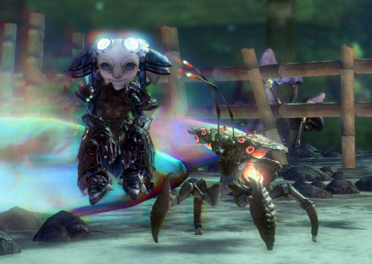
Aah, a horrifying amount of those in this single scene. Perfect!
Let's start with a little timelapse video, and I'll get into the details with screenshots below then.
So this actually went smoother than expected? Not super much fiddling needed in the end, but here's how it went in detail:
Load the raw footage into photoshop.
You can do this in two different ways: What I do is simply drag & drop the video file into the program and it'll open with a video timeline and some rudimentary video editing options.
What you can also do is File -> Import -> Videoframes to Layers and select your source video, which will give you a timeline of separate still image frames instead.
It comes down to preference, I used both methods in the past but nowadays I find the video timeline more intuitive.
Cut the footage to roughly the right length.

From experience I know that most of my gifs are around 3-4 seconds long. This can of course vary depending on different factors. Don't get too attached to the exact seconds you selected, you might have to shave off a bit depending on how evil the file size decides to act.
Optional: Change footage speed

Depending on the gif and its purpose, I slow the footage down. I usually do this for the visual effect (especially nice for showing off animation details) but it also has the practical side effect that it can help with file size. Say you want a gif that loops after 4 seconds. At 100% speed your gif will move at your original framerate (in my case 60 fps); if you slow it down but keep the same length in seconds it'll logically use less frames. That's less data to blow up the size! Yey.
Crop the image.
Now this is probably one of the most crucial parts when it comes to your final file size, and your gif looking nice on tumblr. Since the tumblr dashboard displays images at a width of 540px, you want this to be your absolute minimum image width to ensure a crisp image. If I can, I'll make the gifs larger (I like starting at a minimum of 600px and then reduce the image dimensions if needed).
With that in mind.... choose your image crop wisely.
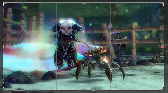
A "widescreen" image like this will be the most merciful in terms of file size, but might not always be what you want in terms of composition.

Given tumblr's very vertical nature, this kind of approach will look great in posts (if it fits your image composition of course), but at 540px minimum width tends to be a file size monster.
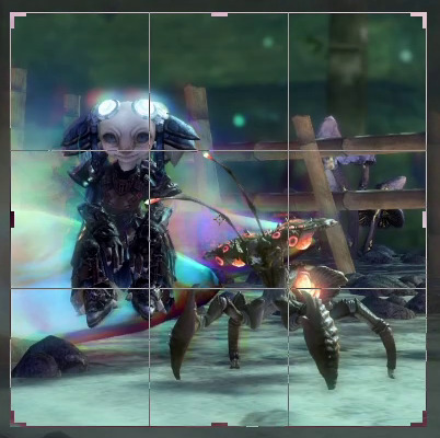
For the gif I'm attempting to make here I opted for a more square approach. The subjects of the scene fill out the image's space nicely, and it's still a nice size for tumblr posts overall. Let's see what the file size will say about this.
Replay your footage after cropping to make sure you didn't accidentally cut off any motion you didn't mean to cut.
Next up: optional colour corrections
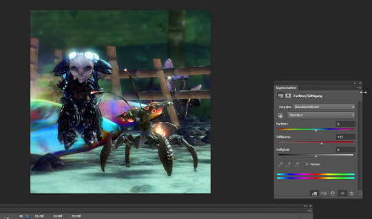
I tend to crank up the saturation for gifs way, way more than I ever would for regular screenshots since I find that often the limited web palette can make them look fairly dull. But like everything else so far, this greatly varies depending on the scene you're showing.
Note that colour correction can increase or decrease file size depending on what exactly you're doing. The more different colours you have, the larger your file size will be.
Reduce image dimensions

Since my original video footage was fairly zoomed out, the cropped area only left me 575px of width to begin with. In an earlier attempt (that I absolutely did not fail to capture and therefore had to record the whole thing a second time) I tried to leave it at these dimensions, but the 10MB size limit did not like that so now I knew better and immediately reduced the width to 560px.
Note: After you've changed the video's dimensions it won't let you edit the speed anymore (for some reason), so make sure you've got that settled.
After all the adjustments are done it's time for the moment of truth...
File > Save for Web...
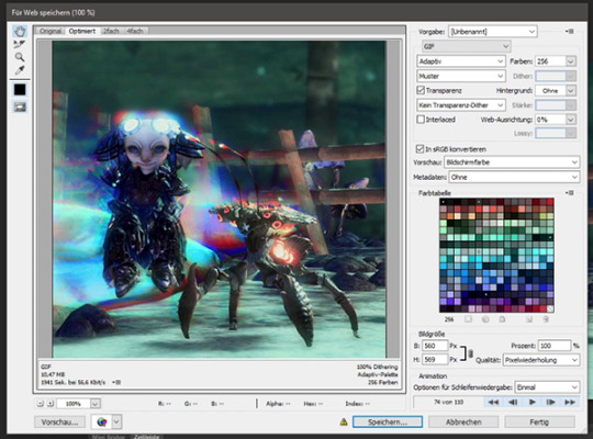
This beautiful window will open and...

Aww almost.
But honestly? That's not bad at all. I've had completely different disasters to deal with in the past (starting somewhere in the mid 20MB, good luck trying to make use of every size-reducing trick you've got up your sleeve).
Before I do any adjustments to shave off the last few KB though, I preview the gif to make sure it loops correctly. I want the Chak to sway seemlessly. Turns out it didn't, so I back out of the window to remove a few frames from the footage. And when I open the "Save for Web" window again....

Well that's anticlimatic. Apparently those few frames were enough to get the file size where I need it. (Note: Sometimes Tumblr likes to be a little b* and pretends your file is too big when you're this close to the 10MB limit. It be like that.)
While my gif journey theoretically ends here, I want to at least show you a few more things that could have helped if I had needed to get the file even smaller.
So this dithering thing I keep making a big deal of...
It can make or break a gif. In my experience this is so, so crucial to the final file size and quality of the gif.
In my own very amateurish words, dithering is a way to emulate colours that aren't actually part of the images colour palette. This is especially needed for in-game transparency effects like fog, glowy stuff, or smooth gradients. And that is part of why I chose this hell scene of all the ley line glow and the typical gw2 bloom that's particularly bad in this area.
PS CS6 offers you three different kinds of dithering techniques: Diffusion, pattern and noise.
My go-to is diffusion dithering, which has adjustable quality levels.


In my opinion it's generally the type of dithering that's often the least noticeable and creates the smoothest looking images. Unfortunately, it's also the one that creates by far the largest file sizes. Another downside is that it doesn't work super well with heavy DoF/fog etc. effects and is prone to really ugly banding, especially visible the more you decrease the quality. It looks awful for this particular scene. (Look at the glow around my asura's headpiece if you don't know what I'm talking about. Or... just the entire background.)
Both noise and pattern dithering will get you smaller file sizes, luckily.
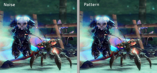
I've never used noise so far (it tends to look messy in my opinion), but pattern gets the job done! Especially for gradient heavy gifs it's a lifesaver. It's definitely more noticeable than the diffusion dithering on static parts of the gif, but it absolutely makes up for it by not having any ugly banding effects. This is also what gave me the neat little 9.99MB file size in comparison to the diffusion dithering's 15.31MB.
Last but not least, if fiddling with the dithering or image dimensions doesn't help you get below that magic 10MB mark...
Limit the colour palette
You can either manually colour edit your image to use less colours for a more artistic approach, or you can let Photoshop limit the palette to its best abilities.
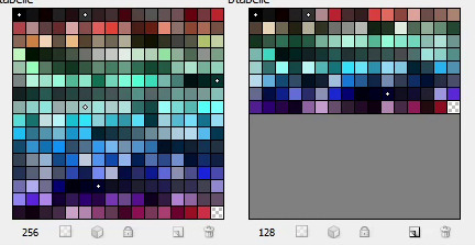
Additionally you can double click each individual colour to replace it how you see fit. (I've done that in the past when Petthri's yellow eye colour got erased and I had to bring it back manually.)
In this gif's example, reducing the palette from 256 to 128 colours has brought the file size down from 9.9 MB to about 8 MB. It can have a big effect, but doesn't always in my experience.
SHOW US THE GODDAMN GIF ALREADY!!!
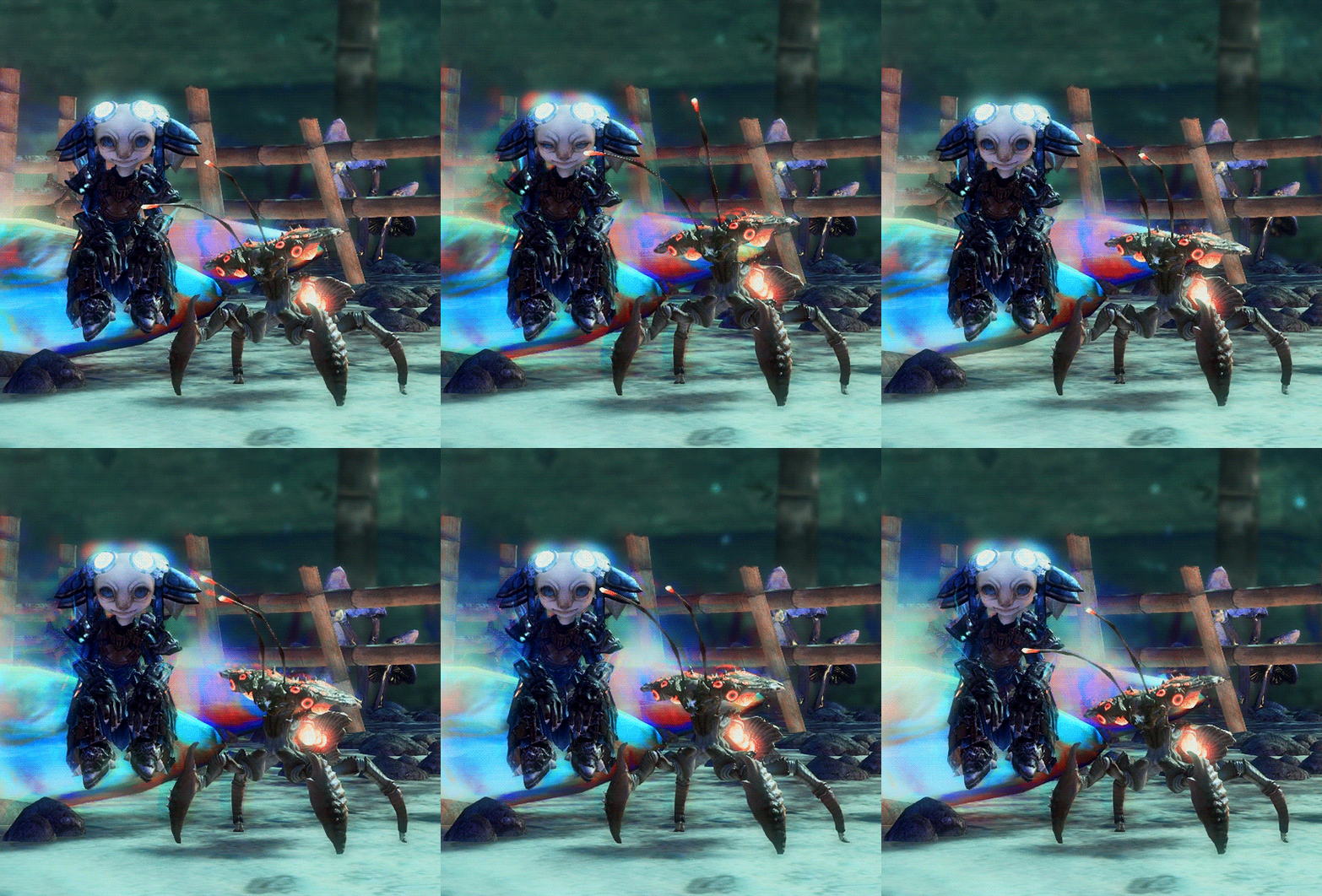
Not the best quality gif we've ever seen on tumblr, but given the extremely unfavourable source material I think it turned out alright. I have to admit I'm actually surprised it worked at all.
Oh well! This got long (once again). I hope this was at least a little bit helpful to someone out there. Happy gif making!
70 notes
·
View notes
Text
I drank two cups of coffee when I woke up so I wrote this meandering screed about some nostalgia post. Enjoy or don't ✌️
No hate if this was one of my mutuals' sideblogs but I got notifications from a y2k nostalgia blog and one of the reblogs was like a photo of a walmart video game section in 2007 and the caption read like "I wish I could wake up in 2005 (❌), no crazy elections (❌😐), good television (❌), and good video games without a constant stream of remasters (❌)" Let's go through this step by step. First of all the photo was mostly wii games so they got the year wrong off the bat. Second of all, no crazy elections⁉️ Like most nostalgiaposting, tumblrposting, and anglophone webposting in general, this is surely from a US perspective. No crazy elections, in the united states of america, in recent memory, in 2005? Maybe I just don't understand the poster's twisted mind. (Or maybe they are just stupid.) Third of all, good television? The torture porn propaganda era of television? The shitty sitcom saturation era? The era of cheap, tacky reality shows? Of course the real fact is they're probably talking about cartoons. I was a child in this era, and I remember it well as I spent the majority of my time in front of our silver widescreen Panasonic crt watching american cartoons on cable, when my parents decided to pay the bill of course (the real crux of this post is that us nostalgia posting will never work on me because we had 16:9 crt televisions in Europe). The mid-2000s was kind of a lull in quality for cartoons, after the really high quality late 90s stuff was mostly off the air and before the explosion of rly creative cartoon network shows at the turn of the decade. All there was worth watching was like, spongebob and that was going downhill fast (and also perhaps my most controversial opinion, of which, if you haven't noticed, I have many, even early spongebob doesn't hold up). Fourth of all, I would never buy a video game but I think the trend of remastering good video games is slightly better than the trends at the time, which can clearly be seen in the photo as the bee movie game and madagascar 2 for the ds are on full display. Was this not kind of an infamously bad era for real video games too? The height of easy over-tutorialised railroaded bullshit and sequels that are the same game over and over again. Nostalgia of this kind is always stupid imo but the fact that it's nostalgia over the 2000s, a decade I associate with shit-awful taste in almost all forms of art and media (I will give flowers to consumer electronics design, a lot of design in general, some of the fashion especially of the minimalist kind and electronic music, american RnB, electroclash and the kind of European house music that is often schlocky but makes Me legitimately nostalgic) makes it really egregious. But that's the twenty year cycle. God It's gonna be a fucking nightmare in like ten years time when people start playing like, the chainsmokers or that fucking "seven years old" song again in fast food restaurants and people will be saying "This is real music, not like now". 🤢
3 notes
·
View notes
Text
New Demigod Cabin: The Tritopatores


The Tritopatores ("thrice-ancestors") are a trio of benevolent Athenian wind gods associated with childbirth, marriage, and the home. Their names are Amalceides, Protocles, and Protocleon, and they're said to be children of Gaia and Helios, or possibly even older. They are ancestor deities that Athenians and other people in Attica prayed to when they prepared to marry or wanted children. They watch over the family and protect the household.
Demigod children of the Tritopatores are always born on Wednesday (because it's the third day of the week) in a location that has the number 3 in either the street address or zip code. Their social security number, license plate number, phone number, etc. always has at least one 3 in it. Children of the Tritopatores are more likely to be born with Down syndrome, since this happens from having a third copy of chromosome 21. When a child of one of the Tritopatores is claimed, a blue triangle with the letter T inside of it appears above their head, accompanied by a soft breeze.
Adult demigod children of the Tritopatores almost always get married and have big families. Daughters of the Tritopatores are three times more likely to give birth to triplets than regular mortals. If a child of the Tritopatores goes through two unhappy/unsuccessful marriages then their third marriage will be blessed with joy, love, and prosperity. They have a strong interest in ancestry and frequently become genealogists or have medical jobs related to genetics. They often find themselves living or working on the third floor of their building.
The children of the Tritopatores always incorporate the number 3 into their usernames and passwords without even realizing it. Their favorite foods are "three cheese" entrees and "triple chocolate" desserts. They often date or befriend demigods from the Athena cabin. They also get along well with other demigod children of domestic deities like Eileithyia and Hymenaeus, and they hold Hera in high respect as well. They frequently visit Hestia while she tends the hearth fire.
The Tritopatore's cabin resembles the Athena cabin and is painted in shades of light blue on both the inside and outside. The flag of Athens flies above the cabin, and the roof tiles change color to match the clouds in the sky. All demigod children of the Triopatores have free access to Ancestry.com and other genealogy sites. Above each of their beds is a group of picture frames that contain portraits of famous or important ancestors. There is always a pleasant, gentle breeze blowing inside. At one end of the cabin is a big widescreen TV, which they use to host movie trilogy marathon parties. There are three chairs in the room, which can magically expand to fit three people.
Demigod children of the Tritopatores can multiply non-magical items into three, and can also create two temporary copies of themselves. They can fly and levitate and have some control over the winds, but aren't strong enough to summon or control storms. By listening to the whispers of the wind, they can hear things that are out of earshot. They are resistant to love magic, and the some especially strong individuals can cause opponents to be inflicted with birthing pains. Children of the Tritopatores have their powers, strength, and stamina increased if they are within a city, and are even stronger when they're inside a home.
Historical Demigods/Legacies: Constantine Angelos, Manuel Comnenos, Maria Callas, many prominent Athenians.
Cabin Members: Aarti Tripathi, Seth and Trinity Adams, Tercero Balza, Trey Fallon, Head Counselor: Atticus Comnenos
#camp half blood#percy jackon and the olympians#percy jackson cabins#percy jackson fanfiction#percy jackson new cabins#pjo aesthetic#pjo cabins#pjo fanfiction#pjo moodboard#pjo#amalceides#protocles#protocleon#wind god#childbirth gods#marriage gods#Athenian gods#Tritopatores
8 notes
·
View notes
Text
Definitive Alex Amelia Pine 3D Mario Opinion List (Based on the Games I’ve Played)
64: Vastly overrated. Controls poorly in stages that are too tightly designed for the wide-turning, slippery Mario. In desperate need of an actual full remake/remaster. - Honorable Mention: 64DS, a strange side-make? not exactly a remake in the traditional sense, as there’s so many pros and cons to both this and the original. Has some neat ideas and changes, but still keeps the core flaws that make me dislike 64.
Sunshine: TDB
Galaxy: Incredible. Truly narrows down the 3D Mario formula to a pure form that highlights the strengths of the series. Immaculate level design, immaculate soundtrack, tight controls, actual fucking story and lore, gorgeous.
Galaxy 2: Incredible 2. Refines and perfects the style of Galaxy with even more level design concepts and the same amazing controls and design philosophy from the first game. Dropped the already light story/lore which is easily the weakest part of this game, but still an improvement on the first and perhaps the greatest Mario game of all time. (Galaxy 1 as a close second)
3D Land: Simplistic to a fault. Great for the 3DS, especially in the era it released in. Simple fun to give your thumbs something to do and just casually turn your brain off and run through. Nothing crazy or special, just Another Mario Game(tm)
3D World: Really fun obstacle course-style platformer, playing to some of Mario’s strengths with its gameplay. Features multiple characters with unique abilities and playstyles, also great fun with a friend. - Honorable Mention: Bowser’s Fury? haven’t had a chance to play it yet, but it looks amazing and runs in 3D World’s engine, so high hopes!
Odyssey: Bites off more than it can chew, and more than Mario can digest. Wide open spaces that are wayyy bigger than necessary, takes forever to get anywhere and then tries to overcompensate with complicated diegetic platforming challenges that don’t fit Mario’s style too well. Probably the weakest one-off game mechanic in the form of Cappy; unnecessarily complicated button combos for special moves and a pretty superfluous, shoehorned capture mechanic?? Could’ve at least made the cap throw moves better integrated instead of being crazy button combos that completely fuck you over if you don’t get it exactly right the first time. Not a fan of this one, but has some good ideas, like New Donk City for example.
3D All-Stars: a compilation of “Vastly Overrated”, “TBD”, and “Incredible”, yet sadly leaves out “Incredible 2”. Not bad, not great. Oddly enough leaves 64 in 4:3 instead of widescreen like Sunshine? Weird.
4 notes
·
View notes
Text
The dokis + Emari (DDLH)

I had to make it widescreen to fit them all on. For a fangame thing. No idea when I'll actually use these sprites though as they don't appear on the start screen.
The poses were based on the original sprites and I kinda regret doing that as the skirts were a pain to look right (especially Sayori's)...and Monika's left hand. I changed the shoe colours to match their colours, Sayori's top 3 shirt buttons are undone, the bow is tied unevenly, she has a penguin pin on her blazer (hard to tell in this drawing though), her left sock is falling down and her skirt is to her knees; Yuri's blazer is longer, tucked in and the top button is undone (hard to see with that pose though), her socks are shorter or pushed down I can't really tell and her skirt also goes to her knees; Natsuki's blazer doesn't have any sleeves (they're all wearing blazers different ways), with pins and her shirt has shorter sleeves and her socks have polka dots and there is a reason for that but spoilers; Monika basically looks the same but with freckles and wavier hair; Emari's an OC but I followed the formula of: have hair accessory and black socks are reserved for sentient characters only. Also the colours are either brighter or darker than the original it depends on the thing. The glitched ones are holding an item that represents them: Yuri has a butterfly knife, Natsuki has her phone to represent the people who screw her over, and Sayori...well it's self explanatory. Basically Monika's the only one who looks just like her official sprite but with a stiffer pose as posing is hard to draw. Yuri and Monika are a good few inches taller than their canon height; Natsuki is like a foot shorter than Yuri now.
Separate sprites (Newgrounds ver)
#art#digital art#drawing#digital drawing#artwork#digital artwork#illustration#digital illustration#sprite#sprites#sprite art#ddlc#doki doki literature club#ddlc sayori#ddlc natsuki#ddlc yuri#ddlc monika#ddlh#doki doki love hearts#ddlh emari#polka dot#polka dots#red#oc#oc artwork#oc drawing#oc art#fanart#ddlc fanart#featured
9 notes
·
View notes
Text
Saltburn
It took a moment for this movie to settle in on me, and I’ve really been fighting to reconcile what I wanted this film to be with the story that I was given.
If this were about a man driven by love, I am the first one boarding that train. Have you been in love? I say “in love” in the same way that you are “in” a swamp being pulled deeper into sliming, hungry mud. If you are in love like that, is gross, desperate, terrifying, and you will think and say and do things that repulse you at times. I know this, I keep journals and it is physically painful to see the words describing how I felt about this person. I had burned three journals to exorcise these feelings, and I am mostly just glad that I don’t need to revisit the worst of it. So, I am on board for the drinking of the bathwater and the writhing on the grave. I have been there, and to me that is very viscerally real. I can even see needing to be near someone so badly that if they won’t have you, you will get as close as you can if it means sleeping with their sister, their closest friend, a discarded former hook-up, or worming your way into the home that they grew up in. Finally, even if you would never, ever admit it in the most private crevices of your own skull, the absolute climax of if I can’t have you, no one can have you.
If that were the story, it would be powerful. But I don’t think that was the story.
Instead of a powerful story about the obsessive drive of a desperate love, it is a story about… class commentary? In the end, I get the feeling that it was about the impossibility of clawing your way out of the middle class, which turns it from today’s The Talented Mr. Ripley into a ramshackle rehashing of Parasite with a less sympathetic lead character.
Really, I think it takes a specific writer to be a good director, and if you aren’t a good writer this will obviously hinder your movie. My opinion is that this movie could have been great if someone else wrote the story, especially with Emerald Fennel being enormously wealthy herself, the class commentary is muddled. In the end, it seems that Oliver was motivated by envy and not lust and it is hard for me to get behind that, although it is there if you squint your eyes. I also haattteedddd that they had to over-explain the twist! The flashbacks can be left out completely, because it is so much more powerful to tell and not show so that the audience can put these pieces together ourselves.
Now, that all being said there are so many things that I did love about this movie. There was a lot of symbolism and deliberate choices, like the minatore and the maze and all that. The tracking shots were mesmerizing! I thankfully did not watch this with my mom when it was suggested for family movie night, but I woke up my dog so that she could watch the final scene because it was just straight dope to me. Also, as soon as the movie started I was gasping for air because the 4:3 aspect ratio is my absolute jam. Death to widescreen, widescreen is for the dogs.
Now, I will watch it again but I am going to choose to rewrite this mentally as the most unhinged love story and forget the class stuff because out of the things that this movie was trying to say, only one rings true for me.
3 notes
·
View notes
Text
Capturing the ambience of LEGO Rock Raiders
This classic LEGO title can swing from relaxing to stressful quickly, especially when mining in one of the more hazardous biomes.
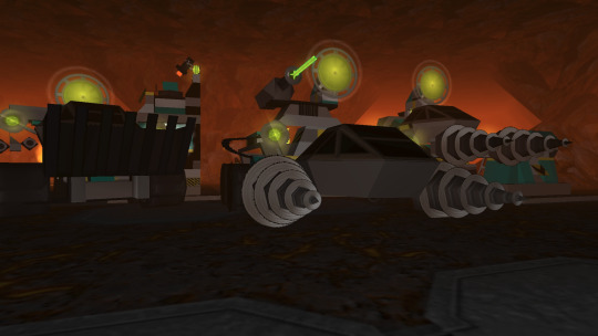
Running the game
Rock Raiders was released in 1999, and needs modification to install and run on modern systems. You can use the community alternate installer on Windows 10. It's recommended to use the Masterpiece edition to avoid issues with copy protection.

For the most vanilla experience that runs on modern systems, follow this guide on using dgVoodoo. However, LRR can be improved greatly with mods - read on.
Community Edition and Cafeteria
For further fixes and QoL improvements we can look towards LRR's legendary modding community. First, it's recommended to run Community Edition for additional options, and fixes for, the game.
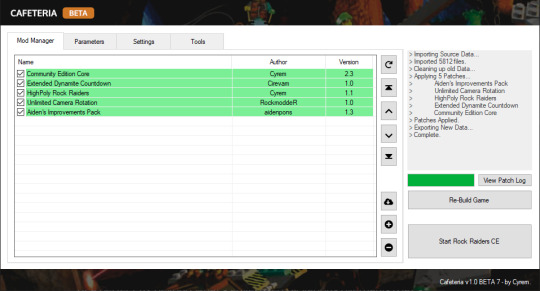
Second, you'll want to launch the game through the Cafeteria mod loader. This includes a Community Edition Core mod, and I recommend adding a couple more:
Extended Dynamite Countdown (this also seems to resolve dynamite-related crashes)
HighPoly Rock Raiders
Unlimited Camera Rotation
Despite all of this I still experienced frequent crashes. I'm not aware of a perfect fix beyond what's advertised by various overhauls (Baz's Mod, Axel's Mod, and Aiden's Improvements Pack). OpenLRR aims to reimplement the game's EXE with fixes for modern systems but isn't complete at the time of writing.
Capturing footage
The Parameters tab of Cafeteria allows us to easily configure which flags to launch LRR with.
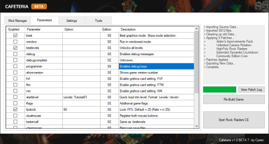
At a minimum I recommend setting up:
best
testlevels
fpslock 60
nointro
You can set widescreen resolutions in Cafeteria's Settings tab.
Camera controls
To zoom in and out, use the +/- keys. Arrow keys rotate the camera. Selecting a Rock Raider offers over-the-shoulder and first-person camera options.
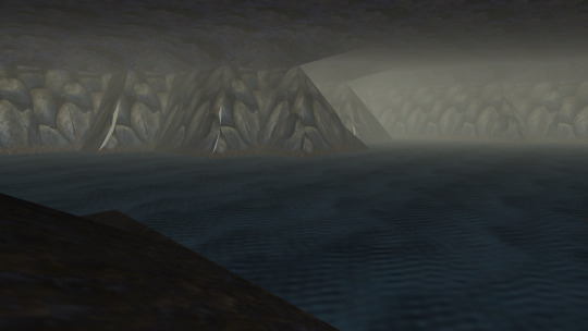
You can cheat by setting large values for the InitialCrystals/InitialOre properties in Data/Lego.CFG. This is especially useful if you want to photograph buildings and vehicles that are unlocked later in LRR's tech tree. We can also using this file to change the presentation of the game - read on.
Hiding the HUD
We can hide the HUD by editing Data/Lego.CFG. This massive plain text file configures the game's frontend, as well as many key gameplay variables.
Look for lines that define UI elements and "comment them out" with a semicolon character, modify coordinates s.t. they are moved offscreen, or delete them. You can also remove or modify the referenced bitmaps so they appear transparent.
Combining a no-HUD mod with the game's first-person mode can produce some amazing screenshots!

Identifying sounds
LRR's ambient soundscapes are defined in Lego.CFG. Look for the assets enumerated under SFX_Drip, SFX_Ambient, and SFX_Ambientloop.
Putting it all together
Overlay the game's ambient assets with your captured first-person no-HUD footage.
youtube
9 notes
·
View notes
Note
Hiya! I was thinking about the remastered animation Cel style evil Conan post you put up recently, and I just wanted to say how amazing and impressive it is! I love love love the look of old animation and you really nailed it. I’ve been trying for ages to mimic that look myself and haven’t been able to crack it, so if you ever wanted to talk about your process on this piece, I’d be all ears! Wonderful work, again!
Waaah hi liv!! Thank you, I'm so glad you like it, and that it comes across so convincingly!! One of my favorite things is to make digital art that can have a second life as a different medium, and I wish I had an easy answer for you as to how I go about doing that, but the truth is that it's mostly the result of a lot of trial and error. And a metric ton of references.
Here's a quick process video of my last piece to try to show off what all my layers are like, but I know it's mostly useless without an explanation!! I can't explain it all because I was kinda winging this one for funsies but I can give you general tips for this particular look.
Clip and words below the break!
As a disclaimer I didn't really go into this one intending for it to come out looking the way it did. So it's more of a hybrid look between my usual "clean" digital rendering and a fake screenshot.
[1] Reference, role models, and inspiration - I'm not kidding when I say I used to tote around an entire, dedicated folder filled with printed reference. These days that usually takes the form of about a million browser tabs ( ̄▽ ̄) I stare at early Detco and the first six movies a LOT. And Cowboy Bebop. And Akira. And and [insert your choice of 80s-90s anime film]. Depending on the exact look you're trying to replicate, you can always look to a more era-appropriate movie.
I love pulling inspo from films in particular (both animated and live action) because cinema is a whole other art that employs all kinds of techniques for our usual considerations (like lighting and framing), and looking to them can inspire some pretty poignant imagery, especially when you're trying to create something that's meant to mimic a single-frame capture of exactly that. I don't keep up with movies or anything, but I do have my favorites, and it didn't really occur to me to look to them until some of my favorite artists revealed that they do the same with theirs.
For this particular piece, I also had to establish some consistency with the other piece that bookends the scene, so I actually referenced my own art, too.
[2] BIG canvas! I usually work at two or three times the size I expect to export. Following standard aspect ratios for animated productions can help sell the look. Letterboxes have their own ratio, too, if you choose a widescreen canvas; and subtitle fonts are usually standardized to certain font families and colors since their primary purpose is to help make the media accessible. All this is usually a quick google search away, OR… if you're like me, and you still watch physical media… you can just yoink most of this from a real DVD.
[3] Thin lines!! I still can't quite nail the right line weight for these-- I definitely went too thick here-- but they tend to be very fine. And imperfections are good! Nobody has a perfectly steady hand, especially with traditional cels.
[4] Less is usually more when trying to sell a screenshot look… it's easy to over-ink and over-render and-- in my opinion-- restraint is necessary to sell it. This is the hardest thing to explain… it's design vs. rote emulation, I think. But that said, digital aids (next point) do a lot of the heavy lifting in these - as far as the art is concerned, a little will go a long way! These were some of my easiest lines and shading. So on that note…
[5] …Blending modes, masks, and filters are all your friends o___o I get a lot of mileage out of the default tools already available to me in the art software. There's plenty out there that's available for free, too! I recommend you find a fake anime screenshot tutorial, follow it once, and just go nuts when you get to the part where you can play with these settings. The make-or-break for a convincing screenshot-- in my opinion-- is texture and bloom, and all these digital tools will help you achieve that.
I hope this helps!! Hopefully the video can help you see a bit more of the process since I can only really offer tips. It shows everything at full size so you can see the details, so go nuts!
Thank you for the ask! Beaming plenty of good luck that you can find the look you want!!
ALSO I REALLY HOPE THIS IS THE PIECE YOU MEANT I'M LITERALLY ABOUT TO QUEUE THIS UP AND JUST REALIZED THE ONE THAT CAME BEFORE THIS IS MORE REMASTERED CEL ANIMATION LOOK SKSKSKSK
the same tips apply though so i hope they still help all the same :3c
10 notes
·
View notes