#Daniel Smith watercolours
Explore tagged Tumblr posts
Visit Tumblr Blog
Explore Tumblr blogs with no restrictions, modern design and the best experience.
Last Seen Tumblr Blogs


Fun Fact
There are dozens of funny blogs to kill time on Tumblr.
Text
David
Today’s #sktchy face: David #DrawingFaces #Watercolour #Moleskine
It always takes me a little while to get used to the change of paper when I start a new watercolour sketchbook, especially if I’ve changed from one brand to another. My last one was a Fabriano Venezia and this is only my second painting in my new one, a Moleskine, so I’m still making that adjustment, but I’m pretty happy with how David’s portrait turned out.

View On WordPress
#Daniel Smith watercolours#drawing#drawing faces#Moleskine watercolour sketchbook#Museum by Sktchy#portrait#portraiture#Prismacolor coloured pencils#Sktchy#watercolour#Zecchi watercolours
1 note
·
View note
Text

my very well-loved watercolor palette 🎨
#watercolor artist#watercolor#watercolor painting#watercolor palette#schmincke#sennelier#daniel smith#painting#paint palette#artists on tumblr#illustrator#art supplies#paint supplies#watercolour#art aesthetic
97 notes
·
View notes
Text
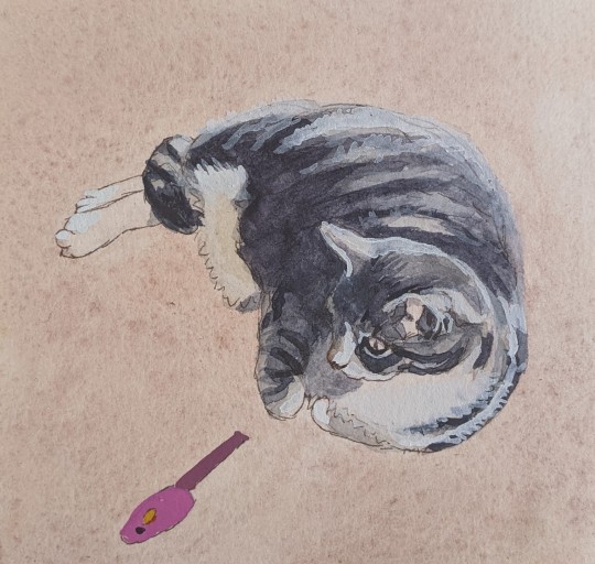
Beatrice relaxing in croissant formation.
#painting#cat art#watercolour painting#watercolor painting#cats#artist#cat ghost#ghost cats#cat#beatrice#daniel smith gouache#croissant cat#croissant#cat portrait
9 notes
·
View notes
Text
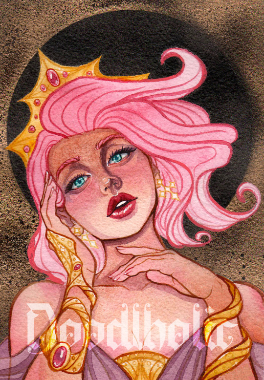
Spring Goddess
#watercolor#spray paint#watercolour art#watercolor illustration#myart#character art#character design#artists on tumblr#stylized#semirealistic#pink aesthetic#arches rough#daniel smith#qor watercolors#art nouveau#watercolor portrait#portrait
24 notes
·
View notes
Text

Jay and Silent Bob outside Mooby’s
#art#drawing#illustration#sketch#fantasy#fictional characters#painting#artists on tumblr#watercolor#traditional art#jay and silent bob#mooby’s#kevin smith#90’s movies#00 movies#film study#watercolour portrait#watercolor painting#daniel smith
27 notes
·
View notes
Text

Margo Robbie in watercolor and prismacolor premiere colored pencil
@raraluvsu97
#daniel smith#art#my art#artwork#artists on tumblr#artist#watercolor#watercolourpainting#watercolour illustration#watercolour portrait#mixed media#prismacolor#prismacolour pencils
7 notes
·
View notes
Text


beautiful gift of watercolours from the wonderful @goshdarnheck for my 39th birthday ❤️


a palette that feels destined to paint some warm summer Ontario landscapes, and a perfect inspiration as I start thinking about native plant gardening this spring!
what would you paint with these?
5 notes
·
View notes
Text

Hooary for Vegetables :)
#drawing#drawingeveryday#drawingoftheday#watercolour art#watercolourpainting#daniel smith#vegetables#cute drawing
2 notes
·
View notes
Text

Watercolor of Ciel Phantomhive I painted from a sketch by Yana Toboso, manga-ka of Black Butler!
Used Daniel Smith and Qor watercolors on a small square paper that I pained while working at an art supply store
#black butler#yana toboso#fanart#anime fanart#anime#watercolourpainting#watercolor#watercolour illustration#qor watercolor#Daniel smith#SoundCloud
5 notes
·
View notes
Photo
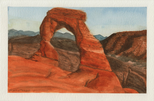
Study of the delicate arch
from 2021
2 notes
·
View notes
Text

“I can bring you in warm or I can bring you in cold”
#the mandalorian#din djarin#mando#mandalorian fanart#the mandalorian fanart#din djarin fanart#din fanart#star wars fanart#star wars#watercolour#watercolour art#watercolor art#portrait#watercolourpainting#watercolor#watercolor portrait#winsornewton#windsor and newton#winsor and Newton watercolor#daniel smith
5 notes
·
View notes
Text


2025 watercolours + thoughts
Welcome to my Roman Empire.
I’ve got far too many colours, I know people work with more but for me it’s almost unmanageable, I’m out of space. I’ve been collecting and trying out and hunting for new and perfect colours for years now so it just ads up*. However I’ve gifted off several tubes I didn’t love last year and I’ve identified what could be on the chopping block next. Ideally I’d like to be able to fit comfortable into 35 wells but that might be a few years off yet.
I enjoyed compiling this while it’s been too hot to do very much of anything. I don’t expect it to be of much interest to anyone but me in 5 years or so when I come back to see how my palette has changed but my paints are important to me so I want to share this… novella. I’ve scribbled in the margins a little, something to keep my attention fired, just silly things but I enjoyed thinking about the colours in ways other than their practical natures 🙃
What I appreciate:
I have leant towards very vibrant colours in past years but I believe my tastes are starting to mellow. I can’t see a day when I have a muted palette though. I also am fond of pastel paints with white pigment put in, I know I’m uncultured. I also don’t love heavy granulation or at least I don’t have many heavily granulated colours so I can choose to mix them in or leave something more flat. I am learning to appreciate just a little movement/interest in my paintings though I’ve noticed. Other than that all I really want from a paint is one that has an acceptable pigment load, drys hard and re wets easily.
Oh and needless to say, a persons working palette is very personal to them so my preferences here are just that for the most part, personal. I’ve had nice paints and have nice paints but don’t find use for them in my own paintings so they sit useless and I end up not liking them. If I painted lots of mech or cyberpunk I bet I’d have made different choices but I like painting… whimsically? Homey? I like making paintings that feel like walking into a familiar metaphysical store, so my palette, as big as it is, I think reflects that.
Thoughts on brands I’ve used:
I’ve ended up with a lot of Daniel smith paints even though I suspect they are they least transparent/ honest of the big watercolour makers. Their formula when you drys to reassuringly firm and not terribly sticky and they rewet very easily and dry up again pretty quick once you’re done painting which are all positives in my very hot and humid climate, plus they have a huge range and the price in australia is fairly okay- I’ve come to not trust their lightfast rating though**
I think M.Graham makes the most beautiful paints and I can get them really very cheap for how highly I rank them against brands that cost more but… they are very very sticky and the folding nature of my paint box is I only trust putting them in the lower half of the tin- I would hate to open it open day to find the top half paints had slid down in the heat and mixed with the lower colours, so I have no yellow/brown m grahams. They also seem sometimes to separate and become grainy- not have granulation- just- spilt and grainy. I’m not convinced it’s the paint and think it might be the tap water. I know purists like painting with distilled water but… I just don’t care enough honestly.
I want to like schmincke because the three paints I’ve tried have dried almost as well as DS and I think they are getting to be a similar price but I often use heavy layers of paint and all three of the colours I have have dried with a glossy sheen which I am very not into, so I don’t know if I’ll pick up more of them now.
Art spectrum is the Australian brand I have. It’s easy to get here, very very cheap. It’s fine. Some of the colours are in my top favourites but I think over all they don’t have the punch/pigment load of the other brands I have. It’s very disappointing because I do like to support local industry. In the very least the formula is made for the climate and dry hard, maybe too hard though
Holbein. Hm Holbein. I’ve had some colours. I think they are probably nice paint and maybe I just haven’t had the right colours for me but I find them a bit.. thick? Milky? I don’t see myself buying more from this brand, it’s not for me
Winsor & Newton you can get as easily as art spectrum here but it’s set up as the professional brand and priced accordingly. I. Don’t see where they get off on the price of it and resisted buying any until I was tempted to try a certain pigment and that’s the brand the local store stocks and I didn’t that day have the for an online order. I like the couple of colours I have of them. Good solid and predictable. I think a little boring but that’s not a bad thing if you want more control.
*I want this list to refer back to god don’t follow my example it really is a lot of paint
**I do my own tests in a window. Many colours do surprisingly fine but I also don’t actually expect watercolours to live in my window unchanged against my harsh southern Sun- however I’ve noticed that the Daniel smith colours that have excellent ratings will surprise me the most with how much they’ll change/disappear with the light, just my thoughts on it, it might just come down to having had so many more ds paints
DS- Daniel smith | MG- M. Graham | S- schmincke | AS- Art Spectrum | H- Holbein | W- Winsor & Newton
Brand//name//changes after 1 year of sun exposer//thoughts//vibes
1- DS // Neutral Tint // very slight colour change- pulls the smallest bit warmer after 🌞// beautiful rich dark grey, very useful in mixes especially to bring down purples without losing vibrancy // the quiet dark of the sky at 4am in the outer suburbs
2- AS // Sepia // very very slight lose of colour in wash, only can see it because I am looking for it // I got this colour and two others as damaged stock, more as a marker for the event that got them damaged than any desire to have the pigments but I’ve been using this sepia more to calm down my other bright pigments. It is chalky and hard to rewet but I couldn’t say that’s the paint or that my tube is understandably fucked. When I use up this tube I could see myself buying another dull brown to fill it’s space but I might branch out to another brand // a cats purr
3- DS // Transparent Brown Oxide // no change // this and the next burnt umber paint I use interchangeabley, I don’t know which I prefer but I seem to be using up the umber a bit faster so I don’t believe I’ll replace this colour. It is more rich and smoother than the umber, leans slightly more red while still being firmly brown. // I am a rock in a field and the field richly feeds many sheep and the sheep are happy
4- DS // Burnt Umber // no change // I bought a 5ml tube of this to try thinking I’d mostly use it straight up as a brown but I’ve been mixing it much like the sepia to tamp colours back a bit but also I think it gently pools -laces and gives things an interesting look. It’s a bit more subtle than the transparent brown so I prefer it a little more. // I am your back warmed by the sun, you are riding a shaggy pony
5- DS // Permanent Brown // very slight fading // I thought I used this colour more than I do but looking at it in the tin I’m not sure I actually reach for it (when I’m painting best I’m not hugely paying attention to where I’m sticking my brush) it is however a nice rich clean transparent red brown, very flat. Perhaps my smoothest brown paint if I wanted to I could make a very even wash with it, but I don’t want to so I don’t think I’ll buy this again. I may not even refill the well now I’m looking hard at it. // the practical shoes of a friendly dentist
6- DS // Perylenne Maroon // darkens? In ☀️, loses a touch of its red, is noticeable // I use this colour for blood. It’s not a bright red at all and has a huge shift from how it looks wet to dry but it flows in water like silk which is fun and I’ve found it to be a better fleshy red than any of my others, it also has a velvety look to me; I just really like it’s style. Which is why I was disappointed to see it shift quite so much away from red in my test. // cradling a fresh cup of tea during a negative mental health episode and feeling the warmth seep into your palms keeping you tethered to reality
7- DS // Naphthamide Maroon // faded very slightly in wash // I could mix this colour; I could do that right now to prove it to myself but I don’t want to. I don’t need this colour. I don’t believe anyone needs this colour. This particular shade just feels so homey to me though; it feels like the colour of nostalgia. I will be keeping it. // The dank purple of a musty cushion in your great aunts suspiciously damp sitting room where the lace curtains are billowing gently on a quiet morning in may.
8- AS // Flinders Red Violet // dulled slightly in mass tone and faded in wash // second of the recovered paints. It doesn’t matter how much I use it, which is fairly often I always forget that’s it’s quiet a vibrant almost magenta, which is why it’s here with the brown reds I guess, instead of with the purples, ah well. I also wouldn’t have bought this had it not had the ties to a store that no longer exists but I’ve got to say it’s a reliable paint. AS paints I’ve found dry too hard usually but this one’s not so bad. I could mix something into it to soften it up more but Im probably not bothered to. I do find myself reaching for it to mix into browns and oranges, but I’m not sure why I would do that. It granulates, sometimes. I won’t replace the tube but I feel it’s absence already // alien virus
9- DS // Quinacridone Coral // very very slight fading of red, leans more orange now but not very noticeable ‘ I’m not sure I’ll replace this tube once it’s gone but I’m enjoying it enough now. I got it because I thought it could fill a space in my pallet I thought was there but now I’m not sure it does fit or if there was a hole at all. It is a bright floral sort of colour and I does mix very beautifully with the Naples yellow but I’m not sure that’s worth another tube // the colour of a plastic slide that’s been left to the elements in a yard where the children have left suddenly
10- I spose this should be up one. I have had Holbein shell pink for years and I do use it, but not really. I don’t like the paint itself it plays awfully with the others, you look at it side ways and the mix turns to chowder. So it kind of needs to stand on its own and I just don’t need that much straight baby flamingo pink. However Daniel smith has a new pale pink coming out soon, same pigment mix as the shell pink I have but I’m hoping it will be a bit more sociable and would like to try it… maybe when/of it has 5ml tubes though. I love using the more opaque/ white pigment paints to cover my mistakes bring things together as a top layer and would like a pink pigment to use. // I hope the vibe of the paint I will one day get will be floating through the clouds of an endless sunrise
11- DS // Pyrrol Scarlet // wash faded to nothing // a solid red. A red that is certainly red. Washes warm. I want a very warm certainly red red I’m just not sure it will always be this red // feet burning on road as you run full pelt towards the Mr Whippy at the beach
12- MG // Pyrrol Red // very very slight fading in wash I wouldn’t notice it if I wasn’t looking // lovely thick paint. Soooo messy. It’s everywhere man you have to be so careful about how much you let dry in the well because it wants to spread and it will. Very alive paint. Very Red. The most red even. It’s hard to tell if its a cool red or if it just so red next to the previous scarlet red that it’s just making the scarlet red look really orange. Both are red. But this is more red. // holding your lover and your lover is the redhead match lady
13- DS // Quinacridone Pink // warms up and fades slightly, noticeable // I’ve tried to get rid of this cool pink/red twice by putting the dried hunk into the dried hunk graveyard palette but it keeps coming back. I find the paint a bit streaky? Uneven? The colour is nice but maybe missing something. // sitting in a low light tapas bar with a cocktail that tastes like codral
14- DS // Quinacridone Red // warms very very slightly // much nicer bright red than the coral in my opinion. But maybe… no, it is nicer. It is very strong, I think it works better for me in washes as is but makes very nice bright oranges. // a lava lamp
15- DS // Quin Fuchsia // no change // I was going to cull this one… but looking at it it really is a very pretty paint. Very potent but not as loud as the others around it. It will stay a while yet. // Tudor doublet worn by Richard Burbage playing Macbeth
16- DS // Rose of Ultramarine // fades, fades to nothing in light wash // romanic name, romanic paint. I could mix it myself but they’ve balanced it so prettily I don’t find myself wanting to. I don’t understand how it fades to nothing with the ultramarine pigment in it but there you go. Maybe I could look at a different brand for my next tube. I often use this to mix into blue to make them a touch more purple but it’s lovely too just doing it’s own thing. // Antarctic dawn
17- AS // Permanent Magenta // fades slightly / the third recovered paint. I was surprised how useful this paint is. It’s not as punchy in mixes as I want it to be, and that’s often a good thing for me. Still very vibrant. A good colour that will hold your hand as you as make mad scientist mixes with your paints. // sturdy windbreaker of a geophysics crew member working on time team in 2001
18- MG // Quin Violet // warms very slightly // Very lovely paint. I don’t reach for it. Not since I’ve got the previous magenta I think. Maybe it’s a little too powerful in mixes. I can’t wield it. With me it’s a very all or nothing paint and I like to mix on the pallet so it’s not been useful for me. The only reason I haven’t dug it out yet is because it’s m Graham and which means it’s sticky and it’s going to be a huge pain in the arse and I’m just going to have to use as much as possible up first // you love red onion so you grow a whole garden bed full of them and when you finally are able to taste your hard earn produce you can’t help but bite into it like an apple but juice squirts in your eye and you don’t try that never ever again
19- DS // Buff Titanium // no change / I should use this more for mixes. I think it’s a very cool paint. Can make things muddy but you’ll forgive it. I love it matched with a touch of cobalt turquoise- really perfect icey green. // I am the soft sand of the reedy distant shore you can almost glimpse through the fog as you drift in a little boat towards your destination : Avalon
20- AS // Australian Grey // no change // The name intrigued me. There’s another brand of (acrylic) paints where all their “Aussie” branded colours are honestly a lot of fun so I was sold on this. Still am. It’s a simple colour. I think they were going for wet gum tree with this one and I love looking at spotty wet gum trees. Being very honest with you though I use it most often as one of the paints I use as a base for skin tones and go redder or tanner from there because I can mix clear transparent skin tones with red/yellow/blue but I am lazy and I can simply jump two steps ahead with a single swipe // polished stone walls of a clean and much welcomed public toilet block
21- H // Imidazolone Lemon // fades, fades to nothing in wash / I don’t know man do all holbeins feel like glue? Like I’ve only got so many yellows because I can’t find one I like and while I like this nice bright colour.. can’t use it. It’s only really with me still because I don’t mind staining it with blues, I will probably pick the paint lump out and stick it in the green corner at some point potentially just to use it up. // Tupperware container that’s been in the work fridge for 3 months untouched
22- DS // Nickel Titanate Yellow // untested / I got this paint because I wanted to support the only local art store stocking Daniel smith paints and… well I had every colour I wanted at that point but I’d been watching oil painters use nickel titanate to use in golds so I got it and it’s lovely, it’s a bit opaque but still subtle, I could get this shade with azo yellow and buff titanium though. Which is why I say I really need to explore the buff more and get used dealing with any muddies it might have. Anyway love this yellow buuut I regret it because I don’t love it enough to have that nickel element on the palette. It’s such a small thing and god knows what goes in to processing the other pigments but ideally I’d feel better and would like to avoid any of the heavy pigments. Did just buy nickel azo though. I doubt I’ll replace this one when the tubes gone which will honestly take some time because for someone with 5 bright yellows on the pallet… I mostly use siennas and ochres so, there’s that. // lucid dreaming about being in a military parade but the soldiers are bananas
23- DS // Nickel Azo Yellow // untested / I am easily suduced by paints that have a dark rich masstone but wash out to glowing bright colours and this yellow does that hard. Still has the metal elements which I don’t even know if nickel is dangerous outside of skin irritation but, yeah. Yeah. I like the yellow glow though. I think it will stay. // it’s 10pm and there’s light spilling from the abandoned sugar cane mill you’re about to trespass on because your crush wants to investigate if the rumours that old tin building now being the haunt of a huge bird with glowing eyes is true
24- DS // Azo Yellow // no change in masstone, disappears in wash / nice yellow. If you thinking of primary yellow then you are most likely think of this yellow. The yellow of Greg the Wiggle. It. Is. Yellow. I don’t believe I have use for such a powerful Yellow. But I have it should I ever need it. // rain coat and hat that’s doing a great job of keeping you dry on a very grey wet day but it’s making you so hot
25- DS // New Gamboge // no change / solid colour. One of my oldest. Still working on the same 15ml tube. Probably still be working on it for the next 20 years with how often I reach for it but I feel better for having this cheerful little drop of sunshine on the palette // buzz
26- DS // Pyrrol Orange // hate it. I’ve had it so long I keep it because I thought I’d like to keep a convenience orange but this one’s so flat. It feels almost dead. I’m just using up the 5ml tube. // stinking revenant that hangs around the apartment that is addicted to orange tictacs and asks if he can watch the game every time you sit down to watch your shows
27- DS // Quin Sienna // darkens slightly, disappears in wash // go to orange, seeing it next to the Pyrrol makes me feel something. The orange of a fox. I mixes interesting browns. // the little scaffolding? holes that run up along the sides of Al-Khazneh at Petra
28- AS // Naples Yellow // no change // I’ve gone through some tubes of this but this was part of the first set of art spectrum and art prism paints I picked out on a whim while standing trying not to have a huge panic attack in riot-art because my job provider had printed out a bunch of resumes and told me I had to go hand out applications at all the shopping centre stores and the beige + nautical home decor store sales lady had said I wasn’t qualified because I wasn’t schooled in design looked at me like a bug in her soup and wouldn’t let me leave a resume and I was too honest to simply toss all the resumes in the bin after that and I also had a lot going on and then the job provider called me in the art store called me while I was trying to reset myself and said I had to attended orientation for a job that really fucked me for 2 years. Yeah. We’ve got history me and this paint. I tried to move on with it because AS paints, I would consider them student grade, really. But I couldn’t. It’s a good paint. For the brand it’s pretty creamy and mixes well with others even though it’s opaque, just being yellow it mixes ugly with purple but that’s not it’s fault. Might be a forever paint. // you are cared for
29- DS // Naples Yellow // fades the fuck away I’m so mad with this paint // what I tried to replace the AS paint with. Immediate regret. Too warm, too saucey? And now I find it fades, wash gone, masstone mostly gone just a pink cast remains, fades the most of any I’ve tested so far. I don’t even mind because I won’t repurchase. Probably. Maybe. I’ll use it up then see if I miss the sauce. // money when you don’t need it anymore
30- DS // Quin Deep Gold // untested // newer colour. I was very excited when I got it. I think it is lovely. A friendly colour, quite a bit more punchy than the next two. I think I could grow to love it. Toasty. // a semi-trailer truck polished to a showroom shine sparkling cheerfully as it hurtles down the freeway way keeping good time; it’s doors a masterwork of twisting hand painted scrollwork; it’s load- charcuterie boards
31- DS // Raw Sienna // no change / a classic. It’s sandy, it’s tasty, it’s what I want. // the smell of powdery make up
32- DS // Burgundy Yellow Ochre // no change / I picked this one out from my dot card sampler. Why I was so attracted to this dirt pigment over other dirt pigments? I don’t know. It’s a very niche one. I will say it’s very soft and I love using it to lay down a first layer. I would say it’s become a firm favourite, use it in almost every painting. // 70s kitchen coming back into fashion
33- DS // Environmentally Friendly Red Iron Oxide // no change // I believe there’s a few paint companies buying mining runoff and making it useful and this is allegedly one of those paints. I use it interchangeably with the next paint because they are very similar, this one granulates a little though, or on this hot press paper though I guess, that’s fine. I’ll use it. I won’t repurchase just because I’m not very excited by it. // you will never know who I really was
34- DS // Burnt Sienna // no change / another classic brown right. Took me a while to.. listen I researched heaps about what other people load their pallets with, I still research. Many colours that seem like most of many people have them and love them or they are very useful… I’m very critical of those colours at first. Like I’m thinking is this really a good pigment or is it a conspiracy thought up by Big Sienna- or really, Big Quin Rose/Gold (I know I’d like those two colours I know I would and yet…. Haven’t tried them, madness). Anyway. Turns out burnt Sienna is the friendly brown of your dreams. // When thou from hence away art past, To Whinny-muir thou com'st at last; If ever thou gavest hosen and shoon, Sit thee down and put them on; If hosen and shoon thou ne'er gav'st nane: The whinnes sall prick thee to the bare bane;
35- WN // Potters Pink // untested // I was intrigued by an earth pink, I got the Winsor and newton one because it was at the store but turns out it might be a little softer and a little pinker than some of the other brands so I’ll probably stick with it. I like it. Puts that interesting gravel into my bright quinacrindones and soft yellows without dulling or darkening them very much. Is a little solid in the pan but nothing unmanageable. // masses of sun bleached cosmo flowers in a hazy valley garden
36- AS // Mars Violet // untested // I don’t know how this one escaped testing I’ve had it a while. I sandy paint but it’s another that was recovered after a calamity so I will not judge it on that basis. I’ve been using it more lately because it is soft colour, not brown not purple, not grey. Just ads a bit of dustiness. // dusk when there’s bush fires about and the wind is down
37- WN // Perylene Green // untested // that’s a nice colour right. Big fan. Big fan of both my perylene colours they are very unassuming when you sit them next to all my quins but they are very dignified colours and hold their own. I don’t know that I will stick with this brand but I don’t have to decide on that just yet // divinity in the forest
38- MG // Viridian // very very slight yellowing // had this for ages. I got this one as my first m. Graham paint because Viridian is sposed to dry very hard and the MG formula being so soft counteracts that. And it does, no problems with rewetting. The tube says something like “⚠️could cause cancer in California⚠️” though. I wasn’t using this colour because it does have a low tinting strength and I got a phthalo green but I’ve leaned back into using this as a mixing green because of that softness, it doesn’t really over power things like it’s phthalo cousin and it has a pleasant fuzz about it. // Your mum wearing a juicy couture tracksuit sitting back lighting a cigarette and sipping tea on the veranda after work and asking if you want happy meals or chinese for dinner as a treat
39- AS // Phthalo Green // very slight yellowing in masstone, fades in wash // I thought I wanted this. I don’t. I’ve seen something where they mix excellent purples with this green and hot pinks so maybe I’ll reconsider // slipping and planting your whole face into thick grass. Youre definitely getting a black eye.
55- DS // Rich Green Gold // no change // I’ve moved these next two up in the list to be with the other greens. Another happy friend that has a huge difference in masstone/wash colour. This one’s a bit edgy and looks sour but it’s got a heart of gold, literally. Really glows, very showy. Base green I usually start with when doing plants because is so full of life. // off shoulder, bell sleeved whimsy goth blouse
56- S // May Green // fades, fades completely in wash // thought I wanted this. I don’t. Dries like a rock. Evil colour. I mean it absolutely is doing it’s thing perfectly, but it’s not for me. // call me Desdinova no, better- The Lair of the White Worm 1988
40- S // Cobalt Turquoise // no change //what to say… poison pigment that’s stolen my heart. Will absolutely ditch it when I find a solid hue but for now… mistakes? Cobalt it. Boring? Cobalt it. Ugly? Roll that dog in cobalt you’ll have a beautiful thing. // Helen of Troy
41- DS // Phthalo Turquoise // untested //. Nice. Nice, nice, nice- this puppies not like the other phthalos, it’s got some depth. Smack between green and blue it is a convenience but it’s good when you want to smack the heat out of something but keep it bright and clean. // 🎼Hold your breath, swim and strain. The smell of death, can't escape. Blood will cloud and drift away. Attract the murders of mermaids. It's so cold they all know. What you've done, you can't run. Vengeance is the law for thee. A thousand leagues below the sea. You've been tracked, you've been seen. Murdering the next kin. Ate their hearts,drank their blood. Washed your fins in blackened mud. Now you swim try to hide. Heart beats faster from inside. Thought it was a big charade. Your life was ended by mermaids. Murmaider, Murmaider, Murmaider, Murmaider, Murmaider, Murmaider, Murmaider…
42- S // Helio Turquoise // fades slightly // very lovely colour. My preferred phthalo blue. Really similar to the previous turquoise though so… might not keep buying it. Really hard to justify having it when I’ve run out of room. // pool tiles at the Gatsby mansion
43- DS+AS mixed // Phthalo Blue Green Shade // untested? I never tested the DS tube but the AS one faded and yellowed // this is a colour, right. What kind of world would we be living in if Botticelli had access to the ethereal phthalo blue g/s? I don’t think it’s for me though. I’ll have it because it doesn’t hurt me to keep it. But it’s a bit of a wallflower. // the eyes of an ibis god
44- MG // Phthalo Blue Red Shade // fades very slightly in masstone, fades significantly in wash // another phthalo with depth. Deeper, warmer blue than the previous three. I’m still learning to use it, it over powers somethings and nearly moves others. I’m not sure if it is as useful as a mixing blue as a regular phthalo blue but in general, yeah, I prefer it. Very pretty. // humpback whales powering calmly through the ocean
45- MG // Manganese Blue Hue // no change // I believe I got this one after I got a Rembrandt cerulean and hated it and I got that because I was trying to divorce the next blue paint on the list. I know in a perfect world in watercolour you get lights by keeping the white of the paper showing but… often I just want to slop full strength colour done and watch it dance and I love a pale bright pigment/mix. This on its own contends with my darker blues together with being my favourite paint. Really lovely. A jewel of a paint. A stand out mix with it is with Quin purple making the most dreamy clear lavender colour, it’s beautiful. I believe other brands with of manganese hues granulate a lot more than this one because the real pigment is a very rough one but I sort out this MG paint which isn’t smooth by any means but I wanted the tone more than I wanted the gravely bits and it provides //I surprise a smile out of you
46- AS // Tasman Blue // maybe fades in wash, I tested it poorly // my problem child. Dry, chalky, have to scrub it to wake it up. Had it on the pallet since day one, tried to dump it but missed its particular feeling. Isn’t the best to mix with or it creates mud very readily but it provides a strong sky I wouldn’t be able to match on my own. And I know I could put something in to soften it but: I simply havent gotten around to it / a 50 year old children’s adventure movie is on tv while you play with a puzzle that smells of moth balls
47+48- AS French Ultramarine + MG Ultramarine // very very slight yellowing and no change // there’s two paints in this well, I keep filling up with two tubes- I can’t tell them apart though. Oh they are a bit different to each other, one is a bit more Blue and I like it better but I couldn’t tell you if that’s the MG or AS, it doesn’t matter because when they are gone I have my eye on a sennelier replacement. In general ultramarine blue has been my favourite colour to look at for some years now but I couldn’t say it’s my favourite watercolour. I find it makes uninspiring purples and dead greens. I say I want this new paint because it seems nice and smooth but I might also seek out a Very granulated ultramarine to play with that element as well. //old king atop the mountain
49- MG // Anthraquinone Blue // slight loss of blue into grey // my three moody blues. I don’t need all three but deep blues are where my heart lies so I keep and use all of them. This one is the bluest of the dark blues but spilts terribly to have dark iron? Granules and I’m just not sure this is a granulating pigment so it’s a problem on my end. Very beautiful though. Very poetic. I got it because I was disappointed in the dry down of the indanthrone blue. When these two paints, pb60? are wet the blue is biblical but then they settle back to reality. Can temper that with the ultramarine sure but you never fully bring it back to the life it has when it’s wet. Use it often to really bring something down to cool black. Love. // Blanket made of pieces of night sky and witch’d to cause sleep
50- AS // Indigo // very slight loss of blue into grey but poorly tested // original paint, might be my original tube as well, I’ve tried to remove it as I have all my first AS paints because, again, sadly the quality I don’t feel matches with the American paints, but here it sits in the middle of the pallet still. I use it to knock the life out of purples mostly without turning them too grey. I think it is a ghostly colour and I do like it for all it is maybe my most dull paint. // Look for me by moonlight; Watch for me by moonlight; I’ll come to thee by moonlight, though hell should bar the way!
51- DS // Indanthrone Blue // slight loss of blue into grey // only very slightly different to anthraquinone, it’s a touch more grey but no less beautiful in its own way. I find it more useful for mixing though since it doesn’t spilt. I think I secretly might like the troublesome anthraquinone more but… it’s mad but I can see myself just keeping both brands on the pallet. I’d prefer that over having quite so many yellows at least. // For, alone of gods, Thanatos loves not gifts; no, not by sacrifice, nor by libation, canst thou aught avail with him; he hath no altar nor hath he hymn of praise; from him, alone of gods, persuasion stands aloof.
52- S // Quin Purple // slight yellowing // sweet purple, I believe it to be quite over looked or at least I do t see people talking about it much and I don’t know why. Doesn’t have the depth of dioxazine type purple but I don’t consider that I bad that, that type of purple is nice and I might try it one day but it seems very strong to me and like it would over power everything. This drys a little dull but the schmincke version I picked out for being I believe the most true and glowing purple pigment. I use stacks of this as my shadow colour. // Virgilius the Sorcerer
53- WN // Ultramarine Violet // untested // my second newest paint. I think. Or third. I just wanted something a bit fresh to play with and this has not disappointed, it does granulate but it’s not over power and usually keeps a harmony with what it’s mixed with. I’m not sure I’ve had much cause to use it on it’s own yet or if I will but I have been hitting my little baby tube very hard all the same, I’ll need another soonish but not sure what brand I’ll get yet // cats up to mischief
54- DS // Lavender // untested // soft colour, gentle colour, colour that is surprisingly easy to fold into others. My newest paint. I am learning about it. I am having a great time, I got it because I was mixing up pale violets for every painting and I thought it might be worth just trying a bottled one- and I still mix them because this is an opaque paint and sometimes I don’t want that but it has been really interesting to experiment with, I don’t see it leaving anytime soon, no regrets // the sun is sinking into the grey, above it floats a fingernail moon and shinning Venus. Wispy clouds above you and storm clouds over the hills are moments away from the sunsets first blush but right now they drift unbothered and you wonder that no other person has seen or will see this exact composition playing out- as the cat makes an attempted escape down the front step


#this is certainly something that I have done.#you really… well not that you could never but I could never bring this much feeling out of myself about digital art#watercolour#watercolor palette#daniel smith#2025 palette#ratts complaints department
0 notes
Text
Acquerelli e granulazione.
Non vedevo l’ora di provarli, e non mi hanno deluso, il prodotto vale il costo… Sto parlando degli acquerelli Daniel Smith, sono sicuramente tra i più apprezzati dagli artisti che utilizzano questa tecnica…presentano una gamma di colori con una luminosità eccellente ed un ottima granulazione, che è la loro particolarità cercata. Ma cosa significa quando un colore granula? La granulazione è…

View On WordPress
0 notes
Text

A Victorian puzzle purse I made for my Valentine.
#victorian#victorian age#victorian puzzle purse#victoriana#origami#artist#cat art#watercolour painting#cat#watercolor painting#cats#daniel smith gouache#comté#taleggio#comtécat#taleggiocat#valentine#valentines day#vino
11 notes
·
View notes
Text
GUEST ARTIST: "The Sunny Watercolorist" by Michael Solovyev

View On WordPress
#WorldWatercolorGroup#aquarelle#artist#Daniel Smith#Daniel Smith Artist Materials#Daniel Smith watercolors#doodlewash#featured#painting#watercolor#watercolour
0 notes
Text


Something from the other week ago now: a pair of Lando and Oscar eyes for the lovely @bright-and-burning 👁
I used a different watercolour palette for these than my previous eyes, and I really really enjoy the colours and depth of them.
Daniel Smith watercolours (+ a bit of Polychromos coloured pencil in the irises) on Stonehenge Aqua cold press heavy 100% cotton 600gsm paper, approx 2.5x3.75" each
#formula 1 fanart#F1 art#landoscar#lando norris#oscar piastri#watercolour#my art#my f1 art#eyes#commissions are still technically open - I just have a small backlog to work through before I'd be actively promoting them again#but if you think you have an idea I'd enjoy I'm all ears (or eyes I suppose)
176 notes
·
View notes