#DM Tutorial
Explore tagged Tumblr posts
Note
How do you get that grainy texture on your art? It’s very nice!
thank you!! i love art that's soft and fuzzy...
i generally do it a handful of different ways, but i tend to bounce between a color noise filter layer in soft light mode, between 30% and 50% opacity,

... or i use something from my wide array of paper textures, and usually set the layer to overlay and play with opacity till i'm happy with it

......oooorr i do a combination of the two! which i did in the final version of this piece, which i Also added a gradient map to to make the colors a lil more ✨Dramatic✨
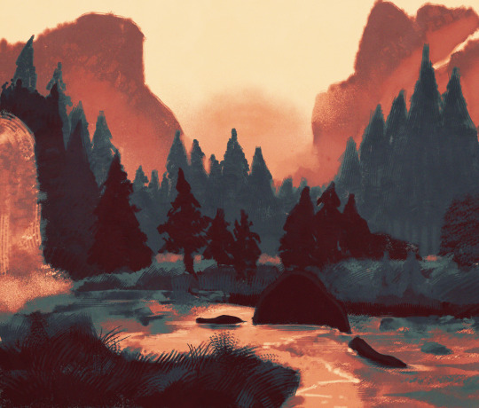
here's where i got (most of) my paper textures and here's a rainbow color noise texture (that i don't personally use but looks rlly similar!)
#i actually use a color noise filter from a VHS auto action set i used to use on my VHS icons. if yall remember those#my art#ask#tutorial#i guess??#idunno#if you have more questions feel free to dm me! i love clip and i love to teach ppl abt all its cool features#dinosaur#since i prolly wont seperate post my landscape study tht i threw a spinosaurus on
105 notes
·
View notes
Text
On one hand I'm so happy because I can listen to the original West End Cast versions of Hadestown with an amazing mixing and quality (as they deserve, they're one if not my favorite hadestown cast), but on the other I can't help but miss a lot of songs in the album :( There's no hey little songbird, there's no how long, there's no flowers- There's just one epic!!!!
#hadestown#hadestown west end#guess i can't erase some slime tutorials from my phone 😔#(if my moots are interested dm me)#hyl rambles
54 notes
·
View notes
Note
still hesitating abt joining [because how the hell do I draw a dazai] but more seriously, everyone's entry are so pretty
bbg drawing dazai is soooo easy trust🙏🏼 he's literally the autism creature with a black wig. observe
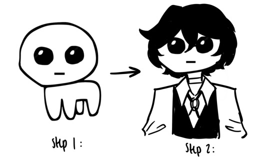
perfect replica
#ok but fr if u actually need help i can give u a tutorial in the dms#ALSO NOOOO DW ABT EVERYONE ELSES ENTRIES.......IT DOESNT MATTER#NOBODY ELSE MATTERS. I PROMISE#I WILL STILL LOVE UR PIECE REGARDLESS OF HOW IT LOOKS#lotus’s asks
241 notes
·
View notes
Text
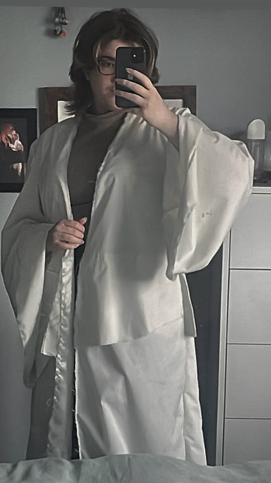
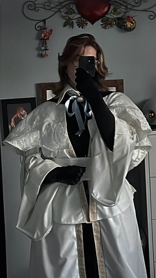
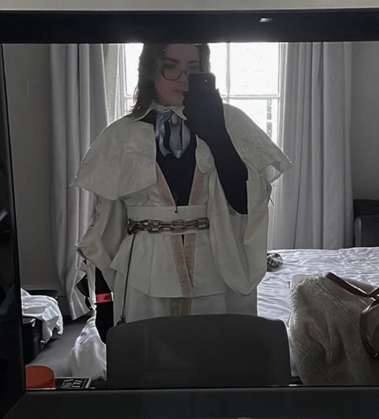
Hello!! breakdown of Choir Cosplay!! This is not really gonna be a step by step but a general vibe of what I did to make this cosplay :) To note: I haven’t sewn anything since I was in highschool which was 8 years ago, so a lot of this is like a ‘ya that works’ - make improvements where I could not :p Overall I wanted the cosplay to not be an exact copy of what is in game, personally I prefer more fitted clothing so I went close to my size with the pattern. Fabric: I used an ivory polycotton, ivory satin and black cotton. 1. I started hunting for a pattern that at least captured the vibe of the choir garb. I had split up the garment in my head into 3 separate parts: The base, the capelet, all the extra fancy bits. The big concern when picking fabric is I didn’t want the garment to be translucent, which is a problem for lighter coloured fabric. BUT!! I found that I didn’t have to make a lining and could instead flatline the fabric - where you cut double the piece and stitch them flat against each other - making it both thicker and opaque!
Flatlining tutorial:
https://www.youtube.com/watch?v=5N-qdP9tcc4&pp=ygUSZmxhdCBsaW5pbmcgc2V3aW5n
I found this pattern by Gunnar Deatherage on Etsy (as a beginner I loved this pattern, it’s very in depth and easy to follow)
https://www.etsy.com/uk/listing/1270370974/maxi-duster-wrap-pattern-instant?ga_order=most_relevant&ga_search_type=all&ga_view_type=gallery&ga_search_query=gunnar+deatherage&ref=sr_gallery-1-14&pro=1&sts=1&dd=1&content_source=95a164c411331c5aaff8fee029dee1e6377d3f92%253A1270370974&search_preloaded_img=1&organic_search_click=1
I did not use the sleeve pattern from it, instead I made my own to have the right fall and size.

Use the sleeve cap from the pattern so it can attach correctly to the bodice/back pieces - then where the sleeve starts to become longer draw out diagonally on both sides. For length I used the original pattern and went slightly longer! :) I used the same pattern for the peplum sorta top section and again for the skirt on the bottom. It creates a stitch line along the front but it’ll be covered by the belt!
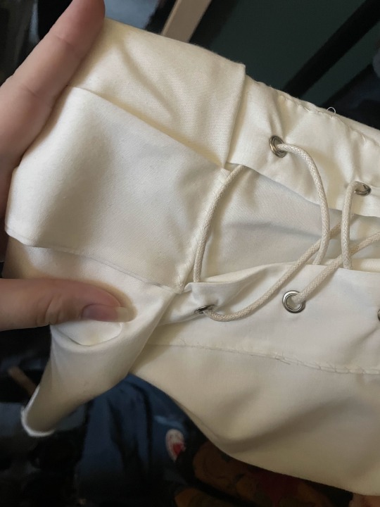
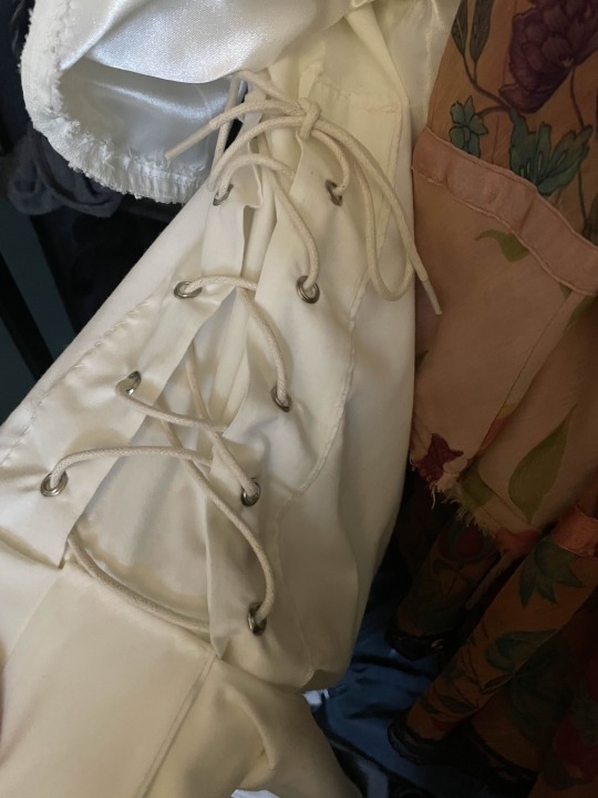
I bought this embroidered ribbon and attached it around the edges of the garment! https://www.etsy.com/uk/listing/840215852/35-mm-golden-victorian-jade-jacquard?click_key=2c042e9416627d9bf9d2f1e85385ba93e48ca464%3A840215852&click_sum=1fe453a7&ref=shop_home_active_1&sts=1 Corset/rolled sleeves: I did this last Corset pieces: Cut out 4 pieces (twice) - and attach them together leaving the end open to turn them inside out. Use a grommet tool and punch some holes through your fabric - make sure they line up. Roll the sleeves to roughly where your inner elbow is and attach another piece of fabric around the width of the roll - pin it in place. Hand sew the corset pieces on and the other piece of fabric so it is all secure :) Thread some similar coloured lacing to the fabric through the holes.
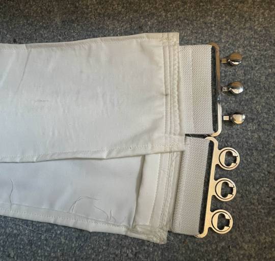
2. The belt! (My mum helped me a lot on this and was my voice of reason) Originally I had bought an elasticated belt with a clasp, but it didn't work at all and ruined the fall of the garment.
I chopped off the end of the belt, leaving me with some elasticated ‘fabric’ and the clasp. Measured my waist and cut out a thick piece of fabric twice and one piece of iron on interfacing. The measurement I did with the base on and added slightly more for both seam allowance and so there was breathing room for myself. Put the clasp piece on either end of the fabric and sew it all together! :) (marks are from the paint of the chain rubbing off onto the fabric :P)
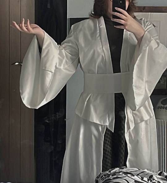
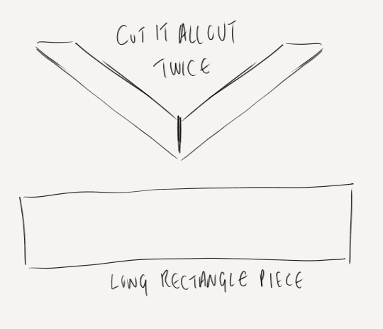
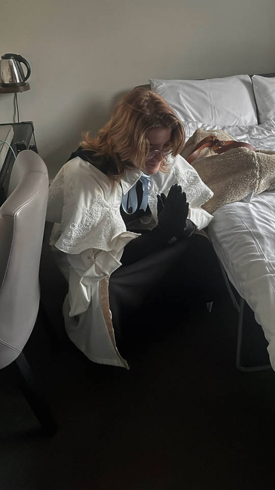
3. The caplet! For the capelet I used this tutorial Easy DIY Capelets | For Halloween, Thanksgiving & Christmas🎃🍂🎄 (The only issue with this is I couldn’t get my head around how to attach a non circle collar) Ivory polycotton + Ivory satin used. Doing the base of this is pretty straightforward with the tutorial - it’s just a circle skirt but for your neck. If you want to be evil to yourself, you can do what I did and hand sew bridal applique all around the garment. If you can machine sew it please do :p I went for a big swooping shaped applique in ivory - any gaps I had were filled with more applique https://www.etsy.com/uk/listing/628065500/beaded-sequinned-lace-flower-wedding?click_key=d8b4937d8079ab34b301cf2d4dc7fbd0d6ede960%3A628065500&click_sum=81fb49a9&ref=shop_home_recs_1 I used poppers on the base and the cape to attach them together - it kept choking me if i didn’t 4. The collar - made me want to cry ngl I could not figure out for the life of me how to attach a non circle collar to the capelet (which is how I wanted it). Instead we have a removable collar!! I copied the size of collar from one of my own shirts and followed these tutorials TWO PIECE COLLAR TUTORIAL | KIM DAVE How to Sew a Collar and Collar Stand Easily by Sew Sew Live 5. Graduation hood???? For some reason you can’t just buy these in the UK without paying £30, so I made my own Cut out double for the pieces around your neck and one for the ‘hood’ part Gather the ends of the rectangular piece and attach them to the other pieces!
6. The Fancy back panel piece Measure from mid shoulder blade to the bottom of the garment for the main rectangular piece. Cut out two other rectangles of the same width coming into an arrow shape. Sew them all together and start sketching on the design. The great thing here is you can make it up, because it’s too complicated and nobody is gonna look at it and be like ‘u did it wrong’ I used a fabric medium and gold metallic acrylic
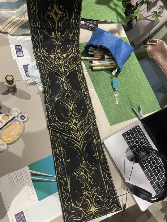
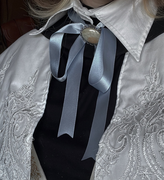
Once it’s all done, I machine sewed it to the back of the base garment because it’s hidden by the cape. 7. THE REST Chain: Me and the chain belt had a fight - Originally I used metal chain,, but I’m allergic to some metal and can’t deal with the smell,, I switched to a plastic chain with 2 D Ring clasps - had to sand it down but the gold spray paint loves to flake off. If I knew about it before, I’d use EVA foam chain :) Black pieces underneath: I bought a turtle neck and a long black skirt :P but you could make it as a dress or smth! Purchased long black velvet gloves, a pocket watch and a key necklace (I didn’t want to use a censer - and they are v expensive/idk how to make one) Ribbon + brooch: I bought chunky soft blue ribbon and found a vintage brooch on vinted
The mask: If you have contacts you’d probably be fine, but I don’t and this mask messed with my depth perception and balance so I had to take it off so I could wear my glasses :(
Use buckram plastic mesh - the thicker kind, used for fursuit eyes and in black! You can see out but nobody can see in. I made a mock up with paper but sorta looks like this shape :)

Eva foam pieces cut out into swirls and filigree like shapes, glue it onto the buckram I did a base coat in grey over the entire thing and painted it with black, gold and bronze acrylic! I hole punched and put the ribbon through it so the mask could be tied around my head.
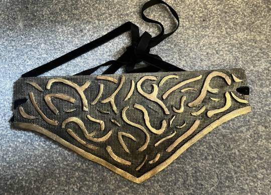
If you’re making the mask and hat - I’d attach the mask to the hat so it’s one piece :) Where I went wrong/what I’d improve I wish I had been able to attach the collar to the rest of the garment. There is a gap that appears between the collar and the caplet/base at the back (mainly due to gravity and it moving) that can be annoying, since my hair is on the longer side it was covered but still I wish it wasn’t there. I’d also want a bigger collar! I’d not use satin as a lining for the skirt and capelet - it’s so annoying to use and it’s so slippery Maybe would not hand sew all that applique because it took me over a week :P BUT OVERALL for a first cosplay, it’s pretty good! I’m mostly happy with the outcome and it was one of my dream ones to do! :) I hope this helps, I didn’t take photos of all the steps unfortunately but hopefully it makes sense :)
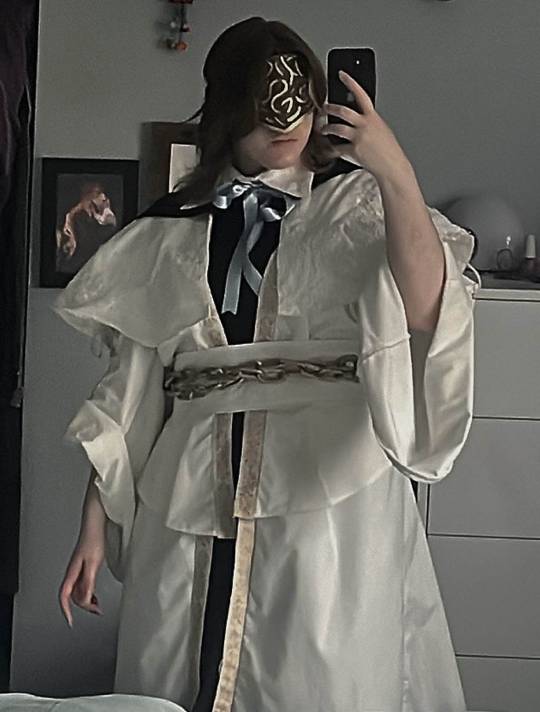
#Choir cosplay breakdown as best as I could#with links and things to where I got my patterns and tutorials from#I hope it helps - if you wanna know more or see more photos feel free to dm and ask idm showing!!#bloodborne#bloodborne cosplay#choir cosplay#bloodborne art#bloodborne choir#cosplay#fanart#art#artist#fromsoft
46 notes
·
View notes
Text
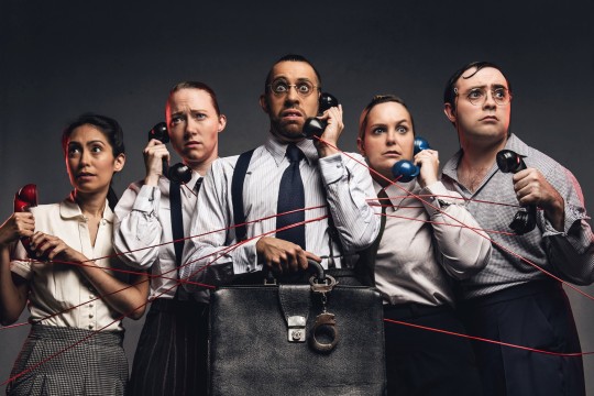
sooo obsessed with them v
#operation mincemeat#im a bit sick rn so im just lying in bed and listening to the soundtrack it's sooo gooooood#please.....spare slime tutorial......dm me please i will gatekeep it i prommy 🙏🏼#according to jules
16 notes
·
View notes
Text
Slang: 101
What do I say? How do I sound 'emo'?
Emo culture has some exclusive terminology, they also have some other phrases that came from the early 2000s. Some you may know and use, some you might have heard and some you may have had no idea about.
Below is a list of words and their meanings to help you out;
This post contains swearing and mentions of SH.
───────────────────────
Bae: A shortened version of 'baby'. Used as a term for a partner or as an adjective for something you like/an attractive person. "She's so bae."
Biatch: Bitch. A word to describe someone you don't like. "Shes such a biatch."
Cutting: The act of self harm, slitting your wrist. Don't cut please x
Crashy: Classy, but trashy. Someone whos attractive and dress in revealing/trashy outfits but have high standards. "Shes cute, but crashy."
Crunk: Excited, hyped up and/or intoxicated. Also a genre of music. "Down to get crunk tonight?"
Dayger: A daytime rager, a party being held during daylight. "Did you get the dayger invite?"
Emo: Someone typically with black hair and clothing who listens to emo music. We all know that's a stereotype. "He's totally emo, he loves Pierce."
Fetch: Something that looks cool, nice, good or expensive. "Your outfit is so fetch."
Fer Shur: For sure. "Oh I'm fer shur down."
Gucci: Anything cool, great or top. "That outfit is gucci."
Kickback: A small get-together between friends or a party. "Come! It's kickback."
Leet/L33T: Leetspeak/L3375P34K, 'elite speak'. "<4N U 3V3N 234D L337?"L33T: 101- Coming soon ;) Follow the blog x
Legit: 100% "Yeah legit down for tomorrow."
LELZ: Another way of spelling LOL (laugh out loud). "Lelz!"
Mood/Feels: A way to say 'I feel you'. "You're upset? Mood."
Noob: A poorly skilled person and/or game player. "You're such a noob, you've lost four times."
Normie: Someone who isn't in the scene/a 'normal' person. "Did you see that normie? Who wears pink?"
PLUR: Peace. Love. Unity. Respect- an exchange of a bracelet. "You wanna PLUR?"
Poser: Someone who tries to fit in with the emo fashion and culture just for attention or popularity. "You're just a poser, you don't even like punk."
Peeps: People. "What you peeps up to?"
Pwned: To dominate and/or defeat something. Same as saying 'get owned'. "Get pwned dude."
Rawr: A cute sound, happy/cute imitation of a roar, or used to express attraction/say 'I love you'. "Heh rawr <3"
Sadboi/boy Sadgurl/girl: A person who is open about his emotions, especially sadness, and channels their sadness through music, art or poetry. "He's a sadboi, legit."
Screaming: Being really happy/excited about something. "Internally screaming right now."
Sick: Cool/awesome. "Dude, that kickflip? sick."
Smexy: Another way to say sexy. "Omg he's so smexy."
Straight Edge: Refraining from using drugs, alcohol and tobacco/cigarettes. "Can't smoke right now, gone straight edge."
Totes: Totally. "Yeah totes down for tomorrow."
Trashy: A 2000s fashion style that usually includes things like, bold makeup, rhinestones and jewels, animal prints, faux fur and matching tracksuits. It can also be used to describe normie wear or clothing that looks- well, trashy. "Look at that juicy tracksuit, so trashy."
Turnt: Excited, hyped up and/or high. "I got totes turnt up last night."
Wannabe: Someone that thinks they are emo but aren't. They claim to like the same music, wear the clothing and say stereotypical things like 'I <ut myself'. (ugh). "I can't believe she's such a wannabe."
ZOMG: A more ramped up version of OMG (oh my god). "ZOMG no way?!"
───────────────────────
Follow for more x Updates every week, Tuesday and Thursday. 6:30pm GMT +11.
#emo#emo blog#emo forever#how to#guide#help#tutorial#101#info#2000s#2010s#early#early internet#web#early web#texting#shorthand#short hand#internet#message#messages#instant message#instant messages#dm#dms#online#leet#leetspeak#internet slang#slang
13 notes
·
View notes
Text
IWTV Slime Tutorials
https://ww16.0123movie.net/movie/interview-with-the-vampire-season-1-1630854184.html
https://ww16.0123movie.net/movie/interview-with-the-vampire-season-2-1630857030.html
#interview with the vampire#iwtv#iwtv slime tutorial#slime tutorial#I'm going to get banned for this 👀#and I'm not having these flag as links but you can screenshot and select text within image#and if you can't do that then dm me
20 notes
·
View notes
Text
I posted the stellated rhombicosidodecahedron i made a while ago but i love it so im posting again
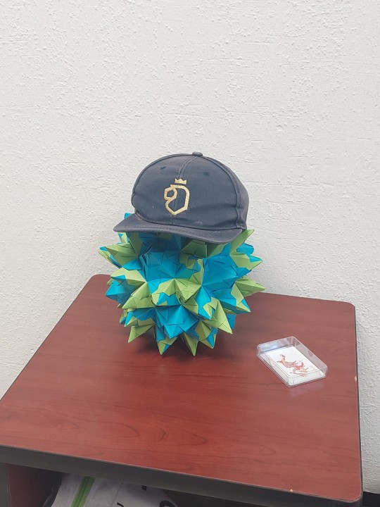
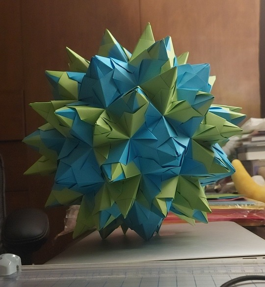
her name is kiki
#its from a youtube tutorial so if interested you can dm me#hat is from the friend that i gifted it to#it turned out so big though i do not recommend using 10cm squares unless its going to be like. a lamp#this was my first venture into origami polyhedra and im really happy about it#doing this instead of the 5 assignments and 3 books i need to read LOL
15 notes
·
View notes
Text

i decided to draw bakura cuz i was bored ^_^
[plz reblog]
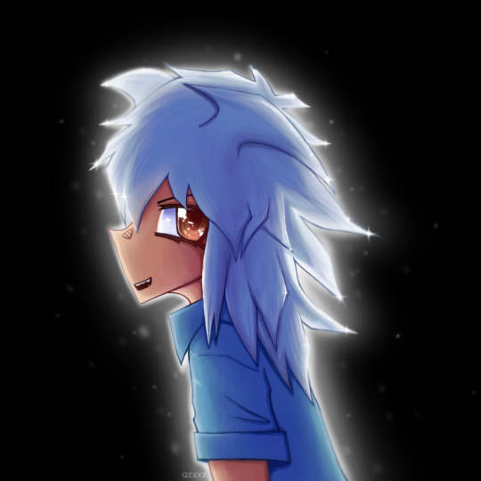
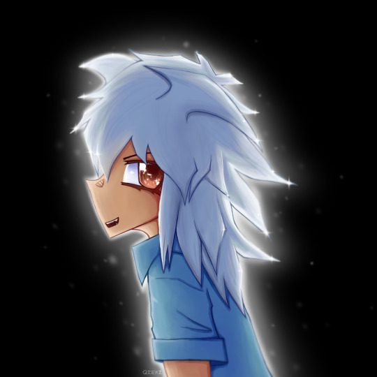
other edit.. + before edit
#i used a tutorial for da eyes it works so well...#art#my art#plz reblog#yugioh#ygo#yugioh duel monsters#yugioh dm#yu gi oh#ygo dm#yugioh fanart#yugioh bakura#dark bakura#yami bakura#bakura#huh im imrpoving maybe 2024 will bring more ^_^#its not good enough yet but still#fanart
38 notes
·
View notes
Text
NexusMods blocking system sucks ass
I understand why it's the way it is but I'm still pissed off by how... basically useless it is; people who don't respect you will use your mods regardless of any boundaries you might have, acting entitled and dumb while doing so 🤷♂️
Also wish Blocking people would mean not being able to see their comments anywhere - or AT THE VERY LEAST stop them from being able to interact and comment underneath your post in public threads, that'd be the minimum deadass
#blah blah#you have mfs doing tutorials on how to edit your mods to make it compatible with a body you don't wanna support <3#and then mfs commenting 'out of spite because its funny' and proceed to have a public meltdown about it for no reason#it's such an embarassing system - sent them multiple DMs about it already so hopefully they'll take those experiences into account#power to the users but protect your modders too y'know
10 notes
·
View notes
Text
good morning glitter bombs ! new week new mobile header ! 😌💛
#i quite like this one. i'm proud of it! there are many tutorials that#i still want to look at to improve my baby gif making skills but progress!#everyone starts somewhere! anyway hope you all have a lovely monday#take good care of yourselves pls. it's rainy and cold where i am it is#definitely hot chocolate weather. which i am planning on making ;^)#i'm at work as usual beloveds. i need to catch up on my dms asap omg#crossing fingers i can get to some. love you all~#tbd
17 notes
·
View notes
Note
how could I make the underfell sans jacket if you wouldn’t mind me asking *in a fancy British accent*
If anyone is looking to make a jacket like my underfell one, this is a little breakdown guide on how I did it and what I used-
Step 1: The jacket
Pick smth heavyweight, and go men’s sizes. For a non riding jacket, I recommend Sherpa lined. And buy in a good XL to XXL or three sizes bigger than what actually fits.
Step 2: the fur
Honestly, I’m big on real fur. For personal projects rather than fast fashion it is actually more eco friendly since it’s biodegradable and all, but I bought a fox for my trim. If you want real fur, be prepared to spend a lot, and look on trusted sites like GlacierWear. (Make sure to buy a piece long enough for the whole hood. Don’t include length of tail and head as those won’t be good for the trim.) Otherwise hit up your local fabric store and get a sandy colored fake fur.
Step 3: accessories
Zipper, grommets, iron on vinyl, and a new zipper pull if you’re extra like me. For the grommets, just find the largest gold ones you can and follow a basic application video. Easy peasy.
I’d recommend going for a good quality vinyl rather than reflective for a basic hoodie, and I switched mine out later, and even now am having trouble getting it to either stick or not crack from constant fabric movement. Another option is fabric paint (just put a white base layer first for opacity), or even sewing strips of red cloth.
In addition, you can buy some nice flannel for the inner lining. I went with a mustard color for fell sans, but red or none is fine too. Just flip the hoodie you bought inside out and trace the three pieces on the fabric. There should be one large back piece and two front panels. Ignore the sleeves. If you line them it will just feel bulky anyways. Sew the three panels together, seams on the back side, hem or simply iron the edging, and sew that sucker in place starting around the neckline. Follow up with the sides and bottom, and finally, secure around the sleeve holes. This will all have to be hand sewn, so I hope your hand stitches are good.
The zipper was recommended to me by Poetax themself, so here’s the link to that: https://www.aliexpress.us/item/2255800632346857.html?spm=a2g0o.order_list.order_list_main.4.81c11802hgljBt&gatewayAdapt=glo2usa4itemAdapt
It comes with a nice heavy gold basic zipper pull already, so feel free to leave it at that. But, if you want a custom one… here’s the link for the one I ordered: https://www.etsy.com/listing/1032760037/custom-logo-necklace-personalized-cut?click_key=1205e5fca17dd58b862f3625ad78781dda00062a%3A1032760037&click_sum=d57a622a&ga_order=most_relevant&ga_search_type=all&ga_view_type=gallery&ga_search_query=custom+necklaces&ref=sr_gallery-3-17&organic_search_click=1&frs=1&bes=1&content_source=79ff0d4f855e4d149a0b95db67f7aa7f62aa4463%253A1032760037
It takes a sec to come in, but the quality is good. I recommend drawing your design digitally in black with a white bg. Make sure you include the loop for the zipper facing the right way (front facing) and make it large enough. I went for 3cm in the final design. 5 was way too big. You could also do a sans skull instead!
Step 4: put it all together
As said, use your hands. Remove the old zipper and put in the spiky new one. Punch holes and add grommets. Make red stripes on the sleeves in your preferred method. Add your new zipper pull and stitch in that bloody lining. Put a dead animal around the face hole.
Step 5: enjoy
Congrats. You now have the epic fell sans hoodie.
And it only took you a whole year to make.
Wear it like a boss btch-
#undertale#underfell#sans#undertale au#fell sans#fell sans hoodie#tutorial#sans hoodie#yasuyasu#yasuyasudere#dm for more questions#sorry for the late reply#but I’ve been busy living
4 notes
·
View notes
Note
Is merrily an accurate depiction of the musical theatre writing process
It is true that he goes 🎹🎹🎹
and I go 💻💻💻
but we do generally hum along, write a song, etc without interruption!
Less referentially/facetiously, it probably was in the 70s! I'm honestly neither old enough nor career-wise advanced enough to tell yet (I mean, I assume it's exaggerated and condensed for the genre, but all the talk of contracts/movies/critics seems pretty similar to what my professors are teaching us.) I think that musical theater as an industry is very different nowadays than when Sondheim was starting out (and not just in bad ways! For example, you don't have to be the white male protege of Hammerstein to have any hope of making it, lol). But the core themes of faith to one's convictions versus making money and friendship tangled with professional relationships in the art world are still as relevant as ever!
#I'll dm you the slime tutorial if you want! it's a banger#but you've probably seen it (?)#either way it's really emotionally impactful now vs watching it in college. realizing that it's the start of the rest of your life etc
4 notes
·
View notes
Text
Shorthand: 101 What does that mean? Are they just letters?
Once again, emo culture being born into the early 2000s, shorthand texting was popular- who has time to click on the keypad for each letter when you could do about three instead?
You defiantly know the classic 'OMG' and 'LOL', but do you know them all and what they mean?
Below is an in depth chart showing what shorthand letters mean what phrase, modern or not; (This entry does contain swearing.)
───────────────────────
AFAIK: As far as I know. "AFAIK? He's right."
AF: As fuck. "That show was good AF."
AFK: Away from keyboard. "Going AFK for a while."
AKA: Also known as. "AKA an ass."
ATM: At the moment. "Nothing going on ATM."
BB/BBG/BBB: Baby, baby girl, baby boy. "Love you BBG x."
BRB: Be right back. "BRB, dinner."
BTW: By the way. "I know the answers, BTW."
CD9/9: Code 9. "CD9 (When someones at the computer or watching)."
CM/CMP/PCM/CMB: Call me, call me please, please call me, call me back. "CMB later."
DM/DMs/PM: Direct message, direct messages, private messages. "She wanted to PM me."
DW: Dont worry. "DW about it."
ED: Eating Disorder. Please contact the Butterfly Foundation if you're struggling x
FML: Fuck my life. "I failed that test, FML."
FR: For real. "She's cute FR."
FW: Fuck with. "I FW that idea."
FOMO: Fear of missing out. "She's got mad FOMO."
FWB: Friends with benefits. "Nah, we're just FWB right now."
FWIW: For what it's worth. "FWIW, I don't think he's good for you."
GB: Goodbye. "Goodnight, GB!"
GN: Goodnight. "Bye, GN!"
GG: Good game. "GG dude!"
GL/GLHF: Good luck, good luck have fun. "Your game is on? GLHF!"
GOAT: Greatest of all time. "MCR is the GOAT."
GTG: Got to go. "GTG, I'll see you tomorrow!"
GTFO/GTFOOH: Get the fuck out, get the fuck out of here. "GTFO with that normie stuff."
HTH: Hope this helps. "HTH with the homework."
HW: Homework. "Have you got the HW notes?"
ICYMI/ICUMI: In case you missed it. "ICYMI, here are the notes."
HTH: Hope this helps. "HTH with the homework."
IDGAF: I don't give a fuck. "IDGAF if she said that."
IK: I know. "Yeah, IK about last week."
IDK/IDRK: I don't know, I don't really know. "IDRK about history."
IIRC: If I recall/remember correctly. "IIRC, he walks home."
IDC/IDRC: I don't care, I don't really care. "IDC about that."
IMO/IMHO: In my opinion, in my honest opinion. "IMO, she's trashy."
LY/ILY/ILU: Love you, I love you. "ILY baby!"
ILYSM/ILUSM: I love you so much. "ILYSM AAAA!"
IRL: In real life. "IRL he's not that cute."
ISTG: I swear to god, I swear to gosh. "ISTG if she's in my class."
JK,JJ: Just kidding, just joking. "JK! That skirt is a cute blue."
K/KK: Okay. "Meet you there, k?"
KIL/KILK: Keep it low, keep it lowkey. "KILK, he doesn't know about the party."
KMS: Killing myself, kill myself. "If I fail, gonna KMS."
KMST: Killing myself tonight. Please call a helpline number x
KYS: Kill yourself Don't bully people please.. Only friends xD
LTR/L8R: Later. "Call LTR?"
LM/LMU: Lets meet, lets meet up. "LMU at the mall later?"
LMK: Let me know. "LMK what happens on Friday."
LOL: Laugh out loud, laughing out loud. "That post? LOL!"
LMAO: Laughing my ass off. "Stop. LMAO!"
NM/NDM: Not much, not doing much. "NDM tonight."
NP: No problem. "NP for the notes!"
NW: No way, no worries. (depends on context for this one). "NW that actually happened."
OC: Of course. "OC I heard it."
OG: Original, on god. (depends on context for this one). "That copy was OG."
OIS/OIC: Oh I see. "OIS, you like her now?"
OMG: Oh my god, oh my gosh. "OMG! I'm dying!"
ORLY/OR: Oh really? "ORLY? He said that?"
OTP/OTP: On the phone, one true pair. (depends on context for this one). "Him and her? OTP for sure."
POS: Piece of shit. "He's a POS for that."
PPL: People. "Yeah, PPL heard that."
QT: Cute, cutie. "He's such a QT."
RN: Right now. "Wanna play RN?"
RLLY: Really. "You RLLY gonna believe that?"
R: Are. "R you gonna be there?"
RU: Are you. "RU coming to school tomorrow?"
RUS: Are you serious. "RUS? She said that?"
ROTF/ROTFL: Rolling on the floor, rolling on the floor laughing. "ROTFL! That face!"
SMH: Shaking my head. "SMH, she can't do that."
SRSLY/SRS: Seriously, serious. "Are you SRS?"
SSDD/SSDS: Same story- different day, same story- different shit. "You know school. SSDS."
SH: Self harm. Please call a helpline number x
STFU: Shut the fuck up. "STFU, no one likes that."
SYS/SYT: See you soon, see you shortly, see you tomorrow. "Okay! SYS!"
TBC/TBH: To be clear, to be honest. "TBH, she sucks."
THX: Thanks. "THX for today!"
TMI: Too much information. "Woah, TMI."
TN: Tonight. "What you doing TN?"
TFW/MFW: That face when, that feeling when, my face when, my feeling when. "MFW he wears sweatpants."
TTYL: Talk to you layer. "I have to go to sleep, TTYL!"
U: You. "U can't be serious."
UR: You're, your. "You left UR sweater here."
WB: Welcome back. "WB! How was dinner?"
WBY/WBU: What about you. "WBU? I like red."
WTF/WTH: What the fuck, what the hell. "WTF was that about?"
YOLO: You only live once. "I'm going out, YOLO!"
YW: You're welcome. "YW for the advice!"
───────────────────────
Follow for more x Updates every week, Tuesday and Thursday. 6:30pm GMT +11.
#emo#emo blog#emo forever#how to#guide#help#tutorial#101#info#2000s#2010s#early#early internet#web#early web#texting#shorthand#short hand#internet#message#messages#instant message#instant messages#dm#dms#online#leet#leetspeak#slang#internet slang
10 notes
·
View notes
Note
Tips on drawing scratch? Sounds like a weird ask but I cant figure out how his body bends. Is he a pillow sorta shape or how? I love ur art btw!!!
Anon you are completely valid it took me like six months to get his look just right (and even then he's still wildly off model lol) but I'll tell you how I do it! (Pillow/flour sack shape is a good way to describe him, especially when bending or laying flat) Just a disclaimer, I highly recommend you search up his model sheets and rules because I tend to gloss over and bend a few of them but if you're planning on drawing him more stylized, here's the rules I follow:
1: As with all characters I draw I start with a circle sketch, it's not necessary but it helps when drawing multiple characters to keep them around the same size in comparison with each other.

2: colored line art sucks, especially with this character because you have to make sure that if he has any overlapping parts with another character (say Molly has her arm around him or something), they're on separate layers which makes coloring a NIGHTMARE. I have no advice for that other than play around with it until it looks right to you
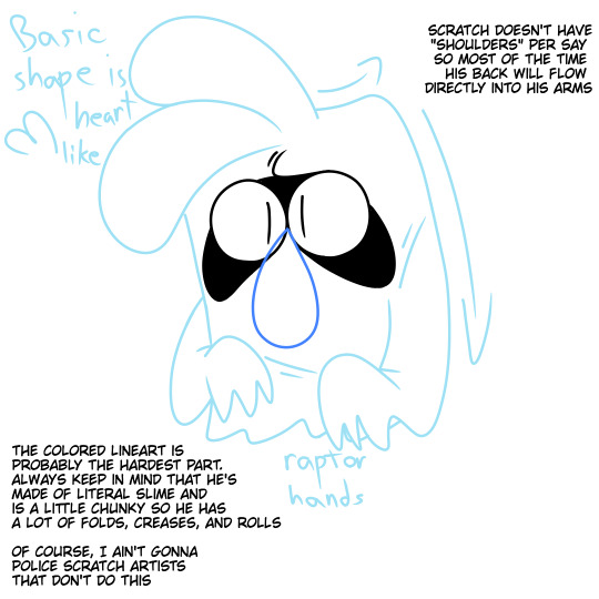
3: coloring can either be really fun and satisfying or a pain in the ass, again it's trial and error for what looks right to you
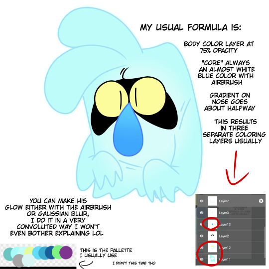
4: some more dynamic poses and fluid actions are super fun and what I get complimented on the most! Breaking the model sheet to push your expressions more is super fun once you get the hang of it, just try drawing a bunch of random squiggles and shapes and try to draw Scratch over them, it's a super fun exercise!

Like I said before I'm not the judge or end-all when it comes to drawing scratch so just have fun with it! Experiment! Maybe study how some other artists draw him! I know I greatly admire some of the ways some artists I know and even some crew members and storyboard artists draw him so definitely start looking at fanart for inspiration. Hope this helps, I'm not a very good teacher!
#the ghost and molly mcgee#tgamm#ask me things#scratch mcgee#art tutorial#i guess#if you have any other questions my dms are open#i could probably go more in detail there but this post is already mucho texto
50 notes
·
View notes
Text
Obsidian Quick Tip - Pinning Sidebar Notes
So you know you can drag notes into your sidebar? Did you know you can pin them there, same as pinning a regular note tab?
Just right-click on the note in the side-bar, or use the command palette and select the ‘pin’ option, and you’re done!
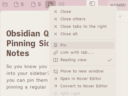
[ID - a screenshot of notes in the Obsidian sidebar. The context menu for one has the ‘Pin’ option highlighted. The two that aren’t selected have a pin icon next to the note icon.]
I like this personally because it saves me from losing notes I want to keep in my sidebar when I open a new note with one of them selected. ‘just don’t do that, space’ well look i can’t fix my own issues, so I just mitigate them. By pinning them.

[ID - a purple decorative divider]
check out my obsidian tag for more posts
check out the tutorials tag for other obsidian tutorials
obsidian resources masterpost
download obsidian
got questions? tutorial suggestions? want to say hi?
#obsidian md#obsidian.md#obsidian tutorials#obsidian tips#writing tools#i have to do this for all my RPG workspaces because i WILL accidentally lose the timeline and the session note and my mini DM screen#given half the chance
6 notes
·
View notes