#Creat to overlay layer above all your layers
Explore tagged Tumblr posts
Text
FF14 Battle Portrait Tutorial
For the past few weeks I was trying to find a way to recreate the battle portrait from FF14 as there was a few characters that I want to see in that style but don't officially have one yet. I think I got it down more or less (see image below) so I thought it's a good time to share what I did.

First of all, I made a few files that would help make life a little easier. They can be grabbed here .
Note: I did use Reshade to do a bit of work at the screenshot stage to help speed up the process but the same effect can be recreated in Photoshop with a vanilla screenshot. There are a lot of tutorials on how to do comic/cartoon effect in photoshop and those would make good bases to work off of.
Step 1: Take the screenshot with the PortraitBase Shader on. I usually take two screenshots. One with "Comic" on and one with it turned off. This is so that I have more to work with if needed.
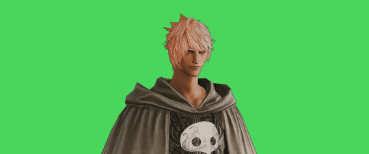

Step 2: Drag all the screenshots into photoshop and remove the background. In photoshop, arrange the layer so that the screenshot with the Comic lines visible is on top of the one with the effect off.
Step 3: Duplicate the the layer with the "comic" effect and apply Blur->Gaussian blur (radius 0.5)
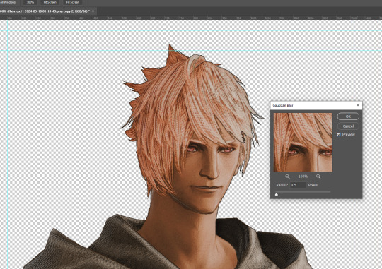
Step 4: Take a look at the hair. In Eric's case, It still doesn't look blur enough to me so I used the blur tool and blurred it a bit more
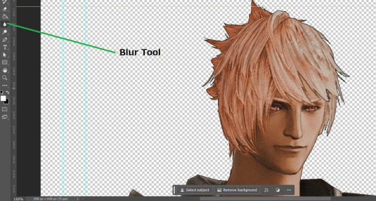
Step 5: Create a new layer above the layer in the previous step and use the brush tool to start outlining the edges. Where to outline is up to you but the idea is to make edges defined so that it looks more like a drawing.

Step 6: Duplicate the outline layer and then hide that layer. Step 7: Merge everything under the outline layer. Step 8: Drag and drop the "Texture.png" into the project and Clip it to your character layer. Set the blending of the texture to "soft light". Step 9: Drag and drop the "stroke Texture.png" into the project and Clip it to your character layer. Adjust the size till you are happy then set the blending to "overlay". Step 10: Adjust the opacity settings of both texture layers until it looks good to you.
Step 11: Click on your character layer and go to image->Adjustments->Hue/Saturation (note: you will see I dragged in the official Hades portrait as a point of reference to work off of). Adjust the saturation till you are happy.
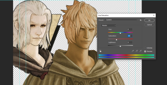
Step 12: Go to image->Adjustments->Color Balance and adjust the color till you are happy. In this example, since Eric is also wearing the Sophist robe, I tried to match that color to Hades' Sophist robe color.
Step 13: Once you are happy, drag the "Template.png" into the project and scale that to the size you want. Make sure it is completely covering the character. If it's not, you can just use paint more of it with the brush tool to extend it till it covers everything.

Step 14: Hide the "template.png" layer and select your character layer. Use the magic wand tool to select the outside of the character.
Step 15: With the selection still selected, click on the "Template.png" layer and press delete on your keyboard. You should now be left with a blank in the shape of your character.

Step 16: Drag the"Template.png" layer to be below your character layer. Then click on your character layer and clip it.
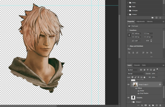
Step 17: Click on the "Template.png" layer and add a 2px stroke and shadow to it.
Step 18: Drag "Back_Deco.png" into the project and place it behind your character. Scale it till you are happy with it.
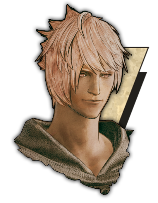
And that's it! Now you can recreate portraits for any NPCs that you want (in theory). A lot of it is also fine tuning to what you want but this should at least give you a decent base to work off of :)
964 notes
·
View notes
Note
sorry if this has been asked before but how do you make your gradients look so good?
Hi Anon! First of all thank you so much 🫶
I like to use gradient maps (which I've explained here) or gradient fills + gradient tool. I'll drop a little tutorial under the cut:
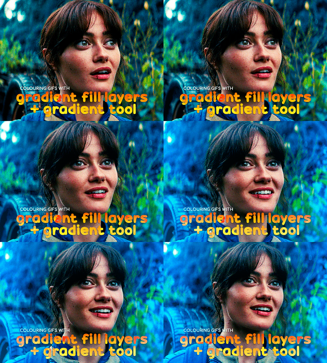
GRADIENT FILL
I'll be using this gif which I've already sharpened and coloured:

First of all let's make the background pop so I'm going to add a gradient fill (Layer -> New fill layer -> Gradient) with these settings (I'm using this colour #0099ff):

Now it's the time to play with the blending settings! Depending on your scene some will look better than others but I usually switch between Soft Light, Overlay, Color or Hue. 90% of the time I use soft light but this scene looked much better using overlay:

As you can see the background looks more blue and vibrant but it's not too much you know.
GRADIENT TOOL
Now it's time to use the gradient tool to give this gif a hazy look. I haven't seen many gifmakers talk about this tool but it's soooo useful and it takes gradients to a whole new level.
Before using this tool we'll need to add a new layer above the gradient fill, like this:
(HELP I just realised I typed “later” instead of “layer” 🤡 but let’s ignore that)
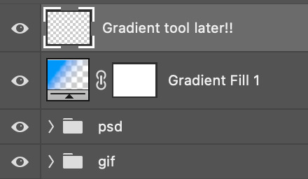
You can choose the gradient tool by pressing 'G' and then clicking here:

Make sure your gradient goes from any colour to a transparent background.

Okay so next to this gradient settings we have five different styles and each one will create a different shape. Depending on the scene I'll use the first, second or fourth one. Here are how they look:
1. Linear gradient
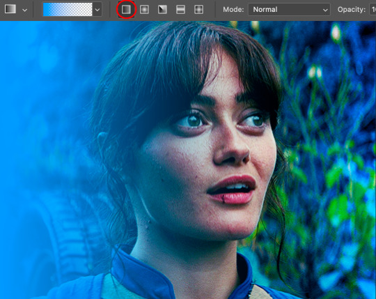
2. Radial gradient + Reverse (if you don't click this you'll end up with a blue circle above your gif)
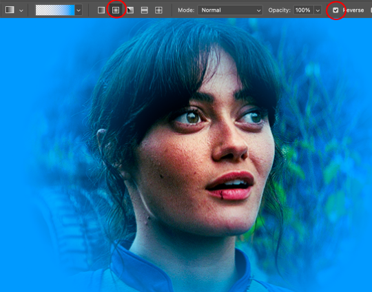
3. Reflected gradient + Reverse
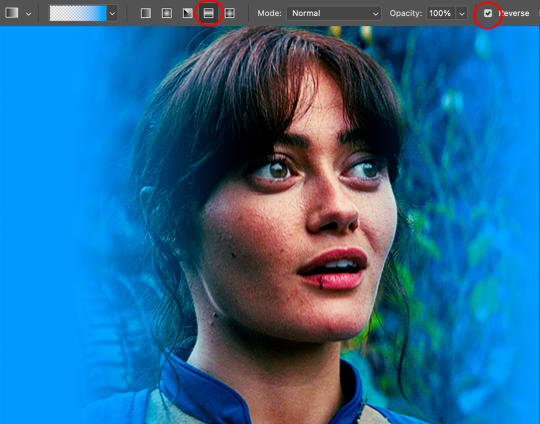
This time I'm going to use the radial gradient so to draw it start by clicking on the centre of the gif and drag the line (the farther you drag it the less intense the gradient looks):
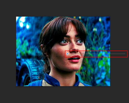
And this is the gradient:
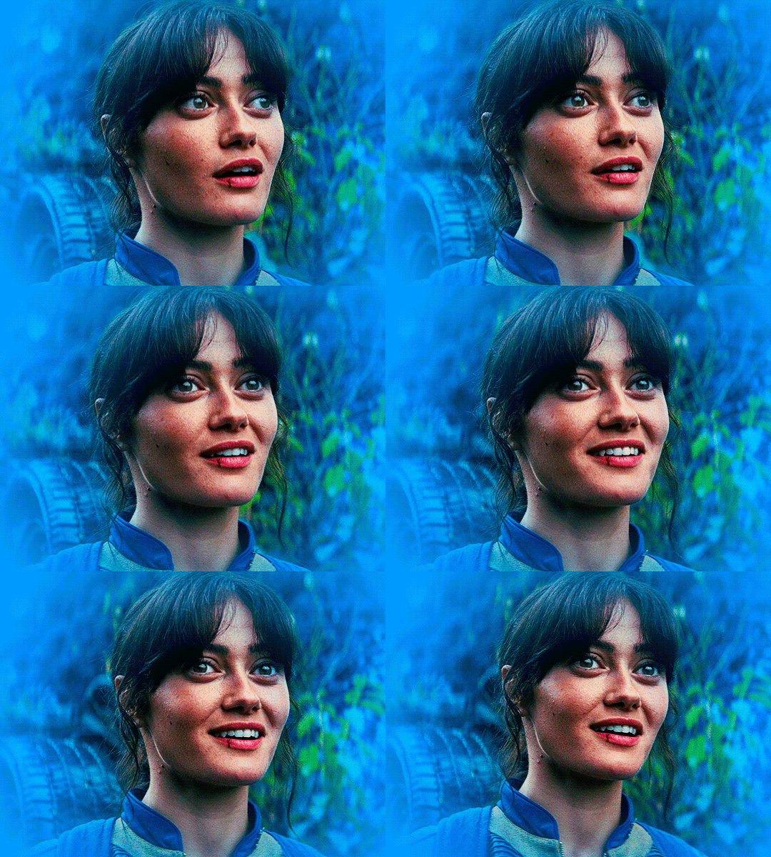
And here comes the fun part again, playing with the blending setting and the opacity! Before doing anything I duplicate my gradient layer because I always use more than one so this is how your layers should look like:

Let's go to the first gradient tool layer and again try different blending modes: soft light, overlay, hue... Most of the time I'll use 'Soft layer' and I'll leave the opacity at 100%.
For the second layer choose 'Screen' and don't worry if your gif looks too bright because we're going to fix this by decreasing the opacity. Anything between 20-60% should look good but it depends if you want a more vibrant or more natural effect. I ended up using 40% and this is the result:

And we're done!!! As you can see the result looks much different from our first gif and it only takes a couple of layers!
Honestly the best advice I can give you is to play with the opacity and blending mode of the different gradient layers because depending on the scene some will look better than others!
#ask#Anonymous#ps tag#tutorial#usernolan#userrin#useraljoscha#uservalentina#userbunneis#userlockescoles#usernik
497 notes
·
View notes
Text


NEW YEAR, NEW FONTS #USERGIFNYNF TYPOGRAPHY CHALLENGE ・ JAN 8-12
Let's kick off 2024 with a new challenge... all about typography! If typography has ever made you feel stuck, we hope this challenge helps you break out of your comfort zone, discover new fonts, and try new styles! This event is open to gifmakers from all fandoms and will run from January 8-12, featuring 5 prompts:
DAY 1 (1/8): LAYER STYLES ↳ Use any combination of blending options (screen, hard light, difference, etc.) and/or layer effects (bevel, shadow, glow, gradient overlay, etc.). DAY 2 (1/9): ONLY ONE ↳ Refine your choices and use ONLY ONE font throughout your entire set. DAY 3 (1/10): PERFECT PAIRS ↳ Use a different font pairing per gif. Check out our font pairing recs! DAY 4 (1/11): THREE TYPEFACES ↳ Use 1 Serif + 1 Sans Serif + 1 Script typeface in your set. DAY 5 (1/12): FAVORITE FONT(S) ↳ Show off your favorite font(s) any way you want!
Rules for how to participate below the cut:

Reblog this post and follow @usergif
Create a gifset using the prompts provided above
Tag #usergifNYNF so we can reblog your creations!
Caption your post with: @usergif new year, new fonts: day # - prompt description [fonts used: font name (source)]*
*Optional: We encourage including font names and their sources in your caption so others can find them [e.g. Blastimo Sans (dafont.com)]. After all, this challenge is about discovering new fonts and typography styles! You can also put this in a "read more" after your main caption or put a link in part of your caption that redirects to an internal Tumblr link (e.g. a page on your blog that lists fonts used). We don't recommend linking to external sites as doing this too many times in one post can affect the visibility of your post.
Questions about the event? Send us an ask here. We’ll tag all event answers with #usergifNYNF.ask. Need inspo? Check our RESOURCE DIRECTORY for typography tutorials or look through some of our members' font recs!
We also want to take this moment to thank you all for helping us reach over 10k followers! We hope this blog can continue to be a source of help and inspiration for gif effects, and we can’t wait to see what you create for this challenge! 🪄

Fonts used: Gif 1, in order of appearance: Traveling Typewriter*, Bassy*, Buy More*, Germanica [Plain Germanica]*, Doky*, Magic Retro*, GIN Grotesk [Gin Rounded] (befonts.com), Random House*, Lostar*, Amberla*, Schizoid Personality* (* = dafont.com) Gif 2: Karla (Google Fonts), Buffalo Script (dafontfree.io)
#usergifNYNF#userace#usershreyu#userelio#alielook#userhella#uservivaldi#usertreena#tuserabbie#userhanyi#tusererika#userbecca#uservalentina#useraish#larlies#usercats#userabs#tusermona#userpickles#*usergif
383 notes
·
View notes
Text
Lancer Tactics devlog
I'm gonna try out posting my ~monthly devlog roundup here as well. These suckers are glorified changelogs with anecdotes and gifs galore. Let me know if this is something you like seeing show up on your dash?
Map Editor
Got units able to be placed/deleted/moved in the mission editor
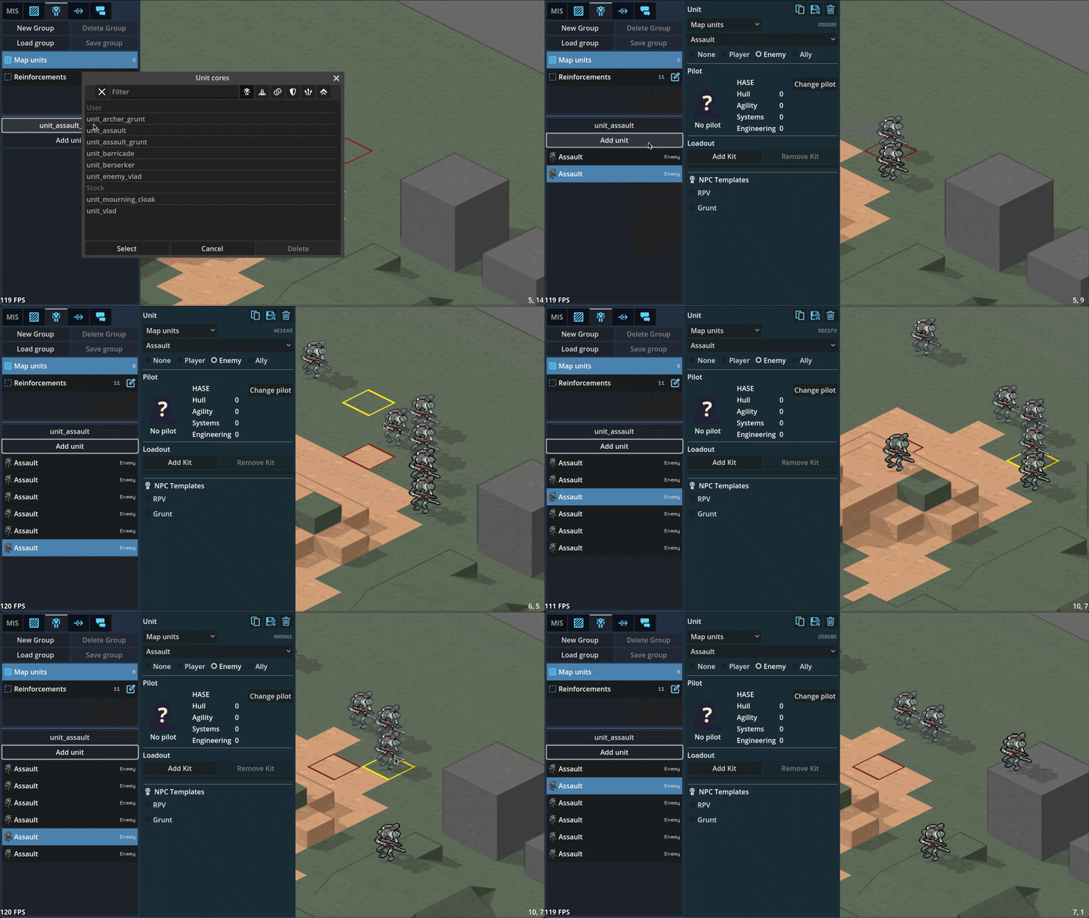
Can paint/remove command zones in the editor
Can paint minecraft-like terrain blocks in the editor

Can paint/rotate multi-tile props in the editor
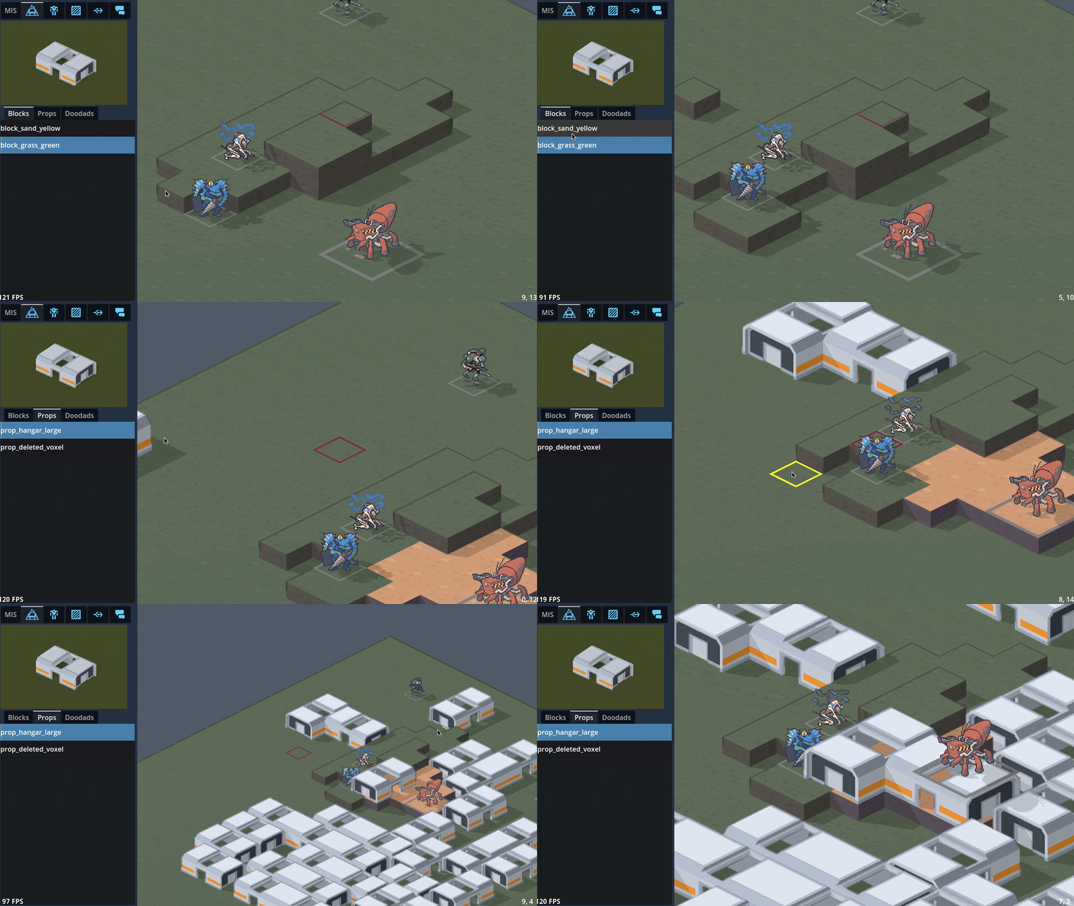
Can edit unit character sheets and portrait via the editor

3D maps
Did a bunch of art tests with 3D mech models, provided by GeneralChaos, which we ended up deciding not to go with to keep things simple.

To avoid the can of worms that is animation, we'd have to lean into a static "tabletop minatures" aesthetic which we decided is not a style we want to be stuck with. By sticking with 2D sprites, we avoid falling into a sort of uncanny valley; it's easier to get away with not animating a 2D sprite than it is for a 3D model.
We also experimented with 3D terrain. We decided to make a rule that the visual style for a piece of terrain should match its mechanical effect: obstructing terrain that you can't move through, such as rocks or buildings, will be in 3D, while non-obstructing terrain like trees will stick with 2D sprites.

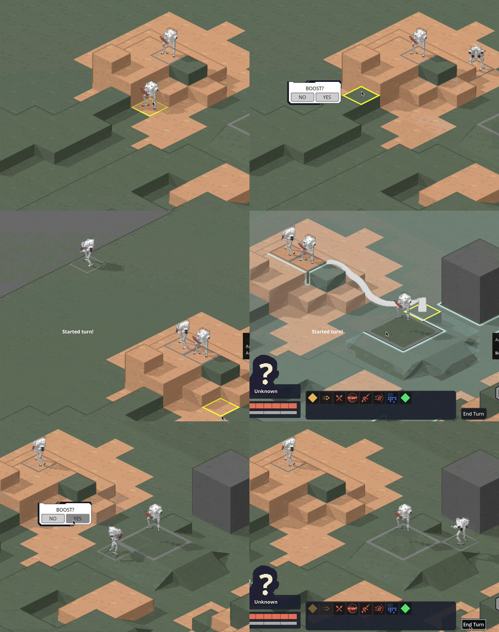
Hooking up the 3D camera to follow events like movement and attacks did a LOT for making it starting to feel like it's cohering into an Actual Game™
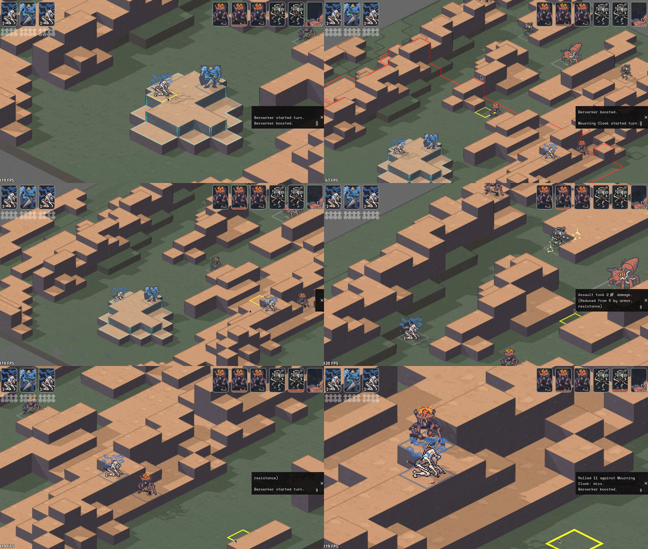
Implemented cover! And an attack preview! Cover works by aiming a ray from the target to the originator (technically to and from each voxel of each, respectively, to handle size 2s shooting above size 1 cover) and tracking all the terrain blocks it hits (how we'll handle non-terrain hard cover TBD). I think I have it working according to Perijove's cover rules manual, but I'm sure there'll be edge cases to work out. This is a case where things are significantly simplified by working in squares instead of hexes; hexes have a lot more possible weird angles you have to deal with.

Re-added what I'm stubbornly calling Combat Popcorn; little bits of text that pop out when you use abilities and attacks.
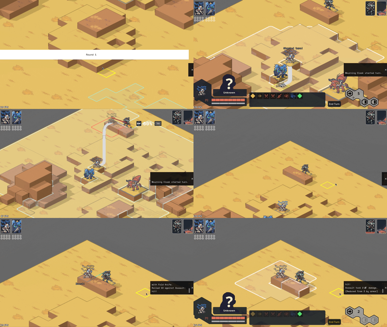
UI & game screens
Added ability for the engine to show UI that's anchored to the game world via a little word bubble line but also stay on screen as the camera moves around.

Got word bubbles working; you can now write dialogue in the mission editor, hit playtest, and see it work in a mission! (it does actually translate correctly now; this gif is just from a bug I thought was funny)

Got ability effects mostly behaving appropriately again, including muzzle flashes. The easiest way to handle them ended up being NOT billboarding them so they always face the camera (like all other 2D sprites in the game); instead, I put them on a plane parallel with the ground and just spin them around the unit to point at wherever their target is.

Did some work ironing out our tooltip system. The standard in CRPGs these days is this kind of nested labyrinth of tooltops that you see in Baldur's Gate 3:
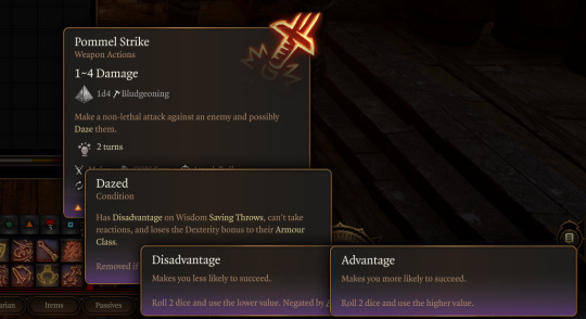
I Did Not Want to try and figure out how to wrangle that much UI, so we're instead opting to cap the nested tooltips at the second layer. You can lock a general tooltip for e.g. an action and then mouseover various items within that tooltip to get glossary definitions...

...and then instead of having those glossary tips be lockable/mouse-overable themselves, I collect all related terms to that glossary definition and let you tab through them.
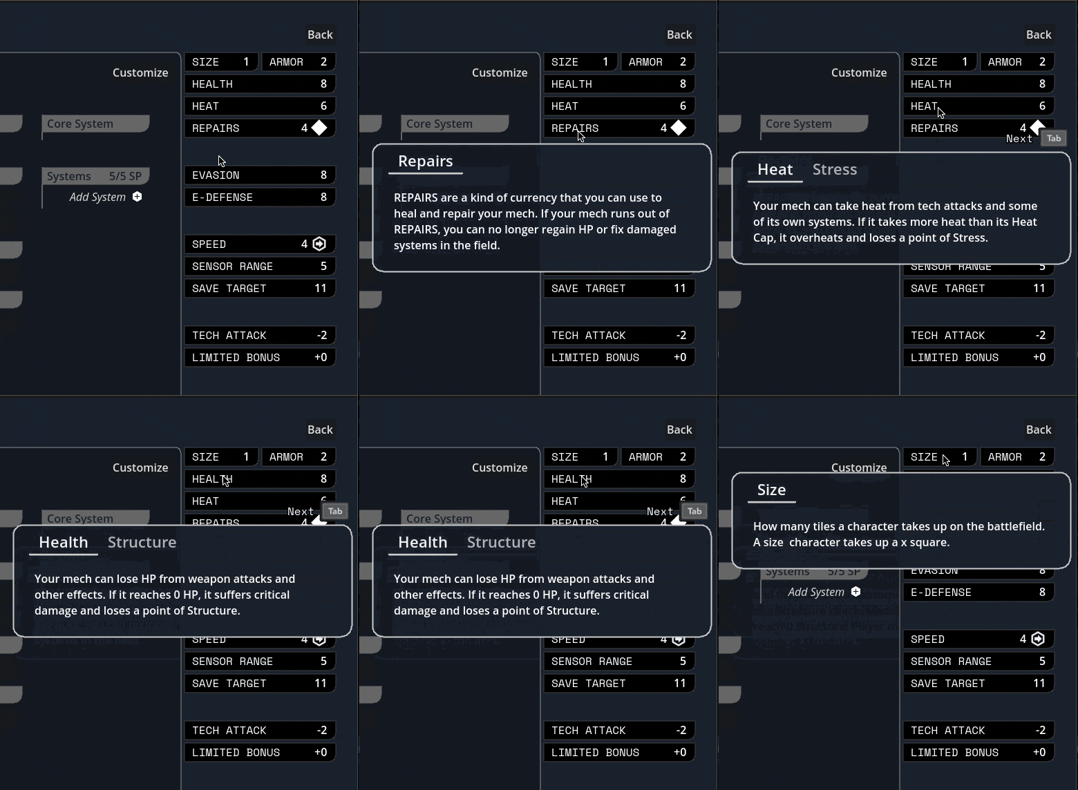
Added skin overlay functionality to the portrait maker, enabling textures like scars, tattoos, stubble, and vitiligo to be applied to just the skin and not extend off into space.
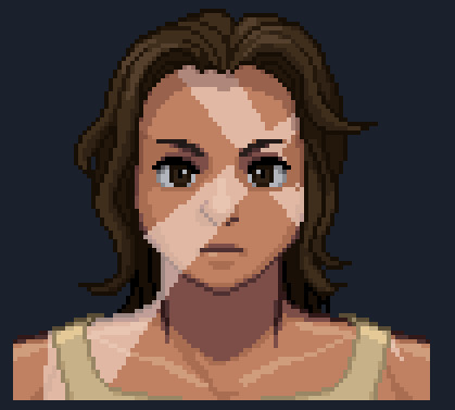
Midway through writing this update, Carpenter sent me this gif of the randomization button working! There's a still a bunch of skintones/assets missing and a few are a bit janky, but it was exciting to start seeing the range of these lil freaks (affectionate) that this editor can create.

Mourning cloak license!
This is the one I'm probably most excited about: I did a bit of a content dive and implemented a basic character sheet + all Mourning Cloak traits and equipment. They don't have fancy graphics yet, but the weapons and systems can be added via the character sheet and used in-game.

It took a little under a day, including adding soon-to-be common mechanisms like bonus damage. This is great news in that it means the engine we've been building for so long in the abstract seems to do a great job in handling comprehensive actual game content, and that it looks like we've set ourselves up for success when it comes time to buckle down on churning that out.
I'm sure other licenses will come with unique difficulties (I fear the day it comes time to do the Mule Harness // Goblin CP) but I'm feeling good about it!
Vertical slice?
Taking a step back, the pressing question on my mind has been "when will we have a playable early access build?"
I was originally hoping for Feb/March, but what we've internally been referring to as the "3D cataclysm" has pushed everything back by at least three months, so the target for the first alpha build is now in May. So, ah, thanks for your patience! Seeing things come together, I've become more and more convinced that moving to 3D was the right call.
#lancer tactics#made with godot#godot 4#indie game dev#game dev#lancer rpg#tactics rpg#indie dev#godot engine
292 notes
·
View notes
Text
Tutorial: How I Render Accents
PART 2: COLORS
I usually do not recommend 'pixel hunting' aka going over your work with a fine tooth comb and picking out stray pixels to erase. However, for setting up a proper base layer for accents it is imperative to do so.
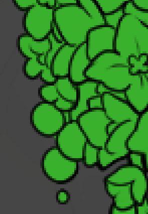
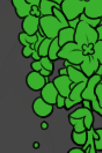
To explain my method of color blocking: I select everything outside of the lines, invert that selection, then fill in. This does a more accurate job than going into each and every section and filling them all in individually, and is also significantly faster. Only downside is small sections like above where you can see bits of the green (which I use bright green against a dark grey background to contrast the base color, lines, and background) poking out, as well as the inner section where it filled in a spot I did not want filled in. Getting all of this right in this stage will make your life easier as you go. (It's also the method I use to color block all my work, even beyond accents)
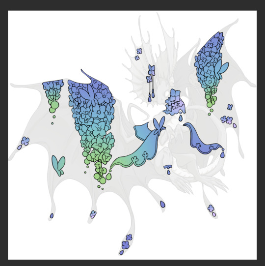
Now this where my style of rendering color may come off intimidating and, tbh it might be. I do gradients first and then I color over them with "normal" blend layers. I typically don't use multiply layers unless I'm shading something that has a lot of textures. If this scares you, it's okay I'll keep walking you through it. Here, my gradient goes from a pastel but deep periwinkle, to a soft more cyan blue, then to a lighter pastel green. Skipping steps and going from the periwinkle to green will give it a different look. There's also hints of a pinkish tone as an accent color.
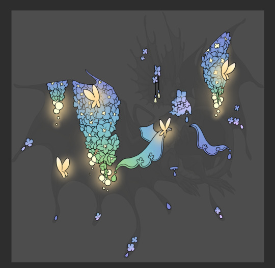
So as I said, these additional layers are done with regular "normal" blend mode layers. I've placed one in between the butterfly line art and the line art for the rest of the flowers, and then an additional layer under everything else. This allows me to create a glow effect specifically around the butterflies, and then specifically under the flowers. Going back and forth with the proper amount of opacity (by using the airbrush transparently) helps to make it glow but not be Too Loud. Also checking it against a dark background can help to check for spots where it spills past the borders, as well as really gauge how Bright it is. I've also color matched the butterflies with the flower pits and the bulbs. This adds extra cohesion and makes them all look uniform but different enough with the gradients.

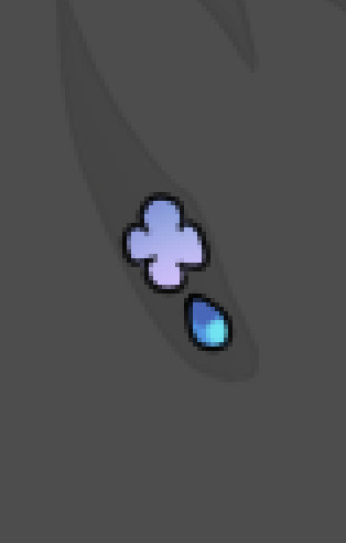

The stages of how I render gems/dew drops. Take the base color, make it a bit darker and less saturated (as well as changing the hue a bit depending on what the default color is. For yellows I go more orange/red, for blues I go more purple or even pink. It depends), add a small drop light at the bottom thats a fairly saturated version of the base color, and then a stark white/ near white highlight. That's it. Don't over complicate it, it will not matter when it gets shrunk down. Note that I do not use multiply/overlay/screen layers for these types of things as it adds too much bulk to the files and doing it manually helps to strengthen your color theory skills.
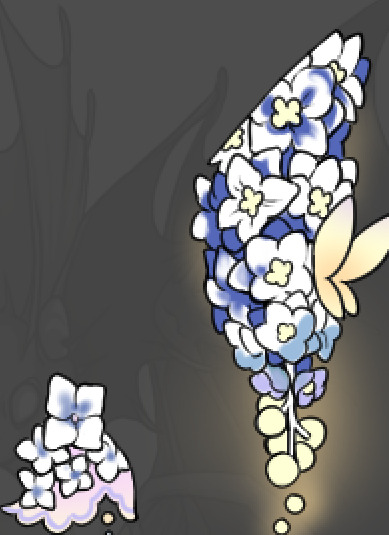
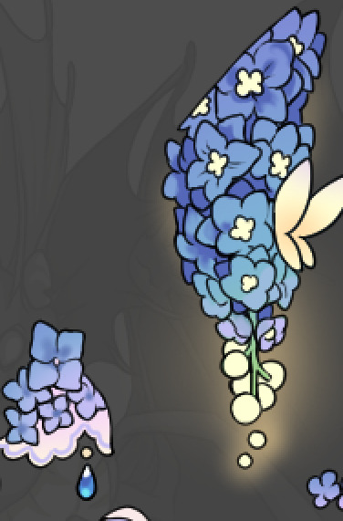
For shading and rendering, again, I create a "normal" layer and simply. Draw over what exists. Color picking and hand blending allow me to create the exact shades and effects that I want that multiply/screen/overlay layers may not be able to achieve. (which isn't to say I dont use them! i just don't use them for the main meat and potato part of my coloring) All of what is shown here is also achieved with the CSP asset SOIPEN (which can be found for free in the asset store)
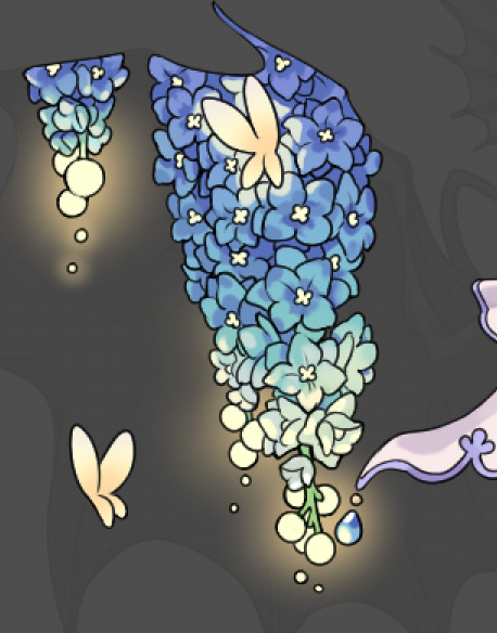

another example. The one on the right is showing how the layer looks without the gradient base layer under it. All of this is rendered by hand. I also specifically put a highlight color around where the butterfly is sitting to give a better illusion that it is properly sitting on the flowers rather than just in front of them.
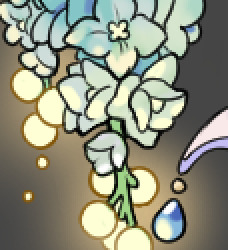
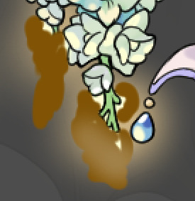
Next is changing the color of the lines, if needed. A method i'll use is I color just the sections I want (on a separate clipping layer) then lock that layer's alpha setting to them add in a gradient. It's a small and subtle effect that adds more depth without doing a lot of effort. (work smarter not harder)
Now we get to the Polish Layers!
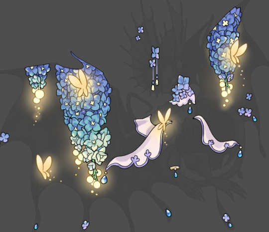
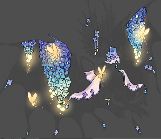
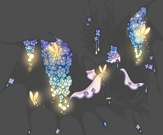
first image is how it looks as a base. second image is with an overlay layer applied. I've used some dark purples and mid tone desaturated greens to push the values a bit further (especially evident on the top left wing) Third image is with a screen layer applied, highlighting the inner most part of the flowers and adding some additional bounce light.
An important thing to note about making accents vs making full coverage skins: OPACITY AND LAYER TYPES MATTER OVER TRANSPARENT SPOTS. What I mean by this is that if you use a soft, light grey to shade with a multiply layer, don't clip it to anything, and have it go outside the lines - that will no longer appear as a 'shadow' when it comes to the final result. Instead you will have a section of soft light grey that is simply laid on top of whatever the image under it is. The same applies for overlay/screen/add layers and so on. If i use a very dark color on a screen layer (to give a soft highlight) and airbrush it over a bunch of stuff and don't clip it, it will end up with this horrible dark splotch over everything that isn't opaque. To this end, mastering normal layers is imperative to having well rendered and convincing accents.
Another thing of note: when it comes to sparkles/small details, note how 'large' the sparkles behind the butterflies are. They seem a bit chunky, yeah?
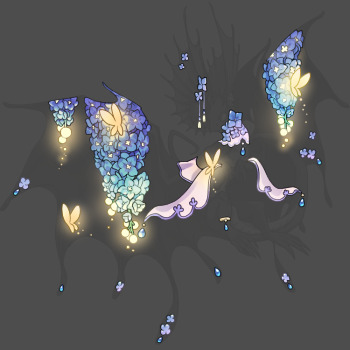
this is what they look like at proper size. If anything, I could have gone larger on the small metal beads connecting the dew drop jewels to the lace.
Another trick I also like to do is this:

a slight hint of transparency! It's just enough to let the dragon's lines underneath show through but not enough to be super noticable. I like to do this a lot when it comes to sparkly and magical effects.
Next is the worst part of all: destroying all that beautiful hard work with the shadow and line art layers! (sobbing)
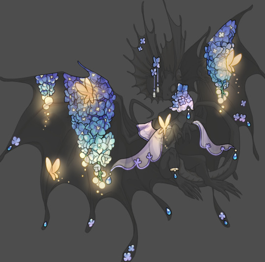
This stage always agonizes me. This is my first pass of the shadow/line layers and let's hope it's dark enough.
But yeah that's a start to finish look at how I create my accents. Unfortunately a lot it devolves into needing to know, yknow, line weight and silhouette importance, color theory and the ways that drawing applications actually apply color to a png vs how its rendered in app. All of these things impact the finesse of the accent, and are things you do have to learn gradually over time, but hopefully this has given yall some additional insight and perhaps some helpful tips.
And this should also explain why I get so mad when people go 'hey can I get this accent in another color' no! no you literally can't!
155 notes
·
View notes
Note
could you please do a tutorial of your game of thrones 'so much for stardust' gifs where it has the ripped paper textures? it's so pretty, and i'd like to learn how to do one with just the texture in the middle and two gifs on either side, like half and half and just having a rip in the middle. it's so cool how you did a gif in the middle though so i wanted to ask as well! all of them are so cool looking. you are extremely talented. if you don't want to though i understand :) thank you
TORN PAPER EFFECT + BLENDING TUTORIAL
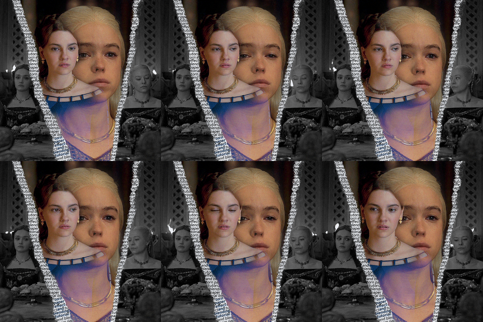
thank you so much for your sweet words, dearest anon and i'm sorry it took so long to answer but it's here now so i'll try my best to explain <3 disclamer: this is the first tutorial i ever made, it's very screenshot heavy and it assumes the basic knowledge of ps and gifmaking. if there's something you don't understand, don't hesitate to ask <3 so, let's get to it!
1. PREPARING THE BASE As you can see in this shot there's a lot of space between Rhaenyra and Alicent and that makes it perfect for the ripped paper overlay without hiding much of the base gif. So the first thing i did was to crop it like this:
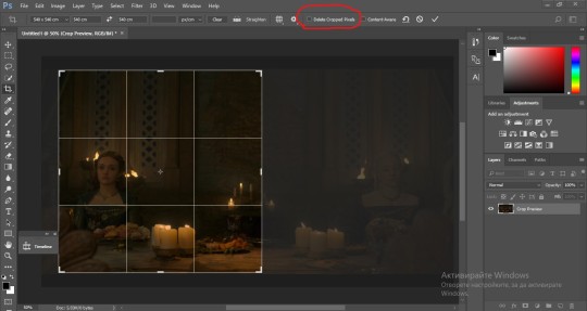
Also you want to make sure that the highlighted box (delete cropped pixels) is unchecked! After taking the usual steps for the animation (creating frames from layers, reversing the frames, setting frame delay) you continue with the video timeline and convert your frames into a smart object. psa: if you don't have the motivation or the time to play around with coloring here are some psds i recommend: 1, 2; as for the sharpening i think this one is the best.
now that you have your smart object sharpened and colored what you want to do next is drag it to the end of the canvas and duplicate it. after that you move the copy on the other end like the original and make sure it's under the coloring layers, like this:
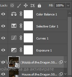
After that you have to create layer masks (the highlighted icon above) for both smart object and the copy and change the blending option of the copy to screen or lighten (whatever looks best!). So this is how it looks now:
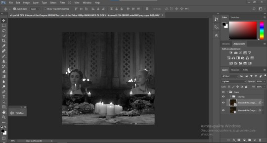
pls ignore that there are no layer masks on the smart objects i just added them after changing the blending rip </3 Now, as you see both gifs are like fighting eachother for their rightful place on the canvas. (fgfgfdf) To fix that you have to use a soft round brush to delete the parts you don't want. (feel free to play around with the brush however you want to get the result you want!) Here's my result:
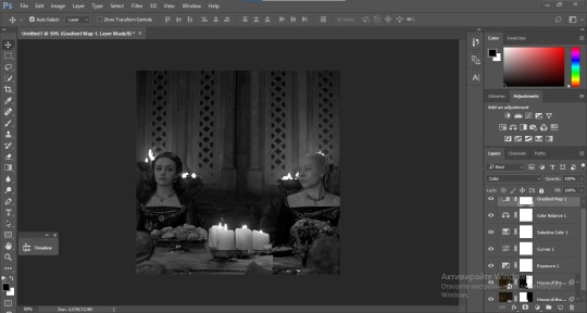
2. THE OVERLAY
Now for the both gifs you want to use for the ripped paper effect you pretty much apply the same steps as the ones you did with the gifs for the base. Here are the two gifs i chose:
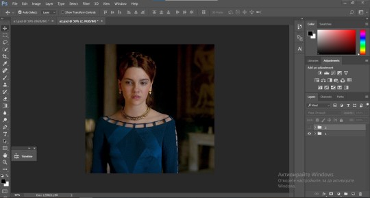
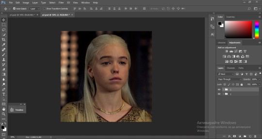
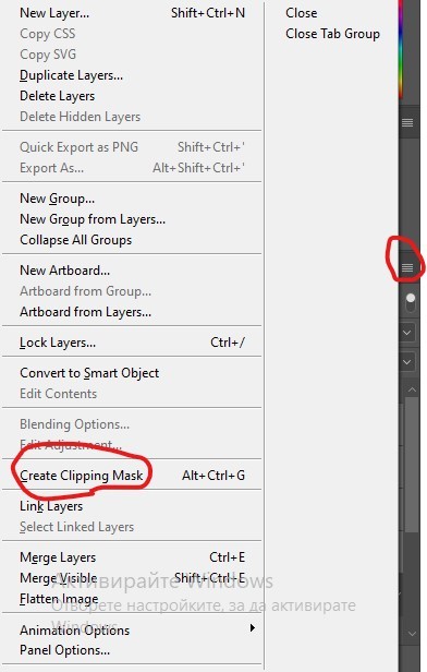
Before blending both gifs however you want to create a clipping mask for each of the smart objects coloring layers, like this:
And now you're ready to blend both gifs together! You choose the group with one of the gifs and change the blending again to screen or lighten and place the said group on top of the other. So this is how it looks now:
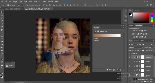
optional: if you feel like the base gif doesn't pop out enough you can always add a gradient map on one of both gifs and play around with the opacity and the color you think fits best.
Then you add a layer mask on the overlay gif group and again play around with the brush to delete what you don't want. So this is the final result:
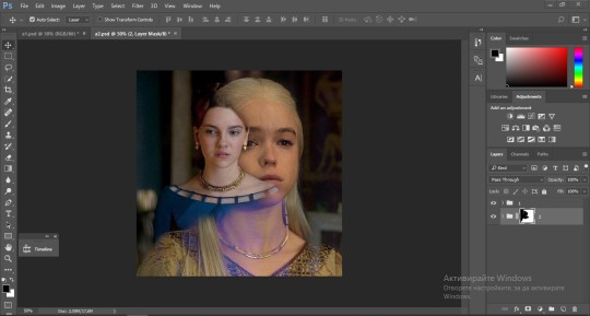
ps - don't repeat my mistake by placing the group with the layer mask under the other group. it should be on top and the blending option should be lighten or screen.
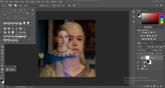
After blending both gifs together, you're ready to place them on the base. So first thing you want to do first is place both groups of each gif in one single group together. Then you duplicate the said group in the psd of the base gif and create a layer mask. This is how it should looks:
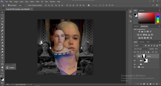
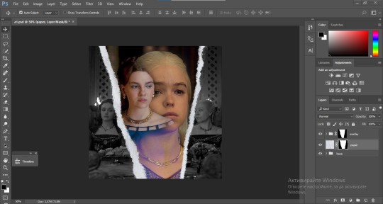
Now, in order to create the ripped paper effect, you'll have to download a ripped paper brush pack. This is the one i use. After loading the brushes in ps (if you don't know how here is explained) you're ready to begin! Change the size and angle however you'd like to make it look how you want. And if you want you can move the overlay gif by choosing both groups in case you aren't happy with the adjustment. This is how it looks like so far:
We're almost done! Now you have to find a paper texture, (i got mine from google) place it between both groups of your gifs and create a layer mask, like so:
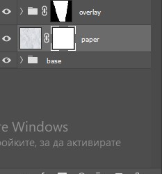
What you have to do here is pretty much the same thing you did with the overlay gifs. Still, make sure there's enough space for the text you want to write in. However, if you think that the space isn't enough you can just delete a bit more of the overlay gifs. Here's mine:
3. THE TEXT
You're finally ready to type out the text you want! If you're having troubles with choosing the right font and size, here are my text settings:
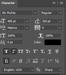
You can always play around with the angle and if your text is too small, zoom in so you can place it just how you like it. And since i'm a bit lazy to deal with it later, i choose to add the highlight color while it's still zoomed. You just have to add an layer above the text and use a soft round brush with opacity from 70-75% and flow from 15-18%.
For the repeated text you want to make sure you create a big space for writing so it can contain the whole space of the torn paper. Also, write where the text will be seen only and use the tab button to skip the space where the gif is. This is how it looks:
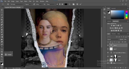
Once you're done with writing the repeated text, you want to select all the character layers and the highlight layer and move them under the overlay gif and on top of the paper, like this:
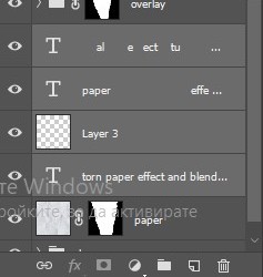
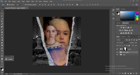
With the layers still selected and in order to contain the text within the paper the last thing you want to do is create a clipping mask. And that's It. You're done! This is the final result:
#allresources#dailyresources#usergif#chaoticresources#gifmakerresource#hisources#onlyresources#alielook#usermaguire#userrobin#usernik#userpat#userbells#gif tutorial#ps help
169 notes
·
View notes
Note
hello! just wondering if you know of a tutorial for the lines going through gifs? and getting them all to match up? like in these sets /post/714978685858496512 and /post/733101286452559872 also are they overlays or how did you make them? thank you in advance!
hey! so, i've attempted to show you with a little tutorial on how i made lines like the ones here and here, i've not seen one around myself and decided to try this out one day and it didn't go too badly so, i hope this makes sense and helps. so, i'll be explaining and showing you how i did the lines on these gifs:
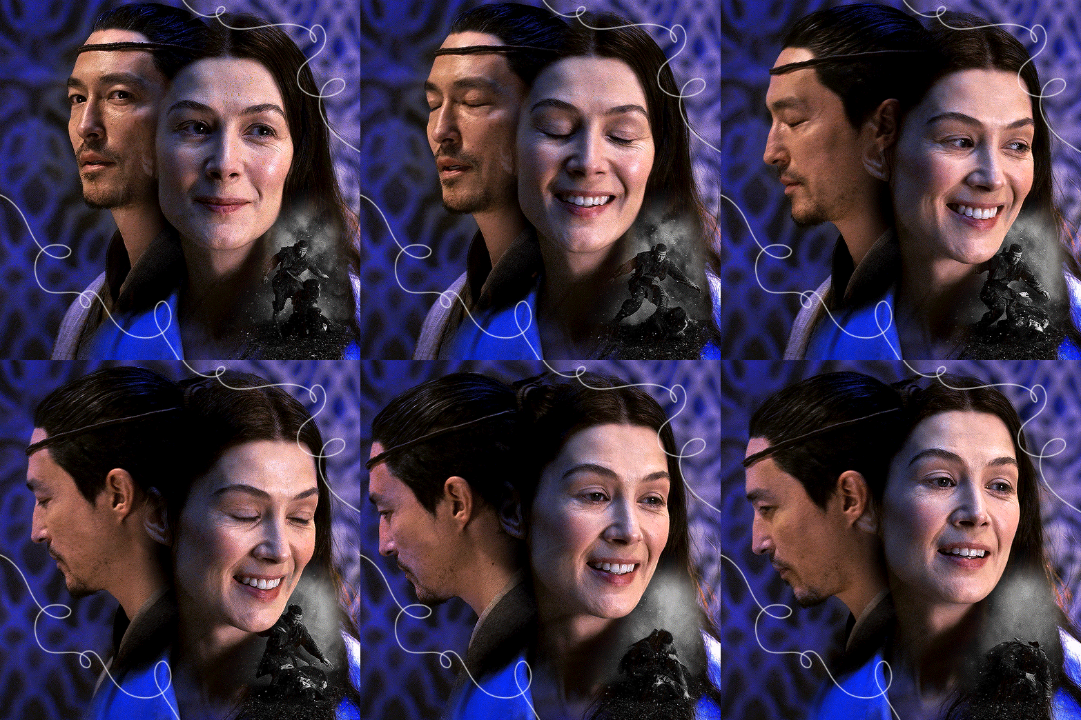
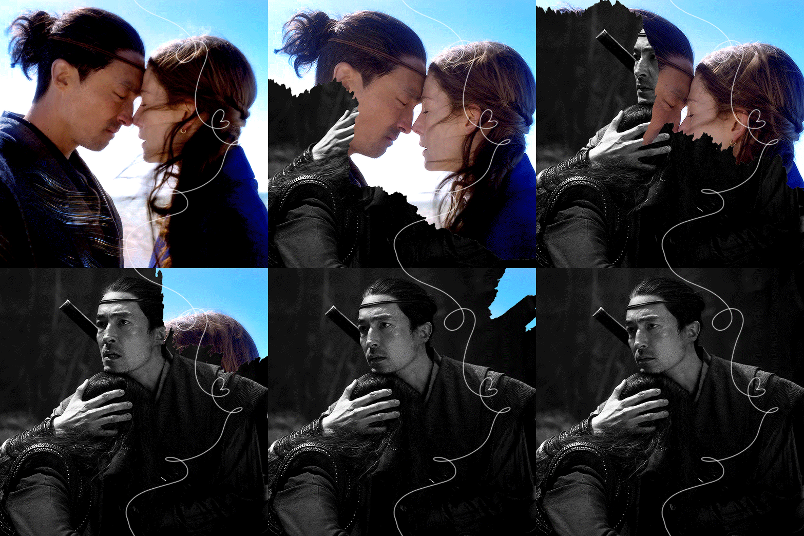
now, firstly i'm going to assume you know the basics and can create/colour etc a gif, you'll need your base gif ready to go. in this example i've flattened them to frames, but you can do this in timeline as well.
step one: add a new layer on top of the gif/smart object, and set up your brush ready. i personally have used 2px brush, 100px hardness, 100px smoothing and 75% flow;

the flow is the main thing i think that is more down to personal preference, it affects how the line draws/moves and will be down to a little bit of trial and error - i've added below how the lines look at difference levels of flow (no other setting from the above has changed just the flow)

step two: decide where you want your lines to link, i've always done from the centre of the gif but you could want your lines to meet up 100px from the left at the top and exit the gif 100px from the right at the bottom. no matter what, the best thing to do here is to add guides to your gifs. as i'm just going straight from the centre to the centre for every gif i add a guideline at 270px

step three: i recommend testing this all out on a separate canvas first to play around and see how you want your line to look etc, but when you're ready you're good to go. start from when the guideline is and draw your line until where you want it to end, the best way to show you this is on video so i've screen recorded the whole process.
youtube
it's honestly pretty straight forward, so i hope this all makes sense, and just have fun with it, i love messing around and drawing 30 versions of the same line until i'm happy with it!!
ALSO, in case you were wondering about the final gif in the wheel of time set, the moving line, that was simply an overlay from this video that i set to screen so the black background disappeared leaving just the line (i stretched/rotated/moved it around get it to start and end where i wanted it to! i just played around with the line thickness when drawing my lines to match as best i could with the line in the overlay!
#ask#anonymous#ps ask#quirkyresources#usernik#userhella#uservalentina#userrobin#userannalise#userrainbow#usershreyu#alielook#useralison#userives#useryoshi#ps help#ps tutorial#chaoticresources#dailyresources#hisources
277 notes
·
View notes
Text
Note , I plan on remaking this .
Here's that tutorial a lot of you were asking for ^ ^ I do everything on Ibispaintx as of right now, which means everything you'll need is free! I've provided all of the effects and knickknacks I use on there (Tutorial below cut)
Before anything else, here's this website. It'll remove (simple) backgrounds from just about any image for you, no pay required
-
Tumblr banner size 1664x936
Tumblr icon size 2048x2048
Tumblr replycon size 1500x500
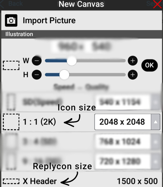
-
This part is pretty self explanatory I think. Get on Ibis and test out some of the filters shown here to get comfortable with how they work! Layering the outer stroke effect is my savior
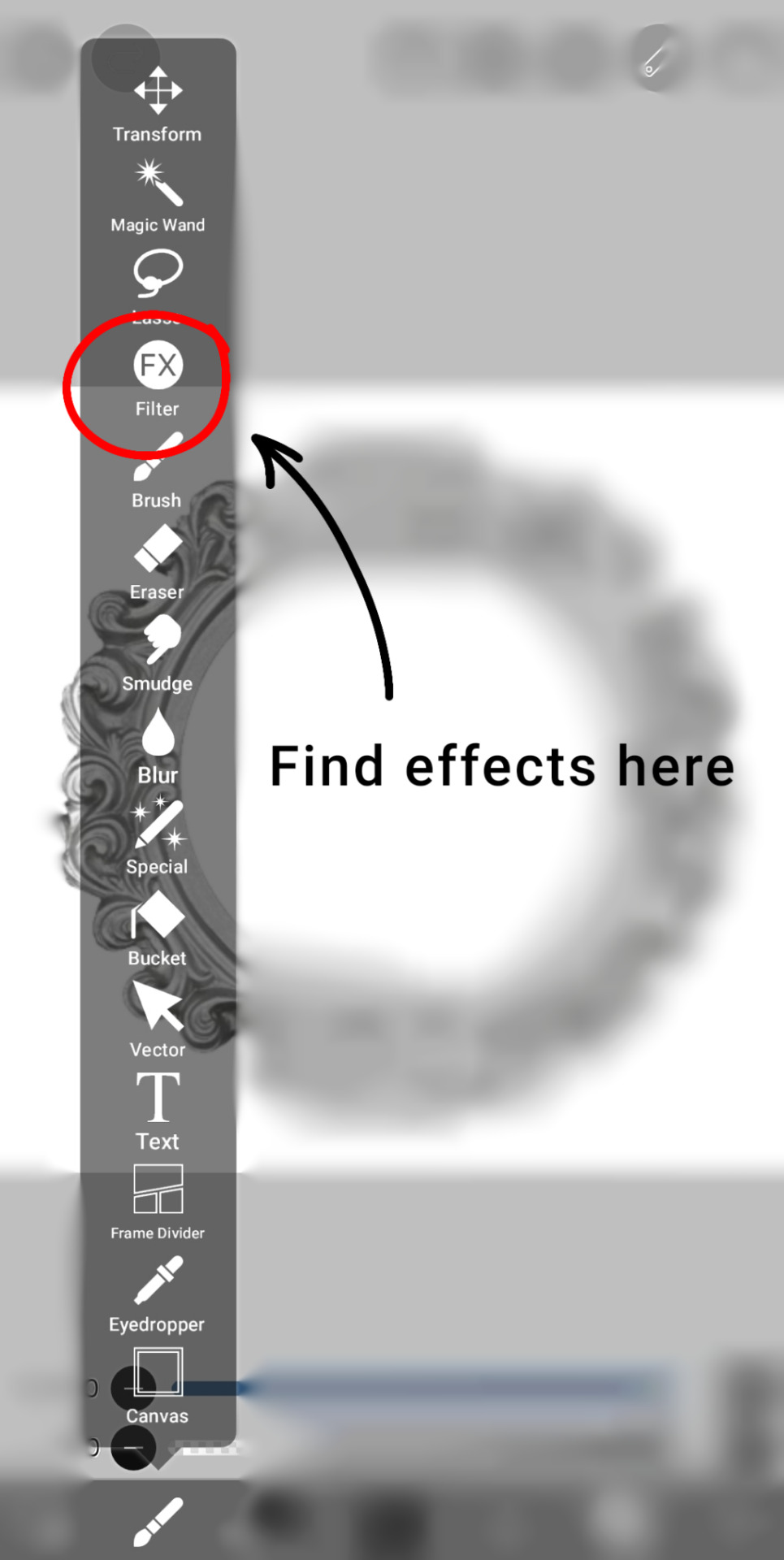

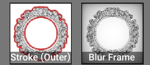
-
The following section is for how I do my coloring. I start off with a color, darken & lighten layer and add from there!
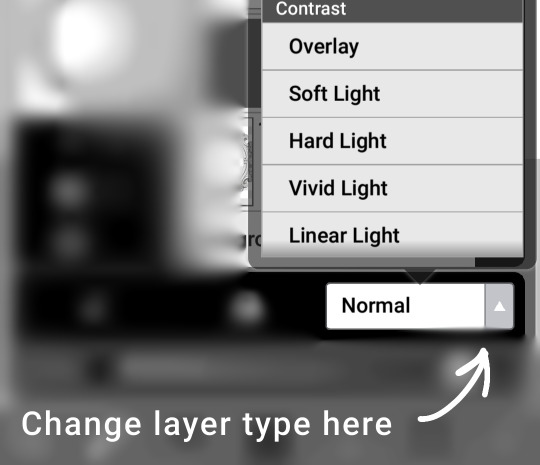
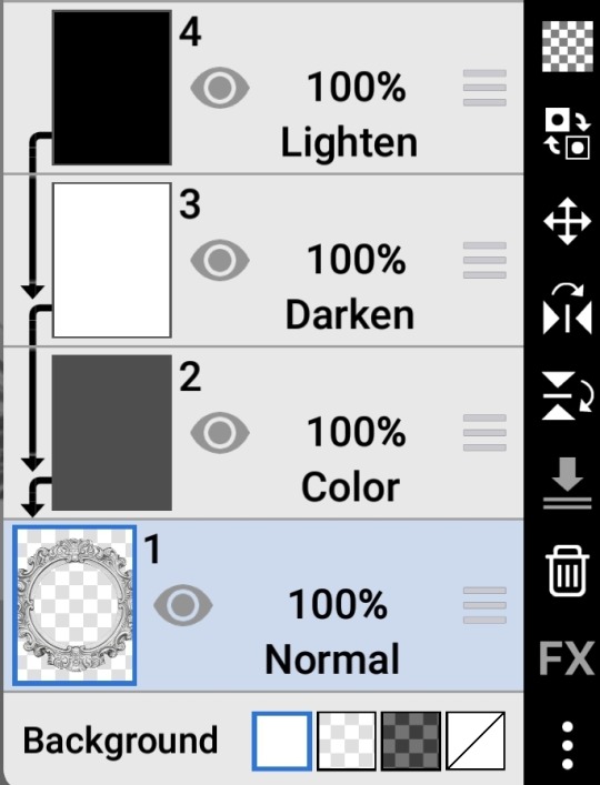
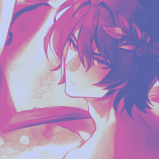
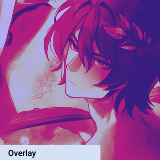
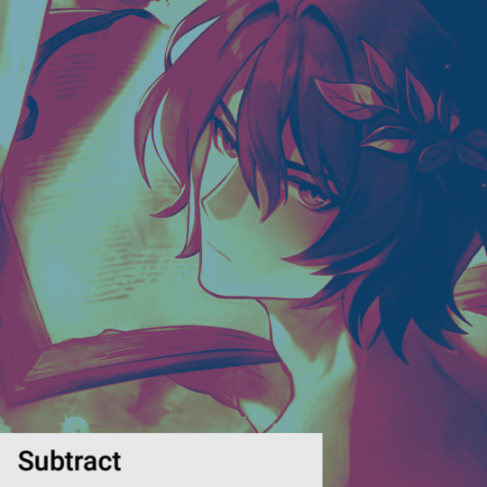
Layer types such as overlay can create a huge difference in how your coloring turns out in the end. Here is a few examples of that, with the 1st image just being the base layers shown above
-
And honestly that's about it. Websites like Pinterest can be super helpful for resources, search keywords like rentry or carrd along with whatever you're looking for so better results show :3 @c0ldhues Ok bye
68 notes
·
View notes
Note
How do you art, and where do you art?
hi my name is moe! i've doing digital 2d art since about 2017 and here's a big post about the how and where of it!
the program i use for my 2d art is firealpaca! the version i use is free to download with the exception of a popup ad that shows up when you start up the program! it's a great, very consistent, program that has updated a lot and improved since i started and i don't think i can vouch for it more. everything i include in this post applies to firealpaca specifically though you can probably do similar things in other programs im a college student on a budget and im very comfortable working with this program.
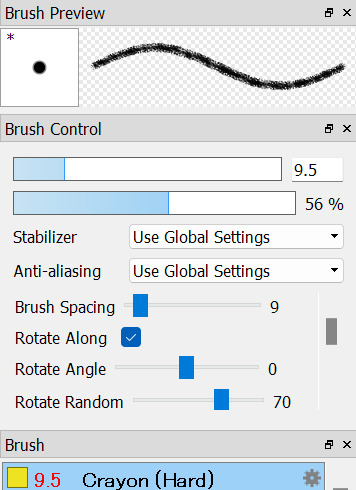


the three main brushes i use i got off firealpaca's brush marketplace! they're all free crayon brushes the first one hard one being the one i use for lineart, the second sort brush i use for sketching, and the third hard one i use for coloring. i think this might be the reason why i get some stuff about people associating my art with childhood/ children's illustrations, im a big fan of using texture where i can and these help to add a lot of visual interest.

seawatt jumpscare
you may see that my finish pieces don't have a lot of flat colors if you zoom all the way in. that's because i use a lot of noise to make the colors look less flat. it sort of reminds me of construction paper, gives a little bit of a fuzziness to it.


i have it set to color at usually around 50. i turn it down sometimes if im working on something smaller. my canvas sizes usually are about 1500 x 1500 just to keep a more consistent square shape across most of my drawings.
another thing i do to make my art pop is i duplicate my lineart layer, use protect alpha to color the duplicated layer another color that's usually brigther than the original layer, put some gaussian blur on it and add multiply or add to the blending on that layer.
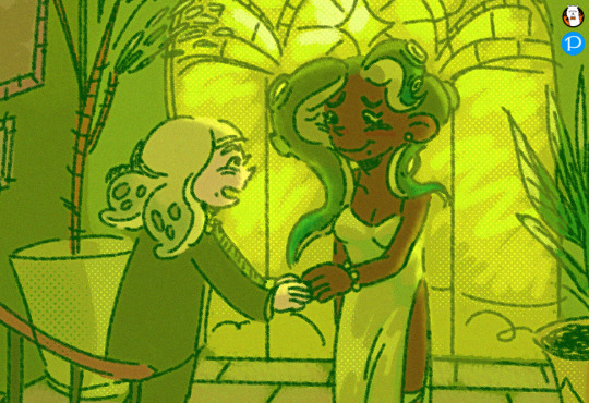
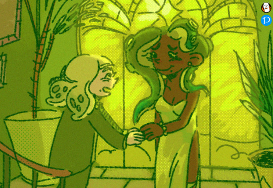
with versus without the added layer! i have this set to add on 31% opacity and ill add more or less if i want the effect to be more or less subtle. it's not very noticable but i think it helps a lot with line clarity and can make something almost glow if you wanted that effect.
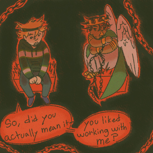
here's another example with a multiply layer (i turned up the opacity to give a better example) subtle and it fights a lot with tumblr image degradation but it makes me happy.
i also make a lot of use of halftoning as you can see in the examples above. I usually only use it to make shadows darker and highlights stand out but they're also really good at filling up dead space like backgrounds to make them more visually appealing


with versus without halftoning! in firealpace you achieve this by using a 8-bit layer (one highlighted) once you add the layer hit the gear icon by the layer and use that to modify the halftoning to your choosing


i usually have mine with a density of 40 but you can tweak it to your choosing. you can also change the blending type on these types of layers i usually just use multiply/ add and occasionally overlay. mess around with the opacity! make it more or less subtle! have fun!
halftoning is tricky to use in firealpaca however due to the way it works. usually i apply it with my soft crayon brush since it hangs around 35% opacity. you can get a more dense halftoning using more or less opacity on your brush and can go back and forth over the halftoning to layer more on. you can also layer two different layers of halftoning to create interesting effects

two different halftoning layers laid on top of each other ^

more opacity + two different halftoning layers laid on top of each other ^
when you go to combine all your layers however because 8bit layers when combined with regular layers lose their halftoning properties. my way around this when combining everything is going layer > merge all when going to finish up and convert everything to png.

that, for the most part is all the technical stuff. i wish i could tell you how i knew what colors to pick but for me i usually pick some variation of green and just go with it. i usually pick the lineart color with my background colors in my mind and go from there until i get bored. complimentary colors such as blue/ orange and red/ green are usually good picks.
did you notice the background/ lineart is green in this picture? that's because the red cancels it out. i sneak it in there sometimes C:
that's pretty much the how of it all, as for the where, usually my bed
that's all
23 notes
·
View notes
Note
Hi, i love Regina gifset especially the text
https://www.tumblr.com/itwasmagic/749567705846251520/i-am-what-i-am-cause-you-trained-me?source=share
would you please post a tutoria for making this text with those colors?
hi! thank you so much, I've never been asked to do a tutorial before 🥹🥹 this is pretty easy but i overexplain things so if it doesn't make sense just let me know!
&& please let me know if this worked ok for you!
*assuming whoever is reading this already knows how to make a gif in photoshop*
I'm pretty sure I used the font Elephant for this set that you linked.
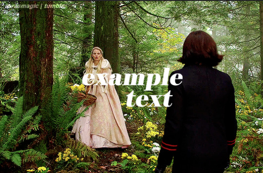
tl;dr if you have a lot of photoshop/text editing knowledge already: create a layer of text > duplicate it > select the bottom layer > go to blending options > add a stroke > ok that > set the layer fill to 0% > reposition the layer a couple of nudges to one side and a couple of nudges down > select the top text layer > go to blending options > add a drop shadow > add a gradient > ok that > set the top layer to difference > enjoy <3
if you want a more in depth tutorial with screenshots:
add your text to your gif with whichever font, size and placement you like
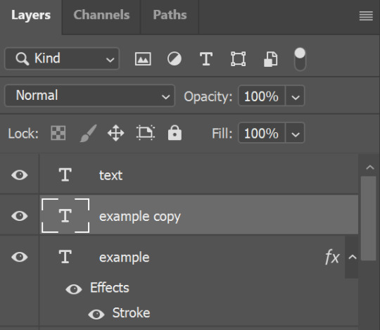
make sure the first text layer you want to edit is selected and press ctrl+J to create a copy of the layer (or right click > duplicate layer... > ok)
select the first text layer again

double click the layer (or right click > blending options), tick the stroke box and use these settings:
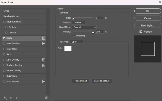
press ok
change the fill to 0% (leave the opacity at 100% because you still want the layer itself with the stroke/outline to be opaque but you want the text colour/filled in part of the layer to be transparent)

make sure the 'move' tool is selected

use the arrow keys on your keyboard to move the text layer with the stroke (i did 3 to the left and 3 down but do whatever works with your chosen font and size (edit: i think i moved it a few nudges right for the original set rather than left just make it up as you go along with me jfngkf)). it should look like this:

select the duplicated layer you made above the first one
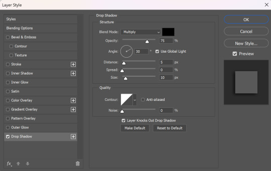
double click the layer (or right click > blending options) and tick the box for drop shadow. I pretty much always use these settings:
then tick the box to add a gradient overlay, it doesn't matter which colours or angle you use, you can play around and adjust it to whatever makes sense with your gif, so if you think the gradient would look better horizontal or vertical or at a different angle, just change the number of degrees it's at until you like it.

click the coloured box next to the option that says 'Gradient:' and this box should pop up:

to change the colours click the little coloured box under the gradient bar you want to change then the box underneath called 'Color:' should light up for you to click on, then either pick a colour or paste in the hex code

for the colours in the set you linked i used #9fb552 for the lighter green and #2f4f2b for the darker green then press ok
if you want to adjust the colour fade, you can drag the coloured squares along the bar or click somewhere just under the gradient bar to add another colour (you could add a third colour or another shade of the same colour, play around until you like how it looks! you can always go back into it at the end and keep adjusting once you can see how the whole thing looks put together.)
ok everything when you have it how you want it, then your text should look like this:
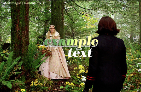
now change the blending on that same layer to 'difference'

the text should now look like this:
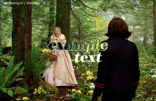
*note, the colours may change when they're blended differently, so like i said earlier you can go back and play around with the colours or shade you picked until they match your gif
if you have another text layer you want to look the same rather than repeating all of the steps, duplicate that one too, use the move tool to reposition the lower layer again and right click > copy layer style > right click > paste layer style on the corresponding layers


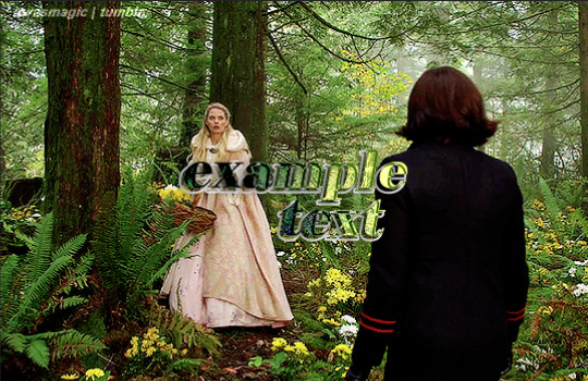
now when you play your gif, the text should look like this:

and you're done!
#answered#anonymous#userssam: tutorial#gifmaking#resource#tutorial#gif tutorial#text effect tutorial#text tutorial#photoshop tutorial
45 notes
·
View notes
Note
please how do you pick colors 😭 I'm trying to learn how to color and I am obsessed with your comics (like your ivantill ones lol) and how do you pick such a cohesive color palette and choose where to put what????
Your art is amazing like actually :) happy holidays!!
😭 tysm anon and happy holidays to you!! i did my best to explain some of the process behind my color picking and choices for the ivantill comics under the cut, i hope its coherent cuz quite frankly it also takes me a long time to decide what colors to use
a little disclaimer: i tend to just put base colors, before i start adding shading or lighting. i also dont usually start off with a fixed color palette in mind, because my process is pretty much figuring out as i go along, and playing with all sorts of colors; however whenever i do end up with a fixed idea on the color palette the process is still applicable anyways so hopefully its helpful for u too :’]
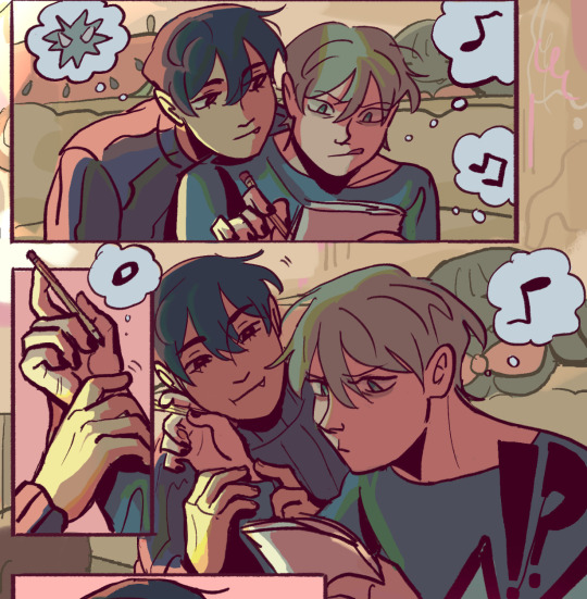
ok so i usually decide colors by asking what kind of mood or tone im going for. for example, the recent ivti comic i did
the comic imo is pretty playful - theres a romantic element ofc but i think the focus is rly on how ivans being kulit / annoying as usual so i thought a spunky, albeit warm color would rly fit. theyre also chilling in tills house so i thought a home-y, comfy feeling would be good
i was still playing around, so for the first attempt at realizing that tone, i added a hot pink multiply layer to see how it looked
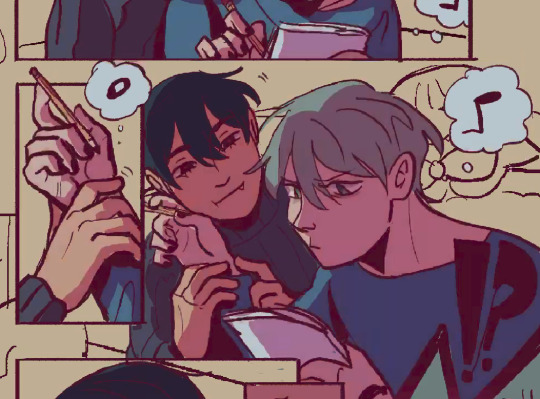
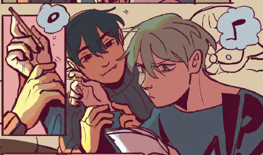
(first attempt vs final colors) (also im sorry for the low quality procreates timelapse is wack)
ironically enough it actually created a really cool looking color palette which was not what i was going for. so i kept testing colors for a bit; the shadow is hot pink, and i ended up going for a bit of a desaturated green as a base / overlay because it mellowed out the pinkness. i also put both the base and the shadow on a darken (50%) layer so that the og colors peek through a bit more compared to a multiply layer. in the end tho, i ditched pink and went for a saturated red
the green also makes for a nice complimentary color to the red, and it overall has that home-y, warm but playful feeling i wanted to include ⬇️
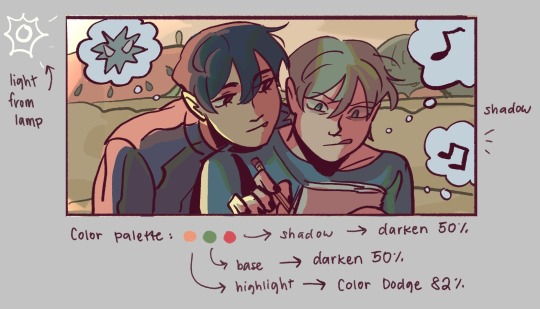
i added a highlight layer (color dodge, 82%) so that it pops a bit more, and also bc i knew i was gonna draw a big lamp on their right in the bg. speaking of the bg i made it a green/yellow hue so that the base for green on ivan n till make sense, and it ended up working for the best cuz the red acts as a nice contrast
(admittedly i think if the lighting of the room is green the shadow should also be green, but tbh i tend prioritize contrast as much as possible regardless cuz it looks nice 🤡 even if it fails to make sense realistically its for the vibes)
^ i ended up remedying this a little bit by adding bits of green to the shadows on ivan n tills hair and clothes, and also because its fairly complementary to the pink palette i have going in for the shadows and even the highlights (esp on ivan)
i also decided to shade in dark parts in the lineart so that it pops a little more
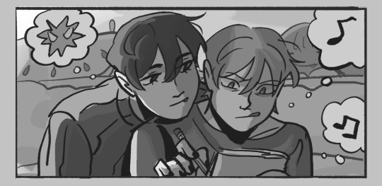
looking at the values also really help! esp in comics, where each panel can have its own lighting depending on what angle ure drawing. u can do this easily by adding a pure black layer above the entire piece, and setting it to color (100%)
for me the values actually made me realize things that may look too similar, which usually leads to me changing the color. for example, the couch and stuffed animals behind ivan and till were actually a lot darker before i changed it. bc it kinda blended into ivti a bit, it also got the eyes’ attention away from them. i ended up adjusting their hue and values so that it matches the bg, and ivan and till stick out more (alongside other color adjustments) ⬇️
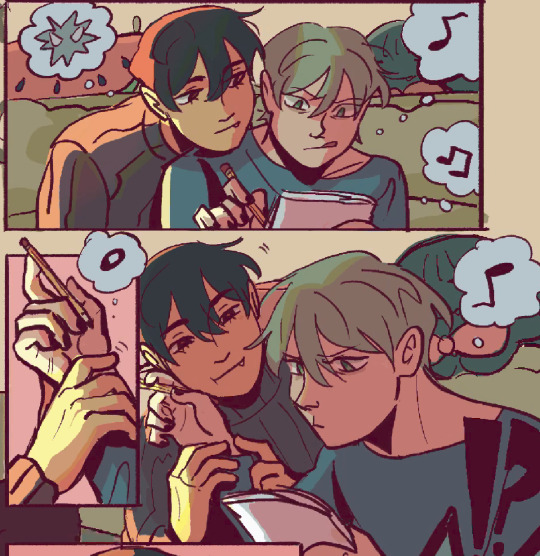
changing the lineart also helps quite a bit! i made the lineart for ivan and till a little darker, while the bg elements got a darker green instead so that the bg elements dont take as much attention
looking at b&w values also helped me realize that the og pink i was using for the panels was a little too dark, so i made it significantly lighter so that the panels stick out more (esp bc they take huge precedence in the second page)
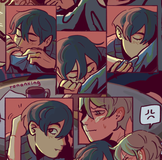
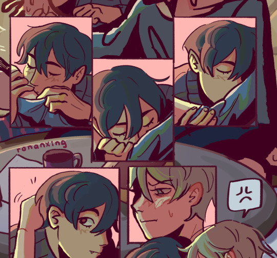
(og panel color vs final)
and finally when i pick all the colors and am satisfied with them, i merge everything into one final color layer for easier rendering :> procreate (and im sure other programs) allows for color / hue adjustments so you can def play around with those!
as for the harana / first ivantill comic i made, it had all the similar steps of the recent comic so ill just talk a little bit about the palette
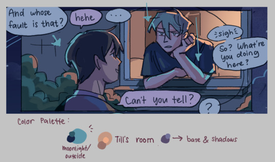
so im ngl this comic was a bit of a struggle to color for me,, cuz i wanted it to be romantic but it was set at night. usually that dictates cooler tones and colors, but i was aiming for something warm. thats when i figured i could just let tills room wash an orange color, which would help with making warm lighting but also help till and ivan stick out again from the surrounding darkness / blues
i went with a purple base, cuz i thought it was a nice warm ish color at night and it makes blue and orange pop. i also figured that i could make the base both purple since the highlights are the most attention grabbing / contrasting colors
also used the moonlight as rim lighting so that ivan sticks out a little more,, i also figured that tills room would be projecting harsher lighting over the moonlight
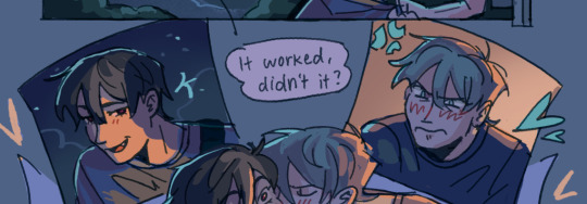
lighting it this way also allows for nice color contrast regardless of what character is in the center: ivans outside but awashed in orange lighting (from tills room), and tills inside but hes sticking his head out a little so hes noticeably purple. it allows for characters to stand out while also being pleasing to the eye
and im ngl i cheated a bit again 😅 i think till shouldve projected a shadow on ivan a couple of times and the highlights might be too harsh but again i just prioritized making their facial expressions seen LOL
for this one i didnt use any layer modes aside from (if i remember correctly) a purple multiply layer and overlay for shadows and base respectively
and thats pretty much my process for figuring out the colors !!
TLDR; i look for the mood or tone im going for, try to make interesting contrasts / complimentary colors and i also double check if each character sticks out by checking values :> it really helps me too to play around a LOT, i think it takes me like an hour or just 30 mins to figure out what colors to use and also adjusting it significantly when i merge everything together
#asks#im sorry this is so long 🫡#hope i was able to help u anon#but ty for the ask it means a lot to me !!#esp cuz i also still struggle with colors
13 notes
·
View notes
Text
hi everyone! i've been asked for a tutorial on how i did the light effect here so im going to put one under the cut. this tutorial assumes you know how to use photoshop and how to utilize timeline
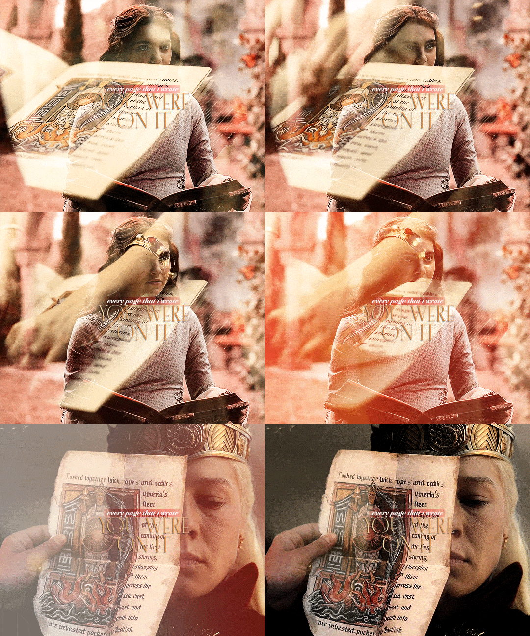
for this tutorial we are using these two gifs from a celebration set (sorry about the watermarks, i do NOT trust people to not steal plain gifs)
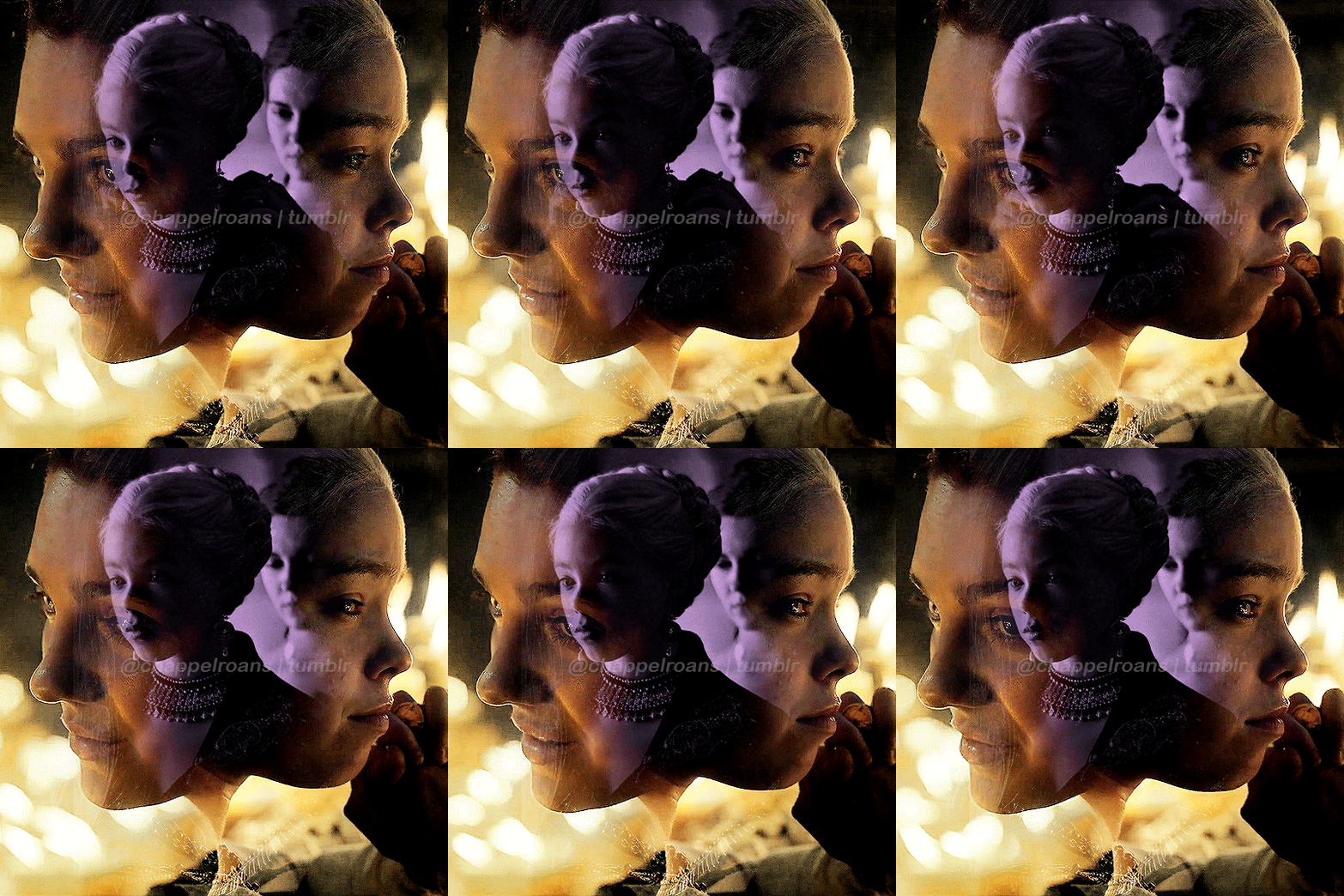

we are also going to be using this light leak as an example. most light leaks will work as long as there's an almost entirely white point within it. you can either screen record or download, however you normally make your gifs should be the way you acquire the video.
now, to start, blend your gifs however you want. sharpening, coloring, and blending should all come before anything else, so go about it as you normally would. once you are finished with each one, make each one into a smart object by selecting all layers -> right click -> convert to smart object. you should have one purple item in your timeline and nothing else. make sure each blended gif is no more than 2:00fps just to make sure the size isn't too large (since we are combining these gifs, we will be multiplying 2:00 to make 4:00, which is a large gif already. watch your sizes.

next, you're going to want to put both gifs into one document. do not blend or overlay them, they need to stay separate. whichever one you choose to be on top should overlap the bottom gif just slightly for what we're doing later.

go ahead and gif your light leak and follow the same process of converting it into a smart object once you're finished coloring/sharpening/etc. then drag it over to your document with your other two gifs and put it on top. change your settings to screen instead of normal.
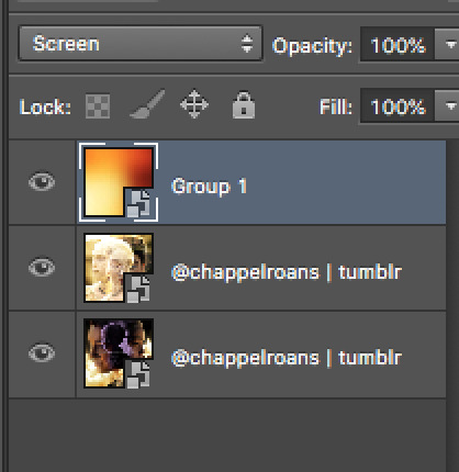
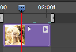
now it gets a little more complicated; not that it's hard, it's just tedious. in your timeline, make sure that second blended gif (in this case, the yellow one) is overlapping just slightly, as i mentioned. in the left toolbar of your timeline is a square with a white triangle and a black triangle inside. this is where you find transitions. we need to insert a fade to the beginning of the second blended gif, so click fade and drag it over to the gif in the timeline. you can adjust the speed of this fade by dragging the gray triangle it creates. just make sure that the end of your fade does not go over the end of your bottom gif, as this will create a transparent screen effect which will mess it up.
we are going to do the exact same fade effect on the light leak gif, but we are going to do a fade intro and a fade outro. click and drag the fade option twice, once to the beginning and once to the end.

again, you can make these fades as long or as short as you want, just keep in mind your file size. a transition like this with two blended gifs will take up a lot of space.
on the light leak gif, i have timed it so that the brightest part of the gif is between my intro fade and outro fade, and it is also right on top of the second gif's intro fade, as seen above. this will give the effect of blending into the light, as seen below.

now you're done! i know this is not the best tutorial and i'm sure there are better ones out there, but this is the way i taught myself to do it, so if you are not able to find a better tutorial this is a great place to start. it's not a perfect transition by any means, mostly due to the lack of full light in the section of the leak that i picked, but it's perfect for practicing and finding what you like and dislike about the process and the result.
32 notes
·
View notes
Note
not a request id jst like to know how you color your graphics :3

‧₊˚౨ৎ good day to you, patron. indeed you may know how I color my graphics. I should share a fair warning beforehand, I do not claim my method of coloring images as the best or only method- there are many viable methods, though, I have found this one works best for my needs.

chapter I ⠀⠀✧ ⠀⠀image choice + program

‧₊˚౨ৎ for this tutorial, I will be using argenti's lightcone, 'an instant before a gaze.' such a beautiful lightcone will do wonderfully for a profile picture in my next edit, which you may want to keep an eye out for. the program I use is firealpaca, it is a free and easy to use drawing app that I have also found suitable for editing. however, this tutorial should apply to all programs usable for edits, so long as it has filters.

chapter II ⠀⠀✧ ⠀⠀color choice

‧₊˚౨ৎ the next step is to choose your colors. I typically only need two to begin recoloring my images, and if needed, I will change throughout the process. however, for simplicity's sake, I've chosen two colors for this edit. I quite like argenti in red, so I will be keeping him in red for this edit. I tend to memorize the general placement of my colors upon the color chart, but if you hold concerns for memorizing your colors, do not fret. I suggest placing your colors on a different layer so you may color pick them as needed. now that we have our colors, we may continue.

chapter III ⠀⠀✧ ⠀⠀beginning the recoloring

‧₊˚౨ৎ to begin coloring, create a new layer, and make sure it is above the image. I start off by using the gradient tool provided by firealpaca to place both colors in a nice gradient, in either order, and then change the blending filter to 'color.' you will see the image change into your desired colors in a natural way; if it does not look like how you imagined, attempt to adjust the opacity or the colors you are using before continuing. as you can see, the image is extremely red, so I will be turning the opacity down for a more natural recoloring.

‧₊˚౨ৎ that is a much better recoloring. it is less bright, and more akin to ambient lighting. this satisfies my needs, so I will continue onto the next step. to continue, you may either create a new layer with the gradient of colors again, or you may simply duplicate the layer from before and adjust as needed. I have chosen to do the latter. after you have the new gradient layer, combine the original gradient layer down to the image after you are certain it suits your tastes.

chapter IV ⠀⠀✧ ⠀⠀continuing to edit

‧₊˚౨ৎ now that you know the basics on how I personally choose to edit, it makes continuing the recoloring much easier. after this, you can duplicate the gradient as many times as needed, or create new gradients and adjust the opacity and the blending filters. I typically tend to use the following filters during my editing, though I may not use all of them if not needed- multiply, overlay, screen, lighten, darken, soft light, hard light, and then color. these are simply my most used filters, and I may branch out into hue or saturation change as needed, though rarely do. feel free to play around with your blending filters, it's important to find which filters suit your preferences and needs most, patron. for this edit, I used mostly multiply, overlay, and screen, and adjusted filters opacity as needed.

chapter V ⠀⠀✧ ⠀⠀returning to old roots

‧₊˚౨ৎ this step is entirely optional, but I enjoy doing this. I like to add a touch of different colors during my recoloring, and in this case, I would like to bring back argenti's green eyes. fetch an image of the character once more, and use it to color pick the color you wish to bring into the edit. in this case, I've used argenti's chibi sticker in order to return his original eye color. you may create a new layer with these colors as well, if you wish to, but I am usually fine to just remember it. this method is the same one I used to bring back the green hues in my personal graphics when editing them.

‧₊˚౨ৎ using your brush tool and on a new layer, color over and fill in the area you wish to recolor. since the area is small, this step is fairly easy, and I simply recolor over the pupil. then, set the blending filter to color, and adjust opacity as needed. you may also attempt to set the filter to overlay or multiply, the blending filter which works best to you is to be discovered by you, but I personally find the color filter to be enough. after this step, I tend to add another layer; in this case, I added an extra screen layer, to add more into it. be sure to add as much as you feel is needed.


chapter VI ⠀⠀✧ ⠀⠀finale
‧₊˚౨ৎ and this is the completed product. though it may not be the best recolor I've done to this day, it certainly befits a good tutorial and sample of how I tend to do my projects. I do hope this helps you color your graphics and images as well, patron. thank you for the question, it was a very fun experience writing up a small tutorial such as this one. do have a good day, now, and until we meet again, patron.


#༒ ꒰ daphne ┊ small talk . ꒱ ⚰︎#༒ ꒰ myrica ┊ questions . ꒱ ⚰︎#tutorial#graphics#graphics tutorial#editblr#editblr tutorial#༒ ꒰ flos ┊ misc . ꒱ ⚰︎
17 notes
·
View notes
Text


RESOURCE DIRECTORY 2.0 + HOW TO NAVIGATE USERGIF
Hello! We hit 10k followers! I want to take this moment to thank all our wonderful followers and the talented members of usergif! We created this blog less than 2 years ago and are constantly blown away by your support and beautiful creations. As a thank-you, we're proud to announce our new and improved resource directory!!! Shout out to arithemes' custom page which allowed us to create a more streamlined and organized directory for everyone to use. Under the cut, you'll find a guide to help you find exactly the resource you're looking for on our blog. Happy gifmaking! :)

THE UPDATED DIRECTORY
All resources are in alphabetical order first by the creator's URL (at the time of entry), then by the resource's title. Each title is a clickable link that'll redirect you to the original post. Beneath that, you'll find the creator's URL and the resource's relevant filter tags:
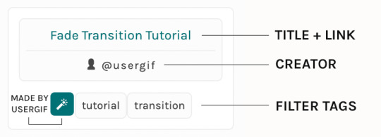
As always, whenever I add new entries to the directory, you'll see the last date listed on the right side of the blog here:
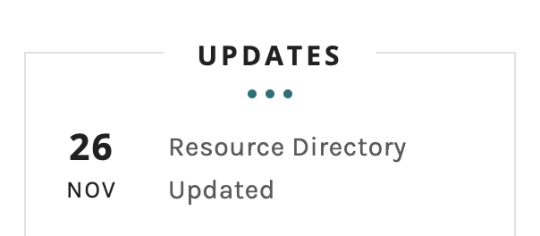
If you don't see one of your recent tutorials listed there, please be patient. I update the directory on a monthly basis, but only add resources that have already exited our queue.
THE FILTERS

Please note: the Source section has exclusive filters, meaning you can only select one at a time. In the Type and Effects sections, you can select as many filters as you want. However, if you select 2 filters in one section, like "animated" and "blending," it'll show results for any resource with either of those tags, not necessarily resources that include both of those tags.
Here's a breakdown of how we categorize our resources:
Source: ↳ all: posted by any creator ↳ usergif: posted by usergif
Type: ↳ all: click this to reset filter selections ↳ action: pre-recorded photoshop functions that can be replayed ↳ basics: non-effects-related resources to help new gifmakers get their feet off the ground (please remember usergif is not a resource for beginner-level gifs and focuses on intermediate to advanced gif effects. however, we thought it would be helpful to keep some basic resources available) ↳ brush: various brush shapes like ripped paper edges or intricate textures ↳ fonts: names and links to fonts or font packs ↳ template: pre-made, downloadable layouts and designs ↳ texture: overlays that add a different finish to a gif such as Ben Day dots (retro comic dots) or glitter ↳ tutorial: any post that provides an explanation for a gif effects process ↳ other
Effect: ↳ all: click this to reset filter selections ↳ animated: an effect that applies movement to an element such as rotating text or wiggling shapes ↳ blending: aka double exposure, this effect combines two or more gifs layered on top of each other ↳ color: specifically for color manipulation, an effect in which the original colors are completely different (e.g. a blue sky colored to look pink) ↳ glitch: an effect where color channels are toggled and layered over the original gif to give a flickering effect ↳ layout: multiple gifs on one canvas like a collage (e.g. hexagon layout) or poster-style templates ↳ overlay: an added element layered above a gif (excluding text) such as a shape, another gif confined to a shape, a texture, etc. ↳ transition: an effect that stylizes the passage from one scene/clip into another, such as a fade, glitch, linear wipe, or motion blur transition ↳ typography: any kind of stylized text added over a gif (does not include basic captions)
You can find examples of all these gif effects via their respective tags on our Nav!
THE SEARCH BAR

This search bar functions the same way as the search bar in the upper right corner of our main blog and the search function on Tumblr's mobile app.

Tumblr search allows you to generate results using keywords found in the body of the post or the tags. So, if you're looking for a post but can only remember it having the word "rotoscoping," you can type that in either in the directory's search or blog's search and find any post on our blog that mentions the exact keyword "rotoscoping."
THE NAV & TAGS
Tags function differently from search keywords as these relate to exact words and phrases found only in the tags, not the body of the post. Our members use tags to categorize original posts and reblogs. Some of our most frequently used tags are listed on our Navigation Page and saved in the mobile search function pictured below:
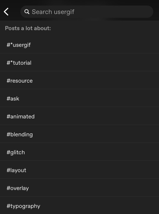
But if you ever want to quickly navigate a tag, simply add /tagged/word to the end of our url to find that tag! For example, if you want to see all the posts we've tagged as a #tutorial, just go to usergif.tumblr.com/tagged/tutorial.
BROKEN LINKS
Whether it's due to a creator frequently changing their url, the absence of an automatic blog redirect, or my own mistakes when coding the directory — you may stumble upon a broken link. Here's what to do:
If a creator has changed their username but their blog doesn't automatically redirect you to the new blog, check if they listed their new user name in the title of their old blog like I did:
In this case, simply replace the url you landed on with this new url. For example, https://sith-maul.tumblr.com/post/692130400398704640/how-to-make-an-animated-google-search-overlay-a → would become → https://cal-kestis.tumblr.com/post/692130400398704640/how-to-make-an-animated-google-search-overlay-a
However, if you can't figure out the creator's new url or in the case that I messed up the link due to human error, feel free to send us a message so I can help find the source or correct the mistake!
WHERE TO FIND THIS INFO AGAIN
If you ever need to access this guide while using the directory, simply click the "i" button here:

And that's it! We hope this revamped directory is a lot more efficient and helpful. Thank you again for all your support and for helping us reach this follower milestone!
#*usergif#*usergifdirectory#completeresources#usershreyu#userace#uservivaldi#userbecca#usertreena#userzaynab#alielook#usernanda#userhella#userelio#useraish#userabs#tuserabbie#tusermona#usersmia#tuserlucie#usercats
326 notes
·
View notes
Text
Ghosts of the Pressy
Look for the green arrows, lovingly maintained. Follow them to the emergency locker, where its supplies are still neatly packed. From our hands to yours, down the generations, our proof against the future's trouble is still as functional, as ready as the hour we put it aside for you. —the past is no forgotten promise by lunaTactics


Short image description: [ID: Two drawings with the same layout and base layers, but different overlays. Both drawings are very tall, about a 1:4 ratio. At the bottom is Murderbot in a corridor of the Pressy, reaching for a life-tender in an emergency cabinet. The background fades up to a black, starry sky. The first version of the drawing has an overlay of blue text bubbles representing the feed, containing dialogue from Fugitive Telemetry with Aylen, Ratthi and Gurathin. The second version of the drawing is overlaid with a transparent layer of misty, otherworldly blue, affecting everything but Murderbot and the life-tender. Tahe upper part of the drawing is filled with a chain of transparent and glowing blue figures, representing the ghosts of the Pressy. Each ghost has their hands on the shoulders of the one who comes after them, and the final one in the chain hands the life-tender to Murderbot. At the very top of the drawing are the words “It is hope like yours that is our future,” a line from Verso’s fic. /End short ID]
Longer, more detailed image descriptions below the cut!
--
Sometimes you read a fic that you can’t get out of your head and you just have to make art about it.
the past is no forgotten promise by the wonderful Verso aka lunaTactics aka @grammarpedant gives me so many emotions, and of course the best thing to do with emotions is to make more stuff out of them! It’s been an entire year since I made this art and shared it on discord, but I’ve never put it up anywhere else! So here is my labor of love, the first Murderbot fanart I ever made and probably still the most ambitious that I’ve completed so far.
In addition to Tumblr, this artwork is now posted to Ao3, with a second chapter that contains some thoughts & musings about why I made this and the choices that went into creating it. You can find it here:
Below the cut is a full image description of all the detail you’d notice from looking closely at the artworks, as well as translations of the Preservation language (written in Aurebesh script) that appears in the background.
Long image descriptions:
Canon version:
From the top down, the background fades smoothly from starry black to the yellowish walls of the Pressy, which are scuffed and textured. Murderbot stands in front of a gray emergency supplies cabinet built into the wall, facing away from the viewer. It has medium brown skin and dark brown, slightly scruffy hair. It’s wearing a dark blue hoodie with the hood down, leaving some inorganic parts at the back of its neck visible. It reaches up towards the life-tender on the shelf.
The emergency cabinet has a glowing green sign above it, with text in aurebesh (an abstract sci-fi script, not readable to English speakers, although the text will be translated below) and arrows pointing down. The life-tender sits on the top shelf. It has a metal frame with a large bulge of folded material, and is labeled with a red tag in aurebesh. Other items sit on the shelf below, including medkits with the red plus symbol. The open door of the cabinet has a sign with a large green warning triangle and some text represented with black lines. The door is slightly scuffed and three lines of aurebesh text are graffitied on it in messy blue ink.
On the wall to the left of Murderbot and the cabinet is a large green arrow pointing to the emergency supplies cabinet, as well as a shiny metal plaque with aurebesh text. To the right of the sign, a sheet of transparent material bolted to the wall covers more blue aurebesh graffiti.
Overlaying the drawing and filling in the negative space in the top 2/3 are numerous text bubbles representing feed conversations. These contain dialogue from Fugitive Telemetry, transcribed below with notes on the visual appearance.(Slightly glowy light blue text, grouped into speech bubble or text message-like rounded rectangles, filled with transparent blue) SecUnit: I’m almost there. Just give me a fucking minute. Aylen: You know, swearing during operations doesn’t meet the professional conduct standards of Station Security. SecUnit: Because Senior Indah has never told anybody to fuck off. Aylen: You have me there. SecUnit: I’m going offline now. Aylen: Understood. Good luck. Disconnected.
(A gap, followed by a different style of text bubble which cuts across the entire width of the drawing. The top outline is formed by a horizontal green line that starts with a waveform representing a short burst of static or noise, and the bottom outline is the same but with the waveform at the end. The waveforms interrupt the first and last lines of text, showing the transmission being started and cut off abruptly. The bubble is filled with green static that bleeds outside the lines. The text inside the bubble is also glowy green.)
[caps] This emergency device alerts the port authority notification network and the transponder will send your location to [end caps]
(Another gap, followed by more blue feed bubbles with a new conversation)
Connection Established. SecUnit: I need help. Ratthi: SecUnit, what’s wrong? SecUnit: Which one of these things is most like an EVAC suit? Ratthi: Uh, are you up on the Pressy? The closest thing I see to an EVAC suit in there is a life-tender. But (overlapping the previous bubble to cut off the sentence) Gurathin: There, third shelf down, with the red tags.
(A gap in the feed bubbles which is filled with the main contents of the drawing, including Murderbot, as described above. The final bubbles are tucked into the lower left corner, behind Murderbot.)
Gurathin: Wait, why do you need it? What are you doing? SecUnit: It’s a Station Security thing, I’ll tell you later. Disconnected.
End ID of canon version.
Fic version:
All the elements from the previous drawing remain, except for the feed bubble overlays, which are gone. Instead, the corridor of the Pressy is overlaid with a ghostly blue mist, giving it a much more otherworldly atmosphere. Murderbot and the life-tender are the only things unaffected by the blue overlay, appearing more solid than their surroundings.
A chain of ghostly blue human figures fill the negative space above Murderbot. The last ghost in the chain is holding out her arms so that, although the cabinet shelf is still visible through the translucent overlay, she appears to be holding the life-tender and handing it to Murderbot. She is looking down at Murderbot and smiling gently. The figure behind her rests their hands on her shoulders. Each ghost in the chain smiles down at their successor with a hand or arm around their shoulder. Their appearances vary, and wear different styles of loose-fitting clothing. At the start of the chain of figures is Captain Makeba, looking down at the other ghosts and at Murderbot. She has short hair and wears a loose robe, and her arms are spread wide in welcome. There is a four-pointed star shining in the center of her chest.
Above the ghosts, in the black and starry part of the background, is a centered column of text with one word on each line. It reads, “It is hope like yours that is our future.” (A direct quote from the past is no forgotten promise.)
End long image descriptions.
Aurebesh translations: The glowing green text above the cabinet says “Emergency.” The metal plaque on the wall says “Station Historical & Environmental Management Preserved Site.” The label on the life-tender says “life-tender.” The graffiti on the wall covered with a clear protective sheet says “Here, you are loved,” a line from the past is no forgotten promise. The graffiti on the inside of the door is three names: RoundedLoaf, lunaTactics, lovedthestars.
(A note on Aurebesh: This is a script from Star Wars, which I was not previously familiar with. It was suggested to me by Sparrow on the Murderbot discord when I asked for ideas on how to portray the old Preservation language that Murderbot didn’t have a translation for. I wanted something that looked like a language, but wasn’t immediately readable by someone looking at the art. Aurebesh is a 1:1 substitution for the characters of the English alphabet, which had the added bonus of letting me hide some messages in plain sight.)
137 notes
·
View notes
Note
Do you have any art advice for people who just started? Layers, tracing, social media etc?
hi anon! i've answered some asks before about general art tips (x x x x ) so if I miss anything here these are more detailed and might help as well!
don't worry too much about creating a style right now! in fact, from my personal experience, i'd say don't worry about creating a specific style at all. the style of a piece is supposed to be a tool to help you give form to a feeling. instead take a look at art that makes you feel good and think about why and use that analysis as a guide for your choices during the process
assuming you're a digital artist, layers are Great. they're Beautiful. I use separate layers for things that I think I might need to move around later, e.g., the colour of the skin, the colour of the hair, etc. most programs have features such as clipped layers (to keep everything on the layer above within what you have drawn on the layer below), blend modes (to change the way the colours on the layer above interact with the layer below), and a naming function, so you can label what is on each layer if you need. definitely have a fiddle around and see what works for you! a general thing that people tend to do with blend modes is multiply for shadows and overlay/screen for lighter parts. have fun with it and see what feels good!
honestly. honestly. the biggest mistake I made was getting too deep into posting on social media before I started enjoying art as a hobby in itself. your skill is not determined by how fast you can draw, or whether your art looks like the most popular pieces you see circulated on social media, or whether one of your pieces breaks 1k notes. social media traction follows your confidence and enjoyment in your work, it's not the condition that precedes that. focus on building a good relationship with your art and your feelings about yourself as an artist and all the good stuff will come without you even realising, I promise <3
29 notes
·
View notes