#Covered Market
Explore tagged Tumblr posts
Text

Come on England, Covered Market, Oxford, U.K., July 2024
7 notes
·
View notes
Text

Borough Market, Halifax
#borough market#halifax#west yorkshire#england#europe#wikipedia#wikipedia pictures#covered market#market#architecture#clock
18 notes
·
View notes
Text

#photography#street photography#oxford#england#photographers on tumblr#black and white photography#covered market
2 notes
·
View notes
Video
St Nicholas Market by [email protected] Via Flickr: Canon A-1 Focal Length: 135mm ISO: 400 Film: Portra 400
#Canon#Canon A1#35mm Film#Film#Film Photography#Photo#Flickr#Canon FD#FD#FD Lenses#Vintage#Analogue#Vintage Lenses#Colour Film#Vintage Canon Cameras#Canon Cameras#Kodak#Portra#Kodak Portra#Kodak Portra 400#Portrait#135mm#FD 135mm F/2.8#Telephoto#Bristol#Covered Market#City#candid#candid portrait#Sad
1 note
·
View note
Photo

cookies.
#street food#local market#markt#street cookies#fresh cookies#kekse#bens cookies#sweets#england#british#covered market#secret places#oxford#oxford market#bakery#street bakery#bäckerei#süßigkeiten#photography#street photography
1 note
·
View note
Text
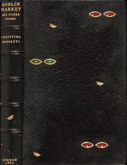
THE GOBLIN MARKET AND OTHER POEMS by Christina Rossetti (London, [1862]) Art binding.
#beautiful books#book blog#books books books#book cover#books#vintage books#book design#art binding#goblin market#christina rossetti
471 notes
·
View notes
Text
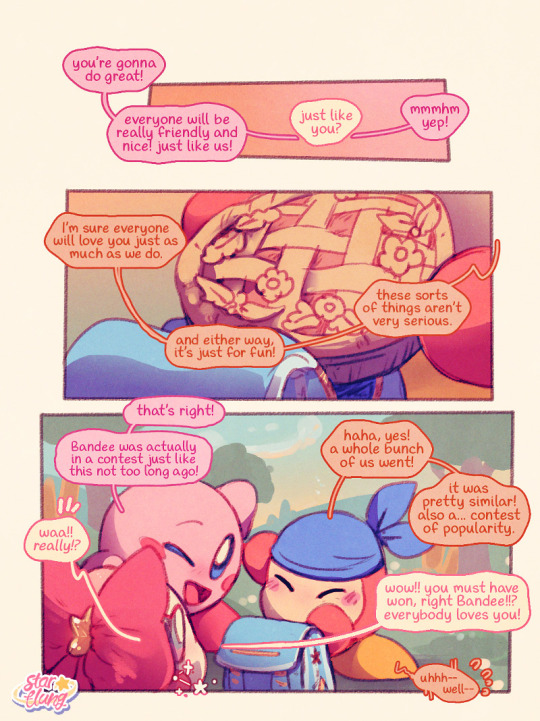

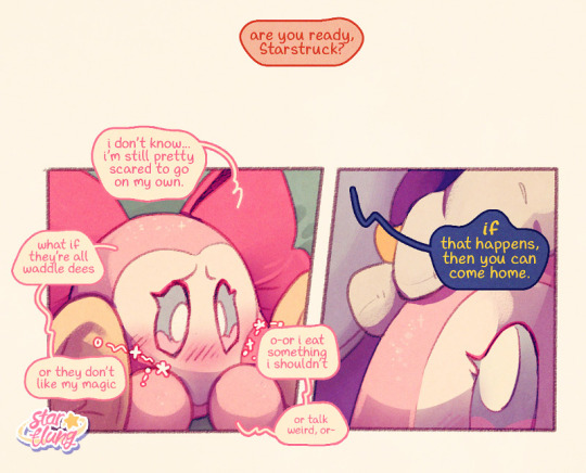
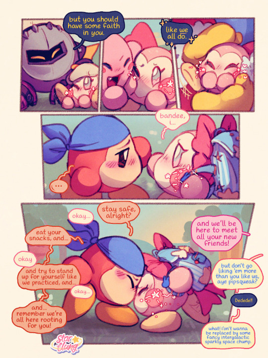
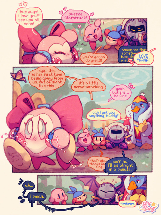
running a little late, but someone's finally arriving at the @kirbyoctournament !

sent in to the tourney by her well meaning friends, starstruck is a Totally Normal adult waddle dee from king dedede's kingdom of dream land! she's here to try and meet new people, and maaaybe get out of her anxious shell a little bit!
equipped with her customary cheerful attitude, she's also sporting a brand new backpack full of lovingly packed goodies to help her through the event.
if you'd like to get to know her a little better, you can check out her tag on my blog, or these three important comics from previously! lastly, you can find the masterpost for her interactive tournament adventure here! this is an ongoing chronological story (separate to her canon story, but referencing it) that will last for as long as she's in the tournament!
a few notes for any interactions
🌸 despite being a waddle dee, other waddle dees typically don't like being around her, and folks who already know what a waddle dee should be like also tend to get a weird vibe off her. 🌸 she is quite friendly and approachable, but prone to extreme anxiety if she perceives she might have done something wrong or inappropriate. tiny wanya takes criticism the way a handful of hay takes a flame. 🌸 if you have wings and you take her flying she'll never leave your side. she's only palm sized, so if you are big and have wings or can fly, please pick her up and go flying with her please please pleeaase she wants to go go flying and fawn over your wings so so bad 🌸 for the purposes of the tourney, which by merit of its existence is something of an au timeline, consider this event to completely predate her ability to summon these.
#my art#my comics#starstruck dee#oc (2024): starstruck dee#kirby#bandana waddle dee#meta knight#king dedede#throwing her into the ring!!! tiny pink bouncy stressball (ball of stress) in there with all these incredibly cool and powerful ocs!#just trotting from your house in the countryside to the Community Gathering and finding a whole bunch of literal legends there#if your oc has wings she is going to be following them around like this -> 🥺👉👈 <- the whole time. just so you know#don't let meta knight know!! she thought he had the market for both “cool knight” and “pretty wings” covered but she's in for a surprise!#anyway. phew! finally finished this just in time! excited to be participating!!! best of luck everybody!
574 notes
·
View notes
Text
Let's talk about Jump GIGA
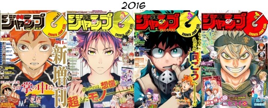


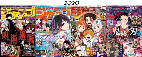
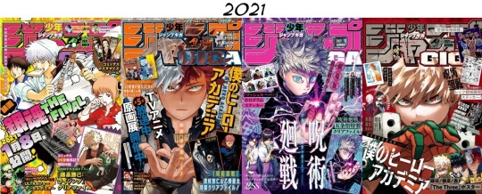
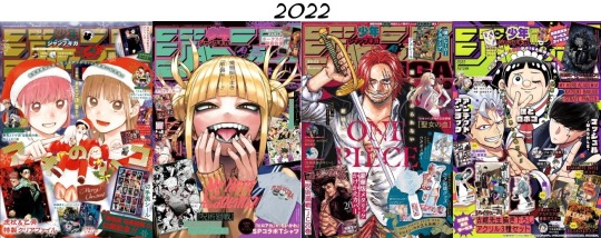

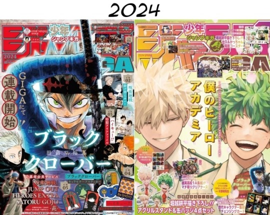
Jump GIGA covers, 2016-2024. Volumes are published (left to right per row) as Winter, Spring, Summer, and Autumn releases, with 2018 and 2019 briefly breaking the pattern by having three Winter and three Summer volumes each. 2023 has an Early Spring volume in addition to the standard four.
So, people have pointed out that the 2024 Spring cover is, uh, not like other covers.
But I've only seen comparisons to other MHA GIGA covers and MHA Weekly Shonen Jump covers. Out of curiosity for what GIGA's typical marketing aesthetics might be, I put together a comparison between all of Jump GIGA's covers to date.
And, um. Some things stand out, to say the least.
First, let me clarify what Jump GIGA even is: it is a seasonal magazine from Shonen Jump, published separate from Weekly Shonen Jump. SJ is an absolutely massive brand and they have a number of magazines serialized outside of the most well-known weekly magazine.
The content of Jump GIGA is primarily made up of one-shots and spin-offs. From the beginning, a lot of the appeal has been the cool cover illustrations which showcase special merchandise that comes with the purchase of GIGA. Usually the cover also promotes big things going on related to the WSJ series, like movie events, new games, or special figurines for sale.
The marketing aesthetic has been clear from the start: the cover consists of one core illustration and a number of ads surrounding it. Most often you get a cover illustration of a protagonist, and then ads and merch for other series, e.g. Food Wars protagonist cover with One Piece film promotion and Haikyuu!! merch.
The purpose of this marketing direction is pretty obvious. Spin-offs and one-shots are not likely to generate a ton of interest consistently, so they lure people in with the cool covers and tempting limited edition merchandise of the series they already know and love. In this way, highlighting one series with the cover and different series with the merch makes sense, because maybe somebody doesn't care about Food Wars, but they definitely want those Haikyuu!! stickers, stuff like that.
Starting from 2020's Autumn volume, you can see a shift. For the first time, basically all of the merchandise is for the cover series. The Demon Slayer manga had already ended five months earlier in May, but a two-chapter spin-off was scheduled for release in WSJ during October. This GIGA was released exactly one day before the second chapter was published and it capitalizes on the hype.
After this point, only MHA and Jujutsu Kaisen dominate the cover and the merch in quite this way, with Black Clover getting attention last volume as a way to highlight the fact that it actually switched syndication from WSJ to GIGA.
Anyway, most commonly the cover illustration is a solo shot of a core cast member (usually but not always the protagonist), and if it's not a solo, it's a big cast illustration.
Only a few covers focus on two characters, and usually it's a crossover as opposed to characters from same series sharing the limelight.
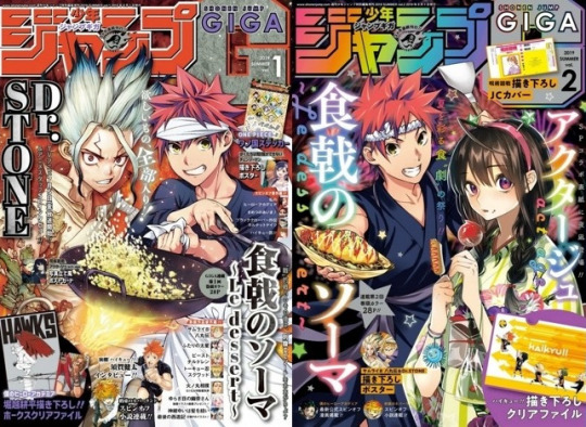
Here we've got Food Wars' protagonist with the main characters from Dr. Stone and Act-Age.
The two covers most similar to the Izuku & Kacchan cover are 2022 Winter and 2023 Autumn.
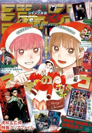
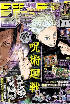
Winter depicts the main trio of Blue Box in a seasonally-appropriate aesthetic. Not gonna lie, this one kinda makes me laugh--Blue Box is a romance and sports manga, and even though Christmas has a romantic air to it in Japan, instead of depicting any sort of like, hesitant but hopeful romantic energy between the heterosexual couple that actually get together later in the series, they focus primarily on the two girls being cute with the guy is a wee footnote? I mean, all right.
Meanwhile, Autumn depicts one of the protagonists with the series antagonist with a typical cool action style. I'm not very familiar with JJK, but I hear these two have got Some Drama going on, so, there's that.
The merch itself has also evolved over the years. Stickers and posters were present early on, but they have since expanded to decorative folders and now acrylic stands and coasters. 2021 Summer sees the first time the cover illustration is marketed as merch, with the Jujutsu Kaisen cover included as a decorative folder.
Right after that, the Kacchan cover of 2021 Autumn is included as a poster alongside earlier covers featuring Todoroki and Izuku.
2023 Summer's cover is a huge, wrap-around MHA cast illustration and it was published three days after chapter 396 came out, strategically timed to highlight the big shift in the final battle as Ochako vs Toga ends and All Might vs. AFO begins. Merch includes a decorative folder of the wrap-around cover and character motif stickers.
And then we get this!?
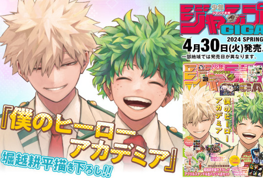
A duo cover illustration where the cover art itself has been merchandised to hell and back!?!?
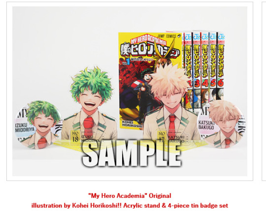
Acrylic stand and pin set!?
Double-sided coaster showing bkdk greatest hits!? With volume 29's river scene cover!?
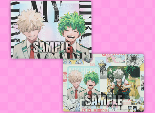
There's also a double-sided poster featuring the Spring cover with the ninth popularity poll art and a decorative bag with the anniversary art. The cover art itself is plastered all over the volume, front, back, and spine, apparently a total of 19 times.
I honestly don't know what to say about this. It feels wild that this is actually what the cover is. Obviously it is a huge marketing push in anticipation of season 7, and Izuku and Katsuki are the most popular characters, but. it just feels... unique.
In the course of Jump GIGA's publication, this direction is kind of unprecedented. Genuinely no one could have expected this. This seems to be the first time there's been this much merch for a cover. And it was a solid fucking move, marketing-wise--it's sold out basically everywhere, everyone is talking about it. And even people who don't follow the series or ship these two can't help but comment on how strikingly romantic it looks!?
I don't know how much say Horikoshi had in what the cover was, but damn it sure feels like he drew this with immense affection. I kind of wonder if he personally pushed for it to be these two, rather than the typical solo shot, cast shot, or even a protagonist vs. antagonist shot.
I'm KO'd, man. idek if this post is useful to anybody I'm just on my hands and knees here.
Everybody knows what we're all here for, and it's these cute boys finally getting their happy ending.
EDIT NOTE: I gathered much of the information and many, many of the images in this post from a fan-made Jump Database. I neglected to say it properly when I first posted this, but special thanks to the very dedicated people who maintain that website!
#bkdk#i'm losing it#idek how to go on#they're so beautiful#I was trying to be all thoughtful and intellectual about what kind of marketing game GIGA plays in SJ's arsenal of branding#but#this is just such a divergence from their typical approach#why are there basically no other duo covers#did the other mangaka just not particularly push for it#did other duos just not serve as attention-grabbing enough#there's nothing else like it#what am I supposed to do with this knowledge
442 notes
·
View notes
Text

shoutout to his “RCG3” vanity plate!!!
#in many ways he would never#like if he were to have a vanity plate it would be like GLNDWR but#still very excited for all the tiny silly details like this. genuinely the best part of comics#graphic novels#also this composition kind makes it look like ronan is the main character and i’m curious if that was intentional#in like a marketing way? cuz everyone luvs ronan?#but in general. god it’s so much better than the normal cover#would’ve loved something blue centric… it’s ok… at least she’s on it!
157 notes
·
View notes
Text
God how I wish the Bat boys weren't brothers/ friends it would be so much more interesting to read the series.
Imagine Cassian being the General of Illyria, who doesn't like Rhysand since he doesn't do anything for his people, even though Rhys is half Illyrian himself, and when he and Nesta are mates so we get even more conflict between Nesta and rhys/ feyre 'cause all of a sudden Nesta has back up in the form of Illyria and nessian would be out here making rebel plans against feysand.
And it would be so much more interesting if Azriel's father was from the CoN and Azriel was also out here starting a revolution with other CoN citizens.
Instead of pro IC/ anti IC we could have had three parties with three different political viewpoints and everybody in the fandom could be a different team. At least that would be more fun than the black and white view SJM currently has of her characters.

#the potential of this#and everybody would have their team in their bio#like Team Velaris; team Illyria; Team Hewn city#the marketing could even slap with different cover arts for the different teams#yes It would be inspired by hotd but SJM already plagarized the shit off of other authors#one more thing doesn't matter at that point#acotar critical#sjm critical#acotar#acotar thoughts#bat boys#rhysand#azriel#cassian
279 notes
·
View notes
Text
you bitches have got to watch Scavengers Reign if you haven't yet, i'm only a few episodes in and it's already completely unlike anything else i've ever seen
#if nothing else just check it out for the incredible animation and the beautifully designed alien world#but that DOES NOT EVEN BEGIN TO COVER IT. NOT EVEN CLOSE.#i'm like. have i forever been changed by this somehow. by a few episodes of this show. i feel altered#i don't even have commentary of any kind or anything funny to say while the episode plays#except for occasionally What The Fuck and Oh My God#i'm just sitting there with my jaw slack until the credits roll#actually that's not true. i occasionally scream. THIS SHOW IS SO SCARY#IT'S NOT MARKETED AS HORROR I DON'T THINK???#IT'S SCARIER THAN SOME HORROR FILMS I'VE SEEN THAT REALLY -TRY- TO SCARE YOU#not in a Horror Genre way but in the way that a world this alien IS horrific. it's so scary. it doesn't matter at all that you're there.#i've never seen a creative work that did ''alien'' this well. i can hardly even draw comparisons#it feels both prehistoric and posthistoric#simultaneously it feels like we're shrunken down experiencing a microscopic level of something and that we're at a macro level#you gotta get into it.#sergle.txt#scavengers reign
259 notes
·
View notes
Text

Borough Market, Halifax
#borough market#halifax#west yorkshire#england#europe#architecture#market#covered market#wikipedia#wikipedia pictures
15 notes
·
View notes
Text

Well… is that face captivating enough to entice you to buy this W.I.S.E cosmetics collection? 🤔
--------------
***Disclaimer***
1/ The "Honey" slogan was coined by @nire-the-mithridatist
2/ The perfume bottle was based on the real Spy x Family Fragrances

3/ The other two pieces were based on the lipstick and blush balm I randomly found in my mother's cosmetic bag.
#spy x family#sxf fanart#loid forger#agent twilight#my art#THE MUNDANE LIFE with THE FORGERS series#in this AU the conflict between the two countries was not as harsh as in canon#“since WISE is always in dire need of funding. why not sell some home-made products to make some money right?”#said Handler#and no one dared to stop her#Twiloid was roped in to carry out her orders as always#after that Fiona had covered her place from floor to ceiling with a few dozen copies of this poster like the crazy fan that she was#Franky made big bucks on the black market with a “shirtless” version he “borrowed” from their photoshoot
638 notes
·
View notes
Text

character poster for salem’s lot (2024) (designed by me)
#inspired by the cover of the 2013 mass market reissue#saw the poster on imdb and got annoyed all over again so#salem’s lot#ben mears#lewis pullman#ames makes things
124 notes
·
View notes
Text


last month i made some pinch pot mugs that weren't done in time for my clay place's end of year mug swap. so now i have weird mugs for me
#i did not make the plate it was a gift#my sweet ceramics mutuals moldspace and kberg have the paws on mugs n bowls market covered btw. check em out
267 notes
·
View notes
Text


At left is the first version of a cover for The New Yorker drawn by Ilonka Karasz that was eventually published, in revised form (right), on September 21, 1935. It shows street markets under the El, a common sight on weekends in the 1920s and 1930s. Click/tap each one to enlarge.
Photos Left: Invaluable Auctions Right: Fine Art America
#vintage New York#1930s#Ilonka Karasz#The New Yorker#vintage illustration#Sept. 21#21 Sept.#street market#1930s New York#elevated subway#vintage magazines#vintage magazine covers#elevated train#El
56 notes
·
View notes
