#Clip studio paint is hard to learn
Explore tagged Tumblr posts
Text

A tool is always innocent
Headcanon: Damian being damned in hell does not make sense. In a world where Talia is good, she made sure that all his sins would fall to her hands. She basically brainwashed her son, so Dami won't have the discernment that would damn his soul. A tool is always innocent. So all his death counts and sins should be placed on Talia's shoulder. Dami is innocent to it all.
So his trip in hell was all due to the fact that when he underwent in-vitro gestation, Ra's ordered using Dionesium (key element in Lazarus) which defied the balance of life and death, damning his soul in limbo.

The Boy Wonder #4 by Juni Ba
#I borrowed my person's drawing pad#Clip studio paint is hard to learn#I prefer medibang...no capacity to learn new skills right now...but i wanna color!#Finally redraw the original one#Damian wayne#dc comics#Dc robin#Talia al Ghul#The colors are all off coz experimental on new brushes and stuff
113 notes
·
View notes
Text

TRIGUN ✝ MAXIMUM: Coming this Halloween!
#IM SO HAPPY W THIS RRRRRRRRRAHHHHHHHHHH#IM LEARNING CLIP STUDIO PAINT GRADIENTSSSSSSS#photo#trigun#trigun maximum#fanart#vash the stampede#nicholas d wolfwood#millie thompson#meryl stryfe#vashwood#<-- bc there on the same page lol#i hope my hard work paid off RAH
648 notes
·
View notes
Photo
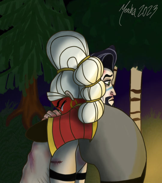
Aftermath
“Ya just ran off! Off to yer own life, just like Quirin.Ya never cared about any one of us Adira!” Hector spat, ignoring the searing pain in his body. He cursed his weakened state as a burning sensation bubbled up behind his nose. “Specially me.”
Adira stalked towards him, a hellish anger painted on her face. He braced himself. Hoping, praying, that she would hit him.
Instead, she fell to her knees in front of him. Arms rose and wrapped around him. Hector fought the sensation, waiting for her to constrict him, but it never came.
“You idiot,” Adira’s muffled voice made him freeze. They sat there for a moment. Adira holding him in a close embrace. Hector still frozen, unsure what to do.
“I never stopped caring for you, brother.”
He felt a lump form in his throat. Her broken voice bringing him into the light.
“I never stopped loving you, Hector.”
_______________________________________________
Welp...I finally colored something. This takes place after everything with the Great Tree when Adira is caring for Hector. I kind meant for this to have some Hectira vibes, but it could just be platonic as well. You chose.
I am proud of some things in this...but not my background. One day I will be able to make a decent background. Turns out I can draw tears and wounds with ease. Guess I need to draw more angsty stuff haha. This did make me remember why I hate coloring stuff so much though.
I HATE SHADING WITH A BURNING PASSION.
I dunno. My brain just has such a difficult time wrapping around that concept and I tend to REALLY overthink it. Although I have to give a shout out to Winged Canvas on YouTube (and other platforms) for the helpful videos on how to shade in digital art and such. Her video’s have helped me a lot so far.
I did use a very helpful reference for this pose. Here is the link. https://twitter.com/278byaedeok/status/1378919862165114885/photo/4
#tangled the series#tts Hector#tts Adira#tw blood#tts Brotherhood#Hectira#if you want it to be#HectorxAdira#was trying to finish this before the weekend#my weekends are so busy now#i'm learning the ropes on Clip Studio#and it is very enjoyable#just a hard transition from traditional art#esp since the only digital art i've ever come close to doing is literally Microsoft Paint#meecha art#my art#i am still very proud of this#:3#even though i still have a lot to learn#but doesn't everyone?
31 notes
·
View notes
Text

She kik.
She stronk.
She Kiyo.
Also, gonna be streaming on PICARTO from 3:30PM - 5:30PM eastern (SFW). Hope to see you there. I'm gonna be drawin' comics. :3
#kiyo amachidame#gif animation#learning how to do this is hard#clip studio paint animation#it's fucking difficult#but lookit her go#lookit her lil leg#she is beauty#she is grace#she gonna kick you in the face#wayward compass#kiyo
5 notes
·
View notes
Text
Help. He's too cute.
Less angst for Link, please.

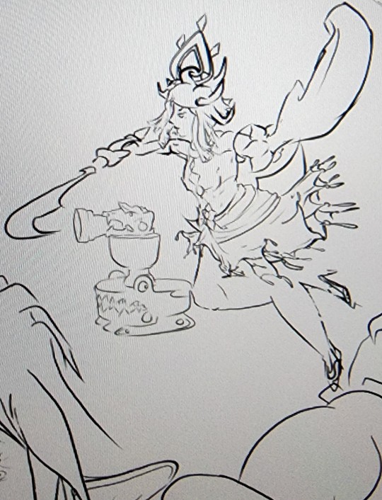

#I honestly can't tell you at what hour mark practicing line art turned into revisiting learning realism#but at some point I realized my grave mistake and I'm having to go over everything#I went too hard on his teeth but jfc his smile makes me so happy#crooked teeth wide grin#HES NOT ALONE and hes SO happy#also my roomba army#I didn't have a reference for them and look how doofy their eyes came out#im keeping them#loz#the legend of zelda#tears of the kingdom#totk#Link#WIP#blue draws#digital media#clip studio paint#also Riju shows where I realized I went hard#but I love her.
7 notes
·
View notes
Note
Hey, I was wondering if you had any starter tips for digital art? I'm a traditional artist and have been for years, but I was recently given a tablet and clip studio. I am having SUCH a hard time getting anything to look right: shaky lines, flat/too soft pieces, just an absolute childish mess every single time. I see all these gorgeous digital pieces and have NO IDEA how to get there.
Heya!
So, it's been a very very long time since I transitioned from traditional to digital art, but I DID do proper traditional for a few years; we're talking ink pens, color pencils, markers, watercolor, fancy papers, the works. I did some acrylic painting too but only monochrome (and before anyone asks, these works no longer exist so I can't share them) all that to say that I do have some experience with the former and definitely felt the learning curve when I changed to a tablet.
To get the unhelpful advice out of the way first: It's a different and unfamiliar medium, and there is probably nothing significant that you're "missing" about it except time and exploration. There are pillars to digital art just like there are in traditional art, but when it comes to personal process everyone has their quirks and habits - you gotta mess around and find what works for you. I suggest looking up tutorials and speedpaints on youtube even if you know all the basics or if the style you see doesn't appeal to you; just watching how others do their thing might help you figuring out how you would like to do yours!
Now, for the more practical advice:
-I don't know what kind of tablet you got, but assuming it's a non display, that's an extra hurdle you have to get over in developing the eye-hand coordination necessary to use it. This feels very alien at first but it shouldn't take longer than a few weeks to feel completely natural.
-On that note, if there is a significant size discrepancy between the tablet and the screen you are looking at, that might mess you up. Try adjusting the size of the CSP window so it fits the size of the actual drawing surface you are using more closely.
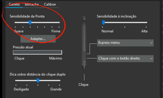
-Every drawing tablet's pen has pressure settings that can be tweaked to your liking, I for one always make it a little softer than the default.
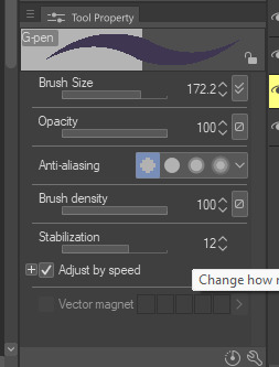
-BRUSH STABILIZATION! That's a setting every individual brush (and almost every tool, I believe) on CSP has. It does as advertised: stabilizes your brush strokes. A lot of people like this set between 8-20 depending on the brush, and it can make a huge difference to the way you draw.
It is usually always visible in the tool properties, but if not, you can toggle it on through the "sub tool details" menu by clicking the little wrench symbol on the bottom right.
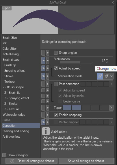
Hopefully this has been helpful at all. Good luck!
196 notes
·
View notes
Text
Pulp Covers And How To Paint Them
With the rise of cheap printing in the early twentieth century, mass-marked paperbacks swept the world, each offering lurid thrills for obscenely low prices. Sex, sadism, and incredible violence for as little as ten cents. An easy purchase to slot in between fifty cigarettes a day and enough bourbon slugs to kill a small garden.
Pulp fiction is where some of the greats of American literature cut their teeth, including the big three, Raymond Chandler, Ross MacDonald and Dashiell Hammett. The contents of these stories, both the dizzyingly good and astoundingly terrible, have been absorbed and digested and remixed and regurgitated in nearly every permutation imaginable, fuelling pop culture some one hundred years on. This isn't an essay on that. Nobody likes to open a tutorial and be greeted with a wall of text. The history is for another time.
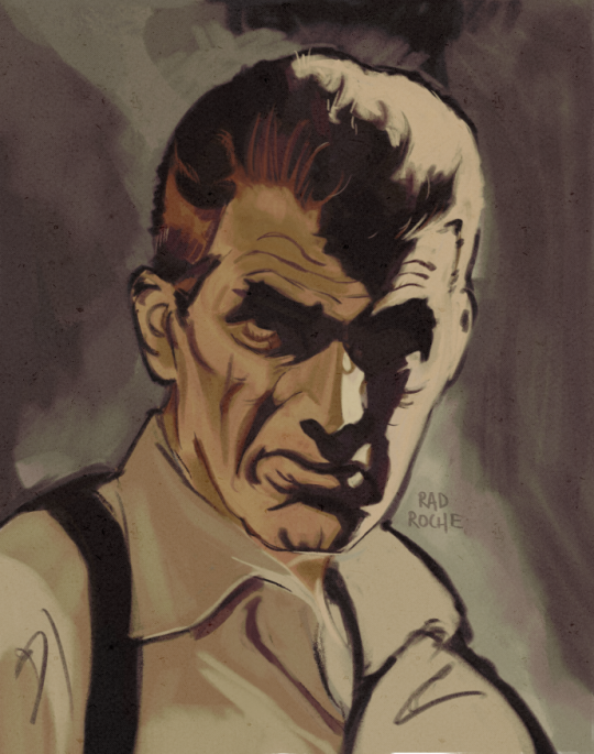
But it is about how to paint it.
Don't let the pre-amble intimidate you, it's not as hard as it sounds. You will need:
Painting software with some image editing capabilities. You don't need all the bells and whistles of Photoshop, but I wouldn't recommend something like MSPaint, at least not to start with. I'm using Clip Studio Paint.
A really beat-up paper texture. The grungier, the better.
A lightly-textured brush. Here are the specific brushes I use, 99% of which is the well-named rough brush. Try and avoid anything with any impasto elements.
Go to your colour-picking tool and use the 'select from layer' option. Doing all the painting on a single layer is going to make your life easier.
A complete willingness to make mistakes and, instead of erasing, painting over them. It generates much more colour variation and interest! Keep your finger off the E key.
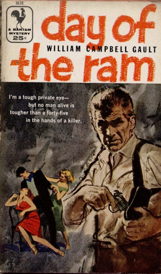
Good reference! That painting is a master copy of Mitchel Hooks' art for Day of the Ram. Find a style you really love and want to learn? Have no clue where to begin? Do direct studies!
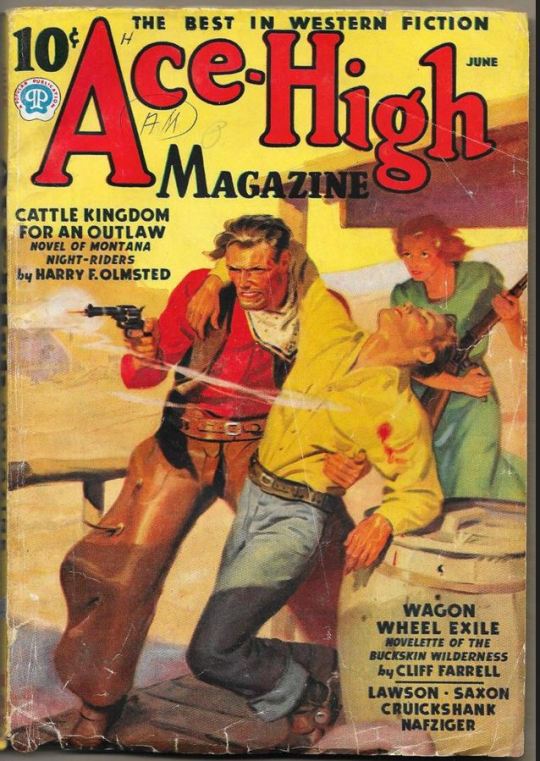
Let's not worry about whatever is happening in the background. It's probably fine. Let's get started! Pulp magazine art is a lot more varied than you might first think, so don't agonize over having a style that 'fits' or not. I'm also specifically aiming for something you'd see on the cover after printing, not the initial painting they would use for printing. The stuff I'll show here is a pretty narrow band of it, but here are some general commonalities. This is a painting by Tom Lovell.
Let's dig into this.

The colours are very bright and saturated, but the actual values, the relative lightness and darkness of them, are actually grouped very simply! You can check this by filling a layer full of black, putting it on top and setting its mode to colour. If the value of a painting looks good, you actually get a lot of leeway with colour. But here's what I think is the most important thing to keep in mind.
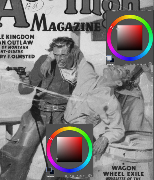
The darks aren't that dark, and the lights aren't all that light! Covers are paintings reproduced on cheap paper. Anything you wouldn't want to happen in the printing process, you lean into. Value wash-outs, lower contrast, colours getting a weird wash to them, really gritty texturing. So let's get painting! Here's my typical setup.
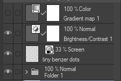
That bottom folder is the painting itself. The screen layer is the grungy paper texture. To get the effect you want, put it down, invert its colour, then set it to screen. That washes out your painting far, far too much, so to compensate, I put a contrast layer up on top. Fiddle around with the settings, but this is where mine ended up sitting.
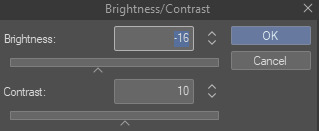
Note I'm saying this before even starting the painting: you want to do this as early as possible. This is where the 'select from layer' colour picker comes in handy. You can paint without worrying about the screen or contrast layer. Something not looking right? Enable your value check layer and keep painting. When you turn it off, it'll still be in colour. Here's a timelapse so you can see what that looks like.
And when you check the values...
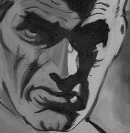
They're pretty simple! This isn't a be all and end all, but I hope it serves as a decent primer. I want thirty dames on my desk by Monday!
#rochedotpng#art tutorial#art resources#couldn't find a thing online about this style so here's how i do it#pulp#it's how i did the death shroud one more or less
354 notes
·
View notes
Note
just found your blog, I think your paintings are absolutely gorgeous! I've been wondering, what draws you to work with oil paints above other mediums? I've found them very tricky to work with in the past and I'm fascinated by the depth and cleanliness you can bring to them
Hello there, thank you for asking! I’m very glad to hear you enjoy my work :) I have many reasons why I must work in oil, allow me to offer you this numbered list. I am very normal about it.
The art which I have grown up loving and aspiring to make was largely made with oil. It is my strong feeling that if you want to recreate an art style, the easiest way to achieve this is to use the same medium in the same way that the original artist made their work in. All mediums have their own idiosyncrasies and it is far more practical to use the same medium than to try to recreate the effect of one medium through another medium. I learned this the hard way trying to achieve the particular look of paint tool SAI, first through drawings coloured with water based paints, then with clip studio paint. It is better to use the same materials that your chosen art movement used if you want to work accurately in the style. I was asked once why I don’t use watercolour. I don’t use watercolour because I can’t make an oil painting out of it.
They are difficult to gain control over. This seems like a point against them, but let me tell you why this is a point in their favour for me. There was a time in my digital illustration career when I hit a very brutal plateau. I was very bored and I strongly disliked working on my commissions. Digital art had ceased to be particularly hard in terms of program handling, but my drawing skills were weak at the time. I decided I needed something properly difficult, and not having had time or space until that point to work in oil, I took it up again. Being so unpracticed and unskilled, it was very punishing, frustrating, and unrewarding, and by the end of my painting practice I would be begging to return to the relative ease of my digital work. Of course, there is only so long that I can engage with a skill before I fall into a bottomless pit of commitment.
Another point regarding difficulty and maybe more importantly, perceived difficulty. I am a highly competitive person, some might say pathologically. And since oil is often seen as the most difficult medium [although I would say, again, it is the easiest thing to make an oil painting out of] there is then less overall competition within the medium than there is in water based mediums for example. I compare this to another scenario, that of horse training. Why would a horse trainer choose to work with feral, unhandled mustangs, when you can work with a nice horse who has been handled and conditioned from foalhood? One reason is to show very high level horsemanship. If you train a mustang then you really know how to train horses. Technical difficulty can be dealt with, it is only a matter of hundreds of hours of work. Oversaturation of a niche, however, is a much more difficult problem, which is also out of my personal control. I’d rather prove myself against one oil painter than three acrylic painters.
On the topic of perceptions, oil is commonly seen as the most valuable type of painting. I’m not saying that’s a fair perception, just that it exists. Often when people think of “good paintings” the paintings they imagine are typically in oil. I’m sure we’ve all seen particularly dynamic fotografs compared to oil paintings. This has two functions for me, one, that I can make these objects of perceived value, which please and entertain. The second function of them is to legitimize myself as an artist in the eyes of the general public. Digital art is a commonly devalued and little known or cared about art form, even though so much incredible contemporary art is of digital mediums. Unless someone is already involved in digital art communities, it can be difficult for them to relate to it or even imagine what it could be, or how it is made, even though it permeates society. Digital art is seen as low art. On the other hand, the first thing that comes to mind for people when they think of art or “Fine Art” is usually oil paintings. There are significant social advantages to being able to say “I am a painter” versus the awkwardness of having to admit “I am a digital illustrator” with all of the confusion and skepticism that brings. Again, I don’t bring this up in order to champion this line of thinking, I am just saying that this perception exists.
On a technical level, there is something about oil. The textures and handling needs of the different pigments and mediums, and the physical feeling of manipulating all of it is something I cannot do without. My teacher who first introduced me to oil compared it as painting with melted butter against the feeling of painting with glue or toothpaste, which he felt about acrylic paint. This is a matter of opinion, but one I agree with. There are tactile sensations which only exist in oil, and the longer drying time allows for much more mixing on the palette. I would be furious if I spent time mixing a colour only for it to dry and become unusable within the hour.
The dangers involved, both to the art in terms of archival quality, and to myself in terms of poisoning or fire, make this medium into something that demands strict attention. Many of my materials can kill if I do not handle them correctly. To me, this immediate danger brings the specter of death from the shadows and defangs him, transforms an unknown terror into a banal familiar matter. These materials might harm me, but instead they help me and they are my dear familiar companions. My duty is just to honour and steward them well and help them fulfill their purpose, which is to please and entertain.
In terms of my recommendation of this medium to others, I would recommend it if you are the kind of person who can withstand slow progress and who wants to earn something hard. Beginnerhood typically lasts a long time with these materials, unless you are a particularly strong painter in other mediums already and have a good teacher. I wouldn’t know because I am the initially unskilled type. A warning for the initially skilled people reading this: there will come a time in your practice when your initial skills are no longer adequate for the task ahead. I suggest you learn how to work hard before you come to this point so it will be less devastating for you. Enjoy the simple struggles of your beginning, even if it may overall be very boring. Lose yourself within it. The milestones of the intermediate stage are much farther apart than those in the beginner’s fight.
With regards to your comment on cleanliness, first I thank you, that is very kind. I allow myself to work slowly and try to control my impulsivity. Speed will come with time and experience, I am content with a slow and measured process for now.
33 notes
·
View notes
Text

So I finally got myself into trying clip studio paint, it was a little hard to learn the program, yet I had my precious time. Thought of Doodling up some death expressions for the start lmao
112 notes
·
View notes
Text
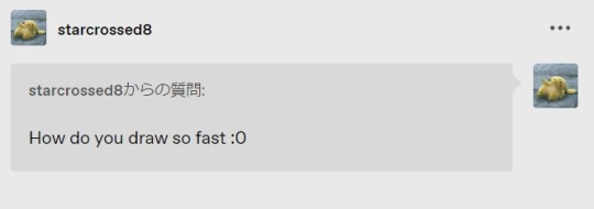
All thanks to Clip Studio Paint's 3D dolls! These dolls have saved me a lot of time and effort in drafting and composing… I can't draw without them anymore🤣
And actually, the more I draw, the more I enjoy improving my drawing, so lately I've been sacrificing sleep and food to draw 🥹 I'll try to take care of myself to the extent that I don't get sick 🤣
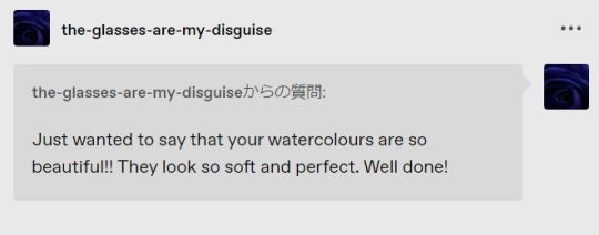
Aww, thanks for those kind words! I started studying recently because I love those gentle colors and gradations that can only be expressed by hand-painted watercolors, and I really enjoy painting them! There are so many things I want to paint in watercolor, so please keep an eye on my training 🥹💞
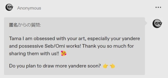
I'm so glad so many people can relate to how attractive the Yandere and possessive Slytherins are 😆💕. And of course I would love to draw more! I'd like to draw some kind of spicy and dark smut, but I've already drawn a Yandere-like smut with this and that, so it's hard to come up with a new story 🤣 But I hope to draw something about them soon 💪
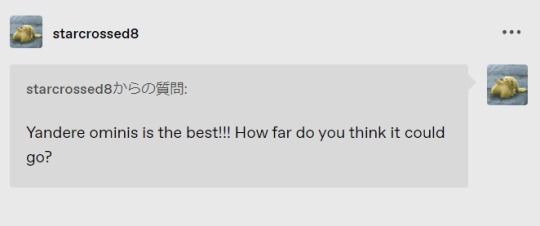
Thank you! I'm not sure I understand what you are saying with my poor English, you mean how much more Yandere and Dark can ominis be?😳✨ In my headcanon, I envision Ominis as a less aggressive, conservative, self-sacrificing Yandere compared to Seb, but when, for example, the Gaunt family tries to harm MC or MC is in danger, I want him to be dark, cunning and aggressive to any extent!🤭🤭🤭 Sorry if I misread your English and gave a misguided answer 😭🙏

Sorry I forgot to reply to your Ask for over two months 😭🙏. And I am very honored to receive your compliments! To be honest, I still find it very difficult to paint and represent these people who lived in Britain and Scotland at the end of the 19th century, but on the other hand, it's very interesting to learn about the western culture of the time! I will continue to draw various Ominis in the future 😆💪✨.
I would like to take this opportunity to say that I think there are a lot of Ask's that I forgot to reply to when I just created this Tumblr account. I was new to Tumblr back then and didn't really understand the Ask 😭 I'm sorry if anyone is disappointed that you took the time to send me an Ask. But I read all the texts I received with full of joy! Thank you so much after all!
90 notes
·
View notes
Note
Hi, I love your art so much. I wanted to ask, how did you get so good at drawing anatomy & posing? Are there any resources that you use for referencing, have you studied anatomy? Any tips on that? Thank you ;_;. Also wanted to express my appreciation: I really admire how kind you are, especially with how generously you share detailed art tips and advice.
hi! first of all thank you so much ❤️ it's funny that you say that because i think anatomy and posing are two of my biggest weaknesses/things i really need to improve on! i am very reliant on using posing dolls like the clip studio paint models and magicposer.
i try to do a bit of studying every day to break myself out of this reliance and build my visual references. croquiscafe used to be a go-to suggestion for figure drawing practice. i can't recommend them anymore but you can still find their resources online, and there's also the Art Models series of books. in addition to more static figure drawing poses i try to study more dynamic poses (photos of figure skaters and volleyball players are personal favorites) and ones from odd angles (jookpubstock has a lot!)
i don't know how helpful my advice will be, though, considering how tremendously much i have to learn! i will say, i think finding ways to improve your art that are fun for you personally are important- i often see more intense books like anatomy for sculptors recommended and i find that it's so hard for me (out of pure lack of spine) to focus on more academic approaches that it ends up as wasted time
thanks again and take care! i'm happy to hear my advice can be helpful, i always worry i have less to say than i'd want :,)
39 notes
·
View notes
Note
Hey, I was wondering if you have a brush recommendation for CSP brushes for Lineart with good line weight? I'm trying to improve the weight of my lines, but I'm having a hard time finding brushes with the flexibility I'm looking for
That's a good question. There are all sorts of ways line weight is used and the right brush is different for each genre and style of drawing, I'd say.
To start: A lot of my lineart brushes are adjusted with slightly LESS brush size dynamics because I always felt like the original default CSP brushes (like the Mapping Pen and G-Pen) gave an unrealistic and uncontrollable amount just based on the their pressure settings.
Some people do use them well for specific styles, so they're not inherently bad. But I definitely think they're not friendly to beginners or people who just wanna pick up a pen and go draw rather than obsess over the precise way they're pushing down on their pen.
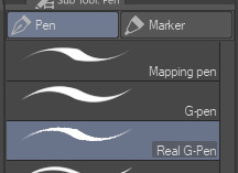
More recent versions of Clip Studio Paint actually came with some new default brushes, including "Real G-Pen", which had pressure settings that felt more right to me. But it's a little noisy so its uses are a bit more specific.
I have a brush set included with EnpitsuP called Superclean Linework. Those are the ones I designed as cleanup brushes for anime-ish looking art. They come in several flavors: Densy, Softie, Smoothy, Sang. I varied them based on how I saw different artists preferred their lines: a bit on the sharp side? Slightly blurry? With a little bit of opacity fade? A little more line variation? Among these, Sang has the largest amount of size response.
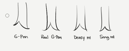
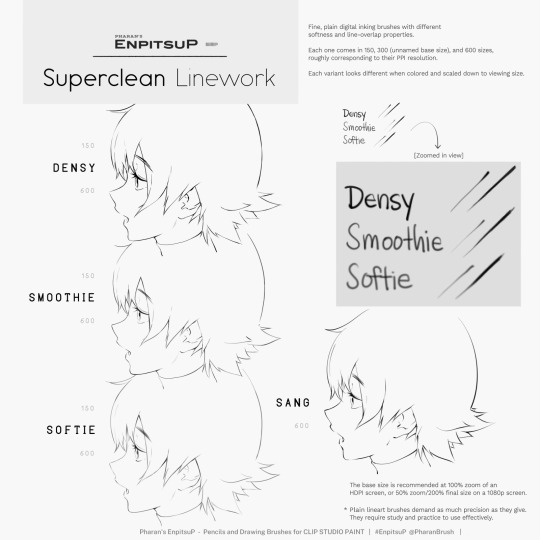
Ultimately, it may be a little bit of both a subjective experience and depend on what your hand/tablet/driver settings/style preferences are like. If you're having trouble finding a brush for this purpose, I think you should hone in on if you're not finding the right brush because every brush seemed too difficult to control, or you can't seem to get results you like, or you can't find one with a feel that matches the physical tool you're used to.
I think it's also worth noting that some artist's styles also rely a lot on them just changing their brush size setting depending on what part they're drawing. So you may end up needing a brush that has less pressure-size variation than you expect. My recommendation is always to look very closely when learning from someone else's linework example. Try to achieve it yourself side-by-side and see where it doesn't quite match up and ask yourself why. Or ask others why.
Of course, there are a bunch of other "lineweighty" brushes too outside of this genre of mostly-thin lineart.

#clip studio#clip studio paint#pharanbrush#clip studio brush#clipstudiopaint#clip studio paint brushes#EnpitsuP#KrupukP#csp brushes
82 notes
·
View notes
Note
Nudges you
Hi I love your work your colours are so. Colourful. It makes my brain tickle in a good way
Okay onto questions!!!!
one: where the hell did you get the references slash ability to draw iron man mech suits. like. if you just doodled that in a meeting??? what????? you didn’t have a reference???????
second question: what brushes do you use?
third question: how you anatomy (good grammar yes)
ok thank you goodbye have a. Lovely day
lkdfghlkdjfhlgkj hey THANK YOU YOU'RE VERY SWEET i did look at him to see what he looked like first, but mark 1's all rectangles and messy bits he's very nice to draw!!! i highly recommend it. clunky little guy
all other iron man suits i learned to draw by simply drawing iron man 1000 times. i learned to draw in general by drawing iron man i love him very much :) but looking up pictures of hot toys figures/those cool model kits of the suits is super helpful for refs! nice clear shots and fun poses.
secret: my art is very easy. here are all of the base colours i use

taken from an old timey comics colouring guide palette thing because i love old timey comics and i hate colouring <3 for skin tones/shading i'm usually adding overlays and fiddling with the colour wheel though
for that iron man, i used the "real g-pen" brush that comes with clip studio paint; for most of my other art i use this little dude that i made!
I colour with the default "milli pen" brush that also comes with CSP, and then the speckle shading stuff is with. the tone scraping thing in the airbrush tool that also comes with CSP......tone scraper my beloved how would i get through the day without it......
anatomy is really hard and i am constantly fighting for my life, glad it's looking successful i will tell you when i figure it out lkdfjhgkj i try to do studies breaking bodies down into shapes but gosh people are just shaped so weird. iron man suits are easier. let's just draw iron man suits
have a lovely day!! 💛❤️
#i use like 3 tools i am very tired i make things easy for myself :)#how did i draw him: gazed at him lovingly while my boss was talking until he was scanned into my mind & then drew him :)
27 notes
·
View notes
Note
Hey weird question but what’s your recommend pen pressure for clip studio??? I had the program for a while and enjoying but I can’t seem to get the pressure to feel right
ouu this really will depend on you, some people require different amounts of tension / pressure in their pen grip to feel "right". It also depends on your tablet, some tablets come with a wider range of pressure output - right now the standard across the board seems to be 8192 levels of pressure sensitivity, but other models can come with less and that can limit your range in what's possible (I remember the days when 2048 levels was mind-blowing LMAO and now I'm learning that 8192 is the new norm ?? wild). That said, levels of pressure sensitivity are kind of like resolution differences in TV's - there comes a point where you can't even feasibly see the difference anymore so a higher number in pressure sensitivity isn't necessarily going to make any sort of significant difference for you.
Ultimately what I will suggest is to pick a pen pressure that lightens the burden on your wrist and tablet, you shouldn't have to be digging the pen hard into the surface of the tablet to get lines at their full size. If you find yourself doing that, you should try and lighten the curve of pressure sensitivity in your settings, your tablet surface and joints will thank you.
It should also be noted that you can change both global and brush-specific pen pressure settings. So while I have a general global pen pressure setting that applies to the entire program, some brushes I apply lower - or higher - minimum size values depending on the purpose of the brush. Lining pens for detailed work I'll typically have lower minimum values, whereas large painting brushes I'll keep at a static pressure size because they don't need to get too small for detail and are best expressed with sweeping motions that can be achieved with just a few levels of pressure. And some brushes I just have pressure sensitivity turned off entirely because they're meant to be the same uniform shape throughout!
You should also check your pen tablet's specific pen pressure settings as well. IDK what brand of tablet you're using but they usually require drivers to work and if you start those driver hubs you can find pressure sensitivity settings to apply not just to Clip Studio, but across all software.
I'll share with you my settings if you want to try them, but again, you'll have to adjust them to your needs as what I find comfortable isn't necessarily going to be comfortable for you.
Huion Tablet pen pressure settings:

(I have these set to a linear default, it just means that any customizing I do is exclusive to the program I work in, makes things less complicated for me)
Clip Studio Global pen pressure settings:

You can find this option under File > Pen Pressure Settings; it's where you can adjust the global pen pressure to apply to the entire program regardless of what brush you're using. What's nice about this is that you can actually draw while this is active and it will adjust your settings accordingly to match your technique!
Here's a lil' video demonstrating it:
And of course, just note that regardless of whether you're changing global settings or specific brushes - a higher curve means less pressure is required to achieve the targeted brush size, a lower curve means more pressure is required to achieve the targeted brush size. So if you have a brush set to a size of 15, a higher curve means you won't need as much pressure to get to that size, whereas a lower curve will require more (but that means you can achieve a wider range of smaller sizes leading up to size 15 with a lower curve). Where those curves fall on the graph determines that curve of pressure - if a high curve is immediate, then the range of pressure is very very low; if a curve starts off low but gradually builds up to and ends in a high curve, you'll have to travel that curve of pressure through your technique to achieve that highest point, meaning wider range of size expression, but not necessarily beneficial if you don't need that wide range and want to be able to get from small to big quickly and without much pressure needed.
Specific brush pen pressure settings:


So what's basically happening here is that some brushes have more unique pressure settings tailored to that specific brush (such as the DAUB Basiliscus brush which, iirc, came packaged with those pressure settings, meaning it has unique properties that don't specifically adhere to the global pressure settings I showed above); whereas other brushes have the pen pressure turned off entirely either to prevent it from having dynamic lines, OR to allow it to be manipulated through other pressure settings like tilt/thickness/opacity rather than size.
All of this is why my specific tablet driver has a default linear path for its pen pressure, so that I can alter the necessities of my brushes and software as needed. By default, I don't like having to put too much pressure on my pen to achieve the targeted size value, so my general settings curve in CSP looks like this:

Which means I can achieve that maximum value without too much pressure; if that upper curve was further away from the start point, I would need to apply more pressure to hit it.
Whereas if I need a specific brush to achieve a wide range of pressure expression through a slowly-building curve, then I'll edit those brushes settings to do so! (the DAUB Basiliscus brush seen above is, again, a good example of this, because its pressure curve is the complete OPPOSITE of my global pen pressure settings.)
And if anyone's still struggling to grasp the concept of the pen pressure graph, I think the best way I can compare it is to something like volume, or even video editing fade-outs or animation frame timing. It's all in the timing, if something gets bigger faster you don't get a chance to see what came between point zero and point 100. Here's a visualization with examples in terms of music that is fundamentally the same in how pen pressure operates:

I hope that all makes sense and helps! I probably went into way more detail than necessary but I figure if I'm answering the question anyways, may as well go into more detail for those who might also benefit from this! Especially when it involves graphs LMAO (I'm awful at math but graphs are my jam hahaha)
31 notes
·
View notes
Text
Been Learning to Paint Old Cel Animation Backgrounds
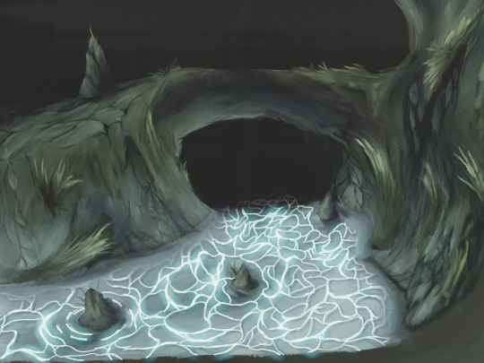
Lately, I've had the drive to learn and practice creating digital paintings that closely resemble the traditional background paintings found in older anime. As a first step, I decided to grab a Kingsfield 4 screenshot from @moonlightfaust and use it as a reference.

I honestly ended up kinda surprised at how good I think it turned out. I haven't really tried painting a background before, and I think this is a very good first step for where I wanna be.
How I do it
Firstly, I loaded up my reference on my second monitor and started painting away in clip studio paint. I sketched things out at first and then used the default gouache brush for the broad strokes. I made sure to use a nice variation of colors and values on the surfaces to give them texture. After that I blended stuff together using a custom blend brush I grabbed called "wet betty", and then I used the thin gouache brush to work on smaller details. I drew out the caustics and then painted some blue lighting on the walls on a layer set to additive (glow). Here are some wip photos showing all that off.
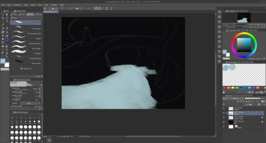
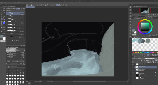
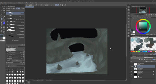


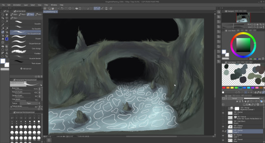
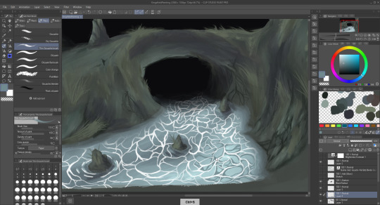
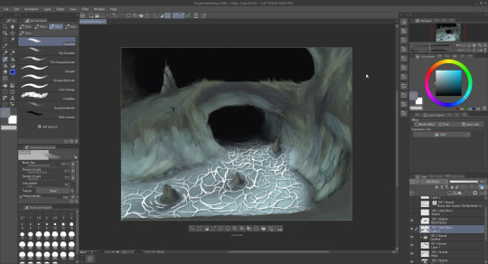
After creating the base drawing, I brought it into Affinity Photo and adjusted the brightness/contrast and added a softproof adjustment layer to make it look as though it was printed. I also used a white mask of the caustics in order to make those parts of the image transparent.
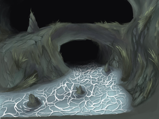
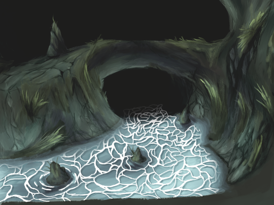
After that, I brought the image into blender in order to simulate the cel animation look.

I'm using a variation of @jam2go's under-lighting method here in order to get that nice, naturalish glow. I'm using a special compositing setup in order to simulate the little variations in light and lens artifacts you might get from capturing cels that gets processed onto the final render.
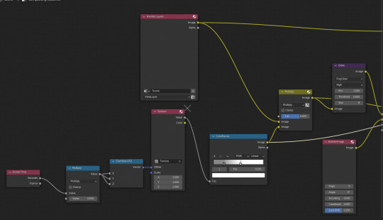

I've also given the image cel plane very subtle bumpiness in order to simulate real celluloid not being completely flat. (It's a little hard to see, but I just subdivided it and used a displacement modifier)
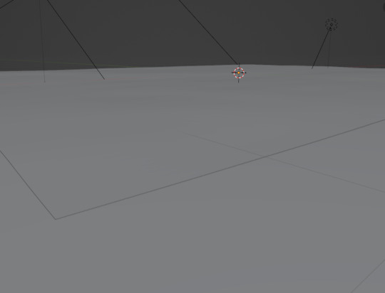
The light artifacts and the cell bumpiness are both animated, and I also added very subtle noise to the position of the cell to simulate how each frame in cel animation isn't placed in exactly the same spot. After rendering, it all comes together to simulate a cel animation look fairly nicely I think.
Anyway back 2 gamedev now
#painting#gouache#digital painting#digital artist#cel animation#anime background#anime scenery#blender#blender 2d#jam2go#moonlightfaust#kings field
54 notes
·
View notes
Note
Hi! I hope you're doing well, you have no idea how relieving it is to hear someone assuring that there's always time to improve and that there's no need to become a twenty something prodigy, although I think your art is literally amazing. I just wanted to ask whether you would be willing to share more about your personal and professional art journey from someone who is currently going to art school and losing their mind lol
So I watched my older cousin go thru art school... And decided it was not for me haha. Bless you and I wish you all the success. But I do not do well in a structured art sphere. I have a hard time with consistency and deadline meeting so it's been a slog for me to make a business out of this.
But I've only taken a few art classes and the rest of it has been an organic sorta process of improvement that I've taken at my own pace. A lot of my journey has been looking at stuff other people do and going "ooo I like that. What do I like about that? How could I incorporate that in my stuff?"
I turned to digital art but immediately got overwhelmed by the programs available to learn at the time. Photoshop and clip studio both intimidated me and I ended up going with paint tool SAI because of its simplicity. Eventually procreate and the iPad proved to be even simpler and more intuitive. So I've stuck with that!
But I started really REALLY trying to actively improve back in 2014. That was ten years ago babe! Finding what works, dealing with life, and then practicing all day every day makes the time fly. It's okay if it doesn't happen right now. Even if it does for other people, they have their own roads and will have just as many peaks and valleys as you. You're doing just fine, and it's all gonna be okay 🥹
44 notes
·
View notes