#Clairefontaine paper
Explore tagged Tumblr posts
Text
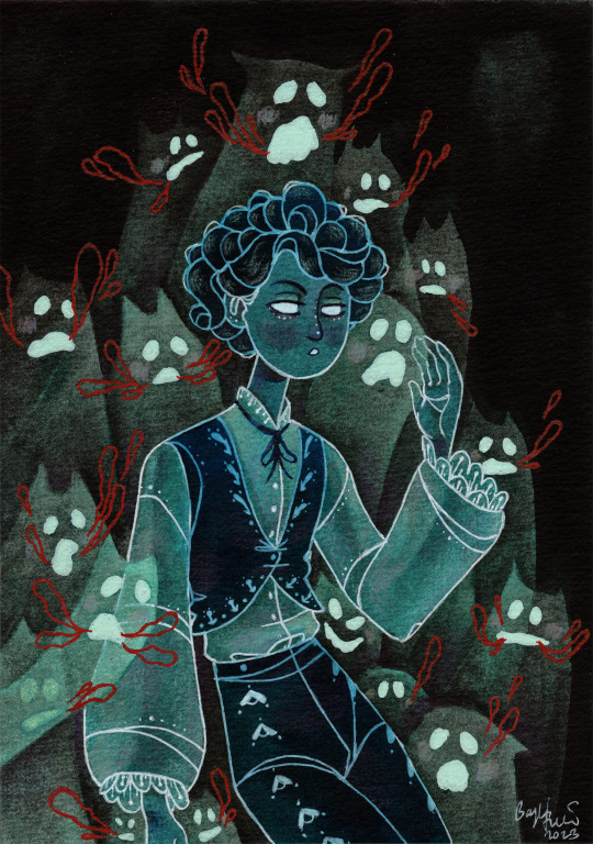
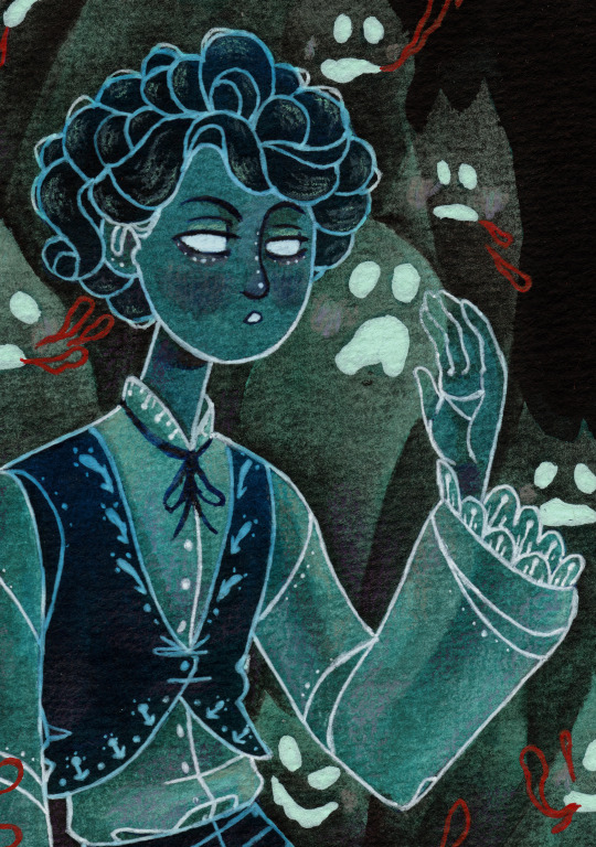

👻 GhostBon 👻 Watercolor, anilinky, ink with white gel pen and colored pencils on watercolor paper.
Small process image under the cut

#myart#traditional art#boni#folktale#ghost#spoopy#cat ghosts#folk costume#total random tho#anilinky#watercolor#dark fairytale#dark art#white gel pen#originally i wanted to draw a random dude but my hand slipped#oops#red gel pen#curly hair#clairefontaine#tbh this paper is not the best#oc#speech bubbles#illustration#whatevs#who knows how tagging works anymore.
237 notes
·
View notes
Text
attention stationery lovers: rhodia spiral grid notebooks + uniball jetstream pen
2 notes
·
View notes
Text
Nota Bene Papeterie. Clairefontaine notebooks, Pilot inks (Iroshizuku Kon-Peki and Pilot Blue-black).

6 notes
·
View notes
Text
I bought a new plannerrrrr
My last one still has quite a few blank pages so I could have kept it for a while longer, but I've had it for a whole year and I think I need a refresh, so: 💸💸💸
#it's the a5 rhodia goalbook dotted#my last one was a quo vadis life journal dots and the paper should be the same (clairefontaine)#i always wait at least a year (usually more) before i buy a new one so i allow myself to spend more for nicer paper#in any other case i'd just buy the 5€ bullet journals from flying tiger lol
1 note
·
View note
Text
that post about how reaching your 30s is nice because you've gotten to Know Yourself~ and what you Like~ by this point but it's just about having developed embarrassingly specific stationary preferences
#80 or 90g/m2 weight 5mm x 5mm grid Clairefontaine/Rhodia paper and a black Pilot Hi-Tecpoint V5 or Bic Cristal large#a4 for drafting/rough work#a5 for day-to-day notes/lists#btw#if you even care
6 notes
·
View notes
Note
Hi, which sketchbooks do you use? Thanks
actually just posted a sketchbook tour video where I go over my sketchbooks a bit !
youtube
I used Pink Pig ones for a while (UK company) cause their sketchbooks are cheap, have pretty covers, and their papers have dealt with almost everything I've thrown at them.
Recently though I've been trying out some different ones, like 'Clairefontaine Goldline travel journals' cause I wanted to try a square sketchbook without ringbinding and this one also dealt with mixed media well. There's lotsa fancy sketchbooks I wanna try like Stillman & Birn and Pith, but at the end of the day I'm very cheap n I don't wanna be too scared to draw in an expensive sketchbook lmao
104 notes
·
View notes
Text
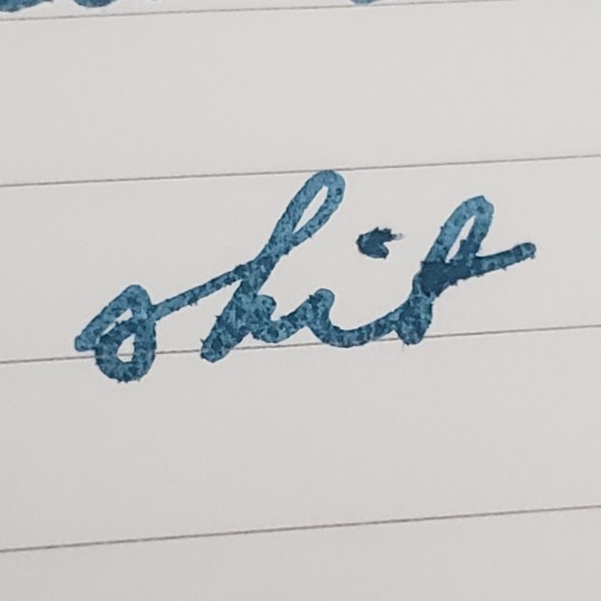
Still overpriced and still takes FP inks like typing paper huh
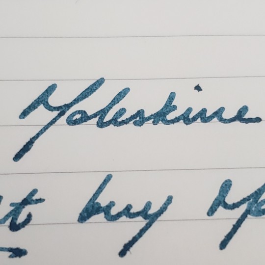
Reminder that Moleskines are overpriced trash (at least in the US) and I don't know why I thought maybe this time it would be different lol
88 notes
·
View notes
Text
FTH Fanbinding: "Kaleidoscope" by Silvergirl
Whew. This was quite the undertaking as I’d felt ambitious. @totallysilvergirl was the winner of my FTH fanbinding auction and chose one of her own fics, from a fandom I’m actually in (Sherlock). I’d skimmed her AO3 to see what fics might be her potential choice and had immediately zeroed in on “Kaleidoscope”. The title was evocative and the plot sounded intriguing, being a fix-it for the end of Season 3. Good-sized wordcount, too.
I was super happy when she actually chose this fic!
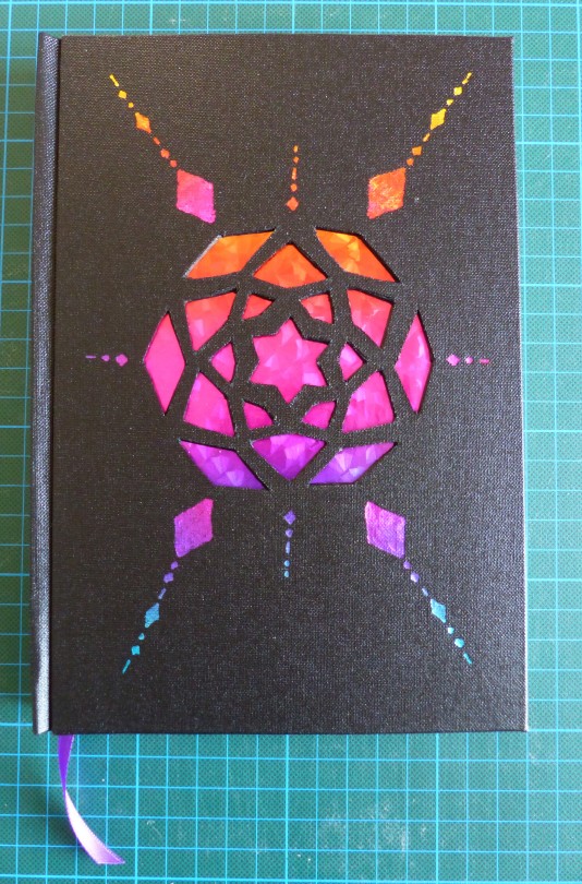
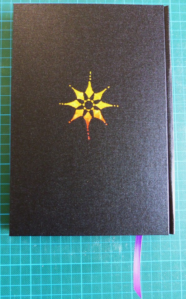
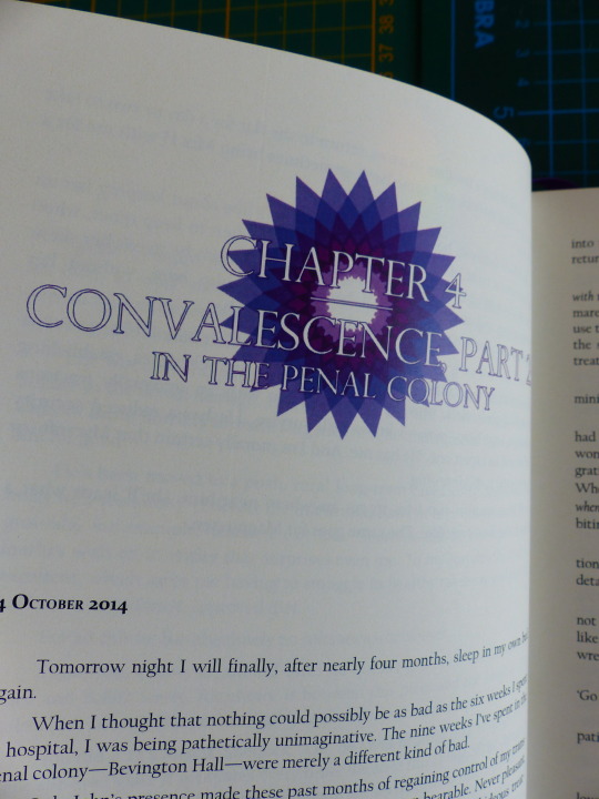
The typesetting took me a long time and I leaned very heavily into the whole kaleidoscope theme. I also decided to use different colours and fonts for the different PoVs.

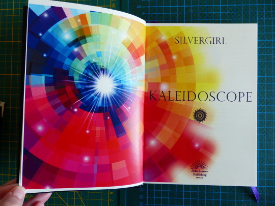
This was also the first time I tried out a title page spreading over both pages – usually, I’ve only used the right page and the left one stayed blank, but I wanted to try spreading out the picture this time. It worked quite well, overall.
For endpapers, I chose this lovely purple Chiyogami paper. Purple has become Sherlock’s colour, in a way, and so it seemed quite fitting. I strengthened the crease with Schirting again.
Also, because the book had 8 signatures, I think, I sewed with tapes to make the spine more secure. It was the second time trying this and it worked really well!

Now to the case. Oh boy. XD
I had to think a bit about the cut-out design. I wanted it to yet again resemble a kaleidoscope, but it took me a while to wrap my head around how best to do it. I finally decided to make a stencil for the centrepiece and add some more elements without cut-outs.
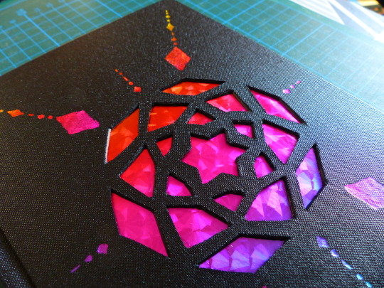
I decided on the lovely shattered glass rainbow foil and am super in love with the effect, especially on the spine! I think it looks so cool!

I not only made SilverGirl’s copy but also one for myself. They’re very similar, just the endpapers and the foil on the cover are different.
I messed up on the spine title on my copy a bit. The fight with the foil is real. *sigh* But it’s not too bad.
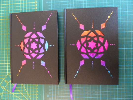
A huge thank you again to Silvergirl for participating in FTH this year and for putting her trust in me!
Materials used:
Printed on Clairefontaine DCP 100g
Case + endpapers:
- English Buckram linen
- Chiyogami paper 60g (endpapers)
- hot foil (Decofoil)
The fic in question (go check it out, it's really great!):
#my fanbinding#fanbinding#arts and crafts#bookbinding#fth#fandom trumps hate#fth crafts bazaar#books#sherlock#my posts
203 notes
·
View notes
Text
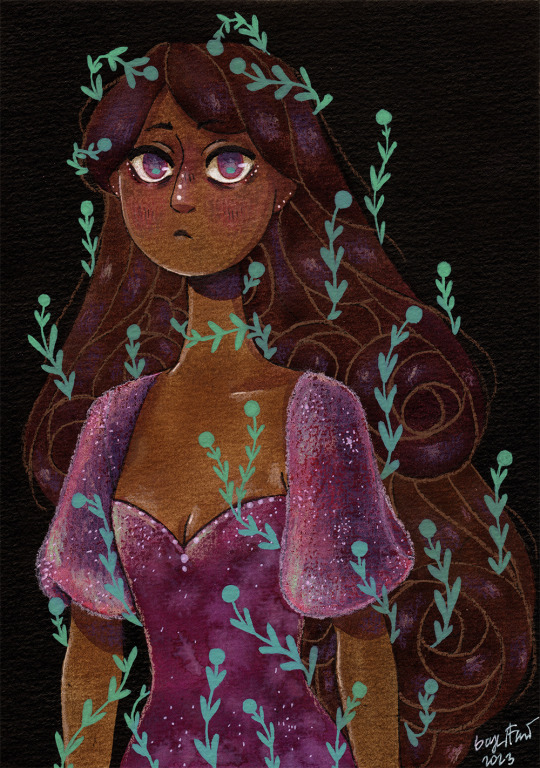
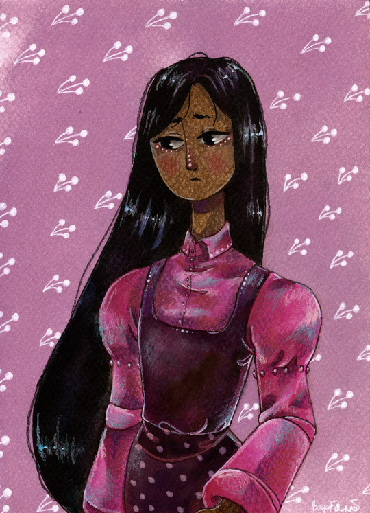
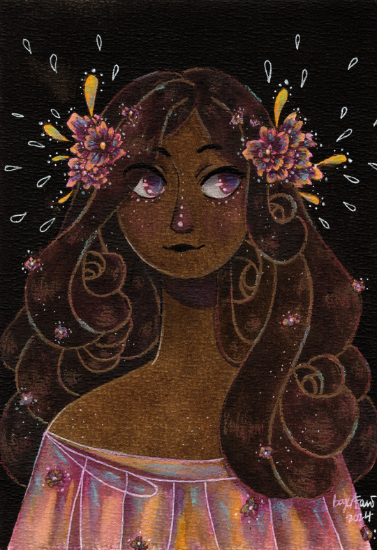
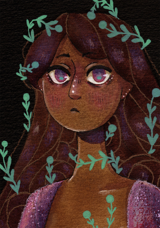
🌸 Pink lady 1-2-3 🌸 Drawings I made while testing new watercolor papers. The results are not the best. These papers don't really let you wash together colors, which is weird for watercolor papers. They just suck all the water in and don't let you do anything with it :') I feel sorry for these ladies, they could have been much better...now I have a bunch of papers I don't know what to do with :I (the papers are btw: Clairefontaine Aquarelle Etival, Drasca Watercolour Pad, SM LT Art Start Pad)
Close ups under the cut-


#myart#traditional art#pink lady#watercolor#ink#ecoline#watercolor pencil#pink#pink dress#pink flowers#pink eyes#half body#plants#ivy#i will redraw them someday...they deserve justice#clairfontaine#sm lt#drasca#like howdo you use these papers properly#i mainly use canson.fabriano and hahnemüle and those are perfect for my painting style#but not hte cheapest#so i tried to look for other papers#not much luck so far
151 notes
·
View notes
Text
Stages of a Castiel...


...and the finished Cas!

I used pastel pencils and charcoal to draw the Cas, and the paper is a pink 24x32cm Clairefontaine ingres (ridgy texture). The pink doesn't look pink unless you edit it, though, which is why it looks different colours - I don't edit my progress shots.
I'm pretty pleased with the finished picture. I could have kept fiddling with it and maybe improved or maybe messed it up completely - I think art's always like that! Anyway, if you would like to buy this pretty Cas, please message me. I could even zoom him into the post if you're going to the Liverpool Comic Con this weekend and you want something for Misha to sign!
308 notes
·
View notes
Text
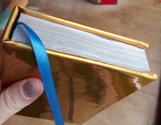
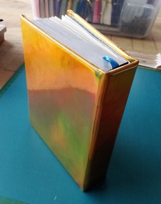
Goldsickness collection
So I bound a collection of goldsickness-centered fics and I'm pretty happy with how it turned out. This post is about the binding, and I'll do the fic recs in another post so they can be found separately later, but I'll still say a huge THANK YOU to the authors here for writing these and replying when I reached out!

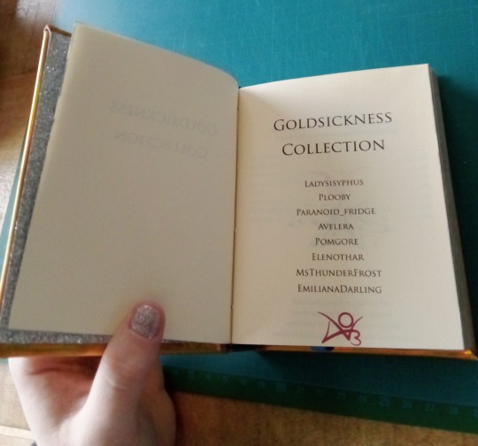
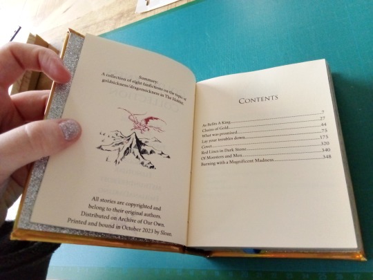

A list of the fics:
As Befits a King by @ladysisyphus
Chains of Gold by Plooby
What was promised by @stillparanoidnolongerafridge
Lay your troubles down by @avelera
Covet by @pomgore
Red Lines in Dark Stone by @elenothar
Of Monsters and Men by MsThunderFrost
Burning with a magnificent madness by EmilianaDarling
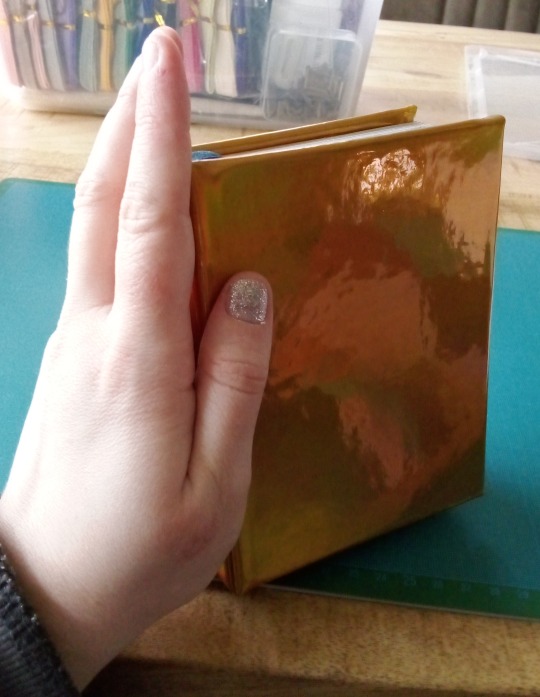
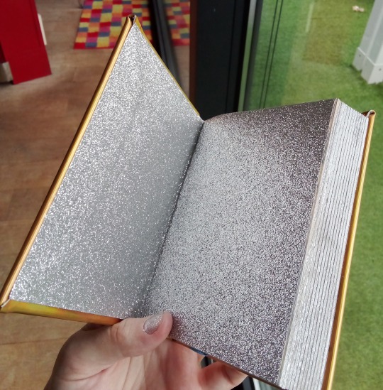
My intention with this binding was to make a book that could look like a jewel in Thrór's treasure hoard. I wanted it to evoke opulence, so it's voluntarily very busy for the eye. The fabric is holographic golden pleather (which is so hard to take a picture of, the book actually looks darker and truly gold, but the camera shows reflections from every angle), it looks like it's shifting in the light (and it gives me a headache if I stare at it too long, but I want to stare at it, which echoes the gold getting to Thorin's head nicely). The endpapers are sparkly like silver and diamond dust, and I gilded the edges for the first time. Notice the black headbands and blue ribbon as a callback to Thorin's hair and eyes.
This fantastic fanart and its colors were part of my inspiration.
Mistakes What I learned this time
The book has flaws, of course. The main problem is that I did a straight spine instead of a round one as I usally do: I misjudged the size difference between the text block and the cover, it should have been bigger because of the added thickness of the spine. I used a fabric that's very thick and unwieldy and not made for bookbinding, so I have big prominent corners. And since this is the first time I use a guillotine, I need to loose some habits I had when typesetting to get my margins to look good without cutting. This time, I actually could cut, and it was too tight. The acrylic paint gilding isn't great either.
But!
It's fine. It's a small book, but all the text I wanted to preserve is there, it's beautiful to me, and I'm very proud!
Materials:
Holographic pleather, 30x20 cm, amazon
Clairefontaine A4 paper, ivory color, 80g/m², bought in store
Acrylic paint Créalia, "matt silver pearl", cultura
Gray cardboard, 2mm thick, apg reliure
Ribbon, 6mm, amazon
Headband, amazon
117 notes
·
View notes
Text

Smaug - by Jenny Dolfen
“Smaug lay, with wings folded like an immeasurable bat, turned partly on one side, so that the hobbit could see his underparts and his long pale belly crusted with gems and fragments of gold from his long lying on his costly bed.”
Watercolour & gold leaf on Clairefontaine Etival cold-pressed paper, 29×40 cm.
#tolkien legendarium#jrr tolkien#middle earth#the hobbit#j.r.r. tolkien#smaug#smaug the dragon#desolation of smaug#erebor#the lonely mountain#dragons of middle earth#dragon#lake town#dwarf kingdom
18 notes
·
View notes
Text
Fruit Omens: Pair the Marvellous
Azirapear aka Mr. Pair aka Pair the Marvellous is performing tonight at the Windmill Theatre!
Confused? Maybe you missed my Fruit Omens intro post!


✨Featuring✨
Troglodytes troglodytes aka the Eurasian wren aka the bird on all farthings minted after 1937.


Reference images
Various screencaps and whatnot as an overall study of what Aziraphale wears in the show, plus...

Source: S2E4 > X-Ray > Bonus Content > Photos

Source: ebird.org/species/winwre4

Source: gbclassiccoins.co.uk/shop/farthings/1941-george-vi-bronze-farthing
Materials
Paper: Clairefontaine (Layout Double-Face)
Pen: Pilot (G-Tec-C4)
Markers: Copic Sketch (YR30, Y11, Y15, YR18, R00, R24, T6, 110, E42, E23, E27, YG91, B000, B95, BG72, BG49)
Pencils: Caran d'Ache Luminance (801)
#my art#fruit omens#azirapear#pair the marvellous#good omens au#good omens#good omens art#good omens fanart#aziraphale#mr a. z. fell#fell the marvelous#magician aziraphale#1941 aziraphale#1941 is everything#1941 minisode#good omens 1941
18 notes
·
View notes
Text

💉"Trafalgar D. Water Law, One Piece"
(15×21)
Watercolor on cold pressed paper.
Clairefontaine Aquapad paper.
Winsor & Newton Cotman watercolor.💉
#art#traditional art#anime#manga#one piece#trafalgar d water law#one piece trafalgar law#trafalgar law#heart pirates#vitiligo#law one piece#surgeon of death#watercolourpainting#watercolor
78 notes
·
View notes
Note
not a meme question, but do you have a favorite pen? i don't know anything about them but you seem to, lol
I do, but my answer will differ depending on if you're asking my personal favourite pen or if you want advice as someone who doesn't use FPs as to what a good way to try one out is, anon! (sorry you just ACTIVATED MY TRAP CARD)
I currently have six fountain pens, five of which are 'starter'/budget pens and one of which is a mid-range 'enthusiast' pen. My favourite I own is the latter. It's my Nahvalur Original, which I own in the Spring colour, and which cost me around £45. It's a pen designed to exclusively take bottled ink with a fancy filling mechanism, instead of ink cartridges. It's not high end by the standards of fountain pens, per se, but it's solidly in the 'enthusiast' realm. (My Dad, who once owned an FP because he needed something that looked good while signing Important Work Documents, did a double take when I told him how much it was, lmao. He did not ever spend that much on one pen.) It is a hefty, lovely thing with great build quality which I can use with fancy ink and feels great to write with. Nice nib, great quality, looks awesome.
But if you have never used a fountain pen, and want to try it, you do not need to spend over £20 or your local equivalent, fwiw. Many cheap fountain pens suck, but equally, many people who have spent thirty years collecting them who own pens worth hundreds will happily tell you, many cheap fountain pens are excellent, and noone needs to spend much to get an industry-gold-standard one. My second favourite pen is my Pilot Kakuno, which is aimed mostly at schoolkids in Japan where Pilot are based, can be bought for under twenty pounds shipped in the UK, similar prices in most of the world, and writes better than multiple 'adult' pens I own. Because Pilot has incredible high quality pen nibs and the Japanese FP market is competitive. You could easily buy just a Kakuno and be set forever with a pen that is extremely good quality! And there's other similarly great options too; there's a whole section of the market that is just 'good pens for newbies'. The Lamy Safari is a very famous option from a western (german) brand, for example. (Also have one of those, it's good.)
If you want to try fancy fountain pen inks with special qualities like sparkle or sheen, you'll probably need to put down a little extra money for a converter- basically a refillable cartridge that refills from a little ink bottle, instead of the disposable ones most stationary shops sell. But you don't need that if you're happy with the normal ink cartridges. All cheap fountain pens accept cartridges, though the better brands do tend to require you buy their cartridges, unfortunately.
And if you REALLY don't want to risk it: buy a Platinum Preppy. Platinum are a very well regarded brand, they use the same nibs in their entry level pens as they do their £30 ones, just with cheaper gel pen like bodies- and they are like. £5. Comes with a cartridge. Writes great, I own one. Again, a Japanese brand aimed squarely at schoolkids, very cheap but genuinely good to write with.
(The one thing for fountain pens I would say is, do spend the extra little bit on a cheap notebook with fountain pen friendly paper. Same as with e.g. paints, good paper is more important than the pen a lot of the time. The worst fountain pen in the world on good paper is better than a £500 pen on shit paper. Here is a guide; I use Clairefontaine.)
anyway sorry maybe you didn't want all of that. but if you think fountain pens sound Interesting and are curious, i'd encourage you to try one, but buy cheap. many cheap pens rule. and fountain pens are great- they are better than almost every other kind of pen for doing longform writing, because they don't cause wrist strain when doing it for long periods. i would definitely recommend a fountain pen over other kinds if you want to use it to write for long periods, no matter what pen you get, tbh!
10 notes
·
View notes
