#clairfontaine
Explore tagged Tumblr posts
Text
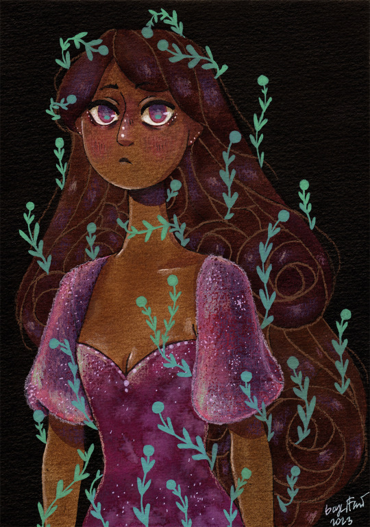
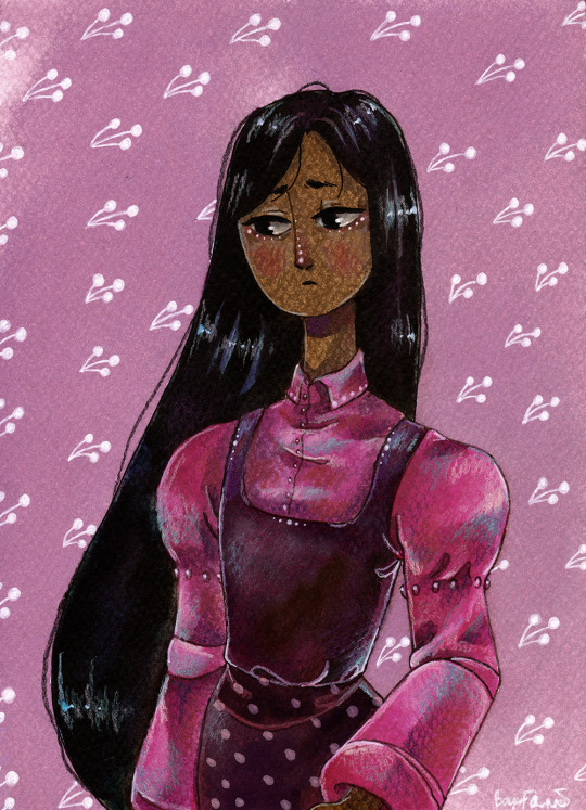
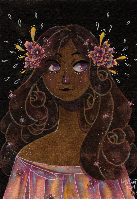
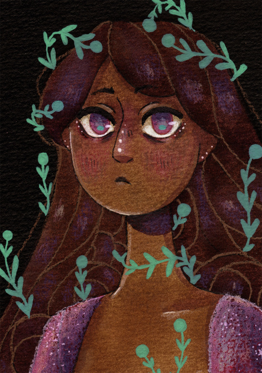
🌸 Pink lady 1-2-3 🌸 Drawings I made while testing new watercolor papers. The results are not the best. These papers don't really let you wash together colors, which is weird for watercolor papers. They just suck all the water in and don't let you do anything with it :') I feel sorry for these ladies, they could have been much better...now I have a bunch of papers I don't know what to do with :I (the papers are btw: Clairefontaine Aquarelle Etival, Drasca Watercolour Pad, SM LT Art Start Pad)
Close ups under the cut-


#myart#traditional art#pink lady#watercolor#ink#ecoline#watercolor pencil#pink#pink dress#pink flowers#pink eyes#half body#plants#ivy#i will redraw them someday...they deserve justice#clairfontaine#sm lt#drasca#like howdo you use these papers properly#i mainly use canson.fabriano and hahnemüle and those are perfect for my painting style#but not hte cheapest#so i tried to look for other papers#not much luck so far
173 notes
·
View notes
Text

Railway station of Clairfontaine, Picardy region of France
French vintage postcard
#railway#station#photo#france#ansichtskarte#postal#postkaart#sepia#french#clairfontaine#tarjeta#ephemera#photography#carte postale#historic#picardy#briefkaart#postcard#vintage#region#postkarte
4 notes
·
View notes
Text
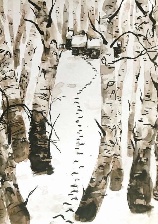

sketchbook review | clairefontaine mix media
expectations:
smooth, at least compared to my other sketchpads (whatever cheap stuff i find & my favorite czech paper, design of art)
white, not the typical yellowish tint
can take watercolor without curling up on itself like a scared isopod (250g/m2), color somewhat liftable
pen-friendly
markers don't bleed through instantly
reality:
relatively smooth, random soft texture, very white
takes watercolor well, minimal warping (not taped) after moderate water usage
cheap pen nib doesn't get stuck on texture, doesn't collect fibers. had to actually try to get nastier lines
markers not yet tested
it cost me like 3 czk ($0.13) per page on sale, ~3.8 czk ($0.16) pp normally!
🗒️✏️
conclusion: no rating yet, needs more techniques to appreciate&assess this "multi-techniques" paper; honestly i just want to show you this thing 🍂❄️
study of a piece by wang yuyuan:

it is probably just (diluted) (sepia) ink; i used watercolor (umber, mars brown) & black drawing ink; added more texture by lifting watercolor with crumpled tissue & wet some of the ink
#sketchbook review#pen and ink#watercolor#traditional art#trees#birch#winter#snow#winter forest#sketchbook#clairfontaine#gift art#searching for the original piece was not fun#reverse searching a pinterest upload#finding exactly one source attributing it to this artist#wang yuyuan
3 notes
·
View notes
Text

3 notes
·
View notes
Note
A mutual acquaintance wants to try getting one of those fancy pens, got any suggestions for newcomers?
Absolutely!
Despite me always pining for the super pricy fancy pens, some of the best pens you can own imo are less than $20 USD off the bat, and while the "nicer" ones out there are. over that price, you don't really need that to get a really good first experience. I'll offer some super easy pens, some more intermediate pens, and some inks! This is going to be a long ride, so buckle up!
If you don't know where to start and are intimidated by bottled ink and instead want a pen that can write right away, I recommend the Pilot Varsity! You can get them at Michaels here in the US, and theyre slowly becoming more popular in retail shops like Walmart.
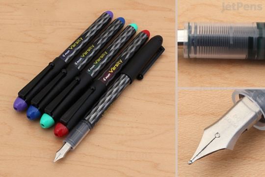
Classic steel nib, not much flex because it's steel, but it writes pretty sturdily. I really like that it comes in different colors. They're disposable, so if you don't like them then you dont gotta keep 'em, and if you bust the nib by accident (we all have at least once), you aren't going to have to sell a kidney to replace it like you might need to with pricier pens.
If you want a pen you can put ink cartridges into, or just want a good workhorse of a pen, i HIGHLY recommend the Platinum Preppy. The one I own was $14 USD and came with a cartridge of water soluble black ink. For $4 USD, I got 4 cartridges of Platinum's Carbon Black ink, which is waterproof and smooth! Very versatile!
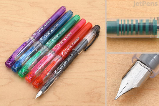
I REALLY like this one. Ive never had the ink dry out even when i had tucked away for like a month, and if you ever want to use it with bottled ink, you can get a Platinum converter and use whatever fountain pen safe ink you dream of :] This pen only comes in F as far as I know (which is a western EF), but the chinese market has a version called the Platinum Meteor that comes in EF and has a cute shooting star on the nib :] Back when I started writing this I had lost mine for like a month but just found it and it wrote just fine the second i opened it up. The only thing I DISLIKE is that the converter cartridges are sold separately and you HAVE to buy platinum brand for this pen. I already have two bc of my other platinum pens, but. Yanno. Its still annoying to HAVE to do that.
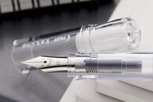
Similarly, the Kaküno is fantastic! all the above statements, but it has the added benefit of having a cute face on the nib as well as some cute collabs sometimes :] They're also about $14-$16 USD. They take Pilot cartridges in various colors, which are $3-$4 USD and Pilot converters.
I highly recommend the platinum preppy for the full fountain pen experience! It's not mega-expensive as pens go, so if you dont like it you havent sunk hundreds of dollars into a tool.
Lamy is having quality control issues that no one seems to want to contest because of their popularity, and the recent "no bro its totally the same color as the old popular one trust me" ink fiasco. TWSBI is another brand thats normally recommended and while theyre good pens, theyre shitheads as a company and like to use their muscle to bully both retailers and also smaller pen companies. I dont recommend either brand right now.
NOW, ONTO INK AND PAPER:
Your nib, paper, and ink are pretty important. fountain pens dont like rough paper, but they handle it better the larger they are (M, B). Dry inks will not always play nice in fine pens (Ef, F), and an EF pen will eat the shit out of rough paper and can get clogged. If you can get your hands on Rhodia paper to practice, good! If not most sketchbooks will tolerate F pens in my experience. Stillman and Birn are my workhorse sketchbooks and the pens work fine in all of their paper styles, but Hobby Lobby's sketchbooks also handle it well, as do BLICK's colorful leather sketchbooks. Don't Buy Moleskine. If you want to get really good ink effects (ie, you bought an ink with glitter or it has some cool effect like sheening or shading), tomoe river paper is hailed as the gold standard, but you can get similar effects on Rhodia or Clairfontaine paper, which afaik is easier to get ahold of overseas (cant speak for other countries on the US continent, but I will say I saw more clairfontaine in france than here on the us).
NOW FOR INK. my favorite part :] :
For both Waterproof and Black ink, i recommend Platinum's Carbon Black. I think it's pigment-based, unlike most dye-based inks, so it can be tough to clean out of your pen if it dries, but its noting a lil soap and water cant fix :3 It's benefit is that it comes in cartridges usable with platinum pens, so you dont need a whole bottle if you dont want one.
For color inks, I really like Pilot's Iroshizuku line. It is a WET ink and is not waterproof, but they come in cool bottles and pretty colors. I own Ajisai, Shinkai, and samples of Momiji, Murasaki Shikibu, Chikurin, Kosumosu, and Asagao. I use them both to sketch AND to color things and write. My workhorse non-waterproof color, the one i draw most in, is the Sailor Studio 343, but the sailor manyo line is also great! If you like and/or miss scented inks, De Atramentis has a line of them!
Be careful with inks that have glitter. I own the J. Herbin Emerald of Chivor and its glorious but if you leave it in your pen...thousands soaks hell attack. That being said if it would entice you, treat yourself to a fun and shiny ink! I have Colorverse Scorpii Glistening and its really pretty! Diamine has an excellent range that are easier on your pen but I dont have experience with them ngl.
UNDER NO CIRCUMSTANCE SHOULD YOU BUY ANYTHING FROM NOODLERS. aside from having a shithead of a company leader, their inks are actually pretty volatile and can blow up both vintage and modern pens and im speaking from experience even though I used to use their eel bulletproof black and a waterproof blue one. I ended up using the blue ink to dye a cu chulainn wig darker for a wip alter cu cosplay. the last ink i bought, Tchaikovsky, also had a strange and suspicious stank about it.
Buying inks in bottles can be super expensive, but Goulet Pens sells 2ml samples that you can buy a shitload of and try them all out! I try to get new samples on the rare occasion when i need a new bottle of my favorites :> I'll probably buy a full bottle of Sailor Nekoyanagi, Pilot Iroshizuku Chikurin, or Diamine Writer's Blood next.
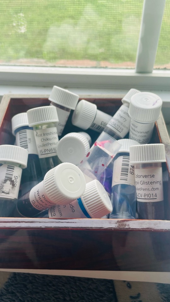
I hope this helps! I had to edit it a few times over the course of the past few weeks bc i went on an entire tangent about bootleg pens I like and uh. realized thats both overly complicated for the base question/bootleg pens tend to need tweaking to work nice. that being said, i'll say it quickly: buying lil nibs from aliexpress has actually worked pretty well for me n my tswbi knockoff (lanbitou 3059) has a fude nib i got that's bent to allow brushlike strokes! but I donmt recommend it for a first pen bc it required some grease and a nib tweak upon purchase and dries p easily bc of the cap.
#SO SORRY THIS TOOK FOREVER I DIED BUT I GOT A LITTLE BETTER!#going though all my inboxes now and. eeheh ive got srt to draw now...#not art#tldr. buy platinum preppy. get ink samples from goulet pens and a platinum converter OR#get a platinum refill cartridge of the carbon ink#waterproof isnt importsnt if you dont use watercolors and gouache like i do i suppose. hur i can confirm it stands up to HEAVY water abuse#thanks for the ask!#for paper rhodia seems to be most accessible. tomoe paper hard to buy. i still dont own any...#BUT i got a clairfontaine notebook for pen testing from goulet a while ago
9 notes
·
View notes
Text


Was this the best drip from clairfontaine fashion-week?
#the bar was low#ibrahima konate#konate#equipe de france#les blues#France nt#clairfontaine fashion week#football fashion
9 notes
·
View notes
Text
Papírokról
Nálam most itthon alapvetően ötféle töltőtollbarát papír van. Amikor új tintát veszek, általában mindegyiken kipróbálom - bár határozott kedvencem van. :)
Ehhez a poszthoz ezt a csodás kis szettet használom: Taccia Ukiyo-e Hokusai Collection. Mivel ez most nem a tintáról szól, legyen most elég annyi, hogy ez két két, egy kék/zöld és egy piros szín található a szettben.


Ezeket a papírokat használtam: 1) Tomoe River (2024, fehér) 2) Maruman Mnemosyme (krém) 3) Midori MD (krém) 4) Rhodia (fehér) 5) Clairfontaine (fehér).

Tomoe River (2024) - A sheen nagyon szépen látszik a swatch-on, de az írásmintában nem nagyon jön elő. - Nagyon szeretem, hogy milyen vékony a papír. Érzésre is jó, és elég sok lapot bele tudnak szuszakolni viszonylag normálméretű füzetekbe. - Kicsit nehezen szárad rajta a tinta (főleg széles heggyel), ezért érdemes hozzá itatóst használni. - Nekem ez a kedvencem, de az idei füzetekről azt hallani, hogy nem egyenletesen jó a papír minősége.
Maruman Mnemosyme - Nagyon enyhén krém színű, majdnem fehér. - Nem mutat sheen-t, kicsit flat az összes szín. - Nagyon pici füzetem van belőle, nem jegyzetelésre használom.
Midori MD - Krém papír, nagyon szép pasztel dot griddel. - Mutat sheen-t, de nem annyit, mint a TR. - Általában kevésbé vibránsak rajta a színek, de minden tinta szép rajta. - Külön pirospontot adok a füzetek nagyon minimál ("very Japanese") csomagolása és megjelenése miatt.
Rhodia - Fehér papír, az ízlésemnek kicsit erőteljes szürke dot griddel. - Szépek a színek, a swatch mutat egy kis sheen-t is. - Én nem szeretem ezeknek a füzeteknek a tapintását, érzését - de ettől az írásélmény egyáltalán nem rossz. - Nagy előnye, hogy egy átlag Pirex-ben többféle méretben, kötéssel és vonalazással megvehető. - Nem szeretem a fekete / narancssárga borítót, de egy kis matricázással megszépíthető.
Clairfontaine - Nagyon fehér. - Sheen nem nagyon van, de minden szín szép élénk. Mintha a shading jobban előjönne. - Ebből is csak pici füzetem van, és nem használom jegyzetelésre. Nem tudom megmondani, hogy miért, de ezt szeretem a legkevésbé. - Ez is egyszerűen elérhető Pirex-ben. Legtöbbször ki is írják a füzetek ára mellé, hogy ilyen papírból készült. Többféle design-ban, méretben és vonalazással elérhetőek a füzetek.
34 notes
·
View notes
Text
Ficbinding: A Complete Kingdom by Komodobits
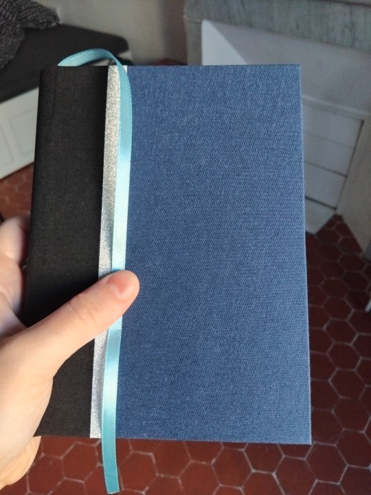
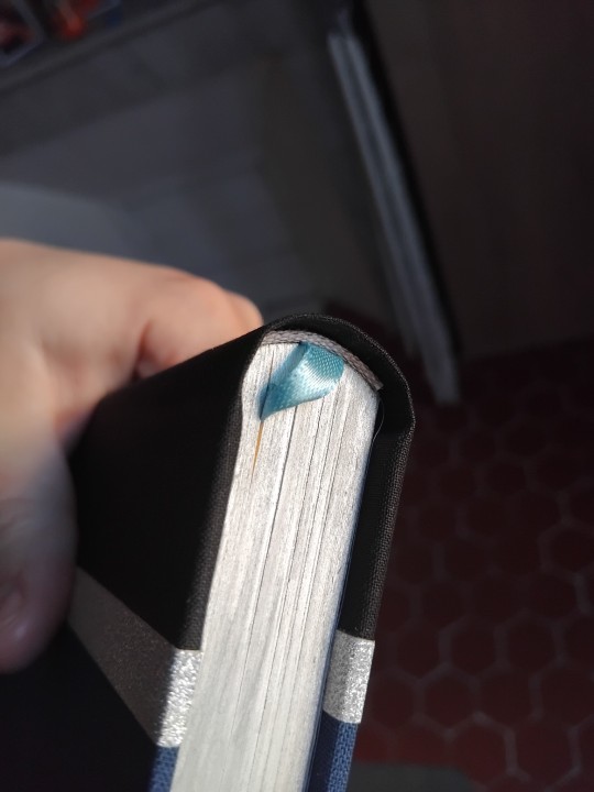
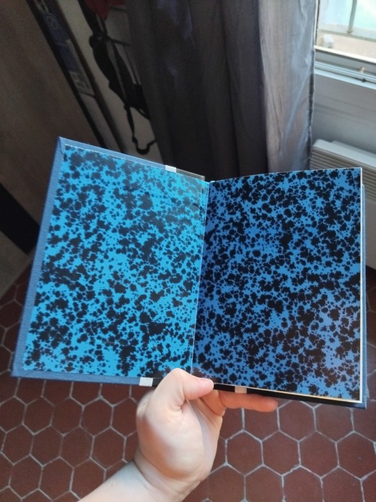
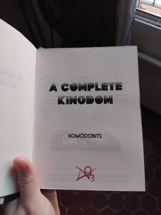
The fic: SPN, Castiel/Dean Winchester, 85k
This fic had me staying up until 2am to read, it swept me up and flattened me. It's so well-written, so faithful to the characters, so well constructed that all you can do is strap in and enjoy the ride and hope you're not sobbing by the end (a vain hope). It's such a good story, period, that I think it can be enjoyed by non-SPN people. Mind the tags. Summary:
The sea; it swallows me. It comes up to my knees and it swallows me. The boys owe Jody a few dozen favours, and so when her niece goes missing near an old fishing village on the coast of Maine, Dean, Sam, and a newly human Castiel agree to take the case on. They settle into an old abandoned lighthouse-keepers' cottage, and slowly the tide comes in. (post-s8)
The bind: I'm so proud of this one, guys. I tried new things, pretty much everything worked, and I learned new skills!
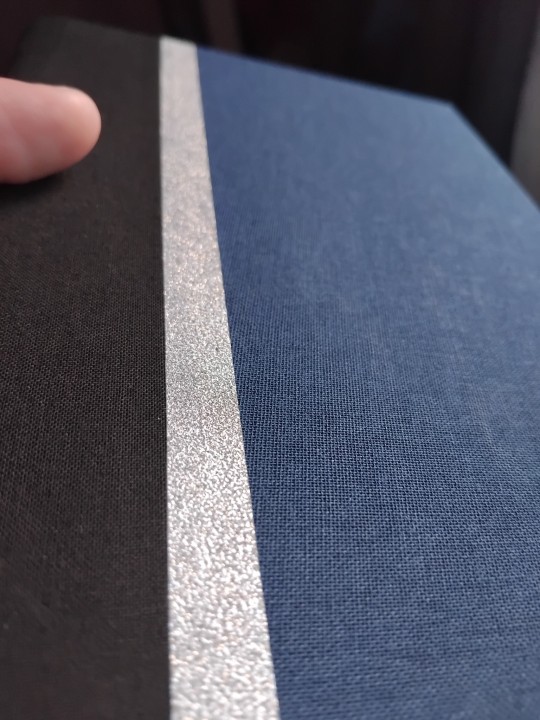
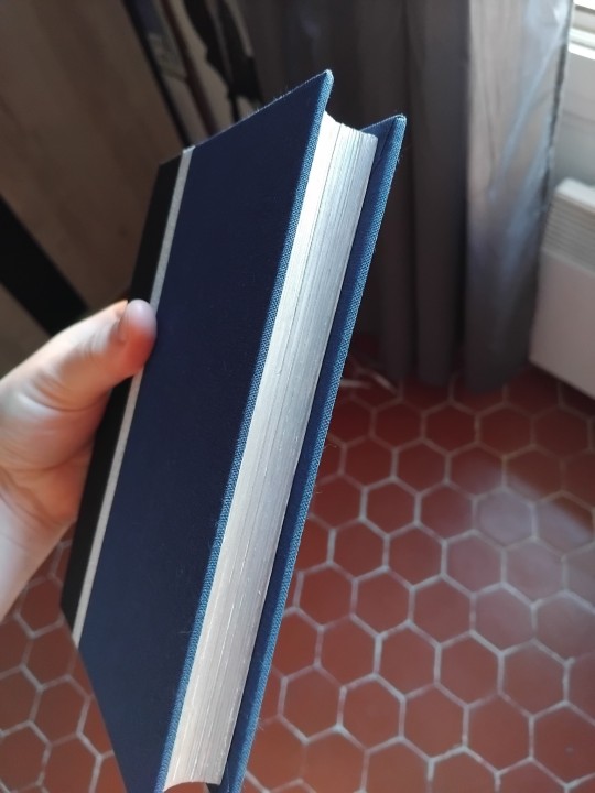
Let's start with the colors. The story is sea-themed and stormy, so I chose black, dark blue and silver for the cover and light grey and light blue for the headbands and bookmark. I meant to use white for the headbands, but discovered I don't have white ones. It's the first time I do an overlap of fabrics and it turned out awesome. The silver stripe is a simple gift wrapper ribbon.
Typesetting:
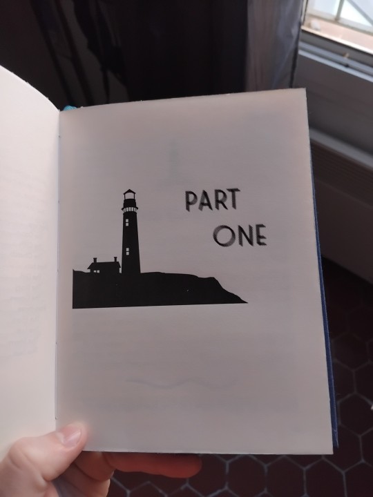
The title font is so cool, with a droplet effect. For the part titles I chose a kind of blurry, hazy font because this story is about perception of reality and the loss of it. The chapter titles of the first part are solid, then they're altered in the following parts, to symbolize a slipping grasp on reality as time goes on.
I put headers and bottom-of-page numbers this time, which forced me to figure new things out in LibreOffice and do some maths 💪
The image of a lighthouse also changes in the three parts of the story. If you've read this fic, you know why.
Little wave as a divider.
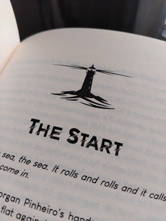
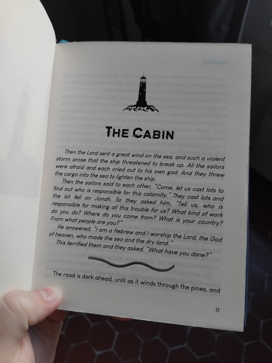
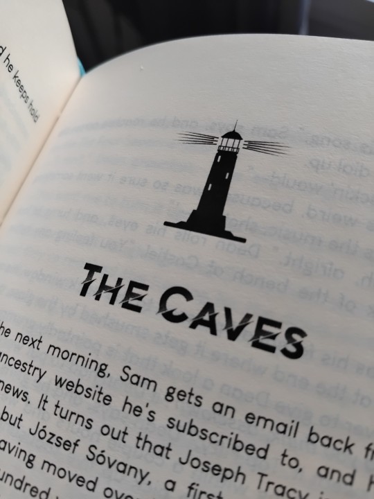
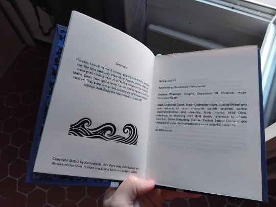

Making the book:
I hadn't made a big book (printed at the A5 format) in a while and it felt amazing going back to that. It stretched my maths muscles. It's relaxing to do a book and not have to fight for every millimeter, like with small books. It's a more forgiving format.
Trimming went amazingly this time, I'm finding my footing slowly.
I had to sandpaper the edges to color them silver. I don't mind working with sandpaper, but it's quite brutal on the book, and wouldn't do it every time.
The edge painting was made with a silver marker, so I knew it wouldn't be perfect, but it looks good enough and doesn't peel away.
My corners are improving! They look almost perfectly square.
In reaction to the last bind I made, I augmented the overhang (still don't know if that's the word) between the edge of the covers and the edge of the textblock. From 3mm to 5mm. I'm very happy with this, it looks much better!
It's rare that I'm disappointed in a fabric, so I'll highlight here that I don't like this endpaper. It's pretty, but it's a sort of glossy magazine paper that didn't react to glue so well.
Overall, I love this book and this story deeply. I think it may be my best work technically so far.
Fonts: Rained (title), Moonrising (author name), Louis George Cafe (text), Brightness, Brightness Book and Brightness inverted (chapter titles), Snorter (part titles). Materials: 2mm grey board, 80g/m² ivory Clairfontaine A4 paper, synthetic ribbon and headbands (found on amazon), black and blue cloth and endpaper from Schmedt, silver non-textile ribbon (bought in craft store).
Feel free to ask me more about materialsand fonts (or whatever), it won’t bother me at all to tell you what I used, but I’m too lazy rn to write it in this post that’s long enough already.
30 notes
·
View notes
Text
ok, if you're a beginner and are interested in getting into fountain pens, i recommend jetpens' beginner guide because it's pretty alright
note: i don't recommend shopping at jetpens - they aren't bad by any means, but goulet pens is family owned and gives you a lollipop and sticker freebie with every order! i prefer them because of that. they also just have better customer service and, like, actually do sales sometimes. jetpens never does sales and when they do the deals are Bad
for beginner pens i personally recommend, if you wanna go REALLY cheap, get a jinhao shark. they use international standard cartridges AND include a converter for under five dollars! people seem to really like the pilot metropolitan for beginners, but i personally hate it for its garbage converter, proprietary fill system, and slippery grip section. the lamy safari has a triangle grip that some people hate and it also uses proprietary lamy fill systems, but it is far superior in my opinion. if you want to play it safe, i would go with pilot - lamy has some quality control issues. if you want to cross your fingers for a really good batch and experience, go lamy. for other options, check out the beginner pen selection on goulet's site! if you have any questions about specific pens in that selection then send an ask, i am insane and will probably have more information for you
do not buy disposable fountains as your first pens - they aren't representative of the experience.
info on different ways to fill your pen are here! i will always recommend bottled ink over cartridges - there's more options and bottled ink is better for the environment!
for inks, i'll always recommend waterman intense black if you want a black ink. it's nothing if not reliable! for more colorful options, try the pilot iroshizuku line. they're amazing!!!! please note that SHIMMER INKS are NOT for beginners. if you want glitter, make sure to practice with other inks and pens first so you know you like the hobby... glitter is not for the faint of heart in the fountain pen world. do not buy any NOODLER'S INK, the guy who owns it is a trump supporter and conspiracy theorist.
for paper, i would recommend not using something super textured or fibrous, as the fibers can get caught in your pen and cause a clog. printer paper is crummy but not the absolute worst - your ink WILL feather and bleed somewhat, but it won't be terrible. for dedicated paper, try rhodia, tomoe river paper (MY FAVORITE), or clairfontaine! you don't have to worry too much about this if you're a beginner, just make sure not to use your pens on highly textured paper
there's a lot more i could talk about, so again, feel free to ask! this is just the basics =)
27 notes
·
View notes
Text

Testing some new watercolor paper for future projects: This one is Clairfontaine cold pressed 140lb, which sponge up a LOT more color pigments than my regular paper that I use, but the inking itself was nice enough even if the paper got more texture. Gonna try the backside next which is more smooth. (Had to add more glow to the eyes in PS).
#my art#era of iridore#comicartist#watercolor#lgbtq artist#fantasy#traditional art#artists on tumblr#watercolourpainting#woodland#dragon nymph#artistic nude
5 notes
·
View notes
Text

11 May 2017 | Catherine, Duchess of Cambridge is presented with a cake as she tours a cycling themed festival and unveils a mural of British cyclist Tom Simpson and Luxembourgish cycling legend Charly Gaul during a one day visit to Luxembourg at Place de Clairfontaine in Luxembourg, Luxembourg. (c) Jeff Spicer/Getty Images
6 notes
·
View notes
Text


Calligraphy practice with John Keats. And my everyday handwriting🤭🤭
17 notes
·
View notes
Text

My day job is keeping me busy, and the art I am working on is secret for now - so here's a throwback to my first time using pastelmat for colour pencil - really need to do another full piece on pastelmat - was so excited at being able to layer white over dark!!!
#painteddog#wildlife#africanwildlife#wilddog#dog#animalart#colorpencil#pastelmat#clairfontaine#Colourpencil#dogsofinstagram#Drawinganimals#drawingfur#fluffyears#petthedog
51 notes
·
View notes
Text
I was really expecting to see some REAL ‘Clairefontaine fashion-week’ fits. And all we got was a repeated partial serve from Kylian and recycled fits from the rest.

2 notes
·
View notes
Text
psg when multiple players (all Muslim) are being investigated for rape and there is international systematic sex trafficking of prostitutes and abuse of young boys at clairfontaine and in the french football federation

psg when someone points out there are a disproportionate amount of black people in france

if anyone wants reminding of how gay football is more is being made of racism allegations (the "racism" being a man saying the generational disparity in ethnicity in france is an economic strategy, basically a fact) than there are of the dozens of high profile footballers on trial for rape or the industrialized sex trafficking and sex abuse that occurs
100 notes
·
View notes
Photo
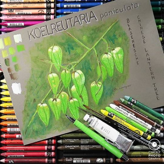
Koelreutaria paniculata A while ago when I was in Rehab for my back, I ordered some goodies from Gerstaecker, a German art store, which I did an unboxing video for. Amonst my supplies was an A4 block of Clairefontaine Paint ON, grey, acid free, 250 g/qm and the beautiful watercolour crayons Neocolor II Aquarelle from Caran d’Ache which I did a swatching video for. I wanted to show you the first artwork I used the crayons for here on IG which I did at the end of the swatching video. If you would care to watch the video please follow the link in my bio. I had seen this Chinese Lantern Tree in the local botanical garden and took some photos of it because all the little lanterns were glowing in the sun. Unfortunately, none of the pictures came out mainly due to the fact that I was finding it hard to stand and take my time with them. So I wanted to preserve some impression of the beautiful little tree and made this illustration as a reminder. Werbung weil Markennennung und Verlinkung. Der Inhalt ist freiwillig ohne Bezahlung und ohne Aufforderung durch die im Text genannten Anbieter entstanden! ••••••••••••••••••••••••••••••••••••••••••••••• #Aquarell #Watercolour #watercolor #Guache @davinci_artistbrushes_official #watercolorpainting #watercolorartist #artoftheday #artofinstagram #WorldWatercolorGroup #watercolorsketch #watercolordrawing #watercolorillustrator #watercolorillustration #watercolourillustration @carandache #NeocolourII #aquarelle #crayons #sketching #Design #Clairfontaine @clairefontaine_officiel @clairfontaine_deutschland #Papercraft #Paperlove @gerstaeckerverlag #gerstaecker #floralart #Flower #Tree #Lampion #Lantern #Blasenesche ••••••••••••••••••••••••••••••••••••••••••••••• Camera used is the #Canon PowerShot G7 X Mark II Digital Camera @canon_photos @canondeutschland @canoncollectiveofficial (hier: Bad Pyrmont, Germany) https://www.instagram.com/p/CHljrAzhsMk/?igshid=1oc1rdb3bo1aj
#aquarell#watercolour#watercolor#guache#watercolorpainting#watercolorartist#artoftheday#artofinstagram#worldwatercolorgroup#watercolorsketch#watercolordrawing#watercolorillustrator#watercolorillustration#watercolourillustration#neocolourii#aquarelle#crayons#sketching#design#clairfontaine#papercraft#paperlove#gerstaecker#floralart#flower#tree#lampion#lantern#blasenesche#canon
2 notes
·
View notes