#Chaoticresources
Explore tagged Tumblr posts
Text
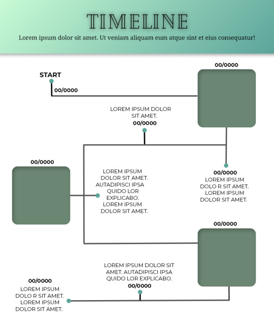
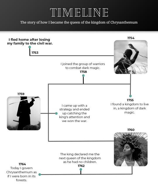
Template #008 by dailyresources
— Timeline Template
Please do not repost / redistribute or claim as your own.
Please, like or reblog if you download.
You may edit as much as you like, it is fully customizable.
This is a free template. PSD File.
Credit is very much appreciated.
Photos by pexels.
Any issues, don’t hesitate to contact me!
Fonts: Cheque, Noto Serif and Montserrat.
Enjoy ❤
Download Link: [mediafire] or [payhip] Support me on [ko-fi]
#templates#timeline template#timeline#free template#psd template#free resources#graphic template#photoshop template#photoshop resources#evansyhelp#dearindies#chaoticresources#allresources#hisources#yeahps#my creations#*mine#*
665 notes
·
View notes
Text
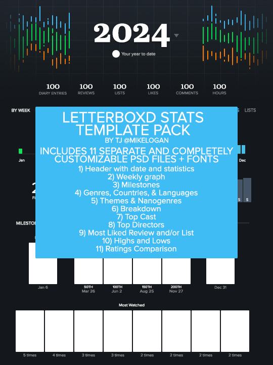
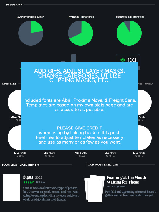
LETTERBOXD STATS TEMPLATE PACK by tj @mikelogan Includes 11 separate and completely customizable .psd files + 3 font families
Header with date and statistics Weekly graph Milestones Genres, Countries, & Languages Themes & Nanogenres Breakdown Top Cast Top Directors Most Liked Review and/or List Highs and Lows Ratings Comparison
WHAT YOU NEED*:
Basic gifmaking knowledge Including: layer masks and clipping masks
TO USE:
PLEASE GIVE CREDIT BY LINKING BACK TO THIS POST PLEASE DO NOT REPOST/CLAIM AS YOUR OWN REBLOGS ARE APPRECIATED FEEL FREE TO TAG ME IN ANY SETS YOU MAKE WITH #USERTJ
MEDIAFIRE DL | MEGA DL MY LETTERBOXD
*A FEW NOTES:
All graphs are completely customizable using layer masks. For all the bar graphs, I find them easiest to edit using the rectangular marquee tool to select the proper area and then using your brush tool. For the pie charts, I had the best luck using the polygonal lasso tool to select the slice I wanted to mask. All the information used was taken directly from my Letterboxd stats page. I believe there are a few sections only available to patrons of the site, such as the Ratings Comparison. The only parts I left out were the lists integrated into the stats page and the Crew & Studios section. The fonts included in the folder are the exact ones used by Letterboxd, so you could always use them to create your own templates for those if you want to. I have no issue with anyone using these templates to help create their own, but please give proper credit. Making these took literal hours.
IF YOU HAVE ANY QUESTIONS OR PROBLEMS WITH THE TEMPLATES, PLEASE SEND ME AN ASK OR A MESSAGE AND I'LL HELP HOWEVER I CAN!
#templates#resources#letterboxd#gifmakerresource#completeresources#dailyresources#chaoticresources#my resources#ramblings#userchibi#userbambie#userhann#userbuckleys#usermadita#userbess#tuserambs#usernolan#usercats#tusermira#userwintersoldado#usertina#userhollywood#userpegs#usermibbles#quicklings#usercamena#userholloway#tuserlucie#uservivaldi#nessa007
161 notes
·
View notes
Text


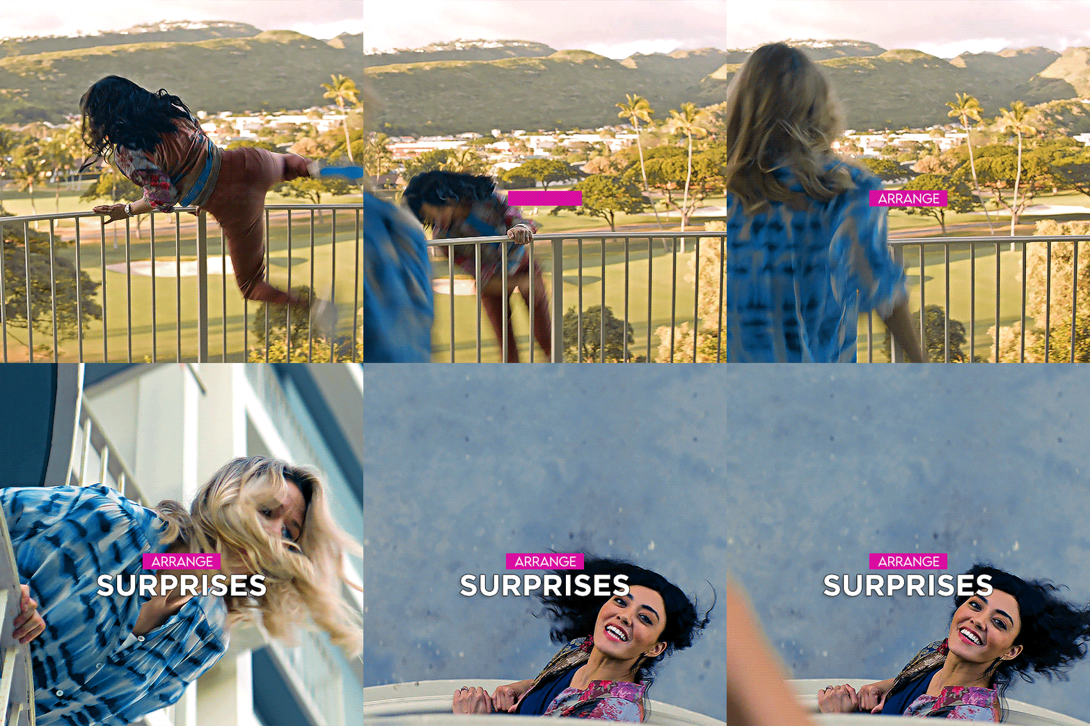
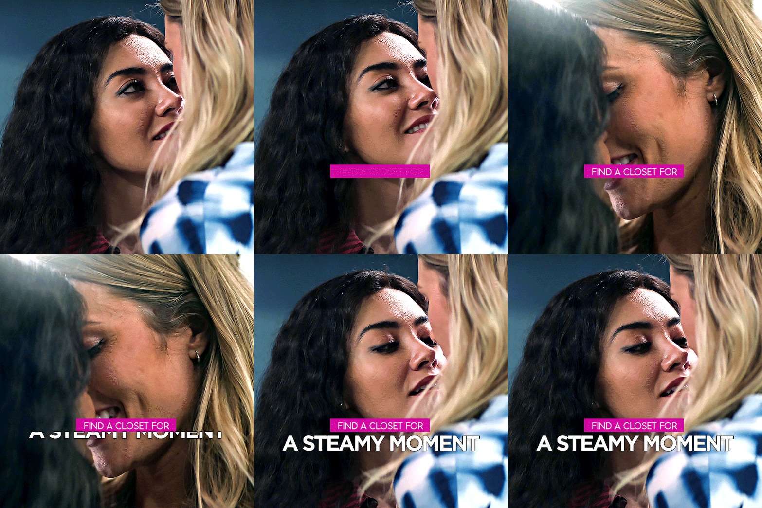

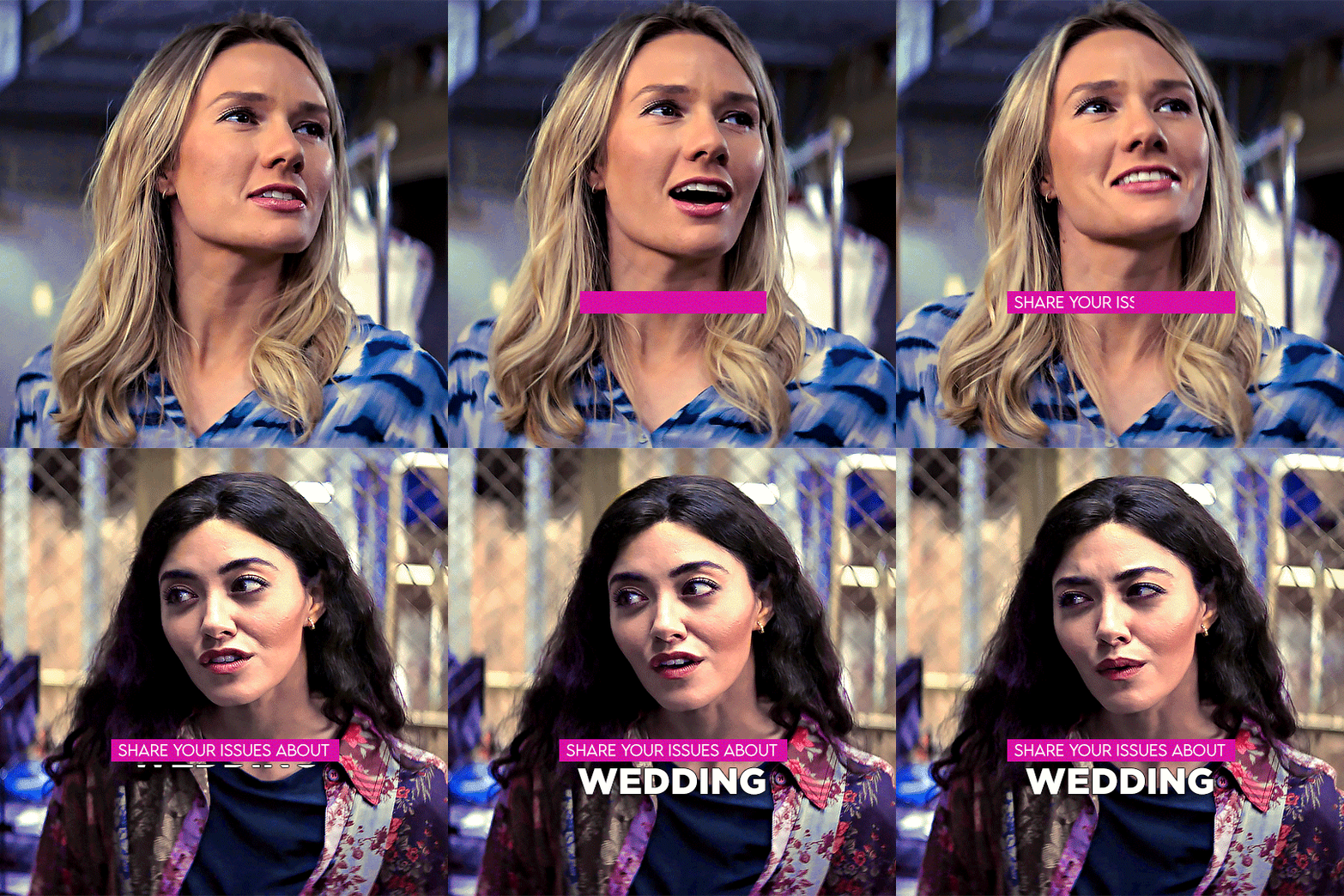
LUCY & KATE | NCIS HAWAI'I 3x04
6 tips to make your (fake) honeymoon extra special by Lucy Tara and Kate Whistler
#kacy#kate x lucy#usergif#wlwsource#lucy x kate#wlwgif#kate whistler#dailylgbtq#lucy tara#filmtvdaily#tori anderson#ncis hawaii#dailytvwomen#yasmine al bustami#usergay#femalegifsource#filmtvtoday#fybadassladies#dailyflicks#userladiesblr#lgbtqgifs#usernati#femaledaily#ChaoticResources#tvarchive#my graphics#imo this fake honeymoon episode was one of the best part of this very short and very kacy deprived season#this set may not be my best work but I enjoyed making it#kacy is still my comfort ship and they're precious to me during the tough time I'm going through.
370 notes
·
View notes
Text
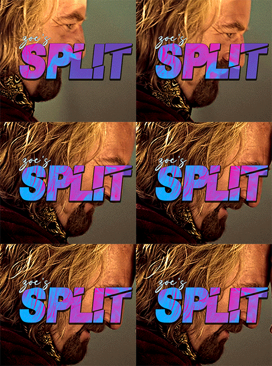
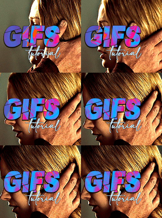
i always get questions when i do a split gifset, and it's a deceptively simple process so i thought i'd try to show how i do it! i don't know if these types of gifsets have a more universally recognized name, but that's what i call them so that's what i'm going with.
i'm going to write this assuming you have a solid familiarity with photoshop and making gifs, but please feel free to send me an ask if anything is unclear. i use video timeline/smart objects so will be showing that (here's a great general tutorial on giffing with timeline). i will also be talking A LOT about gif dimensions, so first let's briefly go over the limits and theory a little bit.
a 1 column gifset can accommodate gifs 540 pixels wide
2 columns = 268 pixels each with a 4 pixel gutter between
3 columns = 177, 178, 177 pixels with 4 pixel gutters
i'm mostly going to talk about 2 column split gifs here (what i will refer to as 2x1 from now on - 2 across and 1 high), but the process is the same for 3 column (3x1) and so on (1x2, 2x2, etc).
so, why would you even want to make a gifset like this? i mean, let’s face it, generally, bigger is better for gifs on tumblr, and there are obvious incentives to 540 width gifs over 268 or 177/8 width, especially since the upload limit went to 10MB. but even 10MB isn’t much when you’re talking about high quality footage. gif making is a constant balance between quality (whatever that means to you: frame dimensions, sharpening, coloring, etc) and file size. split gifs are a cheat to that limitation >:)
i personally believe an untapped frontier of tumblr gifmaking is playing with dimensions and time. that sentence makes me sound like an old-timey sci-fi villain, but you get the idea: gifmaking is an art and there are many fun and interesting ways of exploring the medium. you can do a lot with 268 pixels! longer frame loops to gif longer scenes unbroken, bolder coloring on a wide shot you don’t want to pare down. and, a shorter x axis means the y axis’s bang goes a lot further on a buck. also just if you have a 2 column set but only 5 gifs so you need to make one take up 2 slots. there's a lot of reasons but the most important one is it's fun :) here are some examples of other split gifs i've made: x, x, x
this isn't so much a limitation, more of a shift in how you think about gifs, but it's important to remember that each gif should ideally be doing something still. when making split gifs, it’s easy to pick a wide scene without thinking about how it’ll be split down the middle, and then you’re left with a lot of something on one side and a lot of incongruous nothing on the other - or you're left with a person cut in half awkwardly in the middle. so while a split gif can still be a whole scene, you shouldn’t ignore the break and what it means to the bigger picture. now this is personal preference, but i like to play with the break and make it a part of the gifset. mirrored movement, subjects trapped on either side but still talking to each other, a bird flying from one side to the other. fun with frames! it can be another way of drawing attention to specific images/moments/feelings happening within the same shot.
SIMPLE SPLIT GIFS
to more narrowly define what i’m calling “simple split gifs,” it’s one set of frames split down the middle into two separate gifs that are meant to play concurrently, side by side.
first thing's first, crop your gif and uncheck delete cropped pixels if it is not already (very important). i'm cropping it to the 1x1 size, in this case 268x350. if you need to see how the full size will look, you can try it out with 536 first. but this one is pretty easy, this is the exact center of the frame (the left boundary of this crop is the center line) and both their heads fit within their respective 1x1 crop.
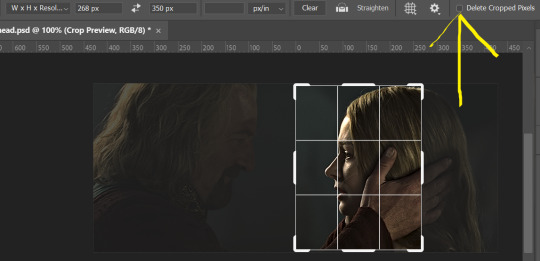
then color as you normally would. if your scene is very different one side to the other, it might be easier for you to color on a wider crop and then either crop again or copy paste your coloring to the smaller crop version. i do that with the 2x6s, but it's usually not that big a deal to color the 2x1s with just the small crop on your canvas at the time. this scene is very symmetrical, both in movement and colors, so i'm good.
now the fun part! once you've got one side how you want it, save/export as you normally would. at this point i also like to make a mental note of how many frames there are.

so i have 49 frames and it's still only ~3MB! this is just an example that i picked from my rotk fancy set, otherwise i probably would have made this gif longer.
then onto the other side, so i ctrl + z my way back to my smart object video timeline. to get to theoden i just drag and drop the smart object 268 pixels over. since this one is in the exact center of the image, it even helpfully guides me (this can get annoying if you are NOT giffing the center of the image fyi, but you can always manually go pixel by pixel too if you need to with your <- -> keyboard buttons. just always remember where you started and count accurately). i can never move around my smart object without hiding the adjustment layers on top of it, so you'll see me do that in this screen recording.
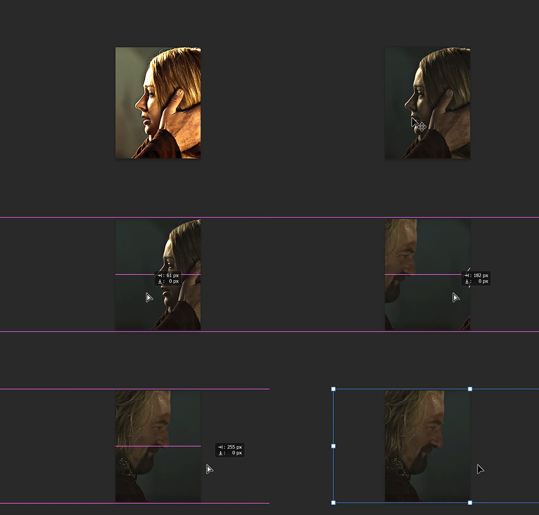
see how it corrected me when i dragged it a few pixels down by accident, and with all those pink guidelines? sometimes photoshop is good 😌
then make sure you still like the coloring, adjust whatever needs to be adjusted, but watch out! don't make any major changes because it still has to match the other side. and export again.

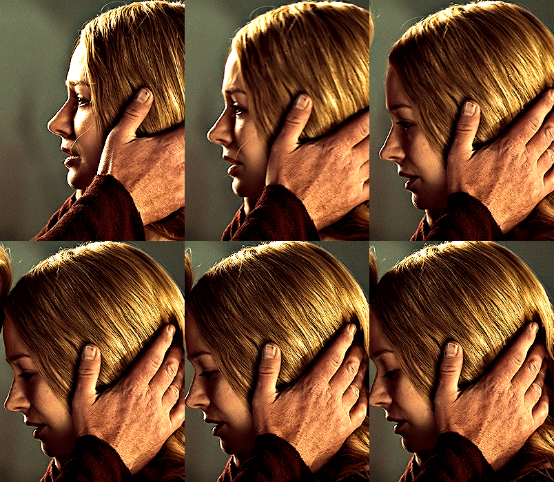
what we perceive as 1 series of frames chopped down the middle is just 2 separate gifs with the same frame rate. when tumblr loads the images, it will run concurrently in the post (even though it never does in the draft post 🙄). and that's it!
COMPLEX SPLIT GIFS
again i'm making up terms, but i call anything with more than 2 components a complex split gifset. i've tweaked some things in the process as i went along, but this is generally how i did the lotr series. these sets are basically just many split gifs with transitions. and here's where endurance becomes a factor :) there's a lot of prep done blind. but if set up well, it will be fairly easy to pull together by the end.
first i decide on my dimensions, using my upper bounds to determine how big i'm going to go. since lotr has very nice large file sizes, i can go pretty big without sacrificing much in quality. i decided on 3 rows of 350 pixel height gifs and it's worked well for me. that means my biggest gif will have a total height of 1050 pixels - fun! you could also do 8 rows, with two 2x2s or just a series of 2x1s that transition to 1x1s. there really is no limit to this except your imagination and source material.
i cap everything i'm going to use before i even open photoshop, then do all of them at once. uncheck delete cropped pixels, then i make my gifs! this is where i spend 90% of the time on this set. every gif should be the size of the smallest 1x1 gif (268x350 for me). i make all 10 into a fully colored, separate psd. (and then i usually go back through all of them a few times to get the colors to match better 😅) for the bigger ones (2x1: 536x350 and 2x6: 536x1050), i just crop them as if they were 1x1 but always thinking about how they will look when big. this gets tricky when i do the big one :) my lazy workaround for that is to basically make it twice: one cropped as it will be and one full size for me to color. then i copy and paste all the coloring layers onto the small one and voila, i know that the coloring in the upper right slice will also look good on the bottom left slice 1050 pixels away because i saw it on the full size version.
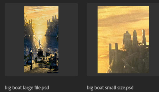
coloring is probably the biggest thing i'm thinking about with this kind of set. the whole idea is that these gifs are using the same colors, more or less, throughout each phase. even with the 1x1s, they're still part of a larger color concept, and they should (🤞) work with each other.

in a pinch, i like to eyedrop a color from one gif and add it as an accent to another. one of my 1x1s had a much more muted color palette originally, but i wanted it to have deeper blues and yellows to complement the 1x1 that would go next to it, so i added some gradients on lower opacity over it, color picked from other gifs i already colored.

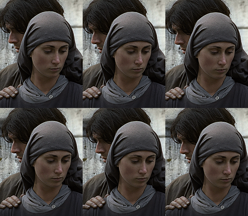
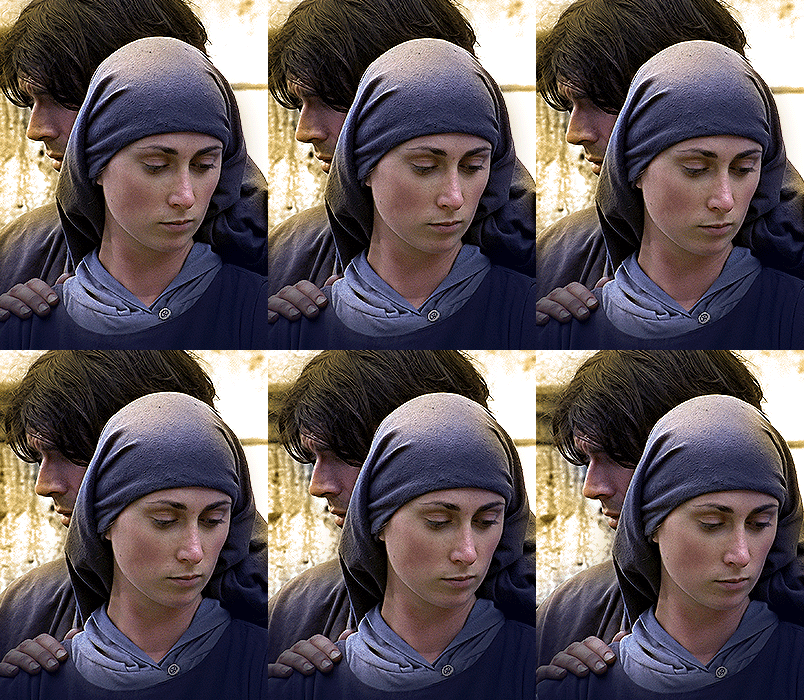
i keep my coloring and the smart object in separate folders to help me in the final step of combining everything, and then i trim everything down to my lowest common denominator of frames. you might think you need to keep frames pretty minimal if you're doing 3 phases with transitions like this, but there's more room to work with on a small gif, in terms of file size. i usually do 30-50 frames for each phase, with the assumption that i'll be adding a transition on each side of each gif that will eat up some frames (i usually do 4-6 frame fade transitions). for the rotk set my final frame count was 129 and i never went over 8MB on a gif, so there's plenty of space play around with things :)
and then, combine! whatever order you start with, you are stuck with (unless you're getting even more complicated, but we won't go into that lol). for these sets i go small 1x1 -> medium 2x1 -> big 2x6. i like to think of it in phases from this point on. small is the first phase, then medium, then big. then i put in the fade transitions, chopping up the first phase gif so the last one will fade into it, restarting the whole cycle seamlessly. i'm just doing a quick and dirty fade here, but here's a tutorial if you want more explanation on transitions.
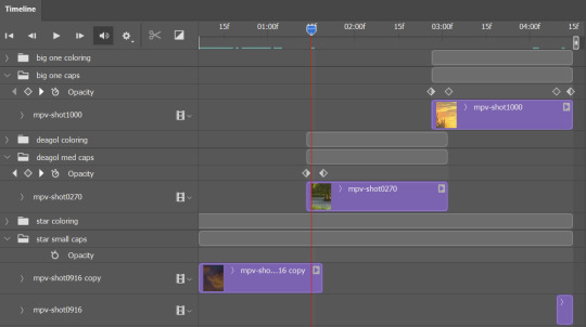
at this point i save this psd as its position, "top left" or whatever (usually it's a psb by this point too 🥲), just in case i need to go back to it. then i export this first gif and move on to the rest.
it's the same concept as a simple split gif: drag and drop the smart object to the new position, but now there are multiple phases to keep track of. folder organization has been key for me to keep everything straight. i move through the gifs in a backwards S, starting with the top left. but you could go any direction, just gotta stick with it and remember your counts. in my case, i'm always thinking of 268 pixels over and, for the 2x6, 350 up/down. it's a tedious process, but it goes quick (apart from waiting for photoshop to load each time you export).
i did this series as a color concept aesthetic kind of thing, so my theory was by using the same-ish colors throughout, that would save me in the end when it came time to export. there's only 256 colors max to work with on a gif, and that's usually what gets me over the 10MB limit. but as i said, i have never even gotten close to the size limit on this series. it's pretty hard to reach the limit on 268 pixels, but not impossible. (i did run into that on the emma set i did, and that was hell. but also not an impossible fix in the end.)
and that's it! if you try any of this and have trouble, i'm happy to help if i can but mostly this is a "click around and see what works for you" kind of process. and feel free to tag me on your split gifsets :) i love seeing them <3
#*lotrsplit#*#split gifs#gif tutorial#photoshop tutorial#usergif#allresources#chaoticresources#completeresources#photoshop tag
293 notes
·
View notes
Text

SUPERMODEL PSD COLORING by @loviestudio
This coloring was made in Photoshop CC; it might work on Photopea!
TERMS
Like and/or reblog to help a creator.
Don’t repost, re-upload or put it on packs and/or google drive. Don’t claim my resources as your own, and don‘t share them without my consent! Don’t use my resources as a base or copy them.
Credits are not mandatory, although I’d love to see your edits!
My resources are free for personal or non-commercial use only. For commercial use, you must pay for the download. If you paid for the download, you are authorized to use it commercially. Reach out to me for more information or if you have questions about my resources licenses.
Follow me for more resources! ♡
This is a free resource, but you can buy it with points on DeviantArt to help out a creator or download it for free on Ko-Fi. Thank you!
DISCLAIMER: I don’t own any of the pictures used to make the preview and I have no intention to violate the copyright rules. If any picture in the preview belongs to you and you want me to remove it, please, contact me!
#dailypsd#supportcontentcreators#dailyresources#allresources#completeresources#chaoticresources#dearindies#psd coloring#psd download#psd for icons#photoshop resources#photoshop psd#resources#for icons#psds#psd#coloring psd#icon psd#psd: pastel#psd: bright#psd: unsaturated#free resources#free#free psds
245 notes
·
View notes
Photo


smalllady's gif overlay pack 1 - because i got tired of people saying "just google it bro" (ノಠ益ಠ)ノ彡┻━┻ seriously...google search results for gif overlays are pitiful. so here's some better quality gif overlays! i made these from free resource videos from youtube. ✧ all gifs are 540x540px, 120 frames, and below 10mb ✧ you can either just save these gifs or you can dowload the psds [here] ✧ i don't care if these get reposted everywhere...i just want stuff like this to be more accessible
#smalllady resources#gif overlays#gif textures#itsphotoshop#completeresources#yeahps#chaoticresources#not that it matters anymore.........
1K notes
·
View notes
Text
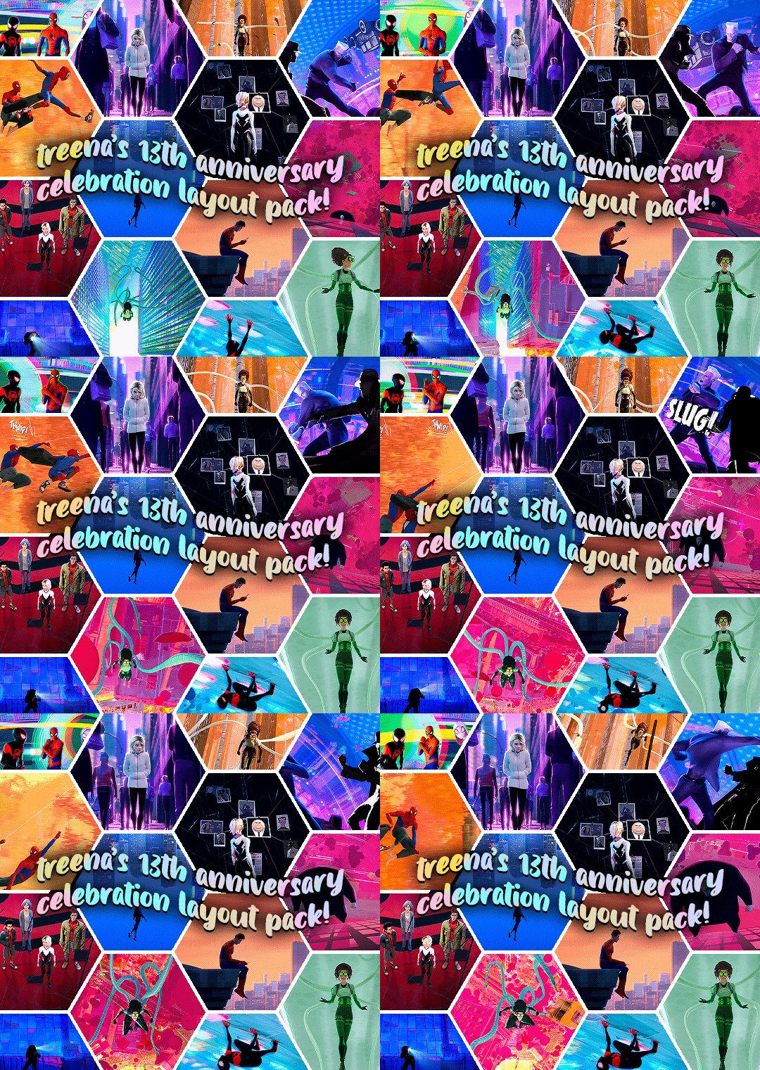
GIF LAYOUT/TEMPLATE PACK!
i've had my beloved blog for what feels like forever, but today it turns 13, so in celebration and as a little thank you to all of you for following my nonsense and sticking around, i've decided to share some of my favourite layouts that i've created.
PLEASE credit if you use any of these! either link to this post or the original sets linked below!!! (except of course the sharpening actions!)
HEXAGON LAYOUT - this is my favourite kind of set to make so i hope y'all have as much fun with this as i do. there's two folders of the layout, one is just the reverse of the other depending on how you want your gifs to look, just clip your gifs to each hexagon and watch it all take shape! [first seen here]
PALETTE MOVIE POSTER - this psd has folders for each element, so the text layers are labelled in a group, and then the palette boxes are grouped together too, just fill each layer clipped to a palette square with your chosen colour! [first seen here]
LETTERBOXD TEMPLATE - i almost didn't share this one because of the labour of love it was to make, but feel like i'm so proud of it, it deserves to be shared. each movie space is split into a group, and within that there's the folders for the star ratings. you can toggle on/off the heart/review/date (as the ratings change you'll just have to shift over these logos to keep things uniform!) and clip your gif over the shape for the movie poster. [first seen here]
DIAMOND MULTI GIF LAYOUT - the most simple of all the layouts, but it got a really great reaction so i'm throwing that in here too, again like the hexagons, there's two versions. one being the reverse of the others, just clip your gifs to each shape. [first seen here]
SHARPEN ACTIONS - VERSION #1 & VERSION #2 - have been asked about sharing these recently so thought i'd add this in, i mostly use version one but occasionally it's too sharp for certain media, so i use version two, which is just the same thing without the last extra sharpening!
#quirkyresources#chaoticresources#userk8#userhella#usernik#alielook#userrainbow#uservivaldi#usershreyu#userelio#usermorgan#userrobin#usergiu#usersalty#useryoshi#useral#uservale#tuserabbie#userelm#userfanni
1K notes
·
View notes
Note
Hello! I just saw your last Caskett gifset for usergif and i loved it, can i aks how did you make the old film look/filter?
Hi, Anon! I used an overlay which I got from here :) I don't know if you're familiar with overlays but here's what I do:
SMALL OVERLAY TUTORIAL
First I make my gif as I usually do and in that gifset this was the base I was working with (a gif with 37 frames):
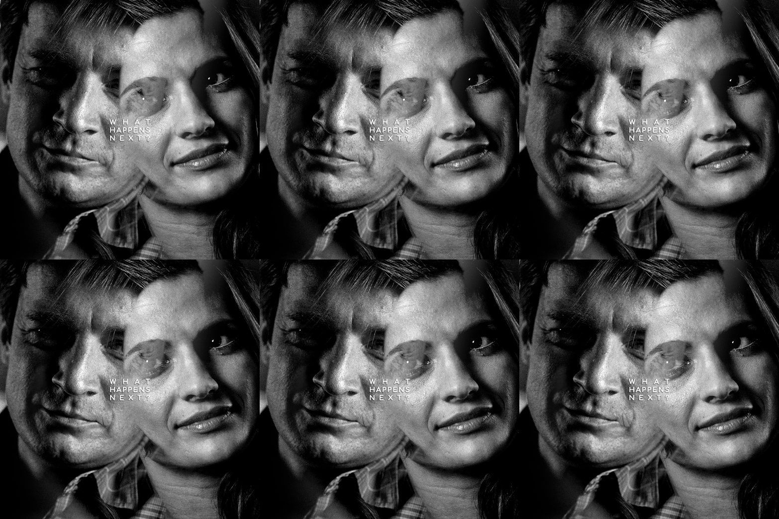
So, next I take screencaps of the overlay I'm using and I make sure it's got the same number of frames, in this case 37. Now I put my overlay screencaps above my gif and this is what my photoshop looks like:
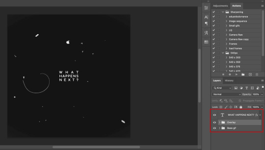
Notice how I placed my overlay between the text and the base gif. The text thing is optional but I liked the text to stand out.
Now, as you can see this overlay's background isn't completely black but gray, and I didn't want that. I added a Selective Color layer and increased the "Black" in the "Black" tab to +100. This is how it looks now:
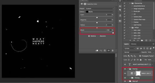
The difference is noticeable right? Well now onto the last step. I went to my overlay group layer and set the Blending mode to Lighter Color and the Opacity to 50%.
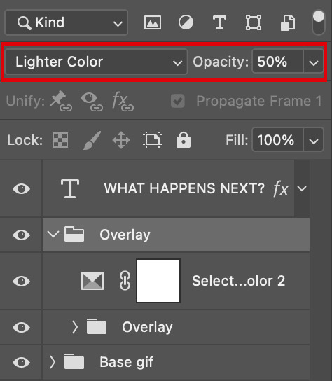
This step depends on your personal preference so feel free to play around with the Blending Modes and the Opacity and see which ones suit your gif best. With those settings I got my final gif:
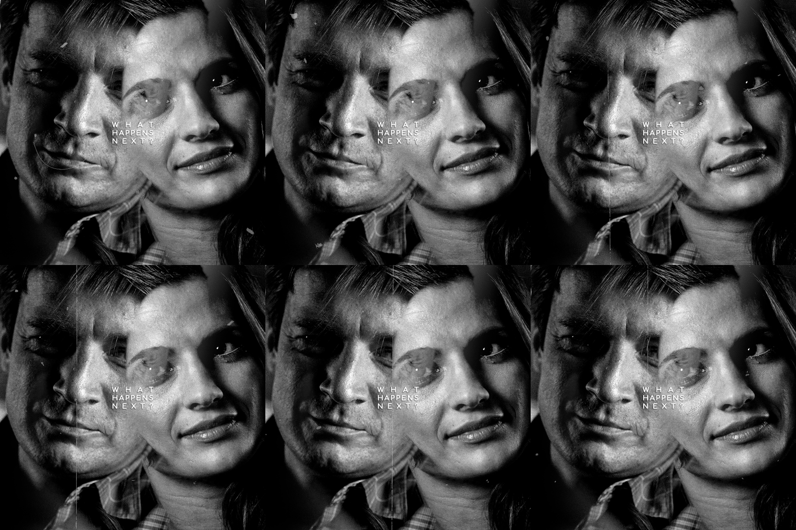
And that's how I work with overlays! There are so many nice overlays in youtube you just have to use keywords like camera, vhs, old video, lightleaks, etc. Overlays can completely change your gifs and turn a simple gif into a beautiful and complex one!
#ask#Anon#ps tag#tutorial#userabs#alielook#uservivaldi#userelio#userbuckleys#userrobin#tuseruta#userahri#userbeani#userchibi#carolook#usermai#usertenacious#userwintersoldado#usercats#usermels#tuserheidi#tusermels#chaoticresources
67 notes
·
View notes
Note
how do you sharpen your gifs???? they're insanely high quality!
Hello, Anon dearest, and thank you so much! ✨ To answer your question properly, I would first have to know which gifset(s) of mine you're referring to because I've made a lot over the years and I often change my sharpening settings, too. It totally depends on what I'm working with at the moment, to be honest. 😅
But, as for the last few sets of mine (this, this, and this in particular), I used these settings:
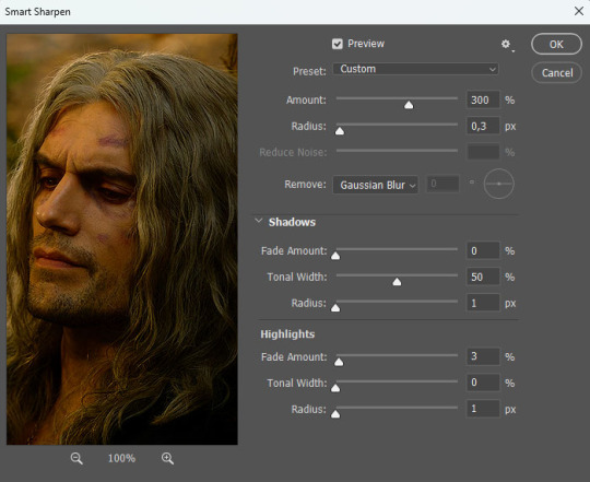
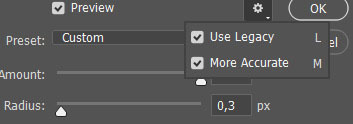
After converting my frames/layers into a smart object, I applied the settings above. Remember to click on the gear icon in the upper right corner and check both 'Use Legacy' and 'More Accurate' as well. This will make your sharpening look more 'natural' and less cakey imo.
Below is a comparison of before and after:
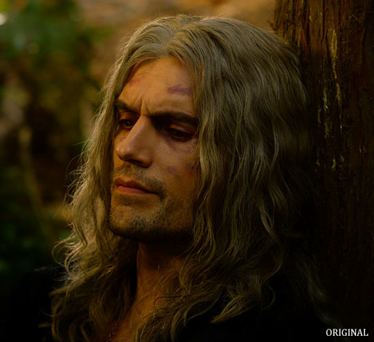
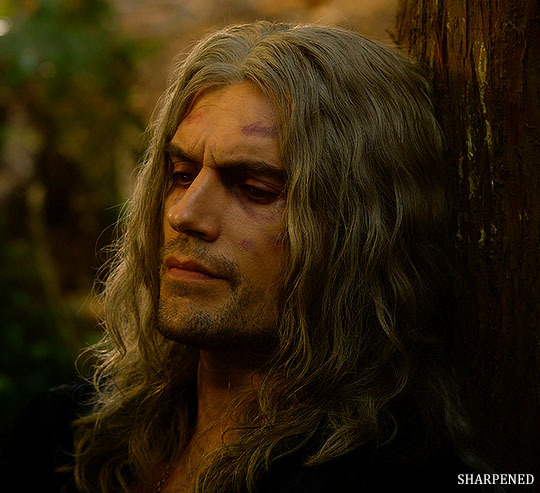
Note: This Geralt screenshot was taken from a 4K (2160p) video. Most videos I work with are at least 1080p or 720p because quality matters.

And here's the final result: colored, brightened, and sharpened.
—
I hope this answers your question. If not, feel free to send me more questions about this kind of stuff. I'm always happy to help out :)
#replies#anon#photoshop#tutorial#resources#ps help#sharpening#gifs#giffing#completeresources#allresources#chaoticresources#my gifs#my tutorials
298 notes
·
View notes
Text
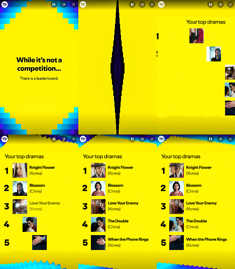
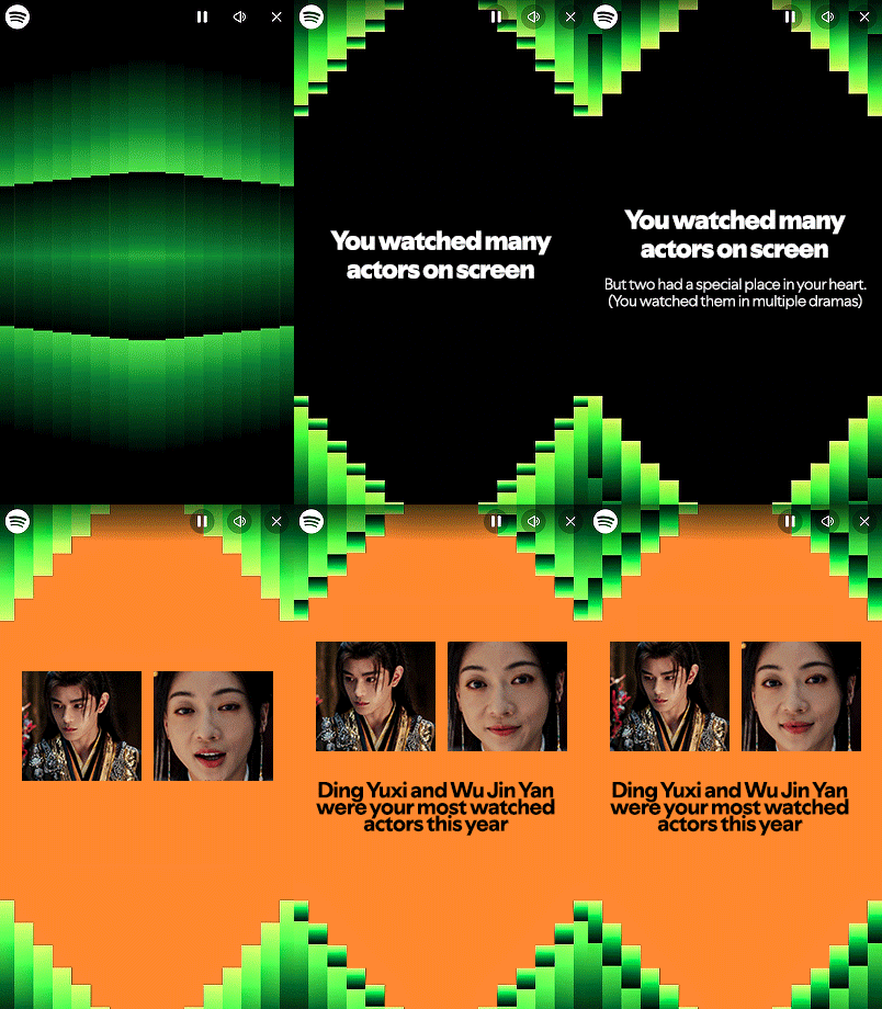
SPOTIFY WRAPPED 2024 TEMPLATE:
Here is a Spotify Drama Wrapped 2024 template I made to commemorate this year. Feel free to use! If you enjoyed this template, please consider liking/reblogging this post, following us and joining userdramas here so we can continue producing similar content :) Link for template under the cut. Photoshop knowledge required for this template as it requires some keyframes manipulation.
Feel free to message @deokmis if you have any questions and please feel free to use the #udeokmis tracking tag if you use this template!
Includes:
1 intro gif in .gif form
6 PSD files for gifs, each editable to your liking (the last gif template has 2 versions based on your preference)
Font files used in the template
Instructions for individual gifs:
Gif 1: Upload as is
Gif 2: Not much required, enter the text as you like. Everything is set up
Gif 3: After placing your gif over the gif carrier, make sure to right click and select "Create clipping mask" and make sure to create the transform keyframes in line with the gif carrier keyframes so they both move together. Gif dimensions are 180px x 180px
Gif 4: As with gif 3, make sure to line up the transform keyframes exactly with the carrier layer keyframes. Gif dimensions are 50px x 50px
Gif 5: Not much required, enter the text as you like. Everything is set up
Gif 6 (one actor version): As with gif 3 and 4, make sure to line up the transform keyframes exactly with the carrier layer keyframes. Gif dimensions are 109px x100px
Gif 6 (2 actor version): As with gif 3 and 4, make sure to line up the transform keyframes exactly with the carrier layer keyframes. Gif dimensions are 109px x100px
Click here for folder link! Credit appreciated, please like and reblog if you download/use! Enjoy :)
#spotify wrapped template#photoshop template#admin post#photoshop resources#resources#ps resources#completeresources#allresources#chaoticresources#itsphotoshop#templates
73 notes
·
View notes
Text


gif sharpening action by alltoowsll
like or reblog if you download
do not modify or claim as your own
created with photshop cc
up to 116 frames (wish i did more but i was exhausted lol i also made it mainly for 540 px gifs)
download
how to use:
create your gif as usual, open your timeline and click here

then click on your frame 1, play the action and voilà! you're done. color it and you should be done! you don't need to reopen it to adjust the timing :) this action looks wayyy better in 540 px gifs. example:


#chaoticresources#userelena#tuserbea#allresources#resources#ps resources#completeresources#userpjo#tuserrex#userautie#userhallie#my actions#mine#my resources#sharpening action#actions#ps actions#gif actions#gif action
125 notes
·
View notes
Text

Thank you @cobbbvanth for asking me for this; I’ve never been more flattered! ☺️ I’ve only been making gifs for a little more than 2 years, so I’m really still only figuring Photoshop out, and my colouring owes everything to other people’s tutorials (some of which can be found here). To be honest, I was only asked some tips, but I have no clue what to include and what to leave out; so, here’s my complete (if random) colouring process.
NOTE: This is a colouring tutorial, not a gif-making one. The tutorial that taught me everything I know about that (and to which I am eternally grateful) is this one by @hayaosmiyazaki.
I. SHARPENING My standard sharpening settings are:
One Smart Sharpen filter set to Amount: 500 | Radius: 0,4
A second Smart Sharpen filter set to Amount: 10 | Radius: 10
One Gaussian Blur filter set to Radius: 1,0 and Opacity: 30%
One Add Noise filter set to Amount 0,5 | Distribution: Gaussian
II. BASIC COLOURING This is the part where I add most of the adjustment layers available and just play around with them. Obviously different settings work for different scenes, but I do have some standard ones.
Brightness/Contrast I usually up the Brightness to +10-30, and the Contrast to about +10.
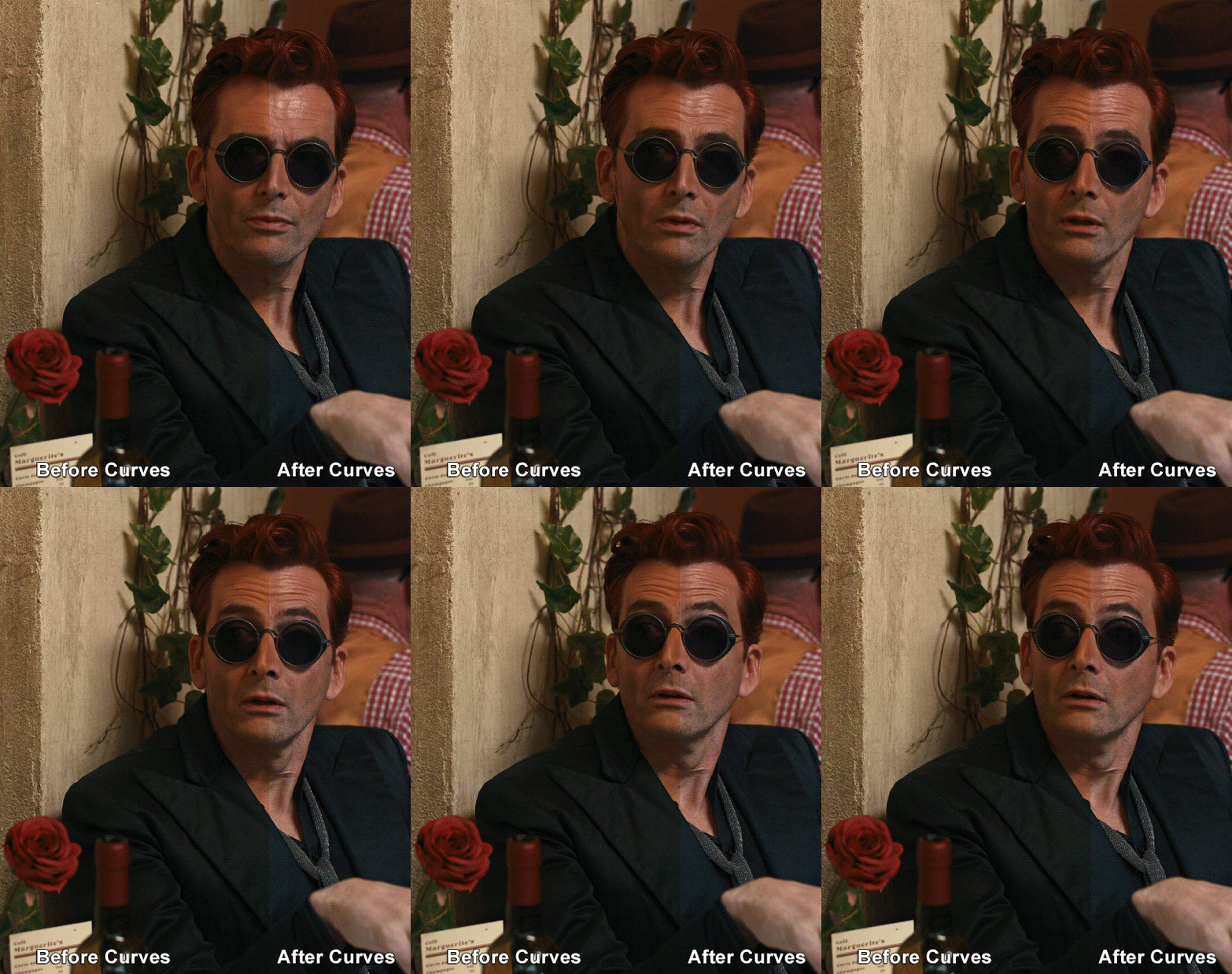
Curves
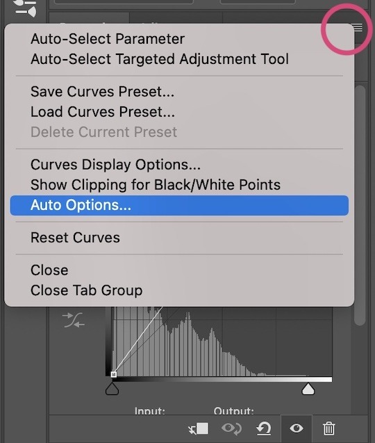
For the first Curves layer I go to Auto Options > Enhance Brightness and Contrast, and then adjust the opacity until I’m happy.
I might repeat the above step if the gif still looks too dark to me.
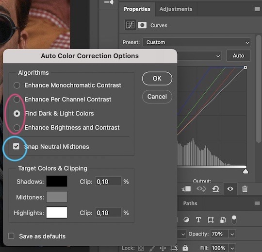
I add another Curves layer, I go to Auto Options and this time I pick either Find Dark & Light Colors or Enhance Per Channel Contrast, and check or uncheck the Snap Neutral Midtones option, until I see something I like. I will then adjust the opacity.
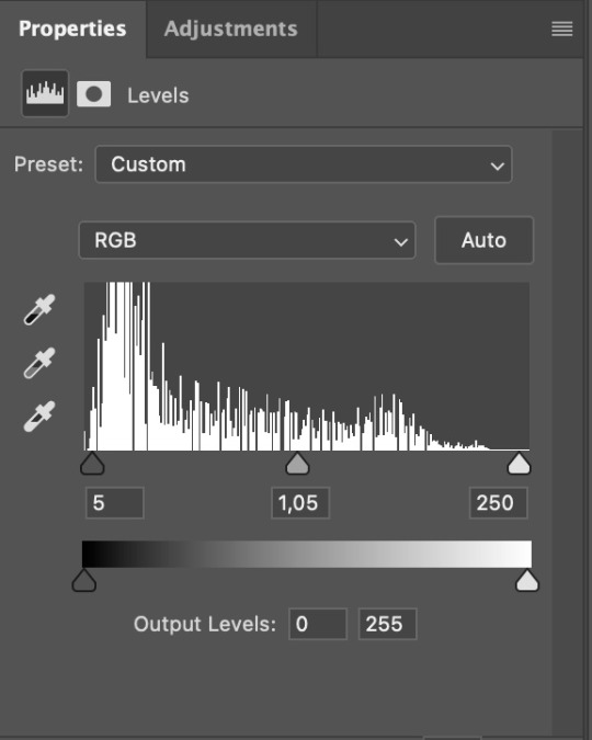
Levels I add a Levels layer that usually looks something like this:
Exposure I add an Exposure layer, where I usually set the Offset to around -0,0010.
Selective Color To make the faces look okay, I create a Selective Color layer, select the Reds and usually add some Cyan (+10-20%) and play around a little (±5%) with Magenta and Yellow too. I might also add another layer, select the Yellows and make slight tweaks there too.
III. FUN COLOURING About colour manipulation: PiXimperfect just uploaded a tutorial that explains everything so much better than I ever could, so I highly recommend you go watch it. It’s made for static images though, and things are more complicated with moving images, so I also recommend @sabrinaacarpenters’s tutorial.
The reason I usually go for a softer colouring is that a more vivid one requires a lot of patience and precision, and I honestly can’t be bothered. Instead, I try to tweak the colous only a little, so that the edges can be a little rough without it looking too wrong.
One thing to remember is that each gif is different, and there isn’t one foolproof way to do this, so you will need to use a different technique depending on the gif you’re working with.
Okay, so, after I’ve decided what colour I want my background to be:
1. I create a Hue/Saturation layer and change the greens, cyans, blues and magentas to that colour. That’s easy enough, since it doesn’t mess with the face colour. I then set the blending mode to Color. If your background doesn’t include any yellow or red, you might be done here, like in the case bellow:
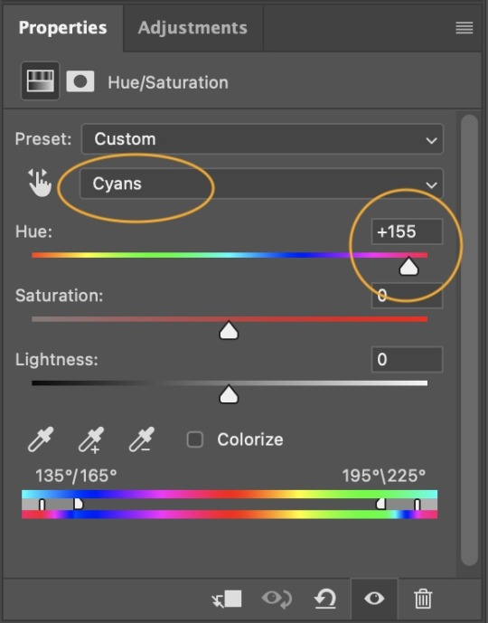
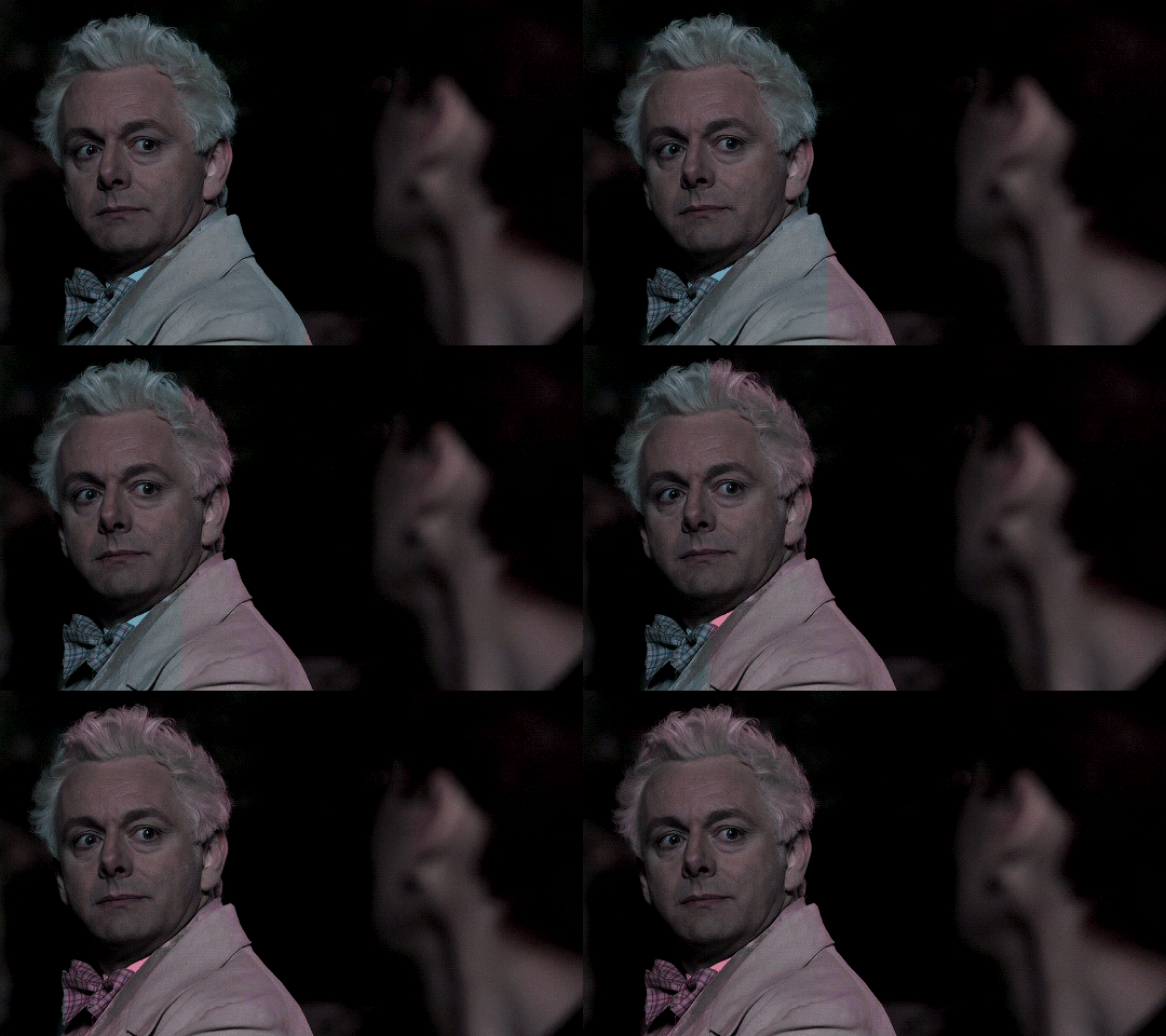
2. To change the yellows and reds, I create a new Hue/Saturation layer, select the yellows/reds, move Saturation to 100 (temporarily) and then play around with the sliders until the face colour isn’t affected. I then change it to whatever I’ve chosen and change the blending mode to Color.
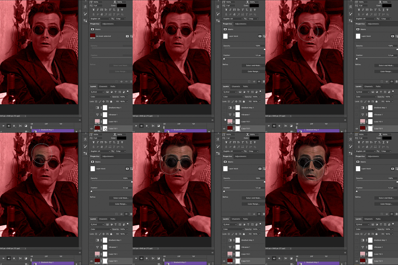
3. If for whatever reason step 3 doesn’t work (the background is white or black for example, or just too red), I might create a Solid Color layer set to whatever colour I want, set the blending mode to Color and then select the layer mask and carefully paint with a soft, black brush over the people’s faces/bodies. I will then lower the Opacity, to whatever looks smooth enough. If there’s a lot of movement in your gif, you might have to use keyframes (see sabrinaacarpenters's tutorial linked above). However, my main goal is to avoid using those; that’s why I try my hardest to tweak around as many Hue/Saturation layers as needed and not have to create a solid color layer.
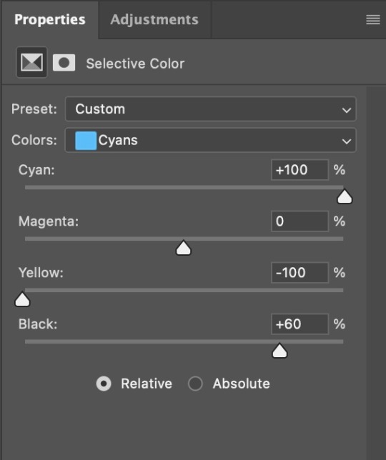
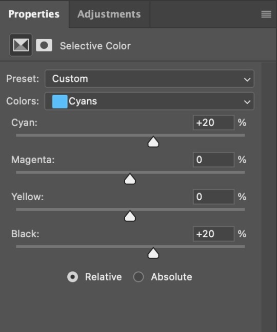
4. Once my background looks the colour I want it, I might add a Selective Color layer that matches my background color and then try to make it look more vibrant. For this Aziraphale gif below for example, I’ve selected the Cyans and then set Cyan to +100%, Yellow to -100% and Black to +60, then created another one, selected the Cyans again and then set Cyan to +20 and Black to +20.
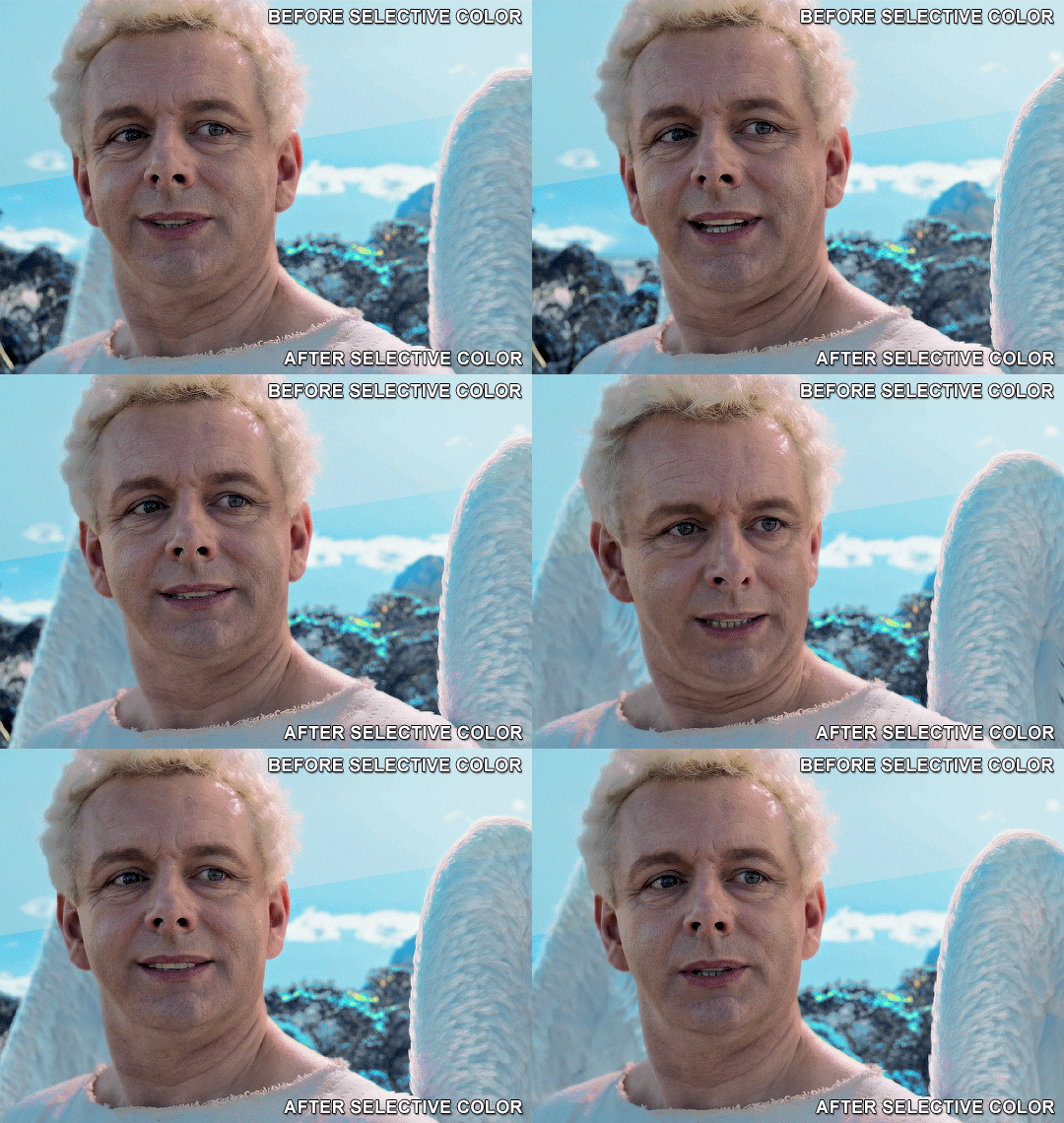
5. If the gif has a white area, I create a Solid Color layer with a colour that matches the rest of the background and then set the Opacity low. I might also create a Selective Color layer, increase the Black and then play around with the colours.
IV. FINISHING TOUCHES
I create a Vibrance layer and set the Vibrance to around +30 and the Saturation to about +5.
I create a black and white Gradient Map layer (with black on the left end of the spectrum and white on the right), set the blending to Luminosity and the Opacity to about 20-30%.
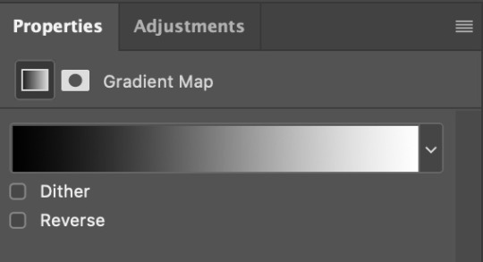
AAAND that’s about it I think! This ended up way too long and perhaps a little incoherent. I tried to make it as general as possible, so you might have to mix and match for best results. Feel free to ask me for further explanations about any one of these steps, and please tell me if you want me to go through the colouring of a specific gifset (although, as I said, I'm by no means an expert). Happy gifmaking!
#gif tutorial#allresources#completeresources#dailyresources#photoshop tutorial#minee#tutorial#tutorial*#chaoticresources#uservivaldi#userdanahscott#usersanshou#userfanni#userbuckleys#userrobin#tuserjen#userdavid#userzaynab#tusermimi#thingschanged#tuserju#usertj#userhallie
358 notes
·
View notes
Text

TJ MIKELOGAN's HALLOWEEN 2024 EVENT
RULES:
Use the tag #USERTJ to share your creations (and so I can reblog them)
Include "TJ MIKELOGAN's HALLOWEEN 2024 EVENT" + that day's prompt in your caption
Reblog this post
THINGS TO KNOW:
This event is open to anyone who wants to participate – gifmakers, editors, etc. – and you do not have to be following me if you don’t want to! Create gifsets, graphics, moodboards, whatever you enjoy!
You can do as many or as few prompts as you want! This is supposed to be fun, so no need to put unnecessary pressure on yourself.
Interpret the prompts however you see fit; stick to them as loosely or as rigidly as you want! If you have any questions, don't hesitate to send me an ask or DM!
When I reblog your creations, I will tag them as halloween24event and I will tag mine as *halloween24
Make sure to check out the #USERTJ tag as well so you can see what everyone else is coming up with and share what they’ve created! Even if you’re not participating in the event yourself, please support creators by REBLOGGING!
PROMPTS:
DAY 1: Your go-to Halloween movie DAY 2: Colors – orange and black DAY 3: Foreign horror DAY 4: Classic horror (pre-2000s) DAY 5: Villains DAY 6: Horror parallels DAY 7: Vampires DAY 8: Costumes and makeup DAY 9: Horror movie soundtracks DAY 10: Animation DAY 11: Obscure horror DAY 12: Newer horror (2000-2010) DAY 13: Horror television DAY 14: Horror tropes DAY 15: Halloween episodes/specials DAY 16: Colors – purple and green DAY 17: POC in horror DAY 18: Spooky musicals DAY 19: Horror remakes DAY 20: Quotes DAY 21: Make it horror DAY 22: LGBT+ horror DAY 23: Modern horror (2010-2024) DAY 24: Horror sequels DAY 25: Final girls DAY 26: Colors - black & white DAY 27: Period (historical) horror DAY 28: Halloween nostalgia DAY 29: Horror film that scared you the most DAY 30: Favorite horror movie DAY 31: Wildcard – your choice
last year's event post + creations
gif frame/border can be found here by @raccoonscity
Below the cut, I’m tagging those who reblogged my original poll regarding this event and were either interested in participating or signal boosting, those who participated last year, as well as some moots who’ve expressed interest in all things Halloween and horror. Regardless of why you were tagged, please don't feel obligated!
@kizzyedgelll @scarecrowmax @vinmauro @sidprescot @showyoumyfavoriteobsession
@thepunkpanther @idlewarning @3rdboywonder @hollytanaka @rhcenyra
@mvthr @taiturner @stuckinthedeadlights @chappelroans @maybethistimemegz
@katieskrsgard @charmedslayer @marionsravenwoods @kvtnisseverdeen @usertiff
@sapphic-girls @elssbethtascioni @esmecarmona @maxinesminx @maxanor
@magicaplin @miwtual @scullys-scalpel @sculien @muldxr
@angelamcss @finnickodaiir @ianmckellen @cowboykeery @laurabenanti
@chaoticroad @muldery @kizzyedgelll @leodanbrock @anyataylorjoys
#*halloween24#horroredit#halloweenedit#gifmakerresource#completeresources#dailyresources#chaoticresources#horrortvfilmsource#junkfooddaily#userriel#userairi#userzal#tuseraicr#usermaguire#alexlook#useralien#userveronika#tusercj#usergwendaria#userhann#usermalina#userbrittany#tuserheidi#janielook#usermagic#userbuckleys#userfanni#usermimsi#userpriyas#nessa007
269 notes
·
View notes
Note
As a fellow gifmaker (only not quite as skilled as you are) I've been struggling and your gifs always look so amazing and nice and colourful so I was wondering if you could share some tips on how do you colour tinted scenes like in MoTA? thank you Jess you are amazing ����
heey there!!!! First of all sorry for taking so long to reply to this, I was so happy with your nice comments that I wanted to give you a proper insight on how I do it, but unfortunately I'm quite HORRIBLE at explaining things?
I'll put it under the cut because it's gonna be a long post! but if you have any doubts my askbox is always open!!!!

So first of all I already gave some tips on how does my process with coloring gifs work so you can check it on my resources and tips tag
As you said you are also a fellow gifmaker so I'll take it from there as I assume you already know gif 101, but if you are new to this you can again check my tag for some beginners tips
Also want to point out this lovely tutorial by @ajusnice that might be even more helpful, since I learned a lot from it
Disclaimer: i'm colorblind, I can see all the hues, just not all the shades and I tend to struggle with greens, oranges and yellows so apologies for any mistakes or if this turns out looking weird!

HOW TO COLOR TINTED SCENES????
So at this point I hope you already have you gif all cut down to the size that you want and used your fav action/sharpening presets ( I use this or this actions to sharpen my gifs
Now I'll use the footage down bellow as it is really blue tinted and I worked with it for this gifset (MoTA SPOILERS AHEAD!!!!!!!!!) so it looks like this
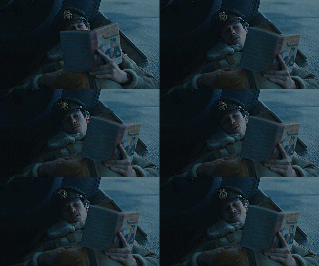
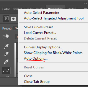
3. So the first thing I do is work with curse as it gives me a better grasp of what I have and how do I want to go with it. I have been using this method where you go to Curves >> Click on the top right menu >> Auto Options
4. Now a new window thing will open up and then I click on the option Find Dark and Light Colors, as you can see my gif already looks a lot brighter and now so tinted
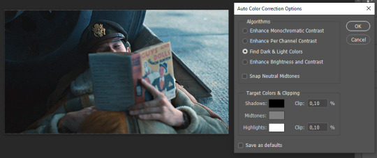
5. this is how my gif looks like I selected that option
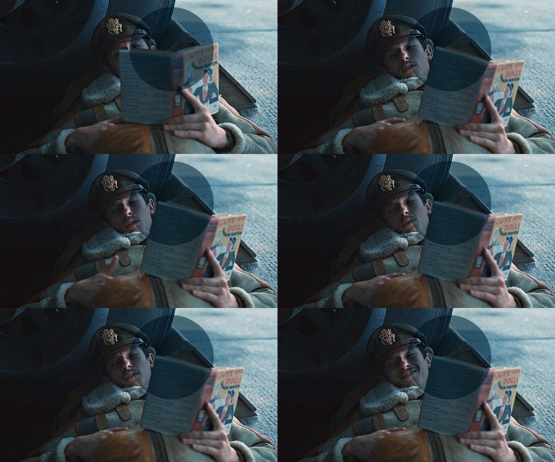
6. still does look a little blue-ish doesn't it? Okay so now I'll go to some adjustment layers, the first thing I do is work with hue/saturation. I'll go to the cyans and blues first and I want to remove some of the blue tint of my scene. I prefer to decrease the saturation of those colors so it looks a bit like this
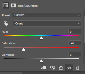
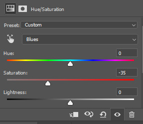
and my gif looks like this
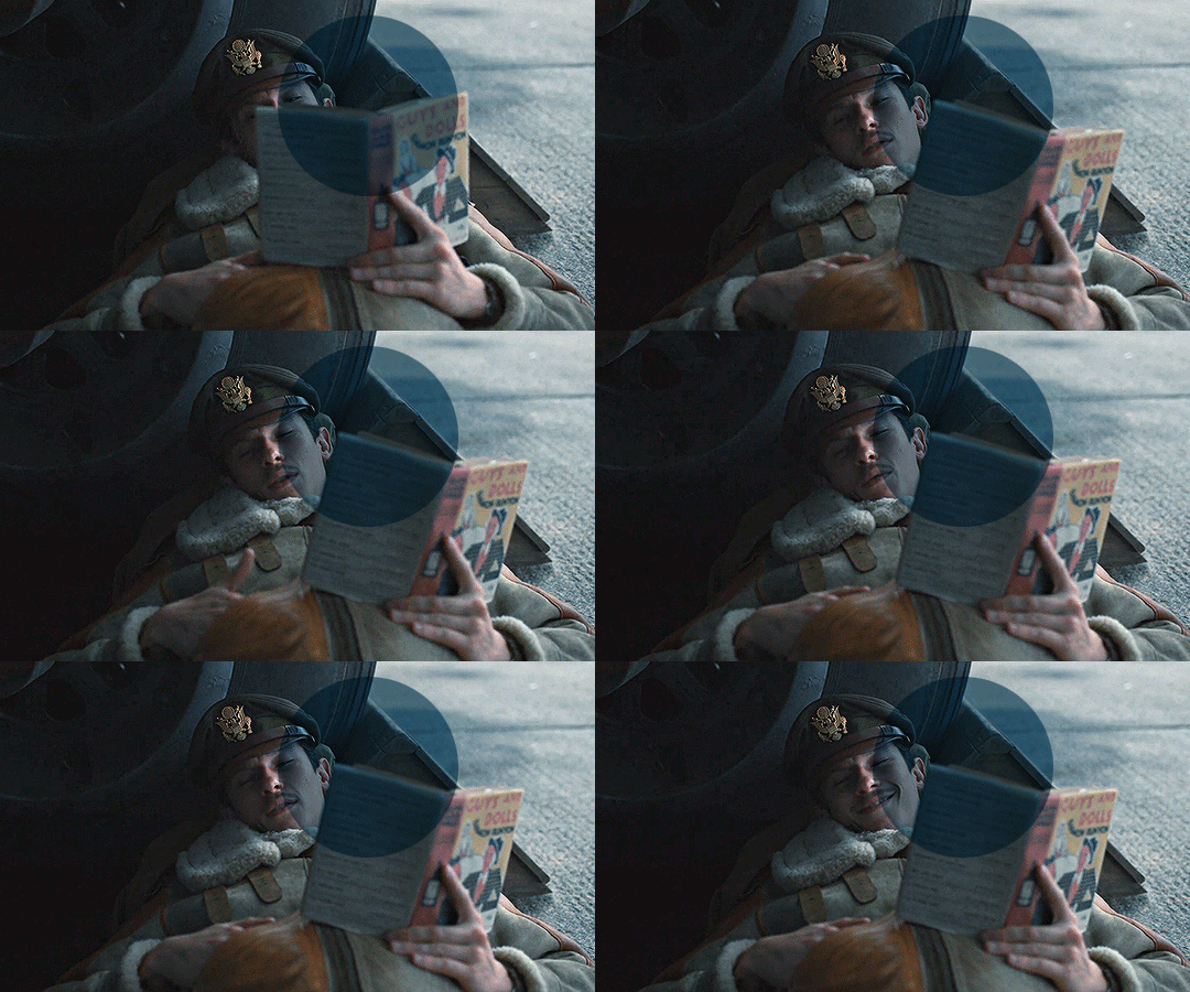
7. So here is our first problem, while I took away the blues my gif now looks a little dull as the scene was delivered to us in such a different color scheme, It wasn't supposed to look like this so now we need to color correct!! For this I work my way around vibrance/saturation so my menu looks like this
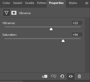
And my gif looks like this
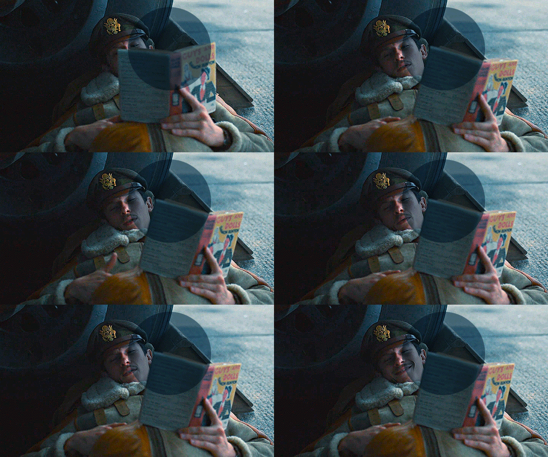
8. Problem #2 because now it looks too blue tinted AGAIN! so I just repeat step 6 again so my menus look like this
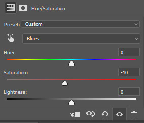
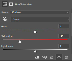
and my gif looks like this
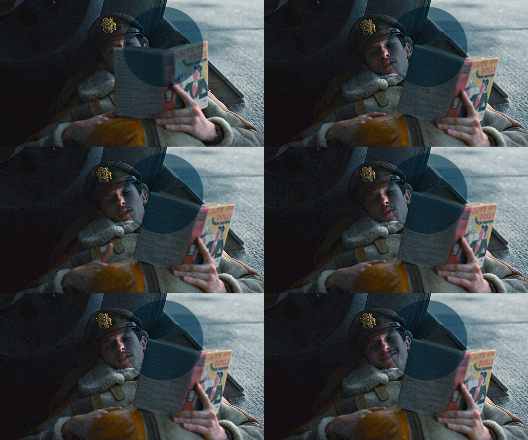
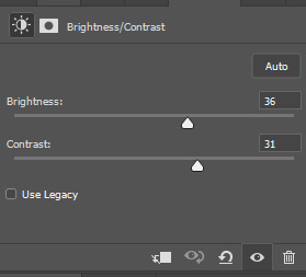
9. from now on it's only about some details such as correct the brightness/contrast of the scene and I personally like to use the color balance adjustment layer, I'll leave it all here
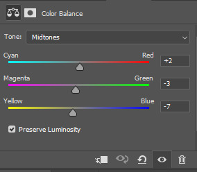
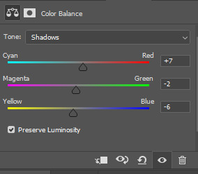
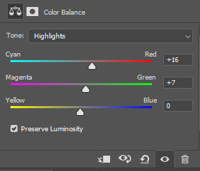
10. finally one of my fav adjustment layers -> SELECTIVE COLOR i just mess around until it looks nice to me, I'll leave the configs I used down bellow
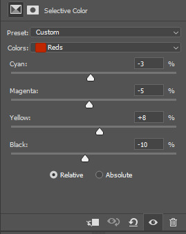
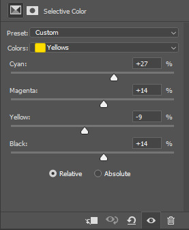
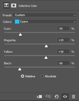
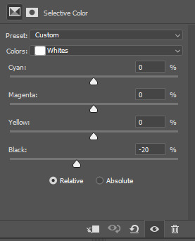
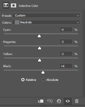
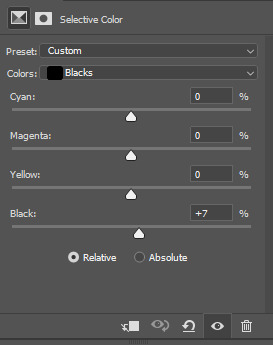
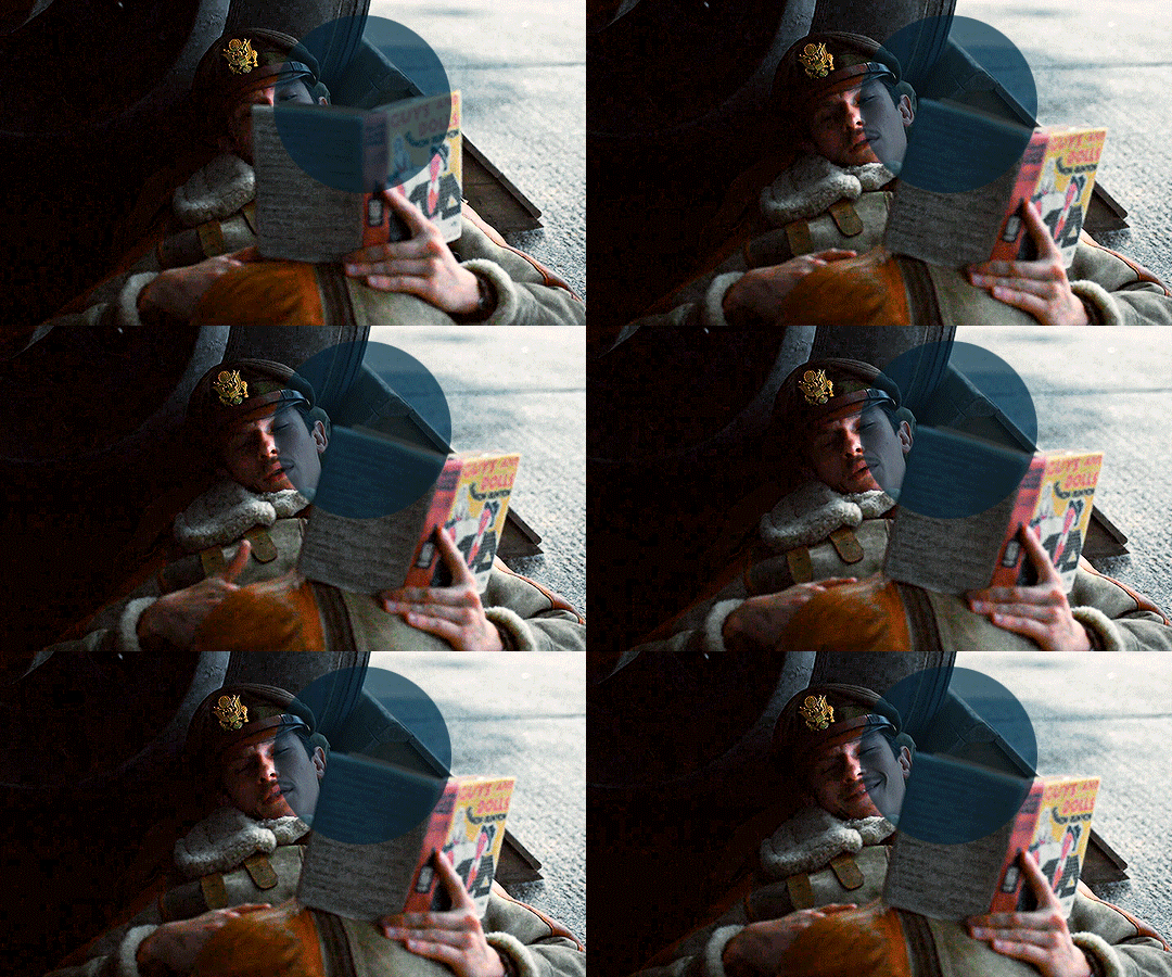
Finally after all those steps my gif looks like this
#asks#anon#s: resources#requests#coloring tutorial#usergif#allresources#chaoticresources#gif tutorials#gif tutorial#psd tutorial#completeresources
213 notes
·
View notes
Note
could you please do a tutorial of your game of thrones 'so much for stardust' gifs where it has the ripped paper textures? it's so pretty, and i'd like to learn how to do one with just the texture in the middle and two gifs on either side, like half and half and just having a rip in the middle. it's so cool how you did a gif in the middle though so i wanted to ask as well! all of them are so cool looking. you are extremely talented. if you don't want to though i understand :) thank you
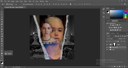
TORN PAPER EFFECT + BLENDING TUTORIAL
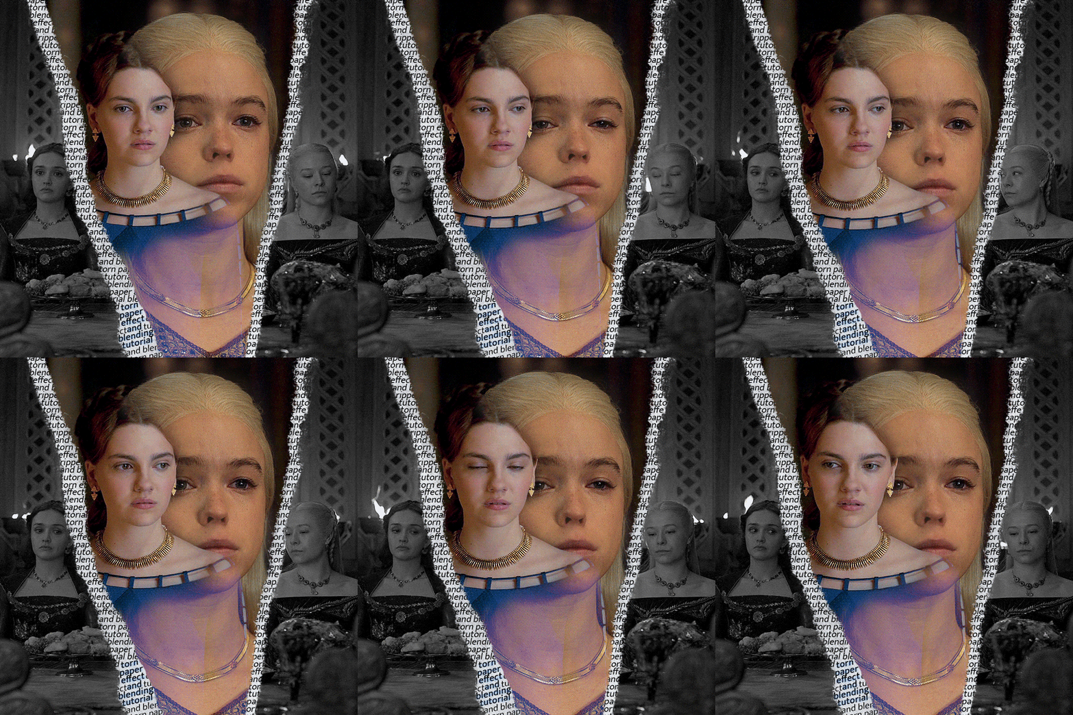
thank you so much for your sweet words, dearest anon and i'm sorry it took so long to answer but it's here now so i'll try my best to explain <3 disclamer: this is the first tutorial i ever made, it's very screenshot heavy and it assumes the basic knowledge of ps and gifmaking. if there's something you don't understand, don't hesitate to ask <3 so, let's get to it!
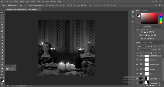
1. PREPARING THE BASE As you can see in this shot there's a lot of space between Rhaenyra and Alicent and that makes it perfect for the ripped paper overlay without hiding much of the base gif. So the first thing i did was to crop it like this:
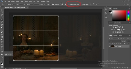
Also you want to make sure that the highlighted box (delete cropped pixels) is unchecked! After taking the usual steps for the animation (creating frames from layers, reversing the frames, setting frame delay) you continue with the video timeline and convert your frames into a smart object. psa: if you don't have the motivation or the time to play around with coloring here are some psds i recommend: 1, 2; as for the sharpening i think this one is the best.
now that you have your smart object sharpened and colored what you want to do next is drag it to the end of the canvas and duplicate it. after that you move the copy on the other end like the original and make sure it's under the coloring layers, like this:
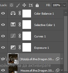
After that you have to create layer masks (the highlighted icon above) for both smart object and the copy and change the blending option of the copy to screen or lighten (whatever looks best!). So this is how it looks now:
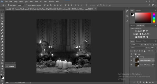
pls ignore that there are no layer masks on the smart objects i just added them after changing the blending rip </3 Now, as you see both gifs are like fighting eachother for their rightful place on the canvas. (fgfgfdf) To fix that you have to use a soft round brush to delete the parts you don't want. (feel free to play around with the brush however you want to get the result you want!) Here's my result:
2. THE OVERLAY
Now for the both gifs you want to use for the ripped paper effect you pretty much apply the same steps as the ones you did with the gifs for the base. Here are the two gifs i chose:
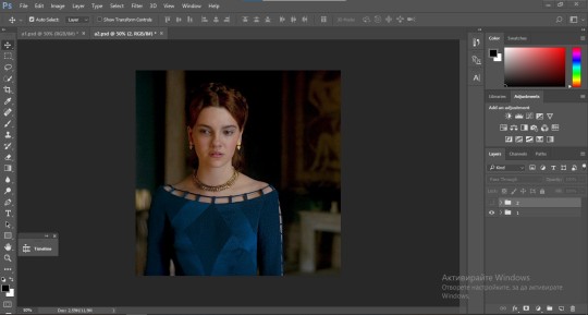
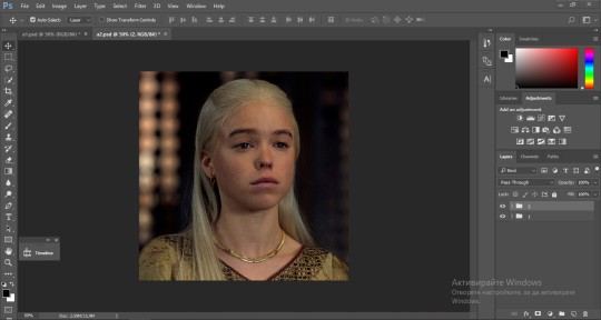
Before blending both gifs however you want to create a clipping mask for each of the smart objects coloring layers, like this:
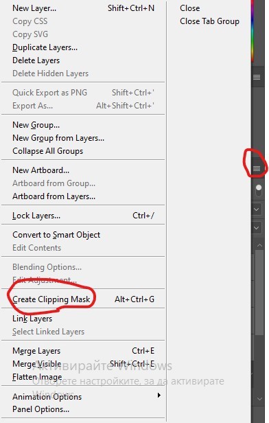
And now you're ready to blend both gifs together! You choose the group with one of the gifs and change the blending again to screen or lighten and place the said group on top of the other. So this is how it looks now:
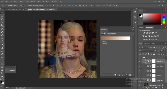
optional: if you feel like the base gif doesn't pop out enough you can always add a gradient map on one of both gifs and play around with the opacity and the color you think fits best.
Then you add a layer mask on the overlay gif group and again play around with the brush to delete what you don't want. So this is the final result:
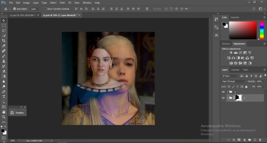
ps - don't repeat my mistake by placing the group with the layer mask under the other group. it should be on top and the blending option should be lighten or screen.
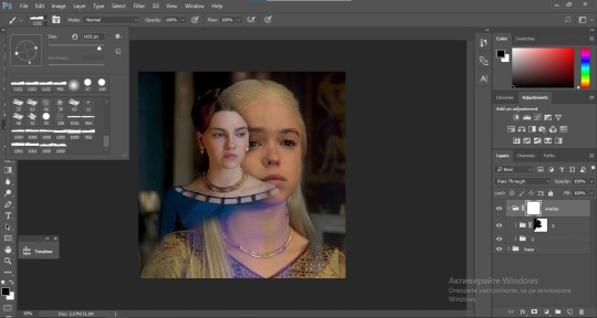
After blending both gifs together, you're ready to place them on the base. So first thing you want to do first is place both groups of each gif in one single group together. Then you duplicate the said group in the psd of the base gif and create a layer mask. This is how it should looks:
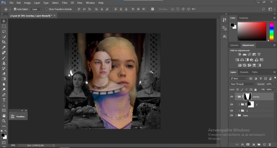
Now, in order to create the ripped paper effect, you'll have to download a ripped paper brush pack. This is the one i use. After loading the brushes in ps (if you don't know how here is explained) you're ready to begin! Change the size and angle however you'd like to make it look how you want. And if you want you can move the overlay gif by choosing both groups in case you aren't happy with the adjustment. This is how it looks like so far:
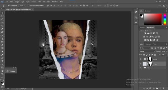
We're almost done! Now you have to find a paper texture, (i got mine from google) place it between both groups of your gifs and create a layer mask, like so:
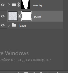
What you have to do here is pretty much the same thing you did with the overlay gifs. Still, make sure there's enough space for the text you want to write in. However, if you think that the space isn't enough you can just delete a bit more of the overlay gifs. Here's mine:
3. THE TEXT
You're finally ready to type out the text you want! If you're having troubles with choosing the right font and size, here are my text settings:
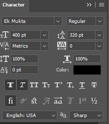
You can always play around with the angle and if your text is too small, zoom in so you can place it just how you like it. And since i'm a bit lazy to deal with it later, i choose to add the highlight color while it's still zoomed. You just have to add an layer above the text and use a soft round brush with opacity from 70-75% and flow from 15-18%.
For the repeated text you want to make sure you create a big space for writing so it can contain the whole space of the torn paper. Also, write where the text will be seen only and use the tab button to skip the space where the gif is. This is how it looks:
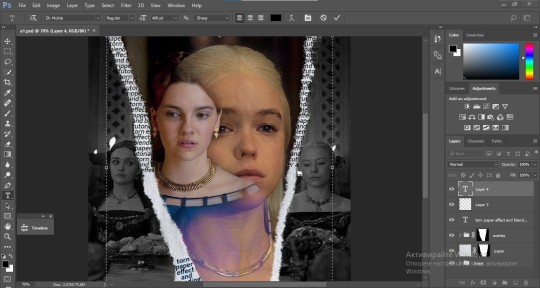
Once you're done with writing the repeated text, you want to select all the character layers and the highlight layer and move them under the overlay gif and on top of the paper, like this:
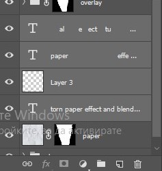
With the layers still selected and in order to contain the text within the paper the last thing you want to do is create a clipping mask. And that's It. You're done! This is the final result:
#allresources#dailyresources#usergif#chaoticresources#gifmakerresource#hisources#onlyresources#alielook#usermaguire#userrobin#usernik#userpat#userbells#gif tutorial#ps help
171 notes
·
View notes
Text

REVOLUTION PSD COLORING by @loviestudio
This coloring was made in Photoshop CC; it might work on Photopea!
CONTENT
1 Photoshop file (PSD) with the coloring.
TERMS
Like and/or reblog to help a creator.
Don’t repost, re-upload or put it on packs and/or google drive. Don’t claim my resources as your own, and don‘t share them without my consent!
Don’t use my resources as a base or copy them.
Credits are not mandatory, although I’d love to see your edits!
You are allowed to use my premium resources commercially once you pay for them. Reach out to me for more information or if you have questions about my resources license.
Follow me for more resources! ♡
This is a premium resource — available free for the first 10 downloads on my Ko-Fi page! You can buy it with points on DeviantArt or on Ko-Fi. Thank you!
DISCLAIMER: I don’t own any of the pictures used to make the preview and I have no intention to violate the copyright rules. If any picture in the preview belongs to you and you want me to remove it, please, contact me!
#dailypsd#supportcontentcreators#dailyresources#allresources#completeresources#chaoticresources#dearindies#psd coloring#psd download#psd for icons#photoshop resources#photoshop psd#resources#for icons#psds#psd#coloring psd#icon psd#psd: pale#psd: unsaturated#free resources#free#free psds
184 notes
·
View notes